Evaluating the Usability of the OpenVista
Electronic Health Record EHR
Eliz Markowitz
School of Biomedical Informatics, The University of Texas Health Science Center at Houston
8181 Fannin Street #612
Houston, TX 77054, USA
ABSTRACT
In the midst of pressing demands for viable Electronic Health Record (EHR) technology, Medsphere OpenVista offers a Graphical User Interface (GUI) system that strives to provide such technology across a variety of healthcare organizations and settings. While the overall structure and function of OpenVista may improve overall performance, in terms of cost reduction, clinical performance, and patient care outcomes, there is still much room for improvement in OpenVista’s user interface. Via the application of user interface design methods and techniques, recommendations for the overall improvement of the OpenVista Patient Summary screen were made and a low-fidelity prototype was created. The goal of the new patient summary screen was to create a user environment that will optimize user performance via reduction of time spent acquiring data, improving the ease of data acquisition, and clarity of data. The two patient summary screens were compared via a KLM analysis and the low-fidelity prototype screen was found to increase ease of use and efficiency. Specifically, OpenVista required, on average, 60% more mental operations and 31% more time per task than the prototype. Consequently, while EHRs are quite valuable, poor design can lead to extensive usability issues amongst both novice and expert users. While OpenVista is quite prevalent amongst many hospitals utilizing EHRs, there is still much room for improvement.
Keywords
Design, Human Factors, OpenVista, Usability, Electronic Health Record (EHR), Keystroke-Level Model (KLM)
1.
INTRODUCTION
1.1 OpenVista: Electronic Health Records (EHRs) are viewed by many as useful tools for improving and supporting the provision of high quality healthcare. [1] While there is currently no standard HER at the moment, the HER aims to digitally record health information about specific patients or populations. OpenVista, one of the most prevalent HER systems currently in use, derives from the Veterans Health Information Systems Technology Architecture; an HER used and developed by the United States Department of Veterans Affairs (VA). [2] In the midst of pressing demands for viable Electronic Health Record (HER) technology, Medsphere OpenVista offers a Graphical User Interface (GUI) system that touts use “across the continuum of acute, ambulatory, and long-term care environments as well as in facility, multi-specialty healthcare organizations.” [3] Despite the fact that the VA and many other organizations successfully utilize OpenVista, the user interface leaves much to be desired in terms of usability and design.
1.2 Design Guidelines for a GUI: A GUI allows a user to interact with an application via direct manipulation. The most important aspect of healthcare applications revolves around usability. Usability, as far as GUI design is concerned, encompasses ease of use, a low learning curve, and preventing user error as much as possible. Indeed, in order to ensure an intuitive system that adheres to professional standards, applications utilized in the healthcare field must take into consideration the diverse backgrounds and tasks of clinicians while employing usability standards. [4] In addition to providing the required functionality, design guidelines should be adhered to in order to increase the overall usability of the interface. Additionally, heuristic evaluation is often used in order to determine potential issues with the user interface design. While a plethora of usability heuristics exist, the majority focus on similar issues such as consistency, task match, appropriate visual presentation, user control, memory-load reduction, error handling, and guidance and support. [5]
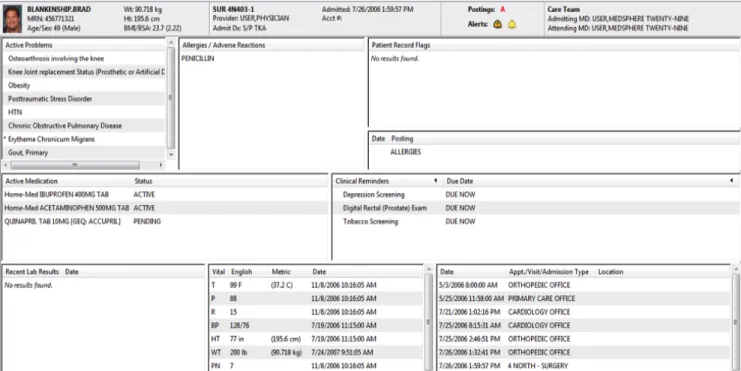
1.3 OpenVista Design Principles Violations: While the current structure and function of OpenVista may improve overall performance, in terms of cost reduction, clinical performance, and patient care outcomes, there is still much room for improvement in the OpenVista user interface. Indeed, the overall structure of the GUI violates many of the aforementioned design principles. There have been numerous papers discussing usability violations of OpenVista and comparing OpenVista to other EHRs. However, there is a distinct dearth of literature focused on the improvement of OpenVista. Accordingly, rather than providing solutions to the problems of OpenVista, individuals are simply told that alternative EHRs are either better or worse for clinicians. [6-7] Due to the aforementioned, the focus of this analysis will be on OpenVista’s Patient Summary Screen (Figure 1). The patient summary screen contains a plethora of information that a clinician can browse through when treating a patient. Unfortunately, however, the layout and design of this screen leaves much to be desired. Furthermore, improved design would not only improve the aesthetic and appearance, but would also improve the efficiency and usability of the EHR.
2.
METHODS
2.1 Heuristic Evaluation and Severity Ratings: Heuristic Evaluation (HE) allows an evaluator to examine the interface and make note of usability issues. In order to determine potential user problems, a set of heuristics is used to judge the usability of the interface itself. One HE method utilized by many to determine the usability of a GUI is
Figure 1: Sample OpenVista Patient Summary Screen
Nielsen’s ten usability heuristics. Developed by Jakob Nielsen and Rolf Molich, Neilsen’s usability heuristics (Table 1) are widely used in order to pinpoint issues with GUIs. [8]
In addition to determining design flaws, the evaluator may be asked to rate the severity of each issue. Nielsen defined the severity of a usability issue as a combination of the following factors: frequency, impact, and persistence. [9] If the frequency, impact, and persistence of a usability problem is high, the severity of the usability issue will also be quite high. In order to weigh the severity of usability issues against one another, Nielsen devised a severity rating scale. The severity of a usability issue can be rated on a 0-4 scale (Table 2), with 0 indicating no usability problem and 4 indicating a usability catastrophe. [10]
Estimating the severity of usability issues offers a number of benefits. Primarily, severity ratings can aid the system producer in the allocation of resources. For example, if the severity ratings indicate major usability issues, it would be necessary that these problems be fixed prior to release. Conversely, if there are only a limited number of minor and/or aesthetic
usability issues, the producer might decide to release the system without further changes.
While conducting a HE and assigning severity ratings does not, in itself, provide interface solutions, it does allow for specific usability problems to be pinpointed. Once specified, individuals can propose solutions that solve the usability issues and reduce the severity rating to a sufficient state. In short, HE allows producers to identify potential usability flaws.
2.2 Prototyping:A prototype is a draft version of a concept, application, or idea that can range from a set of drawings to a fully functional model. [11] Prototyping is not only cost-effective, but can provide useful insight regarding application design. Furthermore, prototyping allows the design team to quickly make changes and alter the design prior to the release of the product. Accordingly, prototyping has been known to improve the productivity of a department’s applications development effort. [12]
1 Visibility of system status
2 Match between system and the real world
3 User control and freedom
4 Consistency and standards
5 Error prevention
6 Recognition rather than recall
7 Flexibility and efficiency of use
8 Aesthetic and minimalist design
9 Help users recognize, diagnose, and recover from errors
10 Help and documentation
0 Not a usability problem at all
1 Cosmetic problem only: Need not be fixed unless
extra time is available on project
2 Minor usability problem: Fixing this should be
given low priority
3 Major usability problem: Important to fix, so should be given high priority 4 Usability catastrophe: Imperative to fix this before
product can be released
There are a variety of different prototyping techniques that can be utilized. Generally speaking, there are three main categories of prototypes: high-fidelity, medium-fidelity, and low-fidelity. [13] A high-fidelity prototype could be a fully functioning model of the product, a medium-fidelity prototype could be a limited functionality, mockup of the model, and a low-fidelity prototype could be a non functional mockup or storyboard representation. While low-fidelity prototypes have limitations in terms of usability assessments, they can be helpful in visualizing alternative design solutions, which, in turn, can provoke innovation and improvement. [14]
There has been much debate as to whether using high-fidelity prototypes ultimately results in a final product with a higher level of quality than utilizing low-fidelity prototypes. One study attempted to discover if using a high-fidelity, computer based prototype was more effective than using a low-fidelity, paper prototype. The results showed that there was no reliable difference in the number or type of usability issues discovered using the low- and high-fidelity prototypes. [15] After the results of the aforementioned study were released, a number of follow up studies were conducted in order to determine if the results were limited to specific domains. Primarily, Catani and Biers used low- and high-fidelity prototypes to perform library search tasks and found that there was no reliable difference in the usability issues discovered. In fact, there was a high commonality in the usability issues uncovered using the different prototypes. [16] In 2002, the idea was put to the test again when Walker et. al. had participants carry out banking tasks using low- and high-fidelity prototypes. Like the prior studies, it was found that there was no reliable difference in the number and type of usability issues uncovered. [17]
Clearly, there are many benefits to low-fidelity prototyping. Due to the fact that low-fidelity prototyping is quite cost-effective, many design teams utilize this type of prototyping early in the design stages. Furthermore, it is often unnecessary to use a fully functional prototype when designing an application. Perhaps most importantly, as previously noted,
there are no significant differences in determining usability issues with low- and high-fidelity prototypes.
2.3 GOMS/KLM Analysis: When considering usability, it is imperative that one takes into account both the physical and mental actions undertaken by the user. GOMS analysis (Goals, Operations, Methods, and Selection rules) is one of the best-known models of cognitive task analysis. [18] The GOMS analysis aims to speak to the coverage of the functionality of a system and provide estimates of task performance time. [19]
The Keystroke-Level Model (KLM), proposed by Card and Moran, is a simplified version of GOMS wherein the execution time of a task is estimated by listing sequence operators and assigning a time to each operator. The original KLM had six classes of operators: K for pressing a key, P for pointing to a location on screen with the mouse, H for moving hands to home position on the keyboard or to the mouse, M for mentally preparing to perform an action, and R for system response where the user waits for the system. [20]
For the purposes of this project, the KLM analysis was used to determine both physical and mental actions undertaken by a user who wishes to garner information from the patient summary screen. The actions undertaken by the user were chronicled step by step and the time associated with each action was recorded.
3.
RESULTS
3.1 HE and Severity Rating Results: Based upon Nielsen’s usability guidelines, a HE of the OpenVista patient summary screen was conducted and severity ratings were assigned to each issue (Table 3). Four individuals, having backgrounds in both informatics and medicine, conducted the HE. While none of the usability problems were catastrophic in nature, rectifying the problems would enhance the user experience and the overall efficiency of the system.
Usability Problem Description
Heuristics
Violated
Mean Severity
Rating
Layout and position of the patient summary boxes is inconsistent and this leads to poor visibility of problems, vitals, and admissions information, which, in turn leads to inefficiency.
Consistency Visibility
3.25
There is an inconsistency between metric and U.S. measurements for weight, height, and temperature. The user should be able to quickly/efficiently switch between these systems depending on preference.
Consistency Flexibility
2
The fonts and capitalization are all the same which leads to no clear level of hierarchy. Differentiating the fonts could improve the clarity of the patient summary screen.
Consistency 3
The Vitals section on the patient screen could be improved by creating visual
models to represent whether the vitals are in normal or abnormal ranges. Efficiency Match 3 The patient summary screen violates the “less is more” principle. Minimize the
information and limit what the user sees to the essential aspects.
Aesthetic & Minimalist Design
3 Buttons at the top of the patient summary screen do not appear as buttons upon first
glance.
Match 2.5
It is unclear that the titles of each sub-box can be ordered when selected. Match 2.5
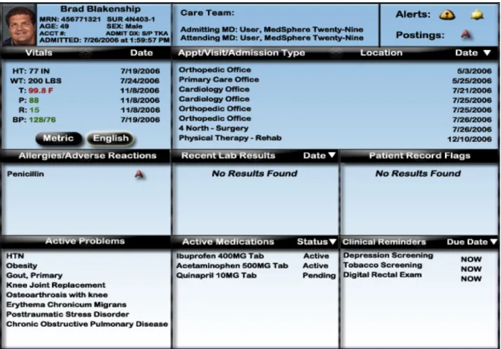
Figure 2: Prototype of Improved Patient Summary Screen
Many of the usability issues centered on consistency/standards and visibility; i.e., in the case of the patient summary screen, there was little adherence to platform conventions. For example, there appeared to be a lack of hierarchy amongst the different areas of the patient summary screen. By clearly delineating the difference between headings and input, clinicians would struggle less to acquire necessary information. The visibility of the patient summary screen was also limited. Primarily, the layout and position of the information boxes is inconsistent and leads to poor visibility of problems, vitals, and admissions information. The lack of consistency and visibility can lead to both inefficiency and medical errors.
Furthermore, it was also found that there were issues regarding concept matching between the system and the real world. A representation is a mapping between a represented world (that which is to be represented) and a representing world (that which does the representing). [21] As far as the patient summary screen is concerned, it is imperative that functions of the GUI match the internal representation of the user; i.e., buttons should appear to be buttons and there should be no question regarding their function.
3.2. Prototyping Results: As previously discussed, many studies demonstrated that there was no reliable difference in the usability issues discovered when using low- and high-fidelity prototypes. Accordingly, rather than create a high-fidelity prototype of the OpenVista patient summary
screen, I chose to create a low-fidelity, paper mock-up (Figure 2).
In order to create a viable prototype, it was essential to understand the outcome of the HE and associated severity ratings (Table 3). Via the utilization of the HE a prototype was created that fixed the usability issues found in the initial OpenVista patient summary screen. In order to test the usability of the new prototype in comparison to the typical OpenVista patient summary screen, a KLM analysis for both screens was undertaken.
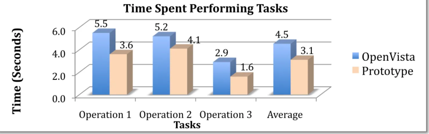
3.3 KLM Analysis: For this KLM analysis, industry standard estimated times for each operation are used. [22] As seen in Tables 4 and 5, the KLM analysis was used determine the internal and external actions required by the user for a number of common actions. In each scenario, the low-fidelity prototype of the patient summary screen required fewer actions of the user than the current OpenVista patient summary screen.
Specifically, on average, the prototype decreased the time a user spends on a single task by 31% (Figure 3). Such a huge decrease in time spent would not only lead to more timely care, but would also be more efficient and cost-effective. Furthermore, when the mental operations were compared, it was found that OpenVista required 60% more internal, cognitive operations from the user than the prototype (Figure 4). Due to the fact that the mental load of the user was decreased, the usability of the prototype patient summary screen far exceeded the usability of the OpenVista patient summary screen.
4. CONCLUSION
In this study the current OpenVista patient summary screen was evaluated via Nielsen’s usability heuristics. After determining the various usability issues, the issues were given a severity score based on Nielsen’s severity rating scale.
Based upon the outcomes of both the HE and severity rankings, a low-fidelity prototype was developed. The aim of the prototype was to improve upon the current OpenVista patient summary screen by addressing the discovered usability problems. Both patient summary screens were then evaluated via a KLM analysis. Here, different user actions were tested in order to analyze the amount of time an expert user would spend on each task. Based on the results of the KLM analysis, it was
found that expert users must invest more time and perform more mental operations to garner information from the current OpenVista patient summary screen.
Further directions for this project include creating a functional prototype and comparing the functional usability of OpenVista and the prototype.
5. CONCLUSION
This study demonstrates that while EHRs are quite valuable, poor design can lead to extensive usability issues amongst both novice and expert users. While OpenVista is quite prevalent amongst many hospitals utilizing EHRs, there is still much room for improvement. By upgrading the user interface, the OpenVista EHR could improve usability leading to an overall improvement in user efficiency.
6. REFERENCES
[1]Poon EG, Wright A, Simon SR, Jenter CA, Kaushal R, Volk LA, et al. Relationship Between Use of Electronic health Record Features and Health Care Quality: Results of a Statewide Survey. Med Care. 2010;48(3):203-209.
Method for determining most recent appointment. Description Operation Internal or
External
Time (Sec)
Reach for mouse [mouse] H External 0.40 Locate Appointment
Information
M
[locate] Internal 1.20 Point to Appointment
heading [field] P External 1.10 Click on
Appointment heading [mouse] K External 0.20 Recognize that appointments can be ordered M [recognize] Internal 1.20 Click on Appointment heading to order options K [mouse] External 0.20 Locate most recent
appointment [locate] M Internal 1.20
5.50
Method for determining patient temperature.
Reach for mouse [mouse] H External 0.40 Locate Vitals
Information [locate] M Internal 1.20 Locate Patient
Temperature [locate] M Internal 1.20 Determine if temperature is in English/Metric measurement M [determine] Internal 1.20 Determine if temperature is within the normal or abnormal range M [recognize] Internal 1.20 5.20
Method for determining active problems. Reach for mouse [mouse] H External 0.40
Locate Active Problems [locate] M Internal 1.20
Move pointer to scroll bar
P
[scroll bar] External 1.10
Scroll down to view all active problems
K
[mouse] External 0.20
2.90
Method for determining most recent appointment. Description Operation Internal or
External
Time (Sec)
Reach for mouse [mouse] H External 0.40 Locate Appointment Information M [locate] Internal 1.20 Point to order
appointments [field] P External 0.60 Click arrow to order appointments K [mouse] External 0.20 Locate most recent appointment M [locate] Internal 1.20 3.60
Method for determining patient temperature.
Reach for mouse [mouse] H External 0.40 Locate Vitals Information M [locate] Internal 1.20 Move pointer to English or Metric Button P [button] External 1.10 Click on English
or Metric Button [mouse] K External 0.20 Locate
Temperature
M
[locate] Internal 1.20
4.10
Method for determining active problems
Reach for mouse [mouse] H External 0.40 Locate active
problems
M
[locate] Internal 1.20
1.60
Table 4:KLM analysis of the current OpenVista patient
[2]Brown SH, Lincoln MJ, Groen PJ, Kolodner RM. VistA—U.S. Department of Veterans Affairs national-scale HIS. Int J Med Inf. 2003;69:135-156.
[3]System Overview. Open Source EHR
Meaningful Use Leader - Medsphere Systems OpenVista. 2010. Available at: http://www.medsphere.com/. January 21, 2010.
[4]Johnson CM, Johnson TR, Zhang J. A user-centered framework for redesigning health care interfaces. J Biomed Inform. 2005;38(1):75-87.
[5]Hvannberg ET, Law EL, Larusdottir MK. Heuristic evaluation: comparing ways of finding and reporting usability problems. Interacting with Computers. 2007;19(2):225-240.
[6]Saitwal H, Feng X, Walji M, Patel V, Zhang J. Assessing performance of an electronic health record (EHR) using cognitive task analysis. Int J Med Inform. 2010 May 6 [epub ahead of print].
[7]Zhang Z, Walji MF, Patel VL, Gimbel RW, Zhang J. Functional analysis of interfaces in U.S. military electronic health record system using UFuRT framework. AMIA Annu Symp Proc. 2009 Nov 14; 2009:730-4.
[8]Neilsen J, Molich R. Heuristic evaluation of user interfaces. Proceedings of CHI’90; 1990 April 1-5; Seattle, WA. 249-256, 1990.
[9]Nielsen J. Usability inspection methods. New York: John Wiley & Sons; 1994.
[10]Nielsen J. Severity ratings for usability problems.Use-it.com. 2005. Available at: http://www.useit.com/. March 1, 2010.
[11]U.S. Department of Health & Human Services. Develop a Prototype - Design. Usability.gov. 2010. Available at: http://www.usability.gov/design/. March 18, 2010.
[12]Kraushaar JM, Shirland LE. A prototyping method for applications development by end users and information systems specialists. MIS Quarterly. 1985; 9(3):189-197.
[13] Sauer J, Selbel K, Ruttinger B. The influence of user expertise and prototype fidelity in usability tests. Applied Ergonomics.
2010;41(1):130-140.
[14] Bailey B. Paper prototypes work as well as software prototypes. Usability.gov. 2005. Available at:
http://www.usability.gov/pubs/062005news.html. March 18, 2010.
[15] Virzi RA, Karis D, Sokolov JL. Usability problem identification using both low and high-fidelity prototypes. Proceedings of CHI’96; 1996; Vancouver, BC, Can. 236-243.
[16] Catani MB, Biers DW. Usability evaluation and prototype fidelity: users and usability professionals. Proceedings of the Human Factors and Ergonomics Society 42nd Annual Meeting; 1998 Oct 5-9; Chicago, IL. 1331-1336.
[17]Walker M, Takayama L, Landay JA. High-fidelity or low-fidelity, paper or computer? Choosing attributes when testing web prototypes. Proceedings of the Human Factors and Ergonomics Society 46th Annual Meeting; 661-665, 2002.
[18]Card SK, Moran TP, Nowell A. The psychology of human-computer interaction. Lawrence Erbaum, 1983.
[19]John BE, Kieras DE. Using GOMS for user interface design and evaluation: which technique? ACM Transactions of Computer-Human Interaction (TOCHI). 1996;3(4):287-319.
[20]Card, SK, Moran TP, Newell A. The keystroke-level model for user performance time with interactive systems. Communications of the ACM. 1980;23(7):396-410.
[21]Zhang J. Representations of health concepts: a cognitive perspective. J Biomed Inform. 2002; 35(1):17-24.
[22]Kieras DE. Using the keystroke-level model to estimate execution times. (Unpublished report, 1993). Available at:
http://www.pitt.edu/~cmlewis/KSM.pdf. Accessed April 4, 2010. Figure 3. Time required by the user when undertaking operations in the OpenVista and Prototype screens.