Munich Personal RePEc Archive
Structural Transformation in Developed
and Developing Countries
Bah, El-hadj M.
The University of Auckland
November 2007
Online at
https://mpra.ub.uni-muenchen.de/10655/
Structural Transformation in Developed
and Developing Countries
El-hadj Bah
∗Department of Economics, The University of Auckland, Auckland, New Zealand
September 19, 2008
Differences in key features of the development process across rich and poor countries can provide clues to the sources of the large variation of cross-country income. Kuznets included structural transformation as one of six stylized facts of economic development, finding that developed countries all followed the same process. In this paper, I compare structural transforma-tion processes in developed and developing countries. I find that developing countries follow distinct structural transformation paths that deviate from that followed by developed countries. A puzzling finding is the presence of substantial sectoral changes during times of economic stagnation or decline.
Key words: Africa, Asia, Latin America, Structural Transformation, Eco-nomic Development, Structural Change
JEL Classification: O10, O11, O14, O57
∗Email:[email protected]. I would like to thank my advisor Dr. Richard Rogerson for his invaluable
1. Introduction
Understanding why some countries are so poor relative to others is one of the most
important objectives of economics. In this paper, I examine key features of structural
change that differ across rich and poor countries. These structural differences can provide
important insights about the underlying sources of income differentials. One prominent
feature of economic development is the process of structural transformation, i.e., the
re-allocation of resources across sectors that accompanies development. In fact, Kuznets
(1971) included structural transformation as one of six stylized facts of economic
devel-opment. He found that developed countries all followed the same process of structural
transformation. It is therefore of interest to ask whether developing countries are also
following a similar process. In this paper, I conduct a detailed analysis that compares
structural transformation processes in developed and developing countries. I find that
the processes being followed by developing countries are often dramatically different from
the path followed by developed countries. This finding implies that it is important to
consider the structure of economies for understanding income differences between rich
and poor countries.
Kuznets distinguished between two phases of structural transformation. In the
be-ginning of the development process, an economy allocates most of its resources to the
agricultural sector. As the economy develops, resources are reallocated from agriculture
into industry and services. This is the first phase of structural transformation. In the
second phase, resources are reallocated from both agriculture and industry into services.
The analysis conducted here covers nine developed countries with data going back to
1870 and 38 developing countries for the period 1965-20001
. Using fixed effects panel
data regressions, I confirm Kuznets’ claim that developed countries followed the same
process of structural transformation.
My analysis of structural transformation in developing countries yields three main
1
findings. First, there is a considerable heterogeneity in the structural transformation
processes being followed by developing countries. Although most developing countries
are not following the path of the developed countries, a few are. I show that the
struc-tural transformation processes in developing countries deviate from the path followed by
the developed countries along two key dimensions: the relationship between changes in
sectoral output shares and changes in log of GDP per capita, and levels of sectoral output
shares for a given per capita GDP. To illustrate these differences, I analyze five patterns
of structural transformation being followed by developing countries.
Second, I find that the sub-continents of Africa, Asia and Latin America are following
different structural transformation processes. African countries tend to have low
agricul-ture and high service output shares at very low GDP per capita. Compared to developed
countries, Latin American countries move from the first to the second phase of structural
transformation at lower per capita GDP. Asian countries on the other hand, have
rela-tively higher industry output shares and comparable service shares. On average, Asian
countries are closest to the structural transformation path of developed countries.
Third, whereas from the traditional view we expect structural transformation to be
associated with economic growth, I find that many developing countries experience
sub-stantial structural transformation during periods of economic stagnation and even decline.
This was most evident among African and Latin American countries. This finding
sug-gests that structural transformation can occur without or with little changes in GDP.
This is a puzzle from Kuznets’ view of structural transformation. However, there is no
always a systematic link between GDP per capita growth and structural transformation.
In a three-sector model developed by Bah (2008), GDP per capita is affected by levels of
sectoral total factor productivities (TFP) while structural change is affected by changes
in relative sectoral TFPs and the elasticity of substitution between the industrial good
and services. In the context of that model, structural transformation can occur with very
little growth in GDP per capita.
The importance of structural transformation in economic development was a central
promi-nent by the works of Kuznets (1966, 1971) and Chenery (1960, 1975)2
and more recently,
there has been a great deal of work that allows for structural transformation in the
neoclassical growth model in order to explain some facts of economic growth and
devel-opment3
. The main contribution of this paper is to provide a systematic characterization
of structural transformation processes in developing countries. The findings suggest that
there is no systematic link between GDP growth and structural change and it is
impor-tant to use disaggregated models of growth for understanding the sources of differences
in income between rich and poor countries.
The rest of the paper is organized as follows. Section 2 analyzes the structural
trans-formation of developed countries. Section 3 analyzes the main differences in structural
transformation between developed and developing countries. Section 4 provides a
de-tailed analysis of structural transformation in Africa, Latin America and Asia. Section 5
shows evidence of structural transformation in times of economic stagnation or decline.
Finally, section 6 concludes.
2. Structural Transformation in Developed Countries
In this section, I study the structural transformation process followed by developed
coun-tries from 1870 to 2000. The analysis includes nine developed councoun-tries: Australia,
Canada, France, Germany, Italy, Japan, Sweden, United Kingdom and the United States.
The choice of countries is based on data availability.
2.1. Data
The data for sectoral output shares come from three sources. The early series are from
Temin (1967), which provides agricultural and industrial shares of national income in
current prices for the years 1870, 1890, 1910, 1930 and 1950. I obtained data from the
World Bank Tables (1983) for the years 1955, 1960, 1965 and 1970. The World
Develop-2
Other authors include Chenery et al. (1986); Syrquin (1986, 1994); Beaumol (1967) and Temin (1967).
3
ment Indicators online database has yearly data from 1971 to 2000. I use 5-year interval
time series from 1975 to 2000. This gives me a panel data set consisting of 15
cross-sections for nine countries4
. Data for GDP per capita, expressed in 1990 international
Geary-Khamis dollars, is from the “Historical Statistics for the World Economy: 1-2003
AD” by Maddison (2006). I use the same sources for developing countries for the period
1965-2000.
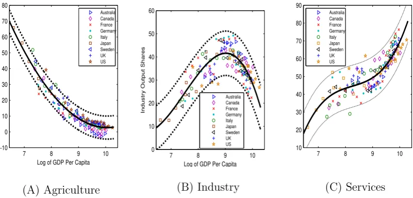
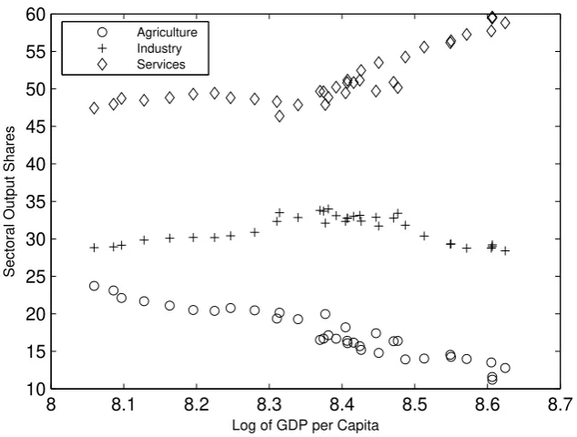
2.2. Paths of Sectoral Output Shares
The movement of sectoral output shares is a key regularity of the data for developed
countries during their long development process. Even though the speed of transformation
may differ across countries, all present the following similar features. As GDP increases,
the agricultural output share declines, the industry output share initially increases and
subsequently decreases, while the service output share is always increasing.
To determine whether the developed countries experienced a similar structural
trans-formation process, I use a polynomial function to fit the relationship between sectoral
output shares and per capita income for all countries. The degree of the polynomial
is determined by the goodness of fit. Starting from a linear polynomial, I increase the
degree by one and continue this process until the change in R-squared is less than 0.015
.
For each sector, I estimate the following equation:
vait =αi+β1log(gdpit) +β2(log(gdpit))
2
+β3(log(gdpit))
3
+. . .+ǫit (1)
where vait is the sectoral value added share of GDP for country i in period t and αi is a
country fixed effect.
The regression results are presented in table 1 in the appendix. The relationship
between agricultural output share and log of GDP per capita is best fitted by a quadratic
4
Note that the panel data set has two different time intervals: 20-year until 1950 and 5-year from there. I also used a second panel data set with 20-year intervals for the whole period. The results are essentially the same.
5
7 8 9 10 -10 0 10 20 30 40 50 60 70 80
Log of GDP Per Capita
Agriculture Output Shares
Australia Canada France Germany Italy Japan Sweden UK US (A) Agriculture
7 8 9 10 0 10 20 30 40 50 60
Log of GDP Per Capita
Industry Output Shares
Australia Canada France Germany Italy Japan Sweden UK US (B) Industry
[image:7.595.81.507.80.284.2]7 8 9 10 10 20 30 40 50 60 70 80 90 Australia Canada France Germany Italy Japan Sweden UK US (C) Services
Figure 1: Structural Transformation in Developed Countries
polynomial (β3 = 0). The R-squared for the fixed effects estimation is 0.92. The average
standard error for the prediction is 3.6. For industry, the best fit for the data is a third
degree polynomial. The goodness of fit is lower than that of agriculture. The R-squared
is 0.63 and the average standard error is 4.8. The relationship between service output
shares and log of GDP per capita is also approximated by a third degree polynomial with
an R-squared of 0.74. The average standard error is 5.9.
We know that the standard within estimation for panel data does not pin down the
fixed effect (αi) for each country. However, we can use country dummy variables to
estimate the Least Square Dummy Variable model (LSDV). Let α be the average fixed
effects for the 9 countries. For each countryi, I calculateαei =αi−α and call it the fixed
effect deviation from the mean. The distribution of this coefficient helps us understand
the extent of heterogeneity between countries. Table 2 shows the fixed effect deviation
from the mean for each country. The standard deviations of the distributions are 3.7
for agriculture, 3.1 for industry and 2.5 for services. In agriculture, the big deviations
are experienced by Australia, Germany, Italy and the UK. Australia and Italy are above
the average of the fixed effects while Germany and the UK are below. In industry,
Germany and Japan are well above the average fixed effects while Australia and to some
below the average and the US that is well above. Figure 1 shows the scatter plots of
the sectoral output shares corrected for the fixed effects deviation from the mean ( i.e.,
vait−αei for all i) versus log of GDP per capita. The graphs also show the fitted curves
with the lower and upper bounds at two standard deviations of the forecasted values.
Most of the data points are very close to the fitted curves and almost all are within
the bounds of the estimation. These three graphs along with the regression tables show
that developed countries all followed a similar process of structural transformation. This
process fits Kuznets’ description. In the following sections, I discuss how the structural
transformation processes of developing countries compare to the above baseline process.
3. Structural Transformation in Developing Countries
In this section, I analyze the structural transformation in developing countries. I selected
38 countries for the analysis based on a set of criteria. The first criterion is coverage of as
many different regions of the world as possible. Thus countries from Sub-Saharan Africa,
Southeast & East Asia and Latin America were selected. The second criterion is data
availability. Sectoral output shares from 1965 to 2000 are available for 54 developing
countries from the regions mentioned above. From this initial sample, I exclude six
countries, Botswana, Gambia, Guinea-Bissao, Lesotho, Swaziland, that had less than
1 million inhabitants in 1965. I also exclude countries that experienced major political
disruptions like civil war. This criterion excluded Burundi, Nicaragua, Rwanda and South
Africa6
. In addition, major oil and mineral producers are not included. In particular, I
exclude countries that had mining and oil production above 30% of GDP for five years.
The following five countries fit this criterion: Republic of Congo, Mauritania, Nigeria,
Venezuela and Zambia. At the end of the selection process, I have 38 countries distributed
as follows: 16 in Africa, 10 in Asia and 12 in Latin America. The list of countries is in
table 3 of the appendix7
.
Contrasting the structural transformation of developing and developed countries
re-6
South Africa had no civil war but I consider the apartheid system as a major political disruption
7
veals two main findings. First, developing countries in general are following a different
path of structural transformation, although there are a few countries that are following
the path of developed countries. Second, there is a lot of variation in the structural
transformation paths followed by developing countries. My analysis will show that the
structural transformation process in developing countries differs from the path followed
by the developed countries along two key dimensions. The first dimension is the
rela-tionship between changes in sectoral output shares and changes in log of GDP per capita
(slope effect). The second dimension is a level effect that shows the levels of sectoral
output shares for a given per capita GDP. I should note that many countries deviate in
both dimensions.
The first question is whether the structural transformation process in developing
coun-tries is similar to the process followed by developed councoun-tries. One way to address this
question is to use similar polynomial functions to fit the data for both groups. For
de-veloped countries, I used fixed effects panel regressions to estimate equation (1). The
agricultural sector are best fitted by a quadratic function while the industry and service
sectors are best fitted by third degree polynomials. For developing countries, I also use
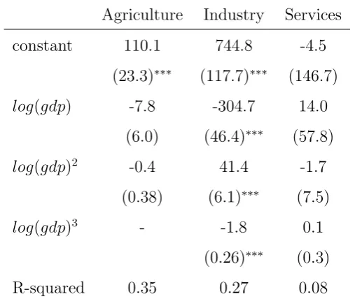
fixed effects panel regressions to estimate equation (1). Table 4 shows the results of the
regressions. Several remarks are in order. First, the R-squared are very low. They are
0.08 for services, 0.27 for industry and 0.35 for agriculture. For the agricultural sector,
only the constant term is statistically different from 0. None of the coefficients is
statis-tically different from 0 for services while all of them are statisstatis-tically different from zero
for the industrial sector. These results differ greatly from those of developed countries
where the R-squared were high and all coefficients were significantly different from 0 at
the 5% level. From this table we can conclude that the structural transformation process
for developing countries differs from that of developed countries.
To assess the heterogeneity among developing countries, I calculated the fixed effect
deviation from the mean (αei) for each of the 38 countries. Table 5 shows considerable
heterogeneity among countries. The standard deviations for the distributions are 6.8 for
larger than those obtained for developed countries.
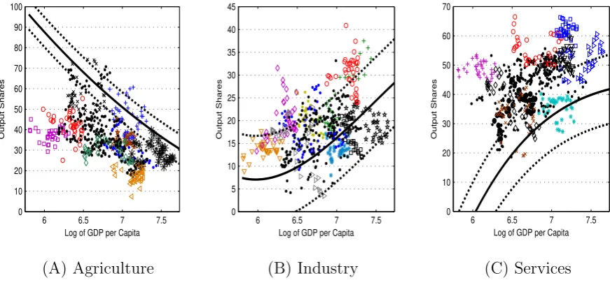
Another way to consider the above results is to plot the sectoral output shares versus
log of GDP per capita. Figure 11 in the appendix shows the scatter plots along with
the fitted curves and prediction bounds for developed countries. It is clear from these
figures that many developing countries have their sectoral output shares outside of the
prediction bounds for developed countries.
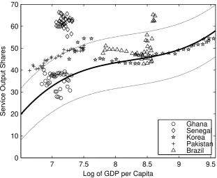
3.1. Patterns of Structural Transformation in developing Countries
Given the heterogeneity of structural transformation processes in developing countries,
I selected five countries to highlight some of the differences. These five countries will
also show how structural transformation processes in developing countries deviate from
the path of developed countries. The process in each of the five countries represents
a particular pattern of structural transformation that is followed by other developing
countries in my sample. The selected countries are: Korea8
, Brazil, Pakistan, Ghana and
Senegal. To keep the analysis simple, I just show, in figure 2, the service output shares
versus log of GDP per capita for the example countries.
From the figure we see that Korea’s data points can be fitted by a third degree
poly-nomial. Korea’s path is similar to the one followed by developed countries, especially
after per capita GDP surpasses $4000 (log of GDP per capita higher than 8.3). Other
countries that have a similar path include Chile, Indonesia, Malaysia and Thailand. The
path followed by Pakistan traces the upper bound curve of the prediction for developed
countries. Thus, this pattern differs from that of the developed countries in the level
effect dimension. Countries that have this pattern include India, Sri Lanka and Uruguay.
Brazil’s path shows a clear change in trend. Before per capita GDP reaches $5000,
service output shares were close to the fitted curve. From there, the service output
shares increase greatly with only small changes in per capita GDP. The last data points
are all above the upper bound curve. Both the slope and the level effects differ from
those of developed countries.
8
7 7.5 8 8.5 9 9.5 0
10 20 30 40 50 60 70
Log of GDP per Capita
Service Output Shares
[image:11.595.134.446.86.342.2]Ghana Senegal Korea Pakistan Brazil
Figure 2: Patterns of Structural Transformation
NOTE: The fitted curves and the confidence interval bounds are obtained from the regression results for developed countries.
The two African countries in the figure have no clear paths. Therefore, we cannot
see the relationship between service output shares and GDP per capita from this figure.
However, we can see that Ghana’s data points are all close to the fitted curve while
Senegal has all its points above the predictions’ upper bound curve. Therefore, Ghana
deviates from the baseline process in the slope dimension while Senegal differ from both
the level effect and slope dimensions. Countries with Ghana’s pattern include Mali,
Cameroon and Uganda while countries like Madagascar and Zimbabwe follow Senegal’s
pattern. Another way to see the differences between the five patterns is to look at the
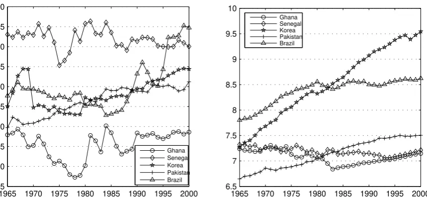
time series plot of the shares of services in output represented in figure 3. I also plot the
time series of log of per capita GDP. This representation helps us see the direction of
movement for the countries that stay stagnant in terms of income per capita. The service
output shares for Senegal were the highest and they varied a lot around a constant trend.
Brazil had the second highest shares followed by Korea and Pakistan. Ghana had the
lowest shares and they vary quite a bit especially before 1990.
1965 1970 1975 1980 1985 1990 1995 2000 25
30 35 40 45 50 55 60 65 70
Ghana Senegal Korea Pakistan Brazil
(A) Services Output Shares
1965 1970 1975 1980 1985 1990 1995 2000 6.5
7 7.5 8 8.5 9 9.5 10
Ghana Senegal Korea Pakistan Brazil
[image:12.595.83.513.77.279.2](B) Log of GDP per Capita
Figure 3: Time Series Plot of the Patterns of Structural Transformation
different from the one followed by developed countries. The analysis also shows some
of the heterogeneity that exists among developing countries. In the following section, I
will reinforce these points by analyzing the structural transformation processes of Africa,
Asia and Latin America.
4. Differences in the Structural Transformation
Processes for Africa, Asia and Latin America
In the previous section, I showed that there is heterogeneity in the structural
transforma-tion processes for developing countries. In this sectransforma-tion, I push the analysis farther and ask
if the heterogeneity is mostly due to continent effects. In other words, how different are
the structural transformation processes of countries in Africa, Asia and Latin America.
The analysis of this section leads to two findings. First, the structural transformation
process of all three regions are distinct. Second, significant heterogeneity remains between
4.1. Comparing fitted Curves
The first exercise I conduct is to find the best fit of the data for each continent and
compare the fitted curves. Again, I use fixed effects panel regressions to fit the data.
For the African countries, table 6 shows that there is not a good fit for the data. The
regressions for all three sectors have R-squared close to 0. Therefore, I will not draw a
fitted curve for Africa and I conclude that Africa’s structural transformation is different
from the other processes. For Asia, table 8 shows the results of the regressions. The
agriculture and industry sectors are best fitted with quadratic polynomials with R-squared
equal 0.76 and 0.63 respectively. The service sector is fitted with a third degree polynomial
with an R-squared of 0.44. For Latin America, the output shares of agriculture are fitted
by a quadratic polynomial while those of industry and services are fitted by third degree
polynomials. The highest R-squared is for the agricultural sector at 0.49. The other two
sectors have R-squared at respectively 0.17 and 0.19. The results are shown in table 7.
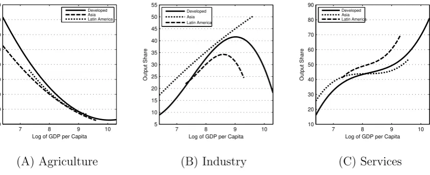
The fitted curves for Asia, Latin America and the developed countries are shown in
figure 4. For the agriculture, the fitted curve for Latin America is very close to the one
for all developed countries. For the Asian countries, the fitted curve starts low but moves
closer to the other two later. For industry, the previous pattern is reversed. The curve for
Asia is above the one for developed countries. However, the two curves are close when log
of GDP per capita is between eight and nine. The curve for Asia is increasing during the
whole range of log of GDP per capita. This suggests that these countries are in the first
phase of their structural transformation process. The curve for Latin America coincides
with that for the developed countries in the beginning but it reaches its maximum at a
lower per capita GDP. This suggests that Latin American countries transitioned from the
first to the second phase of their structural transformation at a lower GDP per capita
with a lower maximum industrial output share. For services, the curves for Asia and the
developed countries are close while the one for Latin America again starts close to the
two but ends up well above them.
7 8 9 10 0 10 20 30 40 50 60 70 80
Log of GDP per Capita
Output Share
Developed Asia Latin America
(A) Agriculture
7 8 9 10
5 10 15 20 25 30 35 40 45 50 55
Log of GDP per Capita
Output Share
Developed Asia Latin America
(B) Industry
7 8 9 10 10 20 30 40 50 60 70 80 90
Log of GDP per Capita
Output Share
Developed Asia Latin America
[image:14.595.88.510.78.250.2](C) Services
Figure 4: Comparing Fitted Curves
NOTE: The fitted curves for each group are obtained by regressing sectoral output shares on log of GDP per capita as in equation (1).
deviation from the mean for each country. Table 5 shows the results9
. For Asia, the
standard deviations are 4.6 for agriculture, 6.6 for industry and 5.3 for services. Notice
that a big driver of these standard deviations are China. When I exclude China, the
standard deviations are respectively 4.2, 3.2 and 3.9. For Latin America, the standard
deviations are respectively 4.9, 5.4 and 3.2. Recall that the respective standard deviations
for developed countries are 3.7, 3.1 and 2.5.
This brief analysis shows that Africa, Asia and Latin America have very different
structural transformation processes. It also shows that the structural transformation of
Asia is the closest to that of the developed countries. However, given the poor goodness
of fit for Africa and Latin America, I will conduct further analysis to strengthen the above
findings. Next, I analyze the averages of sectoral output shares for each continent and I
show the scatter plots to highlight the differences between countries.
4.2. Structural Transformation in Africa
The analysis of the sectoral output shares for the 16 African countries reveals some
important features. In 1965, the service output share was the highest in nine countries
out of the 16 in the sample. After services, the agriculture sector was the second most
important. The service output share was 42.81% on average for the 16 countries while
9
the agricultural share was 40.62%. Maddison argues that Africa started its structural
transformation around 1950. It is then surprising to see high service output shares at
such an early stage of the transformation. Next, let’s examine the changes of the output
shares of the three major sectors in the last four decades.
6.7 6.75 6.8 6.85 6.9 6.95 15 20 25 30 35 40 45 50
Log of GDP per Capita
Sectoral Output Shares
[image:15.595.138.451.186.420.2]Agriculture Industry Services
Figure 5: Structural Transformation for Africa
NOTE: The data points represent the cross-country average of sectoral output shares for Sub-Saharan African countries.
6 6.5 7 7.5 0 10 20 30 40 50 60 70 80 90 100
Log of GDP per Capita
Output Shares
(A) Agriculture
6 6.5 7 7.5 0 5 10 15 20 25 30 35 40 45
Log of GDP per Capita
Output Shares
(B) Industry
6 6.5 7 7.5 0 10 20 30 40 50 60 70
Log of GDP per Capita
Output Shares
(C) Services
Figure 6: Structural Transformation in Africa
[image:15.595.74.510.509.713.2]Figure 5 shows the yearly averages from 1965 to 2000 of sectoral output shares versus
the average log of GDP per capita for the 16 African countries. It is clear from the
figure that the changes of sectoral output shares are different from the transformation
described by Kuznets. This process deviates from the path of developed countries not
only in the relationship between sectoral output shares and GDP per capita but also in
the levels of sectoral shares for given per capita GDP. On average, the sectoral output
shares change very little. The levels of agriculture and industry output shares are small
while those of services are high. From the figure, the relationship between GDP per
capita and the sectoral shares is somewhat misleading because average GDP per capita
is sometimes decreasing. However, the changes in GDP are small, so we can say roughly
that on average sectoral output shares were almost constant between 1965 and 2000.
This graph hides the differences that exist between African countries. In figure 6, I
plot the sectoral output shares versus log of GDP per capita for all 16 countries. First,
looking at the agricultural sector, we see that African countries have significantly lower
output shares. Most of the data points are outside of the prediction bounds for developed
countries. This is not the case for industry where most data points are within the bounds
and a few are actually above the upper bound. The third panel of the figure shows that
most African countries have high service output shares for their level of per capita income.
Only a few data points are within the prediction bounds of the developed countries. The
graphs also show the differences between African countries. We already saw for example
that Ghana had service output shares close to the fitted curve while Senegal has all its
data points well above the upper bound curve of the predictions. Many countries with
comparable per capita GDP have very different sectoral output shares.
4.3. Structural Transformation in Latin America
In this section, I analyze the structural transformation of the 12 Latin American countries.
First, I plot in figure 7, the yearly averages of sectoral output shares versus average log
of GDP per capita for the period 1965-2000. When average GDP per capita was below
that. It looks like on average, the Latin American countries moved from the first to the
second phase of structural transformation at GDP per capita around $4000. Looking at
only this figure, we may be tempted to conclude that the structural transformation for
Latin America looks like the path of developed countries. However, as we will see, this
average is misleading since most countries do not resemble this path. In addition, the
levels of sectoral output shares deviates from the path of developed countries even for
this average.
8 8.1 8.2 8.3 8.4 8.5 8.6 8.7
10 15 20 25 30 35 40 45 50 55 60
Log of GDP per Capita
Sectoral Output Shares
[image:17.595.136.453.255.495.2]Agriculture Industry Services
Figure 7: Average Structural Transformation for Latin America
NOTE: The data points represent the cross-country average of sectoral output shares for Latin American countries.
7.5 8 8.5 9 0 10 20 30 40 50 60
Log of GDP per Capita
Output Shares
(A) Agriculture
7.5 8 8.5 9 10 15 20 25 30 35 40 45 50 55
Log of GDP per Capita
Output Shares
(B) Industry
7.5 8 8.5 9 20 25 30 35 40 45 50 55 60 65 70
Log of GDP per Capita
Output Shares
(C) Services
[image:17.595.84.513.577.748.2]Figure 8 shows the scatter plots for sectoral output shares for all Latin American
countries. The first panel shows that most countries had agricultural output shares
within the prediction bounds for the developed countries. In fact only Bolivia, Brazil and
Honduras have data points below the lower bound curve. This is reflected in the fitted
curve graph that I showed previously. The second panel shows that many countries have
industrial output shares around the lower bound curve. For the service sector in the third
panel, many countries start with shares close to the fitted curve but they end up much
higher. In fact there are quite a few data points above the upper bound of the predictions
for the developed countries. This confirms again the result obtained from the analysis
of the fitted curves conducted in section 4.1. Recall that the fitted curve for the service
share of GDP for Latin America starts close to that for developed countries but ends
up much higher. The scatter plot graphs also show that there are important differences
among countries.
4.4. Structural Transformation in Asia
Next, I analyze the process for the 10 Asian countries of the sample. I start by plotting,
in figure 9, the yearly averages of sectoral output shares versus average log of income per
capita for the period 1965-2000. There are two points to note about this figure. First,
there was a steady decline in the agricultural output shares. Since the service sector
shares initially decreased as well, there is a big increase in the share of industry in the
beginning. After GDP per capita passes $2000, there were steady increases of the shares
of industry and services. The second point is that, on average, the Asian countries are in
the first phase of structural transformation as we saw with the fitted curves analysis.
The scatter plots in figure 10 show the sectoral output shares versus log of GDP per
capita for all countries. The first panel shows that some countries had low agricultural
output shares. Many data points are around the lower bound curve. However for the
industry sector in panel two, there are very few points below the fitted curve for developed
countries. Most countries had high industrial output shares. In fact, there are a few data
7 7.5 8 8.5 15 20 25 30 35 40 45 50
Log of GDP per Capita
Sectoral Output Shares
[image:19.595.138.448.121.360.2]Agriculture Industry Services
Figure 9: Structural Transformation for Asia
NOTE: The data points represent the cross-country average of sectoral output shares for Asian countries.
6.5 7 7.5 8 8.5 9 9.5 0 10 20 30 40 50 60 70 80 90
Log of GDP per Capita
Output Shares
(A) Agriculture
6.5 7 7.5 8 8.5 9 9.5 0 10 20 30 40 50 60
Log of GDP per Capita
Output Shares
(B) Industry
6.5 7 7.5 8 8.5 9 9.5 0 10 20 30 40 50 60 70 80
Log of GDP per Capita
Output Shares
(C) Services
[image:19.595.79.511.504.711.2]shares of these countries are distributed around the fitted curve. There are only few
data points around the upper bound curve. The heterogeneity between countries is also
apparent from these graphs. For example, China has very high industry output shares
and low service shares. It is the contrary for Pakistan and India.
5. Structural Transformation and Economic Stagnation
In the literature, structural transformation is commonly linked to development or growth
of per capita GDP. As Syrquin (1994) puts it: “There is a strong association of economic
structure with the level of development and between growth and structural change.”
However, structural transformation can also occur during periods of economic stagnation
and even economic decline. In fact this was a key feature of structural transformation in
Africa and Latin America. For Latin America, this happened when the countries moved
from the first to the second phase of structural transformation. We already saw in section
3 that Brazil’s service output shares increased greatly when per capita GDP was stagnant
around $5000. For African countries, GDP per capita in 2000 was the same or lower than
that of 1965; yet they experienced structural transformation during the period. From
Kuznets’ view of structural transformation this is a puzzle because we would expect the
sectoral output shares not to change if GDP is not changing. To illustrate the puzzle, I
show the time series plot for Argentina and Niger as examples.
Looking at figure 12, we can divide the period for Argentina into three sub-periods,
1965-1976, 1977-1990 and 1991-2000. For the first and last sub-periods, the changes in
sectoral shares seem consistent with the changes of GDP per capita. However, from 1977
to 1990, GDP per capita decreased from $8304 to $ 6436. During the same period, the
share of industry decreased from 47.81% to 36.02% while service output share increased
from 44.11% to 55.85%. Even though the share of services in output increased by 11
percentage points and that of industry decreased by 12 percentage points; GDP per
capita decreased by 23%. It is the reverse of what one might expect. If we consider the
output shares.
From figure 13, we see that GDP per capita for Niger decreased from $935 in 1965
to $518 in 2003, a 45% decline. During the same period, the agricultural output share
decreased from 67.7% to 39.86%, the share of industry increased almost 5-fold, from 3.47
% to 16.76% while the service output share increased from 28.82% to 43.38%. This shows
a substantial structural transformation with a big decrease in GDP per capita. Again, it
is the reverse of what one might expect. It seems that when countries are growing, the
sectoral output shares move in the “right” direction. But when countries are stagnant
or declining, the sectoral output shares move in the “wrong” direction. Other examples
of structural transformation with economic stagnation are shown in figure 14 in the
appendix.
Models of structural transformation use mostly two features to drive labor reallocation
across sectors: non-homothetic preferences and productivity growth differential. Consider
a three-sector economy with non-homothetic preference with respect to agricultural good
and TFP growth differential between industry and services10
. Assume that TFP growth
in services is 1/3 of the growth in industry. In such an economy, labor will move out of
agriculture if income elasticity is below 1. Labor will also reallocates from industry to
services because of their TFP growth differential. However, if TFP growth rates are low
in agriculture and industry, GDP will growth very little. This shows that it is possible
for an economy to experience big changes in sectoral employment or output shares with
very little change in GDP per capita.
6. Conclusion
The processes of structural transformation across developed countries are similar and
they fit the pattern described by Kuznets. However, the analysis of the structural
trans-formation processes of Africa, Latin America and Asia conducted in this paper leads
to different conclusions. First, the structural transformation for developing countries in
general is different from the path followed by developed countries. Second there is a lot
10
of heterogeneity in the structural transformation processes followed by developing
coun-tries. I show five patterns of structural transformation, and only one resembles to the
path followed by developed countries.
The are also differences between the paths followed by the sub-continents of Africa,
Asia and Latin America. Asia is following a path that is the closest to that of developed
countries. A key feature for Asian countries is high industrial output shares. African
countries have low agricultural output shares and high service output shares at very low
GDP per capita. Latin American countries on the other hand, have agricultural output
shares similar to those of developed countries, but a key feature for these countries is that
they move from the first to the second phase of structural transformation at a low GDP
per capita and with low maximum industrial output shares. This leads to high service
output shares around the end of the period.
The third main finding of the paper is the presence of structural transformation during
periods of economic stagnation or decline. Many African and Latin American countries
experienced periods of significant sectoral output changes in the “wrong” direction while
GDP per capita was stagnant or even declining. This is a puzzle from Kuznets’ view of
References
Bah, Elhadj, “A Three-Sector Model of Structural Transformation and Economic
De-velopment,” September 2008. University of Auckland Working Paper.
Beaumol, William, “Macroeconomics of Unbalanced Growth: The anatomy of Urban
Crisis,”The American Economic Review, June 1967, 57 (3), 415–426.
Buera, Francisco and Joseph Kaboski, “The Rise of the Service Economy,” August
2007. Northwestern University Working Paper.
Chenery, Hollis B., “Patterns of Industrial Growth,” The American Economic Review,
September 1960,50 (4), 624–654.
, “The Structuralist Approach to Development Policy,” The American Economic
Re-view, May 1975, 65 (2), 310–316.
Chenery, Hollis, Sherman Robinson, and Moshe Syrquin, Industrialization and
Growth, Oxford: Oxford University Press, 1986.
Duarte, Margarida and Diego Restuccia, “The Structural Transformation and
Ag-gregate Productivity in Portugal,” November 2006. University of Toronto Working
Paper.
and , “The Role of Structural Transformation in Aggregate Productivity,” October
2007. University of Toronto Working Paper.
Echevarria, Christina, “Changes in Sectoral Composition Associated with Economic
Growth,”International Economic Review, May 1997, 38 (2), 431–452.
Gollin, Douglas, Stephen L. Parente, and Richard Rogerson, “The Role of
Agri-culture in Development,” American Economic Review: Papers and Proceedings, May
2002,92 (2), 160–164.
, , and , “The Food Problem and the Evolution of International Income Levels,”
Kongsamut, Piyabha, Sergio Rebelo, and Danyang Xie, “Beyond Balanced
Growth,”Review of Economic Studies, October 2001,68 (4), 869–882.
Kuznets, Simon, Modern Economic Growth, New Haven: Yale University Press, 1966.
,Economic Growth of Nations, Cambridge: Harvard University Press, 1971.
Laitner, John, “Structural Change and Economic Growth,”Review of Economic
Stud-ies, July 2000, 67(3), 545–561.
Maddison, Angus, “Monitoring the World Economy:1820-2003 AD,” http://www.
ggdc.net/Maddison2006.
Murphy, Kevin M., Andrei Shleifer, and Robert W. Vishny, “Industrialization
and the Big Push,”The Journal of Political Economy, October 1989,97(5), 1003–1026.
Ngai, L. Rachel and Christopher A. Pissarides, “Structural Change in a
Multi-Sector Model of Growth,” American Economic Review, March 2007, 97 (1), 429–443.
Restuccia, Diego, Dennis Tao Yang, and Xiadong Zhu, “Agriculture and
Aggre-gate Productivty: A Quantitative Cross-Country Analysis,”The Journal of Monetary
Economics, Mars 2007, 55 (2), 234–250.
Rogerson, Richard, “Structural Transformation and the Determination of European
Labor Market Outcomes,” February 2007. NBER Working Paper No 12889.
Syrquin, Moshe, “Growth and Structural Change in Latin America since 1960: A
Comparative Analysis,” Economic Development and Cultural Change, January 1986,
34(3), 433–454.
, “Structural Transformation and the New Growth Theory,” in Lugi L. Pasinetti and
Robert M. Solow, eds.,Economic Growth and the Structure of Long-Term Development,
Vol. 112 of IEA Conference 1994.
Temin, Peter, “A Time-Series Test of Patterns of Industrial Growth,” Economic
A. Appendix A: Figures and Tables
Table 1: Regression Results for Developed Countries
Agriculture Industry Services
constant 524.32 926.0 -1773.0
(34.9)∗∗∗ (366.3)∗∗ (446.0)∗∗∗
log(gdp) -103.7 -394.9 651.7
(8.1)∗∗∗ (129.5)∗∗∗ (157.6)∗∗∗
log(gdp)2
5.2 54.9 -78.4
(0.5)∗∗∗ (15.2)∗∗∗ (18.5)∗∗∗
log(gdp)3
- -2.4 3.2
(0.6)∗∗∗ (0.7)∗∗∗
R-squared 0.92 0.63 0.74
NOTE: This table report the fixed effects panel regressions of equation (1) for each sector. The data consist of 9 developed countries with 15 observations per country. The standard errors are in parentheses.
∗∗∗ significant at 1%,∗∗ significant at 5%,∗ significant at 10%.
6 7 8 9 10 0 10 20 30 40 50 60 70 80
Log of GDP Per Capita
Agriculture Output Shares
(A) Agriculture
6 7 8 9 10 0 10 20 30 40 50 60
Log of GDP Per Capita
Industry Output Shares
(B) Industry
6 7 8 9 10 10 20 30 40 50 60 70 80
Log of GDP Per Capita
Service Output Shares
(C) Services
Figure 11: Structural Transformation in Developed Countries
[image:25.595.79.513.445.647.2]Table 2: Fixed Effects Deviation from the Mean
Country Agriculture Industry Services
Australia 4.9 -4.3 -0.4
Canada 1.2 -1.9 0.7
France 1.1 0.5 -2.1
Germany -4.1 5.4 -1.3
Italy 5.8 -1.5 -4.3
Japan -2.8 3.3 -0.5
Sweden -0.3 -1.0 1.2
UK -4.5 2.1 2.6
US -1.5 -2.6 4.0
std. dev. 3.7 3.1 2.5
NOTE: This table report the difference of the average fixed effects with each country fixed effect. The average fixed effect is obtained by regressing equation (1) for each sector. The country fixed effect is obtained by LSDV estimation.
Table 3: List of Developing Countries
Africa
Benin, Burkina Faso, Cameroon, Central African Re-public (C.A.R), Chad, Cˆote d’Ivoire, Ghana, Kenya, Madagascar, Malawi, Mali, Niger, Senegal, Togo, Uganda, Zimbabwe
Asia China, India, Indonesia, Korea, Malaysia,
Nepal,Pakistan, Phillippines, Sri Lanka, Thailand
Latin America
[image:26.595.107.487.525.704.2]Table 4: Regression Results for all Developing Countries
Agriculture Industry Services
constant 110.1 744.8 -4.5
(23.3)∗∗∗ (117.7)∗∗∗ (146.7)
log(gdp) -7.8 -304.7 14.0
(6.0) (46.4)∗∗∗ (57.8)
log(gdp)2
-0.4 41.4 -1.7
(0.38) (6.1)∗∗∗ (7.5)
log(gdp)3
- -1.8 0.1
(0.26)∗∗∗ (0.3)
R-squared 0.35 0.27 0.08
NOTE: This table report the fixed effects panel regressions of equation (1) for each sector. This regression is similar to the one done for the developed countries. The data consist of 38 developing countries with 36 observations per country (yearly data, 1965-2000). The standard errors are in parentheses.
∗∗∗ significant at 1%,∗∗ significant at 5%,∗ significant at 10%.
Table 5: Fixed Effects Deviations from the Means for Developing Countries
Agriculture Industry Services
min max Std. dev min max Std. dev min max Std. dev
All countries -15.6 16.2 6.8 -13.5 20.6 5.8 -16.6 17.7 7.0
Asia -6.4 9.0 4.6 -5.5 16.9 6.6 -10.6 7.1 5.2
Asia w/o China -5.5 9.0 4.2 -5.5 3.2 3.2 -4.2 7.1 3.9
[image:27.595.74.524.561.684.2]Table 6: Regression Results for Africa
Agriculture Industry Services
constant 63.3 -8.6 226.83
(11.7)∗∗∗ (6.8) (93.2)∗∗∗
log(gdp) -3.9 4.0 -54.1
(1.7)∗∗ (1.0)∗∗∗ (27.6)∗
log(gdp)2
- - 4.0
(2.0)∗
log(gdp)3
- -
-R-squared 0.001 0.03 0.01
NOTE: This table report the fixed effects panel regressions of equation (1) for the 16 African countries. The standard errors are in parentheses.
∗∗∗ significant at 1%,∗∗ significant at 5%,∗ significant at 10%.
Table 7: Regression Results for Latin America
Agriculture Industry Services
constant 499.7 2883.1 -3884.8
(68.4)∗∗∗ (1180.7)∗∗ (1441.7)∗∗∗
log(gdp) -101.0 -1127.3 1447.6
(16.4)∗∗∗ (428.1)∗∗∗ (522.7)∗∗∗
log(gdp)2
5.2 146.6 -178.3
(1.0)∗∗∗ (51.6)∗∗∗ (63.0)∗∗∗
log(gdp)3
- -6.3 7.3
(2.1)∗∗∗ (2.5)∗∗∗
R-saquared 0.49 0.17 0.19
NOTE: This table report the fixed effects panel regressions of equation (1) for the 12 Latin American countries. The standard errors are in parentheses.
[image:28.595.164.430.475.693.2]Table 8: Regression Results for Asia
Agriculture Industry Services
constant 331.4 -88.1 -1727.8
(27.3)∗∗∗ (23.6)∗∗∗ (196.5)∗∗∗
log(gdp) -62.2 20.6 650.7
(6.9)∗∗∗ (6.0)∗∗∗ (75.4)∗∗∗
log(gdp)2
2.9 -0.6 -79.7
(0.4)∗∗∗ (0.4)∗ (9.6)∗∗∗
log(gdp)3
- - 3.2
(0.4)∗∗∗
R-squared 0.76 0.63 0.44
NOTE: This table report the fixed effects panel regressions of equation (1) for the 10 Asian countries. The standard errors are in parentheses.
∗∗∗ significant at 1%,∗∗ significant at 5%,∗ significant at 10%.
19650 1970 1975 1980 1985 1990 1995 2000 10
20 30 40 50 60 70
Ag Ind Serv
(A) Services Output Shares
1965 1970 1975 1980 1985 1990 1995 2000 6000
6500 7000 7500 8000 8500 9000 9500
[image:29.595.311.511.475.668.2](B) Log of GDP per Capita
1965 1970 1975 1980 1985 1990 1995 2000 450
500 550 600 650 700 750 800 850 900 950
(A) Services Output Shares
19650 1970 1975 1980 1985 1990 1995 2000 10
20 30 40 50 60 70 75
Ag Ind Serv
[image:30.595.313.516.114.304.2](B) Log of GDP per Capita
Figure 13: Structural Transformation for Niger
6 6.5 7 7.5 8 8.5 9 9.5
20 30 40 50 60 70 80
Log Of GDP per Capita
[image:30.595.135.446.451.713.2]Service Output Shares
8 8.2 8.4 8.6 8.8 9 9.2 -5
0 5 10 15 20 25 30 35
Log of GDP per Capita
Output Shares
Botswana Mauritius South Africa
(A) Agriculture
8 8.2 8.4 8.6 8.8 9 9.2 20
25 30 35 40 45 50 55 60 65 70
Log of GDP per Capita
Output Shares
Botswana Mauritius South Africa
(B) Industry
8 8.2 8.4 8.6 8.8 9 9.2 25
30 35 40 45 50 55 60 65 70
Log of GDP per Capita
Output Shares
Botswana Mauritius South Africa
[image:31.595.83.514.313.515.2](C) Services
B. Appendix B: Other African Countries
The selection criteria for Africa eliminates the two biggest economies, South Africa and
Nigeria, and its two most successful, Botswana and Mauritius. In this appendix, I show
the structural transformation of Botswana, Mauritius and South Africa starting in 198011
.
GDP per capita nearly tripled in Botswana and by 2.4-fold in Mauritius between 1980
and 2000. South Africa’s GDP per capita in 2000 was 87% of its level in 1980. Figure 15
show the sectoral output shares for the three countries. Botswana’s economy is primarily
led by the exploitation of diamonds. We see the industrial share of GDP is above the
upper bound curve of the developed countries. Its agricultural and service shares are all
near the lower bound curve. For Mauritius, agricultural shares trace nicely the fitted
curve for the developed countries while industry and service shares trace respectively
the lower and upper bound curves. We can say that Mauritius is mostly following the
path of the developed countries. This is not the case for South Africa. The country has
been almost stagnant in the last 20 years. While the data points are mostly inside the
prediction curve, agricultural shares have not changed much. Industrial shares decreased
from a high of 48% in 1980 to 32% in 200012
. This was matched by increase in service
share which increased from 54% to 65% in this period. Therefore, South Africa has the
path of stagnant countries and it is very similar to Argentina.
11
There is no data available for Nigeria.
12