Exploring user and system requirements of linked data
visualization through a visual dashboard approach
MAZUMDAR, Suvodeep <http://orcid.org/0000-0002-0748-7638>, PETRELLI,
Daniela <http://orcid.org/0000-0003-4103-3565> and CIRAVEGNA, Fabio
Available from Sheffield Hallam University Research Archive (SHURA) at:
http://shura.shu.ac.uk/5416/
This document is the author deposited version. You are advised to consult the
publisher's version if you wish to cite from it.
Published version
MAZUMDAR, Suvodeep, PETRELLI, Daniela and CIRAVEGNA, Fabio (2014).
Exploring user and system requirements of linked data visualization through a visual
dashboard approach. Semantic Web, 5 (3), 203-220.
Copyright and re-use policy
See
http://shura.shu.ac.uk/information.html
Sheffield Hallam University Research Archive
Exploring User and System Requirements of
Linked Data Visualization through a Visual
Dashboard Approach
Suvodeep Mazumdar
a,∗, Daniela Petrelli
band Fabio Ciravegna
aaOAK Group, Department of Computer Science,
University of Sheffield
Regent Court, 211 Portobello Street, S1 4DP, Sheffield, United Kingdom.
Email: {S.Mazumdar,F.Ciravegna}@dcs.shef.ac.uk
bArt & Design Research Centre
Sheffield Hallam University, Sheffield, United Kingdom E-mail: [email protected]
Abstract.One of the open problems in Semantic Web research is which tools should be provided to users to explore linked data. This is even more urgent now that massive amount of linked data is being released by governments worldwide. The development of single dedicated visualization applications is increasing, but the problem of exploring unknown linked data to gain a good understanding of what is contained is still open. An effective generic solution must take into account the user’s point of view, their tasks and interaction, as well as the system’s capabilities and the technical constraints the technology imposes. This paper is a first step in understanding the implications of both, user and system by evaluating our dashboard-based approach. Though we observe a high user acceptance of the dashboard approach, our paper also highlights technical challenges arising out of complexities involving current infrastructure that need to be addressed while visualising linked data. In light of the findings, guidelines for the development of linked data visualization (and manipulation) are provided.
Keywords: Information Visualization, User Interaction, Linked Data
1. Introduction
The understanding of the intrinsic value of making data available as linked data is quickly spreading and with that is the exponential increase in the number of initiatives and repositories. In just a few years, several countries have joined the effort of making their data available to citizens1. If, on the one hand, this amass of data is exciting to have, on the other hand it would be great if there was an easy way to get a grip on what
*Corresponding author. E-mail: [email protected].
1As of January 2012, 28 countries have made their data available
http://www.data.gov/internationalDataWebsites
such repositories contain. The Semantic Web commu-nity is facing new challenges in terms of consuming the linked data made available, e.g. dynamic discov-ering of sources, provenance and quality assessment, effective integration to name a few. However this is only one side of the coin as data are intended to be, in the end, for human consumption, not just for ma-chine crunching. While some well-crafted visualiza-tion applicavisualiza-tions are being developed for specific data sets and specific purposes2, the vast majority of tools
2http://www.data.gov/developers/showcase has some interesting
examples [accessed 28/02/2012]
to explore linked data are based on a variation of an aggregated list. In some cases this is the best option as the abstraction of the data itself make it difficult to display it otherwise, e.g. information about a person and their work is properly displayed as a (web)page and applications like Sig.ma3 are a good example of user-centred display. However, although this is a so-lution easy to generalise, it cannot be considered the best one as the aggregation of data into a list flattens the depth of the linked data itself and could hide its most important characteristics. For example, numeric data may be more meaningful and revealing when vi-sualized as graphs or plots or pie charts than as a table or list. [5] describes that finding the right visualization for a given set of data is not a trivial task:“One must determine which questions to ask, identify the appro-priate data, and select effective visual encoding to map data values to graphical features such as position, size, shape, and colour.”. To facilitate this investigation spe-cific tools are needed that support looking at the same data from different angles and, eventually, take a de-cision on which visualization is the most effective for the task in hand.
We propose a tool that, in a dashboard metaphor, provides consumers of linked data different visualiza-tions to be used simultaneously. We define “consumers of linked data” as both potential users and application developers interested in understanding what a specific linked data set is about. To be effective, such a tool has to be easy to use but also easy to plug into any linked data set made available. This paper discusses the im-plementation of a generic dashboard-based visualiza-tion framework, Points of View (.views.) and reports on the exploration of two fundamental aspects: User needs and System requirements. On the bases of the lessons learnt, we provide basic guidelines for the de-sign of generic linked data applications. The paper is organized as follows: Section 2 discusses related work and Section 3 the design rationale. Section 4 discusses the user interactions involved in the system. Section 5 provides an insight into the implementation. Sec-tions 6 and 7 report our findings of user and system formative evaluation. Section 8 discusses the proposed guidelines. An outline of the future work concludes the paper.
3Sig.ma Semantic Information Mash-up http://sig.ma/ [accessed
28/02/2012]
2. Related Work
Visualization of linked data has focussed so far mainly on providing browsers for visualizing RDF. Our intention of providing a generic and customiz-able framework for supporting multiple visualizations has focussed our review of the related literature into two main categories - Generic interfaces/browsers and multiple visualizations.
Applications like mSpace [16], user-composed facets browsing for a classical music database, or Muse-umFinland [10], a web-based pre-defined facet brows-ing for museum collections, provide browsbrows-ing func-tionalities on specific data sets. Some researchers have addressed the visualization of data in a generic way: Longwell provides faceted browsing for arbitrary data, but requires a domain-expert to configure the different facets, while Welkin4loads RDF models and provides a graphical representation of the data along with lists of predicates and resources. Both RDF Gravity5 and IsaViz6 are graph-based visualizations of RDF OWL graphs or ontologies: the latter uses graph visualiza-tions to help authoring RDF data, the former provides a visualization of existing RDF data. Experimenta-tion with large scale RDF is progressing with several graphing tools available to try7.
In order to be generic, all these examples map the data onto highly abstract visualization structures like graphs, missing out on the advantage of visual dis-play for understanding and reasoning [5]. To provide domain-independent tools that are at the same time fa-miliar, some approaches started from the standard web content and enrich it with semantics. PowerMagpie8 adds semantics to web browsing sessions by analyz-ing the text of a web-page and maps the extracted con-cepts to existing semantic web ontologies. Similarly, PiggyBank [8] extracts concepts from browsed pages, aggregates and stores them in a local database for later facet browsing or search, e.g. sorted lists of subsequent links, dates, times etc.
4Welkin, http://simile.mit.edu/welkin/ [Accessed 28/02/2012] 5RDF Gravity,
http://semweb.salzburgresearch.at/apps/rdf-gravity/ [Accessed 28/02/2012]
6IsaViz, http://www.w3.org/2001/11/IsaViz/ [Accessed
28/02/2012]
7Large-scale RDF Graph Visualization Tools,
http://www.mkbergman.com/414/large-scale-rdf-graph-visualization-tools [accessed 28/02/2012]
8PowerMagpie, http://powermagpie.open.ac.uk/ [Accessed
Closer to our intended goal of providing generic, in-formative and intuitive visualizations on large linked datasets are Tabulator [11], /facet [7] and Semantic Wonder Cloud [13]. Tabulator [11] visualizes RDF data on geographical maps, timelines and calendar views; /facet [7] is a generic semantic browser that al-lows the user to select the facet sequence, results are visualized as list or on timeline enriched by concepts; and the Semantic Wonder Cloud [13] provides a mind-map like visualization on DBpedia with large central concepts and satellite ones. Although closer to our in-tent, these three systems differ in core design deci-sions. Tabulator provides multiple views in different tabs on a single page thus loading the user with the cognitive effort of remembering the content of a vi-sualization from one tab to the next when exploring the data, while we intend to support visual compar-ison by providing simultaneous views. As /facet and Semantic Wonder Cloud, we intend to provide visu-alizations of different facets, but rather than just dis-playing a preconceived view, (e.g. a timeline in /facet) or as related concepts in a simplified graph (Semantic Wonder Cloud), we go a step further mapping the data on several, specific and intuitive visual frameworks (as we attempted in [15]). However, the possibilities for visualizing data are multiple [5], many more of those we explored in [15], therefore a larger range of views is considered here.
A few projects share our goal of aggregating and visualising data, by simultaneously presenting multi-ple facets of the data. The Paggr system [14] aggre-gates and displays information collected from multiple distributed semantic sources in widgets, using several SPARQL operations. While Paggr focusses on mash-ing up data from several sources usmash-ing multiple text-based widgets, each customized to focus on a particu-lar facet of the data, our approach is to visually abstract RDF responses to provide simultaneous multiple visu-alizations. Sparks9provides a good example of coordi-nated multiple visualizations in a dashboard-like face, aimed at exploring linked data. The Sparks inter-face mainly consists of a geographical map, displaying geo-located data elements. Interactive filter elements like sliders and tag clouds allow users to click and select the relevant subsets of the data. However, the user has little flexibility in defining filters or facets of their choice during an exploratory session. The Sparks interface is further restricted to visualizing only
geo-9Sparks Prism, http://sparksrdf.github.com/
located datasets and may not be the ideal choice for datasets that do not (or sparsely) contain geographical information. Sgvizler10is an interesting JS tool that en-ables different visualizations of results from SPARQL SELECT queries. The two ways of using the tool are either use a form based approach (where users can write SPARQL queries on form elements, and visual-ize its results) or embed SPARQL queries within <div> elements. It also functions as authoring tool, where the onus is on a semantic web expert to build individual <div> elements and present them in a web page. Sim-ilar to Sparks, Sgvizler lacks the flexibility of defining new filters or facets without being an expert in building SPARQL queries.
Worth noticing as it points out in the opposite di-rection, is the work done in Exhibit [9]. Instead of a generic visualization framework, Exhibit offers to the owner a simple environment for publishing data visu-ally that a generic user could look at and interact with. Although this approach is particularly relevant with the current trend of Web 2.0 tools and amateur web author-ship, it fails in situations where the data owner is just interested in releasing it, but cannot spend effort on (or does not know how to) making that data visually ac-cessible. This is the case for the government data that rely on the good will of others to make it graphically accessible.
3. The Dashboard Design Rationale
A tool that provides the user with a flexible way to look at the data from many perspectives needs to be customizable as the most effective type of visual-ization highly depends on the data type and the task in hand [5]. This design decision on effective cus-tomisation led to the adoption of a dashboard layout [3]. A dashboard provides simultaneous visual sum-maries of large sets of information in a limited amount of space (here, a single web page). Effective dash-boards should be able to provide all the information in a meaningful, correct and intuitive way [3]. While widely used in business information systems since the 80s, dashboard-like user interfaces are becoming in-creasingly common in other domains only now. Pop-ular websites like igoogle11 and BBC12 use a design inspired by dashboard layout, by providing contextual
10Sgvizler, http://code.google.com/p/sgvizler/ 11igoogle interface, http://www.google.com/ig
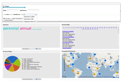
Fig. 1. The Web-based interface for grass data with generic filters (top) and four different views on the retrieved data set, namely: tag cloud, result list, pie chart and geo-plot. (Data is courtesy of the GrassPortal (http://www.grassportal.org/) Project and Kew Gardens)
widgets, each tuned to display a specific set of infor-mation. The design rationale embedded in our visual-ization system Points of View, is to create a dashboard for generic linked data by making visualizations avail-able in customizavail-able widgets as shown in Figure 1. As linked data is given for public consumption, it is not predictable which visualization users will find more useful given their task. For example, government data on schools performance would be better visualized as individual items on a map for parents trying to decide the best choice for their children, but would be more meaningful to public servants who want to compare schools performing trends across the country if it was aggregated in tables. Therefore multiple views over the same data seem to be indispensable to support the un-derstanding of the value of linked data and facilitate its use and consumption. Although we acknowledge that not all visualizations are equal and that a specific view can show or hinder interesting phenomena in the data [5,3], we think it is important to explore the issue of visualizing linked data as broadly as possible, leaving the introduction of visualization constraints (i.e. which data type should be visualized, how and for which
pur-pose) for a later stage when the basic framework has been understood. So in this work we focus on:
1. Understanding how a dashboard approach could support the user in exploring unknown datasets and appreciate the multi-faceted nature of the un-derlying linked data in a short span of time. 2. Understand which are the technical implications
and constraints to provide a generic visualization service over linked data, both stored locally or re-motely accessible via endpoints, and which tech-nical contraints affect the user interaction.
In summary, our aim is to facilitate the visualization of a generic linked data set in a way that is familiar and easy to understand and customise.
4. User Interaction
Figure 1 and Figure 2 show the same interface ap-plied on different datasets (though the CSS styles13 ap-plied in the examples are different). The different
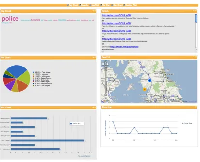
Fig. 2. Social data after the flood in Cumbria, UK in 2007 visualised using.views.(Data harvested from Flickr (http://flickr.com) and Twitter (http://twitter.com)). The CSS style in this instance has been modified from Figure 1, though the basic interface remains the same.
alizations provide complementary information to the user as shown in Figure 2: the most discussed topic was the police (from the tag cloud top left), two ar-eas were affected (from the geographical view, mid right), and when Twitter and Flickr registered higher activities (timeline, bottom right). The different visual widgets act on the same data set, each parsing it ac-cording to the type of visualization they provide, e.g. geo-plotting extracting geo-information, timeline fo-cussing on time values, etc.
It is important to notice that some visualizations could be meaningless with certain data, e.g. if time is not provided a timeline would be empty. Therefore users can enable or disable widgets or re-arrange them (via drag-and-drop) depending on their needs and the data in hand. For example, numeric data would be bet-ter visualized as a table, a pie chart or a bar chart than as a list. The visualization widgets developed so far in-clude: a tag-cloud; a result list with links; a
geograph-ical plot; a timeline; a pie chart; a bar chart (all in Figure 2). Although this list is surely not exhaustive, we were at this point more interested in providing a generic framework that could be expanded with other visual widgets than an exhaustive, but closed, tool. In-deed,.views.acts as a visualization platform for linked data where new visualization widgets can be plugged-in as and when they are developed.
of interest, then clicks on a view to dig into the details, e.g. at individual instances.
.views. provides two different types of filtering mechanisms: global and local. Global filters act on the whole data set and affect all of the visualization gets; local filters are attached to a single view (or wid-get), e.g. zooming in a geographical view to see de-tails; clicking on a slice of a pie chart to see the rel-evant subset of data. Global filters are automatically generated out of the data set, while local filters could be already imbedded in some views (e.g. on maps) but some need implementation (e.g. pie chart selection). Global filters are composed to retrieve the result set: items selected from a drop-down menu can be set to a specific value for data querying (Figure 3). Local fil-ters support digging-into the retrieved set from differ-ent perspectives.
Fig. 3. Global filtering for user-defined queries on the DBpedia dataset. On entering the values for filters, the number of results avail-able is displayed in a button, clicking on which starts visualizing the results.
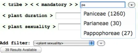
Once the system has started up, the user queries the data by selecting the appropriate global filters that re-strict the entire dataset to the subset of interest. The fil-ters are selected from a drop-down list that is automat-ically generated during initialization by querying the backend for all the query-able concepts. Upon select-ing a filter from the list and clickselect-ing on the (+) but-ton, the filter gets added in the filtering interface as shown in Figure 3 where the user had previously se-lected ‘country’ and ‘type’ as global filters. The in-terface displays the filter name (as retrieved from the data set) as a label, and provides a text box, which en-ables the user to type the respective filter values. As for the global filters,.views. automatically provides sug-gestions on the possible values: while the user is typ-ing, SPARQL queries are sent to the backend to collect possible alternatives then displayed as suggestion list. Figure 4 shows an example taken from the grass data set: to a user typing “pa” the system suggests Paniceae, Parianeae and Pappophoreae as possible values for the
filter named ‘< tribe > < < mandatory > >’, with the number of occurrences in the data in brackets14. The suggestion list is automatically extracted from the data and therefore provides an insight into the underlying data fostering understanding for users unfamiliar with the set.
[image:7.595.312.537.314.400.2]When the setting of global filters and their respec-tive values is complete and the button ‘ # results avail-able’ is clicked, the backend is queried. The results are then simultaneously displayed in all of the visualiza-tion widgets available on the interface. The user can then explore a single visualization by making use of local filters - such as: clicking on portions of aggre-gate plots like the bars in a bar-chart, zooming into ge-ographical maps etc.
Fig. 4. Automatic suggestions guide users for providing the right query. Typing a few characters (here, “pa”) starts suggesting possible filter values containing these characters, along with the total number of times they have occurred within the dataset.
In summary, the novelty of our approach is in pro-viding a generic mechanism that automatically gener-ates the user interface (both filters and visualizations) from a set of existing data and its structure without relying on any pre-determined domain-specific doc-ument templates..views. tightly pairs the actual data set with graphical widgets giving the user the power to directly interact and explore the data. Contrary to other approaches that start from the domain descrip-tion,.views.prevents querying empty data set thus sav-ing users’ time and frustration.
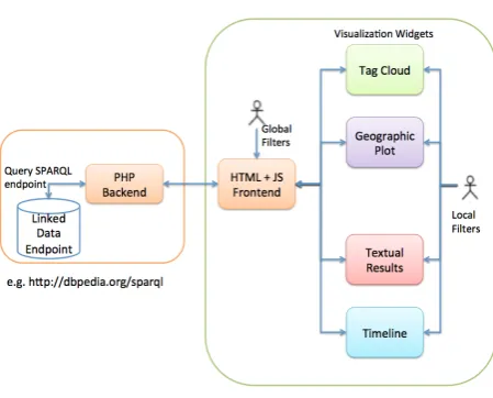
5. Architecture
.views.is composed of two sub-systems: the front-end provides visualizations and user interactions, the back-end deals solely with querying the endpoints (Figure 5, backend on the left, front-end on the right).
14This feature is disabled while querying SPARQL endpoints, as
To start with a new data set,.views.has to go through a configuration step: a file contains the mapping be-tween the widgets and the data feature, as well the cor-responding endpoint to query. The following example shows properties defined within a configuration file:
endpoint = "http://dbpedia.org/sparql";
instancetype = "<http://dbpedia.org/ontology/Place>"; geocategory = "<http://www.georss.org/georss/point>"; piecategory = "<http://dbpedia.org/property/city>"; barcategory = "<http://dbpedia.org/property/state>";
.views. loads the configuration file at set up and builds SPARQL queries accordingly. The properties ‘piecategory’, ‘barcategory’, ‘geocategory’ define how the respective widgets will be plotted, in a piechart, barchart, and on a map respectively ; ‘endpoint’ de-fines which endpoint will be queried; and ‘instance-type’ defines the type of instances that will be re-trieved. Preparing a configuration file requires a certain understanding of a new dataset. Although linked data providers are likely to offer descriptions of their data models, a pre-configuration step can identify proper-ties that are good candidates for certain visual widgets. For example, aggregate-based widgets like pie charts, bar charts are effective visualizations for faceted prop-erties that have a short list of possible values occurring multiple times across the dataset whereas a tag cloud better suit a situation where the list of possible values are much larger. An example query to retrieve a list of properties that may fit in this criteria could be:
SELECT DISTINCT ?concept, count(distinct ?value) AS ?count WHERE {
?s ?concept ?value. } ORDER BY DESC (?count)
The result would be an ordered list of all properties along with the total number of unique values. Distri-bution of the distinct values across the data set can be retrieved by iterating through each property and query-ing for the distribution of its unique values. An exam-ple query (where the current property being investi-gated is ‘city’) would be:
SELECT ?val COUNT(DISTINCT ?obj) AS ?count WHERE { ?obj <http://dbpedia.org/ontology/city> ?val. }ORDER BY DESC(?count)
The resulting distribution can be analyzed and a set of interesting properties identified. It is to be noted, however, that users can have different criteria for ex-pressing interesting charts: a pie chart with too many sections, having equal area could be more interesting to some users than a pie chart with many sections with minimal area and a few sections with larger areas.
In-deed, to determine which type of visualization better fit which data for which task is still a matter of re-search, but results coming from the field of visual an-alytics [5,3] are promising and allow us to forecast a time when this step of associating data features to visualization widgets is done automatically or semi-automatically.
The pre-configuration step can either be a back-end process (the user enters a new dataset endpoint URL and several PHP scripts automatically executes in the background, thereby selecting several possible prop-erties) or a user-directed process (where the user can actively query the endpoint with a few pre-defined scripts on an interactive ‘setup’ environment to iden-tify the respective properties). A fully automatic pre-configuration step can be time and resource intensive for its large number of calls to an endpoint and may result in unexpected time outs and performance issues, as discussed in Section 7. Here we used a user-directed definition of the properties in the configuration file supported by queries similar to those above. However, once the system has loaded, the user has the flexibility to modify the faceting fields from each widget.
To explain the .views. interface, lets consider the flow starting from the user interaction when querying the DBpedia SPARQL endpoint. The user is shown an HTML page with default widgets: on loading the page, a script sends a SPARQL query to the back end to retrieve all the concepts in the dataset. An example SPARQL query would be as follows:
SELECT DISTINCT ?concept WHERE {
?s a <http://dbpedia.org/ontology/Place>.
?s <http://www.georss.org/georss/point> ?location. ?s ?concept ?value.
} ORDER BY (?concept)
The example query looks for all places in DBpedia that have a referenceable geo-location, but any other configurable constrain, e.g. a time frame, could be used too (by modifying the configuration file). Once the query is passed to the backend, a PHP script passes the query to the SPARQL endpoint using ARC15 classes. The response from the endpoint is then parsed by the backend and converted to JSON format, which is then passed to the frontend. The frontend, upon receiving this response, parses the JSON16object to populate its list of concepts that will support the user in selecting the global filters.
15ARC RDF system, http://arc.semsol.org/
Fig. 5. Architecture of the visualization interface
This is captured by the drop-down select list (next to “Add filter:” in the Figure 4). The following shows an example query, where the user has selected ‘country’ and ‘type’ as filters and entered the value for country as ‘united_kingdom’. The user then starts typing ‘uni’ as the value for ‘type’.
SELECT DISTINCT ?type WHERE {
?s <http://dbpedia.org/property/country> ?country. ?s <http://dbpedia.org/ontology/type> ?type. FILTER (regex(?type,"uni","i") &&
regex(?country,"united_kingdom","i")). }
The query would return the types of instances that contain the character sequence ‘uni’ as its type and ‘united_kingdom’ as its country. The user can then se-lect one of the suggestions and that would add the fil-ter fil-term as a global query. In our current implementa-tion, automatic suggestions have been disabled due to back-end performance issues (as will be discussed in Section 7). Currently, the SPARQL queries do not con-tain any FILTER constraints. Instead, the user types the URI (or a matching literal) to have a valid global filter set up.
Once the user has followed the steps of selecting global filters and entering filter terms (as shown in Fig-ure 3 and 4),.views.immediately displays the number of matches in the database, number returned after an-other query is sent to the endpoint. An example would be:
SELECT COUNT (DISTINCT ?s) AS ?count WHERE { ?s <http://dbpedia.org/property/country>
<http://dbpedia.org/resource/United_Kingdom>. ?s <http://dbpedia.org/ontology/type>
<http://dbpedia.org/resource/Public_university> }
This query counts the unique instances of pub-lic universities that are located in United Kingdom17. Clicking on the filtering interface (on ‘68 results avail-able’ in Figure 3) triggers the simultaneous display of the widgets.
Unique queries (tuned by the individual widgets) are passed to the backend, which then responds with the results provided by the endpoint (which are fur-ther converted to JSON). In our previous example with public universities across United Kingdom, if the pie chart is focussed on visualising the results based on cities, the following query would be generated from the pie chart widget.
SELECT DISTINCT ?piecategory COUNT (?instance) AS ?count WHERE {
?instance <http://dbpedia.org/property/country> <http://dbpedia.org/resource/United_Kingdom>. ?instance <http://dbpedia.org/ontology/type>
<http://dbpedia.org/resource/Public_university>. ?instance <http://dbpedia.org/property/city>
?piecategory. }ORDER BY DESC(?count)
The focus (or faceting field) of each widget is de-fined in the configuration file, but, for some widget, the user can alter it by selecting a new field from a drop-down list, e.g. Figure 1 shows that the mapping for both the tag cloud and pie chart can be changed using the drop down list in the bottom of the widget, whereas the map display is fixed. This flexibility en-sures that the user has complete control over which facet of the data are explored at any time. The change of the faceting field (in our example, setting ‘county’ instead of previously defined ‘city’) from the drop-down list triggers a SPARQL query to the backend, es-sentially the same query, but with a different final triple pattern:
?instance <http://dbpedia.org/property/county> ?piecategory.
The back-end responds with a JSON object, which contains an ordered list of counties for the universi-ties in United Kingdom. Each widget receives a simi-lar JSON object, which is then parsed in its own way to provide the specialized visualizations18.
17All the references to the filter values are as URIs and not plain
text to improve system performance, as discussed in Section 8 18Several open-source JavaScript libraries have been used, to
Once the individual widgets are loaded with their visualizations, the user can further interact with local filters and drill down to individual instances or group of homogeneous instances as in the case of maps and tag cloud. Local filters are generated either when se-lecting a different faceting field from a drop-down list (as discussed previously) or clicking on instances. The following example SPARQL query is generated when a section (in our example, the city London) of a pie chart is clicked:
SELECT ?instance ?property ?value WHERE {
?instance <http://dbpedia.org/property/country> <http://dbpedia.org/resource/United_Kingdom>. ?instance <http://dbpedia.org/ontology/type> <http://dbpedia.org/resource/Public_university>.
?instance <http://dbpedia.org/property/city> <http://dbpedia.org/resource/London>. ?instance ?property ?value.
}group by ?instance
[image:10.595.68.294.412.614.2]The back-end responds with a JSON object con-taining all the information regarding the selected in-stance(s). JS modules then parse the object to create an HTML string that gets rendered on a popup dialog, as shown in Figure 6.
Fig. 6. Popup dialog providing details on individual instances - here, the details on the University of Sheffield.
This allows a separation of the user from the raw data instances. The approach of providing aggregated views and combinations of data instances as visualiza-tions enables users to have a high-level overview of the data. However, users can also drill-down to individual instances of data, which provides them direct access to
the underlying data. The benefit of such a mechanism is that the users would not need to be semantic-web or database experts - their interactions would identify the subset of the data they are interested in.
6. User Needs: A Focus Group Validation
As discussed previously, it is essential for any visu-alization of linked data to take into account user needs. Following a user-centred design approach [6], a group of potential end-users has been involved in the forma-tive evaluation of.views. A formative evaluation dif-fers from a summative evaluation in several ways19: it is done earlier in the design-development cycle, it aims at exploring the design space (e.g. alternative possibil-ities) and to have an overall sense of the user reaction to the system under design. As such it uses less formal techniques than a summative evaluation, but provide richer data to support understanding and, eventually, redesign.
Two sets of formative evaluations were carried out over one year: the first evaluation used a focus group technique with hands-on sessions and provided ev-idence of use (via observations), participants’ com-ments and suggestions that were used to re-design the system; the second evaluation was a usability test con-ducted in pairs in order to provoke a natural discus-sion between the participants and reveal what is in their mind better than other techniques, e.g. think aloud. Data collected in this way, narratives and discussions were analysed qualitatively, looking for emerging pat-terns of consensus across groups.
While for the system evaluations.views. has been tested on 4 different data sets (DBpedia20, grass dataset (Figure 1), social data (Figure 2) and UK Government education data21), only the grass data set22 was used for the user evaluation. The set holds ecological and evolutionary data collected by biologists around the world, grass species descriptions and their global dis-tribution and is of high interest to biologists: these were the participants involved in the two formative user evaluation. The dataset contains descriptions as
19A summative evaluation occurs later in the development phase,
when decisions have been already taken, and aims at ascertain the status of the system, e.g. by measuring its usability.
20DBpedia data, as available at http://dbpedia.org/sparql
21Edubase data, as available at
http://services.data.gov.uk/education/sparql
22The grass data set was kindly provided by the Kew Gardens via
well as global distribution of 17,621 grasses, based on 1,090 different characteristics.
The goal of the evaluation was to understand how
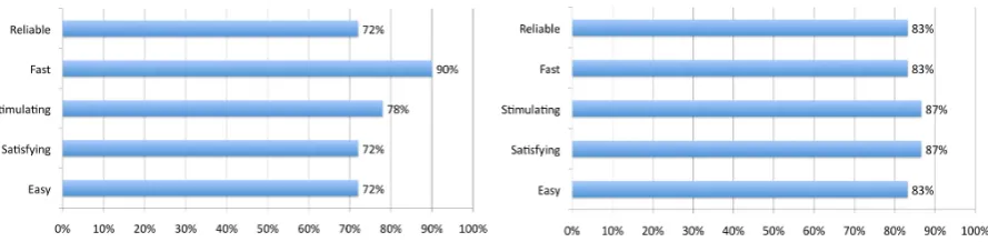
.views.matched expert users expectations, as well as gaining feedback on its usability. Over a period of a week, 8 students from the Animal and Plant Sciences department took part in 5 focus groups, each involv-ing 1 to 3 participants23. Each session lasted between 1.5 hours and 2 hours; the screen interaction and the comments were recorded for future analysis. Partici-pants ranged from first year BSc to MSc graduates. They were first briefed on the project as a whole and a 15-minute demonstration of the data and system was given. Then it was their turn to have their hands on the system: a trace provided as a set of questions. A user satisfaction questionnaire was then used to start the conversation around their experience. Questions on a 5-point Likert scale [12] were targeted to rate differ-ent criteria in the system ranging from ease of use to reliability. The response was overall positive: the sys-tem was judged easy (72%), satisfying (72%), stimu-lating (78%), fast (90%) and reliable (72%).
The comments from all the users were then collated and analysed, which led to several interesting ideas emerging: users appreciated the option of adding cus-tomized filters to select the data of their choice. Com-ments like“You can use a large number of filters and so be as specific or vague as you want. All the infor-mation was displayed well and linked together well”
were encouraging and show that our intuition about user-selected querying was right in spite of the high number (1,090) of filter choices they had to deal with. This list, containing properties like flower color, sepal length, height of plant etc. is gathered while initial-izing the interface by querying for all the properties of grass. However, the long list had drawbacks: com-ments like“Hard to find the required filter in the list”
clearly show that the filtering interface needs some fur-ther thoughts.
Apart from an alphabetical order, participants sug-gested providing frequently used filters (“Query box could contain a few of the more commonly used fil-ter region, leaf size, synonyms”) and to group them into categories and sub-categories (e.g. general char-acteristics (plant duration, sexuality, height etc.), re-gion (Africa, Europe, Asia etc.), part of plant (anthers, spikelets, caryopsis etc.)).
23Sessions with one participant only were due to the partner
miss-ing the meetmiss-ing. Although this is not the ideal settmiss-ing, we believe valuable data were collected in the individual sessions.
Some participants suggested new visualization fea-tures we did not foresee during the design phase:
“Comparisons could be useful side by side visualiza-tions? i.e. for one species distribution of annuals vs perennials. Could be very useful to show basic climate data on map”. Other interesting suggestions include to overlay the geographical map with other imageries (e.g. street map, satellite and 3D imagery) or the use of a C-S-R triangle (Competitor, Stress tolerator, Rud-eral) used by ecologists and botanists to show the per-formance of a plant respect to these categories[4]. Data could then be plotted on the triangle that would be-come an alternative, topological view over the data.
The results from the focus group was analyzed to identify what are the areas that needed improvements.
.views. was then modified to include new features, bug fixes and cosmetic changes. Features that were added were enabling users to replot visualization wid-gets on the basis of the variables that they select (a feature identified by users as essential), mechanisms to improve transferring of queries and result sets and improved backend to better handle different types of queries as well as larger results. Cosmetic changes in-clude modifying the look-and-feel of the user inter-face to provide improved readability, adding domain-specific labels to help domain experts understand the interface better, removing certain pre-defined filters (that were pointed out as unhelpful by students) and improved interaction mechanisms.
The new version of the system was then used in the user test with computer scientists and domain ex-perts. This was conducted six months later, once the improved version of the system was ready for user testing. The study was conducted in three sessions of two experts working in pairs - a computer scientist and a biologist. This pairing was instrumental to under-stand how each expert looks at and interprets the visu-alizations and to foster discussion among the experts. Each session lasted 30–40 minutes, and the mouse control was swapped mid-way. No prescriptive task was given: participants were invited to try out tasks and queries that they would perform in their daily activi-ties. User interactions and conversations were logged and recorded and a user satisfaction questionnaire was collected. Finally, all 6 participants discussed their comments and suggestions as a group.
do-Fig. 7. User-satisfaction questionnaire responses for students (Left) and domain and computer science experts (Right) show the overall improve-ment of the modified system.
main experts and computer scientists(Right) as com-pared to the responses of students.
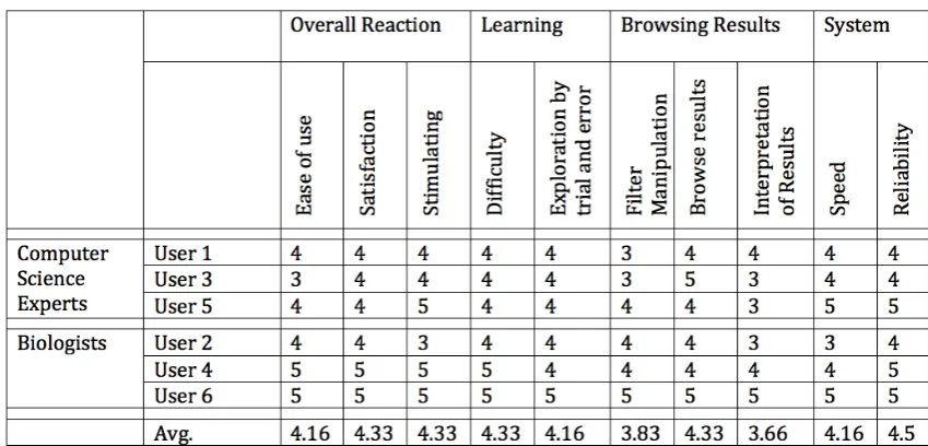
In spite of the general consensus indicating a marked improvement in the user experience of the software, it is important to assess how individual experts with different expertise appreciated the system. The users rated the system on several criteria (ten) on a 5-point Likert scale, which were then analyzed. In the table 1, the odd numbered users (Users 1,3,5) were computer science experts, whereas the even numbered users (Users 2,4,6) were biologists. It was observed that in general, computer science experts found difficulty with the filters and interpreting some of the visualizations.
Biologists found the system easier to learn com-pared to computer science experts, which could ex-plain their higher level of satisfaction with the filters and the system in general. This is likely to be due to the partial familiarity with the data as some of the features used are common across the discipline.
In the follow-up group discussions, users com-mented positively on the intuitiveness and the gen-eral look-and-feel of the system. Users also appreci-ated the way in which they can“quickly see how data is distributed” and “got straight to where I needed to be”. Though users seemed to have difficulty in querying the interface, some appreciated the ability to“click on the menu to see all the possibilities” in-stead of a taxonomic view, while others disliked the drop-down list approach. Comments like “too much time lost scrolling through all morphological charac-teristics”and“Character list should be hierarchical so that it is easier to navigate”indicate that there is some re-thinking required regarding the filtering inter-face. Few users mentioned that they would like to see more data, for example,“Lack of specimen date infor-mation (Collection dates)”.“The current version only lists Accepted Names”and“The taxonomic data was not clear in that will the final system include both
Ac-cepted Names and Synonyms”indicate the users would like to perform disambiguation tasks like relate several species to each other.
Some users found the large number of available wid-gets was not always useful (“too many widgets at first, which get you a bit lost”) and showed explicit prefer-ences (“tag clouds seem to be less useful than other features” and “geographical map not useful”) that could be incorporated in user profiles.
The self-selected tasks showed biologists could re-late the tool to their daily work, however they ex-pressed the need for more datasets to be visualized. They appreciated the ability to visualize a particular facet of the data in an aggregate visualization, and then swap the view to a completely different facet. This was a feature that was added in the improved version of the system, an outcome of the first focus group session with students. Participants saw such visualization ap-proaches as a step forward from traditional search en-gines, as they could be empowered to find patterns or distributions in very little time.
[image:12.595.75.520.124.233.2]in-Table 1 User-satisfaction responses for domain experts on a 5-point Likert scale.
tuitiveness of some parts, like the filter selection. How-ever it should be noted that some of the difficulties could come from the data itself, for example the long list of filters (1,090!) the user has to go through to se-lect the interesting item, is an essential part of the data structure. This evaluation clearly showed how this kind of details have to be considered beforehand if a generic tool to visualize linked data has to be provided.
7. System Requirements: Understanding Public Linked Data Endpoints
As linked data become available from different sources, a visualization tool should be able to take dif-ferent sets and visualize them without too much tun-ing, ideally without any tuning. Porting a system onto another domain might not be straightforward and the technical implications of using a different infrastruc-ture have to be understood in full as certain aspects of the interaction, e.g. system reaction time, must be kept between accepted thresholds to assure users ac-ceptability. For example, a system is perceived as in-teractive if the response time is under 2 seconds, but for direct manipulation of data the reaction time must be under 2 milliseconds. The portability of.views.was tested on different domains and data sources: SQL databases, RDF triple stores and SPARQL endpoints. To better understand the limitations developers would face while building user-interfaces for open linked data, we used a realistic and large dataset: DBpedia
contains almost three and a half million resources, stored in over a billion RDF triples (version 3.5.1, re-leased Apr 28, 2010). This provided an excellent use-case for our research. Before we started implementing our system on SPARQL endpoints, we performed sev-eral tests on large SQL databases. These tests had indi-cated that in order to provide a fluent interaction with the data via a user-interface, there are certain compro-mises that are required. For example, dragging a slider to continuously query the database would cause the system to slow down, as it has to continuously send queries and parse the results. Instead, sending queries only when the user finishes dragging the slider (indi-cated by a release of the slider handle) would make a significant improvement on the system.
The system evaluation was composed of two parts both logged and time-stamped:
1. Querying the endpoints and retrieving results from the filtering interface;
2. Visualizing the result sets into 5 widgets textual results, geographical map, pie chart, bar chart, tag cloud.
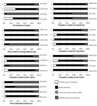
[image:13.595.83.508.121.325.2]JSON, and time to transfer JSON objects to the fron-tend. The frontend was evaluated by timing the perfor-mance of each visualization widget. Figure 8 shows the relative response times for the DBpedia endpoint (in-crease in the result size maps: 100=1, 600=2, 1100=3, 2200=4). The time taken for the backend to process the query and send the results to the frontend varied from 123.78ms to 6.9s, with the query execution time vary-ing from 98ms to 6.85s. For most of the cases (60%), the time taken for executing the query took more than 70% of the backend processing time. In order to see if there were computational bottlenecks or patterns that could be optimized, data was normalized to highlight the proportion among the different phases. Figure 8 plots the distribution of the 4 tasks and show several interesting points:
– The overall time taken by the backend is highly dependent on either the query execution time or the time taken to transfer the results to the fron-tend as they take the maximum time to complete.
– The overall time taken by the backend is highly variant.
– The time taken for transferring the query to the backend and the time for converting the results to JSON objects is negligible compared to the other two.
A major concern is the query execution time, the variation of which is alarming and cannot be con-trolled. While it this could be attributed to high server load or the way queries are distributed, this is an im-portant aspect that user interface developers need to take into consideration. The system tests show that though the query execution phase often takes a lot of time to complete, there are other phases in the backend processing that can be significantly improved. More investigation is needed to understand the causes of the delays in transferring the result objects to the frontend and further optimize this step.
This high variability in the query processing stage is in contrast to the performance achieved by traditional databases. In a similar experiment with a MYSQL database, we tested how the backend performs with similar query-result sets. The overall backend pro-cessing time varied between 0.00026ms and 6.48ms. Though SQL data stores can be expected to be faster, the relative time taken by the query processing stage has been consistent, consuming most of the entire backend processing time.
8. Discussion and Guidelines
To better understand the constraints for an effective and generic approach to the user-centred visualization of linked data, both user and system aspects have to be taken into account. Therefore both a formative user evaluation and a testing of the backend performance were needed to better understand pitfalls and potential. This section pulls together the results of the two evalu-ations and discusses which points have to be taken into account when designing user interfaces to linked data. Our initial intuition was that the response from pub-licly available SPARQL endpoints would be quite slow as compared to querying a local database; the system tests proved that the real problem is the inconsistent time laps of the query execution phase, a far greater challenge, as it cannot be fully controlled. Reflecting on the implications for the user interface and the inter-action, these basic guidelines can be considered:
8.1. Instance Counts
Providing instance counts (while entering textual queries, slider actions or selecting checkboxes etc.) should be handled with care. We have often found that due to the delay (in processing of a previous query) in the backend, the results being passed to the frontend (thereby parsed and rendered in the frontend) over-write the recent results. This happens more often while obtaining instance counts, as the interaction itself ex-pects several quick responses from the backend. For our implementation, timeouts of 200ms from the fron-tend were introduced so that it would prevent delayed results from previous queries over-writing recent re-sults. Another suggestion would be to add user inter-ventions before sending queries to the backend e.g. pressing enter to retrieve instance counts.
8.2. Dynamic Querying
Fig. 8. Plots showing the extremely high variation of query execution phase (98ms to 6.85s) in the backend processing. The size of the results (1 – 2200 results returned, 2 – 1100 results returned, 3 – 600 results returned and 4 – 100 results returned) are shown as individual bars on the y-axis, and the differently shaded x axis bars show the time taken to perform individual functions to retrieve the respective results. The plots show the relative times in different parts of the system
the first solution mainly due to the fact that it does not pose any restrictions on the interactivity of the query-ing interface.
8.3. Automatic Suggestions
Automatic suggestions were disabled, as responses from the backend were often late and could overwrite more recent suggestions, as explained in a previous point. As the backend processing was time-exhaustive, we decided to disable searching using regular expres-sions. Instead, queries are presently performed using URIs. Doing so does not put any demands on the end-point to process regular expressions, thereby making the backend respond quickly.
8.4. Aggregate Queries
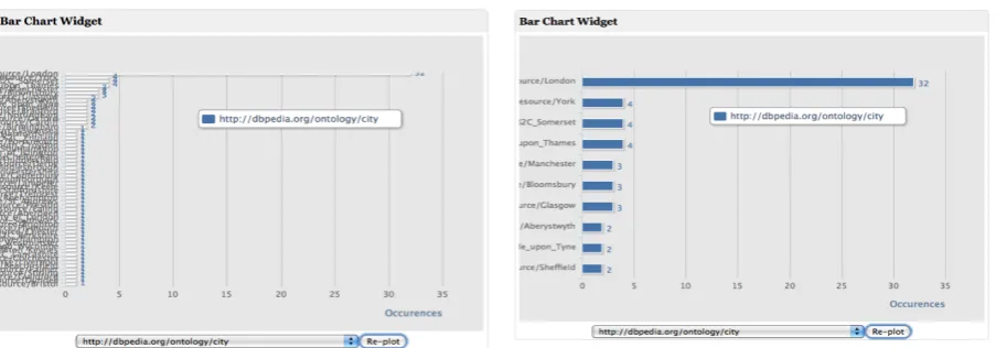
re-Fig. 9. Improving readability (and speed) by limiting results for aggregate queries. Both figures show identical information (e.g., most resources are in London). However, the first widget is almost illegible.
sults), this helped in providing a more readable visu-alization. Figure 9 shows the improvement in the bar chart widget when this was done. The figure on the left shows the aggregate results before any limits applied. The figure on the right shows the improved readability achieved by applying limits.
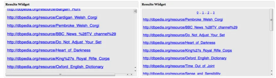
8.5. Textual Results
As can be seen from Figure 8, the query execution time for the text result widget was high. Further on, more instance matches result in further delays since it takes more time to process large data objects. Textual result can then be presented on request in a separate overlapping layer, i.e., by providing only a window (as a page) of the entire result set (Figure 10). This solu-tion reduces time and improves readability. Thereby, instead of sending one highly time consuming query, we modified the system to send several short queries when required.
The above mentioned guidelines are often adopted by software developers in order to cope with unreliable or slow databases. Several other software engineering approaches can be adopted for improving the system performance like caching results, interacting with lo-cal datasets, engineering SPARQL queries to provide quicker responses etc. However, our intention of evalu-ating the system limitations is to understand how good practices in visualization can be harmonically aligned with the current system infrastructure, keeping the user expectations in mind. We have realized that the unre-liability of the linked data endpoints may create issues (like delays, timeouts etc.) in user interfaces as well
as deactivation of essential functionalities, which can adversely affect the user experience. In order to ad-here to specific guidelines established by the informa-tion visualizainforma-tion community, the backend infrastruc-ture needs to provide a consistent performance. Our ef-forts are in understanding what are the existing infras-tructure problems faced by interface developers, and to benchmark such systems against the performance of traditional datastores, from a developer/consumer’s point of view.
[image:16.595.74.526.121.279.2]Fig. 10. Improving readability for textual results by providing a page view of large result sets. Note the scroll bar for both figures indicating the number of textual results contained in the widget.
However, by being able to drill down into individual data instances, the users will always have access to their data.
Apart from understanding the potential impact of the system architecture on user expectations and expe-rience, our approach has also been to understand how we can provide a generic visualization framework. The dashboard approach has been applied over the years to cater to different requirements for different domains.
.views.is capable of porting to several backends - tra-ditional databases as well as linked data or triplestores. The flexibility offered by such systems seems to be ideal for a linked data visualization framework - devel-opers can contribute by creating ‘add-on’ visualization widgets that cater to specific domains or data types; users can select which visualization widgets they pre-fer to use and in which order; users can select sec-tions of the visualizasec-tions within individual widgets to further investigate areas of interest; data owners can use such framework to quickly explore their own datasets, shared data or even organizational data. It is also the familarity of the users with systems following the dashboard approach that has influenced our design choices - the users would not need to be trained in us-ing dashboards as they almost unknowus-ingly use such systems daily (BBC, igoogle, etc.).
9. Conclusion
Everyday more linked data is made available to the public for consumption, e.g. citizens interested in gov-ernment policy or developers of linked data applica-tions. However, there is no generic interface for ex-ploring unknown linked data set available today, and, as a matter of fact, only Semantic Web people could
look into those repositories and, even they, with diffi-culties. To be able to create effective interactive visual-izations, a deeper and better understanding of the im-plications of the current technical setting and the user requirements are needed. Our portability experiments with several different domains indicate that we can use
visualization interface could embed those constraints and reduce the risk of data misinterpretation.
10. Acknowledgements
This research is funded by the Samulet project funded by Rolls-Royce plc. and the Technology Strat-egy Board. We gratefully acknowledge their support. We thank our focus group attendees for their cooper-ation and extremely helpful suggestions and we are grateful to the GrassPortal project for providing us with invaluable support.
References
[1] Christopher Ahlberg, Christopher Williamson, and Ben Shnei-derman. Dynamic queries for information exploration: an implementation and evaluation. In Proceedings of the SIGCHI conference on Human factors in comput-ing systems, CHI ’92, pages 619–626, New York, NY, USA, 1992. ACM. ISBN 0-89791-513-5. . URL http://doi.acm.org/10.1145/142750.143054. [2] M. Butler, D. Huynh, B. Hyde, R. Lee, and S.
Maz-zocchi. Longwell project page, 2006. URL http://simile.mit.edu/wiki2/Longwel. [3] Stephen Few. Information Dashboard Design: The
Effec-tive Visual Communication of Data. Number 3900693099. O’Reilly Media, 2006.
[4] J. P Grime. Vegetation classification by reference to strategies. Nature, 250:26 – 31, 1974. . URL http://dx.doi.org/10.1038/250026a0.
[5] Jeffrey Heer, Michael Bostock, and Vadim Ogievetsky. A Tour Through the Visualization Zoo.Communications of the ACM, 53(10.1145/1743546.1743567):59–67, 2010.
[6] M. D. Helen Sharp, D. Yvonne Rogers Ph, and M. D. Jenny Preece. Interaction Design: Beyond Human-Computer Interaction. Wiley, 2 edition, March 2007. ISBN 0470018666. [7] Michiel Hildebrand, Jacco van Ossenbruggen, and Lynda Hardman. /facet: A Browser for Heterogeneous Seman-tic Web Repositories. In Isabel Cruz, Stefan Decker, Dean Allemang, Chris Preist, Daniel Schwabe, Peter Mika, Mike Uschold, and Lora M. Aroyo, editors,The Semantic Web -ISWC 2006, volume 4273 ofLecture Notes in Computer Sci-ence, chapter 20, pages 272–285. Springer Berlin Heidelberg, Berlin, Heidelberg, 2006. ISBN 978-3-540-49029-6. . URL http://dx.doi.org/10.1007/11926078_20. [8] D. Huynh, S. Mazzocchi, and D. Karger. Piggy Bank:
Experience the Semantic Web Inside Your Web Browser.Web Semantics: Science, Services and Agents on the World Wide Web, 5(1):16–27, March 2007. ISSN 15708268. . URL http://dx.doi.org/10.1016/j.websem.2006.12.002.
[9] David F. Huynh, David R. Karger, and Robert C. Miller. Exhibit: Lightweight Structured Data Publishing. In Pro-ceedings of the 16th international conference on World Wide Web, WWW ’07, pages 737–746, New York, NY, USA, 2007. ACM. ISBN 978-1-59593-654-7. . URL http://dx.doi.org/10.1145/1242572.1242672. [10] Eero Hyvönen, Eetu Mäkelä, Mirva Salminen, Arttu Valo, Kim Viljanen, Samppa Saarela, Miikka Junnila, and Suvi Kettula. MuseumFinland–Finnish museums on the semantic web.Web Semantics: Science, Services and Agents on the World Wide Web, 3(2-3):224 – 241, 2005. ISSN 1570-8268. . Selcted Papers from the International Semantic Web Conference, 2004 - ISWC, 2004.
[11] Tim B. Lee, Yuhsin Chen, Lydia Chilton, Dan Connolly, Ruth Dhanaraj, James Hollenbach, Adam Lerer, and David Sheets. Tabulator: Exploring and analyzing linked data on the semantic web. InIn Procedings of the 3rd International Semantic Web User Interaction Workshop (SWUI06), page 06, 2006. [12] R. Likert. A technique for the measurement of attitudes.
Archives of Psychology, 22(140):1–55, 1932.
[13] Roberto Mirizzi, Azzurra Ragone, Tommaso Di Noia, and Eugenio Di Sciascio. Semantic Wonder Cloud: ex-ploratory search in DBpedia. In Florian Daniel and Fed-erico Facca, editors, Current Trends in Web Engineer-ing, volume 6385 of Lecture Notes in Computer Science, pages 138–149. Springer Berlin / Heidelberg, 2010. URL http://dx.doi.org/10.1007/978-3-642-16985-4_13. 10.1007/978-3-642-16985-4_13.
[14] Benjamin Nowack. Paggr: Linked Data widgets and dashboards. Web Semantics: Science, Ser-vices and Agents on the World Wide Web, 7(4):272– 277, December 2009. ISSN 15708268. . URL http://dx.doi.org/10.1016/j.websem.2009.09.005. [15] Daniela Petrelli, Suvodeep Mazumdar, Aba-Sah Dadzie,
and Fabio Ciravegna. Multi Visualization and Dynamic Query for Effective Exploration of Semantic Data. In Abraham Bernstein, David Karger, Tom Heath, Lee Feigen-baum, Diana Maynard, Enrico Motta, and Krishnaprasad Thirunarayan, editors, The Semantic Web - ISWC 2009, volume 5823 of Lecture Notes in Computer Science, pages 505–520. Springer Berlin / Heidelberg, 2009. URL http://dx.doi.org/10.1007/978-3-642-04930-9_32. 10.1007/978-3-642-04930-9_32.
[16] M.C. Schraefel, Max Wilson, Alistair Russell, and Daniel A. Smith. MSPACE: Improving Informa-tion Access to Multimedia Domains with MultiModal Exploratory Search. Communications of the ACM, 49:47–49, April 2006. ISSN 0001-0782. . URL http://doi.acm.org/10.1145/1121949.1121980. [17] Ben Shneiderman. The eyes have it: A task by data type