Baseball Scouting Reports via a Marked Point
Process for Pitch Types
Andrew Wilcox and Elizabeth Mannshardt
Department of Statistics, North Carolina State University
November 14, 2013
1
Introduction
Statistics and baseball have always gone hand in hand. In baseball’s earliest days newspapers printed a summary of baseball games that showed the number of runs scored by each player and the number of runs each team scored in each inning (Schwarz, 2004). Over the years what we now know as a box score has evolved to include all of the various outcomes of every pitcher and batter that takes part in the game. Today box scores are just one set of statistical information that is kept in an attempt to summarize a game of baseball. In addition to box scores, fans can now find complete play by play data sets as well as data sets containing pitch trajectory data for every major league baseball game. This abundance of data is used by teams and fans alike in an attempt to explain what they see on ball field.
In the past when individual pitch data was collected it was done by tracking each pitch by eye and marking it by hand in a scout’s notebook. Alternatively all of the pitches could be video taped and plotted by hand later. This type of data collection led to large amounts of measurement error for the individual pitch data. However a new age for baseball data collection is beginning thanks in part to
the PITCHf/x system (Fast,2010). This recently developed system uses cameras
within every Major League ball park to track the speed, movement, and location of every pitch thrown and provides detailed data about pitch location.
Until recently the use of spatial statistical techniques for baseball scouting
reports has been fairly restricted. However with the PITCHf/x system providing
spatial data can now be applied. In this paper we focus on modeling the pitching tendencies of a particular pitcher by creating a spatial statistical model that is based on pitch type and location. In addition we attempt to use this model to shed light on how a starting pitcher’s location changes over the course of the game. This type of modeling can help improve scouting reports on a pitcher and is one
of the extensions put forth byAlbert (2010). In particular we explore the use of
a marked point process model to create intensity functions for each pitch type. These intensity functions contain information about the rates at which pitchers throw each type of pitch and the locations where these pitches occur. Moreover they provide a smooth surface from which more visually informative graphs can be made and a framework for measuring how location changes throughout the game.
In Section 2 we describe the PITCHf/x system in more detail and give a
de-scription of the data being used in our analysis. The statistical methodology be-hind marked point processes and their application to baseball pitch data is de-scribed in Section 3. Section 4 contains the results of this methodology applied to the pitches thrown by Clayton Kershaw during the 2012 season. In addition this section uses our methodology to study how the location of three prominent pitchers changes as the game progresses. Finally Section 5 contains a discussion and possible extensions of this work.
2
PITCHf
/
x System and Data Description
The PITCHf/x system was first introduced in 2006, and by 2008 had been installed
in every major league ballpark (Fast, 2010). This system uses a combination of
high speed cameras, mathematical formulas, and computer software to track and record every pitch thrown during a major league baseball game. While a more
de-tailed description of the PITCHf/x system is given inFast(2010), essentially the
high speed cameras capture close to 20 images of the pitch in flight between the
pitchers hand and the front of home plate and the PITCHf/x system uses these
im-ages with constant acceleration formulas to identify the coordinates for each pitch as it crosses home plate. More information about the explicit formulas being used
is discussed byNathan(2007). According toBaumer and Draghicescu(2010) the
margin of error for the coordinates of the pitch as it crosses home plate is around 0.4 inches. Thus there is a relatively small amount of measurement error for this system since the width of home plate is 17 inches.
Along with these coordinates, the PITCHf/x system also saves other covariates
such as the spin and the speed of the pitch. Using these covariates, classifying algorithms based on the speed, spin, and location of the pitch can be used to identify the type of pitch that was thrown. However there has been some debate over how well these classification algorithms are performing, especially when it
comes to pitches that are similar to one another (Brooks,2012,Fast,2010,Nathan,
2007, Pane, Ventura, Steorts, and Thomas,2013). However according toBrooks
(2012), the algorithms are much improved when compared to when the system
was first installed. Since pitch classification is not the topic of our paper, we refrain from going into more detail on the classification algorithm and the debate
over its performance. Instead we highlightPane et al.(2013) as a more complete
discussion on this topic and the fact that our choice of pitcher and time frame should help minimize any error that may occur from pitch misclassification.
In this paper we focus our analysis on Clayton Kershaw who is a well known pitcher for the Los Angeles Dodgers. We chose Clayton Kershaw because he is a successful pitcher that even a casual baseball fans may have knowledge of and because he throws four distinct pitch types that are easy to classify. Clayton Kershaw throws a four-seam fastball, changeup, curveball, and slider. The distinct movement and velocity of these pitches make them easier to classify then say the
difference between four-seam and two-seam fastball. As discussed previously this
should help minimize any misclassification of pitch type error in the PITCHf/x
system. To highlight the usefulness of the methodology described in this paper, we also consider David Price of the Tampa Bay Rays and Justin Verlander of the Detroit Tigers. Along with Clayton Kershaw these pitchers were three of the best pitchers in Major League Baseball during the 2012 season, each finishing in the top 2 of their respective league in Cy Young Award voting. However using our methodology we show that these pitchers progress through a game in very
different ways.
It is well accepted in baseball that some pitchers will approach right-handed
hitters (RH) and left-handed hitters (LH) differently. That is, the side of the plate
from which a hitter swings plays a large role in determining the strategy used by the pitcher. As such it makes sense for us to perform separate analyses for RH and LH batters. There are other factors such as the count or type of hitter that might also play a role in changing a pitchers strategy. However in this paper our primary focus will be on how LH pitchers Clayton Kershaw and David Price pitch to RH hitters and how RH pitcher Justin Verlander pitches to LH hitters. However our techniques and analysis could easily be extended to explore similar questions about how pitchers approach batters with the same handedness. For our analysis
will use the PITCHf/x data on the 2,731 pitches thrown by Clayton Kershaw to RH batters, the 2,588 pitches thrown by David Price to RH batters, and the 2,182 pitches thrown by Justin Verlander to LH batters during the 2012 Major League Baseball regular season.
For a spatial point process we must define the window in which the locations
for pitches may appear. While arguments can be made for many different widow
sizes we keep it simple in an attempt to not allow extreme outliers influence our
analysis. Horizontally our chosen window stretches 1ft offeither side of the plate
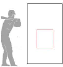
and vertically our window stretches from just above ground level to 6ft high. Thus balls that bounce in the dirt, are way over the batters head, or are far away from the plate are excluded in our analysis. The use of this window excluded a total of 109 pitches which is less than 4% of the total number of observed pitches thrown by Clayton Kershaw. A picture of this window with reference to a typical strike
zone can be seen in Figure1. This typical strike zone is created to be 20in. wide
and extends from 1.75ft off the ground to 3.4ft off the ground. These numbers
are based offthe work of Fast(2011) who shows that this is the strike zone that
umpires generally call. It is also important to note that all of our graphics are made from the catcher’s viewpoint. Thus to a RH hitter inside pitches refer to the left side of the window while outside pitches refer to the right side of the window.
Figure 1: Window size for our analysis (black) plotted with a typical strike zone (red). Note that all graphs will be made from the catcher’s viewpoint.
3
Statistical Methodology for Point Processes
In general a point process can be thought of as a stochastic process where the ob-served locations occur at random and are viewed as the response variable. When these locations contain additional information the process is known as a marked point process. The term “mark” refers to the additional information at each lo-cation. The goals of analyzing a spatial point process vary by application, but typically include modeling the intensity of the points in the region of interest and
recognizing the stochastic dependence between the points (Gelfand, Diggle,
Gut-torp, and Fuentes,2010).
From a batter’s point of view, the location of a pitch is a random event that occurs from the pitcher’s unique point process. Modeling this process would be valuable because both the pitcher and hitters can gain information that helps them perform by studying a pitcher’s unique point process. In the data collected from
the PITCHf/x system the pitch locations are marked by the type of pitch that was
thrown. These pitch types help explain the speed and movement of a pitch and are important to characterize and distinguish between since pitchers strategically
use each pitch differently. For example a fastball is a type of pitch that has very
little movement but is thrown at a high velocity, while a slider moves horizontally across the strike zone at a slower velocity then the fastball. Typically the fastball is the pitch most often used when a pitcher needs to throw a strike, while breaking pitches such as the slider are used to get strikes by fooling the hitter or to induce the batter to swing and miss. Our goal in this paper is to accurately characterize the intensity function for each pitch type in and around the strike zone. This will provide distinct pitcher profiles that can be used to determine if a pitcher favors
certain locations for his different pitch types. More importantly this modeling
will provide a measurable smooth surface for these pitch locations that can be interpreted graphically. It can also be used to measure changes in a pitcher’s
location in different situations such as early versus late innings in a game. While
there may be some benefit to knowing the stochastic dependence between pitches, it is of secondary focus for the aim of this paper.
3.1
Pattern Characterization
(Baddeley and Turner, 2005, Gelfand et al., 2010). In particular this is done by
testing for the two different types of departure from CSRI: dependent components
and non-random labeling.
The multivariate point process that arises from baseball pitch data is marked by pitch type. Thus the marks are categorical in nature and the process is often
called a multi-type point pattern (Baddeley and Turner,2005). The overall point
process then has points (s,m) where s is some location in Rd and mis the mark
from some discrete set M(Gelfand et al.,2010). Since Clayton Kershaw has four
different types of pitches-fastball, changeup, curveball, and slider-the set of marks
is{m∈M :M = {1,2,3,4}}. The overall point process Xis then equivalent to the
set of non-marked point patterns{Xm:m=1,2,3,4}wheremcorresponds to the
marks value.
Our baseball intuition leads us to the conclusion that our data will not be CSRI. A pitcher does not randomly throw pitches around the strike zone, but instead pitches with a strategy to induce an out. Thus he attempts to pitch to the corners of the plate and throw specific pitch types in the locations where they are most likely to produce the desired result. Thus we would be surprised to find pitch type location data that did not depart from CSRI.
However since testing for CSRI is always a first step in a point pattern analy-sis, we feel it would be incomplete to ignore this process. Thus we have included a full analysis testing for CSRI in the Appendix of this paper. It includes a more de-tailed description of the tests performed and the results of those tests. In summary the Appendix shows that, as expected, the data on Clayton Kershaw’s pitches to RH batters is not CSRI. The test shows that while the data has independent com-ponents based on pitch type, the points are not randomly labeled. That is, the location of a pitch is dependent on the type of pitch that was thrown.
3.2
Intensity Function Modeling
The modeling and hence graphing of the intensity function for a marked point process can be performed by fitting a parametric model to the data. Typically for marked point process data Poisson point processes are used where the marks can be used as a factor. If the process is found to be CSRI then the intensity function
using the 2-D spatial locations (x,y) and marksmis modeled as
logλ(x,y,m)=αm (1)
whereαmrepresents a degenerate mean effect, uniformly dispersed across all
lo-cations (Baddeley and Turner,2005). This model is only valid when the process
is CSRI and thus every mark value is equally likely. However, if the process is found to deviate from CSRI then we need models that use location information, possibly including interactions between the mark value and the location informa-tion. Likelihood ratio tests and other model comparison techniques can be used
to compare different models when a process is found to not have complete spatial
randomness and independence.
It is important to note that this type of intensity function modeling relies on a parametric assumption, typically that the intensity function of the process follows a Poisson distribution. As such non-parametric estimates of the intensity func-tion can be used as one type of model validafunc-tion as they look to generally model the intensity function without the use of a parametric assumption. A common non-parametric modeling technique is to model the intensity function using
ker-nel density estimation. As noted inSheather and Jones(1991) the typical kernel
density estimate for a random sample X1, . . . ,Xnis
ˆ
fh(x)= n
−1Σn i=1h
−1
K{h−1(x−Xi)} (2)
wherenis the sample size,Kis the kernel function, andhis bandwidth or
smooth-ing parameter. While Sheather and Jones (1991) has presented a reliable data
based method to select this smoothing parameter, using kernel density estimation on point process data is still sensitive to the chosen bandwidth. This is because
the bandwidth is attempting to balance bias and variability (Gelfand et al.,2010).
In addition these non-parametric estimates do not give standard errors for the es-timated intensity function and as such it is hard to accurately quantify the error associated with using these functions. Thus these methods are typically seen as
exploratory data analysis tools (Gelfand et al.,2010) and in our paper will be used
in comparison to our parametric models for model validation purposes.
Heat maps and other data smoothing techniques that are popular on
base-ball analysis websites such as fangraphs.com are typically based on these
non-parametric models. However as discussed above, they can highly sensitive to
the bandwidth and can provide seemingly differing information on the same data.
This warning is even put forth bySlowinski(2011) onfangraphs.comto educate
No Interaction Poly O(1) Poly O(2) Poly O(3) Harm O(2) Harm O(3)
-4374 -4516 -5964 -5959 -4903 -4899
Table 1: AIC values for the different interaction models fit to Clayton Kershaw’s
pitches to RH batters. Here Poly O(x) is a polynomial fit of order x and Harm O(x) is a harmonic fit of order x. The lowest value is bolded indicating the best fit.
4
Results
For our data on Clayton Kershaw’s pitches during the 2012 major league baseball regular season, we would like to estimate the intensity functions for each pitch type. These functions can then be used as a graphical tool to aid scouting re-ports on Clayton Kershaw. In addition we show how these functions can be used
to measure how the location of a certain pitch type may be changing in diff
er-ent situations throughout the game. To stay consister-ent with baseball theory we will only perform analysis for pitches thrown RH hitters. However this analysis could easily be extended to LH hitters as well. All of our statistical analysis was
performed using the spatstat package (Baddeley and Turner, 2005) in the R
statistical software version 2.13.
4.1
Model Selection
Since our data does not appear to be CSRI, we need to include some sort of in-teraction between the pitch type and the pitch location when modeling Clayton Kershaw’s intensity functions. In our analysis we considered various types of interactions between pitch type and pitch location including both harmonic and polynomial functions up to order 3. When the models like these are not nested, information criteria such as the Akaike Information Criterion (AIC) put forth by
Akaike(1974) can be used to select the best fitting model. Thus for the
polyno-mial and harmonic functions considered we provide the AIC values for the diff
er-ent models in Table 1. Table 1 shows that the best fit for our data is a polynomial function of order 2 since it has the lowest AIC value.
Following Table 1 the model we use is a Poisson point process model with log-quadratic intensity
log(λ) = α0+α1x+α2y+α3xy+α4x2+α5y2
+ β0mI{M=m}+β1mxI{M=m}+β2myI{M=m}+β3mxyI{M=m}
+ β4mx2I{M=m}+β5my2I{M=m}
(3)
where the location coordinates are denoted (x,y), the pitch types are denoted{M =
1. . .4}, andI{M=m} is an indicator function denoting when the pitch is of type m.
An equivalent way to view Equation (3) is as a separate model for each pitch type.
Thus by lettingγim= αi+βimwe have
log(λm)= γ0m+γ1mx+γ2my+γ3mx2+γ4my2+γ5mxy. (4)
In Equation (4) it is easy to see that the number of parameters that need to be
estimated is 6 times the number of pitch types. Since Clayton Kershaw throws 4 distinct pitches there are a total of 24 parameters that must be estimated. It is important to note that this model provided the best model for Kershaw’s pitching to RH hitters over the entire 2012 season. The evaluation of other pitchers or
different situations may lead to models of a similar but not exact structure. It is
important to perform model validation in each situation and not assume that one model will perform best in all cases.
4.2
Graphical Advantage
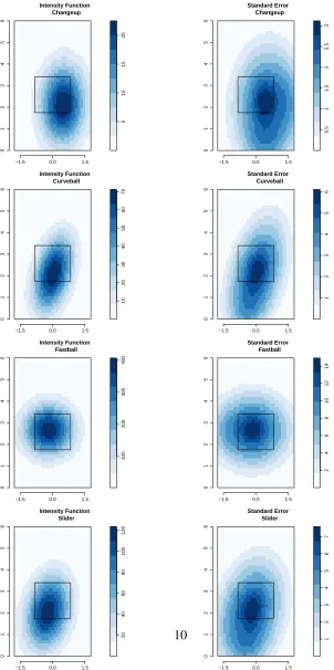
The parametric model in Equation (3) was fit to Clayton Kershaw’s pitches to RH
hitters using thespatstatpackage in R. The results of this model along with its
corresponding standard errors are presented in Figure2. The color scale in Figure
2 represents the magnitude of the intensity function. It conveys the number of
pitches that were thrown by location over the course of the 2012 season. Thus
from Figure 2 we see that Clayton Kershaw throws his fastball with the highest
intensity followed by his slider, curveball, and finally his changeup. In addition we see that Clayton Kershaw’s fastball intensity function is circular, but centered slightly inside to a RH hitter. This tells us that his fastballs are thrown to both sides of the plate but occur slightly more often on the inside corner. Most importantly, most of his fastballs tend to be in the strike zone. This implies that Kershaw uses this pitch most often to rack up strikes and does not try to get RH hitters to chase this type of pitch out of the strike zone as often. Another interesting observation is that while Clayton Kershaw does not throw his changeup very often, when he does he almost always does so on the outer half of the plate. Clayton Kershaw’s breaking pitches, the curveball and the slider, both tend to be thrown down in the strike zone with sliders tending towards the inner half. It is important to note, that the slider is thrown more often than the curveball.
The graphs shown in Figure 2 allow these general inferences about the way
51 0 1 5 2 0
−1.5 0.0 1.5
0123456 Intensity Function Changeup 0.5 1 1.5 2 2.5 3
−1.5 0.0 1.5
0123456 Standard Error Changeup 10 20 30 40 50 60 70
−1.5 0.0 1.5
0123456
Intensity Function Curveball
123456
−1.5 0.0 1.5
0123456 Standard Error Curveball 100 200 300 400
−1.5 0.0 1.5
0123456 Intensity Function Fastball 2 4 6 8 10 12 14
−1.5 0.0 1.5
0123456 Standard Error Fastball 20 40 60 80 100 120
−1.5 0.0 1.5
0123456
Intensity Function Slider
1234567
−1.5 0.0 1.5
0123456
Standard Error Slider
Figure 2: The fitted Poisson process model for RH hitters (left) and its associated standard error (right). The pitch type is given in the label of each graphic.
the fact that intensity function modeling allows for plots of smooth surfaces as opposed to simple scatter plots. While scatter plots focus on showing the exact lo-cation of every pitch, smooth surfaces focus on characterizing patterns and trends. In a scatter plot, pitches thrown in the same location can stack on top of each other making it unclear just how many pitches were thrown in that single location. In addition these plots tend to draw our eyes to outliers which can make it harder to
see an overall pattern in the data. Figure3shows the scatter plots as presented on
pitchfx.texasleaguers.com for the same Clayton Kershaw data. Comparing
Fig-ures 2and 3highlights this graphical advantage for smoothed surfaces resulting
from considering an intensity function.
(A) (B)
(C) (D)
Figure 3: Scatter plots of Clayton Kershaw’s pitches to RH hitters broken down
by his four different pitch types: Changeup (A), Curveball (B), Fastball (C), and
Slider (D)
4.3
Model Validation
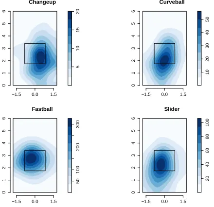
non-parametric models using Gaussian kernel density estimation and the fitted
in-tensity functions for each pitch type are shown in Figure4. Here the bandwidth
parameter is chosen automatically based on cross-validation methods which are
data dependentBaddeley and Turner(2005). Figure4is consistent with our
Pois-son process model shown in Figure2and helps validate our model choice.
Changeup 5 1 01 52 0
−1.5 0.0 1.5
0123456 Curveball 10 20 30 40 50
−1.5 0.0 1.5
0123456 Fastball 50 100 200 300
−1.5 0.0 1.5
0123456 Slider 20 40 60 80 100
−1.5 0.0 1.5
0123456
Figure 4: Non-parametric estimation of the intensity functions for Clayton Ker-shaw’s pitches to RH hitters. The pitch type is given in the label of each graphic.
4.4
Measuring Location Change
Starting pitchers, like Clayton Kershaw, are used in the beginning of the game and
continue to pitch for as long as they are effective. In modern baseball it is typical
to see a starting pitcher throw between 5 and 7 innings before being removed for a relief pitcher. The thinking is that these starting pitchers tire as the game goes
on and eventually reach a point where they are no longer effective. Where there is
room for improved understanding is exactly how starting pitchers tire and become
ineffective. Do starting pitchers simply lose velocity as the game goes on? Does
their location change in later innings? Do all starting pitchers tire in the same predictable way?
While it is fairly easy to track a pitcher’s velocity during a game and study how
it changes in different game situations, studying a pitcher’s change in location is
more difficult. However the modeling of an intensity function for a pitcher
pro-vides a framework in which to measure location change. As seen in Equation (4)
there is an estimated intensity function with different parameters associated with
each pitch. Since this is a mathematical function, partial derivatives can be used to find the center of the function. Thus by estimating a pitcher’s intensity functions
for different time periods, we can track how a pitcher’s location is changing over
the course of the game.
Finding the maximum of a function is equivalent to finding where the func-tion’s first derivative is equal to zero. Thus for the log-quadratic Poisson process
model put forth in Equation (4), the first partial derivatives with respect to the
(x,y) coordinates can be used to find the maximum value of the function. Since
Equation (4) is quadratic in the (x,y) coordinates this maximum value will also
be the center of this circular function. Thus we can easily find the center of a pitcher’s intensity function by solving the system of equations
α1m+2α3m+α5my = 0
α2m+2α4m+α5mx = 0.
To study how a pitcher’s location changes over time we split the overall pitch data into groups based on the inning each pitch was thrown in. We consider early in the game to be innings 1-3 and the middle of the game to be innings 4-6. We refrain from analyzing data from innings 7-9 for two reasons. First there is a much smaller sample size for this time frame because the pitcher is normally taken out before this time frame. Second if a starting pitcher is throwing past the 7th inning he is pitching well enough not be removed from the game. Thus this could introduce bias as this data only includes games where the pitcher was pitching well.
We start by looking at how Clayton Kershaw’s location to RH hitters changes throughout the course of the game. Clayton Kershaw averaged nearly 7 innings
per start in 2012 but his split-statistics from baseballreference.com provide
evi-dence that he may be tiring in the middle innings. His Earned Run Avearge (ERA) rose from 1.82 in the early part of the game to 3.77 in the middle innings. Addi-tionally his opponents On-base Plus Slugging (OPS) rose from .557 to .678 and
his walk per nine inning ratio (BB/9) rose from 1.91 to 3.48. Thus while Clayton
Kershaw is still a very good pitcher in the middle innings, it seems that batters are making better contact and Clayton Kershaw is not finding the strike zone as often
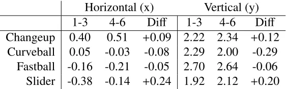
Horizontal (x) Vertical (y)
1-3 4-6 Diff 1-3 4-6 Diff
Changeup 0.40 0.51 +0.09 2.22 2.34 +0.12
Curveball 0.05 -0.03 -0.08 2.29 2.00 -0.29
Fastball -0.16 -0.21 -0.05 2.70 2.64 -0.06
Slider -0.38 -0.14 +0.24 1.92 2.12 +0.20
Table 2: The coordinates for the center of Clayton Kershaw’s intensity function for each pitch. The coordinates are measured in feet to match the axes in our
figures and the difference is found by subtracting the early innings from the middle
innings.
a drastic decrease in velocity for Clayton Kershaw. In fact in the middle innings there is only a 0.5 Miles Per Hour (MPH) drop in his average slider velocity and less that a 0.2 MPH drop on the rest of his pitches.
To help explain the change in Clayton Kershaw’s stats from the early to middle innings we use our intensity functions to track his location change. After fitting
the data from the early and middle innings separately we solved equation (5) for
each pitch to determine the center of the function for each pitch. The coordinates
for these centers are presented in Table 2 along with the difference between the
two time frames. The difference was taken as middle minus early time frame so
that positive values in the x-direction correspond to pitches further away from a RH batter and positive values in the y-direction correspond to pitches that are
higher in the air. From Table 2 we see that there are three differences that are
at least 0.17 feet which corresponds to just over 2 inches. The first is a drop of Clayton Kershaw’s curveball by 0.29ft. At first we might think that this drop in his curveball is an improvement in location, but looking at this change in reference
to the strike zone in Figure5is more revealing. In the 1-3 inning we see that the
vast majority of Clayton Kershaw’s curveballs were thrown in the strike zone as very little of the darker colored rings are located outside the strike zone. However in innings 4-6 his average location has dropped which pushes a fair amount of the darker colored rings below the bottom of the strike zone. Even if this is a deliberate change in strategy for Clayton Kershaw to try and induce more swings and misses on his curveball, the end result is that only 52% of 147 curveballs went for strikes in innings 4-6 compared to 62% of 108 curveballs in innings 1-3. This inability to create strikes with his curveball in the middle innings may be contributing to the higher walk rate in the middle innings.
The largest change in Table2comes from Clayton Kershaw’s slider. The slider
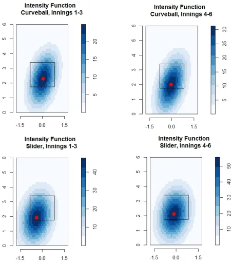
Figure 5: Intensity Functions of selected pitches for Clayton Kershaw with the center of the intensity function marked in red. The pitch type and inning grouping of the data is given in the label of each graphic.
has large movements in both directions moving 0.2ft higher and 0.24ft away from a RH hitter. Once again this movement is put in perspective by the intensity
functions in Figure5. From Figure5we see an early inning slider location down
and in to RH hitters. Since the slider is a breaking pitch that is breaking in towards a RH hitter, this pitch is likely used to jam batters inducing weak contact or to get batters to swing and miss. In the middle innings though this pitch typically higher in the strike zone and more over the middle of the plate making it easier for a RH batter to hit. This tendency for the slider to occur in a better hitting location may be a leading reason why Clayton Kershaw gets hit harder and gives up more runs in the middle innings. In fact we find that RH batters contact rate against Kershaw’s slider goes from 14% early on to 16% in the middle of the game. What is even more striking is that batters are not just making more contact on his slider, they are also making better contact. The batting average on balls put
in play offKershaw’s slider jumps from .294 in the early innings to .444 in the
the middle innings as opposed to only one home run in the early innings.
While the data for Clayton Kershaw shows a difference in the location in his
breaking pitches as he moves to the middle of the game, this experience is not the same for all major league pitchers. This can be shown in analyzing two other high profile pitchers, David Price and Justin Verlander. For both of these pitchers
we first confirmed that the log-quadratic model shown in (3) performed the best
for their data and then repeated the location analysis using our fitted intensity functions. Once again, for David Price we focus only on RH hitters since he is a LH pitcher like Clayton Kershaw, but for Justin Verlander we only focus on LH hitters since he is a RH pitcher.
Like Clayton Kershaw, David Price averaged nearly 7 innings per start in 2012. However his split-statistics and pitch locations do not seem to change as much when comparing the early innings to the middle innings. By just looking at the split-statistics over the innings grouping we see that David Price’s ERA rose from
2.61 to 2.84, his OPS rose from .580 to .649, and his BB/9 rose from 2.52 to 2.94.
These rising split-statistics provide some evidence of tiring but the changes are much smaller that what is seen in Clayton Kershaw. Price is similar to Kershaw though in the fact that his average velocity dropped by less that 0.3 MPH on all pitches except his cutter which dropped by 0.7 MPH. Looking at his location in
Table 3 we see that his consistency in his split-statistics may come from being
remarkably consistent in location. The only pitch that changes by more than 0.2ft is his cutter which moves up in the zone by 0.22ft. While his cutter is centered near the middle of the strike zone and this rise would make it easier for a RH batter to hit, David Price does not use his cutter all that often. In fact he threw a cutter just 12% of the time in the early innings and 13% of the time during the middle innings. Thus we feel that it is Price’s ability to consistently locate his pitches with consistent velocity that leads to split-statistics that show Price not tiring as the game moves to the middle innings.
Justin Verlander is an interesting case because his split-statistics seem to show him performing slightly better as the game moves from the early to middle in-nings. His ERA fell from 2.91 in the early innings to 2.49 in the middle inin-nings.
In addition his BB/9 fell from 2.45 to 2.12 while the opponents OPS rose only .007
from .616 to .623. These changes over the course of the game are unusual for a starting pitcher but those familiar with Justin Verlander will not find this at all
sur-prising. In fact this phenomenon has already been documented in Lemire(2012)
where he discusses how Verlander tries to pace himself so that he is stronger over
the course of the game instead of tiring. As pointed out in Lemire (2012), one
of the reasons for Verlander’s success later in the games comes from a distinct
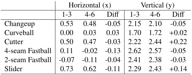
Horizontal (x) Vertical (y)
1-3 4-6 Diff 1-3 4-6 Diff
Changeup 0.53 0.48 -0.05 2.15 2.10 -0.05
Curveball 0.00 0.03 0.03 1.70 1.72 +0.02
Cutter 0.50 0.47 -0.03 2.22 2.44 +0.22
4-seam Fastball 0.11 -0.02 -0.13 2.62 2.57 -0.05
2-seam Fastball -0.07 -0.11 -0.04 2.41 2.38 -0.03
Slider 0.73 0.62 -0.11 2.29 2.43 +0.14
Table 3: The coordinates for the center of David Price’s intensity function for each pitch. The coordinates are measured in feet to match the axes in our figures and
the difference is found by subtracting the early innings from the middle innings.
crease in velocity. In 2012 versus LH batters all of his pitches except his changeup saw an increase in velocity from the early to the middle innings and his 2-seam and 4-seam fastball increased on average by 0.9 MPH and 1.0 MPH respectively.
What is not addressed in Lemire(2012) but can be highlighted by using spatial
point process modeling is that Justin Verlander is able to achieve this increase in velocity without changing his location. In fact it can be argued that the small
change that does occur makes the location of his pitches harder to hit. In Table4
we see only see large horizontal differences for his 2-seam fastball and his slider,
and large vertical differences in his curveball. The horizontal differences could be
due to the fact they are being measured on relatively small sample sizes. In fact in both inning breakdowns Justin Verlander threw his 2-seam fastball just 6% of the
time while throwing his slider just 3% of the time to LH batters. The difference
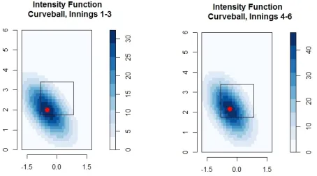
we focus on is the rise in his curveball by .17ft since he throws this pitch 13% of the time in the early innings and 18% of the time in the later innings to LH batters.
Figure6shows that this rise allows for more curveballs to be called strikes while
still keeping the majority of curveballs in a very difficult location for a LH batter to
Horizontal (x) Vertical (y)
1-3 4-6 Diff 1-3 4-6 Diff
CH -1.04 -0.96 +0.08 2.23 2.13 -0.10
CU -0.48 -0.37 +0.11 2.00 2.17 +0.17
FF -0.18 -0.27 -0.09 2.76 2.78 +0.02
FT -0.60 -0.29 +0.31 2.66 2.65 -0.01
SL -1.32 -0.51 +0.81 2.17 2.08 -0.09
Table 4: The coordinates for the center of Justin Verlander’s intensity function for each pitch. The coordinates are measured in feet to match the axes in our
figures and the difference is found by subtracting the early innings from the middle
innings.
Figure 6: Intensity Functions of Justin Verlander’s curveball with the center of the intensity function marked in red. The inning grouping of the data is given in the label of each graphic.
5
Discussion
From our analysis of Clayton Kershaw, David Price, and Justin Verlander during the 2012 season, it seems that marked point processes provide a useful framework
for analyzing PITCHf/x location data and characterizing pitchers’ behavior. First,
by fitting a marked point process pitcher profiles can be created with a smooth
surface for the different pitch types. This provides a graphical advantage over
traditional scatter plots as the smooth surface is able to better highlight location trends in the data. Additionally spatial point process methods provide a stan-dard error which helps quantify uncertainty. Second using a marked point process provides a parametric function which can be used in answering interesting
ball questions. We have shown how they can be used to characterize a pitcher’s trends as well as providing a framework for measuring the change in pitch location throughout the game.
In tracking the location of pitchers over the course of the game we found
interesting differences in three high profile pitchers. Clayton Kershaw shows what
we would expect from a typical pitcher, that is as we move to the middle innings his performing is less consistent. As expected this might be due to a physical tiring
effect, but we did not see a change in velocity to support this. Instead we saw a
change in the location of Clayton Kershaw’s breaking pitches that may explain his change in success. Particularly his curveball was thrown lower in the zone for less strikes while his slider was thrown more in the middle of the plate leading to more and better contact for RH hitters. However we found that all pitchers do not follow this same progression as David Price seems to be an example of consistency. Not only are his split-statistics and velocity barely changing when we compare the early and middle innings, but his location is also incredibly consistent. Finally, Justin Verlander shows a unique case where a pitcher seems to be getting better as the game goes on. While his increase in velocity over the course of the game is well documented, we were able to show that this velocity increase does not come at the expense of location. In fact it could be argued that his location is improved for his most frequently used breaking ball.
There are many extensions and possible future applications that arise from us-ing marked point process models to create intensity functions. The most obvious extension lies in the parametric modeling itself. In this paper we explored just one possible model space that included only the use of Poisson models to paramet-rically fit an intensity function. However there are other parametric models for
marked point process data, including Gibbs models and Strauss models (Gelfand
et al.,2010), that may provide more accurate estimates of the intensity functions. These other parametric models could be included in a larger model space and compared using AIC to see if there are better fits to the data. The other obvious extension is to analyze more pitchers than those presented in this paper. While all of our examples were best fit by log-quadratic intensity functions, fitting more
pitchers may require the use of different parametric models.
In considering our location analysis, it would be interesting to see the results of splitting the data into groups based on pitch count instead of by inning. Pitch count may be a better indicator of tiring as the number of pitches needed to get
out of an inning can be varied from start to start and across different pitchers.
tire. Finally if we looked at multiple years of data we could see if the tiring pattern is consistent from year to year and try to see if we could relate this to a pitchers conditioning.
Answers to other interesting baseball questions may come to light as we study
different aspects of the intensity functions themselves. Our focus to answer
loca-tion quesloca-tions was implemented through tracking the movement of the center of the intensity function. However it is possible that the shape and angle of the in-tensity function may also lead to new analysis. It seems that for breaking balls the shape of the intensity function seems to mirror the break of the pitch. Using this
idea to study the how the break effects the effectiveness of the pitch could be
an-other interesting avenue of research. We hope that the idea of fitting marked point process models to pitch location data can be used to extend the already exciting
work being done with the PITCHf/x dataset.
6
Acknowledgements
The authors thank three annonymous reviewers for their insightful comments and suggestions which served to strengthen the paper’s content and conclusion. We also wish to thank Luke Smith at North Carolina State University for his discus-sions regarding the direction of the paper’s overall question, as well as participants of the 2013 New England Symposium on Statistics in Sports for their interest and comments on the corresponding poster. Elizabeth Mannshardt was supported as a Post Doctoral Research Scholar through the National Science Foundation’s (NSF) Collaborative Research: RNMS Statistical Methods for Atmospheric and Oceanic Sciences under Grant No. DMS-1107046. Any opinions, findings, and conclu-sions or recommendations expressed in this material are those of the author(s) and do not necessarily reflect the views of the NSF.
References
Akaike, H. (1974): “A new look at the statistical model identification,”Automatic
Control, IEEE Transactions on, 19, 716 – 723.
Albert, J. (2010): “Baseball data at season, play-by-play, and pitch-by-pitch
lev-els,”Journal of Statistics Education, 18.
Baddeley, A. and R. Turner (2005): “Spatstat: an R package for analyzing spatial
point patterns,”Journal of Statistical Software, 12, 1–42.
Baumer, B. and D. Draghicescu (2010): “Mapping batter ability in baseball using spatial statistics techniques,” JSM, Statistics in Sports Section.
Brooks, D. (2012): “Yes, we actually classified every pitch,”Harball Times, URL
http://www.hardballtimes.com.
Brooks, D. (2013): “Brooks baseball,” URLhttp://brooksbaseball.net/.
Fast, M. (2010): “What the heck is pitchf/x?” Harball Times, Baseball Annual.
Fast, M. (2011): “Spinning yarn: The real strike zone, part 2,”Baseball
Prospec-tus, URLhttp://www.baseballprospectus.com.
Gelfand, A., P. J. Diggle, P. Guttorp, and M. Fuentes (2010): Spatial Statistics,
Chapman & Hall/CRC Handbooks of Modern Statistical Methods, CRC
Press-INC.
Lemire, J. (2012): “How justin verlander is defying conventional baseball
wis-dom,”Sports Illustrated, URLhttp://sportsillustrated.cnn.com.
Nathan, A. M. (2007): “Analysis of pitchf/x pitched baseball trajectories,” The
Physics of Baseball.
Pane, M. A., S. L. Ventura, R. C. Steorts, and A. Thomas (2013): “Trouble with the curve: Improving mlb pitch classification,” .
Schwarz, A. (2004): The numbers game: Baseball’s lifelong fascination with
statistics, Macmillan.
Sheather, S. J. and M. C. Jones (1991): “A reliable data-based bandwidth selection
method for kernel density estimation,”Journal of the Royal Statistical Society.
Slowinski, S. (2011): “Heat maps: What they show, and mistakes to avoid,” Fan-graphs, URLhttp://www.fangraphs.com.
7
Appendix
7.1
CSRI Methodology
To determine the pattern characterization of a marked point process is is typical to test for departures from complete spatial randomness and independence (CSRI). The first type of departure from CSRI for a marked point pattern is dependent components. To test for this type of departure the null hypothesis is that the
com-ponents are independent. That is each unmarked point pattern Xm is itself an
independent point processes. Tests for this hypothesis typically use a “bivariate” or “cross-type” distance function which are extensions of summary functions used
for univariate point processes (Gelfand et al.,2010). For our analysis we focus on
the bivariate K-function which is a function of the expected number of points of
type jwithin a given distance of a point of typei(Gelfand et al.,2010)
Ki j(r)=1/λj∗E[nj|r <ri]. (5)
Herer corresponds to the distance between two points andλj is the intensity for
the sub-patterns of points with type j. Additionally nj is the number of points
that are of type j and ri is a distance to a typical point of type i. This function
is determined by second moment properties of the process and under the null
hypothesis of component independence takes the valueKi j =πr2.
To test the null hypothesis of independent components Monte Carlo methods
are used. In these methods we simulate different patterns from the data as random
shifts of the sub-patterns from a single type of mark. Thus our simulated data follows the null hypothesis of independent components and we can use it to create an envelope of expected values of the bivariate K-function under the null
hypoth-esis. If the observedKi jfunction from the data lies inside this envelope, we fail to
reject the null hypothesis of independent components.
The second type of departure from CSRI is non-random labeling. This means that given that the locations are fixed, the marks in the observed point process are not conditionally independent and identically distributed. For baseball pitch data this speaks to whether or not the location of the pitch has any relationship with the pitch type. To test for this departure we use the null hypothesis that the marks are conditionally independent and identically distributed given that the locations
of the overall process (X) are fixed. Again Monte Carlo methods can be used to
test this null hypothesis, but now we will need to use the difference between an “i
to any” distance summary, and the distance summary itself (Baddeley and Turner,
Baddeley and Turner(2005) as
J(r)= 1−G(r)
1−F(r) (6)
whereF(r) is the cumulative distribution function of the empty space distance and
G(r) is the cumulative distribution function of the nearest neighbor differences.
The “ito any” generalization of this distance function is defined as
Ji•(r)=
1−Gi•(r)
1−F(r) (7)
where Gi•(r) is the distribution function of the distance to the nearest point of
any other type (Gelfand et al., 2010). Thus to test the null hypothesis of random
labeling we used the test statistic Ji•(r)−J(r), which should equal zero under the
null hypothesis of random labeling. Once again Monte Carlo methods are used to create an envelope assuming the null hypothesis of random labeling. Specifically this is done by holding the observed locations fixed, re-sampling the marks, and
computing the test statistic. If the test statistic, Ji•(r)−J(r), for the observed data
lies inside this envelope we fail to reject the null hypothesis of random labeling.
Another way to explore the interaction between points of different marks is to
observe the marked connection functions. Gelfand et al. (2010) describes these
functions as pairwise estimates of conditional probability such that
pi j(r)= P u,v
{m(u)=i,m(v)= j}. (8)
Here pi j is the conditional probability that given points at locations uand v, the
marks at these points will beiand jrespectively. ThusPu,vstands for the second
order conditional probability function andm(u) and m(v) are the marks attached
to the locationsuandv. The graph of the function pi jcan then be used to help us
identify the association between two different mark types. If the observed
condi-tional probabilities for two different pitch types are lower than what is expected
under random labeling, then points that are close together are likely of the same
type. As Gelfand et al. (2010) notes that while this could be termed negative
association, it is not conclusive evidence for dependence since there are likely associations between marks of the same type as well.
7.2
Testing for CSRI
Before modeling the intensity function we first determine if the data is CSRI. Thus we test both the independence of components hypothesis and the random labeling
hypothesis. In all of our analyses we use 39 Monte Carlo simulations to create an envelope which corresponds to the critical values for testing the null hypothesis. The number of simulations was chosen to be the smallest number of simulations
that provide a 5% significance level for the two-sided significant test Baddeley
and Turner(2005). Note that in our graphs the envelope is not a 95% confidence interval around the given function but instead is a point-wise representation of the critical values for testing the null hypothesis.
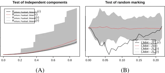
Our first step is to test the independence of components hypothesis using the
K-function discussed in Equation (5). In all of our analyses for all pairs of pitch
types the K-function for our data fell within the Monte Carlo simulated envelope
as seen in Figure 7A. Thus for our data on Clayton Kershaw’s pitches we failed
to reject the null hypothesis of independence of components and we assume that each pitch type follows its own independent point process. This is consistent with
the baseball theory that a pitcher may throw his different pitch types with various
frequencies in different locations. That is, a pitcher has his own preference as to
where and how often he throws each pitch type.
In our test of the random labeling hypothesis we use the test statistic given in
Equation (7). From Figure7B we see that the test statistic for our data lay outside
the simulated envelope for at least some range. While Figure7B only gives the
0.0 0.2 0.4 0.6 0.8 Test of Independent components
r Kinhom, Fastball, Sliderobs(r) Kinhom, Fastball, Slider(r) Kinhom, Fastball, Sliderhi(r) Kinhom, Fastball, Sliderlo(r)
0.00 0.05 0.10 0.15 0.20
Test of random marking
r
(Jidot−J)obs(r) (Jidot−J)(r) (Jidot−J)hi(r) (Jidot−J)lo(r)
(A) (B)
Figure 7: Examples of the tests for the independent components hypothesis which is not rejected (A) and the random labeling hypothesis which is rejected (B). The graphic in (A) compares Clayton Kershaw’s fastball and slider for independent components while (B) shows the test for random labeling of Clayton Kershaw’s fastball.