ABSTRACT
DENNIS, BRENT MOORMAN. Assisted Navigation of Large Information Spaces. (Un-der the direction of Dr. Christopher G. Healey)
With the advent of computers and more sophisticated electronics, scientists can now collect
massive amounts of information. The increasing size and dimensionality of these datasets
makes them challenging to visualize in an effective manner. Visualizations must show the
global structure of spatial relationships within the dataset while simultaneously representing
the local detail of each data element being visualized. Techniques in information visualization
provide views of the dataset at multiple scales allowing the user to visualize large numbers of
data elements. Unfortunately, these techniques often do not address the problems of visualizing
multidimensional datasets. Multidimensional visualizations use color, texture, and other visual
features to represent the values of multiple attributes at a single spatial location. However,
these techniques do not address how to visualize large numbers of data elements.
Visualizations of datasets with large sizes and high dimensionalities are often forced to
omit data elements from the current view. This thesis proposes to combine ideas from
infor-mation and multidimensional visualization with a navigation assistant to help users identify
and explore areas of interest within their data. The assistant identifies data elements that are
potentially ”interesting” to the user, clusters them into spatially coherent regions, and
con-structs underlying graph structures to connect the regions and the elements they contain. Using
graph traversal algorithms, optimal viewpoint construction, and camera planning techniques,
Assisted Navigation of Large Information Spaces
by
BRENT M. DENNIS
A thesis submitted to the Graduate Faculty of North Carolina State University
in partial fulfillment of the requirements for the Degree of
Master of Science
Department of COMPUTER SCIENCE
Raleigh, North Carolina
2002
BIOGRAPHY
Brent Moorman Dennis was born July 4, 1976 in Atlanta, Georgia. In 1998, he received
his Bachelor of Science degree in Mathematics with a concentration in Computer Science
from Davidson College, Davidson, North Carolina. After spending a year at the University
of North Carolina at Charlotte furthering his education in computer science, Brent entered
the Computer Science graduate program at North Carolina State University. On October 9,
2002, he successfully completed his oral preliminaries for his Master of Science degree and
will graduate in December. Brent plans to continue his academic studies with the pursuit of a
ACKNOWLEDGEMENTS
There are many people to whom I owe many thanks that have contributed to the completion
of this thesis. First, I would like to thank my committee members, Dr. Christopher Healey, Dr.
Carla Savage, and Dr. Robert St. Amant, for the time and effort they devoted to my thesis.
A special thanks goes to Dr. Healey, my advisor and committee chair, whose critiques, high
standards, advice, and support ensured I wrote a thesis to the best of my ability.
There are a number of my peers I also need to thank. A special thanks goes to Laura
who shared the same thesis-writing adventure with me. She brought welcome advice and
assistance throughout the creation of this thesis. Many thanks go to Sarat whose ideas and
insight contributed to this thesis, even at the late hours of the day. Thanks also go to the rest
of my research group, Mike, Amit, and Vivek, who have all supported me during my time at
NCSU.
Finally, I want to thank my parents and family for their unwavering encouragement and
strong faith in my abilities. Their support has been instrumental to the completion of my
Contents
List of Figures vi
1 Introduction 1
2 Navigation 6
2.1 Virtual Worlds . . . 7
2.2 Cognitive Maps . . . 8
2.3 Supporting Cognitive Maps and Wayfinding . . . 10
2.4 General Frameworks for Navigation . . . 13
3 Visualization 16 3.1 Information Visualization . . . 17
3.1.1 Overview+Detail . . . 18
3.1.2 Focus+Context . . . 20
3.2 Multidimensional Visualization . . . 25
3.3 Summary . . . 31
4 Areas of Interest 33 4.1 Identifying EOIs . . . 34
4.2 Areas of Interest . . . 35
4.3 Constructing Areas of Interest . . . 37
4.3.1 Proximity . . . 38
4.3.2 Population . . . 39
4.3.3 Area . . . 39
5 Graphs of the Navigation Framework 41 5.1 Discussion of Relevant Graph Theory . . . 42
5.2 Voronoi Diagrams and Delaunay Triangulations . . . 43
5.3 Euclidean Minimum Spanning Tree . . . 45
6.1.2 Hamiltonian Graphs and the Traveling Salesman Problem . . . 52
6.2 Optimal Viewpoints . . . 55
6.3 Camera Path . . . 59
6.3.1 Quality Cinematic Shots . . . 60
6.3.2 The Camera Path and Spline Curves . . . 61
6.3.3 Maintaining Effective Exploration and Preserving Quality Shots . . . . 64
6.3.4 User Control . . . 65
7 Practical Applications 66
8 Conclusions and Future Work 74
List of Figures
2.1 Model of a navigation framework . . . 13
2.2 Revised model of navigation framework . . . 14
3.1 Example of a tree-map . . . 21
3.2 Example of perspective wall and cone tree . . . 22
3.3 Example of the hyperbolic browser . . . 24
3.4 Predator-Prey Model . . . 26
3.5 Examples of preattentive processing . . . 28
3.6 Examples of texture elements . . . 30
4.1 Forming a cluster using convex hull algorithm . . . 38
4.2 Examples of clusters formed with varying parameters . . . 40
5.1 Voronoi diagram and Delaunay triangulation of a set of points . . . 44
5.2 Example of a Euclidean minimum spanning tree . . . 46
6.1 Shortest path search using Dijkstra’s algorithm . . . 51
6.2 Approximation of minimal cost Hamiltonian cycle . . . 54
6.3 Construction of constraint buffers . . . 57
6.4 Optimal viewpoints and a camera path . . . 59
6.5 Natural spline curve . . . 63
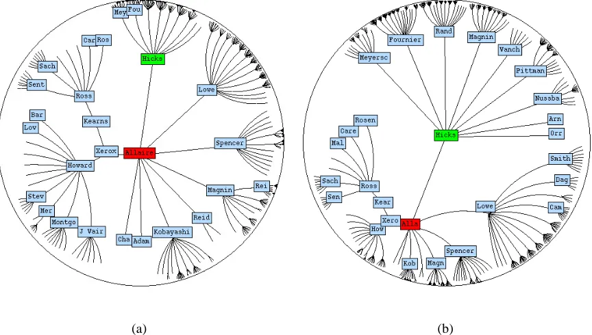
7.1 Visualization using pexels . . . 68
7.2 AOIs in a visualization . . . 70
7.3 Example of an AOI tour . . . 71
7.4 Example of a shortest path tour in an AOI . . . 72
Chapter 1
Introduction
”Science is best defined as a careful, disciplined, logical search for knowledge
about any and all aspects of the universe, obtained by examination of the best
avail-able evidence and always subject to correction and improvement upon discovery
of better evidence.” James Randi
With the advent of computers, scientists can now collect massive amounts of information.
The volume of data currently being stored has reached a size that was unheard of only a few
years ago. The analysis of large, complicated information spaces is an important challenge
faced by the scientific community. Research is now focused on how to harness the power
of computers to manage this data. Constructing visual representations (or visualizations) of
a dataset is one technique with great potential. Effective visualizations can show both the
local, detailed information represented by individual data elements and the global structure of
amounts of information. The goal of these efforts is to confirm existing hypotheses and to
discover entirely new properties embedded within the data.
Visualization is relevant to many scientific areas such as medicine, engineering, earth
sci-ences, and molecular biology [GFG+94]. The importance of visualization was first proposed in
a 1987 NSF report [MDB87]. Panelists noted that the human brain cannot efficiently interpret
large collections of data when presented in an exclusively numerical format. They suggested
that visualization offers a key alternative method to examine these types of datasets. “The
abil-ity of scientists to visualize complex computations and simulations is absolutely essential to
insure the integrity of analyses, to provoke insights, and to communicate those insights with
others” [MDB87].
Formally, a dataset D is composed of a finite set of data elements ei, D = {e1, ..., en}, wheren is the size ofD. The dataset represents a set of attributes A = {A1, ..., Am}, where
m is the dimensionality ofD. Every ei inDencodes a value for each attribute, that is, ei =
{ai,1, ..., ai,m}.
An effective visualization should meet two fundamental criteria. First, a representation
must be generated that will accurately depict the attribute values at each data element’s spatial
location. Second, the representation must allow a user to view the data at multiple scales, and
to efficiently explore at each of these scales.
Constructing visualizations that satisfy the above criteria is a challenging problem due in
large part to the size and dimensionality of a typical dataset. Traditional displays represent data
To handle a dataset with m > 2, techniques are needed to encode higher dimensional data
into the plane. A second problem is visualizing large numbers of data elements. The size and
resolution of a computer screen impose a hard limit on the amount of information that can be
shown in a single display. As a result, some information may be forced offscreen to provide an
adequate local view of the data. Successfully managing offscreen information is a fundamental
problem in visualization.
Research in multidimensional visualization focuses on the first problem. These techniques
attempt to display multiple attribute values simultaneously in a single image by combining
multiple visual features (e.g. color and texture) to represent the attributes. However, these
methods do not explicitly consider the number of data elements to visualize. If offscreen
infor-mation exists, the techniques normally assume a fully-manual navigation system controlled by
the user (e.g. simple translation and rotation of the view position).
Techniques from information visualization address the second problem by visualizing the
dataset at multiple scales. By compressing certain parts of the display, they allow the
visual-ization of additional data elements. Typically, there exists a user-chosen local view to provide
detailed information and a global overview to provide global context about the dataset.
Unfor-tunately, most of these techniques are not designed to visualize multidimensional data.
More-over, although they can significantly increase the number of data elements being visualized,
they can still be overwhelmed by very large datasets.
Existing techniques from both multidimensional and information visualization offer only
and display these regions of interest is critical to the exploration process. The more effort users
expend searching the dataset, the less effort they may devote to analyzing it. Helping to identify
the structure and location of areas of interest can greatly reduce the burden of navigating the
dataset. This will dramatically increase the efficiency of the user’s exploration process.
By combining techniques from multidimensional visualization and information
visualiza-tion with a navigavisualiza-tion assistant, we hope to create a system that allows researchers to easily
locate and analyze areas of interest within a dataset. The navigation assistant is a software
agent that aids users by identifying “interesting” data elements, structuring them into coherent
regions, and reporting their locations. By revealing spatial relationships between individual
elements and the regions they form, users can locate and explore within those regions more
effectively. Therefore, they can focus more time on the exploration of their data and less on
making correct navigation decisions.
In our system, users describe the properties of the data that classify an element as
inter-esting. This is done with simple boolean and mathematical rules. Once elements of interest
are identified, they are assigned to areas of interest using clustering techniques. Within each
area of interest, a graph is built to provide local navigation assistance. The local graphs are
connected to a global network to provide high-level navigation assistance between different
areas of interest. Users can ask the assistant to automatically manipulate their viewpoint to aid
with a variety of navigation tasks, such as moving to a nearby area of interest and viewing the
data elements it contains. Automated tours are built using the graph framework, graph
users maintain full control of the camera, choosing to halt (or initiate) automated tours or to
manually navigate to any location in the data.
The remainder of this thesis is structured as follows. Chapter 2 discusses research
con-ducted in the area of navigation. Chapter 3 describes systems in both multidimensional and
information visualization. Chapter 4 explains how areas of interests are formed. Chapter 5
details the construction of the graph components of the framework. Chapter 6 defines how the
framework is used for assisted navigation. Chapter 7 describes a practical application of the
Chapter 2
Navigation
With the advances in computer graphics and computer processing power, scientists and
engi-neers are now able to create large virtual worlds. As virtual worlds increase in both size and
application scope, users must contend with the problem of visualizing and navigating within
those virtual spaces. “Becoming lost” in virtual worlds has been identified as a serious
hin-drance to users [DMR90]. Visualizations are a type of virtual world. They emulate the
phys-ical world by converting a dataset into a virtual environment of objects (data elements) each
assigned to a relative position. Users can change their location within the world and interact
with its objects. Therefore, reviewing research in navigating virtual worlds will be useful for
understanding how to effectively navigate a visualization.
Navigation within a virtual world or information space is a growing area of research in
information and computer science. Navigation is a basic human process that we perform
navigate the physical world. Researchers have discovered that effective techniques for
navigat-ing the physical world may not always apply to a virtual world. This consequence has led to
investigations about how humans perform successful navigation tasks. Discovering the
under-lying foundations of human navigation might provide researchers with information on how to
successfully support navigation within a virtual world.
2.1
Virtual Worlds
Virtual worlds can be subdivided into two main categories: discrete and continuous [Mod97].
Discrete environments are typically document-based hypermedia, such as the World Wide Web
or a document database. Continuous environments often use a spatial model that simulates the
physical world. Virtual reality systems or a satellite image display are examples of a
contin-uous information space. Discrete spaces “take advantage of well-developed human skills in
organizing and classifying information,” while continuous spaces use “well-developed human
cognitive and neuro-motor skills for dealing with the physical world” [Mod97].
Darken further classifies virtual worlds using three attributes: size, density, and activity
[DS93]. He describes a world as small if it can be mostly viewed from a single viewpoint such
that all pertinent and important distinctions between objects are discernible. As motivation for
his definition, Darken uses Kuipers and Levitt’s definition of a large world, “a space whose
structure is at a significantly larger scale than the observations available at an instant”[KL88].
If no vantage point exists from which the entire world can be viewed in detail, Darken classifies
environ-mental objects. Sparse worlds have large amounts of open space between objects, while dense
worlds have relatively large numbers of objects and much less open space within the
environ-ment. Activity refers to whether or not objects change within the environenviron-ment. Static worlds
contain objects that do not change in appearance or position over time. Dynamic worlds can
be much more complex since objects have the potential to change in appearance and position.
2.2
Cognitive Maps
Psychologists are very interested in discovering and understanding the cognitive structures
humans use for navigation. Tolman first proposed the concept of cognitive maps for
naviga-tion tasks [Tol48]. Cognitive maps, or mental maps, are a crucial tool used by humans for
navigation. During navigation tasks, cognitive maps are critical for storing and using
envi-ronmental information. Tolman built his theory on the results of experiments conducted with
rats in mazes. He discovered that the rats acquired a “field map of the environment” based on
knowledge gained during the process of learning [Tol48]. He further described this knowledge
as “a cognitive-like map of the environment . . . indicating routes and paths and environmental
relationships” [Tol48].
Experts have been unable to determine if cognitive maps are analog (continuous) or
propo-sitional (discrete). Stevens and Coupe conducted a set of directional experiments whose results
support human storage of environmental knowledge in a discrete hierarchical representation
loca-accurately store navigation information in an analog fashion. The authors state it is not
effi-cient for humans to store every possible spatial relationship in their long-term memory, making
hierarchical representations ideal for both the storage and retrieval processes [SP73].
Downs and Stea proposed an entirely different model. They suggest cognitive maps are
stored in an analog representation [DS73]. Downs and Stea believe that humans use
loca-tional information, composed of distance and direction, and attributive information, composed
of description and evaluation, to build a diversified group of “signatures” [DS73]. Signatures
are sets of coding and decoding operations performed by humans. Signatures resemble
carto-graphic maps, linguistic information, and other kinds of visual imagery. Noting human
limi-tations on information storage, Downs and Stea acknowledged that “cognitive maps are
com-plex, highly selective, abstract, generalized representations in various forms . . . incomplete,
distorted, schematized, and augmented, and we [found] that both group similarities and
indi-vidual differences exist” [DS73].
Thorndyke and Hayes-Roth also support an analog representation of mental maps [THR82].
They proposed that humans acquire special types of spatial knowledge from maps and the
navigation process. Route (or procedural) knowledge stores procedures used to move through
an environment, while survey knowledge stores properties of an environment’s topography. As
navigators gain more experience in an environment, they tend to transform route knowledge
into survey knowledge. Research shows different individuals favor using either route or survey
knowledge [Pas84]. Another type of spatial knowledge was presented by McKnight [MDR93],
types of spatial knowledge are key resources for successful navigation.
2.3
Supporting Cognitive Maps and Wayfinding
Within an environment, certain objects or combinations of objects possess properties that can
have a large influence on a mental map. Lynch proposed a set of structural design principles
that can improve the function of mental maps by increasing the imageability of the environment
[Lyn60]. Lynch defines imageability as
“ . . . that quality in a physical object which gives it a high probability of evoking a
strong image in any given observer. It is that shape, color, or arrangement which
facilitates the making of vividly identified, powerfully structured, highly useful
mental images of the environment” [Lyn60].
Lynch defined five structural components that improve the imageability of an environment.
1. Edges: linear borders between two areas.
2. Paths: conduits of movement, considered to be the most essential of the five elements.
3. Districts: two-dimensional regions of an environment which have distinguishing
char-acteristics from each other. Observers may mentally enter and leave a district.
4. Nodes: similar to districts, except they are much smaller and occur in vital, important
Well-designed environments should integrate these components into a concrete underlying
structure to afford the creation of better mental maps. While Lynch’s work dealt with city
plan-ning, his concepts have strong potential for application to virtual worlds. The use of Lynch’s
ideas in virtual worlds has been studied in [CIP96, DS96, IB95, Mod97, Shu90].
Passini defined wayfinding by expanding on Lynch’s ideas. He claims wayfinding is
com-posed of three iterative processes [Pas84]:
1. Build a cognitive map and collect information (temporal, locational, and descriptive) to
better understand the environment.
2. Build a plan of actions to take within the environment based on the information that has
been gathered.
3. Perform the planned actions within the environment.
Passini proposed a set of design components derived by the revision of Lynch’s imageability
design elements. Passini’s three design elements that support effective wayfinding are:
1. Create an organizational principle that promotes imageability and supports efficient
cog-nitive processing.
2. Create a spatial enclosure which supports both memorability as well as contextual and
structural inferences.
3. Create a spatial correspondence between important environmental properties and
Darken and Sibert explored how humans use the wayfinding process. They classified
wayfinding tasks into three different categories [DS96]:
1. Naive search: a searching task in which the navigator has no presumptive information
on the target’s location.
2. Primed search: a non-exhaustive searching task in which the navigator knows the target’s
location.
3. Exploration: any type of wayfinding task in which there is no pre-defined target.
These classes are mutually exclusive, but practical wayfinding tasks are typically sequences
of the above searches. For example, a navigator could have a general idea of where a target
might be located, but its specific location is unknown. Therefore, a navigator may take a
primed search to the general area of the target, and then perform a naive search of the target’s
neighborhood [DS96]. Naive searches can be much more common in virtual worlds than they
are in the physical world, since first-time explorers of a virtual world may lack adequate route
and survey knowledge of the environment.
The authors say that an environment must support both exhaustive (naive) and non-exhaustive
(primed) searches. Most importantly, wayfinding should support the acquisition of survey
knowledge. While naive and primed searches attempt to locate a specific target, the goal of
ex-ploration is to gather survey knowledge of the environment. Therefore, a good wayfinding
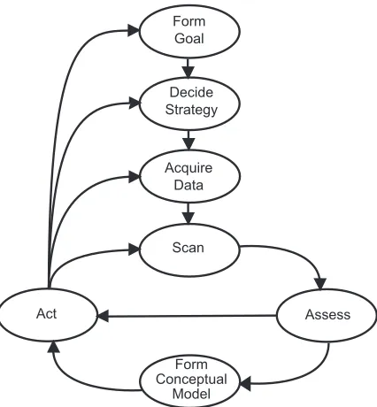
Decide Strategy
Acquire Data Form Goal
Scan
Act Assess
Form Conceptual
Model
Figure 2.1: A general navigation framework model.
principles for the support of wayfinding that follow Passini’s elements [DS96]:
1. Divide the world into distinctive regions while preserving a sense of place.
2. Organize the regions under a simple organizational principle.
3. Provide frequent directional cues.
2.4
General Frameworks for Navigation
Darken defined navigation as the composition of wayfinding and locomotion [JF97].
Environ-mental features that support an effective framework for wayfinding in a virtual world have been
described above. General framework models for navigation are often composed of wayfinding
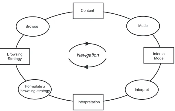
Navigation
Model Browse
Browsing Strategy
Formulate a browsing strategy
Internal Model
Interpret
Interpretation Content
Figure 2.2: Spence’s revised navigation framework model.
At the same workshop, Spence proposed his general framework for navigation (Figure 2.1)
[JF97]. With this framework, the navigator’s goal is influential to the development of the
appropriate navigation strategy. The navigator gathers a collection of data to help perform the
appropriate navigation task, for example, reading a map, querying a search engine, or accessing
some other external source. The navigator then scans the environment and makes an assessment
as to whether his expectations are met and if he is closer to achieving his goal. This assessment
contributes to the modification of the navigator’s cognitive map of the environment. The
as-sessment also influences the action, locomotive or cognitive, taken by the navigator. Possible
actions are very diverse. The action might be either locomotive, e.g. backtracking or turning
right, or cognitive, e.g. modifying the navigation strategy or collecting more environmental
information. The navigator could also abandon the current goal and begin the construction of
a new goal.
is composed of four cognitive activities: browsing, modeling, interpreting, and formulating the
browsing strategy. When performed in sequence, these activities constitute the process of
navigation. The result of each activity influences the execution of the next. Spence describes
the browsing process as the “registration of content” [Spe99]. Information is gathered but not
yet integrated into any type of internal environmental representation. The subsequent stage
performs the integration of information into the users’ cognitive maps. The cognitive map is
the users’ mental model of the environment. Users rely on their model and the display of the
data to develop an interpretation of the environment. Interpretations influence the formation
of subsequent browsing strategies. For example, if the interpretation is that the user is in the
neighborhood of a target, the strategy might change from a general scan of the data to a detailed
inspection of a small region in the data. The cognitive map also influences the building and
execution of a browsing strategy. Spence points out that existing internal models can influence
the construction of the cognitive map of the navigation space and the development of browsing
Chapter 3
Visualization
The advancement of graphics technology has enabled the presentation of scientific data to
evolve from simple graphs, scatter-plots, and tabular forms to more complex graphical
rep-resentations. These representations can allow scientists to more easily interpret information
and relationships from their data than if they were only studying a table of empirical numbers.
Likewise, the increase of the amount of data that can be stored electronically has allowed the
creation of huge databases and virtual libraries that can be accessed from a single graphical
display. Electronic storage of information is more space and time efficient than conventional
paper mediums making it ideal to archive today’s vast quantities of data. However, locating
and accessing this information is not a trivial task. Users need navigation tools to locate
infor-mation and translation tools to convert the data from 1’s and 0’s to a format users can efficiently
interpret. Visualization attempts to find solutions to these problems.
computer-supported, interactive, visual representations of data to amplify cognition” [CMS99].
Cogni-tion can be defined as the acquisiCogni-tion and use of knowledge. Expanding cogniCogni-tion increases
the ability of users to perform discovery, decision-making, and explanation. These cognitive
activities can provide users with extended insight into a dataset.
The concept of visualization formally began with an NSF report in 1987. This report
en-visioned visualization as a tool that allowed the handling of large sets of data in order to aid
scientists with gaining insight and observing underlying trends and relationships within the
datasets [MDB87]. Visualization techniques are sometimes divided into two different
cate-gories: scientific visualization and information visualization. Scientific visualizations are built
to display physically based data that possesses some form of inherent geometry. Information
visualization attempts to display non-physically based, or abstract, data forms.
Below is a discussion of several visualization systems that have been built to address
sci-entific or abstract data. Given the previous discussion of how the dimensionality of modern
datasets continues to grow, we will focus on multidimensional scientific visualization
tech-niques.
3.1
Information Visualization
Some information visualization systems attempt to fit large amounts of information on a
sin-gle screen. One group of techniques designed around this goal are the focus+context and
overview+detail algorithms. overview+detail presents users with a global overview of a dataset,
presents users with global contextual information along with ways to focus on local areas to
collect more detailed information. Many information visualization systems may fit into either
of these broad categories.
3.1.1
Overview+Detail
While not a requirement, overview+detail algorithms typically provide a user with multiple,
separate views of the data. Each view presents the dataset to the user at a different scale or view.
One of the critical scales is the overview. An overview “reduces search, allows the detection
of overall patterns, and aids the user in choosing the next move” [CMS99]. However, users
also need to be able to rapidly access detailed information about local areas of the dataset.
Therefore, a detail view should also be provided. Multiple views can be presented in two
ways: one at a time (time multiplexing) or simultaneously in different sections of the screen
(space multiplexing) [CMS99]. Multiple views occupying the same screen requires additional
screen area, forcing space-multiplexing algorithms to make calculated trade-offs with the use of
available display space. A variety of overview+detail systems have been built [Shn92, KPS97,
BH94, PMR+96, MF95].
Plaisant et al used overview+detail techniques to construct a tool to visualize medical and
court documents called LifeLines [PMR+96]. Their system presents a medical or court
profes-sional with an overview screen of a personal record. For the period of time a record represents,
the system uses color-coded facets to symbolize time periods in the subject’s life (e.g. open
arrests or doctor’s appointments. The information is presented below a time-line which marks
units of time (e.g. days, months, or years) with vertical bars. Dividing the display area into
time blocks supplies the user with a sense of the scale within the overview and allows the user
to better understand the context of events. For large records occurring over lengthy time
peri-ods, LifeLines condenses the facets and reduces the width of the blocks of time. Also LifeLines
drops off less important information, such as labels and tag-names for the facets and icons.
Since low-level detail can be lost with large files, the authors propose two methods for
retriev-ing it. If enough screen space is available, LifeLines will use multiple screens to display an
overview and a number of detailed views. If only one view is allowed, LifeLines enables users
to zoom in to areas by clicking on a location of the display, thus revealing facet thickness,
labels, and other details. This process is known as semantic zooming and was first presented
by Bederson [BH94].
Semantic zooming occurs when the content remains constant while the representation of
that content changes. Bederson proposed that at zoomed-in scales, details of an object should
be available to the user. However, zoomed-out views might be more effective if an object takes
on a representation different than the traditional scaled-down view [BH94]. Bederson
imple-ments this concept with Pad++ [BH94, Bed95]. Pad++ is a zooming interface that supports
colored text, text files, hypertext, graphics, and images. Users are able to define distinct
repre-sentations for the above objects at different scales. Pad++ was used to visualize a file system.
At the top level, the user is presented with square frames for directories. As zooming occurs,
replaced by a representation of the contents of the file, for example the hypertext of an HTML
file. Furnas used space-scale diagrams to help build different representations of the same object
at different scales for semantic zooming [FB95].
The tree-map is another well-known overview+detail system (Figure 3.1)[Shn92]. The
tree-map decomposes a dataset into a rectangular image. This image contains individual
re-gions which are hierarchically partitioned, usually into rectangles, based on the different
at-tributes of the data. The tree-map can display high levels of detail by zooming into regions in
which the user is interested. By clicking on the display, the appropriate region is expanded,
re-placing the overview display and revealing more high-level details. Shneiderman also uses the
tree-map to view the contents of a file system. The application of tree-maps has been studied
in other areas, including software engineering and tournament monitoring [JB97, BE94].
3.1.2
Focus+Context
Another technique that researchers use in information visualization is focus+context. Like
overview+detail, focus+context provides users with both global overview information
(con-text) and local detail (focus) information. However, focus+context techniques often try to
present both types of information in a single display. This design aspect is based on an
as-sumption that the user requires both overview and detail information simultaneously. However,
information needed from an overview might be different than information needed from a focus
view. This condition allows focus+context techniques to selectively reduce information from
(a) (b)
Figure 3.2: (a) shows a perspective wall with a central focus view and two overviews that are warped to smoothly unify the three different displays. (b) shows a cone tree with shadows added to assist a viewer in understanding the structure of the cone tree.
resources to correspond to the interest of the user’s attention [CMS99].
The bifocal display is an early focus+context technique that explicitly provides the user
with a focus and contextual display [SA82]. This system presented the user with a single
focus view flanked by two overview displays. However, this system did not seamlessly unify
the contextual views into the focus display, thus providing no assistance for integrating the
different scales of information. The perspective wall was designed to smoothly unify the focus
view with contextual views (Figure 3.2a) [MRC91]. By warping the overview displays, this
system assists users with the integration of focus and contextual information.
The cone tree uses depth and perspective projection to visualize hierarchical data (Figure
3.2b) [RMC91]. Cone trees lay out hierarchical data in three dimensional space. A level’s
root is placed at the apex of a cone while the nodes are evenly distributed along the cone’s
base. The cones’ heights are uniform from level to level, while the radius of a cone’s base will
users to visualize information that would otherwise be occluded from their view. The cone
tree supports interactive controls that allow a user to bring components into or out of focus.
Specifically, the user can perform pruning or growing operations that increase or reduce the
amount of information in the display.
Cone trees harnessed properties of perspective projection in Euclidean geometry. Instead
of Euclidean geometry, the hyperbolic tree uses properties of hyperbolic geometry to visualize
additional information. In Euclidean geometry, for a given pointpand linel, there exists only
one line passing throughpthat is parallel tol. In hyperbolic space, there exists multiple parallel
lines that diverge from each other. When a hyperbolic plane is placed within a Euclidean two
dimensional circular disc, the size of components will contract as the distance from the center
of the circle increases. Also, there is an exponential growth in the number of available display
regions, although with a corresponding reduction in each region’s size. If used to visualize a
tree, the hyperbolic browser can fit a large number of nodes near the circumference of the disc.
As nodes are moved to the center of the disc, more display space becomes available allowing
the presentation of detailed information for a node.
The hyperbolic browser uses properties of hyperbolic space to visualize a dataset in a
“fish-eye” display. A fisheye view provides local detail at the center of the view. As one moves
outwards, the view will fade to mostly contextual information. Often, the local detail fades
rapidly as one moves away from the center. As a result, a fisheye succeeds as a powerful
fo-cus+context tool that can provide both contextual and detailed information of a dataset in a
visualiza-(a) (b)
Figure 3.3: A hyperbolic browser is shown in (a). (b) shows how a node is moved out of focus and new node is brought in to focus.
tion [Fur81, Fur86]. He proposed the use of a Degree of Interest, or DOI, metric to determine
the amount of detailed information to display for a given component. The DOI metric is a
function of a distance and a Level of Detail, LOD, function. Distance is a value representing
a system dependent length between a given component and a focus point. For every
compo-nent, the LOD provides a measure of that component’s importance, particularly to the global
structure. Customized fisheye views can be built for a dataset and a user’s goals by defining
the appropriate DOI, distance, and LOD functions. Fisheye views have been used in a variety
of document viewers [BHDH95, RM92, RC94, SSTR93]. Sarkar and Brown extended
Fur-nas’ general fisheye concepts to include consideration of the layout of the content of a dataset
3.2
Multidimensional Visualization
Information visualization techniques try to resolve the complications of visualizing a large
number of data elements. What happens when each data element represents more than one data
attribute? Refining a multidimensional dataset into individual displays representing individual
attribute values can be counterproductive to understanding the data. The goal of
multidimen-sional visualization is to find an effective visual summary of datasets withm >1so that users
can find important relationships among the attributes. [WB97].
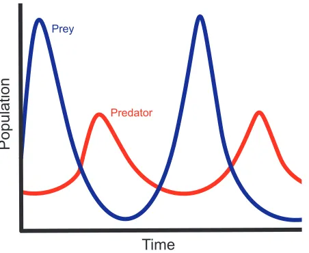
A simple example is the well-known biology model of the predator-prey relationship. A
biologist builds a mathematical model and uses it to generate D. For this particular D, A is
composed of three attributes, time, prey population, and predator population. The biologist
constructs two graphs, one representing time versus predator population and the other time
versus prey population (Figure 3.4). Both graphs are placed in the same display, one on top of
the other. Immediately, the biologist can observe how his model suggests the strong
interde-pendency between predator and prey populations.
Building and comparing scatter plots and curves is one of the earliest forms of visualizing
multidimensional data. However, as the number of attributes grows, such composite images can
become too congested. This can prevent researchers from detecting features and relationships
within their data. The HyperSlice and hyperbox techniques attempt to relieve this congestion
by segregating the data into plots comparing two attributes [vWvL93, AC91]. Instead of a
single, unified image, there now exist a set of images, each showing the relationship of two
Time
Populat
ion
Time Prey
Predator
Figure 3.4: A two-dimensional graph of the relationship between predator and prey populations.
system’s ability to create effective layouts for successfully visualizing multidimensional data.
However, the disjoint nature of these visualizations can impede a user in detecting relationships
involving more than two attributes.
Color is a powerful tool for visualizing information. Ware studied some of the strengths and
limitations of visualizing data with color [War88]. He investigated how background color can
interfere with the perception of a foreground color. His experiments tried to determine if users
can accurately read information from univariate displays despite the effects of this contrast
interference. Ware points out that while users could perform accurate scans, the construction
of an appropriate colormap is often dependent on the users’ tasks. Bergman et al attempted to
build appropriate colormaps based on properties of the dataset and human perception [BRT95].
They constructed a rule-set that selects colormaps based on data type and spatial frequency, as
These rules derived values for the luminance, hue, and saturation of a colormap.
Color is a preattentive visual feature. Preattentive visual features can be detected by the
low-level human visual system with great accuracy and high speed, typically in under 200
milliseconds. Moreover, preattentive processing operates independent from the number of
elements in a view. Examples of preattentive tasks include edge detection, target identification,
and region tracking. In data exploration, preattentive processing is an extremely powerful
tool for visualization. Well-designed visualizations can combine preattentive visual features in
ways that allow users to rapidly detect important characteristics of the data.
However, visualizations must map preattentive visual features to attributes with care. When
used in conjunction, certain combinations of visual features can interfere with preattentive
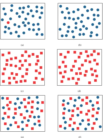
processing. Consider the visual features of color and shape (see Figure 3.5). A red circle can
quickly be identified among a group of blue circles. Likewise, a red circle can be preattentively
located among a group of red squares. Unfortunately, among a group of red squares and blue
circles, a red circle is difficult to locate. The low-level vision system can not preattentively
integrate the color and shape visual features.
In order to harness the power of preattentive processing, research has steered towards
de-veloping visualizations using texture. Some of the early research on how the human visual
system processes texture information was conducted by Jul´esz [Jul81]. Jul´esz proposed a
tex-ton theory that claims the low-level visual system detects three types of feature: elongated
blobs with a given set of visual properties (e.g. orientation and length), ends of line segments,
(a) (b)
(c) (d)
(e) (f)
distinguish between textons that belong to the same category.
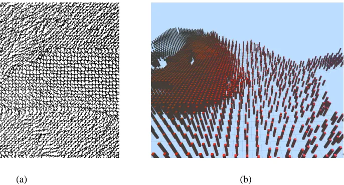
Grinstein and Pickett implemented a system, EXVIS, that demonstrates Jul´esz’s theories
[PG88, GPW89]. EXVIS constructed “stick-men” to visualize spatial coherence within a
dataset (Figure 3.6a). One stick-man is associated with each data element. Attribute values
in the element orient the limbs of its man [PG88]. When they are displayed, the
stick-men form texture patterns that identify spatial regions with common sets of attribute values.
Boundaries between such regions are also easily identifiable. The original stick-man icon used
a five limbed figure to represent a dataset with five dimensions. Four dimensions modified the
orientation of the four limbs of a stick-man, while the fifth dimension determined the
orien-tation of its body. EXVIS belongs to a family of visualization systems called iconographic
systems. Iconographic systems use glyphs or icons to integrate texture properties into a
visu-alization. The geometric appearances of the icons are determined by the attributes of a dataset.
Ware and Knight constructed their own textons, based on Gabor filters, to create texture
visualizations [WK95]. Ware and Knight built the OSC model of texture space with three
scaling values: orientation (O), size (S), and contrast (C). The authors note that this model
is not necessarily complete. Orientation refers to how the textons were oriented within the
environment. Size refers to the physical size of the textons. Contrast refers to the ability
to distinguish a Gabor element from its background. Gabor filters were applied to Gabor
elements in order to vary the OSC scales of the elements. Ware and Knight incorporated a
three dimensional color model into their visualization techniques, allowing them to represent
(a) (b)
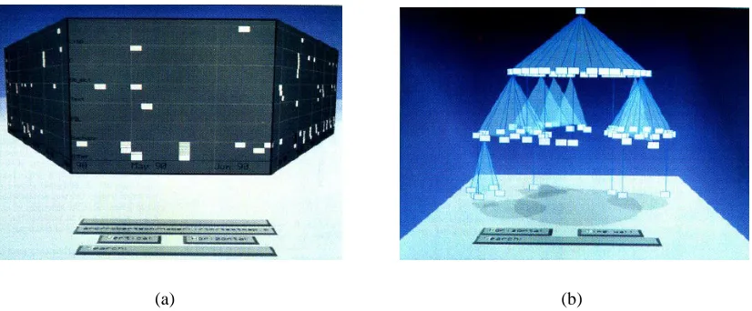
Figure 3.6: (a) shows a visualization using EXVIS stick-men and (b) shows how pexels are used to visualize a weather dataset.
remaining two were represented by two color components. The third color component was
needed to properly visualize texture by providing an appropriate background color.
Healey and Enns sought additional ways to combine color and texture features in a
multidi-mensional visualization. They constructed perceptual texture elements, or pexels, to represent
multiple attributes with color and texture properties at a single spatial location (Figure 3.6b)
[HE98, HE99]. Healey and Enns specifically studied the texture features of height, density, and
regularity. They conducted experiments to determine how texture features can interfere with or
facilitate preattentive processing. These experiments revealed that users could identify
fluctu-ations of height with great ease. It was slightly more difficult for users to differentiate between
density variations, while users had a significantly more difficult time distinguishing variations
in regularity. As a result, Healey and Enns ranked the texture features to provide a guide for
creating effective visualizations that use these texture properties. The most important attribute
impor-tant attribute. Healey and Enns also studied the influence of color on preattentive processing.
They found that colormaps composed of three to five colors could be discerned preattentively,
while larger colormaps could not. Other experiments were conducted to determine how color
and texture features interact with one another. These experiments revealed that color variation
caused a small, yet significant, interference with the detection of regions with certain height
and density characteristics. However, texture features did not interfere with the detection of
regions defined by color.
3.3
Summary
Multidimensional visualization techniques use layout and visual features (e.g. color and
tex-ture) to display multidimensional datasets in a two dimensional planar image. These
multi-dimensional techniques focus mainly on handling largem values. None attempt to visualize
efficiently a large number of data elements. It is left to users to locate offscreen data elements
using simple navigation tools, such as translation and rotation of the viewpoint. Information
visualization techniques provide local and global information simultaneously to users to
dis-play large numbers of data elements effectively. However, these systems are not concerned
with effectively visualizing data elements composed of multiple attributes. Information
visu-alization techniques often filter local information to provide global context views. How should
these filters be modified to provide the necessary overview of a multidimensional dataset?
Should certain attributes be given precedence over others during the filtering process? The
display large numbers of multidimensional data elements. Furthermore, this system operates
under the assumption that information will be omitted from the current view and attempts to
Chapter 4
Areas of Interest
Every dataset contains elements that a user considers interesting. These elements encode
in-formation that defines the underlying properties of the dataset. A key part of data exploration
is locating these elements and enabling the user to examine them. To increase the efficiency
of an exploration task, a visualization system can highlight these interesting data elements and
inform the user of their positions. Reducing the users’ search efforts increases the likelihood
they will gain additional insight into a dataset. Our system provides the above functionality
and takes it one step further. By organizing elements of interest into larger entities, our system
provides additional support for studying interesting properties of a dataset and reducing the
4.1
Identifying EOIs
Identifying elements of interest, or EOIs, is an important step in the navigation process.
Iden-tification should be simple, accurate, flexible, and rapid. Once identified, EOIs can be
incor-porated into the navigation framework. The framework will serve as a backbone for providing
users with tools to more easily explore the EOIs in a dataset.
Most data elements can be classified as “interesting” based on properties of their attribute
values. Consider an e-commerce auction dataset where the data elements are composed of the
attributes bidderID, itemID, currentbid, and time. Users might need to examine data elements
whose current bids are much higher than average in order to view who is winning certain
auctions. Similarly, users might wish to explore data elements at the end of the auction, or data
elements where the time attribute is highest, in order to observe any rapid increase in bids that
may occur as an auction closes.
All of these properties can be explicitly defined using a simple mathematical grammar.
Using mathematical and boolean operators with a dataset’s attributes as operands, a set of
rules can be generated by the user that will classify an element as interesting. As an example,
consider the following potential set of rules for a collection of weather data.
temperature > avg(temperature) + 2∗stddev(temperature) (4.1)
windspeed > median(windspeed) + 10.0 (4.2)
These rules identify data elements that represent locations characterized by higher than
nor-mal temperatures (Equation 4.2), wind speeds 10 units above the median wind speed (Equation
4.3), and precipitation values below a user defined limit (Equation 4.3). The rules below
de-scribe data elements that satisfy the e-commerce example dede-scribed above.
currentbid > avg(currentbid) +stddev(currentbid) (4.4)
time > 9
10∗max(time) (4.5)
Sometimes the user might search for elements whose attributes satisfy combinations of
several rules. Users can employ boolean AND and OR operations to tie rules together or
spec-ify their independence from other rules. Also, rules may make use of constants and common
statistical tools such as standard deviation, average, median, max, and min. These functions
provide users with the necessary tools to create meaningful sets of rules.
4.2
Areas of Interest
Once the user has constructed a set of EOIs to study, the next step is to incorporate them into
coherent structures. By spatially clustering EOIs, users define regions of potential interest
within their datasets. This simplifies the exploration tasks by allowing users to more easily
identify regions they should focus on from the rest of the dataset. We assume the size of the set
interesting is either too general or too vague. As an oversimplified example, if a user specifies
interesting elements as those in which a specified attribute is greater than its median, one half
of the dataset is now considered interesting.
Even though the size of the set of EOIs is small compared to n, the number of EOIs can
overwhelm a display in one of two ways. Small fractions of large datasets may still contain
hundreds of data elements, making it difficult to fit all of the EOIs on-screen. Likewise, EOIs
could be spread out over a large spatial area, making it impossible for the user to simultaneously
view all elements of interest in detail.
By “clustering” the EOIs based on their spatial positions, we attempt to alleviate the users’
burden of locating and navigating to EOIs outside their current view. By displaying spatial
clusters of EOIs in a high-level overview display, the user can more easily identify the presence
and general location of the EOIs. An overview display allows a user to navigate to a location
that contains a cluster. Within this local region, clusters establish boundaries, or borders, that
users may need to determine how they will explore the surrounding area. Clustering the EOIs
also divides the dataset into regions and districts as described by Lynch, creating a visualization
that supports efficient mental map creation [Lyn60]. The geometric properties of clusters also
contribute to the visualization by providing additional survey and landmark knowledge to the
4.3
Constructing Areas of Interest
Once the EOIs have been identified, they must be organized into areas of interest, or AOIs. The
AOIs are built using a spatial clustering algorithm that takes a set of EOIs as input and returns
the set of EOI clusters as output. The basic clustering algorithm is described below:
1. LetAjbe an empty set.
2. Chooseei from the setE of EOIs as a starting point and add it toAj.
3. Select the set of elementsEpoint fromEthat are within a thresholdδofei, and add them toAj.
4. Compute the convex hull,Cj, ofAj.
5. Select the set of elementsEhull from E −Aj that are within the threshold δ from the boundary ofCj and add them toAj.
6. Re-computeCj, and repeat the selection process until there are no elements within dis-tanceδof the convex hull or there are no more points inE.
The algorithm returns a partition ofE into EOIs that belong to Aj and those that do not. Subsequent AOIs may be built by applying the same algorithm to the EOIs that remain in
E−Aj.
The above algorithm represents a simple and effective clustering technique, but it require
some extensions to work properly in our large dataset environment. Grouping EOIs that are
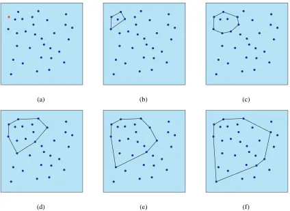
(a) (b) (c)
(d) (e) (f)
Figure 4.1: An example of how the convex hull algorithm constructs a cluster. The initial vertex is colored red in (a). (b)-(f) shows how elements withinδof the convex hull are identified and added toAjuntil the distance from the convex hull to all remaining vertices is greater thanδ
want to influence the clusters in other ways. This can be accomplished by considering
addi-tional parameters during AOI construction.
4.3.1
Proximity
The proximity parameter is used to control the physical size and density of AOIs. This
param-eter represents δ in the primary clustering algorithm. High proximity values will allow for a
smaller number of large AOIs. Low proximity values will generate a larger number of small
4.3.2
Population
The population parameter places an upper bound on the logical size of an AOI by specifying
the maximum number of EOIs that can be contained within a single AOI. Specifying a small
population will partition a set of EOIs into a larger number of smaller AOIs. This means the
user navigates smaller sets of data elements, resulting in a possible reduction in the number
of AOIs whose data elements cannot be viewed simultaneously. However, the user must now
manage a larger overall number of AOIs in order to explore the entire set of EOIs.
4.3.3
Area
The area parameter places an upper bound on the physical size of an AOI. Physically smaller
AOIs may be easier to manage since the user needs to keep track of less off-screen information.
However, users must again explore a larger number of AOIs to view every EOI.
The area of a convex hull can be computed by forming a triangulation of the hull. The
simplest triangulation for a convex hull of n vertices is to select an arbitrary vertex v on the
convex hull and form an additionaln−3edges by connectingv to every other hull vertex not
adjacent to it. The area of the convex hull can be found by computing the sum of the areas of
(a) (b)
(c) (d)
Chapter 5
Graphs of the Navigation Framework
Once the areas of interest have been constructed, they are integrated into the navigation
frame-work. The framework serves three purposes. First, it provides visual cues to the user about the
locations of elements of interest within the information space. Viewers use these cues to aid
with navigation decision making. Second, the framework also provides levels of imageability
as described by Lynch [Lyn60]. Increased imageability aids users by preserving their sense of
position within the environment. Third, the framework provides a data structure that can be
used by the navigation assistant to implement a variety of automated tours through the data.
The framework is structured using two types of graphs: local and global. Graphs are an
ideal instrument to use for the framework. They are a flexible structure that is easily integrated
into a virtual environment. Graph traversal algorithms provide a solid foundation for camera
planning. The global graph links the AOIs together, providing a unified structure of AOIs. The
each AOI. This graph is meant to assist users with global movement between AOIs. A local
graph is built within each AOI to assist with navigating between the AOI’s elements of interest.
We chose a Delaunay triangulation of EOI positions to construct the local graph. Each of these
local graphs is connected to the minimum spanning tree to complete the framework.
5.1
Discussion of Relevant Graph Theory
For many of the following sections, we employ the following graph theory and definitions. A
graphGis composed of a set of vertices,V(G), and a set of edges,E(G), where every edge
e ∈ E(G)is represented by an unordered pair of distinct vertices inV(G). For everye, there
existsu, v ∈ V(G)such that e = uvor e = vu. A graph is a weighted graph if every edge
e ∈E(G)is assigned a numeric value denoted asw(e). w(e) =w(u, v)whereeconnects the
verticesuandv. Our system makes use of weighted graphs with non-negative values. All of
the graphs used in the navigation assistant are simple graphs, e.g. graphs that do not contain
loops or multiple edges which share the same two endpoints.
A complete graph is a graph constructed by connecting every vertex to every other vertex.
A planar graph is a graph whose vertices and edges can be laid out in a plane such that no two
edges will cross. The dual graph ofGis a graphG∗ which has a vertexv∗ for every face of
G, i.e. if Fi is a face ofG, then there existsvi∗ ∈ V(G∗). For every edgee ∈ E(G), with e
5.2
Voronoi Diagrams and Delaunay Triangulations
Given a setSofnpoints in the plane, for each pointpi ∈Swhat is the set of points(x, y)in the plane that are closer topithan to any other point inS[PS85]? The solution to this problem is a partitioning of the plane into polygons,Pi, some of which are unbounded, wherePirepresents the locus of points(x, y)closest to the given pointpiinS.
For any two points, pi, pj ∈ S, we can partition the plane into two planes. One half-plane represents the locus of points(x, y)closest to pi, while the other half-plane contains the points closest to pj. The half-plane containingpi and all points in the plane closer topi than topj is denoted asH(pi, pj). Such a half-plane is defined by the perpendicular bisector of the line segmentpipj.
The locus of points(x, y)closest topi can be described as the intersection ofn −1 half-planes. This intersection forms a polygonal region called the Voronoi polygon associated with
pi, denotedV(i).
V(i) =\
i6=j
H(pi, pj) (5.1)
The nVoronoi polygons corresponding to the npoints of S form the Voronoi diagram of
S, denoted Vor(S). Vertices in the Voronoi diagram are called Voronoi vertices and edges of the
Voronoi diagram are called Voronoi edges. In a Voronoi diagram, if(x, y)is contained inV(i),
then(x, y)is closer topithan to any other point inS.
The dual of a Voronoi diagram is called a Delaunay graph. The straight-line dual of a
(a) (b)
Figure 5.1: A Voronoi diagram is shown in (a) and its corresponding Delaunay graph is shown in (b).
make it an ideal choice to be used for the local graphs of our framework.
For an evenly distributed set of points, the corresponding Delaunay triangulation avoids
long, thin triangles, using full triangles constrained to a local area within the set of points. The
Delaunay graph is a planar graph. There exist polynomial-time graph traversal algorithms for
planar graphs. The Delaunay triangulation has a number of edges linear with respect to the
number of points inS. Euler’s formula for planar graphs states that a planar graph has no more
than3N −6edges [Wes01]. This restriction prevents an explosive increase of the number of
edges for a large set of points. Likewise, it is shown that the average degree of a vertex in the
X
v∈V(G)
deg(v) = 2e
X
v∈V(G)
deg(v) ≤ 2(3N −6)
P
v∈V(G)
deg(v)
N ≤
6N −12 N
avg(deg(v)) ≤ 6
(5.2)
Therefore, Delaunay graphs typically have low branching factors. The Delaunay graph
provides edges that help to visualize spatial relationships between EOIs within an area of
in-terest. The Voronoi polygon for a data element represents the spatial neighborhood of that data
element. Users are often located within the neighborhood of the element they are currently
vi-sualizing. To view a set of EOIs, users typically move between adjacent neighborhoods. A
De-launay edge is created between two points when their neighborhoods are adjacent. Therefore,
the Delaunay graph provides directional information to neighboring EOIs that are adjacent to
the current EOI. This property makes Delaunay graphs a useful tool for visualizing the spatial
relationships between EOIs.
5.3
Euclidean Minimum Spanning Tree
Like the local graphs, the global graph is meant to provide specific navigation aids. We expect
users will need to move between AOIs, especially if they are spread throughout the dataset. We
Figure 5.2: The Euclidean minimum spanning tree for a set of points.
A Euclidean minimum spanning tree was chosen to act as the global graph because of the
particular set of edges it contains. The minimum spanning tree is constructed with Kruskal’s
algorithm using the Euclidean complete graph whose vertices are the centers of the set of AOIs.
The spanning tree is initialized by adding every vertex as an individual component. Each edges
is assigned a weight equal to its Euclidean length. Iterating through the edge list from smallest
to largest weight values, an edge is added to the tree when it connects two disjoint components.
Components can be existing subtrees or disjoint vertices. Each edge added to the spanning tree
decreases the number of disjoint components by one. The algorithm terminates when there
Since Euclidean distances are used for the edge weights, Kruskal’s algorithm connects each
AOI to its closest neighbor. The algorithm connects AOIs spatially near to one another early in
its execution, ensuring short paths that produce clusters of AOIs. The same connectivity feature
occurs between the clusters. The result is a Euclidean minimum spanning tree that supports
Chapter 6
Assisted Navigation
With the graph framework in place, the navigation assistant has the ability to perform various
types of exploration tasks for the user. The assistant provides these operations by generating
automated tours based on the user’s requests. An automated tour is built in three steps. First,
using a graph algorithm, an ordered sequence of EOIs is created for the user to view.
Sec-ond, the navigation assistant computes an optimal viewpoint from which to display each EOI.
Finally, a spline curve is formed through the viewpoints, completing the construction of an
automated camera path.
6.1
Graph Traversal Algorithms
In addition to providing a visualization of the spatial relationships between EOIs, the local
graph is used as a spatial data structure by the navigation assistant. The first step in
should be seen. Using a set of traversal algorithms on the framework’s graphs, the assistant can
generate a variety of ordered EOI sequences. An ordering is important because it defines the
exploration path through the dataset to satisfy the user’s navigation request. The assistant
cur-rently implements two types of graph traversals: shortest path and minimum Hamiltonian cycle
approximation. The graph theory of each traversal will be described before its application.
6.1.1
Dijkstra’s Algorithm
A common problem in graph theory is computing the shortest path between two vertices in a
graph. An x,y-path is a sequence of edges and vertices,{v0, e1, v1, e2, v2, . . . , en, vn}, where the endpoints ofei are the verticesvi−1 andvi,v0 =x, andvn =y. No edge occurs more than once in an x,y-path. The distance,d(x, y), for an x,y-path in a weighted graph is the sum of the
edge weights of the edges along the x,y-path. For any two distinct verticesxandyin a graph
G, we often want the x,y-path for whichd(x, y)is minimal.
Dijkstra’s algorithm can be used to find the minimal (or shortest) x,y-path inO(V2 +E),
whereV is the number of vertices andE is the number of edges inG. The algorithm works
by incrementally building a list of vertices,S, whose shortest path from a given source vertex,
x, has been computed. Letδ(v)be the current estimated cost of the shortest x,v-path. Initially,
δ(v) = ∞for allv