Page 1 of 6 Big-data Clinical Trial Column
Rainforest plots for the presentation of patient-subgroup analysis
in clinical trials
Zhongheng Zhang1, Michael Kossmeier2, Ulrich S. Tran2, Martin Voracek2, Haoyang Zhang3
1Department of Emergency Medicine, Sir Run-Run Shaw Hospital, Zhejiang University School of Medicine, Hangzhou 310016, China; 2Department of Basic Psychological Research and Research Methods, School of Psychology, University of Vienna, Vienna, Austria; 3Division of Biostatistics, JC School of Public Health and Primary Care, The Chinese University of Hong Kong, Shatin, Hongkong, China
Correspondence to: Zhongheng Zhang. No. 3, East Qingchun Road, Hangzhou 310016, China. Email: [email protected].
Abstract: While the conventional forest plot is useful to present results within subgroups of patients in clinical studies, it has been criticized for several reasons. First, small subgroups are visually overemphasized by long confidence interval lines, which is misleading. Second, the point estimates of large subgroups are difficult to discern because of the large box representing the precision of the estimate within subgroups. Third, confidence intervals depicted by lines might incorrectly convey the impression that all points within the interval are equally likely. Rainforest plots have been proposed to overcome these potentially misleading aspects of conventional forest plots. The metaviz package enables to generate rainforest plots for meta-analysis within the statistical computing environment R. We suggest the application of rainforest plots for the depiction of subgroup analysis in clinical trials. In this tutorial, detailed step-by-step guidance on the generation of rainforest plot for this purpose is provided.
Keywords: Rainforest plot; subgroup; visualization; clinical trial
Submitted Jul 19, 2017. Accepted for publication Sep 26, 2017. doi: 10.21037/atm.2017.10.07
View this article at: http://dx.doi.org/10.21037/atm.2017.10.07
Introduction
Case mix is common in clinical trials, despite strict inclusion/exclusion criteria. Such case mix might lead to heterogeneous intervention effects in patient subgroups. Thus, clinical studies often benefit by subgroup analysis, aiming to further explore the effectiveness of the intervention across different subgroups of interest. For
instance, the overall effect might be neutral, but beneficial
or harmful effects may be present in subgroups (1). Although post-hoc analyses are not able to provide strong confirmatory evidence, they might generate hypotheses which can be tested in future experimental trials. Thus, subgroup analysis can provide useful information and is widespread in clinical research. A forest plot is usually employed for the presentation of the results of subgroup analysis. Key components of the forest plot include point
estimates and confidence intervals for each subgroup. The
conventional forest plot comprises a box, representing the
point estimate for each subgroup, and a line, representing the 95% confidence interval. The precision of the point estimate of each subgroup is represented by the size of the box.
However, such a graphical display of the estimate and
its uncertainty has been criticized for several reasons: first,
because subgroups with small samples—and therefore imprecise estimates—have long confidence intervals, they might attract more visual attention than large subgroups
with short confidence intervals; second, the individual effect
of a large subgroup may not be readily discernable because
of its large box; and third, the confidence interval depicted
by a line might incorrectly convey the impression that all points within the interval are equally likely. As a matter of fact, the likelihood of values within the interval decreases, as they approach the outer boundaries (2).
represented by a likelihood raindrop (Figure 1). The shape of the raindrops depends on the assumed distribution of the estimates via the respective likelihood function (3). In the following we assume (asymptotically) normally distributed estimates throughout, which is the most common case.
In rainforest plots, the confidence interval is marked by a
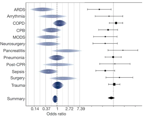
horizontal white line, and its width corresponds to the width of the raindrop. In addition, the uncertainty is represented by both the height of the raindrop and the shading (3). The individual effect is clearly marked by a white tick mark and can be discerned regardless of the sample size of the subgroup. The height of the raindrop corresponds to the likelihood of each value within the confidence interval and allows to assess the plausibility of different values (4). In Figure 1, we compare the conventional forest plot with the rainforest plot. In the right forest plot, the pancreatitis subgroup may draw more visual attention because of its wide confidence interval. This might be unwarranted, because the respective point estimate is the least precise. However, in the left rainforest plot, the trauma subgroup— with the highest sample size and therefore most precise estimate—may draw the viewer’s attention for its thicker raindrop and darker color as well as higher saturation.
In this tutorial, we will introduce how to generate such a rainforest plot for the depiction of subgroup analysis in clinical trials.
Working example
For the sake of illustration, we generate a dataset containing 1,000 patients and three variables. The R code is as follows.
> set.seed(888)
> group <- sample(c("trt", "ctrl"), replace=T, 1000)
> subgroup <- sample(c(rep("trauma", 5), "surgery", rep("COPD", 4), "ARDS", rep("pneumonia", 3),
rep("MODS", 5),
"arrhythmia", "pancreatitis", "post-CPR", "neurosurgery", rep("sepsis", 2), rep("CPB", 2)), replace=T, 1000)
> mort <- sample(c("alive", "dead"), replace=T, 1000)
> df <- data.frame(group, subgroup, mort)
The set.seed() function is used to make sure that the randomly generated data are exactly reproducible. The group variable is a string vector including all subgroups. We use the sample() function to sample a subgroup randomly for each of the 1,000 patients. The value of each element is randomly selected with replacement from the vector c(“trt”,“ctrl”), with “trt” indicating the treatment group and “ctrl” indicating the control group. The subgroup variable is generated in the same way as that for the group variable. In order to generate different sample sizes across subgroups, some string values are repeated several times. The more times these are repeated, the larger the samples will be. For
example, the “trauma” string value is repeated for five times,
and this value is expected to occur five times more likely than that of the “arrhythmia” or “pancreatitis” string values. The mort variable contains the dichotomous outcome (alive versus dead). Note that in this example only random, instead of systematic, between subgroup differences are simulated. Systematic differences are typically of interest for subgroup analysis. Finally, the three variables are merged into a data frame.
Arrythmia COPD CPB MODS Neurosurgery Pancreatitis Pneumonia Post-CPR Sepsis Surgery Trauma
Summary ARDS
0.14 0.37 1 2.72 7.39 Odds ratio
Subgroup analysis
Subgroup analysis can be performed efficiently with the dlply() function in the plyr package. This function allows to
subset a data frame, to apply user-defined functions to the
subset, and then to combine the results into a list.
> library(plyr)
> mods <- dlply(df, .(subgroup), function(df) glm(mort ~ group, family = "binomial",
data = df))
> coefs <- ldply(mods, coef) > se <- ldply(mods,
function(x) sqrt(diag(vcov(x)))) > rslt <- merge(coefs, se, by = "subgroup")[ , c(1, 3, 5)]
> names(rslt) <- c("subgroup", "coef", "SE")
The first line applies dlply() to slice a data frame into subsets by subgroups. Then, a glm() function is applied to each subset. The result is a list of glm objects containing
coefficients, residuals, and so forth. With these glm objects, we can use the coef() function to extract coefficients from
each of the glm objects. In this situation, the ldply() function is employed. Note that the two plyr functions are different: dlply() versus ldply(). The former receives a data frame as input and returns a list as output, whereas the latter receives a list and returns a data frame. The method to extract the
standard error of each coefficient is equivalent. In the end,
all returned vectors are merged into a matrix. The result is shown below.
> rslt
subgroup coef SE
1 ARDS -0.15415068 0.6485637
2 arrhythmia -0.47260441 0.6088275
3 COPD 0.01813521 0.3199052
4 CPB -0.04879016 0.5061123
5 MODS 0.04018938 0.2968675
6 neurosurgery 0.87546874 0.7852812 7 pancreatitis -0.28768207 0.6929349
8 pneumonia -0.39086631 0.3606007
9 post-CPR 0.08701138 0.6513389
10 sepsis -0.59652034 0.4638507
11 surgery -0.49062292 0.6935073
12 trauma -0.59255994 0.3145582
The first column is the row number (without clinical relevance). The second column contains the subgroup names. The third column contains the regression coefficient, whose exponentiation corresponds to the odds ratio of the treatment effect for each subgroup. The last column contains the standard error of the regression
coefficient.
Visualization of subgroup analysis with rainforest plots
Rainforest plots can be generated using the rainforest() function from the R package metaviz (5). Should users wish
to make additional modifications beyond the options of the
rainforest() function, the ggplot2 package will be helpful.
> library(metaviz) > library(ggplot2)
> forest <- rainforest(x = rslt[, c("coef", "SE")],
names = rslt[, "subgroup"], summary_symbol = "none") +
scale_x_continuous(name = "Odds Ratio", limits = c(-2.5, 2.5),
breaks = seq(-2,2, by = 1),
labels = function(x) {round(exp(x), 2)}) +
theme(plot.margin = unit(c(0.6, 0.3, 0.3, 0), "cm")) > forest
The first two lines load the metaviz and ggplot2
packages. The first argument x of the rainforest() function
approach) to the rainforest plot.
A complete rainforest plot can be drawn at this step. Since the plot is composed using the ggplot system,
elements of the rainforest plot can be optionally modified or added with great flexibility layer by layer. The following
codes after the symbol “+” change the scale of the horizontal axis. The name of the axis is “Odds Ratio”. The axis limits
here are set to (−2.5, 2.2), which should be adjusted in other
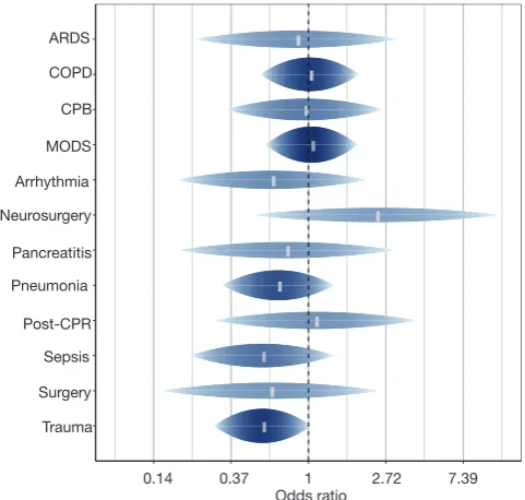
cases. The label values of the horizontal axis are changed to show the exponentiation of the original x values, such that they are readily interpretable as odds ratios. The resulting rainforest plot is shown in Figure 2.
Adding a side table beside the rainforest plot
Sometimes, investigators and readers are interested in the exact values of the effect estimates and their corresponding standard errors. Here we introduce a method to add a data table beside the rainforest plot. Furthermore, one might be interested to estimate the overall treatment effect and to add it to the rainforest plot.
> mod.sum<-glm(mort ~ group, family = "binomial",
data = df)
> rslt.sum <- rbind(rslt, data.frame(subgroup = "summary", coef = mod.sum$coef[2],
SE = sqrt(diag(vcov(mod.sum)))[2]))
The summary effect can be estimated using the glm() function, as described above. After model fitting, the estimated coefficient and its standard error are extracted from the glm object and added to the rslt object.
Next, we proceed to generate a data frame containing all text annotations that will be displayed alongside the
rainforest plot. The coefficients of each subgroup and the
summary effect are exponentiated to obtain odds ratios. The round() function is used to round the odds ratios to two decimal places. Approximate standard errors of the exponentiated coefficients are obtained by using the delta method.
> lab <- data.frame(V0 = rep(rev(c(1:nrow(rslt.sum), nrow(rslt.sum) + 0.75)), 3),
V05 = rep(c(1,2,3), each = nrow(rslt.sum) + 1), V1 = c("OR",
round(exp(rslt.sum$coef), 2), rep("", nrow(rslt.sum) + 1),
"SE", round(rslt.sum$SE * exp(rslt.sum$coef), 2)))
In the data frame, three variables (V0, V05, and V1) are created. V0 contains the vertical position of each annotation, and V05 contains the horizontal position. In this example, there are three columns and one row. In our example, the approximate standard error of the OR is estimated using the delta method (6). Alternatively, the confidence intervals of the coefficients can be estimated on the log scale and then the exponentiated lower and upper bounds given. Another method is to give the original coefficients and SE (not exponentiated) in the table and in addition the exponentiated coefficients (but without SE). The V1 variable contains the actual text annotations. The following code creates a ggplot object with these annotations.
data_table <- ggplot(lab, aes(x = V05, y = V0, label = V1))+
geom_text(size = 4, hjust = 0, vjust = 0.5) + coord_cartesian(xlim=c(1, 4.5),
ylim = c(0, nrow(rslt.sum) + 1), expand = F) +
Figure 2 Rainforest plot to display subgroup analysis.
theme_bw() +
theme(panel.grid.major = element_blank(), legend.position = "none",
Within the ggplot() function, lab is the data set to use for plotting. The V05 is mapped to the horizontal axis and V0
to the vertical axis. The string vector V1 is filled into each
cell of the table.
Because we now also want to show the overall summary effect, we plot a new rainforest plot.
> forest.sum <- rainforest(x = rslt.sum[, c("coef", "SE")], names = rslt.sum[, "subgroup"], summary_symbol = "none")+
scale_x_continuous(name = "Odds Ratio", limits = c(-2.5, 2.5),
breaks = seq(-2,2, by = 1),
labels = function(x) {round(exp(x), 2)}) +
theme(plot.margin = unit(c(0.6, 0.3, 0.3, 0), "cm"))
Then, we align the rainforest plot with the exact text annotations.
> library(gridExtra)
> grid.arrange(forest.sum, data_table, layout_matrix =rbind(c(1,1,1,2), c(1,1,1,2),c(1,1,1,2),c(1,1,1,2)))
The last step is to use the grid.arrange() function, to
finally align the two ggplot objects: The rainforest plot and the data table containing the exact coefficients and standard
error values. The layout_matrix argument is to set the
layout of the graphical table. The resulting figure is shown
in Figure 3.
Summary
While the conventional forest plot is useful to present subgroup analysis in clinical studies, it has been criticized for several reasons. First, small subgroups might be misleadingly overemphasized through long confidence interval lines. Second, the point estimate of large subgroups
is difficult to discern because of the large box representing
the high precision of large subgroups. Third, displaying
confidence intervals by a line does not contain information on the plausibility of different values within the confidence
interval. All these three shortcomings can be overcome by the rainforest plot, an improvement of the conventional forest plot. The metaviz package (5) enables to generate rainforest plots for meta-analysis, and we used it for the generation of rainforest plots to visualize subgroup analysis in clinical trials. The treatment effect was estimated for each subgroup by using a logistic regression model. The plyr package was used to subset the full data frame, which then returned a list or data frame comprising the regression coefficients and standard errors of the models. This data frame can be passed directly to the rainforest() function. Finally, we created a data table, containing the values of odds ratios and standard errors for all subgroups, and added this to the right side of the rainforest plot, using the grid. arrange() function.
Acknowledgements
Funding: Z Zhang was funded for this study by the Zhejiang Engineering Research Center of Intelligent Medicine (2016E10011) from the First Affiliated Hospital of Wenzhou Medical University.
Footnote
Conflicts of Interest: The authors have no conflicts of interest
to declare.
References
1. Di Maio M, Perrone F. Subgroup analysis: Refining a positive result or trying to rescue a negative one? J Clin
Oncol 2015;33:4310.
2. Schild AH, Voracek M. Finding your way out of the forest without a trail of bread crumbs: Development and evaluation of two novel displays of forest plots. Res Synth Methods 2015;6:74-86.
3. Jackson CH. Displaying Uncertainty With Shading. The American Statistician 2008;62:340-7.
4. Barrowman NJ, Myers RA. Raindrop Plots. The American Statistician 2003;57:268-74.
5. Kossmeier M, Tran US, Voracek M. metaviz: Rainforest plots and visual funnel plot inference for meta-analysis. R package version 0.1.1. 2017. Available online: https:// github.com/Mkossmeier/metaviz
6. Ver Hoef JM. Who invented the delta method? The American Statistician 2012;66:124-7.