24
North Carolina State University’s Department of Math, Science, and Technology Education along with Wake Technical Community College’s Engineering Technology Division and North Carolina’s Department of Public Instruction (Vocational Education Division), sought ways in which to build a strong secondary program in scien-tific and technical visualization, focusing on the use of sophisticated graphics tools to study mathematics and the sciences. Momentum for this high school-level scientific visualization curriculum developed out of a revision of the complete high school technical graphics curriculum used throughout the state (North Carolina Public Schools, 1997). It became clear that a scientific visualization track could both broaden the scope of the current technical graphics curriculum and attract a new group of students to technical graphics.
For the past four years, educators from North Carolina have met to develop and improve a new sequence of courses in scientific and technical visual-ization. The main goal of these courses is to teach technical graphics to a new audience: science, tech-nology, technical, and pre-engineering students. The courses are designed to reflect a broader application of computer graphics techniques in the workplace and represents a rich area in which technical graphics teachers at all levels of education can be involved. These new courses complement, rather than replace, more mainstream technical graphics courses in archi-tectural and mechanical drafting currently being taught.
While contemporary high school drafting (tech-nical graphics), technology education, and college programs now use sophisticated graphics tools to cre-ate two-dimensional (2-D) and three-dimensional (3-D) wire-frame and solid models, their focus has remained narrow. It is now apparent that changes
pri-marily brought about by advances in technology have created new opportunities to use similar tools to pro-mote and enhance the study of the physical, biologi-cal, and mathematical sciences.
These new courses are designed to articulate into scientific visualization and technical graphics curric-ula at both two-year and four-year colleges and uni-versities through the Tech-Prep initiative. Articulation between schools allows for a broader range of students to have a visual science course count for admission into a college or university. The courses have the potential to replace the fundamental drafting course required for most degrees in engi-neering and technology.
The proposed student populations taking the sci-entific visualization courses are traditional vocational track students and pre-college students who plan on studying in scientific, engineering, and technical fields. The graphic tools used in these courses can help students to understand abstract and numerical concepts and understand how these graphic tools are used in the sciences, business and industry, finance, and virtually all major areas of our economy.
Background
Technical graphics have long been recognized as a powerful communications tool by professional engineers, scientists, mathematicians, statisticians, and other technical professionals. The use of techni-cal graphics to convey scientific and technitechni-cal data and concepts has a long tradition in print media. William Playfair, working in the 18th century, is often recognized as being one of the earliest practi-tioners of using graphics to communicate technical data to the public at large (Tufte, 1983). More recently, theorists in the 1970s and 1980s began work on a modern basis for technical communication
Scientific Visualization for Secondary and
Post–Secondary Schools
25
with graphics (Bertin, 1983; Cleveland, 1985; Tufte, 1983). This work, using graphic design, rhetoric, and psychological theory as its basis, attempted to try and understand the appropriate match of information to be conveyed, graphic technique, and audience to be served.
Through most of this period, scientific and tech-nical data continued to be produced using mainly manual methods by professional graphicians. During the 1980s, improved printing and computer technol-ogy combined with demands from the public increased the use of technical graphics in textbooks and newspapers. The success of the national news-paper USA Today is subscribed partly to its revolu-tionary use of full-color artwork and extensive use of informational charts and graphs (Brock, 1998). Though now being widely viewed by the public, these graphics were still being produced largely by trained professionals.
The 1980s also brought into use the color graph-ics workstation. In combination with custom-writ-ten programs, graphics workstations were used to produce graphic visualizations of the masses of data being produced by a new generation of supercom-puters (Friedhoff & Benzon, 1989; McCormick, Defanti & Brown, 1987). During the period of the late 1980s and early 1990s, individuals began to bring together the technical communication theories of effective graphic communication with the new flexibility and power that computers brought to pro-fessionals (Keller & Keller, 1993; Patrikalakis, 1991; Senay & Ignatius, 1990). Still, the audience was pro-fessional researchers who could hire staff to program and produce these visualizations on high-end com-puter technology. In tandem with the development of supercomputing graphics, the desktop publishing revolution brought, for the first time, computer graphics tools to the general public. Now the types of tools being used to create graphics for the newspa-pers could also be purchased by the average comput-er uscomput-er. New books became available to help guide scientists, engineers, and technicians in creating their own visualizations without the use of specially trained staff (Kosslyn, 1994; Tufte, 1990). In addi-tion to general purpose graphing tools, off-the-shelf scientific visualization tools became more generally available, taking the place of custom-programmed tools that researchers were using to create more spe-cialized visualizations.
The mid-1990s saw the greatly increased
demand for 3-D modeling tools meet with affordable desktop computers capable of running this class of software. Now, both 2-D and 3-D graphics tools were available to the general public. During this time period, professionals in fields related to graphics also saw an increased demand for technological and com-puter competencies among both teachers and their students (Technology Assessment Project, 1999). This is coupled with an understanding of the impor-tant role that hands-on activities can play in the math, science, and technology classrooms (Luna, 1998).
Transformation to Scientific Visualization
In the 1990s technical and engineering graphics courses in secondary and post-secondary institutions across the country began facing criticism concerning their content. Even after the move to 2-D/3-D com-puter-aided drafting (CAD), many still questioned whether it was relevant to teach a highly specialized mechanical or architectural graphics language to a broad population of students (Raudebaugh, 1996). In this context, many professionals and researchers in graphics began to explore the role graphics played in a larger instructional and work context.
During the 1980s and 1990s, a resurgence of interest in the importance visualization plays in suc-cess (both in the classroom and in professional life) emerged. Several researchers recognized that the cre-ation and manipulcre-ation of both traditional and com-puter-generated graphics can improve visual commu-nications in engineering-related professions (e.g., Bertoline & Miller, 1989; Rodriguez, 1992; Sorby & Baartmans, 1994; Zsombor-Murray, 1990). Though many in the technical graphics field who teach at sec-ondary and post-secsec-ondary educational institutions have discussed the benefits of traditional technical graphics as a means of developing spatial visualiza-tion skills, this was still envisioned by most as hap-pening in the context of mechanical or architectural design graphics. During this time period, however, science educators also recognized the importance of enhancing the visualization abilities of students and professionals (Baker & Pilburn, 1997). Science edu-cators were, as it can be imagined, using very differ-ent examples to show the use of graphics than would typically be seen in a mechanical engineering graph-ics classroom.
In the early 1990s we began to study how some hands-on activities used in engineering graphics
26
classes could be used with a broader population of science and technical majors (Wiebe, 1992). In this scientific visualization course, rather than using the documentation of mechanical objects as the vehicle for the creation of graphics, the communication of more conceptual scientific and technical ideas and empirical results were used as a basis for creating graphics. We felt graphics communication principles formalized by theorists in the 1970s and 1980s and applied in professional science and technical profes-sions could also be applied in technical graphics courses at the secondary and post-secondary levels (Bertoline, Wiebe, Miller & Mohler, 1997). This goal, facilitated by the increasing affordability of 2-D and 3-D computer graphic tools and the recognized need to address the graphic/visualization literacy issue at earlier grades, led to the expansion of this effort to secondary schools (Clark, Wiebe & Shown, 1996; Wiebe & Clark; 1998 North Carolina Public Schools, 1997). Though many look to our field as a source of applied skills for professionals in the sci-ence, technology, and engineering fields, there was the realization that many of the traditional concepts of technical graphics communication could be applied in a different context to a broader field of sci-entific visualization.
Scientific and Technical Visualization Curriculum
Unlike the architectural and mechanical tracks, scientific visualization courses are unlikely to prepare students for a vocation directly out of high school. Instead, these courses prepare students for a commu-nity college program related to scientific visualization or for enrichment in a scientific or technical career in engineering, technology, education, or the physical sciences. Therefore, potential students are likely to be those on an academic track who have never taken a vocational course before.
The scientific visualization courses expose stu-dents to all of the major conceptual areas associated with scientific visualization and give them experience in a broad range of graphic techniques. Unlike many of the graphic techniques covered in the architectur-al and mechanicarchitectur-al areas, scientific visuarchitectur-alization tech-niques are more broadly applicable. Also, because the track is more academic, students focus on theory and operations so they understand why particular graph-ic techniques are used. The primary areas covered in scientific visualization courses include:
• Basic design principles • Graphing/plotting • Image processing • 2-D/3-D modeling • Animation and simulation • Presentation and publication
The curriculum team, consisting of teachers and administrators from both secondary and post-sec-ondary education, decided to have five major compe-tencies for the first-year curriculum (Table 1). The first competency centers on leadership development. This competency is designed to give students basic leadership skills and to develop a career plan that will include the information taught within this curricu-lum. The second major competency teaches students problem solving using design concepts involving visual science theory. Total Quality Management (TQM) tools are included to aid the students in find-ing solutions to problems and to develop consensus-building measures for working in groups. While stu-dents are working on problem-solving and critical-thinking skills, the third competency teaches students how to use computers as tools for visualizing scientif-ic data and information. The fourth and fifth com-petencies are the most demanding. These competen-cies require students to use a computer to learn dif-ferent visualization principles needed to analyze information and apply knowledge toward a scientific problem. Eighty percent of the course is conducted around these two competencies. Major focus areas for competencies four and five include the following: coordinate systems, spatial relationships, time repre-sentation, geometric shapes, terminology, ortho-graphic projection, pictorial projection, shape prop-erties, color, qualitative and quantitative data, dependent and independent variables, scales, and technical presentation skills.
In the second year, the curriculum centers on 3-D graphics and image processing (Table 2). With a focus on applications rather than cognitive knowl-edge-based learning, students incorporate advanced visualization techniques that are used to enhance existing models. These techniques include the use of advanced color and lighting. Also, students have a greater emphasis in conducting both quantitative and qualitative research. The main focus for this second-year curriculum is to develop and present a project in a portfolio format for assessment by the teacher and
27
classmates. The end result is that students understand and apply their visualization skills in scientific-relat-ed fields. Thus, upon completion of both classes, stu-dents may want to pursue a career using these skills in a science-related profession or relate these visual skills to other professions while enhancing their capa-bilities at using graphics as a career-related
function (Table 2).
Impact on Future Curriculum Development
A curriculum of this type influences the types of students who take a graphics class at the secondary level as well as the visualization skills of students. With a scientific visualization curriculum, secondary and post-secondary education technical graphics teachers will have students who want to understand visual science theories and apply these visual
tech-niques to more than just mechanical or architectural areas. Thus, the new scientific visualization curricu-lum will bring a new type of student to the class-room: those who want to apply visual techniques into academic areas such as mathematics, science, tech-nology, chemistry, physics, and biology. This new curriculum allows these “nontraditional” students to see how visual science can be applied to other careers. Scientific visualization allows students to create the graphics they would normally see in television science specials or in their textbooks. In addition, students have the opportunity to delve into science and technology topics at a depth not allowed in a tra-ditional science class. They do this within the frame-work of a formal graphics communication discipline (previously outlined). There is the additional benefit that the vehicle of creating scientific visualizations also emphasizes key computer skills for the 21st cen-tury: data format standards and data exchange tech-niques, Internet-based data harvesting and research, 3-D modeling and animation, image processing, data input and output using numerous multimedia for-mats, and learning computer graphics
hardware standards.
Although this new curriculum is developed as a vocational track, the concepts and information used throughout the curriculum can easily be integrated into mathematics, science, and technology education classes. Technology education teachers can use the curriculum structure, as well as its data or conceptu-al-based problems, to teach students ways to manip-ulate technical, mathematical, and science data and visually see the results. Therefore, technology educa-_________________________________________________
1. Leadership Development:
– Basic techniques for parliamentary procedure – Steps for processing a motion/vote
– Establish goals
– Identify of career goals
2. Apply Problem Solving and Design Concepts: – Explain the concepts and principles of problem
solving and design
– Apply problem solving and design methodology
3. Basic Computer Knowledge and Concepts: – Identify and explain basic computer terms
and concepts
– Provide advantages and disadvantages for using computers in scientific visualization
– Apply concepts and principles of computer file management
4. Visualization Principles:
– Identify and explain the application of descrip tion systems for space and time
– Explain the fundamental concepts of shape description
– Identify and explain visual properties of objects – Describe visual methods for representing data-driven visualizations
________________________________________
_________________________________________________ 1. Advanced 2-D and 3-D Visualization Techniques:
– Use color, texture, lighting, and rendering – Research based graphing for both quantitative
and qualitative data
– Image processing, simulation, and animation 2. Presentation techniques
– Use software to present scientific and technical data
– Develop interactive presentations with story boards
– Present research data and develop a portfolio ________________________________________ Table 1. Scientific and Technical
Visualization I Curriculum Outline.
Table 2. Scientific and Technical
28
tion teachers can help students to develop visualiza-tion skills through classroom instrucvisualiza-tion and labora-tory-based problems, and integrate technology in other scientific areas.
Application of Scientific Visualization
Scientific visualization is first placed in context with other technical graphic communication meth-ods. The exploration of systems is introduced along with a review of the general types of systems that might be explored, analyzed, and presented using sci-entific visualization techniques. A foundation is built around understanding the different types of data variables, which may be used to describe both the probing and recording techniques used on the system. In creating a visualization, the initial design is typically driven by classifying graphics into two major categories. First, one must determine if the visualization is concept-driven or data-driven. A con-cept-driven visualization is typically generated from a concept or theory and not directly tied to any empir-ical data. It does not mean that there isn’t any data that either supports or refutes the theory, but this particular exploration does not require one. For example, if the goal is to represent the development of a volcano over time or the effects of harmonics in a suspension system on a car, it may be more effective to use diagrammatic techniques to represent the phe-nomena rather than to graph data values. A data-driven visualization uses empirically or mathemati-cally derived data values to formulate the visualiza-tion. In this case, a specific relationship between data values and the graphic elements is defined so that a graphic characteristic varies in some predetermined fashion.
The second category is whether the visualization is to be represented in two or three dimensions. Evaluation of both the information to be presented and the capabilities of the computer hardware and software being employed also become factors in deciding on the dimensionality of the visualization. Since both concept-driven and data-driven visualiza-tions can be represented in either two or three dimen-sions, a matrix of four possible visualization types is derived. The four visualization types are 2-D con-cept-driven, 3-D concon-cept-driven, 2-D data-driven, and 3-D data-driven. This matrix can be used as means of classifying assignments and examples in the scientific visualization course. These visualization types are explored, analyzed, and presented through multiple techniques that are used extensively in
graphic communications. In order to support the curriculum, examples of activities using these differ-ent visualization techniques were developed and placed on a web site and CD-ROM for use by teach-ers (Wiebe & Clark, 1997). Below are the major cat-egories that many of the activities fall into, along with some examples.
Graphing/Plotting
A taxonomy is presented to students that classi-fies visualization methods used, based on both the types of data variables used and the intended audi-ence. In addition, the basic graphic elements in graph plotting are introduced along with a review of two-dimensional coordinate systems used for organizing the graphic elements. Graphing and plotting exercis-es are done based on a number of different applica-tion areas. In some cases, the data can be collected from experiments the students create. In other cases, the data may be gathered from both print and elec-tronic (e.g., Internet) sources. The primary focus in this section is 2-D graphing/plotting methods, man-ually done and using computer-based tools (Wiebe, 1997a).
Weather Data Exercise
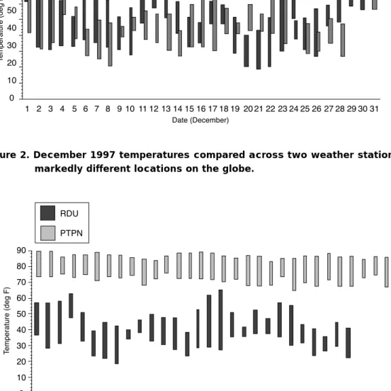
The federal government’s National Oceanic and Atmospheric Administration (NOAA) is a rich source of both historic and current weather data from around the country. NOAA’s National Climatic Data Center’s (NCDC) web site contains access to local climatic data collected on an hourly basis at air-ports and other key weather stations (NCDC, 1999). In this example, weather data were gathered from the Raleigh-Durham International Airport in North Carolina (Station: RDU, WBAN: 13722, Latitude: 35°52’) and a station on the Ponape Caroline Island, Micronesia (Station: PTPN, WBAN: 40504, Latitude 6°58’). Presented in spreadsheet form, data such as the minimum, maximum, and average daily temperatures can be compared month to month, year to year, and from station to station. The graph in Figure 1 compares the minimum/maximum daily temperatures for December of 1996 and 1997 at RDU. In addition to looking at the variation at a sin-gle weather station, comparisons can also be made across stations. Figure 2 shows the differences in min-imum/maximum daily temperatures for December of 1997 for both the North Carolina and Micronesia stations. Besides an overall warmer temperature, there is also less spread between the minimum and
29
maximum temperatures in a day or week. Is this due to its closer proximity to the equator, proximity to a large body of water, or other factors? Graphical com-parisons can be made with other weather stations around the globe using a number of different graph-ing techniques to explore these questions. These graphs become vehicles both for making sense of numeric weather data and for challenging the student to come up with effective visualization methods inte-grating multivariate data.
Image Processing
This part of the curriculum focuses on area ren-dering techniques using image-processing tech-niques. Also included is an introduction to color the-ory-both its perceptual basis and computer-based generation methods. Through the use of image pro-cessing software, the basic principles of how such software is designed and functions is explored. Image processing exercises are based on data gathered from Figure 1. Minimum/maximum daily temperatures for December of 1996 & 1997
Figure 2. December 1997 temperatures compared across two weather stations at markedly different locations on the globe.
30
both images created by the students (either using all digital or a combination of photographic and digital methods) and images acquired through the Internet. Throughout this section, techniques used by profes-sions that rely on image-processing techniques (i.e., medical and earth sciences) are examined (Wiebe, 1997c).
MRI Scan Problem
With this problem, students are given a series of mag-netic resonance imaging scans of a human head. Within these images, a large cavity is identified where cerebrospinal fluid flows through ventricles. This region is highlighted by selecting and manipulating the pixel values of this region in each of the slices using image-processing techniques. When the region is highlighted in all of the appropriate sections, this region in each of the slices is recompiled and an ani-mation created of the region being rotated. This exer-cise not only allows students to explore image-pro-cessing techniques and learn about human anatomy, but also lets them apply sectioning and projection techniques in ways not available in a traditional tech-nical graphics class.
Animation, Modeling, and Simulation
Two major new areas are introduced in this area: dynamic visualization and 3-D modeling techniques. Dynamic visualization through animation and simu-lation shows how the change in a system over time either predefined or as a real-time response to user input can be represented. Two-dimensional simula-tion is explored using software tools modeling either physical (e.g., dynamic mechanism motion) or con-ceptual (e.g., model of a virus) systems. Similarly, 3-D modeling tools can be used to create representa-tions of systems, which can then be manipulated to represent some process. The 3-D model can be the basis of a static image or used for animations to rep-resent a dynamic process. Coupled with the creation of 3-D models is an introduction to rendering tech-niques, including proper use of lighting, color, and camera position (Wiebe, 1997b).
Newtonian Physics Problem
Though many areas of physics lend themselves to visualization, Newtonian physics stands out as an excellent example of how 3-D and 2-D visualizations can help support learning about physical principles. Formulas representing the principles of Newtonian
mechanics often use spatial coordinate values both as independent and dependent variables. These values cannot only be represented in traditional graphs, but also as symbolic models. In this sample problem, stu-dents take theoretically derived data to create an ani-mation of a cannonball-given an initial velocity and vector-being shot from a cannon and model it in a 3-D modeling and animation package (see Figure 5). This exercise represents a blend of concept-driven and data-driven visualization. Besides creating a pic-torial view of the ball trajectory, animations from orthographic viewpoints (i.e., top, front, side) of the trajectory can be created to isolate movement along pairs of coordinate axes. This allows students to visu-ally identify along which axes acceleration is taking place.
Presentation and Publication
This last area focuses on the integration of infor-mation used to represent and analyze a system into a form that can be presented to an audience. Information sources include textual and numeric data in addition to the graphics created as part of the visualization. The focus is on the clear and concise presentation of necessary information to the intend-ed audience. Exercises use multimintend-edia presentation software that integrates text with both static and dynamic graphics (see Figure 3). This last area can be used as part of a capstone project encompassing both the scientific visualization course and other related courses. The presentation process emphasizes the use of multimedia formats being integrated into a project that extends from a comprehensive study about a given scientific subject.
Vocational and Technology Education’s Role Within Scientific Visualization
Vocational and technology education within North Carolina and across the nation has many things to consider during the development and implementation of this new curriculum. First, scien-tific visualization is not limited to vocational stu-dents, and all students in engineering, scientific, and technological areas can use visualization techniques. Therefore, technical graphics programs should include scientific visualization and teach students how visualization skills can be used outside of tradi-tional engineering fields. Since one of our goals in vocational and technology education is to integrate our curriculum content with general education in order to establish technological literacy, scientific
31
visualization will broaden our technical graphics cur-riculum and prepare students to integrate visualiza-tion skills in other professions (e.g., chemistry, medi-cine, biology, physics, meteorology, agriculture).
Second, vocational and technology educators need to consider the demand for a technical graphics teacher to teach this type of curriculum and team teach with other educators from other disciplines. Science teachers know the content, but vocational and technology teachers know the processes for visu-alization. Scientific visualization with its content and visual processes requires integrating both the academic and vocational areas. Thus, technical graphics teach-ers need training in this new integrated approach to teaching. They will also need updated skills to include new software and scientific content that are directly related to the curriculum.
Finally, teachers of technical graphics in two and four-year programs need to include this new content into the existing curricula of any type of graphic com-munications program. It is expected that the graduate understands the many forms and processes where
visualization is being used. It is the role of the college and university graphics educators to include this new content area and better prepare their graduates for employment, not only in the traditional technical graphics area, but for the emerging areas within scien-tific visualization. Our responsibility as vocational, technical, and technology educators at the post-sec-ondary level in graphic communications is to educate our students in the skills and knowledge needed for the 21st century.
Aaron C. Clark is an Assistant Professor of Graphic Communications at North Carolina State University in Raleigh. He specializes in teaching introductory engi-neering drawing, with an emphasis in 3-D modeling and animation. He is a member of the Alphi Pi Chapter. Eric N. Wiebe is an Assistant Professor in the Graphic Communications Program at NC State University. Dr. Wiebe has authored or co-authored four texts on techni-cal graphics used universities nation-wide. He is a mem-ber of the Alpha Pi Chapter.
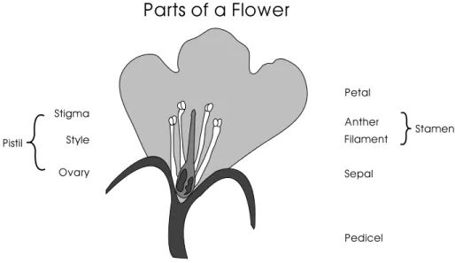
Figure 3. An illustration of a flower integrated with text labels.
References
Baker, D. R., & Pilburn, M. D. (1997). Constructing science in middle and secondary school classrooms. Boston, MA: Allyn & Bacon. Bertin, J. (1983). Semiology of graphics: Diagrams networks maps (Berg, William J., Trans.). Madison, WI: University of Wisconsin Press. Bertoline, G. R., & Miller, C. L. (1989). Spatial visualization research and theories: their importance in the development of an engi
neering and technical design graphics curriculum Model. Proceedings of the ASEE Engineering Design Graphics Division Mid-Year
32
Bertoline, G. R., Wiebe, E. N., Miller, C., & Mohler, J. L. (1997). Technical graphics communications. (2 ed.). New York, NY: McGraw-Hill. Brock, K. (1998). USA Today: 15 years. (Freedom Speaks, Episode 507): Media Studies Center. URL http://www.mediastudies.org/free
domspeaks/507.html
Clark, A. C., Wiebe, E. N., & Shown, T. (1996). Future directions for graphics: A look at the new technical graphics curriculum in NC high schools. Paper presented at the Engineering Design Graphics Division Mid-Year Meeting, Raleigh, NC.
Cleveland, W. S. (1985). The elements of graphing data. Monterey, CA: Wadsworth.
Friedhoff, R. M., & Benzon, W. (1989). Visualization: The second computer revolution. NY: Harry N. Abrams. Keller, P. R., & Keller, M. M. (1993). Visual Cues. Piscataway, NJ: IEEE Press.
Kosslyn, S. M. (1994). Elements of Graph Design. San Francisco, CA: W. H. Freeman. Luna, M. C. (1998). Technology education and its discontents. Tech Directions, 57(8), 26-27.
McCormick, B. H., Defanti, T. A., & Brown, M. D. (1987). Visualization in scientific computing. (ACM) Computer Graphics, 21(6). National Climatic Data Center. (1999). National climactic data center online archives, (Vol. 1999): National Climatic Data Center, National Oceanic and Atmospheric Administration, US Government. URL http://www.ncdc.noaa.gov/
North Carolina Public Schools. (1997). Scientific and Technical Visualization I (Curriculum T&I 7922): State of North Carolina. Patrikalakis, N. M. (Ed.). (1991). Scientific Visualization of Physical Phenomena. Berlin: Springer-Verlag.
Raudebaugh, R. A. (1996, October). Manual drafting: A skill for the 21st century? The Technology Teacher, 8-12. Rodriguez, W. (1992). The Modeling of Design Ideas: Graphics and visualization techniques for engineers. NY: McGraw-Hill.
Senay, H., & Ignatius, E. (1990). Rules and principles of scientific data visualization. Paper presented at the State of the art in data visualization (ACM) SIGGRAPH Course Notes (27).
Sorby, S. A., & Baartmans, B. G. (1994). An introduction to 3-D spatial visualization - A pre-graphics course. Proceedings of the 6th International Conference on Engineering Computer Graphics and Descriptive Geometry, Tokyo, Japan.
Technology Assessment Project. (1999). NC Technology Competencies for Educators, (Vol. 1999): North Carolina Department of Public Instruction. URL http://www.ofps.dpi.state.nc.us/OFPS/hm/te/techcomp.htm
Tufte, E. R. (1983). The Visual Display of Quantitative Information. Cheshire, CT: Graphics Press. Tufte, E. R. (1990). Envisioning Information. Cheshire, CT: Graphic Press.
Wiebe, E. N. (1992). Scientific visualization: An experimental introductory course for scientific and engineering students. Engineering
Design Graphics Journal, 56(1), 39-44.
Wiebe, E. N. (1997a). Earth Science - Graphing. URL http://www2.ncsu.edu/unity/lockers/project/scivishome/graphprob.html Wiebe, E. N. (1997b). Physics - Modeling. URL http://www2.ncsu.edu/unity/lockers/project/scivishome/modelprob.html Wiebe, E. N. (1997c). Remote Sensing - Image Processing. URL http://www2.ncsu.edu/unity/lockers/project/scivishome/lessons/
remote2/remote.html
Wiebe, E. N., & Clark, A. C. (1997). Scientific Visualization Project Homepage. URL http://www2.ncsu.edu/scivis/
Wiebe, E. N., & Clark, A. C. (1998). Evolving technical graphics in the high schools: A new curriculum in scientific visualization.
Engineering Design Graphics Journal, 62(2), 4-15.
Zsombor-Murray, P. J. (1990). 2-D and 3-D CAD: complements to visualization. Engineering Design Graphics Journal, 54(3), 17-29. Scientific Visualization 1
Acknowledgements
This project described was supported in part by a Tech-Prep Initiative Grant to the state of North Carolina and funded through the Carl Perkins Act. The authors would also like to acknowledge the help of Eleanor V. Hasse in developing the curriculum materials described in this article.