Random sampling as a clutter reduction technique to facilitate interactive visualisation of large datasets
419
0
0
Full text
(2)
(3) Ah Ha! Now that is interesting! Bob Spence.
(4)
(5) 6.. Abstract Within our physical world lies a digital world populated with an ever increasing number of sizeable data collections. Exploring these large datasets for patterns or trends is a difficult and complex task, especially when users do not always know what they are looking for. Information visualisation can facilitate this task through an interactive visual representation, thus making the data easier to interpret. However, we can soon reach a limit on the amount of data that can be plotted before the visual display becomes overcrowded or cluttered, hence potentially important information becomes hidden. The main theme of this work is to investigate the use of dynamic random sampling for reducing display clutter. Although randomness has been successfully applied in many areas of computer science and sampling has been used in data processing, the use of random sampling as a dynamic clutter reduction technique is novel. In addition, random sampling is particularly suitable for exploratory tasks as it offers a way of reducing the amount of data without the user having to decide what data is important. Sampling-based scatterplot and parallel coordinate visualisations are developed to experiment with various options and tools. These include simple, dynamic sampling controls with density feedback; a method of checking the reality of the representative sample; the option of global and/or localised clutter reduction using a variety of novel lenses and an auto-sampling option of automatically maintaining a reasonable view of the data within the lens. Furthermore, this work showed that sampling can be added to existing tools and used effectively in conjunction with other clutter reduction techniques. Sampling is evaluated both analytically, using a taxonomy of clutter reduction developed for the purpose, and experimentally using large datasets. The analytic route was prompted by an exploratory analysis, which showed that evaluation of information visualisation based on user studies are problematic. This thesis has contributed to several areas of research: ‣ the feasibility and flexibility of global or lens-based sampling as a clutter reduction technique are demonstrated through sampling-based scatterplot and parallel coordinate visualisations. ‣ the novel method of calculating the density for overlapping lines in parallel coordinate plots is both accurate and efficient and enables constant density within a sampling lens to be maintained without user intervention. ‣ the novel criteria-based taxonomy of clutter reduction for information visualisation provides designers with a method to critique existing visualisations and think about new ones.. i.
(6)
(7) 6.. Acknowledgements My thanks go to my supervisor Alan Dix, for his unrivalled enthusiasm, acute perception, mathematical wizardry and for generally letting me get on with things. I am indebted to my wife Devina for supporting me in this venture and for taking on the daunting task of proof reading the manuscript. I am grateful to the late Steve Pollitt, who gave me the opportunity to start my information retrieval research with the MenUSE and HiBROWSE projects in the mid 90’s and who was an inspiration to me. Special thanks to Enrico Bertini for helping to get the initial sampling-based visualisation off the ground. I would also like to thank my examiners, Aaron Quigley and John Mariani for their valuable comments and suggestions. I am grateful to Lancaster University for the 40th Anniversary Doctoral Fellowship award and to the Computing Department for their support. I would also like to thank the following for their contributions towards the cost of attending conferences: The Royal Academy of Engineering, DELOS European Network of Excellence and at Lancaster University, The William Ritchie Travel Fund, The Faculty of Science and Technology and the Computing Department. Finally I would like to thank the people in InfoLab21 for making it a pleasant work place, with special thanks to Kiel for taking time out to chat about the world of gaming and other more erudite matters.. ii.
(8)
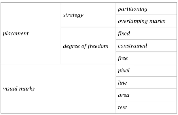
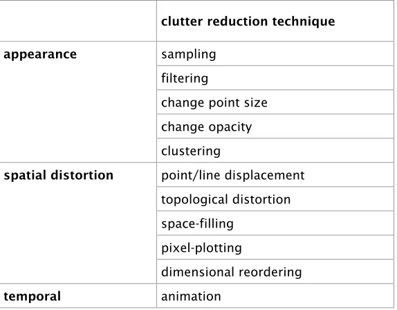
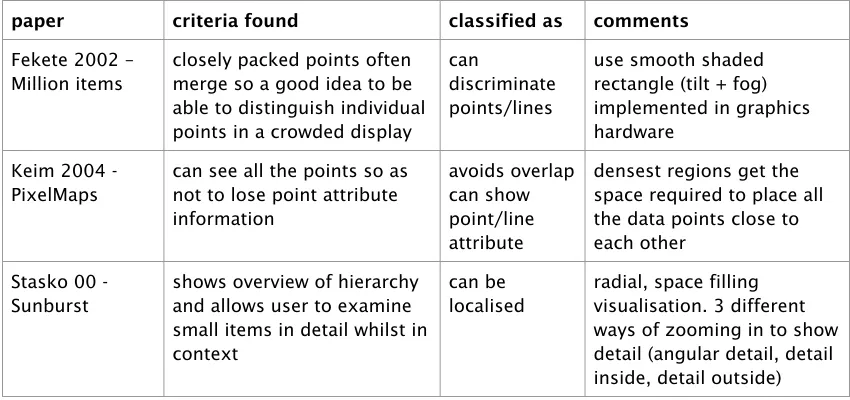
(9) Table of Contents Abstract .......................................................................................................................... i Acknowledgements....................................................................................................... ii Table of Contents......................................................................................................... iii List of Figures.............................................................................................................viii List of Tables...............................................................................................................xiii Chapter 1 Introduction................................................................................................ 1 1.1 Visualising large datasets .......................................................................................3 1.1.1 Visual limits...................................................................................................3 1.1.2 Computational limits..................................................................................... 7 1.2 Uses of randomness.............................................................................................. 9 1.2.1 Randomness in computing ........................................................................... 9 1.2.2 Randomness for data processing................................................................. 9 1.3 Random sampling for clutter reduction................................................................. 11 1.4 Approach and Objectives..................................................................................... 13 1.5 Novel characteristics of the work.......................................................................... 19 1.6 Contribution to the research area......................................................................... 21 1.7 Structure of the thesis .......................................................................................... 23. Chapter 2 Sampling as a clutter reduction technique ...........................................27 2.1 The Astral Telescope Visualiser............................................................................29 2.1.1 Sampling issues......................................................................................... 33 2.2 The z-index method..............................................................................................35 2.2.1 Display continuity........................................................................................35 2.2.2 Reality Check.............................................................................................. 37 2.3 Randomness in visualisation................................................................................ 37 2.3.1 Sampling an infinite space..........................................................................39 2.3.2 Non-uniform sampling................................................................................ 41 2.3.3 Sampling a network graph.......................................................................... 43 2.4 Types of sampling................................................................................................ 45 2.4.1 Constant density ......................................................................................... 47 2.4.2 Attribute dependent density........................................................................ 47 2.4.3 Sampling structured data............................................................................ 47 2.5 Sampling from databases.....................................................................................49 2.5.1 Issues and requirements ............................................................................ 49 2.5.2 Database management system support..................................................... 51 2.6 Summary and reflection........................................................................................ 53. Chapter 3 Clutter-reduction Taxonomy for Information Visualisation................. 57 3.1 Information visualisation classification schemes.................................................. 59 3.1.1 Ward’s taxonomy of glyph placement strategies........................................ 63 3.1.2 Bertini’s classification of clutter reduction techniques.................................65 3.2 Techniques for visual clutter reduction................................................................. 65. iii.
(10)
(11) Table of Contents. 3.3. 3.4 3.5. 3.6. 3.2.1 Appearance ................................................................................................ 67 3.2.2 Spatial distortion......................................................................................... 69 3.2.3 Temporal..................................................................................................... 71 Clutter reduction criteria....................................................................................... 71 3.3.1 Avoids overlap ............................................................................................73 3.3.2 Keeps spatial information........................................................................... 73 3.3.3 Can be localised ......................................................................................... 73 3.3.4 Is scalable .................................................................................................. 73 3.3.5 Is adjustable ............................................................................................... 75 3.3.6 Can show point/line attribute ...................................................................... 75 3.3.7 Can discriminate points/lines...................................................................... 75 3.3.8 Can see overlap density............................................................................. 75 3.3.9 Other criteria............................................................................................... 75 Clutter-reduction Taxonomy..................................................................................77 3.4.1 Discussion of clutter reduction technique................................................... 79 Evaluating the taxonomy...................................................................................... 97 3.5.1 Validity ........................................................................................................ 99 3.5.2 Utility ........................................................................................................... 99 3.5.3 Comparison with Ward’s taxonomy of glyph placement strategies.......... 101 3.5.4 Comparison with Bertini’s clutter reduction strategies.............................. 103 3.5.5 Criteria are important................................................................................ 109 Summary and reflection...................................................................................... 111. Chapter 4 Clutter reduction: random sampling and lenses................................ 117 4.1 Sampling-based scatterplot and parallel coordinates ......................................... 119 4.1.1 Basic sampling ......................................................................................... 119 4.1.2 Reality Check............................................................................................ 121 4.2 Comparing clutter reduction techniques using same dataset.............................125 4.2.1 Sampling...................................................................................................127 4.2.2 Opacity..................................................................................................... 127 4.2.3 Point size .................................................................................................. 129 4.2.4 Filtering..................................................................................................... 129 4.2.5 Filtering vs. Sampling............................................................................... 131 4.2.6 Sorting issue............................................................................................. 133 4.3 Sampling Lens ................................................................................................... 133 4.3.1 Lens features............................................................................................ 133 4.3.2 Generating the lens sample ..................................................................... 135 4.3.3 Implementing the lens.............................................................................. 137 4.3.4 Examples of the lens on scatterplots and parallel coordinates................ 139 4.4 Other lenses and techniques for parallel coordinates ........................................ 139 4.4.1 Inter-axis................................................................................................... 139 4.4.2 Axis (filter)................................................................................................. 141 4.4.3 RaDar....................................................................................................... 143 4.4.4 Fade and Twinkle – Reality Check transitions .......................................... 147 4.5 Summary and reflection...................................................................................... 149. iv.
(12)
(13) Table of Contents Chapter 5 The provision of auto-sampling ........................................................... 155 5.1 Defining a clutter measure ................................................................................. 157 5.1.1 Existing metrics for display clutter and density .........................................157 5.1.2 Defining a measure for occlusion............................................................. 159 5.2 The first attempt at auto-sampling ......................................................................161 5.2.1 Defining further occlusion measures ........................................................ 165 5.3 Investigating occlusion measures for parallel coordinates ................................. 165 5.3.1 The experiments ....................................................................................... 165 5.3.2 Empirical results ....................................................................................... 167 5.3.3 Theoretical model..................................................................................... 171 5.4 Methods for calculating occlusion.......................................................................173 5.5 Comparing the occlusion algorithms.................................................................. 177 5.5.1 Accuracy : which is good enough?........................................................... 177 5.5.2 Efficiency: which is fast enough?.............................................................. 181 5.5.3 The winner................................................................................................ 187 5.6 Dealing with non-uniform density....................................................................... 187 5.6.1 Identifying the problem............................................................................. 189 5.6.2 The solution - using multiple bins............................................................. 191 5.7 Summary and reflection...................................................................................... 197. Chapter 6 Evaluation of sampling......................................................................... 199 6.1 User evaluation issues....................................................................................... 201 6.1.1 User evaluation of information visualisations is problematic.................... 201 6.1.2 Possibility for evaluating the Sampling Lens with users........................... 205 6.1.3 Objectivity of criteria-based evaluation..................................................... 209 6.2 Comparing sampling to other clutter reduction techniques................................ 211 6.2.1 Criteria based evaluation of sampling.......................................................211 6.2.2 Comparison between sampling and clustering .........................................219 6.2.3 Advantages and disadvantages of sampling ............................................ 221 6.3 Further exploration of sampling-based scatterplots........................................... 223 6.3.1 Global sampling........................................................................................ 223 6.3.2 Lens-based sampling ............................................................................... 231 6.4 The Sampling Lens synthesis............................................................................ 233 6.4.1 Development of the Sampling Lens application........................................233 6.4.2 Functionality of the Sampling Lens visualisation...................................... 235 6.5 Can sampling be incorporated into other visualisations?................................... 239 6.5.1 Hierarchical data structures...................................................................... 241 6.5.2 Visualisations that avoid overplotting....................................................... 245 6.5.3 Visualisations that provide representative data........................................ 245 6.6 Astral Visualiser revisited................................................................................... 247 6.6.1 Thinking about the Astral Visualiser..........................................................249 6.7 Summary and reflection...................................................................................... 251. Chapter 7 Conclusion............................................................................................. 255 7.1 Main issues and outcomes................................................................................. 257 7.2 Summarising sampling as a clutter reduction technique .................................... 261 7.3 Meeting the objectives of this work..................................................................... 267. v.
(14)
(15) Table of Contents 7.4 Future directions.................................................................................................271 7.4.1 Sampling structured and relational data................................................... 271 7.4.2 Visualising uncertainty .............................................................................. 275 7.5 Final remarks......................................................................................................277. References .................................................................................................................281 Appendix A Examples of clutter reduction techniques........................................ 313 A.1 Clutter-reduction Taxonomy techniques ............................................................. 313 A.1.1 Filtering..................................................................................................... 313 A.1.2 Change point size .....................................................................................315 A.1.3 Change opacity ........................................................................................ 317 A.1.4 Clustering ................................................................................................. 319 A.1.5 Displacement............................................................................................ 321 A.1.6 Topological distortion................................................................................ 323 A.1.7 Space-filling .............................................................................................. 327 A.1.8 Pixel-plotting ............................................................................................. 327 A.1.9 Dimensional reordering ............................................................................ 329 A.1.10 Animation.................................................................................................. 329 A.2 Other techniques ................................................................................................ 333 A.2.1 Summary statistics and aggregation........................................................ 333 A.2.2 Dimensional reduction.............................................................................. 335 A.2.3 Appearance other than point size and opacity......................................... 335 A.2.4 Anisotropic Volume Rendering................................................................. 337. Appendix B Description of datasets used in this work.........................................339 B.1 B.2 B.3 B.4 B.5 B.6 B.7. Portland cars dataset (cars 5k and cars 1k)...................................................... 339 SIPP 2004 dataset ............................................................................................. 339 Parcels dataset .................................................................................................. 341 Synthetic clustering dataset ............................................................................... 341 People dataset................................................................................................... 343 Stockmarket dataset .......................................................................................... 343 Household Income dataset ................................................................................ 343. Appendix C Details of experiments with parallel coordinate Sampling Lens.... 345 C.1 exp1 to exp21..................................................................................................... 345 C.2 exp22 to 29......................................................................................................... 347 C.3 exp30 to exp34................................................................................................... 347 C.4 exp35 to exp41................................................................................................... 349 C.5 exp42 to exp44................................................................................................... 349 C.6 exp45 to exp55................................................................................................... 351 C.7 exp56 .............................................................................................................. 353 C.8 exp57 to exp59................................................................................................... 353 C.9 Data collected for each experiment.................................................................... 353 C.10 Example of data output from an experiment...................................................... 357. vi.
(16)
(17) Table of Contents Appendix D Implementation Issues........................................................................ 359 D.1 Instrumentation of the Sampling Lens................................................................ 359 D.1.1 Density visualiser......................................................................................359 D.1.2 Extended sampling controls..................................................................... 361 D.1.3 Empirical controls..................................................................................... 361 D.2 Architectural issues............................................................................................ 363 D.2.1 InfoVis Toolkit architecture ........................................................................365 D.2.2 Implementing the sampling applications................................................... 365 D.3 OpenGL implementation..................................................................................... 369 D.3.1 Java2D vs. OpenGL ................................................................................. 369 D.3.2 OpenGL version of the Sampling Lens..................................................... 371. Appendix E Comparison of Natural Building Techniques.................................... 375 Appendix F An Explorative Analysis of User Evaluation Studies in InfoVis.......379. vii.
(18)
(19) List of Figures Figure 1-1. A concept map showing a set of linked concepts surrounding the idea of information visualisation............................................................................................................................. 0. Figure 1-2a. Examples of overplotted visualisations - NetMap movie database ........................................ 2. Figure 1-2b. Examples of overplotted visualisations - Cars for sale............................................................ 2. Figure 1-3. Relationship between the objectives of this research...................................................... 12-18. Figure 2-1. Views of the stars through a zoomable telescope as the magnification increases ............... 28. Figure 2-2. Model behind the Astral Telescope Visualiser....................................................................... 30. Figure 2-3. Example of zooming in to a scatterplot with the Astral Telescope Visualiser prototype, demonstrating automatic adjustment of the sampling rate ....................................................30. Figure 2-4. Generation of parameter-performance pair by random sampling the parameter space....... 40. Figure 2-5. Histogram view of the multi-dimensional parameter and performance spaces of the Influence Explorer................................................................................................................................. 40. Figure 2-6. Examples of different types of sampling from Bertini and Santucci’s sampling visualisation (a) original image, (b) best uniform sampling and (c) perceptual non-uniform sampling...... 42. Figure 2-7. Visualisation large network graph through sampling (Rafiei and Curial) (a) 0.1% sample size and (b) 0.2% sample size ......................................................................................................42. Figure 2-8. Washing powder sales map: uniform sampling removes most of the data items in less populated regions ................................................................................................................ 46. Figure 2-9. Washing powder sales map: non-uniform sampling provides a region wide comparison of brands ................................................................................................................................... 46. Figure 2-9. Washing powder and washing machine sales map: (a) identical non-uniform sampling for powder and machines (b) independent non-uniform sampling ............................................. 84. Figure 3-1. Using sampling to reduce the number of overlapping lines .................................................. 78. Figure 3-2. Dynamic query interface ....................................................................................................... 78. Figure 3-3. Displacement reveals the data underneath and helps to disambiguate the edges ............... 79. Figure 3-4. Examples of multi-attribute glyphs........................................................................................ 80. Figure 3-5. The clustering used in Hierarchical parallel coordinates is scaleable to very large datasets, only limited by computational resources ............................................................................... 80. Figure 3-6. PixelMap avoids overlap altogether by distorting the underlying map .................................. 81. Figure 3-7. Overlaid grid squares provide a reference for the user and helps to keep spatial information following a topological distortion............................................................................................82. Figure 3-8. Example of an RSVP, Rapid Serial Visual Presentation....................................................... 82. Figure 3-9. Space-filling algorithms avoid overplotting............................................................................ 84. Figure 3-10. An example of filtering with a lens......................................................................................... 86. Figure 3-11. Constant density display ....................................................................................................... 86. Figure 3-12. Liquid browsing displaces points locally based on the distance from the stylus position and the pressure exerted by the user........................................................................................... 86. Figure 3-13. NodeTrix combines a node-link representation to give an overall view of a social network with adjacency matrices giving detailed analysis of local communities. ............................... 88. Figure 3-14. Dimensional reordering in a parallel coordinate plot............................................................. 88. Figure 3-15. Changing the visibility of structures within a parallel coordinate plot using transfer functions to map line density to opacity ................................................................................................90. Figure 3-16. Hierarchical clustering with Edge Bundles ........................................................................... 90. viii.
(20)
(21) List of Figures Figure 3-17. Animated bubbles used in Cenimation avoid permanent overlap ......................................... 90. Figure 3-18. Discrimination of lines in a parallel coordinate plot utilising the outlier-preserving technique of Novotny et al. and opacity ................................................................................................. 92. Figure 3-19. Curving the lines of the plot to help the user follow individual lines...................................... 94. Figure 3-20. Topological distortion along axes of a parallel coordinate plot which stretches region with many lines crossing to help disambiguate the paths of the lines .......................................... 94. Figure 3-21. Reducing the opacity of lines can indicate the density of the overlapping lines ................... 96. Figure 3-22. Information Mural utilises the display space by plotting at a pixel level................................ 96. Figure 3-23. Fisheye Menu example....................................................................................................... 110. Figure 4-1. Sampling-based scatterplot visualisation showing age (horizontal axis) versus monthly income (vertical axis) for a sample of 9432 people ............................................................. 118. Figure 4-2. Scatterplot of the age-income-education data now reduced to 188 points (a 2% sampling rate) ..................................................................................................................................... 118. Figure 4-3. Basic z-index method to generate a sample and ensuring display continuity ..................... 120. Figure 4-4. Parallel coordinates visualisation at sampling rates from 100% to 5%............................... 120. Figure 4-5. Scatterplots following successive Reality Checks showing that despite the 2% sampling rate, the distribution is fairly consistent in the more dense regions of the plot ............................ 120. Figure 4-6. Parallel coordinate plots following successive Reality Checks ........................................... 122. Figure 4-7. The same section from three scatterplots following successive Reality Checks demonstrating an artefact of the sampling .......................................................................... 122. Figure 4-8. Generating successive Reality Check samples with the z-index method........................... 122. Figure 4-9. Reducing the overlap of points using random sampling..................................................... 126. Figure 4-10. Reducing the opacity of the points gives a useful density map .......................................... 126. Figure 4-11. A combination of sampling to reduce overlap and opacity to see the overlap .................... 128. Figure 4-12. Effect of the size of the plotted points on the perceived density ......................................... 128. Figure 4-13. Filtering on three vehicle types........................................................................................... 130. Figure 4-14. The effect of sampling on showing the distribution of the three vehicle types .................... 130. Figure 4-15. The effect of low sampling rates on showing the distribution of the three vehicle types ..... 130. Figure 4-16. Inappropriate sorting of the data over emphasises the number of blue points................... 130. Figure 4-17. Parallel coordinates Sampling Lens with an early version of the sampling control panel... 132. Figure 4-18. Generating lens samples with the z-index method............................................................. 136. Figure 4-19. Screen shots of the early version of the Sampling Lens..................................................... 138. Figure 4-20. Use of the inter-axis lens on a parallel coordinate plot................................................ 140-141. Figure 4-21. Parallel coordinate plot of the Portland cars dataset showing the advantage of axis lens in reducing display clutter........................................................................................................ 142. Figure 4-22. Enhancing Figure 4-21d through the use of the RaDar technique...................................... 144. Figure 4-23. The use of an axis lens in conjunction with the rainbow colouring of RaDar............... 144-145. Figure 4-24. Parallel coordinate plots illustrate the use of an axis lens and RaDar colouring in revealing patterns in otherwise very overcrowded plots ..............................................................146-147. Figure 4-25. Fade transitions for (a) parallel coordinate plot and (b) scatterplot..................................... 148. Figure 4-26. Twinkle transition on a parallel coordinate plot................................................................... 148. Figure 4-27. Example of the use of a fisheye lens .................................................................................. 152. Figure 5-1. Occlusion model: (a) scatterplot with overplotting occurring at two of the pixels. (b) two lines crossing at the centre point ................................................................................................. 160. ix.
(22)
(23) List of Figures Figure 5-2. Sampling control panel for the auto-sampling version of the Sampling Lens .................... 162. Figure 5-3. (a) Example of lines meeting at a point on an attribute axis. (b) Setting a non-overlap zone near to an attribute axis so that lines meeting at a point on the axis are not counted as overlapping ..........................................................................................................................162. Figure 5-4. Behaviour of the lines algorithm with and without zone clipping in the exceptional case where many lines meet on a vertical axis ........................................................................... 164. Figure 5-5. Parallel coordinate plot using 1K car dataset (labels and lens positions for exp1,2 & 3 are superimposed) .................................................................................................................... 166. Figure 5-6a. Occlusion measures for exp1, exp2 and exp3 plotted against sampling rate .................... 166. Figure 5-6b. Occlusion measures for exp1, exp2 and exp3 plotted against plotted points.................... 169. Figure 5-6c. Occlusion measures for exp1, exp2 and exp3 plotted against behaviour of the measures at low densities ........................................................................................................................168. Figure 5-7. Overplotted% occlusion measures a wide range of line crossing patterns (experiments 1, 2, 3, 18, 20 and 21)................................................................................................................. 168. Figure 5-8. Lenses at 10% sampling rate for experiments 1, 2, 3, 18, 20 and 21................................. 169. Figure 5-9. Occlusion measures for experiments 1, 2 and 3 normalised against overplotted%............ 168. Figure 5-10. Model-based measures, overplotted%, overcrowded% and hidden%................................ 170. Figure 5-11. (a) theoretical curves for measures based on random point placement and (b) comparing theoretical and empirical results ..........................................................................................170. Figure 5-12. Line overlap proportion....................................................................................................... 174. Figure 5-13. Three different occlusion algorithms (exp1)........................................................................ 176. Figure 5-14. Three different occlusion algorithms for (a) exp2 and (b) exp3 ........................................... 176. Figure 5-15. Raster values for the three experiments, plotted against the number of lines crossing the lens ......................................................................................................................................178. Figure 5-16. The three occlusion measures, raster, lines and random for a dense region of a 10,000 record dataset (exp7) .......................................................................................................... 178. Figure 5-17. Lens position for exp7 showing the small low density region to the right ........................... 179. Figure 5-18. Exp1, 2 and 3 normalised against raster values ................................................................. 180. Figure 5-19. Modification of the original lines algorithm to deal with the special case of lines meeting at their end points ....................................................................................................................180. Figure 5-20. Calculation times for the three algorithms ........................................................................... 182. Figure 5-21. Raster overplotted% for various cell widths plotted against sampling rate (exp1).............. 184. Figure 5-22. When rasterising a line, the proportion of cells crossed increases with the cell size.......... 184. Figure 5-23. Accuracy of different raster cell-widths (exp1) .................................................................... 184. Figure 5-24. Reduction in the calculation times of the raster algorithm with increasing cell widths........ 186. Figure 5-25. Lens patterns used to investigate non-uniform density across the lens ............................. 188. Figure 5-26. Lines, raster and random overplotted% values at different sampling rates for lens positions exp30, exp32 and exp34 ..................................................................................................... 188. Figure 5-27. Lines, raster and random overplotted% values for lens positions exp30 and exp34 plotted against number of plotted points ......................................................................................... 190. Figure 5-28. Overlap density maps for exp30, exp32 and exp34 at a sampling rate of 20%.................. 190. Figure 5-29. Example of dividing a 100 pixel wide lens area into bins 30 pixels wide............................. 191. Figure 5-30. The positive effect of binning on random overplotted% in correcting for a partly covered lens (exp39) ................................................................................................................................ 192. Figure 5-31. The number of plotted points is not exactly proportional to the sampling rate.................... 193. x.
(24)
(25) List of Figures Figure 5-32. Random occlusion measure normalised against the raster standard for a partly covered lens (exp39) ................................................................................................................................ 195. Figure 5-33. The advantage of using binning for lens with non-uniform density ..................................... 194. Figure 5-34. The effect of binning on the calculated raster overplotted% values .................................... 196. Figure 6-1. FilmFinder application in Spotfire........................................................................................ 212. Figure 6-2. Colour scale for USA household income scatterplots ......................................................... 223. Figure 6-3. Full 155K dataset showing the distribution of household income across the USA ............. 222. Figure 6-4. (a) 5% and (b) 1% samples of the original USA household income 155K dataset...... 224-225. Figure 6-5a. Reducing the opacity of plotted points to 4% gives a good indication of the higher population density areas and an approximate average income through colour blending ..................... 226. Figure 6-5b. Reducing opacity to 1% highlights major population centres but other information is lost . 227. Figure 6-6a. Filtering highlights areas of high income............................................................................. 226. Figure 6-6b. Filtering highlights areas of low income.............................................................................. 227. Figure 6-7. North-eastern states household income map (a) full dataset (b) reducing the sampling rate to 2%............................................................................................................................ 228-229. Figure 6-8. Two successive Reality Checks following on from Figure 6-7b, demonstrate that different 2% samples present representative views. ............................................................................... 228. Figure 6-9a. Sampling lens over Philadelphia reduces the overplotting.................................................. 230. Figure 6-9b. Four successive Reality Checks (top) and two other samples (bottom)............................. 230. Figure 6-10. Reality Check samples for the lens on a densely populated scatterplot............................. 231. Figure 6-11. Combination of reduced opacity and a sampling lens on a cluttered scatterplot................ 232. Figure 6-12. Visualising large hierarchies with (a) Hyperbolic Browser and (b) Treemap ....................... 266. Figure 6-13. Changing the focus in a Hyperbolic Browser to expand lower nodes................................. 241. Figure 6-14. Acyclic tree before sampling............................................................................................... 242. Figure 6-15. Sampling the acyclic tree (50% sampling rate). (a) any node and (b) only leaf nodes. ..... 242. Figure 6-16. Acyclic tree with different path lengths ................................................................................ 242. Figure 6-17. Zooming in on a scatterplot with automatic adjustment of sampling rate............................ 244. Figure 6-18. Zooming in on a scatterplot with automatic adjustment of sampling rate..................... 246,249. Figure 6-19. Zooming out on a scatterplot with automatic adjustment of sampling rate......................... 248. Figure 7-1. Relationship between the objectives ................................................................................... 266. Figure A-1. HomeFinder’s dynamic query interface............................................................................... 312. Figure A-2. Attribute Explorer................................................................................................................. 314. Figure A-3. Enhanced dynamic query filters .......................................................................................... 314. Figure A-4. Examples of multi-attribute glyphs...................................................................................... 314. Figure A-5. Constant density (a) original display (b) VIDA constant density display........................... 316. Figure A-6. Reducing the opacity of lines in a parallel coordinate plot to produce a density map ......... 316. Figure A-7. Changing the visibility of structures within a parallel coordinate plot using transfer functions to map line density to opacity ..............................................................................................318. Figure A-8. Hierarchical parallel coordinates......................................................................................... 318. Figure A-9. Hierarchical edge bundles with bundling strength ß increasing from left to right ................ 321. Figure A-10. Resolving point occlusion a) no jitter b) random jitter and c) smart jitter.......................... 320. Figure A-11. EdgeLens displaces lines to reveal labels .......................................................................... 322. Figure A-12. Curving the lines of a parallel coordinate plot to help the user follow individual lines ......... 322. xi.
(26)
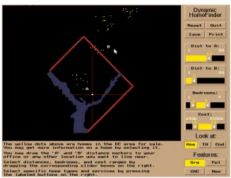
(27) List of Figures Figure A-13. Keim’s PixelMap distorts the underlying spatial area to avoid overlapping items............... 324. Figure A-14. Carpendale's pliable surfaces indicates degree of distortion.............................................. 324. Figure A-15. Topological distortion along axes of a parallel coordinate plot helps to disambiguate the paths of the lines ................................................................................................................. 324. Figure A-16. Space-filling algorithms avoid overplotting: a) Treemaps and b) Sunburst......................... 326. Figure A-17. Pixel-plotting: Keim’s a) spirals and b) Pixel bar chart....................................................... 326. Figure A-18. TableLens displays attribute values as pixel bars ............................................................... 329. Figure A-19. Information Mural utilises the display space by plotting at a pixel level.............................. 328. Figure A-20. Dimensional reordering in a parallel coordinate plot: a) before reordering, b) after.......... 328. Figure A-21. Animation to avoid overlap: a) RSVP carousel b) Cenimation........................................... 330. Figure A-22. Feature animation imparts information on skewness and standard deviation to a cluster in a parallel coordinate plot ........................................................................................................ 330. Figure A-23. Parallel coordinates and circular parallel coordinates......................................................... 334. Figure A-24. Proximity-based colouring discriminates lines in the original parallel coordinate plot by automatically assigning different colours to clusters........................................................... 334. Figure A-25. Blurriness can discriminate between points whilst still maintaining context........................ 336. Figure B-1. A parallel coordinate plot of the Portland cars dataset showing the extent of the data....... 339. Figure B-2. Distribution of educational achievements for SIPP dataset ................................................ 340. Figure B-3. Parcel dataset (German post office)................................................................................... 340. Figure B-4. Distribution of median household income for USA census................................................. 342. Figure C-1. Lens positions for exp1, 2, 3, 18, 20 and 21....................................................................... 344. Figure C-2. Lens at 10% sampling rate for exp1, 2, 3, 18, 20 and 21.................................................... 344. Figure C-3. Lens position for exp7 to 14 (People 10K dataset)............................................................. 344. Figure C-4. Lens positions for exp22, 23, 24, 25, 26, 27, 28, 29 (30% lens sampling rate)................... 346. Figure C-5. Lens positions for exp30 to 34 (10% lens sampling rate)................................................... 346. Figure C-6. Screen shots for synthetic data experiments 42, 43 and 44............................................... 348. Figure C-7a. Investigating binning with a synthetic dataset..................................................................... 350. Figure C-7b. As Figure C-7a but with random overplotted% normalised against raster overplotted%.... 350. Figure C-8. Lens screen shots for exp45 (top left) to 55 (bottom right)................................................. 351. Figure C-9. Lens screen shots for a range of occlusion values - exp56................................................ 352. Figure C-10. Example of the data output from an experiment and read into a spreadsheet............ 356-357. Figure D-1. Sampling Lens density visualiser......................................................................................... 360. Figure D-2. Extended sampling controls for the Sampling Lens ............................................................ 362. Figure D-3. Part of a spreadsheet based on the output file produced via the empirical control panel... 364. Figure D-4. Control panel for conducting the experiments..................................................................... 364. Figure D-5. Internal structure of the InfoVis Toolkit................................................................................ 366. Figure D-6. Parallel coordinate lines in the lens sample are clipped to the lens outline and any attribute axes within the lens ............................................................................................................. 368. Figure D-7. Comparison of the drawing time for Java2D and Jogj (OpenGL) version of a simple parallel coordinate applications. ...................................................................................................... 370. Figure D-8. Comparison of the drawing time for the Jogl (OpenGL) version of a simple parallel coordinate applications with and without the use of a display list ....................................... 372. xii.
(28)
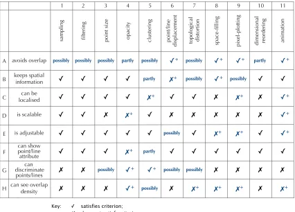
(29) List of Tables. List of Tables Table 1-1. Contribution to the research area.......................................................................................... 20. Table 2-1. Data table with the addition of a z-index to facilitate random sampling................................. 34. Table 2-2. Summary of the key benefits of a sampling approach to clutter reduction based on the proposed Astral Visualiser..................................................................................................... 54. Table 3-1. Ward’s taxonomy of glyph placement strategies ................................................................... 62. Table 3-2. Bertini’s design space characterisation................................................................................. 64. Table 3-3. Bertini’s clutter reduction strategies...................................................................................... 64. Table 3-4. Clutter reduction techniques used in the Clutter-reduction Taxonomy .................................. 66. Table 3-5. Example clutter reduction criteria search records................................................................. 70. Table 3-6. Clutter-reduction Taxonomy for information visualisation...................................................... 76. Table 3-7. Using the taxonomy to combine the strengths of several techniques to create new visualisations ......................................................................................................................... 98. Table 3-8. Sample points in a design space of glyph layout strategies ................................................. 98. Table 3-9. Expanded version of Ward’s taxonomy of glyph placement strategies ............................... 100. Table 3-10. Comparison of Bertini’s clutter reduction methods with the clutter reduction techniques used in the Clutter-reduction Taxonomy ...................................................................................... 102. Table 3-11. Expanded version of Bertini’s clutter reduction strategies .................................................. 104. Table 3-12. Expanded version of Bertini’s design space characterisation............................................. 106. Table 3-13. A comparison of natural building techniques for walls ........................................................ 108. Table 3-14. The clutter reduction taxonomy for the topological distortion technique.............................. 110. Table 4-1. Basic clutter reduction techniques ...................................................................................... 126. Table 4-2. Strengths and weaknesses of sampling and some other clutter reduction techniques....... 150. Table 5-1. Definition of the occlusion measures .................................................................................. 164. Table 5-2. Lines within the lens at 10% lens sampling rate................................................................. 166. Table 5-3. Raw data values for occlusion measures........................................................................... 174. Table 5-4. The average pixels per line of all the lines crossing the lens.............................................. 178. Table 5-5. The major components of time taken to redraw the lens.................................................... 182. Table 6-1. The strengths and weaknesses of a sampling approach to clutter reduction in relation to the criteria used in the Clutter-reduction Taxonomy and the objectivity in assessing each criterion. .............................................................................................................................. 208. Table 6-2. Clutter-reduction Taxonomy (copy of Table 3-6).................................................................. 210. Table 6-3. A summary of the benefits of sampling for clutter reduction based on the taxonomy......... 220. Table 6-4. Comparing the performance of Java2D and OpenGL versions of the Sampling Lens with parallel coordinates datasets .............................................................................................. 232. Table 6-5. The Clutter-reduction Taxonomy for the sampling and topological distortion techniques ... 250. Table 7-1. Main issues and outcomes arising from each chapter................................................. 256-260. xiii.
(30)
(31) List of Tables. Table 7-2. A summary of the benefits of a sampling approach to clutter reduction.............................. 260. Table 7-3. A summary of some disadvantages of a sampling approach to clutter reduction............... 264. Table 7-4. Main issues and outcomes for objective...................................................................... 266-270. Table C-1. Details for experiments 1 to 21........................................................................................... 347. Table C-2. Details for experiments 22 to 29......................................................................................... 347. Table C-3. Details for experiments 30 to 34......................................................................................... 347. Table C-4. Details for experiments 35 to 41......................................................................................... 349. Table C-5. Details for experiments 42 to 44......................................................................................... 349. Table C-6. Details for experiments 45 to 55......................................................................................... 351. Table C-7. Details for experiment 56.................................................................................................... 353. Table C-8. Details for experiments 57 to 59......................................................................................... 353. Table D-1. Summary of the data produced for the parallel coordinate experiments............................. 362. Table D-2. InfoVis Toolkit package structure together with the principal classes added to implement to Sampling Lens .................................................................................................................... 368. Table D-3. Data sets used to compare the performance of Java2D and OpenGL versions of parallel coordinates ..........................................................................................................................370. Table D-4. Comparison of OpenGL and Java2D for a variety of dataset ............................................. 372. xiv.
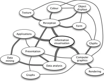
(32) Figure 1-1. A concept map showing a set of linked concepts surrounding the idea of information visualisation. [After Ware 04, Figure 11.10].
(33) 1.. Chapter 1. Introduction. Chapter 1 Introduction Information visualisation is essentially about data, visual displays, people and their quest for understanding. The data is often very large, the visual displays are relatively small and hence we must explore ways, using the available computer hardware and software, to make this acquisition of knowledge as easy and enriching as possible. We have 20 billion or so neurons of the brain devoted to analysing visual information for patterns. Combine this with an adaptive decision-making system that consults a vast mental library of experience and we can construct and utilise mental models to make sense of the physical world we live in. In our physical world we have created a digital world. Inexpensive, powerful computers and mass storage devices, coupled with high speed communication systems have given rise to ubiquitous sensing [Essa 00] – whether this is recording our shopping habits, collecting environmental data in a forest or downloading emails, our digital world is data rich. Much of this data is abstract, in that it does not map easily onto a physical space. Although we could certainly produce a Google mashup showing where emails originated, it would be more interesting to get a clear view of our email communications in terms of who, what, where and perhaps, ultimately, why. This understanding or cognition is really about constructing a mental model and, as with the physical model of our world, a visual representation of the email data leverages our remarkable visual decision-making system. Now, let us add interactivity to permit exploration and we have information visualisation, succinctly defined by Card et al. in their book, subtitled “Using Vision to Think” [Card et al. 99]: “The use of computer-supported, interactive, visual representations of abstract data to amplify cognition” However, what visual form do we use to represent the often complex, multidimensional abstract data so the user can make sense of it? And, how do we make this interactive so the user can explore the data, bearing in mind that the user often does not realise what information is hidden within? These are some of the concerns of information visualisation designers who are faced with multifaceted tasks, as illustrated by the concept map in Figure 1-1. During the last two decades, a wide range of visualisations have been devised. We will meet some of the more enduring ones in Chapter 3.. 1.
(34) Introduction. Chapter 1. This is how NetMap sees the Internet Movie Database. The database contains data on over 250,000 movies. Figure 1-2a. The green contains the data on the movies.. and more than 900,000 people who helped make them. The blue at the outer edge of the circle contains the data on the actors in the database.. And the red in the center is thousands of lines linking actors to movies.. Example of overplotted visualisations - NetMap movie database [Netmap]. Figure 1-2b. Example of overplotted visualisations - Cars for sale. 2.
(35) Chapter 1. Introduction. Desktop computers and their impressive graphics cards are increasingly powerful and so visual representations of large amounts of data can be created quickly enough to allow real-time interaction by the user, such as dynamic queries and zooming. However, with increasing computational power, large is rapidly becoming larger. A 10,000 record dataset could be considered as large by some visualisations, although in data mining, many millions of records are common. It is estimated that Wal-Mart’s data warehouse is over 1000 Terabytes 1. So how do we start to analyse the 800 billion IP packets per day transported on a section of the Internet backbone? [Keim 08]. The next section looks at the problems of visualising large datasets and some of the approaches that have been tried. Section 1.2 considers the use of randomness in computer science and data processing. Having exposed the main issues, the objectives of this work are stated in Section 1.3 followed by an outline of the approach taken, in Section 1.4. The novel characteristics of this work are then described, together with the contribution that have been made to the research area. Finally, the structure of the thesis is outlined in Section 1.7.. 1.1. Visualising large datasets Dealing with large datasets causes two main problems: visual limits – the overwhelming number of items makes it difficult to comprehend the dataset due to perceptual or cognitive limitations of the user or hardware limitations of the display device. computational limits – the amount of data is too great in terms of the necessary processing power, data storage or network traffic, especially when requiring interactive control of the visualisation. Each of these problems will now be considered.. 1.1.1. Visual limits The visual limits of visualisations are apparent in many systems. For example, Figure 1-2a is from Netmap's Web site [Netmap], which illustrates the actor-film relationships in a large database of movies. On the circumference of the circle, 900,000 actors and 250,000 movies are drawn as points and red lines are drawn between each movie and the actors who appeared in it. The entire circle is solid red due to massive overplotting of lines, and of course some action is needed to reduce the number of actor-film relationships in order to identify any meaningful patterns. The second example, Figure 1-2b, is a parallel coordinate plot showing details of over 5000 cars advertised for sale on the Web. Although overplotting is not so extreme as the movie data 1. http://www.informationweek.com/news/storage/showArticle.jhtml?articleID=201203024 Aug 2007. 3.
(36) Introduction. Chapter 1. 4.
(37) Chapter 1. Introduction. example, much detail is hidden amongst the mass of lines. Even with very high resolution displays, the human visual system can only resolve points at approximately 200dpi at normal viewing distance. However, taking into account the reduction in visual acuity due to low contrast and colour, we cannot normally reach this 200dpi level. So we have a limited number of pixels (approximately 2 million up to 10 million for advanced screens) to display the data and apart from space filling techniques (e.g. Keim’s pixel spirals, TableLens, TreeMap) visualisations will result in overlapping data items as the number of items becomes large. Even with pixel plotting the number of data items is limited by the number of available pixels on the screen. To make matters worse, the size of plotted points on say, a scatterplot, is usually much larger than 1 pixel, especially if using a glyph to represent one or more attributes, and each line of a parallel coordinate plot is drawn using many pixels. Not only does occlusion result in loss of data from view, but the adjacency of points, crisscrossing of lines, mixing of colours and shapes can also confuse the user and interfere with the process of building that all important mental model. This obstacle to understanding is often referred to as visual clutter. So how do we reduce clutter? As with a cluttered desk, the simplest method is to remove some of the items. However, point and line visualisations rely on the human Gestalt visual system to extract trends and rules. We perceive wholes or patterns, rather than pieces or parts, but achieving the right density is critical – too few points and we see spurious connections or cease to see patterns just points, too many and the data becomes an amorphous blob. Of course, there is the question of which items to remove. Other techniques include reducing the size of the data points to give each one more space, making the points semi-transparent so we become aware of any underlying data items, and clustering groups of similar points into a single point that effectively reduces the number of points. These all affect the appearance (or disappearance) of data items. Another possibility is to keep all the data items on the display but move them so they do not overlap or at least, overlap less. These are spatial distortion techniques. Alternatively, we can show the data items briefly in succession, so the user gets to see all the items but not all at once. There have been few attempts to classify clutter reduction techniques, so part of this research work has been to devise such a classification. A criteria-based assessment of the techniques, resulting in the Clutter-reduction Taxonomy for information visualisation is presented in Chapter 3.. 5.
(38) Introduction. Chapter 1. 6.
(39) Chapter 1. Introduction. 1.1.2. Computational limits Along with the limits imposed by the resolution of display devices and human acuity, there are limits on the amount of data that can be dealt with by the computing hardware. The main players in this are the processing power of computational devices, the data storage and network bandwidth. processing power Some visualisation algorithms require substantial processing power. Plotting the points will take time proportional to the number, O(N) and likewise for simple processing such as filtering or calculating display attributes. However, if we want to do even moderately interesting things such as sort the data, this will take O(NlogN) time and more complex manipulations are likely to take times that rises quadratically, O (N2), or even exponentially. Whilst rapid interactive feedback may be obtained for small experimental datasets, scaling up to real datasets may take the application a prohibitive time to refresh, e.g. render a large number of lines to the screen. As mentioned earlier, the sophistication and processing abilities of the graphics cards in current desktop and laptop computers are steadily increasing and, in raw processing power, often exceed the central processor in these machines. In addition to speeding up the rendering of the graphics from the basic machine, the graphics cards can be programmed directly from within an application using languages such as DirectX or OpenGL. This can enable interaction with far greater amounts of data items. Along with much faster drawing, inbuilt functions such as shading [Fekete and Plaisant 02], textures [Johansson et al. 06] and fog [Kosara et al. 02] have all been used effectively in clutter reduction and these are described in Chapter 2. data storage and network bandwidth For various reasons, such as the large amount of data or multi-user requirements, datasets are often held on remote database servers and hence the retrieval of the data is also dependent on the bandwidth and latency of the connecting network. Sometimes it is possible to pre-compute meta-data and use this for visualisation, only retrieving detailed data on demand. However, even reduced meta-information may be too voluminous for very large datasets. Chalmers [Chalmers 99] points out that metadata, such as index information for Web documents would be too great for normal storage systems, thus implying that meta-meta-data is required. Note that using a Web search engine effectively off-loads this storage problem in the same way that an SQL server does.. 7.
(40) Introduction. Chapter 1. 8.
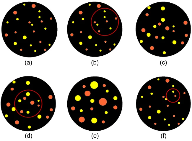
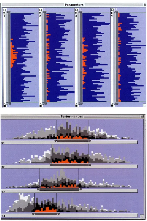
(41) Chapter 1. Introduction. 1.2. Uses of randomness One possible way to address these visual and computing limits is random sampling2. We will first look at some examples of the effective use of randomness 3 in computer science and data processing, before questioning whether randomness can be used in clutter reduction.. 1.2.1. Randomness in computing Traditional algorithms are deterministic, attempting to find the unique or the best solution. In contrast, modern algorithmics (modern here really goes back at least 40 years), including neural networks, genetic algorithms and simulated annealing, makes heavy use of randomness. These algorithms are non-deterministic and find a solution rather than the solution, and good rather than best. Because of this more relaxed and inexact approach to solutions, these algorithms can tackle problems that are otherwise intractable, including NP-hard ones. Quality is traded for computation. In some cases, this is a simple cost-benefit trade-off, in others this is because the computation for the exact solution would be impossible. Further examples of the use of randomness include. primality. tests,. spreadspectrum. encoding. techniques. in. wireless. communications, telephone routing and parallel computing. In some of the cases, randomness is used simply to reduce the computational effort – if one could do the calculation in full, it would be better but the random version is just good enough. However, in many cases, the randomness is essential otherwise the system would be worse in terms of performance. For example, RSA public key encryption requires the selection of two prime numbers, with larger numbers offering higher security. To check if a 128-bit number is a prime number by simple division would take approximately 3000 years (i.e. 1020 divisions at 1 Gigaflops) whereas a simple probabilistic primality test such as the Fermat primality test provides a workable solution.. 1.2.2. Randomness for data processing Several commercial statistical and data mining applications refer to the use of random sampling. For example, Statistica 4 mentions using sampling to speed up processing. 2. “In statistics, a simple random sample is a subset of individuals (a sample) chosen from a larger set (a population). Each individual is chosen randomly and entirely by chance, such that each individual has the same probability of being chosen at any stage during the sampling process, and each subset of k individuals has the same probability of being chosen for the sample as any other subset of k individuals”. Yates, D.S., Moore, D.S., Starnes, D.S. The Practice of Statistics, 3rd Ed. Freeman. 2008. 3. “of or characterizing a process of selection in which each item of a set has an equal probability of being chosen”. Dictionary.com Unabridged (v 1.1). Random House, Inc. http://dictionary.reference.com/browse/randomness – accessed Oct 2008. 4. http://www.statsoft.com. 9.
(42) Introduction. Chapter 1. 10.
(43) Chapter 1. Introduction. and SAS Enterprise Miner5 notes the use of sampling for predictive modeling. There has been considerable research in the database literature, since the advent of data warehousing and related data mining application, on the use of sampling in connection with query optimisation. The cost of executing ad-hoc queries on very large databases is considerable, hence the ability to calculate an approximate answer based on a random sample from the database is desirable. Probabilistic counting techniques [Shah and Ramachandran 04] are good at estimating the size of multi-sets and techniques exist to help determine appropriate sample sizes to mine [Domingo et al. 02]. Another area of research is attempting to compensate for lost objects, size and structural distortions within a sample [Breunig et al. 01]. Clustering is used in data mining to help discover distributions and patterns in the underlying data. Techniques that use random sampling have been demonstrated to be efficient and accurate even for very large databases [Guha et al. 98, Kollios et al. 03, Palmer and Faloutsos 00]. Efficient strategies have been developed for single joins [Chaudhuri et al. 99] and also for some aggregate queries [Chaudhuri et al. 01].. 1.3. Random sampling for clutter reduction This thesis is about using random sampling to reduce the size of the dataset, either under user control or automatically that results in a reduction in the display clutter, thus providing users with a better understanding of the data. When the idea of using dynamic random sampling for clutter reduction was proposed [Dix and Ellis 02, Ellis and Dix 02] there were no visualisations at the time that utilised such a mechanism. The proposals sparked interest in this area. Since then, two applications, [Bertini and Santucci 06, Rafiei and Curial 05] have applied random sampling as part of the interaction process (see Section 2.3). Given the success of randomness in other areas of computer science, there is little use of sampling within existing visualisation algorithms. There are examples of randomness being used in learning algorithms, sampling large or infinite data spaces and for pre-processing datasets to a manageable size, and these will be considered in Section 2.3. But little work has been published on its use in more interactive visualisations. It is surprising that sampling has not been used more widely, despite very large datasets being regarded as problematic as already discussed in Section 1.1. For instance in other realms, if one wants to determine some aspect of real world data, it is normal to capture only a sample. For example, if we wish to discover if cats really do prefer Fishy Bytes to some other ordinary food, we do not have to tempt all the cat 5. http://www.sas.com/products/miner. 11.
(44) Introduction. Chapter 1. 5 to devise a clutter reduction taxonomy. 1 to investigate random sampling as a technique to facilitate interactive exploration of large datasets. 2 to develop focus+context clutter reduction in the form of a lens. for information visualisation. 4 to evaluate sampling as a clutter reduction technique. 3 to provide auto-sampling for a lens on a parallel coordinate plot. Figure 1-3a. Relationship between objective 1 and the other objectives of this research. 12.
Figure
+7
Related documents
En el contexto contemporáneo de sobreexposición, las prácticas artísticas que se caracterizan por una tendencia a la desmaterialización, a la concepción de la
The maximum allowable payment to enrolled Georgia and non-Georgia hospitals for Medicare outpatient coinsurance (crossover claims) will be 85.6% of the hospital-specific Medicaid
Bank Sohar and Qatar National Bank (QNB) have signed a syndicated loan worth 77.5 MM USD for Dalma Energy International’s oil drilling rig project... Energy with Saudi
Tables 2, 3, and 4 show the results of the Tobit regression of expected returns to storage (futures price spreads) and market advisory service recommendations on number of wheat
By-Laws: Chair: Lisa Lalla, Chair-Elect: Arielle Harper, Secretary: Suzanne McDonald Communications & Marketing: Chair: Betsy Brown, Chair-Elect: Darrius Barrow,. Secretary:
• Besides sampling error, the sample estimate may be subject to other error which, grouped toghther, are termed non-sampling errors.. • Non-sampling error is the error that arises
Informal institutions like Bank Nkhonde play a vital role in building social networks and bridging social capital in rural areas.. The groups have managed to include the poor
METHODS: We compared data aggregated from two ongoing cohorts: (i) the Acute Myocardial Infarction in Switzerland (AMIS) registry, which includes patients with acute
