Exploring Large-Scale Interactive Public Illustrations
Emily-Clare Thorn
1, Stefan Rennick-Egglestone
1, Boriana Koleva
1, William Preston
1, Steve
Benford
1, Anthony Quinn
2and Richard Mortier
31
School of Computer Science, University of Nottingham, Nottingham, United Kingdom
2School of Design, Central Saint Martins College of Art and Design, London, United Kingdom
3
Computer Lab, Cambridge University, Cambridge, United Kingdom
{pszet,pszsre,pszbnk,pszwp,pszsdb}@nott.ac.uk,
[email protected],
[email protected]
ABSTRACT
We present a research-through-design exploration of transforming large-scale public illustrations into interactive media. We collaborated with creative practitioners to extend an existing visual marker technology to support spatial and layered interaction with wall-sized images. We document how these techniques were used to design interactive illustrations and how visitors to an exhibition engaged with these. We conclude that it is feasible to combine spatial and layered interactions to attach complex narratives to public illustrations, and highlight challenges around instruction giving, sociality and repeat experiences. Author Keywords
Large scale displays;visual patterns;mobile interaction ACM Classification Keywords
H.5.m. Information interfaces and presentation (e.g., HCI) INTRODUCTION
From graffiti and street art, to billboards and posters, to temporary hoardings around building sites, large-scale public illustrations are a ubiquitous feature of the urban environment. In this paper, we consider how to make these static images interactive through digital augmentations that allow designers to embed complex digital narratives into large-scale visual media. To support this work, we have extended an existing mobile computer vision technology which allows for the recognition of topological structures in illustrations and their linkage to digital content. Our central challenge has been to identify appropriate mechanisms for scaling up interactions with visual markers so as to take advantage of the possibilities offered by the large physical scale and high resolution offered by public illustrations. In exploring this space, we have worked with illustrators and creative writers to consider two broad approaches for extending interactions with visual markers. The first
concerns spatial interactions in which users scan sequences or groups of visual markers that are embedded within an illustration, panning across its surfaces or stepping forwards and backwards to explore a range of content. The second addresses layered interactions in which multiple layers of visual markers are overlaid on the same illustration, with users switching between them as they interact. To support a realistic understanding of the opportunities and constraints of these for both designers and users, we have developed candidate implementations of both. We also commissioned creative teams to produce three large-scale interactive illustrations which were presented at an exhibition.
In this paper, we document what we learned through this process. We describe the mechanisms that we chose to implement spatial and layered interactions, consider creative practitioners used them to create three distinctive illustrations, and reflect on our observations of how exhibitions attendees interacted with them at our exhibition. RELATED WORK
In conducting this exploration, we have drawn inspiration from several threads of prior work. Most immediately, our work seeks to extend familiar but simple interactions with street posters that involve small numbers of embedded and obvious visual tags. These include the use of QR codes as physical hyperlinks to digital information such as event details, map coordinates or vouchers and promotions [21]. Our aim is to extend such approaches to gracefully embed a higher density of visual codes within an image in a way that is both aesthetic and richly interactive. Our work contrasts with recent approaches that have employed computer vision to recognize the image as a whole. These are often coupled with the display of AR content (e.g. where the poster acts as reference frame in which to visualize 3D graphics) [13]. Although not intended as a public illustration, a prototype by Reilly et al [20] has demonstrated mechanisms for creating composite interactions linking together RFIDs embedded in a paper map. Interactions include path-select (click handheld button, drag along path, release button to select entire path) and multi-select (click button to select multiple non-adjacent items). In working with a computer vision technology, we have sought to enable composite interactions that do not require the augmentation of an illustration with electronics. Instead, all interactive features are embedded directly into the illustration itself.
© Thorn et al 2016. This is the author's version of the work. It is posted here for your personal use. Not for redistribution. The definitive version was published in the Proceedings of the 2016 ACM Conference on Designing Interactive Systems.
More widely, our work has been informed by extensive prior research into interaction with large, high-resolution printed displays (rather than illustrations). Here, Yeh at al [27] have highlighted the high resolution, low cost, reliability, mobility, and flexibility of paper, and proposed a network monitoring tool consisting of a 3ft by 6ft print showing all devices attached to a network, which can be annotated by an Anoto digital pen, linked to extra information presented on a mobile device, and used as a backdrop for projection of real-time information about the behavior of the devices. Although not digitally augmented, the work of the artist Simon Schofield [22] also shows the potential of large graphical designs to stimulate rich physical interactions. His scenes are algorithmically composed from individual elements, presenting features at different scales, from just a few millimeters to several metres. They are printed onto rubberized paper, which is robust enough to walk on, and are installed on floors or walls of environments such as galleries. They encourage physical interactions such kneeling down, getting close to inspect tiny features, or standing back to see the full image. Finally, our work relates to an emerging body of work on large-scale public digital displays. In particular, engaging passers-by in urban interactions has been a key objective for work on media façades. Here interactivity, such as playing games, can also be supported through the users’ mobile devices but in contrast involves the creation of a giant digital display by equipping the outer shell of a building with light emitting elements [23,1].
APPROACH
We have followed the overall approach of Research through Design (RtD) [28] in which our research findings emerged from ongoing reflection on a practice-led design process that produced an annotated portfolio of artefacts [11]. RtD has grown to become a broad umbrella that encompasses a diverse set of practices [10]. Ours has been to work with professional illustrators and storytellers to create a series of large-scale interactive illustrations that serve both to demonstrate and to challenge the development of new technologies. In assembling teams, we identified illustrators working within three very different graphical approaches, so as to provide a broad, rich and realistic exploration of our technology. The process itself involved three stages: We identified a candidate visual marker technology
and conducted design workshops to explore how this might be extended to support new kinds of interaction. Extensions were implemented into a new mobile app. We commissioned creative teams to design interactive
public illustrations, which were tested with the app. We hosted an exhibition of the resulting illustrations
and collected observations and feedback from use. Creative teams were required to produce illustrations within commercially realistic timescales; this contrasts with a substantial amount of prior RtD work which frequently sets aside temporal and financial constraints [28].
IMPLEMENTING SPATIAL & LAYERED INTERACTION Many visual marker technologies might support interaction with large public illustrations. Widely used technologies such as barcodes [8] and QRcodes [15] are robust and scalable but suffer from a limited design aesthetic, in spite of various services to try and make them more visually interesting and personalized [2,8]. Recently, there has been a growth of interest in vision technologies that can recognise more aesthetic or natural images (or parts thereof) for example Goggles [12], Blippar [4], String [18], Media Markers [16], reacTIVision [3] and ARTag [9]. Within this latter camp, we chose to work with an approach based upon recognizing simple topological structures within images first implemented in a system called D-Touch [7].
We adopted this approach because previous studies, using a re-implemented and extended version, reported how it was especially suited to use by professional illustrators to create hand-drawn interactive patterns when decorating ceramic bowls [17]. This study showed how providing a simple set of topological rules made the operation of the technology sufficiently transparent to designers that they could easily learn to work with it and also develop new creative strategies that were not envisages in the initial system. In particular, the inherent visual ambiguity that similar looking patterns can embed different codes (topologies) within them, while the same code can be embedded in vary different designs proved to be fertile ground for creativity. Having identified a baseline technology, we then organized a series of workshops with illustrators who were already familiar with the topological approach. We discussed settings in which public illustrations might appear, considered illustrations presented as single images or composed from multiple repeating elements (e.g. ceramic tiles) and explored the goals of making them interactive. The workshops generated a suite of interaction techniques for large-scale public illustrations based around the two broad approaches of spatial- and layered- interaction. Spatial interaction
The first approach that emerged from the workshops was to consider how users might trigger interactions by engaging in various spatial movements, for example scanning across a large illustration or zooming in and out. For this, we directly built on the path and group select interactions identified by Reilly et al [20]. We encouraged designers to embed multiple recognizable codes within a single illustration and then to connect them using pattern paths
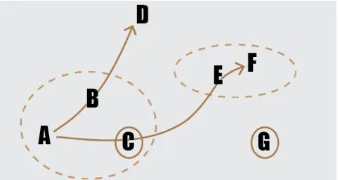
topological codes embedded within (labeled A-G). The interaction has been configured so that two of these (C and G) can be scanned in isolation to trigger interactions, two pattern paths can be scanned {A->B->D} and {A->C->E->F} as can two pattern groups {A,B,C} and (E,F}.
Fig 1. Pattern paths (arrows), pattern groups (dotted ovals). Each letter represents a discrete Aestheticode.
Layered interaction
The second approach that emerged from early workshops involved users interacting with different layers of visual codes that are embedded into the same illustration. This was inspired by previous research that had shown how designers came to realize that they could add certain colours to their patterns so as to enhance their aesthetics without affecting recognition [17]. This was possible because the computer vision software first applied a colour filter to a captured image then threshold it to black and white before trying to detect topological features. This previous research reported how the designers came to learn this technique as a result of experimentation. In our work, we decided to bring it directly under their control by introducing a controllable filtering mechanism into the vision pipeline that would allow chosen colours to be filtered in and out. We implemented two classes of filter:
RGB: The colour space used by mobile phone cameras. Our filter removes the named layer [red, green, blue] and retains the remainder of the visual information CMYK: Used for printed media. We converted the
video feed to CMYK, [cyan, magenta, yellow, black] and provided similar filters to remove a named layer. Figure 2 presents an example of how this works. Previous implementations of the topological approach require the interactive part of the pattern (the code) to be separated from other parts of the pattern by (near) white space. This can be seen in fig 2, left in which the fish (code) are clearly separated from the red lily pads. In contrast, fig 2, centre shows an example in which the interactive part (fish) overlaps the background (lilies). Applying a red filter however, removes the lilies to present the system with the image shown in fig 2, right for subsequent processing. By dynamically switching between different filter types and colours the user can reveal different layers of codes within the same drawing.
Fig 2. Coloured filtering. The carp are valid Aestheticodes. Following the workshop, we implemented a mobile app called Storicodes that could recognize topological markers within patterns using the D-Touch approach and that also supported our chosen techniques of pattern paths, pattern groups and switchable colour filters. The next step was to explore how skilled illustrators and storytellers would put these features to use.
DESIGNING THREE PUBLIC ILLUSTRATIONS
For the second phase of our process we commissioned three creative teams, each comprising a writer and an illustrator, to design interactive public installations. We consider team members to be research participants, and hence have created pseudonyms to protect their identity. The three writers (Alice, Cheryl and Penny) were all published authors of creative fiction. We recruited three illustrators who each bought a distinctive graphical style and approach to design: Lucy works with physical media such as paper and colored pencils; John works with layered collages of digital media. Dave works in the advertising sector, which requires him to develop work with a wide range of styles. Each team was given a distinctive brief to target a specific audience. Two briefs were for “portable” illustrations that did not strongly reference a deployment environment. The third was for an ongoing project documenting the literary history of a city. Briefs and allocations were as follows: Brief 1: Write a short narrative featuring literary
figures from Nottingham city’s past and present. You might merge fact and fiction to create something intriguing and interesting [Dave and Penny].
Brief 2: Write a short narrative that takes a young adult on a hunt through the illustration. It can be in any setting you wish but must give clues to point the participant in the right direction through the narrative to find the next visual code [John and Alice].
[image:3.612.55.297.124.252.2]two and documenting the design process. Teams were not given target physical dimensions for the illustrations, but we emphasized the need to produce work on a large scale. We conducted a concluding interview with authors and designers to help understand the process as a whole. We now present the three designs that they created.
Illustration 1: A Princess Honeymoons in our Town
[image:4.612.324.551.58.331.2]Princess presents three fictional characters, all of whom have previously featured in novels written by Nottingham-based authors. The central conceit of this work is that these characters have met by chance in a pub. The illustration for this work resembles a banknote (appropriate, given that the characters purchase and consume a substantial amount of alcohol during the story). Embedded codes within in the illustration link to web-pages that present the textual elements of a non-linear story (e.g., fig 4).
[image:4.612.57.294.260.409.2]Fig 3. Princess illustration. Courtesy of Dave.
Fig 4. Web-page showing introductory narrative. Courtesy of Dave.
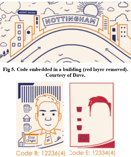
Color filtering was used to create two layers of interaction, red and blue. Launching the Princess experience from the Storicodes app automatically engages a filter to remove all reds from the camera feed, leaving the blue layer intact. The first interaction is then to use the smartphone to scan a pattern embedded into the central buildings (fig 5), triggering the display of a web-page showing the introductory piece of narrative (fig 4). This sets the scene for the story, by introducing the three principal characters.
Fig 5. Code embedded in a building (red layer removed). Courtesy of Dave.
Fig 6. Arthur Seaton as a code. Left: first filter applied. Right: second filter applied. Courtesy of Dave. The story develops through conversations between pairs of characters. Each is defined by a pattern path, composed of two visual codes embedded directly into the visual representation of the two characters (fig 6, left). Scanning the phone from one character to another reveals a page of dialogue between these two characters. Once all three pairs of dialogue in the initial blue layer have been scanned, Storicodes automatically switches to a coloured filter that scans the red layer of embedded codes (fig 6, right), enabling the viewer to trigger further conversations. The interaction concludes by re-scanning the blue-layer of the building code, which links to a concluding scene.
Illustration 2: Stalker
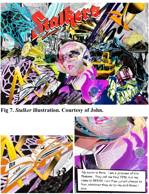
Stalker is a visually-complex illustration (fig 7) that was composited from over 100 layers in Photoshop. Color filtering was used extensively to ensure that the six interactive patterns hidden in the illustration could be robustly scanned. The associated digital experience took the form of a game comprising a series of missions that requiring interaction with nearby props and people. The underlying sci-fi story is one of rebellion by the Stalkers against their oppressors. Opening elements of the narrative position the experience as a call to arms and the illustration as an “inter-dimensional communication device”.
[image:4.612.57.291.304.591.2]such as picking up a package at a curiosity shop and listening to instructions on a tape recorder. The team intended that these would be instantiated in local venues such as galleries or cafes, creating the need to revisit the illustration multiple times, perhaps over several days. Each interaction directs the user back to scanning a new feature of the illustration so as to collect a further instruction. If they complete all activities, they obtain a code to a safe that they can open to obtain a reward.
[image:5.612.331.544.276.423.2]Fig 7. Stalker illustration. Courtesy of John.
Fig 8. Left: Journal Right: Associated digital content. Courtesy of John.
Fig 9. Sera's badge. Left: no filter. Right: filter applied. Courtesy of John.
To make the interaction with the illustration work, Storicodes automatically switches between specified color filters at key points in the experience, allowing for hidden codes to be robustly revealed to the recognition algorithm. As an example, fig 9 shows the impact of applying a filter that selects for yellows in Sera’s badge.
Illustration: Who am I?
Who am I? is an interactive illustration targeted at young children, split across six panels (fig 10,11). Collectively, these tell the story of a creature who is trying to discover what species he is. All panels were originally hand-drawn and then digitally scanned for reproduction, with Photoshop used to make small alterations. Colour filtering was used to mask background detail, enabling the illustrator to work in a free and flexible manner when embedding codes into the wider picture (fig 12). Users follow a linear path through the narrative in which a digital representation of the creature is revealed through its visits to other animals. (fig 13). Pattern groups were used to link digital content to collections of patterns without these needing to be linked into a single code (fig 12). The split over six panels created a particularly challenge for how to guide users through the interaction that we discuss in detail, alongside the two other examples, in the following section.
Fig 10. Who Am I? (panels 1,2,3). Courtesy of Lucy.
Fig 11. "Who am I?" (panels 4,5,6). Courtesy of Lucy. Guiding users through interactions
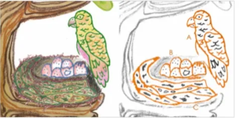
[image:5.612.328.544.279.583.2] [image:5.612.323.549.433.585.2]Fig 12. Left: Pattern group comprising nest, eggs and birds. Right: cyan filter (code in orange). Courtesy of Lucy.
Fig 13. The creature visits others. Courtesy of Lucy.
Fig 14. "Princess" postcard, front and back. Courtesy of Dave. 1. Printed postcards giving instructions for downloading the Storicodes app and engaging in initial interactions. 2. Instructions embedded directly into digital media that
was revealed on the phone.
3. Instructions embedded directly into the illustrations
An example postcard is shown in fig 14. This incorporates the following instruction fragment that simultaneously introduces core characters, indicates that download of an app is required, and provides a starting point for interaction. “My dear princess,” replied Don Juan, “they can do just that, they but download the Storicodes app and scan the buildings in Mister Huggett’s beautiful mural.”
An example of an instruction integrated into digital media is provided by Stalker where the follwing text was
displayed at the end of a conversation between two guards so as to guide the user to now scan the mountains.
“You need to take the vital information you have heard above to Sera! Scan the BLUE AND BLACK DULU MOUNTAINS and tell Sera the location of the map”
As a six panel piece, “Who Am I?” embedded a substantial amount of instruction within the piece itself, giving to guide a user through a linear series of interactions. Many of these were embedded into the illustration in a narrative style. For example the instructions embedded in fig 15 that read:
“Maybe I’ll find more creatures like me in the lake. I’ve heard the whale is very wise so I’ll ask him first and the octopus is very clever, so I’ll ask him second, and maybe then I’ll find the catfish.”
[image:6.612.316.557.285.399.2]… guiding the viwer to scan the pattern path embedded into part of the illsutration shown in fig 16.
Fig. 15. A panel embedding instructions. Courtesy of Lucy.
Fig. 16. Pattern path through whale, octopus and catfish codes (highlighted in orange). Courtesy of Lucy.
Documentation of the design and production process The research team kept a detailed record of the design and production process and conducted concluding interviews with the designers and writers. This allowed us to understand the approach taken by the creative teams. The approach taken by the writers
The writers [Penny, Alice, Cheryl] generally lead the process of writing the narratives for the work:
[image:6.612.318.560.414.541.2]appropriate length for usage on a mobile device once an initial prototype of the web-content had been made For Stalker, Alice generated a much greater depth of
material than was needed, including a substantial number of scenes which did not have dependencies on each other. John then selected from these to create a linear story to work into the illustration.
For Who am I?, Cheryl produced an initial document that described in detail the interactions in each panel, and also the narrative elements relating to the panel. The instructions discussed above were produced by the writers, and a key decision was whether they should be voiced as coming from Storicodes or one of the characters. The approach taken by the illustrators
[image:7.612.339.535.301.424.2]All of the illustrators worked to establish an effective overall layout and visual style for the illustrations before even thinking about the challenge of designing and integrating effective interactive patterns (e.g. fig 17). This reflected on a general professional confidence that they could make the interactive elements of the design work when needed, and also on the limited amount of time available for what was a commercial piece of work for them. There was a necessity to understand that the design worked on a large scale before “tidying it up” and filling out specific detail, to avoid wasting time. Limited time also meant that the designers had to work in a familiar way. Lucy worked rapidly in pencil and ink, producing a series of early sketches and then rubbing out or using Tippex where necessary. Dave produced vector art that could be tweaked and refined as necessary, and John worked in Photoshop to establish a basic collage of multiple layers.
Fig. 17. Initial layout for Princess. Courtesy of Dave.
Working with color filters proved to be the most challenging element of engaging with the technology and their usage did not seem to be fully intuitive to the designers on first encounter. Consequently, we provided designers with a version of the Storicodes app that directly revealed the impact of applying different colour filters. Lucy employed this to develop a palette of coloured pencil/pen marks on a piece of paper that acted as a ready-to-hand guide as to the impact of different filters. The most technically complex usage of color filters was in Princess
that is constructed from two independent layers of color. Dave conducted initial experiments with hand-drawn
geometric shapes that revealed the danger of introducing breaks in solid lines (not acceptable within the Storicodes recognition algorithm). As such, the final design avoided any crossings between the two color layers.
[image:7.612.54.298.437.549.2]The recognition technology did impose some compromises on the aesthetics of the design, but these were not of major importance, and could be worked around. As part of his “house style” Dave typically uses offsetting of colours to add contrast and texture, and to simulate the effects of screen-printing, as shown in the image on the left of fig 18, where the red hair “bleeds” over the blue line. However, applying a cyan filter to this caused a narrow white strip to appear (highlighted using the oval on the right of fig 18), which could confuse the recognition algorithm. As such, Dave avoided the use of offsetting in his final design. Similarly, Lucy chose to enlarge some patterns with delicate features beyond her preferred initial sizing to aid robustness of recognition, whilst John increased the contrast of elements in his collage to make them robustly scannable (e.g. the journal in the bottom left of fig 8).
Fig. 18. Problems caused by offsetting. Left: offset image. Right: implications of applying filter. Courtesy of Dave. Reproduction of the illustrations
For each of the three illustrations we ran a test print onto the material we planned to use, working with a printing company who specialized in large-scale reproduction work. This allowed us to verify that color filtering still worked as expected with printed material. For Princess, we ran a second test print to verify that the thickness of the lines in the design worked effectively with the Storicodes recognition algorithm. Final versions of Princess were printed on 5mm Foamex Board with PVC printing, whilst
Who am I? and Stalker were printed onto a flexible 200mic PVC sheet. All were waterproofed, allowing us to exhibit the work in either an exterior or an interior setting.
EXHIBITING THE ILLUSTRATIONS
Fig 19. Princess, attached directly to a wall
[image:8.612.53.296.392.548.2]Fig 20. Participants interacting with the “Stalker” piece
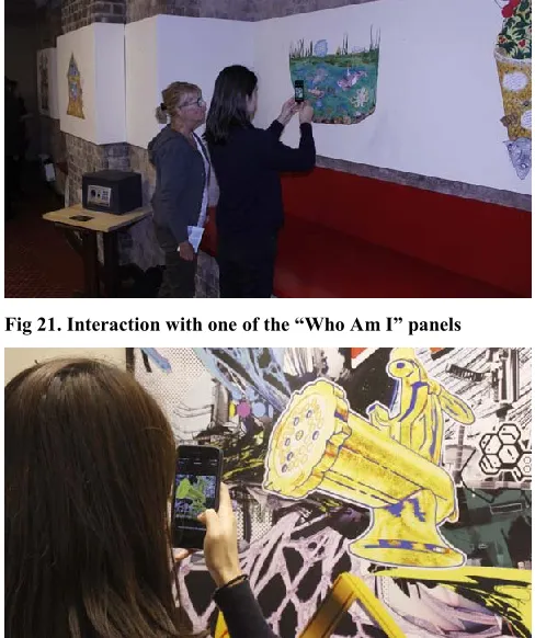
Fig 21. Interaction with one of the “Who Am I” panels
Fig 22. Scanning a visual code
We began with a brief introduction to the project. Those with iPhones were asked to download the app; others were given a phone to use by the research team. Rather than giving explicit instructions, the postcards described earlier on were handed out. Attendees were given time to freely explore the interactive illustrations while the resreach team observed and answered questions (this took about 40 minutes). They did this individually or in groups of 2-3. If participants arrived with others they tended to stay together during the experience.
In general participants were able to identify the visual elements they needed to scan in order to follow a narrative, but occasionally had to experiment with scanning from different distances to get a clear view of a full code. The design of each illustration clearly led to different patterns of physical interaction; interactive visual elements in “Who Am I” were small, and embedded in the fine detail of the illustration, and hence drew participants in very close. Stalker promoted quick interactions that drew people away from the illustration itself and into associated activities. Interactive features such as the building and the characters in Princess were large and bold, requiring scanning from a greater distance as well as movement from one side of the illustration to the other. This led to people contending for space and occluding each other, although also served to trigger impromptu conversations between attendees. The throughput with Princes was also lower, as the dialogue between the characters took some time to read.
Our observations revealed the importance of carefully wording instructions. In “Who Am I?”, the following narrative element made it very clear that the representations of three animals had to be scanned in turn:
“Maybe I’ll find more creatures like me in the lake. I’ve heard the whale is very wise so I’ll ask him first and the octopus is very clever, so I’ll ask him second, and maybe then I’ll find the catfish.”
In contrast, the instruction to “Now scan each pair of characters to hear their conversation” in Princess were ambiguous to some, who subsequently tried to simultaneously scan the characters (which meant fitting the entire illustration in the camera view, which did not work). For a few participants there were also issues when the textual narrative appeared on both the phone screen and the illustration (as in “Who Am I”) as they tended to focus on just reading one (usually the mobile device) and so missed some hints on what to do next.
When the attendees had finished exploring the illustrations, we facilitated a group discussion to get feedback on the design of the interactive installations and their potential future use. Participants saw the illustrations as lovely public art in their own right, and commented that the visual designs were interesting and engaging. They found Stalker
[image:8.612.52.296.408.699.2]Princess was seen to have a simple and effective design. However, some participants reported that they did not fully read the dialogue presented through the linked web-pages, and a few did not read the narrative on the postcard completely so did not know where to start. The hand-drawn aesthetic and story of “Who am I” were liked, but to simplify interaction it was suggested to increase the size of the panels and highlight interactive items on the phone. Placing all three illustrations in the same setting lead to a relatively fast-paced interaction in which participants moved from one illustration to another. Longer installations in more public venues might allow for a slower engagement (especially in the case of Stalker), potentially facilitating engagement with detail that was missed in the exhibition. In considering the ability to associate layers of content with the same visual element, discussions focused on the possibility of extending the number of available layers, or enabling the selection of a subset of layers to provide individuals with a bespoke experience that might feel more personal, secretive or intimate, rather than everyone accessing the same content. Other possibilities included the creation of layers which emerged in relation to external conditions, and which might consequently produce an adaptive narrative. For example, the changing nature of light that falls on an illustration, and the impact of this on the color perceived by the camera, might be used to read different codes and provide content that differentiated between midday and dusk. Alternatively, rendering codes in photochromic ink might allow for responses to changes in light, or thermochromic inks could be used to react to temperature. The participants also considered exploiting what the human sees versus what is detected by the camera in order to create optical illusions.
Finally, potential settings and applications for interactive public illustrations were considered. Suggestions included shopping centers and walls of buildings, where the same illustration could provide different layers of information for different users (e.g. young children, young adults, older adults). Other examples included museum displays (to allow for additional and easily updatable content), interactive educational displays in schools (e.g. for geography), a national treasure hunt, an area maps to provide details about local places of interest, or augmenting books or graphic novels with additional content layers. DISCUSSION
By following a research through design process we have explored large scale interactive illustrations as a new public medium. We have revealed that they offer exciting new design possibilities – graphic designers and storytellers were able to create engaging pieces and largely viewers were able to successfully interact with them. However, our experience has also raised design and interaction issues. We now reflect on the opportunities and challenges of the medium so as to guide practitioners while also framing an agenda for further research.
Designing interactive illustrations
We begin with the designer’s perspective – what did we learn about designing large-sale interactive illustrations? The three creative teams employed various combinations of spatial and layered interaction to produce very different pieces, both in terms of the structure and aesthetics of the graphics and the associated digital narratives.
Considering layered interaction first, Who am I? and
Princess both made use of pattern paths as an interaction mechanism. In Who am I?, this was used torequirea linear movement of the camera through three animal characters, whilst in Princess, it allowed for access to a non-linear dialogue through the scanning of pairs of patterns. Pattern groups in contrast, were only used in one instance - in “Who Am I?”, where the eggs, nest and bird had to be simultaneously scanned. With codes statically embedded in the illustration, it is easy to see that pattern groups may not offer anything beyond what can be achieved with a single code. However, we suggest that pattern groups will become more useful if participants can somehow move elements around and dynamically compose them. An example might be a child’s jigsaw puzzle, linked to digital content that is revealed as the child gradually assembles it.
Support could be provided for automatically identifying visual elements that can be turned into codes, making suggestion for how a specific element might become a code, and helping blend codes into the wider image. Interacting with public illustrations
We now turn to the viewer’s perspective – what was it like to interact with these large-scale public illustrations? While our participants found all three illustrations to be engaging, their experiences did raise some important concerns. Embedding instructions
There is a spectrum of possibilities for embedding the points of interaction within an illustration – from making them obvious (by highlighting them on the screen or on the illustration) to purposefully hiding them. All three creative teams adopted the approach of weaving the interactive elements into the narrative itself, although they established different tactics for achieving this – external postcards, embedding them in the digital media, and embedding them in the illustration itself. While all three appeared to work, we note an important difference between them. Embedding instructions into the illustration makes the physical experience more self-contained. Indeed, one might construct an illustration that worked in its own right, with digital interactions providing an additional perspective. Conversely, embedding instructions into the digital media may allow for more dynamic reconfiguration of interactions and perhaps even re-appropriation of a long-lived piece of public art to tell new stories.
We note that instructions and narrative have to be carefully designed and we noted some problems with ambiguity. Previous accounts of the nature of instruction-giving over thin channels (such as text messages and audio recordings on mobile phones), and the ways in which such instructions are complied with (e.g. [25]) may help us to design more effective instructions and means to repair when the experience breaks down. Another important consideration for this medium is the opportunity to deliver instructions through a combination of channels – on the phone, the illustration or proxy objects such as postcards – and be mindful that participants do not just focus on one.
Interaction position
It may not be immediately clear where participants need to stand in order to interact with large illustrations as there is a much wider range of possibilities compared to nearfield displays. The design of the interactive elements may prompt users, for example, small visual items require participants to get close and vice versa. We suggest that there are also more explicit design strategies for communicating the interaction sweet spot that can be explored by future research, such as extending the illustration out onto the floor in front. Another aspect of interacting with digitally augmented illustrations is that scanning pattern paths requires the participants to move around. This might cause problems with users occluding each other., especially in in unsupervised public spaces.
Sociality
The large scale of the illustrations affords interaction by multiple participants. We saw small groups exploring the illustrations together (although the interactions were not explicitly designed to be collaborative), leading to the idea of making them more “socially scalable” where engagement becomes richer as more people interact [24]. Furthermore, the illustrations will inhabit public settings where people move around and there are spectators and bystanders. Designers need to respect and shape this sociality. We anticipate the “honeypot effect” noted by Brignull and Rogers [6] in which the clustering of users around the display attracts yet more users, and consider how to design “entry points” that invite and entice people into engagement and “access points” that enable users to join the activity [14]. A further consideration is whether to reveal visitors’ interactions to spectators and so encourage them to become engaged or whether to try to hide them so that important clues are not given away as spoilers [19]. Repeated experiences
The kinds of public illustrations we are considering may be deployed as long-term public installations, making it important to consider repeat visits. To encourage people to interact again designers will need to provide something new each time. Layered interaction is particularly exciting in this regard as it allows us to reveal new codes on subsequent visits. An interesting direction for future research is also to explore visual patterns that change (and so does the code that is recognized) in response to external conditions such as lighting and temperature as noted earlier. CONCLUSION
We have explored the opportunities created by augmenting large-scale public illustrations with interactive features. We have described the extension of an existing computer-vision technology to support spatial and layered interaction with large and complex visual narratives. We have presented a portfolio of three such illustrations created by teams of writers and illustrators and have offered reflections on the design process and how they were experienced by users. Through this work, we have identified the value of being able to embed multiple layers of interaction into a single illustration, and also considered the question of how the design of interactive elements impacts on the physical elements of the interaction with an artwork. An important step for future work will be to deploy such pieces over longer timeframes in public spaces so as to gain a deeper understanding of how visitors approach them, discover what to scan, orient themselves to the illustrations and other visitors and engage in repeat visits.
ACKNOWLEDGEMENTS AND DATA ACCESS
REFERENCES
1. Boring, S., Gehring, S., Wiethoff, A., Blöckner, M., Schöning, J., Butz, A. Multi-user interaction on media façades through live video on mobile devices. Proc. CHI 2011. http://dx.doi.org/10.1145/1978942.1979342. 2. Barcode Revolution website,
http://www.barcoderevolution.com/, verified Jan 2013 3. Bencina, R., Kaltenbrunner, M. and Jorda., S.
Improved Topological Fiducial Tracking in the reacTIVision System. Proc. 2005 IEEE Computer Society Conference on Computer Vision and Pattern Recognition (CVPR'05) – Workshops. Volume 03 (CVPR '05), Vol. 3. IEEE Computer Society, 2005 4. Blippar website, http://blippar.com/, verified Jan 2016 5. Bowers, J. The logic of annotated portfolios:
communicating the value of' research through design. Proc. DIS 2012.
http://dx.doi.org/10.1145/2317956.2317968 6. Brignull, H. and Rogers, Y. 2003. Enticing people to
interact with large public displays in public spaces. In Proc. Interact. IOS Press, IFIP, 17–24.
7. Costanza, E. Huang, J., 2009, Designable visual markers. Proc. CHI 2009.
http://dx.doi.org/10.1145/1518701.1518990 8. D-barcode website, http://www.d-barcode.com/,
verified Jan 2013.
9. Fiala, M., “ARTag Revision 1. A Fiducial Marker System Using Digital Techniques”, NRC/ERB-1117. November 24, 46 Pages. NRC 47419, 2004
10. Gaver, W. What Should we Expect from Research Through Design? Proc. CHI 2012.
http://dx.doi.org/10.1145/2207676.2208538
11. Gaver, B., & Bowers, J. (2012). Annotated portfolios. Interactions, 19(4), 40-49.
12. Goggles website, verified Jan 2013, http://www.google.co.uk/mobile/goggles/ 13. Grubert, J., Grasset, R. and Reitmayr, G. 2012.
Exploring the design of hybrid interfaces for augmented posters in public spaces. Proc. NordiCHI 2012. ACM, pp. 238-246.
14. Hornecker, E., Marshall. P., and Rogers, Y. 2007. From entry to access—How sharability comes about. Proc. Designing Pleasurable Products and Interfaces (DPPI’07). ACM.
15. ISO, International Organization for Standardization, ISO/IEC 18004 “QR code” 2000.
16. Liu, Q., Liao, C., Wilcox, L., Dunnigan, L., Liew, B., Embedded media markers: marks on paper that signify associated media, Proc. Conference on Intelligent user interfaces (IUI '10), 149-158, ACM, 2010
17. Meese, R., Ali, S., Thorne, E. C., Benford, S. D., Quinn, A., Mortier, R., ... & Baurley, S. L. (2013, April). From codes to patterns: designing interactive decoration for tableware. Proc. CHI 2013. ACM. 18. Powered by String website,
http://poweredbystring.com, verified Jan 2013 19. Reeves, S., Benford, S., O’Malley, C., and Fraser, M.
2005. Designing the spectator interface. Proc. CHI‘05, ACM, 741–750
20. Reilly, D.F., Welsman-Dinelle, M., Bate, C., Inkpen, K.: Just Point and Click? Using Handhelds to Interact with Paper Maps. Proc. Mobile HCI 2005, 239–242 (2005)
21. Rukzio, E.; Schmidt, A., and Hussmann, H. Physical Posters as Gateways to Context-Aware Services for Mobile Devices. In Proc. 6th Workshop on Mobile Computing Systems and Appl., IEEE (2004), 10-19 22. Schofield, S. The Kipple Pond.
http://www.simonschofield.net/gallery/view/kipple-pond
23. Seitinger, S., Perry, D., Mitchell, W. Urban pixels: painting the city with light. Proc. CHI 2009.
24. Snibbe, S.S. and Raffle, H.S. 2009. Social immersive media: pursuing best practices for multi-user
interactive camera/projector exhibits. Proc.CHI 2009.. ACM, New York, NY, USA, 1447-1456.
25. Tolmie, P., Benford, S. Flintham, M. Brundell, P, Adams, M. Tandavantij, N. Far, J.F. and Giannachi, G. 2012. "Act natural": instructions, compliance and accountability in ambulatory experiences. Proc. CHI 2012. ACM, New York, NY, USA, 1519-1528. 26. Woodland, N., Silver, B., Classifying Apparatus and
Method, US Patent 2,612,994. Issued Oct 7, 1952. 27. Yeh, R. B., Brandt, J., Boli, J., & Klemmer, S. R.
(2006, October). Interactive Gigapixel Prints: Large, Paper-based Interfaces for Visual Context and Collaboration. Proc. Ubicomp (Vol. 6). 28. Zimmerman, J., Forlizzi, J., Evenson. S. (2007)
Research through design as a method for interaction design research in HCI. Proc. CHI 2007). ACM, New York, NY, USA, 493-502.
29. Zimmerman, J., Stolterman, E., & Forlizzi, J. (2010, August). An analysis and critique of Research through Design: towards a formalization of a research