Experiments in inkjet colour tests for printmaking
Carinna Parraman, Centre for Fine Print Research, University of the West of England, Bower Ashton Campus, Kennel Lodge Road, Bristol, BS3 2JT, UK
Abstract
The motivation for this research is based on how artists mix and print colour by traditional means (painting and printmaking) and how these differ from colour picker tools, slider bars and methods developed for digital printing, and whether it is possible to incorporate both? Artists have been expert at mixing colour for centuries, yet although the artist and designer has access to a wide range of digital imaging tools and technologies, that on first glance, are dedicated to the creation of colour mixtures, the resulting colours are often disappointing. It appears that hardware, software tools and methods for digital printing are not necessarily suited to the specific requirements of the artist. In fact, they are too generalised to obtain a high degree of quality and too inflexible to allow artists to obtain precision and predictability. Based on existing hardware and software, the paper suggests alternative approaches to custom colour ink mixing and printing. Through the development of alternative ink colours specifically mixed for inkjet printing the paper demonstrates specially designed charts for printing and double printing of custom mixed inks.
1. Introduction
Over the last half century, the digital studio - incorporating cameras, scanners, computers and printers - has become a significant presence in the realm of the fine artist. Although inkjet printing fulfils many of the requirements for the artist, there are potential opportunities for developing methods and tools that address artists’ methods in mixing and printing colour. Based on early experiences of colour management systems for inkjet printers during the 1980s, it was soon clear there was more room for improvement. Problems were encountered when transferring image and colour data from one device to another, and when printing RGB images using CMYK colours. Although frustrating for many, inkjet technology has posed such a new and exciting potential that it was impossible to overlook.
For artists, the approach to formulating a colour palette is based on the relationship between the appearance of colours in a scene and mixing pigments according to the colours in the scene. The artist might employ a range of decisions based on formal training, an understanding of colour theory, interpretation, emotion and aesthetic choices, or as John Gage in Colour in Art explains, those decisions may reflect the ‘creative imagination of the artist’ [1]. However, for digital colour methods of mixing and creating palettes, the artist may be able to employ many of their traditional skills, yet these digital methods for transferring colour from screen to paper are neither direct nor controllable. It is very likely that artists can explain the difference between subtractive colour mixing and additive colour mixing, yet might be less familiar as to how different values of red, green and blue (RGB) can be added to obtain a particular colour, and furthermore, how cyan, magenta, yellow and black inks in a printer (CMYK) are colour managed within the digital printing pipeline.
The evolving question was whether an inkjet printer could be considered as a more innovative and creative device? Improvements could be brought about by adapting existing tools and changing methods in printing, by encompassing
traditional approaches to printing, and accessing the software and hardware in a more direct and controllable way. This might be addressed by: bypassing standard CMYK process inks; increasing or adapting the available colour range to encompass new custom colour palettes; improving methods of mixing and printing colours; by addressing how colours are printed by changing which colour could be printed first; and developing methods for over-layering colours. A deeper understanding of the relationship between artists’ methods for colour mixing and their choices of colour pigments could have significance in developing alternative approaches for digital ink colours.
By way of illustrating how inkjet might be modified, one can draw upon the technological parallels of screenprint or serigraphy to compare the positive and problematic areas of inkjet. The advent of screenprint, most utilised in the 60s and 70s when photosensitive coatings were introduced, enabled the artist to combine text, photomechanical image and handmade marks in a highly innovative way. This made it possible for the artist to over-layer colours, to print light over dark, to use opaque inks and translucent inks, and to add gloss and matt varnishes and build up layers. Although the mesh size of the screen reduced the possibility of high resolution or half-tone images, the artist was able to compensate by creating highly saturated colour images through stochastic halftoning, and print techniques that included multiple, blended, or flat colours, through multi-layering. One can suggest each of these processes has its benefits and disadvantages, and neither process (inkjet nor screenprint) could alone offer the perfect solution.
The question therefore is what colour delivery system may best suit the specific needs of the fine artist? In commercial printing the method of representing a broad range of colours is based on the mixing capacity of a range of four process colours. The selection of the most basic ink colour system consists of process primaries that represent the mid-point between a red shade, blue shade and a yellow shade. Whilst this approach to colour mixing is used to simulate the many hues generated by those pigments, it does not give access to all the rich complex colours, such as Burnt Umber, that are accessible by mixing the variety of artist pigment colours. However, by employing the methods offered by this research, the artist can seek out a great variety of pigment colours that each offer very subtle differences, and when mixed with other colours will create many thousands of subtle hues, tones and tints. The artist engaging in traditional printing methods has the opportunity to add opaque whites, translucent bases or media that will change the viscosity, texture and the transparency of the colour.
Figure 1. Sheets of semi gloss paper were initially coated with the original Vivera CMYKLcLm inks using a K-Bar, allowed to dry and were then measured.
Figure 2. A list of the shortlisted colours, demonstrating the ratios of inks used to obtain the colours, and the draw down samples. Other samples to the right and left of the hand drawn samples, are the printed versions, which were used to compare the accuracy of the two samples.
As each ink colour was mixed, draw-downs of mixed colours were made (figure 1) and then measured using a spectrophotometer. Each new colour was printed, measured and compared to the draw-down measurement; this was to ensure that the method of pre-sampling of the hue colours could be achieved without the need to print every mixed colour. As new ink combinations were mixed, the same method was used. The ink ratios were also recorded so that the inks could be mixed again. The experiments sought to produce light and dark colour combinations of each new hue colour (figure 2), ideally resulting in a smooth tonal transition from light to dark, with visible printed colour information in the light areas. Furthermore, by creating ICC profiles from the printed colour charts and viewing the measured colour in a three-dimensional space, it was possible to gain an overview of the relationship between a generic CMYK gamut and the newly mixed colours, for example, where these mixed colours might extend the limits of the existing CMYK colour gamut (further details on the mixing, filling and methods for visualising the colour gamut is explained by the author [2] ).
As tests progressed, colours and colour combinations were fine tuned, and the print heads were rearranged according to their most appropriate placement in the printer. The initial objective was to ensure a smooth transition between light and dark colour pairs, therefore the placement of the inkjet heads reflected a similar positioning to existing CMYK inks: a cyan and light cyan might be replaced by a green and light green or a
blue and a light blue; the magenta and light magenta might be replaced by a red and an orange. However, as exampled when working with artists Ruth Piper as described in 2008 [3] the channels could also be used separately, which resulted in a more blocked appearance to the colour chart.
2.1 Practical colour print experiments
A series of practical printed tests were devised to test the relationship of custom mixed colours, in particular to test: • The smoothness of transition of tone and colour.
• The transition of the lightest to darkest colours, when layers were over-printed.
• The final appearance of the different colours relative to each other when printed.
From these practical print tests, the data provided the artist with:
• A range of printed colour charts that showed the gamut of the inkset on paper.
• An ICC profile enabling the user to reference how the printed results would look while working on the screen.
2.1.1 Colour print hardware
Tests were conducted on two 24” HP 130nr RGB printers, which have a roll-feed and are capable of printing 2400dpi horizontal resolution and 1400dpi vertical resolution. The printers have six-colour channels: cyan, magenta, yellow, black, light cyan, light magenta. One machine remained unmodified to print cyan, magenta, yellow, black, light cyan, light magenta inks and is referred to as the ‘cmyk printer’; the second printer was used for experimental/novel inksets and is referred to as the ‘custom printer’.
In order to over-print colour, and based on experience of using the HP130, this machine was quite accurate (to one pixel) in reloading and over-printing colours (however, a white frame was needed around the image to allow the sensor inside the printer to track and find the edges of the sheet. If an image covered a whole sheet, the machine would reject the paper).
2.2 Examples of colour print charts
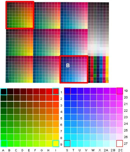
In order to visualise the printed colours and to create the ICC profiles, an industry standard TC9.18RGB type colour chart format was adopted. This chart uses a ramp progression of colour squares that contains equal percentages of colour mixtures within a 3x3 grid of 9x9 colour patches and includes all the primary and light colours (figure 3). The colour patches outlined in red and labelled as A and B, illustrate the position of each of the primary hue colours with each corner of the square equal to 100% of each colour. In the patches in the top left hand corner (A), the hue colours are red, yellow, green. In the patches in the bottom right corner (B), the hue colours are magenta, cyan and blue. A 100% black patch appears at the top left of the target (in block A) and a white patch (which contains no ink) can be located at the bottom right (in block B).
The inclusion of colour pairs was to emulate the existing light and dark system that is currently employed for cyan and magenta and their lighter colour versions. The objective was to ensure a smooth transition between white to full hues and also between the hues themselves. For example, in the same way a light cyan is used to print lighter areas of a cyan, so a violet or a blue requires lighter companions in order to produce the subtlest range of hue mixes. Therefore for every 100% hue colour, a lighter version was mixed to obtain a range of what are termed as colour pairs: blue and light blue, purple and light purple, rose and light magenta, red and orange, green and light green.
B
[image:2.595.58.271.281.432.2]Figure 3. TC9.18RGB industry standard colour test chart. The four corners represents the limits of the RGB values (position on the chart): Black 0,0,0 (A1); Red 255,0,0 (I1); Green 0,255,0 (A9); Yellow 255,255,0 (I9); Blue 0,0,255 (S19); Magenta 255,0,255 (2C19); Cyan 0,255,255 (S27); White 255,255,255 (2C).
2.2.1 Creating and printing the custom mix colours Working from the shortlist of primaries as described in section 2 a series of colour charts were created. The combinations of the mixed hues and lighter colour pairs were based on traditional hue colours that are more recognisable for use by artists. Ten different colour charts were printed onto high-quality fine-art inkjet coated paper and named as: 1. rose-purple-dark yellow; 2. rose-purple; 3. red-purple; 4. blue-green-black; 5. red-blue-green-black; 6. red-green; 7. rose-green; 8. red-blue; 9. rose-blue; 10. green-blue.
The titles of the charts indicate the primary hue colours of each chart, and are shortened versions of the six ink colour sets, for example: the primary hue colours of chart number 5, contain red and green, light red, light green, yellow and purple.
For each of the colour combinations a TC9.18RGB colour target was printed, and measured using a Gretagmacbeth Spectrolino spectrophotometer on a SpectroScanT X-Y measuring table; the illumination was set to D50 and observer angle set to 2 degrees; the LAB data imported into ProfileMaker. Once the ICC profile was generated, the profile could be viewed using the Apple ColourSync Utility to compare the new inks to the standard HP CMYK inks; to visualise how the gamut had changed and to indicate what was gained and lost.
The chart could also be used soft preview the colours on screen and to obtain more consistent predictability of the appearance of the printed ink on paper. The ICC profile that is generated from the coloured chart is used to assist in driving the colours accurately from image file to printer. The measured data could also be used to make comparisons between the existing CMYK colours and newly mixed colours, or to make a comparison between any two colour charts (figure 4).
An artist wishing to use this system would have at his or her disposal a printed colour chart demonstrating the printed colour patches on a particular paper, the corresponding ICC
profile (that would be uploaded to the Colour Profile Library
[image:3.595.309.534.111.268.2]on their computer hard drive), and a colour selection chart that could be accurately viewed in Photoshop.
Figure 4. Using the colour picker tool in Photoshop, a colour patch can be selected. When using colour measured data from a custom ink mixed colour chart, the same colour patch can be soft previewed, therefore assisting in an accurate colour selection process for the artist.
2.3 Printing new inks using a custom colour template
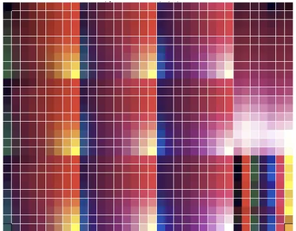
The objective of the following test was to visualise the relationships and possibilities of colour mixing and to discover how two printers using twelve colours (six per printer) could overlap and mix. To achieve this, all the twelve colour channels using both the unmodified and custom HP colour printer were used; the unmodified printer used a standard CMYK colour set, and the second a custom 6-colour set. In order to test how two printers could be used to visualise the possibilities of enhanced colour printing, a new colour template was created. A six pointed star was generated in Photoshop using layers of colour, so that each point contained 100% values of cyan, magenta, yellow, black, light cyan and light magenta (figure 5).
Each hue was assigned a separate layer and colour, in the shape of a semi circle that overlapped slightly so that when the layers were multiplied, a small amount of colour mixing occurred. Three different versions were made which, collectively, offered the full range of possible colour combinations. In this way, the tonal progressions between colours, and variations in colour mixing could be tested and compared (figure 6).
Figure 5. The colours were graded so as to fade to a white point in the centre.
Figure 6. Each inkset and permutations of ink combinations were printed using this template.
[image:3.595.308.535.574.640.2] [image:3.595.313.527.673.733.2]2.3.1 Double printing using twelve colours
[image:4.595.306.532.73.227.2]In order to test how colours are mixed through double printing, the same six pointed stars were used to create a twelve-pointed star. For this test print, six different permutations were involved. In Photoshop, six stars were generated, flattened, copied and then pasted as a second layer. These stars were rotated around their central axis to form a twelve-pointed star (figure 7)
Figure 7. Different permutations for two printers and 12 colours. In this case, one printer contained the original CMYKLcLm inkset and the second printer contained Purple (B), rose (R), green (G), light green (LG), dark yellow (DY) and light magenta (LM).
2.3.2Double printing the stars
[image:4.595.64.278.170.309.2]The first layer was printed on the HP130 using CMYK inks (the “save paper on the roll” and “automatic cutter” option was unchecked). When the image was printed, the uncut paper was rolled back through the printer, the roll was removed and transferred to the second HP130, which contained the modified inks, in this case a dark yellow, rose and green combination (table 1). The printer feed take-up-system repositioned the paper in the same position and printed the second image over the first printed CMYK layer, which resulted in a composite twelve-pointed star (figure 8).
Table 1 Colours and their placement for printing the stars
RGB-CMYKcolour chart: Dark yellow- rose-green HP Channels Custom colours Yellow Dark Yellow (Dk)
Black Purple (B)
Magenta Rose (R)
Cyan Green (G)
Light magenta Light Magenta (Lm) Light cyan Light Green (Lg)
[image:4.595.307.522.397.565.2]2.3.3Summary of the double printing experiment The printed stars demonstrated that each of the hue primaries could be selected and printed, and by over-printing, a visualisation of subtle colour mixtures could be made. As demonstrated in each star, the different primary colours can be seen at the point of each star, blending towards white at the centre. These experiments when contrasted with CMYK colours revealed a broader range of hues particularly in the browns, purples, ochres and more highly refined variations of greens, that tended to be overlooked in the standard digital palette. The results of these experiments clearly indicated the value of further developing the concept of an extended colour set.
Figure 8. The printed results demonstrating the over layering of both colour sets.
2.3 Creating and previewing a new custom inkset in Photoshop
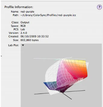
In order to address a particular fine art colour-printing requirement by the author, a new custom colour ink set was generated. The primary hues in this ink set are blue, purple, red, orange and yellow (figure 9); the ICC profile was named red-purple and installed into the Libraries folder, or the system folder on the computer’s hard drive. The following section describes how an artist can utilise the bespoke ink set within their practice by uploading the ICC profile in Photoshop, and soft previewing the colours prior to printing.
Figure 9. The printed TC9.18RGB industry standard colour test chart using the custom colours using blue, purple, red, orange, and yellow;
Based on the method as described in section 2, a new custom palette was mixed, printed and an ICC profile generated (figure 10). In this instance, an ICC profile can be used in two ways:
• by changing the working space, the appearance of the image file can be changed, or,
• by assigning a profile to an image file and embedding the colour data with the file.
[image:4.595.58.279.517.613.2]magenta, yellow and black inks, it is necessary to be able to preview the appearance of the printed colour. The suggestion therefore is to change the working space according to the inks in the printer.
Figure 10. The ICC colour profile that was generated from the chart.
2.3.1 Using colour profiles in the working space The following figures illustrate how by changing the working space from RGB and using the ICC measured profile red-purple as the new working space, the artist can preview how the colour will appear prior to printing.
In the color settings menu in Photoshop the red-purple ICC profile is selected and assigned as the RGB working space. Therefore when any image file is opened in Photoshop using this working space the RGB values will be adjusted to the new working space. The TC9.18 RGB.tiff target is useful to give an indicator of the colour changes (figure 11). The RGB values will remain the same, ie. a magenta patch will still remain 255, 0, 255, but will appear red in the working space and all the other colours will correspond to the measured values from the selected colour-chart. The coloured pixels in the image file will not be adjusted, so images can be opened and closed and different working spaces can also be tried without any change or tagging to the file. This can be used if switching between inksets to test different results. Working on an image file in the
[image:5.595.63.234.127.306.2]red-purple working space, using layers and the multiply option in layers, enables a soft-preview of how the printed version will appear (figure 12 and 13).
Figure 11. The TC9.18RGB image file is opened in the new red-purple working space.
Figure 12. Image file viewed in an Adobe RGB working space.
Figure 13. The same image file viewed in the red-purple working space.
If the colours remain as individual layers (figures 12 and 13), the artist can either print the layers separately by multi pass printing (passing the paper many times through the printer), or the layers can printed in one pass. By modifying the layers in Photoshop the artist would be able to obtain the appearance of multi-layer printing.
3. Conclusion
In order to measure the colour and be able to preview how the colours appear on paper, an industry standard colour chart was used to compare measured colour data. For each of the newly mixed inks an RGB TC19 colour ramp chart was used to proof print all the ink combinations. The printed colour chart containing new colours was then measured and the profile used as the working space. The generated profile was also used as data for comparing ink sets, to analyse how the gamut had been compressed or expanded. The printed colour chart could also serve as a look-up-table, which enabled the artist to work in the same colour space as the novel colours selected for the print heads; to mix, select and overlay colours prior to printing.
The printed colour stars demonstrated a wide range of subtle intermixable colours, which were printed onto a carefully selected fine art paper so the artist would have a better understanding of the visual effects of the printed ink on paper. The research has highlighted the need for a balance between retaining the artists’ exploration of colour and at the same time, the reassurance that a specific colour once chosen would be printed with a much-reduced margin of error.
[image:5.595.56.291.581.722.2]References
[1] Gage, J. (2006). Colour in Art. London, Thames and Hudson, p 87. [2] Parraman, C. (2010) ‘The development of artists’ novel colour palettes for inkjet printing’. Proc. of IS&T/SPIE Electronic Imaging
Conference2010, 7528
[3] Parraman, C. (2008) ‘Colour in flux: Describing and printing colour in art’. Proc. of IS&T/SPIE Electronic Imaging Conference2008, Vol 6807-0N