Abstract—The rapid development of technology has caused the emergence of various sophisticated information and communication technologies much cheaper than in previous years. Therefore, the penetration of technology is not only into every aspect of highly developed societies but also into developing countries such as Indonesia, as more and more people can afford to buy a variety of technologies. However, to use the technologies, many of the users in developing countries need to make a rapid technology leap; hence many of them are having difficulty in using the technologies. This paper will look at the cellular phone which is one of the technologies widely used in developing countries. Many people can afford to have cell phones but experience difficulties in making full use of them, such that they only operate the basic functions. One of the reasons for this is the low comprehension level of icons being used in the interface. This study explores the use of alternative icons that may improve user comprehension level by considering the social and cultural background of Indonesian users.
Index Terms—e-literate, icon, interface design, usability
I. BACKGROUND
echnology has penetrated every aspect of modern society, not being part of the digital society is no longer an option [1]. People use technology to communicate to each other, do business transaction, find information, and for many other activities. The use of information communication and technologies may also have a big impact on socio-economic development of poor communities in developing countries [2],[3],[4],[5]. However, in developing countries, many people especially those who live in rural area, are facing difficulties when confronted with technologies. The problems faced by these people are not solely related to the problem of computer literacy, but, rather many of them are also illiterate or have very limited reading and writing abilities. One widely used technology is the cellular phone, and currently there is a high adoption rate by illiterate people [6]. Previous studies that have asked users about the experience of using a cell phone have shown they often rely on rote learning or assistance from others, hence rendering usage of technology possibly less effective than it
Manuscript received December 21, 2012; revised January 21, 2013. Restyandito is with the Department of Systems Engineering and Engineering Management, City University of Hong Kong, Hong Kong SAR (e-mail: [email protected]).
Alan H. S. Chan is with the Department of Systems Engineering and Engineering Management, City University of Hong Kong, Hong Kong SAR (e-mail: [email protected]).
Aditya W. Mahastama is with the Department of Information Technology, Duta Wacana Christian University, Yogyakarta, Indonesia (e-mail: [email protected]).
Tri S. Saptadi Author is with the Department of Information Technology, Atma Jaya University, Makassar, Indonesia (e-mail: [email protected]).
should be [7],[8]. Krisnawati and Restyandito [7] further pointed out that user experience and cultural background play an important role in understanding the user-cellphone interface. Diverse users from different countries, groups and religions have different beliefs and values, thus have different perceptions and expectations. Gao and Krogstie [9] also highlighted the relevance of the cultural dimension as one of the factors affecting the adoption of mobile information services.
According to the International Organization for Standardization [10], usability is defined as “the extent to which a product can be used by specified users to achieve specified goals with effectiveness, efficiency and satisfaction in a specified context of use”. It is a major challenge for us to develop a user-friendly technology for the illiterate and non computer literate users.
This paper will examine some possible alternative icons that can be used to symbolize functions often encountered in a cell phone and discuss whether those icons help illiterate and non e-literate users in understanding the functionality of a phone. Martin and Ashworth [11] defined e-literacy as the awareness, skills, understandings, and reflective approaches necessary for an individual to operate comfortably in information-rich and IT-enabled environments.
II. RELATEDWORK
Many studies have been directed at this problem such as: using a pictorial interface for self-identification of illiterate villagers [12]; icon-based interfaces to access Automated Teller Machines [13], and; application of text-free user interfaces [3].One way to improve user ability to make use of technology is by employing pictures and symbols. Previous studies have reported that users with a low level of literacy prefer fully iconic interfaces [14], and that audio capabilities can enhance usability [15]. But many of the symbols used in current technologies, including those on cell phones, were derived from computer interfaces which use office metaphors, whereas the variety of backgrounds of users now extends far beyond office workers. Among the many types of users there are farmers, fishermen and food sellers, none of whom have ever been exposed to modern technology before. Icons using cultural and often Western concept, such as musical notes may not make sense to many users [8].
One of the essential factors in studying usability is guessability [16],[17]. When users look at a device for the first time, they will construct a mental model of how it works [18], therefore an interface need to have a good affordance and visibility [19]. Affordance is the action possibilities of which a person is aware in relation to a particular design. The
Designing Usable Icons for Non e-Literate User
Restyandito, Alan H.S. Chan, Aditya W. Mahastama, Tri S. Saptadi
concept, idea or function of a device can be represented using an icon. When designing an interface, choosing the right icon will provide several benefits, such as making use of the extensive ability that people have in pattern recognition. Icons offer language independence for using products regardless of geographical locations, they reduce the space required to display information, and can offer a certain level of aesthetic appeal. However, the effectiveness of the imagery used for icons is influenced by the cultural background of the user [20],[21]. An icon must depict easy association with the message. There are many approaches to designing an icon, namely, resemblance, exemplar, symbolic and arbitrary [22]. Icons that show a direct image of the function or concept itself is called a resemblance icon. A picture of a radio resembles the function of a real world object which is a radio. Icons that provide examples to convey their meaning are called exemplar icons. A sun is one object that can be used, for example, when explaining about weather. Symbolic icons are used to present the underlying referent that is at a higher level of abstraction than the image itself. A compass representing a browser is an example of a symbolic icon. A compass as a navigational tool is used to depict the use of a browser to navigate the web. Arbitrary icons have no relationship to their intended meaning so the association must be learned. A green robot to represent the android operating system is an example of an arbitrary icon. According to Marcus [23], user interfaces are comprised of the following components: metaphors, mental models, navigation, interactions (includes input/output techniques, feedback and status display) and appearances. Metaphor is the use of a familiar concept to explain a new concept. Metaphors are commonly used to map user understanding of a product, and activities and reactions, to a product. They help make sense of user needs in relation to the physical attributes of the product and the source of inspiration for a metaphor [24]. The most commonly used metaphor is the desk or office metaphor to help users understand how computers organize data (store, manipulate, delete, etc.) in RAM (Random Access Memory) using familiar objects such as files, folders, and trash bin [22]. Other widely seen metaphors are used on the Internet, where, for example, the metaphor of a book with pages (web page, home page, etc.), text (hypertext), bookmark, etc. are used.
An icon might not be effective if the meaning conveyed is not interpreted correctly by the users. In one of their interviews, Krisnawati and Restyandito [7] came across several users who thought that an envelope is used to represent the function of transferring money. They built their mental model on their experience with using envelopes. Since they never received or sent mail, they had no clue that an envelope can be used to represent sending text messages on a cell phone. They had only used envelopes to give donations or gifts at wedding parties or various social events, thus they quite correctly concluded that, for them, an envelope represents giving or transferring money to someone.
One of the factors contributing to user comprehension of an icon is cultural background. Studies by Heukelman and Obono [25], Shen, et al. [26] and Evers, et al. [27] suggest that for users from a particular culture, metaphors specific to that culture are better understood. Another study by Syarief, et al. [28] identified that there were perceptual differences between people from two culturally different populations, American users preferred a symbolic sign style (partial presentation of an object) whereas Indonesian users favored an icon using a full representation of the object. A similar study conducted by Kim and Lee [21] showed that Americans preferred abstract and semi abstract icons whereas Koreans preferred semi abstract and concrete icons. However, it should be noted that most of the respondents in these studies were computer literate.
The purpose of this study was to further analyze some of the problems faced by non e-literate users in using technology and to identify factors that can increase usability of technology. A user friendly interface can help to overcome the technology gap and minimize the digital divide in modern society between the tech-savvy and the non tech-savvy populations so that there will be fewer lost opportunities and, hopefully, greater socio-economic development.
III. METHOD
A. Participants
An interview technique was used here and the interviews were conducted in the two cities of Yogyakarta and Makassar (each from different major islands in Indonesia) to reduce location bias. The interview was designed to reveal how people interpret symbols for a cell phone interface. There were 45 respondents, 25 from Yogyakarta and 20 from Makassar. The respondents were selected using convenience sampling; they were grouped into two categories. The first one was cell phone users and the second one was respondents who have never used a cell phone. All of them were at least 30 years old and none any higher education. Table I provides a summary of demographics of participants according to their education, age and gender.
TABLEI(A) RESPONDENT’S EDUCATION
No educational background 4 Elementary School 15 Junior High School 8 Senior High School 18
Total 45
TABLEI(B) RESPONDENT’S AGE
Age 60-69 4
Age 50-59 15
Age 40-49 16
Age 30-39 10
Total 45
TABLEI(C) RESPONDENT’S GENDER
Male 23 Female 22
B. Procedure
The target users were divided into two groups. The first group was given a brief explanation of some features of cell phones, namely it can be used to send text messages, it has the alarm function, it can be used to make a call, and it has a game function. The explanation was given in plain language avoiding the use of technical terms and jargon such as texting, SMS, making phone call or alarm, instead the interviewer explained that the cell phone can be used to send messages, talk to people in other place and wake people up. The second group was given no explanation prior to the interview. The idea was to see whether the interviewees would make associations for symbols based on the explanation or based on their own free interpretation; this was of special interest in the case of the nonuser group. The distribution of participants is shown in Table II.
TABLEII
THE DISTRIBUTION OF THE RESPONDENT’S GROUP
Given explanation (G)
Not given any explanation (A) Total Cell phone user (C) 13 10 23 Nonuser (N) 11 11 22
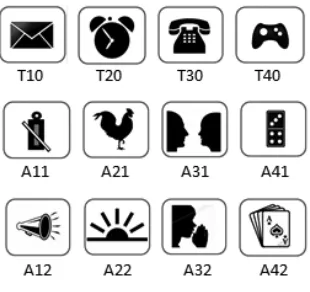
[image:3.612.68.302.256.308.2]There were two sets of simple concrete icons. The first set consisted of target icons that are often found in cell phones to represent the functions of Short Message Service (T10), setting the alarm (T20), making a call (T30) and playing games (T40), whereas the second set of icons (A11, A21, A31, A41, A12, A22, A32, A42) were alternative icons. Icons A11 and A12 were used as alternative symbols for the Short Message Service (SMS) function, icons A21 and A22 were used as alternative symbols to represent alarm, and so on for the remaining icons (see Figure 1).
Fig. 1. Target icons and alternative icons.
All of the icons were shown to the respondents in random order to avoid any association between target icons and alternative icons. For each icon, the respondents were first asked to identify the symbols, and then they were asked to guess what the icon represented. If they stated the meaning correctly they were given a score of 1, otherwise they received a score of 0. Further questions were asked as necessary in order to better understand their reasoning.
IV. RESULTSANDDISCUSSION
The data collected were tested using the Anderson-Darling test and the p-values for the respondents were 0.458 for cell phone user and 0.656 for nonuser respectively. Using an α
level of 5%, it can be concluded that the data were from a normally distributed population. Table III presents the summary result obtained from the interview for response scores.
TABLEIII The Results of the interview
Target Icon Alternative Icon 1 Alternative Icon 2
Grp. T 1 0
T 2 0
T 3 0
T 4 0
A 1 1
A 2 1
A 3 1
A 4 1
A 1 2
A 2 2
A 3 2
A 4 2 Tot.
C.G. 12 10 13 9 2 7 9 13 2 2 4 12 95
C.A. 10 5 10 8 1 2 9 8 0 0 4 9 66
Tot. 22 15 23 17 3 9 18 21 2 2 8 21
(%) 96 65 100 74 13 39 78 91 9 9 35 91 N.G
.
4 4 8 5 4 6 6 9 3 6 2 11 68
N.A .
5 2 7 3 4 5 7 11 3 3 1 10 61
Tot. 9 6 15 8 8 11 13 20 6 9 3 21
(%) 41 27 68 36 36 50 59 91 27 41 14 95
We can see that for the target icons (T10, T20, T30 and T40), with the exception of T20 which reached a level of 65%, cell phone user comprehension level of the icons used were above the ISO 3864 requirement that symbol comprehension must reach a criterion of at least 67% correct to be considered acceptable. There was a strong correlation between experience and level of comprehension, t(22) = 16.41, p < 0.05 (one-tailed). On the contrary non cell phone
users had difficulty in understanding the meaning of the target icons used in cell phones. With the exception of icon T30 (telephone), the number of interviewees who guessed correctly was below 50%.
Although the cell phone user group used their cell phones on a daily basis, not all of them could identify icon T20 (an alarm clock). When asked further, many of them said that they only use their cell phone to make or receive calls and messages. Even some of those who could identify the icon as a clock interpreted it as a feature to show the present time, they were not aware that the phone had an alarm clock feature. This is not surprising, because as Lalji [8] pointed out, many users found the icon and menu options made no sense to them and they therefore ignored the associated functions. Some users even got intimidated by the presence of numerous symbols and gave up trying and concluding that they were not smart enough to operate a cell phone.
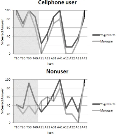
When we compare users understanding of the target icons to the alternative icons, we see a reversal of the results. (Figure 2) The average percentage of cell phone users decreased from 83.75% for the target icons down to 45.63% for the alternative icons but for the nonusers, the average percentage increased from 43% for the target icons up to 51.63% for the alternative icons. However, there was no strong evidence that non cellphone users performed better than cellphone users on the alternative icons, t(21) = 0.562 , p
[image:3.612.112.267.447.593.2]Fig. 2. Comprehension score for each icon.
As may be seen in Figure 3, nonusers had lower comprehension scores for the target icons i.e. those used in today’s cell phones, but generally higher recognition rates for the alternatives icons. The generally lower comprehension scores for the cell phone users for the alternatives icons is perhaps not surprising, since cell phone users are already accustomed to the symbols used in their devices, and as Jordan [16] has stated, experience plays an important factor in usability. However, our interest here is more directed at the nonuser groups, since they are the ones that have difficulty in using the technology. It may be seen that, for all participants, a significant increase occurred in understanding message intended in icon T40 (games), when the simple and familiar symbols of deck of cards (A41) and a domino (A42) were used to represent games. The nonuser understood that the symbol represented games.
Fig. 3. Comprehension score of cellphone user and nonuser.
For the nonusers an increase in understanding of the message ‘alarm clock’ occurred when the alternative icons were used instead of T20 (an alarm clock). The scores rose from 27% for T20 up to 50% and 41% respectively for alternative icons A21 and A22. Respondents identified icon A21 with the rooster crow they heard in the morning, while
icon A22 was identified with sunrise, both were associated with waking up in the morning.
Even though for A11, A12 and A31, A32, the alternative icons for T10 (text message) and T30 (making call) respectively, the percentage recognition rate declined , still some respondents interpreted them correctly, in fact 59% for A31 which shows that the proposed alternative metaphor may help some of people in understanding the functions of the cell phone. Icon A11 a kentongan (an instrument made from hollowed branch used in many villages in Indonesia as a means to give information to the neighborhood such as an event occurring (guest visit, meeting, etc.), danger (flood, fire, a thief) as well as time (used by the night guard to inform about important times such as prayer time)) and A31 (two people facing each other talking) were better understood than icon A12 (megaphone) and A32 (people whispering information). Some respondents mistakenly identified Icon A32 as a person praying, thus they interpreted it as a function to alert the user about prayer times (the majority of Indonesian people are Moslems and pray 5 times a day). Therefore, incorrect, or rather unintended, interpretations occurred because respondents could identify a symbol with different objects.
[image:4.612.328.530.517.569.2]For some nonusers who are non e-literate, icons which resemble objects they encounter in everyday life will be comprehended more readily (Figure 4). These icons are more meaningful for them and have close semantic distance such as kentongan (A11) and megaphone (A12) for sending messages compared to an envelope which they rarely use. Similarly for the alarm function which is intended to wake people up; non e-literate users, who rarely use an alarm clock, rely on cock crow or sunrise to determine time to wake up in the morning. In contrast, for cell phone users, the alternative icons have lower comprehension levels, because they are more familiar with the icons they use, or at least see, regularly. It seems likely that if they started to learn to use cell phones with the alternative icons, they would probably have scored better on the alternative icons.
Fig. 4. Icons where nonuser has higher percentage of comprehension
[image:4.612.86.295.522.628.2]does not seem to be correlated with the comprehension score. The range of the respondent age is 36-67 years old, most likely they have the same background, being grown up with less technology influence. If the interview had also been conducted to younger generation, we can expect the comprehension score will be higher, as they have been exposed more to technology, even if it is only through media such as watching a cellphone commercial on TV.
Fig. 5. Comprehension score from each city.
In this study, prior knowledge was found to result in better comprehension of the target icons. As may be seen in Table III, both groups had higher percentage correct scores when briefed about cell phone functions. Prior knowledge may have helped to build the mental model needed to understand the icon [22].
In order to improve user understanding of symbols, strong emphasis should be placed on using designs which have obvious and direct connections with things encountered in daily life [17]. Disparities in culture can create misunderstanding, consequently designs developed and used successfully in one culture do not necessarily work well for people from another culture. Our ability to visually perceive and interpret information is a precondition for an efficient handling of graphical user interfaces. It is easy to assume that all people make sense of the world in very similar ways; this ignores behavioral and neurological findings showing that how we perceive information is strongly influenced by our cultural background [29]. Previous studies have indicated that localizing an interface is preferred by users [30], [25]. A study done by Wang [20] pointed out that Taiwanese computer users recognized cultural icons combined with Chinese characters more accurately than standard icons combined with an international alphabet. Katre’s research on illiterate users also suggested that pictures/symbols in the interface should reflect the mental model of users and should be localized, as users come from different geographical conditions and lifestyles [12].
It is difficult to design icons that can be recognized effortlessly and accurately by very large populations, therefore it is advisable to use them in combination with text [3], [13]. Johnson & Coventry, [31] also suggest that audio can be used to input and output information in the form of speech. Nevertheless Lalji [8] found that although voice instructions made it easy for participants to perform some actions, it turned out the users did not have a clear idea of how something works, they merely followed the instructions but were not able to explain the reason for doing something. They were unable to build the mental model needed to understand how to operate their devices. For example, when instructed to find a number in the address book using up and down buttons, participants were literally pressing the two buttons alternately thus toggling between two numbers, following the instruction literally. Furthermore, even after hearing the instructions several times, they could not remember the instructions afterwards.
V. CONCLUSION
This study has shown the use of the right metaphor can improve users understanding of an icon. Further study is needed to determine suitable interface metaphors. A User Centered Design approach recommends techniques like contextual inquiry [32], field study and ethnographic study as general solutions to many usability problems [33]. Combining the right representation of icon, text and speech will increase the usability of cell phones.
ACKNOWLEDGMENT
The first author would like to thank the Directorate General of Higher Education of Indonesia for supporting this study at City University of Hong Kong.
REFERENCES
[1] H. Rugayah, I.K. Sari, U.Y. Aznita, M.F. Murni, and F.S.M. Sharifah, “Digital inclusion and lifestyle transformation among the Orang Asli: Sacrificing culture for modernity?”, Asian Social Science, Oct 2012, Vol 8, Issue 12, 2012. pp. 80-87
[2] S. Mitra, “Self organizing systems for mass computer literacy: Findings from the hole in the wall experiments” in International Journal of Development Issues, Vol. 4, No. 1 pp. 71 – 81, 2005
[3] I. Medhi, “Text-Free User Interfaces for illiterate and semiliterate
Users” in Information Technologies & International Development, Vol.4, Issue 1., 2007
[4] T. Parikh, K. Ghosh, and A. Chavan, “Design considerations for a
Financial Management System for rural, semi-literate users”. ACM
Conference on Computer-Human Interaction, 2003
[5] B.V. Ratnam, P.K. Reddy, and G.S. Reddy, ”eSagu: An IT based personalized agricultural extension system prototype – analysis of 51 Farmers’ case studies” in International Journal of Education and Development using Information and Communication Technology (IJEDICT), Vol. 2, Issue 1, 2005. pp. 79-94.
[6] D. Heuklman, "Can a user centered approach to designing a user interface for rural communities be successful?" in Procedings of
conference CHI-SA, Cape Town, South Africa, 25-27 January, 2006
pp. 51-58
[7] L.D. Krisnawati, and Restyandito, "Localized User Interface for improving cellphone users device competency" in International Journal of Information Technology and Web Engineering, Vol.3, No.4, January-March 2008, IGI Publishing. 2008
[8] Z. Lalji, and J. Good, "Designing new technologies for illiterate populations: A study in mobile phone interface design" in Interacting
with Computers, Vol.20, Issue 6, December 2008, Elsevier B.V, 2008.
[9] S. Gao, and J. Korgstie, "Explaining the adoption of Mobile Information Services from a cultural perspective" in Proceeding of
10th International Conference on Mobile Business, IEEE. 2011.
[10] ISO 9241-11. "Ergonomics requirments for office work with Visual
Display Teminals (VDTs) – Part 11: Guidance on Usability",
International Organization for Standardization, Geneva , 1998 [11] A. Martin, and S. Ashworth, “Welcome to the Journal of eLiteracy!”
JeLit 1(1): 2-6. 2004 Available at:
http://www.jelit.org/archive/00000011/
[12] D.S. Katre, "Using mnemonics as part of Pictorial Interface for Self-Identification of illiterate villagers" in Proceedings of
International Conference on Human Computer Interaction, IESUP,
CSI, Bangalore, India, 2004
[13] A. Thatcher, S. Mahlangu, and C. Zimmerman, “Accessibility of ATMs for the functionally illiterate through icon-based interfaces” in
Behaviour & Information Technology, Vol.25, No.1, January-February
2006, pp. 65-81
[14] H. Shakeel, and M.L. Best, “Community knowledge sharing: An Internet application to support communications across literacy levels”. in Herkert, J.R. (Ed.), Social Implications of Information and
Communication Technology. IEEE Press, New York, 2002. pp. 37–44. [15] S. Deo, D.M. Nichols, S.J. Cunningham, I.H. Witten, and M.F. Trujillo, "Digital library access for illiterate users" in Proceedings 2004 International Research Conference on Innovations in Information
Technology (IIT2004), Dubai, U.A.E, 2004 pp. 506–516.
[16] P.W. Jordan, "An introduction to usability". London: Taylor & Francis, 1998
[17] A.H.S. Chan, and K.W.L. Chan, "Effects of prospective-user factors and sign design features on guessability of pharmaceutical
pictograms”, Patient Education and Counselling - doi:
10.1016/j.pec.2012.10.009, 2012.
[18] Y. Rogers, H. Sharp, and J. Preece, “Interaction design : beyond
human-computer interaction”, Chichester, West Sussex : Wiley, 2011.
[19] D. A. Norman, “The design of everyday things”, New York :
Doubleday 1990
[20] H.F. Wang, and K.L. Wang, “The cultural imagery used in icon design”
in Proceedings of the International Conference on Contemporary
Ergonomics, 1-3 April 2008, Nottingham, UK, Taylor & Francis, pp. 86-91
[21] J.H. Kim, and K.P. Lee, "Cultural difference and mobile phone interface design: Icon recognition according to a level of abstraction" in
Mobilehci'05 Proceedings Of The 7Th International Conference On
Human-Computer Interaction With Mobile Devices & Services,
Salzburg, Austria2005. pp. 307-310.
[22] J. Preece, Y. Rogers, and H. Sharp,”Human-Computer Interaction:
concepts and design”, Addison Wesley, 2002
[23] A. Marcus, and F.W. Gould, "Crosscurrents cultural dimensions and global web user interface design interaction". 2000
[24] J. Hey, J. Linsey, A. Agogino, and K. Wood, "Analogies and metaphors in creative design" in International Journal Of Engineering Education, 24(2), 2008. pp. 283-294
[25] D. Heukelman, and S.E. Obono, "Exploring the African village metaphor for computer interface icons", in Proceedings of the 2009 Annual Research Conference of the South African Institute of
Computer Scientists and Information Technologist, 2009 pp. 132-140
[26] T.S. Shen, M. Woolley, and S. Prior, “Towards culture centered design” in Interacting with Computers, 18, 2006. pp. 820-852.
[27] V. Evers, A. Kukulska-Hulme, and A. Jones, "Cross-cultural understanding of interface design: A Cross-cultural analysis of icon recognition" in Proceedings of the International Workshop on
Internationalisation of Products and Systems, IWIPS, 20-22 May,
Rochester, New York, 1999.
[28] A. Syarief, J.R. Giard, T. Detrie, and M.K. McBeath, “An initial cross-cultural survey of user perception on web icon design for travel
websites”, the 6th Asian Design International Conference,October
14-17, 2003, Ibaraki, Japan Available at: http://www.idemployee.id.tue.nl/g.w.m.rauterberg/conferences/CD_d oNotOpen/ADC/final_paper/013.pdf (Accessed: 10 November 2012) [29] K. Reinecke, and K.Z. Gajos, “One size fits many Westerners: How
cultural abilities challenge UI design”, CHI 2011, 2011
[30] E.A. Onibere, S. Morgan, E.M. Busang, and D. Mpoeling, “Human Computer Interface design issues for a multi-cultural and multi-lingual English speaking country-Botswana” in Interacting with Computers, 2001. pp. 497-512
[31] G.I. Johnson, and L. Coventry, "You talking to me? Exploring voice in self-service user interfaces" International Journal of
Human-Computer Interaction 13, 2001. pp. 161–186
[32] H. Beyer, and K. Haltzblatt, "Contextual techniques, interactions" (6)1, 1996. pp.32-42