Twitter card: exploring the feature and adding new services
Konstantin Fedorov
University of Tampere
School of Information Sciences Computer Science / Int. Technology M.Sc. thesis
Supervisor: Päivi Majaranta June 2015
University of Tampere
School of Information Sciences
Computer Science / Interactive Technology
Konstantin Fedorov: Twitter card: exploring the feature and adding new services M.Sc. thesis, 36 pages, 3 index and 24 appendix pages
June 2015
This study examines the Twitter card, a feature that adds a preview for rich content links included in tweets. Previous research has not cover this recently added feature, though it has an obvious impact on the user interaction with his/her timeline and provides a new way of representing the user interface. At the same time, a default Twitter client has a major drawback – the number of web services that are officially supported is quite small. This study explores the possible future of Twitter card and presents a prototype application that shows what will happen if all the links will have previews, how this can be implemented and what users think about it.
The prototype application was developed using HTML/CSS/JavaScript, PhoneGap framework and ported to Android operating system. The source code of the application is provided as part of this research.
This study provides also user experience evaluation of Twitter card and the prototype application, and finds out the improvements in the hedonistic perception of the service if the number of supported services increases.
Contents
1. Introduction ... 1 2. Twitter ... 1 2.1. Description ... 1 2.2. Categories of messages ... 2 2.3. Twitter features ... 3 2.4. Twitter card ... 43. Content rich user interfaces ... 6
3.1. Introduction ... 6
3.2. Twitter ... 6
3.3. Instagram user interface ... 8
3.4. Digg ... 9
3.5. Flipboard ... 10
3.6. Paper ... 11
3.7. Prototype application ... 12
4. Preliminary small scale group interview ... 12
4.1. Method ... 12
4.2. Implementation ... 12
5. Application development ... 14
5.1. Introduction to the system ... 14
5.2. PhoneGap development ... 15
5.3. Twitter API connection ... 16
5.4. Twitter authorization and OAuth ... 17
5.5. Data storage ... 18 5.6. Embedding media ... 18 5.7. HTML and CSS libraries ... 19 5.7.1. Backbone.js ... 19 5.7.2. Twitter Bootstrap ... 19 5.7.3. jQuery ... 20 5.7.4. twig.js ... 20
5.8. AJAX loading indicator ... 20
5.9.1. Codebird.js ... 20
5.9.2. jStorage ... 21
5.9.3. twitter-text.js ... 21
6. Prototype user interface ... 22
6.1. Authorization process ... 22
6.2. Main interface ... 24
7. User testing ... 25
7.1. Methods ... 25
7.2. Results of think aloud method ... 26
7.3. Results of questionnaire ... 27
8. Discussion ... 30
References ... 32
Appendix 1. Background questionnaire ... 37
Appendix 2. Consent form ... 40
Appendix 3. Test plan ... 41
Appendix 4. Summary transcription of user testing ... 43
1.
Introduction
In recent years there has been an increasing interest in social networks and particularly Twitter. The idea of writing a message just in 140 characters opened a new way to share information among people.
In 2012 Twitter revealed а new desktop feature called “Expanded tweet” (Sippey, 2012), later “Twitter card”, which shows interactive previews for the links in messages. Users can watch for example a YouTube video directly from Twitter or read the introduction of a newspaper article without opening a new window in the browser.
However, the small number of officially supported web services does not give the opportunity to use these features fully. Although the list of services is not available publicly, some major services are not supported, for example Instagram. Moreover, the Twitter mobile application has even fewer web sites with previews.
This study suggests that modern mobile devices have room for improvement and can support the generation of previews for all the links using automated services. Furthermore, it also illustrates that users appreciate this opportunity. The developed prototype application based on Twitter attempts to address this issue and to prove the idea by conducting user testing based on it. The exploratory user testing reveals the attitude of the participants to expanded tweet feature and to the application itself. The data yielded here can be used for further improving the Twitter user interface, for sharing interactive previews of interesting links.
This study briefly reviews in the following sections the related literature, describes the prototype application structure and development process and results of preliminary, as well as main user study of this application and related questions.
2.
Twitteris a social network that allows registered users to communicate with each other using 140-charactertext messages, called"tweets" and to unregistered only to read them (Wikipedia, Twitter, 2014). There are different ways to access Twitter – through web, through mobile applications, through SMS, and the like. This network is one of the 15 most-visited websites (Alexa, 2014) with 500 million users (Lunden, 2012).
Microblogging is a broadcast medium that exists in the form of blogging. A microblog differs from a traditional blog in that its content is typically smaller in both actual and aggregated file size. Microblogs "allow users to exchange small elements of content such as short sentences, individual images, or video links". These small messages are sometimes called microposts (Wikipedia, Microblogging, 2014).
Twitter became famous during the “South by Southwest” conference in 2007, when the service was presented to public. Online feed was projected to the wall and visitors could exchange their impressions during the event. Next year after that Twitter already has had 6 million users, few thousands of registrations per day and a 600% of growth. In 2009 the growth already reached about 18000% (Akcora and Demirbas, 2010).
Twitter is used for many different purposes; for example, it is an important event backchannel. It has been used to describe important happenings (San Diego fires, Sichuan earthquake, Mumbai terrorist attacks) or as revolutionary machine for controlling street demonstrations in Iran after the presidential elections of 2009 (Rogers, 2013). It has also shown potential for measuring and predicting major depression in individuals - based on messages of people with clinical depression (De Choudhury, 2013).
In addition, Twitter is actively used in marketing and branding: 19% of tweets contain mention of a brand. Nearly 20% of the branding microblogs contained some expression of brand sentiments, from which more than 50% were positive and 33% were critical of the company or product (Jansen, 2009).
However, tweets still can lack credibility, for example when comparing newspaper article and tweet with the same news. Respondents found newspaper articles more credible than microblog messages (Schmierbach and Oeldorf-Hirsch, 2012).
Twitter is mainly English speaking resource. Language activity varies depending on time zone, English tweets being the most popular, followed by Japanese and Spanish. English language versions were remarkably frequent (68%) in two time periods: 2pm and 6pm (Honeycutt and Herring, 2009).
2.2. Categories of messages
Motivations for blogging in general among users can be divided in a few categories (Nardi, 2014): documenting life (recording activities and events), commenting (expressing opinions), getting catharsis (outlet for thoughts and feelings), musing (thinking by writing) and using as community forum (sharing experiences). This is similar to a study (Naaman, Boase and Lai, 2010) that divided all Twitter messages into categories. Human coding and quantitative analysis were applied to the categories of the messages posted by users (Table 1): information sharing, self-promotion, opinions/complaints, statements and random thoughts, me now, question to followers, presence maintenance, anecdote (me) and anecdote (others).
Code Example(s)
Information Sharing(IS) “15 Uses of WordPress<URL REMOVED>”
Self-Promotion (SP) “Check out my blog I updated 2day 2 learn abt tuna! <URL REMOVED>”
Opinions/Complaints (OC) “Illmatic = greatest rap album ever”
Statements and Random Thoughts(RT) “The sky is blue in the winter here””I miss New York but I love LA...”
Me now (ME) “tired and upset” “just enjoyed speeding around my lawn on my John Deere. Hehe :)” Question to followers (QF) “what should my video be about?”
Presence Maintenance (PM) “i'm backkkk!”
“gudmorning twits”
Anecdote (me) (AM) “oh yes, I won an electric steamboat machine and a steam iron at the block party lucky draw this morning!”
Anecdote (others) (AO) “Most surprised <user> dragging himself up pre 7am to ride his bike!”
Table 1. Categories of messages in Twitter (Naaman, Boase and Lai, 2010)
Females and users of the mobile application were more likely to post “me now” messages. 20% of users had 53% of messages in “Information sharing” category, having more friends, followers and mentions, than 80% of users having 48% of messages in “Me now”.
Respondents in the study by Counts and Fisher (2011) found 15% of Tweets highly interesting, looking at them for longer time than at other tweets. They would like to click 52% of links in Twitter timeline, but would reply just to 24% and retweet 34% of all messages. A user spent just 3 seconds on average to read a tweet.
2.3. Twitter features
The main features of Twitter include the following: hashtags, favorites, mentions, and retweets. A hashtag is any word or phrase immediately preceded by the # symbol. Tweets containing the same keyword or topic will be shown on click on the hashtag. Favoriting a Tweet indicates that the user liked a specific Tweet or put it to bookmarks. All favorited Tweets are saved in Favorites link in user’s page. The @ sign is used to call out usernames in Tweets: "Hello @twitter!" People will use @username to mention a user in Tweets, send him a message or link to his profile. A tweet that the user forwards to his followers is known as a Retweet. It is often used to pass along news or other valuable discoveries on Twitter and always retain original attribution. Up to now,
the research has tended to focus on mentions, retweets and favorites (Twitter, The Twitter Glossary, 2014).
Meier, Elsweiler and Wilson (2014) listed the purpose of favoriting tweet as follows: liking tweet (same feature as in Facebook), showing that the tweet is informational, marking the author as a special person (for example, celebrity), and emphasizing that tweet personally relates to the user.
It was shown (Honeycutt and Herring, 2009) that, despite of environment that was not created initially for user-to-user conversations, the @ symbol is a marker of addressivity. The user indicates an intended addressee by typing the person’s name at the beginning of an utterance. Thus Twitter also becomes usable for collaboration and recommendations. Most conversations seem to be three to five messages sent over a period of 15 to 30 minutes. 91% of the @ symbol’s usage relates to direct tweet to some person, 5% are references and locational “at” took just 0.75%. 33.44% of all tweets start with the “@” symbol (replies) according to the statistics collected during the year 2009 (HubSpot, 2009).
Retweet is just 1.44% of whole tweet population (HubSpot, 2009). This feature is used mainly for the following motivations: spreading information to new audiences, entertaining specific audience, commenting by retweeting and adding new text to it, making presence of another person more visible and so on (Boyd, Golder and Lotan, 2010). Retweets happen more often if the original tweet contains photo, video, quote, number or hashtag (Rogers, 2014).
2.4. Twitter card
Initially Twitter card was called an expanded tweet and described (Sippey, 2012) as a tweet that has a link to partner websites, which are supported by Twitter to show content previews (showing images, playing videos and more). It can for example be a video from YouTube, The Wall Street Journal article and other rich content. The user can continue to read the article, follow these accounts, and reply to, favorite or retweet the tweet as usual. Later, the expanded tweet was named as Twitter card in the documentation for developers (Twitter, Twitter cards, 2014).
On the basis of the evidence currently available, it seems fair to suggest that Twitter card functionality was actually created to solve partly the problem of information overload (Wikipedia, Information overload, 2014), caused by social networks in the Internet. Exploring information and new data has become increasingly difficult as the volume and diversity grows (Shneiderman and Plaisant, 2005, p.43). A question of which tweet will attract attention of the user was raised by researchers with the increase in the amount of textual data generated by Twitter users (Chun, et al., 2012).
In recent years, researchers have investigated a variety of approaches reducing overload when searching for relevant information in Twitter but nearly all studies have concentrated on automatic methods. Chen et al. (2012) suggested using collaborative ranking to capture personal interests. Alonso, Marshall and Najork (2012) investigated what the actual strategy is for a user to find interesting tweets and proposed a method to score tweets through textual and contextual features.
On the other hand, there is overwhelming evidence of human's natural ability for fast recognition of visual information. Users are working faster with visual rather than with textual representation of information. Software designers are developing appealing user interfaces for input, search and output to manage rich data user interfaces, which can be extended by sound, animation and video (Shneiderman and Plaisant, 2005, pp. 6-8). Moreover, user interface shortcuts for favorite features decrease the amount of interactions and increases their pace. Frequent knowledgeable users especially appreciate this fact (Shneiderman and Plaisant, 2005, p.68).
The eye tracking study by Counts and Fisher (2011) showed that on average the participants spend less time looking at a tweet with links and rate them as less interesting. It also gives weight to the claim that tweets with links do not attract the user more than tweets without links.
While Twitter card requires a link inside of tweet, just 22% of the messages in Twitter contain a link (Crawford, 2014). The evidence from it suggests that expanded tweet will not work for significant part of messages. One possible implication of this is that we cannot just cut out these tweets from general timeline in our research; otherwise we almost certainly will remove some tweets, which are important for user.
The current literature lacks studies about Twitter card, though this feature brought a significant change in the Twitter user interface. Insufficient research on this subject does not allow drawing any firm conclusions about this change. This study continues the Twitter idea of changing user interface and displaying the content preview rather than textual data and extends the amount of supported services and reducing the amount of textual information. A new user interface is presented by the working application based on user’s Twitter timeline.
The individual preferences vary by person or task, just as car models or flavors vary (Shneiderman and Plaisant, 2005, pp.24-29). The presented new user interface does not substitute the current Twitter design; however users might find it useful and attractive. Moreover this study reveals how users perceive the Twitter card and this question has not been researched enough in previous studies.
3.
Content rich user interfaces
3.1. IntroductionThe web design trends in 2014 will remain in memory with following features: flat design, design firstly oriented for mobile phones and only then to other devices, less text and more content, minimalist navigation, one page design, bigger and better imagery (Lake, 2014).
Similarly, one of the ways to increase enthusiasm among users of system is to use direct manipulation with objects of the system (Shneiderman and Plaisant, 2005, pp.214-215) and giving feeling of involvement directly with the world of objects.
In contrast to textual descriptors, “dealing with representations of objects may be more “natural” and closer to innate human capabilities: action and visual skills emerged well before language in human evolution”. In addition, people work with actions more quickly when those people are given visual rather than textual data (Shneiderman and Plaisant, 2005, p.235).
Modern web services, including Twitter, can have rich content in addition to the textual data. It includes animation (dynamic images), video and audio (clip embedded within a text, graphical document or web page) and different interactions (Dix et. al., 2004, pp.749-756). The rich content user interfaces can be best described with an example of the mobile applications of Twitter, Instagram, Digg and FlipBoard.
3.2. Twitter
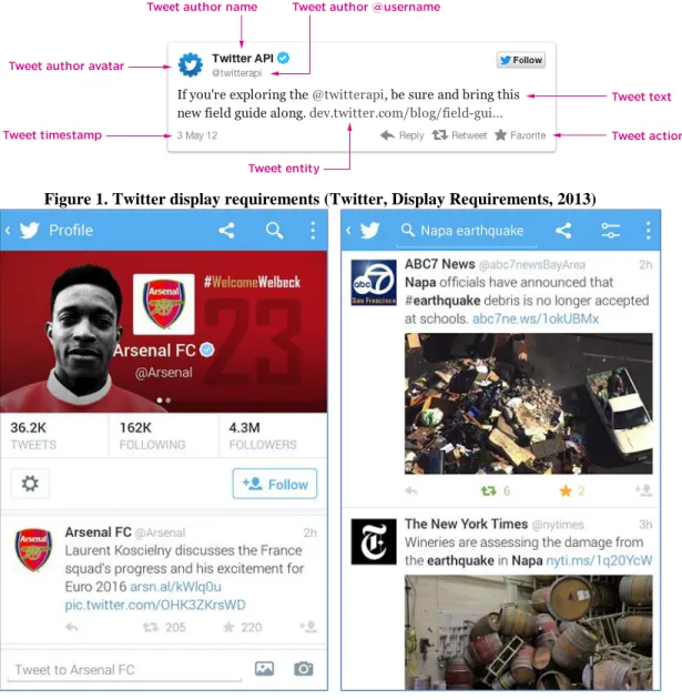
The traditional user interface of a tweet is shown in Figure 1. Twitter mobile application user interface (Figure 2) consists of a table with latest tweets, sorted by date in descending order and it can be scrolled till the last user’s tweet. This table is called
“timeline” and shows usually all the latest messages from the accounts that the user is following. Each tweet consists of the user’s thumbnail, his name and username, text of message and a preview, if such is available. Previews can be shown or played by clicking on it. User can reply to tweet, favorite tweet, share it with user’s followers by clicking Retweet button. The details of user’s account can be viewed by clicking on his thumbnail, and then timeline will show only tweets that were written or retweeted by him or her.
Figure 1. Twitter display requirements (Twitter, Display Requirements, 2013)
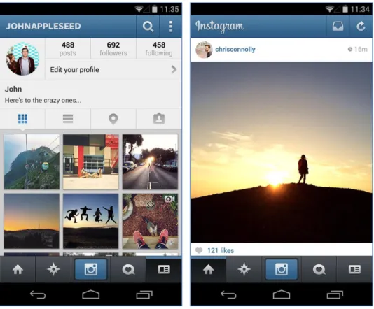
3.3. Instagram user interface
Figure 3 Instagram mobile application (Instagram, Google, 2014)
Instagramis an onlinemobilesocial networkthat allows its users to take pictures and videos, and share them on different networking platforms. Each image will be uploaded with 4:3 aspect ratio and can be changed using several filters (Wikipedia, Instagram, 2014).
Launched in October of 2010, Instagram currently has 20 billion of pictures shared, and every day 60 million new pictures are uploaded and 1.6 billion “likes” are made. In 2011 it was called by Apple “Application of the year”, and in 2012 was acquired by Facebook (Instagram, 2014).
Users of Instagram are approximately divided in Android and iPhone users by 50% and 50%, with 68% female users, conquering 7% of daily photo uploads, among the top four photo-sharing platforms. Instagram is designed for mobile users, having minimalistic interface for uploading pictures comparing to Flickr, which is more suitable for professional photographers (Ferrara, Interdonato and Tagarelli, 2014).
Instagram is also famous for so called “selfies”, aself-portraitphotograph, typically taken with a hand-helddigital cameraorcamera phone (Wikipedia, Selfie, 2014). Photos with faces are 38% percent more likely to receive “likes” and 32% more likely to receive comments. At the same time, the number of faces, their age and gender do not affect “likes” (Bakhshi, Shamma and Gilbert, 2014). 46% of photos represent selfies or posing with other friends, 10% can post about food, and approximately the same percent about different gadgets (Hu, Manikonda and Kambhampati, 2014).
Instagram user interface (Figure 3) is similar to Twitter interface. The main interactivity element here is the Like button and each of the photos gets usually more
“likes” than actual replies to picture. The author of the picture can be viewed by clicking on his name, and then Instagram will open a list of photos uploaded by the user. The user can also check which pictures are shared around, activity happened to user and whom he/she is following, by clicking buttons in the menu.
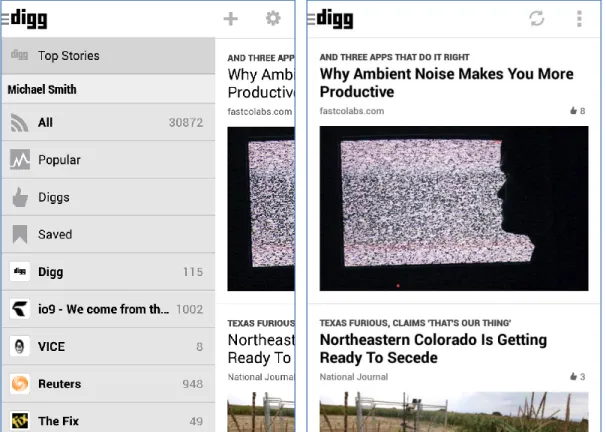
3.4. Digg
Figure 4. Digg mobile application (Digg, Google, 2014)
Digg is a news aggregator with an editorially driven front page, aiming to select stories specifically for the Internet audience such as science, trending political issues, and viral Internet issues. It was launched in its current form on July 31, 2012, with support for sharing content to other social platforms such as Twitter and Facebook.
(Wikipedia, Digg, 2014).
The interface (Figure 4) has elements quite similar to other applications and sites, where user can share content: title, preview, category, reference and number of “likes”. It also prompted the creation of other story submission social networks such as reddit (Wikipedia, Digg, 2014).
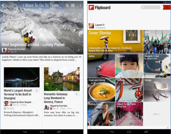
3.5. Flipboard
Figure 5. Flipboard mobile application (Flipboard, Google, 2014)
Flipboard is a social-network aggregation, magazine-format mobile app localized in more than 20 languages. The software collects content from social media and other websites, presents it in magazine format, and allows users to "flip" through their social-networking feeds and feeds from websites that have partnered with the company.
(Wikipedia, Flipboard, 2014).
Flipboard combines the idea of print with social media. It supports Facebook and Twitter and lets readers flip through latest stories and updates. The links and images are rendered right in the application, so users do not have to scan long lists of posts, instead they see instantly all stories, comments and images (Flipboard, 2010). The design (Figure 5) consists of previews, titles that are placed on previews and short abstracts of texts.
3.6. Paper
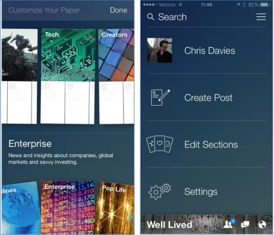
Figure 6. Paper mobile application (Slashgear, 2014)
Facebook Paper (Constine, 2014) is a standalone mobile app, which delivers full-screen Facebook articles in categories that user likes. The top half of the application shows photos and videos, the bottom half shows status updates and link stories (Figure 6). The user can swipe the screen to move between news. The application has the following categories for reading: Score, Headlines, Cute, Planet, Enterprise, Exposure, Flavor and Ideas. Each category has articles chosen by editors and by the Paper algorithm, meaning that user can see not only content from his timeline, but also editors’ picks.
3.7. Prototype application
The aforementioned projects represent rich media in their interfaces in similar ways. For example, a size of media is increasing and gets more attractive. The features such as “like”, favorite and sharing are also common for these applications. This naturally leads to the discussion of how alternative Twitter interface could look like and how the Twitter card feature could be used to expand Twitter features. These questions were discussed in preliminary small scale group interview.
4.
Preliminary small scale group interview
4.1. MethodThe method of testing the application with two participants at a time was used for initial discussion and understanding of a feature product (Rubin, 2008, p.306). It represents the communication between two people jointly working with the product by understanding how they attack potential problems. By using this method it is possible to capture the conceptual model and thought process of the users.
The method of testing of two participants is an exploratory test that is conducted early in the development cycle in the preliminary stages of being defined and designed. The user and the usage of product were defined, having functional specifications and early prototypes. The objective of the method is to evaluate the effectiveness of this prototype and to understand the user’s conceptual model. It is possible to understand if the user understands the fundamental elements of the interface, how well it represents objects, manipulations and navigation. It is also possible to answer more abstract questions, such as what do users think and conceive about project (Rubin, 1994).
The prototype in this case should not represent the entire functionality of the product, but should be enough for the test goal. The testing process itself is quite informal and collaborative between the participants and test monitor. The users share their ideas how to improve the interface; the emphasis is on discussion and examination of high-level concepts and thought process.
Another reason to choose the method of testing of two participants was also support of user-centered design, “… the practice of designing products so that users can perform required use, operation, service, and supportive tasks with a minimum of stress and maximum efficiency” (Woodson, et al., 1981). It allows to derive product goals, objectives, context, and environment from the user’s viewpoint (Rubin, 2008, p.17).
4.2. Implementation
The group consisted of two active Twitter users (2 males, average age 23), who are using it every day for reading, writing and replying to messages. The session was held in a free discussion format, where some questions were asked and a few
wireframes were shown and responders had to comment freely. The participants were encouraged to communicate with each other during discussion.
The official Youtube application has had an evolution of its design, moving from the larger amount of information about videos and smaller size of video player, to the opposite situation with just a title and big preview image. That is why first question was about it and what happened with design during this time and why do they think did it happen.
The new design was described as “flat”, “trendy”, “more simple with more images”, “images are bigger”, “less different data”. The change of color scheme from black to white was also mentioned, as well as the fact that this kind of design looks more “interactive”. According to the participants, the description of video is not needed that much, since often it doesn’t say anything and the title is more explanatory. Another factor that can be important, when the user is searching for video, is the number of views.
The fact that Youtube and other services are moving to bigger thumbnails and interactive content led to next question – what if the description and title were eliminated and rich media shown directly in a full screen. In other words, what will happen if people’s choice is based on only preview with no textual information. The wireframe with four possible rich contents was shown to represent this situation: video, image, web site preview and audio. The participants mentioned that video and picture have different settings - the preview of video usually requires first description or title to read, in order to understand what this preview is about. The opposite happens for the picture – the user want to see what this picture is about and who uploaded it – after he/she already have seen it. Preview of audio player and websites seems to be self-sufficient to be shown in a full-screen.
Next, the responders got a wireframe representing the tweet elements and numbers, assigned to them for easier discussion. They were asked to say what is the most important in a tweet that affects them to focus their attention on it and to read and interact with this rich media. The highest interest is caused by mentioning the user in the timeline’s thread, meaning that tweet was intended for him. Another important fact that attracts attention is who the author of the message is and how his avatar looks like (which reduces need in reading of name, if the avatar is already known).
This reply led to another discussion – what if all of the Twitter rich media content is shown in a full-screen directly with an opportunity to swipe between them in a mobile phone. The response was negative, mentioning for example that just the rich content itself open in a full screen is not tempting enough to check it. It also raises the problem of order, since chronological order is not relevant anymore here without dates, description and context. One rich content element per page seems to be also too demanding for the attention of responders, since it can be uninteresting for user, but full
screen calls an association with something important and needed. In addition it causes the user to scroll intensively to find something very interesting.
As the previous assumption that full screen can be interesting for users was criticized, the responders were asked to suggest an alternative idea for usage of rich media content and how to choose the tweet that can be interesting for reader. The participants advised to base the selection on messages from your friends, number of retweets, specific hashtags and messages from organized Twitter lists, or from Discovery section, which has recommendations what to read for this user. Facebook was given as an example, as it uses some algorithms and chooses the messages that are important and have to be shown.
Then the participants were asked to suggest the user interface for the full screen - how a tweet with rich content could be shown. They said that seeing the part of next tweet’s content is very advisable. On the other hand, the idea of using carousel element, which is widely used in mobile and web environment, was discarded by the participants as taking a lot of space and not creating tempting content. The same happened with the idea of using horizontal scrolling, which was rejected as the vertical scroll was found to be much better and fitting more content.
The idea of using Twitter rich media content in the same way as Instagram appeared during discussion. This means that Instagram could be extended to usage of any type of rich media. It was mentioned also that the new user interface should certainly include the initial description from the tweet which is more important than description from video itself.
The preliminary discussion with the participants revealed many interesting facts about the Twitter application and users’ perceptions about it. The results of this discussion enforced to refuse from the idea of showing only tweets with links, show full screen previews on load, and moreover led to the intention to test the current Twitter card feature and to the question how can it be improved.
The prototype application proposed in this study will extend the official Twitter application features by extending a number of supported rich media services in links. The user interface will look similar to the default application and will not confuse users.
5.
Application development
5.1. Introduction to the systemA mobile phone was chosen as the platform for developing a prototype. Mobile Twitter users appear to be more engaged with content compared to desktop users. They check Twitter more often than average Twitter users, are 44% more likely to click on links, 66% more likely to retweet and 76% more likely to favorite a Tweet (Twitter Advertising, 2013).
The development of the application was divided in two parts – user interface and interaction logic implementation. Both parts were created using web technologies. The user interface is based on HTML5 and CSS, and the interaction logic on JavaScript. It is possible using PhoneGap (Wikipedia, PhoneGap, 2014), an open source framework that allows creating mobile apps using a standardized web application programming interface (API) for the different platforms, mainly for smartphones.
In this application PhoneGap was a middle layer between JavaScript and the specific API of the phone. It runs a web browser with additional features inside of the application window. The produced code is cross-platform, thus it can be compiled for different operating systems if needed. For testing purposes code was compiled for Android and tested in OnePlus One phone, which was running a built-in operating system Android Runtime Jelly (4.2.2).
An access to the user’s timeline and related features was provided by Twitter API, which gives access to a big variety of stored data. For example, the developer can make a search, show the user’s timeline, and reply to a tweet, post new tweets and other features. Access to these queries is allowed through the widely used REST API, which can be defined (Wikipedia, Representational state transfer, 2014) as an architectural style consisting of a coordinated set of architectural constraints applied to components, connectors, and data elements, within a distributed hypermedia system.
The application also required the way of creating preview for links in tweets. The solution suggested by Embedly API (2014) was used in order to speed up the development of prototype enough for user testing. Embedly provides HTML, which is ready to be included in the web page, after the developer has provided a link to the site. It supports more than 250 providers of rich content, for example, for video Vimeo, Hulu, for images Instagram, Dribble, Imgur and for other rich media Google Maps, Storify, Tumblr, Kickstarter, Formspring and many other providers. Embedly is used, for example, by The Guardian, The New York Times, Reddit, AOL and other big media companies. Embedly provides interactive previews or at least a thumbnail for any web page in the internet.
The design was implemented using Bootstrap framework (Bootstrap, 2014), a free collection of tools for creating websites and web applications. It supports responsive web design and contains HTML and CSS-based design templates for typography, forms, buttons, and navigation and other interface components, as well as optional JavaScript extensions.
5.2. PhoneGap development
The PhoneGap development for Android can be done with standard integrated development environment (IDE) called Android Developer Tools (ADT). This IDE is
based on open-source Eclipse software tool, which supports a variety of different programming languages. Eclipse is an open development platform for frameworks, tools and runtimes for building, deploying and managing software across the lifecycle.
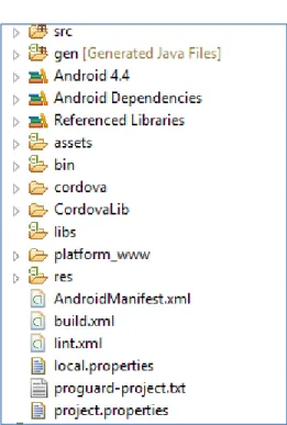
Each PhoneGap project has from the start predefined files (Figure 7), which allow developer to start an empty application. Later he/she can extend this empty application with own files. The basic structure of PhoneGap Android project can be represented with following files and folders (krasnoff, Code Project, 2012):
src: Java sources of PhoneGap related files
gen: Generated Java Files, Android SDK internal use only assets/www: All the HTML and JavaScript logic goes here
AndroidManifest.xml: Android definition file. It has Android minimum version, description of Android device capabilities, to which project has to have access
Figure 7. Structure of the Android application
Android Developer Tools give an opportunity to create virtual Android Devices as virtual machines and test the application in an environment close to real mobile phone.
ADT tool is suitable for the standard Android project, but PhoneGap is based on HTML and JavaScript, that is why Aptana plug-in for Eclipse (Aptana, 2014) should be installed in addition. It supports PHP, HTML, CSS and JavaScript development, code assistance, debugging and code highlighting.
5.3. Twitter API connection
The connection to Twitter can be established through special Application Programming Interface (API) and it allows developers to use in their application all
corpuses of data available in Twitter. It can provide a simple Follow button for the user’s web site, or access to complicated queries such as search, showing user’s timeline, replying to tweets, posting new tweets and so on.
Access to these queries can be done through the so called REST API, Representational state transfer, which is an alternative to other distributed-computing specifications such asSOAP (Wikipedia, Representational state transfer, 2014).
For the development of the application we need an access to the following API methods (Twitter, 2012):
GET statuses/home_timeline
“Returns a collection of the most recentTweetsand retweets posted by the authenticating user and the users they follow. The home timeline is central to how most users interact with the Twitter service”.
GET favorites/list
“Returns the 20 most recent Tweets favorited by the authenticating or specified user”.
POST favorites/create
“Favorites the status specified in the ID parameter as the authenticating user. Returns the favorite status when successful”.
POST favorites/destroy
“Unfavorites the status specified in the ID parameter as the authenticating user. Returns the unfavorited status in the requested format when successful”.
5.4. Twitter authorization and OAuth
The Twitter application should support OAuth method of authorization in order to get access to its API (Twitter, OAuth | Twitter Developers, 2014). The OAuth authorization framework appeared (Internet Engineering Task Force, 2012) as an alternative for traditional client-server authentication model, which required the third-party application to store the user’s credentials. In addition, it allowed access to user’s protected resources with no restrictions and resource owner could not revoke access for this third-party application.
The OAuth 2.0 authorization framework enables a third-party application to obtain limited access to an HTTP service, either on behalf of a resource owner by orchestrating an approval interaction between the resource owner and the HTTP service, or by allowing the third-party application to obtain access on its own behalf.
(Internet Engineering Task Force, 2012)
The OAuth enabled application gets an access token - a string storing a specific scope, lifetime, and other access attributes (Internet Engineering Task Force, 2012). This token is issued by an authorization server with the approval of the resource owner.
The client uses the access token to access the protected resources hosted by the resource server.
The usual OAuth authorization behavior for website consists of few steps. First, the website redirects user to the special authorization page of API owner. Secondly, the user puts his credentials to API owner form and after successful authorization he/she will be redirected back to initial site.
However if it is not a website but an application, it does not have URL to be redirected to. Twitter provides alternative way for this case – the user receives special pin-code after authorization, then he/she returns manually back to the application and puts in this code.
5.5. Data storage
The application has to keep user’s data, when he/she accesses it, for example in order not to ask user again for a password after he/she closed this application. In addition, Twitter OAuth tokens, which are used every time the application makes a request to Twitter server, should be saved. HTML5 already has for it built-in storing tools called web storage, which is supported by PhoneGap, so no additional libraries needed.
Web storage and DOM storage (document object model) are web application software methods and protocols used for storing data in a web browser. Web storage supports persistent data storage, similar to cookies but with a greatly enhanced capacity and no information stored in the HTTP request header. There are two main web storage types: local storage and session storage, behaving similarly to persistent cookies and session cookies respectively (Wikipedia, Web storage, 2014).
The lifetime of session storage is restricted by the lifetime of the browser window or tab, where the site is located. This means that it will be cleaned after the browser is closed, which is not suitable for needs of the application that is being described here. That is why local storage should be used instead to save data between sessions.
5.6. Embedding media
Since the prototype application should be able to render previews for links, a third-party tool Embedly was chosen. It supports big amount of media providers and can represent a preview basically for any address in internet as piece of HTML code that can be later embedded to any web page. Embedly represents an oEmbed open format that allows inserting content from one website into another (Wikipedia, oEmbed, 2014)., which is supported by such web sites as Flickr, Hulu, Rdio, SoundCloud, SlideShare and the like.
Embedly consists of 3 services: Embed, Extract and Display, from which we are interested only in Embed, which is actually representing rich media based on its URL.
Embedly has paid and free versions, but for testing purposes the latter is enough, since it allows checking 5000 URLs per month and has just a rate-limit of 15 requests per second.
Embedly supports more than 250 providers of rich content, for example, for video Vimeo, Hulu, for images Instagram, Dribble, Imgur and for other rich media Google Maps, Storify, Tumblr, Kickstarter and Formspring. What is also noteworthy is that it can basically create a preview of any page, for example for news to show thumbnail and the abstract of the text from this page.
The initial setup consists of registration at Embedly site and getting special key, setting up connection to the API using this key, and handling API response, which contains ready to use HTML code, preview thumbnail and description. In case of sites such as Youtube, SoundCloud and so on, service will return also preview of this content, for example Youtube video player, SoundCloud audio player and user can listen to them directly from the application.
Web sites and applications can connect to API using library for jQuery, which eases up the development process (Embedly, 2014). The basic setup consists of adding jQuery and Embedly jQuery to HTML and it is presented in the Appendix 5.
5.7. HTML and CSS libraries 5.7.1. Backbone.js
Backbone.js (Backbone.js, 2015) is a JavaScript library, which allows creating a structure for a single-page application. It divides the application into few parts and makes a communication between them. The prototype application uses it to follow a certain structure of files so that it will be easier to understand the code. In addition, Backbone.js makes the development faster, since it includes functions frequently used for JavaScript development.
5.7.2. Twitter Bootstrap
One of the ways to speed up application development is using a framework for design of the application. There are a few libraries that provide basic front-end structure for web applications based on CSS and JavaScript. One of the most popular frameworks for this is Bootstrap (licensed under MIT) and it was used for the prototype development.
Applying Bootstrap styles to the web application can be done by inserting links to its CSS and JavaScript, which can be located locally or for example using special content delivery network (Bootstrap, Getting started, 2014). Bootstrap by default supports responsive design, which is useful for the PhoneGap application, because then design can adapt to any Android device screen.
5.7.3. jQuery
Another library that speeds up the development is jQuery. The work with web application means extensive interaction with elements of HTML in JavaScript. jQuery is widely known among developers and it is used for the development of the prototype in this study. It allows navigating easily through the HTML document structure with special selectors, working with events and AJAX requests. Moreover, some of the plugins mentioned here are extensions for jQuery, so it is actually needed by plugins used in the prototype application.
5.7.4. twig.js
The application code grows significantly during the development of the project and it can become unintelligible, if a code structure was not planned beforehand. One of the ways to avoid it is to move frequently repeated parts of the HTML markup to special templates.
twig.js (Roepke, 2014) is JavaScript implementation of Twig templating language made for PHP, mainly used in a very popular Symfony2 PHP framework. The usage of the template system reduces the amount of code and makes it more readable, since repeatable parts of code are moved out to separate files. Some simple logic inside of the template is also possible, such as comparison operators, loops “for”, variable setting and reading.
5.8. AJAX loading indicator
The process of getting a preview for websites consists of two steps: a request to Embedly API and request to elements of preview itself. Taking this into account, it is a good idea to have some indicator of how the process is going so that user will understand in which stage he/she is.
The SVG indicator “Loading…” (Jackson, 2014) was used for these purposes, since it is licensed under MIT and SVG format supported by modern browsers in vector format and thus responsive to changes of height and width without quality loss.
5.9. Twitter API libraries 5.9.1. Codebird.js
The prototype application needs to connect to Twitter API and thus, it requires a library for it. Codebird.js (Jublo Solutions, 2014) is a Twitter library written in JavaScript, which allows calling API requests to Twitter directly from the browser and has built-in support for OAuth user authentication. First, the prototype application should authenticate API requests on behalf of a certain Twitter user, according to OAuth instructions. This is done by creating a pin input field, opening a new window in
browser that will ask for user credentials at site of Twitter. The user gets pin-code, returns to the application and puts there the received pin-code.
5.9.2. jStorage
Browsers’ default storage supports just strings. On the other hand, the prototype application should have an ability to save the data, for example, authentication data and cache. The objects returned by Twitter are usually objects or arrays of objects and thus the application needs some alternative solution that could work with it.
jStorage (Reinman, 2012) is a cross-browser key-value database to store data locally in the browser. jStorage supports all major browsers, both in desktop and in mobile. Additionally, jStorage is library agnostic, it works well with any other JavaScript library on the same webpage, if it is jQuery, Prototype, MooTools or any other framework. jStorage makes use of HTML5 local storage where available and userData behavior in Internet Explorer older versions. jStorage can store strings, numbers and JavaScript objects. The latter one, for example, is not supported by default in browsers; it has to be transformed first to the string using JSON encoding.
5.9.3. twitter-text.js
Any Twitter client has to be able to parse data that is contained in the tweet, for example a text link that should become a real “clickable” hypertext link. A hashtag should be transformed to a search interface link. Twitter-text utility (Twitter, Twitter Text Libraries, 2014) provides such text processing routines for tweets.
6.
Prototype user interface
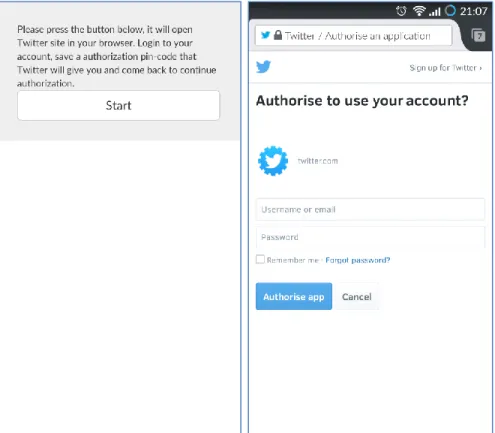
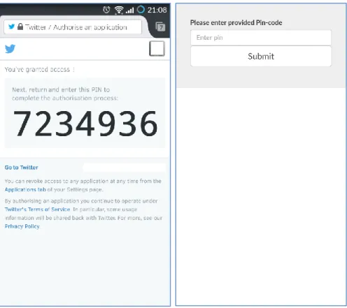
6.1. Authorization processFigure 9. First and second steps of authorization
The authorization consists of 4 steps (Figures 9 and 10). First, when the user opens the application he sees the welcome screen, where the description text and then button to start the authorization are located. The application sends a request to Twitter and generates a link after the user clicked the button. The default browser of the phone is then opened asking to input user name and password to continue the process.
Figure 10. Third and fourth steps of authorization
Next the user receives a special pin-code, which he/she should input to the application and then return to the application using standard methods of switching between applications in the Android operating system. After the user is done, he will see the main interface of the application.
6.2. Main interface
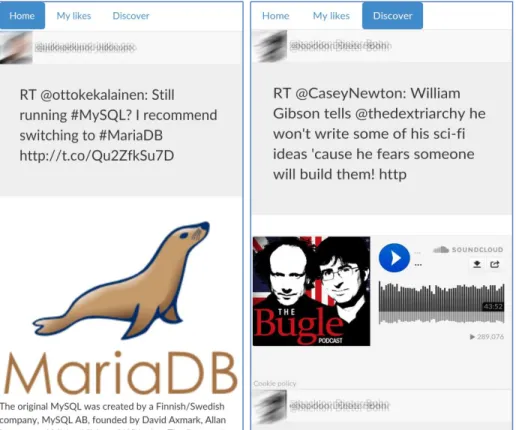
Figure 8. The prototype application screenshots
The result application consists of three navigational tabs (Figure 8): Home, My likes and Discover. Home is the user’s timeline and looks similar to the official Twitter application. Each of the tweets has an image of the author, his nickname and real name, the text of the tweet and preview of the link (if the text contains any). The Home timeline is scrollable with a swipe of a finger from bottom to the top of the screen (and vice versa to check the latest tweets). My likes feature loads all the favorited tweets that were created by user. The Discover tab is fictional in this case and is the same for all of the users (and thus is not the same as in the Twitter official application). It shows some of the most popular rich media services: SoundCloud, YouTube, Instagram and Flickr, and how they could look like if they could appear in user’s timeline. It was important to create this fictional tab, since during user testing it is not feasible to find rich media services from the real user’s timeline in the concrete time when the testing takes place.
The application had also an extended version, which had the Favorite button and a number of favorites by other users, in addition to text of the tweet. It was represented in both Home and My likes views. The button had an image of a heart without any text. In addition, the timeline was filtered and showed only tweets that had links. The
extended version of the application was used for separate evaluation and described in the next chapter.
7.
User testing
7.1. MethodsThe method consisted of two main parts: first, “think aloud” method was used to discuss the Twitter card feature while testing the prototype application and the experience that users have had during testing and earlier in everyday life. Second, the participants filled an experience questionnaire AttrakDiff™ to test how they perceive the prototype application and the idea of increasing number of supported services by Twitter card. AttrakDiff™ is a 23-word Likert scale with opposite pairs in each end of the scale, representing attractiveness and visual appeal qualities, created to evaluate the usability and design of interactive product. In the end of the experiment, the moderator can check the results with an automatically generated graphic and text related to the research. A comparison method was used in the AttrakDiff™ questionnaire, which relates two versions of the product before and after changes.
The participants were divided into three groups: pilot testing with one of the participants to reveal possible issues that can appear during testing, the core testing of the application prototype with five participants and the testing of the extended version of the application with additional features and one participant.
The first participant contributed in pilot testing, where all the technical questions related to the future user testing were verified: if the participant understand the terms in the questionnaires, how to start the recording application in the phone, how to remove all the private data of the user in end of the session, how long these sessions actually take and so on. The pilot testing results are not detailed, since it was held just for preparations for actual testing with other participants and for solving common mistakes. This participant passed through the same steps as in real user testing: giving instructions, replying to questionnaires and discussion of the application.
The next five participants were the core of this research; they answered the questions about their Twitter timeline, tested the application prototype and compared it with standard Twitter client by filling the user experience questionnaires.
The last participant tested the extended version of the application, which had the same features as original prototype with some additions. For example, all his timeline was filtered and showing only tweets with links. The participant was suggested to imagine that presented timeline is a separate application for sharing links with friends and liking them. Like button had in addition the number of times that it was favorited by other users.
All in all, user testing of the prototype was held among 6 workers of web agencies (6 males, found among friends and co-workers, average age 29) located in Helsinki in Finland, leading in open source web design and development. All interviewed participants were active Twitter users, and working in development and project management. Predictably, all of them had excellent computer skills, using computer and Internet daily for different purposes (playing music, using social networks, playing games, sending and receiving e-mails and so on).
7.2. Results of think aloud method
The think aloud method in this study extended the user experience questionnaire, since it did not contain any comments from the participants and it could be difficult to interpret the results. They were asked, for example, to tell if the preview engages the participants to interact with the tweets, how they use the Favorite feature and whether the preview affects the usage of this feature. In addition, they told their opinion about the tweet with and without preview, and about the representation of the preview in the official and prototype applications. The background questionnaire, consent form and test plan with questions are provided in the Appendixes 1, 2 and 3. The short transcription of the think aloud sessions is provided in Appendix 4. The main ideas that were expressed during think aloud method are mentioned here.
First, two participants suggested the idea of giving an opportunity to hide expanded tweets for those people who do not like it. The concerns were connected with unnecessary interactions that can be caused by it – animated images that can attract too much attention, occasional clicks on videos while browsing timeline. It is worth to mention that the current prototype outputs all the previews directly to the timeline. The official application shows just part of preview and the user has to click on it to see the full preview.
One of the participants appreciates in Twitter only textual data and it seems that improvements in Twitter card were not affecting him much, since this feature itself is not used at all.
Three participants mentioned that the feature of showing short abstract for the link was really interesting for them. This is a built-in feature of Embed.ly and was not initially considered as a subject for this research and thus it became a surprising discovery.
Some of the services were wrongly scaled to the phone screen for unknown reason. For example, some of YouTube videos looked too small and almost impossible to interact with. This should be explored in future versions of this application.
During the research the participants’ timelines were usually filled by thumbnails of links, quite rarely there were any really interactive links such as YouTube or Flickr. However, when they checked examples of how these services could look like in
timeline, they seem to appreciate this more than thumbnails. They mentioned that these previews can save time, since the user does not have to click on the link and wait while Twitter opens a site in a separate window of the browser application.
Quite common was the opinion that it should be some balance between the number of links that are supported by Twitter card and safety. Uncontrolled number of links that can be shown for user can terrify him because of its uncertainty. On the other hand, Twitter supports just few popular services and the situation when Instagram was removed from supported services for unknown reason the participants found disadvantageous for the end user.
There was no clear picture of how the participants are using favorites – it can be either as bookmarks, or as “like”. Three participants mentioned that they can bookmark the tweet even before reading the link itself, just by looking at preview in Twitter card. It can happen for example if they want to check link later, but now they are in the bus travelling somewhere and cannot read properly the full text. On the other hand, those who favorite as in a “like” feature have many different motivations to do this. Twitter card can make this action more appealing, but still it is just one of many reasons for doing so. Because of this ambiguity it is hard to assume any correlation between improvements in Twitter card and behavior in favoriting.
7.3. Results of questionnaire
AttrakDiff™ is an instrument for measuring the attractiveness of interactive products. With the help of pairs of opposite adjectives, users (or potential users) can indicate their perception of the product. These adjective-pairs make a collation of the evaluation dimensions possible. The following product dimensions are evaluated (AttrakDiff™, 2014):
Pragmatic Quality (PQ):
“Describes the usability of a product and indicates how successfully users are in achieving their goals using the product”.
Hedonic quality - Stimulation (HQ-S):
“Mankind has an inherent need to develop and move forward. This dimension indicates to what extent the product can support those needs in terms of novel, interesting, and stimulating functions, contents, and interaction- and presentation-styles”.
Hedonic Quality - Identity (HQ-I):
“Indicates to what extent the product allows the user to identify with it”.
“Describes a global value of the product based on the quality perception. Hedonic and pragmatic qualities are independent of one another, and contribute equally to the rating of attractiveness”.
Figure 9 represents the results that were automatically generated by AttrakDiff™, bottom and left values are lower. The “V” rectangle represents the Twitter card feature in default Twitter client. The “N” rectangle is the prototype version of Twitter card. This figure clearly shows that participants’ experiences towards the default application are quite neutral and not engaging. In addition, the prototype application clearly moved the perception towards hedonic and pragmatic qualities. At the same time the square of the rectangle reduced, which means that the users are less variable in the evaluation of new Twitter card opportunities.
Figure 9. Portfolio with average values of the dimensions PQ and HQ and the respective confidence rectangles of the product in the fore-study and after-study
The picture of change in these values is represented in Figure 10 as a line graph. The best results were achieved in “Hedonic quality – Stimulation” and “Hedonic Quality - Identity”. It is worth to mention here that the prototype improved statistically significantly only in the stimulation aspect of hedonic quality. Other values did not succeed in it, however they improved in absolute values. In addition, the small number of the participants could affect these results.
Figure 10. Mean values of the four AttrakDiff™ dimensions
The exact mean values of the word pairs are presented in Figure 11. Among all values the “undemanding - challenging” word pair seems to be the extreme value. It is hard to say if such high value for the prototype application in being undemanding is advantage or the opposite.
It is interesting that the values in the Attractiveness section stayed almost unchanged. This means that the prototype application did not have any significant effect in this field. It can be explained by the fact that design of Twitter application was created by professionals and they put an effort to make this application attractive. On the other hand, the Pragmatic quality values were changed but in different directions among the X-axis. However, the average value stayed unchanged, which can be considered as good result as well. The prototype application was described as
“inventive”, “human”, “connective”, “integrative”, “novel”, “captivating” and
“pleasant”, but also “complicated”, “unpredictable” and “repelling” and needs an improvement in these areas.
Figure 11. Mean values of the AttrakDiff™ word pairs
8.
Discussion
All in all, the user-testing participants liked the idea of the application and even asked if the development would also be continued after it. The results from AttrakDiff™ user experience evaluation tool showed an evident increase in hedonic satisfaction and one of them was statistically significant. However, due to the small number of the participants, it is hard to estimate how true that is. A higher number of participants could improve exactness of results. The participants appreciated the extended number of supported services in Twitter card.
During the user testing one characteristic property of Twitter was found. It was revealed that the usage of Favorite button varies among users – some use it as a bookmark, and some as “Like”. There was no clear preference over it, but this could be explored in further research. Partly because of this ambiguity there was found no effect of the Favorite button on user’s interaction with Twitter card.
The application was lacking the real Discover functionality, which could show the data that user sees in his Twitter timeline. The participants expressed interest in seeing
real data there but this feature is not available currently for developers through Twitter API.
The results of user testing can be used for making improvements in the current user interface of Twitter, since the participants appreciated the extended number of supported services in Twitter card. In addition, the source code of the application can be used also for creating a separate Twitter client that will show only tweets with links and their preview, or for a separate social network that shares interesting links with other users through a mobile phone with a broad support of the previews in messages.
AttrakDiff™ results also can be used for exploring Twitter card feature itself and what could be improved or how users perceive this feature. The results of discussions can also be taken into account for feature improvements in Twitter interface, if the developer of the application considers it from the point of view of user-centered design.
Strategies to enhance the prototype application might involve extending its functionality. For example, it could also provide visual information for tweets without links. This can be achieved, for instance, using text categorization and extracting pictures related to this category through image search system. The application could be ported to a desktop as well, providing the same features there. This could open it up to a broader audience and make easier configurations in a computer. Another idea is handling multiple links in a tweet, instead of just taking the first one from it. In future, the application could show a few previews according to the number of links the tweet has. In addition, the prototype application could use its own code that could generate previews, at least for the most popular web services.
The source code (Appendix 5) can be used for future development of program that can work with Twitter and Embedly API, providing extended features as whole or as module in the more complex application.
References
Akcora, C.G., Demirbas M., 2010. Twitter: Roots, Influence, Applications. Buffalo, NY, USA: Department of Computing Science and Engineering State University of New York at Buffalo.
Alexa. 2014 Alexa - twitter.com. [online] Available at: <http://www.alexa.com/siteinfo /twitter.com> [Accessed 24 August 2014].
Aptana. [online] Available at: <http://www.aptana.com> [Accessed 24 August 2014]. AttrakDiff™. [online] Available at: <http://www.attrakDiff.de/index-en.html>
[Accessed 30 December 2014].
Backbone.js. [online] Available at: <http://www.backbonejs.org> [Accessed 15 March 2015].
Bakhshi, S., Shamma, D.A., Gilbert, E., 2014. Faces Engage Us: Photos with Faces Attract More Likes and Comments on Instagram. Proceedings of the SIGCHI Conference on Human Factors in Computing System, CHI ’14. Toronto, Canada, April 26 - May 1. New York, NY, USA: ACM.
Bootstrap. Bootstrap - The world's most popular mobile-first and responsive front-end framework. [online] Available at: <http://www.getbootstrap.com> [Accessed 30 December 2014].
Bootstrap. Getting started. [online] Available at: <http://getbootstrap.com/getting-started/> [Accessed 30 December 2014].
Boyd, D., Golder, S., Lotan, G., 2010. Tweet, Tweet, Retweet: Conversational Aspects of Retweeting on Twitter. 43rd Hawaii International Conference on System Sciences (HICSS). Kauai, HI, USA, January 5-8, 2010. Washington, DC, USA: IEEE.
Carle, S., 2012. More interactive Tweets, in more than 2000 ways. [online] 25 October 2012. Available at: <https://blog.twitter.com/2012/more-interactive-tweets-in-more-than-2000-ways> [Accessed 30 December 2014].
Chen, K., Chen, T., Zheng, G., Jin, O., Yao, E., Yu, Y., 2012. Collaborative Personalized Tweet Recommendation. Proceedings of the 35th international ACM SIGIR conference on Research and development in information retrieval. Portland, Oregon, USA, August 12–16, 2012. New York, NY, USA: ACM.
Choudhury, M.D., Gamon, M., Counts, S., Horvitz, E., 2013. Predicting Depression via Social Media. Proceedings of 7th International AAAI conference of weblogs and social media. Boston, USA, 8-11 July 2013. [Accessed 15 March 2015].
Chun, C.W., Lee, J.T., Lee, S.W., Rim, H.C. 2012. Detecting Informative Messages. Based on User History in Twitter. Proceedings of 8th Asia Information Retrieval Societies Conference, AIRS 2012. Tianjin, China, December 17-19, 2012. Berlin, New York: Springer Berlin Heidelberg.