Document downloaded from:
This paper must be cited as:
The final publication is available at
http://dx.doi.org/10.1016/j.patcog.2013.06.014 http://hdl.handle.net/10251/40252
Hernández-Orallo, J. (2013). ROC curves for regression. Pattern Recognition. 46(12):3395-3411. doi:10.1016/j.patcog.2013.06.014.
ROC Curves for Regression
Jos´e Hern´andez-Oralloa
aDepartament de Sistemes Inform`atics i Computaci´o, Universitat Polit`ecnica de Val`encia Cam´ı de Vera s/n, E-46022, Val`encia, Spain. Tel: +34963877007, Fax: +34963877359
Abstract
Receiver Operating Characteristic (ROC) analysis is one of the most popular tools for the visual assessment and understanding of classifier performance. In this paper we present a new representation ofregressionmodels in the so-called regression ROC (RROC) space. The basic idea is to represent over-estimation against under-estimation. The curves are just drawn by adjusting a shift, a constant that is added (or subtracted) to the predic-tions, and plays a similar role as a threshold in classification. From here, we develop the notions of optimal operating condition, convexity, dominance, and explore several evalu-ation metrics that can be shown graphically, such as the area over the RROC curve (AOC). In particular, we show a novel and significant result: theAOC is equivalent to the error variance. We illustrate the application of RROC curves to resource estimation, namely the estimation of software project effort.
Keywords:
ROC Curves, Cost-sensitive regression, Operating condition, Asymmetric loss, Error variance, MSE decomposition.
1. Introduction
Receiver Operating Characteristic (ROC) analysis [36, 47, 4, 48, 19, 35, 14, 34] is a very popular technique for the graphical analysis of classification mod-els. ROC analysis is profusely used in many areas [21, 37, 30, 31]: radiology, medicine, statistics, bioinformatics, machine learning, pattern recognition, etc. Also, some metrics derived from the ROC curve, such as the Area Under the ROC Curve (AUC), are now key for the evaluation and construction of classifiers [15, 38, 50, 42, 32].
In classification, the traditional notion of operating condition is common and well understood. Classifiers may be trained for one cost proportion and class
tribution (both making the operating condition) and then deployed on a different operating condition. ROC space decomposes the performance of a classifier in a dual way. On thex-axis we show the false positive rate (FPR) and on the they-axis we show the true positive rate (TPR). ROC curves neatly visualise how the TPR and the FPR change for different (crisp) classifiers or evolve for the same (soft) classifier (or ranker) for a range of thresholds. The notion of threshold is the fun-damental idea to adapt a soft classifier to an operating condition. ROC analysis is the tool that illustrates how classifiers and threshold choices perform.
The adaptation of ROC analysis for regression has been attempted on many occasions. However, there is no such a thing as the ‘canonical’ adaptation of ROC analysis in regression, since regression and classification are different tasks, and the notion of operating condition may be completely different. In fact, the mere extension of ROC analysis to more than two classes has always been difficult be-cause the degrees of freedom grow quadratically with the number of classes (see, e.g., [46, 17, 44]). Consequently it is even questionable whether a similar graph-ical representation of ROC curves in regression (or other tasks [26]) can even be figured out. Notable efforts towards ROC curves (or graphical tools) for regres-sion are the Regresregres-sion Error Characteristic (REC) Curves [3], the Regresregres-sion Error Characteristic Surfaces (RECS) [51], the notion of utility-based regression [41] and the definition of ranking measures [43]. These approaches are based on gauging the tolerance, rejection rules or confidence levels. Some of these ap-proaches actually convert the evaluation of a regression problem into a classifica-tion problem (tolerable estimaclassifica-tion vs. intolerable estimaclassifica-tion). However, none of these previous approaches started from a notion of ‘operating condition’, related to anasymmetric loss function. Also, the notion of threshold was not replaced by a similar concept playing its role for adjusting to the operating condition, and the dual positive-negative character in ROC analysis was blurred.
In this paper we present a graphical representation of regression performance based on a very usual view of operating condition. Many regression applications have deployment contexts where over-estimations are not equally costly as under-estimations (or vice versa). This is called the loss asymmetry. Certainly, loss asymmetry is just one possible kind of operating condition (or one of its con-stituents), but it is a very common and important one in many applications.
The ROC space for regression (RROC space) is then defined by placing the to-tal over-estimation on thex-axis and the total under-estimation on they-axis. This duality leads to regions and isometrics in the ROC space where over-estimations have less cost than under-estimations and vice versa. There we can plot different regression models to see the notions of dominance. We also consider the
construc-tion of hybrid regression models by ‘interpolating’ between points in the RROC space. Moreover, the plot leads tocurves(called RROC curves) when we use the notion of shift, which is just a constant that we can add (or subtract) to example predictions in order to adjust the model to an asymmetric operating condition. This notion is parallel to the notion of threshold in classification. Interestingly, while we can derive the best shift for a dataset given an existing model (which boils down to finding the shift that makes its average error equal to zero if the cost is symmetric), there are some effective methods to determine this shift for the deployment data given an operating condition, as has been recently explored by [1][55]. All this leads to a more meaningful interpretation of what the ROC curves for regression really mean, and what their areas represent.
The paper is organised as follows. Section 2 introduces some notation, the problem of cost-sensitive evaluation and the use of asymmetric costs in regression. The RROC space is defined in section 3, where we represent several regression models as points, derive the isometrics of the space and develop the notions of hybrid models, dominance and convex hull. Section 4 introduces RROC curves, which are drawn by ranging a constant additive shift. We define an algorithm for plotting them and determine some of its properties in terms of segment slopes and convexity. Section 5 analyses the area over the RROC curve (AOC), proving its linear relation to error variance, and showing that the squared error decomposition can be shown in RROC space. A real example is included in Section 6, which il-lustrates how RROC curves are used from training to deployment. Finally, section 7 closes the paper with an enumeration of issues for future investigation.
2. Background
In this section we introduce some notation and the basic concepts about cost-sensitive regression and the need of asymmetric loss functions.
2.1. Notation
Let us consider a multivariate input domainXand a univariate output domain
Y⊂R. The domain spaceDis thenX×Y. Examples or instances are just pairs
hx,yi ∈D, and datasets are subsets (actually multi-sets) of D. The length of a
dataset will usually be denoted by n. Acrisp regression model m is a function
m:X→Y. When the regression model is crisp, we just represent the true value byyand the estimated value by ˆy. Subindices will be used when referring to more than one example in a dataset. Vectors (unidimensional arrays) are denoted in boldface and its elements with subindices, e.g., v= (v1,v2, . . . ,vn). Operations
mixing arrays and scalar values will be allowed, specially in algorithms, as usual in the matrix arithmetic of many statistical computing languages. For instance,
v+cmeans that the constantc is added to all the elements in the vectorv. The mean of a vector is denoted by µ(v) and its standard deviation as σ(v) —over
the population, i.e., divided byn. Given a dataset withninstancesi=1. . .n, the error vector eis defined such that ei,yˆi−yi. The value µ(e2)is known as the
mean squared error (MSE), µ(e)is known as the mean error (or mean error bias, MEB), µ(|e|)is known as the mean absolute error (MAE) andσ(e)2as the error
variance. Occasionally, we will drop the precedingM, especially when referring to total squared error (SE), total error bias (EB) and total absolute error (AE).
2.2. Cost-sensitive problems and loss functions
In cost-sensitive learning [13], there are several features which describe a con-text, such as the data distribution, the costs of using some input variables and the loss of the errors over the output variables [52]. In this paper, we focus on loss functions over the output variable, which is the kind of costs ROC analysis deals with (typically integrated, along with the class distribution, within the notion of
skew). A loss function is defined as follows:
Definition 1. A loss function is any function `:Y×Y→R which compares el-ements in the output domain. For convenience, the first argument will be the estimated value, and the second argument the actual value.
Typical examples of loss functions are the absolute error (`A) and the squared error (`S), with`A(yˆ,y),|yˆ−y|and`S(yˆ,y),(yˆ−y)2. These two loss functions aresymmetric, i.e. for everyyandrwe have that`(y+r,y)=`(y−r,y). Two of the most common metrics for evaluating regression, the mean absolute error (MAE) and the mean squared error (MSE) are derived from these losses.
2.3. Asymmetric costs
Actually, although symmetric loss functions (and derived metrics) are com-mon for the evaluation of regression models, it is rarely the case that a real prob-lem has a symmetric cost. For instance, the prediction of sales, consumptions, calls, prices, demands, survival times, positions, reliabilities, etc., rarely has a symmetric loss. For instance, a retailing company may need to predict how many items will be sold next week for stock (inventory) management purposes, e.g., in order to calculate how many items must be ordered. Depending on the kind of product, it is usually not the same to over-estimate (increasing stocking costs)
than to under-estimate (an item goes out of stock and it cannot be sold or sold with delays). In fact, it is also rare to find applications where even an asymmetric cost is invariable. In the above-mentioned example, depending on the warehouse saturation, the cost (and the asymmetry) may change in a weekly or daily fashion. Because of this, a specialised model for each fixed given asymmetry is not a prac-tical solution in general. This motivates the adaptation (or reframing) of models, rather than their re-training for each new asymmetric loss. This variability of the operating condition is at the core of ROC analysis in classification.
There has been an extensive amount of work on regression using asymmet-ric loss functions. In some cases, the loss function is embedded in the learning algorithm (see, e.g., [10, 45, 11]), which is useful if the operating condition is stable and we know it during training. However, the adaptation (or reframing) of an existing model to a different operating condition has also been investigated for regression (e.g., Granger [22, 23]). Many different kinds of asymmetric func-tions have been explored: Lin-Lin(asymmetric linear), Quad-Quad(asymmetric quadratic),Lin-Exp(approximately linear on one side and exponential on the other side) andQuad-Exp(approximately quadratic on one side and exponential on the other side) [53, 54, 6, 7, 8, 2, 49]. Some of these approaches try to adapt to the operating condition using complex (generally non-parametric) density functions, which is problematic for complex asymmetric loss functions.
As mentioned above, there are many possible asymmetric loss functions. The simplest (and perhaps most common) one is the asymmetric absolute error`Aα:
Definition 2. The asymmetric absolute error`Aα, also known asLin-Lin, is a loss function defined as follows:
`Aα(yˆ,y),
2α(y−y)ˆ ifyˆ<y
2(1−α)(yˆ−y) otherwise
with α being the cost proportion (or asymmetry) between 0 and 1, with
in-creasing values meaning higher cost for low predictions (under-estimation). In other words, whenα =0 we mean that predictions below the actual value have no
cost. Whenα =1 we mean that predictions above the actual value have no cost.
Whenα=0.5 we mean that costs above and below are symmetric.
3. The RROC space
For every regression model and dataset we can determine the erroreifor each instanceiand summarise positive and negative errors separately.
Definition 3. The total over-estimation is given by OVER,∑i{ei | ei>0}and
the total under-estimation is given by UNDER,∑i{ei|ei<0}.
The following example illustrates this:
Example 1. Consider a regression model m1 which is applied to a dataset with
n=10instances, producing the predicted valuesy that, compared with the actualˆ
values y, leads to the error values e=yˆ−y:
1 2 3 4 5 6 7 8 9 10
ˆ
y -0.082 3.323 2.320 1.080 7.893 4.983 5.121 3.442 2.083 1.112 y 0.211 2.725 1.933 3.242 7.858 6.061 7.173 3.082 0.894 1.203 e -0.293 0.598 0.387 -2.162 0.035 -1.078 -2.052 0.360 1.189 -0.091
The error row (e) shows the difference, which is positive for over-estimations and negative for under-estimations. The sum of over-estimations (OVER) is2.569
while the sum of under-estimations (UNDER) is −5.676. This regression model
clearly under-estimates (it has a negative error bias, sinceµ(e) =−0.3107<0). The MAE (0.825) and the MSE (1.219) do not show the asymmetry of predictions. 3.1. Showing models in RROC space
The basic idea of the ROC space for regression is to show model asymmetry:
Definition 4. The Regression Receiver Operating Characteristic (RROC) space is defined as a plot where we depict total over-estimation (OVER) on the x-axis and total under-estimation (UNDER) on the y-axis. Since OVER is always pos-itive (but unbounded) and UNDER is always negative (but unbounded), we will typically place the point(0,0)on the upper left corner (the RROC heaven), and will clip both the x-axis and y-axis as necessary to show the region of interest.
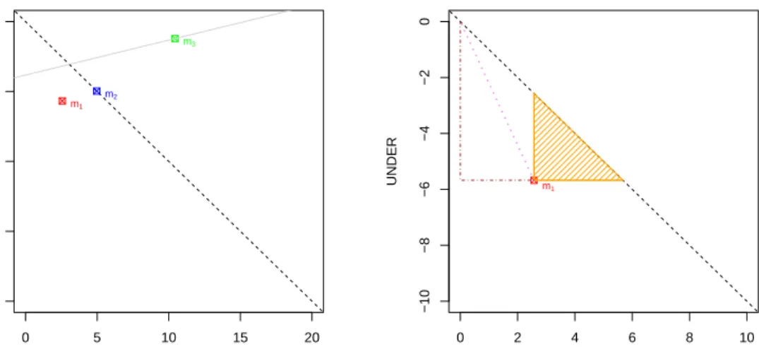
Figure 1 (left) shows the RROC space and the regression modelm1in example 1. We will occasionally draw a diagonal dashed lineOVER+UNDER=0 to show the points where the under-estimation equals the over-estimation.
Example 2. Consider a regression model m2which is applied to the same dataset as example 1: 1 2 3 4 5 6 7 8 9 10 ˆ y 0.786 2.078 0.587 1.676 9.052 5.875 6.885 3.038 4.097 0.308 y 0.211 2.725 1.933 3.242 7.858 6.061 7.173 3.082 0.894 1.203 e 0.575 -0.647 -1.346 -1.566 1.194 -0.186 -0.288 -0.044 3.203 -0.895
● 0 5 10 15 20 −20 −15 −10 −5 0 OVER UNDER m1 m2 m3 ● 0 2 4 6 8 10 −10 −8 −6 −4 −2 0 OVER UNDER m1
Figure 1: Left: RROC space and the representation for regression modelsm1(in red),m2(in blue)
andm3(in green) in examples 1, 2 and 3. The diagonal (dashed black) shows whereUNDER
andOVERare equal. Modelm2has zero error bias (µ(e) =0). We also show the first isometric line (solid light grey) corresponding toα=0.8 (slope=0.25) touching any of the three models. Right: RROC space with regression modelm1(in red) in example 1 (note that the RROC space has been zoomed in now for bothx-axis andy-axis). We show several metrics that can be plotted on the RROC space: the sum of the length of the two dot-dashed segments in brown is exactly the absolute error (AE): 8.25; the length of the dotted violet segment equals the unweighted macro-average squared error (uSE): 6.23; the length of either the horizontal or vertical orange segment connecting the pointm1with the diagonal is exactly the total error bias (EB=µ(e)·n=OVER+ UNDER): −3.107; and the area of the orange-shaded triangle is clearly half of the squared error bias (12(µ(e)·n)2=12(OVER+UNDER)2): 4.827.
The sum of over-estimations (OVER) is4.972while the sum of under-estimations
(UNDER) is −4.972. This regression model finds an equilibrium between over
and under-estimations (it is unbiased, sinceµ(e) =0). However, the MAE (0.9944) and the MSE (1.7619) are worse than for m1in example 1.
Modelm2is also shown in Figure 1 (left). Clearly it is on the diagonal. Finally let us consider a third model:
Example 3. Consider a regression model m3as follows:
1 2 3 4 5 6 7 8 9 10
ˆ
y 1.253 4.232 1.734 5.325 6.842 9.325 8.232 3.525 1.352 1.778 y 0.211 2.725 1.933 3.242 7.858 6.061 7.173 3.082 0.894 1.203 e 1.042 1.507 -0.199 2.083 -1.016 3.264 1.059 0.443 0.458 0.575
of under-estimations (UNDER) is −1.215. This regression model clearly over-estimates (it has a positive error bias, sinceµ(e) =0.9216>0). The MAE (1.165) and the MSE (2.12) show that this model is worse than models m1and m2.
From each point in RROC space, we can derive several metrics very eas-ily, as seen in Figure 1 (right) for model m1. We have that MAE= 0.825= (OVER−UNDER)/n, so AE is just half the perimeter of the rectangle that each point creates with the RROC heaven (0,0). In other words, theAEis just the Man-hattan distance to RROC heaven. The diagonal of this rectangle (the Euclidean distance) is just given by p(OVER2+UNDER2). This measure, which we call
uSE (as an unweighted macro-averaged version of the total squared error, SE), is interesting in itself, because highly penalises models with a high imbalance be-tween over and under-estimations, and can be seen as a measure of ‘symmetric calibration’. Finally, the total error biasEB=µ(e)·nequals the length of the two parallel (horizontal and vertical) segments from the model point to the diagonal.
In RROC space we denote the regression model always outputting∞and the
model always outputting−∞as the (trivial)extremeregression models, which fall at(∞,0)and(0,−∞)respectively in RROC space.
3.2. RROC space isometrics
We have mentioned above that (half) the perimeter of the rectangle from RROC heaven to the regression model corresponds to the absolute error. Can we extend this observation to the asymmetric loss? The following straightforward lemma shows that total asymmetric absolute loss can be calculated graphically as the sum of the distance to the y-axis (OVER=0) and to the x-axis (UNDER=0), using the appropriate asymmetry factorα.
Lemma 1. The total asymmetric absolute loss is given by:
L=
∑
i `Aα(yˆi,yi) =2(1−α)·OVER−2α·UNDER Proof. L=∑
i `Aα(yˆi,yi) =∑
i {2α(yi−yˆi) if ˆyi<yi, 2(1−α)(yˆi−yi) otherwise} =∑
i {2α(−ei)|ei<0}+∑
i {2(1−α)(ei)|ei>0} = −2α·UNDER+2(1−α)·OVERClearly, forα =0.5, we have that this is the absolute error. This also shows
that the closer we are to RROC heaven (0,0)(in terms of a Manhattan distance) the better. All this leads to loss isometrics:
Definition 5. RROC isometrics are defined by varying t over:
2(1−α)·OVER−2α·UNDER=t
The following proposition just gets the slope of each parallel isometric:
Proposition 2. Given an isometric2(1−α)·OVER−2α·UNDER=t, the slope
only depends onα and is given by:
slope=1−α
α
Proof. By isolating the variableUNDERwe have:
UNDER = −2(1−α)·OVER+t −2α = 1−α α ·OVER+ −2t α
= slope·OVER+intercept (1)
Theslopeis then given by the first term 1−α α
Clearly, forα=0 (under-estimations have no cost) we have infinite slope. For α =1 (over-estimations have no cost), we have a slope 0. This notion of isometric
is very similar to the notion already present in ROC analysis for classification [18]. In fact, this means that we can slide isometrics (movingt) to find optimal points in RROC space, in the very same way as we do in ROC space.
Let us illustrate this. Figure 1 (left) shows the RROC space and the regression modelsm1, m2andm3 in examples 1, 2 and 3 respectively. We also consider the operating condition α =0.8, meaning that under-estimations are 4 times more
expensive than over-estimations. This α leads to a slope of 0.25. By sliding
through all the parallel isometric lines from the one crossing the RROC heaven
(0,0)to the first isometric touching a point corresponding to any model, we touch at(10.431,−1.215)first. In fact, theinterceptis given by isolating it from the line equation (eq. 1 above), which, in this case, leads to−3.82275. The lineUNDER=
0.25·OVER−3.82275 is then shown on Figure 1 (left), touching regression model
m3. Even though model m3 has a worse mean (symmetric) absolute error than
● 0 5 10 15 20 −20 −15 −10 −5 0 OVER UNDER m1 m2 m3 ● 0 5 10 15 20 −20 −15 −10 −5 0 OVER UNDER m1 m2 m3
Figure 2: The three models as in Figure 1 (left). Left: by considering any model which can be constructed by randomly choosing (with any bias) between models m1 andm3, we can show a
segment of models (in solid black). Right: completing this for any other two models —including the extreme models at(0,−∞)and(∞,0)— we can derive the convex hull (shown in solid black).
absolute error. Namely, whilem1has a loss of 2(1−α)·OVER−2α·UNDER=
0.4·2.569−1.6·(−5.676) =10.1092, we have thatm3 has a loss of 2(1−α)· OVER−2α·UNDER=0.4·10.431−1.6·(−1.215) =6.1164.
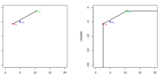
3.3. Hybrid models, dominance and convex hull
Another construction that is also originally present in ROC analysis for clas-sification is the notion of hybrid models. Given any two models, we can construct a hybrid model by randomly choosing each prediction from any of both models using a (possibly biased) coin. We can also do this in regression. Figure 2 (left) shows the isometric (in light grey) passing through modelsm1andm3. The solid black segment connecting both models shows that any model along the segment can be constructed. More precisely, each point in that segment would represent the expected value of a model constructed by choosing between the models in a random (biased) way. Consequently, we can just connect both points since any point in between is technically achievable (at least in expectation).
For instance, a hybrid model using a random (in this case unbiased) choice between these two models leads to pointsOVER= (2.569+10.431)/2=6.5 and
UNDER= (−5.676−1.215)/2=−3.45 on expectation, which is exactly on the middle of the segment. This point represents that we usem1half of the times and
m2the other half1. This is like ROC analysis for classification.
In this particular case, we just draw a line between the point representing
m1: (2.569,−5.676) and the point representing m3: (10.431,−1.215), leading
to UNDER=0.567·OVER−7.134. From this slope of 0.567, we just
calcu-lateα = 1+slope1 =0.638. Obviously, for thisα both models have the same loss. L(m1) = (1−0.638)·2.569+0.638·5.676=4.551 and L(m3) = (1−0.638)· 10.431+0.638·1.215=4.551.
Given these two models, we say that, for slopes lower than 0.567 (asymme-tries α greater than 0.638), model m3 dominates, while we have that model m1 dominates for the rest of operating conditions.
This leads to the notion of dominance and convex hull. In fact, after con-necting all the points by the segments representing the hybrid models, and also including the extreme classifiers at(0,−∞)and(∞,0), we can calculate the
con-vex hull. Any model under the concon-vex hull can be discarded, in the same way as traditional ROC analysis does. Figure 2 (right) shows the convex hull of the three models and the extreme models. We see that modelm2can be discarded. It cannot be optimal for any operating condition.
4. RROC curves
In ROC analysis for classification, we can tweak the predictions of a crisp classifier by changing the predicted class of a random percentage of examples. With this, we can move the classifier in ROC space. However, this just moves the classifier along the two straight lines that connect the original point with the points at(0,0)and(1,1)(the trivial, or extreme, classifiers).
In general, however, in ROC analysis, curves are constructed by the use of soft classifiers, i.e., classifiers which output a rank, score or probability estimation. By moving a threshold from the lowest possible value to the highest possible value (or vice versa) we get many possible crisp classifiers, each of them represented by a point in ROC space, leading to a ROCcurve.
Interestingly, in RROC space, we do not need soft regression models in order to create acurve. It is just sufficient to use ashift, which works as a parallel con-cept to the notion of threshold. For each example we can get a modified prediction
1Remarkably, this is very different to averaging both models. For instance, if
we calculate the (unweighted) average of m1 and m3 we have an error vector e =
h0.375,1.053,0.094,−0.040,−0.491,1.093,−0.497,0.402,0.824,0.242i, with OVER = 4.081 andUNDER=−1.0265. This point isnoton the segment.
as ˆy0←yˆ+s, wheresis the shift. Although there are, as we will see, many ways of determining this shift, it seems natural to consider first that sis constant, i.e., that we apply the same value for all the examples.
Definition 6. Given a regression model m, a (constant-)shifted regression model, denoted by mhsi, is the result of adding the same shift s to all its predictions, i.e.,
ˆ
y0←yˆ+s for all predictionsy.ˆ
The use of a shiftscan lead to models with different values of UNDERand
OVER, denoted byUNDERhsiandOVERhsi, and lower (or higher) loss. In fact, given the asymmetric absolute loss with an operating conditionα, and assuming
a (constant-)shifted regression model, the optimal shift choice method s∗(α) is
derived from lemma 1 as:
s∗(α) =arg min
s
∑
i`Aα(yˆi,yi) =arg min s
{2(1−α)·OVERhsi −2α·UNDERhsi} (2)
This means that the original bias of the model is irrelevant as we can uses∗(α)to
eliminate the bias (for symmetric losses) or to minimise an asymmetric loss. Actu-ally, this shift can be moved from the lowest possible value (−∞) to the maximum
possible value (∞). All this leads to the notion of RROC curve.
Definition 7. Given a regression model m, its RROC curve using a (constant) shift is given by plotting all the models mhsiwith s ranging in[−∞,∞].
In fact, the function s∗(α) is non-decreasing, and we only need to explore
the shifts from s∗(0) = arg mins2·OVERhsi =−max(e) to s∗(1) =arg mins2· UNDERhsi= −min(e). For example 1, these values are s0(0) =−0.598 and
s1(0) =2.162. We can instantly plot the curves point-wise, by just using a suffi-cient number of values forsin this range. However, there is a more direct way of plotting and analysing the RROC curve. This is what we do next.
4.1. Algorithm for drawing RROC curves
We can realise that if we move the shift froms1tos2and no example changes
fromOVERtoUNDERor vice versa, then the increment/decrement inOVERand
UNDERis linear, as the following proposition shows:
Proposition 3. Given a model m, for any two shifts s1and s2such that the
exam-ples for which mhs1i and mhs2i over-estimate are the same (and hence the rest that under-estimate are also the same for both), then for any other shift s3 with s1≤s3≤s2we have that the points(OVER,UNDER)for the three models mhs1i,
Proof. We have that OVER for mhs1i is calculated as: OVERhs1i = ∑i{ei+
s1 | ei+s1>0} while OVER for mhs2i is calculated as: OVERhs2i=∑i{ei+
s2 |ei+s2>0}. Since, by assumption, the examples which over-estimate are the same for mhs1iand mhs2i, let us call this numberno. The previous two expres-sions can then be rewritten as:
OVERhs1i=nos1+
∑
i {ei |ei+s1>0} OVERhs2i=nos2+∑
i {ei |ei+s1>0}Note that the second term is also rewritten with s1, since the elements are the same. Also, since the examples which over-estimate are the same for s1 and s2 they are necessarily the same for everys3withs1≤s3≤s2. So, we have:
OVERhs3i,nos3+
∑
i
{ei |ei+s1>0}
We can see that these three co-ordinates only differ on the first term, which is lin-early related tos(s1,s2ors3). We can obtain similar expressions forUNDERhs1i,
UNDERhs2iandUNDERhs3iand theirnuexamples. The three points are related by a linear term ons, expressed as(nos,nus), so they lie on the same line.
From proposition 3 we can introduce a very simple algorithm to draw RROC curves (Algorithm 1).
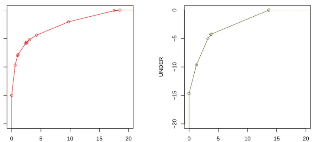
Figure 3 (left) shows a RROC curve using this algorithm for model m1 in example 1. The points where the slope of the RROC Curve change are called
vertex points, and the rest of points fall onto the segments. Consequently a RROC Curve for a regression model applied to a dataset withninstances hasn+2 vertex points (typically, onlynare visible on the plot, because two are the extreme points) andn+1 segments, denoted byi,i+1 withi=1. . .n+1.
In case there are some ties in the error vector, some vertex points and segments collapse into a single point. Let us see this:
Example 4. Consider a regression model m4as follows:
1 2 3 4 5 6 7 8 9 10
ˆ
y 0.123 1.221 1.845 4.573 8.558 7.392 5.669 1.578 0.806 1.245 y 0.211 2.725 1.933 3.242 7.858 6.061 7.173 3.082 0.894 1.203 e -0.088 -1.504 -0.088 1.331 0.700 1.331 -1.504 -1.504 -0.088 0.042
Algorithm:PlotRROCCurve
input : An error arrayˆeof sizenwith the valuesˆy−y.
output: Then+2 vertex points of the curve in arraysRROCXandRROCY
// Draws the curve from bottom-left corner to top-right corner
e←SortDecreasingly(e) RROCX1←0
RROCY1← −∞ fori←1tondo
s← −ei // The shiftsas examples change fromOVERtoUNDER
t←e+s // Applies a constant shiftsto the arraye
RROCXi+1←∑j{tj |tj>0} //OVER
RROCYi+1←∑j{tj |tj≤0} //UNDER
end
RROCXn+2←∞
RROCYn+2←0
Algorithm 1:Draws a RROC curve. We use boldface for arrays notation.
We see a triple tie between examples 1, 3 and 9, another triple tie between examples 2, 7 and 8, and a double tie between examples 4 and 6.
Figure 3 (right) only has five points as there are only 5 different error values.
4.2. Properties: slope and convexity
From the new RROC curve, we may want to calculate the slopes of each seg-ment, in order to exactly determine where each possible isometric (and asymmetry
α) would lead to on the curve. This can be done very easily:
Lemma 4. The slope of each segment i,i+1in the RROC curve is given by(n+
1−i)/(i−1), with i=1. . .n+1.
Proof. Let us assume there are no ties in the error vector. As shown in proposition 3, there is one example changing fromUNDERtoOVER(from bottom-left to top-right) at each vertex point. At the first vertex point i=1, all the examples are under-estimated, and the shift change moves along an infinite slope. For the next vertex pointi=2, we haven−1 under-estimated examples and 1 over-estimated example. This means that any shift increment corresponds to one unit right and
n−1 units up. This is a slope ofn−1. By induction, this leads to(n+1−i)/(i−
1), with the last segment having 0 slope. If there are ties, then more than one example will change from under-estimation to over-estimation at a time.
● 0 5 10 15 20 −20 −15 −10 −5 0 OVER UNDER ● ● ●● ●● ● ● ● ● ● 0 5 10 15 20 −20 −15 −10 −5 0 OVER UNDER ● ● ● ● ● ● ● ● ● ●
Figure 3: Left: Modelm1in example 1 drawn as a RROC curve by changing the shift. Vertex
points (10 in this case, since the two extremes are not visible in the plot) are shown as small circles. The curve is then composed of 11 segments. The original shift (s=0) is still represented with a small square and lies on a segment between two vertex points. Right: Modelm4in example 4 drawn as a RROC curve by changing the shift. The model has several errors with the same value (two triple ties and a double tie), so the number of distinct visible points is reduced fromn=10 ton−2−2−1=5.
Thus, and somewhat surprisingly, given a a dataset with a fixed number of examples, all regression models (without ties) will have exactly the same slopes. The difference between the curves will be given by the length of the segments, not their slopes. From the equation1−α
α =slopein proposition 2 relating asymmetries
and slopes, we have that each segmenti,i+1 corresponds toα =slope1+1, leading
toα =i−n1 withi=1. . .n+1.
Finally, we can see immediately that RROC curves are convex:
Proposition 5. For every regression model, the RROC Curve is convex.
Proof. It is direct from lemma 4 since the sequence of the segment slopes of the curve(n+1−i)/(i−1)is non-increasing.
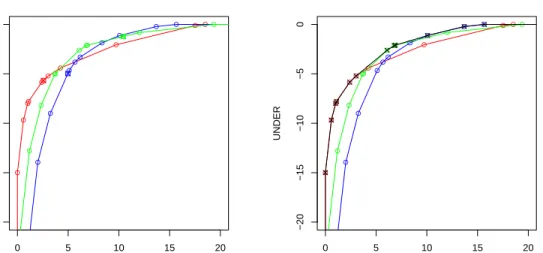
This property is very useful when working with curves (e.g., for calculating their dominance regions) and it also allows the direct calculation of the optimal shift as for eq. 2. The convexity of a single RROC curve does not mean that the notion of convex hull seen in the previous section is useless. More on the contrary, whenever we have more than one model, we can see concavities. Figure 4 (left) precisely shows this, and the convex hull is shown in Figure 4 (right).
● 0 5 10 15 20 −20 −15 −10 −5 0 OVER UNDER ● ● ●● ●● ● ● ● ● ● ● ● ●● ● ● ● ● ● ● ● ●● ●●● ● ● ● 0 5 10 15 20 −20 −15 −10 −5 0 OVER UNDER ● ● ●● ●● ● ● ● ● ● ● ● ●● ● ● ● ● ● ● ● ●● ●●● ● ●
Figure 4: The left plot shows the three modelsm1(red),m2(blue) andm3(green) in examples 1,
2 and 3 drawn as RROC curves by changing the shift. Note that in this case modelm3cannot be
rejected, because there are regions where it is optimal. If we select the best portions from the three models we see concavities, which can be resolved by the use of a convex hull (shown on the right) in black. There are 12 visible points (represented as black crosses) on the convex hull: 6 fromm1
(red), 3 fromm3(green), and 3 fromm2(blue).
4.3. Related and alternative graphical tools
Before further analysing RROC curves, it is appropriate to take a look at other curves and graphical tools that are used for the analysis of regression models. Regression Error Characteristic (REC) curves [3] are, by far, the most successful attempt to bring ROC analysis to regression. The idea is based on plotting the percentage of examples (accuracy) whose predictions are inside a tolerance level
ε. As the tolerance level increases on the x-axis the accuracy increases on the y-axis, so REC curves are always non-decreasing. Alternatively, REC curves can be seen as a plot of the cumulative distribution function of the prediction error. Similarly to ROC curves, several models can be represented in the same space, so that dominance regions can be determined. The crucial point about REC curves is what the operating condition means. In the case of REC curves, the operating condition is the maximum tolerance level that is admitted for predictions. This is useful in applications where the maximum admitted error can vary from time to time. If a context is very strict on errors we can use the models that perform better in that range. On the other hand, if we are more flexible on errors, we can choose a different model. We will plot some REC curves in section 6.
Regression Error Characteristic Surfaces (RECS) [51] are an extension of REC curves where the cumulative distribution of the dependent variable is set as an
additional dimension [51]. In this way, REC surfaces (if the loss function is the absolute deviation) show the joint cumulative distribution function of the errors and the target variable. The operating condition is then a pair of tolerance level
ε and the value of the dependent variable. This is useful if we have different
tolerance levels depending on the output variable. In fact, it is easy to make a section of the REC surface to account for relative performance, as, e.g., admitting an error of at most 25%.
Despite their usefulness, none of the previous approaches focusses on the problem of asymmetric loss functions and the notion of operating condition as a parameter of the loss function2. As a result, we do not have the dual (TPR vs. FPR) view of ROC analysis (where both axes have the same dimension and commensurable meaning), from where the notion of loss isometrics can be de-rived. Also, we think that the problem of asymmetry in regression is arguably more common than the problem of limited tolerance. Nonetheless, we see RROC curves and REC curves as complementary tools, which either (or both) can be used depending on the kind of operating conditions we want to deal with.
There are other more classical plots for analysing regression models, such as scatter plots (predicted vs. actual), residual density plots and residual boxplots [33]. While these plots make it possible to see model asymmetries, it is very difficult to compare several models and determine the dominance regions. Also, Figure 5 (left) will also show a residual density plot. In section 6, we will show scatter plots and residual density plots and compare them to RROC curves and REC curves.
Finally, as there is a point-to-line (or point-to-point [29]) correspondence be-tween ROC curves and cost curves [12] in classification, we can also consider the definition of cost curves for regression. The cost space for regression (RCOST) is defined as a plot where the expected loss (e.g., the asymmetric absolute loss) is shown on the y-axis for a range of operating conditions (e.g., the asymmetryα)
on thex-axis. We will also show a RCOST curve in section 6.
5. Areas and metrics
RROC curves, as in ROC analysis, can be especially useful for analysing mod-els under different operating conditions and select the best one for a single operat-ing condition or aregionan interval of operating conditions. Also, we can create
2In the so-called utility-based regression [41], the asymmetric absolute loss function (Lin-Lin)
hybrids through the notion of convex hull. Nonetheless, in ROC analysis we are also interested in evaluating models that can work well for a wide range of op-erating conditions. One measure that gives us a good indication of a classifier performing well in a wide range of operating conditions is the Area Under the
ROC Curve (AUC). Can we develop a similar measure for RROC curves? The
following definition introduces such a measure:
Definition 8. The Area Over the RROC Curve (AOC) is defined as follows:
AOC,− Z ∞ 0 UNDER dOVER= Z 0 −∞ OVER dUNDER
Lower values for AOC are better. This area can be calculated very easily by using the sum of the n+1 upward trapeziums given between the elements 1
and n+2 fromRROCX andRROCX in algorithm 1. Actually, for models always
outputting finite values, this can be calculated from 2 to n, since the extreme trapezium 1 to 2 has area 0 and the trapeziumn+1 ton+2 as well, so we only need to sumn−1 trapeziums. Consequently:
AOC= n
∑
i=2 −RROCYi+1+RROCYi 2 (RROCXi+1−RROCXi)As the RROC space is unbounded, only the areaoverthe curve makes sense:
Proposition 6. For any regression model m which always outputs finite values, the AOC is finite.
Proof. Since the modelmalways outputs finite values, there is a shiftso, such that for any shifts≤sowe have thatOVER=0 and there is also a shiftsu, such that for any shifts≥suwe have thatUNDER=0. This means that the curve touches (and stays at) both thex-axis and they-axis. Then the area is finite.
For the three modelsm1, m2 andm3 in Figure 4 (left), theAOC is 56.1387, 88.0933 and 63.9295, respectively. What is the meaning of these figures? To answer this question, let us first consider the ‘best’ possible model in terms of
AOC(a perfect square with top-left corner at the RROC heaven (0,0)). This model means that there is a shift that achieves 0 error. This is rarely the case, except for datasets with one single example (where there is always a shift getting 0 loss). It is also very rare to have a dataset for which all the examples have the same error, another possible situation where we would haveAOC=0.
We could also think about the relation ofAOCto other metrics, For instance, a model with very high MSE orMAE could, in principle, have AOC=0. This would suggest that the shift was very badly chosen. This phenomenon mirrors what happens with classical ROC analysis; we can have bad accuracy for a model with optimalAUCby choosing a bad threshold.
A possible way to look at AOC is as the expected value of the total under-estimation given a distribution for the total over-under-estimation. Alternative, if we look at the distance to RROC heaven, we can see AOC as an aggregate of the macro-average squared error (n·uSE) with a distribution which depends on the model, which is similar to one recent interpretation given toAUC[24]. Other interpreta-tions as an aggregation of expected loss may be possible3, as it has happened with
AUCrecently, where new interpretations have been introduced [20, 28].
Having said all this, the idea of theAOC being related to the distribution of errors seems more appealing. If we have a compact error distribution, then AOC
will be low because many shifts will be able to place most errors close to 0. If we have a sparse error distribution, thenAOCwill be high. One classical measure of dispersion is precisely the variance, defined and decomposed as follows:
Definition 9. The error varianceσ(e)2(or, simply,σ2) is defined as:
σ(e)2, ∑ n i=1(ei−µ(e))2 n = ∑ni=1e2i n −µ(e) 2=
µ(e2)−µ(e)2=MSE−µ(e)2 whereµ(e)(or, simply,µ) represents the mean of the vectore.
Note that we define the population error variance, by dividing byn(instead of
n−1). The last term in definition 9 is just the classicalMSEdecomposition as the sum of the squared mean error bias (µ2) and the error variance (σ2).
Quite surprisingly, the observation that the AOC and the error variance are related can be made extremely precise, as the following theorem shows:
Theorem 7. The area over the RROC curve equals the population varianceσ2of the errors multiplied by a factor n2/2which is independent of the model. Namely:
AOC= n
2 2σ
2
3We suggest some possible pathways for exploration. SinceAOCis related to the magnitude
of predictions (and errors), it cannot be directly related to rank-based correlation measures in regression. However, it could be related to this sum∑y1,y2(yˆ1−yˆ2|y1>y2), which would work
The proof is found in the appendix.
Corollary 8. If the model is unbiased (i.e. µ(e) =0) then:
AOC= n
2
2 MSE
The proof of this corollary is direct from theorem 7 and definition 9 (error variance decomposition). These important results provide a natural interpretation of the AOC and its connection with error variance and MSE. Also, AOC (and indirectlyMSE) can be interpreted as a measure of performance over a range of asymmetry parametersα, provided we choose the shift optimally (eq. 2).
For the models m1, m2 and m3 in examples 1, 2 and 3 we have a variance of 1.1228, 1.7619 and 1.2786 respectively. The AOC is 56.1387, 88.0933 and 63.9295 respectively. Sincem2is unbiased, itsMSEis precisely 1.7619, its error variance. The constant factor isn2/2=50 in the three cases.
In general, we can show theMSEdecomposition (the squared error bias and the error variance) in RROC space. In Figure 1 (right) we saw that the area of the shadowed triangle is exactly half the squared error bias. By summing this area to the AOC we have half the squared error (SE). This again draws a parallelism with classification, where a perfectly calibrated model has 0 calibration loss, and
MSE is just given by the refinement loss, recently connected withAUC [28]. In regression, we have just seen that a model with no bias leads to a MSE which is just the error variance, now connected withAOC.
Given this link between the area over the RROC curve and the error variance, we can also explore the link with an error density plot. As we can see in Figure 5 (left), there is a high correspondence between the density plots and the RROC curve, but the cumulative character of the RROC curve makes the latter smoother. Note that this connection betweenAOCand the error variance indicates that it is the dispersion that counts when adapting our models to cost-sensitive situations with asymmetries, and not the position, which can be ignored if the optimal shift is chosen for each particular operating condition. This again shows a parallel with ROC analysis, where the absolute values of the scores do not affect theAUC. Only their order matters. Here, for RROC curves, the position of the mean error (the error bias) does not affect theAOC, only the dispersion of the error.
Interestingly, then2factor in theorem 7 also suggests that a scaled representa-tion of RROC curves could be done by dividing both x-axis andy-axis byn, i.e., plottingOVER/nagainstUNDER/n. This would make the curves independent of the number of examples and could be the standard representation in many
appli-−0.04 −0.02 0.00 0.02 0.04 0 10 20 30 40 N = 1000 Bandwidth = 0.002112 Density ● 0.0 0.5 1.0 1.5 2.0 −2.0 −1.5 −1.0 −0.5 0.0 OVER / n UNDER / n m1 ● ● ●● ●● ● ● ● ●
Figure 5: Left: The error density plots of the same three models as in Figure 4. We can see that similar error density functions will produce similar RROC curves. Here, more peaked density functions mean better RROC curves. Right: Model m1 as in example 1 drawn as a normalised RROC curve, using a normalised scale for thex-axis andy-axis (n=10 examples). Compare with Figure 3 (left). Now we can see theaveragemetrics of those shown in Figure 1 (right).
cations, especially when the number of examples in the datasets may vary or we may even compare several models (or the same model) against different datasets (with different sizes). Figure 5 (right) shows the same plot as Figure 3 (left) but normalising by the number of examples (in this casen=10). It also shows the same metrics as in Figure 1 (right), but now the magnitudes correspond to the
meanversions (MAE,MSE,uMSE andMEB).
Finally, the derivation of an area from a curve is not exclusive of ROC curves (or RROC curves). Some of the curves discussed in section 4.3 have associated areas with particular meanings. For instance, the AOC for REC curves have been shown [3] to be a lower estimation of MAE if the error function is the absolute error and a lower estimation ofMSE if the error function is the squared error. As a result, we can say that if the error bias is zero, then the AOC of a REC curve is always lower than or equal to the AOC of a RROC curve. Nonetheless, it is important to note that the AOC is the sample error variance (more precisely a linear function of it), and not an estimation. Also, these two areas for REC and RROC curves represent different things and may serve different purposes. In order to see this, we include the AOC for the REC curves and the RROC curves in the real example that follows.
6. A case study
Cost asymmetries and biased predictions are an issue in most application areas where regression is used: sales forecasting, inventory control, position and speed tracking, pose estimation, survival analysis, consumption estimation, demand pre-diction, weather forecasting, series analysis and econometrics, among many oth-ers. Project effort estimation is one application area where over-estimations and under-estimations may have different costs depending on the situation. As a real example, we will work with a software engineering project effort dataset. In this area in particular [45], “underestimating software projects can have detrimental effects on business reputation, competitiveness, and performance” while “overes-timated projects can result in poor resource allocation and missed opportunities to take on other projects” [5]. This phenomenon is extensible to other areas as well [53, 2, 6, 49, 39]. The relation between under-estimation and over-estimation costs can be tuned by the project manager depending on the context.
We will use a dataset comprising 145 projects from the Computer Science Corporation (CSC). This dataset has been thoroughly discussed and analysed in [33]. We use the (compact) version of the dataset published in [33], with attributes “client code” (cc), “project type” (pt) and “adjusted function points” (afp) as pre-dictive variables, and the ”actual effort” (ae) in hours as the dependent variable4.
Typically, the evaluation metrics used for this and other effort estimation prob-lems are [33]: (1) the mean magnitude relative error (MMRE), which is a normal-isation of the absolute error, (2) “the proportion of project estimates within 25% of the actual”, denoted as “Pred(25)”, and (3) boxplots for the residuals. The first one is a special case of the asymmetric absolute loss used in RROC curves (as-sumingα=0.5), while the third one is used to “show whether or not the estimates
are biased [...] and whether the model has a tendency to under- or over-estimate” [33]. With RROC curves we will be able to see both things (and more, such as dominance, isometrics and areas) with the same plot. The second one seems to be closely related to the concept of tolerance in REC curves, although REC curves use a notion of absolute tolerance, while Pred(25) refers to a notion of relative
4This attribute setting is similar to “model 1” in [33]. We investigated the logarithmic
transfor-mation of the numerical variablesafpandae(as done in some models in [33]), but we did not find any significant improvement for any of the regression methods we used. For the two categorical variables we merged all the values (including missing values) with less than 10 instances into a single merger label (so that new values cannot appear on the test set if they have not previously appeared on the training set). Finally, we removed the outlier example 102, following [33].
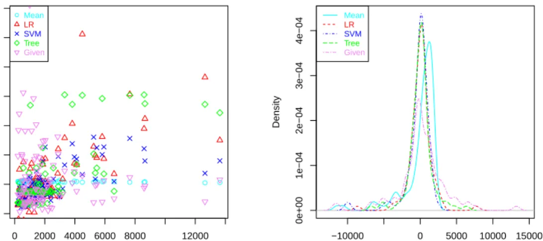
● 0 2000 4000 6000 8000 12000 0 2000 6000 10000 14000 actual predicted ● ● ●●●●● ●●●● ● ●●●●●●●● ●●●●●● ●●●● ● ●●● ● ● ● ● ● ● ●●●●●●●●●●●●●●●●● ●●●●●●●●●●●●●●●●●●●●●●●●●●●●●●●● ●●● ● ● ● ● ●Mean LR SVM Tree Given −10000 0 5000 10000 15000 0e+00 1e−04 2e−04 3e−04 4e−04 N = 96 Bandwidth = 453.8 Density Mean LR SVM Tree Given
Figure 6: Five regression models on the work dataset. Left: a scatter plot. Right: density plot. We see thatLRandSVMare more peaked than the rest (and they peak at a residual of 0), with almost no tails, while the others seem to perform worse, especiallyGiven.
tolerance. As a result, RROC curves are very suitable for this kind of problem in conjunction with other approaches, such as REC curves.
We considered the following experimental scenario. We randomly split the dataset into aworkdataset (2/3 of the data) for model training and selection and a
deploymentdataset (1/3 of the data) for final evaluation. We built several models with the work dataset using 10-fold cross-validation. As a custom procedure (see, e.g., [3]), the aggregated results of the 10 trials were used to build the plots (RROC and REC curves), estimate the metrics and dominance regions. Then, the 10 trials were discarded and the whole work dataset was used to retrain the models, as usual in cross-validation. Finally, the models were evaluated for the deployment dataset under several operating conditions (the asymmetry cost parameterα).
We compared five methods: Meanis the mean of the dependent variable for the training set,LRis a linear regression using the functionlminR[40], SVMis a support vector machine using the function ksvmin the Rpackagekernlab, andTreeis a regression tree using the functionrpartin theRpackagerpart. In addition, for comparison, we also included a method known asGiven, which is provided by [33] as an estimation method used by CSC (“first estimate”).
Figure 6 shows the results of these five methods on the work dataset (the test values for the 10 trials) using two common plots: a scatter plot and a residual den-sity plot. While these two plots show some relevant information, it is very difficult to compare several models with them, see the tolerance levels or the asymmetries.
● 0 1000 2000 3000 4000 5000 6000 0.0 0.2 0.4 0.6 0.8 1.0
Absolute deviation tolerance
Accur acy Mean LR SVM Tree Given ●
0e+00 2e+07 4e+07 6e+07 8e+07
0.0 0.2 0.4 0.6 0.8 1.0
Squared error tolerance
Accur acy Mean LR SVM Tree Given
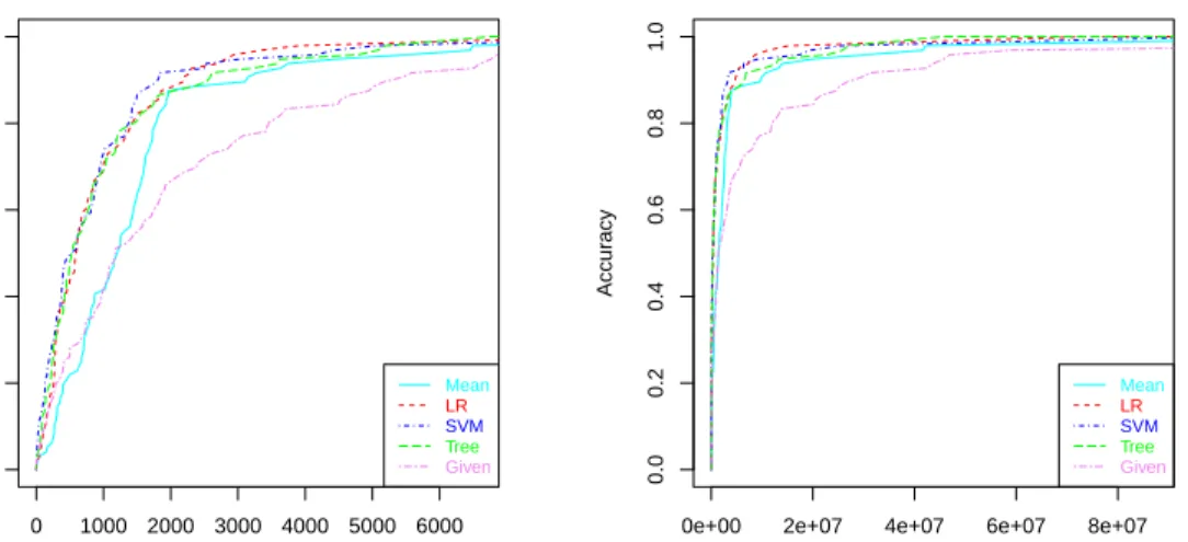
Figure 7: REC Curves. Left: using absolute error (absolute deviation). Right: using squared error.
Things improve significantly when we plot the REC curves (described in section 4.3) for the five models (see Figure 7). We see that theMeanmodel and especially theGivenmodel behave much worse for almost all ranges of error tolerance. Also, e.g., we can see on Figure 7 (left) that if we set our absolute deviation tolerance at 2000 hours, then the best model seems to beSV M. However, REC curves are not devised to show asymmetry information and we cannot see the bias either.
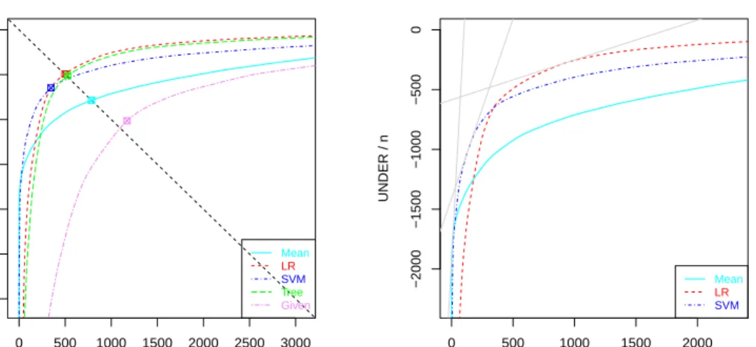
Figure 8 shows the corresponding RROC curve. Here we can clearly see the asymmetries. For low over-estimations (low values of α), Mean and SVM are
better, whileLMis better for low under-estimations (high values ofα). Note that
the curves implicitly assume the best shift for each operating condition α. By
using eq. 2, s∗(α) can be exactly calculated on a sample (in this case the work
dataset). The ultimate goodness of this mapping on a deployment dataset will be given by the quality of the RROC curve estimation (we will explore this below).
We can also compare some metrics that can be derived from the plots we have seen so far (see Table 1). Interestingly, we can also see the contribution of each of these measures graphically and whether the differences between two models are originated uniformly from a wide range of operating conditions (as happens with the difference inMAEbetweenLRandTree) or it conceals a cancellation for two different dominance regions (as happens with the difference inMAEbetween
LRandSVM). This can only be seen on the RROC curves, and not by any global metric (includingAOC).
Once the analysis has been done on a work dataset, it is time to see how our findings and selections behave on a deployment dataset. From work to
deploy-● 0 500 1000 1500 2000 2500 3000 −3000 −2000 −1000 0 OVER / n UNDER / n Mean LR SVM Tree Given ● 0 500 1000 1500 2000 −2000 −1500 −1000 −500 0 OVER / n UNDER / n Mean LR SVM
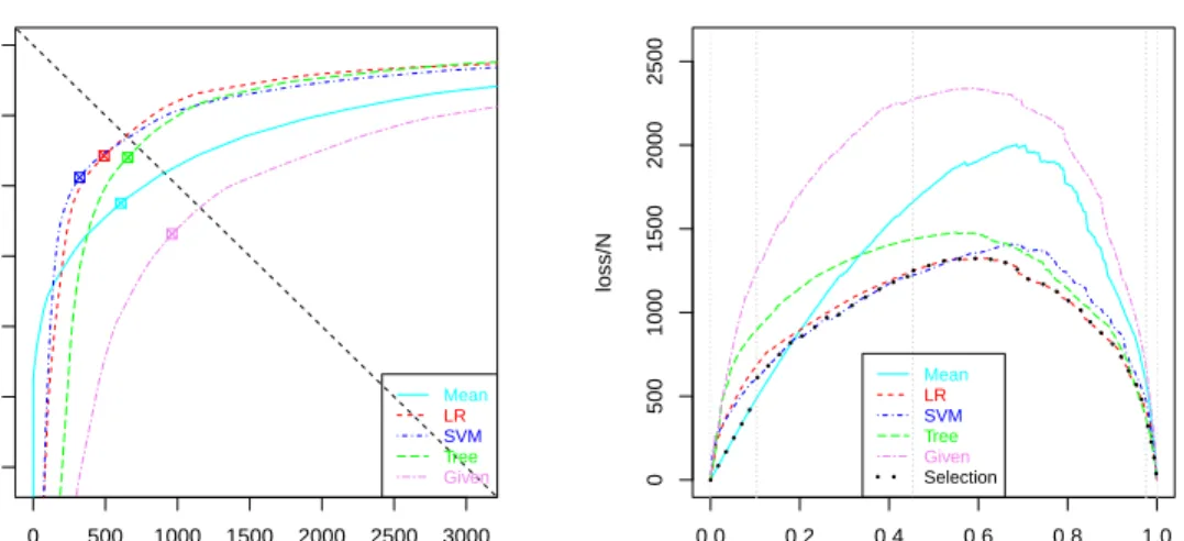
Figure 8: RROC Curves for the work dataset (using the 10 folds of a cross-validation process). Left: the RROC curve for the five models, showing a negative bias forSVMand a positive bias forGiven, while the other three models are unbiased (almost on the diagonal). Right: the same (zoomed-in) RROC curve where theTreeandGivenmodels have been removed, since they can be safely discarded (as far as the curves are well estimated). We show three isometrics corresponding toα =0.05, 0.25, 0.75, in grey, clockwise from bottom left to top right. By taking the slopes
where the curves cross, we can easily calculate the dominance intervals: α∈[0,0.103]for the Meanmodel,α∈[0.103,0.453]for theSVMmodel, andα∈[0.453,1]for theLRmodel.
ment, we need to keep three things: (1) the five models, (2) the dominance regions (see Figure 8) and (3) the five shift mappingss∗(α)corresponding to each model
(that can be stored into an array for a range of α ∈[0,1])5. Note that elements
2 and 3 are available if we just keep the segments of the RROC curves. With all these elements, the procedure at deployment time is simple: (1) recognise the operating conditionα, (2) look at the dominance regions and see which modelm
is best for thatα, (3) take the mappings∗ formto calculate the shift s∗(α), and
(4) apply the shift tomto make the predictions.
The effectiveness of the above procedure will depend on the accurate estima-tion of the RROC curve. For instance, the dominance regions for the work dataset could differ from those in the deployment dataset. We can see whether this hap-pens in this example by comparing the curves shown on figures 8 and 9 and the intervals identified in their captions. Actually, the regisions are similar. But the ul-timate quality criterion must be whether this procedure can choose the model that
5There are more elaborate methods, such as those of [1][55], using non-constant shifts, or even
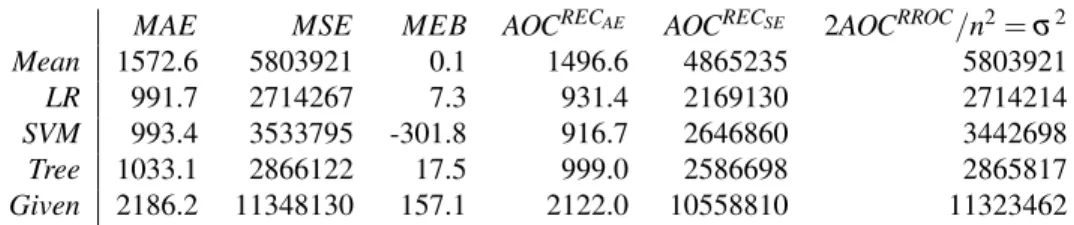
MAE MSE MEB AOCRECAE AOCRECSE 2AOCRROC/n2=σ2 Mean 1572.6 5803921 0.1 1496.6 4865235 5803921 LR 991.7 2714267 7.3 931.4 2169130 2714214 SVM 993.4 3533795 -301.8 916.7 2646860 3442698 Tree 1033.1 2866122 17.5 999.0 2586698 2865817 Given 2186.2 11348130 157.1 2122.0 10558810 11323462 Table 1: Averaged 10-fold cross-validation results on the work dataset. We see several metrics for the five models of our case study:MAE,MSE,MEB, the area over the REC curve using absolute error, the area over the REC curve using squared error and the normalised version of the area over the RROC curve (which equals the error variance). While the AOC of the REC curves are under-estimations of theMAE andMSEmetrics (as shown by [3]), we see that the AOC of the RROC curve is just theMSEminus the squaredMEBas given by the decomposition in eq. 9.
(usings∗) minimises the loss function for each possible condition. This is nicely reproduced by the RCOST curve (introduced at the end of section 4) shown on the right of Figure 9. This shows that the procedure has worked almost perfectly, by choosing the best model for almost all over the range.
On other occasions we may be interested in part of the range ofα∈[0,1]. For
instance, in this software effort problem we may be told that operating conditions usually range between α ∈[0.33,0.8], i.e., from cases where an over-estimation
is up to 2 times (0.33 vs. 0.67) more costly than an under-estimation to cases where under-estimation is up to 4 times (0.2 vs. 0.8) more costly than an over-estimation). Then we only need to look at this range of operating conditions on Figure 8, and see that it is enough to keep theLRmodel and theSVMmodel.
Figure 9 also shows a close (and very interesting) relation between RROC curves and RCOST curves. While RCOST curves are obviously better for lo-cating the expected loss for each operating condition, RROC curves have more information: under-estimation and over-estimation. In fact, from them, we can get the loss, but not the other way round. Also, theAOC corresponds to the vari-ance of the residual, while the area under the RCOST curve is only meaningful as an expected loss for a uniform distribution of operating conditions. Another ad-vantage of RROC space over RCOST space is that by varying the isometrics (from straight lines to any other function) we could see the notion of dominance for sev-eral asymmetric loss functions, while cost curves would need to be redrawn. This comparison is extremely similar to that in classification [12] [29] and unveils a potential for further exploration.
Finally, Table 2 shows the quality metrics for the deployment dataset. The comparison with Table 1 shows that there are important differences in global met-rics. Despite this, the model selection that we have performed with RROC analysis has still been quite robust.
● 0 500 1000 1500 2000 2500 3000 −3000 −2000 −1000 0 OVER / n UNDER / n Mean LR SVM Tree Given ● 0.0 0.2 0.4 0.6 0.8 1.0 0 500 1000 1500 2000 2500 α loss/N Mean LR SVM Tree Given Selection
Figure 9: Left: the RROC curve for the five models (previously trained with the whole work dataset) on the deployment dataset. The dominance intervals are now:α∈[0,0.159]for theMean
model, α ∈[0.159,0.548] for the SVMmodel, andα ∈[0.548,0.938] for the LRmodel (there is a small interval for theTreemodel forα ∈[0.938,1]). These are approximate to those found for the work dataset (see Figure 8). Right: a RCOST curve shows the actual asymmetric loss for α∈[0,1]. The dotted curve in black shows the results obtained by the selection of models
performed for the work dataset, using the dominance regions in Figure 8 (shown as grey vertical lines) and the map functions∗obtained from the work dataset. We see that piecewise composition of the choices made by this procedure has led to a very good choice for this deployment dataset.
7. Discussion
We said in the introduction that there is no such a thing as the ‘canonical’ ROC space for regression, corresponding exactly to the ROC space for classifica-tion, since regression and classification are very different tasks. Having said this, we think that the RROC space, curves and analysis that we have introduced in this paper present so many parallelisms and share so many common notions and proce-dures, that their curves could reasonably be calledtheROC curves for regression, with arguably more support than other previous attempts. We have seen that the notions of operating condition, cost asymmetry, RROC space, points, segments, RROC heaven, RROC isometrics, hybrid models, convexity, dominance, convex hull, curves, shift choice methods, etc., derive smoothly and work almost the same as in the classification case, so the practitioners which are used to ROC curves can directly apply their expertise on ROC analysis to regression quite easily.
There are also some caveats. First, while we have argued that asymmetric costs are common in many regression applications, there might also be some problems where asymmetries are not important. Second, when asymmetry is important the
MAE MSE MEB AOCRECAE AOCRECSE 2AOCRROC/n2=σ2 Mean 1731.4 7305474 -516.2 1642.5 6646875 7039046 LR 1278.2 4200835 -296.2 1197.2 3659776 4113120 SVM 1263.1 5134660 -618.4 1174.8 4503110 4752242 Tree 1455.5 5119506 -141.8 1376.3 4532698 5099411 Given 2303.8 12689846 -381.3 2203.8 11748335 12544431 Table 2: Similar to Figure 1 but calculated on the deployment dataset.
operating condition may be unknown on deployment time6. Third, keeping sev-eral models and choosing the best one depending on the operating condition seems a reasonable way to adapt predictions to the new context, but there is always the alternative approach of retraining the model (provided that we can use specialised regression techniques for each cost function [11, 39]). This is known as the re-framing/retraining dilemma. Fourth, on occasions the data at hand may be insuffi-cient to do a good estimation of the RROC curves (even if we use cross-validation or confidence bands). Hence the rejection of regression models and the identifica-tion of dominance regions may be statistically unreliable. These four caveats are not new to RROC curves, but inherited from the very nature of ROC analysis as a method of choosing the best modelgiven the operating condition.
We now point out other more specific limitations of RROC curves and suggest some possible solutions, which can be used as start points for future work. The first issue that could be explored and generalised is the very notion of operating condition. We have only considered the loss asymmetry while, in classification, the class distribution can also be integrated (along with the cost proportion) in what is usually referred to as skew. In regression, the distribution of the output value (and not only the loss asymmetry) may also be considered part of the op-erating condition as well. This integration does not seem to be direct as a single parameter, but it is worth being investigated as a 3D plot, possibly in the same way REC surfaces extend REC curves by including the cumulative distribution of the dependent variable as an additional dimension [51]. Also, the combination of REC curves and RROC curves could be explored.
A (related) second issue is the use of other loss functions. For instance, instead of an asymmetric absolute error, we could use an asymmetric squared error Quad-Quad. This would lead to non-straight isometrics in the RROC curve, but the
6Related to these two first caveats, we note that there has been some work to explore whether
costs should or should not be asymmetric and even determine their parameters from the dataset (e.g., [9], for the Lin-Lin cost function, as the one used here).
basic ideas would remain. Again, plotting different isometrics in RROC space for many different loss functions (Lin-Lin, Quad-Quad, Lin-Exp, Quad-Exp, etc.) would closely resemble the celebrated paper [18] on isometrics for ROC curves in classification.
The most common application of RROC curves is thelocalselection of models according to an operating condition, as we have seen in a real scenario in section 6, instead of the selection of models by the use of global metrics. Nonetheless, a third important avenue of future work would be to further investigate the connection with the error variance we have unveiled here and to analyse the relation of AOC
with other global metrics. We think that RROC curves represent the expected loss for a range of operating conditions on one side, and the distribution of the error on the other side (as theAOC has been shown to be equivalent to the error variance). The derivation of global or partial (see, e.g., the use of partial AUC
in [42]) areas using some knowledge about the ranges and/or distributions of the operating conditions may be useful in many applications, where we do not know the exact operating condition, but we may still have some information about some asymmetries being more likely than others. In general, there may be important connections to be unveiled between regression techniques trying to minimise the error variance (instead of squared error) and those classification techniques trying to maximise the AUC (instead of accuracy) [15]. Also, the link betweenAOCand theMSEdecomposition could be related to the recently discovered equivalence of
AUCto the refinement loss term of theMSEdecomposition using the ROC curve [28]. So we anticipate a plethora of connections between RROC curves and many other performance metrics in regression, as has been done for classification in the past years [16, 24, 20, 27, 28].
Finally, the relation between classification and regression could be better un-derstood, since any scoring classifier (producing probabilities, likelihoods or other kinds of scores) can also be examined in terms of asymmetry as if they were re-gression models. In fact, some datasets (e.g., in signal detection) are presented with a quantitative output, modelled with regression and ultimately converted into categorical decisions (alarm, failure, etc.) with a (varying) threshold.
Overall, we think that RROC curves could become a fundamental tool in the assessment, improvement and deployment of regression models. In order to facil-itate their use in real applications, we have developed a library for plotting RROC curves7, the intercepts and dominance regions, calculating their areas and
ing their convex hulls. The library also includes tools for plotting REC curves and RCOST curves, as well as the code for reproducing all the examples in this pa-per. The availability of software, the ubiquitous appearance of asymmetric losses in regression applications, and the success of ROC analysis for classification in the past decades suggests that RROC curves may soon become mainstream in all the areas where ROC analysis has shown to be useful: medicine, bioinformatics, statistics, machine learning and pattern recognition.
Acknowledgments
I would like to thank Peter Flach and Nicolas Lachiche for some very useful com-ments and corrections on earlier versions of this paper, especially the suggestion of draw-ing normalised curves (dividdraw-ing x-axis and y-axis by n). This work was supported by the MEC/MINECO projects CONSOLIDER-INGENIO CSD2007-00022 and TIN 2010-21062-C02-02, GVA project Prometeo/2008/051, the COST - European Cooperation in the field of Scientific and Technical Research IC0801 AT, and the REFRAME project granted by the European Coordinated Research on Long-term Challenges in Information and Communication Sciences & Technologies ERA-Net (CHIST-ERA), and funded by the respective national research councils and ministries.
References
[1] G. Bansal, A. Sinha, and H. Zhao. Tuning data mining methods for cost-sensitive regression: A study in loan charge-off forecasting. J. Management Information System, 25:315–336, December 2008.
[2] A. P. Basu and N. Ebrahimi. Bayesian approach to life testing and reliability estima-tion using asymmetric loss funcestima-tion. Journal of statistical planning and inference, 29(1-2):21–31, 1992.
[3] J. Bi and K. P. Bennett. Regression error characteristic curves. InTwentieth Inter-national Conference on Machine Learning (ICML-2003). Washington, DC, 2003. [4] A. P. Bradley. The use of the area under the ROC curve in the evaluation of machine
learning algorithms. Pattern Recognition, 30(7):1145 – 1159, 1997.
[5] L. C. Briand and I. Wieczorek. Resource estimation in software engineering. Ency-clopedia of software engineering, 2002.
[6] M. Cain and C. Janssen. Real estate price prediction under asymmetric loss. Annals of the Institute of Statistical Mathematics, 47(3):401–414, 1995.
[7] P. F. Christoffersen and F. X. Diebold. Further results on forecasting and model selection under asymmetric loss. J. of applied econometrics, 11(5):561–571, 1996. [8] P. F. Christoffersen and F. X. Diebold. Optimal prediction under asymmetric loss.
Econometric Theory, 13:808–817, 1997.
[9] M. A. Clatworthy, D. A. Peel, and P. F. Pope. Are analysts’ loss functions asymmet-ric? Journal of Forecasting, 31(8):736–756, 2012.