W&M ScholarWorks
W&M ScholarWorks
Dissertations, Theses, and Masters Projects Theses, Dissertations, & Master Projects2009
A Bayesian network approach to feature selection in mass
A Bayesian network approach to feature selection in mass
spectrometry data
spectrometry data
Karl W. KuschnerCollege of William & Mary - Arts & Sciences
Follow this and additional works at: https://scholarworks.wm.edu/etd Part of the Bioinformatics Commons, and the Mathematics Commons
Recommended Citation Recommended Citation
Kuschner, Karl W., "A Bayesian network approach to feature selection in mass spectrometry data" (2009). Dissertations, Theses, and Masters Projects. Paper 1539623543.
A Bayesian Network Approach to Feature Selection
in Mass Spectrometry Data
Karl Wayne Kuschner
Williams burg, Virginia
MS, National Security Studies, Naval War College, 1996
MA, Physics, University ofTexas at Austin, 1993
BS, Mathematics and Physics, U.S.
Air
Force Academy, 1983
A Dissertation presented to the Graduate Faculty
of the College of William and Mary
in
Candidacy for the Degree of
Doctor of Philosophy
Department of Physics
The College of William and Mary
May 2009
APPROVAL PAGE
This Dissertation is submitted in partial fulfillment of the requirements for the degree of
Doctor of Philosophy
Karl Wayne Kuschner
Approved by the Committee, April, 2009
Chancellor Professo 'gene Tracy, Physics The College of William and Mary
Professor John Delos, Physics The College of William and Mary
ABSTRACT PAGE
One of the key goals of current cancer research is the identification of biologic molecules that allow non-invasive detection of existing cancers or cancer precursors. One way to begin this process of biomarker discovery is by using time-of-flight mass spectroscopy to identify proteins or other molecules in tissue or serum that correlate to certain cancers. However, there are many difficulties associated with the output of such experiments. The distribution of protein abundances in a population is unknown, the mass spectroscopy measurements have high variability, and high correlations between variables cause problems with popular methods of data mining. To mitigate these issues, Bayesian inductive methods, combined with non-model dependant information theory scoring, are used to find feature sets and build classifiers for mass spectroscopy data from blood serum. Such methods show improvement over existing measures, and naturally incorporate measurement uncertainties. Resulting Bayesian network models are applied to three blood serum data sets: one artificially generated, one from a 2004 leukemia study, and another from a 2007 prostate cancer study. Feature sets obtained appear to show sufficient stability under cross-validation to provide not only biomarker candidates but also families of features for further biochemical analysis.
TABLE OF CONTENTS
list of Figures ... iv Acknowledgments ... vi Chapter 1: Introduction ... 1 Background ... 1 Mass Spectrometry ... 1 Goal ... 3Chapter 2: Mathematical Tools ... 7
Notation ... 7
Product and Sum Rules of Probability ... 8
Probability Distributions ... 8
Conditional Probabilities ... 8
Information Entropy ... 9
Mutual Information and Conditional Mutual Information ... 11
Bayes' Theorem ... 13
Chapter 3: Data Sets and Signal Processing ... 17
Sample Collection and Bias A voidance ... 17
Leukemia Data ... 19
Generated Data ... 21
Prostate Cancer Data ... 26
Signal Processing ... 28
Data Analysis ... 28
Normalization ... 31
Chapter 4: Classification and Feature Selection ... 34
Feature Set Selection ... 36
Filter and Wrapper techniques ... 36
Wrapper methods ... 37
Naive Bayesian Classifiers ... 38
Bayesian Networks ... 42
Bayesian Networks and Causality ... 47
Bayesian Classifier Construction ... 48
Structure Learning ... 49
Parameter Learning ... 51
Mutual Information with Class ... 54
Discretization ... 55
Cross-Validation ... 56
Chapter 5: Application of the Naive Bayesian Classifier ... 60
Feature Selection ... 64
Error Rates ... 65
Feature Set Stability ... 67
Effect of Correlations ... 69
Correlation Effects ... 71
Chapter 6: Bayesian Network Algorithm ... 75
Goal ... 75
Algorithm ... 76
Initial data processing ... 77
Structure Learning ... 77
Mutual Information ... 79
Adjacency Matrix ... 82
First Level Connections ... 87
Second Level Connections ... 87
Parent-Child Identification ... 88
Metavariables ... 91
Parameter Learning ... 93
Classification and Error Rates ... 95
Chapter 7: Results and Analysis ... 96
Generated Data ... 97
Nai:ve Bayesian Classifier ... 97
Bayesian Network ... 101
Analysis ... 106
Leukemia Data ... 108
Naive Bayesian Classifier ... 108
Bayesian Network ... 112
Analysis ... 11 7 Prostate Cancer Data ... 119
Naive Bayesian Classifier ... 119
Bayesian Network ... 122
Analysis ... 127
Chapter 8: Conclusion ... 128
Appendix A: Mathematics ... 130
Maximum Entropy ... 130
Maximum Mutual Information ... 131
Naive Bayesian Classifier Instability ... 132
Appendix B: MATIAB Code ... 135
Nai:ve Bayesian Classifier Code ... 135
Bayesian Network Algorithm ... 146
Appendix C: Results ... 175
Index ... 179
Glossary ... 180
Works Cited ... 182
LIST OF FIGURES
Number Pa e
Figure 1: A portion of a typical mass spectrum ... 2
Figure 2: Leukemia data ... 20
Figure 3: Mislabeled replicate spectra ... 21
Figure 4: Generated data distribution for highly diagnostic peak ... 23
Figure 5: Distribution for highly diagnostic peak after de-normalization ... 25
Figure 6: Generated data ... 26
Figure 7: PCA data ... 27
Figure 8: The need for signal processing ... 30
Figure 9: Histogram of normalization factors ... 33
Figure 10: Bayesian network ... 42
Figure 11: Causal chain for disease ... 4 7 Figure 12: Sample population and instrument function ... 53
Figure 13: Mutual information threshold ... 55
Figure 14: Naive Bayesian classifier ... 60
Figure 15: Nominal classification error rates of individual variables ... 63
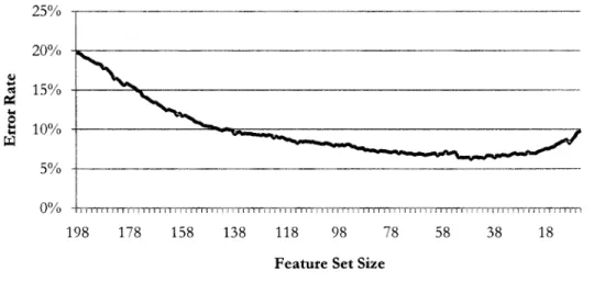
Figure 16: Cross-validated error rate, forward selection, PCA data ... 65
Figure 17: Error rate during backward elimination, Leukemia data ... 66
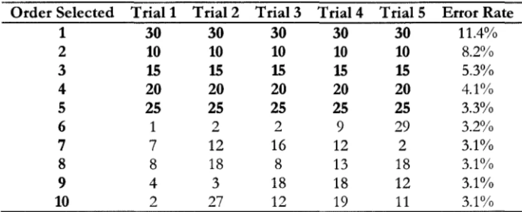
Figure 18: Variable selection frequency, 5 forward selection trials ... 67
Figure 19: Correlation between two diagnostic peaks ... 70
Figure 20: Generated data set with perfectly correlated features ... 71
Figure 21: Generated data set with correlated features with noise ... 72
Figure 22: Bayesian network forMS data ... 75
Figure 23: Histogram of MI between features and the class ... 80
Figure 24: Mutual information between variables, QC data ... 81
Figure 25: MI threshold effects under 10-fold cross-validation ... 82
Figure 26: Adjacency matrix representation ... 83
Figure 27: Results of optimizing discretization boundaries ... 84
Figure 28: Center bin isolates uncertainty ... 85
Figure 29: Search for optimal boundaries for three bin discretization ... 86
Figure 30: Removal of false connection to class ... 88
Figure 31: Effect of increasing drop threshold ... 90
Figure 32: Abundance probability differences by class ... 94
Figure 33: Error rate during forward selection, generated data ... 98
Figure 34: Error rate during feature selection, generated data ... 100
Figure 35: Distribution of features 3 and 4, generated data ... 101
Figure 36: Effect ofMI Threshold ... 102
Figure 37: Frequency of class-variable connections, generated data ... 104
Figure 38: Error rate distribution, generated data ... 106
Figure 39: Resulting Bayesian network, generated data ... 107
Figure 41: Error rate during feature selection, Leukemia data ... 110
Figure 42: Frequency of class-variable connections, Leukemia data ... 113
Figure 4 3: Histogram of CV error rates, Leukemia data ... 116
Figure 44: Resulting Bayesian network, Leukemia data ... 117
Figure 45: Leukemia (red) and normal spectra, vicinity feature 198 ... 118
Figure 46: Error rate during forward selection, PCA data ... 119
Figure 47: Error rate during repeated forward selection, PCA data ... 120
Figure 48: Error rate during backward elimination, PCA data ... 121
Figure 49: Error rate during feature selection, PCA data ... 122
Figure 50: MI threshold effects under 10-fold cross-validation ... 123
Figure 51: Effect of increasing drop threshold, PCA data ... 124
Figure 52: Error rates from the BN algorithm, PCA data ... 127
ACKNOWLEDGMENTS
The author wishes to express sincere appreciation to Dr. Gene Tracy, Dr. Dasha Malyarenko, and Dr. Bill Cooke for their guidance and support during the development of this project. Funding for this project was provided in part by the National Cancer Institute under grant R01-CA126118.
CHAPTER 1: INTRODUCTION
Background
In early 2001, Incogen, a bioinformatics company, received funding from the Commonwealth of Virginia to move to Williamsburg and lead a bioinformatics consortium that included the College of William and Mary, among others. The next year, Incogen began a Small Business Innovation Research project, funded by the National Institute of Health. This project added Eastern Virginia Medical School in Norfolk, Virginia as a collaborator, and expanded the consortium's previous work to develop a set of computational tools for classifying biologic data, including data derived from mass spectrometry (MS).
That work led to an ongomg project whose goal is to create tools for "computationally improved signal processing for mass spectrometry data." One of the steps in that project, and the focus of this work, is the development of methods to exploit the improved MS data to find biologically relevant information.
Mass Spectrometry
A mass spectrometer is an instrument that takes some sample of material, biologic or otherwise, and measures the relative amounts of constituent materials--ordered by molecular mass1-in the sample. The output, shown in Figure 1, is called a mass
spectrum and is initially continuous2 in nature, with very low signals representing mass regions where nothing was found, and spike-shaped structures (called "peaks") representing a relatively large amount of material at a particular mass. The signal intensity is shown here on a logarithmic scale, but in arbitrary units. The horizontal axis values are the atomic weight being detected.
7000 7500 8000 8500 9000 9500 10000 10500 11000 11500
Mass
Figure 1: A portion of a typical mass spectrum
One type of mass spectrometry instrument works by ionizing the molecules in a sample, typically by an intense laser pulse or ion collision, then accelerating the resulting ions through an electric potential of a few kV After the molecules have been accelerated to some terminal velocity v, which depends on their mass m and electric charge
z
as well as the electric potential V, they float down a field-free time of flight (TOF) tube and strike a detector. The energy E gained relates the electric potential and velocity by E=zV= Vzmtl. Low mass ions reach a higher velocity and hence strike the detector first; heavy ions are detected last. By measuring the number of detections along a time scale, then converting the time axis into mass per unit charge(m/
~' a spectrum of signal intensity vs.m/
z
is created. While this2 Insomuch as each time point has a corresponding integer number of detections, the spectrum is actually
is not the only method of mass spectrometry, it is a common one used in the field of proteomics. Its ability to survey a wide range of mass values aids the search for important proteins, as opposed to other methods, which might search for the abundance of a material at a specific
m/
zvalue.Our group has data available from two types of TOF-MS instruments: matrix-assisted laser desorption/ionization (MALDI), and surface-enhanced laser desorption/ionization (SELDI), which is a special type of MALDI.
There are several errors associated with this type of instrument. Although we would like the peaks to be infinitely narrow "spikes," they in fact have finite width due to the method of ionization and detection. In addition, the time that a specific molecule arrives differs slightly from trial to trial, and the intensity measured can vary for reasons other than true abundance variations in the sample. Another important error arises because of the violence of the initial ionization and the several ways a single molecule can show up-with charge
z
>1 (called multiply-charged states), in fragments, or with small common molecules such as the chemical matrix attached (adducts) or detached (neutral loss). These processes result in peaks at differentm/
z
values that actually represent a single underlying molecule.Goal
Early detection of cancer dramatically increases the long-term survival rate of those afflicted [1]. However, most cancers are difficult to detect early, and accurate
analysis often requires surgery or biopsy followed by forensic pathology of the tissue.
The use of mass spectroscopy to search for biological markers, or biomarkers, in easily obtained biologic samples would enable higher throughput and less invasive testing. Since cancers typically cause variations in the gene expression-and hence protein abundance--of affected cells, researchers hope to find traces of these over or under expressed (or mutated) proteins that would differentiate samples from those with, and those without, the disease. Blood serum (blood with cells and platelets removed) is one of the easiest samples to obtain, and if the protein markers can be found to be transported in the blood, a test for early detection could be designed.
The difficult part of this task is the detection and identification of the biomarker. There are some 30,000 or more genes in the human genome, which express at least 100,000 different proteins varying across twelve orders of magnitude in abundance - far beyond the resolution of current instruments. In addition, the natural variation of protein abundance across a population is often wide, and can mask any variation between sub-groups, such as those with or without a disease. Even a single individual has a dynamic proteome; the blood serum changes throughout the day as food is digested and proteins are absorbed in the body-one of our colleagues at EVMS is able to determine whether a patient has eaten recendy simply by the opacity of a vial of blood.
Our group has found that one of the largest errors in the process stems from the chemical and physical preparation of the samples prior to the MS measurements [2]. We have noted, for example, coefficients of variation (CV) of 5% from a single robotically prepared sample that is measured multiple times, and a CV of 30-40% from a single serum sample that is robotically prepared into multiple instrument samples prior to measurement. This is not a condemnation of the robotic process over manual preparation; in fact, the opposite is true-manual chemical preparation will introduce even more variation. The biochemical preparation steps, such as the amount of materials mixed, introduce this variability. To date, the problem of correcting errors associated with the biochemistry of sample preparation have been somewhat intractable, but our group continues to innovate in this area.
Other than the preparation protocols, there are three main areas where we seek improvement in the current technology-more accurate and precise measurement of the samples by improvements in the MS instrumentation, better analysis of the spectra produced (via noise reduction and other signal processing), and finally, better methods of mining the data for the biomarkers.
Current preparation and instrumental errors, such as those described above, make biomarker identification part art and part science. No single, well-accepted, and successful methodology for data analysis and biomarker discovery yet exists. In fact,
Proteomics methods based on mass spectrometry hold special promise for the discovery of novel biomarkers that might form the foundation for new clinical blood tests, but to date their contribution to the diagnostic
armamentarium has been disappointing [3].
The MS group at William and Mary is pursuing improvements in all three areas, but it is the last goal-improved data mining-that is the focus of this work. Specifically, the research described herein seeks to find molecules that are diagnostic of the disease state, discard those that are not, and determine the data-derived relationships among these candidates. In addition, we want to arrange the selected variables into a stable classifier that is predictive when new data is introduced.
CHAPTER 2: MATHEMATICAL TOOLS
Notation
Much of the mathematics used in this work is from the field of probability theory. As is common, capital letters represent statements, such as A = "the patient has the disease" or X = "the signal intensity is between 100 and 11 0."
The function P(A) represents the probability that A is true, or, more informally, can take on one of the values A =a. A vertical bar after a capital letter, followed by one or more capital letters, represents conditions that are assumed to be true prior to the evaluation of the unknown, hence P(A
I
B) is read "the probability of A, given that B is true." This is known as a conditional probability.As alluded to previously, small letters denote the values of a variable represented by its capital letter, so that one would write "the probability that X=x is true, given that Y has the value y" as P(X=x
I
Y=y), or often P(xI
y). These values typically represent measurements, and a set of such values {x1, x2, x3, ... , xJ is written as the bold x and called a case.A conjunction, or logical "and," is denoted by a comma, or if the meaning is clear, two statements joined, e.g. (A AND C) = (A,C) = (AC). A logical "or" is always represented by a plus sign between statements, as in (A OR B) = (A+ B). A tilde appearing before a capital letter represents negation, so that NOT A=~ A.
Product and Sum Rules of Probability
Two rules of the algebra of probability theory that we will use most often are termed the product rule and sum rule. More information (and a proof) can be found in Jaynes, 2003 [4]. They are
P(A, B)
=P(A!B)P(B)
(Product Rule)
(Sum Rule)
P(A +B)
=P(A)
+
P(B)- P(A, B).
Probability Distributions
(1) (2)
Much of what follows relies on the concept of a probability distribution function, or PDF. We will use this terminology for both discrete and continuous variables for simplicity, understanding that for a continuous variable, P(x) means P(X is between x and x+dx). PDFs sum (or integrate) to unity over all values that the
variable can take. For simplicity, we may write N(u,(J) to represent a Gaussian distribution with a mean of f.1 and standard deviation of (J.
Conditional Probabilities
Conditional probabilities represent a partitioning of the data space based on the value of another variable (or variables). Therefore, if A represents the statement "I bring an umbrella to work" and B represents "it rains that day," then P(A I B)
and P(A I ~B) partition all the days into those with rain and those without.
One of the problems we will encounter is that such partitioning can rapidly reduce the number of samples from which to derive information. Take, for example, a patient sample size of 100, which may be sufficient to estimate the frequency of
values for some variable of interest A. If, however, we wish to condition on two different variables B and C, each of which has four discrete possibilities, then P(A
I
BC) must necessarily partition the sample space into 16 possibilities, namely "B=b1 and C=c1," "B=b1 and C=c2," etc. It is entirely possible that one or more of these groups has no samples at all-making it impossible to empirically estimate P(AI
BC) from that data for those values of B and C.Information Entropy
Information (or "Shannon") entropy H is analogous to thermodynamic entropy [5] in that it is a measure of the disorder in a system, and is derived from the possible ways that a system can be arranged while preserving its macroscopic attributes. In the case of information entropy, the "disorder" measurement can be expressed as the smallest number of bits that a large binary string can be compressed, while maintaining all the information it contains (maximum lossless compression). A string like "11111111111111" could be compressed to "15 ones," for example, while 011101100110000 is much more difficult to compress and thus has more entropy.
The mathematical definition for entropy is derived from the exponential expansion coefficient H in the limit equation N=enH, where n is the number of measurements of a random variable, and N is the number of all possible combinations of measurements of length n that yield the observed distribution of outcomes, e.g.
exponential, with H being a function of the fraction of observed trials of one outcome, as well as the probability of that outcome.
In the limit of large n, information entropy H in the discrete case is defined by
H(X)
=
-I
P(x)log
P(x), (3)X
where the summation is over the allowed values of X, and P(x) represents the frequency in which that value appears in the system [6]. The base of the logarithm is arbitrary, but is typically taken to be base 2 by those working in information theory, and the resulting units are called "bits." Extending the definition to the joint entropy H(X,Y) yields
H(X, Y)
=-I
P(x,y) logP(x,y). (4)x,y
Entropy has a maximum value when the probabilities of all possible values of the variable (or variables) are equal. A proof is in Appendix A: Mathematics. The minimum entropy of zero occurs when a variable always results in a single value, so that P(x) = 0 or 1 and all terms in equation (3) vanish.3
Conditional entropy, which is the entropy remaining in one variable given the state of another, is written
H(YIX)
=-I
P(x,y) logP(y!x). (5)x,y
Mutual Information and Conditional Mutual Information
One novel element of the work described here is that, rather than use more traditional tests for the correlation of variables, we use the information theory concept of mutual information, or MI. Mutual information is a measure of the information gained about one variable when another is known.
MI is strictly non-negative, and does not depend on any specific type of correlation, as would a linear correlation coefficient. The data we will use has no known underlying natural distribution (such as Gaussian), and many traditional statistical tests may fail in this environment. We will therefore find it necessary to empirically model the distributions based on "training data." The ability to use MI as a model-free test for independence is therefore crucial, since it does not require assumptions about the underlying distributions.
Mutual information has been used since shortly after the introduction of entropy by Claude Shannon [5] in the middle of the last century4 and has clear probabilistic meaning. Its model-free nature and ease of computation with empirical data make it a natural method for discovering associations between variables.
Mutual information is defined by
~ P(x,y)
MI(X; Y)
=
L
P(x,y)log2
P(x)P(y) (6)x,y
4 Shannon's classic 1948 paper defines all the terms in the entropy form of the mutual information equation below, but did not explicitly address the concept of mutual information. This paper led to the pseudonym
where the sum is over all possible values of the variables X andY In the case of a continuous variable, the summation is replaced by a double integral over dx and
t!J.
In terms of entropy, the mutual information is
MI(X; Y) = H(X)
+
H(Y)- H(X, Y)= H(Y)- H(YIX), (7)
as can be shown by expanding the logarithm function in equation (6) above and applying the definitions of entropy. The minimum value of MI is zero and occurs when X andY are independent variables. In that case, P(X,Y) = P(X)·P(Y),5 the logarithm vanishes for all terms in equation (6), and the MI equals zero. This can also be seen by examining the joint entropy H(X,Y); in the case where X andY are independent, equation (7) becomes
H(X, Y) = -
L
P(x)P(y) log2 P(x)P(y) x,y~-
rh
P(x)P(y) log2 P(x)+
h
P(x)P(y) log2 P(y)l
~- r~
P(x) log2 P(x)+
~
P(y) log2 P(y)l
(8)
= H(X)
+
H(Y).Here the second step relies on the property of products inside the logarithm, the third step on the fact that the sum of P(X=x) across all xis one, and the final step applies the definition of entropy. Substituting this result into the first line of equation (7) shows that the MI vanishes for independent variables.
The maxunum value of MI occurs when the result of sampling X always determines the result of sampling Y (this assumes X has the same, or more, possible values than does Y; if not, swap the variables). This maximum value is equal to the entropy of the variable with fewer possible values, and, at a maximum state of entropy, is the logarithm of the number of those values. See Appendix A:
Mathematics for a proof.
Another useful way to think about mutual information is as a decrease in information entropy between that of two sets of outcomes taken separately, and the set of outcomes taken together, as can be seen in the first line of equation (7).
Conditional Mutual Information (CMI) is the mutual information between two variables when conditioned on a third. Data is grouped using each of the possible values of the conditioning variable, and the mutual information is calculated between the other two. Explicitly,
~ P(x,ylz)
MI(X;
YIZ) =L
P(x,y,z)log
2 P(xlz)P(ylz). (9) x,y,zBayes' Theorem
Bayes' Theorem was used extensively in the development of the classifier and associated algorithms described here. The key feature of Bayes' Theorem is that it allows one to invert the statements inside a conditional probability, e.g. to go from P(A
I
B) to P(BI
A). This is an important step in many analyses, and one that is often not well addressed-especially in traditional statistics. A Student's t-test, fortwo sets of data, given that they came from the same underlying distribution?" The real question often being posed, however, is "what is the chance there was a single underlying distribution, given these two sets of observed data?" This latter question is answered by applying the t-test, then using Bayes' Theorem to invert the resulting P(data
I
distn"bution) into the required P(distributionI
data).In our experiment, we examine groups of patient samples of known disease state to empirically estimate the distribution for "the probability that we would get this set of data from a serum sample, given that a patient has this disease, and the models we have developed from others with the disease." The question we really want to answer (for a classifier) is, of course, "what is the probability that a patient has a disease given this set of data derived from their blood serum and the model we have developed from previous cases?" Bayes' Theorem allows us to make this logical transition. In its most common form, it is
(Bayes' Theorem) p
( I
B A)-
_
P(AIB)P(B) P(A) (10) which is easily derived by using the product rule (1) twice-swapping A and B-and solving for the form above. The term in the denominator, P(A), is a normalization constant which can be calculated by marginalization (summing over all possible values) of the joint distribution,(Marginalization) P(A)
=
I
P(A, B) (11)which is equivalent to summing terms like the numerator in equation (9) over all possible values of B instead of a particular one.
The term P(B) in the numerator is called a pn·or. It must be assigned by the researcher as the probability of B before anything is known about A; in the case of the disease example above, it would be the original probability that a sample comes from a patient with the target disease. This would be the researcher's best estimate based on the origin of the sample (e.g. from the general population, or someone with symptoms) but without consideration of the current data. As an illustration of the importance of this term, consider the following (oft-misunderstood) example:
As a requirement for employment, you are required to be tested for a rare (one in a million) but deadly disease. The test for this disease has a false positive (see Glossary) rate of 1%, and a false negative rate of 1% as well. You test positive for the disease. Bayes' Theorem should give you some relief; since, out of 100 million people tested, it is far more likely that you are one of the million people that test positive falsely, than one of the 99 out of 100 million that have the disease and test positive correctly. It is the prior probability that you have the disease-one in a million-that creates this counter-intuitive result.
To illustrate this mathematically, take the ratio of the probability you have the disease to the probability you do not have the disease, given that you have gotten a
positive test for it. Those values are P(B="have disease," given A= "test positive") to P(- B="no disease," given A= "test positive").
Applying Bayes' Theorem (1 0) to both of the terms in the ratio, then cancelling the normalization factor P(A) that appears in both, yields the ratio
P(BIA) P(-BIA) P(AIB)P(B) P(AI-B)P( -B) (. 99)(10-6) 1
______
:::::::__ _
(. 01)(.999999) - 10,000'Therefore, you are 10,000 times more likely to have gotten a false positive than to have the disease.
These mathematical tools will be used in the development of the algorithms described later. First, however, it is important to understand the data for which those algorithms are designed.
CHAPTER 3: DATA SETS AND SIGNAL PROCESSING
One of the first steps in the process of biomarker discovery is the collection of the biologic samples that will provide the data. The two real data sets discussed in this work originated as blood samples taken from patients diagnosed both with, and without, a specific disease. A third data set, consisting of data computationally generated to mimic the known qualities of the real data, serves as a quality control and testing experiment.
The samples were prepared by technicians at Eastern Virginia Medical School in Norfolk, Virginia. Specifics of the sample preparation appear later in the text, however, the basic process includes:
• Sample collection and labeling
• Sample preparation, including randomization • Mass spectrometry
• Signal processing
Following the collection of the raw machine data, the signal processing, which is described in detail on page 28, was accomplished. After those two steps, the classification and feature selection methods described in Chapter 4 were applied.
Sample Collection and Bias Avoidance
As has been extensively discussed in the literature recendy, the collection and preparation processes, if not done correcdy, can introduce biases that make accurate data analysis difficult or even impossible. Baggerly [7] argued that a study claiming to have discovered a biomarker for ovarian cancer was fatally flawed
because samples were ordered according to disease state during measurement. Time-dependant instrument errors then introduced artifacts in the resulting data that made any conclusions inherently suspect.
Even as simple of an error as taking samples from different disease groups at different times of the day could effectively ruin a study, since protein expression may be dynamic, as was noted previously. Sample collection is by far the most difficult and costly part of the process, and those doing the data analysis typically have no control over this phase.
Similarly, the creation of data from the samples must be as unbiased as possible. Data from the two real sample sets described in this work were created by Semmes, et al., of Eastern Virginia Medical School (EVMS) in Norfolk, Virginia [8]. Special care was taken by that group to randomize the processing of the samples to avoid the problems previously described. Also, intermixed with the primary samples were samples taken from a single serum pool (mixture) of a large group of nominally healthy people, which acted as a surrogate for a population average.
This "Quality Control;' or QC, pool allows the measurements to be calibrated in several ways. Since the QC samples are nominally identical, any variations noted must arise from the data creation process of preparation and MS measurement. We have noted (and corrected for) variations due to the position of the sample on
the plate, or "chip," that is inserted into the machine, and the number of samples run since the beginning of the experiment.
Leukemia Data
The samples producing the first real data set were provided by the National Institute of Health to Eastern Virginia Medical School, and kept frozen until processed through a SELDI instrument in 2004 [8]. Patients were diagnosed at the time of the original specimen collection by World Health Organization guidelines as to whether or not they had leukemia, a cancer of the blood.
The working data set includes 145 different patients, of which 78 were classified during the clinical portion as "normal," and 67 with various stages or forms of leukemia. 6 The samples from the patients were processed multiple times, resulting in 425 cases for the study. Multiple cases from the same sample are called replicates.
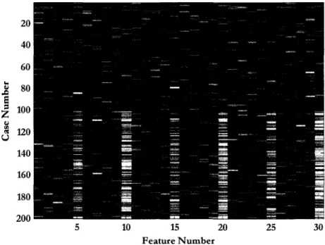
Figure 2 is a heat map of the Leukemia data set. Each row of pixels represents the abundances for all the molecules (or peaks) found in a single spectrum (or case); each column is the abundance of a specific molecule for all cases. The color of the
(iJ) pixel reflects the abundance of peak i in case ;~ where i runs along the
horizontal axis. When sorted into classes, the heat map may be useful for searching for diagnostic portions of the spectra by eye. The dotted line represents the division between the normal class, which is the top half of the cases, and the
6 We included acute and chronic forms of lymphoma and myelogenous leukemia, as well as adult T-cell
disease class. It should be possible to see the class difference in the rightmost variables (disease cases are slightly brighter) that we will later find to be diagnostic.
50 100 150 ... ... ..0
e 200
=
=
... "' "' 250 u 300 350 400 20 40 60 80 100 120 140 160 180 Feature NumberFigure 2: Leukemia data
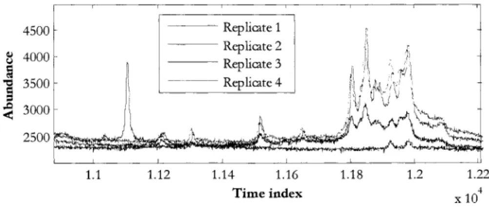
One of the samples in the "leukemia" class was rejected after it was found that the database had a transcription error. That sample's original diagnosis was not compatible with the "leukemia" classification. Another sample, diagnosed as "smoldering leukemia;' was rejected since that condition is considered a "preleukemia" [9] and only develops into leukemia in a minority of cases [1 0]. One of the four replicates of another sample was found to differ greatl/ from the other three, and was also removed. Figure 3 shows the mislabeled replicate 1 in blue, superimposed on the correct replicates (2-4) of the same ID number.
7 We examined linear correlations between replicates of each sample. Those which had low correlation with
other available replicates were examined manually. All but one was retained, as the low correlations appeared to be due to signal variations. 'lbe one rejected appeared to be completely unrelated to the three other replicates with the same sample ID number.
Therefore, the analysis was done with 65 total cases in the disease class, and 417 total replicates, with m /
z
up to 13 kDa.4500 Replicate 1 - - - Replicate 2 J' • ~ 4000 . 11 I ~ • 1: \ I> 1::,; \ I rl 'i- \ I ~
I
Replicate 3 1 11[ .,, ' '1:1§ 3500 \ -- - - - Replicate 4 II!
\k11 'I' , \. yv
v •~
"xl.
)\ . __
, A ,
,~~~--J
2500 1.1 1.12 1.14 1.16 1.18 Time indexFigure 3: Mislabeled replicate spectra
1.2 1.22 4
X 10
During the course of the development of this methodology, others in our group continued to work toward more accurate identification of peak positions and their values. Because of this increased fidelity, we had access to four separate versions of the data set. The first had 48 unique
m/
z
positions, the second had 120, the third 199, and the fmal set had 209 unique variables identified. The final version is the one primarily referenced in this work, however, in Chapter 5: Application of the Naive Bayesian Classifier, the first version was used for testing.Generated Data
The computationally generated data set strives to mimic as closely as possible the 199-variable version of the Leukemia data set. The numbers of cases, including replicates, and number of peaks are similar.
In this data set, we attempt to reproduce those systematic and statistical properties we have found in the real data, without the several artifacts that we have no specific explanation for (such as certain peaks failing to appear in some replicates).
The primary purpose of this data set is for quality control and testing of the algorithms. By mimicking known properties of the real data, then attempting to identify those properties with algorithms made for that purpose, we gain a better understanding of the reliability and stability of the protocols used.
The following steps were taken to prepare the generated data:
1. A spectrum8 with 200 peaks is created by taking the average of the non-disease cases in the Leukemia data set. This provides a baseline for creating all the cases that will be used.
2. A set of spectra, with the number of cases approximating the number of unique patient identification numbers in the Leukemia data, is generated via a draw from a N (fl., a) distribution for each variable independantly. fl. is the value of the average spectrum at that peak position, a is estimated from the Leukemia data set population. At this point there should be no real distinction between any of the 200 variables.
3. One-half of the population is designated to be in the disease class. A class vector representing this choice is created and attached to the data.
8 A full spectrum is not created as we do not wish to replicate the signal processing steps described later.
4. One peak ~abeled 200) is chosen as "highly diagnostic" and the mean ell IIi 70 60 ~ 50
u
'0
40 t 30120
10 0values of the two subpopulations (normal and disease) are separated by two times the population's average standard deviation. Specifically, the disease cases are redrawn from N(f1+2a,a). This results in a distribution like the one shown in Figure 4.
6 7 8 9
II Class A II Class B
10 11 12 13 14 15 16 17 18
Abundance (xl0-3)
Figure 4: Generated data distribution for highly diagnostic peak
5. A random fraction (about a tenth) of the total value of this peak is placed into each of four adjacent peaks ~abeled 195-199). In this manner, five diagnostic peaks are created, all diagnostic of the class. This procedure mimics the measurement of adducts or modifications in the real data set, wherein slightly modified molecules show up as peaks separate from the original.
6. A small fraction of the value of the key peak (200) is moved into a peak some distance away in the list ~beled 100), representing a
multiply-charged ionization satellite (z =2). This 1s repeated to a different peak (labeled 99) for one of the adducts (199).
7. Another moderately diagnostic9 peak is created but not added to the peak list. Instead, varying portions of the total value of that peak are placed in two non-adjacent peaks (labeled SO and 150). This represents the breaking apart of a biomarker protein, whose mass is too great to be detected, into several fragment molecules that are in the range of measurement.
8. Two more peaks (labeled 1 and 2) are selected as "mildly diagnostic" and the values chosen from two normal distributions whose means are separated by about one standard deviation of either group. Specifically, the disease cases are redrawn from N (f-l +a,a). One of these two peaks has a portion of the other peak's value added to it to represent two peaks that are so close together that the peak value of one is "riding up" on the tail of another. See Figure 8 on page 30 for an example.
9. The cases are replicated three times (the original of each case is discarded) by multiplying each value by a de-normalization factor to replicate the signal strength and chemical preparation effects as described on page 31. For a single data vector X, a factor
f
is first selected from ~ U (0.5, 2.0) to replicate the range of total ion current normalization factors found in the30 ~ 25 riO
J
20._
0 15t
110
z
5 0Leukemia data. The resulting distribution for the highly diagnostic peak is shown in Figure 5.
• Class A
• Class B
3 4 5 6 7 8 9 10 11 12 13 14 15 16 17 18 19 20 21 22 23 24
Abundance (xt0-3)
Figure 5: Distribution for highly diagnostic peak after de-normalization
A summary of the diagnostic peaks placed in the generated data is given in Table 1. The resulting Bayesian network is shown in Figure 39: Resulting Bt!Jesian network,
generated data, on page 107 .
Table 1: Diagnostic variables, generated data
Peak 200 196-199 99, 100 1, 2 3, 4 50,150 Purpose Highly diagnostic Adducts or modi-fications of peak 200 Correlated doubly charged ionization states of 199,200 Diagnostic with correlations due to nuxmg Mildly diagnostic Diagnostic-but hidden-primary peak
The actual data set is too large to include in this document, but a heat map is shown in Figure 6 below. The code for creating the generated data can be found in Appendix B: MATLAB Code.
50 100 150 .... " ~ 200
s
=
=
" 250 "'"
u 300 350 400 450 20 40 60Prostate Cancer Data
80 100 120 140
Feature Number
Figure 6: Generated data
160 180 200 .;
X 10
The data encompassing the prostate cancer (PCA) data set was created under our ongoing National Cancer Institute-funded project. The data is secondary to the primary goal of that project, which is "improved signal processing methods" of the type described in the following section.
Serum samples selected for this study were chosen to have a wide range of prostate-speci£c antigen (PSA) levels, with similar PSA distributions in both class groups--disease and normal. Previous studies have had high PSA levels in only the disease group; we wished to avoid the possibility of introducing expenmental bias.
Therefore, on this project, samples were selected to be included in the non-disease group based on having PSA levels that matched those of samples found in the disease group.
As in the Leukemia data set, several replicates were created from each serum sample. These replicates received independent chemical preparation. Two affinity surfaces (IMAC and C3) were used for protein purification from serum. The affinity surfaces assist in enhancing the signals for certain types of molecules such as the hydrophobic apolipoproteins (C3) or phosphorylated proteins (IMAC) [11].
X 105 0 6 50 5 100 4 ... ...
""
e
=
150 3=
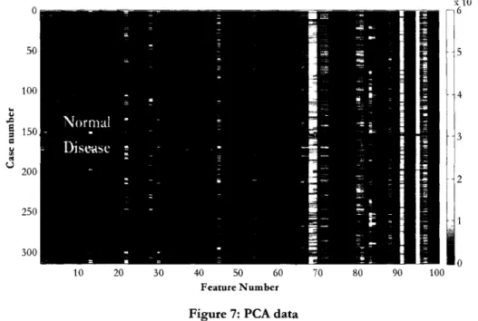
... "' "' u 200 2 250 300 10 20 30 40 50 60 70 80 90 100 Feature NumberFigure 7: PCA data
The Bruker Ultraflex instrument used required the spectra to be gathered in three stages for maximal resolution. Spectra were taken in the mass ranges of 0-20kDa, 15-100 kDa, and 2-100 kDa; here we use the results from the 2-100 kDa mass range. More detailed information on the exact experimental design and MS equipment can be found in Gatlin-Bunai (2007) [11]. A heat map of the PCA data is presented in Figure 7.
Signal Processing
For the leukemia and PCA data sets, sample order was randomized and patient samples were interspersed with QC samples. The MS measurements were run over a period of several weeks. For each replicate of a sample, a spectrum was produced and tagged with metadata, including patient ID, date collected, and date/time and settings of the MS run, among others.
These several replicate spectra from each sample, along with the metadata described above, constitute the input to data analysis portion of the project.
Data Analysis
There are three phases in the data analysis process - signal processing, feature selection, and classifier construction. The first, whose input is the set of spectra and associated metadata, includes a number of steps, listed in Table 2. This phase is not the primary concern of this work, but it is necessary to understand the steps in this phase, and especially the problems caused by their imperfections, to understand the results of the final two phases.
The output of the signal processing phase is a two dimensional table of values, in which each row represents a single replicate spectrum, and each column represents a mass per unit charge (m/ :<) spectral position. The table entries are the measured signal intensity of that replicate at that
m/
zvalue.Background Subtraction Res am piing Peak Selection Peak Alignment Recalibration Replicate Averaging Deconvolution
Table 2: Steps in the Data Creation Process
The presence of large amounts of matrix molecules and other instrument effects produce a slowly varying underlying signal that must be removed so that a true zero value can be found and peak heights measured against this baseline. See Figure 8.
Because peaks at the higher mass end of the spectrum have broader width than those at the lower end, our group resamples all peaks to have the same width (in the time domain). Therefore, a peak that is 10 time units wide may be resampled to be a standard of 5 time units wide, and its height doubled, to maintain the total integrated signal under the peak. This step allows for more accurate peak selection and alignment. It also increases the accuracy of our normalization procedure, discussed later.
Peak selection determines which
m/
z
values represent a molecule, and which of those appear in a sufficient number of samples to represent a variable in the end data. The noise associated with the instrument can mask peaks of lower signal intensity, or conversely, appear as peaks where none exist.Ensures the same true
m/
z
value (representing a specific molecule) is in the same position in the data table for all samples. See Figure 8.Corrects for the effects of instrument errors. The QC data is examined for changes in total signal over time, for example; this calibration is then reapplied to the sample data.
To reduce variations due to preparation and measurement, several samples are measured from a single patient's serum. The results are initially treated as independent samples for peak selection, alignment, and other steps, but are eventually averaged to give a single measurement for each patient.
A peak whose mean value lies within one peak width of another, which is often the case with adducts, rides up on the slope of the adjacent peak. The adjacent peak must be deconvolved (removed) to find the true maximum value of the neighbor. See Figure 8.
Figure 8 shows the necessity for several of the data creation steps listed above. The first pane shows the extreme background height arising at lower
m/
z
values. Thisbackground can cause dependencies in the values of nearby peaks (peak A high implies peak B high) even when no real dependency exists, since the level of the background overshadows the true level of the peaks. Removal of this "background" signal reduces artificial correlations between variables and the variance between samples.
The second pane shows a slight shift to the left between the peak maxima for two spectra, even though these spectra are derived from the same pool of sera. This shift can cause incorrect measurements of either the peak position or the peak value, or both, and may even cause peak detection to fail. Peak alignment attempts to find time-scale correction coefficients to ensure peaks from similar ions appear at the same mass positions in all spectra, and are measured at their maxima.
The third pane shows that when peaks have
m/
z
value differences less than the peak width, portions of the peaks can add up to yield a value that is higher than the true abundance for either peak. This will also yield artificial correlations between peaks (massive left peak always implies high right peak). Deconvolution attempts to find the true maximum values of closely spaced peaks.Background subtraction Peak alignment Deconvolution
Once all of these steps are completed, the abundance values at the aligned peak positions are recorded, along with other data about the spectra. Table 3 shows an example of the output of this process.
Table 3: Example abundance values for five patients (arbitrary units)
Patient ID Disease m/ zpositions
number Class 2755 2797 2873 ""'_,
_____
2959 665 Normal 1.368 0.308 2.151 0.774 672 Normal 1.600 1.827 1.798 1.636 679 Normal 0.399 1.630 1.749 1.418 696 Disease 0.438 0.696 1.607 1.941 721 Disease 1.249 1.023 1.944 1.106 NormalizationOne critical problem with of an MS experiment is that two identical samples (or even two scans of a single sample) can result in spectra that, while having nominally the same shape, differ gready in the values of the various peaks. As noted previously, sample preparation, particularly total volume of material, plays a large role in producing this systematic error-but other factors such as ionization efficiency add to the problem.
Several methods of correcting for such errors have been used [12], however, we have determined that a simple method of total ion current normalization reduces much of the sample-to-sample variation without undue complexity that might introduce more artifacts. We have noted unexpectedly high correlations between some variables in the QC data due to problems in signal processing, and normalization does reduce, but not eliminate, these correlations [13].
is summed across all peak positions (columns) to find that sample's total ion count.
An alternate method, integrating the processed spectra across the entire
m/
z
range, was considered but discarded due to its higher dependence on precise background subtraction-a process with relatively large inaccuracies.Every abundance value in each sample is then scaled by a normalization factor equal to the population average total ion count divided by the sample total ion count. This method reduces the variation in measured abundances of nominally identical samples, such as those from the QC data, from 40-50% to about 20% of the average value.
It is possible to normalize the sample total ion count on subsets of peaks. We avoid this technique, however, due to the possibility of destroying valid information should we "normalize out" variations in samples from different classes. While this is a possible problem with total ion normalization as well, we feel that the chance of introducing error is greater with a small subset of peaks used without additional information.
Figure 9 shows the normalization factors resulting from the process described above being applied to the Leukemia data set of 417 spectra. The horizontal axis lists the possible values of the normalization factor (/J, shown as log10 (cp). A factor
qJ
=
1 (no normalization required) is represented by the zero position. Positive 0.3 represents spectra that were doubled to bring the total ion count to the data set average; negative 0.3 represents spectra whose signal was halved.60 ~ 50
...
....
~ QJ 40 :;l.. rJl._
30 Signal is twice 0...
QJthe a\<agc
..&l 20s
=
:z
10 0Logarithm of Normalization Factors Figure 9: Histogram of normalization factors
Inspection of the spectra with normalization factors above 2 show that these spectra have consistendy low signals and, therefore, lower signal-to-noise ratios. This induces data reduction errors, especially in background subtraction and peak picking. It is also clear, by inspection, that these low signals are not necessarily an attribute of the sample, as some low signal spectra have replicates (other spectra produced from the same sample) that have no apparent problems.
We have therefore chosen to include in our algorithms the option to remove spectra with high (greater than 2.0) normalization factors. While this choice of threshold was somewhat subjective, in the chart above it is apparent that there is a large decrease in the frequency of occurrence at about that value. In no case were all the various replicates of any one sample removed.
The resulting array of signal intensities for each replicate at each peak position, as well as the metadata necessary to identify each spectrum and its class, constitutes
CHAPTER 4: CLASSIFICATION AND FEATURE
SELECTION
Each
m/
z
column in our data arrays, which started out as a signal peak found in a number of spectra, can be considered a set of realizations of a random variable representing the measurement of the abundance of that molecule in each sample. Each row, created from a single spectrum, is an instance, or case, of the full set of variables.These variables are also referred to as "features." The terminology arises from information theory and the computational task of pattern recognition. In this task, an image is broken into features-such as the eyes and nose of a face-that are significant, and only specifically selected features are processed. We will transition to this terminology for the remainder of the discussion, understanding that the terms "peak," "variable," and "feature" are synonymous.
The phase of our analysis that follows the signal processing is called "feature selection." In this phase, features are chosen for inclusion or exclusion in the classifier, the goal being that the final feature set includes only those variables that will be helpful in classification.
The final phase is the construction of a classifier. This construct, whose parameters are typically learned from samples of known classification, allows new, unknown samples to be classified-in this case for disease state. A probabilistic classifier returns the probability that the sample lies in one or another class (e.g.
"95% chance of having Leukemia"). A deterministic classifier takes the values of the features and returns a specific classification. A popular choice, and the one we have made, is to build a probabilistic classifier and use its output to give a deterministic result by setting some probability threshold for declaring the class, such as "if the probability that this case comes from a patient with leukemia is greater than 50%, we will consider the class as "disease." Obviously, this may not be the threshold that a doctor might set for further testing of a patient. It is common to vary this threshold to understand the relationship between the false positives and false negatives that result; we have not done so here, as the accuracy of the classifier is not our primary goal.
Instead, the primary focus of biomarker discovery lies in the feature selection phase. Initial efforts in this field focused on finding single features that are indicative of disease state, although more recently, multi-feature sets (or even mathematical combinations of features) have been sought and examined (c£ Oh, 2005 [14]). Once diagnostic features are found, further investigation as to the nature and origin of the molecules is done in an attempt to learn more about the processes causing the disease itself. Diagnostic features are not typically called biomarkers until their underlying biology and relation to the disease is better understood. In this research, we limit the process to selection of diagnostic features, although we will attempt to examine their inter-relationships.
Feature Set Selection
As has been emphasized, the choice of which features to include in a classifier is the primary goal of this research. These features represent
m/
z
values, which may lead to the identification of proteins, then genes, and then the biological processes that may cause the disease. Even if we could create an accurate classifier direcdy using all the variables produced by the data reduction methods discussed in Chapter 3, we would still want to identify those features that provide the greatest information.Filter and Wrapper techniques
Choosing which features to include in a specific classifier can be accomplished using a number of criteria. Methods that use some scoring criteria to select individual features prior to creating a model for the classifier are known as filters.
Another commonly used method is that of the wrapper, which selects a feature subset and scores it using the resulting classifier itself, say by the classifier's error rate for a data set with known results. An algorithm searches through the space of
all subsets, looking for ever lower error rates.
The search algorithm used in the wrapper technique is typically not exhaustive. For most problems, the number of possible subsets is intractably large. Instead, one of many approximate search methods is used, eliminating large portions of the search space at each iteration. A good review of the many methods is found in Miller [15].
We have employed both filter and wrapper techniques. Although we have said that the final phase of the analysis is the classifier construction, it is clear that a wrapper technique requires both feature selection and classifier construction to occur simultaneously.
Wrapper methods
Two of the most straightforward wrapper methods are fonvard selection and backward elimination [15]. To perform forward selection, the following pseudo-code 1s
implemented:
Select a feature
Find an n-fold cross-validated error rate based on using only that feature as a criterion.
Repeat for all features.
Permanently select the feature that has the lowest error rate. From the remaining features/ select a feature.
Using the new feature/ and the one chosen previously/ create a model and find the model1s cross-validated error rate.
Repeat for all features.
Choose the feature that, when combined with the first feature selected, results in the best model. Continue to add more features until some threshold-perhaps "error rate begins to rise"-is reached. The final set becomes the selected subset of features.
Backward elimination is a similar process. Under this method, each feature of the current set is removed, one at a time, and the remaining feature set is used to find a cross-validated error rate. The feature whose removal results in the lowest error rate is discarded permanently. The process is repeated until some threshold (error rate rises, or minimum number of features remain) is met. Our first attempt at
feature selection and classification is a wrapper method that uses exactly these techniques.
Naive Bayesian Classifiers
Bayes' Theorem, which is a quarter-millennium old, has come into more widespread use in the last quarter century--especially in the fields of machine learning and pattern recognition. One of its most popular uses is for email filtering, where it is used to answer the question "what is the probability this email is spam, given the words and other data in the message" by learning the probability of those features first from a corpus of source-known examples.10 These probabilities are often updated as the recipient manually accepts or rejects new messages, refining and personalizing the filter.
This "learning" of the probabilities for data occurrence based on a set of cases with known results is a key step in the construction of any Bayesian classification system. The known data is called the "training set," and the probability that a new case will be observed to have a certain value (or range of values) is based on the frequency of that value in the training set, or a model distribution based on the data in the training set.
As an illustration of the use of learned probabilities and Bayes' Theorem to classify, consider the following example.
!O Sec, for example, the 1997 Microsoft Research group article entitled "A Bayesian approach to filtering junk email" at http:// rescarch.microsoft.com/ -horvitz/junkfllter.htm.
A researcher is searching for the probability that "a person has long hair, given that they are male" using Bayes' Theorem. To do so, the researcher might sample a population, noting the sex and hair length of each case, then choose some boundary between long and short hair, such as "touches the collar." A probability distribution is created by directly counting the samples with long (or short) hair. The researcher then makes the assumption that "if I have seen that 80% of the males so far have short hair, then the probability of a new person having short hair, given they are male, will be 80% as well." This, plus a researcher-chosen prior probability of a new person being male (and the normalization factor) would allow her to answer the question "what is the chance that this new person is a male, given that I know only that they have short hair?"
This example shows the simplest use of Bayes' Theorem for classification, based on a single variable (hair length). Suppose however that the researcher knows that she will have the additional information that "the new person wears pants (or not)." By gathering this information from the training set, and creating the needed four entry probability table P( sex= {male, female} I pants= {yes, no}) she can use this additional data to refine the classifier. If she assumes that the length of a person's hair and the wearing of pants are independent, i.e. men with short hair are not more likely to wear pants than men with long hair, then by the definition of independence P(hair, pants