Sarah J. Arnold. Quick Searching at the Library: A Usability Study on Combining Web Scale Discovery Tools for the Ultimate Search Interface. A Master’s Paper for the M.S. in L.S degree. April, 2013. 76 pages. Advisor: Chad Haefele
Research was conducted to develop a clear picture of user preference at the University of North Carolina at Chapel Hill by having representative users answer questions about their use of the library in a questionnaire and following-‐up with a usability test. The usability testing involved two main goals: first, participants compared two search pages, one with tabs similar to the current library homepage and one without that is similar to a Google interface. This first goal also tested the library’s new combined search known as Articles + Catalog. The second portion of the tests involved having the participants respond to a proposed library homepage in order to gather feedback for a redesign project. The resulting data showed users preferred the tabbed widget, but overall participants were not averse to the use of the simple widget on the proposed library homepage since the information they found most important was still available.
Headings:
Academic Libraries.
Web Scale Discovery Tool.
Online Public Access Catalog.
Web Site -‐-‐ Design.
Usability Testing.
QUICK SEARCHING AT THE LIBRARY: A USABILITY TEST ON COMBINING WEB SCALE DISCOVERY TOOLS FOR THE ULTIMATE SEARCH INTERFACE
by Sarah J. Arnold
A Master’s paper submitted to the faculty of the School of Information and Library Science of the University of North Carolina at Chapel Hill
in partial fulfillment of the requirements for the degree of Master of Science in
Library Science.
Chapel Hill, North Carolina
April 2013
Approved by
Table of Contents
List of Figures & Tables ... 2
Acknowledgements ... 3
Introduction ... 4
Purpose of Study ... 5
Environment at UNC-‐CH ... 8
Literature Review ... 9
Background ... 9
Increase in Use of Library Websites and Search Tools ... 10
Combining Multiple Search Tools ... 13
Usability Testing of Library Websites and Search Tools ... 14
Methodology ... 18
Questionnaire ... 19
Usability Test ... 20
Results ... 26
Questionnaire Responses ... 26
Overview of the Usability Test ... 28
Tasks 1 and 2: General Subject Search ... 30
Combined Search Results ... 31
Simple Search Page versus Tabbed Search Page ... 34
Task 3: Searching for a Known Book ... 36
Task 4: Searching for an Individual Database ... 37
Task 5: Searching for a Group of Databases ... 41
Task 6: Searching with Incomplete Article Information ... 44
Library Homepage Wireframe ... 45
Discussion ... 48
Limitations of Study ... 51
Conclusion ... 53
References ... 55
Appendix A: Questionnaire Consent and Questions ... 58
Appendix B: Usability Test Observation Guide ... 61
Appendix C: Usability Test Participant Handout ... 65
Appendix D: Results from Questionnaire and Usability Test ... 67
List of Figures & Tables
Figure 1 ... 6
Figure 2 ... 7
Figure 3 ... 22
Figure 4 ... 22
Figure 5 ... 24
Figure 6 ... 25
Table 1 ... 29
Figure 7 ... 38
Figure 8 ... 39
Figure 9 ... 42
Acknowledgements
I would like to thank the School of Information and Library Science for accepting my request for a Carnegie Grant, which funded the incentives for my research
participants.
I am also indebted to the many colleagues and supervisors who assisted me in the completion of this project. I would like to thank all of them for helping me gather the data, taking notes, and providing me with guidance and support.
Ellie Boote
Research Services Librarian
Dani Brecher Research Assistant
Mel Clendening
Fines and Billing Statistics
Chad Haefele
Emerging Technologies Librarian
Emily King
Coordinator of E-‐Learning Services
Anna Sandelli
Research Assistant (CALA)
Kim Vassiliadis
Introduction
With academic library users turning to online search engines like Google
instead of the library’s website and search tools, libraries have had to adjust their
tactics. The trend has become to focus on meeting users where they are with the
types of search interfaces that they are accustomed to seeing and using. Similarly,
the constant growth of library resources and the overwhelming amount of
information available to users needs to be addressed in a way that allows for easier
access and organization. Swanson and Green (2011) state the true purpose of a
library homepage “is to add value to all of our resources by making them findable”
(p. 227). The virtual space that a library inhabits needs to be just as accessible,
friendly, and comfortable as its physical spaces. Web scale discovery tools attempt
to fill the gap between library users’ knowledge from their use of the Internet and
technology and their use of library resources. As Michael Kelley (2012) put it:
“
There is great hope that these rapidly maturing products will not only
promote information literacy strategies but also deliver what
metasearch (or federated search) has failed to achieve—a Google-‐like
interface that provides a fast, single point of entry to an institution's
relevant and vetted scholarly content” (p. 34).
This single point of entry that allows users to access the entirety of a library’s
collections, both print and electronic, will remove much of the guess work that users
face in our virtual environments. What is not shown as commonly are the results of
conducted for this study will provide a unique look into what users prefer about this
approach compared to searching other ways. Furthermore, the academic librarian
still has a responsibility to fulfill in both creating virtual spaces that users can
manage and in training users how to use these spaces.
Purpose of Study
By conducting a usability test with a representative group of library users at
the University of North Carolina at Chapel Hill Libraries (UNC Libraries), the plan
was to discover how users compare two different search interfaces that utilize the
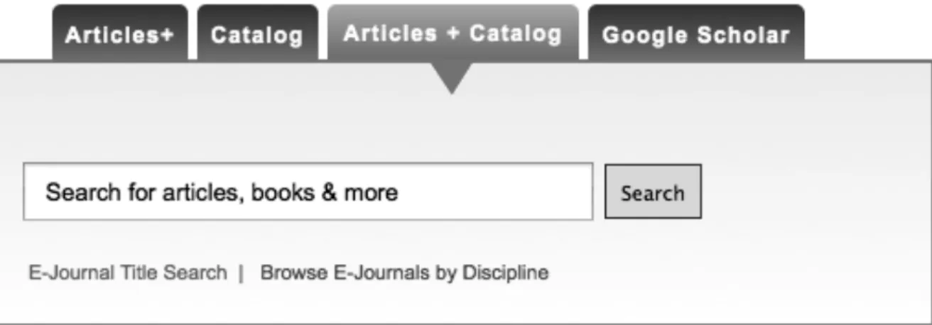
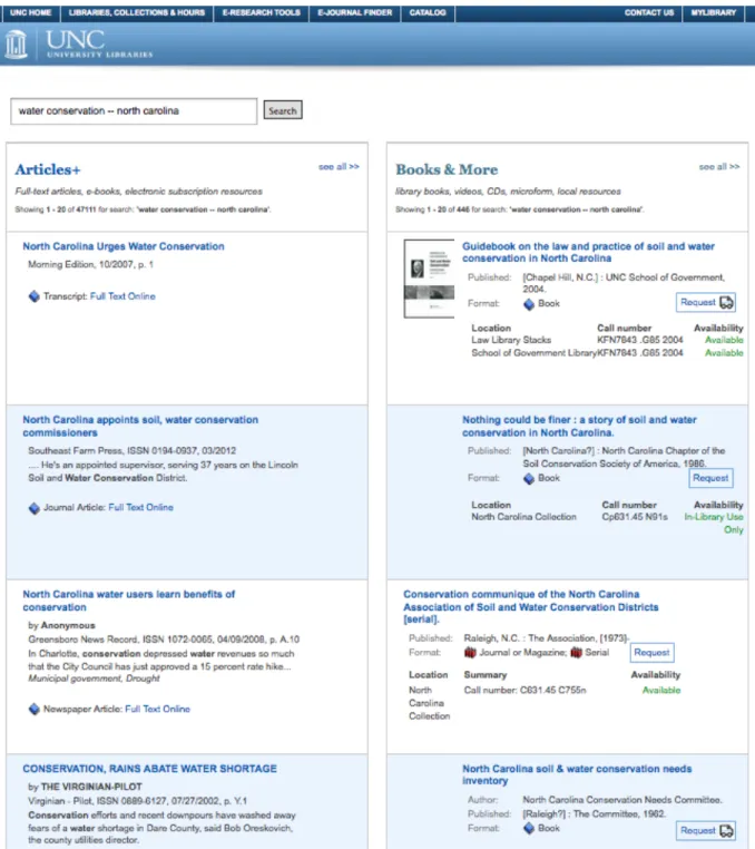
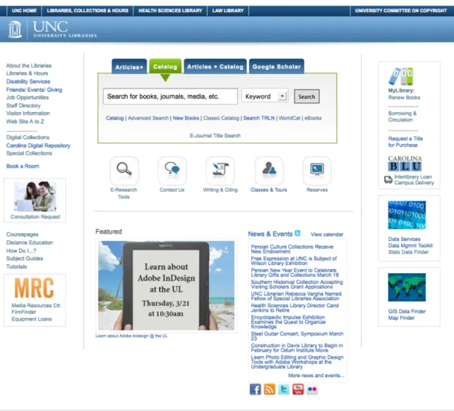
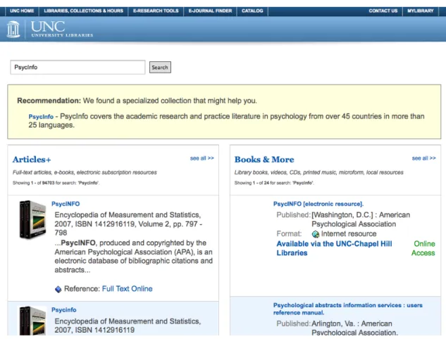
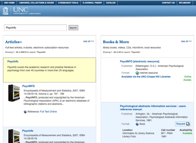
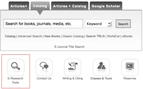
library’s Articles + Catalog search (see Figures 1 and 2 below). The Articles +
Catalog search combines Serials Solutions’ Summon web scale discovery service
with Endeca, a faceted search tool that operates as UNC’s online public access
catalog (OPAC) and a discovery layer over its integrated library system (ILS),
Millennium. This combination will create a more streamlined search tool that
incorporates what librarians like to see for indexed and cataloged resources and
what users are used to seeing from their experiences in a broader online
environment. In addition, users will find the search easy to use due to quick results
that they have come to expect based on years of using non-‐library search engines
widely available on the Internet. By combining web scale discovery tools and online
public access catalogs, libraries will increase the use of their resources due to the
more powerful search interface. Users will be able to effectively utilize the library as
The overall purpose of this study will be to parse out certain aspects of the
users’ opinions on using the library’s new Articles + Catalog tool as well as their
preferences for search widget layout. These aspects include, but are not limited to:
• whether or not users are comfortable using the library’s Articles +
Catalog search,
• if they find the results that they expected and are satisfied with them,
• their opinions on how easy the search widget was to navigate, and
• if they plan to continue using this type of search in the future.
It will also be interesting to get feedback on the unique layout of the Articles +
Catalog search’s results, which will have articles and related database materials in
one column and books and related items from the library’s catalog in another. This
standout feature of the Articles + Catalog search could be what makes or breaks this
new search tool for users because it is the one feature that truly sets this search
interface apart from its non-‐library competitors like Google and Amazon.
Figure 1. Current UNC Libraries search widget with Articles + Catalog search selected for display. The catalog tab is
Figure 2. Screenshot of the search results page for "water conservation -‐-‐ north carolina" in the Articles + Catalog
Environment at UNC-‐CH
The University of North Carolina at Chapel Hill is a four-‐year, public
institution that is classified as a research university with very high activity by the
Carnegie Foundation for the Advancement of Teaching (2010). According to UNC’s
News Service (2013), the entire student body totals 29,278 with 18,503 students
classified as undergraduates (Students section, para. 1). The University offers “77
bachelor’s, 109 master’s, 66 doctorate and six professional degree programs
through 14 schools and the College of Arts and Sciences” (Key Statistics section,
para. 1). There is a full-‐time faculty of 3,221 (Key Statistics section, para. 5).
The libraries themselves hold 7.2 million volumes and subscribe to 92,483
serial titles, both electronic and in print (Key Statistics section, para. 6). From March
1, 2012 to February 28, 2013, the library’s website had 168,457 unique views per
month (an average of 5,538 per day) according to the site’s Google analytics tool.
Since the release of the combined search known as Articles + Catalog on January 14,
2013, the search has logged a total of 8,119 searches (an average of 142 per day) up
Literature Review
Though a review of the literature revealed hundreds of articles on both web
scale discovery tools and ILS OPACs, few were updated on the latest findings and
uses of these tools due to their constant changing nature. While this literature
review is not comprehensive, it does focus on recent articles published since 2010
that discuss the issues raised in relation to web scale discovery tools and their use at
academic libraries and by their users. This review also focuses on issues related to
library websites in general, single search options versus tabbed searching widgets,
and the impact these issues have on library resources and their use by patrons.
Background
Web scale discovery tools are being used more and more by libraries. They
are the next big move for library resources if libraries are to remain in the game
with search engines like Google and online bookstores like Amazon and Barnes &
Noble. Web scale discovery tools are viewed as being user friendly due to their
similarities to non-‐library search tools like Google. In other words, library catalogs
and databases in their current form are considered to not be easily accessible by
users who are accustomed to Google and other popular search engines for the
majority of their research needs. The reasons for this vary widely, but most come
back to the issue of complicated search strategies and the wide array of database
desired “Google-‐like” interface with the library’s resources, essentially combining
the best of both and thus making access to information smoother overall (Thomsett-‐
Scott and Reese, p. 123-‐124). While it is easy to compare web scale discovery tools
to Google, it should be noted that this type of search “can be considered as deep
discovery within a vast ocean of content” (Vaughan, 2011, p. 5) due to its gateway-‐
like nature for library holdings.
According to Vaughan (2011), Serials Solutions’ Summon, the web scale
discovery tool used at the UNC Libraries, currently contains a large index of over
94,000 journals and 6,800 publishers totaling over half a billion individual items;
most of which are journal and newspaper articles that customers have access to.
The chief aggregators partnered with the Summon Service are ProQuest, LexisNexis
Academic, and Gale (p. 122). The volume of items and the credibility backing those
materials due to their sources puts Summon on par with the likes of Google and
Amazon if not above them. Serials Solutions itself releases updates for Summon
every three to four weeks (Vaughan, 2011, p. 22).
Increase in Use of Library Websites and Search Tools
According to a Pew Research Center’s Internet & American Life Project’s
survey on how teens research (2012), 65% of Advanced Placement and National
Writing Project teachers agreed “that the internet makes today’s students more self-‐
sufficient researchers” (Purcell et al., p. 3). Further, 76% of these teachers “‘strongly
agree’ with the notion that ‘search engines have conditioned students to expect to
be able to find information quickly and easily’” (p. 17). The most insightful and
Wikipedia, and other online search engines more than ever to research their class
assignments. Truly for these students, research means “googling” (p. 33-‐34). These
findings create an impetus for academic libraries, and libraries in general, to provide
search tools and websites that are user friendly and reliable.
Against this backdrop of teenage “googling” stands the decreasing use of
library websites by college students who have developed their research habits much
like the teens discussed above. A 2010 report from the Online Computer Library
Center (OCLC) found that since its 2005 report there had been a decrease in the use
of library websites (p. 52). In addition to this finding, 83% of college students begin
their “information searches using search engines,” a decline from 92% in 2005
(OCLC, 2010, p. 53). This finding displays the opposite of what libraries would like
to hear about the use of their resources. Part of the issue has to do with students
feeling overwhelmed by the complicated mazes created by library interfaces, which
tend to be organized more for the resources than for the users who need to access
them. Non-‐library search engines then become a go to for students since they are
convenient, unintimidating, and easy to use and access, despite their lack of
reliability and accuracy. These latter characteristics are most often cited as being
related to library resources, but seem trivial in comparison to the ease of use factor
(OCLC, 2010, p. 53). The literature also suggests that web scale discovery tools and
OPACs are more frequently used for university library websites as separate ways of
accessing library resources, a trend that shows libraries are attempting to change
the declining use of their resources.
scale discovery tools and next generation catalogs has been increasing. This increase
is most likely due to the previously discussed symptoms and to the user demand for
ease of use. According to Hofmann and Yang (2012), “discovery tool use has almost
doubled” in a matter of two years from 16% in 2009/2010 to 29% in 2011/2012 at
the 260 libraries that they studied (p. 257). Included in these numbers are the
implementations of discovery tools that offer a single search box interface and those
that have next generation catalog features such as a faceted interface (Hofmann &
Yang, 2012, p. 263). Numbers like these do not lie – libraries are attempting to move
in a direction that users want in order to provide search tools that are more in line
with what users have come to expect from their experiences in other non-‐library
virtual environments.
In a 2009 study at Grand Valley State University in Michigan, Way looked at
how the implementation of Summon affected the use of their library’s electronic
collections. He pulled usage statistics from September to December of that year.
Way (2009) found the drastic “increase in full-‐text downloads and link resolver
click-‐throughs [to suggest] Summon had a dramatic impact on user behavior and the
use of library collections during this time” (p. 219). He concluded that the
implementation of Summon did in fact increase the use of library resources, an
exciting find for all academic libraries that have implemented these tools (p. 219).
Based on these findings and the similarities between web scale discovery tools and
sites like Google, it is unsurprising that users will take to using search tools like
Combining Multiple Search Tools
The unique nature of studying the Articles + Catalog tool comes from the lack
of research into the user perspective on combinations of these types of search tools.
UNC Libraries are not the first to develop a customized search interface that
combines multiple platforms and source types. Hofmann and Yang (2012) found
that a majority of the libraries they studied “use their discovery tool in conjunction
with their classic ILS OPAC” (p. 259). This is a finding that shows the flexibility and
potential of discovery tool and catalog combinations. For example, North Carolina
State University has developed a multilayered search that incorporates Summon,
Endeca, and other search tools into one seamless interface. 1 Similar approaches to
combined search interfaces are being developed at Villanova, the University of
California in San Francisco, the University of Michigan, and the University of Virginia
(Lown, Sierra, and Boyer, 2013, Background section, para. 6).
The three current team members of NCSU’s QuickSearch revealed interesting
statistics on the use of this type of combined search interface in a pre-‐published
article. Lown, Sierra, and Boyer (2013) used transaction log files to gather data on
the frequency of use of the various sections on their QuickSearch interface
(Methodology section, para. 1). They found that the majority of hyperlinks used
were in the articles and catalog sections at a combined use of almost 80% (Lown et
al., 2013, Results section, para. 2). Further, they discovered that the direct links to
articles or catalog items were used more frequently than the links to view more
results (Lown et al., Articles & Catalog Module Pattern Use section para. 1-‐2). This is
an issue that I believe will be corrected with UNC’s two column layout plan, though
users most likely will not go beyond the first page/two columns of results.
Usability Testing of Library Websites and Search Tools
The approach used in the study to gather data, a questionnaire and follow-‐up
usability test, will allow for in-‐depth discovery of how and why users turn to non-‐
library resources and potentially lead to findings that will allow libraries to change
this trend. Not only will insight be provided on how users understand these types of
search tools, but investigators will also be able to observe how they are using the
tools first hand and begin to understand the issues that keep users from taking
advantage of the library’s curated sources.
One of these issues is user confusion over what exactly the one search box is
meant to do. Majors (2012) found that the single search box interface was used “for
many kinds of things not supported by the discovery interface” such as “‘interlibrary
loan,’ ‘help,’ and ‘chat with a librarian,’” which could be due in part to the lack of
“transparency about what is being searched and/or indexed” (p. 191). In their
usability test at James Madison University, Fagan, Mandernach, Nelson, Paulo, and
Saunders (2012) found that “students had trouble determining what is searched by
various systems,” which is unsurprising based on past research findings. However, it
is still troubling because web scale discovery tools are meant to meet users where
they are by bridging the gap between what they expect and what is possible based
on past systems. As long as the goal of reaching out to users and creating tools that
they find easy to use and understand remains unmet, this issue will hopefully begin
study.
Furthermore, based on the usability test of Gross and Sheridan (2011),
students tended to maneuver through the discovery tool’s interface easily, “but
[were] somewhat perplexed by the search results” (p. 242). Based on their
observations, the students struggled to differentiate among the various source
types. For example they “were confused between the record of a book, and the
record of a book review” (Gross & Sheridan, 2011, p. 242). Fagan, et al. (2012)
discovered similar findings over student source type confusion. This issue is one
that I hypothesize would become less of a hindrance with the UNC library’s
proposed Quick Search results organization. The dividing line between source types
will be clearly separated between the two columns.
One concern that has arisen deals with the ease of access to the library’s
resources via the combined search. Users will perform a search, receive the
Summon and Endeca results on a single page, and then either scroll through the
results or decide to jump out into the individual interfaces of one or the other
depending on their needs. This concern was addressed by a 2009 usability study at
Moraine Valley Community College when they tested the ease of use of their
library’s website. Their site varies from others by not including a search bar on the
homepage. Unlike other academic institutions pushing for a more Google-‐like
appearance with their search tools, Swanson and Green (2011) wanted to know if
users were able to access the MVCC library’s resources since databases and the
catalog were accessed via links from the homepage rather than through a search
in accessing resources located on a secondary page (p. 227), which provides relief
over the concern that the combined search results page being utilized at UNC will
cause undue obstacles for users.
In Spring 2010, Teague-‐Rector, Ballard, and Pauley organized a usability test
of the North Carolina State University’s tabbed search interface, which is similar to
the one currently used at UNC Libraries. The stated purpose of using a tabbed
search tool was to create a search interface capable of allowing access to multiple
silos of library information such as articles, books and media, journals, and the
library’s website (p. 81 and 85). A combined “All” option is also available. In their
results, Teague-‐Rector et al. (2013) found that most of the usability participants did
not immediately stick with the “All” search, but utilized the tabs when beginning on
search tasks (p. 88). Moreover users seemed to struggle with tasks involving journal
articles and databases, but found searching for books and library services much
easier to complete (p. 88-‐9). Overall they concluded that the tabbed search widget
worked well for both user access and the organization of library resources and
services; yet, they also came upon common user frustrations with library search
interfaces (p. 91). Despite these frustrations, library website users will hopefully
find ways to interpret the search interfaces in front of them based on their ever
growing knowledge from other online interactions.
Still, Swanson and Green (2011) bring up an interesting point regarding the
library’s homepage and the importance of balancing the resources available in
limited space available. They found that “the more items that are added to the site
ever taking advantage of all that the library has to offer. By providing a balance of
library resources and services for the user to peruse, libraries can begin to create
websites that are more user friendly. The proposed homepage that UNC’s User
Experience department has created strips away much of the content that can
currently be found on the site (see Figures 5 and 6). The fact that this study found
evidence supporting exactly what the UNC Libraries are attempting to do further
Methodology
Based on findings from the literature, a usability test with common, but
specific tasks for participants to complete will be the best method of gathering data
for this study. This approach will draw out user preference for the type of search
page used to access library resources as well as for the two-‐column results display.
As previously mentioned, the Articles + Catalog tool will combine Serials Solutions’
Summon, a web scale discovery tool, and Endeca, an OPAC that operates as a
discovery layer on top of UNC’s ILS, Millennium. A web scale discovery tool is a
library search engine that envelops the features of traditional online library search
tools (facets, uniform/indexed keywords, etc.) with the ease of use provided by
popular Internet search engines that users tend to gravitate toward for simplicity.
The types of materials indexed include journal articles, newspaper articles, online e-‐
books, book reviews, theses and dissertations, and reference materials. The purpose
of such a tool is meant to pull users back to the library and its resources by making
access easier while still maintaining the credibility and trustworthiness of materials
found through library search engines.
Similarly, an integrated library system online public access catalog (ILS
OPAC) provides access to a library’s physical and electronic holdings mainly in the
form of books, journals, and media, which allows for narrowing of results using
an OPAC is the main search option featured on a library’s website as it currently is
for UNC-‐CH’s library website as of March 2013. Once the Articles + Catalog has been
vetted over a period of months, it will eventually become the default search for
users.
For the purposes of this study, a locally developed search interface was
examined that combines the two described types of searches above into a single
search interface. This search tool came about based on the findings of a previous
usability study of the library’s Articles+ tool performed in Spring 2012. A task force
recommended the development of a combined Articles/Catalog search option that
displayed results from Summon and Endeca in a two-‐column display. This search
tool was released in January 2013, but not made the default search option.
The goals of this study were to determine the perception of users and their
research habits in regards to the library’s search options (Articles+/Summon,
Catalog/Endeca, and combined) as well as the usability of the combined search tool
described previously. A further goal that developed as the study progressed was an
examination of the search widget employed to allow users to access the materials
needed to fulfill their research objectives (see Figure 1 for live version of UNC’s
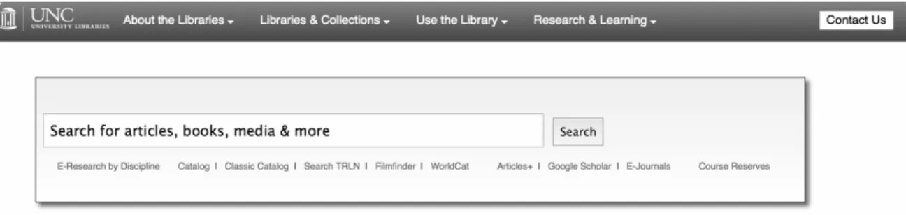
search widget and Figures 3 and 4 for the widgets used during testing). The
following sections detail the ways that this study accomplished these goals.
Questionnaire
A questionnaire was made available from January 14th through February
13th, 2013 using UNC’s Qualtrics survey tool and the campus mass email system.
library’s website to search for books, they would not be asked a follow-‐up question
about how often they had searched for books in the past month. The questionnaire
had a twofold purpose: first to collect responses about the information gathering
habits of users and their use of existing search tools, and second to screen for
potential participants in the usability testing portion of this study. While the
literature does cover most of what the questionnaire will find about user
preferences, the importance of gathering this information on the specific population
that will be studied for this paper will build a better foundation for the second stage
of the process – the usability test. See appendix A for the final versions of the cover
letter and questions.
Usability Test
While the study had 13 participants for the usability test, the findings will be
generalized in an attempt to apply the results to the overall population represented
by these selected users. Jakob Nielsen stated that usability testing is comprised of
three components: (1) representative users, (2) representative tasks for the users to
perform, and (3) observation of the users performing these tasks including their
successes and failures with the search interface (as cited in Gross & Sheridan, 2011,
p. 238-‐239). Through the UNC-‐CH libraries, this study utilized Techsmith’s Morae
usability testing software to record a participant’s actions via screen capture and
audio recording. This allowed for the gathering of hard data on study participants’
use of the Articles + Catalog tool. At the same time, the principal investigator and a
note taker observed and questioned them on their experiences with and preferences
mixture of qualitative and quantitative data gathered from this study provides a
fuller understanding of the needs and wants of users when it comes to library
search tools. It is also worth noting that what a participant says and what they do
can speak volumes in regards to how they are perceiving their use and how they are
actually using these types of tools.
After establishing the three criteria above, the first step of selecting
representative users was completed through the use of a questionnaire, which is
discussed in detail in the previous section. The representative tasks will be laid out
for the chosen users in order to test the system and not the users themselves. If the
users were to be tested, it would be better to have them decide their own search
tasks, but in the case of this study they were given a list of specific tasks to complete
and then asked about their reactions and preferences. The observation guide and
tasks including the handout that each participant received are laid out in detail in
Appendices B and C.
While performing these tasks, participants were asked to share their
opinions on the results and whether or not the results met their expectations. They
were also asked about their preferences based on the layout of the search interface
including the two columns of results and the simple versus tabbed navigation of the
initial search widgets. For this second part, two wireframe search pages were set up
for the participants to use during the usability testing. Both pages used the same
search tool as their default option. One search page had tabs that allowed users to
select among the following options: only searching Articles+, only searching the
or searching Google Scholar. Each tab option provided advanced search and other
related options listed as links below the search box. This tabbed widget is
representative of the UNC Libraries’ current search options that have been used for
approximately 5 years. The other search page was a simple version that only had
one main search box option with other choices for Articles+, the catalog, WorldCat,
Google Scholar, etc. linked underneath. Figures 3 and 4 show what each page looked
like for the testing.
The second half of the usability test involved asking participants about a
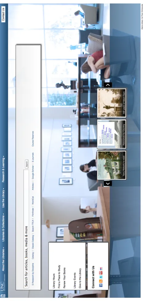
possible redesign of the library’s homepage (see Figure 5). Participants were shown
a wireframe of the proposed new site and asked for their input. The librarians in
UNC’s User Experience department will use the data gathered from this portion of
Figure 3. Tabbed search page option for usability test.
the usability test to build a more user friendly and streamlined homepage for the
libraries. For the purposes of this study, some of the data gathered during this
portion will be examined in the Results and Discussion sections though the majority
is not applicable and thus will not be covered in depth. See Appendices B and C for
the observation guide and participant handout information and Figure 5 for a
screenshot of the proposed library homepage wireframe, and Figure 6 for a
Fi
gu
re
5
. S
cr
ee
ns
ho
t o
f t
he
pr
opo
se
d
lib ra ry h om epa ge w ir ef ra m
e
th at w as s ho w
n
to
u
sa
bi
lit
y
Results
Questionnaire Responses
Over the course of the 31 days that the questionnaire was active, 132
respondents began the questionnaire with 125 completing it, a response rate of
95%. Of these 125, the majority stated that they were faculty members (42%) with
undergraduates (28%), graduates (17%), and doctoral students (13%) following.
The majority of respondents were female (65%). Respondents were given the
opportunity to fill in their area of study, which resulted in numerous variations on
specific sub-‐disciplines. To condense these various responses, the UNC Academic
Departments list2 was used along with UNC’s listed Schools3 to determine the final
list (see Appendix D for complete results).
After the basic demographic questions, the questions focused on library
experience and use of the respondents. When asked if they had attended a library
instruction session while at UNC, 57% responded in the affirmative. The purpose of
this question was to determine the experience level of users, which means over half
of the questionnaire respondents have had some exposure to the UNC libraries and
their resources and/or services.
In regards to library resource use, 97% of respondents had used the library’s
website to search for books or other print materials. While 17% used it 0-‐1 times,
2http://www.unc.edu/academics/depts-‐a-‐z/
22% 2-‐4 times, 14% 5-‐6 times, 7% 7-‐9 times, and 39% used it 10 or more times in
the previous month. Comparatively, only 45% of respondents had used the library’s
Articles+ feature to search for journal articles from the library’s electronic holdings.
With 20% using it 0-‐1 times, 32% 2-‐4 times, 20% 5-‐6 times, 9% 7-‐9 times, and
another 20% of those respondents had used it 10 or more times in the month prior.
When asked about the percentage of the library’s resources they thought was
covered in Articles+, 3% of respondents thought it was less than 5%, 9% thought it
was somewhere between 5-‐24%, 29% thought 25-‐49% was covered, 26% thought
50-‐74%, and 24% thought 75% or higher was being searched through Articles+.
This question had an 85% response rate, or 112 out of 132 respondents.
One interesting question that seemed to almost split the respondents dealt
with their go-‐to source to begin researching. When asked this question, 53%
responded with Google while 45% said they use the library’s website. Only 1% use
Wikipedia or print materials each. Contrary to the response of the previous question
and what was expected based on library literature, 57% of respondents said they
prefer a library-‐style search with multiple options like keyword, title, etc. while 43%
would prefer a Google-‐style interface with one search box. Bias of respondents may
be an issue with these responses due to library branding on the questionnaire as
well as the information provided to respondents in the questionnaire’s consent
dialog.
Of the 125 who completed the questionnaire, 71 respondents were
interested in being contacted for the follow-‐up usability test of the library’s search
campus, making it a total pool of 77 potential usability test participants. Of those 77,
19 participants were selected based on their stated areas of study in order to cover
the wide breadth of disciplines and the perspectives they bring to library research.
13 of them responded and participated in the final testing.
Overview of the Usability Test
For the usability test, participants were asked basic demographic and library
use questions followed by a series of six tasks involving two search pages. Finally
they were shown a proposed library homepage wireframe and asked for their input
on it. While each of the six tasks followed an ideal path that illustrated what the
investigators wanted to find out about the tools, participants were asked to behave
as they would normally and were given free range to search the mocked up widgets
as they saw fit to begin each task. If a participant’s path differed from the ideal path,
they were simply asked to go back and test out the search page in that ideal way.
The breakdown of the 13 participants is as follows: 31% undergraduate, 23%
graduate, 8% doctoral, 38% faculty. The broad range of disciplines covered by these
13 provides an accurate representation of today’s academic library environment.
Five came from a social science discipline (social work, journalism and mass
communication, two from psychology, and political science), three came from the
humanities (art history, classics, and comparative literature), three from the hard
sciences (physics and engineering, environmental science and engineering, biology
and environmental studies), and two from the medical field (nursing and health
In order to get participants comfortable with the testing environment and to
gather more background information on their library website usage, some basic
questions were asked regarding the types of tasks they had attempted on the
library’s website in the past month (see Table 1 below). To accomplish these tasks,
seven participants used Articles+ and four used the library’s catalog. Most of the
participants followed paths they were comfortable with. They started by going to
the library’s main site or via their disciplines branch library site or course site to
access E-‐Research Tools, E-‐journals, and specific databases like Web of Science,
JSTOR, ARTstor, and PsycInfo.
Table 1.
Tasks attempted by participants in the month prior to usability testing.
Attempted Task Total
Looking for an article 10
Looking for a book 7
Other information or materials like government documents, e-‐journals,
and specific research on animation 3
Looking for films 1
Looking for library hours 1
Researching a topic 1
Participants were also asked about their preferences regarding print versus
electronic versions of items in order to determine whether or not they would want
to see one version or another listed first in their search results. The findings here
are not easily broken down due to the mixed preferences of each individual
classes, while they would select electronic articles and e-‐books to fulfill their
research needs. Those who wanted electronic versions of articles preferred them for
their ease of access and the ability to print them rather than having to track down
the original print version, copy or scan and print it.
Tasks 1 and 2: General Subject Search
Tasks 1 and 2 involved a general subject search on a preselected subject that
did not directly apply to any of the participants and their areas of study. The object
here was to control the results and to provide the investigators with easy to
compare outcomes. The search page that each participant used first was randomly
chosen (see Figures 3 and 4 to view each search page). Participants were asked to
complete the same task twice, once on each search page in order to create a baseline
of comparison between the two pages. Each participant was asked the same two
questions regarding their expectations based on each search widget and their use
(or not) of autosuggestions on whichever search page was tested first. For a
breakdown of what each participant searched for and other results from the
usability test, see Appendix D.
Upon first viewing of a search page, the majority of participants (9 out of 13)
stated that they expected to search “articles, books, media, and more,” which is the
language used to describe the default, or combined, search. For those who landed on
the tabbed search page first, a minority described what they could search based on
the tabs available. While one participant stated that the default search on the page
appeared to search “mainly books, but I guess it says articles so maybe it would be
expected to be searching anything and everything. One participant who was asked
this question after using the tabbed search first thought aloud: “this to me seems
more general. It doesn’t necessarily say articles, books, microfilm, anything like that
and now that I think about it that might be kind of nice especially in comparison to
the other one” – a sentiment that was shared by many when comparing the two
search widgets.
Out of the 13 participants, only eight noticed the autosuggest options that
appeared. Five utilized them for their searches and six stated their search was
affected by the suggestions. Thoughts from participants who stated they were
affected were in line with others:
“[The library] must have something regarding this topic if it drops down.”
“I do use what drops down to help guide me to where I’m going.”
“I guess this is what’s being recommended to me.”
Based on the numerous suggestions received:
“I thought this is something reasonable to search.”
Combined Search Results
Part of tasks 1 and 2 were questions aimed at drawing out the thoughts each
participant had on the new layout of the combined search results page (see Figure
2). The questions were repetitive in a way to draw out the various reactions of each
participant with the goal to gain as much insight into each participant’s inclinations.
Most of the initial reactions of participants involved the separation of
“First reaction is, for a topic that I don’t know very much about, it’s neat to have them side by side because I might be more interested in an article or be more interested in a book, and I don’t have to do any clicks.”
“Actually like this a lot because it separates it into articles and books depending on what you really need.”
“Something I’m not used to seeing – I’m used to seeing one column… but then I saw the two titles and thought ‘oh, I like that’… I like that they separate it.”
“It’s interesting seeing them split. I’m so used to seeing the list across that for a second it was a little overwhelming.”
“It’s different, but not bad. There’s more information than the other way that I search.”
“A little odd having the articles and the books separated, but I guess it’s actually kind of convenient.”
“For a very general interest kind of thing, having both the articles and the books I liked. For one it showed me there were both and it showed me the difference between the two.”
While some other participants commented on the adjustments they would need to
make to use a tool like this:
“It would take a little bit of time to get used to it. I think my natural
inclination is to read left to right, so you focus on the articles section rather than the book section, so it takes a little while to realize that this is a column and the Books & More is a column.”
“I think that I would prefer to see a single column as opposed to two columns, but I may get used to that. It’s like computer software when they cram an update down your throat, you get mad at first, but then you learn to like it or don’t.”
“If not used to this page, it may be difficult, but once you expect this when you search it is going to be a lot easier.”
Some of the more seasoned researchers felt the two-‐column layout would be too
much if they were going through their usual research routines:
“I think in general it would be useful to someone looking for an overall inclusive… anything article or book related to this topic… but for my usage, I usually am looking for journal articles so it might be a little bit more
distracting for my daily use.”
“If I were looking for a book or a local resource, I’d really like it. Since I’m used to only looking for articles, I wouldn’t be annoyed, but there is a lot more scrolling down…” Clicks on “See all results in Articles+” link. “That’s really nice to have that breakout and then still be able to get to if I just want to see [articles].”
One participant showed concern for their students and the issue of source
credibility, an issue that would need to be considered when introducing novice
researchers to a tool as powerful as the combined search:
“First thing that would strike me are the different columns. At first it’s pretty convenient, but then I would worry especially with having to deal with some of my undergrads… I could see them thinking that these are all equivalent”
Though many mentioned being overwhelmed by the layout and large number of
results, of the 13 participants, only one mentioned the immediate lack of facets to
narrow their search results:
“An embarrassment of riches… I would wonder how to sort through 66,409 articles and 450 books and I would probably begin to cast about on the screen looking for ways to refine my search.”
Many of the participants commented on the two column layout being too
cluttered looking. They suggested widening the columns as well as making the
headings larger. One participant even mentioned adding a line down the middle to
distinguish them that much more. The majority of participants stated they were
satisfied or somewhat satisfied with the results that they saw on after performing
to become more pleased due to its all-‐encompassing nature and easy access to the
Summon (Articles+) and Endeca (Catalog) interfaces.
Simple Search Page versus Tabbed Search Page
Contrary to what was expected, a 69% majority of participants (9 out of 13)
preferred the tabbed search page to the simple one and chose to use it for tasks 3-‐6.
Of these nine, eight used the tabs to complete at least one of the four tasks. What is
interesting here, however, is that when completing tasks 1 and 2 five participants
did not notice the difference between the search pages until it was pointed out to
them when being asked about their preference.
Participant comments varied, but overall the response was positive in
regards to the tabbed search page:
“It had the three options that I really wanted. So, I like the tabbed better because it gives me the flexibility that I want, which is to see articles, catalog and book options, and then together.”
“If someone isn’t accustomed to searching for things, this one is quite clear, I feel.”
“I would rather have than them than not. In fact, I would probably rather have more tabs than what you’ve given me.”
“It’s not a big deal, but there are times when I’m just looking for research articles and would use the articles tab.”
“[The tabbed] makes it a little more clear that you have options.”
Though one participant felt they might miss something by being provided choices
through the tabs: