ABSTRACT
DEO, PALLAVI SUMANT. DataSlicer: A Recommendation System for Visual Data Exploration. (Under the direction of Dr. Christopher G. Healey and Dr. Rada Y. Chirkova).
The need for methods to analyze large, complex datasets continues to grow as the
volume of data being collected continues to accelerate. One method proposed to address this problem is visualization, the conversion of some or all of a dataset into an image that allows
viewers to explore, discover, validate, and present findings. To support this, data analysts often need to transform a dataset into a form that is amenable to building an insightful visualization. For many datasets and common analytical tasks such as finding outliers or general trends in
the data, only a small subset of the entire dataset may actually be needed in the visualization. However, finding the right slice of data is crucial. Determining how to select and transform data for visualization is a difficult problem, particularly when faced by data-unfamiliar or inexperienced users. Existing data visualization software provide numerous ways to
manipulate and transform the data, but they do not actively assist in suggesting effective visualizations, or in identifying promising data slices for building visualizations that focus specifically on a user’s data and analysis tasks. In other words, they do not “predict” the task that the user is trying to solve, nor “suggest” the next best steps a user could take. Users are
often unable to transform their data and design visualizations to address their analysis needs,
requiring them to start over or to seek the help of an expert. It would be efficient to have a system that takes an expert’s visualization history into consideration and guides the user
space of possible data transformations and visualizations, sequence pattern matching to compare expert sequences to partial novice sequences, and data to visual feature mapping to
convert data slices into effective visual representations. Experimental results confirm that users who faced difficulty solving common analysis tasks on their own could successfully complete
DataSlicer: A Recommendation System for Visual Data Exploration
by
Pallavi Sumant Deo
A thesis submitted to the Graduate Faculty of North Carolina State University
in partial fulfillment of the requirements for the degree of
Master of Science
Computer Science
Raleigh, North Carolina
2016
APPROVED BY:
_______________________________ _______________________________
Dr. Christopher G. Healey Dr. Rada Y. Chirkova
DEDICATION
BIOGRAPHY
Pallavi Deo is originally from India. She graduated from Mumbai University in 2011 with a
Bachelor of Engineering in Computer Science. She worked at Infosys in India as a Software Developer for three years before pursuing her Master’s degree at North Carolina State
ACKNOWLEDGMENTS
I would like to thank Dr. Healey for being a great mentor and providing constant
guidance towards my thesis. I would also like to thank Dr. Chirkova for her support and advice in this research. Both are great advisors and it was an honor working with them. I wish to thank
Dr. Juan Reutter for his valuable inputs on algorithm development from time to time and I really appreciate Dr. Carla Savage and Dr. David Roberts for taking interest in this research.
Next, I would like to thank Deepak Arora and Juhi Desai for taking time out of their
schedule to review my thesis. I also wish to thank all the members of DataSlicer project- Vaira, Farid, Gargi and Guilherme for all the hard work they have put into the project with me.
TABLE OF CONTENTS
LIST OF TABLES ... viii
LIST OF FIGURES ... ix
Introduction ... 1
1.1 Thesis Problem... 4
1.2 Proposed Solution ... 5
1.3 Results ... 7
Background ... 9
2.1 Visualization History ... 9
2.2 Classification... 11
2.3 Existing Systems ... 14
2.3.1 Microsoft Excel ... 14
2.3.2 R + Shiny ... 16
2.3.3 Spotfire ... 17
2.3.4 SAS VA ... 18
2.3.5 Tableau ... 19
2.4 Data Analysis ... 20
2.4.1 Statistical algorithms vs visual data presentation ... 21
2.4.2 Hypothesis testing vs exploratory data analysis ... 22
2.5 Need for Assistance ... 23
Related Work ... 24
3.1 Research in Visualization ... 24
3.2 Recommendation Systems ... 26
3.3 Pattern Matching ... 27
3.4 Case Based Reasoning ... 28
Prediction Engine ... 30
4.1 Goal ... 31
4.2.4 Sequences and data-slice graphs ... 40
4.2.5 Expert users ... 43
4.3 Algorithms ... 43
4.3.1 Matching algorithm ... 44
4.3.2 Ranking algorithm ... 45
4.4 Constructing and Using Data-slice Graphs ... 48
4.4.1 Parsing the log file ... 48
4.4.2 Graph construction ... 49
4.4.3 Recommendation system ... 50
4.4.4 Prediction system ... 51
4.5 System Architecture ... 52
4.5.1 Front end ... 52
4.5.2 Interface ... 53
4.5.3 Back end... 54
4.5.4 Scalability ... 54
4.5.5 Implementation ... 55
Experiments ... 56
5.1 Procedure ... 56
5.2 Tasks ... 58
5.2.1 Task 1: Spatial outliers... 58
5.2.2 Task 2: Local data outliers ... 59
5.2.3 Task 3: Outliers in economic patterns ... 60
5.2.4 Task 4: General economic patterns ... 60
5.3 Expert Solutions ... 60
5.3.1 Task 1 ... 60
5.3.2 Task 2 ... 61
5.3.3 Task 3 ... 62
5.3.4 Task 4 ... 62
5.4 Results ... 63
Visualization Client ... 65
6.1 Sidebar ... 65
6.3 Workbook ... 70
6.4 Prediction Display ... 70
6.5 Example Workflow ... 73
Conclusion and Future Work ... 76
REFERENCES ... 79
APPENDICES ... 83
Appendix A ... 84
LIST OF TABLES
Table 1 The datasets, number of observations, and number of attributes with
attribute descriptions ……… 59
Table 2 The users’ questionnaire for tasks filled by participants with values in
LIST OF FIGURES
Figure 1 Examples of visualizations……… 2
Figure 2 A naïve user’s approach in finding outliers……….. 7
Figure 3 System recommendation for a visualization to identify the filter values to be used to find outliers in the number of earthquake occurrences………… 8
Figure 4 Visualizations from the 18th and 19th century………. 10
Figure 5 A 3D scientific visualization………. 12
Figure 6 An information visualization of estimated tweet sentiment……….. 13
Figure 7 Visualization in an Excel worksheet………. 15
Figure 8 R + Shiny application of a sample dataset……… 16
Figure 9 Visualizations generated in Tableau………. 18
Figure 10 Outlier earthquake locations visualized on a map……….... 32
Figure 11 Visualization using the dimensions average magnitude (of earthquakes at location), number of earthquakes (at location), and depth (of earthquake).. 35
Figure 12 The data specification for the visualization in Figure 11……….. 39
Figure 13 Example of data slice graph……….. 41
Figure 14 Algorithms for matching and ranking functions………... 45
Figure 15 System architecture………..………. 53
Figure 19 Overview of visualization front end……….. 66
Figure 20 Visualization front end with different sections highlighted………... 67
Figure 21 Sidebar of visualization front end………..………... 68
Figure 22 A focused view of shelves………..………... 69
Figure 23 Sidebar and shelves in the visualization front end as updates by a user... 71
Figure 24 Prediction display of a sample input………... 72
Figure 25 Boxplot of average of magnitude grouped by locations of earthquake... 73
Figure 26 Updated shelves for the selected prediction………... 74
Figure 27 Prediction showing location on the map which are outliers in average of magnitude of earthquakes………..………...
Chapter 1
Introduction
Data visualization is a visual way to present data. In many cases, it makes data more readable and easier to understand. For example, one can get a better overview of a dataset by
visualizing it, rather than by reading the data attribute values associated with each data sample or data element.
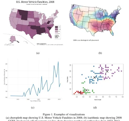
Certain types of visualizations are common and well known to the general public. Examples include different types of maps: choropleth, isarithmic, point, and proportional dot; and charts (or graphs, as they are often called): bar, line, pie, and scatterplot. Each of these
visualizations has been long studied and specialized to a specific type of task. Choropleth maps show data attribute values over different spatial regions, usually by coloring each region based on its value. Isarithmic maps use contour lines to show paths of equal value, highlighting
regions where values change slowly (the isocontour lines are far apart) or quickly (the lines are packed closely together). Line charts are ideal for tracking change in an attribute value over
time. Scatterplots identify relationships like correlation and clustering between a pair of attribute values. Figure 1 shows an example each of choropleth map, isarithmic map, line chart and scatterplot.
recently, visual analytics seeks to merge the areas of data analytics and visualization,
combining their strengths to iteratively generate high-quality visual results.
Data analytics encompasses a wide range of statistical and mathematical approaches,
normally for use to solve real-world problems. Examples of these techniques include
(a) (b)
(c) (d)
Figure 1. Examples of visualizations
(a) choropleth map showing U.S. Motor Vehicle Fatalities in 2008; (b) isarithmic map showing 2008 CCES ideological self-placement; (c) line chart showing number of earthquakes from 1972-2012
clustering, classification, dimensional projection, regression, and time series analysis, among others. With emergence of new technology, digitized data is available for almost every area of
research. This ability to easily capture and store massive amounts of data has resulted in the “big data” phenomena, making the need for data analytics on large datasets a rapidly growing
field of study.
A common approach to analyze data is by performing Exploratory Data Analysis (EDA). It is a philosophy for data analysis that employs a variety of techniques (mostly visual)
to maximize insight into a dataset; uncover underlying structure; extract important variables; detect outliers and anomalies; test underlying assumptions; develop parsimonious models; and
determine optimal factor settings [1]. This thesis focuses on tasks involving exploratory data analysis such as finding outliers in certain data attribute values, or uncovering trends about data stored in given datasets.
Analysts are now turning to visualization as a faster and easier way to understand data in a variety of situations. Data analysts seek to transform the data to generate visualizations
that highlight meaningful traits. Well-crafted visualizations can uncover trends, realize insights, explore sources, and tell stories [2]. This makes complex data more accessible, understandable and usable. The increased use of visual analytics has led software developers
to build visualization software to meet the need for an efficient tool that can import different data formats and manage large volumes of data.
(data-feature mappings). Unfortunately, these systems to do not constrain the user or offer guidance in choosing the best visualization for a given dataset and analysis task. Indeed, most systems will not even assist in constructing an effective visualization. It is left to the expertise of the user to ensure that the particular data-feature mappings they choose work well. In the
worst case, a poor choice of data-feature mapping will result in a visualization that actively interferes with a user’s ability to see the particular patterns or relationships they need to complete their analysis task [7] [8] [9].
1.1 Thesis Problem
Our goal in this thesis is to investigate one possible approach to addressing the problem
of assisting non-expert users during exploratory data analysis and visualization design. We will track a user’s interactions with our visualization system, by generating a sequence of user
actions. A sequence is a series of steps or operations in the visualization system that include
data selection, data transformation, and data visualization. Based on these interactions, we will predict the particular task T the user is trying to solve. Once T is identified, previous visualizations that have been shown to work well for T can be suggested to the user, providing a visual representation that is known to be effective.
Two important steps in performing EDA are “data selection” and “generating the visualization”. The latter can be simplified by visualization tools available to the user. The data
selection step, on the other hand, requires knowledge and experience. Only after the correct
involves selecting the data subset from the original dataset, and then optionally transforming this data slice by performing operations such as grouping, aggregation and filtering. Examining
a dataset and identifying the correct data slices for the task at hand is a difficult challenge faced by inexperienced users. Typically, there are an enormous number of data slices available. Even
for a small dataset, trying different data slices and producing visualizations in the hopes of encountering the right data slice to solve the task can be time consuming and prone to failure. In this thesis, we propose a solution to this problem by introducing a recommendation system
that guides a user with his exploration task. Two analysis tasks used in this thesis are: Finding spatial locations that are outliers in number of occurrences and magnitudes of earthquakes, and
finding trends in business imports and exports for high population countries over the past 10 years.
We observed that even for seemingly simple tasks such as these, a naïve user may face
difficulty finding a correct solution, and in most cases cannot find any correct solution at all. While in some domains approximate solutions may be acceptable, it is never the most desirable
result. Certain domains like national security, healthcare or environmental studies are very sensitive to accuracy and it is essential for these domains to build visualizations that are as accurate as possible in terms of the ability of the data slice being shown to lead to correct
solutions for the original analysis task.
examines the user’s current data slice and the operations performed, to compare it against past
sequences (paths taken in the visual state space) of an expert (for the same dataset) in order to
predict T and recommend a data slice and corresponding visualization. We also construct a framework that allows us to capture and store user sequences in a visualization front end based
on data slices used at every step in a sequence. The following example briefly describes one of the experiments conducted as a part of this thesis.
For the earthquake tasks mentioned above, we use a database that records earthquake
information on 8288 earthquake incidents that occurred over the past 113 years from 1900 to 2013. The user’s task was to find locations that are outliers in the number of earthquake
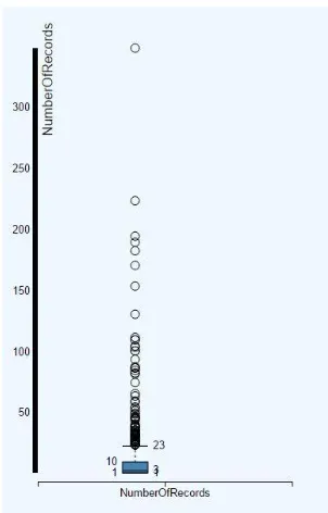
occurrences. One obvious approach to solving this task would be to directly visualize the number of records against locations either on a map or with a bar chart. Unfortunately, this results in a dense visual with low readability. Figure 2 shows an example of both visualizations.
A possible next step would be to filter out locations that are clearly not outliers. We observed and our experiments confirmed that this step is one users have difficulty identifying,
and when they do, determining the exact filter to apply on the data. Most users guess the value and end up with an approximation of outliers. This fails to complete the task successfully. Our system recognizes the user’s confusion and suggests a visualization (in this case, a boxplot) to
a boxplot suggested by the system. It clearly displays the filter value to be used (values greater
than 23, based on quartile) in order to find outlier locations in number of occurrences of earthquakes.
1.3 Results
Our system is built on the assumption that the data slice choices made by domain experts may help other users solve similar exploration and analysis tasks in a more correct and efficient fashion. To verify this assumption, we conducted four sets of experiments involving
(a) (b)
the average number of correct solutions found, and user efficiency (speed), understood as the
average number of data-specification steps taken to find a correct visualization for the task. Results from experiments show statistically significant improvement in solving the tasks, both
in terms of accuracy and efficiency; when recommendations are requested from the system versus when users tried to complete the tasks on their own.
Chapter 2
Background
In order to fully understand the approach followed and algorithms constructed for the recommendation system, it is essential to understand two core areas on which this research is
based: visualization and data analysis. In this section we will describe how visualization has evolved over time, its broad classification into two major categories (scientific visualization
and information visualization), and present existing systems that allow users to build visualizations. We will also describe data analysis beyond its basic definition and discuss why data analysts can often benefit from assistance in their exploration tasks.
2.1 Visualization History
It is common to think of statistical graphics and data visualization as relatively modern
developments in statistics. In fact, the graphic representation of quantitative information has deep roots. These roots reach into the histories of the earliest map-making and visual depiction,
and later into thematic cartography, statistics and statistical graphics, medicine, and other fields [10]. The ancient Babylonians, Egyptians, Greeks and Chinese all developed sophisticated ways of representing information visually to plot the movements of the stars, produce maps to
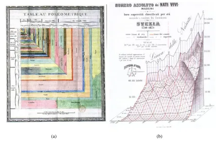
19th century. Figure 4 shows two such charts before computers were used for building data visualization. With the emergence of computer technology, it became possible to handle much
larger amounts of data. Interactive graphics made it possible to dynamically navigate a visualizations in order to reveal interesting facts hidden in the data. This resulted in many
software systems to enable users to build interactive visualizations. We will introduce some of the well-known visualization software systems later in this section.
(a) (b)
Figure 4. Visualizations from the 18th and 19th century: (a) a treemap generated by De Fourcroy on the work of French civil engineers and a comparison of the demographics of European cities; (b) a 3D model
2.2 Classification
Data visualizations can be broadly classified into “scientific visualization” and “information visualization”. This distinction is based on the type of data they represent and
their applications. Scientific visualization is primarily concerned with the visualization of data
with explicit spatial positioning (architectural, meteorological, medical volumes, biological phenomena, etc.), where the emphasis is on realistic representation of volumes, surfaces,
illumination sources, and so forth, perhaps with a dynamic (e.g., time) component. It is sometimes considered a branch of computer science that is a subset of computer graphics, with a significant overlap in techniques for certain types of photorealistic visualizations. The
purpose of scientific visualization is to graphically illustrate scientific data to enable scientists to understand, illustrate, and glean insight from their data [12]. Scientific visualization has found its applications in natural sciences, geography, ecology, and mathematics as well as in
formal and applied sciences. Figure 5 shows one such application in mathematics, a plot that shows rendering of a mathematical function [13].
While scientific visualizations make various phenomena in the sciences easier to understand through their visual depiction, information visualization focuses on studying (interactive) visual representations of more abstract data to reinforce human cognition. One
how to spatially position the data attributes within the visualization. Data within an information visualization can also include both numerical and non-numerical data, such as text, images, or
sound. Based on this definition, scientific visualization is normally concerned with data that has a well-defined representation in 2D or 3D space, i.e., data with an intrinsic spatial layout (e.g., a flow simulation in 3D space), whereas information visualization deals with data that
has no pre-defined spatial positioning (e.g., graphs of web links). Similarly, scientific visualization data tends to be numeric, whereas information visualization data can cover a
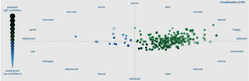
wider range of possible data types [14]. Information visualization is applied in areas of financial data analysis, market studies, crime mapping, data mining, digital libraries, and so on. Figure 6 gives an example of an information visualization. It is a scatterplot of sentiment
Figure 5. A 3D scientific visualization
analysis of tweets from the Twitter microblogging social network containing the word “visualization” [15].
One final comment is that a significant overlap exists between scientific and information visualization. For example, the use of visual properties of color (hue, saturation,
and brightness) and texture (size, orientation, spatial packing density, and so on) are applied in both areas to represent data attribute values. Interaction operations like translate, rotate, zoom,
and filter are also shared across both subdomains. Finally, certain types of visualizations are commonly used for both scientific and information visualization data. For example, a bar chart could represent the number of days above a certain temperature in a meteorological dataset, or
the number of occurrences of specific words in a text dataset. Research between the two subdomains is commonly shared to produce improvements in both scientific and information
visualizations.
2.3 Existing Systems
As important as visualizations are to the study of data analytics, it is nontrivial to build
them using traditional drawing tools, even with the power of a computer. This led to the need for software that focuses specifically on the task of building the visualizations for data analysts. Over time, developers have designed a variety of software systems to facilitate the task of
constructing data visualizations. Most are generic, and designed to be useful with small to medium scale data represented in simple visualizations. Some more recent systems focus on
specific needs such as handling large volumes of data or building real-time visualizations. Instead of relying on commercial software, a corporation may also prefer to build their own visualization tool tailored for their needs.
In this section, we will describe some of the popular industry software systems that are used for building visualizations, to highlight how they work as well as important functionality they may lack.
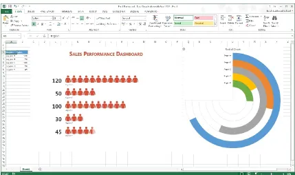
2.3.1 Microsoft Excel
Excel is a widely used application for storing and managing data. Originally intended for accounting purposes, it offers sophisticated functionality for numeric calculation, as well
as methods to filter and validate data. One of the features offered in Excel is its ability to create charts from values stored in groups of cells. These visualizations can be presented along with their data or on a separate Excel worksheet. An important strength of these visualizations is
Even though Excel is simple to use, it only offers a basic set of visualization
functionality. Thus, building complex visualizations can require significant effort and experience. In Excel, customizing its standard formats and combining different data with
different types of charts is not always intuitive. This is a disadvantage from data visualization perspective, especially for users with little or no visualization experience. Figure 7 shows a visualization generated in Excel, placed alongside its data.
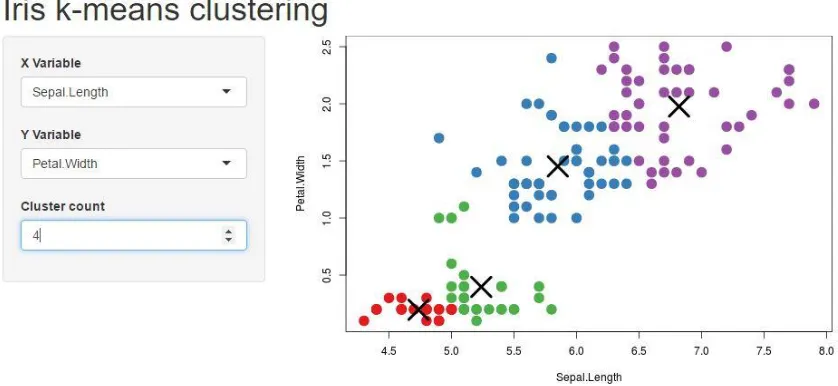
2.3.2 R + Shiny
R is a programming language and software environment for statistical computing,
supported by the R Foundation. The R language is widely used among statisticians and data miners for developing statistical algorithms to perform data analysis [16]. Shiny is a web
application framework for R. It allows users to build interactive web applications directly from within R. Shiny does not require experience with web development, however, knowledge of R is essential to use it effectively. A user typically builds a Shiny application by first designing
a user interface layout, then adding control widgets to manage which data is selected and presented. These are attached to a reactive output and visualization that changes as the widgets are manipulated. Shiny visualizations can be designed quickly with a feature called “reactive expression” that controls when a certain part of application needs to be updated, avoiding
unnecessary computation [17]. Users are exploring innovative ways using Shiny to improve their data visualization applications. Figure 8 demonstrates an application developed using R
+ Shiny, where different data is visualized in a scatterplot based on the choices made by the user in the three drop-down menus to the left of the visualization.
2.3.3 Spotfire
With Spotfire, dashboards containing multiple visualizations designed to be effective
for a user to interpret can be built. Spotfire also allows users to publically share their visuals over the web and provides collaborative tools to accelerate more informed and transparent design decisions. Interestingly, Spotfire also provides predictive analytics to “allow you to be
the leader when changes happen, and to minimize risk when the expected changes are on the downslide” [18]. Although having the software predict future data for user is a useful feature,
Spotfire does not assist in building the visualization that will display this potential future data. The prediction system assumes whatever visualizations exist to be final when making a future prediction. It does not guide the user to a desired or effective final visualization. This is
2.3.4 SAS VA
SAS Visual Analytics (SAS VA), designed and included as part of the commercial SAS statistical software package, includes all the expected features of a commercial visualization
system: interactivity, the ability to publish visualizations on the web, and so on. It is tightly integrated into the SAS statistical engine, allowing users to perform complex statistical and
analytic operations on their data prior to visualizing it. Additionally, SAS VA offers portability by allowing visualizations to be published on multiple devices including desktop computers, tablets and mobile phones. It also claims to “highlight key relationships, outliers, clusters,
trends and more, guiding users to critical insights that inspire action” [19]. This is a good
(a) (b)
Figure 9. Visualizations generated in Tableau
starting point for users’ exploration tasks, but SAS VA does not offer any assistance to identify
the tasks the user is performing, or to provide relevant suggestions on data or visualization
operations. SAS visualizations extend beyond traditional text data. For example, users can perform sentiment analysis on text data using SAS SA (Sentiment Analysis) or SAS Contextual
Analysis (SAS SCA), then visualize the text and its corresponding sentiment estimates. SAS VA also offers a “smart feature” to automatically select the type of chart (bar chart, line chart,
histogram, treemap, boxplot, and so on) that it thinks is most appropriate for data a user selects
and asks to visualize.
2.3.5 Tableau
Initially built from the Polaris research project undertaken at Stanford University in the 1990s, Tableau has developed rapidly to provide industry standard visualizations that support
a wide range of data types. Tableau is currently used in multiple organizations for their data visualization needs. It has 23 visuals (chart types), together with the ability to select a visual that it feels best represents data a user asks to plot. Some of the more complex visuals available
in Tableau include treemaps, packed bubbles, dual combination charts, and area charts. Two of these charts are shown in Figure 9. Tableau is also intelligent enough to suggest additional
Because of the popularity and flexibility of the software, Tableau was initially chosen as the front end for our prediction system. Once the prediction back end was ready, we replaced
Tableau with a new front end built to better support our prediction requirements and remove dependencies on Tableau’s limited APIs. This new front end is described in section 6 of this
thesis, and draws its initial design inspiration from the look and functionality of Tableau.
2.4 Data Analysis
Both prior to and after the data has been visualized, it needs to be properly analyzed in order to identify meaningful traits that may or may not have been revealed by visualization. By definition, “Data analysis is the process of systematically applying statistical and/or logical techniques to describe and illustrate, condense and recap, and evaluate data” [20]. Analysis
can be done without visualization, but because of the availability of visualization software and the potential accuracy and simplicity of the visualizations built using these software, the
process of analyzing raw data may be improved through visualization. A visualization allows users to apply their visual pattern recognition abilities, their ability to use domain knowledge
and context to better understand the results being presented, and to disambiguate potentially confusing findings.
There are a number of issues that researchers should be cognizant of with respect to
data analysis. These include concurrently selecting data collection methods and appropriate analysis, determining statistical significance, manner of presenting data, reliability and validity
choice of how the data is manipulated (statistical algorithms versus visual data presentation), and how it is observed (hypothesis testing versus exploratory data analysis) [21]. These options
are discussed below.
2.4.1 Statistical algorithms vs visual data presentation
Statistical methods use means, medians, standard deviations, ranges and other, more complex statistical analysis (e.g., logistic regression, time series analysis, etc.). Statistical
results are helpful, because of their compactness relative to the full dataset, and their clarity to uncover potentially hidden patterns and trends to support understanding, comparisons, and decision making. However, they may not emphasize certain types of interesting features (e.g.,
spatial patterns of weather conditions in a particular geographic area). If care is not taken, they can also be distorted by spurious values in the data. For example, the mean is sensitive to
outliers, and should normally be replaced by the median if outliers are known to exist.
A potential remedy to some of these issues is the presentation of the data and any derived statistical results as a visualization. This has the ability to highlight interesting features
[21]. Which data operations a user performs can also define follow-on analysis techniques. For example, data analyzed using statistical algorithms alone is often applied to hypothesis testing
2.4.2 Hypothesis testing vs exploratory data analysis
Hypothesis testing is a theory driven approach which is more objective than exploratory
data analysis, which relies on more subjective observation skills. To perform a hypothesis-driven analysis, one must be specific about the analyses to be perform. A null hypothesis must be clearly stated, and the data must be collected in a repeatable manner. If there is any
subjectivity involved in locating or analyzing study results for statistical significance, the findings are technically not valid [22].
The purpose of exploratory data analysis (EDA) is to search for patterns. What constitutes a “pattern” is defined by the user, which makes the process an inherently subjective
enterprise. Exploratory analyses incorporate the wisdom, skill, and intuition of the investigator
into the experiment. Unless additional investigators with similar wisdom, skill and intuition exist, the analyses are not strictly repeatable, and are hence not falsifiable [22]. Exploratory
data analysis is an approach to analyzing data to identify and summarize their main characteristics, often with visual methods [23]. A statistical model may be used, and statistical analysis may be performed prior to visualizing the data, but exploratory data analysis is
primarily focused on seeing what the data can tell us beyond the formal modeling or hypothesis testing tasks. Exploratory data analysis was promoted by John Tukey to encourage statisticians
2.5 Need for Assistance
Clearly, analyzing the data using exploratory data analysis techniques takes practice
and an understanding of many different factors. This makes the job of users inexperienced with EDA and visualization difficult. Data-inexperienced users will face difficulties exploring the data to their full potential. Unfortunately, there are few tools that can be applied to help users
gain insight into their data by guiding them through their exploration. Some tools make general predictions and some suggest possible future trends, but none of these take current user actions
into consideration or in any sense try to identify the task that the user is working to accomplish. Thus, we feel there is a strong need for a recommendation system that looks at the data the user is trying to explore, captures how they are trying to explore it, and then matches this
Chapter 3
Related Work
In this section, we examine our findings of relevant research in the visualization domain, then explain what general recommendation systems are and how they function. We
next discuss algorithms that may be useful in building our recommendation system and Case Based Reasoning, an approach in AI, which is similar to our approach of design.
3.1 Research in Visualization
Significant advances have been made recently in developing various facets of visual
solutions for data exploration and analysis. We have already presented some popular tools in visualization and highlighted their unique features. The system architecture in our project is based on the connection between SQL queries and visualizations, similar to the core of
commercial tools such as Tableau [24] [25]. Our data-slice format, as described in next section, has been inspired by, and is similar to, the formalization of visualizations provided in [25]. At
the same time, the main purpose of that formalization is for the visualization system to maintain the context of the current visualization as it is being actively managed by the user, rather than by the system itself.
have worked in this space on (semi) automatic recommendations of the best visual specification for a given task and data slice. However, the built-in assumption in these projects is that the
appropriate data slice has correctly been chosen. Our work is orthogonal to these efforts, in that we aim to choose the best data slice, and assume that the visual specifications are given.
We expect to be able to combine our work with existing approaches to identify visual specifications in the future, to create a system that can help users to select both the appropriate data and the best presentation.
In this current project, our overall goal is the same as in the above papers. At the same time, instead of aiming for a fully automatic tool for selecting potentially relevant data slices,
we focus on choosing data slices that best address a given visualization-based task. As a result, the data slices selected by our system are task dependent, rather than data-set dependent, and are also not limited to “statistically interesting” data, for example, as in the SeeDB system [29].
Further, we work with the hypothesis that previous users, when faced with the same type of task, could offer insights to guide the system towards high-quality data slices (or sequences
thereof), along with their visualizations. In its emphasis on domain knowledge for the given task and dataset, our approach is in line with research directions such as that of DeepDive [30] [31]. As a result, our approach can suggest to users both data slices and associated visual
3.2 Recommendation Systems
In general, a recommendation system of any kind is a system that seeks to predict the “rating” or “preference” that a user would give to an item. Some common examples of
recommendation systems are shopping websites that provide a list of items you might be interested in purchasing (e.g., Amazon), websites hosting TV shows that recommend shows
you may like (e.g. Netflix), flight reservation system that prompt you from time to time about best rates for travel to a particular city (e.g., Expedia), or job portals that have matching job
profiles that could interest you (e.g. LinkedIn).
In almost every domain, recommendation systems have become an integral part of certain operations. They serve the goals of the service providers as well as that of the
customers. For customers, it saves the time searching for an item, since the recommendations are often accurate and include items the customers want to consider. For service providers, recommender systems engage the customer for longer periods of time and possibly increase
their satisfaction, leading to additional sales or successful searchers. There are many factors that affect these recommendations, including but not limited to:
User history User preferences
Other users with similar interests Promotions from the seller
While these factors are easy to identify, the algorithms to generate recommendations are not
algorithms that could be used to match current user actions with their own or other users’ history.
3.3 Pattern Matching
Pattern matching refers to searching for a pattern of tokens in one sequence that occurs
in an identical or similar order in another sequence. A sequence is generally represented with a data structure like a tree or a graph. A token would then correspond to a node in that tree or
graph. A simple example of pattern matching is searching a string for given substring. Pattern matching techniques have many applications, including the ones found in recommendation systems. A good pattern matching algorithm is essential for this research.
The simplest algorithm to search for a pattern is a brute force exact pattern match, where the entire target data structure is searched for a required pattern from the source structure, without any allowance for alternation of the target pattern. The search stops as soon
as a match is found. Although it has high time complexity, the brute force method is chosen when a simple implementation is required for small sequences or when the need to search for
a pattern is infrequent. A more complex but faster algorithm for string searching is the KMP (Knuth-Morris-Pratt) algorithm, which is also famous for its efficiency. It searches for occurrences of a "word" W within a main "text string" S by employing the observation that
Graph pattern matching is a generalized problem of string matching. Like any other algorithm, the main considerations for graph pattern matching are speed and efficiency. As
discussed later in the thesis, the problem that we are focusing on is not simply finding a pattern, but using pattern matching to find a specific node representing a data slice that the user is
currently observing. Once a match has been found, the subtree that results is parsed in order to generate recommendations. This is discussed in more detail in next section.
3.4 Case Based Reasoning
Case-based reasoning (CBR), broadly construed, is the process of solving new problems based on the solutions of similar past problems. It has been argued that case-based
reasoning is not only a powerful method for computer reasoning, but also a pervasive behavior in everyday human problem solving; or, more radically, that all reasoning is based on past cases personally experienced. The work of Roger Schank is held to be the origin of CBR [34].
Case-based reasoning has been formalized as a four-step process:
1. Retrieve: Given a target problem, retrieve from memory cases relevant to solving it. A
case consists of a problem, its solution, and, typically, annotations about how the solution was derived.
2. Reuse: Map the solution from the previous case to the target problem. This may involve
adapting the solution as needed to fit the new situation.
3. Revise: Having mapped the previous solution to the target situation, test the new
4. Retain: After the solution has been successfully adapted to the target problem, store the resulting experience as a new case in memory. [35]
CBR draws attention in machine learning because:
CBR does not require an explicit domain model and so elicitation becomes a task of
gathering case histories.
Implementation is reduced to identifying significant features that describe a case, an
easier task than creating an explicit model.
CBR systems can learn by acquiring new knowledge as cases. This and the application
of database techniques makes the maintenance of large volumes of information easier. [36]
DataSlicer is designed with a similar approach. It gathers information from an expert and refers to the knowledge base to recommend solutions to a naïve user. It differs from CBR
in the sense that DataSlicer does not use the same knowledge base for all datasets and all tasks. DataSlicer has a different knowledge base for every different dataset. It maintains information about different tasks performed for each dataset. Thus, there is no need to retain a revised
Chapter 4
Prediction Engine
Now that we have described importance of exploratory data analysis and need for assistance in existing data visualization software to successfully complete visual exploration
tasks, we move our focus towards the DataSlicer system. We start with the goal and the envisioned user experience with a visualization-enabled system, where the system can advance the user’s task-solving process by selecting task relevant data slices from the underlying data.
We do this with the help of the same example described in section 2. Next, we describe the framework of the DataSlicer system by explaining some important terminologies used
throughout this thesis. This includes data nodes, interesting nodes, sequences, data slice graphs, and expert users. We then discuss the matching and ranking algorithms, which are essential to providing the most relevant recommendations to the user. Moving forward, we outline the
process of constructing a data-slice graph for a given task on a given dataset and discuss the different ways of using data-slice graphs, depending on whether domain experts have been
4.1 Goal
When presented with a visual-analysis problem or task, the user needs to make
decisions about which data he would like to visualize to solve his task. The default approach is for the user to construct various visualizations directly in a visualization tool, and to then iteratively improve or replace them until one or more visualizations that are effective for the
task are found. This process is both time and resource intensive. Our system is designed to alleviate or eliminate the inefficiencies in solving the data and visualization selection part of
the user’s visual-analysis task. We suggest data slices that help to create visualizations to solve
the current analysis task. The goal is to save the user time by reducing the exploration effort needed to construct the data slices for such visualizations.
Our proposed system is designed to serve as a back end for any visualization tool. To achieve this, we need an interface between our back end and the target system to control the data that we receive from the visualization system. In our current prototype, we make use of
the session log file generated by the visualization system to achieve this. While working on a task a user may need suggestions on the visualizations that are relevant to solving the task. Our
system is designed to analyze the user session and recommend an appropriately visualized data slice based on the history of past users in similar scenarios. Our system assigns priority to the data slices based on various factors that proved interesting to previous users. For example, the
Consider the task of finding outliers in the number of earthquake occurrences using the
earthquake dataset, as presented in Section 2. A user may start his work on this task by
constructing a visualization similar to those of Figures 2a or 2b. If he is overwhelmed by the amount of potentially relevant information in the visualizations, he could ask the system for a recommendation. The system would analyze the user’s currently viewed data slice, as well as
the operations he performed to arrive at that slice. Based on comparisons with past sequences of interest, the system would identify the data slice shown in Figure 3, and then that of Figure
10. These two data slices, in this order, are recommended back to the user. The system will also determine appropriate visualizations for the recommended data slices by using the visualization preferences stored for those data slices. The user would then have the information
he needs to solve the task of finding outliers in the number of earthquake occurrences. We test
the above claim using a controlled experiment discussed in task 1 of section 5.
The DataSlicer framework and system are designed to work with users who create sequences of appropriately visualized data slices. A sequence can be exploratory or part of an
existing solution. In an exploratory sequence, the user tries to determine which individual data slice works best for addressing a specific analysis task. Alternatively, a sequence could be part of a solution that calls for construction of multiple consecutive data slices, as in the
earthquake-outlier task. In both cases we encode all the sequences of data slices for tasks on a particular dataset in a data-slice graph for the dataset.
In the data-slice graph, nodes encode data slices, together with any appropriate visualizations. Directed edges encode transitions between consecutive data slices in past user sessions. When a user asks for recommendations, our system matches their current session
with the information stored in the data-slice graph, based on an algorithm for measuring similarity between two nodes. An example of the algorithm is presented in Section 4.3. If a
match point is found, the system recommends those data slices that were the most helpful at that point in the graph, to previous users working on tasks of the same type. Our approach can use any algorithm for determining whether a node is sufficiently helpful or interesting to a
user. In our experiments, we considered a data slice interesting if its visualization has been examined by at least one user for an amount of time above a fixed threshold. To enable the
The number of data slices that one could construct using a dataset with just a few attributes may be prohibitively large for computational purposes. As an illustration, consider a
situation where a user plots a line chart of date versus number of occurrences and magnitude of earthquakes for the earthquake dataset (this task explained in more detail in section 2). He
may also plot a line chart of date versus magnitude and number of occurrences of earthquakes. These are same fields, taken in different order. In both the cases a visualization system would generate two line charts: one with date versus number of occurrences and another with date
versus magnitude. It may not be practical or even feasible to represent and store all the possibilities explicitly. Instead, since our goal is to present the user with a specific data slice,
we manipulate abstractions from visualizations using the relational model, similar to what was done in [31]. We map each data slice to a simplified relational-algebra expression, and work with simple relational queries. Moreover, the nodes in the graph store only those expressions
that were featured in at least one past sequence used for the same type of task on the current dataset.
The data-slice graph contains all the information that we need to recommend data slices to the user. Once we match the user’s current data slice to a node in the graph, we can limit our
search for interesting nodes to the nodes in the graph that are “downstream” and closest to the matched node. Intuitively, this amounts to finding the next interesting nodes in previous
sequences that feature a data slice similar to that of the current user. In the following sections
4.2 DataSlicer Framework
The DataSlicer framework allows us to capture a user’s visual exploration in a visualization front end and transform it to a format that can be used by the system to suggest recommendations. In this section we will describe some of the terms that we use to describe
our algorithms.
4.2.1 Data node
visual specification, with information describing how the data slice is visually presented,
including the type of visual (e.g., boxplot or bar chart), colors, forms, and so on. This tuple
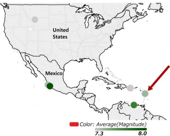
<D, V> forms a data node where each node corresponds to a different visual specification. Consider Figure 11, which visualizes information from the earthquakes dataset. To create this visualization, we first need the latitude and longitude for each observation. This will
tell us how to place an observation on the map. Figure 11 also shows three additional attributes for each observation point: the average magnitude, the number of records and the average depth
of each earthquake. Each of these attributes is shown using a different visual cue: dot color to represent magnitude, dot size to represent the number of records, and dot label to represent the
average earthquake depth. The visualization terminology for each of these attributes is a layer. In general, each layer is assigned a different visual cue.
Thus, the data specification D for Figure 11 states how to extract the information about
the data points to be shown: the latitude, longitude, magnitude, number of records, and depth (Figure 12). The visual specification V for Figure 11 states that the visualization needs to show
the map of Central America, that each data point is to be shown as a dot, and that different visual cues are assigned to each of the layers: color for average magnitude, size for number of records, and label for average depth. Our data-specification format has been inspired by, and is similar to, the formal definition of visualizations provided in [31]. Similar to [31] [37], we assume that the data to be specified comes from a single relational table. If two or more
To define a data specification on a relation R (dataset), the following information is
required:
1. The fields used from the dataset. These are either attributes of R called simple fields (generally corresponding to the columns in the table), or complex fields formed by
combining two or more attributes using the operations of concatenation (+), cross product (×), and nesting (/) [31]. Examples of complex fields are: Age_group×Region, which corresponds to the product of these attributes; or Quarter / Month, which
corresponds to the set of all months for each quarter. We also allow aggregation over simple and/or complex fields, using operators SUM, MIN, MAX, or AVG.
2. How the data from these fields are extracted. A user may not always extract all the information from the selected fields as is, so it is important to specify how the data is being grouped and which filters are currently active. Here we also provide information about which fields are being mapped to the visual axes X and Y, and which fields are
being rendered as layers.
Formally, a data specification is a tuple (X, Y, Layers, Filters, Grouping), where X and Y are the fields rendered respectively as the X and Y axis, Layers is the set of fields rendered
as layers, Filters is the set of filters in use, and Grouping is the set of attributes being grouped
[38]. Continuing with our example, the data specification for Figure 11 is
GROUP BY <grouping specification, X and Y axis> HAVING <filters on aggregated fields>
The connection between data specifications and SQL is important, as it provides
flexibility when communicating with the log file of the visualization system. Different
visualization software may have different way of storing the information in their log file. They may store it directly or in the form of SQL queries. As long as the data specification is logged
in one of these two ways, we can capture it and form the nodes as required. The Polaris prototype [31] of the Tableau Software system [3] discussed in section 2 logs SQL queries for the visualizations generated. For our example, the query is
SELECT Latitude, Longitude, AVG(magnitude), SUM(number of records), AVG(depth)
FROM Earthquakes
WHERE Latitude < 49.5 AND Latitude > 5.3 AND Longitude < -24.5 AND Longitude > -128.7 GROUP BY Place
4.2.2 Interesting nodes
Some data specifications provide more information than others for the task assigned to
the user. We denote these as interesting visualizations, and mark the nodes they form as interesting nodes. For example, for the task described in section 2, Figure 3 is an interesting
visualization, as it providers the filter value that are key to solving the outlier task. In this case, we call this an interesting visualization and the node storing the data specification for Figure 3 is marked as an interesting node.
experiments we marked a visualization as interesting if at least one user visually examined the visualization for at least a fixed number of milliseconds.
4.2.3 Operations on data specifications
Once nodes are formed, we need to understand when the visual specification no longer
corresponds to the current node. When that happens, we need to form a new node with an updated data specification. A navigation algebra is developed to enable transitions from one data specification to the next in a visual exploration sequence.
Generally, each step in the visualization front end corresponds to transforming the current data specification by transitioning to a new data specification. The basic operations for transforming data specifications are as follows:
Add/remove a filter condition;
simple fields: lon (= longitude), lat (= latitude), pl (=place), mag (= magnitude) nr (= number of records), de (= depth) complex fields: —
X Axis: lon
Y Axis: lat
Layers: AVG (mag), SUM (nr), AVG (de)
Grouping: pl
Filters: —
Add/remove a field to/from the grouping specification; and
Modify the specification of a complex field by adding or removing an operation (such as × or +).
In most systems, one can directly replace a field A with a field B. With the intention of
having only basic operations, we choose to model this action with two operations: removing A and then adding B [38].
We use the navigation algebra to represent how users navigate between visualization
in a step-by-step fashion. Consider, for example, a user going from the visualization of Figure 11 to that of Figure 12. We can model this as a sequence of three data specifications, starting
with
(longitude, latitude, {AVG (magnitude), SUM (number of records), AVG (depth) }, place, - ), then removing depth, to obtain
(longitude, latitude, { AVG (magnitude), SUM (number of records) }, place, - ), and then removing the number of records, to arrive at
(longitude, latitude, { AVG (magnitude) }, place, - ), which corresponds to the data specification of Figure 12.
4.2.4 Sequences and data-slice graphs
In section 1 we described a data sequence as a path in a visual state space. When working on a visual exploration or visual analysis task, users create what we call sequences of
filtering the data, adding an extra attribute to the data specification, or changing the type of
visualization. As discussed for various software in section 2, there are many more operations that a user can perform on the dataset. Each subsequent operation produces a new visualization in the sequence, and users continue in this fashion until they complete their task.
Since our goal is to predict the slice of the data whose visualization is appropriate for the user’s task, we do not concentrate on those parts of a sequence where new visualizations
are created by modifying the visual specification. Rather, we focus on changes in the data specifications. These changes are modeled using our navigation algebra as described above.
Assuming that we have a log containing sequences of visualizations generated by previous
users of the system, we can then naturally generate what we call a Data-Slice Graph of the log. The nodes of this graph consist of all the data specifications occurring in the sequences in the
log. A directed edge from a node D1 to a node D2 exists if the log contains a sequence where
(a) (b)
Figure 13. Example of data slice graph
graph contains sequences generated by users who were solving the same task on the dataset. Figure 13b depicts a fragment of the graph, showing nodes with IDs 14, 13, 8, 9, 23 and 24.
Figure 13b was generated by the user sequence (D8, D9, D23, D24, D23, D8, D13, D14). That is, the user started in node 8, with the specification
D8 = ( longitude, latitude, {}, place, - ),
assigning the earthquake longitude to the X axis, the latitude to the Y axis, and grouping by the attribute Place. This specification corresponds to a visualization showing the map with one
dot for each place where there has been at least one earthquake. The grouping in D8 groups all the earthquake events in the same location into a single tuple. The user then added a filter on
the attribute Magnitude, to remove places where the average magnitude was not “high enough.” Note that rather than storing the precise filter, D8 stores just the fact that a filter was
added. This is crucial, as it allows us to map all the data specifications with similar filters into
a single representation.
Continuing with the sequence, the user then added depth (node ID 23 with data specification D23) and minimum depth (node ID 24 with data specification D24), then removed
the minimum depth to arrive back at node 23. After this, the depth was removed (back to node 8), and number of records was added (node 13). Finally, the user removed the grouping clause
(node 14), probably to examine all the earthquakes in the dataset.
Formation of correct sequences and the data-slice graph is a responsibility of the log
4.2.5 Expert users
We distinguish between two types of users: expert and regular users. Regular users ask
for help from the system and expert users indirectly provide this help by using the system for their exploration tasks. Data specifications (nodes) generated by expert users are called expert nodes, while those generated by regular users are called user nodes. Expert nodes are assigned
higher interestingness values, making them more likely to appear in a prediction.
We create an expert edge from node D1 to node D2 if the sequence generating D1 and
D2 was generated by an expert, versus a user edge if it was generated by a regular user. In addition, for each edge of the form (D1, D2) we maintain the number of sequences in the log where D2 followed D1.
4.3 Algorithms
In this section, we look at the algorithms for matching and ranking of data specifications. The main focus of our framework is on servicing user requests to recommend the next task-relevant data slice and its appropriate visualization. To continue with our example
in previous section, suppose that a user is exploring the earthquake dataset for magnitude outliers in Central America, and is currently looking at the visualization in Figure 11. The data specification for Figure 11, as discussed in Section 4.2.1, is
1. The data specification currently being examined by the user is matched to a node in the data-slice graph. The easy special case occurs when the current data specification is
already represented by a node in the data slice graph. In general, however, we need to locate one or more nodes that are closest to the current data specification, in terms of
operations of the navigation algebra. In our example, the data specification of Figure
11 does not exists in the data-slice graph of Figure 13a, so we need to match it to the “best-match” node in the graph. The closest matches would be the nodes with IDs 8 and 23. Each of nodes 8 and 23 are three operations away from the specification of
Figure 11. To reach node 8 from Figure 11, we remove all three layers, and to reach node 23, we remove the magnitude and number of records, then introduce a filter on magnitude. We keep all such “best-match” nodes.
2. Once a match has been found, the system needs to use the data-slice graph to find “downstream” data specifications that are potentially interesting to the user and are the
closest to the matched node, in terms of operations of the navigation algebra. In our
example, this would correspond to nodes 9 and 23.
4.3.1 Matching algorithm
The algorithm addressing the first challenge is called Match (see Figure 14a for the pseudo code). The input to this algorithm is a data specification D, and we compute, for all nodes in the data-slice graph, the edit distance between N (the current node) and each of the specifications in the nodes of the graph Q. We do not want to differentiate between the
common object. Thus, for each node Q in the graph we compute three distances between N and Q:
1. The edit distance ds that considers only the fields assigned to the X and Y axes and the layers in N and Q;
2. The edit distance dg considering only the fields in the grouping clauses of N and Q; 3. The edit distance df considers only the filters applied to N and Q.
We add the three values to obtain the final value for Q, and output all the nodes Q in
the graph for which this value is the lowest.
4.3.2 Ranking algorithm
(a) (b)
the data-slice graph, the next task is to retrieve the interesting “downstream” nodes in the graph that are the closest to the matched node. We do this using our Rank Data Slices algorithm (see
Figure 14b for the pseudo code.) The algorithm works as follows. We assume that each node Q in the data-slice graph is given an “interestingness” value Qk. (Any interestingness measure
will work for our purposes, as outlined in Section 4.2.2.) We are also given a threshold t, with the objective of selecting only those nodes with an interestingness value above t, as well as the desired number m of output nodes.
For each node Q that is in the output of the Match function, we select all the nodes in the data-slice graph whose interestingness value is greater than the threshold t, and rank them in terms of weighted-shortest-path distance to N. We then select and return the M nodes from this set that are closest to N. If there are than m such nodes, we complete the list with the most interesting nodes overall, according to the interestingness values in the graph. This might be necessary if, for instance, the user’s current visualization is not relevant to the task and thus
cannot provide a useful input to the Match algorithm.
In our experiments, as reported in Section 4.2.2, we chose screen time as our measure to determine the interest in each data specification. We assume that the longer a user looks at the screen to examine a particular visualization, the more interesting that visualization is to the
user. We also set our threshold t to three seconds. Though it might look like a small value for the threshold, it filters out almost 70% of the graph nodes. Furthermore, in the experiments we
regular user edges. Specifically, the weight of an edge from a specification D to a specification
D0 that was part of an expert sequence would be set in the experiments to 1, and the weight of
an edge from a regular user sequence would be set to 1+1/nµ, where nµ is the total count of previous users’ sequences that have moved from D to D0 in one step. Please see Section 4.2.5
for a discussion of expert and regular edges.
Returning to our example, recall that the specification of Figure 11 was matched to the
nodes 8 and 23 of the query graph. A call to the Rank Data Slices algorithm will now try to find the most interesting specifications that are closest to these nodes. This can be understood as asking for the most interesting specifications that include the latitude and longitude (and
thus are expected to be shown in a geographical representation). The ranking algorithm would return the two interesting nodes that are closest to either 8 or 23. These answers include 23 itself, with distance 0; and 9, with distance 1. To present these back to the user, we take these specifications and produce a visualization using the user’s previous visual specification (a geographical representation). If we use the visual specification in Figure 11, the visualization
of the specification of node 9 would look just as that of Figure 12, except that color would not
be used to distinguish the average magnitude.
With this discussion, it is evident that for the matching and ranking algorithms to work
efficiently, proper graph construction is crucial. Only when the nodes and edges in the graph correctly reflect user sequences, can the predicted node be most helpful to the user’s