R E S E A R C H
Open Access
ALOHA: developing an interactive
graph-based visualization for dietary supplement
knowledge graph through user-centered
design
Xing He
1†, Rui Zhang
2†, Rubina Rizvi
2, Jake Vasilakes
2, Xi Yang
1, Yi Guo
1,3, Zhe He
4, Mattia Prosperi
5, Jinhai Huo
6,3,
Jordan Alpert
7,3and Jiang Bian
1,3*FromThe Third International Workshop on Semantics-Powered Data Analytics Madrid, Spain. 03 December 2018
Abstract
Background:Dietary supplements (DSs) are widely used. However, consumers know little about the safety and efficacy of DSs. There is a growing interest in accessing health information online; however, health information, especially online information on DSs, is scattered with varying levels of quality. In our previous work, we prototyped a web application, ALOHA, with interactive graph-based visualization to facilitate consumers’browsing of the integrated DIetary Supplement Knowledge base (iDISK) curated from scientific resources, following an iterative user-centered design (UCD) process.
Methods:Following UCD principles, we carried out two design iterations to enrich the functionalities of ALOHA and enhance its usability. For each iteration, we conducted a usability assessment and design session with a focus group of 8–10 participants and evaluated the usability with a modified System Usability Scale (SUS). Through thematic analysis, we summarized the identified usability issues and conducted a heuristic evaluation to map them to the Gerhardt-Powals’cognitive engineering principles. We derived suggested improvements from each of the usability assessment session and enhanced ALOHA accordingly in the next design iteration.
Results:The SUS score in the second design iteration decreased to 52.2 ± 11.0 from 63.75 ± 7.2 in our original work, possibly due to the high number of new functionalities we introduced. By refining existing functionalities to make the user interface simpler, the SUS score increased to 64.4 ± 7.2 in the third design iteration. All participants agreed that such an application is urgently needed to address the gaps in how DS information is currently organized and consumed online. Moreover, most participants thought that the graph-based visualization in ALOHA is a creative and visually appealing format to obtain health information.
(Continued on next page)
© The Author(s). 2019Open AccessThis article is distributed under the terms of the Creative Commons Attribution 4.0 International License (http://creativecommons.org/licenses/by/4.0/), which permits unrestricted use, distribution, and reproduction in any medium, provided you give appropriate credit to the original author(s) and the source, provide a link to the Creative Commons license, and indicate if changes were made. The Creative Commons Public Domain Dedication waiver (http://creativecommons.org/publicdomain/zero/1.0/) applies to the data made available in this article, unless otherwise stated.
* Correspondence:[email protected] †Xing He and Rui Zhang are co first authors.
1Department of Health Outcomes and Biomedical Informatics, College of
Medicine, University of Florida, Gainesville, FL, USA 3
Cancer Informatics and eHealth Core, University of Florida Health Cancer Center, Gainesville, FL, USA
Full list of author information is available at the end of the article
(Continued from previous page)
Conclusions:In this study, we improved a novel interactive visualization platform, ALOHA, for the general public to obtain DS-related information through two UCD design iterations. The lessons learned from the two design iterations could serve as a guide to further enhance ALOHA and the development of other knowledge graph-based applications. Our study also showed that graph-based interactive visualization is a novel and acceptable approach to end-users who are interested in seeking online health information of various domains.
Keywords:Knowledge base, Knowledge graph, User-centered design, Usability, Dietary supplement, Online health information
Background
A large body of evidence shows that some dietary sup-plements (DSs) are beneficial for overall health, and in some cases, can help manage certain health conditions [1, 2]. With the increase in health awareness, the past few decades have witnessed a rapid growth of DS use in the United States. The proportion of US adults using at least one DS has increased from 42% in 1988–1994 to 54% in 2003–2006 [3, 4]; while in 2011–2012, roughly 52% of US adults reported having used a DS in the past 30 days [4]. Consumers are thus increasingly interested in learning about DS products and DS-related health in-formation [5,6]. However, most consumers have limited, even erroneous knowledge about DSs, especially their safety and efficacy. Consumers often believe that DSs are held to the same safety and efficacy standards as over-the-counter medications. On the contrary, DSs are not regulated as drugs and are not required to undergo rigorous designed clinical trials. Further, approval from the US Food and Drug Administration (FDA) before the sale in the US is not necessary for a DS, unless the prod-uct is intended for therapeutic use [7].
Meanwhile, because of the rapid growth of the inter-net, recent years has witnessed an increasing trend of online health information seeking [8]. For many people, the internet is the first place to find health information [9, 10]. The public is also increasingly interested in on-line DS-related health information. Nevertheless, many studies have shown that both health professionals and the general public have difficulty in finding trusted, high-quality, and easy-to-understand online health infor-mation in general [11, 12]. Our study [13] found that online weight loss information returned by search en-gines such as Google often rank less reliable sites higher than those of better/quality sites, and often top-ranked sites include advertisements that make unrealistic weight loss promises. And more specifically, both the quality and accessibility of DS-related online health information are worrisome [14, 15]. A recent study shows that with the emergence of new online media platforms and the popu-larity of social media, consumers face new challenges in consuming online health information [16]. The study re-vealed several problems in web pages that contain both
conventional evidence-based treatments (e.g., healthy bal-anced diet exercise) and unconventional treatments (e.g., DSs): 1) most pages either promised or strongly suggested that there was a high likelihood of complete recovery from diseases; 2) the background and credentials of the authors and the information sources they cited (if any) vary widely; 3) many pages sold commercial products including DSs and books; 4) these pages often use a large number of personal emotional anecdotes and actively referred to the word cure; 5) most pages present some biological explana-tions of the treatments, and some of the explanaexplana-tions in-volve levels of complexity far beyond the level of educated public consumers [16]. Considering that consumers fre-quently turn to online health information resources, it is crucial to assist them in obtaining evidence-based, high-quality online health information rather than information that is controversial, exaggerated, or not evidence-based.
and representing essential information about DS ingredi-ents, primarily their interactions with drugs, and poten-tial severe adverse events. iDISK can be easily integrated with other resources in the Unified Medical Language System (UMLS) as it follows its Rich Release Format (RRF). Nevertheless, there is not yet a solution for general consumers to access high-quality scientific knowledge in the iDISK knowledge base (KB) with a user-friendly interface.
Visualization is necessary to organize and facilitate navi-gation of massive information to inspire“visual thinking” [25]. A well-designed interactive visualization system can facilitate users’understanding and consumption of the in-formation [26]. Our previous work on visualizing social networks has shown the potential to help people explore, perceive, and reason with graph-structured data [27]. Ontologically-structured knowledge bases (or knowledge graphs) such as iDISK can be naturally visualized as graphs/networks (i.e., nodes connected with links). We be-lieve that a graph-based interactive visualizations of the semantic search results from iDISK can help users query the knowledge base efficiently in order to find and under-stand DSs and their related essential information.
In our previous work [28], we prototyped a web-based application with interactive graph-based visualization, named ALOHA (i.e., dietAry suppLement knOwledge grapH visuAlization), to facilitate browsing of the iDISK KB. In this work, we further refined ALOHA following a user-centered design (UCD) approach to improve end-users’ user experience (UX). Built upon our previous study [28], we carried out two new UCD iterations aim-ing to increase the usability and UX of ALOHA. For each of the two design iterations, we first analyzed the feedback and System Usability Scale (SUS) scores col-lected from previous design session, refined existing functionalities and added necessary new features, and further evaluated the usability of ALOHA with a group of intended end-users.
The rest of the paper is organized as follows. We will first introduce iDISK KB, the application architecture of ALOHA and our UCD process in the“Methods”section. The usability testing results for each design iteration and the key features updated in ALOHA will be presented in the“Results”section. We will discuss the lessons learned, summarize current work, and propose future directions in the“Discussion and Conclusions”section.
Methods Data sources
Dietary supplements, often defined as a category of food, are widely consumed in people’s daily life, despite the limited knowledge around their safety and efficacy as well as the lacking of any well-established regulatory policies, unlike their drug counterparts [23]. There is an
urgent need for a well-integrated, evidence-based DS knowledge base that can facilitate dissemination of sci-entific knowledge around DS use. The iDISK was cre-ated as a standardized source of DS and DS relcre-ated safety information (with a focus on drug-supplement in-teractions [DSIs]) to help clinicians, researchers, and consumers make informed decisions about DS use. The data in iDISK are standardized in an ontological struc-ture consisting of three main parts: concepts related to DSs, relationships between these concepts, and the attri-butes of these concepts and relationships. The current version of iDISK focuses on information around individ-ual DS ingredients and their relationships with 4 other concept categories: 1) drugs or herbs with which the DS ingredients will interact (e.g., “Melatonin interacts with Nifedipine”), 2) diseases or conditions on which the DS ingredients will affect (e.g., “Melatonin is effective for in-somnia or sleeplessness”), 3) signs/symptoms through which DS ingredients manifest their adverse reactions (e.g.,“Melatonin has adverse effects of tachycardia or in-crease heart rate”); and 4) DS products that contain the DS ingredients (e.g.,“Sleepaid contains the Melatonin”).
Development of ALOHA following a user-centered design process
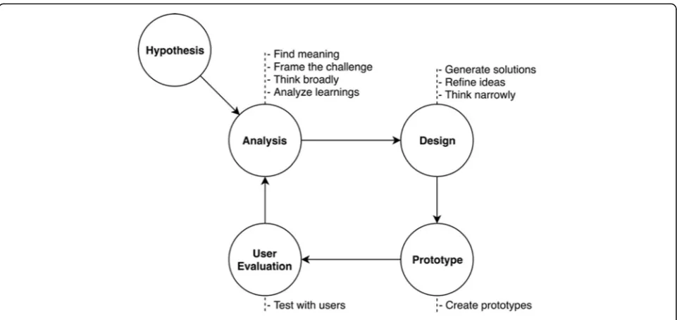
The main goal of ALOHA is to facilitate the target users of iDISK to find and consume DS information, especially safety information associated with DS ingredients. UX is one of the most critical factors to be considered. Thus, we employed a UCD process in developing ALOHA. As shown in Fig. 1, our design and development process of ALOHA can be divided into 5 steps: 1) an initial hypoth-esis making process through summarizing existing re-search; 2) analysis of the needs and requirements of the intended end-users; 3) a prototype design with the re-quired functionalities and related visualizations; 4) a work-ing prototype development; and 5) usability assessments and collection of user feedback. The last four steps: ana-lysis, design, prototype, and user evaluation should be conducted iteratively.
Hypothesis making
A project following UCD principles should begin with a hypothesis that has come from stakeholders and was informed by existing literature. Based on our prior work on visualizing social networks [27], discussions with various domain experts including clinicians, phar-macists, DS researchers, ontologists and experts on semantic web knowledge base/graph, as well as our re-view of existing literature, we hypothesized that a graph-based visualization would be an effective way for end-users to explore, perceive, and reason over the graph-structured knowledge presented in iDISK.
Analysis of the needs and requirements
In our previous work [28], which was the first design it-eration, we gathered a list of potential DS relevant ques-tions that would interest the intended end users from relevant Yahoo Answers! (i.e., a social question and an-swer system) posts (e.g., searching for DS products to remedy specific conditions and questions on potential safety issues of the DS products). Based on these con-sumer questions, we identified an initial collection of intended end users’needs and requirements. In the sec-ond and third design iteration, we analyzed the feedback collected from previous iteration’s usability assess-ment session and updated the needs and require-ments (e.g., adding additional functionalities to help end-users explore product-level information such as “What ingredients does product X contain?”).
Design
In the first design iteration, we reviewed existing literature on visualization approaches in presenting ontologically-structured data and determined that graph−/ network-based visualizations have been widely used and proven useful. We have also identified a number of existing graph-based visualization frameworks such as D3.js [29] and Sigma.js [30] as well as those that are embedded in state-of-the-art graph databases (e.g., Neo4j [31] and GraphDB [32]). We then sketched the initial features desired by the intended end-users and developed the func-tional requirements based on the needs and requirements. In the following two design iterations, based on user feedback from the usability assessment sessions, we rede-signed or refined existing features (e.g., removed unneces-sary information that clogged user attentions such as the
UMLS semantic type of DS ingredients) as well as added a number of new features (e.g., added“Zoom and Filters”to help user focus on the information that is more important to the specific user). One key design principle that we consistently followed throughout our UCD iterations is that the user interface (UI) should be clean and simple yet provide all the necessary functionalities. When conflicts arose between the two (clean vs. comprehensive), we chose a simpler design that makes the UI clean.
Application
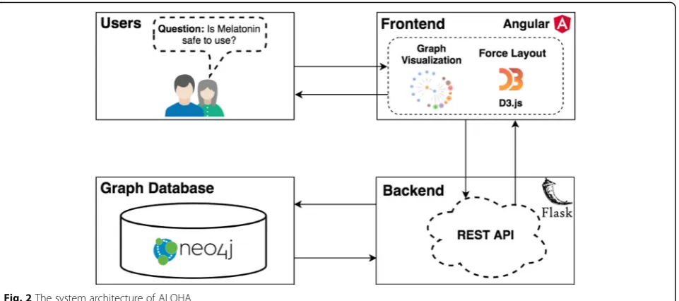
As depicted in Fig.2, ALOHA includes three components:
1) A Neo4j graph database that can store ontologically-structured knowledge and execute semantic queries. We used Neo4j as the graph database for ALOHA. Data in iDISK are in UMLS RRF format that cannot be imported into Neo4j directly. Thus, we first transformed the RRF formatted data into comma-separated values (CSV) format and then imported into a Neo4j database via Cypher [33]—a graph query language designed specifically for Neo4j.
2) A Flask-based Python backend with Representational State Transfer-ful (RESTful) application programming interfaces (APIs). We used the Flask framework [34], a popular web application framework in Python, as the backend framework. We followed the best practices in developing web applications and provided RESTful—an architectural style for designing web services—API endpoints to connect the frontend UI with the backend graph-based data services through the Neo4j Python driver [35].
3) A web frontend built with the popular Angular web application framework with d3.js-powered
interactive visualizations. We used Angular [36] (commonly referred to as“Angular 2+”or“Angular v2 and above”)—a TypeScript-based [37] open-source front-end web application framework for rapid application development combined with d3.js-based interactive graph visualizations. We chose a force-directed graph drawing algorithm to provide an aesthetically-pleasing visualization of the information in iDISK. A force-directed layout uses a physics-based simulator for positioning visual elements. In a force-directed graph layout, there are two types of forces: a repulsive charge force and a pseudo-gravity force. Forces can be set up between nodes, so that 1) all nodes repel one another; 2) nodes are attracted to the center of the gravity; 3) linked nodes are a fixed distance apart; and 4) nodes may not overlap. A force-directed layout keeps nodes centered in the visible area and avoids expulsion of disconnected subgraphs.
As shown in Fig.2, as users interact with the frontend interface (e.g., post their DS questions materialized as in-teractions with the graph-based visualizations), the fron-tend sends HTTP requests to the various REST API end-points on the backend. The backend services will reformulate the questions and user interactions as Neo4j Cypher queries through various pre-defined query tem-plates and then retrieve graph-structured data from the Neo4j graph database with reasoning enabled. The Cy-pher query results are processed on the Flask backend (mostly house-keeping procedures such as reformatting the data into JavaScript Object Notation, JSON, so that
the data can be easily consumed by d3.js). The processed data will be returned to the frontend, where the d3.js-powered interactive visualization module will render the nodes and links according to data received, as our query results are essentially a subgraph of the iDISK know-ledge base relevant to the specific user questions.
User acceptance and usability assessments
In each design iteration, we inspected the usability of ALOHA with a focus group of 8 to 10 participants re-cruited from a convenience sample (i.e., college stu-dents). Our primary research questions were: (1) Will users accept the graph-based visualization of DS infor-mation? What are facilitators and barriers to the accept-ance? (2) Are existing question templates useful? What other ways do the users want to facilitate navigation of the KB (3) What tailored features do users expect? (4) What design specifications are ideal for usability? Each focus group session lasts 1 h with 5 segments: 1) an intro-duction to the study and basic functionalities of ALOHA; 2) the participants explore the ALOHA system freely for 20 min; 3) quantitatively assessements of usability using a modified System Usability Scale (SUS) [38]; 4) the users answer 4 open-ended questions to stimulate user thinking; and 5) at last, open discussions to gather user experience and feedback for improvements.
Analysis of the data collected in usability assessment focus groups
We employed both quantitative and qualitative methods to analyze the data gathered from the focus group in each design iteration.
Fig. 2The system architecture of ALOHA
Quantitative analysis
To evaluate ALOHA’s usability quantitatively, we used the SUS that provides a quick view of the usability of the overall system [38]. The original SUS questions were created to evaluate the usability of systems, such as “I think that I would like to use this system frequently.”To make it more suitable for evaluating web-based applica-tion ALOHA, we simply replaced the word “system” with“website,” e.g.,“I think that I would like to use this website frequently.” The SUS is, however, technology independent and has been used on evaluations of hard-ware, general softhard-ware, websites, and mobile apps. The 10-item SUS questionnaire is based on a 5-point Likert scale and scales to a maximum score of 100 on the users’impression of the usability of a system in general. A SUS score of 0 to 50 means the usability of the system is not acceptable, and a score of 50 to 70 means mar-ginally acceptable. A score higher than 70 means the system’s usability is acceptable.
Qualitative analysis
We posted four open-ended questions before each us-ability assessment session: 1) “What other functions should be added to the website?”; 2) “Do you have any ideas or advice for this visualization?”; 3)“List the most negative aspect(s)”; and 4) “List the most positive as-pect(s).” We then encouraged the participants to“ think-aloud” and verbalize their experience interacting with ALOHA [39]. Participants were also encouraged to dis-cuss other related issues, such as their perceptions and attitudes about using a system like ALOHA. With the participants’ consent, the focus group session was re-corded and then transcribed.
The usability issues were identified and categorized by themes and heuristics. We used a 2-step process to qualitatively analyze the usability assessment sessions: 1) we collected an initial set of usability issues from users’ answers to the open-ended questions; and 2) we then analyzed the transcripts of the sessions to extract more usability issues from the conversations. All usability is-sues were encoded using themes derived from the the-matic analysis [40] and mapped to usability heuristics defined in Gerhardt-Powals’cognitive engineering prin-ciples with a focus on identifying any violations of the usability principles [41]. The usability heuristics contains 10 principles: 1) automating unwanted workload; 2) reducing uncertainty; 3) fusing data; 4) presenting new information with meaningful aids to interpretation; 5) using names that are conceptually related to function; 6) grouping data in consistently meaningful ways; 7) limit-ing data-driven tasks; 8) includlimit-ing in the displays only that information needed by the user at a given time; 9) providing multiple coding of data when appropriate; and 10) practicing judicious redundancy [41]. We followed a
well-established process for the thematic analysis [40] commonly used in human-computer interaction projects consisting of 5 steps: 1) familiarizing with data (i.e., the answers to the open-ended questionnaire and the tran-scripts); 2) assigning initial annotation codes (i.e., a de-scription of what has been said by the participants) to the data; 3) sorting (or grouping) codes into broader themes; 4) reviewing and refining the themes identified before; and 5) naming and describing each of the themes.
Through the thematic analysis, the usability issues re-ported by the participants were encoded by themes in each design iteration. We derived the usability themes based on the characteristics of the identified usability is-sues. Similar usability issues reported by different partic-ipants were grouped as a unique issue type.
More importantly, we extracted suggested usability improvements from the open-ended questions and the transcribed text from voice recording. These suggested improvements were analyzed and ranked by importance, which were used to inform the design choices in the next iteration.
Results
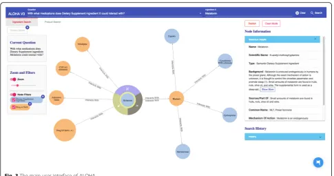
An evolving prototype of ALOHA
Compared to our previous ALOHA prototype in the first design iteration [28], Fig.3 shows an evolved UI of ALOHA. The new UI consists of four parts: 1) a top bar for users to pick and enter DS questions of their inter-ests based on a set of pre-defined question templates, 2) a canvas for graph-based interactive visualization, 3) a left group of information boxes including the current user question and various visualization options such as zooming and filtering, and 4) a right group of informa-tion boxes to show detailed informainforma-tion of the current selected node and search history.
Consumer questions
In the first design iteration, we analyzed a historical Yahoo Answers! dataset covering 2009 to 2014 (~ 3.8 million questions and 13.5 million answers posted by 339,193 users). Using the keyword“dietary supplement”, we found 157 questions related to DS in the“Health”category and primarily from the“Alternative Medicine”sub-category in Yahoo Answers!. Based on these questions, we identified the initial set of user needs. Combined with expert opin-ions and information contained in iDISK, we identified 7 question templates that consumers of DS are interested in. These questions are:
1) What is/are available product(s) containing DS ingredient X?
3) Which LanguaL type does DS product with ingredient X belong to?
4) What is the background/origin of DS ingredient X? (24 out of 157; 15.4% of Yahoo Answers! posts, e.g.,
“Phytochemistry - Thyme Thymol effects on human
body as a dietary supplement?”)
5) What are the common uses of DS ingredient X? (25 out of 157; 15.9% of Yahoo Answers! posts, e.g., “Do amino acid dietary supplement help lose weight?”)
6) What is/are the common adverse reaction(s) associated with DS ingredient X? (11 out of 157; 7.0% of Yahoo Answers! posts, e.g.,“I’ve heard that taking fennel as a dietary supplement helps with digestion, any negative side effects?”)
7) With what medications does DS ingredient X could interact with? (3 out of 157; 1.9% of Yahoo
Answers! posts, e.g.,“Can dietary supplements effect how a flu shot works?”)
In the following two iterations, we extended the question templates and added three DS product related questions based on user feedback from the usability assessment ses-sion of the previous iteration:
1) What ingredients does Dietary Supplement product X contain?
2) What drug does Dietary Supplement product X interact with?
3) What diseases is Dietary Supplement product X effective for?
As the 3 new questions are all about DS products (ra-ther than DS ingredients), we added a new search tab named “Product Search” to the top bar. Further, we also added a question type selection function to distinguish between ingredient or product related questions through switching the two tabs (i.e., “Ingredient Search” and “Product Search”) below the top bar.
In the “Ingredient Search” tab, as the questions are all focused on the relationships between a DS “ingredient X”, the top bar consists of 2 parts. As shown in Fig.3, in the“Question”part (the left part of the top bar), the user first needs to choose a question template of her interest and then types the name of the ingredient in the“ Ingre-dient X” part (the right column of the top bar). There is an autocomplete function, she only needs to enter a par-tial name of the ingredient. This functionality is similar in the “Product Search” tab except that it focuses on product-related questions.
Graph-based interactive visualization
As shown in Fig.3, based on the user question, the system formulates high-level semantic queries using the Neo4j’s Cypher query language to query against the underlying iDISK knowledge base. The Neo4j graph database organizes data as nodes, relationships, and properties in a property graph model (PGM). Naturally, ontologically-structured data in iDISK can also be expressed in a PGM. The Neo4j Cypher is a declarative graph query language. One of the main advantages of the Cypher language is that its syntax is similar to the commonly used Structured Query Language (SQL) for relational databases but optimized to operate on
Fig. 3The main user interface of ALOHA
PGMs. Nevertheless, the Neo4j’s query engine supports semantic queries with reasoning needs (i.e., leveraging the knowledge encoded in the ontology).
The query results (in responding to the specific user question) are then organized as a knowledge graph (i.e., nodes of concepts connected by edges indicating the relationships between nodes)—a relevant subgraph of the entire iDISK knowledge base. We built various con-venient functions to make it easier for the users to explore the knowledge graph.
1) Node expansion.The node expansion function is
the main functionality for users to explore the knowledge graph. As shown in Fig.3, when a user double-clicks on a concept node or clicks on the purple expansion option button around the selected node, the system will expand the node and show all other nodes directly connected (i.e., 1-degree neighbors) to the selected nodes as well as the relationships between them. In the initial design, we restricted the number of nodes to be a maximum of 30 in each Cypher query result, considering that too many nodes displayed in one screen will be too crowded to navigate. However, in the following design iterations, we found that even a limit of 30 nodes for each Cypher query could result in hundreds of nodes after several node expansion operations. Further, some nodes have more than 30
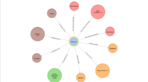
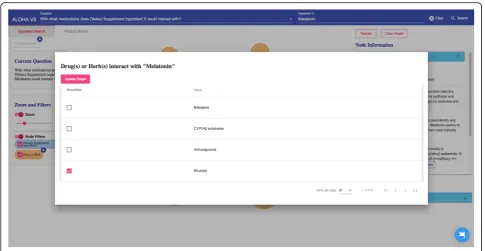
neighboring nodes (e.g.,“Ascorbic acid”and“Calcium” are respectively linked to 10,593 and 8,923 other nodes through corresponding relationships); and limiting the query result to only 30 nodes will result in incorrect answers to user’s question (i.e., showing a random set of 30 nodes that may not be of user interest). Thus, we re-implemented the node expansion functionality. As shown in Fig.4, expanded nodes are grouped into 4 larger nodes (i.e., group nodes) by types (e.g.“DS Product”,“Disease”,“Signs/Symptoms”,“Drug/Herbs”). When a user clicks on a group node, as shown in Fig.5, the user can choose to display or hide individual nodes by checking or unchecking the checkboxes of the nodes of interest in a pop-up table.
Every node, including individual node and group node, is color-coded based on its concept type. For example, as shown in Fig. 4, medications that interact with the specific DS ingredient are colored in orange, while DS ingredient nodes are colored in blue.
2) Tutorial.By employing HelpHero [42], a tool for creating interactive, easy-to-follow web application tours, we created four tutorials to help users get started and learn new features of ALOHA quickly. At the first time when a user enters ALOHA, the
“Brief Introduction”tutorial will appear automatic-ally and briefly introduce the main functionalities of
ALOHA, such as the search bar and node information boxes. As shown in Fig.5, a blue flag icon on the right bottom corner of the screen allows the end users to re-access the tutorials at any time. Figure6shows an example of the tutorials. Currently, there are two video tutorials and two tour tutorials.
3) Node information box on the right sidebar.When a
node is selected, more information about the node such as the background and safety information of a DS ingredient is shown on the right side of the screen. Compared to the previous version of ALOHA, we removed a number of unnecessary information based on user feedback and shortened the length of long text description by utilizing a
“Show More / Hide”functionality, to reduce the cognitive load on end-users.
Usability assessment focus group results
In the first design iteration in our previous work [28], the average SUS score of the initial ALOHA prototype was marginally acceptable (63.75 ± 7.2). The focus group participants have also indicated very different experience when using ALOHA. Overall, 23 distinct us-ability issues were reported by the participants; and our analysis grouped the 23 usability issues into 7 themes (Table 1): 1) lack of functionalities, 2) unnecessary in-formation, 3) incomplete functionality, 4) unclear infor-mation presentation, 5) incomplete inforinfor-mation, 6) lack of information, and 7) unintuitive information. The ma-jority of these usability issues are related to lack of information or functionalities. We also mapped these
Fig. 5An interface for users to navigate the group nodes (i.e., the option to show or hide nodes of interest)
Fig. 6An example of an interactive ALOHA tutorial built with Help Hero
distinct usability issues to the 10 usability heuristics described in Gerhardt-Powals’ cognitive engineering principles. The most frequent usability heuristics are
a) reducing uncertainty and b) including in the dis-plays only the information needed by the user at a given time.
Table 1Usability issues identified in the first design iteration’s usability testing focus group
Theme Usability Issue Heuristic Number of participants
reporting the issue (n= 9)
Incomplete functionality Some weird characters, unreadable Unicode characters
Reduce uncertainty 1/9
There are two across signs work the same way, one of them should be modified
Reduce uncertainty 1/9
Two graphs in the same page separate too far away
Reduce uncertainty 1/9
Can not read the full text content of some questions
Reduce uncertainty 1/9
Can not read the full name on the circles Reduce uncertainty 1/9
Lack of functionality Users can not hide information after they have looked at them
Include in the displays only that information needed by the user at a given time
1/9
Users can not remember the question they asked
Reduce uncertainty 2/9
Don’t know how to start to use the system Reduce uncertainty 2/9
Expect more information when hovering on nodes
Practice judicious redundancy 1/9
No alert message for error or null value Reduce uncertainty 2/9
Questions should be able to start from everywhere (products, ingredient, etc.)
Provide multiple coding of data when appropriate
1/9
Users need go through every circle to figure out the anwser of a question
Group data in consistently meaningful ways
1/9
URL is fixed, users can not return to the previous page
Automate unwanted workload 1/9
Lack of information No sufficient information for some
relationships(like“effects_on”, need more details)
Provide multiple coding of data when appropriate
1/9
Unclear information presentation Links overlap and relationships are hard to be read
Reduce uncertainty 1/9
Nodes’font is difficult to be read Reduce uncertainty 2/9
Small finder icon, it is hard for user to notice it
Present new information with meaningful aids to interpretation
1/9
Unintuitive information Questions are not easy for laypeople to understand
Present new information with meaningful aids to interpretation
1/9
Unnecessary information Preferred names and scientific names are unnecessary nodes
Fuse data 1/9
Redundant information for some questions’results
Include in the displays only that information needed by the user at a given time
2/9
Show too much information without limitation
Include in the displays only that information needed by the user at a given time
3/9
Unnecessary information (Number in the parentheses) in right column
Include in the displays only that information needed by the user at a given time
1/9
Unnecessary information
(UMLS Semantic Type) in right column
Include in the displays only that information needed by the user at a given time
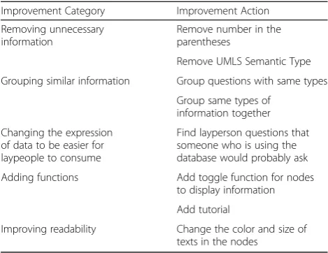
The usability improvements suggested by the partici-pants were consistent with the identified usability issues. These proposed improvements included: 1) removing unnecessary information; 2) grouping similar informa-tion; 3) changing the expression of data to be easier for laypeople to consume; 4) improving readability; and 5) adding functions. Table 2 lists selected suggested im-provements and our corresponding actions for each design iteration.
In the second design iteration, we improved some of the existing features but primarily added many
new features according to reported usability issues. In the usability assessment session of the second design iteration, we recruited 8 participants where 4 of them attended the usability assessment session in the first iteration as well. The total number of usability issues (Table 3) reported by the participants decreased. The total number of usability issues reported was 22, and there were 13 distinct issues after grouping. The us-ability themes revealed were a) readus-ability, b) long re-sponse time, c) information presentation, d) lack of functionalities, and e) incomplete functionality.
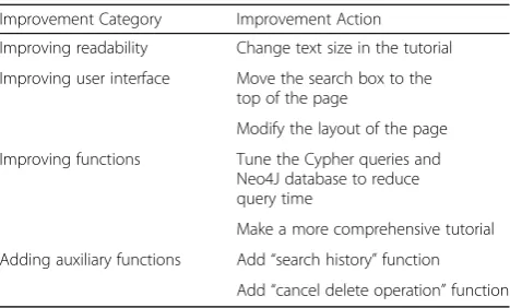
However, the SUS score decreased to 52.2 ± 11.0. After further analysis of the usability testing results, we found that the newly added functionalities en-hanced and enriched the ALOHA application but also increased the complexity of the overall system. Simply adding new functionalities or changing existing fea-tures without due consideration could bring severe usability issues and impair users’ experience of using the application. Further, for the second design iter-ation, the suggested usability improvements (as shown in Table 4) changed to mostly focused on 1) refining the user interface, 2) improving existing functions, 3) adding auxiliary functionalities to make ALOHA more usable, and 4) improving readability.
Learning from the previous design iterations, in the third design iteration, we focused mostly on improv-ing the existimprov-ing functionalities. The SUS score in-creased significantly to 64.4 ± 7.2, which means that
Table 2Selected important improvements suggested in the first design iteration
Improvement Category Improvement Action
Removing unnecessary information
Remove number in the parentheses
Remove UMLS Semantic Type
Grouping similar information Group questions with same types
Group same types of information together
Changing the expression of data to be easier for laypeople to consume
Find layperson questions that someone who is using the database would probably ask
Adding functions Add toggle function for nodes
to display information
Add tutorial
Improving readability Change the color and size of
texts in the nodes
Table 3Usability issues identified in the second design iteration’s usability testing focus group
Theme Usability issue Heuristic Number of participants
reporting the issue (n= 8)
Readability The words in the tutorial are too small Reduce uncertainty 2/8
The word on the line is too close to the line Reduce uncertainty 1/8
Long response time The loading time for queries is too long Reduce uncertainty 5/8
Information presentation The web application layout design is initially not easy to understand
Present new information with meaningful aids to interpretation
1/8
The search box should be on the top Automate unwanted workload 2/8
The text in the node should be maintained by word level
Automate unwanted workload 1/8
Some nodes will be out of the viewport after node dragging
Reduce uncertainty 1/8
It is hard to find the most important information from the result
Include in the displays only that information needed by the user at a given time
1/8
Lack of functionalities There should be a way to cancel delete node operation
Automate unwanted workload 2/8
Search history is needed Automate unwanted workload 2/8
Incomplete functionality The tutorial should be more comprehensive Automate unwanted workload 2/8
Sometimes the disease node can’t expand Reduce uncertainty 1/8
The arrow should be a double direction Reduce uncertainty 1/8
the usability of ALOHA increased compared to previ-ous versions even with more complex and powerful functionalities.
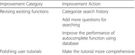
In the third design iteration, we recruited 8 partici-pants where 5 out of the 8 participartici-pants attended the previous design session. The total number of usability issues reported was 22; 10 distinct issues (Table 5) remained after grouping, and most of these issues were minor. The usability themes revealed were a) lack of instruction, b) system complexity, c) incom-plete functionality, d) long response time and e) un-clear information presentation. Compared to the second design iteration, there were no new features requested from users. Table 6 lists the suggested us-ability improvements.
Discussion
The use of DSs (e.g., vitamins, minerals, botanical ex-tracts, and protein powders) is common around the globe, although consumers have limited knowledge of their safety and effectiveness. In this study, we con-ducted two design iterations to further improve our prototype interactive visualization system, ALOHA [28], based on a well-integrated DS knowledge base—iDISK. We followed user-centered design principles during these design iterations, leading to a more user-friendly and useful application.
Two use cases demonstrating the utility of ALOHA
The utility of ALOHA can be demonstrated through two use cases.
Use case 1: searching for drugs that interact with a DS product“Sleepaid”
A user has recently encountered some sleeplessness prob-lems, and she started to take “Sleepaid”—a DS product used for relief of occasional sleeplessness. However, she is also taking other medications at the same time, and she is curious about whether “Sleepaid” has some interactions with the medications she is taking. So, the user decides to give ALOHA a try. First, as shown in Fig.7, she chooses the “Product Search” under the top search box and asks the question“What drugs does Dietary Supplement prod-uct Sleepaid interact with?” She receives the query result in few seconds visualized as a graph.
Table 4Selected important suggested improvements from the second design iteration’s usability assessment session
Improvement Category Improvement Action
Improving readability Change text size in the tutorial
Improving user interface Move the search box to the top of the page
Modify the layout of the page
Improving functions Tune the Cypher queries and
Neo4J database to reduce query time
Make a more comprehensive tutorial
Adding auxiliary functions Add“search history”function
Add“cancel delete operation”function
Table 5Usability issues identified in the third design iteration usability testing focus group
Theme Usability Issue Heuristic Number of participants
reporting issues (n= 8)
Lack of instruction Lack of instructions for the node buttons Reduce uncertainty 2/8
System complexity Need to watch the tutorial first before
using the system
Reduce uncertainty 3/8
Incomplete functionality Search history should not contain duplicates
Group data in consistently meaningful ways
1/8
Search history should be categorized by type
Fuse data 3/8
Sometimes the lines between nodes disappear after filtering
Reduce uncertainty 1/8
The zoom button is not moving with the mouse pointer
Reduce uncertainty 1/8
The number of provided questions is not enough
Provide multiple coding of data when appropriate
1/8
The“Brief introduction”tutorial appears every time
Automate unwanted workload 1/8
Long response time The reaction time for product search
autocomplete is too long
Reduce uncertainty 2/8
Unclear information presentation It is a little hard to understand the search results
Present new information with meaningful aids to interpretation
As shown in Fig.8, Sleepaid contains 5 DS ingredients (i.e., 5-htp, Melatonin, Passion flower, Valerian, and Hops), and each ingredient can potentially interact with different drugs. The user knows about Melatonin as the main ingredient in Sleepaid; and found from ALOHA thatMelatonincan interact with 4 drugs/herbs. She then clicks the “Drug/Herb” group node that is linked to Melatonin and a table pops up showing the 4 drugs that
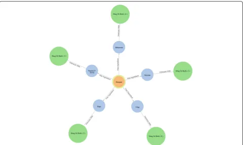
Melatonin can interact with. As shown in Fig. 9 and Fig. 10, she found that Nifedipine, a drug she is taking for her high blood pressure, is in the list, which makes her worry about the potential adverse effects. Thus, she wants to find a replacement of Melatoninas well as the DS product“Sleepaid”.
Use case 2: finding a replacement of“melatonin”
Because of the observed interaction between Melatonin
and Verapamil, the user decides to learn more about
Melatoninand possibly find a replacement ofMelatonin
to address her sleeplessness issue. She first explores the DS ingredient Melatonin in ALOHA. As shown in Fig.11, she chooses the“Ingredient Search” tab and en-ters the question“What is the background/origin of Diet-ary Supplement ingredient Melatonin?”. The system responds with a graph of 4 group nodes linked to Mela-tonin, and the“Node Information” box shows the back-ground and safety information about Melatonin. After reading the information about Melatonin, the user be-comes curious about what diseasesMelatoninis effective for. Therefore, she clicks the brown disease group node; and the system shows her a list of 9 diseases for which
Melatonin is effective. As shown in Fig. 12, the user notices the disease “sleeplessness,” which is one of her
current health problems. Hence, the user chooses“ sleep-lessness” to see what other DS ingredients might be effective for helping with sleeplessness. The user ex-pands the “sleeplessness” node but hides other types of nodes that are not of interest to her through the“Filter” function, as shown in Fig. 13. After checking the effect-iveness rating (part of the “Node Information” as shown in Fig. 13) of each DS ingredient for sleeplessness, the user finds only Lemon Balm, Melatonin and Valerian
are possibly effective. Subsequently, the user decides to explore more aboutLemon Balm andValerianto deter-mine which DS ingredient is safer and more effective considering her current health issues.
Lessons learned from an iterative user-centered design process in developing consumer-facing health applications
The lessons learned from the three design iterations are valuable to guide not only future developments of ALOHA but also other consumer-facing, knowledge graph-based online health information systems. Through the three usability testing focus groups, a number of usability issues were revealed with specific action points to improve both the usability and utility of ALOHA. Nevertheless, simply adding all function-alities requested by end-users without due consider-ation could bring severe usability issues and impair user experience. The SUS score in our second design iteration dropped significantly to 52.2 ± 11.0 from 63.75 ± 7.2 mainly due to these issues. For example, based on user requests, we added a number of tuto-rials hoping that they will help users quickly get a sense of the different functionalities of the system. However, in the usability evaluation focus group of the second design iteration, a number of participants ignored the newly added tutorials. When asked, they expressed that “I am confident that I can learn how to use the system myself.” However, compared to other resources that users used to find relevant health information such as Google search engine and WebMD, a graph-based visualization tool is signifi-cantly different; and thus, it is not easy for users from the general public to get familiar with quickly. There were also many usability issues in the tutorials, which
Table 6Selected important suggested improvements from the third design iteration’s usability assessment session
Improvement Category Improvement Action
Revising existing functions Categorize search history
Add more questions for searching
Improve the performance of autocomplete function using database
Polishing user tutorials Make the tutorial more comprehensive
Fig. 7A user searches for a question:“What drugs does Dietary Supplement product Sleepaid interact with?”
impaired the user experience. As shown in Table 3, two of the eight participants thought that the texts in the tutorials are too verbose and the size of the text font is too small; so they chose to ignore the tutorials all together. Further, two of the eight participants thought that the tutorial was not comprehensive
enough to cover all features of ALOHA. Thus, more work is needed to refine these tutorials.
We also revised a number of existing functionalities, especially improved a number of areas around the interactive visualization. However, the response time for ALOHA increased significantly as we introduced
Fig. 8Query results as an interactive graph-based visualization the for question“What drugs does Dietary Supplement product Sleepaid interact with?”
the new visualization mechanisms. For the ALOHA prototype in the first design iteration, we set a con-straint (i.e., a maximum of 30 nodes) to each Cypher query to reduce the number of nodes rendered in the visualization to make the graph more clear. In the second design iteration, we removed the restriction as we want to get a more accurate answer for each query. Nevertheless, some queries resulted in a large number of nodes (i.e., more than 1000 with a long query execution time) that filled the entire screen making the information unreadable. To solve this problem, we introduced a new visualization
mechanism, where we grouped nodes of the same se-mantic type to reduce the total number of nodes on the screen. This new design not only simplified the user interface but also reduced the query execution time that ultimately improved overall user experience.
Conclusions
In sum, a user-centered design process enabled us to create a user-friendly web-based application, ALOHA, for the general public, especially DS consumers, to ex-plore DS knowledge relevant to their needs, through an iterative development process. Moreover, our study
Fig. 10The“interacts with”relationship between Nifedipine and Melatonin
Fig. 11The query result of question“What is the background/origin of Dietary Supplement ingredient Melatonin?”
showed that graph-based interactive visualization is promising in helping DS consumers explore complex health concepts quickly and can potentially lead to a new way of finding and consuming health information online. This is significant as recognized by many health behavior theories such as the integrated
behavior model, accessing to adequate health informa-tion activates individuals’participation in self-care and leads to healthy life-style [43]. Conversely, inaccess-ibility to adequate health information is associated with serious health risks [44]. In the United States, 72% of adults seek health information online [45].
Fig. 12A list of diseases for which Melatonin is effective
Nevertheless, typical consumers cannot translate the vast amounts of online information into usable know-ledge, nor gauge its quality [46]. Information access bar-riers include overload and disorganization, lack of user-friendliness, and inconsistencies [47]. A novel knowledge exploration mechanism such as ALOHA maybe appealing to the general public and can serve as a template for de-veloping consumer-facing, evidence-based (i.e., supported by scientific literature) knowledge graphs in many other health and disease domains. Nevertheless, future work is warranted in ALOHA to address other online health in-formation issues such as translating and linking the scien-tific terms in iDISK into consumer language. Further, a more formal assessment of ALOHA’s visual interface is needed to demonstrate its effectiveness, for example, through comparing end-users’ knolwege gains between text comprehension and visual comprehension of the same information.
Abbreviations
ADE:Adverse Drug Event; ALOHA: dietAry suppLement knOwledge grapH visuAlization; API: Application Programming Interface; CSV: Comma-separated Values; DDI: Drug-drug Interaction; DS: Dietary Supplement; DSLD: U.S. Dietary Supplement Label Database; FDA: Food and Drug Administration; HTTP: Hypertext Transfer Protocol; iDISK: integrated DIetary Supplement Knowledge base; KB: Knowledge Base; LNHPD: Licensed Natural Health Products Database; NHPID: Canadian Natural Health Product Ingredient Database; NLM: National Library of Medicine; NM: Natural Medicines; PGM: Property Graph Model; RESTful: Representational State Transfer-ful; RRF: Rich Release Format; SQL: Structured Query Language; SUS: System Usability Scale; UCD: User-Centered Design; UMLS: Unified Medical Language System; UX: User Experience
Acknowledgments
None.
Funding
This work was supported in part by grants UL1TR001427, R01AT009457 and the Cancer Informatics and eHealth Core program at the University of Florida Health Cancer Center. The content is solely the responsibility of the authors and does not necessarily represent the official views of the NIH. This article did not receive sponsorship for publication costs.
Availability of data and materials
Please contact Dr. Rui Zhang ([email protected]).
About this supplement
This article has been published as part ofBMC Medical Informatics and Decision Making Volume 19 Supplement 4, 2019: Selected articles from the Third International Workshop on Semantics-Powered Data Analytics (SEPDA 2018).The full contents of the supplement are available online athttps://bmcmedinformdecismak. biomedcentral.com/articles/supplements/volume-19-supplement-4.
Authors’contributions
The work presented here was carried out in collaboration among all authors. RZ and JB designed the study. XH, RZ and RR were involved in acquisition of the data. RZ, JV and RR developed the original integrated DIetary Supplement Knowledge base (iDISK). XH designed and implemented the ALOHA system. XH and XY carried out the usability assessment and design sessions. ZH, YG, and JB analyzed the focus group data. XH wrote the initial draft of the manuscript with substantial support from JB and YG. RZ, RR, JV, ZH, YG, and JB provided expert opinion on the curation of the ALOHA system. All authors provided critical feedback on the study design, reviewed and edited the manuscript. All authors read and approved the final manuscript.
Ethics approval and consent to participate
The usability testing of ALOHA was deemed exempt by the University of Florida IRB-02 (IRB201900047).
Consent for publication
Not applicable.
Competing interests
The authors declare that they have no competing interests.
Publisher’s Note
Springer Nature remains neutral with regard to jurisdictional claims in published maps and institutional affiliations.
Author details
1
Department of Health Outcomes and Biomedical Informatics, College of Medicine, University of Florida, Gainesville, FL, USA.2Institute for Health Informatics and College of Pharmacy, University of Minnesota, Minneapolis, MN, USA.3Cancer Informatics and eHealth Core, University of Florida Health Cancer Center, Gainesville, FL, USA.4School of Information, Florida State University, Tallahassee, FL, USA.5Epidemiology, University of Florida, Gainesville, FL, USA.6Department of Health Services Research, Management and Policy, University of Florida, Gainesville, FL, USA.7Department of Advertising, College of Journalism and Communications, University of Florida, Gainesville, FL, USA.
Published: 8 August 2019
References
1. Committee DGA, HHS O of DP and HP (U. S., USDA C for NPP) U. S., (U.S.) H and HSD. Dietary guidelines for Americans 2015-2020. 2016.https://www. overdrive.com/media/3023326/dietary-guidelines-for-americans-2015-2020. Accessed 4 Mar 2019.
2. DeSalvo KB, Olson R, Casavale KO. Dietary guidelines for Americans. JAMA. 2016;315:457.
3. Gahche J, Bailey R, Burt V, Hughes J, Yetley E, Dwyer J, Picciano MF, McDowell M, Sempos C. Dietary supplement use among U.S. adults has increased since NHANES III (1988-1994). NCHS Data Brief. 2011;(61):1–8. 4. Kantor ED, Rehm CD, Du M, White E, Giovannucci EL. Trends in dietary
supplement use among US adults from 1999–2012. JAMA. 2016;316:1464–74. 5. Manson JE, Brannon PM, Rosen CJ, Taylor CL. Vitamin D deficiency—is
there really a pandemic? N Engl J Med. 2016;375:1817–20.
6. Marik PE, Flemmer M. Do dietary supplements have beneficial health effects in industrialized nations: what is the evidence? JPEN J Parenter Enteral Nutr. 2012;36:159–68.
7. Sadovsky R, Collins N, Tighe AP, Brunton SA, Safeer R. Patient use of dietary supplements: a clinician’s perspective. Curr Med Res Opin. 2008;24:1209–16. 8. Cantor C, Crystal-Mansour D, Dipko S. Health information national trends
survey (HINTS) 2007 final report. Final rep; 2007. p. 103.
9. Hesse BW, Moser RP, Rutten LJF, Kreps GL. The health information national trends survey: research from the baseline. J Health Commun. 2006;11(Suppl 1):vii–xvi.
10. Hesse BW, Nelson DE, Kreps GL, Croyle RT, Arora NK, Rimer BK, et al. Trust and sources of health information: the impact of the internet and its implications for health care providers: findings from the first health information national trends survey. Arch Intern Med. 2005;165:2618–24. 11. Eysenbach G. How do consumers search for and appraise health
information on the world wide web? Qualitative study using focus groups, usability tests, and in-depth interviews. BMJ. 2002;324:573–7.
12. Berland GK, Elliott MN, Morales LS, Algazy JI, Kravitz RL, Broder MS, et al. Health information on the internet: accessibility, quality, and readability in English and Spanish. JAMA. 2001;285:2612–21.
13. Cardel MI, Chavez S, Bian J, Peñaranda E, Miller DR, Huo T, et al. Accuracy of weight loss information in Spanish search engine results on the internet. Obes Silver Spring Md. 2016;24:2422–34.
14. Palmour N, Vanderbyl BL, Zimmerman E, Gauthier S, Racine E. Alzheimer’s disease dietary supplements in websites. HEC Forum. 2013;25:361–82. 15. Baudischova L, Straznicka J, Pokladnikova J, Jahodar L. The quality of
information on the internet relating to top-selling dietary supplements in the Czech Republic. Int J Clin Pharm. 2018;40:183–9.
16. Keselman A, Arnott Smith C, Murcko AC, Kaufman DR. Evaluating the quality of health information in a changing digital ecosystem. J Med Internet Res. 2019;21:e11129.
17. Lossio-Ventura JA, Hogan W, Modave F, Guo Y, He Z, Yang X, et al. OC-2-KB: integrating crowdsourcing into an obesity and cancer knowledge base curation system. BMC Med Inform Decis Mak. 2018;18:55.
18. Therapeutic Research Center. Natural medicines. 2019.https:// naturalmedicines.therapeuticresearch.com/. Accessed 17 Mar 2019. 19. National Institutes of Health. Dietary supplement label database. 2019.
https://www.dsld.nlm.nih.gov/dsld/index.jsp. Accessed 18 Mar 2019. 20. Health Canada. Natural health products ingredients database. 2019.
http://webprod.hc-sc.gc.ca/nhpid-bdipsn/search-rechercheReq.do. Accessed 18 Mar 2019.
21. Government of Canada. Licensed natural health products database. 2019. https://www.canada.ca/en/health-canada/services/drugs-health- products/natural-non-prescription/applications-submissions/product-licensing/licensed-natural-health-products-database.html. Accessed 18 Mar 2019.
22. Memorial Sloan Kettering Cancer Center. About Herbs, botanicals & other products. 2019.https://www.mskcc.org/cancer-care/diagnosis-treatment/ symptom-management/integrative-medicine/herbs. Accessed 17 Mar 2019. 23. Rizvi RF, Adam TJ, Lindemann EA, Vasilakes J, Pakhomov SV, Bishop JR, et al.
Comparing existing resources to represent dietary supplements. AMIA Summits Transl Sci Proc. 2018;2017:207–16.
24. Albert KM. Integrating knowledge-based resources into the electronic health record: history, current status, and role of librarians. Med Ref Serv Q. 2007;26:1–19.
25. Janvrin DJ, Raschke RL, Dilla WN. Making sense of complex data using interactive data visualization. J Account Educ. 2014;32:31–48. 26. Meyer J, Thomas J, Diehl S, Fisher B, Keim DA. From visualization to
visually enabled reasoning. Schloss Dagstuhl - Leibniz-Zent Fuer Inform GmbH WadernSaarbruecken Ger. 2010:227.https://doi.org/10.4230/dfu. sciviz.2010.
27. Bian J, Xie M, Hudson TJ, Eswaran H, Brochhausen M, Hanna J, et al. CollaborationViz: interactive visual exploration of biomedical research collaboration networks. PLoS One. 2014;9:e111928.
28. He X, Zhang R, Rizvi R, Vasilakes J, Yang X, Guo Y, et al. Prototyping an interactive visualization of dietary supplement knowledge graph. In: 2018 IEEE International Conference on Bioinformatics and Biomedicine (BIBM); 2018. p. 1649–52.
29. Mike Bostock. D3.js - Data-driven documents. 2019.https://d3js.org/. Accessed 15 Mar 2019.
30. Alexis Jacomy. Sigma js. 2019.http://sigmajs.org/. Accessed 15 Mar 2019. 31. Neo4j, Inc. Neo4j graph platform–The leader in graph databases. 2019.
https://neo4j.com/. Accessed 15 Mar 2019.
32. Ontotext. Ontotext graphDB. 2019.http://graphdb.ontotext.com/. Accessed 15 Mar 2019.
33. Neo4j, Inc. Neo4j’s Graph query language: an introduction to cypher. 2019. https://neo4j.com/developer/cypher-query-language/. Accessed 15 Mar 2019. 34. Armin Ronacher. Flask (A Python Microframework). 2019.http://flask.pocoo.
org/. Accessed 15 Mar 2019.
35. Neo4j, Inc. Python Graph Database | Neo4j. 2019.https://neo4j.com/ developer/python/. Accessed 15 Mar 2019.
36. Google. Angular. 2019.https://angular.io/. Accessed 15 Mar 2019. 37. Microsoft. TypeScript - JavaScript that scales. 2019.https://www.
typescriptlang.org/. Accessed 15 Mar 2019.
38. Brooke J. SUS: a retrospective. J Usability Stud. 2013;8:29–40.
39. Jääskeläinen R. Think-aloud protocol. In: Gambier Y, van Doorslaer L, editors. Handbook of translation studies. Amsterdam: John Benjamins Publishing Company; 2010. p. 371–3.https://doi.org/10.1075/hts.1.thi1.
40. Braun V, Clarke V. Using thematic analysis in psychology. Qual Res Psychol. 2006;3:77–101.
41. Gerhardt-Powals J. Cognitive engineering principles for enhancing human-computer performance. Int J Hum-Comput Interact. 1996;8:189–211.
42. HelpHero. HelpHero - Add interactive product tours to your web app in minutes. 2019.https://helphero.co/. Accessed 17 Mar 2019.
43. Glanz K, Rimer BK, Viswanath K. Health behavior: theory, research, and practice. Fifth edition. San Francisco: Jossey-Bass; 2015.
44. Benigeri M, Pluye P. Shortcomings of health information on the internet. Health Promot Int. 2003;18:381–6.
45. PEW RESEARCH CENTER. The social life of health information. 2014.http:// www.pewresearch.org/fact-tank/2014/01/15/the-social-life-of-health-information/. Accessed 17 Mar 2019.
46. Kontos E, Blake KD, Chou W-YS, Prestin A. Predictors of eHealth usage: insights on the digital divide from the health information national trends survey 2012. J Med Internet Res. 2014;16:e172.