Visualizing the Provenance of Personal Data using
Comics
AndreasSchreiber1,∗IDandReginaStruminski1,2
1 Intelligent and Distributed Systems Department, Simulation and Software Technology, German Aerospace
Center (DLR), Cologne, Germany; [email protected]
2 Faculty of Media, University of Applied Sciences Düsseldorf, Düsseldorf, Germany;
* Correspondence: [email protected]; Tel.: +49-2203-601-2485
Abstract:Personal health data is acquired, processed, stored, and accessed using a variety of different
1
devices, applications, and services. These are often complex and highly connected. Therefore, use or
2
misuse of the data is hard to detect for people, if they are not capable to understand the trace (i.e., the
3
provenance) of that data. We present a visualization technique for personal health data provenance
4
using comics strips. Each strip of the comic represents a certain activity, such as entering data using
5
a smartphone application, storing or retrieving data on a cloud service, or generating a diagram
6
from the data. The comic strips are generated automatically using recorded provenance graphs. The
7
easy-to-understand comics enable all people to notice crucial points regarding their data such as, for
8
example, privacy violations.
9
Keywords:provenance; quantified self; personal informatics; visualization; comics
10
1. Introduction 11
Understanding how a piece of data was produced, where it was stored, and by whom it was
12
accessed, is crucial information in many processes. Insights into the data flow are important for gaining
13
trust in the data; for example, trust in its quality, its integrity, or trust that it has not been accessed by
14
organizations unwantedly. Especially, detecting and investigating privacy violations of personal data
15
is a relevant issue for many people and companies. For example, personal health data should not be
16
manipulated, if doctors base a medical diagnosis on that data. Health-related data and personal data
17
from self-tracking (Quantified Self; QS) [1,2] should not be available to other people or companies, as
18
this might lead to commercial exploitation or even disadvantages for people, such as higher health
19
insurance contributions.
20
In this field, data is often generated by medical sensors or wearable devices, then processed and
21
transmitted by smartphone and desktop applications, and finally stored and analyzed using services
22
(e.g., web or cloud services operated by commercial vendors). Following the trace of data through
23
the various distributed devices, applications, and services is not easy. Especially, people who are not
24
familiar with software or computer science are often not able to understand where their data is stored
25
and accessed.
26
To understand the trace of data, theprovenance[3] of that data can be recorded and analyzed.
27
Provenance information is represented by a directed acyclic property graph, which is recorded during
28
generation, manipulation, and transmission of data. The provenance can be analyzed using a variety
29
of graph analytics and visualization methods [4]. Presenting provenance to non-experts is an ongoing
30
research topic (“Provenance for people”). As a new visualization technique for provenance, we present
31
provenance comicsthat we introduced and applied to trace personal data [5].
32
The remaining article is organized as follows:
33
• We shortly give an overview about provenance and our provenance model for Quantified Self
34
data and self-tracking workflows [6,7] (Section2).
35
• We explain the general idea of provenance comics for provenance compliant with the PROV
36
standard [8] (Section3).
37
• We describe a visual mapping between the provenance of Quantified Self data and their graphical
38
representations in comic strips (Section4).
39
• We briefly describe our prototype forautomatically generating provenance comics(Section5).
40
• We give details and results of a qualitative user study (Section6).
41
2. Provenance of Quantified Self Data 42
2.1. Provenance of Electronic Data 43
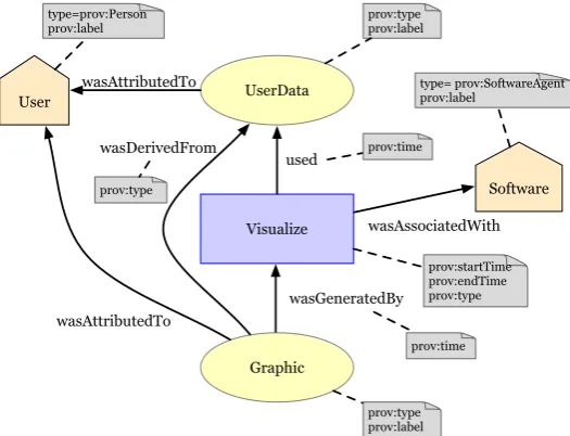
The definition ofprovenanceis:“Provenance is a record that describes the people, institutions, entities,
44
and activities involved in producing, influencing, or delivering a piece of data or a thing. In particular, the 45
provenance of information is crucial in deciding whether information is to be trusted, how it should be integrated 46
with other diverse information sources, and how to give credit to its originators when reusing it. In an open and 47
inclusive environment such as the Web, where users find information that is often contradictory or questionable, 48
provenance can help those users to make trust judgments [8]”.
49
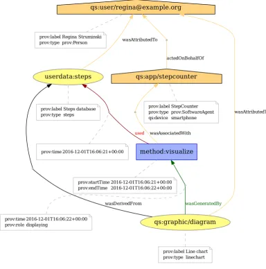
With the previous definition, World Wide Web Consortium (W3C) started in 2011 and finalized in
50
2013 the generic provenance model PROV, which has specifications for a data model PROV-DM [8]
51
and an ontology PROV-O [9], among others. PROV was inspired by various different approaches [10],
52
that is adaptable to any domain. The general provenance model can be seen as a property graph with
53
three different types of nodes:Entities,Activities, andAgents. Entities represent physical (e.g., sensors
54
or medical devices), digital (e.g., data sets), conceptual (e.g., a workflow description), or any other
55
kinds of objects. An activity is a process that uses or generates entities and that can be associated with
56
an agent, meaning that the agent is responsible for the activity.
57
Provenance is being recorded during runtime of a process. To make Quantified Self workflows
58
provenance-aware requires to gather information that is required by the provenance model (see [7] for
59
some possible approaches). This information is stored in a provenance database or provenance store.
60
For example, PROVSTORE[11] is publicly available provenance store. Large provenance graphs of
61
long running real world workflows are stored in scalable databases more efficiently (e.g., using graph
62
databases such as NEO4J[12]).
63
2.2. Provenance Visualization 64
For analyzing data provenance, visualization is a feasible method. Several solutions to visualize
65
provenance exist, for example, publicly available web-based tools such as PROV-O-VIZ[13], desktop
66
tools such as VISTRAILS[14], or numerous other graph visualization tools.
67
Provenance is usually represented as a directed acyclic graph (DAG). In many visualizations the
68
graph is sorted topologically from left to right or top to bottom. Much like in a family tree, the “oldest”
69
data can then be seen at the left or top and the “youngest,” most recent data at the right or bottom.
70
While these graphs may, to some extent, seem quite self-explaining to scientists, they can be rather
71
hard to understand for laymen who are not usually concerned with graphs at all and have not been
72
trained to read them.
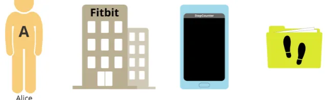
73
Furthermore, provenance graphs can sometimes grow to enormous sizes, becoming so huge that
74
even experts will have a hard time reading them. Since the span of immediate memory is limited
75
to 7±2 entities at a time [15], graphs containing more than five to nine items will become gradually
76
harder to interpret with every new item being added. However, 7±2 is a value that is easily reached
77
and exceeded by even simple examples of provenance graphs. The larger the graphs become, the more
78
difficult it is to draw conclusions and derive new findings from the provenance data.
79
The possibility to view the provenance of their own data is of no value to end users, if the
80
visualization of that provenance is unintelligible to them. It cannot be expected that they learn how to
read an abstract, possibly complex graph. Instead, the visualization should be simple, self-explaining,
82
and familiar in such a way that end users can read and understand it almost effortlessly.
83
2.3. Quantified Self Provenance Model 84
Based on a requirements study of Quantified Self workflows and analysis of documentation from
85
breakout sessions at Quantified Self Conferences (such as the QSEU14 Breakout session on Mapping
86
Data Access [16]), we developed a provenance model for Quantified Self workflows [6].
87
The possible activities in Quantified Self workflows are categorized into six abstract functionalities:
88
Input,Sensing,Export,Request,Aggregation, andVisualization. We defined a provenance sub model for
89
each of these abstract functionalities1.
UserData
Visualize User
Graphic used
wasGeneratedBy wasDerivedFrom
type=prov:Person prov:label
wasAttributedTo
prov:type prov:label
prov:type prov:label
prov:time prov:time
prov:type
wasAttributedTo
Software
type= prov:SoftwareAgent prov:label
wasAssociatedWith
prov:startTime prov:endTime prov:type
Figure 1.Provenance model for the Quantified Self activityVisualize.
90
As an example, Figure1show the provenance model for theVisualizeactivity where data (PROV
91
entity “UserData”) that belongs to a human (PROV agent “User”) is visualized by method (PROV
92
activity “Visualize”) from a certain software (PROV agent “Software”) which results in a graphic
93
(PROV entity “Graphic”). The respective PROV elements can contain attributes, which specify meta
94
information such as time of creation, names, or data types.
95
While the basic Quantified Self activities and the provenance of these activities are easy to
96
understand conceptually, the representation of that provenance can be difficult to understand as
97
explained in Section2.2. For example, the two most common representations of provenance are
98
a graphical representation as a graph (Figure2) and a textual representation in PROV-N notation
99
(Figure3).
100
3. Provenance Comics 101
The basic idea ofprovenance comicsis to present the provenance information of data processes in a
102
visual representation, which people can understand without prior instruction or training. A general
103
advantage of comics over conventional visualizations, like node-link diagrams, is their familiarity:
104
Almost anyone has probably seen some comics in their life. No training is required to read them, and
105
they can transport meaning with minimal textual annotation. They are easy to interpret and not as
106
strenuous to read as, for example, a graph or a long paragraph of continuous text.
107
qs:app/stepcounter
actedOnBehalfOf
prov:label StepCounter prov:type prov:SoftwareAgent qs:device smartphone
qs:user/[email protected]
prov:label Regina Struminski prov:type prov:Person
userdata:steps
wasAttributedTo
prov:label Steps database prov:type steps
qs:graphic/diagram
wasAttributedTo
wasDerivedFrom wasGeneratedBy
prov:label Line chart prov:type linechart
method:visualize
wasAssociatedWith
used
prov:startTime 2016-12-01T16:06:21+00:00 prov:endTime 2016-12-01T16:06:22+00:00 prov:time 2016-12-01T16:06:21+00:00
prov:time 2016-12-01T16:06:22+00:00 prov:role displaying
Figure 2.Graphical representation of the provenance for the QS activityVisualizeas a directed acyclic graph (https://provenance.ecs.soton.ac.uk/store/documents/115521/).
Data provenance has a temporal aspect: origin, manipulation, transformation, and other activities
108
happen sequentially over time. The directed, acyclic provenance graph guarantees that, while moving
109
through its nodes, one always moves linearly forward or backward in time. It is therefore possible to
110
derive a temporal sequence of happenings from the graph that can be narrated like a story.
111
We generate a comic strip for each basic activity in the provenance data (e.g., for the activity
112
“Visualize” in Figures1or 2). Each strip consists of a varying number of panels, which are small
113
drawings that provide further details about the activity. The comic strip for the earliest activity in
114
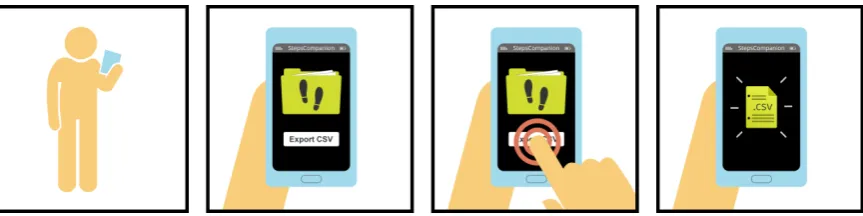
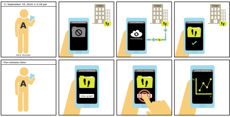
the provenance document is at the top, while the strip for the newest, most recent activity is at the
115
bottom. The complete set of comic strips shows the “story” of the data. Of course, when there are
116
many activities, the collection of comic strips could become quite large. In this case, one could choose
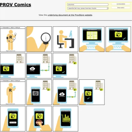
117
a subset of the provenance, containing only those activities that are relevant in real use cases.
118
Some questions that the provenance comics should answer and explain areWhen was data generated
119
or changed?,Where was the user?, orWhere was the user’s data stored? At this time, the comics do not
120
contain the actual data. They only represent information contained in the provenance of the user’s
Figure 3.Textual representation of the provenance for the Quantified Self activityVisualizein PROV-N (https://provenance.ecs.soton.ac.uk/store/documents/115521/).
Figure 4.Generated provenance comic strip depicting the export of step data into a file in CSV format.
data. This might be extended in the future by using (parts of the) data for representing the real
122
measurements, geographical coordinates, etc.
123
4. Visual Mapping 124
To generate the provenance comics, we defined a consistent visual language [17]. This visual
125
language allows to translate the provenance data into corresponding drawings. Generally speaking,
126
we mapped elements of the PROV standard (Entity,Activity,Agent) onto three distinctive graphical
127
features:shapes,colors, andicons or texts.
128
4.1. Shapes 129
We designed and selected shapes according to several criteria. Most importantly, we created
130
shapes that do not show much detail. Instead, they have a “flat” look without any textures, decorations,
131
shadows, or three-dimensional elements. Flat design became popular in mobile UI and icon design [18]
132
and despite of the fact that study results shows a higher cognitive load for searching flat icons [19],
133
we stick to flat design in the first appraoch since we have use cases in mind, where the comics are
134
incoporated into mobile applications.
135
Table1gives an overview of the shapes we selected to reflect the different types of elements in
136
the Quantified Self PROV model [6]. Activities are not directly listed here. Unlike agents or entities,
137
activities are actions that take place over time, as described in Section3. Thus they are not depicted
138
as a single graphic; instead, they represent a temporal progress and only become visible through the
139
sequence of events in the next three to five panels of the comic.
Table 1.Shapes defined for different types of PROV elements.
Element type Shape Example
Agent
type:Person human silhouette
Agent
type:SoftwareAgent
smartphone, computer, . . .
(depending on the agent’s ”device” attribute)
Agent
type:Organization office building
Entity
file folder, document, chart, . . .
(depending on the entity’s “type” attribute)
Activity-related objects
button, icon, . . .
(depending on the activity’s name or “role” attribute)
4.2. Icons, Letters, and Labels 141
As a second distinctive feature, all main actors in the comics carry some kind of symbol on them,
142
whether it be an icon, a single letter, or a whole word (Figure5).
143
• Personagents always wear the first letter of their name on the chest.
144
• Organizationagents display their name at the top of the office building.
145
• SoftwareAgents show an application name on the screen.
146
• Entities are marked by an icon representing the type of data they contain. A few icons have been
147
defined for some types of data that are common in the Quantified Self domain (Table2).
148
Figure 5.Agents and entities using three distinctive features (shape, color, icons/text).
4.3. Colors 149
We defined colors for entities as well as the different types of agents. For example,Personagents
150
use a light orange color, whileSoftwareAgentshave a light blue andOrganizationagents a tan color.
151
Entities are always colored in a bright yellowy green. We took care that colors are well-distinguishable
152
even for people suffering from color vision deficiencies (pronatopia, deuteranopia, tritanopia, and
153
achromatopsy). In the few cases where they are not, discriminability is still granted through the other
154
two distinctive features, namely shape and icons or labels.
Table 2.Icons for some typical Quantified Self data types.
Data type Icon Description
Blood pressure a heart outline with a pressure indicator
Heart rate a heart containing an ECG wave
Sleep a crescent moon with stars
Steps a pair of footprints
Weight a weight with the abbreviation “kg” cut out
4.3.1. Colors for objects of the same type
156
Alternative color shades have been defined for both agents and entities in case that two or three
157
objects of the same type ever need to appear at once.
158
The first alternative was determined by reducing the main color’s lightness (in the HSL color
159
space) by 60%, the second alternative by reducing the lightness by 30%–45%. Figures6,7, and8
160
examplarily simulate the effect of different types of color blindness on agent and entity colors2.
161
(a)
Normal
(b)
Protanopia
(c)
Deuteranopia
(d)
Tritanopia
(e)
Achromatopsia
Figure 6.Personagent color shades and how they are seen by colorblind people
(a)
Normal
(b)
Protanopia
(c)
Deuteranopia
(d)
Tritanopia
(e)
Achromatopsia
Figure 7.SoftwareAgentcolor shades and how they are seen by colorblind people
(a)
Normal
(b)
Protanopia
(c)
Deuteranopia
(d)
Tritanopia
(e)
Achromatopsia
Figure 8.Entity color shades and how they are seen by colorblind people
In a previous approach, colors had been rotated by 180◦, 90◦, and 270◦to obtain well-matched
162
second, third and even fourth colors. However, two problems arose: First of all, the whole comic
163
would generally have become very colorful, which would possibly have led to confusion. Depending
164
on the situation, there might, for example, have been a blue person that owns a blue phone and a pink
165
entity, while at the same time a pink person is present owning a blue entity. Some similar items would
166
have had very dissimilar colors, while some dissimilar items would have had very similar colors.
167
Apart from causing a certain visual inconsistency, this might also have suggested to the reader that
168
there were some deeper meaning to the colors, other than discriminability. For example, the reader
169
might have thought that similar colors indicate a grouping of some kind (e.g. that a pink entity belongs
170
to a pink person).
171
4.3.2. Colors for objects of different types
172
The distinctiveness between the colors of different object types is not as important as that between
173
colors of the same types of objects. That is to say: Color is more important for distinguishing two
174
items that have the same shape than it is for two items with different shapes. Thus the selection and
175
discriminability of colors need not be handled as strictly for different types of actors.
176
Figure9shows that especially the default colors of Person agents and entities are not well
177
distinguishable by readers suffering from color vision deficiencies. However, since shape and icon or
178
text will be different, the weak color difference is neglectable. Figure10shows that items are still well
179
distinguishable due to their shapes and icons.
180
(a)
Normal
(b)
Protanopia
(c)
Deuteranopia
(d)
Tritanopia
(e)
Achromatopsia
Figure 9.Default colors forPersons,SoftwareAgents, entities, and a “button press” effect and how they are seen by colorblind people
(a)Normal (b)Protanopia (c)Deuteranopia
(d)Tritanopia (e)
Achromatopsia
Figure 10.Default colors and shapes for different objects and how they are seen by colorblind people.
4.3.3. Text and icon colors
181
In a number of cases, agents and entities will be labeled with texts, letters or icons. To keep those
182
recognizable on different background colors, a simple rule of thumb has been established using the
183
colors’ equivalents in the Lab color space:
184
• If a color’sL(lightness) value is between0 and 49, the text or icon color iswhite.
185
• If a color’sLvalue is between50 and 100, the text or icon color isblack.
By choosing the font color this way, a contrast ratio of at least 3:1 (often a lot higher) is achieved,
187
which is “the minimum level recommended by ISO-9241-3 and ANSI-HFES-100-1988 for standard
188
text and vision” [20]. The WCAG’s SC 1.4.3 (MINIMUMCONTRAST) requires a ratio of 4.5:1 for
189
standard text, and 3:1 for “large-scale text and images of large-scale text”, with “large-scale text”
190
having a size of at least 18 point, or 14 point and bold style. The even stricter SC 1.4.6 (ENHANCED
191
CONTRAST) requires a ratio of 4.5:1 for large-scale text and 7:1 for standard text [20]. 192
The majority of icons and letters used in the PROV COMICS qualify as large-scale text. By
193
choosing the font or icon color according to the simple “black or white” rule proposed here, it is
194
guaranteed that a contrast ratio of at least 3:1 is always achieved. In fact, when combined with the
195
previously defined agent and entity colors, this rule yields a contrast ratio of at least 4.5:1 for all
196
graphics containing text or icons. Thus, they even fulfill the stricter SC 1.4.6 (ENHANCEDCONTRAST)
197
for large-scale text. Figure11shows some example graphics with high-contrast icons or letters3.
198
(a)
Contrast 15.6:1
(b)
Contrast 8.7:1
(c)
Contrast 5.1:1
(d)
Contrast 14:1
(e)
Contrast 8.1:1
(f)Contrast 4.9:1
Figure 11. Examples of entities and agents with icons passing the WCAG SC 1.4.6 (ENHANCED
CONTRAST).
4.4. Panels and layout 199
All panels are perfect squares. Horizontally, they are separated from each other by a whitespace
200
of 10% of the panel size, while the vertical distance between rows of panel is 20% of the panel size.
201
For example, 600x600 pixel panels have 60 pixels of white space between them horizontally, and 120
202
pixels of white space vertically. By arranging them this way, panels are grouped into rows, helping
203
the reader determine the correct reading direction. This is explained by the gestalt law of proximity:
204
Objects that are close to each other are perceived as a group [21].
205
However, no requirements are made as to how many panels each row should contain. Due to the
206
fact that the comics are to be viewed on different devices the layout needs to be scalable. While a row
207
may consist of four or five panels on a desktop or tablet computer, there might only be enough space
208
for one panel per row on a smartphone.
209
The panels have black borders, the width of which should amount to 1% of the panel size. For
210
example, a 600x600 pixel panel should use a 6 pixel border. In case a caption or introductory text is
211
added to the top of a panel, it is separated from the rest of the panel by a bottom border with the same
212
properties. Borders group the different graphics inside a panel together, so they are perceived as one
213
large image. This is an application of the law of closure, which states that objects in a framed area are
214
perceived as one unit [21].
215
4.5. Captions and text 216
We aimed to include as little text as possible in the comics. Most of the information should be
217
conveyed by the graphics to provide an effortless “reading” experience. However, in certain cases, a
218
few words are useful to support the interpretation of symbols. For example, when up- or downloading
219
data, the words “Uploading. . . ” or “Downloading. . . ” are added below the cloud icon. These short
220
annotations take only little cognitive capacity to read, but may greatly help understand certain icons.
221
Buttons also use textual labels, as it is very difficult to convey the actions they represent in the
222
form of graphics. The labels are only very short though, mostly consisting of only one or two words
223
(e.g., “View graph” or “Export CSV”).
224
Captions are used to expose the date and time when activities took place. Every comic strip
225
begins with such a caption in the very first panel to give the reader temporal orientation. If a relevant
226
amount of time has passed between two activities, a caption may be used again to communicate this to
227
the reader.
228
The comic depicted in Figure14contains examples of these textual annotations, button labels,
229
and captions.
230
4.6. Level of Detail 231
The comics are characterized by extreme simplicity and reduction to the essentials. The reader
232
should never have to look for the important parts of the image. Thus, only relevant items are pictured;
233
no purely decorative graphics are used. This includes the background, which is plain white at all
234
times. No surroundings or other possible distractions are ever shown. By eliminating details, reducing
235
images to their essential meaning, and focusing on specific elements, the emphasis is put on the actual
236
information.
237
4.7. Recurring image structures 238
Activities will not be represented by a single graphic, but by a sequence of three to five comic
239
panels. Similar activities should be illustrated by similar sets of panels, making use of recurring image
240
compositions. For example, the activities of the data sub-modelsExport,Aggregate, andVisualizeare
241
comparable in that they take one kind of data and create a different kind of data from it. They can thus
242
be visualized in a very similar manner (see Figures4,12, and14).
243
Using recurring image structures whenever possible adds to the comics’ consistency,
244
comprehensibility and learnability: Once readers have understood theExportpanels, for example, they
245
will easily be able to understandAggregateandVisualizepanels, too.
246
4.8. Commonly Known Symbols 247
Some of the graphics used in the comics rely on the reader’s experience. For example, “sheet of
248
paper” and “document folder” icons have been used for decades to symbolize data and collections
249
of data, and in recent years, the “cloud” icon has become a widely known symbol for external data
250
storage space.
251
Conventions like these are useful when it comes to depicting rather abstract items. Concrete
252
objects, such as a person, a smartphone, or a computer, can easily be drawn as a simplified graphic,
253
but it is not as easy with more abstract notions like “data.” The graphics representing exported files,
Figure 12.Comic depicting the aggregation of step count and heart rate data into a new set of data.
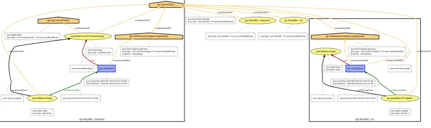
qs:bundle_request qs:bundle_vis
qs:user/Alice
prov:label Alice Wonder
prov:type "prov:Person" %% prov:QualifiedName qs:bundle_request
wasAttributedTo
prov:type "prov:Bundle" %% prov:QualifiedName
qs:bundle_vis
wasAttributedTo
prov:type "prov:Bundle" %% prov:QualifiedName
qs:request used wasAssociatedWith prov:startTime 2016-09-19T19:18:37+01:00 prov:endTime 2016-09-19T19:18:37+01:00 userdata:activities/steps wasAttributedTo qs:service/Fitbit wasAttributedTo prov:label steps prov:type activities/steps userdata:steps wasAttributedTo wasGeneratedBy wasDerivedFrom prov:label Steps prov:type timeseries qs:software/stepscompanion actedOnBehalfOf prov:label StepsCompanion prov:type "prov:SoftwareAgent" %% prov:QualifiedName qs:device smartphone prov:label Fitbit
prov:type "prov:Organization" %% prov:QualifiedName
prov:time 2016-09-19T19:18:37+01:00 prov:role downloading
prov:type qs:request
qs:visualize userdata:steps
usedwasAssociatedWith wasAssociatedWith
prov:startTime 2016-09-19T19:23:50+01:00 prov:endTime 2016-09-19T19:23:50+01:00 qs:graphic/Graphic wasAttributedTo wasDerivedFrom wasGeneratedBy prov:label Graphic prov:type linechart prov:label steps prov:type steps qs:software/stepscompanion actedOnBehalfOf prov:label StepsCompanion prov:type "prov:SoftwareAgent" %% prov:QualifiedName qs:device smartphone
prov:role View graph
prov:type qs:visualize prov:time 2016-09-19T19:23:50+01:00
Figure 13. Provenance graph of two user actions (https://provenance.ecs.soton.ac.uk/store/ documents/115642/)
collections of Quantified Self data, but also data transmission and synchronization build upon icons
255
that have been adopted into many peoples’ “visual vocabulary.”
256
4.9. Example 257
Figure14shows an example of two comic strips that correspond to the provenance graph in
258
Figure13. The example contains the consecutive strips for two user actions:downloading steps count
259
data from a cloud service to the user’s smart phone(PROV activity “request”), andvisualizing the steps data 260
in a line chart(PROV activity “visualize”).
261
5. Implementation 262
For generating the comic strips, we developed the web application PROV COMICS in
263
JavaScript [22] (Figure 15). This web application fetches provenance documents directly from
264
a provenance store. The current prototype supports the publicly available provenance store
265
PROVSTORE[11] using the PROVSTORE JQUERYAPI to retrieve public documents from the PROVSTORE
266
for a certain user.
267
Within the provenance document, the script first looks for activities to determine what kinds of
268
panels need to be displayed. If there is more than one activity, the correct order is derived from the
269
activities’ timestamps. As mentioned earlier in Section4.7, activities will not be represented by a single
270
graphic, but by a sequence of three to five comic panels. Similar activities are illustrated by similar sets
271
of panels.
272
After that, the script reads the attributes of involved agents, entities, and relations to decide
273
which graphics to include in these panels. For example, the attributes indicate whether to display a
274
smartphone or a computer, a folder or a single document, a steps icon or a weight icon, etc.
275
For generating the comics, the ProvComics.js script defines three JavaScript prototypes
276
(“classes”):
Figure 14.Generated provenance comics strip for two consecutive user actions.
ProvComic serves as a frame to contain all comic panels. It is also the general starting point for creating
278
aprovenance comicinside a given HTML element. For example, if there is a<div id=”comic”> 279
tag in the HTML, a newprovenance comicmay be started within thedivelement by declaringvar
280
comic = new ProvComic(”#comic”).
281
Panel represents a single comic panel and has all necessary abilities to create any of the panels
282
described in the concept. For example, it provides functions to add captions, Persons,
283
SoftwareAgents,Organizations, different types of entities, etc.
284
PanelGroup represents a predefined sequence of panels. They make it easier to insert recurring panel
285
sequences. For example, it provides a function to add all panels depicting a downloadRequestat
286
once.
287
6. Qualitative User Study 288
We conducted a user study to evaluate the clarity and comprehensibility of the provenance
289
comics. Ten test subjects were shown a number of test comics and asked to re-narrate the story as they
290
understood it.
291
6.1. Study Design 292
We decided that aqualitative studywas the better choice—in contrast to a quantitative study—in
293
order to find out whether or not the PROV COMICS are comprehensible. Different people may
294
understand the comics in different ways, or have different problems when reading them. These can
295
hardly be compared or measured in numbers, and creating a standardized questionnaire with closed
296
questions would have been very difficult. Moreover, it would probably have led to further problems;
297
for example, if asking about certain features of the comics using single or multiple choice questions, the
298
question itself as well as the available answers might have provided hints and suggested something to
299
the participants that they actually did not understand by themselves when they first read the comics.
300
Due to these considerations, we let test readers speak freely about the comics and performed a
301
qualitative analysis afterwards. However, to make the test readers’ answers accessible to statistics and
302
comparison, we created a list for each of the comics, containing 10 to 23 findings that participants might
303
discover and verbalize. It was thus possible to gain quantitative data by calculating the percentage of
304
discovered findings.
Figure 15.Screenshot of the PROV COMICSweb application (http://provcomics.de).
6.1.1. Research Question
306
The general research question that was to be answered by the study is whether the comics are
307
comprehensible to average end users:
308
• Are the selected graphics and the visual language they form understandable?and
309
• Do users understand the history of their own data (i.e., when and how their data originated, what 310
conversions and transformations it underwent, and who had access to or control over it in the course of 311
time)? 312
The study was also to reveal misunderstandings that may arise from a lack of technical knowledge on
313
the reader’s part and help determine passages where the images are not explanatory enough and need
314
to be improved or extended.
6.1.2. Test comics
316
We selected five different scenarios as test comics to be included in the user study [17]. The first
317
three test comics each depicted a combination of two activities (e.g.,InputandVisualize). The fourth
318
and fifth comics are a little longer, combining three to four activities.
319
6.1.3. Questions
320
We decided to have test readers speak freely about the comics and do a qualitative analysis
321
afterwards. However, to make the test readers’ answers accessible to statistics and comparison, we
322
created a list for each of the comics, containing 10 to 23 findings that participants might discover and
323
verbalize. It was thus possible to gain quantitative data by calculating the percentage of discovered
324
findings.
325
6.1.4. Timing
326
Test readers were interviewed one at a time, and each reader was interviewed only once; there
327
were no repeated interviews with the same persons. All participants were shown the same comics in
328
the same order. The interviews took about thirty minutes each and were conducted over a period of
329
several days.
330
6.1.5. Selection of test subjects
331
No special background was required of the test persons; on the contrary, it was desired that they
332
have no previous knowledge about data provenance and no special expertise in the Quantified-Self
333
domain. No limitations were set in terms of age, gender, or occupation. Table3gives an overview
334
about the selected participants.
335
Table 3.Study participants.
Test subject Gender Age Technical expertise
(0 = none, 3 = expert)
# QS applications
used
Profession
on f 28 2 4 Cook’s mate / waitress
er f 63 1 4 Senior executive in aged care
mm m 25 2 4 Student (computer science)
42 m 25 3 4 Student (computer science)
ab m 26 3 4 Student (computer science)
nn f 43 2 3 Primary school teacher
al m 49 1 1 Commercial clerk
ud f 40 2 1 Optometrist
te m 49 2 0 Soldier
xe m 29 2 1 Computer scientist / programmer
Average n/a 37.7 2 2.6 n/a
Median n/a 34.5 2 3.5 n/a
6.1.6. Tasks, rules and instruments
336
For each participant, five different sheets with comic strips were printed out and handed to
337
them on paper. To obtain comparable results, all test subjects were asked to fulfill the exact same
338
tasks for each of the five comics: first read the comic silently for themselves, and then re-narrate their
339
interpretation of the story. To avoid influencing the process in any way, the examiner did not talk to
340
participants at this stage. A smartphone running a dictaphone app was used to record the participants’
341
re-narrations of the comics.
6.1.7. Debriefing
343
After all comics had been worked through, any difficult parts were revisited and analyzed in an
344
informal conversation. Participants were encouraged to comment freely on the comics, giving their
345
own opinion and suggestions for improvements.
346
6.2. User Study Results 347
The average percentage of findings that participants verbalized over all five comics was 77 %. The
348
value was remarkably high for some particular comics, the highest one being 87 %. Women showed a
349
better overall performance than men (84 % for women vs. 73 % for men). Figure16shows results for
350
all test comics. However, the number of test subjects in this small study is too low to draw any general
351
conclusions from that.
Figure 16.Evaluation of results: Percentage of correct findings for all participants as well as for women and men only (https://plot.ly/~onyame/50/).
352
There were certain difficult parts in some of the comics, which mostly stemmed from a lack of
353
experience with Quantified Self applications or web services. However, even in these cases, the general
354
essence of the story was largely interpreted correctly.
355
Participants had no difficulties recognizing and interpreting the different icons for concrete
356
elements, like persons, smartphones, computers, and bracelets or smartwatches. But even more
357
abstract notions (e.g., “transmitting data from one device to another,” “synchronizing data with a
358
cloud”) were well-understood, since they relied on icons that are commonly used in software and web
359
applications and were understood by most readers without any confusion.
360
Readers also had no problem identifying themselves with the comic figure (human silhouette).
361
Almost every re-narration was told from a first-person point of view, using sentences like “Iwas
362
walking”, “Iwas wearing a bracelet”, “Iclicked the button”, etc.
363
In summary, all users were able to explain correctly the scenarios depicted in the comic strips.
364
Some users suggested minor changes and improvements to the visual representation.
365
Current work includes user studies with a much broader set of people, especially with very
366
limited knowledge about the technology behind wearable devices, smartphone applications, and
367
services.
7. Related Work 369
Usually, visualization in Quantified Self focuses on thedata, where all kinds of visualization
370
techniques are used [23]. For example, time series visualizations or geographical visualization are very
371
common4.
372
Forprovenancevisualization, most tools found in literature visualize provenance graphs using
373
ordinary node-link diagrams, or tree representations similar to node-link diagrams. PROVENANCE
374
MAPORBITER[24], PROVENANCEBROWSER[25], and PROVENANCEEXPLORER[26] are based upon
375
node-link diagrams. Large provenance graphs are then simplified by combining or collapsing
376
sub-nodes or hiding nodes that are not of interest right now. The user can interactively explore
377
the graph by expanding or zooming into these nodes.
378
Other tools, such as VISTRAILS[14], use a tree representation similar to node-link diagrams.
379
Visual clutter is reduced by hiding certain nodes, limiting the depth of the tree, or displaying only the
380
nodes that are related to the selected node.
381
PROBE-IT! [27] and CYTOSCAPE[28] basically display provenance as ordinary graphs. However,
382
Probe-It! does not only show theprovenanceof data, but also theactualdata that resulted from process
383
executions. In CYTOSCAPE, users can create their own visual styles, mapping certain data attributes
384
onto visual properties like color, size, transparency, or font type.
385
One work that stands out due to its completely different and novel approach is INPROV[29]. This
386
tool displays provenance using an interactive radial-based tree layout. It also features time-based
387
grouping of nodes, which allows users to examine a selection of nodes from a certain period of time
388
only.
389
There are some more related works, even though they are not directly concerned with provenance
390
visualization. A non-visual approach to communicating provenance is natural language generation
391
by Richardson and Moreau [30]. In this case, PROV documents are translated into complete English
392
sentences.
393
Quite similar to provenance comics areGraph Comics by Bach et Al. [31], which are used to
394
visualize and communicate changes in dynamic networks using comic strips.
395
8. Conclusions and Future Work 396
The goal of this work was to develop a self-explaining, easy-to-understand visualization of data
397
provenance that can be understood by non-expert end users of Quantified Self applications.
398
A detailed concept has been created that defines a consistent visual language. Graphics for PROV
399
elements like different agents and entities were designed, and sequences of comic panels to represent
400
different activities were determined. Symbols, icons, and panel sequences were specified in an exact
401
and uniform manner to enable the automatic generation of comics.
402
As proof of concept, a prototypical website has been developed which is able to automatically
403
generate comics from PROV documents compliant with the existing Quantified Self data model. The
404
documents are loaded from the PROVSTOREwebsite.
405
A reading study involving ten test readers has shown that a non-expert audience is mostly able
406
to understand the provenance of Quantified Self data through provenance comics without any prior
407
instruction or training. The overall percentage of 77 % for findings verbalized by participants is deemed
408
a good result, given that the checklists were very detailed and contained findings that some readers
409
probably omitted, because they seemed too obvious and self-evident to them.
410
Future work will focus on graphical improvements. This includes suggested improvement
411
measures that resulted from the reading study. A major step will be quantitative comics, which also
412
show actual measured values. For example, diagrams on depicted devices could show real plots of
413
health data, and single comic panels may include real geographical information. Another improvement
414
could be the use of glyph-based depiction [32], where the body shape of depicted humans represent
415
real values such as weight. A more technical improvement will be the consequent use ofprovenance
416
templates[33,34], which will help to standardize the recorded provenance with templates provided to
417
tool developers and which then helps tools for generating comic strips based on these standardized
418
provenance.
419
A useful improvement of the provenance comics would be to make them application-generic to
420
some extent, (i.e., not restricted to the Quantified Self domain). We plan to explore whether provenance
421
comics might be useful for other application domains, such as electronic laboratory notebooks, writing
422
news stories in journalism, or security breaches in Internet-of-Things environments. For example,
423
using provenance comics seem to be a feasible approach to communicate hacking attempts in smart
424
home systems, if provenance of such attacks is available (such as by the recent works of Wang et
425
Al. [35]).
426
References 427
1. Choe, E.K.; Lee, N.B.; Lee, B.; Pratt, W.; Kientz, J.A. Understanding quantified-selfers’ practices in collecting
428
and exploring personal data. Proceedings of the 32nd annual ACM conference on Human factors in
429
computing systems. ACM, 2014, pp. 1143–1152.
430
2. Hoy, M.B. Personal Activity Trackers and the Quantified Self. Med Ref Serv Q2016,35, 94–100.
431
3. Moreau, L.; Groth, P.; Miles, S.; Vazquez-Salceda, J.; Ibbotson, J.; Jiang, S.; Munroe, S.; Rana, O.; Schreiber,
432
A.; Tan, V.; Varga, L. The provenance of electronic data.Communications of the Acm2008,51, 52–58.
433
4. Kunde, M.; Bergmeyer, H.; Schreiber, A. Requirements for a Provenance Visualization Component.
434
Provenance and Annotation of Data and Processes: Second International Provenance and Annotation
435
Workshop, IPAW 2008, Salt Lake City, UT, USA, June 17-18, 2008. Revised Selected Papers; Freire, J.; Koop,
436
D.; Moreau, L., Eds.; Springer Berlin Heidelberg: Berlin, Heidelberg, 2008; pp. 241–252.
437
5. Schreiber, A.; Struminski, R., Tracing Personal Data Using Comics. InUniversal Access in Human–Computer
438
Interaction. Design and Development Approaches and Methods: 11th International Conference, UAHCI 2017, Held
439
as Part of HCI International 2017, Vancouver, BC, Canada, July 9–14, 2017, Proceedings, Part I; Antona, M.;
440
Stephanidis, C., Eds.; Springer International Publishing: Cham, 2017; pp. 444–455.
441
6. Schreiber, A. A Provenance Model for Quantified Self Data. Universal Access in Human-Computer
442
Interaction. Methods, Techniques, and Best Practices: 10th International Conference, UAHCI 2016, Held as
443
Part of HCI International 2016, Toronto, ON, Canada, July 17-22, 2016, Proceedings, Part I; Antona, M.;
444
Stephanidis, C., Eds.; Springer International Publishing: Cham, 2016; pp. 382–393.
445
7. Schreiber, A.; Seider, D. Towards Provenance Capturing of Quantified Self Data. Provenance and
446
Annotation of Data and Processes: 6th International Provenance and Annotation Workshop, IPAW 2016,
447
McLean, VA, USA, June 7-8, 2016, Proceedings; Mattoso, M.; Glavic, B., Eds.; Springer International
448
Publishing: Cham, 2016; pp. 218–221.
449
8. Moreau, L.; Missier, P.; Belhajjame, K.; B’Far, R.; Cheney, J.; Coppens, S.; Cresswell, S.; Gil, Y.; Groth, P.;
450
Klyne, G.; Lebo, T.; McCusker, J.; Miles, S.; Myers, J.; Sahoo, S.; Tilmes, C. PROV-DM: The PROV Data
451
Model, 2013.
452
9. Lebo, T.; Sahoo, S.; McGuinness, D.; Belhajjame, K.; Cheney, J.; Corsar, D.; Garijo, D.; Soiland-Reyes, S.;
453
Zednik, S.; Zhao, J. PROV-O: The PROV Ontology, 2013.
454
10. Moreau, L.; Groth, P.; Cheney, J.; Lebo, T.; Miles, S. The rationale of PROV.Web Semantics: Science, Services
455
and Agents on the World Wide Web2015,35, Part 4, 235–257.
456
11. Huynh, T.D.; Moreau, L. ProvStore: A Public Provenance Repository. Provenance and Annotation of Data
457
and Processes: 5th International Provenance and Annotation Workshop, IPAW 2014, Cologne, Germany,
458
June 9-13, 2014. Revised Selected Papers; Ludäscher, B.; Plale, B., Eds.; Springer International Publishing:
459
Cham, 2015; pp. 275–277.
460
12. Schreiber, A.; Ney, M.; Wendel, H. The Provenance Store prOOst for the Open Provenance Model.
461
Provenance and Annotation of Data and Processes: 4th International Provenance and Annotation
Workshop, IPAW 2012, Santa Barbara, CA, USA, June 19-21, 2012, Revised Selected Papers; Groth, P.; Frew,
463
J., Eds.; Springer Berlin Heidelberg: Berlin, Heidelberg, 2012; pp. 240–242.
464
13. Hoekstra, R.; Groth, P. PROV-O-Viz – Understanding the Role of Activities in Provenance. Provenance
465
and Annotation of Data and Processes: 5th International Provenance and Annotation Workshop, IPAW
466
2014, Cologne, Germany, June 9-13, 2014. Revised Selected Papers; Ludäscher, B.; Plale, B., Eds.; Springer
467
International Publishing: Cham, 2015; pp. 215–220.
468
14. Bavoil, L.; Callahan, S.P.; Crossno, P.J.; Freire, J.; Vo, H.T., VisTrails: enabling interactive multiple-view
469
visualizations. InVisualization, 2005. VIS 05; IEEE, 2005; pp. 135–142.
470
15. Miller, G.A. The magical number seven, plus or minus two: Some limits on our capacity for processing
471
information. Psychological Review1956,63, 81–97.
472
16. QSEU14. Breakout: Mapping Data Access, 2014.
473
17. Struminski, R. Visualization of the Provenance of Quantified Self Data. Master thesis, Hochschule
474
Düsseldorf, 2017.
475
18. Stickel, C.; Pohl, H.M.; Milde, J.T., Cutting Edge Design or a Beginner’s Mistake? – A Semiotic Inspection
476
of iOS7 Icon Design Changes. InDesign, User Experience, and Usability. User Experience Design for Diverse
477
Interaction Platforms and Environments: Third International Conference, DUXU 2014, Held as Part of HCI
478
International 2014, Heraklion, Crete, Greece, June 22-27, 2014, Proceedings, Part II; Marcus, A., Ed.; Springer
479
International Publishing: Cham, 2014; pp. 358–369.
480
19. Burmistrov, I.; Zlokazova, T.; Izmalkova, A.; Leonova, A., Flat Design vs Traditional Design: Comparative
481
Experimental Study. InHuman-Computer Interaction – INTERACT 2015: 15th IFIP TC 13 International
482
Conference, Bamberg, Germany, September 14-18, 2015, Proceedings, Part II; Abascal, J.; Barbosa, S.; Fetter, M.;
483
Gross, T.; Palanque, P.; Winckler, M., Eds.; Springer International Publishing: Cham, 2015; pp. 106–114.
484
20. Cooper, M.; Kirkpatrick, A.; Connor, J.O. Understanding WCAG 2.0: Contrast (Minimum), 2016.
485
21. Böhringer, J.; Bühler, P.; Schlaich, P.Kompendium der Mediengestaltung für Digital- und Printmedien; Number
486
Bd. 1 in Kompendium der Mediengestaltung für Digital- und Printmedien, Springer, 2008.
487
22. Struminski, R.; Bieliauskas, S.; Schreiber, A. DLR-SC/prov-comics: QS PROV Comics Prototype - Big fixes
488
[Data set]. Zenodo, 2017.
489
23. Marcengo, A.; Rapp, A., Innovative Approaches of Data Visualization and Visual Analytics; IGI Global,
490
2014; chapter Visualization of Human Behavior Data: The Quantified Self, pp. 236–265.
491
24. Macko, P.; Seltzer, M. Provenance map orbiter: Interactive exploration of large provenance graphs.
492
Proceedings of the 3rd Workshop on the Theory and Practice of Provenance (TaPP), USENIX Association,
493
2011.
494
25. Anand, M.K.; Bowers, S.; Altintas, I.; Ludäscher, B. Approaches for Exploring and Querying Scientific
495
Workflow Provenance Graphs. Provenance and Annotation of Data and Processes: Third International
496
Provenance and Annotation Workshop, IPAW 2010, Troy, NY, USA, June 15-16, 2010. Revised Selected
497
Papers; McGuinness, D.L.; Michaelis, J.R.; Moreau, L., Eds.; Springer Berlin Heidelberg: Berlin, Heidelberg,
498
2010; pp. 17–26.
499
26. Hunter, J.; Cheung, K. Provenance Explorer-a graphical interface for constructing scientific publication
500
packages from provenance trails.International Journal on Digital Libraries2007,7, 99–107.
501
27. Del Rio, N.; da Silva, P.P., Probe-It! Visualization Support for Provenance. InAdvances in Visual Computing:
502
Third International Symposium, ISVC 2007, Lake Tahoe, NV, USA, November 26-28, 2007, Proceedings, Part
503
II; Bebis, G.; Boyle, R.; Parvin, B.; Koracin, D.; Paragios, N.; Tanveer, S.M.; Ju, T.; Liu, Z.; Coquillart, S.;
504
Cruz-Neira, C.; Müller, T.; Malzbender, T., Eds.; Springer Berlin Heidelberg: Berlin, Heidelberg, 2007; pp.
505
732–741.
506
28. Chen, P.; Plale, B.; Cheah, Y.W.; Ghoshal, D.; Jensen, S.; Luo, Y. Visualization of network data provenance.
507
2012 19th International Conference on High Performance Computing, 2012, pp. 1–9.
508
29. Borkin, M.A.; Yeh, C.S.; Boyd, M.; Macko, P.; Gajos, K.Z.; Seltzer, M.; Pfister, H. Evaluation of
509
Filesystem Provenance Visualization Tools. IEEE Transactions on Visualization and Computer Graphics
510
2013,19, 2476–2485.
511
30. Richardson, D.P.; Moreau, L. Towards the Domain Agnostic Generation of Natural Language Explanations
512
from Provenance Graphs for Casual Users. Provenance and Annotation of Data and Processes: 6th
513
International Provenance and Annotation Workshop, IPAW 2016, McLean, VA, USA, June 7-8, 2016,
514
Proceedings; Mattoso, M.; Glavic, B., Eds.; Springer International Publishing: Cham, 2016; pp. 95–106.
31. Bach, B.; Kerracher, N.; Hall, K.W.; Carpendale, S.; Kennedy, J.; Henry Riche, N. Telling Stories About
516
Dynamic Networks with Graph Comics. Proceedings of the 2016 CHI Conference on Human Factors in
517
Computing Systems; ACM: New York, NY, USA, 2016; CHI ’16, pp. 3670–3682.
518
32. Riehmann, P.; Möbus, W.; Froehlich, B. Visualizing Food Ingredients for Children by Utilizing Glyph-based
519
Characters. Proceedings of the 2014 International Working Conference on Advanced Visual Interfaces;
520
ACM: New York, NY, USA, 2014; AVI ’14, pp. 133–136.
521
33. Curcin, V.; Fairweather, E.; Danger, R.; Corrigan, D. Templates as a method for implementing data
522
provenance in decision support systems.Journal of Biomedical Informatics2017,65, 1–21.
523
34. Moreau, L.; Batlajery, B.; Huynh, T.D.; Michaelides, D.; Packer, H. A Templating System to Generate
524
Provenance.IEEE Transactions on Software Engineering2017,PP, 1–1.
525
35. Wang, Q.; Hassan, W.U.; Bates, A.; Gunter, C. Provenance Tracing in the Internet of Things; USENIX
526
Association: Seattle, WA, 2017.