DOI 10.1007/s13173-011-0051-5 W E B M E D I A 2 0 1 0
Sentiment-based influence detection on Twitter
Carolina Bigonha·Thiago N. C. Cardoso· Mirella M. Moro·Marcos A. Gonçalves· Virgílio A. F. Almeida
Received: 14 June 2011 / Accepted: 25 November 2011 / Published online: 24 December 2011 © The Brazilian Computer Society 2011
Abstract The user generated content available in online communities is easy to create and consume. Lately, it also became strategically important to companies interested in obtaining population feedback on products, merchandising, etc. One of the most important online communities is Twit-ter: recent statistics report 65 million new tweets each day. However, processing this amount of data is very costly and a big portion of the content is simply not useful for strate-gic analysis. Thus, in order to filter the data to be analyzed, we propose a new method for ranking the most influential users in Twitter. Our approach is based on a combination of the user position in networks that emerge from Twitter re-lations, the polarity of her opinions and the textual quality of her tweets. Our experimental evaluation shows that our approach can successfully identify some of the most influ-ential users and that interactions between users provide the best evidence to determine user influence.
Keywords Twitter·User influence
C. Bigonha (
)·T.N.C. Cardoso·M.M. Moro· M.A. Gonçalves·V.A.F. AlmeidaDepartamento de Ciência da Computação, Universidade Federal de Minas Gerais, Belo Horizonte, MG, Brazil
e-mail:[email protected] T.N.C. Cardoso
e-mail:[email protected] M.M. Moro
e-mail:[email protected] M.A. Gonçalves
e-mail:[email protected] V.A.F. Almeida
e-mail:[email protected]
1 Introduction
Twitter is a micro-blogging tool that represents a real-time information network. Motivated by the question “What’s happening?”, users of Twitter post messages of up to 140 characters, calledstatuses, or more familiarly,tweets. A tweet may contain more than just pure text; it may include links to websites, photos, videos and other media, as well short strings preceded by a hash symbol (#), called hash-tags, usually employed to filter or promote content [17]. Also, tweets may refer to other users by preceding their names with anatmark (@). Each Twitter user has a profile page, which contains personal information about her (name, photo, location, etc.), some quantitative data (her number of followers and following users) and hertimeline, i.e. a list of tweets that she has posted (public or private, according to the user’s decision). Furthermore, a user may follow another by choosing to receive the tweets she posts.
Among many other Online Social Networks, such as Facebook, Orkut, Flickr and Youtube,1 Twitter stands out for its simplicity and diversity. Due to the message short size and the effortless posting/reading from anywhere, it is easy to both produce and consume content. Twitter also plays a major role inelectronic word of mouth2[20] due to its immediacy of posting (e.g., one can send a tweet at the moment of a purchase or a problem in the bank) and the simplicity of finding out what people are talking about. In summary, users share opinions, experiences and suggestions in large scale. Considering Twitter users as potential
con-1http://www.facebook.com, http://www.orkut.com, http://www.flickr. com,http://www.youtube.com.
sumers/voters, micro-blogging networks have become a rich source of data in any situation in which feedback is desired. Previous work [26] has also shown that text streams (such as Twitter) are a potential substitute and supplement for tra-ditional public opinion surveys. Therefore, businesses have recently learned the importance of understanding and prop-erly reacting to the information available in Twitter. By an-alyzing the data and the users, they aim to gather market intelligence and improve their campaigns, products or ser-vices acceptance.
However, a huge amount of content is generated daily: on an average day, Twitter publishes about 750 tweets-per-second (tps) whereas on a deciding game of a championship (such as NBA), about 3,000 tps are registered.3Besides be-ing impractical to inspect all the data generated daily (even for a specific topic), not all tweets and users are worth such an evaluation. Under these circumstances, it is crucial to find the key opinion leaders, orinfluential users, who drive the positive and, specially, the negative conversations on Twit-ter.
Katz et al. [21] defined as opinion leaders “the in-dividuals who were likely to influence other persons in their immediate environment”. Although some may ques-tion the existence of influentials [31], its presence and im-portance are widely discussed in the marketing environ-ment [4,5,10,30]. Thus, assuming the existence of such in-fluential users, we propose an approach for finding them in a topic-based scenario. To focus on topics is a matter of de-sign: people are often interested in monitoring one particu-lar topic or context (a product, a personality, an event) [29]. Moreover, focusing on one subject allows us to use senti-ment as a measure of user engagesenti-ment: another influence indicator [14].
We present a method for identifying influential users based on three perspectives: (α) polarity, (β) network and (γ) quality. Specifically, the polarity perspective considers the classification of the tweets of each user as positive, neu-tral or negative in order to find the confident positive and negative users. Such a classification allows us to identify what we call evangelists anddetractors—influential users who stand in favor or against the subject. The network per-spective measures the relation between the user and her neighbors’, including actions (re-tweets, replies, mentions). Finally, the quality perspective is used to rate higher users that have well written tweets.
For testing our techniques, we built two datasets for spe-cific topics (two product brands). Each tweet and user data were manually classified as positive/negative/neutral and evangelist/detractor/irrelevant by marketing professionals.
3http://blog.twitter.com/2010/06/big-goals-big-game-big-records.
html.
Our experimental results demonstrate that we can success-fully identify some of the most influential users concern-ing a subject usconcern-ing our techniques and that interactions be-tween users are the best evidence to determine user influ-ence. The experiments were performed in diverse topic-specific scenarios, demonstrating the applicability of the method to any subject. Moreover, we show that the topic-specific datasets employed have similar characteristics when compared to some more general Twitter collections used in previous work, such as [18] and [22], meaning that most of our results are potentially generalizable.
The main contributions of this paper are summarized as follows: (i) a definition for influential users on Twitter, which considers the importance of the user within the in-teractions concerning a topic, the quality of her tweets and her polarity as new indicators of influence; (ii) a method to find the influentials based on the aforementioned concept; (iii) the construction of two datasets for influence ments, validated by specialists in marketing; (iv) an experi-mental validation and evaluation of the proposed technique, including tests on two datasets, two naive baselines, analy-sis of the impact of each view on the result and comparison of the results using interactions via tweets or the following-follower connections.
This article is organized as follows: Sect.2 presents a review of the related work; Sect. 3 describes SaID, our influence detection method, including details for the pre-processing phase Sect.3.1and metrics analysis Sect. 3.2; Sect.4describes the datasets used for testing the proposed technique Sect.4.1) and discusses the evaluation and valida-tion of the method Sect.4.2; and, finally, Sect.5reviews our main contributions and results.
2 Related work
Finding influential users on Twitter has recently attracted much interest. The report presented in [24] highlights in-teractions (replies, retweets, mentions and attributions) as markers of influence, rather than solely the number of fol-lowers. The authors select a few famous users belonging to the categories “celebrity”, “news outlet” and “social media analyst” and compare several influence indicators, e.g., av-erage content spread per tweet, for each user.
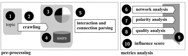
Fig. 1 SaID workflow: (1) topic definition; (2) crawl of topic-related tweets; (3) sentiment analysis of tweets; (4) authors identification; (5) interaction and connection relations parsing; (6), (7) and (8)
net-work, polarity and quality analysis, respectively; (9) combination of the metrics into aninfluence score; (10) rank construction
users can hold significant influence over a variety of topics, and examining the rise and fall of influentials over time.
Based on the concept that influence is measured by the replication of already performed actions, Goyal et al. [15] propose a technique for constructing influence probability graphs from social networks (friendship graph) and action logs. From these two sources of data, the authors build a propagation graph (where nodes are the users who perform the actions and the edges represent the direction of the prop-agation), apply models of influence (static, discrete and con-tinuous time) and finally construct the graph of influence probabilities. Both Goyal et al. [15] and Lee et al. [25] em-phasize the temporal aspect of influence detection, which is indicated as future work of the presented paper.
In [3], the authors measure influence based on the user’s ability to spread brand new content. Given a propagation path traced from the user that created the content (URL) to the last user that received it, they identify the users who are nearer to the origin as the most influent. The attributes con-sidered for the calculation of influence are: the number of followers, number of followings, number of tweets posted and date the user joined Twitter. The authors also analyzed the content of the links posted, observing the average cas-cade size for different interest ratings, types and categories of posts.
Despite focusing mainly on the topological characteris-tics of Twitter and its power as an information sharing en-vironment, Kwak et al. [23], compare three methods for ranking users: the first strategy ranks users by the number of followers, the second applies PageRank to a network of followings and followers and the third one ranks users ac-cording to the number of her re-tweets. As conclusion, the authors find the same gap between the number of followers and the popularity of one’s tweets indicated before.
Our contributions in this article stand out from previous work in key aspects. First, SaID considers more complete metrics for measuring the repercussion of user’s actions: we evaluate features of users within an interaction network that captures all the conversations about a topic. Second, we are the first to apply a tweet content quality analysis: our
hy-pothesis is that users who create well written and more un-derstandable tweets are more likely to be influential than others. Also, we evaluate the commitment of the user with the topic, that is, if she is confident positive or negatively and with what frequency. This allows our method to identify the potential evangelists and detractors concerning the topic. Finally, no previous work evaluates its method using a spe-cialists’ ground truth. Instead of generating various ranked lists and simply comparing them, we validate our technique based on marketing and communication specialists’ point of view.
3 Influential users identification
In this article, we present a method, called SaID (Sentiment-based Influence Detection on Twitter) for identifying influ-ential users on Twitter, which relies mainly on their behav-ior. Figure 1 shows an overview of the proposed method. The two main phases (pre-processingandmetrics analysis) are explained in the following sections.
3.1 Pre-processing
The pre-processing phase consists of five steps. The first one is determining the topic and time interval; the second is crawling; the third one is the sentiment analysis; the fourth is the extraction of user data; and, at last, the fifth consists on the interaction and connection parsing. This section de-scribes each one of them.
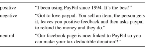
Table 1 Example of positive, negative and neutral tweets positive “I been using PayPal since 1994. It’s the best!” negative “Got to love paypal. You sell an item, the person gets
it, leaves you positive feedback and then asks paypal to refund the money and they do.”
neutral “Our facebook page is now linked to PayPal so you can make your tax deductible donation!!”
be analyzed. It may be a brand, a product, a personality, an event, and so on. Based on the chosen topic, keyword-based queries are built in this phase.
Crawling There is no established benchmark for evaluat-ing user influence detection on Twitter. So, a major effort of this work is to build the data sets. Although expensive and demanding, this process is essential for the experimen-tal validation presented in Sect. 4. For collecting the data concerning the chosen topic, we use the Twitter API.4 Ev-ery tweet, publicly available from the user’s timeline, which contains the defined keywords, during a certain time inter-val, is stored. Also, we carefully eliminate retrieved tweets that fit into a different context or have an undesired con-tent (e.g. posts concerning “house”, the human habitat, on a search for “House”, the TV series).
Sentiment analysis In the third step, every tweet on the dataset is classified either as positive, negative or neutral. Positive ones promote the chosen topic, by expressing user appreciation or satisfaction. Likewise, negative ones express aversion toward the topic and may contain complaints, bad reviews, and so forth. Neutral tweets, on the other hand, are usually the ones that contain unbiased opinions or a purely informative content. Table1contains tweets for each senti-ment concerning PayPal (an online service for paysenti-ments and money transfers). This example also emphasizes the com-plexity of classifying tweets’ sentiment. Aside from its short size, its content is often colloquial and filled with irony and sarcasm, both tones that are hard to identify. Note that, in Table1, the negative tweet is only negative due to the last three words “and they do”.
In this work, the tweets were manually classified by a marketing analysts’ team, in a process in which each tweet’s sentiment was verified at least by two analysts and a super-visor. In case of disagreement, the supervisor’s decision was taken into account.5This sentiment analysis allows the de-tection of engagement of the users toward the defined topic and, consequently, leads to the identifying users who, be-sides from being well connected regarding interactions, are
4http://dev.twitter.com/.
5The automatization of this step and the measurement of its impact on the proposed technique is one of the main focuses of our current research.
responsible for influencing other’s decisions due to the po-larity of their tweets. Furthermore, in a “crisis management” point of view, to recognize the users who lead the positive and, mainly, the negative information flow is essential.
User data extraction As already mentioned, our method gathers the content generated on Twitter via tweets that men-tion a certain keyword set. Since our interest is on user’s characterization, we must identify the author of each tweet and collect her information (using the Twitter API). We store author’s name and her list of followers and following users.
Interaction and connection parsing Finally, the last step in the pre-processing phase is executed, in order to extract the interactions and connections between users. It is very common for a user to interact with others in a post by us-ing the ‘@’ notation prefacus-ing their username. We acknowl-edge four types of possible interaction via tweets: replies, retweets, mentions and attribution. Areply corresponds to a situation in which one user wants to answer a post from another user or simply direct the message to someone else. For example, a tweet of userAin reply to userB would be a post like ‘@B [content of the tweet]’. Aretweetis used to propagate a message:AretweetsB means thatAposted a message thatB has already posted. Retweets, particularly, either have a “RT” markup—for example, ‘RT @B [content posted by B]’—or have a Twitter official retweet identifi-cation. Finally, a mention is a tweet that contains another user in the middle of the text (e.g. ‘[content] @A [content]’) and anattributionis similar to a retweet, except that it cites the username using the notation ‘(via @B)’ instead of ‘RT @B’. We parse each gathered tweet and store all the interac-tions for further analysis. Finally, we extract all the follower-following relations between the users in the dataset, based on each users’ friends list gathered in the previous step.
3.2 Influence metrics analysis
The second phase is the actual influence analysis, in which network,polarityandqualityvalues are calculated and com-bined into a single factor, as explained further.
3.2.1 Network analysis
In order to characterize the roles of users on Twitter and identify the influential ones, we first adopt a complex net-work approach. From the several netnet-works that naturally emerge from user relations enabled by Twitter features, we select two of them for an in-depth analysis: the Connec-tion Graph (Gc) and the Interaction Graph (Gi). Intuitively,
Definition 1 (Connection Graph) For a given subset of users involved in a specific theme, let(Gc, U )be the user
directed unweighted graph, where(u1, u2)is a directed arc
inUif useru1∈Gcfollows useru2∈Gc.
Definition 2(Interaction Graph) For a given subset of users involved in a specific theme, let(Gi, U )be the user directed
unweighted graph, where(u1, u2)is a directed arc inU if
useru1∈Gi has cited at least once (i.e., mention, reply or
re-tweet) useru2∈Gi.
From the different measures for network analysis that could be exploited, such as shortest paths, distance, compo-nent connectivity, clustering, clique, among others [12], the measurements that make more sense for influence estima-tion are those based on centrality, defined on the vertices of a graph. These metrics are designed to rank the notoriety of users according to their position in the network. Similarly, influential users have to be well connected to other users, and play a central role in the graph in which she is embed-ded. For that matter, two centrality measures were chosen. Furthermore, we analyse the in-degree of the users6, as fol-lows.
– Betweenness centrality(bc) is the first centrality measure, and is defined by the fraction of shortest paths between node pairs that pass through the node of interest [7]. In both graphsGiandGc, users with high betweenness have
an important role in the information dissemination pro-cess, since they act as bridges for the data flow.
– The centrality measureEigenvector centrality(ec) [6,28] considers that an user is more central if she is related to users that are themselves central. Thus, the centrality of some node does not only depend on the number of its adjacent nodes, but also on their value of centrality. It is important to remark that Eigenvector centrality is an algo-rithm similar to Pagerank, applied to social networks [11]. We use this metric to rank higher users that are related with many other users or with a few users that are related with lots of other users.
– The In-degree (id) of each user is a key characteristic of the structure of a directed network. In the Interaction Graph, the in-degree measures the number of times a user was cited or had her tweets replied or retweeted, whereas in the Connection Graph, the in-degree stands out for the number of users within the topic that follows the user in focus.7
6All metrics were calculated usingNetworkX[16].
7In the Connection Graph, theinandout-degrees of each user is differ-ent from the number of following and follower users that appear on her profile, because they concern the connections between the users within the collected dataset.
Besides these network features, we also employ the Twit-ter Follower–Followee Ratio (TFF). This metric can be useful to characterize the user, as presented in [22, 24], thus, representing a good influence indicator. According to [22, 24], if the ratio approaches infinity (↑followers, ↓following), the user is likely to be a “broadcaster”, such as news media profiles, celebrities or other popular users. On the other hand, if the ratio approaches 1 (followers followees), the user has reciprocity on her connections. This describes the most common types of user. Finally, if the ra-tio approaches zero (↓followers,↑followees), the user might be categorized as a spammer or a robot, which follows way more users than is followed by (people do not usually fol-low back spammers/robots). Based on this characteristics, TFF is presented as an additional metric for studying the collected data. We use this metric, combined with others, to identify influential users in our dataset, considering the users with higher TFF as more relevant. This metric helps eliminating potential spammers (that may fit in the second and third groups) and valorize the users that are widely fol-lowed, but have some selection for following others.
From an influence detection point of view, the most influ-ential user in a database, would be the one with higher value for each of the four metrics aforementioned (bc,ec,id,tff). For this reason, the metrics were combined in an arithmetic mean (as shown in (1)):
unetwork=(bc+ec+id+tff)/4. (1)
In order to combine them equally, they were normalized8 individually to a[0,1]scale [19]. The resultunetworkis also
in this range. Due to the broad distribution of centrality mea-sure values, the normalization of ec and bc was calculated using logarithmic quantities.
3.2.2 Polarity analysis
The next perspective of influence analysis corresponds to the author’s polarity. This perspective value is calculated based on the classification of tweets, performed in the pre-processing phase. For each user, it considers heroverall con-tribution to the topic discussion: if she posts mostly positive-biased content, she is a potential evangelist. On the other hand, if she posts mostly negative-biased content, she is a potential detractor. Users that stay in the middle are neutral. We consider that positive and negative tweets nullify each other. Thus, for each user, the polarity value is the
summa-8Specifically, we did aRange Normalization[19], in which the range is changed from[xmin, xmax] to[0,1]. The scaling formula is xi=
xi−xmin
xmax−xmin, where{x1, x2, . . . , xm}are the measured values andx
ithe
tion of the sentiment of all her tweets, as shown in (2):
upolarity= i≤nu
i=1
ti, whereti= ⎧ ⎨ ⎩
w+ iftiis positive, w0 iftiis neutral, w− iftiis negative.
(2)
In the formula, ti is the ith tweet (of nu total tweets)
of user u andw+,w0 andw− are the weights associated
with positive, neutral and negative tweets, respectively. The weight is used for balancing the sentiments. For example, one may want to increase the weight of negative tweets to highlight detractors. Also, one may argue that if a user made the effort to write a non-negative tweet on the topic, she is positively contributing to the spread of news about the sub-ject, thus neutral and positive tweets are the same. In this ar-ticle, following the specialists’ instructions, we considered that there are three classes of tweet sentiment and that the neutral ones contribute (with lower intensity) to the user’s positive polarity, by using weightsw+= +2,w−= −2 and w0= +1. Similarly to the network perspective, the polarity
values were range normalized: positive values to[0,1]and negative values to[−1,0].
3.2.3 Quality analysis
At last, we analyze the content of the tweet itself. User generated content is usually very heterogeneous, due to the variety of users’ background and their different intentions. Our goal in analyzing the quality of the tweet content is to rank higher posts (and, consequently, their authors) that are well written and understandable. We hypothesize that if a user is to influence other people, her tweets are expected to have a minimum quality. For that matter, each tweet is evaluated using the Flesch–Kincaid Grade Level metric [27] (kincaidi), which was designed to indicate comprehension
difficulty when reading a passage of contemporary academic English. This metric, successfully applied in the identifica-tion of high-quality Wikipedia articles [13], increased the accuracy of the influential identification for some cases, as studied in the experiments in Sect.4.2. For each tweet, it computes the average number of syllables per word and the average sentence length. For example, a tweet like “aaaaaaa haaate justin bieber!” would have a low quality value, while “PayPal is dangerously easy.” a high one. The user qual-ity perspective was determined as the average of the Kin-caid metric computed for each one of her tweets, as defined in (3), using the packageStyle and Diction.9
uquality= i≤nu
i=1
kincaidi×
1 nu
. (3)
9http://www.gnu.org/software/diction/diction.html.
3.2.4 Influence score
So far, we have presented different types of information that can help characterizing Twitter users, divided into three per-spectives: polarity, network and quality. By exploiting them together, we can obtain a user ranking and assign a single value (influence score) to each user. The user rank is given by (4) and is one of the main contributions of this work.
Is=
α·upolarity+ϕ·(β·unetwork+γ·uquality)
α+β+γ , (4)
where
upolarity,unetwork,uquality are the normalized polarity,
net-work and quality perspectives;
α,β,γ are constants, greater or equal to zero, that weight each of the three perspectives; and
ϕ=|uupolarity
polarity|.
As aforementioned, both network and quality perspective values were normalized to fit into the range[0,1], whereas the polarity perspective values fit into [−1,1]. The auxil-iary variableϕ adjusts both network and quality perspec-tives according to the polarity result. If a user has a polarity equal to zero, the result of the equation is zero (regardless of the other features). Also, if the polarity is negative, both network and quality have their signal changed. The result-ing influence score, for each user, is in the range [−1,1]. By sorting the users in descending order, the top ones, with Is>0, are evangelists or neutral users and the bottom ones,
withIs<0, detractors.
The idea behind combining different perspectives into a single influence score is that a feature alone may not be enough to characterize whether a user is influent or not, whereas the combination of the features may be. A user that is well connected in the graph, has a biased opinion, and writes high quality tweets should be ranked higher as an influential user. The formula eliminates types of pro-file that are erroneously appointed as influent. For example: (i) someone that is well connected, but does not have bi-ased opinion about the subject; (ii) someone that posts daily hundreds of positive/negative tweets about the topic, but, for any reason, no one pays any attention to; (iii) a person whose content is too noisy and does not have a persuasive speech. For the specific cases listed above, the low values of polar-ity (i), network (ii) and qualpolar-ity (iii), respectively, would keep the users from being considered as influent.
4 Experiments and discussion
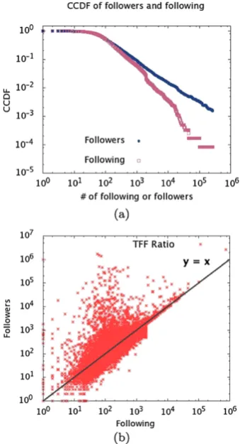
Fig. 2 (a) CCDF of followers and following, and (b) TFF
4.1 Dataset characteristics
We have built two collections, for the experiments. The first one, regardssoda brands, contains 8,063 tweets, posted be-tween August 2009 and September 2009, by 6,885 Brazil-ian users. The second one regardshome appliance brands, has 2,354 tweets, posted between July and August 2010, by 1,671 users. All tweets are in Brazilian Portuguese. Next, we present some statistics for the dataset and why we be-lieve they indicate that the method is generalizable.
4.1.1 Generalization
It is worth noticing that these topic-specific datasets have similar characteristics to previously analyzed samples of the Twitter network that are not restricted to a topic [18,22,23]. Such fact is shown in Fig.2, with plots for thesoda dataset. We analyzed the distribution of following and followers in a complementary cumulative distribution function (CCDF). In statistics and probability theory, CCDF describes the prob-ability of a given value a for taking a value above a par-ticular level [19]. That is,F (x)¯ =P (X > x). They-axis of Fig.2(a) represents the CCDF probability. The square points represent “following” while circles represent “followers” for thesoda dataset. This distribution, specially the region be-yond x =104, has a similar behavior to the one reported
Table 2 Tweets and users per sentiment
+ 0 − Total
soda Tweets 3,083 4,156 824 8,063
Users 2,770 3,401 714 6,885
appliance Tweets 1,489 580 285 2,354
Users 1,198 360 149 1,707
by Kwak et al. in [23]. This “stair-like behavior” shows that there’s is a lack of users that follow and are followed by more than 104profiles. The similarities between the subject-restricted dataset and the other generic samples of Twitter show that there are correspondent types of user in both con-texts, which represent important indications that our method can be expanded to a wider context.
Also, Fig.2(b) shows the follower/following ratio distri-bution among the users. It is possible to identify each type of user, according to the aforementionedTwitter Follower– Followee Ratio on this plot: high ratio users (↑followers, ↓following) appear in the region above the diagonal; users with ratio approximately 1 (followers followees) are around the y =x line; and users whose ratio approaches zero (↓followers,↑followees) are located below the diago-nal. By comparing this TFF plot with previous work, such as [22], there are fewer representatives of the last group. Since their tweets are usually classified as noise (they may contain the keywords but often have unrelated advertising associated) and the set of users is built from the posted tweets, their representation in this dataset is smaller than usual. In order to be an influential user, the person must be an author: she must tweet.
The same analysis was conducted with the appliance dataset. The characteristics are similar; however, it presents sparser data and, for the following-follower plot there are more users around the liney =x. This occurs due to the particularities of the dataset: the subject is certainly less pop-ular than the one insoda’s datasetand most of the users are regular customers using Twitter ascustomer careplatform.
4.1.2 Other statistics
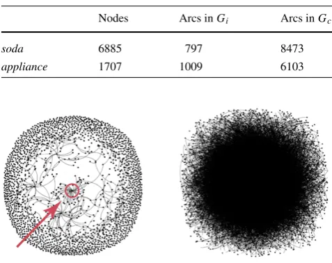
Table 3 Statistics forGiandGcfor both datasets
Nodes Arcs inGi Arcs inGc
soda 6885 797 8473
appliance 1707 1009 6103
Fig. 3 Graphic representation ofGi andGcfor a soda dataset. The marked nodeinGi is a teen celebrity whose comment generated a
large number of replies, as represented by the edges pointing to the node
present in people’s routine than appliance brands. That is, soda brands may be cited in tweets that do not specifically talk about soda. This does not happen so frequently with ap-pliance brands and, for that reason, tweets tend to be more polarized.
Table3compares the number of vertices and arcs of both graphsGiandGcbuilt based onsodaandappliancedataset
and Fig. 3displays a visual representation of both graphs for sodadataset. As shown in [18] (and visible in Fig.3), the graph of interaction is considerably more sparse than the connection graph for both datasets. Accordingly, the number of arcs inGcis much larger than inGiin the two cases.10
4.1.3 Influential users: ground truth
Finally, for testing SaID, the marketing and communica-tion specialists team created a list of influential users for the datasets. The procedure was analogous to the one for sentiment classification: at least two analysts classified each user as influent or not, and a supervisor checked the results, handling the disagreements. The claimed intuition was that users whose content was widespread, whose tweets were en-gaged toward a point of view and whose importance among the topic was relevant, were influential. They analyzed infor-mation about the tweets (RTs, replies) and the user (who she is, what types of tweet she usually writes, what the repercus-sion of her tweets was and so on). It is important to remark
10There may be connections that are not represented inG c, due to
changes in the user profile. Users may change their usernames or pro-tect their accounts during the experiments, making it unavailable to col-lect their data. We expect these changes to be not significative, though.
that the same team analyzed both tweet sentiment and user influence.
For the soda dataset, they found 17 influential users: 10 evangelists and 7 detractors. Meanwhile, for the appli-ance dataset, they found 39influential users: 23 evangelists and 16 detractors. No limit was imposed to the analysts in terms of maximum number of influential users per data set. Although the quantity of users found influent seems small, the team is used to this type of analysis and usually provides such service commercially.
4.2 Experiments
This section discusses the experiments aiming to validate and evaluate SaID. The experiments are divided into three main parts. First, we perform a detailed comparative analy-sis using paired observations of two branches of the method: one using the Interaction Graph and the other one using the Connection Graph. Second, we analyze the impact of each perspective (network, polarity and quality) on influen-tial users’ detection. Finally, we discuss the overall results for both evangelists and detractors.
4.2.1 Experiment setup
In order to evaluate our method, we employ ranking per-formance measures [2], assuming the specialists’ influen-tial lists as ground truth. The measuresprecisionandrecall were adjusted to the context of detecting influential users, as shown in (5) and (6), in whichnr,nirandnitare: the number
of users in the method’s ranked list, the number of influen-tial users in the method’s ranked list and the total number of influential users in the dataset.
precision=nir
nr
, (5)
recall=nir
nit
. (6)
Based on these two measures, we calculate theF-score,
Fβ, of each rank as defined by (7). This measure can be
interpreted as a weighted average of precision and recall.
Fβ=
1+β2× precision×recall
(β2×precision)+recall. (7)
SaID was designed to assist social analysts on the moni-toring task by providing a list of TOP-x evangelists and de-tractors. As a manner of measuring its quality according to the ranked list size available, we evaluate our results using what we call [measure]@x, meaning the measure (preci-sion, recall orFβ) value at a user ranked list of sizex. The
considering 10≤x ≤150. We evaluate this, by calculat-ing the area below the curve, for which we use the notation a([measure]@x).
As claimed by the specialists, the number of influential users in a dataset is usually small when compared to the to-tal of users. Due to this fact, although high precision is de-sired, it is far more valuable to evaluate whether the method is able to find all the influential users or not. For that mat-ter, we focus on maximizing recall@x. Also, we employ β=2 in ourFβ evaluations (F2weights recall higher than
precision).
Finally, two baselines were implemented for evaluating SaID. We call themnaive models, due to their characteris-tics, defined as follows:
– Polarity Random Baseline, PRB, in which tworandom lists of users are generated: one for positive users and one for negative users.
– Polarity Ordered Baseline, POB, in which two ranked lists of users are generated: one for positive users and one for negative users. The both listsordered by the number of tweetsposted by the user.
The measures recall@x andF2@x presented for the
random model (PRB) were calculated as the mean ofn sam-ples, where for each datasetn=max(nix), 0≤x≤150 and i= {e, d}(evangelists and detractors). The sample sizenix was determined as the smallest sample size that provides an accuracy of±20%, with a confidence level of 80%, for the metric, at configurationsx andi, as described in [19]. We used 100 samples to estimate eachnix.
Forrecall@x, we foundn=6000 for both datasets and forF2@x,n=2800 for the appliance dataset andn=1000
for the soda one. The high number of repetitions needed is a consequence of the small number of influential users. For example, considering the soda dataset, one influential accounts for 5.88% of the influential users set (1/17), lead-ing to a high standard deviation, and consequently to a large number of samples needed for the given confidence and er-ror.
4.2.2 Interaction×Connection Graph
For comparing the approaches, two types of influential users ranked list were generated for each dataset: one using the Interaction Graph (Gi) and the other using the Connection
Graph (Gc) as source for the topology features calculation.
As for the parameters α,β and γ, we used the combina-tion that produced a rank with the best curve forrecall@x. A linearly independent set ofα,β andγ varying from 1 to 10 was tested.11
11A discussion about the parameters optimization and the impact of each perspective in the result will be held in Sect.4.2.3.
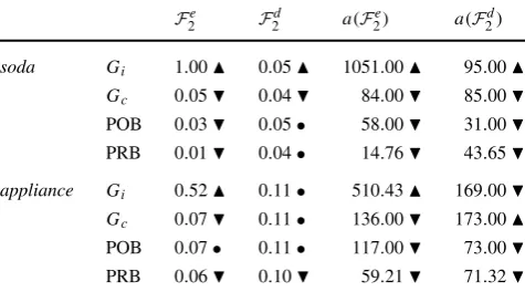
Table 4 F2values for the ranked lists. Thearrowsindicate the higher (best) () and lower (worst) () values. Thecircle(•) indicates equal or approximated values. The parametersα,βandγ used in this exper-iment were:(1,2,3)for soda connection,(1,9,3)for soda interaction, (1,9,1)for appliance connection and(1,9,1)for appliance interaction
Fe
2 F2d a(F2e) a(F2d)
soda Gi 1.00 0.05 1051.00 95.00
Gc 0.05 0.04 84.00 85.00
POB 0.03 0.05• 58.00 31.00
PRB 0.01 0.04• 14.76 43.65
appliance Gi 0.52 0.11• 510.43 169.00
Gc 0.07 0.11• 136.00 173.00
POB 0.07• 0.11• 117.00 73.00
PRB 0.06 0.10 59.21 71.32
Table4shows theF2{e,d}values for the generated ranked lists (evangelists and detractors for each graph used). The absolute values are calculated at ranked lists of sizex=150. The area valuesa(F2{e,d})are calculated for 10≤x≤150. For thesodadataset, all the values for Interaction Graph are higher than the ones for Connection Graph. The values for the naive modelswere lower than both graph approaches, except for F2d, whose values were the same. For the ap-pliancedataset, the difference between the interaction and connection approaches is more subtle. The interaction one is better for two cases, equal to the connection in one and worse in one. This difference will be further explored in the next experiment. Thenaive modelsperformance for the ap-pliance dataset was worse than SaID, as happened for the soda dataset.
Next, we provide a deeper comparison of the ranked lists generated using the Connection and Interaction Graph ap-proaches. For this analysis, we employ a common proce-dure calledcomparison of alternatives using paired obser-vations[19]. This procedure compares two or more systems in order to find the best among them. The observations are calledpairedwhen, for two systemsAandB, in then ex-periments conducted, there is a one-to-one correspondence between theith test in systemAand theith test in systemB. The two samples, generated by the experiments onAandB, are treated as one sample ofnpairs. The difference of per-formance is computed for each pair and a confidence interval is defined. The interval is used as means of checking if the difference measured is significantly different from zero, at a desired level of confidence. If it is, the systems are signif-icantly different. The sign indicates which one has a better performance.
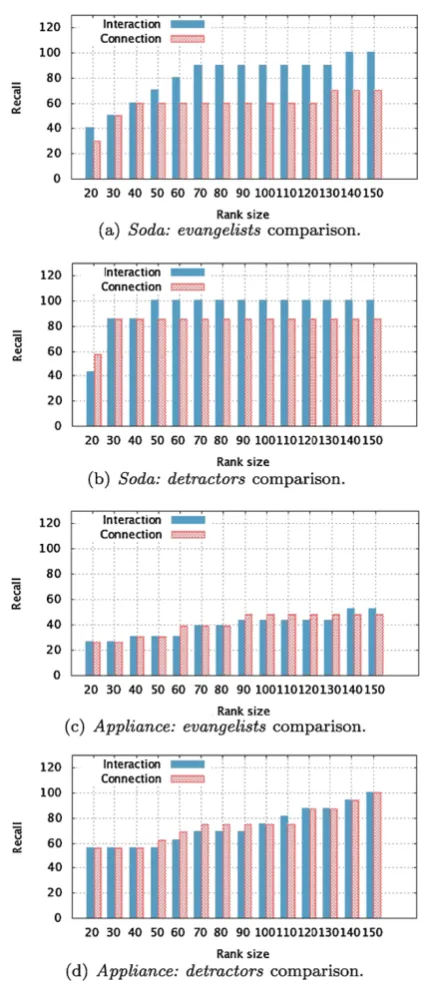
Fig. 4 Paired observations for Interaction and Connection Graph ap-proaches for evangelists and detractors’recall@x in both datasets. The parameters (α, β, γ ) of (4) are optimized for each sce-nario: soda+interaction:(1,9,3); soda + connection: (1,2,3); appliance+interaction:(1,9,1);appliance+connection:(1,9,1)
the size of the ranked lists grows. We treat the samples of Interaction and Connection Graph as one single sample with 15 pairs and compute the difference for each one of them.
Figure4 presents the values of evangelist’s and detrac-tor’s recall@x for each approach and dataset. Table 5 presents the confidence interval of the recall difference for each option. The intervals were calculated with 95% of con-fidence. The Interaction Graph leads to better results in the
Table 5 Confidence intervals of recall difference (interaction-connection), with 90% of confidence
evangelists detractors
soda (5.5147, 13.5329) (14.3002, 25.6998) appliance (−3.0634, 0.1648) (−3.3536, 0.02028)
Table 6 Computing time comparison, in seconds, of betweenness and eigenvector centrality inGi andGc. Thearrowsindicate the higher
(worst) () and lower (best) () values
bc ec
soda Gi 0.00(0.00) 1.96(0.21)
Gc 123.17(5.34) 8.84(0.40) appliance Gi 0.00(0.00) 2.04(0.18)
Gc 96.32(3.13) 5.63(0.50)
majority of scenarios. In the cases in which the Interac-tion approach is not better, the difference between the two approaches is not statistically significant (the interval in-cludes 0), which means that they lead to approximately the same result. We believe that both graph-based approaches have similar results in the appliance dataset due to its smaller size. Since there are less users involved in the discussions about the brand, the chance of an interaction happen be-tween two users that are connected is higher. As seen in Ta-ble3, the number of arcs in Gi andGc are similar to the
ones for the soda dataset.
We also analyze the computational complexity of the ex-traction ofbetweenness(bc) andeigenvector centrality(ec) forGi andGc, in each dataset. Each metric was calculated
10 times for each network and Table6exhibits the average mean cost and the standard deviation obtained (both in sec-onds). As expected, given the number of vertices and arcs shown in Table3, the cost to compute features inGiis lower
for both datasets.Gi expresses only the real content-based
connections between users reducing the problem complex-ity.
Based on these results, we conclude that the interaction based approach is better than the connection based one. For the soda dataset,Gi produced better results with less
com-putational cost. For the appliance dataset, even though the results were similar for both approaches, the interaction one is still cheaper. It is important to remind the reader that an-other additional cost ofGcapproach is to collect all the
fol-lower and following relations for the users in the dataset. Twitter API has limits of access, turning the pre-processing part slow and expensive.
4.2.3 Parameters analysis
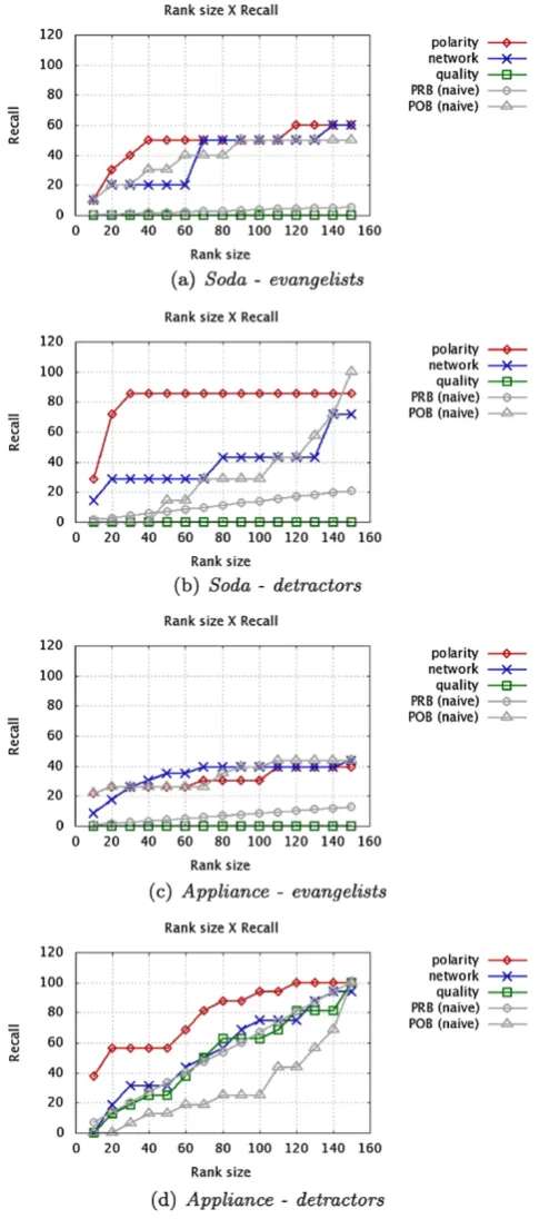
Fig. 5 Plot ofrecall@x, usingGi, considering only polarity, network
and quality in both datasets. Forpolaritythe parameters of (4) are be α=1, β=γ =0, fornetwork, β=1, α=γ =0 and forpolarity, γ=1, α=γ=0.naive modelcurves are also displayed for each case, for comparison
we analyze the impact of each perspective in the method’s result.
As stated before, a single view (polarity, network or qual-ity) may not be good enough to classify users as influential or not. In order to test this hypothesis, different rankings were generated using only one component of (4) at a time. Figure5presentsrecall@x results for each isolated com-ponent using both datasets. We also present values for the two aforementionednaive models.
As can be seen, polarity by itself gives better results than the other perspectives on detractors detection for both datasets. This happens mainly due to the smaller quantity of negative tweets (and users) and the facility with which negative tweets are identifiable. Our polarity factor also out-performs bothnaive modelspresented. For similar reasons, thenetworkperspective works better for evangelists: besides the larger volume of positive tweets, analysts claim that the difference between neutral and positive tweets is quite sub-tle (which can lead to errors if one looks only at the polar-ity). Comparing the network factor thenaive modelsthe or-dered method POB has a similar performance to the network factor alone most of the time. The network factor does not take into account the positive or negative bias of the user, which is very important for the polarized detection, and is partially covered by POB. Finally, thequalityperspective, alone, does not help on detecting neither the evangelists nor the detractors onsoda dataset. This happens also for detrac-tors detection for theappliance dataset. We believe that the low performance of the quality perspective is probably due to the informal and noisy vocabulary used by Twitter users. On the other hand, for detractors identification in the ap-pliance dataset,qualityby itself is practically as good as the network perspective. As already mentioned, in theappliance datasetmost of the negative tweets are from users who ex-plore Twitter ascustomer careplatform, reporting problems and dissatisfactions directly to the official brand profile. For such reason, We believe that the negative tweets are signifi-cantly well-written.
In order to perform a deeper analysis of the impact that each perspective has on the final method results, we employ a 2kexperimental(or factorial)design[19].
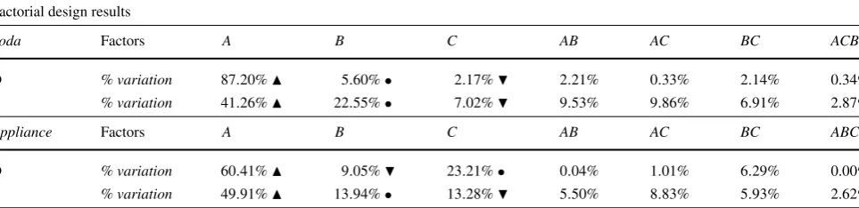
Table 7 Factorial design results for both evangelist (E) and detractors (D) for both datasets Factorial design results
Soda Factors A B C AB AC BC ACB
D % variation 87.20% 5.60%• 2.17% 2.21% 0.33% 2.14% 0.34%
E % variation 41.26% 22.55%• 7.02% 9.53% 9.86% 6.91% 2.87%
Appliance Factors A B C AB AC BC ABC
D % variation 60.41% 9.05% 23.21%• 0.04% 1.01% 6.29% 0.00%
E % variation 49.91% 13.94%• 13.28% 5.50% 8.83% 5.93% 2.62%
k factors is evaluated at two levels. This design acts as a preliminary investigation of which factors are relevant for a deeper investigation. The importance of a factor is mea-sured by the proportion that it explains of the total variation of the response and, in particular, the factors which explain a high percentage of variation are considered the most rel-evant for further investigation. The steps of an illustrative factorial design with two factorsA andB can be summa-rized as follows.
2kFactorial design steps
1. Each of theirk factors is associated to variablesxA and xB, which stand for the lower and higher levels, as
fol-lows:
xk=
−1 if factorkassumes its lower level, +1 if factorkassumes its higher level.
2. The performance (response variable)yof systemsAand B are regressed on xA and xB using a nonlinear
re-gression model of the form:y=q0+qAxA+qBxB+ qABxAxB.
3. The effects q0,qA,qB andqAB are determined by
ex-pressions calledcontrasts, which are linear combinations of the responsesyi calculated based on observations of
each possible combinations of the variables. IfxAi and xBiare the levels ofxAandxB, respectively, the
obser-vation would be modeled asyi=q0+qAxAi+qBxBi+ qABxAixBi.
4. The importance of a factor is measured by the proportion of the total variation in the response that is explained by the factor. In order to calculate this proportion, it is first, necessary to calculate the total variation ofy, or thesum of squares of total, given bySST= 2i=k1(yi− ¯y)2.
5. Also,SST can be expressed asSST =2kq2 A+2kq
2
B+
2kqAB2 . The three parts on the right-hand side represent the portion of the total variation explained by the effect ofA,B, and interactionAB, such asSSA=2kqA2,SSB= 2kq2
Band so on. Thus, thefraction of variation explained
by a factork is given byk=SSTSSk. Finally, this fraction provides means to gauge the importance of the factor.
For our experiment, we define the variablesxA, for
po-larity,xB, for network, andxC, for quality and theresponse
variableisa(recall@x)for, 10≤x≤150. The combina-tion of factors was the following:
xA=
−1 ifα=|u 1
polarity|,
+1 ifα=1,
xB=
−1 ifβ=0,
+1 ifβ=1, xC=
−1 ifγ=0,
+1 ifγ=1.
For polarity, in the lowest level, only the signal of user’s polarity is considered, while for the highest, the intensity is also taken into account. For example, considering a user with polarity perspectiveupolarity= −12, in the lowest level (replacingαin the influence score formula, (4), the polarity part would be
α×upolarity= 1 |upolarity|×
upolarity
= 1
12×(−12) = −1.
Meanwhile, in the highest level, the polarity part would be α×upolarity=1·upolarity= −12. For the network and qual-ity perspectives, the levels were defined as the presence or absence of the component in the influence score formula (β= {0,1}andγ = {0,1}). The intuition of employing this design is to analyze what is the effect on the results when a perspective can be left out.
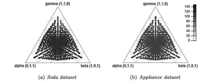
Fig. 6 Ternary plot ofα,βand γ values for the Interaction Graph method. Each
combination of parameters is a circle. The color (from a grayscale palette) represents the value for the area below the recall@xcurve:a(recall)
By observing the results, we can conclude that the re-sponsible for the greatest fraction of thevariation of results in both datasets is the polarity factor. The use of the polar-ity signal, instead of its intenspolar-ity, worsens the result largely. Also, as observed in Fig.5, the polarity is one of the most important perspectives in the method. The other two per-spectives behave differently for the different datasets. For the soda dataset, quality is the minor responsible for the vari-ation for both evangelists and detractors. This means that the presence or absence of the metric does not impact the method much, that is, its contribution for influence detec-tion is small. Meanwhile, for the appliance dataset, quality was responsible for a fraction of variation similar (evange-lists) or greater (detractors) than the network perspective. Looking at both datasets, the network factor stays between the other two perspectives, except for detractors detection for the appliance dataset. Observing the corresponding plot in Fig.5, it is possible to conclude that this happens due to the good results using any of the three perspectives alone (including the quality one): once all the perspectives play a important role in the detection, the fraction of variation is distributed more fairly.
Finally, determining the best combination of α,β, and γ is an issue. For the reported experiments, we have opti-mized the parameters by searching linearly all the combina-tions from 1 to 10. Due to the small number of influential users in each dataset and the impossibility to employ meth-ods such asleave one out[1] (we want to evaluate the rank, not each user), we optimized the parameters using the whole data, in order to estimate the potential of the method. Al-though limitations are expected from this methodology of optimization, Fig. 6shows that the result does not change much for different values of α, β and γ. Specifically, in the ternary plots, each edge corresponds to a parameter and its values increase vertically according to its opposite base. Each point is a combination of the three of parameters. The color of each point indicates the area below the recall@x curve a(recall) for the combination of parameters that it represents. The scale, from 0, white, to 150, black is also shown.
By analyzing the plots, one can see that the values of recall@x are only slightly affected by the change of pa-rameter combination for both datasets. Moreover, the result range for both datasets is similar: arounda(recall@x)∼ 100. Therefore, when dealing with a new dataset, a choice of parameters that is similar to the ones presented in this work is expected to produce good results as well.
4.2.4 Evangelists vs. detractors
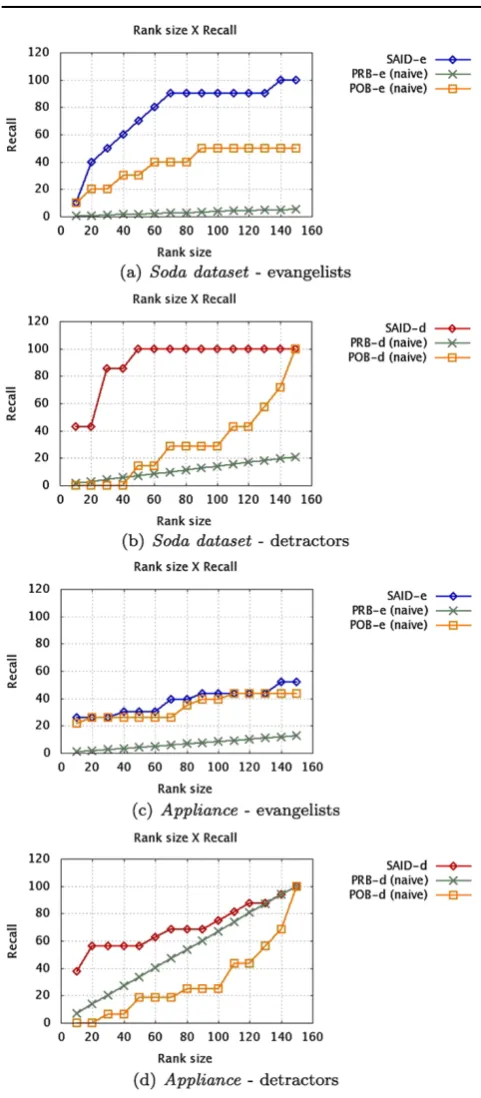
Finally, in this Section, we aim to discuss the final results for evangelists and detractors using the Interaction-based ap-proach. Figure7 shows recall@x for evangelists and de-tractors. We also display thenaive models for comparison purposes.
In both datasets, the result is better for detractors than for evangelists. This difference is mainly because it is eas-ier for an analyst to classify a detractor; it is usually dif-ficult to differ between positive and neutral tweets, which may lead to more errors on finding the evangelists. Further-more, comparing the results presented in Fig.5(using only one perspective at a time) and Fig.7(using the combination of the perspectives), one can see that the latter usually pro-duces better ranked lists than the former for both datasets. In theappliance dataset, for example, although the polar-ity curve for detractors is very similar to the one produced by combining the perspectives, it does not produce good re-sults for evangelists, when compared to the combination of the perspectives. An ideal curve is one that detects the high-est number of influential users as quick as possible, and, for that matter, the combined curve is the best choice.
Fig. 7 recall@x for evangelists and detractors. The parametersα, β andγ of (4) are(1,9,3)forsoda datasetand(1,9,1)for appli-ance dataset.POBe,POBd,PRBeandPRBdare, respectively,Polarity Ordered Baselinefor evangelists and detractors andPolarity Random Baselinefor evangelists and detractors
5 Conclusion
In this article, we addressed the problem of identifying bi-ased influential users on a topic in Twitter. Motivated by the
dynamics of this environment, in which users share opin-ions, experiences and suggestions about diverse subjects, and by the huge volume of content generated daily, we aim to assist businesses (or anyone interested in product/service feedback) on finding the key users that lead the conversa-tions and acconversa-tions for a given subject.
This work has analyzed user behavior, interaction and connections in order to determine their influence on Twitter. Specifically, for each user, her tweets’ readability and polar-ity are extracted, and her position in two different networks (Interaction and Connection Network) of people that talk about the same topic are analyzed. Moreover, since there is no benchmark for influential users detection (a default dataset with tweets and users previously classified), one sig-nificant effort of this work was to build such a test collec-tion. This is not a trivial task due to the difficulty to classify the tweet’s sentiment and the user’s level of influence (both subjective problems by nature).
We have validated our method using specialists’ ground truth for two product datasets, studied the impact of each perspective on influential identification, and compared the results using Interaction and Connection Networks. We have found that the detractor’s result is visibly more accurate than the evangelist’s. This happens due to the occasional diffi-culty for distinguishing between a neutral and a positive-biased tweet during the manual classification. For the nega-tive tweets, this boundary is usually clearer. The experimen-tal results also demonstrated that the interactions (mentions, replies, re-tweets, attributions) of an user with others is a better representation of her influence than her connections (follower, following). The recall values for the generated ranks, using the interactions, were always better. Another substantial remark is that the Interaction Network is more sparse than the Connection one. This means more accurate results with cheaper computational cost.
As future work, we plan to implement and test a full auto-matic approach of SaID, as well as improve the parametriza-tion of polarity, network and quality factors. To include tem-poral aspects in influential detection is also planned. Finally, we aim to expand our experiments in more datasets, featur-ing different characteristics.
Acknowledgements This work is partially supported by the projects INCT-Web (MCT/CNPq grant 57.3871/2008-6) and by the authors’ in-dividual grants and scholarships from CNPq, CAPES and FAPEMIG.
References
1. Alpaydin E (2004) Introduction to machine learning (adaptive computation and machine learning). MIT Press, Cambridge 2. Baeza-Yates RA, Ribeiro-Neto B (1999) Modern information
re-trieval. Addison-Wesley, Reading
4. Barabási A-L (2002) Linked: the new science of networks, 1st edn. Basic Books, New York
5. Berry J, Keller E (2003) The influentials: one American in ten tells the other nine how to vote, where to eat, and what to buy. Free Press, New York
6. Bonacich P (2007) Some unique properties of eigenvector central-ity. Soc Netw 29(4):555–564
7. Brandes U (2008) On variants of shortest-path betweenness cen-trality and their generic computation. Soc Netw 30(2):136–145 8. Brin S, Page L (1998) The anatomy of a large-scale hypertextual
web search engine. Comput Netw ISDN Syst 30:107–117 9. Cha M, Haddadi H, Benevenuto F, Gummadi KP (2010)
Mea-suring user influence in Twitter: the million follower fallacy. In: Conference on weblogs and social media, Washington, District of Columbia, USA
10. Chan KK, Misra S (1990) Characteristics of the opinion leader: a new dimension. J Advert 19:53–60
11. Chen P, Xie H, Maslov S, Redner S (2007) Finding scientific gems with Google’s PageRank algorithm. J Informetr 1(1):8–15 12. Costa LF et al (2007) Characterization of complex networks: a
survey of measurements. Adv Phys 56:167
13. Dalip DH et al (2009) Automatic quality assessment of con-tent created collaboratively by web communities: a case study of Wikipedia. In: Joint conference on digital libraries (JCDL), Austin, Texas, USA, pp 295–304
14. Golbeck J, Hansen D (2011) Computing political preference among Twitter followers. In: Proceedings of the 2011 annual con-ference on human factors in computing systems, CHI ’11, Vancou-ver, British Columbia, Canada. ACM, New York, pp 1105–1108 15. Goyal A, Bonchi F, Lakshmanan LV (2010) Learning influence
probabilities in social networks. In: International conference on web search and data mining (WSDM), New York, New York, USA, pp 241–250
16. Hagberg A, Schult D, Swart P Networkx. High productivity soft-ware for complex networks.https://networkx.lanl.gov/
17. Huang J, Thornton KM, Efthimiadis EN (2010) Conversational tagging in Twitter. In: Conference on hypertext and hypermedia, Toronto, Ontario, Canada, pp 173–178
18. Huberman BA, Romero DM, Wu F (2008) Social networks that matter: Twitter under the microscope. Social science research net-work net-working paper series
19. Jain RK (1991) The art of computer systems performance analy-sis: techniques for experimental design, measurement, simulation, and modeling. Wiley/Interscience, New York
20. Jansen BJ et al (2009) Twitter power: tweets as electronic word of mouth. J Am Soc Inf Sci Technol 60(11):2169–2188
21. Katz E, Lazarsfeld P, CUB of Applied Social Research (1955) Per-sonal influence: the part played by people in the flow of mass communications. Foundations of communications research. Free Press, New York
22. Krishnamurthy B, Gill P, Arlitt M (2008) A few chirps about Twitter. In: Workshop on online social networks (WOSP), Seat-tle, Washington, USA, pp 19–24
23. Kwak H, Lee C, Park, H, and Moon S (2010) What is Twitter, a social network or a news media. In: International conference on World Wide Web (WWW), Raleigh, North Carolina, USA. 24. Leavitt A, Burchard E, Fisher D, Gilbert S (2009) The influentials:
new approaches for analyzing influence on Twitter
25. Lee C, Kwak H, Park H, Moon S (2010) Finding influentials based on the temporal order of information adoption in Twitter. In: Inter-national conference on World Wide Web (WWW), Raleigh, North Carolina, USA, pp 1137–1138
26. O’Connor B, Balasubramanyan R, Routledge BR, Smith NA (2010) From tweets to polls: linking text sentiment to public opin-ion time series. In: Internatopin-ional AAAI conference on weblogs and social media (ICWSM), Washington, District of Columbia, USA 27. Ressler S (1993) Perspectives on electronic publishing: standards,
solutions, and more
28. Ruhnau B (2000) Eigenvector-centrality—a node-centrality? Soc Netw 22(4):357–365
29. Savage N (2011) Twitter as medium and message. Commun ACM 54:18–20
30. Van den Bulte C, Joshi YV (2007) New product diffusion with influentials and imitators. Mark Sci 26(3):400–421
31. Watts DJ, Dodds PS (2007) Influentials, networks, and public opinion formation. J Consum Res 34(4):441–458