C.J. Pennekamp
Cartographic rules for visualisation of
time related geographical data sets
þ
ü
ý
MSc
Cartographic rules for visualisation of time
related geographical data sets
Caroline Jolanda Pennekamp
Dissertation submitted in part fulfilment of requirements for the Degree of Master of Science in Geographical Information Systems
Abstract
Cartographic rules for new visualisation opportunities in GIS
To visualise regular 2-D map elements one can use the Cartographic Grammar as set up by Bertin (1973). The guidelines he made for visualisation of qualitative, ordinal and quantitative data sets are used by cartographers all over the world and can be used by GIS users who like to produce effective maps.
GIS software and hardware possibilities however, made it possible to make new kinds of maps from non-regular data sets. For instance by connecting a database to spatial features it is possible to make time sequences of each object. But also the new technical possibilities as multimedia, quick regenerating of the display devices and software possibilities for generating red/green 3D images generates new output products. These new possibilities have a great new impulse in the world of cartography. The possibility of representing time in maps is one of those new research items.
Research on this new aspect in Cartography has started. In 1994 MacEachren stated "Animation provides a new cartographic variable that can increase the possibilities of exploratory data analysis". He also suggested that "it should be useful to consider this new variable in relation to Bertin's work".
Subject of interest is to set up new easy to use rules, just like Bertin's grammar, which can be used by GIS users as a guideline for choosing the most effective representation to express their particular time variant.
In this thesis these issues are explored in theory. An overview is given of Bertin's theory and the characteristics of time related geographical data sets. An evaluation of the extensions made by fellow cartographers to the theory of Bertin in order to incorporate the factor time in his scheme is made. Finally, a personal proposal of the representation of time related geographical data sets is given, based on the theory models available and extended with new selection criteria. A selection scheme will help a mapmaker in his creating process based on the kind of data, goal and technical possibilities.
TABLE OF CONTENTS
1. INTRODUCTION... 1
2. GIS, VISUALISATION AND CARTOGRAPHY ... 3
2.1INTRODUCTION... 3
2.2DEFINITION OF GIS, VISUALISATION AND CARTOGRAPHY... 3
2.2.1 Definition of GIS ...3
2.2.2 Definition of visualisation ...4
2.2.3 Definition of cartography...5
2.3CARTOGRAPHY... 6
2.4GIS AND CARTOGRAPHY... 7
2.5NEW POSSIBILITIES WITHIN GIS FOR CARTOGRAPHERS... 8
2.6SELECTING TIME AS POINT OF INTEREST... 10
3. BERTIN'S CARTOGRAPHIC GRAMMAR... 12
3.1INTRODUCTION... 12
3.2THEORY... 12
3.2.1 The visual variables...13
3.2.2 Signifying properties...14
3.2.3 Level of measurement...15
3.2.4 The relation...16
3.3WEAKNESS AND RESTRICTIONS OF GRAMMAR THEORY... 18
3.4MODIFICATIONS AND ADDED FEATURES OF OTHER SCIENTISTS... 18
3.4.1 Morrison...18
3.4.2 MacEachren...19
3.4.3 Geels ...21
3.5THEORY IN RELATION TO GIS... 24
4. TIME DATA WITH A GEOGRAPHIC COMPONENT... 26
4.1INTRODUCTION... 26
4.2CLASSIFICATION OF TIME... 26
4.3TIME IN A GIS DATABASE... 28
4.4TIME CHANGES IN GIS... 30
4.5CONCLUSIONS... 32
5. TECHNOLOGICAL POSSIBILITIES TO REPRESENT TIME ... 34
5.1INTRODUCTION... 34
5.2TRADITIONAL MAPPING SOLUTIONS... 34
5.2.1 Single map...34
5.2.2 Series of maps ...36
5.3NEW MAPPING SOLUTIONS... 37
5.3.1 Multiple dynamically linked views ...37
5.3.2 Animations ...38
5.3.3 Sound ...43
5.3.4 Video or images ...44
5.4CONCLUSIONS... 44
6. CARTOGRAPHIC THEORY TO REPRESENT TIME ... 46
6.1INTRODUCTION... 46
6.2 RESEARCH ON REPRESENTATION OF TIME... 46
6.2.1 Dynamic variables ...47
6.2.2 Relation dynamic variables and time ...49
6.3EVALUATION OF SUGGESTED THEORY MODELS... 50
6.3.1 MacEachren...50
6.3.3 Köbben ...53
6.3.4 Koop ...56
6.3.5 Kraak ...58
6.4COMPARISON OF THEORY MODELS... 59
6.5SUMMARY... 61
7. EXTENDED GUIDELINES TO REPRESENT TIME ... 63
7.1INTRODUCTION... 63
7.2GLOBAL SELE0CTION SCHEME... 63
7.3THE INVENTORY STEPS... 64
7.4THE SELECTION... 66
8. DISCUSSION ... 72
9. CONCLUSIONS ... 73
REFERENCES ... 75
BOOKS AND ARTICLES... 72
TABLE OF FIGURES
Figure 1 Conception of visual cartography (©Taylor) ... 5
Figure 2 The communication process of maps (Wieland)... 7
Figure 3 Visual variables (©Bertin) ... 13
Figure 4 Example of signifying properties ... 15
Figure 5 Bertin’s scheme ... 17
Figure 6 Morrison’s variable syntactics ... 19
Figure 7 MacEachren’s extended variable syntactics ... 20
Figure 8 Geels’ scheme ... 23
Figure 9 Human-map interaction cube (©MacEachren/Kraak)... 24
Figure 10 Time classes (Kraak, Edsall and MacEachren)... 27
Figure 11 Representation of time slices (Langram) ... 29
Figure 12 The representation of geographic data in various formats (Langram 1992) ... 31
Figure 13 Interrelation in time components ... 31
Figure 14 Choropleth map ... 35
Figure 15 Contour map... 35
Figure 16 Flowline or movement map... 35
Figure 17 Multi temporal composite map ... 36
Figure 18 Example of map serie representing time (Köbben) ... 37
Figure 19 Brushing technique (Monmonier) ... 38
Figure 20 Temporal brush... 40
Figure 21 Sound variables and syntactics (©Kryger)... 44
Figure 22 Duration... 47
Figure 23 Rate of change ... 48
Figure 24 Order ... 48
Figure 26 Dynamic variables in relation to level of measurement
(MacEachren) ... 50 Figure 27 Colour cycling ... 51 Figure 28 Visual variables in relation to signifying properties
(Ormeling) ... 52 Figure 29 Dynamic variables in relation to signifying properties
(Ormeling) ... 52 Figure 30 Perceptual properties of static visual variables (Köbben) .... 54 Figure 31 Dynamic variables in relation to perception property
(Köbben)... 55 Figure 32 Visual variables in relation to signifying properties (Koop)... 57 Figure 33 Dynamic variables in relation to signifying properties (Koop)58 Figure 34 Overview of theory models ... 60 Figure 35 The selection process ... 64
DISCLAIMER
The results presented in this dissertation are based on my own research in the Department of Environmental and Geographical Sciences, Manchester
Metropolitan University. All assistance received from other individuals and organisations has been acknowledged and full reference is made to all published and unpublished sources used.
This thesis has not been
submitted previously for a degree at any Institution.
Signed:
1.
INTRODUCTION
The use of Geographic Information Systems (GIS) has risen to a high level in all working areas using spatial information. Once started as a tool for manipulating spatial data it is now a fully integrated part within all organisations dealing with spatial related features. Beside the analyses made on digital spatial data, GIS is nowadays used for more complex operations like the exploration of the data. However, GIS is also the tool for the computerisation of the map production process. Cartographers were cautious of these new developments. They worried about their jobs because of the expectation that all GIS users would provide their own maps instead of asking the cartographer in the organisation to make a nice and efficient map of their data.
Although their job is more then selecting the best map type for
representation of the data, it is one of the core activities. Unpleasantly this part is very easily to learn for GIS users. With the help of the 'cartographic grammar' made by a man called Bertin, the right
representation of ordinary 2-d data is easily chosen. He made guidelines for representation of three kinds of data sets: qualitative, ordinal and quantitative data. Depending on the desired signifying properties of the visual variables an expressing method can be derived.
However the bad expectations changed into hope for the cartographers. GIS software and new hardware possibilities made it possible to make all new kinds of maps from non regular data sets. Beside this new
opportunity, the GIS users came back to them asking assistance in the map making process. They perceived that the cartographic section could make the end maps quicker (cheaper) and more beautiful than
The traditional map making process is of course no problem but the new opportunities like multi-media, multi-views, sound, animation, hyper links, quick regenerating display devices and software possibilities for generating red/green 3D images are present a set of research problems. Representation of other -non regular- data sets is now perhaps more possible. Visualisation of data with a time aspect is one of those problems that should be researched.
Research on this new aspect in cartography is already underway, for instance A.M. MacEachren (1994) called animation “a new cartographic variable that can increase the possibilities of exploratory data analysis". He also suggests that "it should be useful to consider this new variable in relation to Bertin's work".
The goals of this thesis are first to evaluate the extensions made by fellow cartographers to the theory of Bertin in order to incorporate the time factor in his scheme. Secondly to develop the methodological base for representation of time based on the theory models available and extended with new selection criteria. The object is to develop a selection scheme which will help a mapmaker in his creating process based on the kind of data, goal and technical possibilities.
2.
GIS, VISUALISATION AND CARTOGRAPHY
2.1 INTRODUCTION
“Cartography is a field with a long practical history but a short academic one”, A.M. MacEachren (1995)
Before starting a research on the visualisation possibilities of time related data sets it is essential to start with the basics of the relevant disciplines: GIS, visualisation and cartography. As stated in the introduction
cartographers were very cautious of GIS software in the eighties. At the same time they started the conversion of an analogue working process into a digital process. Whole new, mostly technical problems appeared and resulted in little time left for fundamental research. This thesis is a start in new fundamental research on visualisation.
In this chapter first the definition of the key issues (§2.2) are examined. After the definitions, the importance of cartography is highlighted, followed by the relation GIS-Cartography. In §2.5 the new technical possibilities are mentioned and discussed. In the last section the human aspect of visualisation is worked out.
2.2 DEFINITION OF GIS, VISUALISATION AND CARTOGRAPHY
2.2.1 Definition of GIS
There are several definitions for Geographical Information Systems (GIS), Kraak and Ormeling (1996,p 9) state that there are two categories: those with a technological perspective and those with an institutional perspective.
From a technological point of view Burrough (1986) makes the definition:
'A powerful set of tools for collecting, storing, retrieval at will,
transforming and displaying spatial data from the real world'.
From an institutional point of view Cowen (1988) stated:
'A decision support system involving the interaction of spatial referenced data in a problem-solving environment'.
For this thesis I would like to use a definition which is the combination of these statements. A GIS is a software package for collecting, storing, manipulating and representing of spatial data sets with the purpose of a decision supported system.
Representing spatail data sets can be rewritten which the term visualisation, the key issue of the next section.
2.2.2 Definition of visualisation
The International Cartographic Association (ICA) was founded in 1959. One of the principle departments of this association is a group of scientific cartographers who collaborate in research. A hot topic at the moment is visualisation. They mentioned that the use of the term visualisation in the cartographic literature can be traced back at least four decades. (URL: ICA, 1998)
Kraak (1997) defined visualisation as 1) visible and 2) modern technology that offers the opportunity for real-time and interactive presentation.
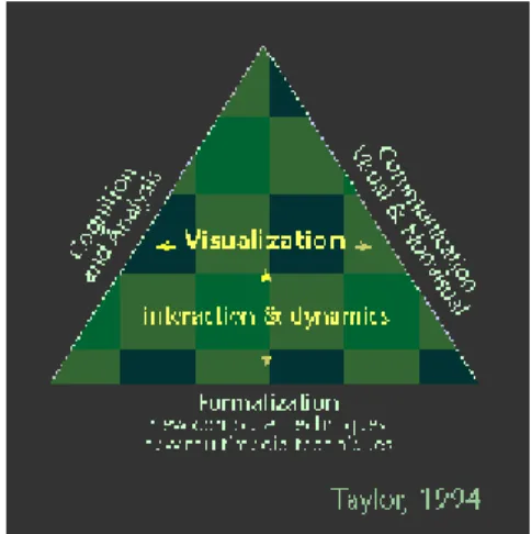
On the other hand Taylor (URL: ICA, 1998) presented in 1991
visualisation as the intersection of research on cognition, communication,
dictated by digital computer systems). In a modification of this model in 1994 he made clear that he does not equate "visualisation" with
"cartography" (Figure 1: Taylor's (1994) extended and revised conception of visualisation in cartography.).
Figure 1 Conception of visual cartography (©Taylor)
Blok and Köbben (1998) concluded that visualisation seems to have at least three meanings: the production of (carto) graphical representations of data, the use of (advanced) display technology that acts as an
interface between data and user, and the production of cognitive (mental) representations.
2.2.3 Definition of cartography
The Dutch cartographic society defined cartography (Bos et al, 1991) as:
"The total of scientific, technical and artistic activities focussed on the production and the use of cartographic products. "
In this case not only maps but also map-related representations and cartographic databases are included.
Visualisation can thus be seen as part of the cartographic process but also as an independent topic with links to cartography as maps are used in a visualisation process.
Kraak stated in his Inaugural address that nowadays the purpose of cartography is not longer only the making of a map, but also the question of the effectiveness of a map. To “How do I say what to whom” he adds “and is it effective?”.
2.3 CARTOGRAPHY
Cartography is also the activity that is focussed on the representation of space and reality. Since man considered land as his property, sketches of parcels were made. Also topographical maps were created for instance for orientation reasons. The goal for both types of maps is to make the best representation of the situation. Of course it would also be possible to try to put into words the spatial attributes of a location, however one map tells more than thousand words. The essential difference with spoken/written text is time itself. Written text is always sequential instead of graphical communication forms, which are spatial. In a map one can see multiple features at the same time which is almost impossible with sound/text communication.
The graphical communication (maps, graphs, pictograms) can also be modelled themselve. Wieland (1980) made such a model to represent the communication process.
map maker map reader
world
Figure 2 The communication process of maps (Wieland)
In this scheme he wants to express the fact that a map-maker interprets the ‘world’ in his own way and represented his ideas in his map. A map-reader interprets this map and creates his own idea about the world that is represented in the map. The grey rectangle represents the overlap between the real world and the world of the map-reader. The bigger the overlap the better the job of the cartographer.
Cartographers should therefor always bear in mind the way the map user is likely going to look. This is called the map-reader perceptive and is discussed further in §3.4.4.
Result of traditional cartographic work is most of the time a two-dimensional map, either a topographical representation or a thematic representation of the real world. To represent an effective map there are numerous rules and guidelines written down in books. Bertin’s book (1981) concentrate for instance on classifying data and gives the onset of the cartographic grammar; Tufte’s books (1983,1990) concentrate on maximalisation of data with use of minimum of symboligy. Other books like the books written by Kraak and Ormelings (1996) and Monmonier (1996) are focussing on the total design of maps. In this books one can find items related to pure map design but also (geographical) data manipulation, projections and technical reproduction facilities.
2.4 GIS AND CARTOGRAPHY
Just like the traditional cartographic products, the main output products from a GIS are 2-D maps. The output can either be on screen or printed out. Due to the fact that printed maps are just like most of the traditional
cartographic maps made for other map-readers and not for pure private use, all cartographic design rules should be used to make an effective map.
Cartographic design rules which should be used are for instance rules dealing with the:
− lay-out
− typology
− text placing
− generalisation
− classification
− use of correct visual variables (Bertin’s grammar)
Of course there are also differences between cartographic rules and the visualisation part of a GIS. One of the most important one is the
difference in standard output device. In a GIS a screen is the most common output not paper. The way of looking to a screen and the possibilities to interact, are different compared to the use a two
dimensional maps. The maximum size and resolution are different and even colours are created in a different way. On a screen the primary colours are Red-Green-Blue, also called the additive primary colour set. Printed maps are based on subtractive colours (Yellow-Magenta -Cyan). Other differences are the greater potential interaction possibilities of GIS users comparing to map-readers of the static properties of a printed map.
2.5 NEW POSSIBILITIES WITHIN GIS FOR CARTOGRAPHERS
In the last few years, changes in traditional cartography have become noticeable: data are stored in digital volumes and there is an ongoing discussion about the introduction of interactive and dynamic ways of
visualisation, using new technological possibilities like animations, multi media, virtual reality, sound and 3 D (Kraak, 1998).
This resulted in an extensive list of current research topics for the researches assembled in the ICA [URL: ICA, 1998]. The most important ones are:
§ TIME: development of a conceptual model and associated tools for the visualisation of spatial-temporal process information (see Slocum and Egbert, 1991, for a review of relevant work in cartographic animation; Kraak and MacEachren, 1994, for discussion of approaches to the representation of spatio-temporal information via maps).
§ FUZZY: development of a conceptual model and associated tools for the visualisation of data quality/reliability.
§ MCA/DSS: explore the impact of map-based spatial decision support tools on decision making strategies and on the outcome of decision-making.
§ 3D: study the potential of three-dimensional representation tools and the corresponding implications of both three-dimensional display and the associated general trend toward realism (versus abstraction) in scientific representation - see MacEachren, et al., 1994 for an initial discussion.
§ Multi media: address implications, for our approaches to map design, of the ability to link many representation forms together in hypermedia documents (e.g., maps, graphs, text, audio narratives, sonic data representation, etc.).
These new topics can be grouped in four basic categories:
a) The geographical possibilities
b) The databases possibilities
§ registration of time aspect § easier aggregation of data sets § larger data sets
§ use of relational or object oriented databases
c) The GIS facilities § Geo-statistics
§ Multi Criteria Analyses / Decision Support Systems d) The technical/graphical possibilities
§ hyper links and dynamic linked views § animations (temporal or non-temporal) § fly over (3D)
§ multi media
§ multi views: same data, multiple expressions, multiple views. § interaction
§ sound
2.6 SELECTING TIME AS POINT OF INTEREST
Out all of the new research topics the visualisation of spatial-temporal data is an interesting and often mentioned term within both the field of cartography and GIS. It concerns not only the latest technical possibilities in a GIS, like the database part and the new graphical possibilities but also the cartographic rules and the impact of the new graphical possibilities on the map-reader.
For ‘normal’ 2 D non temporal maps the design rules and the
effectiveness are well known due to the efforts Bertin (1981) made. His (grammar) rules are very useful for ‘regular’ map design and adapted by
cartographers all over the world. In the next chapter his rules are discussed further on.
However the visualisation of spatial-temporal data does not fit in his grammar. The type of data (time related data sets) nor the latest graphical possibilities can be found in this schemes. Looking for new or possible extended rules are the challenge for the following sections. With these new rules mapmakers can be guided in their creative process to produce maps which are likely to be effective regarding the kind of data, goal and available technical possibilities.
3.
BERTIN'S CARTOGRAPHIC GRAMMAR
3.1 INTRODUCTION
There are numerous books written about Cartography, however the most important one is the French book called Semiologie Graphique written by Jacques Bertin in 1967. This book deals with the technique of ordering and classification of data sets. The last chapters of the book are more graphical oriented. Though, these chapters are so evident that they became the basis of cartographic visualisation. He structures the process of map design and more specific the communication process. Due to his schedules it is easy to understand how the communication process is best steered.
In this chapter his theory is discussed, the relation to GIS is laid and the modifications made on his theory suggested by other researches are presented.
3.2 THEORY
Bertin stated in his book Graphics and Geographic Information
Processing that persons always look at a map with a certain underlying question. This can be “Where is …?” or “What is there?”.
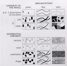
In the 1960s Bertin for the first time systematically studied the graphical elements in a map which he called visual variables, and their impact on the map-reader which he called signifying properties.
For regular 2 Dimensional static maps, Bertin identified eight visual variables, four signifying properties of the visual variables and three levels of measurement for the data sets. His main goal was to link these categories to each other to help the map maker in his decision of
based on the type of data and the signifying properties of the selected symbols.
3.2.1 The visual variables
Visual variables are the representation possibilities of spatial data, which are available for cartographers to represent spatial features on a map. Bertin distinguished eight visual variables into two different groups. The first group of four visual variables is:
§ X
§ Y >> the two dimensions of the plane § size
§ value >> the z-value of the plane
The other variables he called the differential variables: § texture
§ colour § orientation § shape
He expressed this classification in the –original- scheme below:
As can be seen, the representation possibilities can be applied to both point, line or polygon features in a map. However size is only very incidental used in relation to polygon features.
Movement can be an additional variable in this scheme, however Bertin (1981,p 42) argued that “although movement introduces only one
additional variable, it is an overwhelming one; it so dominates perception that it is severely limits attention which can be given to the meaning of the other variables”. For this reason he skipped movement out of this list of variables and out of his theory.
3.2.2 Signifying properties
For each visual variable, Bertin proposed rules for their appropriate use based on the signifying properties of each visual variable. The term signifying property can be explained as the impression that the map-reader gets when looking at a map, or more specifically, looking at a visual variable.
He distinguished four different kind of signifying properties: § similar (
≡
)§ differential (
≠
) § ordered (O
) § proportional (Q
)Example
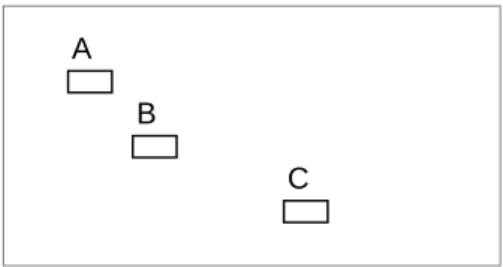
Figure 4 Example of signifying properties
• Features A,B,C are distinguishable. They are therefore different (
≠
) although they are similar (≡
) points.• B is between C and A. The three points are ordered (
O
).• BC is twice as long as AB. AB is a unit for measuring BC and AC, and the eye sees proportions (
Q
).Geels (1987) gave another, easier to understand description: Similar (
≡
) orassociation
It is possible to neglect the differences between the symbols in order to see the corporate figure Differential (
≠
)or selection
It is possible to isolate all spots with the same symbol in order to detect the pattern that they form.
Ordered (
O
) It is possible to order the symbols in an unambiguously way.Proportional (
Q
)It is possible to estimate the proportion of two symbols.
3.2.3 Level of measurement
Separately from the visual variables there are the statistical variables; the classification of the original data set. The thematic data that should be represented can be classified in three different types of data. The
A B
classification is based on the mathematics. One of his ‘mistakes’ is that he merged the classification of ratio data sets with interval data sets in one class called quantitative data sets.
His three classes of data sets are:
• Quantitative (ratio and interval):
Attributes of features who represent an amount. Ratio data (like distance, or inhabitants) can be manipulated with all kind of
mathematical operations without losing total sense. Interval data (like temperature) represents also an amount and has also units with a fixed interval, just like ratio data, however without a absolute zero.
• Ordinal:
Attributes of features who can be ranked (like suitability of soil types for maize), however mathematical calculation like calculating average and sum give no sense due to the fact that the units do not have a fixed interval.
• Nominal or qualitative:
Attributes of features (e.g. provinces, soil types or ID numbers) who have no evident order. Calculation with (ID) numbers gives no sense.
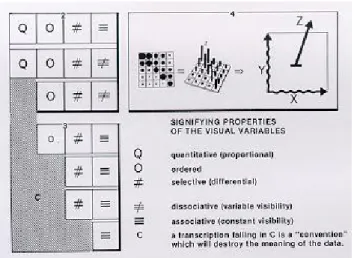
3.2.4 The relation
Bertin connected these elements to each other based on the signifying properties and put it in one scheme. In the scheme itself he does not declare the x and y values. Yet, in the rows are the visual variables declared in the same order as in Figure 3, the columns are the signifying properties which can be used based on the level of measurement of the data. For example ordered or quantitative data can only be represented correct by value and size.
Nine out of the 28 possible combinations between visual variables at one side and signifying properties/level of measurement at the other side are not possible. Bertin calls this transcription useless and warns that this combination will destroy the meaning of the data totally.
Examples:
§ Representing the suitability of soil type for crowing crops like wheat by use of the visual variable colour results in a map that gives the false impression.
§ Representing of inhabitants per county by use of size gives the correct impression of proportion.
Figure 5 Bertin’s scheme
Although not always easy to understand the way Bertin orders his scheme, it is very helpful by the decision which visual variable can be best used to represent the original data set.
3.3 WEAKNESS AND RESTRICTIONS OF GRAMMAR THEORY
All cartographers adapt the theory however the theory is not completely solid and there are certain restrictions in the use of it. One of the weakest points is that the relation between scale of measurement and the
signifying properties of these variables is not stated clearly. In his scheme (fig 5) he mixes the items as can be seen clearly in ‘the legend’ of the scheme.
Another omission is the lack of guidance in how to handle the case more than one visual variable is used. Geels (1987) tried to put these
omissions in a new more extensive grammar scheme (see § 3.4.3). Beside the weakness of the theory there are also restrictions to the use of it. The grammar is intended to use for quantitative, ordered or qualitative data sets. Data sets with more exceptional data like time related data, 3-dimensional data or sound are less suitable for this model. For instance, Bertin use x,y co-ordinates in his scheme as the two dimensions of the plane and he defined size and value as the z-value instead of real z-co-ordinates. Also time date, like the time interval of an event, is difficult to classify into one of the three level of measurements.
3.4 MODIFICATIONS AND ADDED FEATURES OF OTHER SCIENTISTS
Due to the weakness of the model other cartographic scientist tried to improve the model. The new schemes are more or less a variation on the original one, but more ‘complete’.
3.4.1 Morrison
One of the first critics who suggested additions was Morisson (1974). He added arrangement and the third dimension of colour, saturation, to the
list. Bertin used the term colour for the mixture of hue and saturation. Morrisson stated that with the advent of computer-specified colours, colour saturation could be seen as an important new visual variable. Morrison distinguished also another new visual variable: pattern arrangement.
All these visual variables are matched which only two(!) categories of information; either nominal- or ordinal-interval-ratio. Matches between graphic variables and the two levels of measurement are depicted as ‘usable’, ’possible’ or ‘impossible’.
ordinal nominal Size Shape Colour: Hue Colour: Value Colour: Saturation Pattern: Texture useable Pattern: Arrangement possible Patterns: Orientation impossible
Figure 6 Morrison’s variable syntactics
3.4.2 MacEachren
Allan M. MacEachren (1995,p 276) also argued that a further addition to Bertin’s variables is needed. He proposed the term ‘clarity, which he divided in three visual variables or subdivisions:
• crispness: adjustment of the visible detail of a map;
• transparency: a fog that obscures the map theme in proportion to the uncertainty in data about the theme.
nu me ric o rdin al no m in al visual isola-tion visual levels Location Size Shape Colour: Hue Colour: Value Colour: Saturation Pattern: Texture good Pattern: Arrangement marginally effective Pattern: Orientation poor Crispness Resolution Transparency
Figure 7 MacEachren’s extended variable syntactics
In his scheme a visual variable syntactics representing the expanded variable typology is presented. The two columns on the right represent Bertin’s concepts of associatively (
≡
) and selectivity (≠
).In 1991 a seminar directed by MacEachren led to the conclusion that an extension to Bertin’s grammar/syntactics should be made. Although Bertin explicitly stated that his principles concerning visual variables were not applicable to dynamic display, their initial explorations suggest otherwise.
They expected that movement would be a powerful map “variable” because it combines the two indispensable variables of time and space. On the other hand they admit that is probably true that on a dynamic map things that change would attract more attention than things that do not and things that move probably attract more attention than things that change in place. He stated that “The fact that the use of time gives the map designer a powerful new graphic tools is a reason to explore that tool in detail rather than to exclude it from consideration“. MacEachren (1995,p 280).
As a result of the seminar he designed the first rules for representing time. These rules are extensively discussed in chapter 6.
3.4.3 Geels
At the University of Utrecht seminars were organised for students in order to learn the syntactical grammar of Bertin. Geels was one of the instructors in the eighties. Due to the fact that he was forced to explain the theory step by step he detected that certain steps in the theory were missing. One of the weakest points is that the relation between scale of measurement and the signifying properties of these variables is not stated clearly. Another omission is the lack of guidance in how to handle cases where more than one visual variable is suitable.
First he looked for the relation between the measurement level and the visual variables based on the signifying properties of the visual variables.
Bertin already mentioned two connections (order and proportion) in the original scheme. Geels added two new ones, differentiation and distance. Secondly Geels looked for a place in his scheme for the last two
signifying properties Bertin has stated, association (
≡
) and selection (≠
). He added a third signifying property to this list, called differentiation. To explain this he gave the following guidelines.Signifying property name “What do you want to see?” Association or
overall impression
see all of all
Selection see all of one
Differentiation see one by one
He puts all together in a new, more extensive scheme (see fig 8)
This scheme is helpful for students to select the optimal visual variable in relation to the available data set and in relation to the desired impact of the image. However, the scheme is focussed on the selection of an optimal visual variable for area features and is not tested for linear and points features.
Ratio
measure- Interval high image
ment Ordinal middle level
level Nominal low
d iff e ren tia tion o rder dis tan ce p ropo rti on visualvariables d iff e ren ti a ti on s e le c ti on o v er a ll imp re ss ion 2-d plane characteristic size
possible texture
colour
strong Perception orientation
weak shape
Figure 8 Geels’ scheme
3.4.4 Map reader perceptive
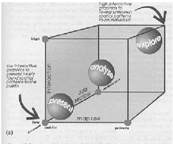
Beside the adaptations mentioned above, can be looked with another perspective at the generation of maps: The human perspective. Bertin’s main goal is how to make a map that gives the best overall impression. However sometimes a map reader wants more than an overall view, for instance when he looks for mutual relations between the surface height of an area and the geological structure. In that case he wants to ‘explore’ a complex map.
MacEachren (1995) jumped on this problem and came out with a human-map interaction cube. The cube is defined by three axes, ranging from public to private map use, from presenting known data to exploring unknown data, and from low to high interaction with the data. Maps should be made according to the corner of the cube that best describes the human-map interaction level. There are three corners explicitly mentioned by MacEachren:
• the private corner
• the exploratory corner
Figure 9 Human-map interaction cube (©MacEachren/Kraak)
Kraak and MacEachren (1997) concluded that there are four overall map goals that could be positioned with respect to the axes in the cube: 1. exploration
2. analysis 3. synthesis 4. presentation
For a long time cartographers made just presentations. Bertin’s theory best fits on this goal. However it is not clear that the theory is also the best theory for exploratory maps. Perhaps the theory should be adjusted to the goal of the map.
3.5 THEORY IN RELATION TO GIS
In most cases Bertin’s theory is useful in a GIS surrounding. In a GIS numerous maps and all kind of attribute data are stored. Most users use a GIS just as a tool to generated maps out of a general database and print them out. Outcomes in between are only presented on the screen. These 2-Dimensional representations are most of the time just as static
as ordinal printed maps and just for presentation goals. For a good representation the grammar rules of Bertin can then be used.
Also the standard software possibilities in most GIS systems are based on his theory. For instance the Legend Editor of ArcView selects
standard all kinds of different colours -without an order- in a colour set to represent attributes with the option Unique Value, and for proportional representation of data only numerical data can be used.
Real cartographic expert systems are very scarce. They are not implemented in regular GIS packages and only used by few cartographers just to accelerate their own work.
So, if a GIS user wants more then just creating regular 2-dimensional maps for presentation goals Bertin’s grammar and standard cartographic utilities within the GIS packages can be used. However, when a GIS user wants to represent data sets like time related data or three dimensional data and/or wants to use other visual variables like crispness,
transparency or animation extended guidelines are desirable. Also new research is necessary to calibrate the grammar rules for other map reader perceptives like analysis and exploration goals.
4.
TIME DATA WITH A GEOGRAPHIC COMPONENT
4.1 INTRODUCTION
In a GIS all kinds of geographical data are stored, managed and explored. However the ability to trace changes in an area by storing historic and anticipated geographic data is hardly used. The former analogue systems tend to provide even a better historic overview of the data than the newer digital systems! Erasing of ink-lines can be easily traced back on an analogue map, but not in a digital file that is stored on (hard) disk. Also revision dates are normally put on the analogue maps. Meta data about digital sets are still scarcely recorded nowadays. Registration and use of time components related to map features are hardly known in GIS business and also the cartographic divisions, who should be responsible for a correct representation, using the new digital techniques, are hardly involved in it.
Before looking to the representation possibilities and new cartographic rules to represent time it is useful to start with focussing on the subject time. In this chapter, three different points of views are considered. First the classification of time in different components (§ 4.2) followed by the technological possibilities to register time in a GIS (§ 4.3) and finally the combination of time and GIS in § 4.4.
4.2 CLASSIFICATION OF TIME
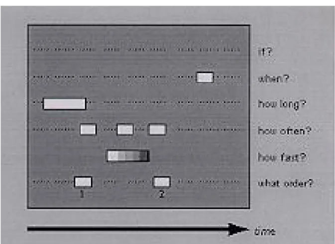
Time is a continuing story for man, however if we look better time can be classified into six different classes.
Figure 10 Time classes (Kraak, Edsall and MacEachren)
• IF:
The base question: “Did an entity exist or appear?”
Temporal existence is context-dependent just like spatial existence. The required resolution specifies if an entity exists or not.
• WHEN:
“What is the temporal location of the object?” Temporal location can be treated as a point or interval at the time bar. (E.g. December 14, 1964)
• HOW LONG:
“What is the time interval of the entities?” The time span between start and end point or between end- and start point. (E.g. three weeks)
• HOW OFTEN:
“What is the temporal texture?” It is a function of time interval between entities in relation to another time unit. (E.g. once in a year)
• HOW FAST/HOW MUCH DIFFERENCE:
What is the rate of change. The rate of change can be calculated in relation to the time span or in relation to the mutation of the object.
• WHAT ORDER:
What is the sequence of the entities. Sequence can be applied to both temporal points and intervals.
This classification is also common used in the world of ecology. They use this classification to classify the different growing stages of vegetation types.
To link this classification with the level of measurement of Bertin is not easy. They do not fit 1:1. Based on the ‘nature’ of the time data set possible relations can be:
Time classification Level of measurement
Temporal existence (if) Nominal Temporal location (When) Nominal or
Quantitative
Time span (How long) Quantitative (ratio) or Perhaps also ordinal Temporal texture (how often) Quantitative (ratio) Rate of change (how fast) Ordinal or
Quantitative Sequence (what order) All levels
The choice of a related level of measurement depends merely on the interpretation of the items within the time classification. For instance when the temporal location is seen as a moment (yes or no at a certain date) the level of measurment is nominal; however when it is seen as the date itself it can be seen as quantitative data.
In chapter six this is discussed further on.
4.3 TIME IN A GIS DATABASE
In a GIS the co-ordinates of the plane can be considered as the first two dimensions. Attributes of the spatial features can be seen as the third dimension. These attributes can be a description of the feature or the z-value (spatial description). Time can also be seen as an attribute (third dimension), however in literature it is normally seen as the fourth dimension.
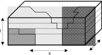
Langram (1992), has visualised time of geographical features as a cube.
Figure 11 Representation of time slices (Langram)
In a vector GIS database each feature has at least two fields extra; start date and end date. In a raster GIS changes are also recorded and changes can easily and quick detected with help of the raster functions. In a vector GIS more complex overlay calculations should be made before changes can be visualised.
An important distinction of information processing is the difference between when events occur in the world and when the database records them. The first moment is called world time the second database time.
World time
Kraak (1996) defines world time as “the time-scale of reality, i.e. the moment an event takes place in the world”. In the GIS database dates are stored either in millennia/years/seconds (e.g. the drift of the continents) or in a specific date format like the Christian time scale started in the year Christ was born. Although the moment in world time is distinct the storage format is not uniform all over the world!
Database time
Database time is defined as the moment a real world event is registered in the database.
t
x
Display time
Display time can be defined as the moment the map reader or the viewer of an animation actually sees the map/images.
Example
The topographic map is a good example of the three different types of time, due to the fact that there is a certain time space between the moment topography is changed until the map is printed out. World time is the moment a new road is built, database time is the moment that the mutation is measured or photographed, and display time is the moment an updated map is published.
Linear versus periodic time
Although time normally is seen as a linear feature, it is also possible to recognise periods with a fixed length. These periods are cycles like the days of a week, tides or the traffic volume per day.
4.4 TIME CHANGES IN GIS
Most mapped data fix time. Data that fix location rather than time are often time-sequenced statistics for specific locations. The greatest challenge is to fix neither location nor time but to describe the path of a moving object.
Fixed Controlled Measured
Soil data Time attribute location
Topographic data Time attribute location
raster imagery Time location attribute
weather reports location time attribute
flood tables location time attribute
tide table location attribute time
airline schedules location attribute time
Figure 12 The representation of geographic data in various formats (Langram)
Another way of representing the three spatial data components is to arrange the components in a triangle.
Figure 13 Interrelation in time components
Time
Normally we think about time as a particular moment, however as stated in par 4.2 time can be divided in six different sub-classes.
Location
Location is the spot in the geographical plane where an entity or feature is located.
Attribute
Attributes are the other more descriptive properties of an entity/feature. For instance the kind of land use for a parcel or the amount of rain measured in 24 hours on a control spot.
4.5 CONCLUSIONS
One can say that the topic time has many faces. The classification of time made by Kraak, Edsall and MacEachren (see fig 10), makes it likely that time can be seen as data input with an own classification instead of the usual classification of the level of measurement. At the other hand time can also be seen as a special form of the attributes of an object. In that case time can be classified into the normal classes of measurement level.
The way this information is stored in a GIS is in this context not so evident although a map-maker and a map-reader should be aware of the differences between world time, database time and display time.
Now we are aware of the relevant aspects of time one can go looking for ways to visualise time. Map series and animations are possible
presentation products. Map series are well known and before the digital revolution the only effective presentation. Map series were often used to represent locational change, for instance coastline changes. On the other hand animations can be made nowadays and seem to have a large impact on the map ’reader’. Temporal animations show changes in spatial patterns in time. There is a direct relation between display-time and world time and the transition of individual scenes is related to a change in location of attribute. (Kraak, Edsall &MacEachren,1997) However the most effective way of presenting time is not easy to determine. The cartographic rules of Bertin are not designed for time related data sets and even the modifications made by other scientists are not especially focussed on time data sets.
In the next chapter the technical mapping solutions, both traditional and new, to represent time are described. In chapter 6 and 7 the spotlight is focussed on the theory based on the technical possibilities discussed in
5.
TECHNOLOGICAL POSSIBILITIES TO REPRESENT TIME
5.1 INTRODUCTION
Before computers became commonplace, cartography was an apparently two-dimensional activity, since its traditional products are drawn or printed on paper. Even in this last two years of this millennium 2-D maps are still the base output format for cartographic representations.
Traditional time related data sets are in traditional cartography represented in either a single map or in map series. However new possibilities of representing time aspects are generated due to technical progress like multi media software and extensive computer power. In this chapter the technical possibilities of representing time are discussed. First focussed on the traditional mapping solutions (§ 5.2), followed by new technical possibilities like animation and sound (§ 5.3).
5.2 TRADITIONAL MAPPING SOLUTIONS
Traditional time related data sets are in traditional cartography represented in either a single map (§ 5.2.1), or in series of maps (§ 5.2.2).
5.2.1 Single map
In a single map different expressions of time can be visualised. Either the calculated differences on one spot or the process of expansion. To visualise time-related data in a static map cartographers normally use three different types of maps:
§ Chroropleth map: a single map in which the differences are represented, changes are calculated, classified and represented in
grey scale or colour value /saturation based on the theory of Bertin that ordered data should be represented with a visual variable with the signifying property order.
Figure 14 Choropleth map
§ Isoline map or contour map: contour lines indicating the location of the examined object.
1060 1130 1180 1240
Figure 15 Contour map
§ Flowline map: arrows are used to indicate the direction of the movement
Figure 16 Flowline or movement map
Another possible map ‘type’ is the multi temporal (Red-Green-Blue) map. This kind of map is seldom used but can be used to visualise changes in time like expansion of a city or a desert. Three different dates (e.g.
years) are each represented in a specific colour value and projected on top of each other. When using the three primary colours red-green-blue all possible colours can be generated. Such an image, called image composite, can easily be made with Digital Image Processing software used for satellite images but can also be made with traditional
photographically procedures.
R G
B
Figure 17 Multi temporal composite map
The representation methods used are linked to the measurement scale from the original data set and to the signifying properties of the visual variables.
Recapitulation:
§ change of attribute is represented in grey scale or mixed colour values (value)
§ expansion is represented in contour lines (more or less value) § direction of movement is represented in arrows (orientation)
5.2.2 Series of maps
Representations of succession of a feature are in traditional cartography visualised in series of maps when it is not possible to combine all feature changes in a single map or to highlight the sequence of the changes. In both cases there is not a locational change but an attribute change.
A well-known example is the changing coastline of e.g. the Netherlands. The coastline went not only inland but went also backwards, so it is impossible to make a efficient single choropleth map (see fig 14). In a map serie each map is of the same type, for instance all choropleth maps or all contour maps.
Recapitulation:
§ All type of maps can be made. The choice for representation variables depends on the measurement level of the data.
§ Within a series of maps the type of variables chosen for is constant.
Figure 18 Example of map serie representing time (Köbben)
5.3 NEW MAPPING SOLUTIONS
5.3.1 Multiple dynamically linked views
Within almost all GIS software based on windows it is possible to link different views to each other. The user will be able to view and interact with the data in different windows; all windows represent (time) related aspects of the data. These views do not necessarily contain maps; charts, sound or video is also possible. Clicking an object in a particular view will show its time relation in all other views. Monmonier (1990) calls this ‘brushing technique’.
Figure 19 Brushing technique (Monmonier)
Brushing means that when an object is selected all corresponding elements in other views/graphics are highlighted. Depending on the view in which one selects the object, there is geographical brushing (clicking in the map), attribute brushing (clicking in the diagram or table) and temporal brushing (clicking on the time line). The user gets an overview of the relation among graphical objects based on time, location and attribute. (See figure 19)
5.3.2 Animations
Animations are new graphical possibilities for representing time.
Basically from the video world, it is now also accessible for cartographers due to the new computer possibilities. An animation is the new version of the time related map series!
Animations can also be used for other purposes like re-expression (e.g. reordering of time moments). However I like to focus on the possibilities of representing time sequences in this report.
Animation is a dynamic visual statement that evolves through movement or change in the display. In cartography, the most important aspect of animation is that it depicts something that would not be evident if the maps were viewed individually. Especially when the display time
corresponds with the world time changes. In that case a single map (=frame) is projected according to the period of time between that frame and the next one. One can say that what happens between each frame is then more important than what exists on each frame.
There are multiple animation classifications, for example: Based on the kind of time data:
§ Linear
Linear data sets show a continuing change, either slowly or more chaotic.
§ Cyclical
Animations based on cyclical data, for instance weather animations, are related to suggested temporal patterns. Although clouds often show a linear movement, temperature and wind speed show often a regular periodic pattern.
Kraak, Edsall & MacEachren (1997)
Based on purpose: § Illustrative animations.
These are animations without interaction possibilities for the spectator.
§ Explorative animations for research purposes.
To explore data sets it is necessary to have the possibilities of interaction. Not only to stop the animation temporally but also to inquire the data at that particular moment.
Koop & Yaman (1996)
Based on technical representation/production method: § Frame by frame.
This is the most elementary animation method. Each single image (or frame) is created separately and finally all frames are combined into an animation. Yet this is the most frequently used animation type in cartography.
§ Key frame.
Only the most characteristic images are created (the so-called key frames) and a computer program interpolates the frames in between. This is technique of interpolation is called morphing.
§ Algorithmic animation.
The most powerful animation technique. A computer program defines what will happen during the animation and the creator only defines objects, changes and the movements, which should be made. (Kraak and Ormeling 1996, p192)
Based on kind of changes: § Temporal dynamic.
In temporal dynamic animations it is the map frame, which is fixed, and the action is within this frame. Changes can be either in location or in attribute value. The latest is equivalent to the term temporal brushing.
1940 2000
1980
Figure 20 Temporal brush
§ Spatial dynamic.
In spatial dynamic animations it is the action which is frozen and not the map frame. For instance panning and zooming or fly-by in a 3 dimensional animation. Another possibility is re-expression of the data in different ways. This can also be classified as geographical
brushing. (Ormeling 1995)
Or based on one or multiple views presented to the viewer. § Transparently overlapping.
The frames displaying a data set are displayed as transparently overlapping frames on top of an animation of the other data set. If the animation containing the transparent symbols could be manipulated independently of the animation that is running on the base, it would be relatively easy to see whether, where and when the patterns in both animations match.
§ Spatial separated.
The frames of the two animations are displayed in two sequences, which are simultaneously running next to each other. In other to explore the similarity of patterns, tools that allow a user to synchronise the animations are needed.
In all cases user interaction is very important. Without interaction the map-reader can only consume and not control the animation. Buziek (1997) calls animations without or with a very low degree of interaction kinematic maps. Animations with a high degree of interaction possibilities he called dynamic maps.
Another important aspect is the effectiveness of an animation. In general, the maps should be as simple as possible.
A technical qualification for a nice animation is that at least 24 images per second necessary are for an impression of a continuous movement.
Animation variables
sound (see § 5.3.3.). A distinction can be made between primary and secondary components of an animation. Primary elements make the animation and secondary elements like sound accentuate the animation. (Cartographic Department University of Nebraska at Omaha)
The graphical variables of animation include:
Animation variable
Description
Position For instance a dot is moved across the map to show change in location. An animation can be used to depict this movement through time.
Speed The speed of movement varies to accentuate the rate of change. For example in an animation that depicts the movement of the centre of a gaz-cloud over a city. Viewpoint A change in the angle of view could be used to
accentuate a particular part of the map as part of an animation. An animation of population change in the Netherlands may use a viewing angle that focuses attention on the western provinces where significant increases in population have occurred.
Distance A change in the proximity of the viewer on the scene as in the case of a perspective view. This can be
interpreted as a change in scale.
Scene The uses of the visual effects of fade, mix and wipe to indicate a transition in an animation from one subject to another. visual variables size, shape, colour, pattern
An animation covers all the changes that have a visual effect. It thus includes the time-varying position (motion dynamics), shape, colour, and pattern of an object (update dynamics) and changes in viewpoint,
orientation and focus. (Foley, 1990)
5.3.3 Sound
Sound is a new phenomena introduced by the possibilities of multimedia personal computers and multimedia software. In a GIS system sound can hardly be connected to a map. The only possibility is to connect it to specific map features. Background music or a typical sound can be played back. In multimedia software packages integrating of sound is easier.
In GIS surroundings experiments with maps in relation to sound are known on topics such as noise nuisance and map accuracy. In both cases pointing at a location on the map controls the volume of noise. Moving the pointer to a less accurately mapped region would increase the noise level. (Kraak&Ormeling,p189)
Krygier (1994) has experimented with sound as an additional variable to visual variables like colour and size. He identified an extensive range of “abstract” sound variables at Bertin’s level of visual variables. See figure below.
Location:
The location of a sound in a two- or three dimensional space
Loudness:
The magnitude of a sound Pitch:
The highness or lowness (frequency) of a sound Register:
The relative location of a pitch in a given range of pitches
Timbre:
The general prevailing quality or characteristic of a sound
Duration:
The length of time a sound is (or isn’t) heard Rate of change:
The relation between the duration’s of sounds and silence over time
Order:
The sequence of sounds over time Attack/delay:
The time it takes a sound to reach its maximum/minimum
Figure 21 Sound variables and syntactics (©Kryger)
5.3.4 Video or images
It is possible in almost all new desktop GIS packages to link a video or an image to a specific spatial feature in the digital map. A video can give extra information about the changes of the feature. In an image or in a chart a more static version of time of that object can be visualised. Disadvantage is that for each object a video/image and an
accompanying link should be made. An overall impression of time for all objects is not possible.
5.4 CONCLUSIONS
In this chapter the technological possibilities which cartographers currently and in the past use to represent time are highlighted.
However the effectiveness of the representation is not measurable and the knowledge rules behind the choice of the optimal representation are not mentioned yet.
In the next chapter the ‘uncompleted’ rules made by prominent researches are considered. These rules should be useful for map- and animation makers to select the most effective way to represent time.
6.
CARTOGRAPHIC THEORY TO REPRESENT TIME
6.1 INTRODUCTION
Although Bertin believed that movement is an overwhelming variable and would dominate perception, other cartographers continued research on movement and time representation in the nineties. They did research on specific parts of the effects of representation of time but did not construct an easy to use scheme for map-makers. MacEachren, one of the most leading researchers in this field, stated in his book How Maps Work (1995) that “What is probably true is that on a dynamic map things that change attract more attention than things that do not and things that move probably attract more attention than things that change place. The fact that the use of time gives the map designer a powerful new tool is a reason to explore that tool in detail rather than to exclude it from
consideration”.
In this chapter a compilation is given about the onset of a new
cartographic addition to the theory of Bertin. The majority of the research is focussed on the extension of the theory (§ 6.2) and not on a complete new design. The theory is designed for the new graphical possibilities and not on the static, traditional maps or series of maps.
In § 6.3 an overview is given of first onsets of prominent cartographers to join these new aspects with known aspects within cartographic grammar. Their results are compared with each other in § 6.4.
6.2 RESEARCH ON REPRESENTATION OF TIME
Recent cartographic research on representation of time is based on the work of MacEachren and DiBiase (1992). They focussed on the theory of
Bertin and were looking on both measurement level and visual variables. Instead of the visual variables, what they called static visual variables, they came with new variables what they called dynamic variables.
6.2.1 Dynamic variables
In the early nineties MacEachren proposed together with DiBiase three types of dynamic variables.
These variables were: § Duration
§ Rate of change § Order
Later he added three additional dynamic variables: § Date or moment
§ Frequency § Synchronisation
Examples of the dynamic variables:
Duration
Duration is the length of time between two identifiable states. Duration can be applied to individual frames of an animation or can be seen as the period between two different states within the animation.
1950 1960 1970 1980 1990
Rate of change
Rate of change is the difference in magnitude of change per time unit for a single frame or for a sequence of frames. The rate of change can be variable or steadily de/in-creasing.
1990
Figure 23 Rate of change
Order
Order is the sequence of frames or scenes. Time is inherently ordered. However it is possible to order frames based on another variable as time and put these frames in a new order and present this.
1950 1960 1970 1980 1990
Figure 24 Order
Date or moment
The time at which some display change is initiated. Display date is specified in relation to a time span that is either linear or cyclical. Thinking in maps: the moment that an element in a map changes.
1950 1960 1970 1980
Figure 25 Moment Frequency
Frequency is the number of identifiable states per time unit. This
temporal frequency is a ratio of two durations. Although it is a calculated variable from other variables it is useful to see it as en extra variable due to the fact that human reception interprets it as an independent variable.
Synchronisation
Synchronisation is also called phase correspondence. It is the temporal correspondence of two or more time series. E.g. the correspondence of grow season and rainfall.
6.2.2 Relation dynamic variables and time
Although MacEachren and DiBiase give the impression that these variables are totally new, they are directly related to the classification of time as shown in § 4.2.
Time classification Dynamic variables
Time span (how long?) Duration Rate of change (how fast?) Rate of change Sequence (What order?) Order
Temporal location (When?) Moment Temporal texture (How often?) Frequency Periodic time Synchronisation
All cartographic researchers adapt this although it is disputable because they put the dynamic variables in the context of visual variables. They are then a kind of the dynamic version of the static visual variables. On the other hand the classification of time in chapter four is almost identical
however based on type of data and not on representation level (=visual variables)!
The differences between the type of data (measurement level) and the possible way of representing issues are placed on the same level and seem now even comparable, although they are clearly different.
At least four prominent cartographers (Kraak, MacEachren, Ormeling and Köbben) tried to work out these new dynamic variables in relation to cartographic grammar. None of these new theories, as discussed in the next section, give a complete overview of the relation between the three major parts in cartographic grammar: level of measurement, signifying properties and variables (either static or dynamic).
6.3 EVALUATION OF SUGGESTED THEORY MODELS
6.3.1 MacEachren
MacEachren suggested the following relation between dynamic variables and the level of measurement:
Numerical Ordinal nominal
Display date Duration Order Rate of change Good Frequency Marginally effective Synchroni-sation Poor
Figure 26 Dynamic variables in relation to level of measurement (MacEachren)
can be used to show that a feature is or is not in a location at a particular point in time. He also suggests that due to the fact that duration is a quantity, which can be precisely controlled with most animation software, duration of a scene can be used to depict ordinal or quantitative data.
Remarkably, he links the scale of measurement to the dynamic
variables. He skips the fact that signifying properties are also essential in map design.
MacEachren also introduced new techniques for representation of periodic duration; colour cycling. Which colour cycling, a range of colour values or hues is “cycled” through the symbol. Colour cycling results in apparent movement or flow through the symbol in a particular direction. Beside duration he suggest that frequency is also clearly a variable in the technique of colour cycling.
Figure 27 Colour cycling
6.3.2 Ormeling
Ormeling (URL:Ormeling, 1998) stated that time as general attribute is an ordered variable. It can be rendered by ordinal visual variables, here size, value or texture as suggested by Bertin.