Information Retrieval Perspective to Meta-visualization
Jaakko Peltonen [email protected] and Ziyuan Lin [email protected] Department of Information and Computer Science and Helsinki Institute for Information Technology HIIT, Aalto University, FinlandEditor:Cheng Soon Ong and Tu Bao Ho
Abstract
In visual data exploration with scatter plots, no single plot is sufficient to analyze com-plicated high-dimensional data sets. Given numerous visualizations created with different features or methods, meta-visualization is needed to analyze the visualizations together.
We solvehow to arrange numerous visualizations onto a meta-visualization display, so that
their similarities and differences can be analyzed. We introduce a machine learning ap-proach to optimize the meta-visualization, based on an information retrieval perspective: two visualizations are similar if the analyst would retrieve similar neighborhoods between data samples from either visualization. Based on the approach, we introduce a nonlin-ear embedding method for meta-visualization: it optimizes locations of visualizations on a display, so that visualizations giving similar information about data are close to each other.
Keywords: Meta-visualization, Neighbor embedding, Nonlinear dimensionality reduction
1. Introduction
We consider exploration of high-dimensional data by scatter plots, which is crucial in data analysis when strong hypotheses are not yet available. A scatter plot can show 2–3 original data features, or a mapping created by dimensionality reduction. A low-dimensional scatter plot cannot represent all properties of a high-dimensional data set; even nonlinear dimen-sionality reduction (NLDR) methods cannot preserve all essential data properties when the output is lower-dimensional than the effective data dimensionality. No single scatter plot is then enough to comprehensively explore the data; multiple visualizations must be created. For high-dimensional data there are numerous possible visualizations: with D features there are (D2−D)/2 traditional scatter plots each showing two features. NLDR methods can yield infinitely many plots by emphasizing different features in the similarity metric and by different hyperparameter values. Each plot reveals different data properties. It is hard and time-consuming to get an overview of a data set from anunorganizedset of scatter plots; to aid analysis, the multiple plots must be related to one another. Analysing and displaying the similarities and relationships between visualizations can be calledmeta-visualization.
We introduce a machine learning approach for meta-visualization: we solve how to arrange numerous scatter plots of a data set onto a display, to show their relationships. Such a meta-visualization can reveal which plots have redundant information, and which different aspects of the data are shown in a set of plots. Our solution principle is that visualizations showing similar information about the data should be close-by on the display.
Given several visualizations of a data set, the first step is to evaluate similarity or distance between them. We introduce an information retrieval approach to evaluate the similarity: two scatter plots are similar if they reveal similar neighborhoods between data samples. The similarity is quantified as an information retrieval cost of retrieving neighbors seen in one plot from the other plot. High similarity often indicates the same structure of data is visible in both plots. Given the similarities, the plots must be mapped onto the meta-visualization display. This is an NLDR task where each complex object is an individual visualization. We introduce an NLDR approach for meta-visualization: locations of plots on the meta-visualization display are optimized for an information retrieval task, so that close-by plots show similar data relationships, under a non-overlappingness constraint. In experiments our approach yields informative meta-visualizations for analysing data through different feature sets, NLDR with different hyperparameters, and numerous NLDR methods. We contribute, based on an information retrieval approach, 1) an NLDR formalization of the meta-visualization task; 2) a data-driven divergence measure between scatter plots; 3) an NLDR method arranging plots on a meta-visualization display, optimized for retrieval of related plots.
2. Background
We use “meta-visualization” to denote works that relate several visualizations. It has also denoted analysing user interaction with a visualization system (Robinson and Weaver,2006); we do not focus on such work. We concentrate on meta-visualization of scatter plots; parallel coordinate plots and recent visualizations (Wickham and Hofmann,2011) are alternatives. The need to organize visualizations has been noted (Bertini et al., 2011); common or-ganizations are simple lists or matrices. In a scatter plot matrix, an element (i, j) is a plot of theith feature vs. thejth feature; related methods include HyperSlice (Wong and Berg-eron,1997). Some methods find orderings of visualizations (Peng et al.,2004). The Grand Tour (Asimov,1985) animates overviews of data projections. Rankings are used to find the most “interesting” visualizations, seeTatu et al.(2009). Some NLDR methods (Cook et al.,
2007) arrange data onto several displays, but do not solve how to relate numerous displays. Interactive systems like DEVise (Weaver, 2006) show multiple visualizations and let users lay them out. Overview+detail techniques show data subsets next to an overall view in (see Cockburn et al., 2008). Methods with linked views (Kehrer and Hauser, 2013) highlight items in several views. Claessen and van Wijk (2011) integrate scatter plots, parallel coordinate plots, and histograms in regular arrangements. Viau and McGuffin
(2012) connect multivariate charts by curves showing relations between feature tuples. Most works above relate a small number of visualizations. Given numerous plots, ar-ranging them onto the meta-visualization becomes crucial; we solve this task. One can then e.g. add parallel coordinate plots connecting axes of nearby plots or axes interactively chosen by the analyst; the above works thus complement our method.
Tatu et al. (2012) arranged plots of subspaces by applying multidimensional scaling to
Tanimoto similarities, which evaluate dimension overlap between subspaces. Such arrange-ments are not based on the data, only on annotation of subspace parameters. Such layouts cannot be computed when plots arise from more complicated NLDR. Tatu et al. also used a similarity based on overlap of k-NN lists, but not for laying out plots, only for
group-ing them. Simple k-NN lists are insufficient to notice nuances of neighborhood changes (see
Venna et al.(2010)), but can be seen as a precursor to similarities proposed in our approach.
Ours is the first neighbor embedding method organizing plots onto a meta-visualization.
3. The Method: Information Retrieval Approach to Meta-Visualization
We optimize meta-visualizations for analysts studying data through neighborhood relation-ships. From each scatter plot, the analyst visually retrieves neighborhood relationships of samples. Given many plots the analyst retrieves which plots show similar neighborhoods as a plot she is interested in, vs. which ones show different information.
Let {xi}Ni=1 be a set of input data samples. Let there be M different low-dimensional scatter plots of the data set; in the mth plot the samples have positions{ym,i}N
i=1 on the plot. The different plots might arise from different features or similarity metrics for the data, different NLDR methods, or different parameters within an NLDR method. Since a low-dimensional plot cannot represent all features of the high-dimensional data, each plot will show different data aspects; in particular, each plot will show different neighborhood relationships between data. In themth plot, let each data pointihave a probabilisticoutput neighborhood, defined as a distribution qmi = {qm(j|i)} over the possible neighbors j 6= i, whereqm(j|i) is the probability that an analyst starting from pointion the display would retrieve point j as an interesting neighbor for further study.
The output neighborhood. The qm(j|i) should depend on positions of data on the mth plot, so that samples j close toiare more likely to be retrieved as neighbors. We set
qm(j|i) = exp(−||ym,i−ym,j||2/σm,i2 )·
X
k6=i
exp(−||ym,i−ym,k||2/σm,i2 )
−1
(1)
whereσ2m,icontrols how quicklyqm(j|i) falls off with distance. If more accurate user models are available, e.g. estimated from eye tracking, they can be plugged in place of (1). We set
σm,i to half of the maximum pairwise distance between points in m. Alternatively the entropy of neighborhood distributions could be fixed as in traditional NLDR (Hinton and
Roweis,2002;Venna et al.,2010), but the simple choice already worked well in experiments.
3.1. Information Retrieval View of Comparing Neighborhoods between Plots In visual information retrieval an analyst looking at a scatter plot retrieves neighbors for each data point. When several plots are available for the data, the analyst cancompare the neighborhoods between plots. If two plots show similar neighborhoods, findings from them support each other; if they show different neighborhoods, they reveal different data aspects. Suppose the analyst studied plotm, and now studies plotm0. As the plots have different data arrangements, when the analyst tries to retrieve the neighborhoods visible in m from
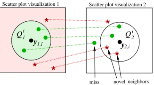
m0, two kinds of errors happen. For each query point i, some points j that used to be neighbors of i in plotm (having high probabilityqm(j|i)) no longer look like neighbors in plot m0 (low qm0(j|i)); they are missed when neighbors are retrieved from m0. Conversely, some pointsjthat were not neighbors ofiin plotm(lowqm(j|i)) look like neighbors in plot m0 (high qm0(j|i)); they arenovel neighbors when neighbors are retrieved from m0. Figure
*
y2,i* *
*
*
Q y1,i*
Scatter plot visualization 1 Scatter plot visualization 2
i 1
miss
Qi2
novel neighbors
Figure 1: Errors in visual information retrieval for query pointi, when neighbors in a scatter plot (left) are retrieved from a second plot (right). Qi
1 denotes points with high neighborhood probability q1(j|i) in the first plot, Qi2 denotes points with high q2(j|i) in the second plot. Missed neighbors have highq1(j|i) but low q2(j|i); an analyst looking at the second plot would miss them. Novel neighbors have low
q1(j|i) but highq2(j|i); they were not apparent in the first plot.
1 illustrates the setup. The concept is symmetric: if plot m0 misses a neighbor that was visible in plotm, equivalently myields the neighbor as a novel neighbor compared to m0.
Cost of errors. If the analyst found interesting relationships from plotm but fails to find them in m0, each missed neighbor and novel neighbor can have a cost to the analyst. The difference measure between plots arising from the information retrieval task is thetotal cost of information retrieval errors when retrieving the neighbor relationships in m from
m0. The total cost can be shown to be a sum of Kullback-Leibler divergencesDKL between neighborhood distributions. 1 In detail, if qim and qmi 0 are “nearly discrete” so qm(j|i) is uniformly high for a small number of neighbors j and very small for other points, and similarly form0, thenDKL(qmi , qim0)≈Const·(Nm,mM ISS,i0 /rmi ) whererim is the total number of neighbors ofiinmandNm,mM ISS,i0 is the number of those neighbors missed when retrieving the neighbors from visualizationm0. We thus useDKL to measure the cost of misses around query pointibetween plots mand m0. The total amount of misses between two plots is
Dm,m0 = X i DKL(qmi , qim0) = X i,j6=i qm(j|i) log qm(j|i) qm0(j|i) . (2) Similarly, it can be shown2 the total cost of novel neighbors for each query point i is equivalent to DKL(qim0, qmi ), we could use
P
iDKL(qmi 0, qmi ) to measure the cost of novel neighbors between m and m0. However, the only difference between this and (2) is that roles of mand m0 have been swapped, thus the cost of novel neighbors comparingm0 tom
is the same as the cost of misses comparingmtom0. Costs of novel neighbors are thus are already included in the M×M matrix of pairwise miss costs between plots.
Discussion of the divergence measure. Eq. (2) measures how the different plots contribute errors in an information retrieval task of the analyst. This has useful properties: 1) The measure is data-driven and applies between any scatter plots of the data set, whether
1. As in an earlier paperVenna et al. (2010) but in a meta-visualization retrieval setting. Although the steps are similar,Venna et al.(2010) is about traditional NLDR and not applicable in meta-visualization. 2. Again similarly toVenna et al.(2010), but in our meta-visualization setting.
they arose from pairs of data features or from NLDR. Moreover, (2) only needs the plots, the original data{xi}are not needed. 2) It can be seen from (1) that neighborhood probabilities are invariant to translation, rotation, and mirroring of plots, thus also (2) is invariant to them. 3) The measure considers all local information, not only a global shape of data; this is important especially when invididual samples are meaningful to the analyst. In Section4.3
we see cases where the overall shape of plots can be deceptively similar but neighborhoods are very different, our measure and meta-visualization reveals this.
3.2. Mapping the Visualizations onto the Meta-Visualization
GivenM plots of a data set, we use (2) between each pair of plotsm andm0, to compute a matrix of divergences Dm,m0. The matrix could be used to order plots: at simplest, pick a plotmof interest then place other plotsm0 on a line in order of theDm,m0; such ordering is based on one row of the matrix. We go further and create meta-visualizations based on the whole matrix. The matrix encodes desired properties of a meta-visualization: plots with small divergence are similar and should be close-by, and plots with large divergence large should be far-off. It remains to lay out the plots onto the meta-visualization based on the divergences; we introduce a meta-visualization NLDR method for this task.
Information retrieval approach for meta-visualization. Given a scatter plot of interest, the analyst may wish to find other plots for inspection containing similar neigh-borhoods. On a meta-visualization such plots should be nearby, so the analyst does not have to scan the entire meta-visualization to find similar plots. We formalize this as an information retrieval task on the meta-visualization; we then and optimize the ability of the meta-visualization to serve the information retrieval. The divergence (2) measures how similar information two plots give to the analyst; we use it to define a true neighborhood for each plotm, as a neighborhood distributionum ={u(m0|m)} is telling the probability that plotm0 would be chosen for inspection next:
u(m0|m) = exp(−Dm,m0/2σm2)· X ˜ m6=m exp(−Dm,m˜/2σm2) −1 (3)
where σ2m controls the falloff rate of the probability and is set as in Venna et al. (2010). We next define neighborhoods on the meta-visualization display, based on the on-screen locations of plots. Let each plot m have a location zm on the meta-visualization display, e.g. as a small “mini-plot” drawn inside the meta-visualization. We define neighborhood distributions vm={v(m0|m)} for plots by their locations on the meta-visualization:
v(m0|m) = exp(−||zm−zm0||2/2σ2m)· X ˜ m6=m exp(−||zm−zm˜||2/2σm2) −1 (4)
where ||zm−zm0|| is the Euclidean distance between the plot locations. The probabilities
v(m0|m) represent which nearby plotm0 the analyst is likely to look at next after looking at plotmon the meta-visualization, based on locations of the plots. Theum ={u(m0|m)}and vm={v(m0|m)}are neighborhoods between entire plots in a meta-visualization, instead of neighborhoods of data within one plot like (1); we callum andvm meta-level neighborhoods.
Information retrieval cost in retrieval of plots from the meta-visualization. Suppose the analyst studied plot m and wants to retrieve similar plots from the meta-visualization. If plots are not well arranged on the meta-visualization, retrieval may yield missed neighbor plots and false neighbor plots. The setup is similar to Figure1, but instead of comparing data points retrieved from two plots, we retrieve entire plots from the meta-visualization and compare them to true neighborhoods of plots. Suppose each missed plot or false neighbor plot has a cost to the analyst; a good meta-visualization should minimize thetotal meta-visualization information retrieval cost: the smaller the cost, the less errors there are, and the better the meta-visualization shows the relationships between plots. It can again be shown (same steps, now between objects that are entire plots) the total cost is equivalent to a sum of two types of Kullback-Leibler divergences:
E=λX m DKL(um, vm) + (1−λ) X m DKL(vm, um) (5) whereDKL(um, vm) is a generalization of the total cost of missed neighbor plots from plot m(plots that are similar tom but are far-off on the meta-visualization), andDKL(vm, um) is the total cost of false neighbor plots retrieved for plot m (plots that are dissimilar but are close-by). Hereλcontrols the tradeoff between costs of missed plots and false neighbor plots desired by the analyst: all λgive good visualization, large λavoids misses and small
λavoids false neighbor plots, we use λ= 0.5 to emphasize both kinds of errors equally. Repulsion to avoid overlap of plots on the meta-visualization display. Op-timizing (5) makes the meta-visualization informative in the sense that neighboring plots yield similar neighborhood information of data samples. However, the meta-visualization must also bereadable by the analyst. We address one simple aspect of readibility: if plots are placed too close-by they will overlap, making it hard to see the data in individual plots. To preserve readability of the meta-visualization, we add a repulsion term to the cost, which gives an additional cost for any pair of plots closer on the meta-visualization than a desired distance threshold. Optimization then tends to keep plots further apart than this threshold, and plots do not overlap when drawn with a size smaller than the threshold. Optimizing the final cost then optimizes information retrieval performance of the meta-visualization, under a readability constraint of non-overlappingness. The final cost is
E =λX m DKL(um, vm) + (1−λ) X m DKL(vm, um) +µ X m6=m0 g(zm,zm0) (6) where the last sum term is the repulsion term,µcontrols importance of repulsion, andgis a simple shrinkage Gaussian function: g(zm,zm0) =exp(−||zm−zm0||
2/σ2
r)−t
1−t if||zm−zm0||2 < T and zero otherwise. Here t= 0.95 and σ2r = −T /log(t) where T is the desired threshold; each repulsion term yields zero cost if plots are further apart than T and cost one if plots fully overlap. The thresholdT is set by the analyst according to how large plots are needed on the display. We use simple data-driven choices: after an initial optimization we set T to an average (squared) distance to nearest plots, and µto make the repulsion term have the same overall weight (times a constant) as the information retrieval terms. To help find good local minima, we increaseµ iteratively during optimization from zero to the final value.
Optimization of the meta-visualization. Eq. (6) is our final measure of meta-visualization quality, in terms of performance in the information retrieval task and read-ability. It is a smooth function of the plot locationszmwhich yield the distributionsvm. To
optimize the meta-visualization, we minimize (6) with respect to all the zm by conjugate gradient descent. The optimization yields a meta-visualization optimized for information retrieval: neighborhoods of plots on the meta-visualization are optimized under the read-ability constraint for minimal retrieval errors compared to true neighborhoods of the plots, which in turn are defined based on neighborhoods of data in the plots. Thus the entire process of meta-visualization, from comparing the individual plots to placing them on the meta-visualization, is based on an information retrieval formulation.
Theoretical connections. Preservation of neighborhood information has been used as a cost function for NLDR of data points onto a single scatter plot by neighbor embed-ding (NE; see, e.g., Hinton and Roweis (2002); Venna et al. (2010)). Such NE methods are unsuitable for meta-visualization as they do not trivially have available a measure to compare visualizations; moreover, they are designed to embed simple data points as dots onto a scatter plot and do not consider overlap of larger objects. Our comparison measure
Dm,m0 is similar to a stochastic neighbor embedding (SNE) cost functionHinton and Roweis (2002), but SNE and other NE methods only used such costs to compare a visualization to a high-dimensional ground truth, whereas we have turned it into a pairwise difference measure where no single visualization is a “ground truth”. Our approach takes advantage of theory, bounds and optimization tools inherited from NE, but brings it into the domain of meta-visualization, with three novelties: 1) the meta-visualization setting, 2) an informa-tion retrieval based distance measure between visualizainforma-tions, and 3) an NLDR method that optimizes both information retrieval performance and readability of the meta-visualization. A precursor of readability was used in a limited setting by Vesanto (1999) to arrange component planes of a Self-Organizing Map, by a glyph placement method where overlap-ping component planes were moved to next-best-matching units. This could be seen as a precursor of our cost which preserves readability (non-overlappingness) as part of optimiza-tion. Glyph positioning approaches are not typical in meta-visualization of two-dimensional scatter plots. The method ofVesanto(1999) uses global correlation of one-dimensional com-ponent planes and does not apply to two-dimensional plots.
Using and interpreting the meta-visualization. Plots close-by on the meta-visualization (for example, a tight cluster of plots) have similar data neighborhoods. Plots far away from each other (for example, separated clusters of plots) show different neigh-borhood information about the data, i.e., different aspects of the data. The arrangement of plots reveals the different aspects of data as groups of plots, and relationships between data aspects by closeness of groups and by plots inbetween groups.
Meta-visualization lessens the workload of the analyst compared to analysing an un-ordered set of plots: instead of analysing each plot separately, the analyst can see which plots provide similar information, and can notice different aspects of the data shown by the plots. Insights about shown similarities and differences can be made: for example, two plots might show similar information because they are based on separate but redundant feature sets. Section 4shows benefits of meta-visualization in different analysis scenarios.
Computational aspects. Our meta-visualization arranges multiple scatter plots, which can be created in parallel; the complexity of each plot is determined by the cho-sen method. Optimizing the meta-visualization first computes pairwise distances between plots inO(N2M2) time forN data samples andM plots. The iterative NLDR optimization of the meta-visualization has O(M2) complexity per iteration. To avoid local minima, the
method can be run in parallel from several initializations, taking the result with smallest cost. In most cases the method yielded good results from a single random initialization. A fast computation approach was proposed for neighbor embedding Yang et al. (2013), approximating distances to far-off points by distances to means of clusters in a quad-tree, withO(Nlog(N)) complexity. The approach can be used in meta-visualization, but we did not implement such approximations as the method was fast enough without approximation.
4. Experiments
We demonstrate the meta-visualization in case studies. We use a benchmark S-curve data set, Olivetti faces data (400 face images of 40 persons, 64×64 pixels each) from http: //www.cs.nyu.edu/~roweis/data.html, Face Pose data (images of 15 persons from 63 angles) fromGourier et al.(2004), and a collection of gene expression experiments.
4.1. Meta-visualization of Feature Pairs, versus a Scatter Plot Matrix
We first show the ability of the meta-visualization to reveal to the analyst which plots are similar. Consider analysing a multivariate data set based on plots of each feature pair. Suppose some pairs actually provide the same information as other pairs; then this should be revealed to the analyst. Relationships between different feature pairs can be hard to see from a simple scatter plot matrix, but a well-optimized meta-visualization can reveal them. We create a data set where each individual feature is unique, but some feature pairs contain the same neighborhood information as other pairs; we create a scatter plot of each feature pair, and show meta-visualization arranges the known-to-be similar pairs close-by.
In detail, we take a 5-dimensional face image data (a subset of 405 images from the Face pose data, each image rescaled to 16×16 pixels and projected to the 5 largest PCA compo-nents of the data set). We then add 20 new features: the original data has 10 feature pairs, and from every such pair [x, y] we add two new features [cos(π/4)x−sin(π/4)y, sin(π/4)x+ cos(π/4)y] as a 45-degree rotation of the original features. The resulting 25-dimensional data contains 25·24/2 = 300 feature pairs to be visualized. Each of the 10 pairs of original features contains the same information as its rotated version, but noticing the 10 pairs and their matching other pairs without meta-visualization would be arduous.
Figure2(left) shows the meta-visualization. It reveals an interesting grouping of feature pairs, with several major groups which are further split into subgroups; such structure will be analyzed in later experiments, here we concentrate on analysing the known ground-truth pairings of plots. Visually, the meta-visualization is very readable: as desired, optimizing the readability cost (repulsion) has kept plots at a distance so that they do not overlap. Note that in an interactive system the meta-visualization can be combined with focus+context techniques such as further enlargement of selected plots.
The 10 matching plot pairs we are interested in are shown with colored borders (same color for both plots in each pair). The meta-visualization placed the plots of the matching pairs close to one another as desired, which is intuitive as they contain the same information. We compare the result to the widely used scatter plot matrix. Figure2(right) shows the same plots in a 25×25 scatter plot matrix. We colored the 10 original feature pairs and their 10 rotated versions with corresponding background colors. Unlike our meta-visualization, the 10 matching pairs of plots are now essentially in arbitrary positions which depend on
Figure 2: Left: Meta-visualization of face pose image data. Each of the 300 mini-plots shows an individual feature pair. 10 plots m have a matching other plot m0
where both plots show the exact same information up to rotation. For each of the 10 matches the meta-visualization placed the matching plots (colored mini-plot borders; corresponding colors are matches) close to each other. In each mini-plot, faces are shown as dots colored by person identity. Right: The same set of plots as a traditional scatter plot matrix. (Each plot in rowi, columnjalso has a trivial match in the transposed cell, rowj, columni.) The nontrivial matching plots are shown with background in the same color; it would be very difficult to notice the non-trivial matches from the scatter plot matrix. (A higher-resolution image of the matrix is available in supplementary material athttp://ow.ly/oyb2P.)
the order of feature indices. It would be difficult to notice correspondence between a pair and its match from the scatter plot matrix; in contrast our meta-visualization finds the correspondence and shows it by plot locations on the meta-visualization. We measure this difference quantitatively by a retrieval measure, recall of matching pairs, by evaluating the 8-neighborhoods of the 10 feature pairs: on the meta-visualization, each of the plots of the 10 feature pairs has its matching rotated version as one of the 5 nearest neighboring plots, whereas in the scatter plot matrix, none of the 10 plots of feature pairs has the matching pair in the 8 nearest neighbors on the matrix. Thus the meta-visualization is more faithful to the data than the scatter plot matrix is. The meta-visualization can also be used in cases where plots do not originate from feature pairs and thus an ordered scatter plot matrix cannot be trivially constructed; Section 4.3shows meta-visualizations for such cases. 4.2. Meta-visualization of Hyperparameter Influence on NLDR.
Besides analysing data by feature pairs or simple projections, NLDR is often used to map high-dimensional data onto a two-dimensional plot, hoping to capture essential data
struc-ture. NLDR cannot preserve all properties of high-dimensional data in one low-dimensional plot (Venna and Kaski,2007;Venna et al.,2010); an NLDR method implicitly chooses some aspect of the data to show, with tradeoffs such as global vs. local preservation, trustworthi-ness vs. continuity, and others. A single NLDR result is thus insufficient to analyze a data set and multiple NLDR results should be created. To create Multiple NLDR results one can (1) run multiple NLDR methods, or (2) run variants of an NLDR method by e.g. adjusting parameters to emphasize different data aspects. We treat the first case in Section 4.3, in this section we treat the second case. We create multiple plots with one NLDR method, and use meta-visualization to study the results. Besides the different views of data given by the NLDR method, meta-visualization can give insight into behavior of the NLDR method. As a case study we create a meta-visualization of Olivetti faces data, where 20 different plots are created by the NLDR method Neighbor Retrieval Visualizer (NeRV; Venna et al.
(2010)). NeRV has a precision-recall tradeoff hyperparameter λbetween 0 and 1; we vary it with values in [0,0.04, . . . ,0.96]. With λ near 0 NeRV emphasizes precision and avoids false neighbors; withλnear 1 NeRV emphasizes recall and avoids misses. It has been shown
Venna et al. (2010) that emphasizing precision or recall yields different plots; we use our
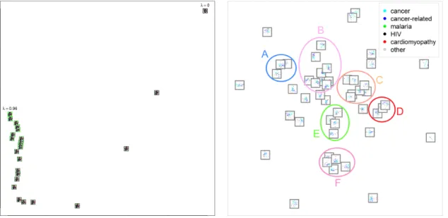
method to meta-visualize the tradeoff. Figure4(left) shows the result. The hyperparameter values yield a smooth continuum of plots; as an interesting discovery, the difference in results between close-by λ values is small at the recall-emphasizing end (λ near 1; green plot border) but at the precision-emphasizing end (λnear 0; dark plot border) differences are larger, indicating that the trade-off parameter λis not linear w.r.t. the actual trade-off between precision and recall, thus care must be taken to set the λwhen the analyst wants a tradeoff mostly emphasizing precision. Thus our meta-visualization revealed insights into roles of the hyperparameters that would have been hard to find in a non-data-driven way, and would have been hard to see from one plot or an unorganized set of plots.
4.3. Case Study: Differences between Nonlinear Embedding Methods
We apply our meta-visualization method to visualize similarities between results of sev-eral state of the art linear and nonlinear dimensionality reduction methods on two data sets. Results of numerous NLDR methods, arranged by a meta-visualization, allow a more comprehensive understanding of a data set than the result of one NLDR method; such re-sults can also yield insights into relationships of the NLDR methods themselves. An NLDR method implicitly chooses what aspect of data to show, based on their cost function or algo-rithm; what aspect each NLDR method will show can be hard to see from the mathematical formulation of the method; moreover, relationships between NLDR methods can be hard to analyze in a non-data-driven manner as the mathematical approaches vary greatly from generative models to spectral approaches to distance preservation criteria and others. For example, a developer of a new NLDR method might be interested to use meta-visualization to analyze how similar results of the new method are to results of established methods.
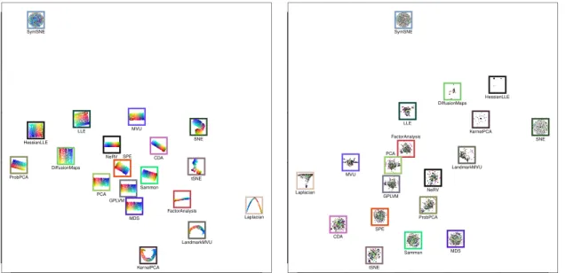
We use two data sets: a simple three-dimensional benchmark data set “S-curve” (points distributed along an S-shaped sheet) and the real-world Olivetti face data set. We create plots of the data sets with 19 methods: Curvilinear Distance Analysis (CDA), Diffusion Maps (Lafon and Lee, 2006), Laplacian Eigenmap (LE) Factor Analysis, Gaussian Pro-cess Latent Variable Model (GPLVM; Lawrence,2004), Locally Linear Embedding (LLE),
Hessian LLE (HLLE), Maximum Variance Unfolding (MVU), Landmark MVU (LMVU), Metric Multidimensional Scaling (MDS), Sammon’s Mapping (Sammon), Principal Com-ponent Analysis (PCA), Kernel PCA, Probabilistic PCA (ProbPCA), Stochastic Proxim-ity Embedding (SPE;Agrafiotis,2003) Stochastic Neighbor Embedding (SNE), Symmetric SNE (s-SNE;van der Maaten and Hinton,2008), t-distributed SNE (t-SNE), Neighbor Re-trieval Visualizer (NeRV;Venna et al.,2010). See Venna et al.(2010) for descriptions and references of CDA, LE, LLE, HLLE, MVU, LMVU, MDS, SNE, and t-SNE.
To simulate a realistic situation where the analyst does not spend equal amounts of time optimizing every visualization, we optimized parameters of CDA, Laplacian Eigenmap, LLE, HLLE, MVU, LMVU, and NeRV to maximize a F-measure of smoothed rank-based precision and recall within each visualization as described in Venna et al. (2010). For the other methods we used implementations in a recent software package3 with default parameters. To avoid sensitivity to initialization, each method is performed several times.
S-curve benchmark data set. Figure 3 (left) shows the result of meta-visualization of the S-curve benchmark data. Notably, among the 19 methods there seem to be several alternative ways to arrange the data: PCA, GPLVM, MDS, and Diffusion Maps have each found an essentially linear projection of the S-curve along its major two directions, and are arranged close together. ProbPCA is similar but has rotated the data. LLE and HLLE are related methods and are shown close-by; they have unfolded the S-curve in a slightly more nonlinear fashion. Sammon’s mapping, SPE and CDA are shown close-by, they have unfolded the data non-linearly except for some remaining curled parts near the ends of the S. NeRV and MVU, shown near to each other, have both found a clean-looking unfolding of the S-curve manifold. SNE and t-SNE are two methods from the same family and are shown close-by; they have unfolded the manifold at the expense of some twisting and tearing. Kernel PCA, LMVU and Laplacian Eigenmap have all found a U-shaped curve based visualization. An outlier is s-SNE which has yielded a curious ball shaped arrangement. The meta-visualization arrangement has thus revealed prominent groups of typical NLDR results, which are related to underlying theoretical similarities of the methods. Olivetti faces data set. Figure 3 (right) shows the result of meta-visualization of the Olivetti faces data. Among the 19 methods there are again several alternative ways to arrange the data, but whereas on the S-curve several methods found essentially the same embedding, on this more complicated data there are more differences visible between methods. ProbPCA, Factor Analysis, and GPLVM have again found a similar embedding, and NeRV is also similar to them, but MDS now differs from them with slightly less outliers and is instead close to Sammon’s mapping. On this more difficult high-dimensional face data data t-SNE finds a clearly different embedding than normal SNE, which is intuitive since the use of the t-distribution in t-SNE was specifically designed to help with embedding of higher-dimensional data sets; t-SNE is here close to CDA, and SPE is an intermediate method between the CDA/t-SNE type result, the Sammon’s mapping type result, and the essentially linear result seen e.g. in PCA. MVU and LLE have found embeddings with prominent outlier clusters, and Laplacian Eigenmap again finds a somewhat U-shaped arrangement. Here Diffusion Maps, Kernel PCA, and HLLE all yield very scattered embeddings with strong outliers. SNE and s-SNE both yield spherical arrangements but closer inspection reveals
CDA DiffusionMaps FactorAnalysis GPLVM HessianLLE KernelPCA LandmarkMVU Laplacian LLE MDS MVU NeRV PCA ProbPCA Sammon SNE SPE SymSNE tSNE CDA DiffusionMaps Laplacian FactorAnalysis GPLVM HessianLLE KernelPCA LandmarkMVU LLE MDS MVU NeRV PCA ProbPCA Sammon SNE SPE SymSNE tSNE
Figure 3: Left: Meta-visualization of linear and nonlinear dimensionality reduction algo-rithms operating on the s-curve data set. The red-green-blue color components of each data point shows the original three-dimensional coordinates of the point. Border colors of the plots simply indicate the different NLDR methods. Right: Meta-visualization of the dimensionality reduction algorithms operating on the Olivetti face data set. Data points are colored according to the identity of the person. Border colors of plots again indicate the different NLDR methods.
that the arrangements are dissimilar, in particular s-SNE has a more regular arrangement of the points. Overall, the meta-visualization again yielded a helpful arrangement of plots, which revealed interesting behavior of the NLDR methods.
4.4. Meta-Visualization of a gene expression experiment collection
We use meta-visualization to analyze a collection of human gene expression experiments from the ArrayExpress databaseH. Parkinson et al.(2009), containingd= 105 “healthy-vs-disease” comparison experiments. Labels “cancer”, “cancer-related”, “malaria”, “‘ HIV”, “cardiomyopathy”, or “other” are available for the experiments. Our interest is how differ-ences between experiments (diseases) are visible in activity of different sets of gene pathways. As preprocessing we build on the work of Caldas et al. (2009), who used gene set enrichment analysis (GSEA) to measure, for each experiment, activities of w= 385 known gene pathways, from the manually compiled C2-CP collection in the Molecular Signatures Database. They then trained a data-driven topic model on pathway activities; the topics are activity profiles of simultaneously active pathways across the experiments. We take the
t = 50 topics modeled by Caldas et al. (2009), and consider for each topic the subset of most active pathways as a feature set for the experiment collection. Theset= 50 pathway subsets represent different aspects of biological activity across the experiments; we use each pathway subset to plot the experiment collection, and use meta-visualization to analyze how
differences between diseases are visible in different pathway subsets. Caldas et al. (2009) had visualized experiments only as a single plot of overall topic activities, not by detailed activities within pathway subsets; our meta-visualization complements their work.
In detail, let Y be the d×w matrix of pathway activities (for d experiments and w
pathways), where each element yij is the activity (size of the leading edge gene subset) of pathway j in experiment i. Let Z be a t×w matrix inferred from Y by a topic model, representing ttopics active across the experiments (when topic models are applied in text data Z is the “topic-to-word matrix”): here each element zmj is the inferred activity of pathwayj in topicm, and zm is the vector of activities of all pathways in topicm.
From each topic m we create a feature set for the experiment collection, representing the pathways active in the topic. To do so, we weight Y by the weights in zm, yielding a weighted feature matrix X(m) of sized×sm where each element isx(m)ij =yijzmj. For each topic we take the most active pathways, by taking the weighted features corresponding to
sm largest elements ofzm. For each topic the number of features sm is chosen by power to discriminate diseases; the highest leave-one-out accuracy ofk-nearest neighbor classification was first determined overkandsm, and the minimalsm reaching that accuracy was chosen. For each topicmwe plot the experiments as a linear discriminant analysis projection of X(m). Each plot shows how much the pathways in the topic can discriminate the diseases in the collection. We then use meta- visualization to study how discriminative power varies across pathway subsets. Figure 4 (right) shows the result. Within each mini-plot, experi-ments are shown as dots colored by the disease annotation: cancer (cyan), cancer-related (blue), malaria (green),HIV (black),cardiomyopathy (red), andother (gray).
The meta-visualization finds groups of topics (pathway subsets) with similar discrimina-tive power, which show different biological aspects of the experiment collection. We point out main groups. In group A, cancer-related, cancer, and malaria are discriminated. Car-diomyopathy is partly mixed with cancer and others. In groupB, malaria is discriminated. Cancer-related and cancer have little overlap. Cardiomyopathy is mixed with cancer. Four plots below the group are similar to the group but also discriminate cardiomyopathy. In group C, most classes are heavily mixed, but cancer and cardiomyopathy have trails that spread out from the central mix. Group D is similar to group C, but with less overlap between cancer-related and cancer. In group E, cardiomyopathy and cancer-related are mostly separated, and cancer-related is mixed with cancer. Malaria is not discriminated well in most visualizations of the group. Cancer is heavily mixed with others. In group F, cardiomyopathy and cancer are well separated; cancer-related and cancer are some-what separated but cancer has heavy overlap with other. The differences of discriminative ability shown in the meta-visualization can be analyzed together with what pathways are active in each group of plots; see Caldas et al. (2009) for annotations of pathways used in the topics. As examples, by the grouping in group A, pathways related to Apoptosis, Glutathione Metabolism and Signaling Pathways have similar discriminability for cancer, cancer-related and malaria experiments. Group C, involving pathways on GPCRS, Ad-hesion, and EHEC/EPEC, cannot separate diseases. Some biologically related topics had different abilities to discriminate diseases, potentially indicating their discriminative power comes from effects not shared among the topics, which can be analyzed in follow-up studies. In summary, meta-visualization yielded insight into how differences between diseases in the collection are visible across subsets of gene expression pathways.
λ =0
λ =0.96
Figure 4: Left: Meta-visualization of the influence of the precision-recall tradeoff hyperpa-rameterλon the NeRV method. 20 visualizations are shown for the Olivetti faces data, created by NeRV with different values λ ∈ [0,0.04, . . . ,0.96]. Intensity of green color = value ofλ. The meta-visualization arranges the plots as a contin-uum where changes between successive λvalues are larger at the precision end. Mini-plots show the face visualizations; for simplicity faces are shown as dots colored by identity of the person. Right: Meta-visualization of a gene expression experiment collection from ArrayExpress; each mini-plot is a discriminative plot where disease experiments are separated based on activity in a subset of gene pathways (different pathway subset in each plot). Points within a plot are ex-periments, colored according to disease annotations. Ellipses and capital letters indicate groups discussed in Section4.4. The meta-visualization varies smoothly with respect to hyperparameters, results athttp://ow.ly/oyb2P.
5. Conclusions and Discussion
We introduced a machine learning approach to meta-visualization; we arrange scatter plots onto a meta-visualization display so that similar plots are close-by. We contributed (1) an information retrieval based nonlinear dimensionality reduction (NLDR) formalization of the meta-visualization task; (2) a data-driven divergence measure between plots; (3) an information retrieval based NLDR method that arranges plots onto a meta-visualization.
Our distance measure and NLDR method were both derived from an information re-trieval task. The similarity of visualizations (scatter plots) was defined by information retrieval costs in an information retrieval task of the analyst, retrieval of neighbor points from the plots. Plots are similar if, for each query point, they yield similar retrieved neigh-bors around the point. The dissimilarity between each pair of plots is quantified as the total cost of missing neighbors of one plot when retrieving them from the other plot, which was generalized to a rigorous divergence measure for probabilistic neighborhoods.
The meta-visualization is then optimized to arrange similar plots close-by, by minimizing a divergence between meta-level neighborhoods of the plots and corresponding neighbor-hoods of their locations on the meta-visualization, with additional costs measuring over-lap of plots. This optimization has a rigorous interpretation as optimization of a meta-visualization information retrieval task, where the analyst retrieves similar plots from the meta-visualization.
In experiments the method yielded promising results in many tasks: finding visualiza-tions that are equivalent despite using separate features; analyzing behavior of a NLDR method with respect to its hyperparameters; analyzing relationships of a large number of state of the art NLDR methods; and analyzing relationships of gene pathway subsets in a collection of gene expression studies over several disease types.
Acknowledgments
The work was supported by Academy of Finland, decisions 251170 (Finnish CoE in Com-putational Inference Research COIN), 252845 and 256233. Authors belong to COIN.
References
D. Agrafiotis. Stochastic proximity embedding. J. Comput. Chem., 24:1215–1221, 2003. D. Asimov. The grand tour: A tool for viewing multidimensional data. SIAM J. Sci. Stat.
Comp., 6:128–143, 1985.
E. Bertini, A. Tatu, and D. Keim. Quality metrics in high-dimensional data visualization: An overview and systematization. IEEE T. Vis. Comput. Gr., 17:2203–2212, 2011. J. Caldas, N. Gehlenborg, A. Faisal, A. Brazma, and S. Kaski. Probabilistic retrieval and
visualization of biologically relevant microarray experiments. Bioinformatics, 25:i145– i153, 2009.
J. Claessen and J. van Wijk. Flexible linked axes for multivariate data visualization. IEEE T. Vis. Comput. Gr., 17:2310–2316, 2011.
A. Cockburn, A. Karlson, and B. Bederson. A review of overview+detail, zooming, and focus+context interfaces. ACM Comput. Surv., 41:Article 2, December 2008.
J. Cook, I. Sutskever, A. Mnih, and G. Hinton. Visualizing similarity data with a mixture of maps. In AISTATS*07, pages 67–74. 2007.
N. Gourier, D. Hall, and J. Crowley. Estimating face orientation from robust detection of salient facial features. In Pointing’04, 2004.
H. Parkinson et al. Arrayexpress update - from an archive of functional genomics experi-ments to the atlas of gene expression. Nucleic Acids Res., 37:868–872, 2009.
G. Hinton and S. Roweis. Stochastic neighbor embedding. InNIPS’02, pages 833–840. MIT Press, 2002.
J. Kehrer and H. Hauser. Visualization and visual analysis of multi-faceted scientific data: a survey. IEEE T. Vis. Comput. Gr., 19:495–513, 2013.
S. Lafon and A. Lee. Diffusion maps and coarse-graining: A unified framework for dimen-sionality reduction, graph partitioning, and data set parameterization. IEEE T. Pattern Anal., 28:1393–1403, 2006.
N. Lawrence. Gaussian process latent variable models for visualisation of high dimensional data. InNIPS’03. MIT Press, 2004.
W. Peng, M. Ward, and E. Rundensteiner. Clutter reduction in multi-dimensional data visualization using dimension reordering. In INFOVIS’04, pages 89–96. IEEE, 2004. A. Robinson and C. Weaver. Re-visualization: Interactive visualization of the process of
visual analysis. In VASDS’06. 2006.
A. Tatu, G. Albuquerque, M. Eisemann, J. Schneidewind, H. Theisel, M. Magnor, and D. Keim. Combining automated analysis and visualization techniques for effective explo-ration of high-dimensional data. In VAST’09, pages 59–66. IEEE, 2009.
A. Tatu, F. Maaß, I. F¨arber, E. Bertini, T. Schreck, T. Seidl, and D. Keim. Subspace search and visualization to make sense of alternative clustering in high-dimensional data. In VAST’12, pages 63–72. IEEE, 2012.
L. van der Maaten and G. Hinton. Visualizing data using t-SNE. J. Mach. Learn. Res., 9: 2579–2605, 2008.
J. Venna and S. Kaski. Comparison of visualization methods for an atlas of gene expression data sets. Information Visualization, 6:139–54, 2007.
J. Venna, J. Peltonen, K. Nybo, H. Aidos, and S. Kaski. Information retrieval perspective to nonlinear dimensionality reduction for data visualization. J. Mach. Learn. Res., 11: 451–490, 2010.
J. Vesanto. SOM-based data visualization methods. Intell. Data Anal., 3:111–126, 1999. C. Viau and M. McGuffin. Connectedcharts: Explicit visualization of relationships between
data graphics. Comput. Graph. Forum, 31:1285–1294, 2012.
C. Weaver. Metavisual exploration and analysis of DEVise coordination in Improvise. In CMV’06, pages 79–90. IEEE, 2006.
H. Wickham and H. Hofmann. Product plots. IEEE T. Vis. Comput. Gr., 17:2223–2230, 2011.
P. Wong and R. Bergeron. 30 years of multidimensional multivariate visualization. In Scientific Visualization: Overviews, Methodologies & Techniques, pages 3–33. IEEE, 1997. Z. Yang, J. Peltonen, and S. Kaski. Scalable optimization of neighbor embedding for