i
Smithsonian Guidelines for
Accessible Exhibition Design
ii
Smithsonian Guidelines for
Accessible Exhibition Design
On Striving for Accessible Exhibition DesignExhibitions are complex presentations that convey concepts, showcase objects, and excite the senses. However, as museums recognize the diversity within their audiences, they realize that exhibitions must do more: exhibitions must teach to different learning styles, respond to issues of cultural and gender equity, and offer multiple levels of information. The resulting changes in exhibitions have made these presentations more understandable, enjoyable, and connected to visitors’ lives.
Accessible design must be a part of this new philosophy of exhibition development because people with disabilities are a part of museums’ diverse audience. Discovering exciting,
attractive ways to make exhibitions accessible will most directly serve people with disabilities and older adults. But to name an audience who will not benefit by these designs is impossible. Accessibility begins as a mandate to serve people who have been discriminated against for centuries; it prevails as a tool that serves diverse audiences for a lifetime.
Exhibition designers, curators, registrars, conservators, collections managers, designers, editors, developers, educators, and other exhibition team members each offer particular insights into the exhibition medium. All of you are in a unique position to synthesize accessibility solutions into your development processes. The Smithsonian challenges its exhibition teams to invent such solutions and to share those findings with colleagues through this document.
Smithsonian Guidelines for Accessible Exhibition Design is a living document. The design tools here, like all creative resources, must be mixed and matched and tested in different
combinations to find workable solutions. Updates, adjustments and refinements will be distributed by the Accessibility Program as better tools are devised.
If you find new solutions or have questions, please contact us at the Smithsonian Accessibility Program
Arts and Industries Building Room 1239 MRC 426 Washington, D.C. 20560 202-786-2942 (voice) 202-786-2414 (TTY) 202-786-2210 (fax) [email protected]
With everyone's talents at work, the Smithsonian may find answers to questions not yet even asked.
Janice Majewski
iii
Table of Contents
Section A Overview of Guidelines
Section B Guidelines and Tools I. Exhibition Content II. Exhibition Items III. Label Design and Text
IV. Audiovisuals and Interactives V. Circulation Route
VI. Furniture VII. Color VIII. Lighting
IX. Public Programming Spaces X. Emergency Egress
XI. Children's Environments
Section C, Resources
Information and Services Publications
Section D, Glossary
Section E, Appendix
Checklist for Publications Language Usage
Access Symbols
List of Illustrations (Including descriptions of the illustrations) Production Notes
iv
How to Use This Document
guidelines=accessibility standards that must be met by every exhibition presented at or by the Smithsonian. (designated in text by boldface capital letter)
design tools = methods for achieving those standards (designated in text by )
This document contains guidelines (listed together in the Overview section) as well as design tools (listed in conjunction with the guidelines in Section B). The guidelines are in part based on construction standards established for the Architectural Barriers Act of 1968, the Rehabilitation Act of 1973, and the Americans with Disabilities Act of 1990. They represent Smithsonian methods for arriving at the laws' required end: accessible exhibitions that work for people with disabilities as well as for the rest of the public. Together the guidelines become the Smithsonian standard for accessible exhibition design.
1
Section A
Overview of Guidelines
2
Overview of Guidelines
I.
Exhibition Content
A. Exhibitions must make exhibit content accessible at multiple intellectual levels and present it through more than one sensory channel.
B. Exhibitions must include the experiences of people with disabilities within their content and presentation.
II.
Exhibition Items
A. Items in exhibitions (e.g. artifacts, graphics, props) must be visually accessible to people. B. Items essential to the exhibition's main theme must be accessible to people by tactile
examination (e.g. touching artifacts, reproductions, models) and/or comprehensive audio description.
C. Items must not be placed in locations such that they create a hazard for visitors. III.
Label Text and Design
A. Essential information in exhibition label text must be accessible to people who have difficulty reading English.
B. Label design must present main exhibition copy legibly for all visitors. Such exhibition label information must be available within the galleries in alternative formats (e.g. Braille, audio) for people who cannot read print.
IV.
Audiovisuals and Interactives
A. All exhibition interactives, audio-only programs (e.g. music with lyrics and texts of speeches), and audiovisuals with soundtracks produced by the Smithsonian must be either open or closed captioned.
If an audio presentation not produced by the Smithsonian is shown in the exhibition for more than three months it must be captioned. If an audio presentation not produced by the Smithsonian is shown for fewer than three months it may be accompanied by a verbatim script mounted directly next to it. Soundtracks of ambient sounds must be identified whether captioning or a script is used. Sounds may also be identified in label text.
B. Interactives and audiovisuals that do not have soundtracks must carry labels stating that fact to assure deaf and hard-of-hearing people that they are not missing information. C. Audiovisual programs and computer interactives that present information with images
and print must be audio described.
D. Instructions for proper use of interactives must be accessible to all visitors. E. Controls for and operation of all interactives must be accessible and usable by all
visitors.
F. Use of interactives must be from a location accessible to people using wheelchairs or other assistive devices (e.g. canes, crutches); interactives must not be blocked by furniture or other obstacles.
3 V.
Circulation Route
A. The circulation route within the exhibition must be accessible according to the
requirements of the Smithsonian Guidelines for Accessible Design for Facilities and Sites. B. The circulation route must be well lighted, clearly defined, and easy to follow.
VI.
Furniture
A. All cases must provide viewing access to people who are short or seated as well as to those who are standing.
B. Cases and vitrines must not present a safety hazard to any visitor.
C. Seating must be provided in each exhibition. 50% of the seats must be accessible. Single-gallery exhibitions must have seating in a nearby corridor or in an adjacent Single-gallery space.
VII.
Color
A. Gallery colors (floors, walls, furniture) must create an environment that is clearly articulated, comfortable and safe.
B. The colors and patterns of exhibition floor surfaces must give accurate information about the depth, height, and condition of the floor surface.
C. Colors within cases must provide clear visual access to objects inside. D. Colors for labels must have a high contrast between text and background.
VIII.
Lighting
A. The safety of visitors (particularly those with low vision and visual perceptual difficulties) must receive equal consideration with exhibit design and conservation issues.
B. Light and color must combine to produce a clearly delineated circulation route into, through, and out of every exhibition space. This is a particular requirement whenever there are changes in level or unexpected turns or obstacles in the route.
C. There must be sufficient light on objects to make them visible to all visitors unless the light level will do substantial damage to the objects.
D. There must be sufficient light on labels to make them readable by all visitors.
E. The elimination of glare from cases and on labels must be considered for those visitors who are seated as well as for those who are standing.
F. Sufficient light to accommodate speechreading and sign language conversation must be provided in locations throughout the exhibition space.
IX.
Public Programming Spaces
A. In places of assembly with fixed seating, there must be a number of wheelchair locations provided in compliance with the requirements of the Smithsonian Guidelines for Accessible Design for Facilities and Sites. These locations must be dispersed
throughout the seating area.
B. If seating is in the form of benches, the same number of benches with arm and back support as wheelchair locations required in the Smithsonian Guidelines for Accessible Design for Facilities and Sites must be provided.
C. Where there is fixed seating, there must also be aisle seats (one percent of the total number, with no fewer than one) that have no armrests, swing-away armrests, or
4 removable armrests. These seats must be dispersed throughout the programming space.
D. Each seat without an armrest or with a removable or swing-away armrest must be identified on the armrest by the international symbol of access.
Signs notifying patrons of the existence of these chairs must also be posted at the entrance to the space. All signs must meet accessibility requirements.
E. Stages, dressing rooms, and other areas for performers associated with public programming areas must be accessible, according to the requirements of the Smithsonian Guidelines for Accessible Design for Facilities and Sites.
F. Assistive listening systems must be provided in all public programming spaces. G. If the programming space is always kept dark, assistive devices (e.g. handrails, strip
lighting) must be available to make accessible the route in, through, and out of the space.
H. Seating color and material must make seats visually accessible to everyone. X.
Emergency Egress
A. There must be fully accessible emergency egress from the exhibition spaces. Provide as many accessible emergency exits from an exhibition space as the number of fire exits required by the National Fire Protection Association's Life Safety Code (NFPA 101). B. Design the exits from the exhibition to either lead back to the accessible entry route or
to lead directly to another accessible egress route.
C. Notification about locations of accessible egress from the gallery must be available at key points in the museum.
D. Both visual and audible fire alarm systems must be provided. XI.
Children's Environments
A. Areas designed specifically for children must meet the children's accessibility
5
Section B
Guidelines and Tools
6
Yes
No
People with disabilities the handicapped, the disabled People who are deaf
or hard of hearing
the hearing impaired, deaf-mute
People who are blind or have low vision
the blind, the sightless
Wheelchair users those confined to wheelchairs, wheelchair bound
People with mobility
impairments the crippled, the lame People with cognitive
disabilities
the retarded,
the mentally deficient People with mental illness schizophrenic (as a generic)
the insane People with learning
disabilities
dyslexic (as a generic), the retarded
Fig. 2 Use language that appropriately describes people with disabilities
7
I Exhibition Content
A. Exhibitions must make exhibit content accessible at multiple intellectual levels and present it through more than one sensory channel.
Offer a programmatic path for traveling through the exhibition.
People with cognitive disabilities (e.g. learning disabilities, mental retardation), like most individuals, learn best from an orderly presentation. An exhibition that reveals its topic through an obvious story line, theme, or repeated element offers landmarks, repetition, and a connecting thread to follow a complex presentation.
An instructional path can be imposed on a more free-flowing exhibition by the use of in-gallery printed handouts or an audiovisual kiosk. The route can also be presented in introductory labels or captioned photographs.
Example: An introductory label or brochure can explain simply one or two themes that are carried through an exhibition. The label could be accompanied by a photograph-coded printed floor plan showing places where those themes are best illustrated. Photo-coded labels within the spaces can pose questions about the themes to further understanding. Present information to all the senses.
Deaf and hard-of-hearing people need audio information translated into print. People with visual impairments need printed information in audio and tactile formats. People with cognitive disabilities may need a combination of formats. Multisensory presentations provide choices for the sensory channel used and interesting repetitions of key points. Some people, however, have difficulty sorting overlapping sights and sounds. Balance noisy and quiet areas within the exhibition and isolate sound through receivers or acoustic treatments.
Example: A history exhibition can present a captioned video with a
descriptive narration on how and where a period garment was worn. Visitors can try on the garment in a nearby hands-on room with a time-appropriate mural as backdrop.
B. Exhibitions must include the experiences of people with disabilities within their content and presentation.
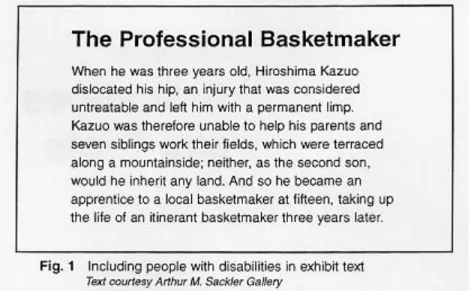
Include people with disabilities in exhibition topics, photographs, and presentations of perspectives (Fig. 1).
8 Individuals with disabilities have contributed significantly to history, science, music, and art, among other areas. They are also a vital part of society. Yet rarely are they seen in the visual images, text, or general content of exhibitions.
Use the voice of people with disabilities.
Many topics in today's society integrally involve people with disabilities. Yet when those topics are presented, perspectives of disabled people often are either not represented or are misrepresented by those who do not have
disabilities. Invite people with disabilities to speak for themselves in exhibitions. Example: In an exhibition on scientific advancements, the issue of genetic engineering directly involves people with disabilities: If science can
change genes carrying deafness, will that effort eradicate future generations of congenitally deaf people and, therefore, the culture of some deaf people--A deaf sociologist's perspective based on broad research of people who are deaf and hard of hearing could be presented in a video or in label text.
Include people with disabilities appropriately.
Many if not most people with disabilities do not see themselves as victims deserving pity or as courageous souls overcoming great obstacles. Instead, they see themselves and want to be seen as people accomplishing daily and lifelong objectives using their own abilities. (See Fig. 1.)
Exhibition labels must use appropriate language
9
II Exhibition Items
A.
Items in exhibitions (e.g. artifacts, graphics, props) must be visually
accessible to people.
Mount small items (to center line) at no higher than 1015 mm (40 in.) above the floor.
A male adult who uses a wheelchair has an average eye level of between 1090 mm (43 in.) and 1295 mm (51 in.) above the finished floor see Fig. 3). Objects placed above 1015 mm (40 in.) will be seen only from below by most seated and short viewers.
Design simple backdrops for items.
Objects mounted against complex backgrounds (e.g. a vessel mounted against an enlarged photograph of an archaeological dig) are difficult to see for people with low vision and for those with figure-ground perceptual problems. (Figure-
ground problems cause difficulty in sorting foreground from background. People with this disability, then, have difficulty finding, for example, their keys atop a desk covered with a variety of office objects.) Multiple objects staggered from the front to the back of a case may also cause visual clutter and foreground- background discrimination problems for some people.
Construct the top of a case at a maximum of 915 mm (36 in.) above the finished floor for items that are mounted flat on a pedestal or deck. For larger items, maintain the minimum case height possible.
10 overall design of a textile is blocked for both visitors with visual and mobility impairments. The standing visitor with low vision cannot get close enough to the object to see the details; the seated visitor cannot see the object's top or interior at all. Shallow cases better serve both types of visitors (see Fig. 6).
Construct exhibition barriers (e.g. railings) at a maximum height of 915 mm (36 in.).
Items placed below an average-height exhibit barrier (1065 mm; 42 in.) cannot be seen by people who are short or seated. However, caution must be used when placing objects inside spaces protected by barriers. Items mounted immediately inside the barriers, if the barriers are label rails, cannot be seen over the tops of the angled labels.
Create color contrast between the items and the background, particularly when the items are displayed in lower light levels.
11 easily perceived. A 70% contrast between foreground and background is
recommended. The Americans with Disabilities Act Standards for Accessible Design offers the following formula for determining contrast percentage: Contrast = [(B1-B2)/B1] x 100
where B1 = light reflectance value (LRV) of the lighter area where B2 = light reflectance value (LRV) of the darker area
Note that in any application both white and black are never absolute; thus B1 never equals 100 and B2 is always greater than 0.
Place small items in the front portion of a case, with larger items behind. People who have low vision often will be able to see small items that are closer.
Avoid shadows falling directly on items.
Items placed in shadows will be lost for people with low vision.
When not prohibited from doing so by conservation requirements, provide at least 100 lux (10 footcandles) of light on an object.
This is the minimum light level at which someone with low vision can see an object (see Fig. 8).
12 If displaying sensitive materials that require a maximum of 50 lux (5
footcandles), then:
position the items to allow the visitor to approach them as closely as possible light the environment with even light (i.e. do not spotlight the object and provide low-level ambient light in the gallery)
provide the highest contrasting background to make objects stand out in the case
present the objects in an alternate format, such as a reproduction or a brochure, that can be viewed in a brighter location
Provide photographs within an exhibition space to give accessibility to objects that require a high mounting position and/or low lighting.
Laminated, high-contrast photographs, located near the individual exhibits or centrally set within the exhibition, are effective in serving those with low vision as well as those who use wheelchairs. People can hold the photographs as close as needed, at whatever angle limits glare, and in the best quality light offered within the space (see Fig. 7).
B. Items essential to the exhibition's main theme must be accessible to people by tactile examination (e.g. touching artifacts, reproduction, models) and/or comprehensive audiodescription.
13 When objects are being selected for inclusion in an exhibition, consider those that may be touched or reproduced for tactile examination.
Tactile experiences are essential to people with visual impairments and greatly assist many people with cognitive disabilities. Tactile experiences should be included in every exhibition.
Select tactile objects so that they provide a coherent explanation of the exhibition topic.
Touchable objects must be related to each other--by context and in space--in order to provide true access to exhibition content for people who have visual impairments.
Example: In an exhibition on contemporary basketmaking, the museum
chooses two or three pieces of the basketmaker's work that are examples of his most important techniques or products. The museum then includes them--or their reproductions--in the space, wherever they are appropriate for the content and design of the exhibition. It then also presents an audiodescription tour--by either an audiotape or a docent--that explains how these touchable examples relate to the others behind glass.
Whenever possible allow objects to be touched by all visitors, not just those who have low vision or are blind.
Tactile access to all visitors may not always be possible (e.g. if actual works of art are used, and only limited touching by those to whom it is essential can be allowed). However, isolating individuals may embarrass those who first must identify themselves and then must handle objects in front of others. The restriction also puts an unfair burden on the guards and docents who must identify "legitimate" users. It also deprives many who could benefit by the accommodation.
Include touchable objects, such as models and reproductions, within the actual exhibition space.
This allows people with visual impairments equal access to the objects without having to separate from their friends or family who are not blind or have low vision.
14 Provide audiodescription for those objects that cannot be touched or that offer little information through touch (e.g. watercolors).
Audiodescription fills in what persons with low vision may not be able to see completely; it provides details and compares new objects to familiar ones for people who are blind. When tactile examination is possible, audiodescription can serve as a valuable complement (see Fig. 9).
C. Items must not be placed in locations such that they create a hazard to visitors. Mount objects so they do not protrude more than 100 mm (4 in.) from a surface and do not present head-clearance problems.
Objects that are wall mounted must protrude no more than 100 mm (4 in.) from the wall unless their bottom edges are cane detectable (less than 685 mm [27 in.] above the floor) (see Fig. 26) or more than 2030 mm (80 in.) above the floor.
15 Objects hanging from above must have lower edges between 685 mm (27 in.) or above 2030 mm (80 in.). (See Fig. 25.) This is a critical factor when the object or work of art has features that make it dangerous.
Example: a work of art consisting of I-beams bolted together, hanging at 1525 mm(60 in.) above the floor, is a head-clearance problem for people who are blind or have low vision or have visual-perceptual difficulties. Placing a detectable warning surface on the floor does not by itself resolve this problem. The surface must be part of a
comprehensive system in the museum about which the visitor is aware. Other possible solutions are barriers around the work, a cane-detectable platform underneath the work, corridors allowing the
16 visitor to pass without approaching the work, and a comprehensive audio-information system that alerts visitors to upcoming danger. Mount objects so that they are not tripping hazards.
Low-height (less than 305 mm (12 in.) above the floor) objects mounted on floors can be missed by people with limited fields of vision. If these objects must be floor mounted, they must be placed out of the path of circulation, be well lighted, and have a surface color of high contrast to the floor.
Example: Mounting a work of art that is a block of aluminum 150 mm (6 in.) high on a gray carpet within a circulation corridor presents a tripping hazard to people with visual impairments. A barrier or a platform that raises the object are preferable. If those options are impossible, change the carpet color to charcoal gray, raise the general light level, spotlight the piece to create a glare off of it, and place the object's label on the other side of the corridor to draw people away from walking into the object.
Ensure that platforms for objects are not tripping hazards.
Platforms should have colors that are of high contrast to the floors and walls, should not have sharp corners, and should not project unpredictably into the path of travel.
17
III Label Design and Text
A. Essential information in exhibition label text must be accessible to people who have difficulty reading English.
Avoid the use of colloquial and complex English, jargon, and technical language in text panels unless such language is explained within the text or in supplementary handouts.
Many individuals who are deaf from birth learn English as a second language (with American Sign Language, a distinct language, being their first). Thus, a congenitally deaf person often does not comprehend the nuances of written English as a native speaker can. Information key to the story should be written in plain English.
Use the active voice in text panels; limit sentence label length.
People who have difficulty reading English are most successful when the active voice is used in short sentences. Subject-verb-object sentence structure ensures better understanding. Sentence length should be no more than 25 words (15 is preferable). Label length should be a maximum of 75 to 100 words.
Use a line length for text that facilitates reading.
Text containing too many characters on a line is difficult to read. Exhibit text should have a maximum of 55 characters (average) per line. Narrower columns, with 45-50 characters per line, are preferable. \
Provide a short overview paragraph at the beginning of introductory and thematic label panels.
People with reading difficulties as well as those with low vision tire easily from the effort of seeing and reading a great number of printed words. An overview sentence or two--set in clear, large print--allows these visitors to gather key information without having to read all of the text (see Fig. 10).
18 Carefully link sentences and paragraphs.
Avoid pronouns that are more than a few words away from their antecedents. Try to limit a sentence or paragraph to one idea. Be sure that when making comparisons, the points of comparison are obvious.
Provide line drawings, silhouettes, and photographs that complement label text to aid comprehension for those with reading difficulties (see Fig. 11).
19 B. Label design must present main exhibition copy legibly for all visitors. Such
exhibition label information must be available within the galleries in alternative formats (e.g. Braille, audio) for people who cannot read print.
Use typefaces that are readily legible.
The typefaces that are easiest for people who have low vision, language problems, or cognitive disabilities are sans serif or simple serif (see Fig. 13).
Accessible faces have the following characteristics: proportions that contribute to legibility (see Fig. 13)
a clear extension for lowercase b, d, g, h, j, k, l, p, q, t, and y easily legible numbers (e.g. distinguishable 5, 6, and 8)
21 The following characteristics of type make reading difficult for this audience see Fig 14):
condensed, extended, or relatively light typefaces a wide variation in stroke width
thin strokes that fade, break, or disappear
letter and numbers that closely resemble each other (e.g. the shapes of "d" and "a" or "6" and "8").
22 Do not set text in all caps.
Type set in all caps is more difficult to read and should be limited to items such as titles and decorative heads.
Avoid use of script and italic type for essential information.
These styles are inaccessible to people with low vision. Oblique type is, however, generally legible.
Alternatives to italic type for book citations, artwork titles, foreign words, and quotations such as underlining, bold face, quotation marks, or another color should be used whenever possible.
If an exhibition title is presented in an ornate or decorative type (and, thus, serves more as a graphic than as legible type), it should be repeated in a clearer type at an accessible location near the exhibition entrance (see Fig. 15).
23 Provide alternative forms of labels (e.g. Braille, audio, large print) within the exhibition space.
They should be located near a well-lighted seating area in an easy-to-use format to facilitate use by visitors with visual impairments.
Select type size appropriate to the viewing distance.
People who have low vision will need larger type than other visitors at every distance. Appropriate ratios type to distance are presented in Fig. 12. When calculating distance, consider also the effects of crowds on actual viewing distance. Type on signs mounted 2030 mm (80 in.) above the floor should have upper case letters at least 75 mm (3 in.) high. Minimum type size, at even the shortest distance, is an x-height of 4.5 mm (3/16 in.)
24 Provide sufficient leading.
Leading, the space between lines (measured from baseline to baseline) should be at least 20 percent greater than the font size used. Wide column widths and typefaces with a high x-height usually require a higher ratio of type size to leading.
Provide consistent letterspacing and word spacing.
Consistent spaces between letters and words facilitate reading of text passages. If kerning between letters is adjusted do not allow letters to touch each other.
Justify the left margin and keep a ragged right margin.
Do not center more than three lines of label text. A predictable beginning point, line after line, and evenly spaced words are much easier to read for people with low vision and for people with cognitive disabilities. Justified text can work only if normal word and letter spacing can be preserved.
Provide high contrast between text and background.
Contrast is an essential element for people with low vision. Research shows that dark on light works marginally better than light on dark for headlines. Light on dark text is acceptable for back-lit labels when light intensity is moderated (e.g. by gels) to avoid light "halo". A 70% light reflectance value contrast is most effective.
25 Lighter type weight and greater letter spacing is required when type is reversed out of the background to ensure legibility.
For outdoor signage, light type reversed out of a dark field may be desirable to offset glare.
Print only on a solid background.
Overprinting (type on an imaged background) is unreadable for people with low vision and perceptual difficulties. The most minimal contrast--5% contrast to the background--overprinted with the darkest type available, may present legible text.
Print on a surface that is textured or that has differing colors and tones (e.g. faux marble, woodgrain) can result in the same illegibility as overprinting.
Diminish glare on all label surfaces.
Glare makes text unreadable for many people with low vision. Labels should be printed on eggshell, matte, or other non-glare surfaces.
Avoid distorting type.
Labels should be silkscreened on clear plexiglass with another background color screened directly onto the back of the plexiglass. Clear plexiglass labels mounted on a solid surface have letter shadows that make them unreadable.
Mount labels so that visitors can get very close to read them.
People with low vision often must be within 75 mm (3 in.) of a label to read it. Label and location should be situated so that the reader does not block his own light. Label location should be out of the way of barriers, protruding objects, stairs, or the swing of a door.
Keep in mind the natural line of sight when mounting labels.
Labels mounted at 45 degree angles to the front of a case or vitrine are more accessible to people who have low vision than those that are mounted flat on the floor of the case. Labels should also be as close to the front of the case as possible. Labels on the back wall of a case or behind a vitrine are impossible for many people to read.
26 Define labels with color or a raised surface.
These elements serve as clues to finding the labels for people with low vision. Type silkscreened on walls often goes undiscovered and, thus, unread by people who have low vision.
Mount wall labels at a height that is comfortable for both those seated and standing.
Wall labels mounted between 1220 mm (48 in.) and 1675 mm (67 in.) are in a comfortable viewing location for both those seated and standing. Wall labels mounted with a centerline at 1370 mm (54 in.) above the floor are at optimum height for everyone (see Fig. 3).
Mount label rails so that the top of the label is at approximately 1015 mm (40 in.) above the floor.
At this height the labels are low enough for those seated but not too low for people with low vision who are standing. Labels mounted lower, particularly in label wells at 305 mm (12 in.) or less above the floor, require that people who have low vision kneel to be close enough to the type.
Locate labels in consistent locations throughout an exhibition.
Labels that appear in a different location at each work of art or within each case are difficult to find for people with low vision and people with cognitive
disabilities.
Provide sufficient light to read labels.
For text to be readable by people with low vision, lighting on the label must be between 100 lux and 300 lux (10 footcandles to 30 footcandles). (See Fig. 8.) Light must be at the same level as the light in the area immediately surrounding the label and must be uniform across the label and the rail.
Avoid shadows on labels.
Shadows from nearby objects or from portions of the exhibit case lower the contrast of type to background. The possibility of shadows should be considered carefully so that text does not become illegible for people with low vision.
27
IV Audiovisuals and Interactives
A. All exhibition interactives, audio-only programs (e.g. music with lyrics and texts of speeches), and audiovisuals with soundtracks produced by the Smithsonian must be either open or closed captioned.
If an audio presentation not produced by the Smithsonian is shown in the exhibition for more than three months it must be open or closed captioned. If an audio presentation not produced by the Smithsonian is shown for fewer than three months it may be accompanied by a verbatim script mounted directly next to it. Soundtracks of ambient sounds must be identified whether captioning or a script is used. Sounds may also be identified in label text.
Provide all audio narration in a print format.
For people who are deaf or hard of hearing to understand presentations with a narrative soundtrack, they need a print translation of the narration. This print can either be open or closed captioning (for a Smithsonian production) or a verbatim transcript (allowable only for non-Smithsonian productions that are shown for fewer than three months in an exhibition space). Audio-only programs require a printed text; ambient soundtracks should be described in a label. Captioning is, by far, the most effective method of presenting narration in print. It allows people to watch the images and the text simultaneously. A script requires a back-and-forth effort between the screen and the script. It also requires a minimum of 16-point type, visual cuing to scenes and key points, and sufficient lighting for reading. A script is a last-resort solution. Open captioning translates the audio portion of a video or film program into visible subtitles. Viewing does not require special equipment; the captions are present on the screen at all times. Closed captioning requires a decoding capability for display on a standard television receiver and can be switched on and off by the visitor on demand.
For non-narrated audio programs, provide visitor-operated volume controls. People who are hard of hearing can hear music at above-average volume. Individual volume controls on hand-held audio receivers provide access to music for this audience.
28 B. Interactives and audiovisuals that do not have soundtracks must carry labels
stating that fact to assure deaf and hard-of-hearing people that they are not missing information.
C. Audiovisual programs and computer interactives that present information with images and print must be audio described.
Audio description (audible description of visuals fit into pauses in the soundtrack) presents information about the on-screen images and action to people with visual impairments. Provide audio description either on the general soundtrack or on a separate track accessed at the interactive site (see Fig. 9). D. Instructions for proper use of interactives must be accessible to all visitors.
Write instructions for interactives in a short-sentence, step-by-step format. People who have difficulty reading (e.g. some people who are deaf or who have certain learning disabilities) can perform the activities if they can get beyond the barrier of complex written instructions (see Fig. 16).
Instructions are more effective for people with cognitive disabilities if participant action is required after each direction rather than after a string of directions. This step-action-step format assists people who have short-term memory problems.
Add illustrations and demonstrations to support verbal instructions (see Fig. 16). Any support to the reading process can contribute to the interactive's overall effectiveness.
Present written instructions in 70% contrast
sans serif or simple serif type
type that has a minimum 4.5 mm (3/16 in.) x-height lighting at a minimum of 100 lux (10 footcandles)
29 Present all instructions in both an audio and printed format.
People who are blind and those who cannot read need instructions presented orally. Those who are deaf or hard of hearing require the instructions in print. E. Controls for and operation of all interactives must be accessible and usable by
all visitors.
Interactives must be within reach range of people who are short or those who use wheelchairs as well as of those who are standing.
30 range of a wheelchair user and unobstructed by shelves or furniture. If the controls are to be used from a forward approach in a wheelchair, they can be no higher than 1220 mm (48 in.) and no lower than 380 mm (15 in.) above the floor (see Fig. 17). If the controls are to be used from a parallel approach, they can be no higher than 1370 mm (54 in.) and no lower than 230 mm (9 in.) above the floor (see Fig. 18).
31 Some people who use wheelchairs cannot extend their arms to full length and cannot use interactives from a side approach. Front-reach range height at a maximum of 1220 mm (48 in.) above the floor is preferred (see Fig. 17a). Some people who are of short stature may not be able to reach controls above 915 mm (36 in.) above the floor.
Lower the reach height for controls that must be located over obstacles. To accommodate forward reach over a table top of between 510 mm to 635 mm (20 in. to 25 in.), the maximum reach height should be 1120 mm (44 in.) above the floor. (See Fig. 17b.)
If a person using a wheelchair must make a side reach over an obstacle (of a maximum 610 mm [24 in.] depth and 865 mm [34 in.] height) to use a control, the controls can be no higher than 1170 mm (46 in.) above the floor to be usable (see Fig. 18b).
Eliminate glare on the interactive's instructional surfaces.
Glare on surfaces such as a monitor screen or a plexiglass protective panel obscures viewing of the audiovisual's images and instructions for people with low vision.
Eliminate reflection and glare for those who are seated or short as well as for those who are standing.
When working to redirect the negative effects of lights, it is important to consider such effects from the perspective of people who are short or seated.
Provide tactile characters and Braille on or directly below the controls to indicate the function of the controls unless they form a standard computer keyboard (i.e. in QWERTY format).
Blind people and some people with low vision need tactile characters (at a 70% color contrast against their background) or Braille to identify the location and function of various controls. People with some residual vision need the markings to be in colors contrasting to the controls. A QWERTY format keyboard (where the first keys of the top line of letters are Q-W-E-R-T-Y) is universally understood and may not need additional markings.
32 Provide touch-sensitive areas in predictable locations (e.g. on all of the four corners of the screen).
People with visual impairments or cognitive disabilities need touch screen programs that have touch areas where they can find them. This eliminates the need to run one's hand across the screen to locate the touch area, or to have to reorient oneself repeatedly to touch areas on each new screen.
Provide touch-sensitive areas that are at least 75 mm (3 in.) in diameter. Small touch areas require fine muscle control. If areas are too small, people with cerebral palsy or other mobility impairments often activate unwanted areas instead of or in addition to those selected.
For activities that require speaking into a specific area, provide equipment that is adjustable for height.
In order for a wheelchair user or someone who is short to use them,
manipulatives requiring a person to speak directly into them can be no higher than 1015 mm (40 in.) above the floor. If the devices are adjustable in height, people in wheelchairs who sit at different heights and people who are tall and cannot bend can use them equally well.
For activities that require listening at a specific area, provide equipment that is adjustable for height.
In order for a wheelchair user or someone who is short to use them,
manipulatives requiring a person to place his ear next to the object to listen can be no higher than 1017 mm (40 in.) above the floor. If the devices are adjustable in height, people in wheelchairs who sit at different heights and people who are tall and cannot bend can use them equally well.
For activities that require viewing in a specific area, provide equipment that is adjustable for height.
In order for a wheelchair user or someone who is short to use them,
manipulatives requiring a person to look into a specified area (e.g. a microscope) can be no higher than 915 mm (36 in.) above the floor. If the devices are
33 adjustable in height and angle, people in wheelchairs who sit at different heights and people who are tall and cannot bend can use them equally well.
Prevent sound from overlapping between interactive areas.
Some people who are hard of hearing or have difficulty filtering a lot of stimuli cannot separate foreground from background noise. For that reason, it is important that there is little overlap of sound from different sources at any one point in an exhibition. Good acoustical environments are essential.
Interactive elements must be operable by people who have limited muscle and hand control and by those who have only one hand. For controls and operating mechanisms to be accessible, these devices must
be fully operable with only one hand
require no tight grasping, pinching, or twisting of the wrist (e.g. lever handles)
require no more than 5 lbs. of force to operate be at least 75 mm (3 in.) in their smallest dimension
be covered with non-slip surfaces (e.g. rubber or ridges on a trackball)
Provide a place to rest one's hand while using the controls.
Some people may need additional support for hands or arms (e.g. table extension or wrist rests) in order to use controls effectively.
F. Use of interactives must be from a location accessible to people using
wheelchairs or other assistive devices (e.g. canes, crutches); interactives must not be blocked by furniture or other obstacles.
Locate the interactive so that everyone can get to it.
For the interactive to be accessible, it must be on an accessible route that meets all of the requirements of the Smithsonian Guidelines for Accessible Design for Facilities and Sites.
Provide sufficient space at and around the interactive so that everyone can use it.
The minimum clear floor space required by a wheelchair is 760 mm (30 in.) wide by 1220 mm (48 in.) long (see Fig. 21). Therefore, a space at least that size that
34 overlaps the accessible route is necessary in order for a wheelchair user to work at an interactive.
Unless the activity requires only minimal interaction by the participant, that floor space must adjoin the interactive in a way that allows forward (not side) access to the activity.
In order for the space to be usable, no more than 485 mm (19 in.) of the clear space (760 mm [30 in.] by 1220 mm [48 in.]) is under the table.
To work at a station, a wheelchair user must have knee space at the interactive of at least 685 (27 in.) high by 760 mm (30 in.) wide by 485 mm (19 in.) deep. To work at a station, a wheelchair user must have the top of the work surface at between 710 mm (28 in.) and 865 mm (34 in.) above the floor.
To make a 180 degree turn out of a station area, a wheelchair user must have either a minimum 1525-mm (60-in.) turning diameter or a 915-mm (36-in.) T- shaped area (see Fig 20).
36
III Circulation Route
A. The circulation route within the exhibition must be accessible according to the requirements of the Smithsonian Guidelines for Accessible Design for Facilities and Sites.
Create an accessible route with the following characteristics:
To be accessible to people using wheelchairs and other mobility-oriented assistive devices, the circulation route must be at least 915 mm (36 in.) wide for one-way traffic (Fig. 22). For two-way routes, the minimum width is 1525 mm (60 in.) (Fig. 23). It is recommended that even one-way traffic routes be a minimum of 1525 mm (60 in.) to allow wheelchair users to stop to look at cases without blocking the route.
All entrances, gates, and doors must meet accessibility requirements (e.g. width, hardware, opening force, thresholds).
A wheelchair user's clear floor space is approximately 760 mm (30 in.) by 1220 mm (48 in.) (see Fig. 21). At least this amount of floor space is necessary on all viewing sides of exhibit cases and vitrines.
37 People need to be able to get to the viewing space from the circulation route. Therefore, this clear floor space must overlap the accessible circulation route through the exhibition space.
If a person in a wheelchair must make a turn around an obstruction, the
minimum clear width of the accessible route shall be as shown in Fig. 24. Where the circulation route makes a U-turn around an object that is less than 1220 mm (48 in.) wide, the pathway width increases to at least 1065 mm (42 in.) on the approach and 1220 mm (48 in.) in the turn (see Fig. 24b).
38 Where the circulation route branches off to allow viewing of cases or objects, the end of the branch provides either a minimum 1525-mm- (60-in.-) diameter circle or a 915-mm (36-in.) T-shaped turning space (see Fig. 20).
People in wheelchairs should not have to back up out of spaces more than 915 mm (36 in.) deep, particularly crowded ones. The circle or T-shape allows someone using a wheelchair the necessary turning space to return easily to the circulation route.
39 If the circulation route is less than 1525 mm (60 in.) wide, there should be
passing spaces at least 1525 mm (60 in.) wide and 1525 mm (60 in.) long at reasonable intervals not exceeding 61 m (200 ft.).
OR
If the circulation route is less than 1525 mm (60 in.) wide, there are T-shaped intersections of two pathways--each a minimum of 915 mm (36 in.) wide--within reasonable intervals not exceeding 61 m (200 ft.).
Clear floor spaces (approximately 760 mm [30 in.] by 1220 mm [48 in.]) should be planned to allow a person using a wheelchair to either move parallel to the case and then proceed in a forward motion or to move perpendicular to a case and then back away easily.
Cases and vitrines should be positioned to avoid dead ends at walls. When this is impossible, a minimum 1525-mm- (60-in.-) diameter turnaround space must be allowed at the end. (See Fig. 20.)
There must be at least 2030 mm (80 in.) of clear head room along the circulation route. Obstacles to be avoided include overhanging works of art, exhibit props, ceiling-mounted signs, plants, and low space under escalators. (See Fig. 25.)
If the head room is less than 2030 mm (80 in.) in a space next to the circulation route, there is a cane-detectable barrier within 685 mm (27 in.) of the ground. This maximum height for the barrier gives someone who has low vision and using a cane the time to stop before his body hits that overhead object.
40 A cane-detectable barrier can be double guardrails, large potted plants, or other solid surfaces (see Fig. 5). Stanchions with a single woven strip or a velvet rope between vertical posts are not acceptable because the horizontal barrier is above 685 mm (27 in.) and the vertical posts are too far apart to be detected in a cane sweep.
Changes in surface texture (i.e. detectable warnings) are useful for alerting people to upcoming barriers when used in the context of an established, consistent warning system. However, they do not give sufficient warning for barriers overhead. A person using a cane will detect the change and slow his forward movement to determine the message it gives. If the cane detects nothing on the ground, the person will proceed and still hit his head on the object above. Also, dog guides do not interpret texture changes. They will proceed forward, and their masters will bump into the objects above. If objects mounted on the wall parallel to the pathway have bottom edges between 685 mm (27 in.) and 2030 mm (80 in.) from the floor, they must project less than 100 mm (4 in.) into the pathway. Wall-mounted objects with bottom edges below 685 mm (27 in.) may project any amount so long as they do not reduce the required minimum clear width of the circulation route (915 mm [36 in.]). This includes wall-mounted cases, wall-mounted signage that is installed perpendicular to the wall, video monitors, and other equipment that is cantilevered from the wall.
Objects on the floor that rise less than 305 mm (12 in.), are tripping hazards. The problem worsens if the object's color does not contrast with the floor or if the lighting is poor.
41 The slope of the circulation route must be no more than 5%. If the slope exceeds 5%, then it becomes a ramp and must meet requirements for a ramp. (See ramps in the Smithsonian Guidelines for Accessible Design for Facilities and Sites.) Any cross slope (a slope that is perpendicular to the path of travel) of the circulation route must be no more than 2%.
When circulation route levels change, the vertical difference must be less than 6.5 mm (1/4 in.). When there is a change in level of between 6.5 mm (1/4 in.) and 13 mm (1/2 in.), the edge must be beveled with a slope of 1:2. Any change greater than 13 mm (1/2 in.) must be ramped. (See Fig. 28.)
42 The circulation route must be free of steps and stairs or include ramps or
elevators adjacent to those steps and stairs. Ramps and elevators must meet the Smithsonian Guidelines for Accessible Design for Facilities and Sites accessibility requirements.
If carpet or carpet tile is used on the floor, it must be securely attached.
Carpet must have a level, low pile and a firm pad or no pad at all underneath it (maximum pile thickness is 13 mm [1/2 in.]).
Artificial carpet surfaces and some natural surfaces (e.g. "astroturf," exterior rubber mats used to clean shoes, and cocoa mat) are extremely difficult for wheelchair users. Such surfaces cause the wheelchair wheels to pull to one side or to sink into the surface.
B. The circulation route must be clearly defined, well lighted, and easy to follow. Provide sufficient lighting on circulation routes.
A minimum of 50 to 100 lux (5 to 10 footcandles) of quality light on the
circulation route is necessary for people with visual and perceptual difficulties to negotiate the path.
Provide nonverbal wayfinding assistance along the circulation route.
Color coding, changes in surface texture, symbols or other nonverbal techniques assist people with cognitive disabilities in finding their way through complex environments. Color contrast (of 70%) between carpet path and edge is also an effective way to define paths for people with low vision or cognitive disabilities.
Visually define the walls, floors, and pedestals.
Some people with low vision have difficulty with depth perception. Color contrast (70%) and directed lighting can differentiate horizontal from vertical surfaces on paths.
Design areas so that floor surfaces at and around accessible seating areas are level, stable, firm, and slip-resistant.
Provide an accessible floorplan to aid visitors in wayfinding.
A floorplan that meets requirements for accessible printed and raised-line materials can assist people with visual impairments and cognitive disabilities to
43 plan travel through complex exhibitions. These should be available at entries to exhibitions, information desks, and/or other central locations.
Provide more than one exit from an exhibition.
Mid-point exits from exhibitions (particularly large exhibitions) assist those who become tired, confused, or overwhelmed when in an exhibition.
44
IV Furniture
A. All cases must provide viewing access to people who are short or seated as well as to those who are standing.
Design cases and pedestals so they display objects within viewing distance of people who are short, seated, or standing. (See Exhibition Items section.)
Design cases and vitrines so they are as shallow as possible, allowing all visitors to see objects up close and from above. (See "Exhibition Items" section.)
B. Cases and vitrines must not present a safety hazard to any visitor.
Design wall-mounted cases so that their lower edges are at or below 685 mm (27 in.) above the floor.
This height allows a cane-detectable barrier for people with visual impairments (see Fig. 26). If the lower edge is maintained at 685 mm (27 in.), it also provides knee clearance for a wheelchair user who wants to move close to a case.
Depending on the size of the case, a cane-detectable platform that matches the footprint of the case may work if placed on the floor directly below. This will, however, eliminate knee clearance for wheelchair users.
45 Long, horizontal cases that have legs only at the four corners (more than 305 mm [12 in.] apart) should be designed so they have a cane-detectable barrier at no higher than 685 mm (27 in.) above the floor.
A cane user will detect objects within a sweep that extends approximately 150 mm (6 in.) to either side of his shoulders (see Fig. 27). Therefore, cases that are, for example, 1830 mm (72 in.) long with a lower edge higher than 685 mm (27 in.) could easily be hit at midsection by a person's body. Horizontal supports may provide a cane-detectable barrier.
46 Maintain a predictable border on both sides of circulation routes.
Cases that jut unpredictably into routes--especially if the cases are not well lighted and have little color contrast to the floor and walls--are very dangerous to people with low vision. This problem is heightened if the cases have sharp angles, corners, or edges.
Design cases so they are distinguishable from wall openings.
Floor-to-ceiling wall cases, with glass fronts of 1830 mm (72 in.) or more in height, can be mistaken for wall openings by people with low vision. Good case lighting, clearly defined case edges, and floors of a different material and color than the floor outside the case limit this problem.
Design vitrines and plexiglass barriers so they are easily detectable. Plexiglass and glass case tops or half-plexiglass walls in front of objects can go undetected by people with low vision. Edges and corners must be rounded. An edging of another material or even a tint at the seams and edges aids detection. C. Seating must be provided in each exhibition. 50% of the seats must be
accessible. Single-gallery exhibitions must have seating nearby, in a corridor or in an adjacent gallery space.
Provide accessible seating in gallery spaces.
For seating to be accessible, seats should be firm and between 430 mm (17 in.) and 510 mm (19 in.) above the floor. Chairs or benches should have both arm and back support. This support is essential for people who have mobility impairments: arms and backs offer people support points when lowering themselves into as well as when rising out of seats. Seat backs should be firm and have an upper edge of no less than 455 mm (18 in.) above the seat; arm heights should be roughly proportionate to the back heights.
Provide seats that are not tripping hazards or obstacles.
For people with low vision, seating is best located where it is not a tripping hazard and where it is clearly visible due to color contrast and good lighting. Benches should not be placed under text on walls. This presents an obstacle and a potential hazard to people who must get very close to text to read.
47 Seating cannot be a barrier to people with mobility impairments. It must not block passage between areas or block the clear floor space needed to operate controls or to use equipment.
Example: A bench cannot be placed near the latch side of door openings where people position themselves in order to open doors), below elevator buttons, or near water fountains.
Provide seating that can be used by people who use wheelchairs as well as by their companions.
Benches and fixed seating need at one end a minimum 760 mm (30 in.) by 1220 mm (48 in.) space to allow a person in a wheelchair to sit next to someone on the bench (see Fig. 31) or to transfer onto the seating itself.
48
VII Color
A. Gallery colors (floors, walls, furniture) must create an environment that is clearly articulated, comfortable, and safe.
Choose colors so that floors are visually separated from the walls and furniture.
People with low vision and visual perceptual difficulties require at least a 70% contrast in colors to negotiate a space. If the walls, floor, pedestals, and benches are all basically the same hue, all pieces of the room blend together. At
minimum, contrasting baseboard strips are necessary. For floors and furniture, shadows from toekicks and glare off of metal legs provide some assistance in detection. However, furniture that is seen primarily from above (e.g. benches) will still blend with the floors unless the color contrasts.
Select light gallery colors if object conservation requires low lighting. Dark wall and floor colors absorb light. If a gallery requires low lighting for conservation reasons, the gallery colors should compensate by being light. This will counteract the low-light effects on negotiating the circulation route, seeing the objects, and reading the labels.
Design well-lighted spaces with limited imagery and few objects in several places within an exhibition.
A lack of solid background in exhibit spaces forces people reading sign language to sort sign movements out of busy surroundings. This quickly becomes tiring on the reader's eyes. Well-lighted, visually quiet areas serve as respite stations for sign language tours and conversations.
B. The colors and patterns of exhibition floor surfaces must give accurate information about the depth, height, and condition of the floor surface.
Avoid patterned carpets and floor tiles on uneven surfaces and in low-lit areas.
Highly patterned coverings misinform people with low vision about changing heights of the surface. This is a particular problem when the pattern is combined with pools of light and shadow or with high polish and glare. Dark colors and
49 shadows are read as sunken; light colors and pools of light are read as raised; glare and sheen are read as wet. At minimum, more and even lighting should be provided in a gallery where patterned floors are a pre-existing condition. C. Colors within cases must provide clear visual access to items inside.
Select background colors that contrast with the items in a case. (See "Exhibition Items" section.)
D. Colors for labels must have a high contrast between text and background. Select label color combinations that provide sufficient contrast between print and background. (See "Label Design and Text" section.)
50
VIII Lighting
A. The safety of visitors (particularly those with low vision and visual perceptual difficulties) must receive equal consideration with conservation issues and exhibition design issues.
For a chart of accessible light levels see Fig. 8.
B. Light and color must combine to produce a clearly delineated circulation route into, through, and out of every exhibition space. This is a particular
requirement whenever there are changes in level or unexpected turns or obstacles in the route.
Limit changes in light level within a gallery and between galleries.
When they must occur, stepping light levels up or down should be gradual. The eyes of people with low vision adjust more slowly than those without
impairment. Spotlighted objects in darkened galleries or dark galleries contiguous with brightly lighted galleries are very difficult to negotiate.
Provide sufficient light on the circulation route.
People with low vision need at minimum 100 lux (10 footcandles) of light to negotiate a clear path that has good color contrast and no obstacles.
Avoid creating pools of light and shadow that create false impressions of depth and height on floor surfaces. (See "Color" section.)
C. There must be sufficient light on objects to make them visible to all visitors unless the light level will do substantial damage to the objects.
Provide sufficient light on the objects. (See "Exhibition Items" section.) D. There must be sufficient light on labels to make them readable by all visitors.
(See "Label Design and Text" section.)
Avoid shadows on label text or objects. (See "Exhibition Items" and Label Design and Text sections.)
E. The elimination of glare from cases must be considered for those visitors who are seated as well as for who are those standing.
51 F. Sufficient light to accommodate speechreading and sign language conversation
must be provided in locations throughout the exhibition space. Provide even, high-quality light in selected areas of galleries.
People who speechread or read sign language need good light to complete the task without eye strain. At least a 100 lux (10 footcandles) level of light between the speaker and receiver is needed. (See "Color" section.)
52
IX Public Programming Spaces
A. In places of assembly with fixed seating, there must be a number of wheelchair locations provided in compliance with the requirements of the Smithsonian Guidelines for Accessible Design for Facilities and Sites. These locations must be dispersed throughout the seating area.
Provide seating areas that are accessible to people using wheelchairs. The requirements for wheelchair locations, as set by the Smithsonian Guidelines for Accessible Design for Facilities and Sites, are as follows:
Capacity of Overall Seating No. of Wheelchair Spaces
4-25 1 26-50 2 51-75 3 76-100 4 101-150 5 151-200 6 200-300 7 301-400 8 401-500 9 501-1000 2% of total
over 1000 20, plus 1 for ea. add'l. 100
Locate spaces for wheelchair users so that they adjoin, but do not block, an accessible route that also serves as a means of egress in an emergency.
Disperse seating for wheelchair users throughout the space.
People using wheelchairs do not always want to sit at the very back or the very front of a public programming space; it is uncomfortable, psychologically isolating, and, if in front, obstructive in that it blocks the view of others. Spaces for people using wheelchairs must be an integral part of the seating plan and must always be near fixed seating. (See Fig. 32.)
53 Spaces for wheelchair users can be filled temporarily by removable chairs when not needed by people with disabilities.
However, those removable seats must be easily removable, preferably by the person using a wheelchair. Removable seats can be fixed seats that swing aside or they can be portable, folding chairs.
Design areas so that floor surfaces at and around accessible seating areas are level, stable, firm, and slip-resistant.
If a person enters the wheelchair location from the side, the spaces must be at least 1525 mm (60 in.) long. (See Fig. 33b.)
If a person using a wheelchair enters the space from the front or back, the spaces are at least 1220 mm (48 in.) long. (See Fig. 33a.)
The width of a space for one wheelchair user is at least 760 mm (30 in.). Space required for two wheelchair users together is at least 1675 mm (66 in.) wide. (See Fig. 33.) One such pairing is desirable; however, there is no requirement that spaces for wheelchair users be paired.
54 B. If seating is in the form of benches, the same number of benches with arm and
back support as wheelchair locations required in the Smithsonian Guidelines for Accessible Design for Facilities and Sites must be provided.
C. Where there is fixed seating, there must also be aisle seats (one percent of the total number, with no fewer than one) that have no armrests, swing-away armrests, or removable armrests. These seats must be dispersed throughout the programming space.
D. Each seat without an armrest or with a removable or swing- away armrest must be identified on the armrest by the international symbol of access. (See Appendix, "Access Symbols".)
Signs notifying patrons of the existence of these chairs must also be posted at the entrance to the space. These signs must meet the requirements of the Smithsonian Guidelines for Accessible Design for Facilities and Sites.
E. Stages, dressing rooms, and other areas for performers associated with public programming areas must be accessible, according to the requirements of the Smithsonian Guidelines for Accessible Design for Facilities and Sites.
Provide an accessible route to all performance areas, including stages (from both front and back stage, if applicable), dressing rooms, and other spaces used by performers.
55 Design all stages, dressing rooms, and spaces used by performers so they are fully accessible according to the standards of the Smithsonian Guidelines for Accessible Design for Facilities and Sites.
F. Assistive listening systems must be provided in all public programming spaces. Provide a permanent assistive listening system if the area seats 50 or more people or, if the number is smaller, either a permanent or a portable assistive listening system may be provided.
Provide assistive listening receivers in number equal to 4% of the total number of seats (but no fewer than two receivers).
Provide signs indicating the availability of the assistive listening system and the procedure for borrowing receivers. The signs must meet accessibility requirements. (See Smithsonian Guidelines for Accessible Design for Facilities and Sites.)
G. If the programming space is always kept dark, assistive devices (e.g. handrails, strip lighting) must be available to make accessible the route in, through, and out of the space.
Design handrails and lighting so that they assist people in finding and following the route into and through a darkened program area.
Handrails and lighting should start outside the entrance--where it is still light--and continue into light--and through the space, light--and then all the way back out to the exit.
H. Seating color and material choice must make seats visually accessible to everyone.
Design the space so that seating does not become a tripping or bumping hazard.
Low light, lack of contrast, step-up seats and unpredictable rows of seats make public programming sp