OECD DEVELOPMENT CENTRE
DEVELOPMENT AiD AND PORTfOLiO fuNDs:
TRENDs, VOLATiLiTy AND fRAgMENTATiON
by
Emmanuel frot and Javier santiso
Research area:
Development finance
Working Paper No. 275
2 © OECD 2008
DEVELOPMENT CENTRE
WORKING PAPERS
This series of working papers is intended to disseminate the Development Centre’s research findings rapidly among specialists in the field concerned. These papers are generally available in the original English or French, with a summary in the other language.
Comments on this paper would be welcome and should be sent to the OECD Development Centre, 2, rue André Pascal, 75775 PARIS CEDEX 16, France; or to [email protected]. Documents may be downloaded from: http://www.oecd.org/dev/wp or obtained via e-mail ([email protected]).
THE OPINIONS EXPRESSED AND ARGUMENTS EMPLOYED IN THIS DOCUMENT ARE THE SOLE RESPONSIBILITY OF THE AUTHORS AND DO NOT NECESSARILY REFLECT THOSE OF THE OECD OR OF THE GOVERNMENTS OF ITS MEMBER COUNTRIES
CENTRE DE DÉVELOPPEMENT
DOCUMENTS DE TRAVAIL
Cette série de documents de travail a pour but de diffuser rapidement auprès des spécialistes dans les domaines concernés les résultats des travaux de recherche du Centre de développement. Ces documents ne sont disponibles que dans leur langue originale, anglais ou français ; un résumé du document est rédigé dans l’autre langue.
Tout commentaire relatif à ce document peut être adressé au Centre de développement de l’OCDE, 2, rue André Pascal, 75775 PARIS CEDEX 16, France; ou à [email protected]. Les documents peuvent être téléchargés à partir de: http://www.oecd.org/dev/wp ou obtenus via le mél ([email protected]).
LES IDÉES EXPRIMÉES ET LES ARGUMENTS AVANCÉS DANS CE DOCUMENT SONT CEUX DES AUTEURS ET NE REFLÈTENT PAS NÉCESSAIREMENT CEUX DE L’OCDE OU DES GOUVERNEMENTS DE SES PAYS MEMBRES
Applications for permission to reproduce or translate all or part of this material should be made to: Head of Publications Service, OECD
2, rue André-Pascal, 75775 PARIS CEDEX 16, France
© OECD 2008 3
TABLE OF CONTENTS
ACKNOWLEDGEMENTS ... 4 PREFACE ... 5 RÉSUMÉ ... 7 ABSTRACT ... 8 I. INTRODUCTION ... 9II. HISTORICAL TRENDS IN OFFICIAL AND PRIVATE FLOWS ... 13
III. ODA DONORS ... 28
IV. ODA RECIPIENTS ... 42
V. ALTERNATIVE DEFINITIONS ... 50
VI. CONCLUSION ... 53
APPENDIX ... 56
REFERENCES ... 58
4 © OECD 2008
ACKNOWLEDGEMENTS
Emmanuel Frot is Assistant Professor at the Stockholm Institute of Transition Economics of the Stockholm School of Economics. SITE, SSE, Sveavägen 65, PO Box 6501, SE-11383 Stockholm, Sweden, email: [email protected].
Javier Santiso is Director and Chief Economist of the OECD Development Centre. He was previously Chief Economist for Emerging Markets at BBVA (Banco Bilbao Vizcaya Argentaria). OECD, 2 rue André Pascal 75116 Paris, France, email: [email protected].
We wish to thank for their comments and insights Andrew Mold, Elizabeth Nash, Sebastián Nieto Parra, Anders Olofsgård and OECD / DAC for the primary statistics used in this paper. The errors and omissions are the sole responsibility of the authors.
© OECD 2008 5
PREFACE
This paper is part of a series of studies on development aid issues. It builds on unique databases, combining OECD official statistics on development aid and others on portfolio flows from bond and equity fund managers.
The objective is twofold: to contribute to the analysis of the aid industries on key issues related to aid volatility and fragmentation; to foresee the possibility to build in the future an aid efficiency index. For that purpose, this paper offers several options for measuring the fragmentation of aid. It follows a companion paper on aid herding where development aid was compared to portfolio fund flows.
In the present paper historical trends in official aid are presented and compared to private capital flows. It shows that official development assistance (ODA) used to be a major source of finance for developing countries but that it is now less important than both foreign direct investment and remittances. Above all trends underlined that aid flows are less volatile than private flows, with the exception of remittances.
The second part of the paper that follows investigates aid fragmentation, an issue that has also been emphasised by our colleagues of the OECD Development Assistance Committee and that we reinforce here with complementary analysis and methodologies. Here, both sides of the donor recipient relationship are studied. Donors have continuously increased the number of recipients in their portfolios. We are now in a situation where most donors have large portfolios, with lots of small partnerships, increasing from the donor perspective the difficulty to monitor and follow up on so many holdings in their portfolios.
Many new donors have entered the market but the main effect for recipients has been to increase the number of small disbursements, increasing the burden on their side too and the transaction costs for dealing with an increasing number of donors and projects.
When compared with portfolio funds, ODA portfolios are much more fragmented. The portfolio investors usually weigh a few countries heavily in their funds, such that they are quite concentrated, unlike aid donors. We might think that aid donors compensate for the bias of private fund managers, but no such evidence is found. The low aid concentration implies that countries are treated quite equally, and so aid is unlikely to compensate for private capital flows volatility.
In policy terms, the authors do not find any negative and significant correlation between aid volatility and capital flow volatility. These results reinforce the calls for a new stabilising role of ODA. In an environment of volatile capital flows, official aid can be used as an income
6 © OECD 2008
smoothing device and donors should be careful not to add to private investors’ volatile investments.
This counter cyclical potential of ODA has been advocated in previous papers and research of the OECD Development Centre1. With this new piece we intend to contribute again to this debate and, hand in hand with our colleagues from the DAC, advocate also for reducing aid fragmentation in donors’ portfolios.
Javier Santiso
Director and Chief Development Economist OECD Development Centre
© OECD 2008 7
RÉSUMÉ
Cet article présente une série de faits stylisés sur l’aide au développement et les flux de capitaux en direction des pays en développement. Leurs quantités et volatilités sont comparées. Il est établi que l’aide au développement n’est plus la plus importante source de financement pour ces pays, bien qu’elle le reste pour certaines régions. Par ailleurs l’expansion des flux de capitaux s’accompagne généralement d’un accroissement de volatilité qui s’ajoute à celle de l’aide, elle-même déjà considérée comme problématique. Les chocs négatifs de flux de capitaux ne s’accompagnent généralement pas de chocs positifs d’aide. Nous étudions la complémentarité de ces deux types de transferts et montrons que les pays qui reçoivent plus de flux de capitaux reçoivent moins d’aide, mais que cette conclusion ne vérifie pas à l’intérieur du pays où les variations d’aide et de capitaux ne sont pas corrélées. Nous utilisons pour compléter ces résultats une base de données des fonds d’investissement privés afin de relever les différences entre les décisions des investisseurs qui détiennent ces portefeuilles et celles des donateurs d’aide. Nous établissons que les flux d’actions sont plus volatiles que l’aide et qu’ils n’en sont ni un substitut ni un complément. Ces résultats renforcent les propositions pour un nouveau rôle stabilisateur de l’aide. Nous étudions ensuite les portefeuilles des donateurs d’aide et des fonds d’investissement pour contribuer au débat actuel sur la fragmentation de l’aide en établissant les tendances pour les 50 dernières années. Nous montrons que les donateurs d’aide ont constamment fragmenté leurs portefeuilles en donnant de l’aide à un nombre sans cesse croissant de pays, mais aussi en égalisant leurs allocations parmi ces pays. Les fonds d’investissement en action ont fait l’opposé au cours des dix dernières années en pondérant fortement quelques pays dans leurs portefeuilles. Ces observations complètent les résultats existants sur la nature progressive des flux d’aide et celle régressive des flux privés.
Mots clés: aide ; flux de capitaux ; flux de portefeuille ; volatilité ; fragmentation.
8 © OECD 2008
ABSTRACT
This paper presents stylised facts about development aid and capital flows to developing countries. It compares their volumes and volatilities and finds that foreign aid is not the major source of finance for these countries any more, though not for all regions. The expansion of private flows has usually come at the cost of an increased volatility that adds up to aid volatility, already considered to be an issue. We do not find any negative and significant correlations between aid shocks and capital flow shocks. Investigating complementarity between flows, we show that in a cross section of countries official development aid (ODA) and capital flows are substitutes but not within countries. On the other hand capital flows are complements both across and within countries. We also make use of a private funds database in order to underline the differences between portfolio investors to emerging markets and aid donors. To our knowledge this paper is the first to use such data in comparison with aid flows. We find that private portfolio equity is more volatile than ODA, and that it is neither a substitute nor a complement of ODA, both across and within countries. We argue that these results reinforce the calls for a new stabilising role of ODA. We then study aid donors and private funds portfolios to contribute to the current debate on aid fragmentation by providing trends for the last 50 years. We show that aid donors have constantly been fragmenting their portfolios by giving aid to an increasing number of countries, but also by making asset allocations more equal across countries. Private portfolio equity funds, on the other hand, have done the opposite for ten years and put a heavy weight on few countries in their portfolios. These observations complement the existing results about the progressive nature of aid flows and the regressive nature of private flows.
Keywords:aid; capital flows; portfolio flows; volatility; fragmentation.
© OECD 2008 9 The financing of development has recently undergone substantial changes. Private capital flows have become increasingly important and now constitute the major source of finance for many developing countries (see on this trend and its policy implications for aid industry, Rodríguez and Santiso, 2007; Santiso, 2008). Aid does not have the prominent role in these countries it used to, though it stays important for others. At the same time the whole architecture of official aid flows is being revised. Donor countries have pledged not only to scale up aid commitments in order to reach the development targets defined by the Millennium Development Goals, but also to monitor aid effectiveness through the harmonisation of donors’ policies.
There is indeed a growing concern that aid efficiency is undermined by fragmentation and a general lack of co-ordination among the donors community. Harmonisation, along with scaling up and predictability, is seen as a prerequisite for aid to deliver its promises. The Paris declaration, signed by donors in 2005, makes harmonisation and cooperation one of its main commitments by stipulating that donors’ actions must be “more harmonised, transparent and collectively effective”. By signing the declaration, donors commit to implement common arrangements and recognise that “excessive fragmentation of aid at global, country or sector level impairs aid effectiveness.”
This paper first presents a historical description of official aid by focusing on comparisons between official aid and private capital flows. It shows that official development assistance (ODA) used to be a major source of finance for developing countries but that it is now less important than both foreign direct investment and remittances. There are however large differences between regions. Sub-Saharan Africa is clearly an outsider and still relies heavily on official aid. While other regions managed to benefit from the expansion of private flows and the integration of international financial markets that started in the nineties, Sub-Saharan Africa missed this opportunity.
We then present stylised facts about the volatility of these flows. Aid is usually considered to be too volatile and this has important consequences for recipients in terms of macro-economic cost (Kharas, 2008), the magnitude of the phenomenon being dependent on both aid and recipients institutional characteristics (Fielding and Mavrotas, 2008). In particular aid volatility prevents consumption smoothing and may trap recipients in poverty if they cannot finance projects that require sustained income flows (see Arellano et al. 2008) and may complicate the macro-economic management of recipient countries, particularly in African aid dependent countries (Adam et al., 2008; Adam et al., 2007). For sub-Saharan countries it has been found that aid fluctuates as much as 30 per cent from a trended average, whilst GDP fluctuates less than 10 per cent from a trended average, according to the findings of Vargas Hill (2005). Not only large
10 © OECD 2008
swings of aid outflows can be damaging but large aid inflows tend to have systematic adverse effects on a country’s competitiveness (Rajan and Subramanian, 2006).
Bulíř and Hamann (2003) have assessed the volatility of aid compared with domestic revenues. They found that, in GDP percentages, aid is four times as volatile as domestic revenues. The results are even more striking for highly aid dependent countries where they found that aid is 7 times more volatile than domestic revenue. In a recent paper, Bulíř and Hamann (2006) pursued the analysis and found that aid volatility might be getting worse over time. They underlined that there was no evidence of any fundamental changes in the way official aid had been delivered in the past five years. If anything, aid volatility has worsened somewhat and the information value of long-term lending commitments has declined.
We contribute to this debate by showing that aid flows are less volatile than private flows, with the exception of remittances. We also do not find any negative and significant correlation between aid shocks and capital flow shocks. Donors do not seem to take into account the variations in capital flows when allocating aid. On the one hand these results reinforce the calls for a new stabilising role of ODA. In an environment of volatile capital flows, official aid can be used as an income smoothing device and donors should be careful not to add to private investors’ volatile investments. Aid would alleviate capital account pressures and help in some cases to restore private investors’ confidence after a shock. It would also ensure that the government is able to carry on its development efforts. Borensztein et al. (2008) have already made such a call after having established that aid is not counter-cyclical to GDP. On the other hand such an insurance device poses moral hazard issues. Private flows are expected to respond to institutional quality, governance, domestic economic conditions, and business environment quality. These characteristics are, at least to some extent, controlled by the government. Insurance through ODA would reduce the incentives for the government to create and sustain suitable conditions for foreign investors. Aid must not indirectly reward bad policies. Ideally we should be able to distinguish between unexpected, external capital flow shocks and domestic policy choices and test whether aid responds to the former and/or the latter. This is beyond the scope of this paper and we simply document the relative neutrality of aid with respect to capital flow swings, leaving this issue to future research.
This paper improves on equity and bond portfolio data compared to previous studies. Bond and equity data from the World Bank are missing for a substantial number of countries. Measurements and misreporting are additional issues that make these data less reliable than those for official flows. In order to alleviate these issues we make use of portfolio bond and equity investment funds data from the Emerging Portfolio Research Fund (EPFR). Time coverage is shorter but data are collected directly from equity and bond investment funds, instead of being derived from Balance of Payments statistics. Using this unique original dataset we show that ODA reaches many more countries than private portfolio investments, but that funds also invest in countries that, as a group, represent a disproportionate amount of global ODA. Private funds and official donors do not act as substitutes. We also find that the portfolio equity fund bias towards relatively large ODA recipients fell substantially in the last decade. This shift is the result of a change in portfolio choices, investing more in Asia, while aid donors did the opposite, increasing aid to Africa.
© OECD 2008 11 The second part of the paper provides an overview of donor and private fund portfolios. We focus in particular on their size, and on their level of fragmentation. ODA fragmentation is receiving increasing attention in academia and among policy makers. The Development Assistance Committee (OECD 2008) has recently released a report to document the degree of aid fragmentation. It argues that there exists considerable scope for an improved division of labour between donors. Acharya et al. (2006) identify donors that are aid proliferators. Knack and Rahman (2007) find that fragmentation adversely affects the bureaucratic quality of aid recipients. Djankov et al. (2008) study the consequences of fragmentation and find that it makes aid inefficient and worsens corruption.
We start by providing some basic facts about the market for aid. It is rather a pretty narrow market from the point of view of donors if we compare their number with those of portfolio investment funds operating in emerging countries. As claimed by Kharas (2007) multilateral aid agencies are around 230, OECD DAC bilateral aid members are 22, to which could be added another dozen of non DAC donors from emerging countries. All in all we hardly reach 300 institutions involved in the aid market while portfolio equity funds operating in emerging markets are estimated to be more than 1 300. We show that few donors represent a large share of global aid, and that their market share has only very slightly fallen in the last decades despite the multiplication of the number of donors. Put in another words, the aid industry is dominated by a few market actors, with large portfolios. This phenomenon is also present in emerging and bond markets as shown by Santiso (2003).
We then measure the dispersion of aid allocation at the donor level. We find the number of recipients in their aid portfolios, and we then compute an aid concentration index for each portfolio. According to these two measures, donors have gradually fragmented their aid allocation over the past years. They have reached increasing numbers of countries. We show that many donors have added new countries to their portfolios without affecting much their portfolio concentration. It has been done by giving to these countries small aid shares. Donors have expanded their number of partnerships but without spending much on their new recipients. We extend the analysis of Acharya et al. (2006) in several dimensions. First, they focus on the very short time period 1999-2001 and average these three years to end up with a single observation per donor. We use the whole available information from 1960 to 2006 and are therefore able to describe the evolution of aid dispersion. Second, we present results for different donor types (bilateral, multilateral, and non-DAC bilateral) to underline differences in allocation policies and for each donor. Third, Acharya et al. (2006) recognise that there are two distinct dimensions to take into account when measuring dispersion: the number of recipients, which we refer to as “portfolio size” and concentration. They combine these two dimensions in single measure by using the Theil index. It makes it difficult to estimate to what extent a low value is due to size or concentration. We keep them separated and propose a two-dimensional approach.
We also draw comparisons with the equity and bond private portfolio funds from the EPFR data. Those are shown to invest much more disproportionately in fewer countries than aid donors do, and more markedly so in the recent years. We again underline that aid donors should take these results into account and, given the relatively high concentration of private fund portfolios, should take care not to increase further the inequalities it induces.
12 © OECD 2008
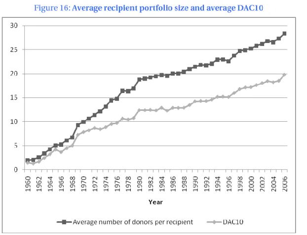
We run a parallel fragmentation analysis for recipient countries. The number of donors a developing country receives aid from (its recipient portfolio size) has continuously risen for the last 45 years, and the trend has not slowed down recently. We also measure donor concentration in each recipient using Hirschman-Herfindahl index to complement the results on portfolio size. Fragmentation can be measured along these two dimensions (size and concentration) and we show how donors expanded their portfolios to the point of managing many small partnerships. We confirm our earlier results on donor portfolios by finding that the average recipient portfolio size has been following a steady increasing trend, but that on the other hand recipient portfolio concentration has been relatively stable. These two observations imply together that the portfolio expansion has allowed only minor actors to come in, leading to more fragmentation for little benefits. These results tend to support the approach initiated by the Paris declaration signed in 2005 that takes fragmentation seriously. While it is too early to observe its effects, it is however troubling that the calls for co-ordination that preceded it during various international summits have not been followed by a clear policy reversal.
© OECD 2008 13 ODA data comes from the Development Assistance Committee (DAC) database on aid. It provides comprehensive data on aid flows from the main bilateral and multilateral donors to over 180 aid recipients, for the period 1960-2006. From 2005, DAC decided to not collect data on countries it did not classify as “developing” (Part II countries in the DAC classification). We focus on developing countries and so drop these observations, unless explicitly mentioned. Data are in 2005 constant dollars.
Private capital flows data comes from the World Development Indicators (WDI) from the World Bank. We use four different variables: foreign direct investment, net inflows; portfolio investment, bonds; portfolio investment, equity; workers’ remittances and compensation of employees, received. All variables are converted in 2005 constant dollars using the US deflator provided by DAC in order to allow an appropriate comparison. The WDI data covers fewer developing countries than the DAC data and only for the period 1970-2006. It typically excludes some small countries. An additional issue is that some variables are not reported for a substantial number of countries in many years. This is especially the case for bond and equity data. We use pair-wise comparisons as much as possible to have comparable samples.
The Emerging Portfolio Fund Research (EPFR) data tracks country and regional weightings, in percentage terms of total assets, and average weightings by investment manager. These two quantities are of interest to draw comparisons with ODA. The share of total flows a country receives can be compared with its ODA share. As this neglects the portfolio dimension of allocation, the manager weighting is defined as the average weight of the recipient in all portfolios. It indicates how much, on average, a manager invests in a country. These weights describe a (virtual) average portfolio. We can compute the exact same weights for ODA and so compare these two portfolios. The EPFR database is unique and tracks both equity and portfolio flows with particular emphasis to investments allocated to emerging countries. It became a standard database used mostly by investment banks in order to track asset allocations and portfolio flows and, to some extent, also by fund managers in order to benchmark and compare their own asset allocation and strategies with their peers. As far as we know comparing ODA allocation and portfolio asset allocation, based on EPFR data, has never been done before.
There are in fact two EPFR datasets, for equity and for bonds. Both report monthly data. Equity data is available from 1995-12-30 to 2007-12-31, and bond data from 2002-03-31 to 2007-12-31. We focus on “Global emerging market funds” that invest in all emerging market regions of the world. This is only a subsample of the full dataset that includes funds investing only in some
14 © OECD 2008
regions, or in developed and emerging markets. We are doing so for three reasons. First, we only have bond data for these funds. Second, we believe ODA donors can be best thought as “global” as they invest in all regions. Third, other types of funds usually invest a very large share of their portfolio in developed countries. In terms of quantity invested, the global emerging market funds are those with the highest investment ratio in non-developed countries. They constitute therefore the category most similar to aid donors. They offer the most comprehensive data on equity investments, and so by focusing on them we do not underestimate the number of countries that benefit from equity investments.
We formatted the EPFR data to make it as comparable as possible to the DAC aid data. First we converted it in yearly data by taking averages. Second, we dropped observations for countries not classified as developing by DAC (Austria, Greece and Portugal that are included in some emerging markets asset class by portfolio bond holders or equity investors). Third, many emerging markets are classified as “Part II countries” by DAC. ODA data for these countries has not been collected since 2005, as they are not considered to be developing countries anymore. It implies that no comparison with ODA can be made after 2005 for these countries. We therefore create two variables, a country weight that takes into account all countries and so is available for comparisons with ODA data only until 2004, and one that considers only part I countries. Given these modifications, we rescaled all the weights such that their sum is always equal to one.
We first present some background results to put into perspective the relative importance of the different flows we study in this section. Net ODA has soared in the past decades, from $ 29 billion in 1960 to 103 in 2006 (in 2005 constant terms). That represents a change of 255 percent, or an average yearly increase of 2.8 per cent. This large increase is however to be put into perspective with other flows: net FDI inflows, for example, increased by 2175 per cent between 1970 and 2006, an average yearly increase of 9 per cent. At the same time it overtook ODA as the major source of funding for developing countries. Figure 1 illustrates this trend.
© OECD 2008 15
Source: Authors based World Bank and OECD data.
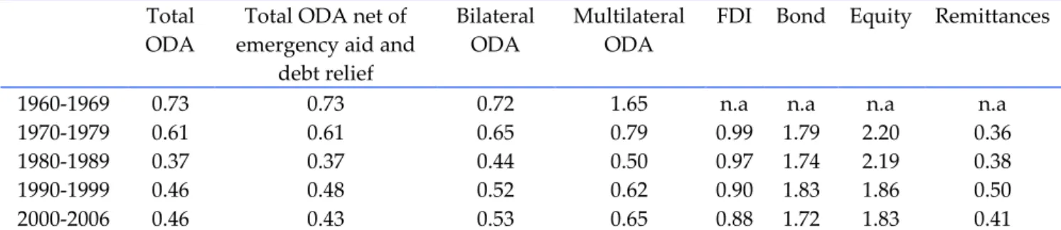
Both FDI and remittance flows to developing countries became larger than those of ODA in the nineties. The sheer development of these two flows has not been mirrored by equity and bond flows yet, although these have also been on the rise and equity was only $6 billion short of ODA in 2006. These characteristics differ widely across regions. Sub-Saharan Africa stands out as the region where ODA is much more important than any other flow. Figure 2 decomposes the average net flows to each region in its components and compares them. For instance the 20 per cent share of ODA in Europe means that in an average year during the period 1970-2006, 20 per cent of the net flow to Europe was made of aid.
Africa is a continent where aid flows dominate: they represent 63 per cent of the inflows received over the period 1970-2006 by Sub Saharan countries, against less than 19 per cent for FDI, 11 per cent for remittances and a meagre 7 per cent for bond and equity portfolio flows (in fact nearly allocated to a single country that is South Africa). This long term perspective masks however some changes in the very last years with an increasing amount of private flows allocated now to Sub Saharan Africa. Foreign Direct Investment reached the record values of 17.3 of $16.7 billion in 2005 and 2006 respectively (in constant terms). Remittances flows as well as portfolio flows have been also on the rise. That said Sub Saharan Africa remains the region
16 © OECD 2008
where aid is the most important. In Latin America, as shown in the charts below, ODA hardly reaches 10 per cent of the total inflows. South and Central Asia falls in between, ODA representing 31 per cent of the total inflows.
© OECD 2008 17 As already mentioned, one of the striking observations unveiled by the regional breakdown is the marked difference between Sub-Saharan Africa and the rest of the world. ODA on average represents 63 per cent of the net flows to the region and remittances are not a large source of finance. At the global level the shares of ODA and FDI are similar but this again hides large regional disparities: Europe and East Asia rely a lot on FDI, while other regions essentially receive external finance from aid and remittances. Figure 2 ignores the volumes associated to these decompositions. Table 1 provides these data, at the global and regional levels. We present the results by decade and for 2006, the last year for which we have data on all the flows.
The rows for Developing Countries merely confirm the conclusions of Figure 1. It also shows how ODA stagnated in the nineties during the exact period where FDI soared. The regional decomposition offers new insights. All the regions benefited from the increasing flows of external finance, but with large discrepancies. Sub-Saharan Africa and Other Asia and Oceania were very similar in the sixties and the seventies. They diverged dramatically after this period to the point of having very little in common nowadays. The sub-table for ODA shows how this flow actually stayed at a rather stable level in all the regions since the seventies, except in Sub-Saharan Africa. A large share of the increase in ODA during the last 40 years has been absorbed by this region.
1960-69 1970-79 1980-89 1990-99 2000-06 2006
ODA
Developing Countries 35.41 49.71 67.08 68.02 82.58 102.90 Europe 2.32 1.04 1.23 2.88 4.71 4.89 Latin America and Caribbean 4.56 4.31 6.15 7.10 6.73 6.73 Middle East and North Africa 5.00 11.76 11.98 9.55 11.86 16.30 Other Asia and Oceania 6.50 8.49 8.75 10.51 8.54 7.66 South and Central Asia 8.81 8.78 10.17 7.88 9.71 11.13 Sub-Saharan Africa 6.89 9.84 19.14 20.47 26.36 39.00
FDI
Developing Countries 14.46 26.40 112.52 191.39 274.31 Europe 0.18 0.26 2.01 11.13 29.53 Latin America and Caribbean 7.21 10.43 45.98 68.97 68.45 Middle East and North Africa 0.97 6.29 3.64 9.96 27.26 Other Asia and Oceania 3.01 5.91 49.55 72.30 101.71 South and Central Asia 0.53 1.39 5.93 15.06 30.67 Sub-Saharan Africa 2.56 2.11 5.41 13.97 16.68
Bonds
Developing Countries 2.34 2.27 26.56 16.13 4.45 Europe 0.00 0.61 2.15 2.96 4.71 Latin America and Caribbean 1.83 -0.25 16.07 3.01 -16.47 Middle East and North Africa 0.17 0.10 0.56 2.65 0.54 Other Asia and Oceania 0.31 1.48 6.15 3.53 5.37
18 © OECD 2008
South and Central Asia -0.00 0.35 1.00 2.92 10.18 Sub-Saharan Africa 0.04 -0.04 0.63 1.06 0.13
Equity
Developing Countries 0.03 0.41 19.36 35.91 96.52 Europe 0.00 0.00 0.39 0.94 2.60 Latin America and Caribbean -0.00 0.11 10.80 4.31 11.11 Middle East and North Africa 0.00 0.08 0.25 0.76 1.92 Other Asia and Oceania 0.00 0.39 2.22 18.01 53.28 South and Central Asia 0.00 0.01 2.37 7.18 12.96 Sub-Saharan Africa 0.03 -0.18 3.33 4.71 14.66
Remittances
Developing Countries 11.29 34.85 63.52 138.31 193.38 Europe 3.36 3.41 5.84 7.10 7.89 Latin America and Caribbean 0.93 4.75 14.22 37.79 55.48 Middle East and North Africa 4.11 10.85 16.73 20.38 25.91 Other Asia and Oceania 0.87 3.88 10.58 35.39 51.23 South and Central Asia 2.61 9.57 12.43 30.52 42.80 Sub-Saharan Africa 0.85 2.39 3.72 7.12 10.08
Source: Authors based World Bank and OECD data.
Private flows represent a new important source of finance to developing countries. However Table 1 underlines that all regions have not equally benefited from them. Cogneau and Lambert (2006) have shown that ODA actually acts as a compensatory transfer for countries who do not have access to other flows. ODA is progressive while FDI and remittances are more regressive transfers. Regardless of distributional concerns, official flows are expected to be less volatile and so to provide a safe and rather constant source of income, while private capital flows may be subject to sudden changes (on volatility of private capital flows see in particular Nunnenkamp, 2001). For instance FDI to Latin America fell by more than 50 per cent between 1999 and 2003, and bonds to Other Asia and Oceania fell by more than 90 per cent between 1997 and 1998 after having increased by more than 200 per cent between 1991 and 1997. Portfolio equity and bond flows tend to be also pretty volatile as documented by several studies focusing on emerging markets, in particular the ones realised by Wang (2007), Bekaert and Harvey (2000; 2003), Bekaert et al. (2002), and Froot and Donohue (2002).
Aid volatility is usually considered to be too high, and is known to be higher than for domestic revenues. A direct consequence of volatility is that recipient governments find it difficult to plan ahead. This is even more complicated when aid is not only volatile but also unpredictable. Two IMF and World Bank economists also underlined that even when disbursed aid is problematic because frequently unpredictable: in a recent paper Celasun and Walliser (2008) show that between 1990 and 2005, there is a significant absolute difference between aid
© OECD 2008 19 promised and aid given, equal to 3.4 per cent of each sub-Saharan African nation’s GDP (in the case of countries like Sierra Leone the swings have been equivalent to 9 per cent of GDP).
Agénor and Aizenman (2007) show that aid volatility may have permanent costs in terms of output and growth, and may create a poverty trap. Large projects require sustained capital inputs and a sudden shortfall may seriously jeopardise their achievement. This is especially true for recipients where ODA represents a large share of their total revenue. For instance in 2007 grants represented 30 per cent of the total tax revenue in Tanzania. The figure reached 47 per cent in Rwanda. For these countries shocks to aid supply correspond to significant variations in their revenues. Arellano et al. (2008) find that a fall in aid volatility would imply significant welfare gains. Borensztein et al. (2008) explain that aid is volatile and fails to smooth economic shocks. They call for a new role for aid as a stabilising financial instrument. Our study of volatility contributes to this debate by investigating the relative volatilities of official and private flows. In face of the increasing role of capital flows for developing countries, as documented in the preceding section, the need for a counter-cyclical instrument that shields against the high volatility of these new flows is becoming even more pressing.
Volatility of a quantity is defined as its coefficient of variation (the standard deviation of the quantity divided by the mean of its absolute value). The normalisation avoids finding larger volatilities for larger flows. It is calculated for each recipient and then averaged over all the developing countries in the sample. Table 2 gives the volatility of each flow for the period 1960-2006 (for private flows it is measured on the period 1970-1960-2006). We read in the first row and first column that total ODA has a volatility of 0.78 which means that its standard deviation is on average 78 per cent of its mean. It confirms the result that aid is quite volatile for developing countries, in line with the findings of previous studies already mentioned on aid volatility.
Total ODA
Total ODA net of emergency aid and
debt relief
Bilateral ODA
Multilateral ODA
FDI Bond Equity Remittances Mean 0.78 0.76 0.85 0.98 1.26 2.65 3.30 0.74 Standard deviation 0.44 0.37 0.48 0.44 0.39 1.13 1.38 0.41 Minimum 0.26 0.26 0.29 0.37 0.53 0.49 1.32 0.08 Maximum 3.71 2.94 3.99 4.11 2.38 6.08 6.08 1.80 Number of observations 152 152 152 152 126 71 71 124
Source: Authors based World Bank and OECD data.
The second column of Table 2 uses net ODA net of emergency aid and debt relief. These two categories are by nature volatile, because of natural disasters for emergency aid, and because debt relief is usually granted in large amounts. The figures show that aid volatility is actually not created by these.
ODA can be further split up into bilateral aid from DAC countries and multilateral aid. The former is less volatile than the latter, such that DAC donors appear to provide aid on a more stable basis. The combination of bilateral and multilateral aid (total ODA) is less volatile, such
20 © OECD 2008
that together the two donor categories manage to reduce aid volatility. As expected, private flows are more volatile than aid with the exception of remittances. Unsurprisingly equity and bond flows are the most volatile. Remittances are not only a major source of funds as shown in Figure 1, they are also a stable source.
Table 2 considers all the countries for which there are non-missing data; this implies that there are more countries in the aid dataset than in the private flows dataset. To avoid this bias in Table 3 volatility is presented only for countries without any missing data for any flow. We omit the column for ODA net of emergency aid and debt relief as results are extremely close to those for Total ODA. The pair-wise comparison implies that many data points are lost and Table 3 uses information on only 54 countries.
Total ODA Bilateral ODA Multilateral ODA
FDI Bond Equity Remittances
Mean 0.67 0.72 0.94 1.23 2.35 3.06 0.74 Standard deviation 0.25 0.30 0.30 0.39 0.95 1.32 0.38 Minimum 0.27 0.29 0.54 0.69 0.49 1.32 0.08 Maximum 1.41 1.64 1.68 2.38 5.27 6.08 1.80
Source: Authors based World Bank and OECD data.
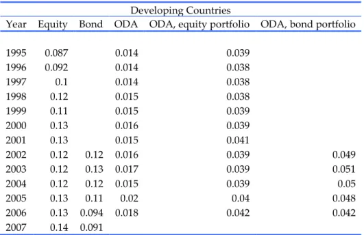
Volatility for the whole period is partly due to the increasing trend in quantities for all flows. To reduce this effect we present figures by decade in Table 4.
Total ODA
Total ODA net of emergency aid and
debt relief
Bilateral ODA
Multilateral ODA
FDI Bond Equity Remittances
1960-1969 0.73 0.73 0.72 1.65 n.a n.a n.a n.a
1970-1979 0.61 0.61 0.65 0.79 0.99 1.79 2.20 0.36
1980-1989 0.37 0.37 0.44 0.50 0.97 1.74 2.19 0.38
1990-1999 0.46 0.48 0.52 0.62 0.90 1.83 1.86 0.50
2000-2006 0.46 0.43 0.53 0.65 0.88 1.72 1.83 0.41
Source: Authors based World Bank and OECD data.
Quite surprisingly, aid has not become more stable over time. Both bilateral and multilateral donors increased the variability of aid compared to the period 1980-1989. On the other hand private flows are now more stable than they used to be. Only remittances are now slightly more volatile but they are still the most stable source of funds. Table 5 restricts the sample to non-missing observations for ODA and remittances to avoid losing too many observations. It confirms that ODA volatility has substantially increased for both types of donors and that remittances and ODA have similar volatilities.
© OECD 2008 21 Total ODA Bilateral ODA Multilateral ODA Remittances
1970-1979 0.46 0.48 0.61 0.37
1980-1989 0.33 0.39 0.46 0.38
1990-1999 0.40 0.46 0.59 0.50
2000-2006 0.46 0.52 0.62 0.45
Source: Authors based World Bank and OECD data.
It is known that aid flows follow the recipients’ business cycles rather than being counter-cyclical. Borensztein et al. (2008), among others, document this result by computing the correlation between aid and income shocks, defined by the gap between the variable and its five year moving average (so at least five years of observations are required for the shock variable to be defined). We follow their strategy but using aid and capital flow data. Table 6 shows that the correlation between aid and private capital flow shocks is extremely low. We knew from the literature that aid was not disbursed during a shortfall in GDP, and have now established that it is neither used as a buffer against a shortfall in capital flows. We complement this result by computing the correlation between FDI and other capital flow shocks. The correlations are larger, though still quite small, and all positive. It indicates that the different capital flow shocks tend to happen simultaneously, thus making the counter-cyclicality of aid even more crucial during an unexpected negative shock.
Coefficients of correlation FDI-5-year moving average of FDI Bond-5-year moving average of Bond Equity-5-year moving average of Equity Remittances-5-year moving average of Remittances ODA-5-year moving average of ODA 0.009 -0.04 -0.03 0.008 FDI-5-year moving average of FDI 0.12 0.09 0.19
Source: Authors based World Bank and OECD data.
Our results on volatility show that compared to private capital flows aid volatility is rather limited, but that aid is not used to act against capital flow shocks. It seems that aid volatility is quite neutral with respect to capital flow variations.
We have established that shocks to capital flows are not compensated by ODA shocks. We now look directly at the complementarity between these same financial resources. We are answering two types of questions: are aid and capital flows complements across countries, and are they complements within countries? The first question investigates whether countries that receive more aid get more (or less) capital flows. The answer does not depend on time variations at the country level but on differences across countries. The second question does the opposite. It
22 © OECD 2008
focuses only on time variations within countries and ignores the between country differences. It says whether a country gets more aid when capital flows vary.
To answer these two questions we run two regressions for each ODA-capital flow pair. The first provides the “between estimator” that exactly answers the first question because it ignores within country changes. The second gives the “fixed effects” estimator that answers the second question because it disregards across country changes. No causality should be inferred from these estimators. They are only correlations and show how a higher level of ODA is associated with a higher, or lower, level of capital flows.
Before we estimate the equations, a transformation is applied to the data. The distribution of each capital flow is highly skewed and estimates are heavily influenced by a few outliers (typically China in the last decade). When faced with this issue, the solution is usually to take the logarithm of the variables as it compresses the distribution. It is not directly possible in this case because many net flows are negative. We use a slightly different transformation by using ln(1+x) if x≥0, and –ln(1-x) if x<0, where x is the variable of interest, or equivalently x/|x|.ln(1+|x|). This transformation has the same desired effect than the logarithm and it allows for negative values in a symmetric fashion. We also always control for the log of population and include year fixed effects.
Both estimators are based on the same equation between two flows to recipient i in year t whose transformed values are and :
The between estimator is the OLS estimator applied to the following equation:
where the barred variables are averages across time, i.e. , is a country fixed effect, is a year fixed effect, and is the error term. The coefficient of interest is . A positive coefficient means that countries with higher levels of x receive more of y.
The fixed effects (within) estimator is the OLS estimator applied to the time-demeaned equation:
where . Similarly, we are interested in the parameter . These equations make clear that the between estimator uses only the cross-section information, while the fixed effects estimator uses only the within, or time-series, information. We therefore have access to the cross and within complentarity of flows.
The next table provides the values of and for various flows, while the complete regression tables can be found in the appendix of the paper2.
2. and are not elasticities. If η is the elasticity of y with respect to x then . However for x and y “large enough” the estimated coefficients are close to the elasticity. A natural point to compute elasticities is the sample mean. For instance the average level of ODA in the whole sample is $ 347.93 million. The average FDI flow is $714.78 million. That implies and so the reported coefficients are virtually equal to elasticities.
© OECD 2008 23 Dependent
variable
Estimator FDI Bond Equity Remittances
ODA Between -0.14*** -0.25*** -0.35*** -0.005
Within 0.01 -0.01 -0.02 0.05
FDI Between 0.56*** 0.95*** 0.43***
Within 0.08** 0.11*** 0.12
Source: Authors based World Bank and OECD data. ***significant at the 1 per cent level, **significant at the 5 per cent level, *significant at the 10 per cent level. All regressions include time fixed effects and the logarithm of the country population. For the fixed effects regressions standard errors are clustered at the country level.
The first two rows of Table 7 present the estimates of complementarity between ODA and capital flows. The answer to the first question (are aid and capital flows complements across countries?) is no, they are substitutes. Countries with higher levels of capital flows receive less aid. The results suggest that ODA is less complementary with equity than with any other capital flow, though the different samples on which coefficients are estimated make comparisons difficult3. This relationship is absent with remittances. The answer to the second question is neither yes nor no. It confirms the findings of Table 6 that aid is neutral to capital flow variations at the country level. In other words, aid does partially compensate for differences in capital flows across countries, but variations in capital flows within countries do not trigger variations in aid. It has a redistributive quality but no insurance effect. The last two rows of the table report results using FDI as the dependent variable. It shows that there is a quite strong complementarity between different types of capital flows, both across and within countries. As we have already argued, the case for a potential role of aid as a cushion against variations in capital flows is reinforced because of these complementarities. A fall in FDI usually occurs in conjunction with a fall in other types of flows, and no change in aid.
The last comparison made between official and private flows in this paper deals with the number of countries benefiting from those. We showed that ODA was less volatile than capital flows, but we also expect it to reach a greater number of developing countries. Figure 3 plots the number of developing countries with a positive net flow in a given year. There were 153 countries in the sample in 2006: ODA is available for each of them, but we have FDI, bond and equity data for only 123 of them, and 118 with remittances data4. It is therefore quite natural that there are more ODA than FDI recipients. In 2006, of the 123 countries for which we have private flows data, 122 had a positive net ODA flow, 114 for FDI, and 118 for remittances. Therefore it is fair to say that in the sample virtually all countries receive positive quantities of aid, FDI and
3. We ran the estimation on a “minimal” sample where no data for any of the flows considered is missing. It includes 2557 observations, and 118 countries. The between estimator of the regression of ODA on FDI is -0.18, on bonds -0.15, on equity -0.28, and on remittances -0.043.
4. The countries in the DAC sample but not in the WDI sample include many small states, most of them islands (Anguilla, Cook Islands, St Helena, Tuvalu, etc.). There are also some “non-island” countries: Afghanistan, Iraq, North Korea, Libya, Namibia, and Serbia.
24 © OECD 2008
remittances. On the other hand very few get a positive quantity of bond and equity portfolio flows. At their peak, in 2005-2006, only around 40 countries in the developing world where receiving equity inflows from global emerging markets funds. Numbers are even lower for bonds.
Source: Authors based World Bank and OECD data.
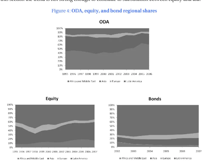
We give first a few indications about the sample of countries that are included in the EPFR data. In the first column of Table 8 we read the number of countries in the EPFR equity index with strictly positive weights. The data actually track more countries (slightly less than 60 for the equity funds), but some have a zero weight. Column 2 indicates the number of countries that get strictly positive gross ODA. Very few of them actually do not get anything. In column 3 we report the share of global ODA that equity recipients represent. Columns 4 to 6 contain the same information but restrict the sample to developing countries. Table 9 is the equivalent of Table 8 for bonds.
The two tables confirm that many more countries benefit from ODA than from equity and bonds portfolios5. The use of the EPFR dataset also offers new insights. Equity funds invest in
5. An important caveat must be made. EPFR data reports portfolio weights, and so must be read as stocks instead of flows (WDI reports flows). On the other hand ODA is a flow of resources, not a stock. However we consider ODA as a portfolio where donors decide from one year to the next whether they increase their holdings in each recipient, as private investors do with funds. When we later use EPFR data to compute a measure of volatility we will use flows, instead of the portfolio weights that reflect stocks.
© OECD 2008 25 roughly 20 per cent of all ODA recipient countries. However these countries represent a much larger share of global ODA. Large ODA recipients are over-represented in the EPFR. The correlation between equity and ODA weights turns out to be positive, with a value of 0.10 for developing countries.
The same is true for bonds, though the correlation is smaller. This bias for equity recipients has decreased with time. In 1995, 36 countries were positively weighed in the EPFR and they represented 46 per cent of global gross ODA. In 2004 there were 40 countries that accounted only for 39 per cent of global ODA. This is true also if we look only at developing countries. ODA has actually recently flowed from countries where private funds invest to countries where they do not.
All countries Developing Countries
Year EPFR ODA ODA share EPFR ODA ODA share
1995 36 186 46.30 27 152 41.78 1996 42 187 51.03 32 152 47.52 1997 38 186 44.18 28 152 41.77 1998 41 186 46.72 29 152 43.10 1999 47 186 48.57 33 152 43.80 2000 48 186 48.37 33 152 43.45 2001 47 185 45.44 33 152 41.79 2002 41 185 38.74 30 152 35.95 2003 40 185 38.43 29 152 35.86 2004 40 184 38.82 29 152 35.93 2005 41 29 152 32.68 2006 43 33 153 36.17 2007 40 29
Source: Authors based EPFR and OECD data.
All countries Developing Countries
Year EPFR ODA ODA share EPFR ODA ODA share
2002 42 185 40.54 32 152 37.81 2003 42 185 31.05 31 152 27.54 2004 48 184 36.93 36 152 33.19 2005 47 36 152 32.66 2006 57 45 153 41.55 2007 57 44
Source: Authors based EPFR and OECD data.
These changes can be better understood by looking at the regional shares in the EPFR. Regional weights are given in the dataset for four broad regions: Africa and Middle East, Asia, Europe, and Latin America. We define similar regions in the DAC dataset. Since comparisons can
26 © OECD 2008
be done for more years using data on developing countries we present graphs using only the data about them.
Figure 4 shows that Africa’s ODA share has been increasing while Asia’s was falling. At the same time Asia’s equity share was increasing. These antagonistic changes explain the falling ODA share of equity recipients. Donors seem to have acknowledged the development of international finance and started to reduce aid to countries with access to it, but as shown later in this section the trend is not strong enough to conclude to substitution between equity and aid.
Source: Authors based EPFR and OECD data.
Unfortunately the short time span of the EPFR data makes many useful comparisons between official donors and private portfolio funds difficult to implement. A further hindrance is that data about total assets invested are available only from 2003 for equity and from 2005 for bonds. We are therefore not able to derive flows for earlier dates. However we exploit the data in two other directions. We compute net equity and bond flows per year in order to compare their size with net ODA flows. Second, we measure volatility for the four-year period where we have both DAC and EPFR data.
We compare capital and ODA flows on the EPFR sample. For each country we multiply its weight by the total assets invested. This gives the capital stock in the country. The monthly
© OECD 2008 27 flow is given by the difference between two consecutive stocks. We then add up all the flows in a year to get the year flow and convert this figure in 2005 constant dollars using the DAC deflator. We only consider developing countries to use all available years.
Equity sample Bond sample
Year ODA Equity ODA Bonds
2003 16.2 16.8
2004 16.3 6.9
2005 24.8 10.0 24.4 4.5
2006 30.3 14.1 42.3 4.3
Source: Authors based EPFR and OECD data.
Table 10 shows that ODA is still a larger source of finance than equity and bonds even for EPFR countries that must receive most of these funds.
Equity ODA, EPFR
sample ODA Mean 1.22 0.38 0.33 Standard deviation 0.44 0.29 0.29 Minimum 0.38 0.024 0.024 Maximum 2 1.24 1.50 Number of observations 34 34 152
Source: Authors based EPFR and OECD data.
The volatility measure is based on a limited number of years but there are two conclusions to Table 11. First, it confirms that portfolio equity is much more volatile than ODA. Quite surprisingly volatility measured using WDI and EPFR data are almost identical, once we adjust for the time span6. Second, private portfolio funds invest in countries where ODA volatility is quite representative of its global value. This result can also be read differently: aid donors do not seem to take into account private capital flow variations when they allocate aid. It is suggested by the preceding results on the complentarity between flows. A similar approach with the EPFR data would show no significant estimates across and within countries (all coefficients are negative, but with very low significance levels; the limit of this approach with the EPFR data is the small sample size, with a maximum of 118 observations).
6. Volatility on the 2000-2006 period using WDI data is normalized for comparison purpose with the other ten year volatility measures. The figure computed from the data is multiplied by the square root of 10/7. The average in Table 4 is 1.83. If we multiply the 1.22 volatility by the square root of 10/4 we obtain a value of 1.93.
28 © OECD 2008
This section focuses on ODA donors. It looks at different patterns in donors’ allocation policies, mostly about the fragmentation of aid. Bilateral aid is highly concentrated into the hands of a small number of donors. If we consider the 22 bilateral DAC donors, the five largest represent more than 75 per cent of the gross disbursements. Figure 5 shows the average shares of the ten largest donors for the period 1960-2006. Figure 6 depicts the situation in 2006. Note how little the situation has changed. The importance of the 5 largest donors has slightly fallen, but by a very small quantity. Similarly the ten largest donors still represent around 90 per cent of total aid volume, and the ranking is almost identical. Figure 7 presents the cumulative weight of the top 5 donors for the period 1960-2006 and confirms this impression of stability. They represented more than 90 per cent of the gross disbursements in the early sixties but this share has been quite stable around 75 per cent since 19807.
7. The totals calculated here are based on bilateral disbursements, and not the total aid budgets. Those are larger as they include payments to multilateral institutions. We used the bilateral disbursements in order to find the relative importance of donors for developing countries. It is more captured by what they actually spend directly in these countries than their total aid budget. However, had we used the official figures we would have found similar results with the predominance of the five largest donors.
30 © OECD 2008
Source: Authors based on OECD DAC data.
The high concentration of bilateral aid is not uniform across regions. In order to measure the intensity of concentration we compute the Hirschman-Herfindahl index of market concentration. It is equal to the sum of squared donor shares. A high index means that few donors represent a large share of aid disbursed in the region. We present the results in Table 12.
1960-1969 1970-1979 1980-1989 1990-1999 2000-2006 2006
World 0.26 0.16 0.13 0.13 0.13 0.13
Europe 0.32 0.30 0.28 0.18 0.12 0.11
Latin America and Caribbean 0.42 0.23 0.20 0.16 0.16 0.17
Middle East and North Africa 0.29 0.30 0.37 0.26 0.24 0.24
Other Asia and Oceania 0.43 0.21 0.23 0.27 0.30 0.27
South and Central Asia 0.38 0.17 0.14 0.18 0.18 0.20
Sub-Saharan Africa 0.25 0.16 0.12 0.12 0.11 0.12
Source: Authors based on OECD DAC data.
The first row of the table confirms that world concentration has remained the same for the past 30 years. However it differs significantly across regions. If we leave aside the decade 1960-1969, when few donors were active, concentration has usually decreased but only slightly. Other Asia and Oceania is an exception, mainly because of the increasing importance of Japan in the region. Sub-Saharan Africa receives a large amount of aid from most donors and as a result its concentration index is low. On the other hand Middle East and North Africa, and Other Asia and Oceania get a lot of funds from one donor, respectively the US and Japan/Australia.
© OECD 2008 31 In this section we study different characteristics of donors’ portfolios of recipients. There is growing concern that donors give aid to too many recipients, in other words that aid allocation is too fragmented.
Fragmentation creates costs on both sides of the relationship. The recipient has to deal with many donors which have different administrative procedures. The bureaucratic burden can be heavy for developing countries, whose administration has already limited resources. On the other hand the donor must keep active relationships with many recipients. Development agencies must keep track of hundreds of projects in many countries with different organisations. Donors started to acknowledge the inefficiency of aid dispersion and calls have been made for greater co-ordination. SIDA, the Swedish aid agency, for example, has decided in 2007 to halve its number of aid recipients. It made it clear that the aid budget would remain constant but that having too many recipients was too costly, and harmful for developing countries.
We measure aid dispersion by looking first at donors, and then at recipients. A first crude measure of dispersion is the average number of recipients a donor gives aid to. We split the sample into two donor categories: DAC donors, and multilateral donors. Figure 8 shows this index for each year in the sample, alongside with the number of recipients in the dataset that gives the maximum portfolio size. A recipient is considered to be in a donor portfolio in a given year if it receives a strictly positive amount of gross ODA from the donor. We later use gross ODA net of emergency aid and debt relief. This measure gets as close as possible with our data to the concept of country programmable aid (CPA) used by the DAC to assess fragmentation. Any flow that is unpredictable by nature is not included in CPA. Around 60 per cent of unpredictable aid is made up by emergency aid and debt relief, but other items that do not imply transfers in the recipient countries (research, administrative costs) are also taken into account. We are not able to use the direct measure of CPA as it is available only for 2005 and cannot be recovered on a disbursement basis for other years. We must add that debt relief grants started to be reported as a separate category in 1988, and emergency aid in 1995 (either because they were inexistent before that date or because of reporting directives). We estimate that our measure that excludes emergency aid and debt relief is a good variable to measure fragmentation at the recipient level.
The average number of recipients in a donor portfolio increased tremendously. It was less than twenty in 1960, and is now above 100, reaching the record value of 109 recipients in 2006. Even small donors tend to disburse funds to many countries. Luxembourg had 82 recipients in 2006, Greece had 115.
Multilateral donors seem to be more focused but this actually hides large differences among them. There are some small donors, with ten or twenty recipients (Caribbean Development Bank, EBRD, Nordic Development Fund), and some very large (the European Commission gave aid to 149 developing countries in 2006, more than any bilateral donor, UNDP, UNICEF, UNTA all have more than 100 countries in their portfolios).
32 © OECD 2008
Source: Authors based on OECD DAC data.
To complement Figure 8 we present the number of countries in each portfolio in 2006. For this year the maximum number of recipients is 153. Some donors are not far from this value. The portfolios with the largest number of recipients include both bilateral and multilateral donors. Even a donor that does not allocate large aid quantities can spread them over a large number of countries. Greece for instance represents less than 0.2 per cent of total gross disbursements in 2006 but still reaches 115 countries.
© OECD 2008 33 EC Japan UNTA United States France Canada Germany UNDP Korea UNICEF Spain Greece UNFPA Norway Sweden United Kingdom Switzerland Belgium Austria Finland Netherlands Italy Global Fund Other Bilateral Donors Ireland Czech Republic Denmark UNHCR Australia Arab Agencies
TurkeyNew Zealand
GEF Luxembourg WFP IDA IFAD Poland Arab Countries Thailand Portugal AfDF IMF AsDF IDB Spec. Fund Nordic Dev. Fund Slovak Republic EBRD Hungary CarDB Montral Protocol Iceland UNRWA 0 20 40 60 80 100 120 140 160
Source: Authors based on OECD DAC data.
Dispersion is measured more precisely by using the Hirschman-Herfindahl index on portfolios. If N is the number of developing countries, the index ranges from 1/N to 1, with a higher value indicating more concentration, i.e. most aid is given to a limited number of countries. The issue with this index is that the only way it takes into account the number of potential recipients is through its lower bound. An additional issue is that it is debatable whether a high or a low value of the index is to be preferred. A high value may mean that the donor spends most of its funds on few countries and very little on many. If there is a fixed cost of establishing a relationship then this may be inefficient. It seems preferable that, with the same budget, the donor gives an equal share to all its recipients, and so has a low index. On the other hand by doing so the donor might spend very little on each country, making its presence worthless everywhere. The right balance is therefore difficult to find. For this reason we believe that portfolio size and concentration must be considered simultaneously and separately. Past studies on aid fragmentation have not exploited this possibility. We first use the simple Hirschman-Herfindahl index but we then complement the analysis to take into account the number of countries in the portfolio. Fragmentation is calculated using gross aid minus emergency aid and debt relief grants.
34 © OECD 2008 DAC donors 1960-1969 1970-1979 1980-1989 1990-1999 2000-2006 2006 Australia 0.57 0.51 0.27 0.17 0.13 0.16 Austria 0.35 0.23 0.20 0.09 0.05 0.06 Belgium 0.59 0.25 0.16 0.04 0.04 0.05 Canada 0.27 0.10 0.04 0.03 0.03 0.04 Denmark 0.40 0.08 0.09 0.05 0.05 0.05 Finland 0.25 0.09 0.05 0.05 0.05 France 0.37 0.05 0.03 0.04 0.04 0.04 Germany 0.14 0.05 0.04 0.04 0.03 0.03 Greece 0.23 0.25 0.14 Ireland 0.29 0.22 0.10 0.09 0.07 Italy 0.19 0.12 0.06 0.06 0.05 0.11 Japan 0.20 0.13 0.07 0.07 0.06 0.06 Luxembourg 0.05 0.05 0.06 Netherlands 0.46 0.14 0.05 0.03 0.03 0.04 New Zealand 0.10 0.12 0.07 0.05 0.06 Norway 0.47 0.11 0.08 0.05 0.03 0.03 Portugal 0.49 0.27 0.31 0.28 0.16 Spain 0.18 0.07 0.04 0.04 Sweden 0.22 0.13 0.08 0.05 0.04 0.03 Switzerland 0.24 0.09 0.04 0.03 0.03 0.03 United Kingdom 0.09 0.11 0.06 0.04 0.06 0.08 United States 0.10 0.09 0.09 0.09 0.09 0.14 Average 0.31 0.15 0.10 0.08 0.07 0.07 Multilateral donors 1960-1969 1970-1979 1980-1989 1990-1999 2000-2006 2006
AfDF (African Dev.Fund) 0.14 0.05 0.05 0.06 0.06 Arab Agencies 0.31 0.06 0.07 0.03 0.03 AsDF (Asian Dev.Fund) 1.00 0.23 0.19 0.16 0.13 0.12 CarDB (Carribean Dev. Bank) 0.24 0.15 0.14 0.16 0.22 Council of Europe 1.00 1.00 1.00
EBRD 0.11 0.12 0.13
EC 0.13 0.05 0.03 0.02 0.02 0.02
GEF 0.13 0.06 0.04
Global Fund (GFATM) 0.23 0.03
IBRD 0.22 0.31
IDA 0.48 0.18 0.13 0.06 0.05 0.05
IDB 0.34
IDB Spec. Fund 0.15 0.08 0.08 0.11 0.17 0.16
IFAD 0.35 0.06 0.03 0.03 0.03
IMF Trust Fund 0.07 0.50
Montreal Protocol 0.24 0.45 0.36
Nordic Dev. Fund 0.08 0.09 0.07
SAF+ESAF+PRGF(IMF) 0.14 0.11 0.10 0.09 UNDP 0.03 0.02 0.02 0.02 0.02 0.02 UNFPA 0.05 0.05 0.03 0.02 0.02 UNHCR 0.13 0.20 0.11 0.08 0.03 0.03 UNICEF 0.05 0.06 0.05 0.03 0.03 0.03 UNRWA 0.54 0.54 0.36 0.42 0.49 UNTA 0.02 0.02 0.01 0.01 0.01 0.01 WFP 0.08 0.05 0.04 0.05 0.05 0.07 Average 0.29 0.18 0.15 0.09 0.10 0.10