Evaluating Cycle Mapping Styles
Final Report to
Bristol City Council
Authors
: Henrietta Sherwin and Caroline Bartle
2
Acknowledgements
This research could not have been undertaken without the help of Martin Whitfield of CityCycle Guides, who produced three of the cycle maps used in the study, and the Bristol City Council Design Team, who produced one cycle map and a combined cycling/bus map. We are grateful to both for their assistance.
For any queries or correspondence regarding this report, please contact the UWE Researchers: Dr Henrietta Sherwin and Dr Caroline Bartle
Centre for Transport & Society
Faculty of Environment and Technology University of the West of England, Bristol Frenchay Campus
3
Contents
Executive Summary ... 4
1 Introduction ... 6
1.1 Context of Cycle Mapping ... 6
1.2 The Research Brief ... 7
2 Scope and Methodology ... 8
2.1 Recruitment of focus groups ... 8
2.2 Production of maps ... 10
2.3 Content of the focus groups ... 10
2.4 Analysis ... 11
3 Findings ... 11
3.1 Use of maps in general ... 11
3.2 Response to Map A ... 14
3.3 Response to Map B ... 17
3.4 Response to Map C ... 20
3.5 Response to Map D ... 23
3.6 Response to map with combined bus and cycling information ... 26
3.7 Summary of response to maps ... 26
3.8 Cross-cutting themes ... 27
4 Discussion and Conclusions ... 29
4.1 The tension between detail and visual simplicity ... 30
4.2 The tension between the preferences of different map users ... 30
4.3 The importance of accuracy and trust in the information ... 30
4.4 The ‘most wanted’ map features ... 31
4.5 Willingness to pay for paper maps ... 31
4.6 Paper versus electronic maps ... 31
4.7 Further research ... 32
4
Executive Summary
This research project used four different maps at the same scale, of the same area, to explore the views of focus group participants on the ‘usability’ of the different styles of map. All the participants lived ‘on the map’ or just outside it, and worked at locations in the centre of the map, which meant that all had a good local knowledge of the area.
The results highlighted the difficulty of classifying cycle routes in a meaningful way for different potential user groups. Some cyclists or potential cyclists would like to see routes suggested on the map, whilst others would prefer to be provided with information such as traffic intensity to help them identify their own routes. Before any map can be produced, the specified users and its intended purpose must be clarified. For example, a type of map with little detail can successfully show that cycling from one area to another is possible, whereas a more detailed map might be required to assist in the planning of a route and with way-finding once a trip by bicycle is underway.
Although the type of information thought to be required on a cycling map varied according to individual preference and map purpose, a number of points were considered to be essential:
Clarity/consistency of terms used to describe cycle routes Information on gradients (e.g. contours)
Information on distance (a grid) Indication of traffic volumes and speed
There was much discussion about the presentation of information on the maps, particularly the choice of colours used, whether colours were clearly differentiated, and whether in some cases they distorted the information - for example, using two colours on the same road might make it appear wider than it was in reality. This was related to a lack of consistency across the maps, and led to uncertainty about what the different colours signified on the different maps.
As participants had good local knowledge, they found discrepancies in the maps and questioned the labelling of some of the routes as ‘quiet’ or suitable for cycling. This led to a more general questioning of the credibility of the maps and whether it was possible to ‘trust’ the information. There was also discussion of who had decided which routes to mark as ‘recommended’, and what the criteria for this might be.
5
6 1 Introduction
1.1 Context of Cycle Mapping
Many government departments are emphasising the promotion of walking and cycling (‘active travel’) to reduce CO2 emissions and traffic congestion, and to tackle obesity. In the UK only two percent of
all trips are made by bicycle1. Nearly a quarter of car journeys in the UK are of less than 2 miles, and over half of all journeys made by car are of less than 5 miles2. It has been estimated that cycling is a viable alternative for 30% of car trips within towns - a greater potential than for walking or public transport3.
As the majority of individuals in the UK drive for the majority of their journeys (80% of males and 65% of females over 17 have a driving licence), their ‘mental map’4
is likely to be based on the road network. Cycling along the same roads as one would drive along might seem a dangerous or unattractive prospect; hence, a lack of knowledge about available short-cuts, traffic-free routes, or routes with lighter motor traffic is assumed, amongst transport planners, to be one of the factors which inhibit the take-up of cycling as a utility transport mode. Therefore, many local authorities, including Bristol City Council, have been producing cycling maps with the aim of reducing this particular barrier to cycling. However, the design and style of such maps varies substantially across the UK (unlike road maps designed for driving, which follow a more standard format). Some, for example, show recommended cycle routes; others colour-code roads according the level of skill required to cycle on them; some provide highly stylised information, whilst others show street names and every cycle lane. There has been no comprehensive evaluation of the ‘usability’ of different styles of map from the perspective of the cyclist or prospective cyclist. Consequently, there is a risk that public resources may be being wasted on the production of maps which do not serve their intended purposes as well as they might.
From the perspective of those producing maps, one of the problems is that there is no ‘accepted’ standard. Therefore, when map producers discuss map design with a commissioning local authority, they are sometimes required to include features which may detract from the map’s usability and render it confusing to the user. Despite the volume of paper cycling maps produced across the UK, there has been no systematic evaluation of the different mapping styles. There is an awareness of the problem; indeed, moves have been made by UK cycling campaign organisations to develop and adopt a national standard for cycle mapping. For example, Cyclenation and CTC have proposed a
1
UK National Travel Survey 2011.
2
Commission for Integrated Transport (Cfit) 2007. Are we there yet? A comparison of transport in Europe. CfiT:London.
3 Cycling England, 2007. Bike for the Future 11: A Funding Strategy for National Investment in Cycling to 2012. London Cycling England.
4
7
National Standard for cycle maps based on mapping that grades the relative cycle-friendliness of the entire road system, in contrast to the marking of recommended routes.
It is acknowledged that maps are just one of many tools to enable way-finding alongside other factors such as existing local knowledge, word-of- mouth, use of signage and other way-markers, exploration and experimentation. Moreover, there is a degree of uncertainty about the extent to which maps act as an ‘enabler’ to encourage greater use of cycling as a transport mode, within the complex decision processes surrounding modal choice. A further contextual factor is the growing range and availability of electronic delivery mechanisms for map-based information (e.g. websites, mobile ‘apps’ and journey planning tools). There is an underlying question as to the role of paper maps and whether local authority cycling maps of the future may simply be seen as marketing tools to promote the possibility of cycling with the expectation that they will be used in conjunction with online way-finding tools.
The broad underlying questions are
• Who are cycle maps for (‘specified users’)? • What are they for (specified goals and context)? • What type of information is essential?
• How is it best presented?
• In what form should it be delivered?
1.2 The Research Brief
This report is based on research commissioned by Ben Robinson, City Transport, Bristol City Council. The Bristol Cycle Map has been produced in various forms since the late 1990s. It is produced to support key policy objectives as set out in the Cycling Action Plan of the Joint Local Transport Plan 2, namely: to promote and encourage cycling through better information and education. The objectives of the cycle map are to:
Support the policy objectives to get more people cycling and maintain the habit of cycling; Make the network more ‘legible’;
Encourage non-cyclists to cycle and new and occasional cyclists to cycle more by highlighting the network and alternatives to busy roads, shortcuts etc.
The intended audience of the map is: Non-cyclists;
New and occasional cyclists; Existing cyclists;
8
In its current format it is produced by CycleCity Guides for Bristol City Council and distributed free, with all the costs being met by Bristol City Council. The cost of the publication is approximately 23p per unit depending on the quantity produced (this price is based on a print run of 30,000). A Bristol Travel Information Review carried out in 2010 looked into paper travel information and concluded that:
There is no evaluation of whether the target audience is reached or if the information provided is being used as intended;
Potential audience is limited by the print run;
Given the resources required to design and produce print materials, there has never really been an evaluation as to whether the format, style and level of detail of the cycle map is appropriate for the intended audience – ‘legibility’ versus ‘usefulness’. The map is comprehensive it what it covers, but is it legible?
Against this backdrop, this research aimed to explore the following issues:
The performance of the Bristol City Council cycling map in terms of legibility and ease of use for people who are not necessarily comfortable with using detailed OS Mapping;
The performance of the existing map in terms of how useful it is to different groups (with reference to the intended audiences above);
What level of detail would be appropriate for the intended audiences; The scale of a cycle map, in terms of naming all, some, or only major roads.
2 Scope and Methodology
2.1 Recruitment of focus groups
Two focus groups were held at the University of the West of England (UWE) Frenchay Campus, and two at the Bristol City Council offices at Romney House, Lockleaze, in January 2012. Each focus group comprised 6 to 8 participants (29 in total). The aim was to obtain opinions on four different types of map of the same location. Each map was centred on UWE and covered the area within an approximately 3 mile radius.
9
each location comprised people who were considering cycling, already cycling, or who commuted by other non-car modes. The composition of each focus group is shown in the tables below.
Focus Group 1: Romney House (car commuters)
Age range
Primary transport mode for
commuting
19-29
30-39
40-49
50-60
Total
car
cycle walk bus
Women
1
2
3
3
Men
1
3
4
4
Total
1
1
5
7
7
Focus Group 2: Romney House (mixed commuter modes)
Age range
Primary transport mode for
commuting
19-29
30-39
40-49
50-60
Total
car
cycle walk bus
Women
1
1
1
1
4
2
1
1
Men
1
1
2
4
2
2
Total
1
2
2
3
8
2
2
3
1
Focus Group 3: UWE (mainly car commuters)
Age range
Primary transport mode for
commuting
19-29
30-39
40-49
50-70
Total
car
cycle walk bus
Women
1
1
2
4
4
Men
1
1
2
1
1
Total
1
2
3
6
5
1
Focus Group 4: UWE (occasional and regular cyclists)
Age range
Primary transport mode for
commuting
19-29
30-39
40-49
50-60
Total
car
cycle walk bus
Women
2
2
4
3
1
Men
1
1
2
4
2
2
10 2.2 Production of maps
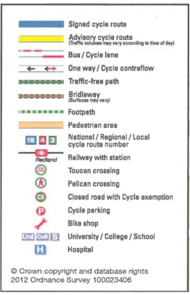
Four different styles of cycle map were produced for the research. All were at the same scale, 1:15,000, of the same area, and were printed on A1 size paper. Three were produced by CityCycle Guides and one by the Bristol City Council in-house design team. A section of each map and key is shown in Figures 1 to 8 in sections 3.2 to 3.5. The maps were:
Map A
A re-framed version of the existing Bristol City Council Cycle Map with UWE at the centre (Figure 1) Map B
A ‘Cyclenation-style’ map which colour codes roads according to ease/difficulty of cycling (Figure 3)
Map C
A less detailed version of Map A which highlights signed cycle routes (Figure 5) Map D
A more schematic map highlighting cycle routes (Figure 7)
Another simplified map similar to Map D but including bus information was produced at the same scale of the same area, but printed at A3 size.
2.3 Content of the focus groups
The focus groups were conducted by Dr Henrietta Sherwin and Dr Caroline Bartle, with Ben Robinson from Bristol City Council observing one focus group and Martin Whitfield of CityCycle Guides
observing another. All participants signed a consent form allowing focus groups to be recorded and transcribed. The structure of each group was broadly similar except that the maps were introduced in the order of Map A to Map D in two of the groups, and in reverse order in the other two (in case the order in which maps were discussed might influence the results).
Each focus group began with a general discussion of the information sources which participants used to plan an unfamiliar journey, and their experiences of way-finding using maps and other tools, after which each of the four maps was discussed one by one. For the first map, participants were asked to locate where they lived on the map or where they would join the map. In pairs, one person was asked to work out a walking or cycling route to the workplace for the other participant, so it was an unfamiliar journey to them. This was a device to stimulate discussion and to prompt exploration of the map, its key, its design, the colours and the information provided to explore how easy it was for them to use. This exercise was repeated for all four maps. Once all maps had been explored, there was a general discussion comparing all the maps, and participants were asked to write down how they personally would rank the maps in terms of their usefulness to them. Some of them had seen the
11
A few minutes were spent on discussion of the fifth map, which was smaller and included bus information. At the end, participants were asked to reflect on whether any of the maps might
encourage them or others to cycle (or use the bus) to work, and if they would be willing to pay for any of the maps.
The research design ensured that the participants reacted to the map in terms of the ease of planning a cycle journey using these maps. Although in some cases participants were asked whether they thought the maps would also be useful once on the journey, this can only be properly tested ‘in the field’.
2.4 Analysis
The transcripts were analysed using Nvivo analysis software, and were first coded according to the structure of the focus group sessions. The discussion around each map was then further coded using codes created inductively as they emerged, ‘bottom-up’ from the data. With time constraints and the composition of the focus groups a decision was made to treat all quotes equally, in other words, whether the participant was male or female or their primary mode was driving or bicycling, was not considered relevant for this initial exploration. In the future it would be interesting to conduct further analysis to see if there was a primary mode or gender difference.
3 Findings
3.1 Use of maps in general
Participants reported using a wide range of information sources, often in combination, for planning and navigating an unfamiliar trip. Most examples referred to trips by car, bicycle or on foot. Examples of maps and navigational tools included: Google Maps and Google Streetview; AA Routeplanner; web-based cycling and walking route planners; SatNav and other GPS devices; Smartphones (including ‘apps’); A to Zs, Ordnance Survey maps; cycling maps; and word-of-mouth.
Web-based information and GPS
Google maps were mentioned most frequently; some participants printed them out whilst others memorised the route and others used their smartphones. Several mentioned using Google Streetview for the end of the journey to find a place to park, find the right entrance of a building or assess the neighbourhood. Many people were moving away from ‘paper sources’ towards greater use of electronic sources:
“I’ve thrown away my A to Z now when I realised I hadn’t used it for about 2 years. I now rely entirely on Google maps and SatNav depending on the type of journey I’m doing”.
“When I first moved to Bristol I carried an A to Z around with me so that if I got lost I could refer to that, but now I’ve got a smart phone I can access Google maps on that . I don’t tend to use A- Z so much anymore. I just keep it in my car”.
12
chance there is a short cut”.
However, there was an awareness that not necessarily all the information that might be needed could be supplied by Google Maps.
“I had to walk from home to this office. I sort of looked on Google Maps to plot out the best route and there were a couple of footpaths missing from that map. It was only when I was actually walking the route that I saw a footpath saying Fairfield School this way, and I knew that Fairfield School was on the way to where I wanted to go. So, I followed that path on a whim and it actually worked out better than I’d planned, but, yes – that footpath isn’t on this map so it’s kind of useless”.
One person had found www.walkit.com to be the best source of walking routes. Another had tried a cycle route planner but found it wanting:
“There’s a cycle website, because when I moved I tried to find out the route, (…). It’s one of those websites which encourages cycling and it does have a map from my house to UWE but it is not that detailed so I ended up using Google”.
Paper Maps
Several participants used paper maps, ranging from OS maps, an atlas, A to Zs, to the Bristol Cycling map, and it was clear there was an awareness of a need for a wider view than just a route in case they got lost. Paper maps were judged to be useful for this, and some people preferred them to electronic sources.
“It’s getting a wider view than the route given to you by Google maps (…) so that you know where you are..if there is a diversion...you know where to turn. It’s important for me, not necessarily the direct route, but an overview of the area, so if you get lost or diverted, you do have an idea of the general direction”.
“A map is very important to me because I like having a picture of where the places are in relation to each other, and I quite like comparing different routes and poring over it, so I would if I was going on holiday, I would spend ages looking at the map, or the area we were going to so I could build up that sense of where things might be, because otherwise I feel very disorientated”.
In one focus group there was a discussion about using cycling maps and the difficulty in getting their bearings whilst underway, due to lack of street names. Others talked about following cycle route signs where available:
“I got lost when I tried to cycle, because they give you (...) an alternative route that’s using cycle tracks, and I knew it would be longer because there are no cycle tracks direct, but I got lost”.
13
existing local knowledge. Others enjoyed the explorative aspect of setting out with a map whilst cycling for leisure.
“I’m a lot more random. I get a general direction of drift of where to go. If I have an important meeting; I’ll plan it and do it, otherwise kind of that direction and I just find it and if necessary I refer back to the map”.
Word-of-Mouth and ‘dummy runs’
Using other people as a source of information for route finding was also common:
“If I’m en route I’ve been known to phone up other people if I get lost, to work out where I am meant to be”.
“I have walked that route to Bristol Parkway station, but the first time I did it I went on the main road and it was only because next time I saw other people taking a different route and kind of followed them, I found it was quicker”.
Doing a ‘dummy run’ of an unfamiliar trip, particularly before starting a new job, was also mentioned.
“I looked online at a couple of routes and then I asked a friend who does that route as well and the idea was I’d print the map off and do it myself the week before but I didn’t. I waited until the Monday, he met me and I followed him to UWE. He works at Hewlett Packard and on the way home I managed to just about get myself home. Yes, following a person I guess”.
Combining different sources
It was especially common for paper maps to be used as a ‘back-up’ for electronic sources. Several people mentioned having got lost following misdirection by a SatNav, and wishing they had a paper map to hand.
“If I was driving to somewhere familiar I would use my GPS but I would also have a Bristol Map because sometimes I don’t trust Tom Toms and if you know that you’ve gone astray then I will have a look at the map to make sure I am still going in the right direction, so a combination”.
“I’d do two things. I would have the paper map and I’d have an app”.
Online maps, or sections of them, were also printed out to be used if necessary en route.
Summary
The discussion of route-planning and way-finding showed the multifarious sources and the extent to which access to smartphones, Google and other on-line sources is changing the way in which
14 3.2 Response to Map A
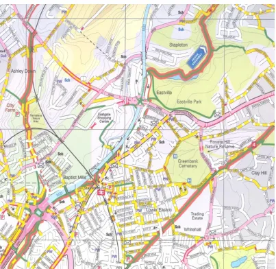
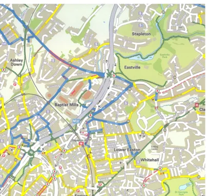
Figure 1: Map A
15 Figure 2: Map A Key
A common initial reaction to this map across the four focus groups was that it was very “busy”, which generated considerable discussion about the high level of detail and whether this was helpful.
“When you’re actually trying to use it and you’re cycling, imagine all the different colours, it could be quite confusing”.
“It’s too much referring to the key for me, I hate having to refer to the key”. “I’m really curious as to what a turning movement only a cyclist can make is?”
Many thought the number of features was excessive, especially for a commuting trip:
“I certainly think indicating public toilets and pubs makes it even more fussy and is unnecessary.”
However, it was thought that this type of feature might be useful for planning a leisure cycling trip.
16
never used it to plan routes. However, the more common view was that the detail was more useful for planning a trip than for navigating when cycling.
“I just want something very simple. If you can take it with you, you just want something you can glance and visualise other ways”.
Participants considered it would take a while to learn to use this map and understand what all the different colours meant: “I think initially it is a bit difficult to familiarise yourself with the colours, once you get to know the maps I suppose it is a lot easier”. For example, there was confusion about the meaning of a red line alongside a green section or ‘cycle route’, which prompted a discussion about whether it might mean that pedestrians were allowed on cycle paths and vice versa. Another
participant felt that the red and green together on a path made it look wider than it was in reality, like a main road or dual carriageway, when it was actually just a path. Another associated the colour blue with a river, but on Map A it represented a motorway.
An issue was raised about the increased trustworthiness of routes marked as “recommended by local cyclists”:
“I think this is the first map we have seen the phrase ‘recommended by local cyclists’. As somebody who doesn’t cycle, I would be drawn to routes recommended by people who presumably know what they are doing”.
17 3.3 Response to Map B
Figure 3 : Map B
18 Figure 4 : Map B Key
There was a general feeling that Map B looked simpler than Map A, with a smaller key, and would therefore be easier to use.
“It looks simpler”.
“It appears to have fewer colours, or it’s certainly got a smaller key”.
“It’s an interesting colour scheme. I’ve never seen it, that scale before – yellow to purple.”
19
“Even looking at the key I cannot figure out what the purple-yellow-orange means. You kind of expect it to go in the colours of spectrum order, if they were doing something like that, it kind of jumps
around. I find it hard to plan a route based on this”.
“There are five categories, which is quite a lot and it isn’t as if it’s the same colour increasing and decreasing in strength, there are five different colours, so you would have to remember”.
However, others felt that the very dark green showing the traffic-free paths stood out well, whilst the more muted colours of the rest of the roads were fairly neutral, allowing the individual to pick out a route. On a more practical note, some thought that there was less colour contrast on this map, so that it might be more difficult to read in bad light or if you were colour blind. The absence of contours was noted, and this was seen as a disadvantage from a cyclist’s perspective.
Several participants liked Map B because it did not prescribe routes, but gave them the information they felt they would need to find their own routes.
“
I think it’s giving the responsibility back to the cyclist (…). You make your own decision on the routes you take. Whereas some of the other prescribed routes, you have to follow that route”.However, others thought that it was harder to plan a route on this map, and that it would be too complicated for a beginner cyclist to find a route. It was thought that beginners might need a
prescribed route. Others thought that it was very helpful for beginners to be able to identify ‘safer’ (i.e. quieter) roads. In two of the groups this provoked a discussion of whether roads with less traffic are necessarily safer for cycling, as there are other factors which also influence ‘bikeability’. For example, narrow roads with parked cars, steep gradients, and residential roads with cars reversing out of driveways can all increase the chance of collisions. By the same token, a novice cyclist might be discouraged from using a road marked as medium-busy (orange), when in fact it might be ‘safer’ than a quiet road with the aforementioned obstacles. In other words this way of categorising roads might have a discouraging effect.
One of the more experienced cyclists in the group felt that the whole design was based on an assumption that did not hold for him as a user. He did not like roads to be graded on his behalf, as perceptions of safety differ.
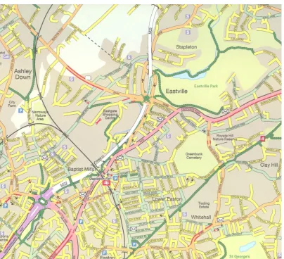
20 3.4 Response to Map C
Figure 5 : Map C
21 Figure 6 : Map C Key
There were mixed reactions to this map, which, as with all maps, initially focussed on ‘readability’:
“I don’t like the graphics on here because I have a job to read it, and one of the things, because of my eyesight as I’m older, black on yellow I find a job to read”.
“Is it hard to read the road names or it is the colours?”. “I took my spectacles off”.
22
this map and said he would use it to programme his GPS device before setting out on an unfamiliar trip.
A major issue was whether it is necessary to highlight signed cycle routes on the map when they are signed ‘on the ground’.
“And that’s the kind of duality that I’m really struggling with. Because, as a cyclist, I either want to find the quickest way or the safe way. Very rarely do I want a signposted way I could just follow. Because I wouldn’t need a map, would I? I’d just follow the signposts”.
Others complained that there was a profusion of different types of cycle routes and not enough other information, and one commented that without a grid it was difficult to judge distances. In contrast to Map A, which was thought by many to have too much information, some thought that Map C had too little:
“ I find it, there’s loads of information about cycle routes but very little information about anything else and for me personally I use all sorts of information to plan a route”.
As signed cycle paths do not exist all over the city, it was thought that this map could give people the impression that it was not possible to cycle to certain places: “there are whole areas where you
seemingly can’t get to”.
“Nothing really connects up. If you are trying to get a route, you know, you’ve got a bit of yellow and then a bit of blue and you have to look at the key about half a dozen times”.
“The route was quite disjointed in that one road can suddenly change colour and become a different meaning, so you don’t get to see a kind of route through”.
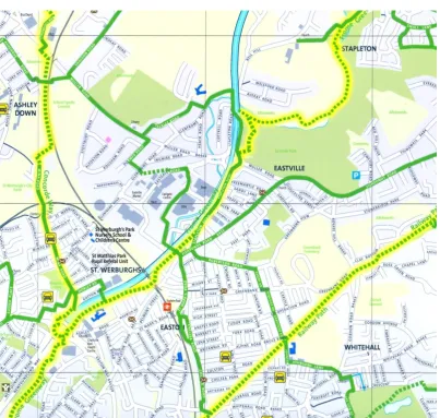
23 3.5 Response to Map D
Figure 7 : Map D
24 Figure 8 : Map D Key
There was broad agreement that this map could help you plan a journey from A to B and it looked as though it was possible to cycle to most areas on the map, which was perhaps partly a function of the fact that the map was partly ‘aspirational’ (i.e. showing a network which is not yet complete). Overall, this was considered to be the most visually appealing of the maps.
“I like it because it (…) does the one thing quite well (…). The route map shows you how to get from A to B and is fairly easy to visualise, green ones or yellow ones if there’s any there. So it’s fairly easy to plan out from here to there”.
25
The participant who made the above comment also said that she liked Map B: “because I like the
traffic information, how busy it is”, suggesting a desire for different types of information which any single map is unlikely to be able to provide.
It was noted that there were no contour lines and fewer street names, which some felt would make it difficult to know where you were once on the journey. In other words, there is a trade-off between clarity of cycle routes (which help to give the impression that cycling around the city is do-able), and detail, which can make a simplified map less useful when you are out cycling.
“This one is really clear, main issue is a little bit more difficult to locate the location quickly but that is because they’ve cut out a lot of the background, the detail. Once you’ve found it there are some really obvious routes”.
“Good for seeing an overall picture of the route, which way you are going, but it wouldn’t be able to help you identify local landmarks or street names to have an idea of where you were if you got lost”.
On the other hand, some thought the opposite: that a stylised map such as this makes it easier to find your bearings when cycling, because the information is easier to digest. Indeed, a common view during the discussion of the more detailed maps was that they might be too complex to be helpful when cycling (this issue can only be understood by testing maps ‘in the field’).
The discussion of Map D prompted consideration of the role of prescriptive routes and their
importance for different people. It was felt that they would be very useful to someone who was new to the area, but those who knew the area (as in the focus groups) felt they would prefer to take a more direct route. More experienced cyclists were thought less likely to require prescribed routes.
One person who was considering cycling to work thought that this map would make it easier for her to find a route:
“
If my work moved to Parkview, that was one of my, you know, considerations was how would I get there? And one of my thoughts was maybe I’ll cycle. And I looked at Sustrans maps but there doesn’t look like any way to get there properly by bike but if I had this map I think I could work out a route a lot easier to get there”.As with all the maps, there was some confusion about what the colour coding represented.
“The key is slightly misleading, the dotted green is traffic-free...dotted and yellow background doesn’t refer to traffic-free...whereas the Frome Greenway is completely traffic-free...but I’d look at this and it is not clear whether it is or not”.
26
Again, the question of trust was raised: who has recommended the cycle routes and why? One experienced cyclist commented that: “there is a certain amount of implied trust in using this map”. 3.6 Response to map with combined bus and cycling information
Some felt that this map (not shown as a Figure) would be useful because it was possible to work out which bus went to which destination but noted that it was not possible to find out the route or
frequency of that service. It was acknowledged that there was a difficulty of putting on all the routes, particularly near the city centre, as there would be too many overlapping lines. It was suggested that bus maps work well online so that you can switch different bus routes on and off.
“The information is really useful but it needs to be on-line so that you can take away the information you don’t need and take away the information that you do need rather than all of it”.
“... for the bus routes...more information would be useful. This is quite useful but I want to be able to look on a road...a colour line for this particular bus route so I can see where it goes...but I suspect there would be too many colours”.
“ If I was cycling I wouldn’t care about the bus routes because I’d be on the bike, same if I was on the buses, I wouldn’t care about the cycle routes because I’m not going to use them”.
There was a general view that bicycles and buses were the least likely combination of transport modes, but others felt they did not want several different maps, each for a different mode, and particularly if they had just started a new job. They would prefer a single map that showed the different options. One person thought that buses were difficult to use, so that you might not use them for one-off journeys but would be more likely to use them for regular journeys. Another thought that a map such as this was useful as an awareness-raiser and might cause her to reconsider her travel habits because it showed that travelling to work by bus was possible.
3.7 Summary of response to maps
At the end of the discussion of all four cycle maps, participants were asked to rank them in their order of preference. Map D was the most popular, followed by A, B and C. Participants were looking at these maps in a contrived situation and were not actually using the maps to execute the journey in the field (the only true test) but it does give an indication that the simplicity of Map D was appealing. Some people thought they would prefer different maps for different purposes (e.g. one for planning a route, another for navigating en route). In all the discussions of each map, there was uncertainty around what the different colour schemes and classifications of cycle infrastructure actually meant in practice.
27
thought to be a good ‘all purpose’ map because of its comprehensive coverage, although the level of complexity might discourage novice cyclists from using it.
Much of the discussion of Map B centred on the appropriateness of grading roads according to level of cycling difficulty (mainly related to traffic levels), and whether the colour scheme chosen for this was effective. There were mixed views as to whether it was better to allow cyclists to pick out their own routes based on information about traffic intensity (as Map B does), or whether prescribed cycle routes were more helpful, especially to novice cyclists . The way in which roads were graded was seen as important, as some ‘quieter’ roads might actually be less safe than some ‘busy’ ones due to steep gradients and parked cars.
Discussion of Map C included the question of whether ‘signed cycle routes’ are the best feature to highlight on a map. Unless there is a comprehensively signed network ‘on the ground’, a map which focuses only on these will give the impression that routes are disjointed, and even that it might not be possible to cycle to some places. It was questioned whether a relatively detailed map such as this would be required to plan a route when the intention was simply to go out and follow the signs. Map D was found to be the most visually appealing of all the maps, and, because of the clarity of the cycle routes, the one which was most likely to give the impression that cycling from A to B was ‘do-able’. However, this could partly be a function of the fact that part of the network shown on this map was aspirational rather than existing on the ground. There was disagreement as to whether a schematic map was helpful during the trip; some liked the visual simplicity but others thought they would need greater detail, such as street names, to help them if they got lost.
The main response to the combined bus and cycle map was that it enabled the identification of whether it was possible to catch a bus from the participant’s home to their workplace, but that they would need to source further information about the route and frequency of the service from elsewhere.
3.8 Cross-cutting themes
Accuracy, trustworthiness, and relationship of what is present on the ground with what is
represented on the map
28
“It’s on the pavement. To me, a traffic-free cycle lane is a traffic-free cycle lane in both directions, and I just don’t think some of these meet that (...) would I be happy to tow a child on a trailer bike or let a 10- year- old cycle on it? If it’s a green cycle lane that is the sort of criteria we should be using to mark them on the map”.
One of the inconsistencies between maps which was noted was that on Map B, Gloucester Road is clearly marked as a busier road, whereas on Map D it is a recommended cycle route. One participant felt that might lead to some confusion:
“There would be traffic: buses, lorries everywhere. I might think this is not what I was expecting on a key cycle route, you might be a bit miffed”.
The remaining two maps just show that it has a bus lane and cycle lane.
Equally there was discussion about whether the signed cycle routes were actually safer routes –
prompting this interaction amongst participants about Map C:
“I would say to people, don’t go there unless you had to, you know. Yet it’s a cycle route. Muller Road”.
“Yes”.
“But it’s a signed cycle route”.
“Signed cycle route. That’s why I’m just not big on Map C, because it’s the duality of the map – it’s showing you to go on these routes which we know, as the residents of Bristol, are not very good routes”.
“No. Dangerous.”
Another participant was critical of the designation of a particular road as ‘quiet’ on Map B:
“I know one local road that is marked on here as yellow and it is meant to be a quiet road. Well it can be terribly quiet, but it is double parked all the time, and going up and down it, particularly at dusk or in the evening, at night, it is terribly dangerous for cyclists and for drivers because you can’t see the cyclists, because it is still double parked, and trying to find a space as a car driver to squeeze in to let another car pass, and the cyclists just, I am amazed they haven’t all been squashed.... So I don’t think denoting it as a quiet road in that instance is helpful and then it makes me wonder about the other yellow roads: are they truly quiet?”
This type of discussion made clear that any inaccuracy leads the user to feel less confident about the rest of the information on the map. In the focus groups, it led to questions about who was making the decisions about the grading of routes according to safety, and who had decided that a route was ‘recommended’.
29
not... I guess what I am saying is that’s my issue with someone making that judgement for me. ...Someone else deciding that that road is safer for me than another road when there’s no cycle facility necessarily on there, I would question”.
Willingness to pay
All participants were asked if they would pay for any of the maps. Some felt they might if they were visiting a place they did not know; they might ‘put a pound in a slot’, but not for their own locality.
“I’m reluctant to pay for things like that. I’d rather spend my money on other things but, yes, if I wanted to go to a different place. I think I would, actually, to see where cycle routes are”.
Some thought they might buy a local map if they were seriously considering cycling but most thought they would not. This was partly because of the availability of free information on the internet, and partly because paper maps quickly become out-of-date.
“No, as far as I’m concerned there is so much useful free information on the net, there is no point in paying. I suspect there are a lot of websites where cyclists are giving the best routes and lots of advice. As well as plotting them for you on Google maps”.
“There is so much mapping online that is free, I think there is a big barrier to paying for it”.
“And I wouldn’t because of all the building work that is going on in Bristol, things change so often and regularly”.
“I’d prefer to pay £8 on an Ordnance Survey Map which has so much more excitement visually and potential things to discover and just knowing there’s one cycle route into town”.
One person said she would buy one of the cycling maps as a phone app., but not the paper version.
“Having responded most favourably to (Map B), would I buy a map of that? Probably not. Would I buy a smartphone app with that on? Sure”.
As previously noted, the attraction of an online version of the cycle maps was discussed in some of the focus groups:
“Might be nice to have these produced on line with overlays(…), so you could print off what you wanted, a particular route that you are going to do, and you could set the preference...for walking, cycling etc. and it overlays and displays it differently depending on what you want. That I’d find useful.”
4 Discussion and Conclusions
30 4.1 The tension between detail and visual simplicity
The discussion of the maps highlighted the constant tension between the map being, on the one hand, visually easy to digest and, on the other, containing enough information to help individuals place themselves on the map and find a suitable route (which is not the same as using the map on the journey to locate themselves and find their way). If there is too much information, the map becomes difficult to read. As one participant commented:
“There is a tension with these maps, which is that the more information you put on, the less obvious it seems you can do it (cycle)”.
If the purpose of the map is to highlight the ‘network’, there is a temptation perhaps to represent it as more comprehensive than it is, with the consequent danger of raising expectation of the likely cycling experience. If a user has a bad experience they might be discouraged from cycling in the future. If, on the other hand, there are certain areas where there really are no ‘safe’ facilities marked, then those who look at the map and live in those areas may decide that cycling is not possible.
4.2 The tension between the preferences of different map users
It became clear that it would be a considerable challenge to satisfy different groups with a single map; for example, someone who prioritises speed and directness over the perceived safety of off-road paths, or someone who likes to work out their own route versus someone who likes to see a clear, prescribed route.
Sometimes the map keys raised as many questions as they answered, as the same roads were marked differently in terms of their categorisation of cycle route. This confusion perhaps points to the need for consistent standards of representation and what is meant by a traffic-free route, shared path etc., and this needs to relate to certain agreed standards on the ground. The fact that the participants had very detailed local knowledge of their area showed that sometimes important features had not been included on the map.
4.3 The importance of accuracy and trust in the information
This also led to a questioning of the way in which certain routes were graded and who had taken this decision; for example, who had identified a ‘recommended cycle route’ or decided to label a particular road as ‘quiet’. Participants lost confidence in the map if they found features which they believed to be represented inaccurately. This suggests that accuracy is particularly important where people with local knowledge constitute the target audience of the map, which is likely to be the case where a map is centred on a place of employment and is seen as a tool to encourage local employees to cycle to work there.
31
surveyors’). A point was raised in some focus groups that routes seemed more credible if they were marked as ‘recommended by local cyclists’. Similarly, trust in the information might be increased if the criteria for identifying, say, ‘recommended routes’, are explained. This could include, for example, whether ‘easy routes’ are judged as such on the basis of traffic volume/speed alone, or whether the designation also takes into consideration matters such as gradient and width of the road, or
permanent presence of parked cars.
4.4 The ‘most wanted’ map features
As we have suggested, it is not possible to identify a list of ‘essential’ features on which all map users would agree. However, there was a reasonable consensus on the importance of the following:
clarity/consistency of terms used to describe routes clear marking of cycle routes
information on gradients (either contours or other indication of inclines) information on distance
indication of traffic volume/speeds
visual clarity (e.g. clear fonts, contrasting colours), especially taking into consideration people who are colour-blind or older users
4.5 Willingness to pay for paper maps
The overall view (with a few exceptions) was that people would not be willing to pay for any of the maps discussed in the focus groups. This was mainly because of the availability of free online maps, and because paper maps were seen as having a limited ‘shelf life’ due to regular changes to the physical environment. Interestingly, some said they were happy to buy an OS map or an A to Z. This might be down to expectations: OS maps and A to Z maps have never been free, whereas people are now used to local authorities providing cycle maps without charge.
4.6 Paper versus electronic maps
It was clear from the focus groups that many people are using conventional paper maps less than they used to, and electronic maps and journey-planning tools more, or they are using them in combination. However, despite the increasing prevalence of online mapping tools and the range of devices which support them, paper maps still have a ‘niche’ in providing an overview of a
geographical area – a route in its context, and many still like to carry them whilst undertaking an unfamiliar trip.
32
as Map D, acting partly as an awareness-raising or marketing device (“cycling from here to here is possible!”), but also detailed maps such as Map A for more detailed route planning or help with navigation. Both are probably necessary to encourage cycling.
Some of the limitations of paper maps, in terms of accuracy and the amount of information they can include, could be addressed through electronic delivery methods. For example, an online base map such as Map A could have different types of feature (e.g. pubs and toilets) switched on or off. Safety information (Map B), signed routes (Map C) and clearly marked routes (Map D) could be available as different layers which the user could add or remove. This would allow people to print off the ‘right’ map for them to take with them if needed, or simply use it on a smart phone or other device. Online maps can be updated at much lower cost, although this still requires the constant updating of information.
4.7 Further research
33
Appendix : Levels of paper map usage amongst users of Bristolstreets.co.uk, Walkit.com and Cyclestreets.net
A recent survey undertaken by UWE on the use of travel information websites5 included two questions measuring the extent to which users of http://bristolstreets.co.uk, http://walkit.com and
www.cyclestreets.net used paper maps for planning or navigating a trip by various transport modes. 1. Bristolstreets respondents (n = 526)
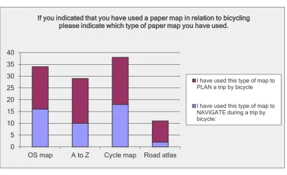
[image:33.595.72.492.365.621.2]Respondents were asked if they ever used a paper map for planning or navigating a trip by various transport modes. 75% of respondents to the Bristolstreets survey used a bicycle at least a few times a year (58% cycled at least once a week), and 60.5% had used a paper map for cycling. Cycle maps were slightly more popular than OS maps and A to Zs for both planning a cycle trip and navigating en route (Figure 1). Road atlases were the least popular. Regarding the split between pre-trip planning and way-finding, cycle maps and OS maps were used by slightly more respondents for planning than for way-finding, but users of A to Zs and road atlases were considerably more likely to use them for planning.
Figure 1: Paper maps used for cycling by users of Bristolstreets.co.uk
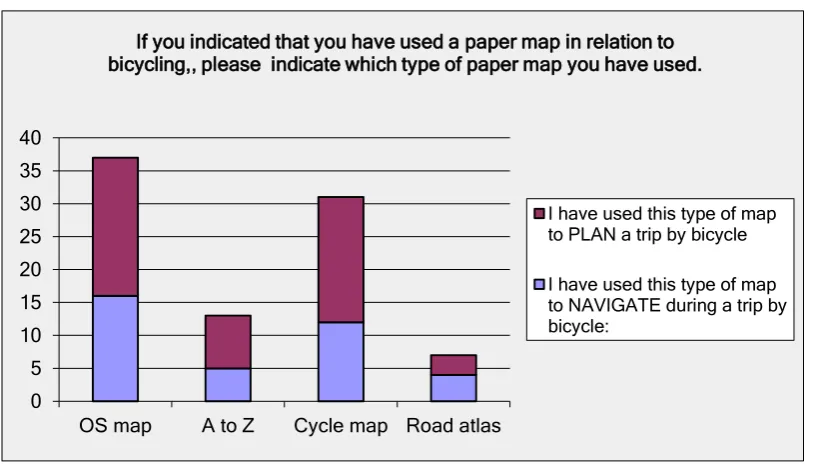
2. Cyclestreets respondents (n = 36)
97% of respondents to the cyclestreets.net survey used a bicycle at least monthly (80% cycled at least once a week), and 85% had used a paper map to plan or navigate a trip by bicycle. OS maps were slightly more popular than cycle maps among this group, and considerably more popular than A
5 “Ideas in Transit” research project:
http://ideasintransit.org/
6
Total number of people taking the survey. The percentages following represent percentage of people answering the specific question rather than percentage of total number taking the survey.
0 5 10 15 20 25 30 35 40
OS map A to Z Cycle map Road atlas
If you indicated that you have used a paper map in relation to bicycling please indicate which type of paper map you have used.
I have used this type of map to PLAN a trip by bicycle
34
[image:34.595.71.479.129.362.2]to Zs and road atlases (see Figure 2). All types of paper map apart from road atlases were used by more respondents for pre-trip planning than for wayfinding.
Figure 2: Paper maps used for cycling by users of Cyclestreets.net
3. Walkit respondents (n = 966)
43% of respondents to the Walkit.net survey used a bicycle at least once a year, and 21.5% had used a paper map to plan or navigate a trip by bicycle. Unsurprisingly, fewer Walkit.net respondents were regular cyclists compared with Cyclestreets and Bristolstreets respondents, and fewer of them used paper maps for cycling. However, looking at their use of paper maps for trips by all modes, it was clear that the majority (86%) used a paper map for some purposes (e.g. 70% used them for walking and 67% used them for car trips). Amongst those using a paper map for cycling, cycle maps were the most popular, followed by A to Zs and OS maps (Figure 3). In all cases, more respondents used them for planning than for way-finding.
0 5 10 15 20 25 30 35 40
OS map A to Z Cycle map Road atlas
If you indicated that you have used a paper map in relation to bicycling,, please indicate which type of paper map you have used.
I have used this type of map to PLAN a trip by bicycle
35
Figure 3: Paper maps used for cycling by users of Walkit.com
0 50 100 150 200 250
OS map A to Z Cycle map Road atlas
If you indicated that you have used a paper map in relation to bicycling, please indicate which type of paper map you have used.
I have used this type of map to PLAN a trip by bicycle