CURRICULUM AND EDUCATION ARTICLE
From Tree to Map: Using Cognitive Learning Theory
to Suggest Alternative Ways to Visualize Macroevolution
Sonia Stephens
Published online: 1 November 2012
#Springer Science+Business Media New York 2012
Abstract Diagrams can be important tools for communicat-ing about evolution. One of the most common visual meta-phors that unites a variety of diagrams that describe macroevolution is a tree. Tree-based diagrams are designed to provide a phylogenetic framework for thinking about evo-lutionary pattern. As is the case with any other metaphor, however, misunderstandings about evolution may either arise from or be perpetuated by how we depict the tree of life. Researchers have tried various approaches to create tree-based diagrams that communicate evolution more accurately. This paper addresses the conceptual limitations of the tree as a visual metaphor for evolution and explores the ways we can use digital tools to extend our visual metaphors for evolution communication. The theory of distributed cognition provides a framework to aid in the analysis of the conceptual affordan-ces and constraints of tree-based diagrams, and develop new ways to visualize evolution. By combining a new map-based visual metaphor for macroevolution with the interactive prop-erties of digital technology, a new method of visualizing evolution called the dynamic evolutionary map is proposed. This paper concludes by comparing the metaphoric affordan-ces and constraints of tree diagrams and the dynamic evolu-tionary map, and discussing the potential applications of the latter as an educational tool.
Keywords Cognitive learning theory . Evolution . Metaphor . Evolutionary trees . Images
Introduction
Although the essential principles of the theory of evolution are fairly uncomplicated to explain, evolution can be one of the
more challenging concepts to communicate effectively in both educational and informal settings. There is a wide variety of cognitive, religious, ethical, and political reasons for this (Scott 2004). In educational settings, for example, cognitive con-structs such as essentialism, teleology, and intentionality may constrain students’ability to understand evolution (Sinatra et al. 2008). In informal settings, prior life experience can also lead to factual misunderstandings about evolutionary processes (e.g., Alters and Nelson2002; MacFadden et al.2007).
One of the crucial tools for educators and science com-municators when communicating about evolution is meta-phor. Metaphors help us make associations between new concepts and familiar ones, providing new insights and suggesting that certain interpretations of information are more likely to be correct than others (Hellsten and Nehrlich 2008). Scientific metaphors are useful because they exemplify important aspects of the subject being rep-resented by highlighting certain properties and omitting others, thus allowing us to emphasize or deemphasize im-portant features of scientific concepts.
Along with scientific models and analogies, metaphor plays a profound role in shaping our ideas about the world around us. Scientific metaphors include mathematical rep-resentations, linguistic metaphors (e.g.,“light is both a wave and a particle”), and more complex models incorporating both an underlying structure and metaphorical entailments, such as Bohr’s “solar system” model of the atom, with electrons moving in fixed orbits like planets (Brown 2003). Such metaphoric constructs are important both with-in the sciences and for science communication. Formal scientific models are often“translated”into metaphoric ver-nacular language and imagery by science educators and communicators. This process facilitates the diffusion of scientific ideas into broader society (Bucchi 2008). Metaphors like the evolutionary“tree of life”are designed to overcome barriers to understanding and provide a phylo-genetic framework for thinking about the pattern and pro-cess of evolution (Catley et al.2010).
S. Stephens (*)
English Department, University of Central Florida, Orlando, FL 32816, USA
While the tree of life is not the only tool used to com-municate about evolution, it is a particularly well-known metaphor. This metaphor combines words and imagery to illustrate the broad scope and branching pattern of macro-evolution. It was first conceptualized as an evolution com-munication tool by Charles Darwin in On the Origin of Species, and presents his central organizing vision of shared descent (Gruber2005). The tree of life illustrates the grand sweep of evolutionary history over time: speciation, extinc-tion, and the relatedness of every living thing. This paper focuses on our visual representations of the tree of life; in other words, how we use tree-like diagrams to communicate about macroevolution.
Different Ways to Visualize Trees
As with any other metaphor, there is not a one-to-one mapping between our mental concepts surrounding trees and a scientific understanding of the processes and patterns of evolution. Numerous studies have shown that misunder-standings about evolution may either arise from or be per-petuated by how we depict the tree of life when we use it as a visual aid to communication (e.g., O’Hara1992; Gould 1995; Doolittle and Bapteste 2007). Tree diagrams vary greatly in structure, orientation, and the types of information they depict. For example, cladograms and phylograms are based upon cladistic analysis, while other types of phyloge-nies incorporate additional non-cladistic information into the visualization (Torrens and Barahona 2012). Most cladistic phylogenetic“trees”developed today have little in common with early depictions of the tree of life, and are tree-like only in general outline. Many other tree-inspired representations of evolution, however, have stronger metaphorical ties to early tree representations like those of Ernst Haeckel. Such repre-sentations can be found in popular media, as well as in educational materials and museums (MacDonald2010).
Understanding phylogenetic trees is important in biology practice, and much contemporary research on evolution visu-alizations focuses on creating tree diagrams whose features do not perpetuate viewers’misconceptions about evolution. For example, including a time scale on diagrams may help viewers better conceptualize evolutionary time (Catley and Novick 2009). Presenting diagrams oriented horizontally or radically may help viewers avoid the misconception that taxa at the top of the tree are superior to those below them (e.g., Catley and Novick2008; Torrens and Barahona2012). Finally, careful consideration of branching topology can help avoid miscon-ceptions about evolutionary advancement and primitiveness among taxa (e.g., Gregory2008; Catley et al.2010).
While many researchers concentrate on improving dia-grams presented in traditional media, such as paper and posters, other researchers focus on harnessing digital media to create interactive tree diagrams (e.g., Carrizo2004;http://
ucjeps.berkeley.edu/htree_intro.html; Maddison et al.2007; Matuk2008). Digital media provide tools for computation and communication that can be helpful in reformulating the ways we visualize evolution. However, contemporary proj-ects that focus on applying digital tools to visualize macro-evolution primarily concentrate on using interactivity to improve the “tree-thinking”skills of users. While this is a key goal of evolution education (e.g., Maddison et al.2007; Gregory 2008), by focusing on only creating interactive tree-based imagery we do not take advantage of the full capabilities that digital tools give us to create alternative visual metaphors to depict evolution. Additionally, because most tools retain tree-based imagery, they may retain design elements that foster existing student misconceptions about the evolutionary process (e.g., Matuk2008).
This study asks how we can mobilize digital media to address some of the limitations of the tree of life as a visual metaphor for evolution and extend the types of visual meta-phors we use for evolution education. It uses the theory of distributed cognition as a framework to analyze the limita-tions of tree diagrams and organize a new visual metaphor for evolution that addresses some of these limitations while retaining valuable evolutionary concepts that the tree of life does communicate, an interactive visualization called a“ dy-namic evolutionary map.”Finally, it assesses the metaphoric affordances and constraints of the dynamic evolutionary map and discusses what they suggest for the map’s potential use as an educational tool.
The Theory of Distributed Cognition
Cognitive science views learning as a process whereby our sensory perceptions are given meanings by our minds, and then these mental representations are used to construct mental models of memory. Mental models consist of representations of concepts or “nodes”of meaning that are organized into units, with a relational structure linking them (Nersessian 2008). Learning takes place when people add new concepts to their mental models or create new connections linking different concepts.
The theory of distributed cognition builds on research that suggests that people complete tasks more quickly and accurately when assisted by external representations than when relying on abstract mental models alone (e.g., Liu et al.2008; Zhang and Norman 1994). It suggests that cogni-tion occurs as we relate the cues from sensory impressions of our external surroundings to our internal mental models. The tools and diagrams that we create or interact with therefore become part of our extended cognitive capacities and help us learn (Nersessian2008; Pea1993).
concepts in another format. For example, Arabic numerals greatly facilitate multiplication and division, while Roman numerals do not, even though the same concepts are being represented (Zhang and Norman1994). Two types of associ-ations are useful when describing the properties of visual-izations for evolution education: affordances and constraints. Affordances suggest; they are cues that help us make new associations. For example, affordances are communicated by properties of visualizations that help students build accurate mental models of evolution. In contrast, constraintslimit; they restrict the range of associations that we make when incorpo-rating new concepts into our mental models (Norman1990). Constraints include aspects of visualizations that foster preex-isting evolutionary misconceptions. Together, the affordances and constraints of a particular visualization tell us something about the types of mental associations students might take from the visualization and incorporate into their mental mod-els about evolution.
In this study, the theory of distributed cognition provides a framework for examining the affordances and constraints of existing visual metaphors for evolution, identifying areas of metaphoric limitation, and organizing a new metaphor to address these limitations. First, conceptual affordances and constraints of tree diagrams were identified from the litera-ture. One group of elements was identified as providing useful affordances that communicate important aspects of the theory of evolution that should be retained in the new visualization. A second group of elements contained conceptual constraints that could facilitate misconcep-tions about evolution. These elements were targeted to be altered in the new visualization. Finally, the features of the dynamic evolutionary map were analyzed using the same framework, in order to predict how effective this new visualization might be as a tool for communi-cating macroevolution.
Affordances and Constraints of Tree Visualizations
Researchers in the learning sciences and philosophy of science have described a wide range of affordances and constraints that tree visualizations suggest to viewers. Importantly, not all tree diagrams share the same features. Some features, such as an overall branching structure, are properties of all tree diagrams. Other features, such as ver-tical or horizontal orientation, are more variable and depend upon the specific configuration of a given evolutionary tree. Table1lists several common features of tree diagrams and describes the affordances and constraints that these features may communicate to students.
Many of the affordances described in Table 1 suggest important aspects of the theory of evolution. For example, one affordance that tree diagrams can depict well,
depending upon the specific tree, is the significance of shared descent and a macroevolutionary pattern that shows a unitary origin of life (Torrens and Barahona 2012). Another positive feature of tree diagrams is their emphasis on cladogenesis as a key feature in macroevolution (Catley and Novick 2008; Gregory 2008). These features of tree diagrams provide affordances that are crucial for the accu-rate understanding of evolutionary theory.
Other elements of tree diagrams suggest possible concep-tual constraints that may foster misconceptions about evo-lution, though with careful interpretation they may also provide important evolutionary affordances. Two important evolutionary concepts in particular are present in tree dia-grams but can be challenging to interpret: the passage of time, and continuity from ancestral to descendant phyla. Time in tree diagrams should be read from the root of the tree to the tips of the branches, as the metaphor of a growing tree suggests to readers. However, research shows that stu-dents may assume an incorrect temporal orientation (Gregory 2008) or not orient themselves temporally at all unless a time scale is explicitly included (Catley and Novick 2009). The problem of continuity between ancestral and descendent phyla is a bit more complex because the units of evolution are clades rather than groups with fixed char-acteristics (O’Hara1988). When branch tips are labeled, but nodes representing hypothesized ancestral phyla are not, readers might question why there are “missing links” in the ancestral chain. However, when nodes are labeled, readers may assume that the ancestor–descendant relationships depicted are known, rather than hypothesized (Catley and Novick2008).
Developing an Alternative Visualization for Macroevolution
There are two distinct, though related, uses of the tree metaphor and tree-like images in biology. The first is qualitative and somewhat impressionistic, as a representation of the overall pattern of evolution, or as a representation of the Natural System, the concept that there is an underlying order in the diversity of life. The second is quantitative and represents formal phylogenetic hypotheses about the relationships among organisms. Both qualitative tree diagrams and quantitative
cladograms are used in evolution education (e.g., Catley et al. 2010; Torrens and Barahona2012), and the ability to interpret trees is an important skill for professional biologists. This paper is chiefly concerned with the more qualitative aspects of tree visualizations and does not propose to rethink the assumptions behind phylogenetic analysis. Therefore, this project seeks to develop an alternative way to visualize macroevolution, rather than to replace phylogenetic tree diagrams.
This project differs from traditional tree diagrams in two primary ways. First, it draws upon an alternative visual Table 1 Potential affordances and constraints introduced by various features of tree diagrams
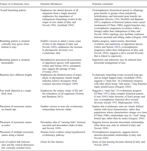
Feature of evolutionary trees Potential affordances Potential constraints
Overall branching pattern Emphasizes the shared descent of all organisms from a single ancestor; emphasizes the importance of cladogenesis (branching events) in the origin of new clades (Catley and Novick2008; Archibald2009)
Overemphasizes hierarchical (parent to offspring) gene transfer in groups where polyploidy, hybridization, and horizontal gene transfer are important (Stevens1984; Doolittle and Bapteste 2007); emphasis of historical pattern omits causal mechanisms (O’Hara 1988); angled branches may overemphasize anagenesis (evolution within a lineage) rather than cladogenesis (Catley and Novick2008); topology may facilitate confusion between ancestral and sibling clades (Gregory2008) Branching pattern is oriented
vertically (tree grows from bottom to top)
Enables viewers to attach a loose sense of time to the diagram (Catley and Novick2009); emphasizes the increase in phylogenetic diversity over evolutionary time
Implies progress, improvement, directional evolution, and superiority of uppermost species (Alters and Nelson2002); overemphasizes anagenesis rather than cladogenesis (Catley and Novick2008); suggests a drive toward diversity that is linked to superiority
Branching pattern is oriented horizontally
Deemphasizes preconceived association of uppermost species with superiority (Alters and Nelson2002); orientation may suggest the passage of time (Tversky2001)
Superiority and inferiority may be inferred from horizontal arrangement of taxa
Branches have different lengths Emphasizes the distinctiveness of major phyla; in phylograms, branch length indicates relative divergence from common ancestors (Gregory2008)
Evolutionary branching events occurred long ago and no longer happen today (Archibald2009); suggests a“main line”of evolutionary progress with other phyla being“side tracks,”long branches imply primitiveness (Gregory2008)
Tree trunk depicted as a single thick stem
Emphasizes the unitary origin of life and the relatedness of all organisms (Torrens and Barahona 2012)
Suggests a“main line”of evolutionary progress (O’Hara1992); hides complex historical pattern (Costa2009); hides diversity of fossil groups and may overemphasize historical drive toward diversity (Gould1995; Maderspacher2006) Placement of taxonomic names
on branch tips
Enables viewers to trace the evolutionary relationships between clades
Implies that evolutionary units are clearly defined entities with fixed characteristics, rather than populations whose characteristics change over time (O’Hara 1988); relationships may be“read”along branch tips, rather than by nodes (Gregory2008) Placement of taxonomic names
at nodes
Downplays idea of“missing links”between ancestral and descendent clades (Catley and Novick2008)
Suggests known ancestor-descendant relationships when these may only be inferred (Catley and Novick2008)
Placement of multiple taxonomic names along a branch
Situates fossil evidence along hypothesized evolutionary pathway
Overemphasizes anagenesis; suggests known ancestor-descendant relationships (Catley and Novick2008)
Lack of explicit link between time and the vertical dimension (for vertically-oriented trees)
metaphor for macroevolution. Second, it incorporates vari-ous interactive features that facilitate a more dynamic rep-resentation of macroevolution than that which can be shown in a paper-based diagram. Together, these features can help us create a new way to visualize evolution that both retains many of the positive affordances of tree diagrams and removes many of the negative constraints.
There are a number of existing educational projects that enhance phylogenetic trees with various types of interactivity and which therefore may enhance meaningful engagement of the viewer with the visualization. These visualizations provide an array of interactive features, such as tree rotation and zooming (e.g., http://ucjeps.berkeley.edu/htree_intro.html; Letunic and Bork 2011), the ability to annotate branches (e.g., Letunic and Bork2011), explanations of how trees are constructed (e.g., WGBH and Clear Blue Sky Productions 2001), and visualization of hypothesized common ancestors (e.g., Yale Peabody Museum2008). The visualization devel-oped in this project differs from others in that it combines a novel visual metaphor with interactive features in a substan-tially different approach to the field of evolution visualization.
A Map Metaphor Lets Us Use Proximity to Indicate Relatedness of Taxa
Broadly speaking, maps are graphical representations that use spatial proximity to represent similarities between objects. For most maps, the objects being referenced in the representation are physical objects in space, e.g., landmarks used to aid in navigation (Elkins1999). However, not all maps refer to external reality or to concrete objects with spatial dimensions (Card et al. 1999). These “non-spatial mappings”are used to represent many concepts in science education (e.g., Wright1932; Tversky2005). Therefore, the concept that maps (or mappings) represent non-spatial sim-ilarities should be familiar to most viewers. This should help viewers understand what is being represented in the dynam-ic evolutionary map with a minimum of explanation.
Map motifs have historically been used to represent the Natural System, and so the use of this metaphor to depict biological relationships has historical antecedents. For ex-ample, “affinity maps,” map-like visualizations of “ affini-ties”among biological groups, date from the mid-eighteenth century (O’Hara 1991). These visualizations generally de-pict classification by different types of characters, rather than by shared ancestry as in evolutionary trees. While there is no reason that proximity could not be used to indicate genetic relatedness, two-dimensional map diagrams are gen-erally unable to illustrate historical phylogenetic relation-ships. This is likely a large part of the reason that such diagrams are not commonly used today.
In an interactive digital visualization, this major limita-tion of the map design can be overcome. Digital tools allow
us to combine the map metaphor with the underlying mech-anism of shared descent and create a non tree-based visu alization of macroevolution that retains this crucial aspect of evolutionary theory. In the dynamic evolutionary map, this is accomplished by incorporating time into the visualization. As described in the next section of this paper, the DEM can be conceptualized as a series of horizontal sections through a vertically growing phylogenetic tree, as suggested by Fig. 1. While the phylogenetic relationships among groups are retained in the DEM, the viewer does not see a tree-like pattern. Therefore, some of the conceptual constraints of tree diagrams may be avoided.
One final implication of using a map metaphor to depict evolution is important to consider. Non-spatial mappings use proximity to display logical relationships, rather than spatial relationships. These types of visualizations may, however, carry with them the affordances of spatial maps. They can therefore be open to unintended interpretation. For example, Wright’s adaptive landscape model for population genetics (Fig. 2) uses a topographical map metaphor to visualize optimal and suboptimal combinations of genes as peaks and valleys.
The adaptive landscape can be interpreted in multiple ways because it draws upon the conventions and affordan-ces of topographical maps (Elkins 1999). For example, genetics students often misinterpret the map as representing the physical movement of organisms along a physical land-scape of “good”and “bad” ecological niches, rather than representing changing frequencies of gene combinations within populations of organisms (Ruse1990). Because the dynamic evolutionary map is also a non-spatial mapping, it is important to consider whether it suggests misconceptions to its users.
What Interactivity Adds to the Visualization
(Yi et al.2007). For example, if a viewer is interested in the specific details about one point in a data display, it would be more appropriate for her to select and elaborate on that one
data point, rather than generate a web of associations be-tween that data point and others.
Interactive media also provide a useful space to explore the ways in which scientific representations are not simply trans-parent depictions of reality. Digital images may be designed so as to either call attention to or hide the decision-making process that was used to create them (Bolter 2001), such as by either making the mathematical terms of a simulation visible to users or by simply rendering the results of the simulation in an animation. If users can explore this space by learning about the assumptions that underpin the pattern of evolution being depicted, they may be able to construct a more nuanced understanding of how science works.
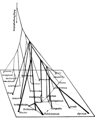
Finally, many complex visualizations have a narrative structure, whether this arises from eye movement across a single scene, from more structured scene transitions as in comic books, or from temporal transitions in animated me-dia (Segel and Heer2010). Visualizations are most effective when a mixture of author-driven and reader-driven visual elements is used, such as by providing a brief linear intro-duction before opening up the interaction to allow more Fig. 1 Evolutionary tree and
similarities between plants in the genusLeontopodium(from Handel-Mazzetti1927)
reader-driven interactivity, or by providing a more exploratory space for interaction that is constrained at key points in the narrative (Segel and Heer2010). In this project, after the desired affordances of the dynamic evolutionary map were identified, the visual style and navigational elements of the map were designed to create a semi-structured interactive experience.
Constructing the Dynamic Evolutionary Map
The dynamic evolutionary map (DEM) follows the evolu-tion of avian orders from the origin of anatomically modern birds, approximately 120 million years ago to the present day. The visualization is largely based upon a large-scale taxonomic study that differentiates among about 40 avian groups that are genetically distinct, most corresponding to orders in traditional classification (Hackett et al.2008). The DEM was constructed in a three-stage process. First, rela-tional maps of avian orders at different points in time were created using information about avian relationships from the two phylogenetic trees. Second, the relational maps were used as guides to program animated, clickable dots repre-senting the orders onto an evolutionary space. Third, an Adobe Flash animation was generated and integrated into a website built using HTML and CSS.
The first stage in creating the dynamic evolutionary map involved converting the information about avian orders in two phylogenetic trees (from Hackett et al.2008and Brown and van Tuinen 2011) to a map-like format. The overall visualization concept required the dots representing avian orders to radiate outward from a central point representing
the origin of birds. The overall animation was created by mapping the present-day positions of the orders, and then animating them “backwards” toward the origin point in a series of stages. A constant rate of movement from the origin of each order to its final position was assumed.
The relational maps were created by qualitatively map-ping two phylogenetic trees onto a two-dimensional space of genetic similarity. First, a phylogram from Hackett et al. (2008) was used to estimate the relative amount of genetic change of each order from the origin of birds and suggest placement of orders on the map in the present day. Animation of the map depicts the origin of birds at the center of the map, with orders radiating out from that central point as dots and moving across the map space until they reach their present-day positions. The more genetic change an order has undergone from the hypothetical ancestral bird, the greater the distance it travels. A second tree by Brown and van Tuinen (2011) was used to calibrate the branching points of orders, represented by dots splitting from one another, to geological time.
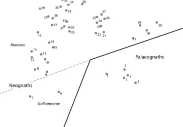
Two factors controlled the ending position of each order (Fig. 3): the relative amount of genetic divergence among orders (represented by radial distance from the origin point) and the relative similarity (relatedness) among orders (rep-resented by proximity of orders to one another). The two major avian superorders, Palaeognathae (“old jaws,” includ-ing ostriches and emus) and Neognathae (“new jaws,” in-cluding most bird species), each received about half of the map space. In the final iteration of this map, however, the Neognaths received more than half of the map space be-cause this group is proportionately much larger than the
Palaeognaths and an equal division of space would have resulted in a very crowded Palaeognath half. Similarly, about two thirds of the Neognath space was allotted to the Neoaves (“land birds”) grouping of orders, and slightly less than one third was allotted to the Galloanserae (“fowl”) grouping.
Once the major divisions of the map space had been determined, orders were placed into the appropriate divi-sion. Palaeognaths were positioned in the bottom right quadrant of the map and Neognaths in the remainder. Positions within each division were determined by qualita-tively plotting clusters of related orders according to their genetic distances (from the Hackett et al. map) from one another and from the origin point.
In order to animate the movement of the dot representing each order from the starting point to its position in the present day, a series of 13 plots of intermediate configura-tions was generated. These plots, plus the origin plot and present-day plots, were used to guide the creation of 15 total static keyframes. In ActionScript, keyframes serve as start and end points, between which the computer generates animated transitions. The overall sequence of animation in the DEM therefore takes place in a series of steps: each
keyframe acts like a“pause”in the overall animation. The keyframes are linked to an animation timeline for avian evolution spanning approximately 105 million years. Each keyframe is positioned roughly seven million years after the preceding keyframe. The positions of the order dots in the keyframes is guided by the origin and present-day positions of the orders, as well as the hypothesized series of evolu-tionary divergence or splitting events that gave rise to each order. These splitting events were located in time based on the Brown and van Tuinen (2011) map, and shown during the animated parts of the visualization as one dot splitting into two during the animation representing the appropriate time before present.
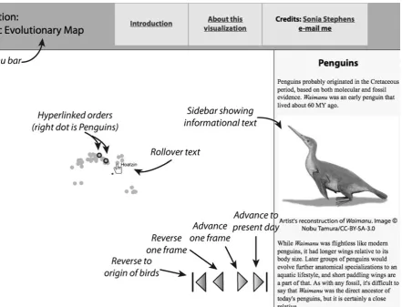
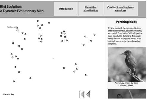
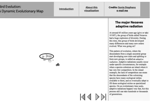
In addition to serving as start and stop points for the animation, keyframes also allow users to interact with the visualization in additional ways. First, each dot on the key-frames is programmed with rollover text that shows the name of the taxon when a cursor is positioned over the dot. Second, some of the dots were also programmed with further interactivity. Clicking on one of these dots opens up an informational page with text and images about the order in a sidebar next to the map (Fig. 4). This gives users a second way to interact with the DEM.
The final step in completing the visualization was gener-ating an interactive Flash animation and placing it into a HTML-based frameset (Fig. 4). Viewers can advance or reverse the map by clicking on forward and reverse buttons, as well as interact with the individual orders as described previously. The appearance of the pages that make up the sidebar text and images is controlled by HTML and CSS scripting. The interactive visualization is accessible online at this site:http://goo.gl/R8vFe(case-sensitive URL).
How Users Interact with the Dynamic Evolutionary Map
The features of the map as it appears in the frameset to viewers are shown in Fig.4. Users begin their interaction by encounter-ing two pages describencounter-ing the dynamic evolutionary map and explaining how it works. Viewers can return to these pages at any time by clicking on the appropriate links in the menu bar. This orienting mechanism draws viewers in, but does not deter-mine the order of their exploration of the visualization. The combination of author-driven and user-driven narrative elements resulting from this interaction is designed to enhance user en-gagement with the visualization (Segel and Heer2010).
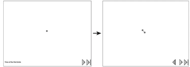
When users click on the forward arrows, the map animates to the next stop in the timeline (Fig.5). Clicking on either the button that advances to the present day or the “reverse” buttons skips the visualization to the specified point without playing the animation. Research on animated visualizations suggests that users of interactive animations value the ability to move backward or forward in time, as well as select different starting points for animated sequences (Fisher 2010). This level of control may enhance the user experience. The second way by which users construct their experi-ence of the dynamic evolutionary map is through synchronic exploration during each“stop”on the evolutionary timeline. Stopping points allow users to compare the positions of different orders relative to one another and to the origin point. Rollover text that appears above each order helps the user orient himself to the location of each order. Users can also compare information about different orders at the same point in the timeline (Figs.6and7).
In most cases, each order is linked to information specif-ically about that order. In some cases, however, multiple orders are linked to the same informational text, which occurs when there is an underlying reason to link these orders. This information is designed to support the commu-nication of aspects of evolution that were difficult to visu-alize on the map. For example, one key event that shapes our understanding of how birds evolved is the adaptive radiation that occurred approximately 65 million years ago, during which most of the modern avian orders split from one another (Fig.7). This is a prominent event in the map visualization, and a description of the causal process underlying the historical pattern here helps address some of the causal explanations for evolution that are omitted from many evolutionary representations (O’Hara 1988).
The only stopping points during which every order dot is hyperlinked are the first two points (Fig. 5) and the last point, representing the present day (Fig.6). There are sev-eral reasons that information was not provided for each order during each time period. First, most orders of birds do not have fossil evidence across the entire timespan of their existence. Since the information about orders presented with the map primarily describes fossil evidence, this makes it challenging to describe something about each order during each time period. In fact, the discontinuity of the fossil record is an important feature of avian evolution that is explicitly referenced in the descriptive information.
Second, presenting information about each order during each time period could easily introduce too much informa-tion to users. The map itself is the most important feature of the visualization as a whole, and presenting an excessive amount of textual information might cause users to lose sight of the overall pattern of evolution as presented by the map, or become overwhelmed by facts and pictures. In the final visualization, information was presented about each order at least twice: once in the final present-day time period, and at least once during a previous time period. This allowed users to conduct at least a minimal level of diachronic exploration of each individual order.
Finally, the present-day description of each bird order provides photos of each group so that they can be visually
compared, and describes the size of each group. Avian orders are widely variable in size, and the size of a given group has little to do with the amount of genetic diversification it has undergone since evolving from the last common ancestor of birds. This information may help users of the map contextualize the definition of the“success”of avian groups in an evolution-ary sense, and counter teleological ideas about evolutionevolution-ary progress. For example, successful orders could be defined as those with the most present-day species, or as those that have persisted to the present day regardless of group size. Teleology can also be inferred from the physical complexity of groups; the visualization addresses this explicitly by explaining that feature like jaw structure in the Palaeognaths and Neognaths do not make one group more“primitive”than the other.
How the Dynamic Evolutionary Map Differs from Tree Diagrams
The dynamic evolutionary map differs from traditional visual representations of evolution in that it uses a map metaphor, animation, and semi-structured interactivity. The map motif itself incorporates certain representational conventions of other evolutionary diagrams. For example, it evokes historical
“affinity” maps (O’Hara 1991) as well as Handel-Mazetti’s diagram of similarities between plant species (Fig. 1). One important convention of the map from a scientific perspective is that the movement of the dots across the map space suggests shared descent, the key concept in evolutionary theory. While Handel-Mazetti’s map is based upon shared descent, many affinity maps were not (O’Hara1991). Since the macroevolu-tionary pattern of shared descent occurs via clagodenesis, it is difficult to depict this pattern in a static diagram without evoking tree-like characteristics. In order to illustrate this fea-ture in the map, animation is used.
animate the visualization backward or forward through time. Beginning at the point when birds originated, the animation shows new bird orders budding off of the initial bird lineage and spreading across the evolutionary map as they diverge genetically. Second, users can explore the map at several stopping points during the animation sequence. At these points, the viewer can click on a dot to find information about that order at a point in time, such as fossil evidence of that order. Viewers can also see the relative genetic distinc-tiveness of orders by looking at how far away they are from other orders. These stopping points may be conceptualized as horizontal sections through a vertically growing phylo-genetic tree, as suggested by Fig.1.
Comparing Features of the DEM and Tree Diagrams
The theory of distributed cognition gives us a framework for comparing the features of dynamic evolutionary map and tree diagrams, and suggesting how these two types of visualiza-tions may affect viewers differently. The DEM instantiates certain evolutionary affordances while not incorporating other conceptual constraints. It was designed to communicate the large-scale pattern of macroevolution of birds from their ori-gin until the present day.
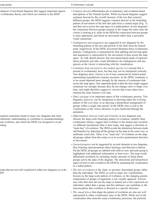
There are four broad groups of concepts communicated via the visual features of the DEM (Table 2). The first group includes affordances of tree-based diagrams that suggest im-portant aspects of evolutionary theory. The map was designed to retain these concepts, which include common descent, cladogenesis and anagenesis, continuity from ancestral to descendant species, and the passage of time. The second group of concepts that are suggested by tree diagrams can be considered to be conceptual constraints that limit evolutionary understanding or contribute to misunderstandings about evo-lution. The DEM was designed to avoid evoking these con-cepts, both related to the pattern being displayed: differentiation between trunk and branches, and the metaphor of upward progress. The third group includes evolutionary concepts that are not well visualized in either tree diagrams or in the dynamic evolutionary map. These concepts were either difficult to address with this type of visualization, outside the scope of this project, or both. Finally, the fourth group of concepts is suggested by the novel map-based visual metaphor itself, and is absent from tree diagrams. These concepts derive from the spatial nature of maps, and may be conceptual con-straints that suggest evolutionary misconceptions.
Table 2 Comparison of concepts communicated by the DEM and by many tree diagrams
Concept group Evolutionary concept
Affordances of tree-based diagrams that suggest important aspects of evolutionary theory, and which are retained in the DEM
•Common descentdifferentiates pre-evolutionary and evolution-based descriptions of the Natural System. While tree-based diagrams suggest common descent by the overall structure of the tree that connects different groups, the DEM suggests common descent in the branching pattern of movement of the dots that split from a central origin (Fig.5), and then move across the map space in a radial pattern. In tree diagrams, the connection between groups remains in the image the entire time the viewer is looking at it, while in the DEM the connection between groups is more ephemeral, and based on movement rather than a persistent visual connection.
•Cladogenesis and anagenesisare suggested in tree diagrams by the branching pattern of the tree and growth of the limb from the branch point, respectively. In the DEM, movement illustrates these evolutionary patterns. Cladogenesis is represented by dots splitting and moving apart, and anagenesis is represented by the movement of dots across the map space. As with shared descent, this movement-based mode of represen-tation primarily provides visual affordances for cladogenesis and ana-genesis as the viewer is interacting with the visualization.
•Continuity from ancestral to descendant speciesis a concept that is present in evolutionary trees, but that may not be interpreted correctly. Tree diagrams show viewers a set of taxa connected by branch points representing hypothetical common ancestors. In the DEM, continuity is to an extent depicted more strongly by the motion of continuous dots across the map space. One important point is that the dots might suggest continuity too strongly because they do not change color or shape over time, and might therefore suggest to viewers that avian orders have retained the same features over time.
•Time’s passageis an important aspect of the evolutionary process. Tree diagrams, however, can be interpreted as showing either the evolving pattern of life over time, or as showing a hierarchical arrangement of groups within a single time period. In the DEM, time is tied to the visualization as the viewer advances or goes backward through the animation.
Conceptual constraints found in many tree diagrams that limit evolutionary understanding or contribute to misunderstandings about evolution, and which the DEM was designed to avoid evoking
•Differentiation between trunk and branchesin tree diagrams may obscure the large-scale branching pattern of evolution, simplify deep evolutionary history, suggest that evolution in the distant past occurred via different mechanisms than it does today, and suggest a direction or “main line”of evolution. The DEM avoids the distinction between trunk and branches by depicting all the groups on the map in the same way, as uniformly sized dots. There is no“main line”of evolution on the map; all groups radiate from the center so as to avoid a predominant direction of movement.
•Upward progresscan be suggested by several elements in tree diagrams, thus fostering misconceptions about teleology and directed evolution. On the DEM, all groups are labeled with rollover text, and each group is highlighted with additional information at least twice. The map avoids differential resolution by including similar amounts of detail about groups across the span of the diagram. The directional and hierarchical aspect of trees is also avoided in the DEM by animating the visualization in a radial pattern.
Concepts that are not well visualized in either tree diagrams or in the DEM
•The unit of evolutionis the clade, or ancestor–descendant group, rather than the individual. The DEM, as well as many tree visualizations, focuses on the large-scale pattern of evolution, so the changing genetic composition of groups of organisms is not visually apparent. Viewers may infer that each dot (on the map) or branch (on a tree) represents an individual, rather than a group, and this inference can contribute to the misconception that evolution is directed in a specific direction. •The causal forcesthat shape the pattern of evolution are also not well
(Catley and Novick2008; Gregory2008; Catley and Novick 2009; Catley et al. 2010; MacDonald 2010; Torrens and Barahona 2012). Therefore, this comparison is necessarily focused on features that are found across a range of diagrams. The dynamic evolutionary map shares some similarities with Wright’s adaptive landscape map (Fig.2), in which the
“ground,”or total map space, represents a theoretical space of evolutionary adaptation. In the DEM, the ground repre-sents the potential evolutionary space across which birds have evolved. It differs from Wright’s map in that the positions of any two groups of birds on the map have meaning relative to one another and to the origin point of birds; the distance between groups on the map is related to the genetic distance between them in real life. Unlike in Wright’s adaptive landscape, the dynamic evolutionary map is not completely unpinned from orientation; the central origin point, representing the genetic“location”of the first birds, remains on the map throughout.
Like Wright’s adaptive landscape, calling this visualiza-tion a“map”might lead to misconceptions among its users related to the affordances of everyday maps. For example, users may have the misconception that what is being depicted is the spread of avian orders across a physical landscape, rather than a virtual space. Another possible misconception is associated with a teleological view of
evolution. Viewers might assume that orders that travel upwards or rightwards (or, leftwards or down, depending on their cultural background) are more advanced or“better” than orders traveling in the opposite direction. Nevertheless, this possible constraint is much less likely in this type of image than in a vertical tree-shaped image.
The DEM may have other limitations. For example, it does not lend itself to teaching “tree-thinking,”as standard clado-grams do (Maddison et al.2007). Biology students ultimately need to learn this skill in order to correctly interpret phyloge-netic studies; therefore, the DEM should be considered a sup-plement to, rather than a replacement of, phylogenetic trees in an educational setting. Two other limitations could be addressed by selecting a different group of organisms to depict. First, it does not address issues of horizontal gene transfer in evolution because it focuses on a vertebrate phylum. Second, because the overall animation is based upon molecular evi-dence from extant orders, it may minimize the importance of extinction as a driver of macroevolutionary pattern.
Conclusions
A number of researchers with a learning-centered focus have explored ways to use electronic resources to make Table 2 (continued)
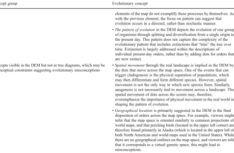
Concept group Evolutionary concept
elements of the map do not exemplify these processes by themselves. As with the previous element, the focus on pattern can suggest that evolution occurs in a directed, rather than stochastic manner.
•The pattern of evolutionin the DEM depicts the evolution of one group of organisms through splitting and diversification from a single origin to the present day. This pattern does not capture the complexity of the evolutionary pattern that includes extinctions that“trim”the tree over time. Extinction is largely addressed within the descriptions of individual present-day orders, rather than by adding dots for orders that are now extinct.
Concepts visible in the DEM but not in tree diagrams, which may be conceptual constraints suggesting evolutionary misconceptions
•Spatial movementthrough the real landscape is implied in the DEM by the dots that move across the map space. One of the events that can trigger cladogenesis is the physical separation of populations, which may then differentiate and form different species. However, spatial movement is not the only way in which new species form. Similarly, anagenesis is not necessarily tied to movement across a landscape. The spatial movement of dots across the screen may, therefore,
overemphasize the importance of physical movement in the real world in shaping the pattern of evolution.
phylogenetic tree diagrams interactive (e.g., Carrizo 2004; http://ucjeps.berkeley.edu/htree_intro.html; Maddison et al. 2007; Letunic and Bork 2011). Importantly, these projects largely share an explicit focus of understanding phylogenetic uses of tree imagery (e.g., Maddison et al.2007). Therefore, none of these projects explicitly explores alternative visual metaphors to the tree of life. Because these tools retain tree-based imagery, they may retain conceptual constraints in their design that foster existing student misconceptions about the evolutionary process (e.g., Matuk2008).
The dynamic evolutionary map was designed to address some of the constraints suggested by various features of tree diagrams that may suggest misconceptions to viewers of tree-like visualizations of evolution. While it is not proposed as a replacement for phylogenetic representations of evolution, it does retain some of the key affordances of tree-based visual-izations. The DEM differs from most traditional visual repre-sentations of evolution in two primary ways. First, its visual form draws upon two representational motifs, affinity maps and evolutionary trees, though it combines these elements in a novel map-based visual metaphor based upon shared descent. Second, it departs from traditional representations of the Natural System by incorporating animation and semi-structured user interactivity. These dynamic design elements facilitate the depiction of change over time and enhance the ability of the viewer to interact with the visualization. However, future user testing will generate empirical evidence that should help refine the theoretical predictions of this study. The analysis of the dynamic evolutionary map’s affordan-ces and constraints suggests that a map-based visualization may be better at communicating some affordances for evolu-tionary understanding than many tree diagrams. For example, the radial design of the DEM avoids suggesting that evolution is directed in a linear manner, or that some phyla are superior to others based upon their relative positions on a tree. However, tree diagrams may be better at depicting affordances like shared descent. This is because the map uses non-continuous animation to depict this, rather than a branching pattern to which a user can continually refer. Comparative user evaluation of the map and a comparable interactive tree dia-gram would help clarify whether this is the case.
Another important aspect of the DEM is that while this visualization incorporates some elements of various types of maps, it incorporates the map metaphor rather loosely. Therefore, it may be better described as a non-spatial map-ping than a“map.”Nevertheless, it is analogous to a map, in the same sense as many scientific visualizations are (Tversky 2005). This loose use of the map metaphor may facilitate user understanding. For example, most students are familiar with a wide array of spatial diagrams, and are unlikely to conflate the positions of phyla on the DEM with their positions in the real world. Again, future user testing of the visualization would help clarify whether this is the case.
The interactive elements of the dynamic evolutionary map also facilitate the communication of important evolu-tionary affordances. In particular, the passage of time may be difficult to convey in traditional tree diagrams. Unless a time scale is explicitly made part of a static diagram, readers have a difficult time situating the macroevolutionary record in evolutionary time (Catley and Novick 2009). While the current iteration of the DEM lacks a constant time scale, the animation itself provides a sense of time’s passage. Furthermore, the animation emphasizes the importance of splitting events in evolution, an important affordance that is sometimes not communicated well by tree diagrams (Catley et al. 2010). Future refinement of the visualization might help emphasize these features.
This study suggests two primary areas of future research related to interactive visualizations that use alternative meth-ods to communicate evolution. First, empirical comparisons of the effectiveness of DEM-type visualizations and compa-rable phylogenetic tree visualizations should help confirm or refute the predictions of this study that are based upon meta-phoric affordances and constraints. The initial results of em-pirical user evaluation of the DEM are currently being prepared for publication. Second, the DEM was developed as a stand-alone model to demonstrate an alternative method of visualization, using the graphical information depicted in a phylogram. Automating map construction by developing a computer program to create a map-like visualization that directly uses phylogenetic data could increase the applicability of this method of visualization. An automated program, for example, would enable the user to update the DEM with new phylogenetic information in the same way that existing soft-ware allows the updating of phylogenetic trees.
The dynamic evolutionary map was designed to be adapted for future use in either formal educational settings or for informal science communication. In educational settings, it could be used as a complement to traditional phylogenetic trees. It could, for example, be incorporated into a classroom setting as an accompaniment to studying cladograms and other types of visualizations that support evolution teaching.
“Tree-thinking”is an important skill for biologists to learn and apply in professional practice, so visualizations like the DEM should not be used to replace the study of phylogenetic trees. Alternatively, future versions of this visualization might in-corporate a branching pattern that the user could toggle on and off, thus combining elements of both metaphors that could support learning. Other elements that could enhance its use as an educational tool include a clear timeline to aid users in tracking the temporal dimension, or a greater focus on the splitting events that support an understanding of cladogenesis. For digitally savvy students, its novel structure and interactiv-ity could help make it an engaging tool.
and is therefore designed to be accessible online to a wide audience. As the only surviving dinosaurs, birds have intrinsic interest to the public, and future versions of the map might emphasize this link. The basic structure and design of the visualization could also be adapted for specific communication situations, for example to communicate about the evolution of other groups of organisms.
Digital tools have promise for transforming science com-munication and education; however, different issues must be met by specific solutions. This paper focuses on one particular area, the communication of macroevolution, which is a field in which many conceptual and social challenges exist. The ap-proach outlined in this paper consists of selecting a specific type of visualization that can be productively modified using digital tools, analyzing the affordances and constraints of the visualization method, and then generating a new type of visual metaphor that communicates accurate affordances while elim-inating inaccurate constraints. By identifying the areas where we can apply digital tools to metaphoric affordances and constraints, science educators and communicators can effec-tively harness the computational power and possibilities for interactive user engagement that these tools provide.
References
Alters BJ, Nelson CE. Teaching evolution in higher education. Evolu-tion. 2002;56(10):1891–901.
Archibald JD. Edward Hitchcock’s Pre-Darwinian (1840)‘Tree of life’. J Hist Biol. 2009;42(3):561–92.
Brown TL. Making truth: metaphor in science. Urbana: U of Chicago P; 2003.
Brown JW, van Tuinen M. Evolving perceptions on the antiquity of the modern avian tree. In: Dyke G, Kaiser G, editors. Living dinosaurs: The evolutionary history of modern birds. Hoboken: John Wiley and Sons; 2011. p. 3–8.
Bolter JD. Writing space: computers, hypertext, and the remediation of print. 2nd ed. Mahwah: Lawrence Erlbaum Associates; 2001. Bucchi M. Of deficits, deviations and dialogues: theories of public
communication of science. In: Bucchi M, Trench B, editors. Handbook of public communication of science and technology. New York: Routledge; 2008. p. 57–76.
Card SK, Mackinlay JD, Shneiderman B. Information visualization. In: Card SK, Mackinlay JD, Shneiderman B, editors. Readings in information visualization: using vision to think. San Francisco: Morgan Kaufmann; 1999. p. 1–34.
Carrizo SF. Phylogenetic trees: an information visualisation perspec-tive. In: Chen, Y-PP, editor. Proc. Second Asia-Pacific Bioinfor-matics Conference (APBC2004). Dunedin, New Zealand: CRPIT; 2004. p. 315–320.
Catley KM. Darwin’s missing link: a novel paradigm for evolution education. Sci Educ. 2006;90(5):767–83.
Catley KM, Novick LR. Seeing the wood for the trees: an analysis of evolutionary diagrams in biology textbooks. Bioscience. 2008;58 (10):976–87.
Catley KM, Novick LR. Digging deep: exploring college students’ knowledge of macroevolutionary time. J Res Sci Teach. 2009;46 (3):311–32.
Catley KM, Novick LR, Shade CK. Interpreting evolutionary dia-grams: when topology and process conflict. J Res Sci Teach. 2010;47(7):861–82.
Costa JT. Annotations. In: Darwin C, editor. The annotated origin: a facsimile of the first edition of on the origin of species. 1st ed. Cambridge: Harvard UP; 2009.
Doolittle WF, Bapteste E. Pattern pluralism and the tree of life hypoth-esis. Proc Natl Acad Sci U S A. 2007;104(7):2043–9.
Elkins J. The domain of images. Ithaca: Cornell UP; 1999.
Fisher, D. Animation for visualization: opportunities and drawbacks. In: Steele J, Iliinsky N, editors. Beautiful visualization: Looking at data through the eyes of experts. Sebastopol, CA: O’Reilly; 2010. p. 329–352.
Gould SJ. Ladders and cones: constraining evolution by canonical icons. In: Silvers RB, editor. Hidden histories of science. New York: New York Review; 1995. p. 33–67.
Gregory R. Understanding evolutionary trees. Evol Educ Outreach. 2008;1:121–37.
Gruber HE. Darwin’s‘tree of nature’and other images of wide scope. In: Gruber HE, Bodeker K, editors. Creativity, psychology and the history of science. New York: Springer; 2005. p. 241–57. Hackett SJ, Kimball RT, Reddy S, Bowie RCK, Braun EL, Braun MJ,
Chojnowski JL, Cox WA, Han K-L, Harshman J, Huddleston CJ, Marks BD, Miglia KJ, Moore WS, Sheldon FH, Steadman DW, Witt CC, Yuri T. A phylogenomic study of birds reveals their evolutionary history. Science. 2008;320(5884):1763–8.
Handel-Mazzetti H. Systematische monographie der gattung Leonto-podium. In Beihefte zum botanischen centralblatt. Cassel: Verlag von Gebrder Gotlhelft. 1927;44:1–178.
Hellsten I, Nehrlich B. Genetics and genomics: the ethics and politics of metaphorical framing. In: Bucchi M, Trench B, editors. Hand-book of public communication of science and technology. New York: Routledge; 2008. p. 93–110.
Letunic I, Bork P. Interactive tree of life v2: online annotation and display of phylogenetic trees made easy. Nucleic Acids Res. 2011;39:W475–8.
Liu Z, Nersessian NJ, Stasko JT. Distributed cognition as a theoretical framework for information visualization. IEEE Trans Vis Comput Graph. 2008;14(6):1173–80.
MacDonald T. Communicating phylogeny: evolutionary tree diagrams in museums. Paper presented at the 2010 annual meeting of the National Association for Research in Science Teaching, Philadel-phia: 2010.
MacFadden BJ, Dunckel BA, Ellis S, Dierking LD, Abraham-Silver L, Kisiel J, Koke J. Natural history museum visitors’understanding of evolution. Bioscience. 2007;57(10):875–82.
Maddison DA, Schulz K-S, Maddison WP. The tree of life web project. In: Zhang Z-Q, Shear WA, editors. Linnaeus tercentenary: prog-ress in invertebrate taxonomy. Zootaxa; 2007. 1668: p. 1–766. Maderspacher F. The captivating coral—the origins of early
evolution-ary imagery. Curr Biol. 2006;16(13):R476–8.
Manovich L. The language of new media. Cambridge: MIT Press; 2000.
Matuk C. Animated cladograms: interpreting evolution from diagrams. Lecture notes in computer science. 2008;(5223):395-397. Murray JH. Hamlet on the holodeck: the future of narrative in
cyber-space. New York: Free Press; 1997.
Nersessian NJ. Mental models in conceptual change. In: Vosniadou S, editor. International handbook of research on conceptual change. New York: Routledge; 2008. p. 391–416.
Norman DA. The design of everyday things. New York: Doubleday; 1990.
O’Hara RJ. Representations of the natural system in the nineteenth century. Biol Philos. 1991;7(2):255–74.
O’Hara RJ. Homage to Clio, or, toward an historical philosophy for evolutionary biology. Syst Zool. 1988;37(2):142–55.
Pea RD. Practices of distributed intelligence. In: Simon G, editor. Distributed cognitions: psychological and educational considera-tions. Cambridge: Cambridge UP; 1993. p. 47–87.
Ruse M. Are pictures really necessary? The case of sewell wright’s ‘Adaptive landscapes.’Proc. of the biennial meeting of the Phi-losophy of Science Association. 1990; 3:63–77.
Scott EC. Evolution vs. creationism: an introduction. Berkeley: U of California; 2004.
Segel E, Heer J. Narrative visualization: telling stories with data. IEEE Trans Vis Comput Graph. 2010;16(6):1139–48.
Sinatra GM, Brem SK, Evans EM. Changing minds? Implications of conceptual change for teaching and learning about biological evolution. Evol Educ Outreach. 2008;1:189–95.
Stevens PF. Metaphors and typology in the development of botanical systematics 1690–1960, or the art of putting new wine in old bottles. Taxonomy. 1984;33(2):169–211.
Torrens E, Barahona A. Why are some evolutionary trees in natural history museums prone to being misinterpreted? Evol Educ Out-reach. 2012;5(1):76–100.
Tversky B. Spatial schemas in depictions. In: Gattis M, editor. Spatial schemas and abstract thought. Cambridge: MIT; 2001. p. 79–112.
Tversky B. Prolegomenon to scientific visualizations. In: Elbert JK, editor. Visualization in science education. Dordrecht: Springer; 2005. p. 29–42.
WGBH, Clear Blue Sky Productions. Evolution: change: all in the family; 2001. Retrieved fromhttp://www.pbs.org/wgbh/evolution/change/ family/index.html
Wright S. The roles of mutation, inbreeding, crossbreeding, and selec-tion in evoluselec-tion. In: Jones DF, editor. Proceedings of the sixth international conference on genetics, vol. 1. Menasha: Genetics Society of America; 1932. p. 356–66.
Yale Peabody Museum. Travels in the great tree of life: morphing arachnids; 2008. Retrieved fromhttp://archive.peabody.yale.edu/ exhibits/treeoflife/morph.html
Yi JS, Kang Y, Stasko JT, Jacko JA. Toward a deeper understanding of the role of interaction in information visualization. IEEE Trans Vis Comput Graph. 2007;3(6):1224–31.