DEMOGRAPHIC RESEARCH
A peer-reviewed, open-access journal of population sciences
DEMOGRAPHIC RESEARCH
VOLUME 41, ARTICLE 17, PAGES 477–490
PUBLISHED 8 AUGUST 2019
http://www.demographic-research.org/Volumes/Vol41/17/ DOI: 10.4054/DemRes.2019.41.17
Research Material
Geofaceting: Aligning small multiples for
regions in a spatially meaningful way
Ilya Kashnitsky
Jos´e Manuel Aburto
This publication is part of the Special Collection on “Data Visualization,” organized by Guest Editors Tim Riffe, Sebastian Kl¨usener, and Nikola Sander.
c
2019 Ilya Kashnitsky & Jos´e Manuel Aburto.
This open-access work is published under the terms of the Creative Commons Attribution 3.0 Germany (CC BY 3.0 DE), which permits use, reproduction, and distribution in any medium, provided the original author(s) and source are given credit.
1 Introduction 478
2 Data and methods 479
3 Application 480
4 Discussion 485
5 Acknowledgements 486
Geofaceting: Aligning small multiples for regions in a spatially
meaningful way
Ilya Kashnitsky1
Jos´e Manuel Aburto2
Abstract
BACKGROUND
Creating visualizations that include multiple dimensions of the data while preserving spa-tial structure and readability is challenging. Here we demonstrate the use of geofaceting to meet this challenge.
OBJECTIVE
Using data on young adult mortality in the 32 Mexican states from 1990 to 2015, we demonstrate how aligning small multiples for territorial units, often regions, according to their approximate geographical location – geofaceting – can be used to depict complex multi-dimensional phenomena.
RESULTS
Geofaceting reveals the macro-level spatial pattern while preserving the flexibility of choosing any visualization techniques for the small multiples. Creating geofaceted visu-alizations gives all the advantages of standard plots in which one can adequately display multiple dimensions of a dataset.
CONCLUSIONS
Compared to other ways of small multiples arrangement, geofaceting improves the speed of regions’ identification and exposes the broad spatial pattern.
1Interdisciplinary Centre on Population Dynamics, University of Southern Denmark, Odense, Denmark, and
National Research University Higher School of Economics, Moscow, Russia. Email:[email protected].
2Interdisciplinary Centre on Population Dynamics, University of Southern Denmark, Odense, Denmark, and
1. Introduction
In data visualization, it is often challenging to represent multiple relevant dimensions while preserving the readability of a plot. This is especially true when the task is to expose spatial variation of some complex phenomenon. In such a case, geographical maps are the natural choice for a visualization framework because they are meant to show spatial patterns. However, the usual limitation is that only one variable can be meaningfully represented with colors in a choropleth. So, what if the dataset at hand is more complex and demands a balanced exposure of several dimensions?
Usually, time is a dimension difficult to represent, yet it is very important for the story underlying certain phenomena. Visualizing time series with choropleths is chal-lenging. One has to produce either small multiples for the years or animated pictures with maps for various years flashing sequentially. Both variants make it difficult to com-pare regions across time, which is the main goal of such visualizations. Furthermore, including additional variables (e.g., age) complicates the representation, and the basic choropleth visualization framework fails. An alternative to overcome these limitations is geofaceting.
The idea of geofaceting is simple: A ‘normal’ plot is produced for each of the re-gions, and then all the small panels are arranged according to their approximate geo-graphic location, thereby making it easier to identify regions. The spatial logic of small multiples alignment helps to identify the units of analysis – usually regions of a country – faster. Moreover, it reveals the macro-level spatial pattern while preserving the flexibility of visualization technique choice for the small multiples. As a result, creating geofaceted visualizations gives all the advantages of standard plots in which one can easily display at least three dimensions of a dataset. The resulting map-like plots provide a unique opportunity to view multivariate spatial patterns at once.
2. Data and methods
The application of our visualization proposal relies on the results from Aburto, Riffe, and Canudas-Romo (2018). These results are based on cause-of-death information available from the Mexican Statistical Office from 1990 to 2015 (Instituto Nacional de Estad´ıstica y Geograf´ıa 2015), and population estimates from the Mexican Population Council, and includes 32 Mexican states as geographical units. Data were disaggregated by single age, sex, and state. Population estimates were adjusted for age misstatement, undercounting, and interstate and international migration.
Cause-specific death rates were smoothed over age and time for each state and sex separately, using 2-d p-spline to avoid random variations (Camarda 2012). Smoothed death rates were then constrained to sum to the unsmoothed all-cause death rates. Pe-riod life tables were constructed for males from 1990 to 2015, following standard demo-graphic methods (Preston, Heuveline, and Guillot 2001: Chapter 3). The average years lived between ages 15 and 49 – temporary life expectancy (Arriaga 1984) – were calcu-lated with cause-specific contributions to the difference between state-specific temporary life expectancy and a low-mortality benchmark using standard decomposition techniques (Horiuchi, Wilmoth, and Pletcher 2008).
The low-mortality benchmark was calculated on the basis of the lowest observed mortality rates by age and cause of death, from among all states for a given sex and year. The resulting minimum mortality rate schedule has a unique age profile, and it determines a benchmark temporary life expectancy. The minimum mortality schedule can be treated as the best presently achievable mortality, assuming perfect diffusion of the best available practices and technologies in Mexico (Vallin, Mesl´e, and Divinagracia 2008; Canudas-Romo, Booth, and Bergeron-Boucher 2019).
There exists substantial regional variation in young male mortality across Mexican states. Therefore, to properly visualize mortality patterns, it is necessary to take into account the spatial dimension of the dataset, which we achieve with geofaceting. As there was no geofacet layout for Mexico, we created one. This produced grid for Mexican states was successfully submitted to thegeofacetpackage (Kashnitsky 2017); however, at the revision stage of the paper, we switched to an improved layout of Mexican states (Zepeda 2018).
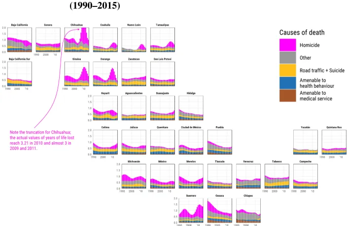
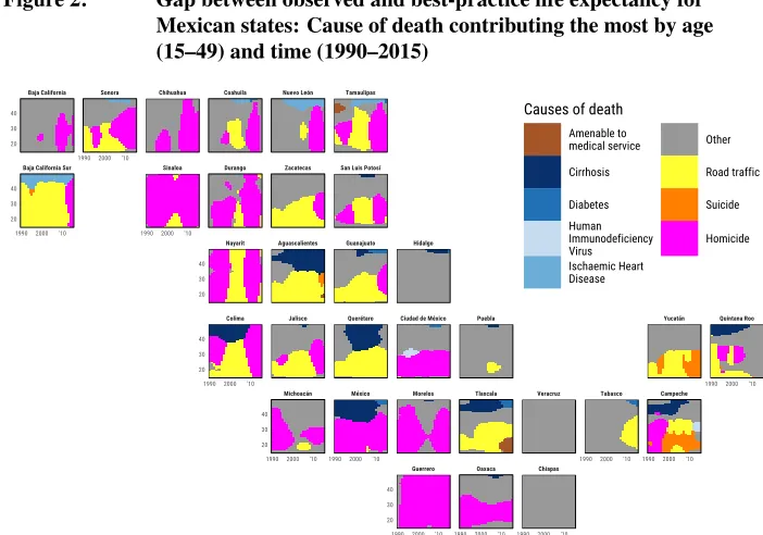
There is no way to efficiently represent in one plot both absolute and relative values. Thus, the first two figures complement each other: Figure 1 uses the stacked bar plot technique to reveal the variation of young adult mortality in Mexican states over time; Figure 2 shows the dominant cause of death with a colored tile plot on a standard Lexis surface, which can be seen as a categorical version of a heatmap (Sch¨oley and Willekens 2017; Rau et al. 2018).
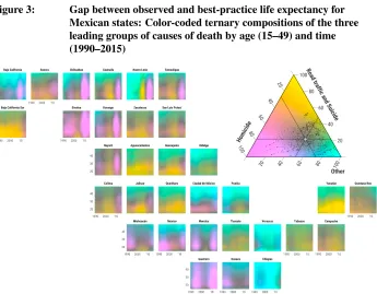
of ternary color-coding, which was recently formalized and streamlined in the R pack-agetricolore(Sch¨oley and Kashnitsky 2018). Ternary color-coding maximizes the amount of information conveyed with colors by representing each element in a three-dimensional array of compositional data with a single color. Each part of the ternary composition is assigned a hue (color characteristic), and the amount of hue for each data element is proportional to its weight in the ternary composition. For more technical de-tails on the method, check Sch¨oley (forthcoming); for an indicative use case of ternary color-coding see Kashnitsky and Sch¨oley (2018). Figure 4 facilitates comparison between Figures 2 and 3.
The figures presented in this paper can be reproduced easily by using the replication material that we provide openly (Kashnitsky and Aburto 2019). We used the R program-ming language (R Core Team 2018) for the analyses and data visualization; in addition, we used these packages: tidyverse (Wickham 2017), tricolore (Sch¨oley and Kashnitsky 2018), ggtern(Hamilton and Ferry 2018),hrbrthemes(Rudis 2018), extrafont(Chang 2014),RColorBrewer(Neuwirth 2014), andgeofacet(Hafen 2019).
3. Application
To show the usefulness of our proposal, we analyze the contribution of homicide, road traffic accidents, and suicide, medically amenable mortality, and causes amenable to health behavior to the gap in temporary life expectancy between ages 15 and 49 of each of 32 Mexican states with a low-mortality benchmark. The category ‘Amenable to med-ical service’ refers to those conditions that are susceptible to medmed-ical intervention, such as infectious and respiratory diseases, some cancers and circulatory conditions, and birth conditions, among others. For details on codes from International Classification of Dis-eases revision 10 included in this category, we refer the reader to the original classification (Aburto, Riffe, and Canudas-Romo 2018). These causes have emerged as leading among young people, and the first two recently had a sizable impact on life expectancy in Mexico (Aburto et al. 2016; Aburto and Beltr´an-S´anchez 2019).
Figure 1: Gap between observed and best-practice life expectancy for Mexican states: Years of life lost by cause of death across time (1990–2015)
Source: Ilya Kashnitsky and Jos ´e Manuel Aburto 2018; replicate: http://github.com/ikashnitsky/demres-2018-geofacet.
Figure 2: Gap between observed and best-practice life expectancy for Mexican states: Cause of death contributing the most by age (15–49) and time (1990–2015)
Guerrero Oaxaca Chiapas
Michoacán México Morelos Tlaxcala Veracruz Tabasco Campeche Colima Jalisco Querétaro Ciudad de México Puebla Yucatán Quintana Roo Nayarit Aguascalientes Guanajuato Hidalgo
Baja California Sur Sinaloa Durango Zacatecas San Luis Potosí Baja California Sonora Chihuahua Coahuila Nuevo León Tamaulipas
19902000 '10 1990 2000 '10
19902000 '10
19902000 '10
19902000 '10 19902000 '10
19902000 '10 19902000 '10 1990 2000 '10
19902000 '10 19902000 '10 19902000 '10 20 30 40 20 30 40 20 30 40 20 30 40 20 30 40 20 30 40
Causes of death
Amenable to medical service Cirrhosis Diabetes Human Immunodeficiency Virus Ischaemic Heart Disease Other Road traffic Suicide Homicide
Cause of death contributing the most by age (15-49) and time (1990-2015)
Gap between observed and best-practice temporary life expectancy for Mexican males (15-49)
Ilya Kashnitsky and Jose Manuel Aburto, 2018; replicate: https://github.com/ikashnitsky/demres-2018-geofacet Source: Ilya Kashnitsky and Jos ´e Manuel Aburto 2018; replicate: http://github.com/ikashnitsky/demres-2018-geofacet.
Figure 3: Gap between observed and best-practice life expectancy for Mexican states: Color-coded ternary compositions of the three leading groups of causes of death by age (15–49) and time (1990–2015)
Source: Ilya Kashnitsky and Jos ´e Manuel Aburto 2018; replicate: http://github.com/ikashnitsky/demres-2018-geofacet.
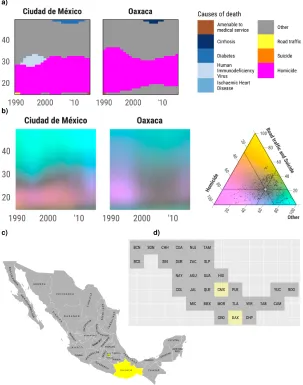
Figure 4: The comparison of the visualization approaches in Figures 2 and 3, panels a and b, respectively, for two selected states of Mexico, Ciudad de M´exico and Oaxaca (The locations of the selected states on a geographical map, and the used geofacet grid are represented in panels c and d, respectively)
a)
b)
4. Discussion
Geofaceting is an elegant data visualization technique that helps to analyze different di-mensions of a complex phenomenon across multiple regions, improving on their graphi-cal representation. Essentially, the method proposes to arrange a multi-panel plot (often called ‘small multiples’) according to the geographical location of the regions. The ap-proach preserves the flexibility of a standard plot for each of the regions allowing different dimensions of a dataset to be depicted. Geofaceting can be seen as an improved alterna-tive to panel matrices or small multiples grids.
We demonstrate the usefulness of geofaceting by showing the specific case of Mex-ico and mortality patterns over a fairly large period, 1990–2015. The main advantage of our proposal is that the reader can easily interpret complex phenomena while being able to identify regional variations. Four dimensions (geography, cause of death, age, and time) can be summarized in a single figure. This benefit is particularly important in the case of young males in Mexico that have experienced an unprecedented period of rising homicidal mortality. Moreover, the changing dynamics of violence in the country is a dimension that is hard to represent graphically. Nevertheless, with the geofaceting framework, the reader can easily get a sense of this phenomenon. For example, while most of the historically violent states are in the northern part of the country (Figures 1, 2, and 3), an upsurge of violence in the south is clear, albeit with different intensities (i.e., the absolute gap between states and best-practice life expectancy). Being able to identify variations regionally, but also in terms of intensity, is a great advantage of the proposed visualization technique.
5. Acknowledgements
References
Aburto, J.M. and Beltr´an-S´anchez, H. (2019). Upsurge of homicides and its impact on life expectancy and life span inequality in Mexico, 2005–2015. American Journal of Public Health109(3): e1–e7. doi:10.2105/AJPH.2018.304878.
Aburto, J.M., Beltr´an-S´anchez, H., Garc´ıa-Guerrero, V.M., and Canudas-Romo, V. (2016). Homicides in Mexico reversed life expectancy gains for men and slowed them for women, 2000–10.Health Affairs35(1): 88–95. doi:10.1377/hlthaff.2015.0068.
Aburto, J.M., Riffe, T., and Canudas-Romo, V. (2018). Trends in avoidable mortality over the life course in Mexico, 1990–2015: A cross-sectional demographic analysis.
BMJ Open8(7): e022350.doi:10.1136/bmjopen-2018-022350.
Arriaga, E.E. (1984). Measuring and explaining the change in life expectancies. Demog-raphy21(1): 83–96. doi:10.2307/2061029.
Camarda, C.G. (2012). MortalitySmooth: An R package for smoothing Poisson counts with P-splines.Journal of Statistical Software50(1): 1–24.doi:10.18637/jss.v050.i01.
Canudas-Romo, V., Booth, H., and Bergeron-Boucher, M.P. (2019). Minimum death rates and maximum life expectancy: The role of concordant ages.North American Actuarial Journal1–13.doi:10.1080/10920277.2018.1519448.
Chang, W. (2014). extrafont: Tools for using fonts [electronic resource]. Vienna: R Foundation for Statistical Computing.https://CRAN.R-project.org/package=extrafont.
Friendly, M. (2008). A brief history of data visualization. In: Chen, C.h., H¨ardle, W., and Unwin, A. (eds.).Handbook of data visualization. Berlin: Springer: 15–56. doi:10.1007/978-3-540-33037-0.
Galton, F. (1863). Meteorographica, or, methods of mapping the weather: Illustrated by upwards of 600 printed and lithographed diagrams referring to the weather of a large part of Europe, during the month of December 1861. London: Macmillan.
Hafen, R. (2018). Introducing geofacet [electronic resource]. Ryan Hafen. http://ryanhafen.com/blog/geofacet.
Hafen, R. (2019). geofacet: ‘ggplot2’ faceting utilities for geographical data [electronic resource]. Vienna: R Foundation for Statistical Computing. https://cran.r-project. org/package=geofacet.
Hamilton, N.E. and Ferry, M. (2018). ggtern: Ternary diagrams using ggplot2. Journal of Statistical Software87(1): 1–17.doi:10.18637/jss.v087.c03.
Instituto Nacional de Estad´ıstica y Geograf´ıa (2015). Deaths microdata [electronic re-source]. Aguascalientes: INEGI.
Kashnitsky, I. (2017). New grid: ‘mex grid1’ [electronic resource]. https://github.com/ hafen/geofacet/issues/31.
Kashnitsky, I. and Aburto, J.M. (2019). Geofaceting: Align small-multiples for re-gions in a spatially meaningful way: Replication materials [electronic resource]. https://github.com/ikashnitsky/demres-2018-geofacet.
Kashnitsky, I. and Sch¨oley, J. (2018). Regional population structures at a glance. The Lancet392(10143): 209–210.doi:10.1016/S0140-6736(18)31194-2.
Neuwirth, E. (2014). RColorBrewer: ColorBrewer palettes [electronic resource]. Vienna: R Foundation for Statistical Computing. https://CRAN.R-project.org/ package=RColorBrewer.
Palsky, G. (1996).Des chiffres et des cartes: Naissance et d´eveloppement de la cartogra-phie quantitative franc¸aise au XIXe si`ecle. Paris: Minist`ere de l’enseignment sup´erieur et de la recherche, Comit´e des travaux historiques et scientifiques.
Preston, S.H., Heuveline, P., and Guillot, M. (2001).Demography: Measuring and mod-eling population processes. Oxford: Blackwell.
R Core Team (2018). R: A language and environment for statistical computing [elec-tronic resource]. Vienna: R Foundation for Statistical Computing. https://www.R-project.org/.
Rau, R., Bohk-Ewald, C., Muszy´nska, M.M., and Vaupel, J.W. (2018). Visualizing mor-tality dynamics in the Lexis diagram. Cham: Springer. doi:10.1007/978-3-319-64820-0.
Remund, A., Camarda, C.G., and Riffe, T. (2018). A cause-of-death decomposition of young adult excess mortality.Demography55(3): 957–978. doi:10.1007/s13524-018-0680-9.
Rudis, B. (2018). hrbrthemes: Additional themes, theme components and utilities for ‘ggplot2’ [electronic resource]. Vienna: R Foundation for Statistical Computing. https://CRAN.R-project.org/package=hrbrthemes.
Sch¨oley, J. (forthcoming). The centered ternary balance scheme: A technique to visualize surfaces of unbalanced three part compositions.Demographic Research.
Sch¨oley, J. and Willekens, F. (2017). Visualizing compositional data on the Lexis surface.
Demographic Research36(21): 627–658.doi:10.4054/DemRes.2017.36.21.
Vallin, J., Mesl´e, F., and Divinagracia, E. (2008). Minimum mortality: A predictor of future progress? Population63(4): 557–590.doi:10.3917/popu.804.0647.
Wickham, H. (2017). tidyverse: Easily install and load the ‘Tidyverse’ [elec-tronic resource]. Vienna: R Foundation for Statistical Computing. https://CRAN.R-project.org/package=tidyverse.