Visualizing 3D Terrain, Geo-Spatial Data,
and Uncertainty
Steve Dübel *, Martin Röhlig, Christian Tominski and Heidrun Schumann
Institute of Computer Science, University of Rostock, A.-Einstein-Str. 22, Rostock D-18059, Germany; [email protected] (M.R.); [email protected] (C.T.);
[email protected] (H.S.)
* Correspondence: [email protected]; Tel.: +49-381-498-7490
Abstract: Visualizing geo-spatial data embedded into a three-dimensional terrain is challenging. The problem becomes even more complex when uncertainty information needs to be presented as well. This paper addresses the question of how to visually communicate all three aspects: the 3D terrain, the geo-spatial data, and the data-associated uncertainty. We argue that visualizing all aspects with a high degree of detail will likely exceed the visual budget. Therefore, we propose a visualization strategy based on prioritizing a selected aspect and presenting the remaining two with less detail. We discuss various design options that allow us to obtain differently prioritized visual representations. Our approach has been implemented as a tool for rapid visualization prototyping in the context of avionics applications. Practical solutions are described for a use case related to the visualization of 3D terrain and uncertain weather data.
Keywords:visualization; terrain rendering; geo-spatial data; uncertainty; prioritization
1. Introduction
The analysis of geo-spatial data requires visualizing both the data and their spatial frame of reference [1]. The frame of reference is typically depicted as a 2D map, but for many applications, including applied geology, oceanography, or avionics, a 3D presentation of the terrain is needed [2–4]. Beside the spatial context, the interpretation of data strongly depends on knowledge about the data quality. Hence, visualizing the data’s associated uncertainty is another important objective [5–7]. Existing approaches usually consider only two out of the three aspects: either data in their frame of reference or data together with their uncertainty. Visualizing all three aspects, the 3D terrain, the data, as well as uncertainty information in a single comprehensible image has rarely been addressed. Our work aims to fill in this gap.
Terrain rendering alone is challenging with regard to both real-time processing and image complexity [8]. Showing data along with the terrain aggravates the problem. To visualize data and the terrain, generally two different strategies can be applied:i) The appearance of the terrain surface is modified to communicate data values, e.g., by colors, isolines or textures, orii) the presentation of the terrain is enriched with additional objects, such as data glyphs or visual cues. The same strategies can be applied to visualize uncertainty information along with the data: i) The data presentation is modified by adjusting e.g., color, saturation or transparency, ii) or uncertainty is encoded by additional graphical elements. If data plus terrain plus uncertainty are depicted together, the resulting visual representations can be quite complex. This is particularly true, if all three aspects are communicated with a high degree of detail. A simple example shall illustrate this problem.
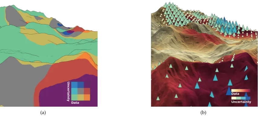
(a) (b)
Figure 1. Visualization of 3D terrain, wind speed forecast data, and forecast uncertainty. (a) The terrain is depicted abstractly using contour lines, and a bivariate color scale with few discrete colors is used to encode the data (green to red) and the uncertainty (green to blue). (b) The terrain is depicted faithfully by shading its surface, a continuous color scale (yellow to red) are used for the data, and uncertainty is represented by color-coded (yellow to blue) triangular glyphs.
is added to show more details of the terrain, and a continuous color scale is applied to encode data values more precisely. While theoretically being superior, this detailed visual representation actually has some drawbacks. Comprehending data values accurately involves additional mental effort, as it requires frequent lookups of continuous colors in the color legend. Moreover, shading the terrain leads to different levels of brightness, which in turn distorts the perception of colors. Parts of the terrain that are less illuminated (e.g., in shadows) might not show any color at all. This could lead to wrong interpretations of data and uncertainty, and eventually to false conclusions. On top of this, uncertainty is encoded using additional graphical primitives, which theoretically better expose the degree of uncertainty. However, there is a considerable amount of occlusion of these graphical primitives with the terrain and color-coded data.
This simple example demonstrates that representing 3D terrain, data, and uncertainty at a sufficiently high level of detail is challenging. Apparently, it is not possible to simply show each individual aspect with full detail. It is rather necessary to balance the interdependencies of the involved visual encodings.
We address this issue by an elementary approach: prioritization. We prioritize a selected aspect of particular interest (terrain, data, or uncertainty). The aspect of interest is shown as detailed as possible, while the remaining two aspects are represented at a lower level of detail.
In this paper, we present basic strategies for prioritizing the visualization of terrain, data, and uncertainty. A number of visualization designs will be discussed and demonstrated. All were generated with a comprehensive visualization tool that facilitates rapid experimentation with different design options and levels of detail. In summary, the following contributions are made:
• Concept of prioritizing the visualization of 3D terrain, data, and uncertainty
• Novel visual representations for depicting all three aspects simultaneously
• Visualization tool for rapidly prototyping differently prioritized visualizations
flight-related scenarios. Section 4introduces our prototypical visualization tool for designing and parametrizing such visualizations. Section5concludes the paper and discusses future work.
2. Related Work
There is much work on rendering 3D terrains, visualizing geo-spatial data, and considering uncertainty. It is beyond the scope of this paper to review the existing approaches. Instead, we are interested in combinations of these aspects. Approaches that pursue such a combination typically focus on only two aspects: either terrain plus data or data plus uncertainty. There are only very few works that actually address all three aspects.
2.1. Presenting Geo-spatial Data in Terrain
The three-dimensional geometry of terrain can be rendered in various ways, including line drawings [9], shading [10], or textures [11]. Terrain rendering techniques can also be combined to improve the perception of spatial features and depth cues [12,13].
In order to visualize geo-spatial data along with terrains, data values can either be mapped onto the terrain surface or be represented by additional graphical elements. While both strategies allow understanding data in their spatial context, there are also problems. If data is mapped directly onto the terrain surface, the presentations of data and terrain features are blended. This can produce mixed colors, which might be hard to interpret. We have already seen this in Figure1(b). If, on the other hand, graphical elements are added to the terrain rendering, occlusions will occur inevitably [2,14]. To improve the readability of data values, it makes sense to take perceptual issues into account, such as the adjustment of size and orientation of data-encoding objects [15].
2.2. Presenting Uncertainty of Geo-referenced Data
Already in the early 1990s, MacEachren [16] and Goodchild et al. [17] pointed out the significance of uncertainty visualization in geographic information science. They emphasized the complexity of the concept of uncertainty, and the many different facets it covers. Some of the facets are objective, such as error, accuracy, and completeness, while others are more subjective, such as validity, variability, lineage, and confidence [18]. Although these facets may partially differ significantly, they all have in common that they represent a certain degree of data quality.
Several surveys provide excellent overviews and taxonomies for the visualization of data and uncertainty [5,7,19–21]. The survey by MacEachren et al. [6] is of particular relevance with regard to geo-spatial data. It considers the different types of uncertainty with respect to the three conceptual dimensions of space, time, and data attributes.
In general, uncertainty visualization can be categorized into intrinsic or extrinsic techniques [22]. Intrinsic techniques visualize uncertainty by altering existing graphical representations of the data, for example, by modifying visual variables, such as hue, saturation, and transparency, or by applying noise [23,24]. In contrast, extrinsic techniques integrate additional graphical primitives into the presentation, such as contours or glyphs [25,26]. Studies have found that extrinsic techniques perform either as good as intrinsic techniques or even better in terms of accuracy and effectiveness [27–29]. Yet, the effectiveness of intrinsic or extrinsic techniques may vary depending on the given task, the type of uncertainty, and the preferences of users [30].
2.3. Presenting Uncertainty and Data in 3D Terrain
As already mentioned, only few works visualize terrain, data, and uncertainty together. Wittenbrink et al. [35] visualize uncertainty in wind data sets embedded into a coarse 3D terrain presentation. They focus on designing wind glyphs for the uncertainty information. Davis and Keller [36] propose a 3D presentation of slope stability. In their work, uncertainty is visualized via animation. While this is a viable approach, in some cases animation might introduce problems such as change blindness. Our work therefore focuses on static representations. Static representations are also used by Schmidt et al. [4] for underwater scenarios and by Kunz et al. [37] for natural hazards over terrain. They propose solutions for presenting data and uncertainty, but no specific techniques for terrain. The visualization is fixed and cannot be adjusted depending on the application context.
In summary, several techniques have been proposed for presenting data in 3D terrain. Much research has studied the visualization of data and associated uncertainty. However, only few works have considered the problem of visualizing all three aspects simultaneously. What we need are general design strategies that can help solving this problem. Our approach of prioritizing one particular aspect and adapting the presentation accordingly is a first step in this direction.
3. Prioritizing Terrain, Data, and Uncertainty
The concept of prioritization is a widely applied strategy – in general and in the context of visualization in particular. For a long time, the concept of focus+context has been used to accentuate regions of interest and to dim less-relevant ones [38].
Recently, Beecham et al. [39] investigated the idea of creating different levels of detail to prioritize the visualization of spatial, temporal, and descriptive aspects of spatio-temporal data. Their study suggests that prioritization is a feasible approach to deal with complex and potentially conflicting visualization requirements.
Our work is conceptually similar in that we also pursue a prioritization by considering different levels of detail that are to be combined into a single holistic visualization. However, instead of using a 2D map, we consider 3D terrain to visualize the spatial frame of reference, and instead of the temporal aspect, we consider the uncertainty of data. What this means concretely will become clear in the next paragraphs.
First, we describe three scenarios that require prioritizing either the 3D terrain (T), the geo-spatial data (D), or the uncertainty (U). For each aspect (i.e., T, D, U), we introduce two fundamental strategies. One generates a detailed representation, the other a more abstract depiction with less detail. Finally, we explain how these individual strategies can be combined to create visual representations that includeT,D, andU.
3.1. Scenarios
As already stated, it hardly makes sense to present all information at full detail. We will demonstrate this by three flight scenarios, which include visualizations for pilots and air traffic controllers. In these scenarios, spatial awareness is relevant, and thus the geometry of T. For D, we consider weather data, including hazardous weather zones and weather forecasts. The forecasts are naturally associated with some uncertaintyU. In summary,T,D, andUhave to be considered in flight scenarios, yet their importance varies with the different scenarios. Typically a selected aspect is of specific interest (denoted as+), while the others communicate context information (denoted as−).
• OverflightT−D+U−: In overflight scenarios, the flight altitude is quite high (>10km). Hence, fine-grained features of the terrain are not essential. The visual representation of T merely serves as an overview to facilitate orientation. Weather forecast data, on the other hand, can be of primary interest, in particular, the spatial distribution and characteristics of hazardous weather zones. Therefore,Dshould be represented at high detail. Information about potential uncertainty are needed as well. But providing a coarse overview ofUto estimate the forecast quality is usually sufficient.
• Re-planningT−D−U+: Hazardous weather zones can make it necessary to adapt flight routes. Before planning a new route the reliability of the corresponding forecast has to be verified. Hence, the presentation ofUis important and should be prioritized. Weather forecast data are needed as well, yet arguably, individual quantitative data values are not needed. A qualitative distinction of safe zones and hazardous zones is sufficient. Similarly, local terrain features are not as relevant. Therefore,DandTcan be shown at less detail.
Next, we will illustrate basic rendering strategies to account for the different degrees of relevance ofT,D, andU.
3.2. Rendering Strategies
As a first step, we define two rendering strategies for each aspect. Depending on whether an aspect is categorized as+ or−, the strategies will aim for a higher or lower amount of detail. This allows us to adjust the visual representation on a fundamental level. Fine-tuning the individual strategies will be considered later on.
Representing TerrainT
Terrain rendering is a field of research with many different techniques. For our work, we make a rather abstract distinction between representing 3D geometry of terrain either by line drawings or by shaded surfaces.
• Line drawing forT−: Our fundamental strategy for less-detailed representations of the terrain is to use line drawings. Silhouettes, contours, or characteristic curves communicate significant geometric features [11]. Various edge styles can emphasize object boundaries or provide shape details [9]. Line drawings have been applied successfully to technical 3D models [40] as well
(a) Line drawings (b) Shading
as to terrain surfaces [41]. Figure 2(a) illustrates that the global topography of a terrain is communicated quite well, whereas fine-grained features are suppressed.
• Shading for T+: We define shading, including texturing, as the fundamental strategy to visualize terrain at high fidelity. Different illumination methods can be applied to shade a terrain surface, ranging from simple local to highly sophisticated global techniques. By applying shading, local terrain features become visible and texturing can improve spatial details. For example, grid textures are useful to emphasize 3D structures [12,42]. This rendering style is demonstrated in Figure2(b). It can be seen that shading shows more and finer details of the terrain, compared to what can be discerned when using line drawings.
Representing DataD
Similar to terrain rendering, there exists a large variety of methods to visualize data. Again, we do not want to delve into the very details of all of these methods, but instead want to make a fundamental decision depending on whether a more or less detailed visual representation is needed. To this end, we propose to distinguish between showing aggregated data and individual data values.
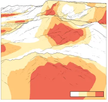
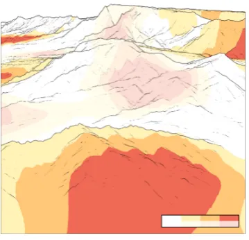
• Aggregation for D−: Representing aggregations, rather than individual values is a common approach. Different aggregation methods can be applied, including clustering, classification, or segmentation. As a result, individual data values are composed into larger units or groups. These units capture basic characteristics of the data and provide a good overview, yet they lack details. Figure3(a) shows an example where aggregation is achieved by using a segmented color scale. The figure shows the severity of thunderstorm cells mapped onto the terrain surface. Four different colors classify regions into safe zones (white), potentially safe zones (light orange), hazardous zones (orange), and no-go zones (red). The four categories of zones can be distinguished easily, where as the underlying data values are abstracted away.
• Individual data values for D+: If there is a need to grasp more details, a trace back to the individual data values can be necessary. For example, detailed data could be required to figure out whether a hazardous weather zone rather tends to be a no-go zone. To continue our previous example, individual data values an be communicated using a continuous color scale, where each data value is associated with an individual color. Figure 3(b) shows the
(a) Aggregation (b) Individual data values
(a) Intrinsic encoding (b) Extrinsic encoding
Figure 4. Strategies for uncertainty. (a) Uncertainty is encoded intrinsically by mapping it to transparency. (b) Uncertainty is encoded extrinsically by mapping it to the color of additional circles embedded into the terrain.
individual values of radar reflectivity (dBZ), which is the quantitative measure behind the previous qualitative categorization of the intensity of thunderstorm cells.
Representing UncertaintyU
As mentioned in Section2.2, two basic approaches exist for visualizing uncertainty: intrinsic and extrinsic techniques. Each provides a different degree of detail.
• Intrinsic encoding forU−: The idea of intrinsic techniques is to modify the existing visual elements. Common techniques are to use bivariate color maps, transparency, noise, or blur. Intrinsic encodings support qualitative assessments with about three or four distinguishable levels [30,43,44]. In Figure4(a), uncertainty is intrinsically encoded by modifying transparency. Higher transparency modulates the perception of color for uncertain data values, whereas colors in certain regions remain unchanged. This allows users to quickly grasp the existence of uncertainty, but not the precise degree of it.
• Extrinsic encoding for U+: Extrinsic techniques incorporate additional graphical elements. This offers a greater flexibility, better visual emphasis, and the potential to encode more details. Figure4(b)illustrates an extrinsic encoding via color-coded dots embedded into the scene. In contrast to the intrinsic example, the dot’s color coding can communicate several degrees of uncertainty. Moreover, the dots clearly outline the areas that are afflicted with uncertainty.
We now have two fundamental rendering strategies for each aspect: line drawing and shading for the terrain T, aggregation and individual data values for the data D, as well as intrinsic and extrinsic encoding for the uncertainty U. In the next section, we will combine these strategies to generate differently prioritized visual representations ofT,D, andU.
3.3. Prioritized Combinations
Table 1.Prioritized combination of terrain, data, and uncertainty.
Strategy for Strategy for Strategy for Prioritization terrain data uncertainty
T+D−U− Shading Aggregation Intrinsic T−D+U− Line drawing Individual values Intrinsic T−D−U+ Line drawing Aggregation Extrinsic
Prioritizing Terrain
Figure 5(a) shows a combined visualization with terrain, data, and uncertainty, where the terrain is prioritized. As previously described, take-off and approach scenarios require a detailed representation of the terrain. Therefore, the terrain is visualized by shading its surface. Ideally a sophisticated illumination model is applied to expose as many detailed features as possible. Moreover, interference with or over-plotting of the terrain features should be reduced to a minimum. Hence, data and uncertainty are presented with less detail.
According to our render strategies, this means showing aggregations instead of individual data values. By using a segmented color scale with only a few distinct colors, an overview of the data is warranted without too much impact on the shading of the terrain surface. For uncertainty, intrinsic techniques should be used, because they work without additional graphical elements, and thus introduce no occlusion. A typical intrinsic approach is to vary the transparency of the data-encoding colors. The degree of transparency should be within reasonable limits to ensure that colors, and hence, data values are still identifiable, even if they are affected by high uncertainty.
Prioritizing Data
Figure5(b)show a combined visualization where the data are prioritized. We mentioned that prioritizing data can be useful in overflight scenarios. As the focus lies on the data, individual data values are visualized. In our case, this is done by using a continuous color scale.
(a) Prioritizing terrain (b) Prioritizing data (c) Prioritizing uncertainty
To prevent that the data presentation gets impaired, terrain and uncertainty are shown with less detail. A shaded terrain surface would considerably distort the perception of the color-coded data. Therefore, the fidelity of the terrain rendering is reduced to line drawings of significant edges. Uncertainties are presented by intrinsic techniques to avoid occlusions. For another intrinsic example, we now superimpose the data presentation with noise. Similar to what has been said before, a certain maximum density of the noise should not be exceeded to maintain the legibility of data values.
Prioritizing Uncertainty
Finally, Figure 5(c) illustrates a design where the focus is set on the data’s uncertainty. Uncertainty can play a significant role when air traffic operators plan alternative flight routes. As uncertainty is the most relevant aspect now, it is visualized using an extrinsic technique. Dedicated triangular glyphs are embedded into the terrain to prominently represent uncertainty. The location of the glyphs encodes where uncertainty occurs, and the corresponding degree of uncertainty is mapped to the glyphs’ height and color.
As terrain and data are deemed less important in this case, the occlusion caused by the glyphs is acceptable, and terrain and data can be depicted at lower detail. Again, the terrain is represented by contours and silhouettes, and the data is shown in an aggregated fashion using a segmented color scale.
In summary, the concept of prioritization allows us to adapt the visualization of terrain, data, and uncertainty to the task at hand. Already the simple combination of our fundamental rendering strategies (as collected in Table1and shown in Figure5) leads to quite different visual representations suited for different scenarios.
Moreover, within each of the fundamental strategies, there are numerous design options to fine-tune the visualization. For example, which shading technique should be applied and how should it be paramterized? How many segments and which hues should a color scale have? What shapes should be used for encoding uncertainty extrinsically? The design space is considerably large. On the one hand, this allows us to better attune the visualization to application-dependent requirements. Yet, on the other hand, it is not clear beforehand how certain design decisions will affect the overall visualization outcome. Therefore, we implemented a software prototype that enables us to flexibly experiment with different design options and test potentially useful visualization variants.
4. Prototyping Prioritized Visualizations
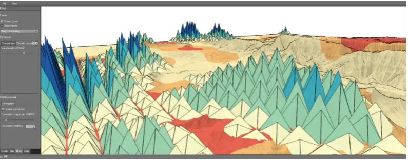
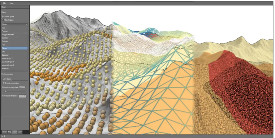
Designing a concrete visualization that addresses a certain use case requires application-specific adaptations. In the first place, it is necessary to choose from the fundamental rendering strategies and to blend them into a suitable combination. Second, the visual encoding has to be fine-tuned to minimize interference and to tailor the design to fit the given scenario. In order to satisfy both requirements, we developed a tool PRIOVIS that supports a flexible steering of the visualization design process. PRIOVIS enables rapid prototyping and seamlessly switching between different visualization designs with only a few clicks. Figure6shows an overview of the software.
4.1. Parametrization
Figure 6.Visualizing hazardous weather regions and associated uncertainty information in 3D terrain. The image shows a schematic overview of PRIOVIS. The user interface supports flexibly steering the visual encoding and seamlessly switching between various visualization techniques.
Terrain Visualization
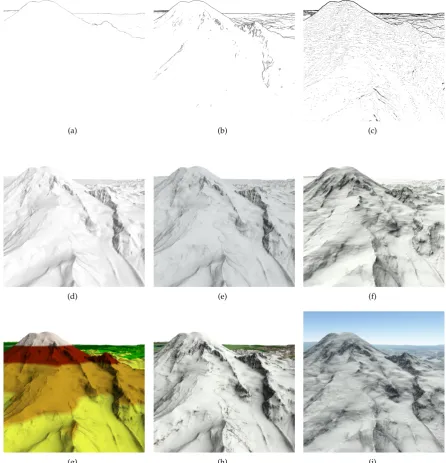
The two fundamental strategies for terrain rendering are line drawing and shading. Both strategies allow for customization as illustrated in Figure7. When using line drawing, the user can choose between displaying silhouettes or enhanced edges. Enhanced edges can either be derived from the curvature of the terrain or from the variation of depth in image space. By selecting and parametrizing different algorithms, the quantity and quality of contours can be adjusted. This directly effects the final degree of detail. Examples are illustrated in Figures (a) to (c).
The shading strategy can be fine-tuned by choosing from a diverse set of illumination models. Currently, PRIOVISsupports phong illumination, ambient occlusion, and ambient aperture lighting [45]. As illustrated in Figures (d) to (f), each model achieves a different level of quality. Local illumination via the Phong model (d) already provides more details than line drawings. Global illumination via ambient occlusion (e) and ambient aperture lighting (f) enhances local surface features and improves the overall image quality. To expose even more details of the terrain, additional textures can be used. Figure(g) shows an elevation-colored texture and (h) depicts a realistic surface texture. Additional atmospheric effects (i) can be used to improve both depth perception and image quality. Finally, line drawings and shading techniques can be combined to further customize the output image.
Data Visualization
To adjust the depicted degree of detail of the data, we visualize either individual data values or aggregations. A selection of the available encodings is shown in Figure8. Data values can be mapped on different visual variables, such as color (a) and (d), size (b) and (e), or direction (c) and (f).
For full details, a continuous mapping of data values to visual variables is used. That is, each individual data value has a unique representation (e.g., a specific color). For aggregated views, the visual variables are grouped into discrete classes (e.g., segmented color scale), each representing an entire subset of the data. The number classes can be chosen freely to adjust the level of detail.
Uncertainty Visualization
(a) (b) (c)
(d) (e) (f)
(g) (h) (i)
Figure 7. Parametrizing the terrain visualization. (a–c) Line drawings: (a) silhouettes, (b) enhanced edges derived from terrain curvature, (c) enhanced edges derived from depth variation. (d–i) Shading: (d) Phong illumination, (e) ambient occlusion, (f) ambient aperture lighting, (g) elevation-colored texture, (h) realistic surface texture, (i) atmospheric effects.
uncertain data is represented by high transparency. From (a) to (c), the modulation increases in strength. Using moderate transparency (b) allows the user to identify where uncertainty is located and which data values are affected. In contrast, when increasing the strength of the modulation (c), the actual data values in uncertain areas become barely visible. This can be useful to draw the attention to data that are certain.
(a) (b) (c)
(d) (e) (f)
Figure 8. Showing either individual data values (a–c) or aggregations (d–f) by visual encodings based on color (a, d), size (b, e), and direction (c, f).
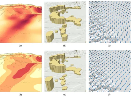
or tetrahedrons. The former are illustrated in Figure (d). In addition, our tool supports extrinsic encoding via grid overlays (e) and fog (f). The visual appearance of the extrinsic techniques is again subject to fine-tuning, for example, by adjusting size, density and color. Extrinsic techniques also lend themselves to redundant encoding. Figure (g) shows tetrahedral glyphs with varying height and color. Additional stylization via outlines (h) or halos (i) can be applied to better separate glyphs and terrain.
All the aforementioned options for parametrization allow the user to tailor the visualization design to application-dependent requirements. Figure 10 shows three additional examples of combined, prioritized, and fine-tune visualizations of terrain, data, and uncertainty. In order to enable rapid prototyping of such examples, the parametrization has to run in real-time. This requires a sophisticated software architecture.
4.2. Architecture
PRIOVIShas been implemented with the requirements of real-time experimentation in mind. At the back-end, a dedicated resource management ensures efficient data processing and rendering. The front-end supports interactive parametrization and exploration of the final visualization results.
Resource Management
(a) (b) (c)
(d) (e) (f)
(g) (h) (i)
Figure 9. Options for visualizing uncertainty. (a) 45% transparency, (b) 65% transparency, (c) 85% transparency, (d) circular glyphs, (e) grid overlay, (f) fog, (g) tetrahedral glyphs with redundant encoding by height and color, (h) outline stylization, and (i) halo stylization.
regions. For instance, we used an 800 km2 terrain of central Europe with a resolution of 1.5 asec
as a testing data set. Regarding weather data and uncertainty, we support two common types of data: scalar fields (i.e., weather data given on a 2D grid) and weather objects (i.e., regions given as polygonal shapes). On top of that, PRIOVIS can visualize other data such as trajectories of moving objects.
Figure 10. Interactively selecting different visual encodings for uncertainty. The graphical user interface of PRIOVISallows for choosing from different visualization techniques, e.g., circular glyphs (left), grid overlays (middle) and noise (right), and tuning their parameters via GUI control elements.
visually. To ensure real-time rendering, the backing algorithms are implemented as a mix of OpenGL shaders and OpenCL kernels for hardware-accelerated execution on the GPU or the CPU. Particularly, rendering the terrain geometry can be computational expensive. Therefore, PRIOVIS integrates sophisticated level-of-detail techniques that achieve real-time frame rates even at sub-pixel precision. The configuration component defines how to integrate data and visual encoding to form a 3D visualization of terrain, data, and uncertainty. To this end, a configuration instantiates data and encoding resources and considers a concrete prioritization and specific parameter settings.
Encapsulating and managing the memory, computational, and visual resources as described before has two main advantages. First, it enables versioning each resource’s state. This allows users to interactively switch between different visualization techniques or tune associated parameters to adapt the overall visual design. Second, it facilitates handling resource updates automatically. For example, if new data is available at an external source, the visualization is refreshed automatically to reflect the incoming changes.
Interactive Parametrization and Exploration
Thanks to the flexible resource management, the user can interactively switch between alternative prioritizations, different weather attributes, and different types of uncertainty. The encoding component allows for adapting the visual design on the fly either by changing parameters exposed in the graphical interface or by modifying the visualization scripts directly in the scripting engine. It is even possible to create new visualization techniques without restarting the prototype. A sensible restriction though is that the basic design of a 3D scene be maintained. This is necessary to be compatible with the fundamental interactions for exploring the final visualization, including free 3D fly-through and moving along pre-defined trajectories.
5. Conclusion
requirements. The prioritized aspect is visually emphasized by showing more detail, whereas the other two aspects are shown with less detail.
For each aspect, we proposed two fundamental rendering strategies to be employed depending on whether an aspect is prioritized or not: line drawings vs. shading for the terrain, aggregation vs. individual values for the data, and intrinsic vs. extrinsic encoding of uncertainty. While these strategies offer basic control for steering the visual budget, a subsequent adjustment of the visual representation is still required. To this end, we developed visualization tool for rapidly prototyping prioritized visualizations. The tool provides various options for rendering terrain, data, and uncertainty, and it allows for a seamless switch between different prioritizations, visualizations, and parametrizations.
Practical relevance of our work has been indicated by means of aviation-related scenarios. We illustrated differently prioritized visual designs that can be useful during take-off and approach, during overflight, or for re-planning of flight routes. While initial feedback from domain experts suggests that our solution has much potential, there are still several research questions to be addressed.
A necessary next step is to conduct a comprehensive evaluation of our approach. In the light of the rich options for parametrizing the visualization design, designing a controlled study can be a considerable challenge. Therefore, it is first necessary to determine suitable candidates that are only later on subject to controlled fine-tuning. Our fundamental strategies are a good starting point for pinpointing such candidates.
It further makes sense to proceed from fully manual prioritization and parametrization to a semi-automatic procedure. That is, given a certain prioritization and a set of visual abstractions for each aspect, a user will be guided whilst adapting the design of the final visualization. For instance, starting by selecting a certain presentation strategy for one aspect, either terrain, data, or uncertainty, only appropriate visual encodings for the other two aspects would be suggested by the system. Likewise, inappropriate parameter settings of the selected visualization techniques could be made unavailable. For example, giving terrain the highest priority could imply that color is reserved for encoding elevation and that the size of additional objects for representing data or uncertainty is limited to a sensible maximum. Providing such guidance would reduce the complexity of designing suitable visualizations for specific scenarios.
Acknowledgments: We gratefully acknowledge additional conceptual input and contributions to the implementation by Falko Löffler.
Author Contributions:S.D. and M.R. conceived, designed, and implemented the approach; S.D., M.R., C.T. and H.S. wrote the paper; H.S. finally approved the published work.
Conflicts of Interest:The authors declare no conflict of interest.
References
1. Andrienko, N.; Andrienko, G. Exploratory analysis of spatial and temporal data: a systematic approach; Springer Science & Business Media, 2006.
2. Helbig, C.; Bauer, H.S.; Rink, K.; Wulfmeyer, V.; Frank, M.; Kolditz, O. Concept and workflow for 3D visualization of atmospheric data in a virtual reality environment for analytical approaches. Environmental Earth Sciences2014,72, 3767–3780.
3. Bleisch, S. 3D Geovisualization – Definition and Structures for the Assessment of Usefulness. Proceedings of the International Society for Photogrammetry and Remote Sensing Annals of the Photogrammetry, Remote Sensing and Spatial Information Sciences, 2012.
4. Schmidt, G.; Chen, S.L.; Bryden, A.; Livingston, M.; Rosenblum, L.; Osborn, B. Multidimensional visual representations for underwater environmental uncertainty.Computer Graphics and Applications, IEEE2004, 24, 56–65.
6. MacEachren, A.M.; Robinson, A.; Hopper, S.; Gardner, S.; Murray, R.; Gahegan, M.; Hetzler, E. Visualizing geospatial information uncertainty: What we know and what we need to know. Cartography and Geographic Information Science2005,32, 139–160.
7. Brodlie, K.; Osorio, R.A.; Lopes, A. A review of uncertainty in data visualization. InExpanding the Frontiers of Visual Analytics and Visualization; Springer, 2012; pp. 81–109.
8. Dübel, S.; Röhlig, M.; Schumann, H.; Trapp, M. 2D and 3D presentation of spatial data: A systematic review. IEEE VIS International Workshop on 3DVis, 2014, pp. 11–18.
9. DeCarlo, D.; Finkelstein, A.; Rusinkiewicz, S.; Santella, A. Suggestive contours for conveying shape. ACM Transactions on Graphics2003,22.
10. Ritschel, T.; Dachsbacher, C.; Grosch, T.; Kautz, J. The State of the Art in Interactive Global Illumination. Computer Graphics Forum 312012.
11. Ware, C.Information Visualization: Perception for Design; Morgan Kaufmann, 2012.
12. Bolton, M.L.; Bass, E.J.; Comstock, J.R. Spatial awareness in synthetic vision systems: Using spatial and temporal judgments to evaluate texture and field of view. Human Factors: The Journal of the Human Factors and Ergonomics Society2007,49, 961–974.
13. Stevens, K.A. Surface perception from local analysis of texture and contour. Technical report, Massachusetts, Institut of technology, 1980.
14. Rautenhaus, M.; Kern, M.; Schäfler, A.; Westermann, R. Three-dimensional visualization of ensemble weather forecasts – Part 1: The visualization tool Met.3D (version 1.0). Geoscientific Model Development 2015,8, 2329–2353.
15. Röhlig, M.; Schumann, H. Visibility Widgets: Managing Occlusion of Quantitative Data in 3D Terrain Visualization. Proceedings of the 9th International Symposium on Visual Information Communication and Interaction, ACM, Dallas, TX, USA2016.
16. MacEachren, A.M. Visualizing uncertain information.Cartographic Perspectives1992, pp. 10–19.
17. Goodchild, M.; Buttenfield, B.; Wood, J. On introduction to visualizing data validity. Visualization in geographical information systems1994, pp. 141–149.
18. Pang, A. Visualizing uncertainty in geo-spatial data. Proceedings of the Workshop on the Intersections between Geospatial Information and Information Technology. National Research Council Arlington, VA, 2001, pp. 1–14.
19. Kinkeldey, C.; MacEachren, A.M.; Schiewe, J. How to Assess Visual Communication of Uncertainty? A Systematic Review of Geospatial Uncertainty Visualisation User Studies. The Cartographic Journal2014, 51, 372–386.
20. Thomson, J.; Hetzler, E.; MacEachren, A.; Gahegan, M.; Pavel, M. A typology for visualizing uncertainty. Electronic Imaging 2005. International Society for Optics and Photonics, 2005, pp. 146–157.
21. Potter, K.; Rosen, P.; Johnson, C.R. From quantification to visualization: A taxonomy of uncertainty visualization approaches. InUncertainty Quantification in Scientific Computing; Springer, 2012; pp. 226–249. 22. Griethe, H.; Schumann, H. The Visualization of Uncertain Data: Methods and Problems. Proceedings of
simulation and visualization ’06. SCS Publishing House, 2006, pp. 143–156.
23. Aerts, J.C.; Clarke, K.C.; Keuper, A.D. Testing popular visualization techniques for representing model uncertainty. Cartography and Geographic Information Science2003,30, 249–261.
24. Guo, H.; Huang, J.; Laidlaw, D.H. Representing Uncertainty in Graph Edges: An Evaluation of Paired Visual Variables.IEEE Transactions on Visualization & Computer Graphics2015,21, 1173–1186.
25. Luo, A.; Kao, D.; Pang, A. Visualizing spatial distribution data sets. Proceedings of Symposium on Data Visualization, 2003.
26. Allendes Osorio, R.; Brodlie, K.W. Contouring with uncertainty. Proceedings of the Theory and Practice of Computer Graphics. Eurographics Association, 2008, pp. 59–66.
27. Drecki, I. Visualisation of uncertainty in geographical data. Spatial data quality2002, pp. 140–159. 28. Grigoryan, G.; Rheingans, P. Probabilistic surfaces: Point based primitives to show surface uncertainty.
Proceedings of the conference on Visualization. IEEE Computer Society, 2002, pp. 147–154.
30. MacEachren, A.; Roth, R.; O’Brien, J.; Li, B.; Swingley, D.; Gahegan, M. Visual Semiotics & Uncertainty Visualization: An Empirical Study. Visualization and Computer Graphics, IEEE Transactions on 2012, 18, 2496–2505.
31. Kardos, J.; Benwell, G.; Moore, A. The visualisation of uncertainty for spatially referenced census data using hierarchical tessellations. Transactions in GIS2005,9, 19–34.
32. Sanyal, J.; Zhang, S.; Dyer, J.; Mercer, A.; Amburn, P.; Moorhead, R.J. Noodles: A tool for visualization of numerical weather model ensemble uncertainty.Visualization and Computer Graphics, IEEE Transactions on 2010,16, 1421–1430.
33. Cox, J.; House, D.; Lindell, M. Visualizing uncertainty in predicted hurricane tracks. International Journal for Uncertainty Quantification2013,3, 143–156.
34. Johnson, C.R.; Sanderson, A.R. A next step: Visualizing errors and uncertainty. Computer Graphics and Applications, IEEE2003,23, 6–10.
35. Wittenbrink, C.; Pang, A.; Lodha, S. Glyphs for visualizing uncertainty in vector fields. IEEE Transactions on Visualization and Computer Graphics1996,2, 266–279.
36. Davis, T.J.; Keller, C. Modelling and visualizing multiple spatial uncertainties. Computers & Geosciences 1997,23, 397 – 408. Exploratory Cartograpic Visualisation.
37. Kunz, M.; Grêt-Regamey, A.; Hurni, L. Visualization of uncertainty in natural hazards assessments using an interactive cartographic information system. Natural hazards2011,59, 1735–1751.
38. Hauser, H., Generalizing Focus+Context Visualization. InScientific Visualization: The Visual Extraction of Knowledge from Data; Springer Berlin Heidelberg: Berlin, Heidelberg, 2006; pp. 305–327.
39. Beecham, R.; Rooney, C.; Meier, S.; Dykes, J.; Slingsby, A.; Turkay, C.; Wood, J.; Wong, B.W. Faceted Views of Varying Emphasis (FaVVEs): a framework for visualising multi-perspective small multiples. Computer Graphics Forum2016,35, 241–249.
40. Gooch, A.; Gooch, B.; Shirley, P.; Cohen, E. A Non-photorealistic Lighting Model for Automatic Technical Illustration. Proceedings of the 25th Annual Conference on Computer Graphics and Interactive Techniques, 1998.
41. Buchin, K.; Sousa, M.C.; Döllner, J.; Samavati, F.F.; Walther, M. Illustrating terrains using direction of slope and lighting. In 4th ICA Mountain Cartography Workshop, 2004.
42. Kim, S.; Hagh-Shenas, H.; Interrante, V. Conveying Shape with Texture: Experimental Investigations of Texture’s Effects on Shape Categorization Judgments. IEEE Transactions on Visualization and Computer Graphics2004,10, 471–483.
43. Robertson, P.; O’Callaghan, J. The Generation of Color Sequences for Univariate and Bivariate Mapping. Computer Graphics and Applications, IEEE1986,6, 24–32.
44. Carpendale, M. Considering visual variables as a basis for information visualisation. Technical report, University of Calgary, Department of Computer Science, 2003.
45. Oat, C.; Sander, P.V. Ambient aperture lighting. Proceedings of the 2007 symposium on Interactive 3D graphics and games. ACM, 2007, pp. 61–64.
c