2019
Dr Maria dos Santos Lonsdale, Ph.D
Dr David Lonsdale, Ph.D
Dr Hye-Won Lim, Ph.D
IDJ – Information Design Journal
Dr Maria dos Santos Lonsdale, Ph.D
Dr David Lonsdale, Ph.D
Dr Hye-Won Lim, Ph.D
Accepted for publication: 14th September 2018
Expected to be published in 2019 Issue 25
Keywords
Information Design
Online Information
Information Processing
User-Centered Information Design Principles
Cyber Security
Information design principles are overlooked in cyber security awareness websites. An Information Design Process Model was devised to help frame and interpret how online information is processed and the role information design principles have in facilitating that processing. Two websites were then compared, and results show significant differences in terms of performance, behavior and perception. The results also show that in situations where serious information is at stake (such as cyber security), a more accessible design does not seem to be sufficient to project a sense of trust and security among users. All these findings led to original insights regarding the design of online
information in terms of lasting impression and user-centered design approaches.
Context
On 1st November 2016, the UK government released its new National Cyber Security Strategy 2016-2021, along with £1.9 billion in investment over five years. The new cyber security strategy will be implemented by the newly established National Cyber Security Centre, which, under the authority of GCHQ, will centralize and rationalize the UK’s cyber security activities. In the United States, annual government spending on cyber security has risen to $19 billion, and Cyber Command has been elevated to the status of a full, unified combatant command. This reflects the emphasis afforded to the subject in the 2015 The DoD Cyber Strategy and the 2017 National Security Strategy.
Despite these developments in funding and organizational structure, both the UK and US identify further room for improvement. In particular, it is acknowledged in the UK National Cyber Security Strategy (2016), “the majority of businesses and individuals are still not properly managing cyber risk”. Since all Internet users play a role in cyber security, this is a serious failing. Indeed, although cyber security is often discussed in technical terms, it is primarily a people problem. As reported in IBM’s Cyber Security Intelligence Index, the vast majority (95%) of security breaches are due to human error (Howarth, 2014). Moreover, much of this is down to deficiencies in education and understanding about basic cyber security matters (Olmstead and Smith, 2017). As noted by GCHQ Director, Robert Hannigan, ‘the baseline of understanding across society and across government is still very low’ (Ashford, 2017). In response, one of the three pillars of the UK strategy, ‘Develop’, has the objective of increasing cyber security awareness and skills. The US National Security Strategy addresses this problem via ‘Building a Culture of Preparedness’ and ‘Information Sharing’.
It is in such areas where information and awareness campaigns come to the fore. However, worryingly significant deficiencies currently exist in cyber security awareness campaigns. For example, the UK cross-government Lonsdale et al. 2019 | 4
Introduction
1
awareness and behavior change campaign Cyber Aware has been criticized for being an ‘expensive flop’. The campaign cost more than £12 million, but has only had 1.9 million visits across 2 years and 10 months, meaning that each visit to the site cost £6.37 (Martin, 2017). This problem of cyber ignorance is well illustrated by the 2017 WannaCry attack, which exploited a known deficiency in older forms of the Windows operating system. Many of the systems affected by the attack had simply not been updated or downloaded the available security patch. This clearly speaks to a lack of awareness of security risks and remedies.
Part of these identified deficiencies are design problems that are simply overlooked, but that according to the literature can significantly hinder users in their attempts to locate, understand and recall/retain information that is vital for cyber security. In this sense, information design is essential when seeking to develop cyber skills and awareness amongst the public.
Information design is vital to the construction of websites where the primary aim is to inform, instruct and educate. However, there is a lack of research and literature focusing on the integration of information and web design and its relevance to the delivery of information and instructions online. This is even more so in the area of cyber security, despite the obvious need to keep the public well informed on how to be cyber secure and avoid falling foul of the many problems encountered online (fraud, identity theft, viruses, etc.).
The first challenge that any information designer and any platform providing information face, is to gain the attention of the user and then continue to hold their attention and interest thereafter (Petterson, 2010). As claimed by Nielsen (2011), users do not stay on a web page for very long before leaving. Users usually leave in 10-20 seconds, with the average page visit lasting a little less than a minute. Scanning and skimming are the most common reading strategies used (Nielsen, 2008; Schriver, 2016) and, on an average visit, users read a maximum of 28% of the words (with 20% being more likely).
user to a website, 2) hold users’ attention for as long as possible, and 3) get them to take desirable actions, it is imperative to deliver information as clearly, quickly and focused as possible.
Aim and hypothesis
The aim of this paper is to identify how successfully cyber security websites are at informing and instructing the public on how to adopt secure online behaviors and be protected online.
The researchers’ hypothesis is that neglecting user-centered design principles compromises cyber awareness by impairing users’ ability to locate, understand and recall/retain information that is vital for cyber security. To test the
researchers’ hypothesis, a study was devised to ascertain the effectiveness of two existing UK websites that provide practical advice on cyber security: Cyber Aware and Get Safe Online.
The need to focus on user-centered design principles stems from the fact that information design solutions that are merely driven by opinion and intuition, without having involved the target user (testing and feedback), nor having been tested and gone through several stages of iteration and re-design, lack validity and reliability and are prone to failure.
Lonsdale et al. 2019 | 6
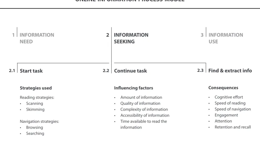
Building on the literature, we propose a theoretical ‘Online Information Process Model’ (Figure 1) that illustrates the process of looking for information online, and identifies at the ‘Information seeking’ stage: the strategies used when looking for information; the factors influencing the information seeking process; and the consequences of poor online information design on user performance. Such a model is important to help frame and interpret how online information is processed and the role information design principles have in facilitating that processing.
Information processing: A theoretical model
2
INFORMATION NEED
Start task
INFORMATION SEEKING
INFORMATION USE
Continue task
Strategies used Reading strategies: • Scanning • Skimming
Influencing factors • Amount of information • Quality of information • Complexity of information
Find & extract info
Consequences • Cognitive effort • Speed of reading • Speed of navigation
1 2 3
2.1 2.2 2.3
The three stages of information processing, based on Choo (1999) and Loeber and Cristea (2003), are defined as: 1) Information need – why do users visit a website? 2) Information seeking – how do users perform?; 3) Information use – do users apply what they have learnt? Although all three stages are identified, since they are equally important and closely inter-related, the model here proposed focuses on Stage 2 – Information seeking, as this is the stage at which design has a direct effect on performance when trying to find online information. For a comprehensive understanding of the process of finding information online, Stage 2 is broken down into three stages. Each sub-stage includes a list of factors that ought to be considered in the information process.
2.1) START TASK – At this first sub-stage, users select a reading and navigation strategy. As discussed by several authors, online reading involves mainly scanning and skimming (e.g., Nielsen, 2008; Schriver, 2016), and online navigation involves mainly browsing and searching (e.g., Loeber and Cristea, 2003). The importance of identifying these strategies in Stage 2 of the model is because, as shown by Lonsdale (2007, 2014b and 2016), design principles can improve performance when using ‘search reading’ strategies to locate information, which is the case when visiting websites. However, for navigation on websites, the most suitable term would be ‘browsing’ strategies, which Loeber and Cristea (2003, p.45) define as the process of following links to get to the information needed (while ‘searching’ strategies on websites is defined by the same authors as typing keywords in order to find information).
2.2) CONTINUE TASK – At this second sub-stage, users continue the task of finding information, which is influenced by several factors. The influencing factors listed in the model were adapted and extended from Hoyer and McInnis’ (2001) Motivation, Ability and Opportunity (MAO) model. All relate to the information itself, with the exception of the last influencing factor, which relates to time. As discussed by Nielsen (2011) users do not spend much time on a website. In addition, as shown by Lonsdale et al. (2006), the implementation of design principles can improve performance in situations of searching for information under time pressure, i.e. when finding information quickly or under a limited time.
2.3) FIND & EXTRACT INFORMATION – At this third sub-stage, users locate the information and retain what fulfils their need. Here we identify the consequences of online information design. For example, the consequences of poor design, i.e. when neglecting design principles that have been identified in the literature, could be: cognitive overload and strain, poor speed of reading and of navigation, as well as poor engagement, attention, retention and recall. Beyond this, Tetlan and Marschalek’s (2016) article on ‘How humans process visual information’ gives a very good account regarding:
• Cognitive effort – the brain can process only a certain amount of information at one time (3-7 items), and when exposed to too much information at one time the user will feel overwhelmed and disengage from the material. Tetlan and Marschalek (2016) point out that information designers have the responsibility to reduce information in order to limit cognitive overload by, for example, grouping units of thought, limiting the number of fonts and colors, balancing words with image, etc.
• Attention – humans also have a limited attention span that changes according to the type of activity required. Tetlan and Marschalek (2016) recommend that in an effort to encourage readers to stay engaged with the material, information designers should use elements that can be interpreted more quickly than text, as is the case of images and symbols, which can prolong engagement.
To further understand which design principles might have a negative effect on cognitive load and strain, speed of reading and navigation, engagement and attention, retention and recall, a framework was developed which includes a total of 82 design principles. These principles were extracted from the fields of Information and Web Design under the content areas of ‘Page layout’ and ‘Navigation’ (see Table 1 in Appendix 1 for a full list of principles). The sources used were limited to articles and books that already provide principles of Information and Web Design. Our approach was to then analyze whether these principles were user-centered, and consequently merge them to create single principles that apply to the design of information on the Web.
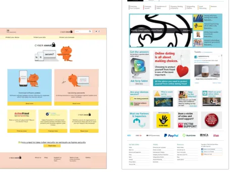
Both websites (Figure 2 and Figure 3 below) were analyzed based on this framework. The findings from this initial evaluation on the design features of the websites provide evidence that simple design principles are being neglected when it comes to cyber security websites (as listed in Table 2 below). The Cyber Aware website, although with a clearer and more accessible design, still fails in some design aspects that if improved would enhance user performance even further. The Get Safe Online website shows far more design problems that can significantly impair (or at least not support) user performance.
Based on these initial findings, the researchers went on to test the hypothesis of whether neglecting information and web design principles that are user-centered, compromises cyber awareness by impairing users’ ability to locate, understand and retain information that is vital for cyber security.
Lonsdale et al. 2019 | 10
Lonsdale et al. 2019 | 12
NEGLECTED DESIGN PRINCIPLES
Cyber Aware • Some important information is not kept above the fold and requires scrolling • The hierarchy could be clearer.
• The menu is not distinct enough.
• Adequate cueing techniques are not being used to distinguish more relevant information.
• Visuals could be better used to create a more aesthetically pleasing website that complements the organization (project a more serious and corporate feel).
• The search box is not long enough (only fits 10 visible characters at a time). • The website content is not rich enough for automated searches (less than the
required 100 pages).
Get Safe Online • The layout is not easy to navigate. • The homepage and menu are too cluttered. • The font size is too small.
• The line length is too long.
• Some important information is not kept above the fold and requires scrolling. • The hierarchy needs to be clearer (confusing to have two bullet points levels
within one another, that look similar).
• Repetition and redundancies need to be deleted.
• A limited number of information items should be displayed at the same time. • Where applicable, units of thought should be grouped so that the user can
visually see and register as a single unit of information.
• Adequate cueing techniques are not used to distinguish more relevant information.
• The graphics are not kept simple and distinct enough from advertisements. • Visuals should be used to complement and/or replace some text. • White space should be used to reflect the relationship between items of
information.
• Horizontal, roll-over activated submenus should not be used. • A-Z listings should be avoided.
• If alphabetizing information needs to be used for “scannability”, then it should be in rows rather than columns.
• Some links do not work.
• The link for the videos is badly located and is not different enough from other elements on the homepage.
Participants
A total of 61 participants were tested, belonging to social grades A and B (higher & intermediate managerial, administrative, professional occupations), since these are the two groups who use the Internet the most in the UK – 94-95% of internet usage, respectively (Cabinet Office, 2012).
The participants were admin, teaching and research staff at university level. Such individuals are considered medium-high risk because they are responsible for personal details, private and financial information relating to students, staff, applicants and research participants. Overall, there were 34.4% males and 65.6% females; 41% of participants were aged 30-39 years old and 24.6% were aged 20-29 years old.
In terms of ‘internet usage’, 91.8 % of participants said that they used the internet ‘very often’. When asked about their cyber security awareness, only 29% of participants said they were aware of cyber security.
Stimuli
The reasons for selecting the two websites in question were as follows: 1) both websites provide practical advice on how to be protected online, with the aim of driving behavior change amongst businesses and individuals, so that they adopt simple secure online behaviors; 2) both websites are closely linked to the same government, i.e., HM Government in the UK (Cyber Aware is sponsored by HM Government and Get Safe Online is a private/public sector partnership with HM Government); 3) despite their similar scope and aim, they adopt contrasting approaches in the way information is designed and delivered, which makes them ideal to fulfil the aim of this study.
Lonsdale et al. 2019 | 14
User testing
4
4.1
Procedure
Participants were asked to find specific information on both Cyber Aware and Get Safe Online websites. The two websites were presented to participants in a random order to prevent biasing and learning effects. Participants were required to complete 4 tasks as follows:
• T1 – Find information and tell us briefly how to create ‘strong passwords’. • T2 – Find information and tell us briefly how to keep your ‘software secure’. • T3 – Find information and tell us briefly how to ‘shop online’ safely.
• T4 – Watch the video ‘Shopping Online’ and tell us briefly what you learnt.
The rationale for choosing the tasks was as follows. For comparison, tasks had to be chosen that featured on both websites. Therefore, as the Cyber Aware website had far fewer menu choices, the first step was to select the first choice under each menu tab that related to the public: T1 – passwords and T2 – Software. T3 – Shopping was then selected because of its popularity among the British public. The latest figures show that 86% of internet users in the UK shopped online in 2017. Moreover, people aged 25-34 are more active e-shoppers (77 % of internet users), as well as people with high education (82%) and employed (73%), which matches the group of participants we tested in our study (Eurostat, 2018). T4 – Video was also selected because of it being an additional means of communicating the information on both websites. For all 4 tasks, the information could be found with 2 clicks/steps (e.g. click on the menu, then click on the specific tab).
Participants were given some instructions before starting the test to maximize the reliability of the findings: 1) You should NOT copy the text from the web page; 2) You should NOT go back to check the answer again. Just write what you remember; 3) You should NOT change the answer afterwards; 4) You should NOT write down an answer based on your knowledge. ONLY information from the respective website will be accepted; 5) If you cannot find or remember the information, just write ‘CANNOT FIND’.
Participants’ behavior was recorded using ‘Movavi Screen Capture’ software, which records the computer screen, mouse movements and participants’ facial expression.
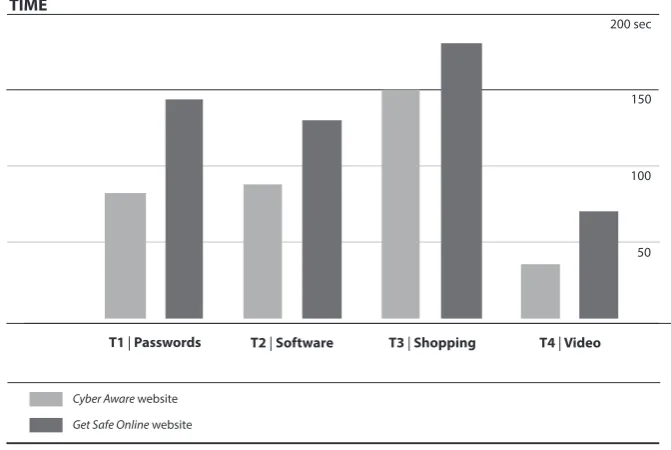
Time
A paired samples t-test was used to compare the time for conducting four given tasks on the Cyber Aware and Get Safe Online websites. Results show that there were significant differences between the two websites. As shown in Table 3, there were significant differences for tasks Password [T1], Software [T2], and Video [T4]. However, a significant difference between the two websites was not found for the task Shopping [T3] (p=.131).
Lonsdale et al. 2019 | 16
Results
5
Table 3 Mean task time in seconds.
5.1
n M SD t p
T1
Time spent to find information
p = .000 p < .001
Cyber Aware
Get Safe Online
81.3
137.8 39.4
61.7
-8.287
T2
p = .000 p < .001
Cyber Aware
Get Safe Online
87.1
128.1 50
87.3 -3.729
T3
p = .131 NS
Cyber Aware
Get Safe Online
150.0
179.1 108.5
111.7
-1.530
T4
p = .000 p < .001
Cyber Aware
Get Safe Online
33.1
66.0 28.0
33.8
-5.505 61
61
61
61
As illustrated in Table 3 and Figure 4, participants took significantly more time to find information on the Get Safe Online website (M=137.8, SD=61.7) than on the Cyber Aware website (M=81.3, SD=39.4) (p < .001) for the task Password [T1]. Participants also took significantly more time to find information on the Get Safe Online website (M=128.1, SD=87.3) than on the Cyber Aware website (M=87.1, SD=50) (p < .001) for the task Software [T2]. The same was true for the task Video [T4], where participants also took significantly more time to find information on the Get Safe Online website (M=66.0, SD=33.8) than on the Cyber Aware website (M=33.1, SD=28.0) (p < .001).
5.1.1. Summary and discussion. Overall, participants took significantly more time to find information on the Get Safe Online website than on the Cyber Aware website on three tasks: Passwords [T1], Software [T2] and Video [T4]. This provides evidence that the way the information is designed (organized and structured) on the Get Safe Online website is less accessible and less clear to users than on the Cyber Aware website.
T1 | Passwords T2 | Software
Cyber Aware website
Get Safe Online website
T3 | Shopping T4 | Video
200 sec
TIME
150
50 100
Lonsdale et al. 2019 | 18
Another important point to make, as noted above, is that users do not stay very long on web pages, with an average visit lasting around 60 seconds (Nielsen, 2011). Thus, to gain users’ attention, valuable information needs to be communicated ideally within the first 10 seconds. In our study, when asked to find information, participants took on average more than the 60 seconds barrier. Only one task out of four, and only on the Cyber Aware website, took less than 60 seconds. In a normal situation, where users are not completing a performance test, they might not stay long enough on either website, nor consider returning to the websites again in the future.
Although no statistically significant difference was found for speed of finding information on Shopping [T3] between the two websites, this was the task in which participants spent more time in total on both websites. Participants struggled to find the information (taking more time to complete the task) and 56% of participants on the Cyber Aware website did not find the information at all. This may be due to the fact that information on how to shop online safely is difficult to access on the Get Safe Online website, and on the Cyber Aware website there is no dedicated page for such information (information is less focused and is dispersed across different web pages). This is worrying because of the high percentage of people who shop online, as mentioned above – 86% of internet users in the UK shopped online in 2017. To gather more evidence on this matter, an analysis of participants’ behavior, as well as their preferences and opinions, is described next.
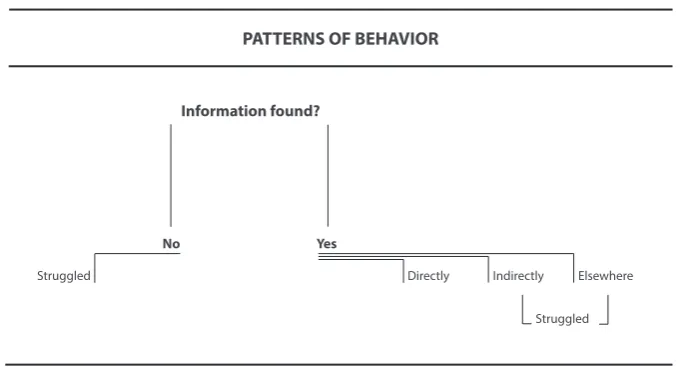
Behavior
A chi-square was used to compare frequency of behavior when finding information on the various web pages available between the two websites Cyber Aware and Get Safe Online for the same four tasks. In case of the expected values being less than 20%, the Fisher Exact Test was conducted. The same four tasks on each website were given and the measurement points of behavior were as follows and as illustrated in Figure 5:
• ‘Found information’ [BP1] – Did participants find the accurate information? • ‘Directly to the page’ [BP2] – Did participants go directly to the correct page
where the information was available and find the accurate information? • ‘Indirectly to the page’ [BP3] – Did participants go elsewhere on the website
before finding the accurate information on the correct page? • ‘Found information elsewhere’ [BP4] – Did participants find similar
information elsewhere on the website?
• ‘Struggled’ [BP5] – Did participants struggle to find the information (going back and forth) and/or could not find the information?
5.2.1. Passwords. According to the results for Passwords (T1), significant differences were found for three behaviors as shown in Table 4.1 and Figure 6.1. Significantly more participants went ‘directly to the page’ [BP2] on the Cyber Aware website (n=55) than on the Get Safe Online website (n=40) (Χ2=10.702, p < .01). Significantly more participants went ‘indirectly to the page’ [BP3] on the Get Safe Online website (n=20) than on the Cyber Aware website (n=6) (Χ2=9.580, p < .01). Significantly more participants ‘struggled’ [BP5] to find the information on the Get Safe Online website (n=21) than on the Cyber Aware website (n=6) (Χ2=10.702, p < .01).
Figure 5 Patterns of behavior when finding the information on the websites
n Yes No Χ2 p
T1 Directly to the page
Behavior when finding information
p = .002 p < .01
Cyber Aware
Get Safe Online
55
40 6
21
10.702
61
Indirectly to the page
55
9.580 p = .003 20
Info found
elsewhere p = 1.000
p < .01
NS
Cyber Aware
Get Safe Online
Cyber Aware
Get Safe Online
0
1 6
41
61
60
1.008 61
61 Information found?
Struggled
No Yes
PATTERNS OF BEHAVIOR
Directly Indirectly Elsewhere
5.2.2. Software. According to the results for Software (T2) significant
differences were found for three behaviors as shown in Table 4.2 and Figure 6.2. Significantly more participants went ‘directly to the page [BP2] on the Cyber Aware website (n=47) than on the Get Safe Online website (n=27) (Χ2=3.739, p < .001). Significantly more participants ‘found information elsewhere’ [BP4] on the Get Safe Online website (n=13) than on the Cyber Aware website (n=4) (Χ2=5.536, p < .05). Significantly more people ‘struggled’ [BP5] on the Get Safe Online (n=34) than on the Cyber Aware website (n=14) (Χ2=13.739, p < .001).
Lonsdale et al. 2019 | 20
80 participants
Info found Directly to page
Cyber Aware website
Get Safe Online website
Info found elsewhere Struggled PASSWORDS 20 60 Indirectly to page 40
Figure 6.1 Frequency of behavior when finding information for task T1 – Passwords.
p = .034 p < .05 4 13 57 48 5.536 61 47
13.739 p = .000 34
p < .001 14
27 61
n Yes No Χ2 p
p = .680 NS 59 57 2 4 .701 61 14
13.739 p = .000 27
p = .071
p < .001
NS 8 17 47 34 53 44 4.075 61 61 Info found T2 Directly to the page
Behavior when finding information
Cyber Aware
Get Safe Online
Cyber Aware
Get Safe Online
Indirectly to the page
Info found elsewhere
Cyber Aware
Get Safe Online
Cyber Aware
Get Safe Online
Struggled Cyber Aware
Get Safe Online
T2 – Software
80 participants
Info found Directly to page
Cyber Aware website
Get Safe Online website
Info found elsewhere Struggled SOFTWARE 20 60 Indirectly to page 40
Figure 6.2 Behavior when finding information for task T2 – Software.
5.2.3. Shopping. The results for Shopping (T3) show significant differences for three behaviors as illustrated in Table 4.3 and Figure 6.3. Significantly more participants ‘found the information’ [BP1] on the Get Safe Online website (n=59) than on the Cyber Aware website (n=27) (Χ2=40.351, p < .001). Significantly more participants went ‘directly to the page’ [BP2] on the Get Safe Online website (n=27) than on the Cyber Aware website (n=0) (Χ2=36.674, p < .001). Significantly more participants ‘struggled’ [BP5] to find the information on the Cyber Aware website (n=61) than on the Get Safe Online website (n=34) (Χ2=34.674, p < .001).
p = 1.000 NS 12 11 49 50 .054 61
n Yes No Χ2 p
p = .000 p < .001 27 59 34 2 40.351 61 61
36.674 p = .000 27
p = .321
p < .001
NS 15 21 0 34 46 40 1.419 61 61 Info found T3 Directly to the page
Behavior when finding information
Cyber Aware
Get Safe Online
Cyber Aware
Get Safe Online
Indirectly to the page
Info found elsewhere
Cyber Aware
Get Safe Online
Cyber Aware
Lonsdale et al. 2019 | 22
Figure 6.3 Behavior when finding information for task T3 – Shopping.
5.2.4. Video. In relation to the results for Video (T4), significant differences were found for three behaviors as shown in Table 4.4 and Figure 6.4. Significantly more participants went ‘directly to the page’ [BP2] on the Cyber Aware website (n=49) than on the Get Safe Online website (n=7) (Χ2=58.227, p < .001). Significantly more participants went ‘indirectly to the page’ [BP3] on the Get Safe Online (website n=50) than on the Cyber Aware website (n=9) (Χ2=55.174, p < .001). Significantly more participants ‘struggled’ [BP5] on the Get Safe Online website (n=54) than on the Cyber Aware website (n=12) (Χ2=58.227, p < .001).
Table 4.4 Behavior when finding information for task T4 – Video.
80 participants
Info found Directly to page
Cyber Aware website
Get Safe Online website
Info found elsewhere Struggled SHOPPING 20 60 Indirectly to page 40
n Yes No Χ2 p
p = 1.000 NS 58 57 3 4 .152 61 12
58.227 p = .000 7
p = .000
p < .001
p < .001 9 50 49 54 52 11 55.174 61 49
58.227 p = .000 54
p < .001 12 7 61 61 Info found T4 Directly to the page
Behavior when finding information
Cyber Aware
Get Safe Online
Cyber Aware
Get Safe Online
Indirectly to
the page Cyber Aware
Get Safe Online
Struggled Cyber Aware
Get Safe Online
Figure 6.4 Behavior when finding information for task T4 – Video.
5.2.5. Summary and discussion. Overall, the vast majority of participants found the accurate information on both websites, with the exception of the website Cyber Aware for information on ‘shopping online’. The latter was may be due to the fact that there was no dedicated page for this category. As many as 56% of participants failed to find the information, 52% wrote “cannot find” and 4% wrote information that was inaccurate (possibly a guess). From the video recording we can see that the remaining 44% who managed to find information on shopping online safely, found bits of information on less formal pages i.e. on the Cyber Aware blog and on articles dating back to 2014 and 2015. With blogs being considered more subjective and less accurate, it is reasonable to surmise that users will have lower levels of trust in such information even if they find it.
In terms of how information was found and accessed, overall significantly more participants found the information more easily, i.e., went directly to the page and struggled less, on the Cyber Aware website than on the Get Safe Online website (with the exception of information on shopping).
For the Get Safe Online website, overall participants struggled more to find the information: 34% struggled to find information on Passwords (compared to 10% on the Cyber Aware website); 56% struggled to find information on Software (compared to 23% on the Cyber Aware website); 56% also struggled to find information on Shopping (compared to 23% on the Cyber Aware website); and as many as 89% struggled to find the video on ‘Shopping online’ (compared to 20%
80 participants
Info found Directly to page
Cyber Aware website
Get Safe Online website
Info found
elsewhere Struggled
VIDEO
20 60
Indirectly to page
User perception
At the end of completing all four tasks for each website respectively, participants were asked to choose three words to describe the website and their feelings after using the website, for which they were given a list of sixteen words (8 positive and 8 negative adjectives/feelings) based on the ‘Microsoft Desirability Toolkit to Test Visual Appeal’ (Meyer, 2016). This was followed by an interview to gather participants’ general opinion about the design of the two websites. Participants were not asked to choose one website over the other, but to list what they liked and disliked.
5.3.1. Description of the website. The choice of three words to describe the website is illustrated in Table 5.1 and Figure 7.1 (please see p. 26).
Lonsdale et al. 2019 | 24 Table 5.1 User description of the website.
Straightforward 9 (7.4%)
Understandable 13 (10.7%)
Time consuming 17 (13.9%)
Overwhelming 20 (16.4%)
Trustworthy 21 (17.2%)
Effective 22 (18.0%)
Relevant 25 (20.5%)
Complex 28 (23.0%)
Stressful 1 (0.8%)
Overwhelming 1 (0.8%)
Complex 1 (0.8%)
Difficult 2 (1.6%)
Frustrating 3 (2.5%)
Confusing 4 (3.3%)
Time consuming 5 (4.1%)
Relevant 6 (4.9%)
Trustworthy 10 (8.2)%
Ineffective 11 (9.0%)
Effective 12 (9.8%)
Fun 16 (13.1%)
Understandable 21 (17.2%)
Straightforward 25 (20.5%)
Friendly 27 (22.1%)
Accessible
Difficult
Confusing
Frustrating
Friendly
Stressful
Fun
Ineffective
Cyber Aware Get Safe Online
Website description
Accessible 38 (31.1%)
Task – Choose 3 words to describe the website
9 (7.4%)
7 (5.7%)
6 (4.9%)
3 (2.5%)
2 (1.6%)
1 (0.8%)
0 (0.0%)
0 (0.0%)
The highest choice was the word ‘Accessible’ (31.1%), selected for the Cyber Aware website, and the word ‘Complex’ (23.0%) for the Get Safe Online website. The second highest choice was the word ‘Friendly’ (22.1%) selected for the Cyber Aware website, and the word ‘Relevant’ (20.5%) for the Get Safe Online website.
5.3.2. Feelings after using the website. The choice of three words to describe participants’ feelings after using the website is illustrated in Table 5.2 and Figure 7.2 (please see p. 26). The highest choice was the word ‘Satisfied’ (22.1%) for the Cyber Aware website, and both ‘Overwhelmed’ and ‘Secure’ (22.1%) for the Get Safe Online website. The second highest choice was the word ‘Calm’ (19.7 %) for the Cyber Aware website, and the word ‘Confident’ (20.5 %) for the Get Safe Online website.
Intimidated 3 (2.5%)
Inspired 4 (3.3%)
Annoyed 4 (3.3%)
Empowered 8 (6.6%)
Valued 8 (6.6%)
Calm 15 (12.3%)
Confused 11 (9.0%)
Satisfied 17 (13.9%)
Secure 27 (22.1%)
Overwhelmed 27 (22.1%)
Empowered 2 (1.6%)
Overwhelmed 3 (2.5%)
Stressed 4 (3.3%)
Valued 4 (3.3%)
Confused 11 (9.0%)
Annoyed 17 (13.9%)
Secure 14 (11.5%)
Engaged 15 (12.3%)
Disconnected 14 (11.5%)
Frustrated 19 (15.6%)
Satisfied 27 (22.1%)
Confident
Engaged
Frustrated
Impressed
Feelings about website
Calm
Confident
24 (19.7%)
19 (15.6%) 25 (20.5%)
10 (8.2%)
10 (8.2%)
9 (7.4%)
Inspired 8 (6.6%)
Lonsdale et al. 2019 | 26 Fu n Ineff ec tiv e
Cyber Aware website Get Safe Online website
10 20 15 5 25 Ac cessible Comple x 35 30 45 participants WEBSITE DESCRIPTION 40 Confusing Difficult Eff ec tiv e Fr iendly Frustr ating Fu n Ineff ec tiv e O ver whelming Relev an t Str aigh tf or w ar d Str essful Time -c onsuming Trust w or th y Understandable Str essful Fr iendly Frustr ating Confusing Difficult Str aigh tf or w ar d Ac cessible Understandable Time -c onsuming O ver whelming Trust w or th y Eff ec tiv e Relev an t Comple x
Figure 7.1 User description of the website.
FEELINGS ABOUT WEBSITE
Cyber Aware website Get Safe Online website
10 20 15 5 25 35 30 45 participants 40 Sa tisfied Calm Confiden t Frustr at ed A nno yed Engaged Disc onnec ted Secur e confused Inspir ed Str essed Valued O ver whelmed Empo w er ed Impr essed In timida ted O ver whelmed Secur e Confiden t Sa tisfied Calm confused Engaged Frustr
at ed Impr essed Empo w er ed Valued A nno yed Inspir ed In timida ted Str essed Disc onnec ted
5.3.3. Design preferences. Features that participants liked for the Cyber Aware website were: simple interface; user-friendly; cleaner look; calm; tidy and clear organization of information; colorful; fun; with more visualization; good layout; big headings; short paragraphs; bigger font size; more memorable video; easy to look at on a mobile phone; more interactive with the information. Features that participants disliked: “childish” look due to the cartoon cat (aimed more at children and teenagers); basic video; menu with very few options (only 3 tabs); design a little plain and simple; website looks like it was produced quickly and
cheaply. Some participants went further and made some design suggestions for
the Cyber Aware website: might be a good idea to combine both websites (use the format of the Cyber Aware website and the content of the Get Safe Online website); the color palette is warm but red might be better for a cyber security subject.
Features that participants liked for the Get Safe Online website were:
professional; serious; detailed; looks more trustworthy; more corporate; more formal; headings with a different color; well separated information; good use of color to separate the different menu options; good to separate personal from business; more contemporary design; the logos of companies at the bottom are good as it gives reassurance of being a trustworthy website. Features that participants disliked: dense text; unclear layout; too many sub-categories in the menu; menu difficult to follow; unclear how information is organized in the mega menu (alphabetical?); when menu is open it does not always fit on one page; looks old and tired; not visually engaging; too many boxes on the right hand-side; too many and unrelated things on one page; too many pictures on the homepage (look like adverts); too busy at the bottom of the homepage.
Design suggestions made by some participants for the Get Safe Online website
included: more hierarchy overall and fewer options to choose from in the menu; show more common and sought-after content first in the menu, and then have separate sections for other content; use pictograms instead of photos.
Lonsdale et al. 2019 | 28
The present study compared two cyber security websites that are equivalent in terms of focus and target audience, to ascertain how successful they are at informing and instructing the public on how to adopt secure online behaviors and be protected online. The websites were compared in terms of: time to search and locate information; whether information was found; user behavior when finding information; and user perception.
The findings confirm the researchers’ hypothesis. Participants performed better (located, understood and recalled information better) with the website that displayed a higher number of user-centered design principles (as defined in the literature). Our study shows that even when information is considered important (such as cyber security information) if too dense, complex and badly designed, it will overwhelm users and they will struggle to find and understand the information they need. Therefore, neglecting the target users’ needs and expectations comes at a price.
Previous studies have shown a significant impact of design aesthetics and perceived ease of use on trust (Li and Yeh, 2010), and have validated the relationship of perceived interactivity (user control, connectedness, and responsiveness) to trust of a website (Cyr et al., 2009). However, our study unexpectedly showed that a design which is clearer, more accessible and that facilitates performance, is not sufficient to project a sense of trust among cybersecurity users. The tone of the design (e.g., more corporate if dealing with more serious information) and the depth of the information (e.g., more detailed
been discussed and researched regarding how to create a good first impression that grabs the users’ attention. But, if the aim is for users to implement what they have found and learnt, then a ‘lasting impression’ counts as much as the ‘first impression’. What our study shows is that, if users do not trust the information, even if they accessed it and understood it easily, they might not act upon it, nor return to the website.
Proposing a redesign of these websites is outside the scope of our research. However, our findings allow us to fill in a few gaps in the research and recommend further principles for information design in general, and online information specifically.
Lasting impression – The first principle is to aim for a lasting impression and avoid setting in motion negative bias and/or attitudes (such as lack of trust). As shown by our results and supported by previous research (discussed by, for example, Loranger, 2016b), users give more weight to the negative than the positive. Therefore, in order to provide a good user experience, legibility and usability should take priority in information and Web design. However, to ensure a lasting positive impression, information design outputs should go beyond that. Designers must mitigate as many design flaws as possible, and this should include the visual tone of the message and the output’s overall visual impression. In sum, information design outputs should take into account, and fulfil, all three stages of our Information Design Process Model, with legibility and usability having the highest impact on ‘Information Seeking’, and lasting impression having the highest impact on ‘Information Use’. That is, a good lasting impression will be key to persuading users to act upon the information, but users will struggle to act upon the information if they cannot locate it, understand it and retain/recall it. It is therefore imperative for such inter-dependence between the different stages of the Information Design Process to be considered in the design development.
as indicated by our results. We therefore suggest that the ‘Information Need’ stage should involve a mixed-methods approach by including both quantitative and qualitative user-centered research methods. Moreover, this information design processing stage should be checked at different times during the design development: a) at the beginning, by conducting primary research and involving target users in co-/participatory design sessions; b) in the middle, by designing, testing, iterating and redesigning the information as many times as necessary; c) and at the end, when implementing and evaluating the final design output (which can resonate with what we have done in our study).
With these two further principles in place, in addition to all the other principles listed in Table 1 blending the fields of Information and Web design, the theory emerging form this study is as follows. Information design principles benefit websites whose primary goal is to inform and instruct the public on important and serious matters. According to this theory, at the ‘Information Need’ stage of the Information Design Process, websites designed taking into account user needs and expectations collected through user-centered research methods: 1) deliver more valid and reliable design outputs and outcomes. At the ‘Information Seeking’ stage of the Information Design Process, websites displaying user-centered design principles and reflecting user preferences (within reason, i.e., that do not compromise accessibility of information): 2) grab and hold user interests and attention; 3) facilitate user access and understanding of information; 4) facilitate user retention and recall of information; 5) create a sense of trust among users in the information provided. Consequently, at the ‘Information Use’ stage, such websites are likely to: 6) help and persuade users to implement the information learnt in their daily lives.
Lonsdale et al. 2019 | 32
Table 1 – Appendix 1
PAGE LAYOUT
Aesthetics • Find balance between all design elements.
• Design documents that are attractive, uncluttered, but informative.
• Lindgaard et al., 2006; • Karlsson, 2007; • Pettersson, 2010; • Waller, 2011
Attention (improve)
• TEXT: set headings in different type versions (e.g. bold. italics, color) and size; use cueing techniques, but conservatively to avoid compromising legibility.
• COLOR: use bold and bright colors to cue the user to new information; use color coding in a consistent and logical manner. • VISUALS: use pictures with interesting content and different types of
visuals; use arrows, bullets, lines, and symbols in various colors. • OTHER: use margin notes, repetition, and space to highlight relevant
information.
• Lee & Boiling, 1999; • Hartley, 2004;
• Leavitt & Shneiderman, 2006; • Pettersson, 2010; • Beukes et al. 2016; • Travis, 2016
Consistency • Use visual consistency to allow users to anticipate where items will be, such as consistent use of color, of size and spacing of text, of size and location of labels, of fonts and backgrounds, of location and function of items.
• Visually align page items consistently (e.g. blocks of text, rows, columns, checkboxes, buttons, data entry fields, etc.).
• Hornof & Halverson, 2003; • Leavitt & Shneiderman, 2006; • Lipton, 2007;
• Pettersson, 2010; • Beukes et al. 2016; • Travis, 2016.
[ continues ]
Color • Use color as an information design tool (not as decoration). • Use color sparingly.
• Use a background color appropriate to the content. • Use a color with good contrast for the text and/or image. • Use colors that are clearly different, but avoid complementary colors. • Use color coding that is quick and easy to understand and with no
more than five colors.
• Do not use color on its own to communicate information.
• Hartley, 2004;
• Leavitt & Shneiderman, 2006; • Lipton, 2007;
• Pettersson, 2010; • Travis, 2016.
PAGE LAYOUT
Graphics • Keep graphics simple and different from banner advertisements. • Use background images sparingly and make sure they are simple. • Make sure the text over images is legible and has sufficient contrast. • Label graphics and photos when their meaning or relationship to
the main text is not clear.
• The organisation’s logo should be a reasonable size and in the same position on every page (usually on the top left corner).
• Use images/graphics to support and improve learning. • Make animations optional and user-controlled.
• Do not use animations without a clear reason, and when you do provide an introductory text for animations/videos.
• Nielsen, 2001;
• Leavitt & Shneiderman, 2006; • Waller, 2011;
• Beukes et al. 2016; • Travis, 2016; • Loranger, 2017
[ continues ]
Hierarchy • Show the hierarchy, sequencing and structure of the content in the graphic design by establishing a high-to-low level of importance. • Do this throughout each page and in the order that is most useful to
users (e.g. important information higher on the page to be quickly located; least used information toward the bottom of the page).
• Farkas & Farkas, 2000; • Hartley, 2004;
• Leavitt & Shneiderman, 2006; • Pettersson, 2010; • Beukes et al. 2016
Homepage • Ensure that the homepage is perceived as a homepage and projects the quality of the website.
• Limit the homepage length and the amount of prose text available. • Show all main options on the homepage.
• Nielsen, 2001;
• Leavitt & Shneiderman, 2006; • Lindgaard et al., 2006; • Karlsson, 2007; • Nielsen, 2010c; • Travis, 2016
Legibility of text
• Use simple and clean typefaces designed for screen display. • Use no more than two fonts, taking advantage of different weights
and sizes.
• Use a 10- to 12-point size font. Do not use less than 9-point and for older adults 14-point might be better.
• Use a black text on a white or yellow background. • Avoid the use of all capital letters.
• Justify text to the left.
• Avoid too short and too long lines (e.g. for reading speed use 75-100 characters per line).
• Lee & Boiling, 1999; • Nielsen, 2001; • Bernard et al., 2002; • Hartley 2004;
• Leavitt & Shneiderman, 2006; • Lipton, 2007;
Lonsdale et al. 2019 | 34
PAGE LAYOUT
Memory & recall
• Organize information carefully. • Use visuals.
• Display a limited number of information items at the same time. • Connect text and illustrations closely.
• Leavitt & Shneiderman, 2006; • Pettersson, 2010
Page length • Use shorter pages when they need to be quickly browsed (e.g. homepages, navigation pages).
• Use longer pages when the aim is comprehension (e.g. content pages with more detailed information).
• Leavitt & Shneiderman, 2006; • Waller, 2011
[ continues ]
Structure & layout
• Use a clear and simple layout and structure for the content, limiting the number of levels in the structure.
• Create a layout that is easy to navigate, i.e. that clearly shows where to start, in what order, and where to end.
• Put most important items and navigation options at the top centre of the page with minimum scrolling.
• Farkas and Farkas, 2000; • Nielsen, 2001; • Hornof & Halverson, 2003; • Leavitt & Shneiderman, 2006; • Lipton, 2007;
• Pettersson, 2010; • Beukes et al. 2016; • Silvennoinen & Jokinen, 2016
Unity • Position closely related items next to each other and use similar characteristics (e.g. color, orientation, pattern, shape, size, texture, value) to show that they belong together.
• Use vertical lists instead of horizontal lists.
• Use amounts of space between items of information that reflect their relationships.
• Nielsen, 2001; • Hornof & Halverson, 2003; • Leavitt & Shneiderman, 2006; • Pettersson, 2010; • Travis, 2016
White space • Use moderate amounts of white space (horizontal and vertical) consistently to organize visual layouts (e.g. to separate paragraphs, subsections, etc.).
• Aim for a good balance between information density and white space.
• Hornof & Halverson, 2003; • Hartley, 2004;
• Leavitt & Shneiderman, 2006; • Lipton, 2007;
NAVIGATION
Feedback • Provide feedback to the user about their path and location on the website by: using breadcrumbs (to give the current location and the next step); matching link text to the destination page’s heading; changing the color of a link that has been clicked, etc.
• Leavitt & Shneiderman, 2006; • Beukes et al. 2016; • Travis, 2016
Homepage • Allow users to access the homepage from any other page (e.g. a logo is not always recognized as clickable, but a link named “home” is). • Do not cover format navigation areas on the home page. • Be very careful with minimalist and hidden navigation.
• Farkas & Farkas, 2000; • Leavitt & Shneiderman, 2006; • Sherwin, 2014; • Beukes et al. 2016; • Travis, 2016; • Loranger, 2017
Menu & listings
• Do not use thin, horizontal, roll-over activated submenus. • Avoid too many menu levels.
• Use mega menus for accommodating a large number of options. • Avoid A-Z listings. Instead, present information in ordinal sequences,
logical structuring, timeline, or prioritization by importance. • If alphabetizing information do it in columns, not rows.
• Leavitt & Shneiderman, 2006; • Nielsen, 2010a and 2010b; • Cardello, 2013; • Whitenton, 2015; • Travis, 2016; • Nielsen and Li, 2017.
[ continues ]
Navigation links
• Use text for links (e.g. links that match the headings on the destination page).
• Use links with meaningful and descriptive text/labels (e.g. general descriptions such “click here” and “learn more” have poor information scent).
• Use an appropriate text length (more than one word and less than a line of text).
• Use consistent clickable cues that are clear to the user (non-clickable items should not be graphically similar to clickable ones). • Change the appearance of links when clicked.
• Create ‘anchor links’ (a short list of contents) if pages are too long and have different sections.
• Avoid duplicate and redundant links.
• Farkas & Farkas, 2000; • Nielsen, 2001; • Leavitt & Shneiderman, 2006; • Cardello, 2013; • Sherwin, 2015; • Beukes et al. 2016; • Loranger, 2016a; • Travis, 2016
Navigation elements
• Locate, group and differentiate navigation elements consistently across pages: menus, tabs, headings, lists, search box, site map, etc.
Lonsdale et al. 2019 | 36
NAVIGATION
Paging • Use paging when finding specific information – what Loranger (2014) calls “goal-oriented” finding tasks.
• Leavitt & Shneiderman, 2006; • Loranger, 2016a
Scrolling • Use longer, scrolling pages when reading for comprehension (not for navigation-only pages such as the homepage).
• Use a page layout that does not require horizontal scrolling. • Keep the most important information “above the fold”, i.e. within the
first viewable area of the page.
• Nielsen, 2001 and 2010c; • Leavitt & Shneiderman, 2006; • Travis, 2016
Scroll stoppers
• Make sure that page elements do not give the false impression to users that they have reached the top or bottom of the page (e.g. headings, block of text in small font, horizontal lines, a block of color that finishes).
• Leavitt & Shneiderman, 2006; • Travis, 2016
Search • If using a search option, provide one on each page, but do not to rely on search engines when the website’s content is not rich enough for automated searches (i.e. with no more than 100 web pages). • The search box should be long enough (at least 30 characters), and
located where users expect it.
• Nielsen, 1999 and 2001; • Farkas& Farkas, 2000; • Leavitt & Shneiderman, 2006; • Beukes et al. 2016; • Travis, 2016
Tabs • Use tabs to alternate between views that relate to the same context. • Locate tabs at the top of the page.
• Design tabs to look like real clickable tabs.
• Highlight tabs in current use, but make unselected tabs also clearly visible.
• Write short labels (1-2 words), avoiding all capitals. • Use one row of tabs only and locate them at the top.
Ashford, W. (2017). Raising cyber security grasp is biggest challenge, says GCHQ chief. ComputerWeekly.com. [Online]. [Accessed December 2017]. Available
from:
https://www.computerweekly.com/news/450414939/Raising-cyber-security-grasp-is-biggest-challenge-says-GCHQ-chief
Bernard, M., Lida, B., Riley, S., Hackler, T., & Janzen, K. (2002). A comparison of popular online fonts: Which size and type is best? Usability News. [Online].
[Accessed December 2017]. Available from:
http://usabilitynews.org/a-comparison-of-popular-online-fonts-which-size-and-type-is-best/
Beukes, W. et al. (2016). Why designers responsible for websites of large organisations disregard basic web design principles. CONF-IRM 2016
Proceedings. International Conference on Information Resources Management.
Cabinet Office. (2012). Digital Landscape Research. [Online]. [Accessed February
2017]. Available from:
https://www.gov.uk/government/publications/digital-landscape-research/digital-landscape-research
Cardello, J. (2013). Four dangerous navigation approaches that can increase cognitive strain. [Online]. [Accessed December 2017]. Available from: https:// www.nngroup.com/articles/navigation-cognitive-strain/
Choo, C. W. (1999). Closing the cognitive gaps: How people process information. Financial Times of London, March 22.
Cyr, D., Head, M. and Ivanov, A. 2009. Perceived interactivity leading to
Farkas, D. K. and Farkas, J. B. (2000). Principles for designing Web navigation. Technical Communication, 73(3), 341–358.
Fessenden, T. (2017a). Five user requirements for online ads. [Online]. [Accessed
December 2017]. Available from:
https://www.nngroup.com/articles/user-requirements-online-ads/
Fessenden, T. (2017b). The most hated online advertising techniques. [Online].
[Accessed December 2017]. Available from: https://www.nngroup.com/articles/
most-hated-advertising-techniques/
HM Government. (2016). National Cyber Security Strategy 2016-2021. [Online].
[Accessed November 2016]. Available from: https://www.gov.uk/government/
publications/national-cyber-security-strategy-2016-to-2021
Hartley, J. (2004). Designing instructional and informational text. In: Jonassen, DH, ed. Handbook of research on educational communications and technology. 2nd ed. New York: Macmillan, 917-947.
Hornof, A.J. and T. Halverson. (2003). Cognitive strategies and eye movements for searching hierarchical computer displays. Conference on Human Factors in Computing Systems (CHI), ACM, pp. 249–256.
Howarth, F. (2014). The Role of Human Error in Successful Security Attacks. Security Intelligence. [Online]. [Accessed December 2017]. Available from:
https://securityintelligence.com/the-role-of-human-error-in-successful-security-attacks/
Hoyer, W. D., & McInnis, D. (2001). Consumer behaviour (2nd ed.) Boston, MA: Houghton Mifflin Company.
Karlsson, M. (2007). Expressions, emotions, and website design. CoDesign, 3(S1), 75-89.
Leavitt, M.O. and Shneiderman, B. (2006). Research-based web design and usability principles. US Department of Health and Human Services.
Lee, S. H. and Boiling, E. (1999). Screen design principles for motivation in interactive multimedia instruction: A survey and framework for designers. Educational technology. 39, 19-26.
Leyden, J. (2013). UK’s Get Safe Online? No one cares’ - run the blockbuster ads instead. The Register. [Online]. [Accessed December 2017]. Available from:
https://www.theregister.co.uk/2013/09/25/gets_safe_online_has_failed_to_ change_behaviours/
Li Y. and Yeh, Y. 2010. Increasing trust in mobile commerce through design aesthetics. Computers in Human Behavior, 26, pp. 673–684
Lindgaard, G. Fernandes, G., Dudek, C. and Brown, J. (2006). Attention web designers: You have 50 milliseconds to make a good first impression! Behaviour & Information Technology, 25(2), pp. 115–126.
Lipton, R. (2007). The Practical guide to information design. New Jersey: John Wiley & Sons.
Loeber, S. and Cristea. A. (2003). A WWW information seeking process model. Educational Technology & Society, 6(3), 43-52.
Lonsdale, M. (2007). Does typographic design of examination materials affect performance? Information Design Journal, 15.2: 114-138.
Lonsdale, M. (2014a). Typographic features of text. Outcomes from research and practice. Visible Language, 48.3: 29-67.
Lonsdale, M. (2014b). The effect of text layout on performance: A comparison between types of questions that require different reading processes. Information Design Journal, 21.3: 279-299.
Lonsdale, M. (2016). Typographic features of text and their contribution to the legibility of academic reading materials: an empirical study. Visible Language, 50.1: 79-111.
Lonsdale, M., Dyson, M. C. and Reynolds, L. (2006). Reading in examination-type situations: the effects of text layout on performance. Journal of Research in Reading, 29.4: 433-453.
Loranger, H. (2016a). The same link twice on the same page: Do duplicates help or hurt?. [Online]. [Accessed December 2017]. Available from: https://www. nngroup.com/articles/duplicate-links/
Loranger, H. (2016b). The negativity bias in user experience. [Online]. [Accessed
December 2017]. Available from:
Martin, A. (2017). That government Cyber Aware website has cost £6.37 per visit since it launched. [Online]. [Accessed December 2017]. Available from: http:// www.alphr.com/politics/1005065/that-government-cyber-aware-website-has-cost-637-per-visit-since-it-launched
Meyer, K. (2016). Using the microsoft desirability toolkit to test visual appeal.
[Online]. [Accessed December 2017]. Available from: https://www.nngroup.com/
articles/microsoft-desirability-toolkit/
Nielsen, J. (1999a). 10 good deeds in Web design. [Online]. [Accessed December
2017]. Available from:
https://www.nngroup.com/articles/ten-good-deeds-in-web-design/
Nielsen, J. (2001). 113 design principles for homepage usability. [Online].
[Accessed December 2017]. Available from: https://www.nngroup.com/
articles/113-design-principles-homepage-usability/
Nielsen, J. (2004). The need for Web design standards. [Online]. [Accessed
December 2017]. Available from:
https://www.nngroup.com/articles/the-need-for-web-design-standards/
Nielsen, J. (2008). How little do users read? [Online]. [Accessed December 2017].
Available from: https://www.nngroup.com/articles/how-little-do-users-read/
Nielsen, J. (2010a). Alphabetical sorting must (mostly) die. [Online]. [Accessed
December 2017]. Available from: https://www.nngroup.com/articles/
alphabetical-sorting-must-mostly-die/
Nielsen, J. (2010b). Mega menus gone wrong. [Online]. [Accessed December
2017]. Available from:
https://www.nngroup.com/articles/mega-menus-gone-wrong/
Nielsen, J. 2010c). Scrolling and attention. [Online]. [Accessed December 2017].
Available from: https://www.nngroup.com/articles/scrolling-and-attention/
Nielsen, J. (2011). How long do users stay on Web pages?. [Online]. [Accessed
December 2017]. Available from:
https://www.nngroup.com/articles/how-long-do-users-stay-on-web-pages/
Nielsen, J. (2016). Tabs, used right. [Online]. [Accessed December 2017].
Available from: https://www.nngroup.com/articles/tabs-used-right/
Nielsen, J. and Li, A. (2017). Mega menus work well for site navigation. [Online].
[Accessed December 2017]. Available from: https://www.nngroup.com/articles/
mega-menus-work-well/
Olmstead, K. and Smith, A. (2017). What the public knows about cybersecurity.
[Online]. [Accessed December 2017]. Available from: http://www.pewinternet.
org/2017/03/22/what-the-public-knows-about-cybersecurity/
Pettersson, R. (2010). Information design–principles and principles. Journal of Visual Literacy, 29(2), 167-182
Travis, D. (2016). 247 web usability principles. User Focus. [Online]. [Accessed
December 2017]. Available from: https://www.userfocus.co.uk/resources/
principles.html
Schriver, K. (2016). Reading on the Web: Implications for online information design. In: Oven, C. P. and Pozar, C. eds. On information design. Ljubljana: The Museum of Architecture and Design. [Online]. [Accessed December 2017].
Available from:
http://www.mao.si/Upload/file/On-information-design_e-book%20.pdf
Sherwin, K. (2015). “Learn more” links: You can do better. [Online]. [Accessed
December 2017]. Available from:
https://www.nngroup.com/articles/learn-more-links/
Sherwin, K. (2014). Breaking Web design conventions = Breaking the user experience. [Online]. [Accessed December 2017]. Available from: https://www. nngroup.com/articles/breaking-web-conventions/
Silvennoinen, J. M. and Jokinen, J. P. P. (2016). Appraisals of salient visual elements in Web page design. Advances in Human-Computer Interaction, 2016(3676704), pp. 1-14.
Tetlan, L. and Marschalek, D. (2016). How humans process visual information: A focused primer for designing information. Visible Language, 50(3), 65-88.
Travis, D. (2016). 247 web usability principles. [Online]. [Accessed December
2017]. Available from: https://www.userfocus.co.uk/resources/principles.html