2.1 Frequency Distributions and Their Graphs 2.2 More Graphs and
Displays 2.3 Measures of Central Tendency 2.4 Measures of Variation Case Study 2.5 Measures of Position Uses and Abuses Real Statistics– Real Decisions Technology
Akhiok is a small fishing village on Kodiak Island. Akhiok has a population of 80 residents. Photographs © Roy Corral
32
Descriptive
Statistics
Where You’re Going
In Chapter 2, you will learn ways to organize and describe data sets. The goal is to make the data easier to understand by describing trends, averages, and variations. For instance, in the raw data showing the ages of the residents of Akhiok, it is not easy to see any patterns or special characteristics. Here are some ways you can organize and describe the data.
Where You’ve Been
In Chapter 1, you learned that there are many ways to collect data. Usually, researchers must work with sample data in order to analyze populations, but occasionally it is possible to collect all the data for a given population. For instance, the following represents the ages of the entire population of the 80 residents of Akhiok, Alaska, from the 2000 census.
25, 5, 18, 12, 60, 44, 24, 22, 2, 7, 15, 39, 58, 53, 36, 42, 16, 20, 1, 5, 39, 51, 44, 23, 3, 13, 37, 56, 58, 13, 47, 23, 1, 17, 39, 13, 24, 0, 39, 10, 41, 1, 48, 17, 18, 3, 72, 20, 3, 9, 0, 12, 33, 21, 40, 68, 25, 40, 59, 4, 67, 29, 13, 18, 19, 13, 16, 41, 19, 26, 68, 49, 5, 26, 49, 26, 45, 41, 19, 49 33 Class Frequency,f 0 –9 15 10–19 19 20–29 14 30–39 7 40 – 49 14 50–59 6 60–69 4 70–79 1 Make a frequency distribution table. Draw a histogram. Age Frequency 2 4 6 8 10 12 14 16 4.5 14.5 24.5 34.5 44.5 54.5 64.5 74.5 18 20 Find an average. = 72 years Range = 72 - 0 L 27.8 years = 2226 80 Mean = 0 + 0 + 1 + 1 + 1 + Á + 67 + 68 + 68 + 72 80
What You
Should Learn
• How to construct a frequency distribution including limits, boundaries, midpoints, relative frequencies, and cumulative frequencies • How to construct frequency
histograms, frequency polygons, relative frequency histograms, and ogives
Frequency Distributions
When a data set has many entries, it can be difficult to see patterns. In this section, you will learn how to organize data sets by grouping the data into intervals called classes and forming a frequency distribution. You will also learn how to use frequency distributions to construct graphs.
In the frequency distribution shown there are six classes. The frequencies for each of the six classes are 5, 8, 6, 8, 5, and 4. Each class has a lower class limit, which is the least number that can belong to the class, and an upper class limit, which is the greatest number that can belong to the class. In the frequency distribution shown, the lower class limits are 1, 6, 11, 16, 21, and 26, and the upper class limits are 5, 10, 15, 20, 25, and 30. The class width is the distance between lower (or upper) limits of consecutive classes. For instance, the class width in the frequency distribution shown is
The difference between the maximum and minimum data entries is called the
range. For instance, if the maximum data entry is 29, and the minimum data entry
is 1, the range is You will learn more about the range in Section 2.4. Guidelines for constructing a frequency distribution from a data set are as follows.
29 - 1 = 28.
6 - 1 = 5 .
Frequency Distributions • Graphs of Frequency Distributions
Frequency Distributions and Their Graphs
2.1
DEFINITION
A frequency distribution is a table that shows classes or intervals of data entries with a count of the number of entries in each class. The frequency f of a class is the number of data entries in the class.
GUIDELINES
Constructing a Frequency Distribution from a Data Set
1. Decide on the number of classes to include in the frequency distribution.
The number of classes should be between 5 and 20; otherwise, it may be difficult to detect any patterns.
2. Find the class width as follows. Determine the range of the data, divide
the range by the number of classes, and round up to the next convenient
number.
3. Find the class limits. You can use the minimum data entry as the lower
limit of the first class. To find the remaining lower limits, add the class width to the lower limit of the preceding class. Then find the upper limit of the first class. Remember that classes cannot overlap. Find the remaining upper class limits.
4. Make a tally mark for each data entry in the row of the appropriate
class.
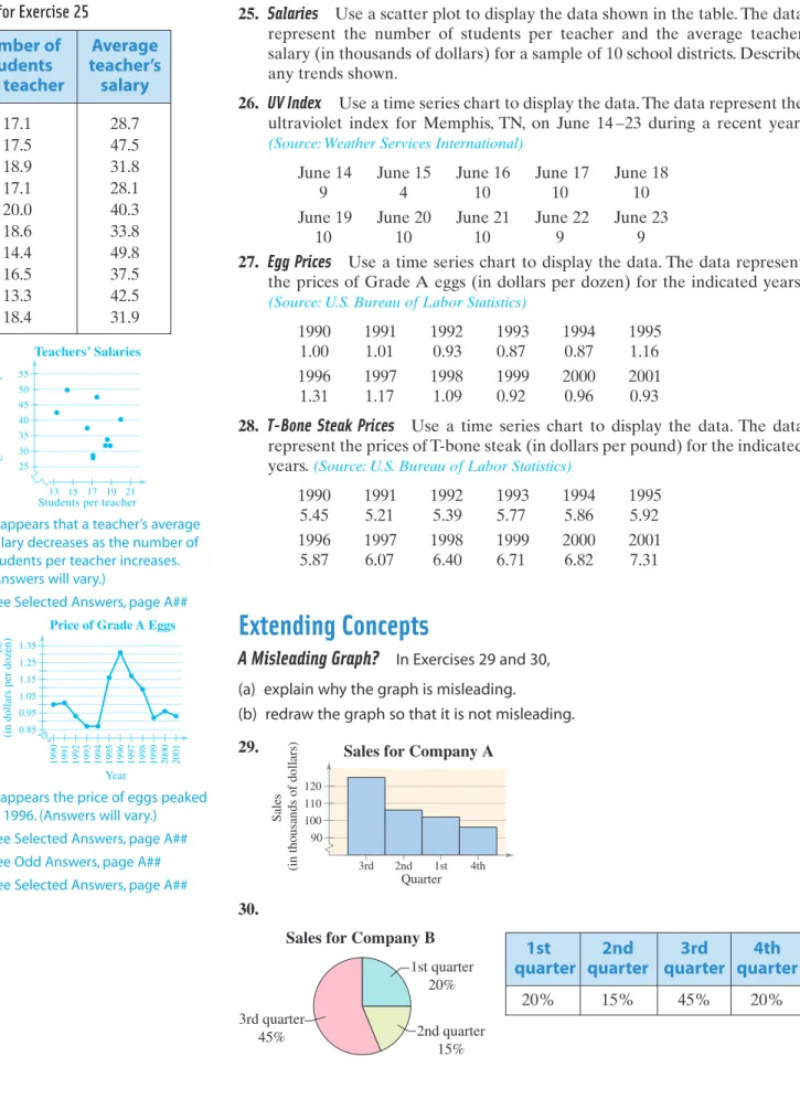
5. Count the tally marks to find the total frequency for each class.f Class Frequency, 1–5 5 6–10 8 11–15 6 16–20 8 21–25 5 26–30 4 f Example of a Frequency Distribution In a frequency distribution, it is best if each class has the
same width.Answers shown will use the minimum data value for the lower limit of the first class. Sometimes it may be more convenient t o choose a value that is slightly lower than the minimum
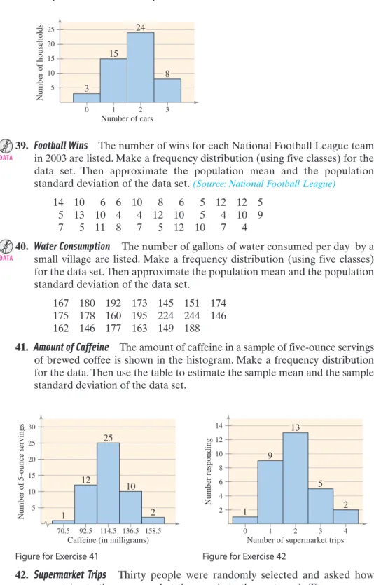
value. The frequency distri-bution produced will vary slightly.
Constructing a Frequency Distribution from a Data Set
The following sample data set lists the number of minutes 50 Internet subscribers spent on the Internet during their most recent session. Construct a frequency distribution that has seven classes.
50 40 41 17 11 7 22 44 28 21 19 23 37 51 54 42 88 41 78 56 72 56 17 7 69 30 80 56 29 33 46 31 39 20 18 29 34 59 73 77 36 39 30 62 54 67 39 31 53 44
SOLUTION
1. The number of classes (7) is stated in the problem.
2. The minimum data entry is 7 and the maximum data entry is 88, so the range is 81. Divide the range by the number of classes and round up to find that the class width is 12.
Round up to 12.
3. The minimum data entry is a convenient lower limit for the first class. To find the lower limits of the remaining six classes, add the class width of 12 to the lower limit of each previous class. The upper limit of the first class is 18, which is one less than the lower limit of the second class. The upper limits of
the other classes are and so on. The lower and
upper limits for all seven classes are shown.
4. Make a tally mark for each data entry in the appropriate class. 5. The number of tally marks for a class is the frequency for that class.
The frequency distribution is shown in the following table. The first class, 7–18, has six tally marks. So, the frequency for this class is 6. Notice that the sum of the frequencies is 50, which is the number of entries in the sample data set. The sum is denoted by gf,where g is the uppercase Greek letter sigma.
30 + 12 = 42 , 18 + 12 = 30 , L 11.57 Range Number of classes = 81 7
Maximum entry - Minimum entry Number of classes
Class width = 88 - 7 7
SECTION 2.1 Frequency Distributions and Their Graphs 35
The uppercase Gr eek letter sigma is used thr ough-out statistics t o indicate a summation of v alues. 1g2
Study Tip
Note to InstructorBe sure that students interpret the class width correctly as the distance
between lower (or upper) limits of consecutive classes. A common error is to use a class width of 11 for the class 7–18. Students should be shown that this class actually has a width of 12.
Lower Upper limit limit 7 18 19 30 31 42 43 54 55 66 67 78 79 90
Class Tally Frequency,f
7–18 6 19–30 10 31–42 13 43–54 8 55–66 5 67–78 6 79–90 2 gf = 50 ƒƒ ƒ ƒƒƒƒ ƒƒƒƒ ƒƒƒ ƒƒƒƒ ƒƒƒ ƒƒƒƒ ƒƒƒƒ ƒƒƒƒ ƒƒƒƒ ƒ ƒƒƒƒ
Frequency Distribution for Internet Usage (in minutes)
Check that the sum of the frequencies equals the number in the sample. Minutes online Number of subscribers Note to Instructor
Let students know that there are many correct versions for a frequency distribution. To make it easy to check answers, however, they should follow the conventions shown in the text.
EXAMPLE
1
If you obtain a whole num-ber when calculating the class width of a frequency
distribution,use the next whole number as the class
width. Doing this ensures you have enough space in
your frequency distribution for all the data values.
Try It Yourself 1
Construct a frequency distribution using the Akhiok population data set listed in the Chapter Opener on page 33. Use eight classes.
a. State the number of classes.
b. Find the minimum and maximum values and the class width. c. Find the class limits.
d. Tally the data entries.
e. Write the frequency f for each class. Answer: Page A29
After constructing a standard frequency distribution such as the one in Example 1, you can include several additional features that will help provide a better understanding of the data. These features, the midpoint, relative frequency, and cumulative frequency of each class, can be included as additional columns in your table.
After finding the first midpoint, you can find the remaining midpoints by adding the class width to the previous midpoint. For instance, if the first midpoint is 12.5 and the class width is 12, then the remaining midpoints are
and so on.
You can write the relative frequency as a fraction, decimal, or percent. The sum of the relative frequencies of all the classes must equal 1 or 100%.
48.5 + 12 = 60.5 36.5 + 12 = 48.5 24.5 + 12 = 36.5 12.5 + 12 = 24.5
DEFINITION
The midpoint of a class is the sum of the lower and upper limits of the class divided by two. The midpoint is sometimes called the class mark.
The relative frequency of a class is the portion or percentage of the data that falls in that class. To find the relative frequency of a class, divide the frequency by the sample size
The cumulative frequency of a class is the sum of the frequency for that class and all previous classes. The cumulative frequency of the last class is equal to the sample size n.
= f n Relative frequency = Class frequency Sample size n. f Midpoint = 1
Lower class limit2 + 1Upper class limit2 2
Midpoints, Relative and Cumulative Frequencies
Using the frequency distribution constructed in Example 1, find the midpoint, relative frequency, and cumulative frequency for each class. Identify any patterns.
SOLUTION
The midpoint, relative frequency, and cumulative frequency for the first three classes are calculated as follows.Relative Cumulative
Class Midpoint frequency frequency
7–18 6 6
19 –30 10
31– 42 13
The remaining midpoints, relative frequencies, and cumulative frequencies are shown in the following expanded frequency distribution.
Interpretation There are several patterns in the data set. For instance, the most common time span that users spent online was 31 to 42 minutes.
Try It Yourself 2
Using the frequency distribution constructed in Try It Yourself 1, find the midpoint, relative frequency, and cumulative frequency for each class. Identify any patterns.
a. Use the formulas to find each midpoint, relative frequency, and cumulative frequency.
b. Organize your results in a frequency distribution.
c. Identify patterns that emerge from the data. Answer: Page A29 16 + 13 = 29 13 50 = 0.26 31 + 42 2 = 36.5 6 + 10 = 16 10 50 = 0.2 19 + 30 2 = 24.5 6 50 = 0.12 7 + 18 2 = 12.5 f
SECTION 2.1 Frequency Distributions and Their Graphs 37
Frequency, Relative Cumulative
Class Midpoint frequency frequency
7–18 6 12.5 0.12 6 19–30 10 24.5 0.2 16 31–42 13 36.5 0.26 29 43–54 8 48.5 0.16 37 55–66 5 60.5 0.1 42 67–78 6 72.5 0.12 48 79–90 2 84.5 0.04 50 g f n = 1 gf = 50 f
Frequency Distribution for Internet Usage (in minutes) Portion of subscribers Minutes online Number of subscribers
EXAMPLE
2
Graphs of Frequency Distributions
Sometimes it is easier to identify patterns of a data set by looking at a graph of the frequency distribution. One such graph is a frequency histogram.
Because consecutive bars of a histogram must touch, bars must begin and end at class boundaries instead of class limits. Class boundaries are the numbers that separate classes without forming gaps between them. You can mark the horizontal scale either at the midpoints or at the class boundaries, as shown in Example 3.
Constructing a Frequency Histogram
Draw a frequency histogram for the frequency distribution in Example 2. Describe any patterns.
SOLUTION
First, find the class boundaries. The distance from the upper limit of the first class to the lower limit of the second class is Half this distance is 0.5. So, the lower and upper boundaries of the first class are as follows:The boundaries of the remaining classes are shown in the table. Using the class midpoints or class boundaries for the horizontal scale and choosing possible frequency values for the vertical scale, you can construct the histogram.
Interpretation From either histogram, you can see that more than half of the subscribers spent between 19 and 54 minutes on the Internet during their most recent session. Frequency (number of subscribers) 2 4 6 8 10 12 14 6 10 8 6 2 6.5 18.5 30.5 42.5
Time online (in minutes) 54.5 66.5 78.5 90.5 13
5 Internet Usage
(labeled with class boundaries)
Frequency (number of subscribers) 2 4 6 8 10 12 14 6 10 8 6 2 12.5 24.5 36.5 48.5
Time online (in minutes) 60.5 72.5 84.5 13
5 Internet Usage (labeled with class midpoints)
Broken axis
First class upper boundary = 18 + 0.5 = 18.5 First class lower boundary = 7 - 0.5 = 6.5
19 - 18 = 1 .
If data entries are integers, subtract 0.5 from each low
er limit to find the lower class boundaries. To find the upper
class boundaries, add 0.5 to each upper limit.The upper
boundary of a class will equal the lower boundary of the next higher class.
Study Tip
Class Frequency, Class boundaries 7–18 6.5–18.5 6 19–30 18.5–30.5 10 31– 42 30.5– 42.5 13 43–54 42.5–54.5 8 55–66 54.5–66.5 5 67–78 66.5–78.5 6 79–90 78.5–90.5 2 fDEFINITION
A frequency histogram is a bar graph that represents the frequency distribution of a data set. A histogram has the following properties. 1. The horizontal scale is quantitative and measures the data values. 2. The vertical scale measures the frequencies of the classes.
3. Consecutive bars must touch.
Try It Yourself 3
Use the frequency distribution from Try It Yourself 1 to construct a frequency histogram that represents the ages of the residents of Akhiok. Describe any patterns.
a. Find the class boundaries.
b. Choose appropriate horizontal and vertical scales.
c. Use the frequency distribution to find the height of each bar.
d. Describe any patterns for the data. Answer: Page A30
Another way to graph a frequency distribution is to use a frequency polygon. A frequency polygon is a line graph that emphasizes the continuous change in frequencies.
Constructing a Frequency Polygon
Draw a frequency polygon for the frequency distribution in Example 2.
SOLUTION
To construct the frequency polygon, use the same horizontal and vertical scales that were used in the histogram labeled with class midpoints in Example 3. Then plot points that represent the midpoint and frequency of each class and connect the points in order from left to right. Because the graph should begin and end on the horizontal axis, extend the left side to one class width before the first class midpoint and extend the right side to one class width after the last class midpoint.Interpretation You can see that the frequency of subscribers increases up to 36.5 minutes and then decreases.
Try It Yourself 4
Use the frequency distribution from Try It Yourself 1 to construct a frequency polygon that represents the ages of the residents of Akhiok. Describe any patterns.
a. Choose appropriate horizontal and vertical scales.
b. Plot points that represent the midpoint and frequency for each class. c. Connect the points and extend the sides as necessary.
d. Describe any patterns for the data. Answer: Page A30
Frequency (number of subscribers) 2 4 6 8 10 12 14 12.5 36.5 60.5 84.5 96.5 0.5 24.5 48.5
Time online (in minutes) 72.5 Internet Usage
SECTION 2.1 Frequency Distributions and Their Graphs 39
EXAMPLE
4
A histogram and its corresponding frequency polygon are often drawn together. If you have not already constructed the histogram, begin c
onstruct-ing the frequency polygon by choosing appropriate
horizontal and vertical scales . The horizontal scale should consist of the class midpoints
, and the vertical scale should consist of appropriate
frequency values.
Study Tip
A relative frequency histogram has the same shape and the same horizontal scale as the corresponding frequency histogram. The difference is that the vertical scale measures the relative frequencies, not frequencies.
Constructing a Relative Frequency Histogram
Draw a relative frequency histogram for the frequency distribution in Example 2.
SOLUTION
The relative frequency histogram is shown. Notice that the shape of the histogram is the same as the shape of the frequency histogram constructed in Example 3. The only difference is that the vertical scale measures the relative frequencies.Interpretation From this graph, you can quickly see that 0.20 or 20% of the Internet subscribers spent between 18.5 minutes and 30.5 minutes online, which is not as immediately obvious from the frequency histogram.
Try It Yourself 5
Use the frequency distribution from Try It Yourself 1 to construct a relative frequency histogram that represents the ages of the residents of Akhiok.
a. Use the same horizontal scale as used in the frequency histogram. b. Revise the vertical scale to reflect relative frequencies.
c. Use the relative frequencies to find the height of each bar. Answer: Page A30
If you want to describe the number of data entries that are equal to or below a certain value, you can easily do so by constructing a cumulative frequency graph. Relative frequency (portion of subscribers) 0.04 0.08 0.12 0.16 0.20 0.24 0.28 6.5 18.5 30.5 42.5
Time online (in minutes)
54.5 66.5 78.5 90.5 Internet Usage
DEFINITION
A cumulative frequency graph, or ogive (pronounced ), is a line graph that displays the cumulative frequency of each class at its upper class boundary. The upper boundaries are marked on the horizontal axis, and the cumulative frequencies are marked on the vertical axis.
j ive o¿
Picturing the World
Old Faithful, a geyser at Yellowstone National Park, erupts on a regular basis. The time spans of a sample of erup-tions are given in the relative frequency histogram. (Source: Yellowstone National Park)
Fifty percent of the eruptions last less than
how many minutes?
0.40 0.30 0.20 0.10 Duration of eruption (in minutes) Relati v e frequenc y 2.0 2.6 3.2 3.8 4.4 Old Faithful Eruptions
Constructing an Ogive
Draw an ogive for the frequency distribution in Example 2. Estimate how many subscribers spent 60 minutes or less online during their last session. Also, use the graph to estimate when the greatest increase in usage occurs.
SOLUTION
Using the frequency distribution, you can construct the ogive shown. The upper class boundaries, frequencies, and cumulative frequencies are shown in the table. Notice that the graph starts at 6.5, where the cumulative frequency is 0, and the graph ends at 90.5, where the cumulative frequency is 50.Interpretation From the ogive, you can see that about 40 subscribers spent 60 minutes or less online during their last session. The greatest increase in usage occurs between 30.5 minutes and 42.5 minutes because the line segment is steepest between these two class boundaries.
Another type of ogive uses percent as the vertical axis instead of frequency (see Example 5 in Section 2.5).
6.5 18.5 30.5 42.5
Time online (in minutes)
54.5 66.5 78.5 90.5 Cumulative frequency (number of subscribers) 10
20 30 40 50
Internet Usage
SECTION 2.1 Frequency Distributions and Their Graphs 41
GUIDELINES
Constructing an Ogive (Cumulative Frequency Graph)
1. Construct a frequency distribution that includes cumulative frequencies
as one of the columns.
2. Specify the horizontal and vertical scales. The horizontal scale consists
of upper class boundaries, and the vertical scale measures cumulative frequencies.
3. Plot points that represent the upper class boundaries and their
corresponding cumulative frequencies.
4. Connect the points in order from left to right.
5. The graph should start at the lower boundary of the first class
(cumu-lative frequency is zero) and should end at the upper boundary of the last class (cumulative frequency is equal to the sample size).
Upper class Cumulative
boundary frequency 18.5 6 6 30.5 10 16 42.5 13 29 54.5 8 37 66.5 5 42 78.5 6 48 90.5 2 50 f
EXAMPLE
6
Try It Yourself 6
Use the frequency distribution from Try It Yourself 1 to construct an ogive that represents the ages of the residents of Akhiok. Estimate the number of residents who are 49 years old or younger.
a. Specify the horizontal and vertical scales.
b. Plot the points given by the upper class boundaries and the cumulative
frequencies.
c. Construct the graph.
d. Estimate the number of residents who are 49 years old or younger.
Answer: Page A30
Using Technology to Construct Histograms
Use a calculator or a computer to construct a histogram for the frequency distribution in Example 2.
SOLUTION
MINITAB, Excel, and the TI-83 each have features for graphing histograms. Try using this technology to draw the histograms as shown.Try It Yourself 7
Use a calculator or a computer to construct a frequency histogram that represents the ages of the residents of Akhiok listed in the Chapter Opener on page 33. Use eight classes.
a. Enter the data.
b. Construct the histogram. Answer: Page A30
Detailed instructions for using MINITAB, Excel, and the TI-83 are shown in the Technology Guide that accompanies this text. For instance, here are instructions for creating a histogram on a TI-83. Enter midpoints in L1. Enter frequencies in L2. Turn on Plot 1. Highlight Histogram. Xlist: L1 Freq: L2 Xscl=12 GRAPH WINDOW 9 ZOOM STATPLOT 2nd ENTER STAT
Study Tip
12.5 0 5 10 84.5 72.5 60.5 48.5 36.5 24.5 Minutes Frequency 12.5 0 2 14 12 8 6 4 10 84.5 72.5 60.5 48.5 36.5 24.5 Minutes FrequencyEXAMPLE
7
SECTION 2.1 Frequency Distributions and Their Graphs 43
Building Basic Skills and Vocabulary
1. What are some benefits of representing data sets using frequency
distributions?
2. What are some benefits of representing data sets using graphs of frequency
distributions?
3. What is the difference between class limits and class boundaries? 4. What is the difference between frequency and relative frequency?
True or False?
In Exercises 5– 8, determine whether the statement is true or false. If it is false, rewrite it as a true statement.5. The midpoint of a class is the sum of its lower and upper limits.
6. The relative frequency of a class is the sample size divided by the frequency
of the class.
7. An ogive is a graph that displays cumulative frequency.
8. Class limits are used to ensure that consecutive bars of a histogram do
not touch.
Reading a Frequency Distribution
In Exercises 9 and 10, use the given frequency distribution to find the(a) class width. (b) class midpoints. (c) class boundaries.
9. Employee Age 10. Tree Height
11. Use the frequency distribution in Exercise 9 to construct an expanded
frequency distribution, as shown in Example 2.
12. Use the frequency distribution in Exercise 10 to construct an expanded
frequency distribution, as shown in Example 2.
1. Organizing the data into a frequency distribution may make patterns within the data more evident.
2. Sometimes it is easier to identify patterns of a data set by looking at a graph of the frequency distribution.
3. Class limits determine which numbers can belong to that class. Class boundaries are the numbers that separate classes without forming gaps between them.
4. Frequency for a class is the number of data entries in each class. Relative frequency of a class is the percent of the data that fall in each class.
5. False. The midpoint of a class is the sum of the lower and upper limits of the class divided by two.
6. False. The relative frequency of a class is the frequency of the class divided by the sample size.
7. True
8. False. Class boundaries are used to ensure that consecutive bars of a histogram do not touch.
9. See Odd Answers, page A##
10. See Selected Answers, page A##
11. See Odd Answers, page A##
12. See Selected Answers, page A##
Exercises
2.1
Help
Student
Study Pack
Class Frequency, 16 –20 100 21–25 122 26 –30 900 31–35 207 36 – 40 795 41– 45 568 46 –50 322 f Class Frequency, 20–29 10 30–39 132 40– 49 284 50–59 300 60– 69 175 70–79 65 80–89 25 fGraphical Analysis
In Exercises 13 and 14, use the frequency histogram to (a) determine the number of classes.(b) estimate the frequency of the class with the least frequency. (c) estimate the frequency of the class with the greatest frequency. (d) determine the class width.
13. 14.
Graphical Analysis In Exercises 15 and 16, use the ogive to approximate (a) the number in the sample.
(b) the location of the greatest increase in frequency.
15. 16.
17. Use the ogive in Exercise 15 to approximate
(a) the cumulative frequency for a weight of 14.5 pounds. (b) the weight for which the cumulative frequency is 45.
18. Use the ogive in Exercise 16 to approximate
(a) the cumulative frequency for a height of 74 inches. (b) the height for which the cumulative frequency is 25.
Cumulati v e frequenc y 5 10 15 20 25 30 35 40 45 50 55
Height (in inches) 62 64 66 68 70 72 74 76 78 Adult Male Ages 20–29
Weight (in pounds)
Cumulati v e frequenc y 5 10 15 20 25 30 35 40 45 50 55 8.5 10.5 12.5 14.5 16.5 18.5 20.5 22.5 Adult Male Rhesus Monkeys
Frequency 150 300 450 600 750 900 18 28 33 Height (in inches)
23 38 43 48 Tree Height Frequency 50 100 150 200 250 300 24.5 44.5 54.5
Age (in years)
34.5 64.5 74.5 84.5
Employee Age 13. (a) Number of classes 7
(b) Least frequency (c) Greatest frequency (d) Class width
14. (a) Number of classes (b) Least frequency (c) Greatest frequency (d) Class width 15. (a) 50 (b) 12.5–13.5 pounds 16. (a) 50 (b) 68 –70 inches 17. (a) 24 (b) 19.5 pounds 18. (a) 44 (b) 70 inches = 5 L 900 L 100 = 7 = 10 L 300 L 10 =
SECTION 2.1 Frequency Distributions and Their Graphs 45
Graphical Analysis
In Exercises 19 and 20, use the relative frequency histogram to (a) identify the class with the greatest and the least relative frequency.(b) approximate the greatest and least relative frequency. (c) approximate the relative frequency of the second class.
19. 20.
Graphical Analysis
In Exercises 21 and 22, use the frequency polygon to identify the class with the greatest and the least frequency.21. 22.
Using and Interpreting Concepts
Constructing a Frequency Distribution
In Exercises 23 and 24, construct a frequency distribution for the data set using the indicated number of classes. In the table, include the midpoints, relative frequencies, and cumulative frequencies. Which class has the greatest frequency and which has the least frequency?23. Newspaper Reading Times
Number of classes: 5
Data set: Time (in minutes) spent reading the newspaper in a day
7 39 13 9 25 8 22 0 2 18 2 30 7
35 12 15 8 6 5 29 0 11 39 16 15
24. Book Spending
Number of classes: 6
Data set: Amount (in dollars) spent on books for a semester 91 472 279 249 530 376 188 341 266 199 142 273 189 130 489 266 248 101 375 486 190 398 188 269 43 30 127 354 84 Frequenc y 5 10 15 20 Size 6.0 7.0 8.0 9.0 10.0 Shoe Sizes for 50 Females
Frequenc y 3 6 9 12 Score 225 275 325 375 425 475 525 575 625 675 725 775
SAT Scores for 50 Students
Relati v e frequenc y 10% 20% 30% 40%
Time (in minutes) 17.5 18.5 19.5 20.5 21.5 Emergency Response Time
Relati v e frequenc y 0.04 0.08 0.12 0.16 0.20
Length (in inches) 5.5 7.5 9.5 11.5 13.5 15.5 17.5
Atlantic Croaker Fish 19. (a) Class with greatest relative
frequency: 8 –9 inches Class with least relative frequency: 17–18 inches (b) Greatest relative frequency
Least relative frequency (c) Approximately 0.015
20. (a) Class with greatest relative frequency: 19 –20 minutes Class with least relative frequency: 21–22 minutes (b) Greatest relative frequency
Least relative frequency (c) Approximately 33%
21. Class with greatest frequency: 500–550
Classes with least frequency: 250–300 and 700–750
22. Class with greatest frequency: 7.75–8.25
Class with least frequency: 6.25–6.75
23. See Odd Answers, page A##
24. See Selected Answers, page A##
L 2% L40%
L0.005 L0.195
indicates that the data set for this exercise is available electronically.
DATA DATA
Constructing a Frequency Distribution and a Frequency Histogram
In Exercises 25– 28, construct a frequency distribution and a frequency histogram for the data set using the indicated number of classes. Describe any patterns.25. Sales
Number of classes: 6
Data set: July sales (in dollars) for all sales representatives at a company 2114 2468 7119 1876 4105 3183 1932 1355
4278 1030 2000 1077 5835 1512 1697 2478 3981 1643 1858 1500 4608 1000
26. Pepper Pungencies
Number of classes: 5
Data set: Pungencies (in 1000s of Scoville units) of 24 tabasco peppers 35 51 44 42 37 38 36 39 44 43 40 40
32 39 41 38 42 39 40 46 37 35 41 39
27. Reaction Times
Number of classes: 8
Data set: Reaction times (in milliseconds) of a sample of 30 adult females to an auditory stimulus 507 389 305 291 336 310 514 442 307 337 373 428 387 454 323 441 388 426 469 351 411 382 320 450 309 416 359 388 422 413 28. Fracture Times Number of classes: 5
Data set: Amount of pressure (in pounds per square inch) at fracture time for 25 samples of brick mortar
2750 2862 2885 2490 2512 2456 2554 2532 2885 2872 2601 2877 2721 2692 2888 2755 2853 2517 2867 2718 2641 2834 2466 2596 2519
Constructing a Frequency Distribution and a Relative Frequency Histogram
In Exercises 29–32, construct a frequency distribution and a relative frequency histogram for the data set using five classes. Which class has the greatest relative frequency and which has the least relative frequency?29. Bowling Scores
Data set: Bowling scores of a sample of league members 154 257 195 220 182 240 177 228 235 146 174 192 165 207 185 180 264 169 225 239 148 190 182 205 148 188
30. ATM Withdrawals
Data set: A sample of ATM withdrawals (in dollars) 35 10 30 25 75 10 30 20 20 10 40 50 40 30 60 70 25 40 10 60 20 80 40 25 20 10 20 25 30 50 80 20
25. See Odd Answers, page A##
26. See Selected Answers, page A##
27. See Odd Answers, page A##
28. See Selected Answers, page A##
29. See Odd Answers, page A##
30. See Selected Answers, page A## DATA DATA DATA DATA DATA DATA
SECTION 2.1 Frequency Distributions and Their Graphs 47
31. Tree Heights
Data set: Heights (in feet) of a sample of Douglas-fir trees 40 44 35 49 35 43 35 36 39
37 41 41 48 52 37 45 40 36 35 50 42 51 33 34 51 39
32. Farm Acreage
Data set: Number of acres on a sample of small farms
12 7 9 8 9 8 12 10 9
10 6 8 13 12 10 11 7 14
12 9 8 10 9 11 13 8
Constructing a Cumulative Frequency Distribution and an Ogive
In Exercises 33–36, construct a cumulative frequency distribution and an ogive for the data set using six classes. Then describe the location of the greatest increase in frequency. 33. Retirement AgesData set: Retirement ages for a sample of engineers 60 65 68 63 66 67 69 67
58 65 67 61 63 65 62 64 73 50 61 71 62 69 72 63
34. Saturated Fat Intakes
Data set: Daily saturated fat intakes (in grams) of a sample of people 38 32 34 39 40 54 32 17 29 33
57 40 25 36 33 24 42 16 31 33
35. Gasoline Purchases
Data set: Gasoline (in gallons) purchased by a sample of drivers during one fill-up
7 4 18 4 9 8 8 7 6 2
9 5 9 12 4 14 15 7 10 2
3 11 4 4 9 12 5 3
36. Long-Distance Phone Calls
Data set: Lengths (in minutes) of a sample of long-distance phone calls
1 20 10 20 13 23 3 7
18 7 4 5 15 7 29 10
18 10 10 23 4 12 8 6
Constructing a Frequency Distribution and a Frequency Polygon
In Exercises 37 and 38, construct a frequency distribution and a frequency polygon for the data set. Describe any patterns.37. Exam Scores
Number of classes: 5
Data set: Exam scores for all students in a statistics class 83 92 94 82 73 98 78 85 72 90
89 92 96 89 75 85 63 47 75 82
31. See Odd Answers, page A##
32. See Selected Answers, page A##
33. See Odd Answers, page A##
34. See Selected Answers, page A##
35. See Odd Answers, page A##
36. See Selected Answers, page A##
37. See Odd Answers, page A##
DATA DATA DATA DATA DATA DATA DATA
38. Children of the President
Number of classes: 6
Data set: Number of children of the U.S. presidents (Source: infoplease.com)
0 5 6 0 2 4 0 4 10 15 0 6 2 3
0 4 5 4 8 7 3 5 3 2 6 3 3 0
2 2 6 1 2 3 2 2 4 4 4 6 1 2
Extending Concepts
39. What Would You Do? You work at a bank and are asked to recommend the amount of cash to put in an ATM each day. You don’t want to put in too much (security) or too little (customer irritation). Here are the daily withdrawals (in 100s of dollars) for a period of 30 days.
72 84 61 76 104 76 86 92 80 88 98 76 97 82 84 67 70 81 82 89 74 73 86 81 85 78 82 80 91 83
(a) Construct a relative frequency histogram for the data, using eight classes.
(b) If you put $9000 in the ATM each day, what percent of the days in a month should you expect to run out of cash? Explain your reasoning. (c) If you are willing to run out of cash for 10% of the days, how much cash,
in hundreds of dollars, should you put in the ATM each day? Explain your reasoning.
40. What Would You Do? You work in the admissions department for a college and are asked to recommend the minimum SAT scores that the college will accept for a position as a full-time student. Here are the SAT scores for a sample of 50 applicants. 1325 1072 982 996 872 849 785 706 669 1049 885 1367 935 980 1188 869 1006 1127 979 1034 1052 1165 1359 667 1264 727 808 955 544 1202 1051 1173 410 1148 1195 1141 1193 768 812 887 1211 1266 830 672 917 988 791 1035 688 700 (a) Construct a relative frequency histogram for the data using 10 classes. (b) If you set the minimum score at 986, what percent of the applicants will
you be accepting? Explain your reasoning.
(c) If you want to accept the top 88% of the applicants, what should the minimum score be? Explain your reasoning.
41. Writing What happens when the number of classes is increased for a frequency histogram? Use the data set listed and a technology tool to create frequency histograms with 5, 10, and 20 classes. Which graph displays the data best?
2 7 3 2 11 3 15 8 4 9 10 13 9 7 11 10 1 2 12 5 6 4 2 9 15 DATA DATA DATA DATA
38. See Selected Answers, page A##
39. See Odd Answers, page A##
40. See Selected Answers, page A##
41.
In general, a greater number of classes better preserves the actual values of the data set but is not as helpful for observing general trends and making conclusions. In choosing the number of classes, an important consideration is the size of the data set. For instance, you would not want to use 20 classes if your data set contained 20 entries. In this particular example, as the number of classes increases, the histogram shows more fluctuation. The histograms with 10 and 20 classes have classes with zero frequencies. Not much is gained by using more than five classes. Therefore, it appears that five classes would be best.
Data Frequenc y 2 1 3 4 5 1 3 5 7 9 11 13 15 17 19 Histogram (20 Classes) Data Frequenc y 1.5 5.5 9.5 13.5 17.5 2 1 3 4 5 6 Histogram (10 Classes) Data Frequenc y 2 5 8 11 14 2 1 3 4 5 6 7 8 Histogram (5 Classes)
SECTION 2.2 More Graphs and Displays 49
What You
Should Learn
• How to graph and interpret quantitative data sets using stem-and-leaf plots and dot plots
• How to graph and interpret qualitative data sets using pie charts and Pareto charts • How to graph and interpret
paired data sets using scatter plots and time series charts
Graphing Quantitative Data Sets
In Section 2.1, you learned several traditional ways to display quantitative data graphically. In this section, you will learn a newer way to display quantitative data, called a stem-and-leaf plot. Stem-and-leaf plots are examples of
exploratory data analysis (EDA), which was developed by John Tukey in 1977.
In a stem-and-leaf plot, each number is separated into a stem (for instance, the entry’s leftmost digits) and a leaf (for instance, the rightmost digit). A stem-and-leaf plot is similar to a histogram but has the advantage that the graph still contains the original data values. Another advantage of a stem-and-leaf plot is that it provides an easy way to sort data.
Constructing a Stem-and-Leaf Plot
The following are the numbers of league-leading runs batted in (RBIs) for baseball’s American League during a recent 50-year period. Display the data in a stem-and-leaf plot. What can you conclude?(Source: Major League Baseball)
155 159 144 129 105 145 126 116 130 114 122 112 112 142 126 118 118 108 122 121 109 140 126 119 113 117 118 109 109 119 139 139 122 78 133 126 123 145 121 134 124 119 132 133 124 129 112 126 148 147
SOLUTION
Because the data entries go from a low of 78 to a high of 159, you should use stem values from 7 to 15. To construct the plot, list these stems to the left of a vertical line. For each data entry, list a leaf to the right of its stem. For instance, the entry 155 has a stem of 15 and a leaf of 5. The resulting stem-and-leaf plot will be unordered. To obtain an ordered stem-and-leaf plot, rewrite the plot with the leaves in increasing order from left to right. It is important to include a key for the display to identify the values of the data.RBIs for American League Leaders RBIs for American League Leaders
7 8 Key: 7 8 Key: 8 8 9 9 10 5 8 9 9 9 10 5 8 9 9 9 11 6 4 2 2 8 8 9 3 7 8 9 9 2 11 2 2 2 3 4 6 7 8 8 8 9 9 9 12 9 6 2 6 2 1 6 2 6 3 1 4 4 9 6 12 1 1 2 2 2 3 4 4 6 6 6 6 6 9 9 13 0 9 9 3 4 2 3 13 0 2 3 3 4 9 9 14 4 5 2 0 5 8 7 14 0 2 4 5 5 7 8 15 5 9 15 5 9
Unordered Stem-and-Leaf Plot Ordered Stem-and-Leaf Plot
Interpretation From the ordered stem-and-leaf plot, you can conclude that more than 50% of the RBI leaders had between 110 and 130 RBIs.
15
ƒ
5 = 155 15ƒ
5 = 155Graphing Quantitative Data Sets • Graphing Qualitative Data Sets •
Graphing Paired Data Sets
More Graphs and Displays
2.2
In a stem-and-leaf plot, you
should have as many leaves
as there are entries in the original data set.
Study Tip
EXAMPLE
1
You can use stem-and-leaf plots to identify unusual
data values called outliers. In Example 1,the data value 78 is an outlier. You will
learn more about outliers in Section 2.3.
Try It Yourself 1
Use a stem-and-leaf plot to organize the Akhiok population data set listed in the Chapter Opener on page 33. What can you conclude?
a. List all possible stems.
b. List the leaf of each data entry to the right of its stem and include a key. c. Rewrite the stem-and-leaf plot so that the leaves are ordered.
d. Use the plot to make a conclusion. Answer: Page A30
Constructing Variations of Stem-and-Leaf Plots
Organize the data given in Example 1 using a stem-and-leaf plot that has two lines for each stem. What can you conclude?
SOLUTION
Construct the stem-and-leaf plot as described in Example 1, except now list each stem twice. Use the leaves 0, 1, 2, 3, and 4 in the first stem row and the leaves 5, 6, 7, 8, and 9 in the second stem row. The revised stem-and-leaf plot is shown.Interpretation From the display, you can conclude that most of the RBI leaders had between 105 and 135 RBIs.
Try It Yourself 2
Using two rows for each stem, revise the stem-and-leaf plot you constructed in Try It Yourself 1.
a. List each stem twice.
b. List all leaves using the appropriate stem row. Answer: Page A30 RBIs for American League Leaders
7 Key: 7 8 8 8 9 9 10 10 5 8 9 9 9 11 4 2 2 3 2 11 6 8 8 9 7 8 9 9 12 2 2 1 2 3 1 4 4 12 9 6 6 6 6 9 6 13 0 3 4 2 3 13 9 9 14 4 2 0 14 5 5 8 7 15 15 5 9
Unordered Stem-and-Leaf Plot
15
ƒ
5 = 155RBIs for American League Leaders
7 Key: 7 8 8 8 9 9 10 10 5 8 9 9 9 11 2 2 2 3 4 11 6 7 8 8 8 9 9 9 12 1 1 2 2 2 3 4 4 12 6 6 6 6 6 9 9 13 0 2 3 3 4 13 9 9 14 0 2 4 14 5 5 7 8 15 15 5 9
Ordered Stem-and-Leaf Plot
15
ƒ
5 = 155Note to Instructor
If you are using MINITAB or Excel, ask students to use this technology to construct a stem-and-leaf plot.
Compare Examples 1 and 2. Notice that by using two lines per stem,you obtain a
more detailed picture of the data.
Insight
SECTION 2.2 More Graphs and Displays 51
You can also use a dot plot to graph quantitative data. In a dot plot, each data entry is plotted, using a point, above a horizontal axis. Like a stem-and-leaf plot, a dot plot allows you to see how data are distributed, determine specific data entries, and identify unusual data values.
Constructing a Dot Plot
Use a dot plot to organize the RBI data given in Example 1. 155 159 144 129 105 145 126 116 130 114 122 112 112 142 126 118 118 108 122 121 109 140 126 119 113 117 118 109 109 119 139 139 122 78 133 126 123 145 121 134 124 119 132 133 124 129 112 126 148 147
SOLUTION
So that each data entry is included in the dot plot, the horizontal axis should include numbers between 70 and 160. To represent a data entry, plot a point above the entry’s position on the axis. If an entry is repeated, plot another point above the previous point.Interpretation From the dot plot, you can see that most values cluster between 105 and 148 and the value that occurs the most is 126. You can also see that 78 is an unusual data value.
Try It Yourself 3
Use a dot plot to organize the Akhiok population data set listed in the Chapter Opener on page 33. What can you conclude from the graph?
a. Choose an appropriate scale for the horizontal axis. b. Represent each data entry by plotting a point.
c. Describe any patterns for the data. Answer: Page A30
Technology can be used to construct stem-and-leaf plots and dot plots. For instance, a MINITAB dot plot for the RBI data is shown.
160 150 140 130 120 110 100 90 80
RBIs for American League Leaders
EXAMPLE
3
70 75 80 85 90 95 100 105 110 115 120 125 130 135 140 145 150 155 160 RBIs for American League Leaders
Graphing Qualitative Data Sets
Pie charts provide a convenient way to present qualitative data graphically. A pie chart is a circle that is divided into sectors that represent categories. The area of each sector is proportional to the frequency of each category.
Constructing a Pie Chart
The numbers of motor vehicle occupants killed in crashes in 2001 are shown in the table. Use a pie chart to organize the data. What can you conclude?(Source: U.S. Department of Transportation, National Highway Traffic Safety Administration)
SOLUTION
Begin by finding the relative frequency, or percent, of each category. Then construct the pie chart using the central angle that corresponds to each category. To find the central angle, multiply 360 by the category’s relative frequency. For example, the central angle for cars is From the pie chart, you can see that most fatalities in motor vehicle crashes were those involving the occupants of cars.Try It Yourself 4
The numbers of motor vehicle occupants killed in crashes in 1991 are shown in the table. Use a pie chart to organize the data. Compare the 1991 data with the 2001 data.(Source: U.S. Department of Transportation, National Highway Safety Administration)
Motor Vehicle Occupants Killed in 1991
a. Find the relative frequency of each category.
b. Use the central angle to find the portion that corresponds to each category.
c. Compare the 1991 data with the 2001 data. Answer: Page A31
Technology can be used to construct pie charts. For instance, an Excel pie chart for the data in Example 4 is shown.
Motor Vehicle Occupants Killed in 2001 Motorcycles 8% Other 2% Cars 56% Trucks 34% 360°10.562 L 202° . ° motorcycles 8%
Motor Vehicle Occupants Killed in 2001 cars 56% trucks 34% other 2%
Vehicle type Killed
Cars 20,269
Trucks 12,260 Motorcycles 3,067
Other 612
Motor Vehicle Occupants Killed in 2001
Vehicle type Killed
Cars 22,385 Trucks 8,457 Motorcycles 2,806 Other 497 Relative frequency Angle Cars 20,269 0.56 202 Trucks 12,260 0.34 122 Motorcycles 3,067 0.08 29 Other 610 0.02 7° ° ° ° f
EXAMPLE
4
SECTION 2.2 More Graphs and Displays 53
Another way to graph qualitative data is to use a Pareto chart. A Pareto
chart is a vertical bar graph in which the height of each bar represents frequency
or relative frequency. The bars are positioned in order of decreasing height, with the tallest bar positioned at the left. Such positioning helps highlight important data and is used frequently in business.
Constructing a Pareto Chart
In a recent year, the retail industry lost $41.0 million in inventory shrinkage. Inventory shrinkage is the loss of inventory through breakage, pilferage, shoplift-ing, and so on. The causes of the inventory shrinkage are administrative error ($7.8 million), employee theft ($15.6 million), shoplifting ($14.7 million), and vendor fraud ($2.9 million). If you were a retailer, which causes of inventory shrinkage would you address first?(Source: National Retail Federation and Center for Retailing Education, University of Florida)
SOLUTION
Using frequencies for the vertical axis, you can construct the Pareto chart as shown.Interpretation From the graph, it is easy to see that the causes of inventory shrinkage that should be addressed first are employee theft and shoplifting.
Try It Yourself 5
Every year, the Better Business Bureau (BBB) receives complaints from customers. In a recent year, the BBB received the following complaints.
7792 complaints about home furnishing stores
5733 complaints about computer sales and service stores 14,668 complaints about auto dealers
9728 complaints about auto repair shops 4649 complaints about dry cleaning companies
Use a Pareto chart to organize the data. What source is the greatest cause of complaints? (Source: Council of Better Business Bureaus)
a. Find the frequency or relative frequency for each data entry.
b. Position the bars in decreasing order according to frequency or relative
frequency.
c. Interpret the results in the context of the data. Answer: Page A31 Cause Millions of dollars Employee theft Shoplifting Administrative error Vendor fraud 2 4 6 8 10 12 14 16
Causes of Inventory Shrinkage
Picturing the World
The five top-selling vehicles in the United States for January of 2004 are shown in the following Pareto chart. One of the top five vehicles was a car. The other four vehicles were trucks. (Source: Associated Press)
How many vehicles from the top five did
Ford sell in January of 2004?
Ford F-Series Chevrolet Silverado
Toyota CamryDodge RamFord Explorer Vehicle
Number sold (in thousands)
10 20 30 40 50 60 70
Five Top-Selling Vehicles for January of 2004 41 31 26 62 28
EXAMPLE
5
Graphing Paired Data Sets
When each entry in one data set corresponds to one entry in a second data set, the sets are called paired data sets. For instance, suppose a data set contains the costs of an item and a second data set contains sales amounts for the item at each cost. Because each cost corresponds to a sales amount, the data sets are paired. One way to graph paired data sets is to use a scatter plot, where the ordered pairs are graphed as points in a coordinate plane. A scatter plot is used to show the relationship between two quantitative variables.
Interpreting a Scatter Plot
The British statistician Ronald Fisher (see page 29) introduced a famous data set called Fisher’s Iris data set. This data set describes various physical characteristics, such as petal length and petal width (in millimeters), for three species of iris. In the scatter plot shown, the petal lengths form the first data set and the petal widths form the second data set. As the petal length increases, what tends to happen to the petal width?(Source: Fisher, R. A., 1936)
SOLUTION
The horizontal axis represents the petal length, and the vertical axis represents the petal width. Each point in the scatter plot represents the petal length and petal width of one flower.Interpretation From the scatter plot, you can see that as the petal length increases, the petal width also tends to increase.
Try It Yourself 6
The lengths of employment and the salaries of 10 employees are listed in the table at the left. Graph the data using a scatter plot. What can you conclude?
a. Label the horizontal and vertical axes. b. Plot the paired data.
c. Describe any trends. Answer: Page A31
You will learn more about scatter plots and how to analyze them in Chapter 9. 10 20 30 40 50 60 70 5 10 15 20 25
Petal length (in millimeters)
Petal width (in millimeters)
Fisher’s Iris Data Set
Length of
employment Salary (in years) (in dollars)
5 32,000 4 32,500 8 40,000 4 27,350 2 25,000 10 43,000 7 41,650 6 39,225 9 45,100 3 28,000 Note to Instructor
A complete discussion of types of correlation occurs in Chapter 9. You may want, however, to discuss positive correlation, negative correlation, and no correlation at this point. Be sure that students do not confuse correlation with causation.
SECTION 2.2 More Graphs and Displays 55
A data set that is composed of quantitative entries taken at regular intervals over a period of time is a time series. For instance, the amount of precipitation measured each day for one month is an example of a time series. You can use a time series chart to graph a time series.
Constructing a Time Series Chart
The table lists the number of cellular telephone subscribers (in millions) and a subscriber’s average local monthly bill for service (in dollars) for the years 1991 through 2001. Construct a time series chart for the number of cellular subscribers. What can you conclude? (Source: Cellular Telecommunications & Internet Association)
SOLUTION
Let the horizontal axis represent the years and the vertical axis represent the number of subscribers (in millions). Then plot the paired data and connect them with line segments.Interpretation The graph shows that the number of subscribers has been increasing since 1991, with greater increases recently.
Try It Yourself 7
Use the table in Example 7 to construct a time series chart for a subscriber’s average local monthly cellular telephone bill for the years 1991 through 2001. What can you conclude?
a. Label the horizontal and vertical axes.
b. Plot the paired data and connect them with line segments.
c. Describe any patterns you see. Answer: Page A31
Year
Subscribers (in millions)
1991 1992 1993 1994 1995 1996 1997 1998 1999 2000 2001 10 20 30 40 50 60 70 80 90 100 110 120 130
Cellular Telephone Subscribers
See MINITAB and TI-83 steps on pages 114 and 115.
Note to Instructor
Consider asking students to find a time series plot in a magazine or newspaper and bring it to class for discussion.
Subscribers Average bill Year (in millions) (in dollars)
1991 7.6 72.74 1992 11.0 68.68 1993 16.0 61.48 1994 24.1 56.21 1995 33.8 51.00 1996 44.0 47.70 1997 55.3 42.78 1998 69.2 39.43 1999 86.0 41.24 2000 109.5 45.27 2001 128.4 47.37
EXAMPLE
7
Help
Student
Study Pack
Exercises
2.2
Building Basic Skills and Vocabulary
1. Name some ways to display quantitative data graphically. Name some ways
to display qualitative data graphically.
2. What is an advantage of using a stem-and-leaf plot instead of a histogram?
What is a disadvantage?
Putting Graphs in Context
In Exercises 3– 6, match the plot with the description of the sample. 3. 2 8 9 Key: 4. 6 7 8 Key: 3 2 2 2 3 4 5 7 7 8 9 7 4 5 5 8 8 8 4 0 2 4 5 8 1 3 5 5 8 8 9 5 1 9 0 0 0 2 4 6 5 6 7 2 5. 6.(a) Prices (in dollars) of a sample of 20 brands of jeans (b) Weights (in pounds) of a sample of 20 first grade students (c) Volumes (in cubic centimeters) of a sample of 20 oranges (d) Ages (in years) of a sample of 20 residents of a retirement home
Graphical Analysis
In Exercises 7–10, use the stem-and-leaf plot or dot plot to list the actual data entries. What is the maximum data entry? What is the minimum data entry? 7. 2 7 Key: 8. 12 Key: 3 2 12 9 4 1 3 3 4 7 7 8 13 3 5 0 1 1 2 3 3 3 4 4 4 4 5 6 6 8 9 13 6 7 7 6 8 8 8 14 1 1 1 1 3 4 4 7 3 8 8 14 6 9 9 8 5 15 0 0 0 1 2 4 15 6 7 8 8 8 9 16 1 1 6 6 7 9. 10. 215 220 225 230 235 13 14 15 16 17 18 19 12ƒ
9 = 12.9 2ƒ
7 = 27 160 162 164 166 168 170 172 174 176 50 52 54 56 58 60 62 64 66 6ƒ
7 = 67 2ƒ
8 = 281. Quantitative: stem-and-leaf plot, dot plot, histogram, scatter plot, time series chart
Qualitative: pie chart, Pareto chart
2. Unlike the histogram, the stem-and-leaf plot still contains the original data values. However, some data are difficult to organize in a stem-and-leaf plot. 3. a 4. d 5. b 6. c 7. 27, 32, 41, 43, 43, 44, 47, 47, 48, 50, 51, 51, 52, 53, 53, 53, 54, 54, 54, 54, 55, 56, 56, 58, 59, 68, 68, 68, 73, 78, 78, 85 Max: 85; Min: 27 8. 129, 133, 136, 137, 137, 141, 141, 141, 141, 143, 144, 144, 146, 149, 149, 150, 150, 150, 151, 152, 154, 156, 157, 158, 158, 158, 159, 161, 166, 167 Max: 167; Min: 129 9. 13, 13, 14, 14, 14, 15, 15, 15, 15, 15, 16, 17, 17, 18, 19 Max: 19; Min: 13 10. 214, 214, 214, 216, 216, 217, 218, 218, 220, 221, 223, 224, 225, 225, 227, 228, 228, 228, 228, 230, 230, 231, 235, 237, 239 Max: 239; Min: 214
11. Anheuser-Busch spends the most on advertising and Honda spends the least. (Answers will vary.)
12. Value increased the most between 2000 and 2003. (Answers will vary.)
13. Tailgaters irk drivers the most, and too-cautious drivers irk drivers the least. (Answers will vary.)
SECTION 2.2 More Graphs and Displays 57
Using and Interpreting Concepts
Graphical Analysis
In Exercises 11–14, what can you conclude from the graph?11. 12.
(Source: Nielsen Media Research)
13. 14.
(Adapted from Reuters/Zogby) (Adapted from USA TODAY)
Graphing Data Sets
In Exercises 15–28, organize the data using the indicated type of graph. What can you conclude about the data?15. Elephants: Water Consumed Use a stem-and-leaf plot to display the data. The data represent the amount of water (in gallons) consumed by 24 elephants in one day.
33 45 34 47 43 48 35 69 45 60 46 51 41 60 66 41 32 40 44 39 46 33 53 53
16. Elephants: Hay Eaten Use a stem-and-leaf plot to display the data. The data represent the amount of hay (in pounds) eaten daily by 24 elephants.
449 450 419 448 479 410 446 465 415 455 345 305 491 479 390 393 403 298 503 327 460 351 409 319
17. Apple Prices Use a stem-and-leaf plot to display the data. The data represent the price (in cents per pound) paid to 28 farmers for apples.
19.2 19.6 16.4 17.1 19.0 17.4 17.3 20.1 19.0 17.5 17.6 18.6 18.4 17.7 19.5 18.4 18.9 17.5 19.3 20.8 19.3 18.6 18.6 18.3 17.1 18.1 16.8 17.9
18. Advertisements Use a dot plot to display the data. The data represent the number of advertisements seen or heard in one week by a sample of 30 people from the United States.
598 494 441 595 728 690 684 486 735 808 734 590 673 545 702 481 298 135 846 764 317 649 732 582 637 588 540 727 486 703 Number of incidents 10 20 30 50 40 Incident
Driving and Cell Phone Use
Swerved Sped up Cut off a car Almost hit a car Using two parking spots 4% Ignoring signals 3% Too cautious 2% Other 10% Tailgating 23% Using cell phone 21% Driving slow 13% No signals 13% Speeding 7% Bright lights 4%
How Other Drivers Irk Us
V
alue (in dollars) 10,000
2000 2001 2002 2003 2004 20,000 30,000 Year Stock Portfolio Adv ertising
(in millions of dollars)
50 100 150 200 Company Anheuser -Busch Che
vrolet Miller Coors Honda Top Five Sports Advertisers 14. Twice as many people “sped up”
than “cut off a car.” (Answers will vary.) 15. Key: 3 2 3 3 4 5 9 4 0 1 1 3 4 5 5 6 6 7 8 5 1 3 3 6 0 0 6 9
It appears that most elephants tend to drink less than 55 gallons of water per day. (Answers will vary.) 16. Key: 319 29 8 30 5 31 9 32 7 33 34 5 35 1 36 37 38 39 0 3 40 3 9 41 0 5 9 42 43 44 6 8 9 45 0 5 46 0 5 47 9 9 48 49 1 50 3
It appears that the majority of the elephants eat between 390 and 480 pounds of hay each day. (Answers will vary.)
17. Key: 16 4 8 17 1 1 3 4 5 5 6 7 9 18 1 3 4 4 6 6 6 9 19 0 0 2 3 3 5 6 20 1 8
It appears that most farmers charge 17 to 19 cents per pound of apples. (Answers will vary.)
18. See Selected Answers, page A## 17ƒ5 = 17.5 = 31ƒ9 3ƒ3 = 33 DATA DATA DATA DATA
19. Life Spans of House Flies Use a dot plot to display the data. The data represent the life span (in days) of 40 house flies.
9 9 4 4 8 11 10 5 8 13 9 6 7 11
13 11 6 9 8 14 10 6 10 10 8 7 14 11
7 8 6 11 13 10 14 14 8 13 14 10
20. Nobel Prize Use a pie chart to display the data. The data represent the number of Nobel Prize laureates by country during the years 1901–2002.
United States 270 France 49 Germany 77
United Kingdom 100 Sweden 30 Other 157
21. NASA Budget Use a pie chart to display the data. The data represent the 2004 NASA budget (in millions of dollars) divided among three categories. (Source: NASA)
Science, aeronautics, and exploration 7661 Space flight capabilities 7782
Inspector General 26
22. NASA Expenditures Use a Pareto chart to display the data. The data represent the estimated 2003 NASA space shuttle operations expenditures (in millions of dollars).(Source: NASA)
External tank 265.4
Main engine 249.0
Reusable solid rocket motor 374.9
Solid rocket booster 156.3
Vehicle and extravehicular activity 636.1 Flight hardware upgrades 162.6
23. UV Index Use a Pareto chart to display the data. The data represent the ultraviolet index for five cities at noon on a recent date.(Source: National Oceanic and Atmospheric Administration)
Atlanta, GA Boise, ID Concord, NH Denver, CO Miami, FL
9 7 8 7 10
24. Hourly Wages Use a scatter plot to display the data in the table. The data represent the number of hours worked and the hourly wage (in dollars) for a sample of 12 production workers. Describe any trends shown.
19.
It appears that the life span of a housefly tends to be between 4 and 14 days. (Answers will vary.)
20.
The United States had the greatest number of Nobel Prize laureates during the years 1901–2002.
21.
It appears that 50.3% of NASA’s budget went to space flight capabilities. (Answers will vary).
22. See Selected Answers, page A##
23.
It appears that Boise, ID, and Denver, CO, have the same UV index. (Answers will vary.)
24.
It appears that hourly wage increases as the number of hours worked increases. (Answers will vary.)
Hours
Hourly w
age (in dollars)
25 30 35 40 45 50 9.00 10.00 11.00 12.00 13.00 14.00 Hourly Wages UV inde x Miami, FL Atlanta, GA Concord, NH Boise, ID Den v e r, CO 2 4 6 8 10 Ultraviolet Index Science, aeronautics, and exploration 49.5% Space flight capabilities 50.3% Inspector General 0.2% 2004 NASA Budget Nobel Prize Laureates
Other 23% United States 40% United Kingdom 15% France 7% Sweden 4% Germany 11% Life span (in days)
4 5 6 7 8 9 10 11 12 13 14 Housefly Life Spans
Hours Hourly wage
33 12.16 37 9.98 34 10.79 40 11.71 35 11.80 33 11.51 40 13.65 33 12.05 28 10.54 45 10.33 37 11.57 28 10.17 DATA
SECTION 2.2 More Graphs and Displays 59
25. Salaries Use a scatter plot to display the data shown in the table. The data represent the number of students per teacher and the average teacher salary (in thousands of dollars) for a sample of 10 school districts. Describe any trends shown.
26. UV Index Use a time series chart to display the data. The data represent the ultraviolet index for Memphis, TN, on June 14 –23 during a recent year. (Source: Weather Services International)
June 14 June 15 June 16 June 17 June 18
9 4 10 10 10
June 19 June 20 June 21 June 22 June 23
10 10 10 9 9
27. Egg Prices Use a time series chart to display the data. The data represent the prices of Grade A eggs (in dollars per dozen) for the indicated years. (Source: U.S. Bureau of Labor Statistics)
1990 1991 1992 1993 1994 1995
1.00 1.01 0.93 0.87 0.87 1.16
1996 1997 1998 1999 2000 2001
1.31 1.17 1.09 0.92 0.96 0.93
28. T-Bone Steak Prices Use a time series chart to display the data. The data represent the prices of T-bone steak (in dollars per pound) for the indicated years.(Source: U.S. Bureau of Labor Statistics)
1990 1991 1992 1993 1994 1995
5.45 5.21 5.39 5.77 5.86 5.92
1996 1997 1998 1999 2000 2001
5.87 6.07 6.40 6.71 6.82 7.31
Extending Concepts
A Misleading Graph?
In Exercises 29 and 30, (a) explain why the graph is misleading.(b) redraw the graph so that it is not misleading. 29. 30. 1st quarter 20% 3rd quarter 45% 2nd quarter 15% Sales for Company B
Quarter 1st 2nd 3rd 4th 90 100 110 120 Sales
(in thousands of dollars)
Sales for Company A 25.
It appears that a teacher’s average salary decreases as the number of students per teacher increases. (Answers will vary.)
26. See Selected Answers, page A##
27.
It appears the price of eggs peaked in 1996. (Answers will vary.)
28. See Selected Answers, page A##
29. See Odd Answers, page A##
30. See Selected Answers, page A##
Year
Price of Grade
A e
ggs
(in dollars per dozen)
1990 1991 1992 1993 1994 1995 1996 1997 1998 1999 1.05 0.95 0.85 1.15 1.25 1.35 2000 2001 Price of Grade A Eggs
Students per teacher
A vg. teacher’ s salary 13 15 17 19 21 25 30 35 40 45 50 55 Teachers’ Salaries 1st 2nd 3rd 4th
quarter quarter quarter quarter
20% 15% 45% 20%
Number of Average students teacher’s per teacher salary
17.1 28.7 17.5 47.5 18.9 31.8 17.1 28.1 20.0 40.3 18.6 33.8 14.4 49.8 16.5 37.5 13.3 42.5 18.4 31.9
What You
Should Learn
• How to find the mean,median, and mode of a population and a sample • How to find a weighted mean
of a data set and the mean of a frequency distribution • How to describe the shape of
a distribution as symmetric, uniform, or skewed and how to compare the mean and median for each
Mean, Median, and Mode
A measure of central tendency is a value that represents a typical, or central, entry of a data set. The three most commonly used measures of central tendency are the mean, the median, and the mode.
Finding a Sample Mean
The prices (in dollars) for a sample of room air conditioners (10,000 Btus per hour) are listed. What is the mean price of the air conditioners?
500 840 470 480 420 440 440
SOLUTION
The sum of the air conditioner prices isTo find the mean price, divide the sum of the prices by the number of prices in the sample.
So, the mean price of the air conditioners is about $512.90.
Try It Yourself 1
The ages of employees in a department are listed. What is the mean age? 34 27 50 45 41 37 24
57 40 38 62 44 39 40
a. Find the sum of the data entries.
b. Divide the sum by the number of data entries.
c. Interpret the results in the context of the data. Answer: Page A31
L 512.9 = 3590 7 x = gx n = 3590 . gx = 500 + 840 + 470 + 480 + 420 + 440 + 440
Mean, Median, and Mode • Weighted Mean and Mean of Grouped Data •
The Shape of Distributions
Measures of Central Tendency
2.3
Notice that the mean in Example 1 has one more decimal place than the original set of data values. This round-off rulewill be
used throughout the text. Another important round-off
ruleis that rounding should not be done until the final answer of a calculation.
Study Tip
DEFINITION
The mean of a data set is the sum of the data entries divided by the number of entries. To find the mean of a data set, use one of the following formulas.
Population Mean: Sample Mean:
Note that represents the number of entries in a population and represents the number of entries in a sample.
n N x = gx n m = gx N