Macroprudential oversight, risk communication and visualization
∗Peter Sarlin
†Goethe University Frankfurt RiskLab Finland
Abstract: This paper discusses the role of risk communication in macroprudential oversight and of visualization in risk communication. Beyond the soar in data availability and precision, the transition from firm-centric to system-wide supervision imposes vast data needs. Moreover, except for internal communication as in any organization, broad and effective external commu-nication of timely information related to systemic risks is a key mandate of macroprudential supervisors, further stressing the importance of simple representations of complex data. This paper focuses on the background and theory of information visualization and visual analytics, as well as techniques within these fields, as potential means for risk communication. We define the task of visualization in risk communication, discuss the structure of macroprudential data, and review visualization techniques applied to systemic risk. We conclude that two essential, yet rare, features for supporting the analysis of big data and communication of risks are analyt-ical visualizations and interactive interfaces. For visualizing the so-called macroprudential data cube, we provide the VisRisk platform with three modules: plots, maps and networks. While VisRisk is herein illustrated with five web-based interactive visualizations of systemic risk indi-cators and models, the platform enables and is open to the visualization of any data from the macroprudential data cube.
Keywords: Macroprudential oversight, risk communication, visualization, analytical visualiza-tion, interactive visualizavisualiza-tion, VisRisk
∗
This research has been supported by a grant from the SWIFT Institute. The author wants to thank Mark Flood, Robert Hofmeister, John Kronberg, Victoria L. Lemieux, Samuel R¨onnqvist, Mikael Sand, Peter Ware and members of the SWIFT Institute’s Advisory Council for insightful comments and discussions. The VisRisk platform for interactive and analytical applications has been produced in conjunction with and is property of infolytika, and can be found here: http://vis.risklab.fi/. VisRisk is open to submissions of systemic risk data, indicators and models for visualization, which should be directed to the author of this paper. The paper has also benefited from feedback from conference and seminar participants at the Data Mining and Knowledge Management Laboratory, ˚Abo Akademi University on August 27, 2013 in Turku, Finland, the11th Payment and Settlement
System Simulation Seminar on 29–30 August, 2013 at the Bank of Finland, Helsinki, Universitat Pompeu Fabra on 18 September, 2013 in Barcelona, the Deutsche Bundesbank on 28 October, 2013 in Frankfurt am Main, the
7thInternational Conference on Computational Financial Econometrics on 14 December, 2013 at UCL and LSE
in London, Arcada University of Applied Sciences on November 14, 2013 in Helsinki, Eindhoven University of Technology on January 7, 2014, the Future of Financial Standards conference by SWIFT Institute, SWIFT’s Standards Forum and LSE on March 25, 2014 in London, the Center of Excellence SAFE, Goethe University on 7 May, 2014 in Frankfurt, the Systemic Risk Center at LSE on May 16, 2014 in London, the ECB Financial Stability seminar on 25 June, 2014 in Frankfurt, the 34th International Symposium on Forecasting on 1 July, 2014 in Rotterdam, The Netherlands, and at the “Systemic Risk and Financial Regulation” Conference on 3–4 July, 2014 at the Banque de France, Paris.
†
Center of Excellence SAFE at Goethe University Frankfurt and RiskLab Finland at IAMSR, ˚Abo Akademi University and Arcada University of Applied Sciences. Correspondence to: Peter Sarlin, Goethe University, SAFE, Gr¨uneburgplatz 1, 60323 Frankfurt am Main, Germany. E-mail: [email protected].
Non-technical summary
The policy objective of safeguarding financial stability, which is addressed through macropru-dential oversight of the financial system, is currently being accepted and implemented within governmental authorities and supervisors. Beyond the soar in availability and precision of data, the transition from firm-centric to system-wide supervision imposes obvious data needs when analyzing a large number of entities and their constituents as a whole. As central tasks ought to be timely and accurate measurement of systemic risks, big data and analytical models and tools become a necessity. While analytics might aid in automated modeling, one approach to deal-ing with complex data and modeldeal-ing problems is to improve end users’ understanddeal-ing of them in order to tap into their expertise. This points towards means that support disciplined and structured judgmental analysis based upon policymakers’ experience and domain intelligence. Further, the mandates of macroprudential supervisors have to date been stressing or even lim-ited to communication, issuing warnings and giving recommendations, which boils down to an emphasis on broad and effective communication of timely information related to systemic risks. Systemic risk has commonly been distinguished into three categories: (i) build-up of widespread imbalances, (ii) exogenous aggregate shocks, and (iii) spillover and contagion. With the aim of mitigating system-wide risks, macroprudential oversight is commonly comprised into a process, where key tasks include (i) risk identification, (ii) risk assessment, and (iii) policy assessment, implementation and follow-up. As a soft policy intervention, risk communication concerns the overall task of spreading broadly and effectively timely information related to systemic risks, as well as other vulnerabilities concerning the financial system and its macro-financial environment. Fortunately, policymakers and regulators have access to a broad toolbox of analytical models to measure and analyze system-wide threats to financial stability. The tasks of these tools can be mapped to the above listed three forms of systemic risk: (i) early-warning models and indicators, (ii) macro stress-test models, and (iii) contagion and spillover models. While the first aids in risk identification, the second and third approaches provide means for risk assessment. Yet, this points out a mismatch between the current objectives and needs and the available tools: while a key task is the communication of risks, the toolbox of analytical models lacks a focus on approaches that support human understanding.
The term visualization has a wide meaning and relates to a number of interdisciplinary topics, in particular information visualization and visual analytics. The rationale behind the use of visual representations and their usefulness relates to traits of the human visual system. Visualization can be seen as a type of cognitive support or amplification, which leads to a focus on strengths and weaknesses of human perception. This highlights the importance of principles for designing visuals that meet the demands of the human visual system. Next, the utilized techniques for visualization can be divided into two types: graphical representations of data and means for interaction. While the former can be summarized in various categories of visualization techniques, such as per output and data, the latter refer to how the user can interact with or manipulate the displayed data, such as zooming or panning, which often has its basis in one or more graphical displays for enabling more flexibility to explore data. This invokes two questions: 1. (2. how) would tapping into visualization support risk communication in macroprudential oversight?
This paper discusses the role of visualization in macroprudential oversight at large, espe-cially for the purpose of risk communication. Risk communication comprises two tasks. Internal communication concerns spreading information about systemic risks within but at various levels of the organization, such as among divisions, groups or analysts, whereas external communica-tion refers to the task of disseminating informacommunica-tion about systemic risks to the general public. In this paper, we mainly focus on the background and theory of information visualization and visual analytics, as well as techniques provided within these disciplines, as potential means for risk communication. The topic of visualization is in this paper discussed from three viewpoints:
(i) we define the task of visualization in risk communication, (ii) present a so-called macropru-dential data cube and discuss its structure, and (iii) review visualization techniques applied to systemic risk. This provides an overview of which tasks should be supported by visualization and the underlying data to be visualized. Eventually, the discussion boils down to two essential, but to date rare, features for supporting the analysis of big financial data and the communication of risks: analytical visualizations and interactive interfaces.
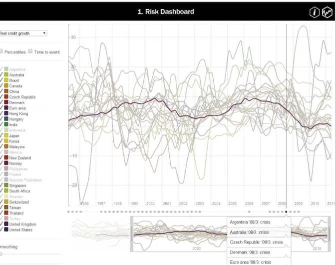
For visualizing the macroprudential data cube through analytical and interactive visualiza-tion, we provide the VisRisk platform with three modules: plots, maps and networks.1 Plots focus on interactive interfaces for representing large amounts of data. While maps provide ana-lytical means for representing the three standard dimensions of a data cube in simple formats, networks aim at visualization of the fourth data cube dimension of interlinkages. While VisRisk enables and is open to the visualization of any data from a macroprudential data cube, the platform is herein illustrated with five web-based interactive visualizations of systemic risk in-dicators and models, of which three make use of analytical visualizations. First, we make use of analytical techniques for data and dimension reduction to explore high-dimensional systemic risk indicators and time-varying networks of linkages. Second, this paper adds interactivity to not only dashboards of standard risk indicators and early-warning models, but also to the analytical applications. The ultimate aim of VisRisk, and this paper at large, is to provide a basis for the use of visualization techniques, especially those including analytical and interactive features, in macroprudential oversight in general and risk communication in particular.
1
The VisRisk platform for interactive and analytical applications can be found here: http://vis.risklab.fi/
“ In the absence of clear guidance from existing analytical frameworks, policy-makers had to place particular reliance on our experience. Judgement and ex-perience inevitably played a key role. [...] But relying on judgement inevitably involves risks. We need macroeconomic and financial models to discipline and structure our judgemental analysis. How should such models evolve?” – Jean-Claude Trichet, President of the ECB, Frankfurt am Main, 18/11/2010
1
Introduction
Macroprudential oversight refers to surveillance and supervision of the financial system as a whole. As can be exemplified by recently founded supervisory bodies with the mandate of safe-guarding financial stability, a system-wide perspective to financial supervision is currently being accepted and implemented as a common objective of governmental authorities and supervisors. To this end, the ESRB in Europe, the FPC in the UK, and the FSOC in the US were founded in the aftermath of the financial instabilities of 2007=2008. Beyond the soar in availability and precision of data, the transition from firm-centric to system-wide supervision imposes obvious data needs when analyzing a large number of entities and their constituents as a whole (see e.g. Flood and Mendelowitz, 2013). As central tasks ought to be timely and accurate measurement of systemic risks, big data and analytical models and tools become a necessity. While analytics might aid in automated modeling, one approach to dealing with complex data and modeling problems is to improve end users’ understanding of them in order to tap into their expertise. As above noted by Jean-Claude Trichet, we need means that support disciplined and structured judgmental analysis based upon policymakers’ experience and domain intelligence. Further, the mandates of macroprudential supervisors have to date been stressing or even limited to com-munication, issuing warnings and giving recommendations, which boils down to an emphasis on broad and effective communication of timely information related to systemic risks.
Financial systems, described by the three pillars of financial intermediaries, markets and infrastructures, have been shown to be recurringly unstable due to limitations related to mar-ket imperfections (de Bandt and Hartmann, 2002; Carletti, 2008). Underlying systemic risk, while having no unanimous definition, has commonly been distinguished into three categories (de Bandt et al., 2009; ECB, 2009): (i) build-up of widespread imbalances, (ii) exogenous ag-gregate shocks, and (iii) spillover and contagion. With the aim of mitigating system-wide risks, macroprudential oversight is commonly comprised into a process, where key tasks include (i) risk identification, (ii) risk assessment, and (iii) policy assessment, implementation and follow-up. As a soft policy intervention, risk communication concerns the overall task of spreading broadly and effectively timely information related to systemic risks, as well as other vulnerabilities con-cerning the financial system and its macro-financial environment. Fortunately, policymakers and regulators have access to a broad toolbox of analytical models to measure and analyze system-wide threats to financial stability. The tasks of these tools can be mapped to the above listed three forms of systemic risk (e.g., ECB (2010)): (i) early warning of the build-up of widespread vulnerabilities and imbalances, (ii) stress-testing the resilience of the financial system to a wide variety of exogenous aggregate shocks, and (iii) modeling contagion and spillover to assess how resilient the financial system is to cross-sectional transmission of financial instability. While the first aids in risk identification, the second and third approaches provide means for risk as-sessment. Yet, this points out a mismatch between the current objectives and needs and the available tools: while a key task is the communication of risks, the toolbox of analytical models lacks a focus on approaches that support human understanding.
The term visualization has a wide meaning and relates to a number of interdisciplinary topics, in particular information visualization and visual analytics. The rationale behind the use of visual representations and their usefulness relates to traits of the human visual system (see, e.g., Ware (2004)). Card et al. (1999) assert visualization as a type of cognitive support
or amplification, which leads to a focus on strengths and weaknesses of human perception. This highlights the importance of principles for designing visuals that meet the demands of the human visual system. Although the computer age has brought visuals, and even the design of them, to the desks of ordinary people, including policymakers, the most influential literature on data graphics design still today dates back to work by Tufte (1983) and Bertin (1983). Rather than an exact theory, Tufte and Bertin provide a set of principles and rules of thumb to follow. Techniques supporting visualization can be divided into two types: graphical representations of data and means for interaction. While the former can be summarized in various categories of visualization techniques, such as per output and data, the latter refer to how the user can interact with or manipulate the displayed data, such as zooming or panning, which often has its basis in one or more graphical displays for enabling more flexibility to explore data. This invokes two questions: 1. (2. how) would tapping into visualization support risk communication in macroprudential oversight?
This paper discusses the role of visualization in macroprudential oversight at large, espe-cially for the purpose of risk communication. Risk communication comprises two tasks. Internal communication concerns spreading information about systemic risks within but at various levels of the organization, such as among divisions, groups or analysts, whereas external communica-tion refers to the task of disseminating informacommunica-tion about systemic risks to the general public. In this paper, we mainly focus on the background and theory of information visualization and visual analytics, as well as techniques provided within these disciplines, as potential means for risk communication. The topic of visualization is in this paper discussed from three viewpoints. First, based upon the needs for internal and external risk communication, we define the task of visualization in macroprudential oversight. Second, we present the so-called macroprudential data cube, by discussing the type of available data for identifying and assessing systemic risk, including their structure and its potential implications for analysis and visualization. Third, we review the current state of the art in visualization techniques applied to the analysis of systemic risk. This provides an overview of which tasks should be supported by visualization and the underlying data to be visualized. Eventually, the discussion boils down to two essential, but to date rare, features for supporting the analysis of big financial data and the communication of risks: analytical visualizations and interactive interfaces.
For visualizing the macroprudential data cube through analytical and interactive visualiza-tion, we provide the VisRisk platform with three modules: plots, maps and networks.2 Plots focus on interactive interfaces for representing large amounts of data, but do not make use of analytical techniques for reducing complexity. While maps provide analytical means for rep-resenting the three standard dimensions of a data cube in simple formats, networks aim at visualization of the fourth data cube dimension of interlinkages. As VisRisk enables and is open to the visualization of any data from a macroprudential data cube, we aim at providing a basis with which systemic risk indicators and models can be widely communicated. It is herein illus-trated with five web-based interactive visualizations of systemic risk indicators and models, of which three make use of analytical visualizations. First, we make use of analytical techniques for data and dimension reduction to explore high-dimensional systemic risk indicators and time-varying networks of linkages. Second, this paper adds interactivity to not only dashboards of standard risk indicators and early-warning models, but also to the analytical applications. The ultimate aim of VisRisk, and this paper at large, is to provide a basis for the use of visualization techniques, especially those including analytical and interactive features, in macroprudential oversight in general and risk communication in particular.
The present paper is organized as follows. While Section 2 discusses macroprudential over-sight and risk communication, Section 3 focuses on information visualization and visual analyt-ics. In Section 4, we present an overview of visualization techniques in risk communication and
2
The VisRisk platform for interactive and analytical applications can be found here: http://vis.risklab.fi/
macroprudential oversight and the macroprudential data cube. Section 5 introduces VisRisk as a general platform for visualizing the macroprudential data cube, and illustrates it with five web-based interactive visualizations of systemic risk indicators and models, of which three make use of analytical visualizations. Section 6 concludes.
2
Macroprudential oversight and risk communication
Since the date when the still ongoing global financial crisis broke out, the notion of a macropru-dential approach to safeguarding financial stability has grown consensus among the academic and policymaking communities alike. Yet, it is by no means a new concept. The Bank for International Settlements (BIS) applied the term to describe a system-wide orientation of reg-ulatory frameworks already in the 1970s, and the term appeared in publicly available material in the mid-1980s (see, e.g., BIS (1986) and Borio (2011)). The series of recently established macroprudential supervisory bodies obviously also motivates understanding and disentangling their specific tasks and functions.
This section attempts to provide a holistic view of a so-called macroprudential oversight process. The starting point ought to be acknowledging the existence of underlying market imper-fections, which might cause systemic risks in the financial system. Then, this section discusses the tasks within the process, and relates the concept of risk communication to macroprudential oversight.
2.1 Market imperfections and systemic risk
The overall need for macroprudential oversight is motivated by the potential for systemic risks that threaten the stability of the financial system. Yet, any form of systemic risk is most often preceded at an early stage by various market imperfections.3 The imperfections, when being re-lated to a financial sector, may lead to significant fragility of not only individual entities, but also the entire system (Carletti, 2008; ECB, 2009).4 de Bandt and Hartmann (2002) relate fragilities in financial systems to three causes: (i) strong information intensity and intertemporal nature of financial contracts and transactions; (ii) balance-sheet structures of financial intermediaries with a high reliance on debts or leverage, and maturity mismatches between assets and liabilities; and (iii) high degree of interconnectedness between financial intermediaries and markets. Thus, the underlying market imperfections may at a later stage propagate as possible systemic risks to financial stability, which supports the role of governments and other supervisory authorities in addressing and monitoring systemic risks.
Whereas the above discussion related to the causes of systemic risk, we have still not defined, and in particular not disentangled, the types of risk that may occur. While there is no consensus on the definition, a number of works have categorized systemic risk into three types (de Bandt et al., 2009; ECB, 2009; Trichet, 2009; ECB, 2010): i) endogenous build-up and unraveling of widespread imbalances; ii) exogenous aggregate shocks; andiii) contagion and spillover.
3
Imperfections in markets may, for instance, take the form of asymmetric and incomplete information, exter-nalities and public-good characteristics and incomplete markets, and are to some extent present in most sectors of the economy.
4
Carletti (2008) relates market imperfections to the financial sector with a number of examples, such as banks being exposed to deposit runs due to the maturity transformation by investing short-term deposits in long-term assets and informational asymmetries between depositors and borrowers, as well as debtholders and firm managers having so-called misaligned principal-agency problems, leading to agents not acting in the best interest of the principal. Likewise, parallels can be drawn between the public good of financial stability and externalities like pollution, as each entity manages its own risks with no need to consider its impact on the system-wide risk as a whole.
The first form of systemic risk refers to the risk that widespread imbalances, which have built up over time, unravel abruptly. The underlying problems are caused by an endogenous build-up of imbalances in one or several parts of a financial system, such as high concentrations of lending in certain parts of the economy or credit booms in general, due to which a shock leading to a repricing of risk may be triggered by even a small event or change in expectations. This resembles Kindleberger’s (1978) and Minsky’s (1982) financial fragility view of a boom-bust credit or asset cycle. Second, systemic risk may also refer to a widespread exogenous aggregate shock that has negative systematic effects on one or many financial intermediaries and markets at the same time. For instance, if banks go bad during recessions, they can be said to be vulnerable to economic downturns. The third form of systemic risk is contagion and spillover, which usually refers to an idiosyncratic problem that spreads in a sequential fashion in the cross section. For instance, a failure of one financial intermediary causing the failure of another financial intermediary given no common risks. These systemic risks set a need for analytical tools and models for financial stability surveillance.
2.2 Analytical tools for financial stability surveillance
The macroprudential approach accentuates the need for a thorough understanding of not only financial entities, be they instruments, economies, markets or institutions, but also their in-terconnections, interlinkages and system-wide importance. For macroprudential oversight, pol-icymakers and supervisors need to have access to a broad toolbox of methods and models to measure and analyze system-wide threats to financial stability. These analytical tools provide means for two types of tasks: (i) early identification of vulnerabilities and risks, as well as their triggers, and (ii) early assessment of transmission channels of and a system’s resilience to shocks, and potential severity of the risk materialization.
The literature, while in many aspects being in its infancy, has provided a variety of tools for financial stability surveillance. Following ECB (2010), we can distinguish the models into three broad analytical approaches that match the identified forms of systemic risks (the addressed risks in parenthesis): (i) early-warning models (build-up of widespread imbalances), (ii) macro stress-testing models (exogenous aggregate shocks), and (iii) contagion and spillover models (contagion and spillover).
First, early-warning models can be used to derive probabilities of impending systemic fi-nancial crises. Second, macro stress-testing models provide means to assess the resilience of the financial system to a wide variety of aggregate shocks. Third, contagion and spillover models can be employed to assess how resilient the financial system is to cross-sectional transmission of financial instability.
In addition to models for signaling systemic risks at an early stage, the literature has provided a large set of coincident indicators that measure the current state of instability in the financial system. While these serve as means to measure the contemporaneous level of systemic risk, and thus may be used to identify and signal heightened stress, they are not designed to have predictive capabilities. This is not the core focus of this paper, but it is worth noting that ex post measures may serve a function in communicating the occurrence of unusual events to resolve fear and uncertainty, e.g., after the so-called flash crash of May 6, 2010 in the United States (US) (Bisias et al., 2012). In the sequel of this section, we focus on the three analytical approaches to derive tools for early identification and assessment of risks, as well as their precise use in macroprudential oversight.
2.3 The macroprudential oversight process
The above described market imperfections, and thereby caused systemic risks, are a premise for macroprudential oversight. Accordingly, the above three analytical approaches aim at
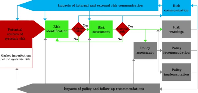
sig-Risk
identification Vulnera-bility assessmentRisk Material risk
Policy assessment Risk warnings Yes Yes No No
Impacts of policy and follow-up recommendations Market imperfections
behind systemic risk Potential sources of systemic risk
Impacts of internal and external risk communication Risk communication
Policy implementation
Policy recommendation
Notes: The figure illustrates the macroprudential oversight process. Thered componentsrepresent risks and vulnerabilities and the green components represent the need for risk identification and assessment, gray componentsrepresent policy assessment and implementation, as well as risk warnings, policy recommendations and to follow-up, andblue components
represent overall risk communication. The figure is adapted from ECB (2010).
Figure 1: The macroprudential oversight process.
naling these systemic risks at an early stage. In terms of a process, Figure 1 puts forward the steps of the process that a macroprudential supervisory body follows.5 As described in ECB (2010), macroprudential oversight can be related to three steps: i) risk identification, ii) risk assessment, and iii) policy assessment, implementation and follow-up, as well as giving risk warnings and policy recommendations. The process in Figure 1 deviates from that in ECB (2010) by explicitly introducing a fourth task of risk communication and its feedback loop. In the figure, red components represent risks and vulnerabilities, green components represent the need for risk identification and assessment, gray components represent policy assessment and implementation, as well as risk warnings, policy recommendations and follow-up, andblue
com-ponents represent overall risk communication. Moreover, following Bundesbank (2013), we can
distinguish the final instruments into different levels of organization: i) soft (communication), intermediate (warnings and recommendations) and hard (interventions).
In the first step of the supervisory process, the key focus is on identifying risks to stability and potential sources of vulnerability. The vulnerabilities and risks could exist in any of the three pillars of the financial system: financial intermediaries, financial markets and financial infrastructure. The necessary analytical tools to identify possible risks, vulnerabilities and trig-gers come from the set of early-warning models and indicators, combined with the use of market intelligence, and expert judgment and experience. This involves ranking risks and vulnerabilities as per intensity, as well as for assigning probabilities to specific shocks or future systemic events. In the second step of the process, the rankings and probabilities may be used to assess the identified risks. Beyond market intelligence, as well as expert judgment and experience, risk assessment makes use of analytical tools mainly from the set of macro stress-testing models and contagion models. In macro stress-testing, simulations of most plausible risk scenarios show the degree of impact severity on the overall financial system, as well as its components. Contagion models, on the other hand, might be used through counterfactual simulations to assess the impact
5
A macroprudential supervisory body is an institution tasked with macroprudential oversight of the financial system and the mandate of safeguarding financial stability. Examples are the European Systemic Risk Board in Europe, the Financial Policy Committee in the United Kingdom (UK), and the Financial Stability Oversight Council in the US.
of specific failures on the entire financial system and individual institutions. The first and the second step of the process should not only provide a list of risks ordered according to possible severity, but also contain their materialization probabilities, losses given their materialization, and real losses in output and welfare, as well as their possible systemic impact. Hence, these two initial steps in the process aim at early risk identification and assessment and provide means for safeguarding financial stability.
Thethird step of the process involves the assessment, recommendation and implementation of policy actions as early preventive measures. Based upon the identified and assessed risks, a macroprudential supervisory body can consider giving a wide variety of risk warnings and rec-ommendations for other parties to use policy instruments, as well as implementations of policies given the instruments at hand. To steer their decisions, the policy assessment step can make use of the same analytical tools used for risk identification and assessment. Likewise, analytical tools may support assessment prior to issuing risk warnings and giving policy recommendations. While the use of policy tools is beyond the mandate of some macroprudential supervisory bodies, actions tailored to the needs of a system-wide orientation are becoming a key part of financial regulation and supervision.6 As illustrated in Figure 1, policies have an impact on not only the assessment of policy and identification and assessment of risks, but obviously also directly on market imperfections and the accumulation of systemic risks.
The fourth step, while not always being the last task to be performed, concerns risk com-munication, and its own feedback loop, which is a central part of this paper and is thus the topic of the following subsection.
2.4 Risk communication
The above discussion untangled overall risk communication as a separate step in the macro-prudential oversight process. Although the tasks of overall risk communication is inherently different, a integral part of warnings, and policy recommendations and implementations also makes use of the communication channel, in which the overall task concerns disseminating in-formation. The above subsection positioned risk communication within the macroprudential oversight process, yet did not provide a detailed discussion. This subsection brings up the role and possible forms of risk communication.
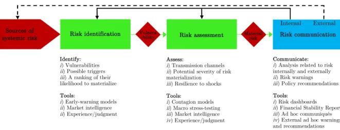
Risk communication describes the task of disseminating broadly and effectively timely in-formation related to systemic risks and other vulnerabilities of the pillars of the financial system. Moreover, macro-financial imbalances and risks at the sector level (i.e., household, corporate, foreign and government). From the viewpoint of risk communication of a macroprudential su-pervisory body, Figure 2 simplifies the macroprudential oversight process into three key steps: risk identification, risk assessment and risk communication. Hence, it concentrates on the soft type of intervention. Following the discussion thus far, the figure also summarizes the key tasks and available tools in each of the process steps. Building upon Figure 1, where risk communi-cation was shown to feed into both underlying systemic risks and the tasks of risk identificommuni-cation and assessment, Figure 2 disentangles the two types of feedback depending on whether one communicates internally or externally. Internal communication concerns spreading information about systemic risks within, but at various levels of, the organization, such as among divisions, groups or analysts, whereas external communication refers to the task of disseminating infor-mation about systemic risks to the general public. As shown in Figure 1, it is worth to note
6
For instance, as interest rate policy may be a too blunt and powerful tool with material impact on other parts of the economy, the policies could take the form of tighter standards – e.g., requirements on capital adequacy, provisioning, leverage ratios, and liquidity management – for individual financial institutions with larger contribu-tions to systemic risk and calibrated to address common exposures and joint failures. Macroprudential regulation and tools may also be used for accumulating buffers or reserves in good economic times to be used during worse times.
Risk identification Vulnera -bility
Identify:
i) Vulnerabilities
ii) Possible triggers
iii) A ranking of their
likelihood to materialize Tools: i) Early-warning models ii) Market intelligence ii) Experience/judgment Assess: i) Transmission channels
ii) Potential severity of risk
materialization
iii) Resilience to shocks
Tools:
i) Contagion models
ii) Macro stress-testing
iii) Market intelligence
iv) Experience/judgment
Sources of
systemic risk Risk assessment Material risk
Communicate:
i) Analysis related to risk
internally and externally
ii) Risk warnings
iii) Policy recommendations
Tools:
i) Risk dashboards
ii) Financial Stability Reports
iii) Ad hoc communiqués
iv) External ad hoc warnings
and recommendations
Risk communication Internal External
Figure 2: Risk communication in macroprudential oversight.
that the information to be communicated might derive directly from the risk identification or assessment steps or then feed back only after recommendations, warnings and implementations in step three.
Internal communication refers to a range of activities at different levels of the organization. Despite that communication of macroprudential supervisors like central banks commonly refers to disseminating information externally, Mohan (2009) stresses that they, particularly policy and research wings, ought to pay attention to and play a pro-active role in the dissemination and effective communication of policy and analysis to internal staff. Borrowing from Mitchell (2001), this necessitates to“sell the brand inside”. This is further exemplified by Mohan, as ”internal communication could act as a conduit for external communication”, where staff oftentimes play a key role as ambassadors of the institution.
We relate this to three levels of organization. At the lowest level, it relates to the use of means for communicating information to support individual analysts, which in the information age mainly relates to human-computer interaction (see, e.g., Dix et al. (2004)). In this case, communication relates to the interaction between a computer and interface with an analyst or policymaker overall. The second level of organization concerns the task of communicating among and within smaller groups, teams or divisions. Within the limits of a small, special-ized audience, this involves not only supporting knowledge crystallization, but also supporting the dissemination of knowledge. While the former relates to communication within groups of analysts and policymakers, the latter concerns communicating the results or insights of one member or team to another. At the final, third level of an organization, communication relates to disseminating the information gathered within the specialized teams, groups or divisions to high-level management or the rest of the organization. As the audience becomes broader, the means for disseminating information, as well as the information itself, need also to be of a more general nature for the message to be digestible. At each of these levels, while the means for internal communication are various communiqu´es and announcements, a policymaker can tap into the tools and expertise, such as analytical models, market intelligence and expert judgment and experience, available at the supervisory body.
Beyond stressing the importance of it, Mohan (2009) pinpoints four suggestions that sup-port internal communication: (i) arranging internal seminars in all regional offices and training colleges after external policy announcements and report publications (ii) the publication of FAQs (frequently asked questions) on the internet/intranet on each policy matter, as well as the provision of educational resources, (iii) the publication of a working paper series with a clear disclaimer that ascribes research findings and overall opinions to the authors, and (iv) internal notes of various divisions should be made available internally, as they are of immense analytical value.
External communication refers to conveying information about systemic risks to the general public, including other authorities with responsibility for financial stability and overall financial-market participants, such as laymen, professional investors and financial intermediaries. An obvious difference in relation to internal communication relates to a comparatively larger het-erogeneity in the audience. Yet, while a voluminous literature supports internal communication within organizations, one needs to look to a different direction in order to answer why a macro-prudential supervisory body ought to communicate risk externally. Paraphrasing the role of communication in monetary policy, Born et al. (2013) argue that communication aims at (i) improving credibility of central banks (relating communication to transparency and reputational purposes), (ii) enhancing effectiveness of policy (relating communication to financial stability contributions), and (iii) to make central banks accountable (relating to explicit communication of identified risks and vulnerabilities).
By means of an example, a key means for such communication is through quarterly or biannual Financial Stability Reports, a recent phenomenon that has quickly spread to a large number of central banks. With the aim of understanding the overall purpose of communication, a survey among central bankers by Oosterloo and de Haan (2004) pinpoints three main reasons for publishing Financial Stability Reports: (i) to contribute to overall financial stability, (ii) to increase the transparency and accountability, and (iii) to strengthen co-operation between authorities with financial stability tasks. At the same time, Allen et al. (2004) were consulted to study the effectiveness of communication related to financial stability at Sveriges Riksbank, the first central bank to publish a Financial Stability Report in 1997. Their external evaluation focused on Financial Stability Reports in 2003 and overall analytical framework and other work on financial stability. This resulted in ten recommendations, such as having and making ob-jectives explicit and precise in the Financial Stability Reports, also covering other sectors than banks, such as the insurance sector, and making charts and underlying data easily download-able. Although the case study focuses solely on the Riksbank, its conclusion of ”the Riksbank is doing a very good job in fulfilling its financial stability responsibilities”feels justified, as they were indeed forerunners in the tasks at that point in time. Further, Cih´ak (2006) systematically reviews Financial Stability Reports, and documents a considerable increase in sophistication over time and improvements in not only their scope, but also the analytical tools with which analysis is conducted.
In a recent study focusing on communication, the overall finding by Born et al. (2013) was that Financial Stability Reports, as well as ad hoc speeches and interviews, affect financial markets by creating news (i.e., co-occurring jumps in stock returns) and reducing noise (i.e., decreasing market volatility). Further, Ekholm (2012) – the Deputy Governor of the Riksbank – notes that there is a strive for not only openness and transparency, but also clear external communication. In particular, Ekholm notes that during times of crisis ”a “negative” but reliable announcement can [...] be better for confidence than a “positive” but uncertain announcement”. Along these lines, the means for external communication concern the use of not only Financial Stability Reports published at regular intervals, but also risk warnings and recommendations communicated through various ad hoc public announcements. A recent addition to the toolbox of communication approaches is the publication of a risk dashboard, which essentially involves developing and publishing a set of indicators to identify and measure systemic risk.7 Like in internal communication, a policymaker communicating externally also ought to tap into not only analytical models and tools at hand, but also market intelligence and expert judgment and experience when representing and judging the current state of risks and vulnerabilities. The latter becomes an obvious input when drafting any types of textual policy communiqu´es.
Thus far, we have taken the analytical models as given – both those used in risk identification and assessment and those used in risk communication. Yet, whereas analytical tools have clearly
7
While the risk dashboard of the European Systemic Risk Board has been published since September 2012, the European Banking Authority published its first risk dashboard in October 2013.
been designed to address the tasks in risk identification and assessment, they are in no, or little, explicit focus in the task of risk communication. In particular, there is a clear lack of integration of tools for the common objective of a macroprudential supervisory body, whose one key focus is to communicate identified and assessed risks. This paper asks the question: is there something to be gained by tapping into the fields of information visualization and visual analytics when communicating systemic risk?
3
Information visualization and visual analytics
The visualization of complex data has lately emerged as one of the key aids to support ex-ploratory data analysis (EDA), though the task of EDA dates back to Tukey’s early work in the 1970s (e.g., Tukey (1977)). Whereas advanced visual representations of data are common in a wide range of disciplines and domains, the use of these types of representations are rare in the communication of macroprudential bodies or supervisory authorities at large. The key aim of this section is to discuss the rationale behind the usefulness of visual representations, how visuals should be designed to meet the demands of the human visual system and categorizations of approaches to visualization. At a higher level, this section covers the discipline of information visualization – and the more recent derivative, visual analytics – in order to support a later discussion of their merits in macroprudential oversight.
Information visualization as a discipline has its origin in the fields of human-computer interaction, computer science, graphics and visual design. A more precise definition of it is “the use of computer-supported, interactive, visual representations of abstract data to amplify cognition”(Card et al., 1999), which highlights improving human understanding of data with graphical presentations or graphics. Tools for information visualization are mainly and best applied for EDA tasks, and most commonly aim at browsing a large space of information. While being in a highly common and general setting, Lin (1997) lists browsing to be useful when:
1. there is a good underlying structure and when related items can be located close by; 2. users are unfamiliar with the contents of the collection;
3. users have little understanding of the organization of a system and prefer to use a method of exploration with a low cognitive load;
4. users have difficulty in articulating or verbalizing the specific information need; and 5. users search for information that is easier to recognize than describe.
The above list relates to situations when visualization is useful, yet we still need to discuss the el-ements of information visualization in-depth. The rest of this section focuses on three subtopics of information visualization – human perception and cognition, data graphics design and vi-sualization techniques – in order to end with a discussion of visual analytics, which combines analytical models with visual representations.
3.1 Human perception and cognition
Much attention is given to the design of visual representations. While being important, a dis-cussion about information visualization cannot start from the colors, shapes and other features used for representing data. Instead, a starting point to visual communication ought to be to understand and acknowledge the capabilities and limits of the human information and visual system. The visual system comprises the human eye and brain, and can be seen as an efficient parallel processor with advanced pattern recognition capabilities (see, e.g., Ware (2004)). The focus of human perception is the understanding of sensory information, where the most impor-tant form is visual perception. The final intelligence amplification of information visualization
can be viewed as a type of cognitive support. The mechanisms of cognitive support are, how-ever, multiple. Hence, visualization tools should be targeted to exploit advantages of human perception.
Mostly, arguments about the properties and perception capabilities of the human visual system rely on two grounds: i) information theory (Shannon and Weaver, 1963), and ii) psy-chological findings. Information theory states that the visual canal is best suited to carry infor-mation to the brain as it is the sense that has the largest bandwidth. Ware (2004) asserts that there are two main psychological theories for explaining how to use vision to perceive various features and shapes: preattentive processing theory (Triesman, 1985) and gestalt theory (Koffa, 1935). Prior to focused attention, preattentive processing theory relates to simple visual features that can be perceived rapidly and accurately and processed effectively at the low level of the visual system. Whereas more complex visual features require a much longer process of sequen-tial scanning, preattentive processing is useful in information visualization as it enables rapid dissemination of the most relevant visual queries through the use of suitable visual features, such as line orientation, line length or width, closure, curvature and color (Fekete et al., 2008). At a higher cognitive level, gestalt theory asserts that our brain and visual system follow a number of principles when attempting to interpret and comprehend visuals. Ware (2004) summarizes the principles as follows:
Proximity: Items close together are perceptually grouped together.
Similarity: Elements of similar form tend to be grouped together.
Continuity: Connected or continuous visual elements tend to be grouped.
Symmetry: Symmetrical elements are perceived as belonging together.
Closure: Closed contours tend to be seen as objects.
Relative size: Smaller components of a pattern tend to be perceived as objects.
The principles of gestalt theory can easily be related to some more practical concepts. For instance, most projection methods, when aiming at visualizing data, may be seen to relate to the proximity principle, as they locate high-dimensional data with high proximity close to each other on a low-dimensional display, whereas others are pushed far away. Likewise, a time trajectory may be paired with continuity. More related to the cognition of visualization, Fekete et al. (2008) relate the core benefit of visuals to their functioning as a frame of reference or temporary storage for human cognitive processes. They assert that visuals are external cognition aids in that they augment human memory, and thus enable allocating a larger working set for thinking and analysis. In the above stated definition of information visualization by Card et al. (1999), visuals are presented as a means to “amplify cognition”. The same authors also list a number of ways how well-perceived visuals could amplify cognition:
1. by increasing available memory and processing resources; 2. by reducing the search for information;
3. by enhancing the detection of patterns and enabling perceptual inference operations; 4. by enabling and aiding the use of perceptual attention mechanisms for monitoring; and 5. by encoding the information in an interactive medium.
Not to disturb legibility of this section, examples of the five ways to amplify cognition are given Appendix A.1. Yet, while visualization provides ample means to amplify cognition, it is also worth looking into matters concerning human perception and cognition that may hinder, disturb or otherwise negatively affect how visualizations are read. An essential part of visualization is to take into account the deficiencies and limitations of human perception. Again, to keep this section shorter, more detailed exemplifications are provided in Appendix A.2. Accordingly, an
understanding of the functioning of the human visual system aids in producing effective displays of information, where emphasis is on presented data such that the patterns are likely to be correctly perceived.
3.2 Data graphics design
Based upon features of the human visual system, and avenues for supporting perception and cognition, the literature on data graphics design has its focus on the principles for visual rep-resentations of data. Herein, the focus is on the early, yet still today influential, work by Tufte (1983) and Bertin (1983). Their works, while being principles for graphics design, are also valid for overall computer-based visualization. Tufte’s set of principles are called a theory of data graphics, whereas Bertin’s work is most often denoted a framework of the planar and retinal variables. Yet, rather than an exact theory, Tufte and Bertin provide a set of rules of thumb to follow.
The following overview is included to provide concrete guidelines, in addition to the higher-level discussion of perception and cognition. Herein, we will only focus on the key components of frameworks and theories by Bertin and Tufte. We start from Bertin’s (1983) framework called the Properties of the Graphic System, which consists of two planar and six retinal variables. The two planar variables are the x and y dimensions of a visual, whereas the six retinal variables describe the following visual marks on the plane: size, value, texture, color, orientation and shape. The eight variables can be categorized according to the following levels of organization, or so-called perceptual properties:
1. Associative (≡): If elements can be isolated as belonging to the same category, but still do not affect visibility of other variables and can be ignored with no effort.
2. Selective (6=): If elements can immediately and effortlessly be grouped into a category, and formed into families, differentiated by this variable, whereas the grouping cannot be ignored.
3. Ordered (O): If elements can perceptually be ordinally ranked based upon one visually varying characteristic.
4. Quantitative(Q): If the degree of variation between elements can perceptually be quan-tified based upon one visually varying characteristic.
When having an understanding of the four levels of organization, we can return to Bertin’s (1983) eight visual variables. We refer to Appendix A.3 for an in-depth discussion of the variables, as we herein only provide a summary of the variable properties. Bertin describes the plane, and its two dimensions (x, y), as the richest variables. They fulfill the criteria for all levels of organization by being associative (≡), selective (6=), ordered (O) and quantitative (Q). The retinal variables, on the other hand, are always positioned on the plane, and can make use of three types of implantation: a point, line, or area. Their perceptual properties are as follows: size (6=,O,Q), value (6=,O), texture (≡,6=,O), color (≡,6=), orientation (≡,6=), and shape (≡).
A complement to Bertin’s framework is the Theory of Data Graphics by Tufte (1983), which consists of a large number of guidelines for designing data graphics. The two key, broad principles are graphical excellence and graphical integrity.
Tufte (1983) defines graphical excellence as a graphic that ”gives to the viewer the greatest number of ideas in the shortest time with the least ink in the smallest space”. The principle of graphical excellence summarizes a number of his guidelines that encourage graphical clarity, precision, and efficiency: i) avoid distortions of what the data have to say; ii) aid in thinking about the information rather than the design; iii) encourage the eye to compare the data; iv) make large data sets coherent; v) present a large number of data in a small space; vi) reveal
data at multiple levels of detail ranging from a broad overview to fine detail; vii) and closely integrate statistical and verbal descriptions of the data. The second of Tufte’s (1983) principles, graphical integrity, relates to telling the truth about data. To follow this principle, Tufte provides six key guidelines: i) visual representations of numbers should be directly proportional to the quantities which the visuals represent; ii) clear and detailed labeling should be used to avoid ambiguity;iii) show data variation, not design variation;iv) deflate and standardize units when dealing with monetary values; v) the number of dimensions depicted should not exceed the number of dimensions in data; and vi) data should not be showed out of context. The overall aim of principles related to graphical integrity is to avoid deception and misinterpretation. This provides a brief overview of Tufte’s rules of thumb, whereas interested readers are referred to Appendix A.3 as well as the original sources.
Bertin’s and Tufte’s principles provide a guiding set of rules of thumb to follow when span-ning the space of two-dimensional visualizations. Yet, visualizations, not the least interactive visualizations, go beyond a static two-dimensional space by including additional visual variables, such as depth and time. This highlights requirements on the visualization techniques and tools, where interaction is essential.
3.3 Visualization techniques and interfaces
The literature has provided a long list of techniques for creating visual representations and interfaces, with the aim of supporting human perception and cognition. This subsection focuses mainly on a rough overview, as well as a brief and simple taxonomy, of methods, rather than a detailed survey. Obviously, a key issue of information visualization is what formats and features the methods will help to organize and visualize, as well as how that relates to the use of the capabilities of the human visual system. Techniques supporting information visualization can be divided into two types: graphical representations of data and interaction techniques. The former type refers to the visual form in which the data or model is displayed, such as standard bar and line charts. Yet, visualization may often refer to the use of manipulable graphical displays of data. The latter type of techniques refer to how the user can interact with or manipulate the graphical displays, such as zooming or panning. These oftentimes have their basis in one or more graphical displays such that they enable more freedom and flexibility to explore the data. From the viewpoint of the underlying data, rather than the formats of visual displays, Zhang et al. (2012) categorize visualization techniques into four groups: numerical data, textual data, geo-related data and network data. Yet, a categorization of visualization techniques as per the types of data does not differentiate all possibilities of techniques. While being some years old, Keim and Kriegel (1996) provide a five-category grouping of techniques by the visualization output that still today holds merit: geometric, icon-based, pixel-oriented, hierarchical, and graph-based techniques. In addition, Keim and Kriegel also illustrate the existence of a wide range of hybrids that make use of multiple categories. While a description of each category and examples of techniques can be found in Appendix A.4, it only highlights the large number and wide variety of available techniques. The categorization of visualizations as per data and display, while highlighting challenges in choosing the correct technique for the data and the task at hand, provides guidance in the choice. For instance, one obvious factor to define the nature of the chosen visualization technique is the properties of the data, such as the form of data, dimensionality of data, data structures and size of data. Further, another factor is the expected output and purpose of use, such as predictive vs. exploratory, temporal vs. cross-sectional, and univariate vs. multivariate analysis and similarity vs. dissimilarity matching, as well as other purposes related to a focus on geo-spatial visualization and network relationships, for instance. While there obviously is no one way to choose the correct technique, considering the two dimensions of data and display, as well as other restrictions, demands and needs for the task, provides an adequate basis.
Given a technique, a critical factor of information visualization is, however, the possibility to interact with the visuals. A common guideline for interactions with visualizations is the visual information seeking mantra (Shneiderman, 1996): ”Overview first, zoom and filter, then details-on-demand”. Whereas Shneiderman (1996) characterizes the mantra with seven abstract tasks, we focus only on the following four explicitly mentioned ones: First, a user should gain an overview of the entire collection through a high-level representation. Second, users should have the possibility tozoom in on a portion of items that are of particular interest. Third, there should exist the possibility to filter out or to eliminate uninteresting and unwanted items, such as allowing users to specify which items to display. Fourth, the user should have the option to select an item or group of items to get further details-on-demand, such as clicking a group or individual items to browse descriptive information.
This provides a starting point to data visualization and user interaction, but does still not address the role of analytical techniques in visualization. The next step is to combine graphical representations of data and interaction techniques with analytical methods.
3.4 Visual analytics
A recent, rapidly growing discipline is that of visual analytics. By adding analytics to the ingredients of information visualization, we end up with the original definition of visual analytics (Thomas and Cook, 2005): ”the science of analytical reasoning facilitated by interactive visual interfaces”. Hence, the field of visual analytics has strong roots in information visualization. Likewise, visual analytics is obviously strongly related to overall data analytics. The term visual data mining descends from the integration of the user in the data mining (or analytics) process through visualization techniques and interaction capabilities (see, e.g., Keim (2001)). This has taken visual analytics to be applied in areas with challenging problems that were unsolvable using standalone automatic or visual analysis (see, e.g., Keim et al. (2009)). In particular, while automated computational processing enables scaling to larger and more challenging tasks, humans exhibit traits that enable a deeper understanding (Risch et al., 2008). This highlights the importance of coupling the strengths of computational and human information processing. When also including the interaction with analytical parameters, visual analytics is not only helpful in applications involving large, complex data, but also those involving complex analytical processes requiring monitoring and interaction.
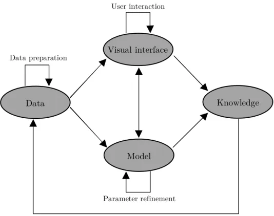
Since we derive visual analytics from three above presented concepts – graphical represen-tations of data, interaction techniques and analytical techniques – there is no need to repeat the discussion of each component. Further, the above presented information seeking mantra only mentions visualization, yet does not integrate it with analytics. Keim et al. (2006) propose com-bining an analytics process and the information seeking mantra for a visual analytics mantra: ”Analyze first, show the important, zoom, filter and analyze further, details on demand”. The authors exemplify the visual analytics mantra with analysis of large network security data. As graphical representations of raw data is infeasible and seldom reveals deep insights, the data need to first be analyzed, such as computing changes and intrusion detection analysis. Then, the outcome of the automated analysis is visualized. Out of the displayed results, the user filters out and zooms in to choose a suspicious subset of all recorded intrusion incidents for further, more careful analysis. Thus, the mantra involves automated analysis before and after the use of interactive visual representations. Following the mantra, the visual analytics process discussed in Keim et al. (2010) is presented in Figure 3. The key steps in the process are data preparation, visual and automatic analysis, and knowledge consolidation. After the step of data preprocessing and transformations, the user selects between visual or automatic analysis methods. The user might prefer to start from whichever of the two tasks, and might then iterate multiple times in between the two components of data visualization and interaction and automatic analysis. Finally, after alternating between visual and automatic methods, the thus far gained knowledge
Data preparation Feedback loop Parameter refinement User interaction Knowledge Data Model Visual interface
Notes: The figure represents the visual analytics process. The figure is adapted from Keim et al. (2010).
Figure 3: Visual analytics process.
is not only gathered, but also transferred through a feedback loop to support future analysis. To be more general, the viewpoint we take on visual analytics relates more to human-computer cooperation. Relying on data as an input, this concerns the combination of various forms of computational and human processing, in order to support the knowledge crystallization process. Beyond aids for visualization and interaction, which support the development of a mental model, this includes advanced analytical techniques as a means to rigorous formal models. It is the interplay between formal and mental models that is the basis for knowledge creation, including tasks ranging from sensemaking to reasoning to decisionmaking.
4
Visualization in macroprudential oversight
The discussion thus far has concerned macroprudential oversight, in particular the role of risk communication, and the visualization of data, in particular the fields of information visualization and visual analytics. It is obvious that what follows now is their coupling: how can visualization be used to support macroprudential oversight in general and risk communication in particular?
This section starts by defining the task of visualization in internal and external risk com-munication. Then, we turn to a discussion about the type of available data for measuring and assessing systemic risk in macroprudential oversight. Finally, we relate the above discussed top-ics in visualization to the tasks of macroprudential oversight, including current use of various categories of visualizations as per the three types of systemic risk models.
4.1 Visual risk communication
Data visualization can serve multiple purposes in macroprudential oversight overall and risk communication in particular. Despite a range of different purposes of use, visual representations
can generally be classified to serve the purpose of communicating information to two audiences: i) internal andii) external.
The purpose of use in internal communication relates to enhancing the understanding of policymakers on various levels. One obvious task is to support analysts themselves, and within other groups of active participants in the process of collecting data and deriving indicators and analytical models. This particularly concerns human-computer interaction, as visual interfaces are used as interactive tools to better understand complex phenomena with no one known mes-sage to be communicated. Whereas the more common setting is likely to involve collecting data and deriving indicators, which could be supported by information visualization, there is also a focus on analytical approaches and understanding derived models, which points more towards visual analytics. This provides input to two purposes: data analysis and decisionmaking. An essential part of data analysis, particularly predictive analytics, involves data understanding and preparation, which indeed benefits from the use of visual interactive interfaces. Likewise, visu-alizing the output of data analysis provides ample means to support in making better decisions. This provides a range of internal communication tasks.
Beyond supporting individuals, one may want to communicate to other involved parties, for which visuals would be used to communicate a particular message or result to entire divisions, the the management and even at the level of the entire organization. At the lower level, the key task is to provide means for interaction with visuals in order to amplify cognition, which supports a better understanding and modeling of the task at hand. As above noted, the case of data analysis by low-level analysts is a standard setting, and mainly involves the task of human-computer interaction. In the context of low-level internal communication of systemic risk modeling, Flood and Mendelowitz (2013) note that data exploration is an area where visualization tools can make a major contribution. They point to the fact that certain tasks of classification, analysis and triage can be automated, whereas many require a human analyst, such as the difficulty to train a well-performing machine to analyze anomalous financial market activity. This follows the very definition of visual analytics. At the higher level, the focus is more on reporting and presentation of information by means of visuals. An example could be the dissemination of identified risks by a risk identification division for further analysis at a risk assessment division, or even to the board or president of an organization. Moreover, disseminating results of analytical models within and among divisions provides scrutiny, which is likely to either improve model credibility or quality. Thus, to sum up, a major concern is how results of the risk identification and assessment tasks are communicated to a wide range of stakeholders in easily understandable formats, with the ultimate aim of achieving transparency and accountability at an internal level.
A possible criticism is that visual inspection of complex data leaves room for human judg-ment, particularly when used for the support of decisionmaking. Contrary to the concept of economic ”rationality”, human adjustment is asserted to make visual analysis prone to a so-called personal forecast bias, which has been associated with traits like prejudice, undue conservatism and unfounded optimism, as among others postulated by Armstrong (1985): ”Don’t trust your common sense.” Yet, it is more than common sense that every policy decision relies at least partly on judgment, which might or might not be biased. And it is also worth noting that the decisions are not made by statistical models, but rather by humans, who are also eventually accountable for them. A number of works have, however, shown that judgmental adjustments to macroeconomic model-based forecasts improve accuracy more often than not. For instance, McNees (1990) shows that judgmental adjustments to macroeconomic forecasts resulted in a 15% improvement in accuracy.
On a more general note, which points towards all levels of organization, Mohan (2009) suggests that we can do much more to improve internal communication due to ”the increasing availability of electronic communication at low cost”. Mohan further stresses the importance of innovative ways as means to accomplish this, as the time of management is unavoidably limited. Turning to relations to Information Visualization and Visual Analytics, both can be seen as
supportive means for internal communication. While the former supports spreading knowledge, the latter has a focus better aligned with creating knowledge.
External communication, on the other hand, refers to conveying information to other au-thorities with responsibility for financial stability and overall financial-market participants, such as laymen, professional investors and financial intermediaries. So, how do visual means aid in the task? Along the lines of the conclusions in Born et al. (2013), even though they rely on effects of mainly textual communication, providing improved means for communication is expected to increase effectivity and certainty of financial markets, particularly through adjustments in stock returns (i.e., creating news) and reductions in market volatility (i.e., reducing noise). Whereas this mainly relates to communication of readily processed and finalized data products, such as on the higher levels of internal communication, it obviously is a comparatively more challenging task due to the large heterogeneity in the audience.
A direct example of such communication is Financial Stability Reports, which indeed can, and already to some extent do, make use of visual representations to communicate the state of financial stability. Relating to the study of the Riksbank’s financial stability work by Allen et al. (2004), the last exemplified recommendation highlighted the importance of providing the underlying data and making charts easily downloadable. Beyond transparent data and visuals, the discussion also stresses overall guidelines in presenting data in a graphical fashion and overall communication through visuals. Most importantly, the authors highlight that Financial Stability Reports do and should contain a wealth of data and indicators, the data ought to be presented through graphical means and the graphical means ought to be presented in an easily accessible and understandable fashion, which is not ”too busy”. This somewhat paradoxical conclusion may also be seen as a call for interaction techniques, with which large amounts of data can be explored but filtered in ways that support understanding.
The most common representation of multidimensional data, yet not interactive, is based upon work by International Monetary Fund (IMF) staff on the Global Financial Stability Map (GFSM) (Dattels et al., 2010), which has sought to disentangle the sources of risks by a mapping of six composite indices with a radar-chart visualization. The aim of the GFSM coincide well with those of external risk communication: ”a summary tool for communicating changes in the risks and conditions [...] in a graphical manner [...] to improve the understanding of risks and conditions [...] and ultimately to warn policymakers and market participants about the risks of inaction.” Relating to the use of judgment, the GFSM not only leaves it to the eyes of the beholder, but goes even further by making use of judgment and technical adjustment to the data prior to visualization. Again, one key task is to achieve transparency and accountability, but obviously this time at an external level. To relate to Information Visualization and Visual Analytics, the task of external communication clearly focuses on spreading rather than creating knowledge, and is hence better aligned with the former approach to visualization.
4.2 Macroprudential data
To arrive at the data used for macroprudential oversight, we need to recall that Section 2.2 related analytical tools in macroprudential oversight to risk identification and assessment. Along these lines, Borio (2009) illustrates how a macroprudential approach to financial regulation and supervision is best thought of as consisting of two respective dimensions: the time and cross-sectional dimensions. First, the time dimension refers to how systemic risk evolves over time and relates to the procyclicality of the financial system. Second, the cross-sectional dimension refers to how systemic risk is distributed in the financial system at a given point in time and relates to common exposures across financial intermediaries and the systemic risk contribution of each institution. This relates data needs to entities and time. Moreover, early-warning exercises most often also make use of a wide range of indicators, measuring various dimensions of risks, vulnerabilities and imbalances. In particular, macroprudential data can be related to