Virginia Commonwealth University Virginia Commonwealth University
VCU Scholars Compass
VCU Scholars Compass
Theses and Dissertations Graduate School
2017
Big Data Visualization Platform for Mixed Reality
Big Data Visualization Platform for Mixed Reality
Aliakbar PanahiVirginia Commonwealth University
Follow this and additional works at: https://scholarscompass.vcu.edu/etd
Part of the Graphics and Human Computer Interfaces Commons, and the Other Computer Sciences Commons
© Aliakbar Panahi
Downloaded from Downloaded from
https://scholarscompass.vcu.edu/etd/5198
c
Aliakbar Panahi, December 2017
BIG DATA VISUALIZATION PLATFORM FOR MIXED REALITY
A thesis submitted in partial fulfillment of the requirements for the degree of Master of Science in Computer Science at Virginia Commonwealth University.
by
ALIAKBAR PANAHI
B.Sc. in Mechanical Engineering - 2006 to 2012
Director: Dayanjan S. Wijesinghe,
Associate Professor, Department of School of Pharmacy
Virginia Commonwewalth University Richmond, Virginia
Acknowledgements
I would like to thank Dr. Dayanjan S. Wijesinghe for all of his continuous support during doing this project. It was an honor to work under his supervision and have him as my advisor. My sincere thanks also goes to Dr. Tom Arodz for his motivation, and immense knowledge. I also would like to thank Vasco for his early work in the the development of functional DTI 4D images. I would also like to thank my family for supporting me spiritually throughout my life. This journey would not have been possible without the support of my family, professors and mentors, and friends.
TABLE OF CONTENTS Chapter Page Acknowledgements . . . i Table of Contents . . . ii List of Tables . . . iv List of Figures . . . v Abstract . . . ix 1 Introduction . . . 1
1.1 Introduction to big data visualization problem . . . 1
1.2 Contributions . . . 1
2 Background . . . 3
2.1 Big data . . . 3
2.2 Promise of Mixed Reality Data Visualization for Current Chal-lenges in Big Data Analysis and Interpretation? . . . 3
2.3 Use of Graph Visualization for Biological Data . . . 4
2.3.1 Graph Visualization . . . 4
2.3.2 Graph Visualization for Biological Data . . . 4
2.4 Use of Visualization in Data Mining and Machine Learning . . . . 6
2.4.1 High Dimensional Data Visualization Using Dimension Combination . . . 6
2.4.2 High dimensional Data visualization using Dimensionality Reduction techniques . . . 8
2.5 Data Visualization Methods . . . 11
2.5.1 2D Data Visualization Methods . . . 11
2.5.2 3D Data Visualization Methods . . . 12
2.5.2.1 Network Data . . . 12
2.5.3 Volumetric Data . . . 15
2.5.3.1 DICOM Images . . . 15
2.5.4 Force-Directed Graph Drawing Algorithms . . . 18
2.6 Use of Mixed Reality for Data Visualization . . . 20
2.6.1 Mixed Reality . . . 20
2.6.2 Why Using Mixed Reality? . . . 22
2.6.3 Mixed Reality Head Mounted Displays . . . 23
3 Design and Implementation . . . 24
3.1 Design . . . 24
3.1.1 Large-Scale Graph Visualization Platform for Mixed Re-ality Environments . . . 24
3.1.2 Large-Scale High-Dimensional Data Visualization Plat-form for Mixed Reality Environments . . . 27
3.2 Implementation . . . 28
3.2.1 Graph Visualization in Mixed Reality . . . 28
3.2.2 Graph Visualization in HoloLens . . . 30
3.2.2.1 First Version . . . 30
3.2.2.2 Second Version . . . 32
3.2.2.3 Third Version . . . 34
3.2.3 Large-Scale Graph Visualization in Oculus Rift and Gear VR using WebGL and WebVR . . . 35
3.2.4 High Dimensional Data Visualization Using Manifold Learn-ing in HoloLens . . . 37
3.2.5 Storage, Retrieval, and Full-text Search on Big Data . . . 38
3.2.6 Spectral Data Visualization in HoloLens . . . 39
3.2.7 Visualizing DICOM Data . . . 39
3.2.7.1 MRI, CT-Scan Images in HoloLens . . . 39
3.2.7.2 4D DTI in HoloLens . . . 41
3.2.7.3 4D DTI in Android ARCore . . . 41
4 Conclusions and Future Work . . . 43
4.1 Future Work . . . 43
4.2 Conclusion . . . 43
Appendix A Sample GraphML File Format . . . 45
Appendix B Terms and Definitions . . . 46
LIST OF TABLES
Table Page
LIST OF FIGURES
Figure Page
1 An example of Hairball problem. When the number of nodes goes
above hundreds, It would be quite difficult to get insight from the data. . 5 2 Tensorflow Playground for visualizing how deep neural networks works.
These types of visualization is helpful for developing new neural
net-works. [4] . . . 6 3 Weka scatterplot visualization with dimension combination technique . . 7 4 One approach to non-linear dimensionality reduction is manifold
learn-ing. Left: the data in higher dimension (3D) is shown. Right: eight algorithm used to represent the same data in (2D) using manifold
learning in scikit-learn [5] . . . 8 5 t-SNE visualization of the MNIST dataset [6] . . . 9 6 t-SNE visualization of images, using their Convolutional Neural
Net-work features. [9] . . . 10 7 Left: A map for exploring different fonts [10]. Right: List of fonts
sorted alphabetically in Microsoft Words. . . 10 8 ActiVis is a visual exploration platform for complex deep neural
net-work models [11]. . . 11 9 Arena3D, written in Java, is able to represent networks in a
multi-layer layout and provides Fruchterman-Reingold, distance geometry,
and hierarchical layout for each layer. [16]. . . 13 10 Text network graph for ”I have a dream” speech of Martin Luther
King Jr. using Textexture [18]. . . 14 11 Temporal graph visualization made of four time-slices, from bottom
12 MRI brain scan represented using different shown in different slices
[20]. . . 16
13 Diffusion tensor imaging of the murine heart that was acquired using MRI at 9.4T [21]. . . 17
14 Pseudo-code for Fruchterman and Reingold algorithm [23]. . . 19
15 Pseudo-code for Kamada and Kawai algorithm [24]. . . 20
16 Virtuality Continuumsimply referred asmixed reality spectrum defines how the merging of real and virtual worlds should be called based on the degree of virtuality that is involved [26]. . . 21
17 Large-scale graph visualization platform for mixed reality environ-ments. . . 25
18 Large-scale high dimensional data visualization platform for mixed reality environments. . . 29
19 Force-directed layout that was used in the first version. . . 31
20 Input of the first version of the app. . . 31
21 Second version of the graph visualization app. . . 35
22 Third version of the graph visualization app. . . 36
23 Citation network of arXiv.org with 1.1 million nodes (papers) repre-sented inside Firefox/Chromium browser using WebGL and WebVR. This online page could be viewed from most of the VR devices for VR experience. . . 37
24 Couchbase Admin Panel showing 1.39 Billion short text saved inside the db with retrieving speed of less than 3ms. . . 38
25 3D MRI model in Hololens. . . 40
26 4D DTI app in HoloLens. . . 41
Abstract
BIG DATA VISUALIZATION PLATFORM FOR MIXED REALITY
By Aliakbar Panahi
A thesis submitted in partial fulfillment of the requirements for the degree of Master of Science in Computer Science at Virginia Commonwealth University.
Virginia Commonwealth University, 2017.
Director: Dayanjan S. Wijesinghe,
Associate Professor, Department of School of Pharmacy
The visualization of data helps to provide faster and deeper insight into the data. In this work, a system for visualizing and analyzing big data in an interactive mixed reality environment is proposed. Such a system can be used for represent-ing different types of data such as temporal, geospatial, network graph, and high dimensional. Also, an implementation of this system for four different data types are created. The data types include network data, volumetric data, high dimensional, and spectral data for different mixed reality devices such as Microsoft HoloLens, Oculus Rift, Samsung Gear VR, and Android ARCore were created. It was shown that such a system could store and use billions of samples and represent millions of them at once.
CHAPTER 1
INTRODUCTION
1.1 Introduction to big data visualization problem
Current advances in technology is increasing the speed of data generation at a prodigious rate. For example, approximately 2.5 million scientific publications are created annually [1]. Genomic and metabolomic analysis on average create terabytes of data per person per lifetime. Study of customer behaviors, buying patterns etc, also create significant volumes of data. However, the ability to visualize this data has been extremely limited until recently to either a 2D surface or a 3D representation on a 2D surface. This creates the following drawbacks;
• Screen real-estate limitations
• 2D display monitors do not provide the sense of depth and users would have
difficulty in perceiving 3D models.
• Representing a large amount of data, even with sampling, could be very
com-plicated for some datasets and be impossible to comprehend in 2D.
1.2 Contributions
The main contribution of this thesis is the design and implementation of a system for visualizing big data in mixed reality. Firstly, we designed two platforms that are capable of storing and visualizing big data in the form of network data and high dimensional data, whose designs and respective components are described in chapter
Microsoft’s HoloLens platform, one using WebVR API in browsers developed for VR devices, and another one using ARcore that can be used in Android powered-devices. The first application developed for HoloLens is able to load the network and high dimensional datasets and represent them graphically in the immersive augmented reality environment, whilst the second application for HoloLens is able to load a volumetric dataset and build a 3D object. The third application that was developed for visualizing network data in the browser is based on another online web application to which we added a component that is able to represent the data in a virtual reality setting. The fourth application is also developed to represent volumetric data in augmented reality but in this case using Android ARCore API for the cellphones, taking full advantage of the availability of these devices, high-resolution cameras and ease of use. In chapter 3.2 we detail how the components of each of the application were developed, how they work, and how they can be applied.
CHAPTER 2
BACKGROUND
2.1 Big data
Big data refers to massive volumes of data, which are hard to process using tra-ditional techniques due to their sheer volume. De Mauro et al. [2] defined big data by combining several definitions as representing the information assets characterized by such a High Volume, Velocity and Variety to require specific technology and analytical methods for its transformation into value.
2.2 Promise of Mixed Reality Data Visualization for Current Challenges
in Big Data Analysis and Interpretation?
For the majority of humanity, the efficient processing of large volumes of numer-ical data in their symbolic representations would be impossible. Because of how our memory works and the inherent low speeds at which we read these symbols. Alterna-tively, computers can process numerical data in a more efficient manner, at a faster pace, and without human error. Yet, such automated systems are currently poor at identifying patterns within the data, creating new hypothesis and understanding the deeper meanings that we as humans are able to grasp intuitively. In this regards, abstraction and visualization of numerical data in an interactive form, specifically for big data helps to describe, explore, and summarize the information much faster by applying human intuition to machine processed data. Here we focus on exploiting data mining and machine learning for visualizing biological data in an interactive mixed reality environment to enable the coupling of the speed of machine processing
to breakthroughs possible via human intuition.
2.3 Use of Graph Visualization for Biological Data
2.3.1 Graph Visualization
Graphs can be used to represent the correlation between different entities. Using graph visualization, it is possible to simplify exploration by doing operations such as sampling, filtering, partitioning and clustering [3]. Depending on the scope of visu-alization, it is possible to provide different abstraction layers to provide meaningful views ranging from overview to detailed view.
2.3.2 Graph Visualization for Biological Data
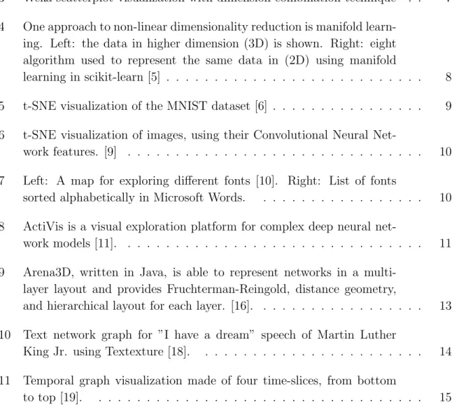
A prime example of where graph visualization is used is in the visualization of biochemical networks. These networks can be biochemical flux networks which represent how biochemical entities get converted from one to another, interaction networks and correlational networks. Irrespective of the type of biochemical network, the common underlying feature of comprehensive biochemical networks is complexity. As such rendering such comprehensive and complex visualization within limited 2D screen real estate space is very difficult and often lead to a situation referred to as the hairball problem. This is because these datasets tend to produce densely pop-ulated complex graphs, within which it is extremely difficult to discern a pattern, structure, or understand relationships within the individual components of the net-work. Although many software, such as Cytoscape, have made significant advances to help analyze such data, they are limited by the technological constraints of visual-izing dense networks in a two-dimensional (2D) environment which limit researchers to simple click and drag types of interactions. This prevents users from achieving a
Fig. 1. An example of Hairball problem. When the number of nodes goes above hun-dreds, It would be quite difficult to get insight from the data.
more natural, organic approach to interacting with networked data. In the age of virtual and augmented reality, it is advantageous and crucial for data scientists to have the ability to engage with biochemical networks naturally, follow the types of re-lationships between the nodes visually, and receive a simplified, but a comprehensive perspective of those networks. To overcome challenges and limitation of existing 2D technology, we are developing a mixed reality software platform to better visualize, analyze, map, comprehend, and engage with biochemical pathways. This software platform has further utility in that it can be used to investigate any network-related information in an immersive environment. Possible applications include the investi-gation of drug interaction networks, gene expression networks, and protein expression networks, biochemical flux networks and biochemical correlation networks.
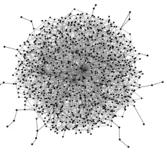
Fig. 2. Tensorflow Playground for visualizing how deep neural networks works. These types of visualization is helpful for developing new neural networks. [4]
2.4 Use of Visualization in Data Mining and Machine Learning
Visualization of data and the process that machine learning algorithms traverse to reach the end goal is one of the significant parts of understanding and tuning to provide better performance.
In Fig. 2 we can see how such a process can be visualized to understand what’s happening in a deep neural network system. The output is indeed 3D, but for the sake of simplicity to work on 2D displays, it is shown in 2D with colors representing the 3rd dimension.
2.4.1 High Dimensional Data Visualization Using Dimension
Combina-tion
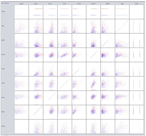
Because representing high dimensional data (more than 3 dimensions) on a single 2D or 3D plot is simply not feasible, we need techniques to overcome this difficulty. One technique that Weka uses, and showed in Fig. 3, is representing a combination
Fig. 3. Weka scatterplot visualization with dimension combination technique of different features in different plots. Unfortunately, this kind of techniques is not of much help since when we have more than three dimensions, and if different classes of the data are not separable using just two of the features, we never see a clear separation between data using this type of visualization. Such visualization generates d∗dscatterplots. If we disregard rotated plots, the number of unique scatter plots is
d 2
+d, which is clearly not efficient. The same method can also be applied using 3D scatter plots and hence reduce the number of total scatter plots however for higher dimension it is still inefficient.
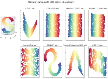
Fig. 4. One approach to non-linear dimensionality reduction is manifold learning. Left: the data in higher dimension (3D) is shown. Right: eight algorithm used to represent the same data in (2D) using manifold learning in scikit-learn [5]
2.4.2 High dimensional Data visualization using Dimensionality
Reduc-tion techniques
An additional type of representation of high dimensional data is using dimension-ality reduction techniques, such as PCA and tSNE, which are being widely used in the scientific community for representing high dimensional data in lower dimensions like 2D and 3D. Other different dimensionality techniques are being used for such purpose, one such technique that is widely being used is manifold learning. Here we see how these methods could be used for learning the shape and distance of data-points in the higher dimensions. We used the scikit-learn implementation of these algorithms: Isomap, Locally Linear Embedding, Modified Locally Linear Embedding, Hessian Eigenmapping, Spectral Embedding, Local Tangent Space Alignment, Multi-dimensional Scaling (MDS), t-distributed Stochastic Neighbor Embedding (t-SNE). [5]
Fig. 5. t-SNE visualization of the MNIST dataset [6]
high dimensional data like the output of Word2Vec and MNIST using PCA and tSNE [6] [7].
Using the toolkit provided by Google, we can see how representing high dimen-sional data like Images or Word2Vec can show a nice separation of the data and hence gives us intuition of our data look likes. Lie et. al [8] showed how this technique for exploration of semantic relationships in neural word embeddings and text analysis can be used. Karpathy [9] showed how the same method would be used to represent the output of CNN network to show similar networks besides each other. He showed that how t-SNE arranges images that have a similar CNN (fc7) code nearby in the embedding. The same method could be used to create a font map that have similar fonts besides each other. This representation shows how much easier it would be to explore and select the desired font instead of having a long alphabetical list of the fonts like what is being used in most of the applications like Microsoft Word.
This method can also be used to represent the output of classification algorithm. It can helps to see how misclassified document distributed among the data and can give us clues about how to tune the algorithm to get better performance. This is what
Fig. 6. t-SNE visualization of images, using their Convolutional Neural Network fea-tures. [9]
Fig. 7. Left: A map for exploring different fonts [10]. Right: List of fonts sorted alphabetically in Microsoft Words.
Fig. 8. ActiVis is a visual exploration platform for complex deep neural network mod-els [11].
Facebook did in their Visual Exploration of Industry-Scale Deep Neural Network Models platform [11]. They used tSNE in their projected view of the system to help them create better deep neural networks. Such networks are complex, and hence for designing them, computational graphs are very helpful. In section 3.2.4 we show how such graphs could be represented in a 3D mixed reality environment. Strand showed how can the same thing implemented for the HoloLens using Shaders to achieve high accuracy representation [12]. Such visualizations have much more information about the misclassified documents and could help to make better decisions instead of using confusion matrix.
2.5 Data Visualization Methods
2.5.1 2D Data Visualization Methods
There are different visualization techniques for representing data in 2D. A catalog of these visualization techniques are shown in [13], [14], and the book The Visual Display of Quantitative Information [15]. The techniques for representing data in a 2D setting are outside of the scope of this thesis.
2.5.2 3D Data Visualization Methods
The number of visualization techniques in 3D is not as good as what we see in 2D. Here we work with these types of data:
2.5.2.1 Network Data
Network data could be represented using graphs. Graphs are created using nodes and edges. Nodes represent entities like genes or proteins and edges represents rela-tions like interacrela-tions. Properties of nodes and edges could be represented using size, color, and shape.
Biological Networks
Many data in biology can be represented using networks such as biochemical path-ways, functional interactions, interactions between genes or gene products. It is also possible to use correlation or distance between two entities to create a network data and hence represent it using graphs.
Multilevel Graph networks
Pavlopoulos et. al [16] proposed a model for visualization of biological networks in 3D using multiple layers. Such visualization is very helpful for showing multi-omics data at the same time, i.e., the connection of transcriptomics, genomics, proteomics, epigenome, metabolomics, and microbiomics. Working with such high-density in-formation in 2D monitors using mouse and keyboard is not easy, but if they are represented in a mixed reality environment, it could be much easier to work and interact with such visualization.
Fig. 9. Arena3D, written in Java, is able to represent networks in a multi-layer layout and provides Fruchterman-Reingold, distance geometry, and hierarchical layout for each layer. [16].
Fig. 10. Text network graph for ”I have a dream” speech of Martin Luther King Jr. using Textexture [18].
Text Network Graph
Graph visualization also is being used for text summarization and showing entities connection in texts. It is also used for showing historical events and texts [17]. Again the limitation of using 3D renderings on 2D surface creates a challenge in properly understanding the relationships between the different entities.
Dynamic Graph Networks
Dynamic graphs are graphs that evolve through time. These graphs could be repre-sented by either an animation that demonstrate how they evolve through time or by multiple static representations of them at different time points. In Fig. 13 we can see how such graph could be built [19].
Fig. 11. Temporal graph visualization made of four time-slices, from bottom to top [19].
2.5.3 Volumetric Data
2.5.3.1 DICOM Images
Digital Imaging and Communications in Medicine (DICOM) is a specification for the storage and transmission of medical imaging. Modern medical imaging sys-tems like X-Rays, CT, Ultrasounds, and MRI (Magnetic Resonance Imaging) support DICOM. As it shows in Fig. 12 since these images are inherent representation of a physical object in the real world like brain and heart, they are 3D. However, since it is difficult to represent such high volume 3D information on 2D surfaces the technique of slicing the image into different section is being used for representation. In our work, we used CT and MRI files and then convert the images to 3D models and import the models into our MR app. Currently this work is being developed in association with VCU Department of Neurosurgery.
Fig. 13. Diffusion tensor imaging of the murine heart that was acquired using MRI at 9.4T [21].
2.5.3.2 DTI
Diffusion Tensor Imaging (DTI) is a magnetic resonance imaging technique that produces neural tract images and helps to get useful information about muscles and other tissues. DTI is the only non-invasive way to observe the architecture of cardiac fibers. We have created 3D representations of DTI images that are being developed in association with VCU School of Medicine.
Spatial Data
Spatial data are data that are connected to a place in the Earth like money trans-action, airplane flights, tweets, and internet network packets. In this thesis, spatial data was treated in a manner similar to high dimensional data without going into the detail of their representation on maps in a 3D environment.
High Dimensional Data
In high dimensional data, for each data point, there are a set of separated values. For the case of 2 or 3 dimensions the visualization would be as trivial as using scatter plots, however for the case of more than three dimensions it is not possible to visualize all of them using regular scatter plots, methods like dimensionality reduction, as such multiple graphs are required to visualize such high dimensional data.
2.5.4 Force-Directed Graph Drawing Algorithms
Force-directed algorithms also known as spring embedders calculate the layout of the graph based on the structure of the graph. In these methods, spring-like attractive forces simulated based on Hookes law are used for the nodes that are adjacent and repulsive forces like electrically charged particles simulated based on Coulombs law are used for all nodes. This provides maximal separation between non adjacent nodes and restricted separation between adjacent nodes leading to the generation of a well distributed network. Furthermore, the spring constant and the coulombic charge for each node and edge is programmatically accessible; other information such as distance between nodes to represent distance in relationship can also be embedded into such networks. The ultimate goal of these algorithms is to find the minimum energy level of the system that provides the most stable and best separated network. The spring layout method of Eades [22] and the algorithm of Fruchterman and Reingold [23] showed in Fig. 14 are among the first proposed algorithms for this purpose. On the other hand, the algorithm of Kamada and Kawai [24] showed in Fig. 16 uses the lengths of shortest paths between two nodes for their forces. In general force-directed algorithms define an objective function which maps graph layout to a real positive number representing the energy of the layout and the goal is to minimize this function.
Fig. 15. Pseudo-code for Kamada and Kawai algorithm [24].
2.6 Use of Mixed Reality for Data Visualization
2.6.1 Mixed Reality
The term Mixed Reality was originally described in the 1994 paper by Paul Milgram, and Fumio Kishino, A Taxonomy of Mixed Reality Visual Displays” [25] as the merging of real and virtual worlds. This paper introduces the concept of virtuality continuum and how the categorization of taxonomy can be applied to displays.
Fig. 16. Virtuality Continuum simply referred as mixed reality spectrum defines how the merging of real and virtual worlds should be called based on the degree of virtuality that is involved [26].
Among the displays that could be used to represent mixed reality Head Mounted Displays (HMD) are the ones that create an affordable immersive environment. These devices could have a see-through display (Optical Head Mounted Displays) or opaque display.
Devices like HoloLens, Meta 2, Magic Leap have a see-through display. Allows the user to see physical environment while wearing the headset. Alternatively, devices like Oculus Rift, HTC Vive, Gear VR, Odyssey have an opaque display. They block out the physical environment while wearing the headset. These devices may use external camera to show the digital representation of the world through the camera and then add digital objects like they are really there in the physical world. Devices like Android and Apple phones, when used by the user in their hand to show the physical world through the camera and then add digital objects inside that is considered Augmented Reality but not Immersive. In this project, we used a Samsung S8+ with Android ARCore for this purpose.
2.6.2 Why Using Mixed Reality?
Mixed reality environments provide better user experience and immersion, which allows better perception of the visualized geometry. Here we count some of the benefits of using mixed reality environment for 3D representation of data [27].
• Benefits of 3D
– Highly dimensional data benefits from being 3D instead of 2D
– Some data like Volumetric data are inherently 3D
– Spatial data visualize is better in 3D
– Network Data, if represented in 3D, avoids edge crossing but in 2D edges
always crosses each other and with thousands of nodes it would be impos-sible to distinguish between the different edges
• Depth perception and perspective
– Human have two eyes which send two different images to the human brain.
The human brain creates a 3D representation in the human mind for un-derstanding objects. Using immersive mixed reality, we can harness this human capability and shows data that has depth and could be readily understood by the human brain.
• Infinite screen real-estate
• Sense of scale
• Gestures and convenience
– Using hand gestures instead of the mouse gives a more natural way of
2.6.3 Mixed Reality Head Mounted Displays
Here we give a list of some of the Head Mounted Displays (HMD) that provides mixed reality experience with translation of the user’s movement into the virtual objects. Some devices like Gear VR and Google Cardboard by default just understand users rotational movements and can not understand user’s movement in X, Y, Z axis. Devices like Google Glass, while considered HMD, does not translate any of the user movement into their virtual presentations and hence are not on this list.
Table 1. Mixed Reality HMDs
Opaque See-through
Tethered Oculus Rift Meta 2
HTC Vive
Samsung Odyssey
Standalone Gear VR HoloLens
CHAPTER 3
DESIGN AND IMPLEMENTATION
3.1 Design
The goal of this work is to develop a platform that enables the visualization of big data that can be structured in a network-fashion or that encompasses several dimen-sions (high-dimensional data). Thus, the next sections will suggest the architecture for visualization platforms of these two types of data: large-scale graph visualization and large-scale high-dimensional data.
3.1.1 Large-Scale Graph Visualization Platform for Mixed Reality
Envi-ronments
Here a platform for analyzing and visualizing big data in mixed reality environ-ment proposed. The system consists of the following components as shown in Fig. 17 .
• Data source Data source could be any source of data that creates network
data. It could be a biological network, as we used BioGrid [28], Social media networks like what we used from Twitter [29], Citation Network, as we used with the USPTO dataset [30]. Biochemical pathways, as we used the graph of lipids and enzymes that was generated in our laboratory from blood samples at VCU Health. Text entity co-occurrence networks as was shown in Textexture website [18].
Fig. 17. Large-scale graph visualization platform for mixed reality environments. information, impute missing values, and to convert them into the format that is acceptable by the database.
• DatabasesThe choice of database heavily depends on the amount of data that
needs to be visualized and the complexity of the queries. If the number of nodes and edges does not exceed more than ten thousand (this is a rough estimate, and this number depends on the amount of information that is attached to each node and edges and the complexity of the query for filtering the data) using text files would be the easiest choice and there is no need to have a database module, since all the data could be easily loaded into the memory. For searching
among these data, filtering specific nodes another module should be added. If the number of nodes and edges goes beyond what is mentioned, then a graph database is required. Notable graph databases are Neo4J, Titan, JanusGraph, which are all part of Apache TinkerPop graph computing framework [31]. Such databases could connect to document store database like ElasticSearch [32] and Couchbase [33] to provide fast document retrieval or full-text search among the documents that are attached to the nodes and edges. For example, in the case of citation network for scientific papers, such system can find and filter documents that match specific queries.
• Graph Computer This unit consists of two modules, online transaction
pro-cessing (OLTP) and online analytical propro-cessing (OLAP). OLTP allow the user to query the graph in real-time, which interact with a limited set of data and respond to the order of milliseconds or seconds. In OLAP the entire graph is processed, and thus, every vertex and edge is analyzed, and results can take on the order of minutes or hours. For example, running PageRank algorithm for ranking the nodes of the system could be done in this section. Such information will be added to network data as metadata and will be shipped into the HMD Renderer for visualization.
• Graph Layout Drawing This unit uses graph drawing algorithm such as
force-directed algorithms to find the 3D coordinates of the nodes. This infor-mation will be shipped to the HMD Renderer so it can place each node in its desired position. It is very important to mention that because some algorithms have hyper-parameters that should be tuned, it would make sense to have this component both inside and outside of the HMD Module, so for small datasets it would be possible to get instant feedback by changing the parameters to see
how they would be represented by different parameters. This is crucial when the speed of connection of the HMD and the Graph Drawing unit is not fast.
• HMD Renderer This module converts network data which now have 3D
co-ordinates into images that should appear on the displays.
• User Interaction InterpreterThis module understand user interactions such
as hand gestures, gaze, and voice commands, It may call the HMD Renderer engine for modification in the output image, like resizing, rotating, moving the graph or nodes or it may call the controller for more functionalities.
• ControllerThis module decides based on user interaction which unit should be
called for further refinements. The user could ask for more information about a specific node, or querying another part of the data, filtering the nodes that have some particular properties or could ask for more analysis on the network, like detecting communities.
3.1.2 Large-Scale High-Dimensional Data Visualization Platform for Mixed
Reality Environments
As will be discussed in section 3.2.3, the same platform could be used for repre-senting high-dimensional data as shown in Fi.g 18. Instead of using Graph Database a NoSQL document store would be a good choice. There would be no need to graph computer component, but a machine learning classifier could be used. Instead of using graph drawing, a dimensionality reduction component should be used to re-duce the number of dimensions to 3. As mentioned before this part may have some hyper-parameters that could be tuned for data representation or in the case of some manifold learning like tSNE the representation would evolve through the time so it
to change the hyper-parameters or see the representation as it evolves through the time and see it instantly in the displays.
• Machine Learning (ML) Predictor This component can perform machine
learning tasks such as classification, regression, and clustering. This component is not only important for running analysis with currently available data, but is also important for performing predictive analytics.
• Dimensionality Reduction Since we need three numerical values for each
samples, we need to do dimensionality reduction to reduce the number of di-mensions to three, so we can use them as the coordination of the samples.
3.2 Implementation
3.2.1 Graph Visualization in Mixed Reality
For visualizing network data in mixed reality environment the first question which comes to mind is to what kind of device we should create our platform. One of the oldest devices for such a purpose is CAVE systems. Because of the high cost of implementation which varies from $30,000 up to 1 million dollars, the low resolution of the image, not being portable, and lack of complete sense of being immersed in the virtual space, this option was not a good choice for this project. The next option was to use VR HMDs like Oculus Rift or HTC Vive. While these devices provide full immersive virtual reality environment with high quality and low cost about $500, such devices could not be used more than 15-30 minutes comfortably. This could happen because of issues like virtual reality sickness, especially if the software provides the ability to move in the virtual space other than user actual movement. Also, because of lack of access to the real world, simple activities such as taking notes, or typing up the findings is impossible while in this virtual space (although the latter is now
Fig. 18. Large-scale high dimensional data visualization platform for mixed reality environments.
being addressed via the availability of virtual keyboards for note taking). We have tried to use Oculus rift in one of our implementation to see the capabilities of such systems and and found that while the capabilities were great, the onset of virtual reality sickness after a short time made the system impractical of deep data dives that require presence in the VR environment for long lengths of time.
The other option was to use Immersive see-through HMDs. The only available option in the market at the time of development of our application was Microsoft HoloLens. Unlike Immersive VR devices working with these devices is much more
comfortable and it does not result in drawbacks of VR sickness that user may en-counter using VR HMDs. The price of HoloLens is about $3000 which is still afford-able for the academic and industrial usage, but not yet probably affordafford-able for public consumers. The other two options which were still under development was Meta 2 and Magic Leap. Magic leap which recently raised $1.9 billion from investors like Google, Alibaba, Warner Bros promised to release an Immersive see-through HMD soon which could be the next big thing that is going to happen in this industry. Also, Microsoft promised to release the next version of HoloLens which uses new emerging AI systems like deep neural network for a better product. In this sense using such HoloLens is the best option at this time.
3.2.2 Graph Visualization in HoloLens
For representing graphs in HoloLens three versions were created. In the first version, an external app for calculating the graph layout drawing was used. In the second version an internal graph layout drawing was used, and in the third version, additional graph layout drawing added to the app via using an external application. By external we mean that the graph drawing engine was not shipped inside the HoloLens app but was implemented on the server.
3.2.2.1 First Version
For the first version of our app, the network data was converted from CSV to JSON format, and then the JSON file was given to a force-directed layout drawing app, such that the 3D coordinates were added to the JSON file [34]. Then we created a Unity project for our application. After that, a code was written from scratch using C# to create Spheres for the nodes, and lines for the edges using an Adjacency List for keeping the graph structure in the memory; as well as the Unity SDK for rendering
the graph. This version was very lightweight and could represent thousands of nodes. Unfortunately, the app that was used for calculating the location of nodes did not perform. The z-axis of the output was smaller than the x and y-axis by three orders of magnitude, and despite trying to calibrate the x and y-axis by resizing them on that direction, it did not show the expected results.
Fig. 19. Force-directed layout that was used in the first version.
3.2.2.2 Second Version
The second application that was generated was built on top of the source code that was generously given by James T Reichart, a collaborator of ours from Microsoft. This version of the app was created by converting the open source C++ code of Forg3D app [35] into C#. The rendering portion was replaced with the code that was needed so Unity engine could render images. On top of this app, we added two other components. First, MixedRealityToolkit-Unity, and second, Microsoft library for mixed reality devices in Unity (previously known as Holotoolkit). Thereafter a graph library for .NET in C# named Satsuma [36] was added to the project.
Satsumas goal was to implement all the necessary graph structures and the fastest possible versions of common graph algorithms. We added Satsuma because of two reasons. First, the ability to do graph processing on the device since some of these calculations like shortest paths, and also a faster version of the force-directed graph algorithm, and more importantly the ability to import and export graph structures in the GraphML format. Since the Forg3D uses a non-standard network data structure as its file format, we decided to use a more common format for importing files into our applications. GraphML is supported in almost all major graph databases and graph viewer applications. One problem that we encountered at this stage was that since Unity uses a cross-platform open source implementation of .NET, Mono, so it could be shipped to different devices, we could not use Satsuma easily. Hopefully, Unity in its newest version 2017.1 supported the newest version of Mono (4.7) which was supporting .NET APIs that was needed by Satsuma we were able to import Satsuma library into our project and load any GraphML file for the source of our application. One benefit of having GraphML was that we could import almost any network data, like Excel and CSV format, into Gephi [37] and do any manipulation on the graph
and run algorithms like community detection and PageRank on our data and then save them as GraphML and import them into our application on HoloLens.
Before using MixedRealityToolkit-Unity, we tuned the project according to what Microsoft suggested in the tutorial pages [38] and tried to use suggested codes for gestures and voice commands. While evaluating the toolkit, we found that the codes were not good in a production application and lack many features that are required in our application.
Mixed Reality Toolkit is a collection of scripts and components that helped us to develop further features very faster. Specifically, we used Input module for gaze, gesture, and voice commands and Sharing module for collaboration across multiple devices.
The gaze functionality tracks user’s head movement for the ability to highlight the node that the user is looking at. We changed the color of that node to red to highlight it is being gazed upon. Also, we used gaze of the user to show the label that is attached to that node so the user could see the name of the nodes they are looking at. We did this because if all the names were enabled by default, it could create a mess of names that go into each other and hence greatly decreasing the readability of the network.
The gesture functionality provides three different functionality: rotate, resize, and move. The user could look at the graph nodes and uses their hand to Tap and hold on the objects so they could rotate, resize or move the graph based on the state they are in.
For changing movement state user could user’svoicecommands likerotate,move, resize for changing the state of the movement. Also, the voice command auto rotate would rotate the graph automatically at a steady speed until the user calls the com-mand stop. These features allow the user to visualize parts of the graph as needed.
As a 3D holographic object, the user is also able to move around or through the network to get to the areas of the network for additional scrutiny.
For retrieving additional information that was embedded within each node, a user could call the command show info when they are gazing at the specific node, so a text box would appear and providing the additional details about the network currently being investigated. Another voice command is show help which shows a menu that has a list of all the voice commands that user could use when they are using this application. The commandreset would reset the position of the graph into their original position and would recalculate the coordination again which could take few second to minutes depending on the size of the graph. The zoom in and zoom out command allow the user to resize the graph and the command Load Network X allow the user to load network with filename x from the application, if it was loaded into the app. One of the APIs that were shipped with HoloLens was the ability to connect the app with Microsoft OneDrive API which allows the user to have a cloud drive and import files easily into HoloLens application.
3.2.2.3 Third Version
In this version of the app, instead of using the force-directed graph drawing al-gorithm that was shipped inside the app, we used the iGraph library with python wrapper on a pc to calculate 3D coordinates of the nodes using four different algo-rithms, sphere layout, grid layout, Fruchterman-Reingold layout, and Kamada-Kawai layout. Then the output was saved in GraphML format and shipped into the ap-plication and then represented without the use of the force-directed graph drawing algorithm that was inside the app. This version made the process of representing the graph much faster since it does not need to calculate the positions of the device.
Fig. 21. Second version of the graph visualization app.
in real-time in the same place or from different distances. We used the MixedReal-ityToolkit module so we were able to see each others avatars in real-time. One of the features for future work is to see the same graph in the same place and to see a synchronized version of the graph so everyone in the collaboration session could manipulate it. This version of the app is still in progress.
3.2.3 Large-Scale Graph Visualization in Oculus Rift and Gear VR using
WebGL and WebVR
Another graph visualization application that we created was by using Package Manager Visualization software [39]. This software renders graphs in a 3D environ-ment using modern browsers WebGL renderer. The software was created by Andrei Kashcha to shows graph of software packages dependencies. We changed the renderer
Fig. 22. Third version of the graph visualization app.
engine code of this program which was using three.js to be able to use WebVR, an API in browsers that allows showing browser contents in virtual reality devices. Then by using data from the arXiv e-prints [40] citation network, with 1,106,142 nodes and 13,471,155 edges was represented. This software could be accessed through browser [41]. The ability to represent such high volume of nodes and edges in a browser was achieved by using Shaders. WebVR is supported on desktop machines through Fire-fox and Chromium, and on GearVR is supported by Samsung Internet and Oculus Browser app. One further central development of this app is to reduce the effect of virtual reality sickness by implementing movement of the graph instead of the camera since when the camera moves users start to feel sick.
Fig. 23. Citation network of arXiv.org with 1.1 million nodes (papers) represented inside Firefox/Chromium browser using WebGL and WebVR. This online page could be viewed from most of the VR devices for VR experience.
3.2.4 High Dimensional Data Visualization Using Manifold Learning in
HoloLens
For representing high dimensional data in HoloLens, we used different manifold learning methods from the scikit-learn library [5]. These methods are capable of learning the manifold of the data in higher dimensions and then reduce the number of dimensions into lower dimensions by preserving the distance of the data points. Such methods considered non-linear. We used the same app that was developed in the Third version. First, we load the high dimensional data into our script that uses scikit-learn to reduce the number of dimensions into three, and then we convert the data into a GraphML file, with nodes being the samples in our data and having no edges. However, it is also possible to write an algorithm to also shows the distance of objects in higher dimensions as their edges when they are converted into graph
format. Then the file loaded into the Third version of the app that was described in section 3.2.2.3.
3.2.5 Storage, Retrieval, and Full-text Search on Big Data
Some of the datasets that were used in this project like US Patent dataset and BioGrid [28] have more than few million nodes and edges in themselves. To be able to find content among these datasets and filtering the desired subset a database for storing such data was required. We considered using cloud platform such as Microsoft Azure, Cosmos DB and Google BigTable, but cost wise these solutions are far more expensive than what a small scale project could afford. Therefore we installed Couchbase database V 5.0 [33] on a cluster of three VPS and was able to load more than 1.3 Billion short random texts like tweets with just 67 GB of RAM and 2TB hard drive. Each message was had up to 4097 characters. The speed of retrieving any message by having its ID was less than 3 ms which was sufficent for our purpose.
Fig. 24. Couchbase Admin Panel showing 1.39 Billion short text saved inside the db with retrieving speed of less than 3ms.
Also, another experiment which we did was to create a full-text search database with the same data. Five VPS each with 50 Gig RAM and 3TB of the Hard drive was used for creating a cluster of Elasticsearch [32] nodes, three nodes were used as
the master, and two nodes were used as the data storage. The result showed that we could fetch most of the queries with less than 20 second, which could be decreased if the number of nodes increased proportionally to the amount of data.
3.2.6 Spectral Data Visualization in HoloLens
3D Spectral Data such as those being used in Liquid chromatography-mass spectrometry, Raman Spectroscopy, Infrared Spectroscopy, and audio files are also amenable to visualization in 3D and provides greater readability that visualization in 2D or as 3D rendering in 2D. We created a sample app to demonstrate the capabil-ity of representing such data in a mixed realcapabil-ity environment using Uncapabil-ity. First, we tried to use Unity HeightMaps for this purpose. However, soon we understood that such heightmap, despite being accurate for their intended purpose, is not suitable for our spectral data as they are not capable of depicting large height variations. At this point we transitioned to the Unity Terrain Engine for our purpose. The Terrain Engine despite being powerful and creates images like what we need, but could not be rotated and created a limitation for our work. Also, we were unable to figure out how to convert our spectral data into a format which could be converted into Unity Terrains and as such this part of the project is still a work in progress.
3.2.7 Visualizing DICOM Data
3.2.7.1 MRI, CT-Scan Images in HoloLens
For creating 3D MRI/CT-Scan images, we used Slicer application [42]. Sample DICOM data was download into Slicer app, then a 3D Volume Model created. The model had more than a million of polygons which were way more than what HoloLens unity engine could render, So we used Blender Decimate Modifier [43] to decrease the
number of polygons to less than 100,000 polygons so it could be visualized inside the HoloLens. The modified model did not have the accuracy that the original model. Later down the road, we acknowledged that Microsoft bought the company named Simplygon which creates a software exactly for this specific reason which could be used in our later versions. Then the model shipped into our Unity project, and MixedRealityToolkit added to project. Then the ability to use hand gestures to interact with the model and using voice commands was added to project like the graph visualization app in HoloLens. We also added a Glassy material to the model, so it was easy to see inside of the model.
Fig. 25. 3D MRI model in Hololens.
which shows the 3D model from a Unity app have a very high latency and couldnt be used in practice.
3.2.7.2 4D DTI in HoloLens
To represent 4D images inside the HoloLens, the same gesture and voice com-mand module that was developed into our graph visualization app were used. We used the slicer app to convert MRI images into DTI form. After that in a manner similar to the process for MRI images, we decreased the number of polygons using Blender and then shipped the model to our Unity project. The app support all the voice command features of the 3D MRI app.
Fig. 26. 4D DTI app in HoloLens.
3.2.7.3 4D DTI in Android ARCore
To represent DTI images in an augmented reality platform, we used Google’s recently released ARCore SDK. Google ARCore does not support the device that we
had (Galaxy S8+), so we had to use a modified version of their service from [44] . We used the same sample app that Google shipped in their SDK and was able to add our DTI image to that application inside Unity. Despite the fact that app was the first beta version of the SDK and is very weak in detecting surfaces, the output result was fairly acceptable for the purpose of demonstrating the capabilities of this software and positioning of the DTI object.
CHAPTER 4
CONCLUSIONS AND FUTURE WORK
4.1 Future Work
For the next version of the apps these works are suggested:
• All the apps need a better UX design like menus to navigate quickly.
• For the graph visualization app in HoloLens Creating separate module on the
server for graph database, graph computer, and graph layout drawing so we could load more data. Also, use Shaders for representing more objects in our app.
• For the graph visualization app in WebVR, implementing graph movement.
• For DICOM viewer apps, using better polygon reducers to preserve the original
shape.
• For the High dimensional app, implementing a method for communicating with
a server and do different algorithm and see the result of classification.
4.2 Conclusion
An original contribution of this thesis is a system for visualizing and analyzing big data in an interactive mixed reality environment. Such a system can be used for representing different types of data such as temporal, geospatial, network graph, and high dimensional. Also, an implementation of this system for four different data types are created. The data types include network data, volumetric data, high
dimensional, and spectral data for different mixed reality devices such as Microsoft HoloLens, Oculus Rift, Samsung Gear VR, and Android ARCore were created. It was shown that such a system could store and use billions of samples and represents millions of them at once.
Appendix A
SAMPLE GRAPHML FILE FORMAT
Appendix B
TERMS AND DEFINITIONS
GraphMLGraph Markup Language is a standard data structure for saving network
data, see appendix for a sample GraphML file.
HMD Head Mounted Display is a display device, worn on the head or as part of a
helmet that represents images in front of user’s eyes.
OHMD Optical Head Mounted Display is a type of HMD that have see-through
glasses that allows the user to see reality without intervening. One famous version of such smart glasses is Google Glass which is considered an augmented reality device, but it does not provide any immersive experience with the virtual image it creates. If OHMD has sensors to detect users head movement and place virtual objects in front of users eyes, then it would be an immersive augmented reality device, so user perceives that the virtual object is somewhere in the world. A notable example would be Microsoft HoloLens, Meta 2, and Magic Leap glasses.
Graph DatabasesGraph Databases is one kind of NoSQL databases that specifically
designed to hold network data structures, and to be able to get a response to the query very fast.
RenderingBy rendering, we mean performing calculations using a 3D software
pack-ages render engine to translate the scene from a mathematical approximation to a finalized 2D image. For determining the color value of each pixel in the flattened image, the entire scenes spatial, textural, and lighting information are combined During the process, the entire scenes spatial, textural, and lighting information are combined to determine the color value of each pixel in the flattened image.
Shaders Shaders are a set of instructions for the GPU for calculating the color of
REFERENCES
[1] Mark Ware and Michael Mabe. “The STM report: An overview of scientific and scholarly journal publishing”. In: (2015).
[2] Andrea De Mauro, Marco Greco, and Michele Grimaldi. “What is big data? A consensual definition and a review of key research topics”. In: AIP conference proceedings. Vol. 1644. 1. AIP. 2015, pp. 97–104.
[3] Robert Pienta et al. “Scalable graph exploration and visualization: Sensemak-ing challenges and opportunities”. In: Big Data and Smart Computing (Big-Comp), 2015 International Conference on. IEEE. 2015, pp. 271–278.
[4] Daniel Smilkov et al. “Direct-manipulation visualization of deep networks”. In: arXiv preprint arXiv:1708.03788 (2017).
[5] et al. Pedregosa Fabian. Scikit-learn Manifold Learning. http : / / scikit
-learn.org/stable/modules/manifold.html. 2017.
[6] Daniel Smilkov et al. “Embedding projector: Interactive visualization and in-terpretation of embeddings”. In: arXiv preprint arXiv:1611.05469 (2016). [7] et al. Smilkov Daniel. Embedding projector - visualization of high-dimensional
data. http://projector.tensorflow.org/. 2017.
[8] Shusen Liu et al. “Visual Exploration of Semantic Relationships in Neural Word Embeddings”. In: IEEE Transactions on Visualization and Computer Graphics (2017).
[9] Andrej Karpathy. t-SNE visualization of CNN codes. http://cs.stanford.
[10] Kevin Ho. t-SNE visualization of fonts using convolutional neural network VGG16. http://fontmap.ideo.com/. 2017.
[11] Minsuk Kahng et al. “ActiVis: Visual Exploration of Industry-Scale Deep Neu-ral Network Models”. In: arXiv preprint arXiv:1704.01942 (2017).
[12] Kaden Strand. Case Study: Holograms and Higher Dimensions. https : / / blog . bluepengu . in / case study holograms and higher dimensions
-145dda33a169. 2017.
[13] Severino Ribecca.The Data Visualisation Catalogue.https://datavizcatalogue.
com/search.html. 2017.
[14] Angela Zoss.Data Visualization: Visualization Types.https://guides.library.
duke.edu/datavis/vis_types. 2017.
[15] Edward R Tufte. The visual display of quantitative information. 2001.
[16] Georgios A Pavlopoulos et al. “Arena3D: visualization of biological networks in 3D”. In: BMC systems biology 2.1 (2008), p. 104.
[17] Harvard Center for History and Economics. Visualizing Historical Networks.
http://histecon.fas.harvard.edu/visualizing/index.html. 2017.
[18] Nodus Labs. Textexture.http://textexture.com/index.php?text_id=604& node_id=0. 2017.
[19] Cesim Erten et al. “Exploring the computing literature using temporal graph visualization”. In: Visualization and Data Analysis. 2004, pp. 45–56.
[20] MRI Brain Scan; What’s Involved.
[21] R Dibb, L Xie, and C Liu. “Magnetic susceptibility anisotropy of the my-ocardium”. In: Proceedings of the 22nd Annual Meeting of ISMRM, Milan, Italy. 2014, p. 627.
[22] PA Eades. “A heuristic for graph drawing”. In: Congressus numerantium 42 (1984), pp. 149–160.
[23] Thomas MJ Fruchterman and Edward M Reingold. “Graph drawing by force-directed placement”. In:Software: Practice and experience21.11 (1991), pp. 1129– 1164.
[24] Tomihisa Kamada and Satoru Kawai. “An algorithm for drawing general undi-rected graphs”. In: Information processing letters 31.1 (1989), pp. 7–15. [25] Paul Milgram and Fumio Kishino. “A taxonomy of mixed reality visual
dis-plays”. In:IEICE TRANSACTIONS on Information and Systems77.12 (1994), pp. 1321–1329.
[26] Microsoft. Mixed Reality. https : / / developer . microsoft . com / en - us /
windows/mixed-reality/mixed_reality. 2017.
[27] Imran Younus (IBM) and Rosstin Murphy (IBM).IMMERSIVE DATA VISU-ALIZATION USING SPARK. https://spark- summit.org/2016/events/
immersive-data-visualization-using-spark/. 2017.
[28] Imran Younus (IBM) and Rosstin Murphy (IBM). Biological General Reposi-tory for Interaction Datasets. https://thebiogrid.org/. 2017.
[29] Twitter Inc. Consuming streaming data. https://developer.twitter.com/
[30] USPTO.Cancer Moonshot Patent Data. https://www.uspto.gov/learning-and- resources/electronic- data- products/cancer- moonshot- patent-data. 2017.
[31] Apache Foundation. Apache TickerPop. http : / / tinkerpop . apache . org/. 2017.
[32] Elasticsearch BV. ElasticSearch. https://www.elastic.co/. 2017.
[33] Inc. Couchbase. Couchbase Database.https://www.couchbase.com/. 2017. [34] Jason Graves. ForceDirectedLayout. https : / / github . com / godlikemouse /
ForceDirectedLayout. 2017.
[35] Jussi Paananen el al. FORG3D. https://bioinformatics.uef.fi/forg3d/. 2017.
[36] Balazs Szalkai. Satsuma Graph Library for .NET. http : / / satsumagraph .
sourceforge.net/doc/html/index.html. 2017.
[37] Mathieu Bastian, Sebastien Heymann, Mathieu Jacomy, et al. “Gephi: an open source software for exploring and manipulating networks.” In: Icwsm 8 (2009), pp. 361–362.
[38] Microsoft. HoloLens Academy. https : / / developer . microsoft . com / en
-us/windows/mixed-reality/academy. 2017.
[39] Andrei Kashcha. Package managers visualization. https : / / github . com / anvaka/pm. 2017.
[40] Cornell University. arXive e-prints. https://arxiv.org/. 2017.
[41] Aliakbar Panahi. arXive Graph Visualization. https://panaali.github.io/
[42] Slicer: medical image informatics, image processing, and three-dimensional vi-sualization software.https://www.slicer.org/. 2017.
[43] Blender Decimate Modifier. https://docs.blender.org/manual/en/dev/
modeling/modifiers/generate/decimate.html. 2017.
[44] Thomas Suarez. ARCore for All. https : / / github . com / tomthecarrot /
VITA
Ali (Aliakbar) Panahi was born on March 22, 1988, in Mashhad, Iran. He received his Bachelor of Science in Mechanical Engineering from Azad University, Central Tehran Branch in 2012. Meanwhile, he did experience himself with different works in his field and other fields, but soon his passion leads him to the software industry. With his friend, they established a software company in Tehran and did a dozen of innovative projects where he learned the arts of programming. After his graduation from his bachelor degree, he joined a well known USA based software company in 2013 where he learned how to create large-scale web applications. He also co-founded three startups where he gained valuable knowledge about the customer side of building software. He left his positions in 2015 to join VCU computer science program, where he could expand his expertise in the scientific aspect of computers.
![Fig. 5. t-SNE visualization of the MNIST dataset [6]](https://thumb-us.123doks.com/thumbv2/123dok_us/11054724.2992434/21.918.346.595.147.373/fig-t-sne-visualization-mnist-dataset.webp)
![Fig. 8. ActiVis is a visual exploration platform for complex deep neural network mod- mod-els [11].](https://thumb-us.123doks.com/thumbv2/123dok_us/11054724.2992434/23.918.242.702.148.347/fig-activis-visual-exploration-platform-complex-neural-network.webp)