Volume 7
Issue 1 Special Issue: Visualizing the (Data)
Future Article 5
2018-01-22
Data Visualization as a Library Service: Embedding Visualization
Data Visualization as a Library Service: Embedding Visualization
Services in the Library Research Lifecycle
Services in the Library Research Lifecycle
Andrea L. OgierVirginia Tech Et al.
Let us know how access to this document benefits you.
Follow this and additional works at: https://escholarship.umassmed.edu/jeslibPart of the Graphic Design Commons, Scholarly Communication Commons, and the Scholarly Publishing Commons
Recommended Citation Recommended Citation
Ogier AL, Stamper MJ. Data Visualization as a Library Service: Embedding Visualization Services in the Library Research Lifecycle. Journal of eScience Librarianship 7(1): e1126.
https://doi.org/10.7191/jeslib.2018.1126. Retrieved from https://escholarship.umassmed.edu/ jeslib/vol7/iss1/5
Creative Commons License
This work is licensed under a Creative Commons Attribution 4.0 License.
This material is brought to you by eScholarship@UMMS. It has been accepted for inclusion in Journal of eScience Librarianship by an authorized administrator of eScholarship@UMMS. For more information, please contact
ISSN 2161-3974 JeSLIB 2018; 7(1): e1126 doi:10.7191/jeslib.2018.1126
Correspondence: Andrea L. Ogier: [email protected]
Keywords: data visualization, service models, graphic design Rights and Permissions: Copyright Ogier & Stamper © 2018
Full-Length Paper
Data Visualization as a Library Service: Embedding Visualization Services in the
Library Research Lifecycle
Andrea L. Ogier and Michael J. Stamper
Virginia Polytechnic Institute and State University, Blacksburg, VA, USA
All content in Journal of eScience Librarianship, unless otherwise noted, is licensed under a Creative Commons Attribution 4.0 International License.
Abstract
Objective: The purpose of this article is to explore data visualization as a consulting service offered by a research library with particular attention to uses of visualization at various places within the research lifecycle.
Methods: Lessons learned from a year of offering data visualization as a consulting service, and two general case studies are offered.
Results: Data visualization consulting services have a few unique considerations, including setting clear expectations, considering proprietary vs open source technologies, and making sure the consulting experience is also a learning experience. In addition, we can clearly place data visualization requests, in the form of profiled case studies, in multiple parts of the research lifecycle.
Introduction
What role does data visualization play within the research lifecycle? How are data visualizations used in the modern research setting? What is the interplay between the two core functions of a data visualization: communication and analysis? In this article we will explore these questions through case studies of visualization-themed consulting work performed within the University Libraries at Virginia Tech.
Recognizing the needs of scientists and scholars to quickly and accurately communicate complex ideas, in 2016 the University Libraries added a Data Visualization Designer to its
Informatics Lab. Created in 2015 to help researchers across the University effectively find, generate, transform, model, visualize, and share research data using tools and techniques based in information science, the Informatics Lab offers specialized research consulting services to faculty and students. These type of research consulting services should enable the Libraries to grow more quickly beyond the course-based information literacy model, embedding library and data services into research groups and positively affecting the research enterprise at the University. Assessment of this hypothesis is still ongoing; however, we offer this statement as part of the context for our discussion of visualization services offered by the University Libraries.
The Challenge of Data Visualization as a Library Service
Visualization services are not new to research libraries or universities; these services can have many forms and may serve a variety of clientele from advanced researchers using high-performance computing services to undergraduate students designing infographics for a class assignment. While data visualization services in libraries are an important and emerging service area, its treatment in the literature of professional librarianship is ongoing and should be distinguished from literature on visualizations of library data or that on visualization tools and methods (see library guides provided by Duke University Libraries, the University of Michigan Libraries; see Magnuson, 2016). This distinction is both subtle and important as data visualization services offered to clients outside the library must navigate many challenges: working with a client’s data and intellectual property, working with clients who many not have access to expensive visualization tools or design software, and understanding assignments so as to draw clear lines between teaching and doing when helping students. Professional development opportunities for librarians have appeared in recent years (see the well-known
NCSU Libraries Data Visualization Program), and these consulting services are beginning to emerge within Libraries. In order to address the background of data visualization as a consulting service, before launching into the case studies we will address these factors as an exercise in lessons learned.
Lessons Learned: The Necessity of Clear Expectations
Concerns of privacy, security, and trust color every interaction between library and researcher; expectations must be outlined and agreed upon at the outset, and librarians/consultants may have to navigate the sometimes-murky waters of attribution, acknowledgement, ownership, and work-for-hire. These factors make sharing details of these type of services all the more difficult, though no less valuable. Data which are not governed by security standards or institutional research boards are probably the easiest to work with from a policy standpoint.
Data Visualization as a Library Service JeSLIB 2018; 7(1): e1126 doi:10.7191/jeslib.2018.1126 But, because conversations about security, confidentiality, and privacy are not externally mandated prerequisites to the work, assumptions about the ownership of these data and data products are easy to misinterpret. The nature of data that are regulated by security standards or IRBs requires clearly laid out and documented processes for levels of access and control, which are much more difficult to misinterpret. Even if the client’s data are not governed by research policies such as security or IRBs, we try to treat them with the same level of thought and care, with clear, documented levels of access. We also encourage clients to allow us to use visualizations created with their data as exemplars or marketing visuals where possible.
Lessons Learned: Proprietary vs. Open Source
Visualization tools and applications come in a wide variety of shapes and sizes: desktop and cloud versions, open source and proprietary, free and prohibitively expensive (for the individual — these applications are often priced for corporate clients). In a higher education setting, the prohibitively expensive tools and applications may be more available due to enterprise licensing, discounted educational rates, or a simple economy of scale in pricing; however, we have found that free/freemium or open applications are particularly useful in educational settings because they have lower barriers for use by both students and faculty. In our data visualization service model, we try to recommend applications that are particularly suited to the needs of our clients: For example, quite often we have found that beginning to explore a data visualization project in Gephi (https://gephi.org) is more time-effective than going straight to Tableau Public (https://public.tableau.com). The integrations and polished final projects in Tableau, however, make it more of a choice for visualization sharing and visualizations that will become web services. Both the open source and proprietary applications have their individual strengths and weaknesses; we believe it is important to recommend the application (or applications) that best fits a project’s stage of analysis, data, and ultimate purpose.
Lessons Learned: Teaching Clients to Fish
One of the most difficult challenges related to working on visualizations with clients is ensuring that every consultation is an opportunity for both the client and consultant to learn something new. Because we are located within a library that has a long history offering information literacy instruction, we try to frame visualization consultations within data or digital literacy. We diligently work to enable clients, particularly student clients, to build skills that will serve them throughout their educational and professional careers. We make it clear, particularly to student clients, that we are not doing their work for them; rather, we work with them to improve the quality and communication of their visualizations. We fill the gap between the skills they have and the skills they need, enabling them to gain new experiences more efficiently than they would on their own. In order to do this, we necessarily assess the skills our clients have and the ultimate goal of the project. Both of the case studies below informed our thinking on this topic and have allowed us to recast and reframe the services we offer.
Data Visualization in the Research Lifecycle
Both case studies described below exhibit common characteristics of data visualization requests, yet, due to different intentions for the visualization, show different placement of visualization work within the research lifecycle because of the intended purpose of the visualization itself. In research settings, visualizations can be used to analyze as well as
communicate data; as we will show in the case studies below, design choices play a significant role in the success or failure of the visualization itself. In cases where the purpose of the visualization is analysis, the complex interplay between clarity and aesthetics1 can have significant effect on the research itself. In cases where the purpose of the visualization is to clearly and concisely convey information, design choices determine the degree to which the intended message is communicated.
Requests for data visualization services run the gamut — from creating easy to understand infographics of processes, ideas, and concepts, to the visualization of “Big Data” using various software and tools to “see” relationships, networks, patterns, themes, and trends, — and everything in between that involves reproducing and communicating data, science, research, etc. visually to an audience. Often times, the data visualization problem is also a design problem - either thinking conceptually about the data and HOW to present it, the form it should take, and how to deliver it, to running raw data and visualizations created through visualization software, which must then be refined using software such as Adobe’s Illustrator and Photoshop (or the freeware versions of Inkscape and GIMP). Simply put, creating an effective data visualization is a multi-faceted process that can range from using a simple drag and drop program and exporting results, to a more involved iterative multi-stepped design process.
Data Visualization Design Consultation Process
Naturally, there are a myriad of questions to ask and answer before taking on a data visualization project as a design consultant. They generally fall into three categories: Purpose of the project, Research processes, and Design principles. Each of the questions below may determine important features of the visualization request.
Purposes of the Project: Determine:
Audience:Who is the audience for the project?
Scope: Is the individual visualization need part of a larger whole?
Intent: What is the story that audiences should take away from the visualization? What should the visualization convey? Is it a scientific principle? Is it statistical data?
Means of Delivery: Where is the project conveying its message? Is it for a scholarly article or a social media post?
Research Processes: Determine:
Data type, form, format:What form and format are the data in?
Collection methods: How were the data collected or generated? If the data were created by someone else, do they have appropriate documentation? 1 See Jones, Ben. 2012. “Data Visualization: Clarity or Aesthetics?” DataRemixed.
Data Visualization as a Library Service JeSLIB 2018; 7(1): e1126 doi:10.7191/jeslib.2018.1126
Analysis procedures: Are there patterns or clusters visible in the data? Can additional analysis processes add value to the visualization step?
Organization principles: How are the data organized? Will they need to be transformed or re-organized to fit a particular analysis or visualization tool?
Intended result: How could the story be visually communicated effectively? What could it look like?
Every project that comes our way is different and they all must be handled in a different manner depending on the what clients/patrons bring to us and what they want, or need, to show or tell their audience. “Data visualization” can mean anything from creating minimalist graphs and charts, the visualization of massive abstract topic networks, to “seeing” animated biochemical processes, or looking at volume metric renderings (VMR) of the human body in a virtual reality (VR) space.
The visualization work that results from their research is based on the data that they’ve collected. We then look at what form or format the data is in, and what form or format the client needs the finalized work to be in for presentation, i.e. a printed publication, poster, or intended for the Web or other means of electronic delivery. These are all aspects that influence the whole design of the finalized versions of the visualizations.
Not only does the client go through a research process to find the original data, we also go through a research process with the client to figure out the best ways to represent their work visually and the best ways to communicate their findings. Communication with the client is key at this point or our research process. We most often prefer to have face-to-face meetings to discuss their wants and needs, and if that’s not possible, then a phone call or email thread will do, depending on the complexity and scope of the project. During these meetings we review and assess the client’s data type, format, organization, and intended results, or questions that they’d like answered by having their data visualized. It’s also during this stage that clients unfamiliar with visualization as a service will be presented with examples of how their data could be visualized and presented. It’s crucial that that the consultant be familiar with the many types of visualization possibilities as possible as well as the tools or development expertise in order to render them, and ideally, some basic graphic design principals to make them aesthetically pleasing, presentable, legible, and meaningful to the viewer.
Design Processes:
Concept: What is the story and how do you want to tell it, and who do you want to tell it to (audience and intent)?
Refining: How do the pieces relate to the whole? Which pieces of the story within the data are most important to highlight and bring out through the visualization? Ethics: Are there ethical concerns related to the data or how it is presented? Are there design choices that could minimize ethical risks?
Presentation/ Layout: How do colors, shapes, layout, and typography affect the effectiveness of the visualization? Can changes to the presentation and layout increase the potential communication of the story?
These questions are neither exhaustive nor required of every potential project; as we will show in the case studies below, the answers to these questions help shape the projects towards their final destinations. The case studies presented below exhibit two typical, if different, types of visualization projects: the first involves a “Big Data” visualization of a large network, while the second is a visual representation of a process diagram used as an infographic for a grant proposal. The primary purpose of the project described in the first case study was to aid a researcher in the analysis of their data, while the project described in the second case study falls squarely in the realm of clear and efficient communication.
Data Visualization Case Studies
Big Data Visualization Network: Analysis Case Study
In Spring 2017, a Ph.D. student in the College of Engineering contacted us for help making sense of a very large dataset contained in a massive, multi-tabbed Excel spreadsheet with over 6,000 data points. Working with the data in that format was extremely time consuming and too vast for her to easily see relationships, networks, and clusters within the data, which she needed to see to finish certain parts of her research. It was that point, she reached out to us to work with her to come up with visualization concepts based on her data organization and a design strategy for effectively visualizing and communicating her findings and research. Purposes of the Project
The audience for this project was partially the student herself, so that she could finish her dissertation, but also the student’s dissertation advisor and committee; therefore, a certain level of knowledge about the subject matter could assumed in the audience. Or, in other words, this project was not for general, public consumption (at least at this stage). The initial story for this project was to cluster data points in order to find themes and subthemes within the data; these themes were assigned numerical values so that they would not affect the visualization itself in the clustering process. Eventually, through clustering, relationships between data points could be observed and analyzed.
Research Processes
The research process was initiated by a request for a face-to-face meeting to discuss what could be done with the client’s data. During the first meeting we went through each of the tabs in her multi-tabbed spreadsheet and discussed various aspects of the data, such as collection methods, meaning, organization, along with what “story” needed to be gleaned from the data and what should be visualized. Since the data was a grouping of themes, sub themes, and attributes to those themes, we decided to create a simple network visualization using Gephi (a free and open source visualization tool) to “see” what was going on in the data, and if we could create a visualization that had meaning. Since the original dataset consisted of over 6,300 data points, it was recommended that we first do a sample of a couple of the most relevant themes within the data before moving on to visualizing the whole dataset and onto to more complex and “deeper” visualizations.
Design Processes
As mentioned earlier the design process wasn’t started until a visualization type, framework, and communication need were discussed and established. After cleaning and organizing the client's data into a format that Gephi could render - in this case nodes and edges files were
Data Visualization as a Library Service JeSLIB 2018; 7(1): e1126 doi:10.7191/jeslib.2018.1126
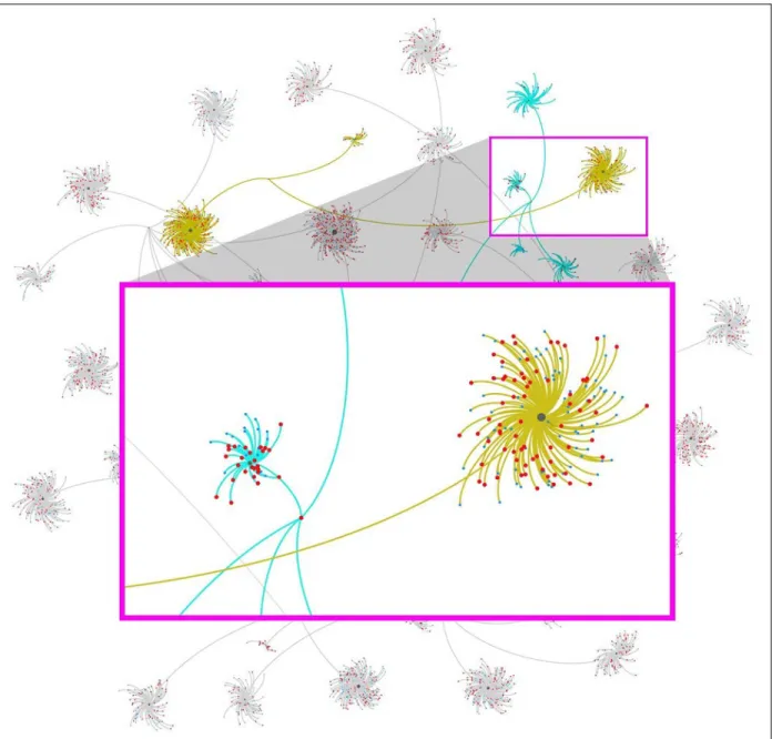
constructed -- several iterations were created using multiple layouts available within Gephi (See Figure 1), and discussed with the client. After the client chose which layouts and color schemes would work best for her research, the design and layout of the visualizations were started. Gephi is able to output rendered files as PDFs, which when opened in design software, such as Inkscape or Adobe Illustrator, are able to be modified and manipulated to further draw emphasis to (or away from) certain aspects of the visualization that need to be seen, or not seen - meaning that even if all the data is shown, not all of it needs to be seen as clearly as the parts that are being discussed directly by the client in her publication. In the case of Figure 1, all 6,300+ data points are on the overall network visualization in the background. Figure 1:Network diagram with (labels removed) showing clusters of themes, subthemes, and relation-ships. Created in Gephi using the Force Atlas 2 and Yifan Hu layouts and Adobe Illustrator.
Some of the edges (lines connecting nodes) are grayed out so they don’t have as much visual emphasis as the edges connecting the two highlights themes which are directly discussed in the client’s paper. In this case we used a mustard yellow and blue because she already established these colors in a previous paper.
For this visualization (part of a series), we used Adobe Illustrator to open and modify the framework visualization rendered by Gephi. Gephi did the bulk of the work by creating the network and relationships and an initial layout for nodes and labels, but Illustrator is where the refining of the visualization will take place by separating different aspects of the network, such as the nodes and edges onto separate layers where they will be locked down while edits to color and stroke width are made to either bring forward or push to the back parts of the visualization that aren’t discussed. Illustrator is also used where colors will be applied and node/edge labels typeface changed, or point size enlarged or reduced. The design process, while similar to the visualization process, differs because it determines how the visualization is seen and understood using basic graphic design and layout principles of typography, color, shape, and layout to convey the “story” within the data. At the end of this process, the client was able to move forward with her research project while incorporating new directions and thematic connections among her data. While the visual presentation of the data was an advantage, the ability to interact with the data to create new lines of research proved to be the most important of this project.
Infographic for Grant Application: Communication Case Study
A referral from a graduate student led a faculty member to contact us for help to visually communicate a complicated concept in a National Science Foundation (NSF) grant proposal. In the last year, we have fielded quite a few of these requests, as research teams often do not have someone specifically trained in visual communication or data visualization on staff. Departmental and college-level grants specialists and administrators have been extremely interested in and supportive of these type of data visualization services.
Purpose of the Project
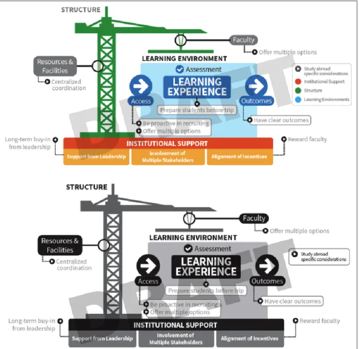
Because this project was for an NSF proposal, it had to meet strict design guidelines, such as being only in grayscale and fitting on a third of a standard letter-sized piece of paper. When the client contacted us for help, she had already begun a rough sketch of what she needed, which proved to be a huge help in speeding up the design process. After meeting with the client during the first consultation, we brainstormed and discussed her diagram and additions we could make to it to make it more effective, the audience (NSF grant reviewer), and design constraint (size and color), and any labels or other explanatory text that would need to be included on the graphic. We also discussed saving out different stages of the graphic with layers turned on/off for her to use when she needed to present her process to students or colleagues.
Design Processes
The client already had a rough start with her process diagram graphic, so the design process was pretty quick and easy; we didn’t have to go through many iterations or edits before it was finalized and ready for the proposal. The biggest constraint for this was size and the need for the final diagram to be in grayscale, which could have presented some contrast and legibility problems to work around.
Data Visualization as a Library Service JeSLIB 2018; 7(1): e1126 doi:10.7191/jeslib.2018.1126 The design is minimalist, using an easy to read and modern typeface, and a simplified color scheme which easily translated to grayscale keeping legibility and contrast sharp enough to diagram the teaching methodology while directly referencing construction and scaffolding as metaphors for the process of learning and institutional support needed for that learning to occur effectively (See Figure 2). Overall, the “design” of this graphic resulted from what you can see on the surface, but also the whole research and design process beginning the very first contact with the client and subsequent consultation. Clarity of communication was the primary function of this project; the final visualization, or infographic, needed to quickly, clearly, and accurately convey a complicated process.
Figure 2: Process diagram outlining a teaching and learning methodology. Created using Adobe Illustrator. Used with permission, © 2017 Amy Hermundstad Nave and Denise R. Simmons, Ph.D.
Conclusion
What role does data visualization play within the research lifecycle? How are data visualizations used in the modern research setting? What is the interplay between the two core functions of a data visualization: communication and analysis? Based on our experience working with researchers, we have found that data visualization plays multiple roles within the research lifecycle, as shown in the case studies above. The questions and concerns that occur in the landscape of research consulting are, in some sense unique; however, the power of visualizations, and the uses of visualized data, can be used for a variety of purposes and in a variety of settings.
Ultimately, we suggest that having an expert consultant in data visualization readily available to help make sense of data in a visual manner can help the researcher come to better conclusions or come up with more refined questions. Patterns can be detected, trends can be predicted, and decisions can be made all the more quickly by looking at the story within the data. As outlined in our two case studies, both researchers benefited from our assistance by being able to present their concepts and ideas in a graphical nature and communicate their findings to audiences of varying familiarity to the subject material. This exemplifies and supports the importance of data visualization throughout the research lifecycle. In the process, both the researcher and consultant learn from each other - the researcher learns more about the importance of data visualization and good design practices, while the consultant gains more experience to help other researchers in their work.
Disclosure
The authors report no conflict of interest. References
Jones, Ben. 2012. “Data Visualization: Clarity or Aesthetics?” DataRemixed.
http://dataremixed.com/2012/05/data-visualization-clarity-or-aesthetics/ NCSU Libraries. 2017. Data Science and Visualization Institute for Librarians.
https://www.lib.ncsu.edu/datavizinstitute
Magnuson, Lauren, ed. 2016. Data Visualization: A Guide to Visual Storytelling for Libraries. New York, NY: Rowman & Littlefield.
Duke University Libraries. 2017. Data Visualization.
http://library.duke.edu/data/data-visualization
Voliva, Carrie O’Maley. 2015. “Data Visualization for Public Libraries.” Public Libraries Online.
http://publiclibrariesonline.org/2015/04/data-visualization-for-public-libraries/
University of Michigan Libraries. 2017. Data Visualization.