Labeled Set Elements with Font Attributes
Richard Brath and Ebad Banissi London South Bank University, London, U.K.
{brathr,banisse}@lsbu.ac.uk http://www.lsbu.ac.uk/
Abstract. We show that many different set visualization techniques can be ex-tended with the addition of labeled elements using font attributes. Elements la-beled with font attributes can: uniquely identify elements; encode membership in ten sets; use size to indicate proportions among set relations; can scale to thou-sands on clearly labeled elements; and use intuitive mappings to facilitate de-coding. The approach can be applied to many different set visualization layouts, including Venn and Euler diagrams, graphs, mosaic plots and cartograms.
1
Introduction
Out of 48 visualization examples in Alsallakh et al’s recent state-of-the-art report (STAR) on set visualization techniques [1], 28 examples use a representation wherein each ele-ment is specifically represented, e.g. a dot in Euler diagram or node on a graph. How-ever, only 12 of the 48 examples represent the item in such a way that it is uniquely identifiable (e.g. a label or a country outline on a map). In addition to identification, the explicit representation of elements as text labels has many potential benefits:
1. Both macro-level densities and micro-level identification can be made available 2. Directly reading text is faster than relying on an interactions, such as a tooltip 3. The overall information density of the visualization is increased
4. Serendipitous patterns otherwise not visible may be revealed
Our unique contribution is to extend labels by varying font attributes, such as bold and italics, to indicate set membership. This approach can yield additional benefits:
5. Noticeable changes in a font indicates differences in membership 6. Membership for any element can be decoded based on the font attributes 7. Intuitive mappings can facilitate decoding these attributes
8. Text can scale to a high number of sets (10) and a high number of elements (1000’s)
2
Why Represent Identifiable Elements?
Alsallakh’s STAR report provides a broad collection of set visualizations, tasks and applications. It identifies 26 set analysis tasks, of which 7 are element related (e.g. A1: find elements that belong to a specific set) and 5 more are related to attributes on elements (e.g. C1: find the attribute values of a certain element). The other 14 tasks are about set and set relations, some of which are also about elements, such as summaries of elements (e.g. B10: comparison of set intersection cardinalities) or element exclusivity (e.g. B12: does one set contain more exclusive elements than another set).
2.1 Review of Element Representations
Given the importance of elements to set analysis, it is useful to consider how elements are represented. This includes whether they uniquely identify the element and how they convey multiple data attributes. In the STAR report there are 28 examples with elements. Those elements are represented as:
• Dots.Simple dots are often used to represent one or two data attributes, such as color or brightness to identify set membership. For example, TwitterVenn [10] (fig. 1 far left) uses dots to indicate search results in a Venn diagram.
• Labels.Labels can uniquely identify items. In all cases additional attributes were not encoded in labels, but rather other visual attributes such as the background color, lines connecting labels, etc. e.g. ComED [22] fig. 1 (2nd from left).
• Glyphs.In 5 cases, glyphs (e.g. pies, bars, and icons) are used to encode attributes such as set membership (e.g. fig . 1 (3rd from left) [4]). Sometimes glyphs are used together with plain labels.
• Images.In 3 cases, images are used. In two of these the images supplement other-wise undifferentiated labels (BubbleSets [12] and Vizster [15]).
• Shape.In one case (fig. 1 right) unique shapes of countries identify the individual elements, assuming that the viewer has a reasonable geographic literacy.
Fig. 1.Elements represented as dots (TwitterVenn), text (ComED), icons and geographic shapes.
In no case do the element representations illustrated in the STAR report use more than two visual attributes. For example EulerGlyphs uses hue and outline to encode memberships. Although there is some use of labels and/or a visual attribute or two to indicate elements in sets, the existing use suggest that much more could be done:
• Identifiable Elements.Uniquely identifiable elements adds information and con-text regarding the members of the sets which may be relevant to the task. Viewers can use their existing knowledge regarding the specific elements to augment their understanding of the sets.
• Multi-attribute Elements.Adding more data through different visual attributes can help identify elements, membership in sets or other data.
2.2 Glyphs in visualization
While identifying individual elements with multiple data attributes per element may not occur frequently in set visualization, other examples can be found more broadly in data visualization.
Borgo et al.’s state-of-the-art report on glyphs [3] characterizes the design space of glyphs including common visualization attributes (e.g. [2,18]) such as size, color, in-tensity, opacity, and shape; as well as semantic attributes such as text, symbols, icons, pictograms [9]. However, the guidelines surveyed focus on traditional visual attributes (color, shape, size, orientation, texture and opacity) although there is some discussion regarding metaphoric pictograms. There is no broader discussion for specifically iden-tifying a large number of unique items.
Brath [5] itemizes approaches for uniquely encoding a high number of categories in glyphs as 1) icons; 2) geometric shapes, e.g. circles, stars; 3) textures, i.e. imagery com-bining shape and color, e.g. logos and flags; and 4) text labels. Icons, shapes and textures can be difficult to create for a large number of categories, without pre-existing libraries of glyphs (e.g. logos, symbols, images), or automated techniques e.g.[24]. However, abstract concepts (e.g. GDP, CPI) may be difficult to encode; some glyphs may be am-biguous (e.g. Clarus the dog-cow); while other glyphs are difficult to add attributes (e.g. a French flag rotated 90 degrees is confused with Netherlands’ flag).
3
Text and font attributes
Given the challenges of glyphs, text is an alternative that can be readily used to uniquely identify hundreds to thousands of elements. In cartography, fonts have been used for centuries to uniquely identify geographic features. Text offers some interesting addi-tional capabilities beyond glyphs which we will discuss in the following subsections.
3.1 Small Type Sizes
In paper-based cartography, minimum font sizes are defined as 3 or 4 point [16,23], with guidelines recommending 5 or 6 point as a minimums (one point = 1/72 inch). Similarly, charts in print have small minimum point sizes, e.g. 4 point [8].
Historically, text in visualizations was limited due to low resolution displays (72-96 pixels per inch). More recent devices, including phones, tablets and PCs, have signifi-cantly increased pixel densities. Current Apple guidelines recommend a minimum size of 13 “CSS points” which renders physically at 3.1 points on an iPhone 6plus.
Text in print environments can go even smaller: microtext is extremely small sized text and originated as an anti-counterfeiting device for banknotes and official govern-ment docugovern-ments as well as archival texts. Microtext can be clear at extremely small sizes, although the ability to decipher the text depends on the eyesight of the viewer.
3.2 Even Type Density
Text can be perceived as an even textural tone due to a unique feature of typography referred to ascolorby typographers. A well-designed font has an even distribution of text ink across a sequence of letters regardless if the letters are sparse (e.g. i,v) or dense (e.g. m, e). In figure 2, the apparent shading behind the large word CANADA in the center of the banknote can be perceived as text on close inspection. This even density of type is used in Typographic Maps to indicate lines and regions with blocks of type.
Fig. 2.The light brown shading behind the large text CANADA in the banknote at left is revealed to be tiny microtext on closer inspection.
3.3 Font Attributes
Another unique feature of typography is the use of font-specific attributes, such as bold and italic, to indicate additional data in text labels such as set membership. In 1920’s Ordance Survey maps [17] (fig. 3) cities are indicated as follows:
• Textindicates the literal name of the city.
• Casedifferentiates between town (uppercase) vs. village (lowercase).
• Italicsare used to indicate an administrative centre, i.e. a county town.
• Font sizeis used to indicate population category.
• Font familyindicates country: serif for U.K., slab-serif or serif variant for Scotland.
Fig. 3.Ordnance Survey labels indicate set memberships via font size, family, italics and case.
In text visualization, additional visual attributes are used on text in less than half of 249 peer-reviewed text visualizations at Text Visualization Browser (textvis.lnu. se) as of 01/22/2016. 40 have no text, 103 have plain text and 106 use text with visual attributes to encode additional data. Of the 106 using visual attributes, most use either color or hue: typographic specific attributes such as bold, italic and case occur in only 15 examples, and typically only a single additional attribute (e.g. highlight with bold).
Brath and Banissi (e.g. [6]) itemize font attributes based on cross-disciplinary re-view, and identify the following font-specific attributes for encoding data:
• Alphanumeric glyphs (A,B,C,1,2,3) literally encode data.
• Symbols (e.g.∞,∀, [,♥,∩). Unlike alphanumerics, symbols are not orderable.
• Weightmay include variants such as black, bold, book, light or extra light.
• ItalicandObliqueare both sloped fonts but italics have different letterforms. Italics may occur at different slope angles, including reverse (sometimes used on maps).
• CASE includes UPPER, lower, Mixed and SMALLCAPS.
• Typefaceindicates font family, e.g.:sans,blackletter,script,source, etc.
• Underline also has many variants, e.g.::::wave, . . . .dot, dash, double.
• Width may be adjusted with font variants (e.g. condensed, expanded), by scaling type (not recommended by typographers), or adjusting inter-character spacing.
• Baseline shift. Can used together withsizechange createssubscriptandsuperscript.
• “Paired delimiters” evoke enclosure by pairing shapes around text, e.g. ({},“ ”,* *) Furthermore, these font attributes are distinct and can be used together in any com-bination, for example: italic + CASE + UNDERLINE +BOLD+WIDE. However, the authors do not provide any examples with more than 2-4 font attributes in prior work nor application to sets.
4
Using Text and Font-Attributes to Represent Elements in Sets
There are many potential benefits to using text and font attributes in set visualizations: 1. Labels can uniquely depict elements. Furthermore, supplemental graphics, e.g.
dots, image, etc. are not needed (e.g. ComEd in fig. 1).
2. Font Attributescan be used to encode set membership, thereby providing clar-ification to some types of set visualizations where element membership may be otherwise ambiguous (e.g. graphs, or maps as in fig. 3). Given the large number of font attributes (10) plus traditional visual attributes (e.g. hue, intensity, orientation), a large number of sets can potentially be encoded. This is a unique contribution. 3. Area Proportionscan be represented with text-based set elements. At a
macro-level, a block of text can be seen as a texture covering an area. At a micro-level the individual text elements can be read (as in fig. 2). This is a unique contribution. 4. Layout Agnostic.Labeled, font-attribute elements can be used across a wide
va-riety of set visualization approaches, including Venn and Euler diagrams, mosaic plots, graphs, maps and so on.
The following examples show different set visualizations techniques extended with labeled font-attribute elements.
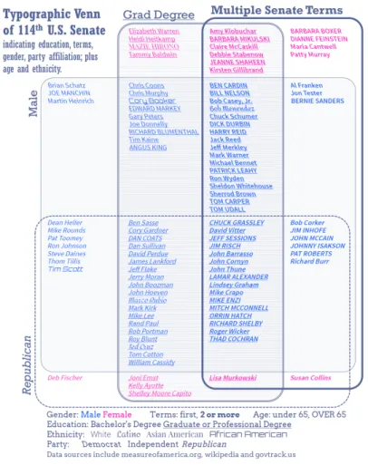
4.1 Typographic Venn Diagram of the U.S. Senate
Figure 4 shows a four-set typographic Venn diagram indicating each member of the U.S. Senate as of 2014 by name, with each element indicating seven data attributes:
• Slopeindicates the political party membership. Right-leaning text indicates Repub-licans, while left-leaning text indicates Democrats. Independents are represented with no leaning at all.
• Boldindicates senators who have served more than one term.
• Underlineindicates senators who have a graduate or professional degree.
• Hueindicates gender: blue for male, magenta for female.
Beyond the four sets depicted by the Venn diagram, additional data is encoded:
• Caseindicates age. Those over 65 are indicated in uppercase.
• Font familyindicates ethnicity. Most senators are plain Caucasians (in a sans serif font), with a couple Latinos (in a curvy font), an Asian-American (in a serif) and a couple African-Americans (in a rectangular font).
Fig. 4.Venn diagram of the United States Senate indicating senators (image by authors). At the level of individual elements, the names of individual senators are readable. Set memberships can be seen, either by assessing the containment of elements relative
to the set outlines, or by the font attributes. For example,MAZIE HIRONOis a female (purple), Democrat (left-leaning italic), over age 65 (all caps), first term senator (not bold), with an advanced degree (underline), and is an Asian-American (serif).BERNIE SANDERSis male (blue), independent (no italics), over age 65 (all caps), multi-term senator (bold), with no advanced degree (no underline), and is Caucasian (plain sans serif font).
At a macro-level, the use of stacked text elements allows stacks to be visually com-pared similar to bars in a bar chart. The viewer can attend to the stacks without regard to the individual names. Many visual comparisons of quantities can be done at the level of set relations. e.g.
• There are far more men than women senators.
• There are more Democratic women senators than Republican women senators.
• There are more Democratic women senators with advanced degrees than corre-sponding Republican women.
• There are no first-term Democratic women without an advanced degree.
Instead of using an area-proportional Venn diagram, the use of stacked text elements allows for the separation of the depiction of logical relations (i.e. the curved lines and fills depicting each set) from the quantities of elements (i.e. stacked text). Issues with attempting to algorithmically size areas of Venn outlines so that areas represent quan-tities are easily side-stepped, e.g. [26]. Each stack can be ordered too: in this example alphabetic order facilitates visual search within subsets. A similar example of the U.S. House of Representatives is available online and also as an interactive demo.
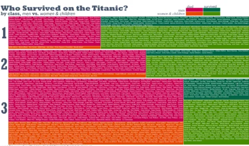
4.2 Typographic Mosaic Plot ofTitanicSurvivorship
A larger scale example is the data repositoryencyclopedia-titanica.org, which provides detailed biographies of 1308 passengers of the Titanic. However, one must either search or browse through lists of names: a macro view of the passengers is not available on this site.
Figure 5 is a typographic mosaic plot ofTitanicpassengers indicating class (hori-zontal bands 1,2,3), survivors (vertically: green survive, red death), and differentiates between men (cranberry/forest green) vs. women and children (orange/chartreuse) in horizontal slices. In a mosaic plot, areas represent quantities. In this plot the higher death rate of third class passengers is immediately obvious.
Within each box of the mosaic plot are the passenger names. At a micro-level the names of individual passengers are visible. A small but readable six point font links to biographies. Font attributes redundantly encode data: italics for women and children; plain roman for men. Sans serifs for survivors and serifs for the dead. Figure 6 shows a closeup near the center of the plot.
One problem using text labels to create quantitative areas is the potential bias in sizes that can occur if there is a concentration of particularly long labels in an area. For example, surviving first class women and children names are on average 36.7 characters long while deceased third class men average only 22.0 characters - the names former segment are 67% longer than the latter. In this example, names have been shortened
Fig. 5.Mosaic plot ofTitanicpassengers with individual passengers named (zoom to read). Image by authors, data from Dept. Biostatistics Vanderbilt University and encyclopedia-titanica.org
Fig. 6.Closeup ofTitanicmosaic plot with individual passengers visible.
to a familiar name and a surname, so that all passengers are reduced to similar visual length. For example the passengerCardeza, Mrs. James Warburton Martinez (Charlotte Wardle Drake)is recorded with eight words in the passenger list, and is reduced in the visualization toCharlotte Cardeza; whileBird, Miss Ellenis visualized asEllen Bird. When the passenger name length is reduced to two words, the above two segments are 13.9 and 13.6 characters respectively - a 2% difference.
Another consideration is box size. The algorithm used here nudges rectangle sizes larger to fit text. As a result, there is a margin of error between the areas if represented accurately compared to areas adjusted to fit text. This is most acute at the smallest sizes (as shown in the fourth column of table 1). For example, the thin orange box in fig. 5 (representing deceased first class women and children) has only 7 members and the height of the box is 8 points tall instead of 6.5 points tall - making this rectangle approximately 20% larger in area than it should be.
There are other considerations as well for using text in the areas. The minimum height for a box is related to the height of a single line of text; whereas the minimum
Table 1: Area errors in plots adjusted for text
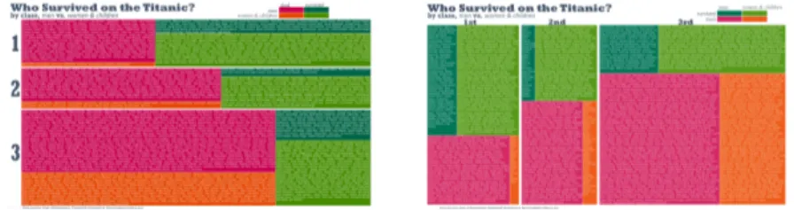
width for a box is related to the width of a word - which is a much larger size than height. The first version of the Titanic passenger mosaic plot (fig. 7 right) created splits in the opposite orientation resulting in many tall narrow boxes. These tall narrow boxes when adjusted for minimum widths, resulted in higher error rates, as shown in the sixth column of table 1.
Fig. 7.Mosaic plot with different orientations: Tall narrow boxes need to be wider to fit text than flat boxes need to be high.
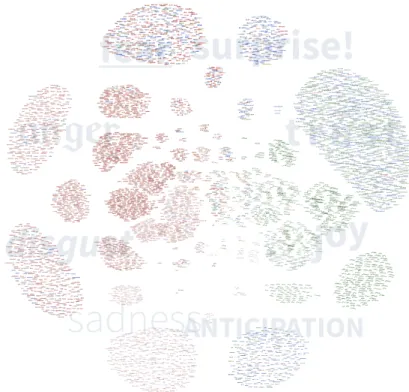
4.3 Typographic Graph of Word-Emotion Association Lexicon
Node-link diagrams (i.e. graphs) are sometimes used to represent sets. In anchored maps[20] a circular layout is used to depict sets as nodes around a circle, and elements as free-floating nodes connected to respective sets. Using a physics-based graph layout model, element nodes are pulled based on set relations: elements belonging to only a single set are pushed outside the circle close to their set, other elements pulled to a position somewhere between their sets.
Node-link diagrams have scalability issues. With few elements, links can clearly show which set an element is connected to. However, when the number of elements is high, the many overlapping links makes it difficult distinguish membership.
Instead, element membership in sets can be encoded in font attributes. Links can be de-emphasized to reduce clutter leaving visible clusters of labels. Clusters can be
Fig. 8.4463 words associated with eight emotions, readable on a 4K display (or zoom to read). Image by authors, data from [21].
visually inspected. If none of the elements stands-out from other elements in the clus-ter, all the font attributes are the same across elements and the cluster is homogenous. Furthermore, font attributes can be used to decode memberships.
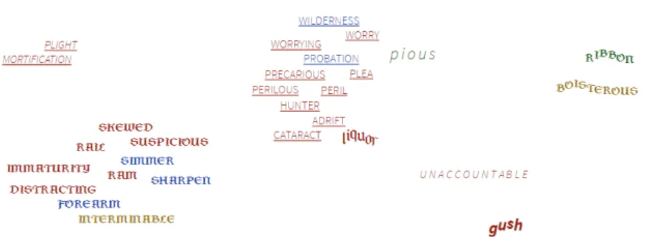
The typographic graph in figure 8 depicts 4463 words associated with 8 emotions (based on [21]). Words can be associated with more than one emotion. The eight large clusters around the perimeter are the words belonging to a single emotion. Each word is encoded with font attributes to indicate its set membership. Starting at 10am and proceeding clockwise: blackletter foranger, underline forfear, added exclamation for surprise!, spacing fort r u s t, baseline shift forjoy, small caps forANTICIPATION, lightweight forsadness, and italic fordisgust. Word hue indicates sentiment member-ship. Positive sentiment is green, negative sentiment is red, neither is blue, both is am-ber. Overall, membership in 10 sets is encoded. The largest cluster (at the perimeter at 2am) is exclusively in the set trust.
There are 140 unique set relations out of 256 possible. A portion of the graph in-terior is shown in figure 9. Near the bottom left is a small cluster of words such as SIMMER,SUSPICIOUS andSHARPEN- this entire cluster is homogenous with blackletter caps indicating angry anticipation. To the right is a cluster immedi-ately visible as heterogeneous; with words such asWORRY,WILDERNESSandPLEA in underline lightweight caps indicating fear, sadness and anticipation. However, two
Fig. 9.Closeup of a congested area of words: font attributes distinguish set memberships
other words positionally close to these words have different very memberships as in-dicated by their attributes:p i o u s, in spaced italics indicates both disgust and trust, whileliquorin a blackletter with a shifting baseline indicates both anger and joy - the latter two words both being singlular elements in these particular set intersections.
Unlike theTitanicexample, variance in word length was not addressed. The average word length is 7.63 characters. For the 24 largest clusters (each more than 50 words), the standard deviation is 0.36 characters. However as clusters become smaller, there can be wider variation: the 10 words in angry surprise average only 6 characters.
Instead of focusing on area accuracy, the design attempts intuitive encodings. Anger words are in a blackletter font - sometimes associated with angry heavy metal bands. Surprise adds an exclamation mark - literally a mark indicating astonishment. Fear uses an underline - as the wordlineis associated with emotionfearin the lexicon. Joy uses a baseline shift - making the word appear bouncy. In addition, interactive techniques, such as mouseover links or tooltips, can be used to clearly indicate memberships.
4.4 Typographic Cartogram of Country Risks
Set elements are sometimes depicted on a map, such as geographic regions (e.g. coun-tries, states, counties) or points (e.g. gas stations, hospitals, etc.) Set membership might be indicated by textures, icons, overlaid blobs, etc. Figure 10 is a closeup view of a map indicating many different types of risk associated with each country via icons. Long lines of icons require leader lines in congested areas. Countries are coloured by summaries, but tiny countries are teeny dots difficult to see when zoomed out.
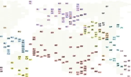
Encoding a high number of set memberships can also be done withpositional en-coding. If labels are constrained to a fixed length (e.g. country ISO codes), then font attributes can be applied to each character separately. For example,USA,CAN, DEU, etc have bold applied to the first, second or third character independently to indicate set membership in three different sets.
Extending this across a variety of font and other visual attributes suggests a possible 20 or more unique indications of set membership into a single label. Figure 11 shows a typographic cartogram, where each country label indicates set membership by the for-matting of each character. In this example, nine set attributes are conveyed in the labels, plus the background colour and the literal label. Countries with no risks are plain (e.g.
Fig. 10.Closeup of a risk map indicating country risk types via icons (AON 2015 Risk Map)
Fig. 11.Country labels indicate 9 different risk types by bold, italic and underline applied inde-pendently to each letter of the three-letter ISO code. Image by authors.
USA), countries with all risks are completely bold, italic and underline (e.g. Ethiopia ETH) and those in-between have only some combination of attributes (e.g.BrazilBRA).
5
Additional Considerations
The use of text elements raises additional issues not relevant to simple glyphs.
5.1 Representing Quantities
Because labels can be different lengths, there can be challenges attempting to use labels to indicate counts. Various strategies can be used:
• Height.Typographic Venn (fig. 4) uses stacked labels making perception of quanti-ties a visual comparison of heights. Height comparison outperforms area estimation tasks [11,14]. The approach sidesteps the issue of variable string lengths.
• Fixed Length Codes.Typographic Cartogram (fig. 11) reduces string lengths to consistent 3 letter codes. A fixed width font ensures consistent physical length.
• Processed Labels.Typographic Mosaic (fig. 5) uses area to indicate quantities, which requires consideration of string length. A simple algorithm reduces strings to similar lengths thereby making the resulting areas directly comparable.
• Accept Some Error.Emotion Words (fig. 8) accepts error and even uses encod-ings such as spacing (making strencod-ings wider) and baseline shifts (making strencod-ings taller) thereby increasing the error in the areas. This may be somewhat offset by differences in density of characters.
• Otherpossible techniques to make string lengths more uniform could include ad-justing spacing between characters; using font variants with different width; or padding with additional characters.
5.2 Intuitive Mappings
Many authors recognize the importance of establishing a metaphoric association be-tween a visual attribute and the concept encoded (e.g.[7,19]). This makes it easier for users to infer meaning from an encoding with less effort required to learn and remember them. In Typographic Venn (fig. 4), gender uses familiar color encodings, party affili-ations are indicated by text literally leaning left and right, added lines indicated added degrees. In Typographic Mosaic (fig. 5), female is represented by italic, considered by some to be more feminine than roman type [13]. As discussed earlier, Typographic Graph (fig. 8) also uses various metaphoric cues.
5.3 Differentiation vs. Decoding
Gestalt principles indicate that visually similar items are perceived as belonging to-gether. The viewer immediately understands whether the two items are similar or dif-ferent if their font attributes are similar or difdif-ferent. Showing all attributes simultane-ously can be useful: for example, in fig. 9 the use of font attributes readily distinguishes between adjacent elements belonging to the same set relations (homogenous attributes) or different relations (heterogenous attributes).
Decoding font attributes is a second step. Short-term working memory only holds a small amount of information (3-7 items, e.g. [25]). This implies cognitive challenges when encoding 10 memberships such as Typographic Graph (fig. 8). Furthermore, some typographic attributes rely on the same low level visual channel (e.g. case and font family both use shape) overloading the visual channel.
5.4 Layout Considerations
Unlike dots or icons, labels have an aspect ratio that is wider than tall. This impacts layout algorithms. Typographic Mosaic generated more accurate areas when favouring wider boxes over taller boxes. The initial Typographic Graph used a collision detection algorithm which assumed square proportions of elements and tended to push text apart vertically rather than horizontally, necessitating adjustments to the layout algorithm.
5.5 Interaction
Encoding many different font attributes simultaneously onto a label may make it diffi-cult for the viewer to decode all the memberships. Tooltips can be used to immediately show memberships. If the task is focused on a subset of set memberships, font attributes can be toggled on/off. Search can be used if the task requires locating a particular ele-ment. Using SVG and javascript, toggling attributes can be done in a single line of code and search can simply use the browser’s find feature (ctrl+f).
5.6 Language
All examples shown are English language. Some languages do not have the same font attributes (e.g. case). Also, languages that represent words with single glyphs will have different considerations: inter character spacing is not available, encoding separate char-acters within a word is not feasible, and so on.
5.7 Evaluation
Evaluation is non-trivial and there are many confounding factors. Evaluation studies should be done to assess ability to notice differences, ability to decode; ability to recall a font mapping; change in perception of areas when font attributes are manipulated; how readability is impacted by layout; how readability is impacted by the application of multiple simultaneous font attributes; and limitations across different languages.
6
Conclusions
We have shown that font attributes can be used to extend set visualization techniques, to enhance labeled elements with additional data such as set membership. These at-tributes can aid detecting differences between elements, encode membership or other data attributes, scale to at least 10 sets and thousands of items. Future work can include extensions to other set layouts, evaluation studies, higher scalability (more elements, more sets) and better techniques for integrating word semantics into encoding schemes.
References
1. Alsallakh, B., Micallef, L., Aigner, W., Hauser, H., Miksch, S., Rodgers, P.: Visualizing sets and set-typed data: State-of-the-art and future challenges. In: Eurographics conference on Visualization (EuroVis)–State of The Art Reports. pp. 1–21 (2014)
2. Bertin, J.: Sémiologie Graphique. Gauthier-Villars, Paris (1967)
3. Borgo, R., Kehrer, J., Chung, D.H., Maguire, E., Laramee, R.S., Hauser, H., Ward, M., Chen, M.: Glyph-based visualization: Foundations, design guidelines, techniques and applications. In: Eurographics State of the Art Reports. pp. 39–63. EG STARs, Eurographics Association (May 2013),http://diglib.eg.org/EG/DL/conf/EG2013/stars/039-063.pdf 4. Brase, G.L.: Pictorial representations in statistical reasoning. Applied Cognitive Psychology
5. Brath, R.: High category glyphs in industry. In: Visualization in Practice at 2015 IEEE Sym-posium on Information Visualization (VisWeek 2015). IEEE (2015)
6. Brath, R., Banissi, E.: The design space of typeface. Proceedings of the 2014 IEEE Sympo-sium on Information Visualization (VisWeek 2014) (2014)
7. Brath, R.K.: Effective Information Visualizaiton: Guidelines and Metrics for 3D Interactive Representations of Business Data. Ph.D. thesis, University of Toronto (1999),http://www. collectionscanada.gc.ca/obj/s4/f2/dsk1/tape7/PQDD_0006/MQ45944.pdf 8. Brinton, W.C.: Graphic Presentation. Brinton Associates (1939)
9. Chen, M., Floridi, L.: An analysis of information in visualization. Synthese (2013) 10. Clark, J.: Twitter venn (2008),http://www.neoformix.com/2008/TwitterVenn.html,
accessed 04/02/2016
11. Cleveland, W.S., McGill, R.: Graphical perception: Theory, experimentation, and application to the development of graphical methods. Journal of the American statistical association 79(387), 531–554 (1984)
12. Collins, C., Penn, G., Carpendale, S.: Bubble sets: Revealing set relations with isocontours over existing visualizations. IEEE Transactions on Visualization and Computer Graphics 15(6), 1009–1016 (2009)
13. Cousins, C.: Design stereotypes: Masculine and feminine design techniques (2012),http: //designmodo.com/masculine-feminine-designs, accessed 03/30/2016
14. Heer, J., Bostock, M.: Crowdsourcing graphical perception: Using mechanical turk to assess visualization design. In: ACM Human Factors in Computing Systems (CHI). pp. 203–212 (2010)
15. Heer, J., Boyd, D.: Vizster: Visualizing online social networks. In: IEEE Symposium on Information Visualization, 2005. INFOVIS 2005. pp. 32–39. IEEE (2005)
16. Hodges, E.R.S.: The Guild Handbook of Scientific Illustration. John Wiley (2003)
17. Hodson, Y.: Popular maps: The ordnance survey popular edition one-inch map of eng-land and wales, 1919-1926. (1999),http://www.davidrumsey.com/luna/servlet/s/ s15w94, accessed: 04/02/2016
18. MacKinlay, J.: Automating the design of graphical representations. ACM Transactions on Graphics 5, 27–34 (2006)
19. Maguire, E.: Systematising glyph design for visualization. Ph.D. thesis, Oxford University (2015)
20. Misue, K.: Drawing bipartite graphs as anchored maps. In: Proceedings of the 2006 Asia-Pacific Symposium on Information Visualisation-Volume 60. pp. 169–177. Australian Com-puter Society, Inc. (2006)
21. Mohammad, S.M., Turney, P.D.: Emotions evoked by common words and phrases: Using mechanical turk to create an emotion lexicon. In: Proceedings of the NAACL HLT 2010 workshop on computational approaches to analysis and generation of emotion in text. pp. 26–34. Association for Computational Linguistics (2010)
22. Riche, N.H., Dwyer, T.: Untangling Euler diagrams. Visualization and Computer Graphics, IEEE Transactions on 16(6), 1090–1099 (2010)
23. Robinson, A., Morrison, J., Muehrcke, P., Kimerling, A., Guptill, S.: Elements of Cartogra-phy. John Wiley & Sons, New York, NY (1995)
24. Setlur, V., Mackinlay, J.D.: Automatic generation of semantic icon encodings for visualiza-tions. In: Proceedings of the SIGCHI Conference on Human Factors in Computing Systems. pp. 541–550. ACM (2014)
25. Ware, C.: Information Visualization: Perception for Design. Springer-Verlag (2000) 26. Wilkinson, L.: Exact and approximate area-proportional circular Venn and Euler diagrams.