Portland State University
PDXScholar
TREC Final Reports Transportation Research and Education Center
(TREC)
8-2010
Oregon Freight Data Mart
Miguel Figliozzi
Portland State University, [email protected]
Robert Bertini
Portland State University
Let us know how access to this document benefits you.
Follow this and additional works at:http://pdxscholar.library.pdx.edu/trec_reports
Part of theManagement Information Systems Commons,Transportation Commons, and the Urban Studies and Planning Commons
This Report is brought to you for free and open access. It has been accepted for inclusion in TREC Final Reports by an authorized administrator of PDXScholar. For more information, please [email protected].
Recommended Citation
Figliozzi, Miguel and Robert Bertini. Oregon Freight Data Mart. OTREC-RR-10-09. Portland, OR: Transportation Research and Education Center (TREC), 2010. https://dx.doi.org/10.15760/trec.12
A National University Transportation Center sponsored by the U.S. Department of Transportation’s Research and Innovative Technology Administration
OREGON TRANSPORTATION RESEARCH AND EDUCATION CONSORTIUM
OTREC
FINAL REPORT
OREGON FREIGHT DATA MART
Final Report
OTREC-RR-10-09
by Miguel Figliozzi, Ph.D. Kristin Tufte, Ph.D. Portland State University Civil and Environmental EngineeringPortland State University for
P.O. Box 751 Portland, OR 97207
i Technical Report Documentation Page
1. Report No.
OTREC-RR-10-09
2. Government Accession No. 3. Recipient’s Catalog No.
4. Title and Subtitle 5. Report Date August 2010
Oregon Freight Data Mart 6. Performing Organization Code
7. Author(s) Miguel Figliozzi Portland State University
Civil and Environmental Engineering P.O. Box 751
Portland, OR, 97207
8. Performing Organization Report No.
9. Performing Organization Name and Address 10. Work Unit No. (TRAIS) 11. Contract or Grant No. 12. Sponsoring Agency Name and Address
Oregon Transportation Research and Education Consortium (OTREC) P.O. Box 751
Portland, Oregon 97207
13. Type of Report and Period Covered 14. Sponsoring Agency Code
15. Supplementary Notes
16. Abstract
Increasing freight volumes are adding pressure to the Oregon transportation system. Monitoring the performance of the transportation system and freight movements is essential to guarantee the economic development of the region, the efficient allocation of resources, and the quality of life of all Oregonians. Freight data is expensive to collect and maintain. Confidentiality issues, the size of the datasets, and the complexity of freight movements are barriers that preclude the easy access and analysis of freight data. Data accessibility and integration is essential to ensure successful freight planning and consistency across regional partner agencies and planning organizations. In relation to Internet-based mapping technology in freight data collection and planning, the main objectives of this project are: (a) address implementation issues associated with data integration, (b) present a system architecture to leverage existing publically-available interfaces and web applications to accelerate product development and reduce costs, (c) describe an existing web-based mapping prototype and its capabilities, (d) state lessons learned and present suggestions to streamline the integration and visualization of freight data, and (e) discuss load-time and display quality issues associated with the visualization of transportation data on internet-based mapping applications. The strategies and methodologies described in this report are equally applicable to the display of areas such as states or counties as well as linear data such linear data such as highways, waterways, and railways. Despite data integration challenges, Internet-based mapping provides a cost effective and appealing tool to store, access, and communicate freight data as well as enhance our understanding of freight issues. Institutional barriers, not technology, are the most demanding hurdles to widely implementing a freight data web-based mapping application in the near future.
17. Key Words
Freight Data, Visualization, Integration, Internet Mapping
18. Distribution Statement
No restrictions. Copies available from OTREC: www.otrec.us
19. Security Classification (of this report) Unclassified
20. Security Classification (of this page) Unclassified
21. No. of Pages 60
iii
ACKNOWLEDGEMENTS
The authors gratefully acknowledge the Oregon Transportation Research and Education Consortium (OTREC) for sponsoring this project. This work also was supported by the
Department of Civil and Environmental Engineering in the Maseeh College of Engineering and Computer Science at Portland State University. In addition, the authors are thankful to the reviewers and editors for their helpful comments and suggestions, and to research assistant Scott Fletcher for his comments and efforts. Any errors or omissions are the sole responsibility of the authors.
DISCLAIMER
The contents of this report reflect the views of the authors, who is solely responsible for the facts and the accuracy of the material and information presented herein. This document is
disseminated under the sponsorship of the U.S. Department of Transportation University Transportation Centers Program and the Oregon Transportation Research and Education
Consortium (OTREC) in the interest of information exchange. The U.S. Government assumes no liability for the contents or use thereof. The contents do not necessarily reflect the official views of the U.S. Government. This report does not constitute a standard, specification, or regulation.
v
TABLE OF CONTENTS
EXECUTIVE SUMMARY ... 9
1.0 INTRODUCTION... 11
2.0 PROJECT VISION AND SYSTEM ARCHITECTURE ... 13
2.1 CURRENT DATA SOURCES AND CHARACTERISTICS ... 14
2.1.1 Port of Portland ... 15
2.1.2 PORTAL Data Source ... 16
2.1.3 Other Data Sources ... 16
3.0 INTEGRATION AND IMPLEMENTATION CHALLENGES ... 17
3.1 GEO-LOCATION... 17
3.2 RAW DATA VS. DOCUMENTS AND IMAGES ... 17
3.3 MAPS ... 18
3.4 DATA OVERLAP ... 18
3.5 SYSTEM MAINTENANCE AND INFORMATION OVERLOAD ... 19
4.0 DATA VISUALIZATION CAPABILITIES ... 21
4.1 TRUCK INCIDENTS ... 22
4.2 TRUCK VOLUME ... 22
4.3 HIGHWAY SPEED AND RELIABILITY ... 25
4.4 GOOGLE SERVICES ... 25
5.0 RECOMMENDATIONS FOR FREIGHT DATA COLLECTION ... 27
6.0 TRANSPORTATION DATA LEVELS OF DETAIL ... 29
7.0 NUMBER OF POINTS, LOAD-TIME, AND QUALITY TRADEOFFS ... 31
7.1 DATA CONVERSION STRATEGIES ... 31
7.2 PROJECTION... 32
7.3 VERTICES TO POINTS ... 33
7.4 SIMPLIFICATION STRATEGIES ... 34
8.0 ALGORITHMIC SIMPLIFICATION METHODS ... 37
8.1 THE LAT/LONG DIFFERENCES ALGORITHM ... 37
8.2 THE DISTANCE ALGORITHM ... 37
8.3 THE TRIANGULATION ALGORITHM ... 37
8.4 THE DOUGLAS-PEUCKER ALGORITHM ... 38
8.5 SIMPLIFICATION SOFTWARE ... 39
9.0 RESULTS AND DISCUSSION ... 41
10.0 CONCLUSIONS ... 45
11.0 REFERENCES ... 47
APPENDIX A ... 51
QUICK INSTRUCTIONS TO ADD A LAYER TO THE OFDM GOOGLE MAPS APPLICATION ... 51
APPENDIX B ... 53
QUICK INSTRUCTIONS TO CONVERT A SHAPEFILE TO A DATABASE TABLE SUITABLE FOR GOOGLE MAPS ... 53
vi
APPENDIX C ... 55 QUICK INSTRUCTIONS TO ADD A POLYGON LAYER ... 55 APPENDIX D ... 57 QUICK INSTRUCTIONS TO CONVERT A DATABASE TABLE TO A SHAPEFILE TO 57 APPENDIX E ... 59 QUICK INSTRUCTIONS TO ADD THE FHWA BOTTLENECK LAYER ORIGINAL
vii
LIST OF TABLES
Table 1. OFDM Data Sources ... 15 Table 2. Comparison of the four algorithms for Oregon Counties 300,000 points ... 30 Table 3. Algorithm Result Comparison ... 33
viii
LIST OF FIGURES
Figure 1. The OFDM System... 14
Figure 2. Freight Data Mart Main Screen ... 21
Figure 3. Truck Incident Display ... 22
Figure 4. Truck Volume Display – Map View ... 23
Figure 5. Truck Volume Display – Detail for I-5 at Interstate Bridge ... 23
Figure 6. Highway Speed and Reliability Display... 24
Figure 7. Google Street View of Incident Location ... 25
Figure 8. Levels of Geographic Detail ... 30
Figure 9. Country map of the world before and after simplification ... 31
Figure 10. Topological integrity damaged due to oversimplification ... 35
9
EXECUTIVE SUMMARY
This report presents the issues surrounding the integration and visualization of freight data using Internet-based mapping applications. An Internet-based mapping system is utilized to provide geographic context and user-friendly information to transportation planning decision makers. A key goal is to provide an intuitive application that requires a minimal learning curve yet provides powerful geographic and contextual metadata.
In relation to Internet-based mapping technology in freight data collection and planning, this report: (a) addresses implementation issues associated with data integration, (b) presents a system architecture to leverage existing publicly available interfaces and web applications to accelerate product development and reduce costs, (c) describes an existing web-based mapping prototype and its capabilities, (d) states lessons learned and present suggestions to streamline the integration and visualization of freight data, and (e) discusses load-time and display quality issues associated with the visualization of transportation data on Internet-based mapping applications.
The strategies and methodologies described in this report are equally applicable to the display of areas such as states or counties as well as linear data such as highways, waterways, and railways. Despite data integration challenges, Internet-based mapping provides a cost-effective and appealing tool to store, access, and communicate freight data as well as enhance general understanding of freight issues. Institutional barriers, not technology, are the most demanding hurdles to widely implementing a freight data, web-based mapping application in the near future.
11
1.0
INTRODUCTION
Public decision makers require a comprehensive picture of freight movements to understand how freight transportation supports economic development, how land use affects freight transportation, and the impacts of transportation infrastructure supply on private-sector freight and commercial activity. The need to integrate and coordinate freight data collection efforts is widely accepted and recognized (TRB., 2003). Freight data is available from many public and private sources. However, the data may significantly vary in terms of collection method, timeframe, format, and quality. The lack of coordination not only prevents the seamless integration of data sources, but also limits the scope and quality of transportation studies.
Over the last 15 years, the ability to collect freight data has significantly expanded through developments in electronics, information and communication technology, and Global Positioning System (GPS) technology. The ability to represent freight data has been greatly enhanced by the development of Geographic Information Systems (GIS) to manipulate and display transportation data at distinct levels of spatial and temporal resolution (Fletcher, 2000). More recently, the development of Internet-based geographic data visualization platforms (e.g., Google Earth) has dramatically expanded the ability to disseminate and access data (Butler, 2006).
The benefits of sharing maps and spatial data among public agencies are well established (Jacoby et al., 2002). Data and map sharing brings about significant reductions in maintenance activity, increases adoption of GIS technologies, and improves information access and accuracy. Maps and data sharing in GIS transportation (GIS-T) networks require unified and standard semantics, data models, and acquisition methods. For example, a clear semantic hierarchy allows higher-order data networks, such as a state highway system, to receive real-time updates reflecting any database changes from local government agencies, such as modifications along a local road network (Dueker and Butler, 1998, Dueker and Butler, 2000). Without common standards and semantics, agencies must devote time and resources to the error-prone and expensive process of data conversion (Abdelmoty and Jones, 1997, Cobb et al., 1998). Similar hierarchies and relations are crucial when sharing multimodal network data (e.g., linking of transit operational data to a road network) (Trépanier and Chapleau, 2001) or the integration of GIS-T applications and transportation asset management (Darter et al., 2007).
Technological developments in Internet-based mapping tools are creating new challenges and opportunities to collect and communicate freight data. The application of GIS-T to freight has been mostly limited to the display and analysis of truck accident data (Harkey, 1999, Chien et al., 2002) and truck volumes (Casavant et al., 1995, Alam and Fekpe, 1998). The combination of GIS-T and GPS-based data also have been successfully applied to the monitoring of intercity truck movements (McCormack and Hallenbeck, 2006, FHWA, 2006), complementing commercial vehicle surveys (SURESHAN, 2006), and to the study of commercial vehicle tours in urban areas (Greaves and Figliozzi, 2008). The private sector is swiftly adopting GPS-based
12
technologies, where the monitoring of freight vehicles and containers across the continental U.S. has the potential to reduce cargo damage, control driver behavior, and reduce freight theft (Elango et al., 2007) (Ramachandran and Klodzinski, 2007).
The aim of this research is to highlight the advantages and challenges of using Internet-based spatial data tools and technologies for integrating and visualizing freight transportation data; a working prototype and its system architecture also are presented. Lessons learned from the prototype implementation and recommendations to improve future data collection and visualization efforts are discussed.
While the collection and integration of transportation data presents its own problems, the final sections of this report focuses on the issues and tradeoffs surrounding the visualization of transportation data. More specifically, the challenges involve designing an intuitive and informative web application that contains a suitable level of detail and also reduces load-times to user-accepted levels. The fidelity or quality of any map grows with the number of utilized points. However, as the number of points grows, the load-time or wait-time for the end user also grows. This report shares the research team’s experience with four algorithms to simplify polygons and reduce load-times. These algorithms are evaluated using two criteria: (a) total load-time and (b) quality or the ability to produce visually appealing and appropriate shapes that maintain a sufficient level of topological integrity.
The report is organized as follows: Section 2.0 describes the project vision, its system architecture, and data sources. Section 3.0 discusses implementation and data integration challenges. Section 4.0 describes visualization capabilities of the prototype. Section 5.0 presents recommendations for data collection. Section 6.0 discusses transportation data levels of detail. Section 7.0 analyzes tradeoffs among mapping quality and loading times. Section 8.0 introduces algorithms to speed up loading times and simplify polygons. Section 9.0 presents results regarding loading times in different Internet environments. Section 10.0 offers conclusions. Several appendices describe common operations used in the manipulation of transportation and geographic data.
13
2.0
PROJECT VISION AND SYSTEM ARCHITECTURE
The system described herein, the Oregon Freight Data Mart (OFDM), is under continuous development1. A primary goal of the OFDM is to provide an online environment to integrate, visualize, and disseminate freight data in the state of Oregon. It was clear from the outset of the OFDM project that the prototype should handle a diverse set of existing and future data sources and types. A clear vision to make the application flexible and cost-effective included the following goals: (a) to provide an intuitive application with minimal user learning, (b) to have powerful visualization and geographical capabilities, (c) to facilitate freight data integration, and
(d) to design a system that can leverage existingpublicly available Internet applications in order
to accelerate product development and reduce costs.
The OFDM is a data visualization tool based on Google Maps® (GM). GM was chosen for visualization because it can be used to combine different types of data and can be accessed by any user from any Internet browser. The intuitive and user-friendly characteristics of GM
provide an excellent platform to tailor the display of information. GM fulfills the ease-of-use and visualization requirements of the OFDM, including the ability to integrate images such as maps, graphics or digital photos, external links, and HTML content. The user interface also enables integrated visualization of data sources using multiple hierarchical layers and clickable links that can be used to explore and expand details.
The OFDM leverages the GM Application Programming Interface (API), which allows a developer to create their own overlays on the basic GM maps. A significant advantage of using GM to display the freight data is the ability to leverage other Google services, such as Google Traffic, Google Street View, and satellite images. The integration of existing freight data with the Google Maps application means that as Google provides more services, the OFDM can take advantage of these services, most often with limited time and monetary overhead. Finally,
Google Earth®2 can be used as a backbone to develop maps that can be exported to KML/KMZ
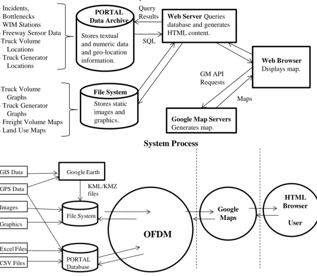
files, a format that is gaining wide acceptance, which can later be displayed in GM. At a high level, the OFDM system processes and architecture are described in Figure 1.
A second key component of the OFDM is PORTAL, the official transportation data archive of the Portland metropolitan region (Bertini et al., 2005b). PORTAL consists of a 700GB PostgreSQL database archive and a website for visualizing that data. The OFDM uses PORTAL for data storage and retrieval. Freight-related data is stored in PORTAL and retrieved for display on the OFDM map interface. Storing data in a database helps support dynamic content by making it easy to select and display only data the user has requested. In addition, as PORTAL expands by adding new data and features, OFDM will automatically be able to leverage that expansion. A current Portland State University (PSU) project involves loading Weigh-in-Motion (WIM) data into PORTAL with the purpose of calculating truck travel times throughout the state
1
A prototype of the Oregon Freight Data Mart can be found at http://portal.its.pdx.edu/testarea/archive/freight_data/fdm.php. This website is working properly as of November 2009 and it is best displayed using Mozilla Firefox© browser. Changes in GoogleMaps© or browser can affect the future display of the Oregon Freight Data Mart and the maintenance of the OFDM website is beyond the scope and funding of this project and report.
14
of Oregon. Once that project work is completed, the WIM data and associated travel times will be automatically available to the OFDM.
System Architecture
System Process
Figure 1. The OFDM System
2.1
CURRENT DATA SOURCES AND CHARACTERISTICS
The OFDM combines a set of diverse data from disparate data sources into a single map-based interface. This interface provides an easy-to-use means of accessing freight-related data while adding geographical context. The OFDM contains data from several sources, including the Port of Portland, the Oregon Department of Transportation (ODOT), Portland’s metropolitan planning organization (Metro), PORTAL transportation data archive, and research analysis and results of several transportation performance-related projects at PSU. This section describes the types of data currently contained in the OFDM as well as data sources and original formats. Table 1 summarizes data sources and their characteristics; the disparate data formats include:
- Incidents, - Bottlenecks - WIM Stations - Freeway Sensor Data -Truck Volume Locations - Truck Generator Locations -Truck Volume Graphs - Truck Generator Graphs
- Freight Volume Maps - Land Use Maps
Web Server Queries database and generates HTML content.
Web Browser
Displays map.
Google Map Servers
Generates map. Maps GM API Requests SQL Query Results Stores static images and graphics. File System Stores textual and numeric data and geo-location information. PORTAL Data Archive Google Earth GIS Data GPS Data File System PORTAL Database KML/KMZ files OFDM CSV Files Images Excel Files Graphics Google Maps HTML Browser User
15
GIS shape files, Adobe PDF files, Microsoft Word documents, Comma-Separated Value (CSV) files, Microsoft Excel files, and PORTAL data.
Table 1. OFDM Data Sources
Name Data Provider Type of Data Source Instrument Collection Metadata Analysis Reports Truck Incidents PORTAL/ ODOT Database Input by ODOT ATMS operators Database field descriptions Truck Volumes Port of Portland Survey Data, Excel File Field Collection, consultants Report description Truck Generators Port of Portland Survey Data, Excel File Field Collection, consultants Minimal metadata Bottlenecks ODOT/ OTREC Project
Text Data Loop
detectors, ground truth GPS data Detailed description and methodology Continuous collection and analysis - Reports Weigh-In-Motion Stations
ODOT Database Scales,
transponder readers Detailed description and methodology Continuous collection Highway Speed and Reliability PORTAL/ ODOT Database Loop detectors, cameras Detailed description and methodology Continuous collection and analysis - Reports Freight Volume Maps
Metro Maps Variety of
truck counts
No metadata
Land-Use Maps
Metro Maps Norms and
regulations
No metadata
2.1.1
Port of Portland
The Port of Portland is one of the major ports in the Pacific Northwest. The Port has an active role in the study of freight movements in the region. Freight data from a recently commissioned data collection study includes truck-following studies, truck counts around the Portland
16
metropolitan area, and truck-trip generation at major freight facilities (such as a terminal at the Port). This data was collected using counts and surveys, and the final deliverables were a series of reports and sets of data in spreadsheets and GIS files.
2.1.2
PORTAL Data Source
As mentioned above, PORTAL archives a wide variety of transportation-related data for the Portland region (Bertini et al., 2005b). PORTAL has been archiving speed, volume and occupancy data from sensors on Portland-area freeways since July 2004. PORTAL also stores weather, incident, freeway dynamic message signs (DMS), bus movement data from TriMet (the local transit agency), and data from 22 WIM stations across the state of Oregon. Most of this data is provided to PORTAL by the Oregon Department of Transportation. An initial selection of PORTAL data has been incorporated in the OFDM, including the freeway sensor data, which is used to plot highway speeds and reliability, and truck incident data. Data stored in PORTAL is easy to integrate into the OFDM. PORTAL’s tabular-style database lends itself to the generation of HTML content and geographical position information compatible with the GM interface. PORTAL data sets, including the freeway sensor data, are regularly updated and the retrieval and storage of the freeway sensor data is fully automated. The retrieval and storage of incident and WIM data is semi-automated. When additional data of these types is received and stored in PORTAL, the new data is automatically integrated into the OFDM.
2.1.3
Other Data Sources
The Intelligent Transportation Systems (ITS) Lab at Portland State University leads many transportation-related research projects. Many of those projects produce data which is pertinent to freight transportation. Examples include bottleneck locations produced by recent projects on travel-time estimation (Tufte et al., 2008) and automated bottleneck identification (Bertini et al., 2005b) as well as truck travel times derived from WIM data. The results of these projects may be in reports or in the PORTAL database. Land-use maps are provided by Metro.
17
3.0
INTEGRATION AND IMPLEMENTATION CHALLENGES
Data integration is a process of assimilating data from different sources and formats. The OFDM integrates a wide variety of freight-related data into a single map interface. One of the main challenges of developing the OFDM prototype was to integrate these diverse data sources in an intuitive and useful way, and also to add geographic context and the ability to associate and connect data through the use of a map-based interface. In addition, metadata, or data about the data, is poor or non-existing in many data sources (see Table 1). The lack of metadata regarding data collection methods, data semantics, and basic data description greatly complicates the data integration process. This section describes several challenges encountered during the course of the OFDM’s development.
3.1
GEO-LOCATION
Geo-location information is provided in a number of different ways. However, the GM API requires geographic coordinates (a latitude-longitude pair) to display a marker, and a list of geographic coordinates to display a polyline or polygon. A subset of the PORTAL incident data is geo-coded with geographic coordinates; typically the major incidents that cause significant traffic delays are also geo-coded. Displaying such geo-located incidents on the OFDM map is relatively straightforward - the incident metadata (time, description, level, etc.) is retrieved from the database along with the geo-location of the incident, and this data is used to create a GM marker for the incident. The rest of the incident data is typically geo-located by specifying the primary roadway on which the incident occurred and the nearest cross street.
Identifying geographic coordinates information requires identifying the coordinates of roadway intersections, which is typically a manual process requiring some human intervention. The PSU Travel Time study provides bottleneck location in terms of a text description, highway corridor, and approximate milepost. This data was geo-located with the help of GM itself, which can provide coordinates for a point clicked on a GM map. Since the number of bottlenecks was small, this manual method of geo-location was acceptable. The FHWA bottleneck study provides LRS identifiers, which require GIS software to convert to latitude-longitude information. Some of the truck volume and truck generator data was geo-located by hand based on text descriptions of collection locations. Geo-location of WIM stations was done using GM satellite images and approximate highway and milepost information from ODOT.
In the process of testing the OFDM interface, it was observed that geo-location information varies greatly in accuracy. From close observation of the incident data and comparing geo-location with text description, it is clear that the ODOT ATMS incident geo-geo-location information is limited in its accuracy. In contrast, the accuracy of the Highway Speed and Reliability data is quite high, as that data was derived from GPS readings taken along the highway.
3.2
RAW DATA VS. DOCUMENTS AND IMAGES
Raw data formats such as CSV files or Excel files tend to be easier to integrate into the PORTAL database and, therefore, into the OFDM. In contrast, data which is provided as figures in
18
Microsoft Word or Adobe PDF is more difficult to integrate in a non-trivial fashion. As shown in Section 5.0, figures can be displayed in the OFDM; however, the data contained in these figures is difficult to integrate into the database and is available only through viewing the images. In contrast, if the data had been provided in a raw format, it could be loaded into PORTAL and queried and displayed dynamically. For example, with the PSU Travel Time bottleneck data, the data was loaded into the database, which gave the user the ability to dynamically select which bottlenecks they wanted displayed. Such dynamic selection is not possible with data that is provided as an image or document. Raw data lends itself to loading into the database and to dynamic and selective display. Graphs that are provided as images from a document can be stored and displayed, but integration is limited.
3.3
MAPS
Land-use and freight-volume data was provided in the form of maps. As discussed above, if the maps are provided as images, the integration is limited to displaying those images to the user. In the case of the land-use and freight-volume maps, despite the fact that geo-location data was clearly available at one time, the maps have not yet been integrated into the GM display due to the fact that they were converted into images. The same problem would occur for maps provided as output from modeling software with limited capabilities for producing Latitude/Longitude data. However, maps provided in formats such as shape files or KML/KMZ files (the format for Google Earth), can be displayed in a GM interface.
3.4
DATA OVERLAP
For many types of information, such as bottleneck locations and freeway speed and travel time, there are several potential data sources. In the case of bottleneck locations, the project had at least three possible sources of data: FHWA bottleneck data (White and Grenzeback, 2007), the PSU Travel Time project (Tufte et al., 2008), and the PSU Bottleneck Identification project (Bertini et al., 2008). All three of these sources provide information about bottlenecks on Oregon highways, but the scope and type of information varies.
The PSU Bottleneck Identification project is investigating automatic bottleneck identification for freeways in the Portland area using the PORTAL data archive. So far, this project has produced a list of possible bottlenecks on Interstate 5 in Portland (Bertini et al., 2008); the information provided by this study is bottleneck location in terms of highway, time of the day, and milepost. The PSU Travel Time project has identified bottlenecks across the freeways in the Portland region; this identification was based on data from the PORTAL data archive and the collection and examination of more than 500 ground-truth (prove vehicles) travel time runs. The information provided by the Travel Time study includes bottleneck location (highway id and milepost), activation time, approximate average length of time the bottleneck is activated, approximate average extent (in miles) of the bottleneck, and a description. Finally, the FHWA provides information on bottlenecks across the state of Oregon (including rural bottlenecks), in contrast to the two previously described sources, which focus only on the Portland metropolitan area. Also in contrast to the two PSU sources, the FHWA provides much greater detail about each bottleneck, including a number of estimated performance metrics, such as AADT, AADTT, Percent Trucks, Annual Truck Hours of Delay, and also classifies bottlenecks. Thus, the
19
distribution of the bottleneck locations and the metadata available about the bottlenecks varies greatly.
At this time, only the bottlenecks from the PSU Travel Time project have been incorporated into the OFDM. The research team is in the process of incorporating the additional bottleneck data and several questions have emerged. These include whether to integrate all three sources or just one source and, if multiple sources are used, whether the team should make separate layers from bottlenecks from separate sources. Making separate layers gives the user flexibility, but may be confusing to a user who does not know how best to select between different sources. If the research team puts multiple sources in one layer, how should it deal with the fact that different bottlenecks have different metadata? Finally, are there accuracy differences between different sources and, if so, how can those differences be communicated to the user?
3.5
SYSTEM MAINTENANCE AND INFORMATION OVERLOAD
Transportation data storage and visualization requires a significant and continuous time commitment and financial support. With any large system, time and resources are required simply to keep the system up and running - hardware and software must be maintained and upgraded; bugs and problems with the system will be discovered and must be fixed and addressed; users need to be trained and their questions must be answered; and changes to systems that interact with the transportation archive must be handled. For example, PORTAL receives data directly from the ODOT ATMS, so ATMS upgrades often necessitate PORTAL maintenance.
As new technologies provide an increasing ability to collect large amounts of data, information overload may cloud essential knowledge. With the proliferation of sensor technology, collecting vast amounts of data is inexpensive and relatively easy; the problem then becomes analyzing, filtering and mining that data. In fact, in many cases, people desire to use data collected for reasons beyond the intended use. For example, the ODOT freeway sensors were installed for the purpose of adaptive ramp metering. However, the data from those sensors is now used for travel time estimation, performance metrics and a wide variety of research projects. WIM data, which is collected for truck preclearance, can now be used to analyze truck volumes and truck travel times.
While it is efficient to use already-collected data in such situations, several issues arise. First, one may simply have much more data than one needs and will need to decide whether to use all of the data or just a subset. In addition, the data quality requirements of the application for which the data was collected may be weaker than the data quality requirements of the new application, so data will need to be cleaned and filtered. Storing and analyzing the vast quantities of freight data that will naturally be collected over the next decade will require careful consideration of system architectures and careful application of emerging technologies to ensure the data is put to its best use.
21
4.0
DATA VISUALIZATION CAPABILITIES
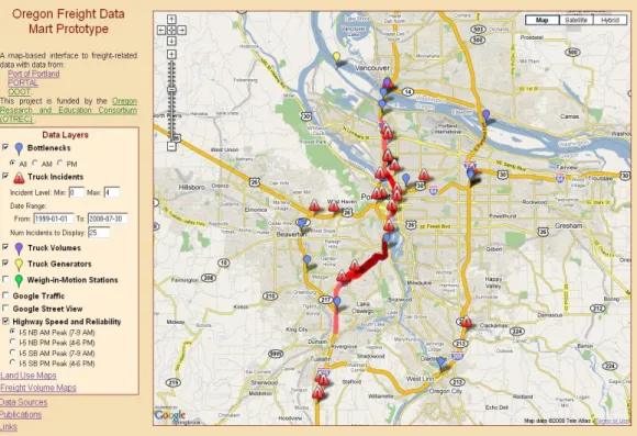
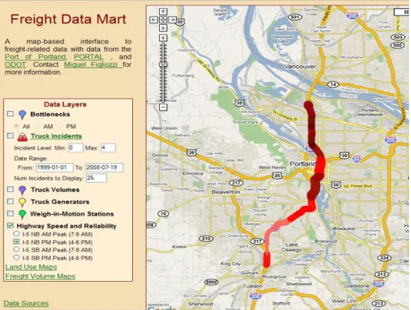
Integrating the data in one central map-based interface greatly enhances a user’s ability to relate and correlate data and to understand the context and meaning of the data. The OFDM data is displayed as points and polylines on the map with associated metadata available via a mouse click or two, or as separate maps or graphs. In this way, all data that is reasonably associated with geographic information is displayed on the map. Figure 2 shows a screenshot of the main page of the OFDM. The primary components of this page are the Data Layers control, which appears on the left side of the screen, and the map that takes up the majority of the visual field. From this figure, one can see that there are many data layers available to the user in addition to two layers for Google services (Google Traffic and Google Street View). Each layer has a check box and a name. The check box can be used to turn the display of each layer on and off. Most layers also have a small icon between the checkbox and name, which indicates the marker that is used to represent that layer on the map. In addition, passing the mouse over a layer name displays a popup window with a brief description of the layer, and clicking on a layer name takes the viewer to the documentation page, which will provide details about that layer. Several of the layers (e.g., Bottlenecks, Truck Incidents, and Highway Speed and Reliability) have additional options that can be used to further select which data is displayed for those layers. A description of some of the data layers and their features is presented next.
22
4.1
TRUCK INCIDENTS
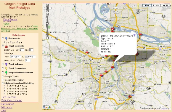
The PORTAL data archive includes data from the Oregon Department of Transportation on incidents since July 1999. From the incident database, only incidents involving tractor trailers, railroads or hazardous materials were included in the OFDM (as shown in Figure 3). Each incident is marked on the map with a caution symbol. If the user clicks on the incident location, more detailed data about the incident is obtained. Additional information that is displayed includes incident time, type of incident, the number of trucks involved, railroad cars involved, and the presence of hazardous materials. The user can restrict the date range and level of incidents displayed and also can control the maximum number of incidents to display. If the date range and level produce more incidents than the specified maximum, only the most recent incidents are displayed. This functionality of allowing the user to control which incidents to display directly results from the storage of the incident data in PORTAL.
Figure 3. Truck Incident Display
4.2
TRUCK VOLUME
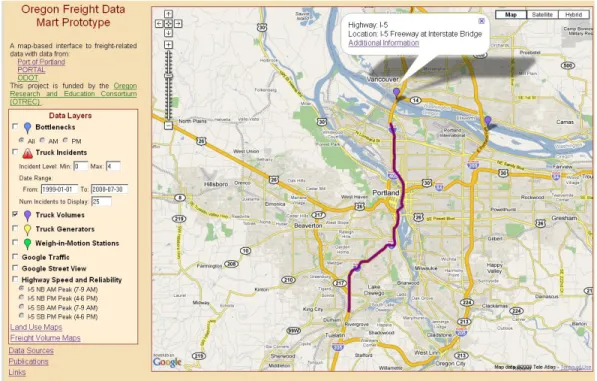
Truck volume data was collected in a recent freight study (Systematics, 2007). Truckers were surveyed and their responses tabulated to provide information about origin destinations and trips from key freight generators. Figure 4 shows the map-based display of the truck volume information. Truck volume is available for display in the OFDM only for selected sites and corridors; data for the I-5 corridor is shown in Figure 4. As with the Truck Incident layer, a user may click on each marker or corridor polyline to retrieve additional information. In this case, a popup appears with a brief description of the location or corridor and contains a link for “Additional Information.” Clicking on the link retrieves a web page with a set of graphs (e.g., a
23
graph detailing truck volume by time of day). Figure 5 shows a portion of the figures shown for I-5 at the Interstate Bridge.
Figure 4. Truck Volume Display – Map View
24
25
4.3
HIGHWAY SPEED AND RELIABILITY
The OFDM uses freeway sensor data from PORTAL to provide corridor speed and reliability information. Figure 6 shows speed and reliability information for the I-5 NB corridor for the a.m. peak. In this figure, speed is indicated by the color of the line and reliability indicated by the line width (Bertini et al., 2005a). The key shown indicates how speed and reliability (standard deviation) are translated into colors and line widths. In the future, when one clicks on a link in this segment, one will be automatically directed to plots generated by PORTAL that provide detailed information about that location. Thus, data from the PORTAL archive is integrated into the OFDM in a visually interactive fashion.
4.4
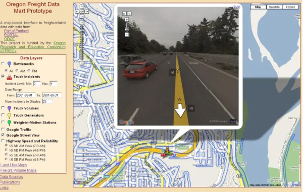
GOOGLE SERVICES
A significant advantage of integrating the freight data into a GM interface is the ability to leverage other Google services. At this time, the OFDM incorporates Google Traffic and Google Street View (cite Google website). Figure 7 shows a geo-located incident and the use of Street View to view the incident location. The ability to view the location of an incident along with information about the incident is quite powerful. Further, the integration of existing freight data with the Google Maps application means that as Google provides more services, the OFDM can automatically take advantages of these services. For example, Google Traffic can be used to display real-time traffic information.
27
5.0
RECOMMENDATIONS FOR FREIGHT DATA
COLLECTION
Powerful lessons for improving freight data collection and communication with minimal cost can be learned from the prototype implementation experience. Integrating diverse freight data into an online mapping system sheds light on the intrinsic weaknesses of current data collection methods. This report describes weaknesses in data collection discovered during the development of the OFDM and makes recommendations for improving the quality of freight data collection. Weaknesses include lack of statistical analysis, documentation, metadata, and geographical information. Recommendations include rethinking data collection methodologies, and using an Internet mapping mindset to take full advantage of technology and improve data quality and the visualization of performance measures.
Metadata is an important but often neglected part of data collection. Metadata, or “data about data,” often includes only basic information such as time and location of collection. However, it should be expanded to also include “collection method metadata.” For example, in the context of a photograph, the data is the photographic image and metadata typically includes the date and GPS coordinates of the photo. Collection and method metadata might include the resolution of the image and information about who or what took the photograph. In the context of a traffic count, the data is the number of vehicles counted and the metadata should include GPS coordinates. The “collection method metadata” would include a picture of the location and installation, model of device used, crew members involved and so on. In addition, semantic data models must also be developed to communicate how different pieces of information relate to each other. For example, links can be created between different data sources that provide similar information (e.g., traffic counts). Such modeling may provide a new dimension of accuracy if the semantic model providing the network of concepts and the relationships between those concepts is correctly applied (Shaw and Xin, 2003, Goodchild, 2000).
Traditional data collection and reporting methods have not been updated to be Internet-mapping friendly. The research team discovered a frequent lack of documentation of geographic detail and data collection procedures. In certain cases, geo-location information was limited to textual descriptions of collection locations, which is not sufficient for integration into a map-based display. Since the current cost of GPS logging devices is minor, any field data collection endeavor that does not provide GPS location data is unjustified. As seen in the previous section, databases or spreadsheets without temporal and geographic location data unnecessarily increase the cost and time of data integration. Similarly, text, or reports, should provide geographic data linking photographic or video recordings to temporal and spatial data. For example, current mapping technology supports transparent access to metadata; by clicking on the location of an accident, a user can immediately access the page of a safety report where photographs of and related information about that accident is contained. Vice versa, in an accident report, there should be a link from the accident photograph to a digital map of the accident location. Public sector agencies should update data collection efforts and procurement practices to standardize the acquisition and access of digital geographic and contextual data using GPS loggers, photographs, video recordings, traffic cameras footage and other such technologies.
28
As more data is collected and displayed, data quality issues, including justifiable statements of uncertainty and error, are becoming increasingly important. Data also should be supported by information regarding any sampling or statistical analysis that took place before or after the data collection itself. Users and researchers will benefit from this statistical metadata. In addition, such data can inform the design of future data collection efforts. For example, reports analyzing congestion and bottlenecks have been linked to the existing OFDM prototype and can be accessed via the “Bottleneck” layer. It is strongly recommended that future data collection efforts include metadata indicating the accuracy of measurements in all data sets. Currently, this metadata is not available in most cases, as illustrated by Table 1.
While integrating data into the OFDM, the research team also observed differences between data from one-time outsourced data collection efforts and continuously collected data. In any data collection effort, statistical analysis should be performed prior to data collection to estimate required sample sizes; this analysis should also be documented. With the outsourcing of data collection, such analysis is not always performed or documented. In addition, continuously collected data can be analyzed and checked for data quality with feedback provided to the collecting agencies to improve data collection and communication methods. This feedback loop makes for an improved data set in contrast to outsourced, one-time data collection. As technology evolves, a move toward continuous (or at least periodic) and automated collection systems can improve the quality of freight data.
Freight performance measures that take into account data mapping and communication should be developed. Given the premise that most transportation data has a strong spatial component, transportation performance measures also should be expected to have a strong spatial component. The synergy provided by Internet mapping allows the visualization and integration of freight-related performance measures and data. For example, the combination of GIS land-use data with GIS-GPS truck-trip data can provide invaluable insights regarding truck-trip demand generation (Fisher and Han, 2001) and the regional significance of freight corridors. Similarly, GPS freight data can be effectively combined with WIM data. Although most truck weight and payload information is generated for pavement management purposes, it also can be used to estimate the distribution of payloads (2000) and analyze the efficiency of urban freight systems (Figliozzi, 2007).
The research team argues that institutional barriers and a pre-Internet mapping mindset, not technology, are the most demanding hurdles to implementing a freight data web-based mapping application. Leveraging existing applications, the team has developed the OFDM prototype so that the software and hardware details are hidden behind standard network appliances and protocols. The OFDM users and information providers are freed from having to know about the details of the low-level technical infrastructure and equipment. Hence, as the OFDM is expanded with more data and features, the data integration and visualization challenges may be less influenced by technology than by inappropriate data procurement and collection.
29
6.0
TRANSPORTATION DATA LEVELS OF DETAIL
While the collection and integration of transportation data presents its own problems, this report’s remaining sections focus on the issues and tradeoffs surrounding the visualization of transportation data. More specifically, the challenges involve designing an intuitive and informative web-application that contains a suitable level of detail and also reduces load-times to user-accepted levels.
Generalization in all forms of cartography is a necessary process (without which our maps would all require a scale of 1:1), which includes the simplification of curves and shapes using polylines. In computer graphics, polylines are used to represent any curve, line, or polygon. A polyline is defined as sequence of points and the line segments connecting the consecutive points. Any polygon is a special type of polyline (i.e., a closed polyline). This research examines various approaches for effectively displaying polygons on a Google Maps application. As any shape or curve is formed by a sequence of points connected by straight lines, for complicated shapes the fidelity or quality of the idealized map representation grows with the number of utilized points. However, as the number of points grows, the load-time or wait-time for the end user also grows. The final sections of this report share the research team’s experience with four algorithms to simplify polygons and reduce load-times. These algorithms were evaluated using two criteria: (a) total load-time and (b) quality or the ability to produce visually appealing and appropriate shapes that maintain a sufficient level of topological integrity. The research team reported on its experience with two pre-load-time simplification strategies; one involved proprietary software and the other a free web-based tool. The team also considered the circumstances in which pre-load-time simplification might be preferred over pre-load-time simplification and vice versa. Finally, the team examined the surprising differences discovered with load-times for three well-known browsers in hopes of better understanding the load-times most of the user population will be dealing with, and perhaps providing a glimpse of what sort of load-time improvements might be expected from web browsers in the near future. The following sections begin with a brief description of the OFDM displaying a wide array of data types and geographic scales.
The OFDM integrates a wide variety of freight-related data into a single map interface. One of the main challenges in developing the OFDM prototype was the integration of these diverse data sources into an intuitive and useful format, as well as the addition of geographic context and the ability to associate and connect data through the use of a map-based interface. The OFDM data is displayed as points, polylines, and polygons on the map, with associated metadata available via a mouse click or two or as separate maps or graphs. In this way, all data that is reasonably associated with geographic information is displayed on the map. The primary components of this page are the Data Layers control, which appears on the left side of the screen, and the map which takes up the majority of the visual field.
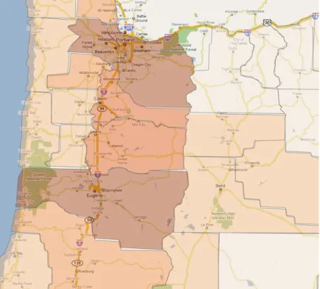
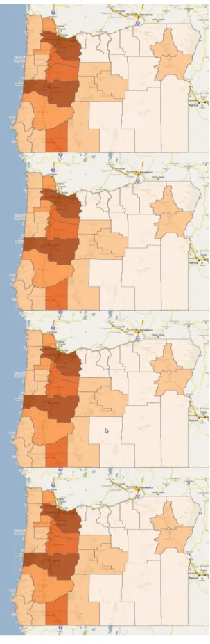
There are many data layers available to the user. These layers greatly differ in their geographic scale used for the display. For example, Figure 8 displays the location of an incident or accident at a street level on top; the reliability of a highway corridor at a regional level in the middle; and
30
commodity production by county at a state level at the bottom. Jointly displaying these diverse sets of data or switching the views creates visualization challenges as detailed in the next section.
STREET LEVEL VIEW
REGIONAL LEVEL VIEW
STATE LEVEL VIEW
31
7.0
NUMBER OF POINTS, LOAD-TIME, AND QUALITY
TRADEOFFS
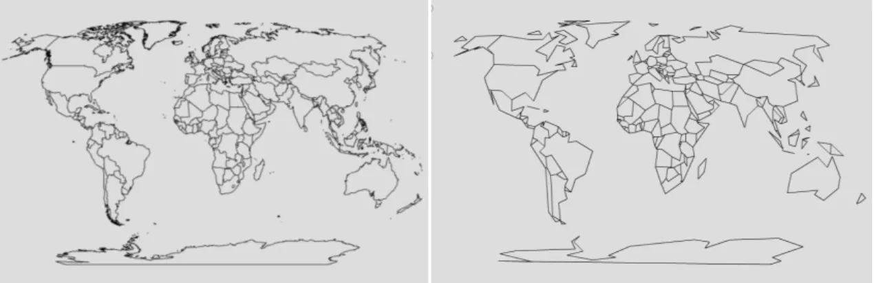
Figure 9. Country map of the world before and after simplification
The larger the number of points displayed at small scale, the longer the load-time or wait-time for the user. Furthermore, displaying too many points at a small scale not only slows down the display, but may clutter and even reduce the quality of the image, as discussed in the next section. On the other hand, there are also quality problems inherent to simplification; primarily the loss of desired shape. Figure 9 demonstrates visual issues inherent in simplification, and illustrates the problem of oversimplification via a before-and-after map containing the countries of the world. The left-hand map in Figure 9 is a simplified version of the right-hand map and was obtained with a tool called MapShaper (2009).
The subjective nature of generalizing a line while retaining its original intent requires a level of human interaction and judgment that defies automation. The tradeoff between point reduction and visualization is a balancing act between decreased load-times and detailed display. The process of simplification requires a level of compromise in order to achieve the appropriate balance between load-time and detail of display. While tolerable wait times have been debated, with many suggesting that user frustration increases after 8 to 10 seconds without feedback (Bouch et al., 2000, King and Nielsen, 2003), others have noted that with feedback, such as a progress bar, tolerable wait times can be stretched to more than 30 seconds (Nah, 2004). While intuition indicates that users of known sites that serve a unique and valuable purpose will be more tolerable of longer wait times, this potential for increased tolerance must be balanced with the tendencies for users to perceive reduced quality (Bouch et al., 2000) and reduced credibility in slower web pages (Fogg et al., 2001). With this in mind, and the current limitations of times for online mapping, users tend to lean in the direction of point reduction and speedier load-times while sacrificing display. The next section describes Google map displays.
7.1
DATA CONVERSION STRATEGIES
This section describes required data manipulations that are needed to preprocess GIS data. The discussion about data conversion and polygon simplification strategies will focus on the Oregon counties.
32
For over 30 years, Geographic Information Systems (GIS) have helped enable the practice of building database-driven digital maps. This movement has served to motivate the uploading of an enormous amount of digital cartography onto the Internet. ESRI products have largely led this innovation in GIS software; hence, probably the most common file type available for download is the ESRI shapefile (.shp). As it can be argued that ESRI has led the innovation of GIS software, it can be poetically argued that Google Maps has put webGIS on the map. Although a distinction should be made between Google Maps web-mapping capabilities and the analysis capabilities with true webGIS, Google Maps seems to have earned the classification of webGIS by its overwhelming presence. Combined, these two innovations have helped in the creation of an uncountable amount of spatial data mapping, and with the ability to freely and easily display this data on a web-based format.
Data in ESRI shapefiles can be displayed in Google Maps after some processing or by using an image overlay. An online search for free, downloadable digital boundary maps of Oregon counties quickly produced a 3MB shapefile on the Oregon.gov website (OGEO, 2009). In preparation for display with Google Maps, any spatial data must first be transformed into the Mercator projection based on the World Geodetic System (WGS) 1984 Geographic Coordinate System. In addition to transforming the projection, creating polygons in Google Maps requires data derived from individual points rather than polygon/geometry objects (which is often the storage type in polygon related shapefiles). There are many available avenues for extracting the points from the shapefile, which are described in the next section, Data Conversion Strategies. Aside from a point-to-polygon strategy, there are other approaches commonly used for displaying polygons within Google Maps. One such approach is the production of an image overlay. In a nutshell, an image overlay is a static image that has been compressed for what is often a semi-transparent display on top of the standard Google Maps display. From looking at other websites, this strategy can be implemented with suitably diminished load-times. However, the layer is then statically defined, and no longer available for adjustments in display, quality, and so on. While such a strategy may be suitable for some situations, such an option was not desirable for the research team’s needs.
As is often the case with digital data that is moved between applications, the format of the data must be converted from one that matches the first application to one that aligns with the second. As stated earlier, the research team’s main data set began as a polygon shapefile for Oregon county boundaries. This format is not yet suitable for display on Google Maps because the projection needs to be transformed into the projection used by Google Maps. Also, the polygons encoded in the shapefile need to be extracted into lists of points before they can be used for generating polygons within Google Maps. While there are multiple ways in which point data can be properly formatted for display in Google Maps (XML, tabular, etc), in all cases except an image overlay, the point data will need to be extracted.
7.2
PROJECTION
Map projection is simply a means of representing data derived from the spherical surface of the earth onto the flat surface of a plane (such as a paper map or a computer screen). Changing map projections is one of the most common tasks of mapping software, and so transforming data into
33
the desired WGS 1984 projection can be accomplished with nearly any mapping tool available. This is easily managed by licensed software such as ESRI’s ArcMap tool (ESRI, 2009), and just as easily managed by much simpler, free tools such as Quantum GIS (QUAMTUM, 2009), uDIG (uDig, 2009), or MapWindow (MapWindow, 2009). Many databases now have spatial extensions available to them that also can be used to transform map data from one projection to another. The PostGIS (PostGIS, 2009) spatial extension to the PostgreSQL (PosgreSQL, 2009) database has such a function in addition to hundreds of other spatially oriented functions capable of transforming and analyzing spatial data. Other databases such as Oracle (ORACLE, 2009) and MySQL (MySQL, 2009) offer spatial extensions with similar capabilities.
7.3
VERTICES TO POINTS
Shapefiles represent spatial data via points, polylines, or polygons. When dealing with polygon data, the shapefile attributes are managed as whole polygon geometries rather than the individual points that make up the polygons. As generating polygons in Google Maps requires the points that make up the vertices for each polygon, a means of extracting the points from the polygon shapefile is required. Again, there are various software tools available for this purpose.
ESRI’s ArcMap has a tool called “Feature Vertices to Points” that produces a table containing the points used to generate each of the polygons. The table includes additional attributes, allowing the various polygons to remain distinguishable from one another. This table can then be exported into a CSV or Excel format for further manipulation or loading directly into a database. PostGIS, the spatial extension to PostgreSQL, has functions that can be used to similarly extract point data from polygon geometries. And similar functions exist in the various spatial extensions that accompany various other databases.
If, however, a user is without a spatially enabled database or suitable software products, there are still other strategies for extracting individual points from the polygons. One such strategy involves converting the shapefile into a KML file. The resulting KML file will be readable via a text editor and will contain lists of points in place of each polygon. To convert a shapefile into a KML file, free tools such as shp2kml (Zonum, 2009) will do. Aside from the points, the resulting KML file will contain ancillary data that users may want to clean from the file before importing to a database or converting to an XML.
Extracting the points from the KML file may require a little technical knowhow, as the research team is not familiar with any tool that automates this process. The team accomplished this task by writing a short Perl script that left only the desired lat/long data and the name of the county represented by the points/polygon. This could just as easily have been managed by a software tool or a short program written in any language that allows for easy file manipulation and regular expressions, as would the use of various command line strategies. A similar script could have been used to create an XML file containing the resulting data, which could then be uploaded directly into a Google Maps application. However, the team’s application is structured around large stores of data and ongoing research projects; the option with intermediate storage in a database was more suited to these needs.
After adjusting the projection and extracting the points from the polygons, the team was left with a tab delimited text file containing a list of points for each polygon. From here it was a simple
34
case of uploading this file into a PostgreSQL database. For the Oregon county dataset, the team ended up with approximately 300,000 points in all. This, the team learned, was an inordinately large amount of data for display via Google Maps. The other two data sets used had point extractions comprising of 10,000 points to 100,000 points, respectively.
7.4
SIMPLIFICATION STRATEGIES
The team must note that the process of simplification for both lines and polygons is, for most cases, identical. A polygon in this case is represented as a list of points, with a start point and an end point, in the same way that a line is represented as a list of points with a start point and an end point. The only difference is that, for the case of the polygons, the start point and the end point are the same. Each of the simplification strategies described below can be used for lines in the same way that they are used for polygons.
The team’s initial (and naïve) attempt at displaying the polygons on its Google Maps application involved the use of all the points provided by the shapefile extraction. The load-time was on the order of minutes, and the team was prompted repeatedly by Google Maps to either continue the loading or cancel the process. Naturally, in a web application, any load-time over a few seconds is unacceptable. The team’s task was twofold: Decrease the load time to an acceptable level, and produce a display with sufficient topographic integrity among the polygons (no visible gaps/slivers or overlaps between neighboring polygon boundaries) with an appropriate visual display (county boundaries remaining close enough to their original shape and accuracy). Perhaps the best known line simplification strategy is the Douglas-Peucker line simplification algorithm published independently in 1972 by Urs Ramer (Ramer, 1972) and in 1973 by David Douglas and Thomas Peucker (Douglas and Peucker, 1973). This recursive algorithm has been shown to simplify lines with remarkable similarity to what a skilled human cartographer would produce, given similar data. For this reason, it has been a popular choice for digital map production. As this algorithm has known efficiency issues, the team decided to try a few algorithms of its own to compare with the Douglas-Peucker algorithm for appropriate visualization results and point reduction, as well as process time for the team’s data set.
35
Figure 10. Topological integrity damaged due to oversimplification
There are, of course, problems inherent to simplification. Primarily the loss of desired shape as has been already discussed in the context of Figure 9. When simplifying the polygons individually, as is sometimes necessary (as opposed to en masse), other problems arise. These include gaps, or slivers, and overlaps between neighboring polygons that need to be addressed. Figure 10 demonstrates the appearance of slivers between Oregon counties and regions produced by an oversimplification of county polygons.
37
8.0
ALGORITHMIC SIMPLIFICATION METHODS
Originally, the research team considered simplifying its polygons in-house at load-time and experimented with the following algorithms. The team’s data consisted of the Oregon county boundaries (OGEO, 2009) which had been correctly projected, converted to 300,000 points, and stored for parsing in a local database.
8.1
THE LAT/LONG DIFFERENCES ALGORITHM
The first linear algorithm the team tried was quite simple. Every time a new point was extracted from the database, the distance in latitude between this new point to the last point extracted was calculated, as was the distance in longitude between the two points. These distances were used to determine whether the new point was within a certain threshold in both latitude and longitude. If it was not at least a certain threshold different than the previous point (e.g., .001 degrees of difference in latitude and longitude), the point was discarded and the algorithm moved on to the next point. This process iterated through the original list until a smaller list of the points for each polygon was left to create the polygon objects in the Google Map application. As the visual integrity judgments (and threshold values) were quite arbitrary, repeated attempts had to be tested until a suitable working model was found. The resulting size of the sub-lists that still maintained an appropriate level of visual and topographical integrity was still around 200,000 points and was far from acceptable.
8.2
THE DISTANCE ALGORITHM
The second algorithm was one that examined the linear distance between consecutive points. Every time a point was extracted from the original list of points, its linear distance to the previous point was determined. This distance was then compared to some threshold (e.g., .005 degrees or more). If the distance was less than the threshold, the new point was discarded. If the distance was greater than the threshold, then the new point was kept. Again, the threshold values were quite arbitrary and various values were tested until one was found. In order to produce a visually appropriate display, 13,000 points were required. While better than the previous algorithm, this was still unacceptable.
8.3
THE TRIANGULATION ALGORITHM
The third algorithm involved a measure of triangulation. Each time a point was extracted from the database, the area of the triangle created with the previous two points, and the point just extracted, was determined. If the area of the triangle was of sufficient size (e.g., greater than .0000015 square degrees of lat/long), then that point was stored in the final list of points; otherwise, the point was discarded and the algorithm moved on to the next point. Again, various thresholds were tested in order to discover the appropriate area that produced the least number of