Utah State University Utah State University
DigitalCommons@USU
DigitalCommons@USU
All Graduate Theses and Dissertations Graduate Studies
5-2010
Applying Information Visualization to Computer Security
Applying Information Visualization to Computer Security
Applications
Applications
Robert Bruce Whitaker Utah State UniversityFollow this and additional works at: https://digitalcommons.usu.edu/etd
Part of the Computer Sciences Commons
Recommended Citation Recommended Citation
Whitaker, Robert Bruce, "Applying Information Visualization to Computer Security Applications" (2010). All Graduate Theses and Dissertations. 636.
https://digitalcommons.usu.edu/etd/636
This Thesis is brought to you for free and open access by the Graduate Studies at DigitalCommons@USU. It has been accepted for inclusion in All Graduate Theses and Dissertations by an authorized administrator of DigitalCommons@USU. For more information, please contact [email protected].
APPLYING INFORMATION VISUALIZATION TO COMPUTER SECURITY APPLICATIONS
by
Robert Bruce Whitaker
A thesis submitted in partial fulfillment of the requirements for the degree
of MASTER OF SCIENCE in Computer Science Approved: _________________________________ Robert F. Erbacher Major Professor _________________________________ Chad Mano Committee Member _________________________________ Xiaojun Qi Committee Member _________________________________ Byron R. Burnham
Dean of Graduate Studies
UTAH STATE UNIVERSITY Logan, Utah
Copyright © Robert Bruce Whitaker 2010 All Rights Reserved
ABSTRACT
Applying Information Visualization to Computer Security Applications
by
Robert Bruce Whitaker, Master of Science Utah State University, 2010
Major Professor: Robert F. Erbacher Department: Computer Science
This thesis presents two phases of research in applying visualization to network security challenges. The first phase included discovering the most useful and powerful features in existing computer security visualizations and incorporating them into the AdviseAid visualization platform, an existing software package. The incorporation of such a complete feature set required novel resolution of software engineering, human factors, and computer graphics issues. We also designed additional novel features, such as plugin interfaces, allowing for rapid prototyping and experimentation with novel visualization features and capabilities. The second phase of the research focused on the development of novel visualization techniques themselves. These novel visualizations were designed and created within AdviseAid to demonstrate that the features of
AdviseAid are functional and helpful in the development process, as well as to be
ACKNOWLEDGMENTS
I wish to thank the many people who have helped me complete this work. First and foremost, I want to thank my major professor, Dr. Erbacher, who has patiently and willingly helped me through this process. If it were not for his encouragement from the start, I would not have even entered the graduate program. If it were not for his guidance and constant assistance, I never would have finished it. I also want to thank Dr. Mano and Dr. Qi for the support they have given me as a part of my committee, and to the faculty and staff of the Computer Science Department.
I wish to also thank my wife. She has been there with constant encouragement and gentle support and has helped me make the time to complete this. Without her by my side, I doubt I ever would have found the drive and motivation to make it through the long process of writing a thesis.
My mother and father have always been there for me from the day I was born, and without their help, I would have given up on this thesis long ago. I cannot count the number of calls that I have made to them to get specific help on various pieces of this thesis, and with all of my schooling in general.
I am also extremely grateful to my friends and fellow students that have worked on AdviseAid with me over the years. I want to specifically thank Steena Monteiro, who has made work and this whole process fun and who has given great advice over the years, and Stephen Miller, who has greatly helped me broaden my understanding of computer science, and has helped me see how exciting software development can be.
CONTENTS
Page
ABSTRACT ... iii
ACKNOWLEDGEMENTS ... iv
LIST OF FIGURES ... vii
CHAPTER INTRODUCTION ... 1
PREVIOUS WORK ... 8
The Visualization Design Process ... 8
Common Features of Security Visualizations... 11
Visualization Development Platforms ... 18
Keys to Visualization Platform Design... 22
METHODS AND IMPLEMENTATION ... 25
AdviseAid Overview ... 25
Input Processing ... 32
Data Processing ... 42
Visualization Framework ... 45
Visualizations ... 51
Other Components of AdviseAid... 62
RESULTS AND CONTRIBUTIONS ... 75
Comparison of Features ... 75
Novel Visualization Techniques ... 76
Separation of Technique and Framework ... 76
Prototyping ... 77
Production-Level Development ... 78
FUTURE WORK ... 79
Rework of the Data Pipeline ... 79
Plugin System Improvements ... 81
CONCLUSIONS... 85
CASE STUDY: THE TRIANGLE VISUALIZATION ... 88
Introduction ... 88
Previous Work ... 91
Methods and Implementation ... 94
Results ... 106
Future Work and Conclusions ... 113
LIST OF FIGURES
Figure Page
Figure 1 AdviseAid architecture diagram. ...27
Figure 2 Database Mapper Utility screenshot ...41
Figure 3 The mappings GUI ...45
Figure 4 Geographical mapping in VisAlert ...48
Figure 5 An example topological map ...49
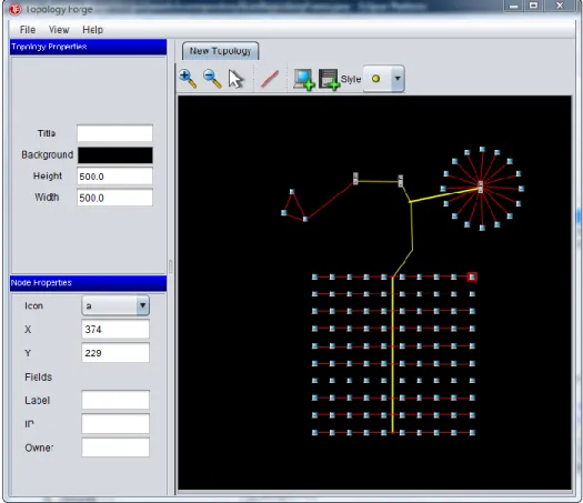
Figure 6 A screenshot of the Toplogy Forge ...50
Figure 7 VisAlert screenshot ...53
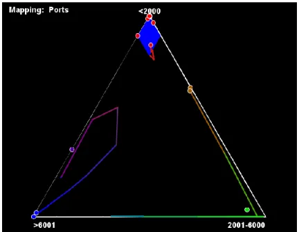
Figure 8 Triangle visualization screenshot ...55
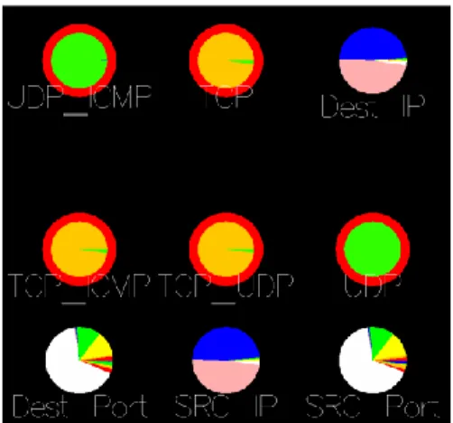
Figure 9 Pie Chart (advanced) screenshot ...56
Figure 10 ForceVis screenshot ...57
Figure 11 Simple Pie Chart visualization screenshot. ...59
Figure 12 Filtered data on a Simple Pie Chart visualization. ...60
Figure 13 The drilldown display ...61
Figure 14 The Plugin Manager interface ...65
Figure 15 The image and video capturing interface. ...70
Figure 16 Video and image capture manager screenshot. ...71
Figure 17 A screenshot of the current mapping system GUI ...83
Figure 18 A basic ternary plot ...89
Figure 19 A screenshot of the Triangle visualization ...91
Figure 20 Illustration of the overall architecture of the Triangle visualization ...95
Figure 21 Screenshot of zones in the triangle visualization ...104
Figure 23 Anomalous activity shown in the Triangle visualization ...108 Figure 24 The Triangle visualization mapped to packet size ...109 Figure 25 The Triangle visualization with video and web traffic ...110
INTRODUCTION
Computers are used throughout the world, in nearly endless ways. The United States Census Bureau indicates that in 2007, 67.1% of people age three and above in the United States live in a home with Internet access, and the number continues to grow [34]. But as computer use has increased, so has computer misuse. Computer attacks have become more and more common [29]. The CSI Computer Crime and Security Survey for 2008 reported that in 2008, 43% of businesses that responded to their survey had
experienced a computer security incident, and 26% had experienced more than ten [25]. Further, the monetary cost of these attacks is high. Of the attacks reported in 2008, the average loss caused by the attack was $289,000 [25].
In order to stay safe from these attacks, individuals, companies, and other organizations have needed to take action to protect themselves. As the variety and frequency of attacks has increased, so has the need for additional tools and systems designed to protect computers. Indeed, because of the dynamic and complex nature of computer-based attacks, it is likely this problem will never have a final, definitive solution.
There is a wide variety of types of tools and systems being used in computer security. Virus scanners, spam filters, and firewalls are all widely used [25]. More advanced systems, including intrusion detection systems such as Snort, are being put to use as well, through to a lesser degree [25]. Some companies and research groups are using proactive measures like honeypots to try to determine specifically what it is attackers are trying to do, while others still attempt to use data mining and genetic
algorithms [21]. It is clear that in order to provide safety to a network or computer, its protections must be as widely diverse as the field of potential attacks.
One type of security tool that has shown great potential is that of visualization. Visualization has become a popular and effective method for detecting and addressing security concerns. The value of and need for visualization in computer security is so great that the VisSEC workshop and community was formed around it. Visualization is a field of computer science wherein data is displayed on the screen graphically in a way that allows a system administrator or analyst to interpret the visual display of the data much faster than textual representation of the same data. The complexity of visualization can range greatly, from basic plots and charts such as bar and line graphs, to more
powerful and complex methods that involve animation, data filtering, and a variety of changing visual attributes. Basic visualizations can display a limited amount of information but remain easy to understand, while complex visualizations can display more information, usually at the cost of being less intuitive.
In recent years, computers and networks have seen an explosion in the amount of data they process, transmit, and store. The sheer amount of data prevents a human from trawling through it to discover meaningful information, such as vital clues to security attacks and vulnerabilities. A wide variety of tools exist for reducing the amount of data an analyst must explore, such as Snort and other intrusion detection systems. These tools, however, are not enough. They often hide information of value by filtering it, while in many cases, leaving the user with far too much information to process. The human visual cortex can process images much faster than text, and applying information
visualization to this problem allows humans quickly gain insight into computer and network data. Ware [37] describes several reasons why visualization is beneficial. He indicates that visualization allows users to comprehend vast amounts of data, because of the parallel nature of the human visual cortex. Also, unlike information calculated algorithmically by automated tools, visualization allows users to perceive emergent properties of the data set not otherwise anticipated. It can reveal problems with the way the data was collected, facilitates an understanding of large and small scale features of the data, and helps users to form hypotheses.
Throughout this thesis, visualization refers to information visualization, rather than scientific visualization. Information visualization is the process of displaying data that has no physical form, whereas scientific visualization seeks to replicate a physical phenomenon. The goal of information visualization is to provide the best method for discovering abstract information, while scientific visualization values realism.
There are a wide range of visualization techniques used in computer security today, and many more in development. The goal of these visualizations is to take low level network data, or information collected on a single machine, and display it on the screen in a manner that will allow an analyst to quickly identify important security events, such as attacks or attempted attacks. Such visualization techniques bypass the time-consuming and tedious process of manually sifting through the low level data, and they are faster than tools that process the data for viewing its text-based or table-based raw output.
North [22] points out that there are no natural constraints on the types of visualizations that can be created, so the possibilities for visualization techniques are limitless. In regards to comparing visualization techniques, Ziemkiewicz et al. state that it is widely recognized that any given method will be better for some applications, and worse for others [40]. Consequently, out of the large number of possibilities, only a small number of techniques actually help analysts. Further, because visualizations are often only suited to a particular task, we can determine that there is a significant need to use multiple visualizations concurrently. Additionally, because so many possible
visualizations can be created, but relatively few will be helpful, it becomes imperative to create an ability to rapidly test new visualization techniques.
Most visualization techniques are derived from abstract representations of data, such as graphs, common plots, and charts, including bar charts and scatter plots [15]. Components of the data set are mapped to visual attributes, such as color, shape, and size. These kinds of visualizations represent data in an abstract manner, wherein users can monitor the basic visual attributes of a visualization, with the understanding that when the visualization or part of a visualization takes on a certain appearance, a problem has occurred.
It is important to note that many visualization techniques share common features. For example, all visualizations must process a data set in one form or another. This requires each visualization tool to implement file parsers, create database connections, or read from a data set in another form. Many security-based visualizations read from the same type of data, such as TCP dump files, Snort logs, and CSV files. Also,
visualizations usually need handle data sequentially, requiring an iterative event loop in which data is handled in short time intervals. Filtering and drilldown are also commonly needed in visualization techniques. Screenshots and video capturing are frequently used to produce reports, as well.
Because visualizations have so much common ground, it would be of great benefit for researchers, developers, and analysts to have access to a platform that
provides many of the common requirements of visualizations, makes it easy to write new visualization techniques, and provides mechanisms for extending the platform in the event that additional components are desired. A few such platforms exist [33, 36, 38], though they are limited either in terms of flexibility in the types of visualizations that can be created or by the lack of features needed to fully allow users to import, manage, and map to data sets.
AdviseAid is an existing visualization platform designed to make visualization prototyping simple and easy. It provides a data pipeline to the visualizations, giving them access to a wide variety of data sources, gives the user the ability to filter the data set, provides visualizations with the ability to drill down into the underlying data set, and to communicate with other visualizations. It allows developers to easily implement new visualization techniques. AdviseAid also provides a plugin system, allowing developers to extend the platform as needed. AdviseAid is powerful enough that the visualization‘s
developer can go beyond the prototyping phase and produce production-caliber visualizations.
These attributes allow AdviseAid to greatly help in the field of applying
visualization to security problems. Because of its simplicity and power, AdviseAid can allow developers and researchers to quickly create, test, and deploy new visualization techniques. Because the AdviseAid platform takes care of many of the common aspects of development process, developers are able to concentrate solely on developing their visualization. This also gives developers more time to address problems or limitations with the individual visualization‘s design and otherwise improve the visualization technique.
For the design and development of AdviseAid, Dr. Erbacher provided the high level direction for needs and requirements, while I was responsible for researching needed the needed capabilities, designing user interface components, designing the software architecture, and guiding the development process with feedback from and discussion with Dr. Erbacher.
The remainder of this thesis is structured in the following way. In the Previous Work section, we analyze and evaluate the common features that many security
visualizations, including AdviseAid, need. This section also takes a brief look at other visualization platforms, such as InfoVis [36] and Improvise [38]. In the Methods and Implementation section, we look at the design of AdviseAid and discuss the features of AdviseAid that were created. In the Results and Contributions section, we look at how the AdviseAid platform helps to expand the field of visualization in computer security. Next, we discuss future steps of AdviseAid‘s development in the Future Work section and what AdviseAid has shown us so far in the Conclusions sections. The final section
of this thesis is a case study of a novel visualization technique, the triangle visualization, which we designed and created to test and demonstrate the capabilities of AdviseAid, as well as to be a useful new visualization in its own right.
PREVIOUS WORK
The goal of the AdviseAid framework is to provide a common set of tools that visualizations, specifically security-related visualizations, can utilize to streamline their development. We took into account three important aspects of computer security
visualizations as we assessed the needs of the AdviseAid platform. First, we analyzed the visualization design process. Second, we looked at a cross-section of the many security visualization techniques in existence in order to determine which features were
commonly implemented, or that their creators indicate would be useful additions. Third, we looked at the existing platforms for creating visualizations, and analyzed needs for improvement.
The Visualization Design Process
Designing a visualization is a complex process involving a wide variety of aspects. Visualization design draws on many fields, including computer graphics, mathematics and statistics, cognitive psychology, art, and GUI design, along with the domain experts that drive the creation of new visualization techniques [6]. To aid in the development of new techniques, a general process for creating visualizations has begun to be established. It is quite common for visualization designers to draw from nature, architecture, and art.
The field of information visualization is fairly new, and as a result, little formal information about the design and needs of a new visualization exists. Craft and Cairns [4] point out that while there are many publications regarding the design of specific techniques, there is little about the overall design process, and that the people seeking to
create a new visualization technique have little to draw on. The authors also discuss how the visualization community is currently seeking to resolve this issue.
A handful of works give a brief overview of the general process of visualization design and development [22, 28, 37]. Each of these methods describes a variation on the following four basic steps. First, input data is read in and stored in a standardized form. Second, the data is transformed to glyphs, wherein various components of the data may modify the appearance of the glyphs in a variety of methods. Third, the glyphs are displayed on the screen using the computer‘s windowing and rendering system. Finally,
the human visual cortex reverses the transform to provide the user with an understanding of the data in the data set. The user is then able to interact with the visualization to modify it in various ways, and indeed, this interaction is so important that it is almost a necessity for visualizations. The completed design of the visualization must take all of these components into account.
North [22] provides an overview of the general process. He indicates that there are two major challenges for any visualization that must be overcome: complexity, meaning the visualization must work for a variety of forms of datasets; and scalability, meaning the visualization must handle significantly large data sets, both in terms of algorithmic complexity, as well as in terms of the ability to display information about a large data set in a way that is comprehendible by humans.
In regards to displaying large datasets, Shneiderman [28] proposes that an overview of the entire data set, along with the user‘s ability to drill down to smaller aspects of the data set and filter out unnecessary data, is among the most effective
methods for providing the user with scalability. This leads to the commonly quoted mantra ―overview first, zoom and filter, then details on demand.‖ North also discusses
the principle of using overviews to deal with large datasets [22]. He points out that an overview gives the viewer the ability to see the big picture, while details-on-demand is then required to view small scale aspects of the data.
Several interaction strategies are discussed throughout the literature. Interaction with the visualization allows the user to discover more information about the data in a variety of ways. North lists some of the most useful and common interaction techniques [22]. This list includes selection, linking to interactively relate information between multiple views, filtering, rearranging, and remapping.
The process of transforming assembled data into glyphs is one of the most important parts of the process. It is this step that gets the data to a form that the human eye will comprehend, once it is displayed. Glyphs are any form of marker that represents a piece of data. These glyphs come in a variety of forms, such as points or other simple shapes, lines and curves, regions such as polygons and volumes, or icons. Relationships between data items can be represented as other additional glyphs. Attributes of the data are mapped to various visual properties of the entity‘s glyph. These properties commonly
include position, color, shape, orientation and size, but can also include additional fields like texture, transparency, motion, density, and so on. The key principle of the mapping process is to match the important data attributes to the most visible visual properties [22]. Position is the most significant visual property in most cases, while visual properties depend on the type of data being analyzed. There are some systems that attempt to
automatically determine mappings [26], though this can limit the capabilities of the system, based on the restrictions needed to allow for automated mapping detection. Most visualizations ultimately need to allow the user to choose the necessary mappings, though many first passes at a new visualization technique have a specific set of mappings that is hard-coded, and cannot be changed.
While visualization techniques may be able to neglect some of the tasks described in these sections, most stand to benefit a great deal by utilizing them. Having discussed the known methods for designing visualizations, we next turn our attention to the way current visualization techniques function, especially those related to computer security, and discuss some of the common features that they share.
Common Features of Security Visualizations
To further understand what is required of visualizations in general, and computer security visualizations specifically, we surveyed the literature and analyzed common features that had been implemented, as well as features not implemented but that the designers still wanted to add in the future. This survey illustrates what is needed in a visualization, and assists in the decision making process for what is required of a visualization development platform. Because computer security visualization is a growing field, there are many visualization techniques in existence. Therefore, the goal of the survey was to get a broad cross-section of the existing types of security
visualizations, rather than catalog all existing techniques.
1. VISUAL. Displays communication patterns between a local network and external hosts [2].
2. Spinning Cube of Potential Doom. Plots network traffic within a cube, with source IP, destination IP, and port as the three axes [15, 16].
3. SecureScope. A 3D tool for situational awareness, correlating bar graphs of attacks with geographical location, business components, and time [27]. 4. PortVis. Analyzes IP protocol data from a table, and displays information
within several plots, and is used to detect port scans, and suspicious traffic patterns [18].
5. NvisionIP. Processes NetFlow data, and provides situational awareness using three levels of detail, ranging from entire class-B networks to individual machines [39].
6. VisFlowConnect-IP. Also uses NetFlow data to allow a user to visually assess the connectivity of large, complex networks [39].
7. Network Eye. Provides an end-to-end view of application communication across the internet, combining two visualization techniques [6, 7].
8. Tudumi. Provides a system for visualizing log data in various ways, with the ability to provide a summary of data and drilldown [31].
9. SHriMP. Helps people browse complex information spaces by providing multiple perspectives and nested interchangeable views [30].
10. SnortView. Displays Snort logs visually, combining two modules to handle log analysis, and a visual display. Also provides real-time monitoring capability [12].
11. Mukosaka and Koike. Combines logical, temporal, and geographical information into a single 3D visualization to display IDS logs, designed to monitor the user‘s own internal network [20].
12. IP Matrix. A method of visualizing the entire IP address space, using an Internet view and a local view to process Snort logs, using a combination of scatter plots, heat maps, and histograms [13].
13. StarMine. Displays log files on a world map, with links to logical and chronological displays [9].
14. Teoh et al. An animated visualization designed to make it easier to detect and analyze anomalies using multiple representations to view Border Gateway Protocol (BGP) data [32].
15. Visual Firewall. Uses four different simultaneous views to display firewall and IDS alarm data, to allow users to see where their firewall may be poorly configured [17].
16. MieLog. An interactive visual log browser to process a generalized log file format in real time [31].
17. Portall. Gives system administrators a view of the processes using the network on a monitored machine, correlated with network activity that the processes are using [8].
18. IDGraphs. Processes NetFlow data to provide a flow-level trace plotted against time [24].
19. SeeNet. Displays a local network, along with the data associated with it, using a map of the network [3].
20. SVision. A 3D plot of hosts that move through a 3D space defined by the services that they use, allowing the user to visually cluster them into normal and abnormal categories [23].
We discovered many similarities among the way these techniques were
implemented, along with the features that the creators indicated that they would like to add in the future. These similarities are discussed below.
Architecture
The architectures of most of the visualization techniques are quite similar. The visualizations read in data from a data source, typically a log file, and display it on the screen using some form of rendering system. The user interacts with the visualization in a variety of ways, and the architecture provides the user with the ability to filter, and perform drilldown.
Not all groups reported their choice of programming language, but of those who did, most indicated that Java was used [27, 30, 39], though C++ was mentioned as well [16, 27]. Many of the visualizations used OpenGL [16].
Nearly all of the visualizations use multiple visualization techniques
simultaneously to allow the user to discover meaningful information. The vast majority of the techniques surveyed include multiple techniques (typically called ―views‖) to
display the data in various ways within the complete visualization [2, 12, 18, 20, 30, 39]. In most cases, this is done to allow for details-on-demand purposes, wherein the view of the full data set and the view of small details require different techniques. A number of other visualizations are a part of a larger collection of visualizations that work together [2, 7, 9, 27, 39]. Some of the sources surveyed state that their technique is not sufficient as a standalone technique to detect all possible attacks [31, 32], though we suspect that there are many other techniques that are this way as well. It is clear, though, that single visualization techniques are generally insufficient for all possible uses.
Inter-visualization communication, or at least, inter-view communication was another common thread we found. Of the visualizations that provide drilldown via a secondary visualization or view, most have a great deal of coupling between the visualizations [2, 12, 30, 39], for example, allowing one visualization or view to know when data is being selected in another.
Another common feature of the surveyed visualizations was the ability to animate the display by handling the data in a sequential manner and displaying it in distinct time steps. Some visualizations provide this mechanism already [3, 11, 32, 39] while others indicate this is a desirable feature to add in the future [2, 9, 12]. In a related aspect, some techniques, such as [16], want to have features to scale and reverse time, allowing users to have various playback speeds.
Input
Visualizations take data from data sources in one form or another. Visualizations that are designed to be general-purpose tend to read general-purpose data storage, like
CSV files, or XLS files. Additionally, visualizations geared toward computer security often wish read from more specific data sources, such as log files. This section discusses the types of input sources that our visualization survey covers.
Most of the visualizations surveyed read data from various logs, from raw network traffic, or processed network traffic. Takada et al. [31] and the Visual Firewall [17] both indicate that they read from log files, without specifying in detail which kind, while Snort logs are also quite common [12, 13, 20]. In addition to Snort logs, [17] handles preventia logs as well. The Spinning Cube of Potential Doom [15] reads log files from Bro IDS. StarMine [9] indicates that while currently they could only handle a single file type, they would like to be able to parse a variety including firewall logs, system logs, and packet sniffer logs. Tudumi [31] uses a general log format to access multiple types of data.
Ball et al., who produced VISUAL, want to add the ability to process network traffic at the packet level [2], while [24] and [39] utilize network traffic at the flow level, specifically the NetFlow file format.
Out of the visualizations we looked at, only one specifically mentioned a generic delimiter separated text file [18], though this type of feature would be more valuable to general-purpose visualizations. Additionally, only one visualization specifically
mentioned connecting to a database [27], most likely because reading the original data in log files or traffic captures was a higher priority. This shows, however, that there is value in reading data from a database.
Aside from the type of file accessed, there are two other features of the input that are worth mentioning. Several reported that they would like to have the ability to read from multiple forms of data and to be able to read from them simultaneously [9, 31]. Because the visualizations surveyed are designed for computer security on a real network, many of these sources indicate that they would like to be able to display real-time data sets [2, 16, 39] to enable analysts to see the current state of their network, as opposed to ―pre-recorded‖ data.
Data Manipulation
Once it is read from the data source, data is usually stored in memory and
processed before being visualized. This is often an interactive process, wherein the user views the visualization and performs various tasks to change the data set ultimately displayed, and the visualization updates itself. We found a number of features to be common throughout most of the visualizations, including filtering, searching, and data mapping.
Filtering came up in nearly all of the visualizations. Filtering allows the user to restrict the data being viewed to focus on areas of interest. Some of the visualizations provide a significant filtering mechanism [39], others only have a limited mechanism for filtering [20], and still others only mention it as an important aspect that they would like to include in the future [16, 24].
For one visualization [24], searching was an important feature. This allows the user to locate where a specific set of data was being drawn within the visualization, and perform highlighting, as mentioned in [39].
A number of visualizations also discussed data mapping as an important aspect of their visualization [11, 17, 18]. Data mapping allows the user to pair parts of the data to various visual attributes, giving the visualization greater flexibility because it can be used to represent the data in a variety of different ways.
Visualization Design
Much of the design of a visualization is specific to the technique itself, but there are some similarities among the different visualizations. A few of these are discussed below.
Almost without exception, drilldown was utilized [2, 16, 18, 39]. While the interaction techniques for determining what specific items were chosen for drilldown, the need is there for virtually all visualizations.
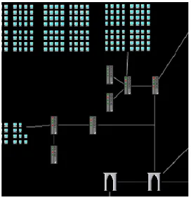
Another aspect of the visualization design that was common among multiple visualizations was that of maps. For example, many security visualizations want to be able to located an IP address either topologically [3] or geographically [9, 13, 20].
Visualization Development Platforms
Our survey clearly demonstrates that visualizations tend to follow similar design and development lifecycles, and that the security visualizations in existence currently share a great deal of common features. Because of this, it would greatly simplify the process of designing and implementing visualizations if they could each share a common codebase that provides these features to the visualization developer. Such action would enable the visualization developer to concentrate solely on a specific visualization
technique without needing to worry about the complexities of the complete process. Indeed, this is the function of AdviseAid.
AdviseAid, however, is not the only platform currently in existence that is available for developing visualizations. Before discussing AdviseAid, it is helpful to analyze other existing systems. In this section, we will look at the existing frameworks designed for creating visualizations.
One of the newer, more powerful visualization platforms in existence is IBM‘s Many Eyes project [10]. Many Eyes is a web-based platform that includes a wide variety of visualization techniques. These techniques are mostly based on simple plots, including scatter plots, bar charts, bubble charts, line charts, pie charts, and geographical maps, such as a US county map or a world map. Input for Many Eyes is restricted to tab-delimited files with a maximum file size of five gigabytes. Many existing visualizations utilize their own special processing of the data, e.g., a US county map that recognizes state abbreviations like AZ, and TX. A key component of Many Eyes is that datasets are made available to the public, so users can discuss the data and share observations. Many Eyes however, is limited in its suitability for visualization development in several ways, especially for security-related data. While the system provides a vast array of
visualization techniques, users are not able to produce their own visualization techniques. The system is also missing many important features that are useful to visualizations, such as drill down, or the ability to handle various file types. Many Eyes also produces only static graphs, which may miss key features of a security-related dataset. In addition,
because datasets are published to the world, most companies would likely be hesitant to place their network data in the public‘s view.
Improvise [38] is another visualization development platform comparable to Many Eyes. While it is missing many of the features of Many Eyes, it provides a number of other tools that may be more helpful for visualizations in general. Improvise has a strong emphasis on coordinating multiple views, which is a feature that Many Eyes is lacking. The architecture and user interface allows users to build and browse through multiple customized visualizations without a high demand for programming skills. This makes it easy to produce novel visualization methods for data sets, but the platform does not easily lend itself to extending the types of visualizations available, even by a skilled developer. Improvise has a powerful filtering framework, allowing users to get access to the data they want without being cluttered by unnecessary data, along with a collection of other tools built into the GUI for working with the dataset. Improvise lacks any sort of feature that would allow for skilled developers with novel visualization ideas to be able to implement them and extend the framework.
The University of Indiana has also developed a platform for creating
visualizations called the InfoVis Cyberinfrastructure (IVC) [36]. IVC is built on top of the Eclipse Rich Client Platform, giving it a large assortment of useful tools with little work. The platform allows developers to produce visualizations in different languages and using different drawing systems while keeping IVC a single ―seamless‖ software package. IVC draws on the strong plugin system that is part of the Eclipse Rich Client Platform to make it easily extensible. The IVC is unique because it does not require data
to be in any particular format, neither does it need to be stored in any particular data structure. However, the IVC framework does not appear to provide defaults for these features to any significant degree, meaning that visualization developers must implement their own file parsers and data structures. This requires each visualization to be
implemented independently from each other. While the end user will get the benefit of a single visualization package, the visualization developer will still need to spend time on a variety of components beyond the core visualization implementation.
Mondrian [33] is another visualization development platform whose strength is that multiple visualizations can be executing concurrently, and the different visualizations are ―fully linked,‖ meaning that data selected in one visualization is marked in all other
visualizations. Mondrian provides a fairly large collection of visualization techniques including common plots like bar charts and histograms, but also includes some less common graphs, such as SPLOM and Mosaic plots. Mondrian can only use standard tab-delimited files. Mondrian, like many of the other systems, does not explicitly allow visualization developers to add in their own new visualization techniques, though the package is open source.
One final platform worth noting is IVEE [1]. IVEE is designed to connect to databases, and tries to automate much of the visualization setup work for the user. IVEE provides a number of standard graph-based visualizations, and multiple visualizations can be active simultaneously. IVEE provides drilldown techniques, and the user can provide an HTML file to indicate to the system how the drilldown data should be displayed. IVEE also allows multiple clients running on different workstations to communicate with
each other. IVEE, too, though, only provides minimal support for new visualization developers, and instead concentrates on the end user.
Keys to Visualization Platform Design
While they provide a number of useful techniques and tools to the end user, the existing visualization platforms do not appear to provide many of the features needed to assist in the development of new visualization techniques. Typically, each visualization is developed as a separate component, including additional filtering and input tools as needed by the visualization, forcing developers to turn their attention from core visualization coding. Each of these platforms tend to provide a set of disassociated visualization techniques, along with glue code for the supporting framework, while many do not even provide adequate functionality for developers to even add new visualization techniques to the system. The platforms do not allow visualization designers to prototype a visualization quickly and with little investment.
An ideal visualization development platform, therefore, should include the following features:
1. Ability to read from various data sources. The visualization designer should not need to worry about reading from a data source. The platform should provide this to the visualization in a manner which is independent of the data source.
2. Built in features for manipulating data before visualization. Once data is read in from the data source, the user must have control over the form and values of data that reaches the visualization. This comes in the form of filtering and aggregating data, among other things.
3. Support for large datasets. Visualization is especially effective on large datasets, and as such, a visualization development platform must have an inherent ability to handle very large datasets without restrictions like those found in [10].
4. Support for time and animation. Many data sets occur over a long period of time, and as such, it is preferable for this data to be displayed in an animated form, rather than as a static graph of the accumulated results.
5. A simple framework for creating a new visualization. An ideal visualization development platform would allow the developer to focus solely on their visualization technique. The process of making the technique itself, however, should also be simplified as much as possible. This includes allowing
development in a simple and powerful language, ideally in multiple languages, and using various rendering tools such as OpenGL, to allow the developer to use knowledge that they already have.
6. A system for mapping data parameters to visual attributes. Each visualization should not need to worry about what fields of a dataset should be mapped to the visual attributes. A single extensible GUI, provided by the framework, allows visualization developers to just use the current mapping, without needing to have each visualization implement their own mapping GUI.
7. Utilization of multiple visualizations, and inter-visualization communication. In order to be useful, many visualization techniques must work with other
techniques. This is commonly done to provide an overview + detail visualization, wherein the overview and the detail visualizations can be created separately. It
also allows for multiple visualizations to work together to complement each other‘s strengths. It is imperative that a visualization platform allow multiple
visualizations to run simultaneously. Additionally, visualizations must be able to communicate with each other, at least to the extent that selected data in one visualization can be coordinated with selections in other visualizations. 8. Data Drilldown. In order for most visualizations to be useful, they usually
require the user to be able to interact with the visualization to drill down to the underlying raw data. Search features would also be beneficial to the user. 9. Extensibility. In order for a visualization system to be most effective, the
platform must be extensible. Visualizations, data source parsers, and other components need to be created without having to interact with or recompile the code for the platform, and added into the program dynamically in the form of a plugin system.
AdviseAid was designed with these basic principles in mind, and is intended to be a visualization platform that is useful to both the end users, and to the developers. These basic requirements allow developers to quickly and easily prototype a new visualization technique and test its usefulness. No system is currently designed to handle all such capabilities. One research goal, based on software engineering needs, was to design a novel environment and associated capabilities to integrate a larger set of these capabilities than currently exists in other platforms.
METHODS AND IMPLEMENTATION
The current version of AdviseAid has been in development since the fall of 2004. It is a fairly large program, with a huge variety of features and components. It is
currently about 85,000 lines of Java code, and includes a wide variety of visualization techniques, most of which are novel, though a few are implementations of existing techniques, or basic plots are included.
This section describes the features that we implemented in AdviseAid. We start by providing a high level overview of the way AdviseAid works. Such an overview allows us to show the impact of our survey of previous work, and the research there engendered to develop a novel set of capabilities to more effectively meet the needs of security and network analysts. We then discuss the important or novel details of the AdviseAid framework, looking at the overall architecture, the input parsing, data handling, and visualization tools that we have created. We conclude this section by discussing the novel visualization techniques that have been produced.
AdviseAid Overview
AdviseAid is a software program and API designed to make visualization techniques easy to implement. One of the primary goals of AdviseAid is to allow a developer to prototype a new visualization technique, to determine quickly if a technique has value and is worth continued development time. AdviseAid is capable of producing production quality visualizations as well. Most visualizations to-date have been for the purposes of computer security, though more general purpose visualizations have been
developed more recently, and AdviseAid is quickly adapting to fill the needs of those visualizations.
AdviseAid is written in the Java programming language. This decision was made to allow for faster prototype development, as Java applications typically require less development time than those written with the other common languages, at the expense of a small decrease in performance speed. A variety of Java-related technologies are used in AdviseAid, including Swing, Java2D, and JOGL.
AdviseAid includes a large number of components that many visualizations need, including being able to read from a variety of input sources, including CSV files,
databases, and live network traffic.
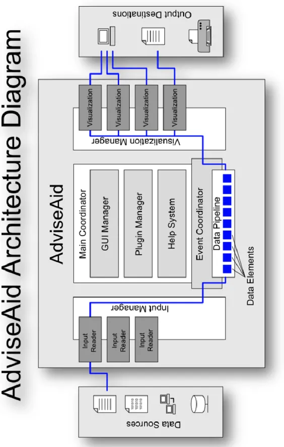
We now turn our attention to the basic architecture of AdviseAid. At its core, AdviseAid simply takes inputs from various sources, typically files, processes them, and hands the results to individual visualizations who determine individually how they will display the data. Figure 1 shows the basic architecture of AdviseAid.
F igure 1. Advise Aid a rc h it ec ture diagr am.
‗
The Main Coordinator
The Main Coordinator is the brain of AdviseAid. It is the central point of the program, and it decides how everything else interacts and functions.
The GUI Manager
In AdviseAid, most of the GUI fits under a managing class called the
MainWindow. This class is responsible for all of the GUI components contained in the application. Visualizations, main window tabs, and other components need to work with the GUI manager to get added to the display.
Plugin System
AdviseAid has a fairly powerful and easy to use plugin system. This system is discussed in more detail later. AdviseAid makes it easy to add and remove plugins during the execution of the program, and also to modify the plugin list outside of AdviseAid environment altogether.
Help System
Another significant component is the help system. The current help system in AdviseAid uses our own XML-based system with local web pages, rather than
connecting to the Internet. The help system is designed in such a way that it is easy to extend, or to replace it with a completely different system if needed.
Event Coordinator
The event coordinator is essentially the heart beat of the program, and the central component of the data pipeline. It takes data from its original source, processes it, and
prepares it for display by the various visualizations. The event coordinator is responsible for determining when more data needs to be read in from its source, when filtering should take place, and when a visualization should be updated and redrawn.
Data Sources
Data originates in data sources. AdviseAid can already access a large assortment of data sources, and the framework is designed in such a way that any new type of data could be accessed by simply creating a new input reader plugin.
Currently, there are input readers that can access specific databases, like MySQL, as well as one that goes through Hibernate, and can be configured to access just about any type of database in existence. Additionally, AdviseAid can read network traffic dump files, which contain network traffic. These files are extremely important and useful when doing network-security-related analysis. AdviseAid can also parse various other files, including things like comma separated value (CSV) files, and a variety of log files, like Snort and Dragon logs, Windows event logs, and email server logs.
The need to support multiple data sources and allow for the easy addition of additional data sources is a design consideration for the research community. This is helpful because as research advances, the source and density of data changes.
Additionally, we have found the need to correlate multiple data sources. The use of relational databases greatly simplifies this correlation and allows the research to focus on the more pertinent research tasks.
Input Readers
Each type of data source is read in by a unique input reader. An input reader has the task of reading in data from the data source in a proper order. Typically, this is done in chronological order. Input readers are supposed to read in data one item at a time, so anything that may more easily read in large groups of data needs to account for this. Input readers also need to be able to tell the earliest time in the data set and the last time in the data set. This may require running quickly through the whole file to find this information, once the data source has been configured.
Input Manager
The input manager acts as a multiplexer for all input readers. The rest of the program does not care about what input reader is currently active. When the event
coordinator asks for data, the input manager goes to the active input reader and collect the data from it. Within the input manager is a subsystem that keeps track of input plugins, and maintains a list of available parsers.
Data Elements
Data elements store data while it is in memory, from the time it is loaded from the data source until it is given to the visualization. In the code, this is represented by the ParameterPercentages class, and to a lesser degree, the DataParameters class. Filtering and searching can be performed on various data elements.
Data Pipeline and the Data Manager
As data moves down the data pipeline from the input source and the input manager, individual data elements are stored in a data manager component. The data remains there as it waits to be processed by filtering modules, visualizations, and other similar components.
Visualization Manager
Like the input manager, there is a visualization manager that is responsible for dealing with all of the visualizations. Unlike input readers, there can be multiple visualizations active at one time. The visualization manager makes sure that each visualization has the newest data and also has a subsystem that keeps track of the
available visualization plugins. The visualization manager also plays an important role in inter-visualization communication, which allows visualizations to request things from other visualizations. For example, if a user selects some data in one visualization, that visualization can request the others to highlight the data as well.
Visualization
Visualizations are the central component to AdviseAid. Visualizations have the responsibility to draw information on the screen or other output destination in a
meaningful way. Visualizations receive the data from the rest of the program through the visualization manager and decide how to display the data.
Usually, visualizations have mappings from the data to certain visual components that can be changed around. For instance, in a bar graph visualization, the bars might each represent a certain IP address, by default. The user could change this to represent a
different port or a different email address. These mappings are dynamically adjustable by the user, allowing for easy exploration of the data.
Also, visualizations have display parameters, which tell the visualization how the information should be drawn, for example, in a bar graph visualization, something like the background color or the maximum height of the chart.
Output Destinations
A visualization can send data to just about anywhere. So far, all existing visualizations send data to the screen. This is usually done with OpenGL, but a few visualizations use Swing, Java‘s windowing toolkit and Java2D. Visualizations,
however, are not limited to sending data to only sending data to the screen. A
visualization could instead, print to a printer or write to a file. For instance, it is possible to create a visualization that would summarize all of the data in the data set, and
generating a PDF report for the end user.
Input Processing
Datasets are an important component of AdviseAid. In the end, they are what the user wants to view, and it is AdviseAid‘s job to display the raw data in a given data set in
a way that allows for a user to quickly and easily extract additional information of value from it.
Initially, AdviseAid was solely focused on network security, and so it could only read network traffic data files. Over the years, though, it has expanded its scope. It began to incorporate input readers for other types of security related applications, like Snort and Dragon log files. More recently, it has begun to see a bigger need to read in
virtually any type of data, and so more general input parsers have been required, like CSV files. Additionally, over the years, it has become necessary to read from data sources beyond just flat files, allowing AdviseAid to connect directly to MySQL databases, and to virtually any form of database through Hibernate. Input parsers have become a key component of the plugin system. In this section, we will look at the various input parsers that have been created over the last several years.
Databases as Input Parsers
As AdviseAid has grown, so has its need to read from databases, specifically MySQL, instead of reading from a flat file. Up until this point, all data sets had come from flat files in a very specific format, and because of this, a number of changes were needed to allow the user to specify all of the required information to connect to a database.
To remedy this, we refactored the code to a new design that allowed for more control over a parser‘s configuration. Once this was accomplished, the MySQL parser
was fairly straightforward. The connection to the database was then made using JDBC. One of the key problems visualization developers face is that much of their time is devoted to writing code to handle a certain data source. Enabling database connectivity in AdviseAid reduces this problem by allowing access to a large category of data storage previously inaccessible in AdviseAid. One of the research challenges that arises when using databases as a data source is in finding an effective way to turn database relations and their contents into in-memory data that the visualization can handle, without
effective, this needs to be done in a way that simplifies the work of the visualization developer as much as possible.
Once AdviseAid makes a connection to the database, it needed to know what columns and what tables to query to get the information it needed, and additionally, it needed to know where to put the data. The user essentially needed to provide a way to map tables and columns in a database to attributes of the data within AdviseAid. To accomplish this in an easy manner, we developed a file format that was easy to parse and that would specify the names of the tables and columns to look up in the database, and what each column represented, as well as a flag to indicate which column in the database represented the time of the event, or other sequential ordering of the data. SQL mapping files can be created quickly using the Database Mapper tool discussed later in this chapter. An example of a file in this format is shown the snippet below.
#Snort Table TABLE:Snort=Snort TIME:Time COLUMN:Generator=SnortGenerator COLUMN:EventID=SnortEventID #Dragon Table TABLE:Dragon=Dragon TIME:Time COLUMN:Event=DragonEvent COLUMN:IPRemote=IPRemote COLUMN:PortLocal=PortLocal COLUMN:Direction=DragonDirection COLUMN:Flags=DragonFlags COLUMN:Protocol=DragonProtocol COLUMN:Message=Message # SQL Query Log TABLE:SQLQuery=SQLQuery TIME:Time COLUMN:ID=SQLQueryID COLUMN:Command=SQLQueryCommand COLUMN:Argument=SQLQueryArgument
Once we had a functioning parser for MySQL databases, we began to see a need to connect to other types of databases. For the most part, connecting to different forms of
SQL databases is very similar, especially in the case of AdviseAid, wherein we are only using the most common kinds of SQL statements that virtually all SQL databases have implemented. The only real significant difference is the fact that connection URLs vary significantly for different SQL database systems. To deal with this problem, we devised a simple method of specifying the needed information to make a connection to a
database.
Our system involved creating configuration files that would specify a URL with the required parameters marked with ‗{‗ and ‗}‘. Additional lines could be specified
afterwards to indicate properties about that parameter, for example whether the data should be hidden, whether it should be password protected, or if the file should have any kind of input validation, such as requiring the input to be a number for a port or
something like that. For example, for the MySQL example listed before, the file would contain one line that looked like this:
jdbc:mysql://{Database Host}:{Port}/{Database Name}?user={User Name}&password={Password} {Password}=Hidden
These database connection files are all placed in a single directory and given a reasonable name that describes the connection type, so AdviseAid can quickly and easily look up the available options, and place them in a drop-down list. When a user chooses one of the options, AdviseAid builds a GUI to represent the connection type, complete with naming the fields after the names in the file, and setting correct options, for
example, using a JPasswordField for hidden attributes, instead of a text file, and the type of data validation specified in the connection file would be applied to the GUI, as well.
The current version, however, still requires the user to gather the necessary DLL and JAR files to communicate with the database. This process is still fairly simple, and in the future, this could be automated as a plugin. The required DLLs for MySQL and PostgreSQL databases are already provided.
Hibernate Input Parser
At the recommendation of some experts in the security and visualization fields, we also added support for using the Hibernate framework in AdviseAid. Hibernate is a system designed to treat items in a database and objects in a program‘s memory as one in the same. This is not the goal of AdviseAid, but Hibernate does allow connection to virtually any form of database using the same format.
In addition to the basic work of creating a new parser for Hibernate, reading data through Hibernate also requires a significant amount of configuration. Hibernate requires a series of complex XML based documents to tell it how to turn each table and column in the database into a Java object, and additional files to tell it how to operate Hibernate itself. Creating a good configuration requires a lot of work, but typically, Hibernate is configured once by an expert or developer. It rarely, if ever, needs to be changed, and the end user never needs to worry about it. So, for most typical uses of Hibernate, a long configuration process is not unreasonable.
Unfortunately, this did not work well in the case of AdviseAid, as the user needs to be able to set up Hibernate to connect to their own database. To resolve this issue, we created a subcomponent of AdviseAid that allows the user to manipulate a GUI to indicate how the various tables and columns map to objects in Java, and then save a
configuration that Hibernate can handle. Because Hibernate is so strict about what configuration files need to exist, as well as where those files should be located, this component had to be able to communicate well with AdviseAid to save the entire generated configuration in the correct locations.
To do this, we extended the Database Mapper tool that we created for MySQL databases. The details of this component are discussed later in this chapter. Here, we only discuss the implementation of saving a Hibernate configuration. Normally, the Database Mapper tool is used to indicate which Java object each table is to be converted into, and which instance variable the various columns represent. However, we
configured our system such that when the user chooses to save a Hibernate configuration, a dialog box opens up that allows the user to choose a name and other properties. The dialog, however, does not allow the user to choose the location of the saved files. This is because Hibernate is often very tricky to get set up properly, and the Hibernate libraries are looking for the configuration files in a very specific location. Preventing the user from choosing an alternative location saves a great deal of problems for the user later on. If the user is using the standalone version of the Database Mapper, the user must choose a file location instead, because in the built-in version, AdviseAid is able to indicate where the correct directory is located.
Comma-Separated Values and Delimiter Separated Values Parsers
AdviseAid also provides an input parser to read comma-separated values (CSV) files. CSV files contain tabular data, wherein rows are placed on separate lines and
columns are separated by commas. It is an extremely simple format that a wide variety of applications know how to work with, including Microsoft Excel. Many visualizations make use of this format because of its simplicity [18].
AdviseAid supports reading CSV files, and in addition, AdviseAid provides alternatives to parse tab-separated values (TSV), and a generalized delimiter-separated values (DSV) file parser, which allows columns to be separated by any delimiter, giving the user the option to specify the delimiter in the GUI.
Each of these parsers expects the first row of the file to contain headers to describe the columns in the data set, though in the future, this may be removed by allowing the user to manually name the columns in a DSV file, and reuse the column names for multiple files.
Live Data Sets and the Network Capture Server
Many data sources can have new data added to them, even while AdviseAid is reading from the file, because AdviseAid typically does not lock the data source. These data sources are considered live data sets, because they are constantly changing to reflect newer data. Being able to read live data sets as new information is continually added is an important and powerful feature we implemented in AdviseAid. Many visualization techniques indicate that this feature is extremely beneficial [2, 16, 39].
The original design of the input parser system required the parser to provide the start and end time of the data set just after being configured. This information was then displayed by AdviseAid. Additionally, as data was being read from the data source, the parser was expected to indicate whether more data remained in the data set. With static
data sets, once the data source no longer contained additional data, reading the data set terminated. With its newly implemented ability to read live data sets, AdviseAid will continue to periodically request more information from the data source, and also frequently asks for updated start and end times of the data set. The user can specify which mode to run in from the main menu.
As none of the input parsers in existence were using live data sets, we created the network capture server and client, an input parser that reads live data sets. This allowed for the installation of various network capture clients across the network, which could collect network traffic on the hosts on which they reside. Once a certain amount of time has passed, or a certain number of packets have been collected, the collected data is sent across to a server program that assembles all of the traffic in one.
The client program was implemented as only a command line application, and was relatively simple. Various command line arguments configure the client, tell it how often to send information to the server, and provide the IP address of the server, as well.
One of the problems this approach faces is that depending on how the client is configured, the client could generate a fair amount of network traffic on its own. This was solved by only sending data across the network in groups, and data from the client to the server on the active port were filtered. This solution has one significant limitation, however. If interesting traffic is sent from the client to the server, this information would be filtered by the client, and the server would never see it. Because of this, filtering can be turned off on the client application. The network capture client uses the pcap libraries to collect information.
The network capture server was implemented as an input parser for AdviseAid, giving AdviseAid direct access to the collected results. The server had a thread waiting for new connections to be made, and another thread going through the open sockets and checking for additional data, pausing briefly if nothing was found on any of the sockets.
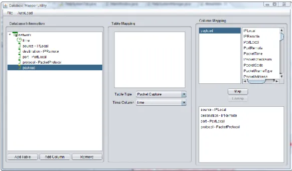
Database Mapper
In our initial work to connect to a MySQL database, one of our major tasks was to come up with a system for mapping columns and tables in the database to our classes and data structures. As mentioned earlier, we created a file format that specified all of the information needed to map the tables and columns in a database to features of the data set in AdviseAid. Creating these files by hand, however, is a time consuming process, and is error prone. As we began to need configuration files for Hibernate, the process became even more complex.
To deal with the issue of creating MySQL mapping files, as well as Hibernate configurations, we created a subprogram of AdviseAid called the Database Mapper. This utility program is designed to streamline the process of making MySQL mapping files as well as Hibernate configurations for use in AdviseAid. The main window for the
Figure 1. Database Mapper Utility screenshot. The database mapper utility allows a user to configure how AdviseAid uses the information in both MySQL databases, and
database access through Hibernate.
The first step in creating a valid configuration is to generate the information about the database you are trying to connect to. Using the Database Mapper, tables and
columns can be added and removed in the leftmost panel manually, or alternatively, an auto-load feature will connect to certain types of databases and query to find the names of the tables and columns in the specified database and build the database information for the user.
The work flow moves across the window from left to right. Once the database structure is set up in the left panel, the user can begin to map certain properties to each table in the database by choosing a type, which lets the AdviseAid know what type of
object to instantiate to represent the table, as well as a time column for each table. Once tables are configured, the user can map individual columns to object attributes in the right panel, choosing from a list of the possible options.
Once the configuration is complete, the user can save it to either a Hibernate configuration or a database mapping file; it is then loaded in AdviseAid in the Hibernate input parser or MySQL input parser plugins, respectively. Also, the user can load configuration files later on to modify them using the Database Mapper.
Data Processing
Once data is loaded into the system, the user will likely want to be able to do a number of different things with the data before it is given to the visualizations. The three most common features that we discovered were needed in a visualization, specifically in computer security visualizations were filtering [20,39], searching [24], and data mapping [11, 17, 18]. Each of these features has been implemented in AdviseAid.
Filtering
By far, the most commonly required data processing feature is the ability to filter out parts of it. This is useful because sometimes, parts of the data are not of interest, and if they can be removed, the user can more quickly analyze the significant parts of the data.
For the most part, filtering in AdviseAid is done using soft filters, meaning that the data is still collected from the input source and stored, but that visualizations never receive it until the filter is removed. This allows visualizations to immediately be updated with all data, in the event that a filter is removed. However, it maintains