Dimensional Point Clouds using
Topological Abstraction
Von der Fakult¨at f¨ur Mathematik und Informatik der Universit¨at Leipzig
angenommene D I S S E R T A T I O N
zur Erlangung des akademischen Grades DOCTOR RERUM NATURALIUM
(Dr. rer. nat.) im Fachgebiet INFORMATIK
Vorgelegt
von Diplom-Informatiker Patrick Oesterling geboren am 24. November 1982 in Halle (Saale) Die Annahme der Dissertation wurde empfohlen von: 1. Professor Dr. Gerik Scheuermann, Universit¨at Leipzig 2. Professor Dr. Thomas Wischgoll, Wright State University Die Verleihung des akademischen Grades erfolgt mit Bestehen
Selbstst¨
andigkeitserkl¨
arung
Hiermit erkl¨are ich, die vorliegende Dissertation selbstst¨andig und ohne unzul¨assige fremde Hilfe angefertigt zu haben. Ich habe keine anderen als die angef¨uhrten Quellen und Hilfsmittel benutzt und s¨amtliche Textstellen, die w¨ortlich oder sinngem¨aß aus ver¨offentlichten oder unver¨offentlichten Schriften entnommen wurden, und alle Angaben, die auf m¨undlichen Ausk¨unften beruhen, als solche kenntlich gemacht. Ebenfalls sind alle von anderen Personen bereitgestellten Materialen oder erbrachten Dienstleistungen als solche gekennzeichnet.
Leipzig, den 14. April 2016 ... (Ort, Datum)
... (Unterschrift)
Danksagung
Mein gr¨oßter Dank gilt Gerik Scheuermann, der mir als Doktorvater ein ¨uberaus spannendes und ertragreiches Thema f¨ur die Forschungsarbeit an dieser Dissertation anvertraut hat. Ich danke Gerik f¨ur die vielen fruchtbaren Diskussionen, die lehrrei-chen Lektionen und Anekdoten und die kollegiale und pers¨onliche Atmosph¨are am Lehrstuhl und auf Dienstreisen.
Ich danke Karin und allen ehemaligen Kollegen, dass sie das Lehrstuhlleben im Alltag und bei Lehrstuhlabenden entspannt gehalten haben und dass jeder f¨ur jeden da war und ein offenes Ohr f¨ur wissenschaftliche Diskussionen und private Gespr¨ache hatte. Ein besonderer Dank geht an die Entwickler von OpenWalnut f¨ur ihre hervorragende Arbeit, welche es mir erm¨oglicht hat, meine Forschungsergebnisse effektiv zu implementieren. Außerdem danke ich Alexander, Christian, Dominic, Gerik, Heike und Mario, dass sie mir 2009 die Entscheidung zu promovieren leicht gemacht haben.
Gunther danke ich f¨ur unsere jahrelange Zusammenarbeit und die tolle M¨oglichkeit, in Berkeley wertvolle Erfahrungen gesammelt zu haben. Ich danke Herrn Professor Heyer f¨ur die hervorragende Zusammenarbeit am gemeinsamen DFG-Projekt und ich danke Gunther und Christian daf¨ur, dass sie sich intensiv ¨uber Jahre am Projekt beteiligt und sehr zum Erfolg unserer gemeinsamen Publikationen und dem Gelingen dieser Dissertation beigetragen haben.
Besonderer Dank gilt—in zeitlich sortierter Reihenfolge—meinen f¨unf pers¨onlichen Mentoren Markus J¨ager, Herrn Dr. Joachimi, Sebastian Eichelbaum, Gerik Scheuer-mann und Christian Heine, die mich zu verschiedenen Zeiten in meinem Werdegang in die richtige Richtung gelenkt haben und von denen ich menschlich, methodisch und fachlich unglaublich viel lernen durfte.
Danken m¨ochte ich vor allem auch meinen Eltern, dass sie mich stets gef¨ordert und unterst¨utzt haben und mir immer mit Rat und wenn n¨otig auch Trost zur Seite standen. All meinen Freunden und insbesondere meiner Kathrin danke ich f¨ur die tatkr¨aftige moralische Unterst¨utzung, das Motivieren in schwierigen Zeiten und das Ertragen unz¨ahliger Monologe meinerseits. Danke!
Contents
1 Introduction 1
1.1 Remarks . . . 4
2 Thematic Classification, Difficulties and Solution Approach 7 2.1 Cluster Analysis: A Brief Introduction . . . 8
2.1.1 Problems with Clustering High-Dimensional Data . . . 13
2.2 Visualization of High-Dimensional Data . . . 14
2.2.1 Projective Visualization Techniques . . . 15
2.2.2 Axis-based Visualization Techniques . . . 18
2.2.3 Problems and Difficulties . . . 19
2.3 Novel Topology-Based Solution Approach . . . 22
I
Visual Analysis of Time-Invariant Clusterings
25
3 Topological Representation 29 3.1 Related Work . . . 293.1.1 Neighborhood Description . . . 29
3.1.2 Scalar Field Topology . . . 31
3.2 Basic Algorithm . . . 34
3.2.1 Approximation of the Density Function . . . 35
3.2.2 Topology of the Density Function . . . 37
3.2.3 Merge Tree Simplification . . . 39
3.2.4 Topology-Based Region Properties . . . 40
3.3 Optimizations . . . 41
3.3.1 Approximation of the Delaunay Triangulation . . . 42
3.3.2 Faster Neighborhood Graph Construction . . . 45
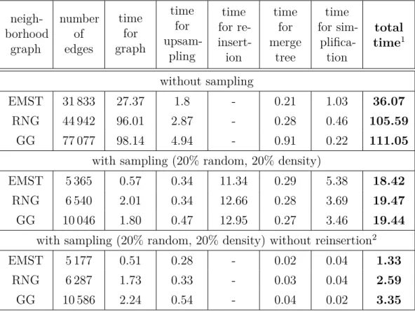
3.3.3 Sampling and Reinsertion . . . 46
3.4 Parameters and Runtime . . . 49
3.5 Examples and Results . . . 53
3.5.1 Artificial 2-D Data Set . . . 53
3.5.2 High-Dimensional Data Sets . . . 60
3.6 Conclusion and Discussion . . . 63
4 Topological Visualization 67 4.1 Related Work . . . 68
4.2 Extended 3-D Topological Landscape . . . 72
4.2.1 Modified Metric-based Distortion . . . 72
4.2.2 Data Point Representation . . . 74
4.2.3 Labeling . . . 76
4.3 2-D Topological Atoll . . . 78
4.4 2-D Topological Landscape Profile . . . 79
4.4.1 Properties of the Landscape Profile . . . 81
4.4.2 Construction and Implementation . . . 84
4.5 Examples and Results . . . 86
4.5.1 Global Overview . . . 86
4.5.2 Unclassified Data . . . 97
4.5.3 Application 1: Visualization of Document Collections . . . 99
4.5.4 Application 2: Classification of Unclassified Data . . . 104
4.6 Conclusion and Discussion . . . 106
5 Interactive Visual Analysis 109 5.1 Related Work . . . 110
5.2 Global Overview and Parameter Widgets . . . 110
5.2.1 Filter Radius of the Density Function . . . 111
5.2.2 Simplification of Structural Noise . . . 115
5.3 Feature Selection and Local Analysis . . . 118
5.3.1 Features in the Landscape . . . 119
5.3.2 Selection and Linked Views . . . 120
5.4 Visual Analysis Framework . . . 123
5.4.1 Prototype Implementation . . . 124
5.4.2 Typical Workflow of the Analysis Process . . . 126
5.5 Examples and Results . . . 129
5.5.1 Data Analysis . . . 129
5.5.2 Unclassified Data . . . 137
II
Visual Analysis of Time-Varying Clusterings
141
6 Topological Representation 145
6.1 Related Work . . . 146
6.2 Algorithm Overview . . . 148
6.3 Merge Tree Transformation . . . 149
6.3.1 Algorithm . . . 149
6.3.2 Implementation . . . 152
6.3.3 Runtime Complexity . . . 153
6.4 Feature Tracking . . . 155
6.4.1 Tracking the Complete Function . . . 156
6.4.2 Tracking Superlevel Sets of the Function . . . 158
6.5 Simplification . . . 160
6.6 Conclusion and Discussion . . . 162
7 Topological Visualization 165 7.1 Related Work . . . 165
7.2 Visualization Design . . . 166
7.2.1 Merge Trees as Landscape Profiles . . . 167
7.2.2 Tracking Information of the Complete Function . . . 168
7.2.3 Tracking Graphs of Superlevel Sets . . . 173
7.3 Conclusion and Discussion . . . 176
8 Application: Temporal Clustering 179 8.1 Related Work . . . 180
8.1.1 Creating the Time-Varying Density Function . . . 181
8.1.2 Analysis of Document Collections . . . 182
8.2 Conclusion and Discussion . . . 190
9 Thesis Conclusion 193 A Data Sets 197 A.1 Artificial 2-D Data Set . . . 198
A.2 Artificial 100-D Data Set . . . 198
A.3 19-D Image Segmentation Data Set . . . 200
A.4 25-D Isolet Data Set . . . 201
A.5 8-D Italian Olive Oils Data Set . . . 202
A.6 4-D Iris Plants Data Set . . . 203
Chapter 1
Introduction
The abilities of computers and the human brain to solve complex problems comple-ment each other. Computers are efficient in performing trivial operations on massive amounts of stored data, but they cannot imagine or question what they calculate and they cannot interpret the results. Humans, on the other hand, lack specialized storage and processing skills, but they are able to formulate their problems theoretically and to find suitable representations. Hence, synergy arises when humans feed computers with meaningful data, let them perform meaningful operations automatically and evaluate and interpret the results afterwards. The crux is that computers work only with numbers, while the human eye is naturally trained to distinguish different patterns, sizes, colors, or shapes. Therefore, to leverage stored data and computed results, one has to make knowledge hidden behind the numbers visible to the eye in order to form a mental image of the data. This is literally1 the definition and the task ofvisualization in computational environments.
This thesis is about visualizing a kind of data that is trivial to process by computers but difficult to imagine by humans because nature does not allow for experience and intuition with this type of information: high-dimensional data. Such data often result from representing observations of objects under various aspects or as single entities with different properties. In many applications, a typical, laborious task for object-based data is to find related objects or to group those that are more similar to each other than to other objects. One classic solution for this task is to imagine the data as vectors in a Euclidean space with object variables as dimensions; a so-calledinformation space. Utilizing Euclidean distance as a measure of similarity, in this vector representation, objects with similar properties and values accumulate to groups, so-called clusters, that are exposed by cluster analysis on the
1Oxford Dictionaries: [verb] visu|al|ize
-1Form a mental image of; imagine;2Make (something)
high-dimensional point cloud. Because similar vectors can be thought of as objects that are alike in terms of their attributes, the point cloud’s clustering structure and individual cluster properties, like their size or compactness, summarize data categories and their relative importance, respectively. Furthermore, (dis-)similarities among the objects can be derived from their points’ affiliation to particular clusters and the overall clustering quality can be evaluated from cluster separation or the noise-ratio—the amount of those points that do not belong to clusters but instead reside between and around them.
Traditional cluster analysis usually means to execute an algorithm that finds a meaningful hierarchy or segmentation of the input data, followed by the inspection of its output, which, depending on the internal representation, typically ranges from pure numbers or tabular summaries to tree-like layouts. Because those summaries primarily focus on cluster segmentation rather than on the depiction of individual cluster properties, a popular alternative is the attempt to look directly at the point cloud, exploiting that the human eye is naturally trained in detecting patterns and coherent groups efficiently. That is, striving to preserve all pairwise distances in the high-dimensional space, the input points are projected into the plane so that the analyst can quickly identify clustering structure and individual cluster properties. However, there is a fundamental problem with such a direct visualization. If the point cloud’s intrinsic dimensionality is higher than two, information usually has to be discarded to find a two-dimensional embedding that can be mapped on the eye’s retina. This information loss, called the projection error, can cause occlusions in the visualization and can even suggest structure that is not present. Moreover, because this approach does not distinguish between clusters and noise, for large data sets, the depiction of cluster separation can be distorted or hidden entirely. Of course, this makes it difficult (or even impossible) to identify and compare clusters and leads to false insights about the data.
The contribution of this thesis is a novel visual analysis approach that facilitates exploration of high-dimensional point clouds without suffering from structural occlu-sion. The presented work is based on implementing two key concepts: The first idea is to discard those geometric properties that cannot be preserved and, thus, lead to the typical artifacts. Topological concepts are used instead to shift away the focus from a point-centered view on the data to a more structure-centered perspective. The advantage is that topology-driven clustering information can be extracted in the data’s original domain and be preserved without loss in low dimensions. To this end, the high-dimensional point cloud is abstracted by a simpler representation whose topological description accurately describes the clustering, but which can
still be visualized occlusion-free using a landscape metaphor that shows clusters and their hierarchy as differently shaped hills. Topology-based quality measures describe cluster properties and are mapped on the hills in the landscape so that the analyst can quickly identify and compare significant features. Furthermore, to facilitate annotation and to stimulate further analysis of individual features, the data points of the underlying point cloud are augmented on their corresponding hills. The second key idea is to split the interactive visual analysis process into two phases: A topology-based global analysis and a subsequent geometric local analysis phase. The occlusion-free global overview enables the analyst to identify all features and link selected clusters or arbitrary point sets to other visualization techniques that permit analysis of those properties that are not captured by the topological abstraction, e.g. cluster shape or value distributions in particular dimensions or subspaces (cf. Chapter 2). The advantages of separating structure from data point analysis are two-fold. While the structural view on the high-dimensional clustering allows for an occlusion-free presentation in the first place, restricting local analysis only to subsets of the data also significantly reduces artifacts and visual complexity in traditional visualizations that focus on the data points themselves. That is, compared to visualizing the complete data with direct visualizations, the additional topological layer enables the analyst to identify structure that was hidden before and to focus on particular features by suppressing irrelevant points during local feature analysis.
This thesis addresses the topology-based visual analysis of high-dimensional point clouds for both the time-invariant and the time-varying case. Time-invariant means that the points are static (or stationary) in the sense that they do not change in their number or positions. That is, the analyst explores the clustering of a fixed and constant set of points. The extension to the time-varying case implies the analysis of a varying clustering, i.e., high-dimensional points that do change in their number and positions and, thus, cause clusters to appear as new, to merge or split, or to vanish. Such temporal cluster analysis is important for many application domains where analysts study changing categories and objects. Especially for high-dimensional data, bothtracking—which means to relate features over time—but also visualizing changing structure are difficult problems to solve.
The remainder of this thesis is structured as follows: Chapter 2 provides a brief introduction to cluster analysis, common applications and alternative visualization techniques for high-dimensional point data. It also reveals where competing visualiza-tions have issues with this data type and it motivates how topological ideas can solve these problems. Following that chapter, this thesis’ subject matter is presented in two major parts; one for the visual analysis of static point clouds and the other part
for its extension to time-varying data. Part I contains detailed explanations about the topological representation, topology-based visualization, and the development and implementation of an interactive visual analysis framework. Part II explains how these ideas and data structures are extended to abstract time-varying input data and how the topological description of changing clusterings can be visualized at high structural detail but without structural occlusion. In both major parts, the utility and efficiency of the approach are demonstrated based on several example data sets; which are described in further detail in Appendix A.
1.1
Remarks
The research results presented in this doctoral thesis build on, improve and develop further preliminary work contained in the author’s diploma thesis. With regard to intersecting content, both theses primarily share basic parts of the topological representation and a prototype implementation of the 3-D topological landscape metaphor as proposed by Weber et al. [169]. As for the topological abstraction, the approach investigated in the diploma thesis—namely using an upsampled Gabriel graph (cf. Chapter 3 in this doctoral thesis)—is now generalized in this doctoral thesis as one possible solution among other neighborhood graphs. The initial approach was not yet optimized to scale for larger data sets, did not support as many feature properties, and did not assist the analyst in finding appropriate parameter values by using intuitive widgets. As for the visualization, this doctoral thesis first describes modifications of the 3-D landscape metaphor to reduce its dimensionality and to provide more information about features and data points. Eventually, the original visualization is completely substituted by a more precise and faster to construct 2-D landscape variation (cf. Chapter 4). The extension to an interactive analysis framework supporting feature selection and linking as well as the whole extension to time-varying data are exclusive contributions of this doctoral thesis.
The work on this thesis was carried out within the scope of a Priority Programme (“Schwerpunktprogramm (SPP)”) about “Scalable Visual Analytics: Interactive Visual Analysis Systems of Complex Information Spaces” funded by the German Research Foundation (“Deutsche Forschungsgemeinschaft (DFG)”). In particular, this work was conducted in connection with a participating project about topology-based visualization of document data represented in the vector space model (cf. Chapter 2); led by Professor Dr. Gerik Scheuermann and Professor Dr. Gerhard Heyer. For this reason, the development of the topological methods and the visualization were inspired and guided by this target application. However, the solutions are not restricted to
this particular application. In fact, the obtained results make valuable contributions to several research fields, like visualization and analysis of high-dimensional point data, high-dimensional scalar field topology, topology-based visualization, temporal clustering of high-dimensional data, and time-varying scalar field topology in high dimensions. In principle, the solutions are applicable in those scenarios where the analyst wants to learn the structure of dimensional point data or high-dimensional scalar fields. To cope with this versatility, the example data used in this thesis cover a variety of different application domains.
Although this thesis is the work of one author, the presented research results originate from intensive collaboration with several colleagues over a couple of years. To appreciate this and to be in line with the familiar publication style of the target audience, the pronoun “we” will be used.
List of Publications
This thesis recapitulates and unifies conducted research. As typical for PhD students in computer science, the majority of the results has already been published in various journals, books, and conference proceedings. These are the relevant peer-reviewed publications for this thesis (sorted by their date of appearance):
[P1] P. Oesterling, C. Heine, H. J¨anicke, and G. Scheuermann. Visual Analysis of High-Dimensional Point Clouds using Topological Landscapes. IEEE Pacific Visualization Symposium (PacificVis 2010). Ed. by S. North, H.-W. Shen, and J.
van Wijk. 2010, pp. 113–120
[P2] P. Oesterling, G. Scheuermann, S. Teresniak, G. Heyer, S. Koch, T. Ertl, and G. H. Weber. Two-stage Framework for a Topology-Based Projection and Visualization of Classified Document Collections. IEEE Symposium on Visual Analytics Science and Technology (VAST). IEEE Computer Society, 2010, pp. 91–98 [P3] P. Oesterling, C. Heine, H. J¨anicke, G. Scheuermann, and G. Heyer. Visualization of High-Dimensional Point Clouds Using Their Density Distribution’s Topology. IEEE Transactions on Visualization and Computer Graphics 17.11 (2011), pp. 1547–1559. issn: 1077-2626
[P4] P. Oesterling, C. Heine, G. H. Weber, and G. Scheuermann. Visualizing nD Point Clouds as Topological Landscape Profiles to Guide Local Data Analysis. IEEE Transactions on Visualization and Computer Graphics19.3 (2013), pp. 514–526.
[P5] P. Oesterling, C. Heine, G. H. Weber, and G. Scheuermann. A Topology-Based Approach to Visualize the Thematic Composition of Document Collec-tions. Text Mining: From Ontology Learning to Automated Text Processing Appli-cations. Ed. by C. Biemann and A. Mehler. Theory and Applications of Natural Language Processing. Springer International Publishing, 2014, pp. 63–85. isbn: 978-3-319-12654-8
[P6] P. Oesterling, P. J¨ahnichen, G. Heyer, and G. Scheuermann. Topological Visual Analysis of Clusterings in High-Dimensional Information Spaces. it - In-formation Technology 57.1 (2015). Special Issue: Visual Analytics, pp. 3–10. issn: 1611-2776
[P7] P. Oesterling, C. Heine, G. H. Weber, D. Morozov, and G. Scheuermann. Com-puting and Visualizing Time-Varying Merge Trees for High-Dimensional Data. Topology-Based Methods in Visualization (TopoInVis). (to appear, received “best paper award”). Springer, 2015
The author also contributed to the following publications:
[P8] G. H. Weber, D. Morozov, K. Beketayev, J. Bell, P.-T. Bremer, M. Day, B. Hamann, C. Heine, M. Haranczyk, M. Hlawitschka, V. Pascucci, P. Oesterling, and G. Scheuer-mann. Topology-Based Visualization and Analysis of High-Dimensional Data and Time-varying Data at the Extreme Scale. DOE Exascale Research Conference. LBNL-5691E-Poster. Portland, OR, 2012
[P9] T. Liebmann, P. Oesterling, S. J¨anicke, and G. Scheuermann. A Geological Metaphor for Geospatial-temporal Data Analysis. IVAPP ’14: Proceedings of the 5th International Conference on Information Visualization Theory and Application. SciTePress, 2014
[P10] P. J¨ahnichen, P. Oesterling, T. Liebmann, G. Heyer, C. Kuras, and G. Scheuermann.
Exploratory Search Through Interactive Visualization of Topic Models. Digital Humanities 2015 (to appear). 2015
Chapter 2
Thematic Classification,
Difficulties and Solution Approach
Given a notion of similarity, finding related objects or grouping similar ones is a typical task in various fields of application. For objects with multiple attributes, finding groups is typically desired at a global scale to find those objects that are alike throughout all variables. In this case, occurring groups describe a categorial segmentation of the data and judging group cohesion, hierarchy, and separability reveals each category’s significance and facilitates comparison. One possible solution for this task is to represent objects as high-dimensional vectors in a space with object properties as dimensions, henceforth called an information space, and to use the Euclidean distance between two points to specify the similarity between their corresponding objects. Note that, strictly speaking, distance is a measure of dissimilarity because the similarity between two points’ objects is inverse to their distance in the information space. However, we refer to the Euclidean distance as a similarity measure because this term is commonly used in the literature. Objects with similar properties and values then accumulate to groups, so-called clusters, that are exposed by cluster analysis on the resulting high-dimensional point cloud. A clustering essentially is the set of all clusters and describes structure at a global scale. This includes information about the number of clusters, their hierarchy if they are embedded in each other, their separation, or the occurrence of noise and outliers—which are basically those points that do not belong to any cluster and occur separately or only in small groups. The clustering specifies the overall quality of the categorial segmentation and enables the analyst, e.g., to find related objects based on their group affiliation. Clusters themselves specify structural information at a local scale. This typically includes a cluster’s number of points and their distribution, a
cluster’s spread or compactness, or its shape. Based on these properties, clusters can be identified and compared using various notions of significance.
Performing cluster analysis on a vector-based representation of domain entities has become a widely-used tool to solve problems in many fields of application. In general, this approach is useful in those scenarios where knowledge can be derived (either directly or indirectly) from the grouping behavior of multiply-attributed objects in their corresponding information space. For example, if text data, image data, or speech sound data are represented as vectors in a space of words, pixel positions, or sonorant features, respectively, the corresponding documents, pictures and vocal tracts cluster if they are about the same topic, scenery, or if they rhyme. Representative for various models to transform real-world data into vector format, Figure 2.1 explains a classic approach to represent documents as high-dimensional points. Another example is the analysis of a data set describing the composition of olive oils with a feature vector consisting of percentages of fatty acids (cf. Ap-pendix A.5). In this example, one is interested if these oils form clusters based on their combination of fatty acids, and whether these clusters correspond, e.g., to geographic growing regions. There are many other popular applications of high-dimensional clustering like analyzing gene expression data [174], comparing cars based on their technical specifications, or studying breast cancer data [132] or wine quality [35, 151]. To accommodate this diversity, the example data used in this thesis also consist of a rich set of real-world objects from various application domains (cf. Appendix A). More data and application examples can be found in the UCI Machine Learning Repository [7].
2.1
Cluster Analysis: A Brief Introduction
In short, clustering or cluster analysis, sometimes also referred to asunsupervised learning, aims at finding “natural”, “useful”, or “meaningful” grouping of entities, given unlabeled data and a measure of similarity. It has long been used as a tool in a wide variety of applications, including biology, marketing, astronomy, psychology, pattern recognition, genomics, earth-quake studies, and data mining. As already mentioned earlier, we consider a clustering (as a noun) as the set of all occurring groups together with noise and outliers, i.e., a segmentation of all the objects in the data. There is no universally agreed upon definition of a cluster [53], but mostly, clusters are described by considering the internal homogeneity and the external separation. Depending on the data distribution and the underlying application, clusters typically represent classes or categories, and a good clustering produces
word 1 word 2 word 3 document word 1 word 2 word n 0.12 0.0 0.34
document words tf-idf values document space
word 1 word 2 topic topic topic word 3
Figure 2.1: Turning text data into point data: To analyze the thematic composition of a text collection, a popular approach transforms documents into high-dimensional vectors using the vector space model [143, 144]. After filtering unimportant words and ignoring grammar and word order, each occurring word is assigned to one dimension of the document space. The entries of a particular vector could be the word frequency in this document, or a more sophisticated weighting like, e.g., theterm frequency–inverse document frequency (tf-idf) [149]. Accumulations in the resulting point cloud represent documents that share vocabulary and word significances— i.e., documents that share topics. The number of clusters reflects topic count, subclusters and their nesting describe sub-topics, cluster size represents the number of documents about this topic, and cluster compactness and separateness indicate a topic’s generality and preciseness, respectively.
clusters with high intra-cluster similarity and low inter-cluster similarity. However, the quality of the clustering mainly depends on the chosen clustering implementation and on the similarity measure used. Typical challenges for cluster analysis are the discovery of clusters with arbitrary shape, the ability to deal with noise and outliers, and scalability with respect to data size and dimensionality. Furthermore, cluster algorithms should make only few restrictions to data attributes, the processing order, and the domain knowledge required to determine parameters.
There are many references for clustering techniques [5, 42, 43, 53, 71, 84, 95, 156] and important survey papers in the literature [175, 9, 17, 55, 85]. Here, we only summarize the key concepts and most important techniques gathered together from the cited literature.
Distance and Similarity Measures. For meaningful clustering results, it is vital to have a precise definition of closeness and how to measure the distance (dissimilarity) or similarity between data objects. Since data objects are described by multiple features, it is reasonable to represent them as a multidimensional vector; with individual features that could be quantitative or qualitative, continuous or discrete, or nominal/binary or ordinal.
Adistanceordissimilarity functionDon a setXis defined to satisfy (1) symmetry:
D(xi, xj) =D(xj, xi) and (2) positivity: D(xi, xj)≥0 for all xi andxj. If also the
conditions (3) triangle inequality: D(xi, xj) ≤ D(xi, xk) +D(xk, xj) for all xi, xj,
Table 2.1: Some typical similarity and dissimilarity measures. Minkowski distance Dij = d P l=1 |xil−xjl|p !1/p
, called the Lp norm
Euclidean distance Dij = d P l=1 |xil−xjl|2 !1/2 , for L2 City-block distance Dij = d P l=1 |xil−xjl|, forL1
Mahalanobis distance Dij = (xi −xj¯ )S−1(xi −xj¯ )T, where S is the covariance matrix
Pearson correlation Dij = (1−rij)/2, where rij = d P l=1 (xil−xi¯)(xjl−xj¯ ) s d P l=1 (xil−xi¯)2∗ d P l=1 (xjl−xj¯ )2
Cosine similarity Sij =cosα = xT
ixj kxikkxjk
Asimilarity functionis defined to satisfy (1) symmetry: S(xi, xj) = S(xj, xi) and
(2) positivity: 0≤S(xi, xj)≤1 for all xi and xj. If it also satisfies the conditions
(3) S(xi, xj)S(xj, xk) ≤[S(xi, xj) +S(xj, xk)]S(xi, xk) for all xi, xj and xk and (4) S(xi, xj) = 1 iff xi =xj, it is called a similarity metric.
Distance functions are typically used to measure continuous features, while similarity measures are more important for qualitative variables. Some typical measures for continuous features are summarized in Table 2.1. Their selection is problem and application dependent. There are also similarity measures for binary features (their dissimilarity can be obtained from Dij = 1−Sij), like the Jaccard
coefficient or the Sokal and Sneath measure [175]. In this thesis, the similarity measure used for the topological analysis defaults to the Euclidean distance. For document analysis, an instance of high-dimensional cluster analysis, it is often convenient to use the cosine similarity in order to reduce the document space to the (surface of the) unit hypersphere in Rd.
Types of clustering algorithms. Clustering algorithms are primarily distin-guished based on their methodology. They are often categorized into being either: “partitional” or “hierarchical”, which means they either construct a previously known number of independent partitions or a hierarchical level-of-resolution decomposition of the data objects; “exclusive” or “overlapping”, which means individual objects
can or cannot belong to multiple groups; “deterministic” or “probabilistic”, which means a definite and percental cluster affiliation; or “agglomerative” (or bottom-up) or “divisive” (or top-down), which means the cluster finding starts with single-point clusters or the complete data set.
Clustering methods. Many clustering methods were introduced for each available clustering type. Making no claim to be complete in any sense, we only mention a representative selection of the most important and established techniques and refer to the literature cited above for further reading and in-depth explanations.
Partitioning (orflat) algorithms construct a partition of a databaseDofnobjects into a set of k clusters. Given a number of desired groups k, the goal is to find k
clusters that optimize a partitioning criterion. Well-known partitioning algorithms are k-means [116],k-medoids [95], CLARA [95] or CLARANS [123]. K-means is the best known and its criterion function is based on the sum of squared errors—one of the most widely used criteria. The algorithm is simple: partition the data into k
non-empty subsets; compute seed points as the centroids (mean point) of the clusters of the current partition; assign each data point to the cluster with the nearest seed point; repeat from step two and stop when no more (or only slight) new assignments. This approach has a run time complexity ofO(N kd) and works well for compact and hyperspherical clusters. Drawbacks, on the other hand, are that there is no universal method for identifying the initial partitions and the number of clustersk, and that the algorithm is not guaranteed to converge to a global minimum. Moreover, the clustering result varies depending on the initial choice of seeds, all objects are forced into a cluster, and the algorithm is also sensitive to outliers. To overcome the most crucial problems, many variants of k-means were introduced [175].
Hierarchical algorithms create a hierarchical decomposition of the data objects and yield a successive level of clusters by iterative fusions or divisions. This approach does not require the number of clusters k as an input, but needs a termination condition. The algorithms are mainly classified asagglomerativeanddivisive methods. Agglomerative starts with n single-instance clusters and successively joins the two closest groups until all objects belong to the same group. Divisive clustering proceeds in the opposite way, i.e., it starts with one universal cluster and splits groups recursively. The results of hierarchical clustering are typically depicted by a binary tree or adendrogram— whose root node represents the whole data set and whose leaf nodes represent the data objects. The height of the dendrogram usually expresses the distance between each pair of objects (points or clusters). Thus, it shows several levels of nested partitioning and a clustering can be obtained by cutting the dendrogram at different levels; then each subtree represents a cluster. Based on the different
definitions of the distance between two clusters, there are many agglomerative and divisive algorithms. The most popular methods includesingle-linkage to define cluster distance by the two closest objects in different clusters, complete-linkage to define inter-cluster distance by the farthest distance of objects, and average-linkage based on the clusters’ means. Classic hierarchical clustering lacks robustness and is sensitive to noise and outliers. Furthermore, it cannot correct previous misclassification since each point is handled only once during the process. The computational cost is at least O(n2), which is problematic for very large data sets. Improved variants, like BIRCH [177], of the classic approach have been presented to deal with larger data sets and noise and outliers by using specifically tuned data structures.
Density-based algorithms are based on connectivity and density functions. They require that the density in a neighborhood of a data point should be high enough if it belongs to a cluster. The most prominent density-based implementations are DBSCAN [52], OPTICS [6], DENCLUE [77], and CLIQUE [1]. DBSCAN creates clusters based on two user-specified thresholds: eps, the maximum radius of the neighborhood, and minP ts, the minimum number of points in the eps-neighborhood of a particular point. Using an R*-tree data structure for more efficient queries, and building on eps and minP ts to define “core objects”, “density connectedness”, and “density reachability”, DBSCAN finally considers a cluster to be “a maximal set of density-connected points” and can distinguish “core points” from “border points” and “noise points”. OPTICS generalizes DBSCAN for multiple values of eps to find clusters of varying density. It produces a (linear) order of the points that, if plotted on the x-axis together with a special distance on they-axis, produce a 2-D plot that shows clusters as valleys (cf. Figure 5.12c on page 133). OPTICS does not produce a strict partitioning, but the 2-D plot, from which a hierarchical partitioning can be extracted based on detecting “steep” areas. It has a stronger focus on finding appropriate parameters and concentrates less on the visualization of the clustering. DENCLUE seeks clusters with local maxima of the overall density function and also requires a user-specified threshold to specify the window width of the filter kernel used to construct the density function. The overall density function can be calculated as the sum of the influence function of all data points. Visualizing the result of density-based clustering is a challenge particularly for high-dimensional density functions. The major advantage of density-based clustering methods is their capability to find clusters of arbitrary shape, to handle noise and outliers, and to scan the data only once. A major drawback, however, is their dependence on the adjusted neighborhood size. While a too large neighborhood combines clusters in
the data, a too small size splits clusters and can even assign each data point to its own cluster.
Grid-based algorithms use a multi-resolution grid data structure. They basically assign data points to the appropriate grid cell, compute the density of each cell, eliminate cells whose density is below a certain threshold, and compose clusters from contiguous groups of dense cells. The complexity of this approach typically depends on the number of grid cell instead than on the number of objects. A strength of grid-based techniques is that there are no distance calculations involved and that it is easy to determine neighbored clusters. However, cluster shapes are limited to the union of grid-cells and thus the accuracy of the clustering may be degraded at the expense of simplicity of the method. Prominent methods are STING [165], CLIQUE [1], or WaveCluster [150]. WaveCluster employs wavelet transformations for a representation of the data objects and the key idea is that clusters can be easily distinguished in the transformed space.
In this thesis, the terms cluster, clustering, and feature are used a lot. They are typically interchangeable to reflect that clusters are the general subject of interest. This does not only include cluster properties to describe an individual feature found in the data but also the segmentation of the data into clusters. That is, we also consider cluster hierarchy, cluster separation, the number of clusters, and the presence of noise or suspicious accumulations as features of the data that are revealed by cluster analysis. Finding and furthermore visualizing thesefeatures to the analyst are the main subject of the presented topology-based visual cluster analysis approach.
2.1.1
Problems with Clustering High-Dimensional Data
Most techniques listed above lack capabilities to deal with high-dimensional data, i.e. their performance decreases with increasing data dimensionality. To make clustering applicable to large-scale data, parallel algorithms can more efficiently use computational resources and incremental techniques do not require the storage of the entire data. These approaches have challenges and difficulties [175] on their own and are not covered by this introduction. Instead, we address fundamental problems accompanying dimensional spaces. Because it is difficult to imagine high-dimensional spaces, it is already complicated to realize how features and algorithms exactly behave in the original space. Furthermore, due to the exponential growth of possible values with each dimension, it becomes intractable to enumerate all subspaces. This becomes problematic because for a large number of attributes, some will usually not be meaningful for a given cluster; while others might correlate. This
is known as the local features relevance and refers to the problem that different clusters might be found in different subspaces. While these issues are related to the semantics of the working methodology of clustering techniques for high-dimensional data, there is a more subtle, yet fundamental problem in high-dimensional spaces.
Distance-Based Similarity Measures
More than fifty years ago, Richard Bellman first spoke about “a malediction that has plagued the scientist from the earliest days” [12]. While his statement, basically, refers to the problems caused by increasing the number of independent variables in different fields of application, especially for metric spaces, where the problem often is termed the curse of dimensionality, this means an exponential increase of volume and data sparsity with each additional dimension. Particularly for distance-based approaches, it has been shown [157, 14, 76] that depending on the chosen metric, distances between points either depend on the dimensionality (L1 norm), or approach a constant (L2 norm) or zero (Ld≥3 norm). That is, for L2, the ratio between the distances to a point’s farthest and closest point approaches one. As a consequence, distance variation vanishes in higher dimensions and some distance-based relationships such as nearest neighbors become fragile in those spaces [76, 14]. Of course, if distances become uniform, every distance-based approach is affected by this phenomenon. To illustrate the effects for proximity-based problems like similarity and clustering search, we consider the Medline data set (cf. Appendix A.8). It consists of 1 250 vectors in a 22 095-dimensional space, divided into five equally sized clusters. The black graph shown in Figure 2.2a indicates the distance distribution between any two points. It reveals that even though the distances range from 0.0 to 1.414, around 98.1% of them are greater than 1.37. The key issue is that both the inter-cluster distances (green) and the intra-cluster distances (red), which are obtained from given classification information, show the same behavior. However, for clustered data, such a graph typically shows two peaks: one peak for the distances inside the clusters and another one representing the average distance between the clusters [157]. Consequently, because only one peak is present, any purely distance-based approach will have problems with finding the underlying clustering of this data set.
2.2
Visualization of High-Dimensional Data
Since there are many clustering techniques which support different data aspects, features, and various notions of a cluster, the most desired strategy to detect groups would be to simply “look” at the point cloud in its original domain. Such a visual
1.37 1.38 1.39 1.40 1.41 1.42 distance occurrences all distances inter−cluster distances intra−cluster distances (a) 0.00 0.05 0.10 0.15 0.20 0.25 distance occurrences all distances inter−cluster distances intra−cluster distances (b)
Figure 2.2: Medline data set: Two plots showing the occurrences of all pair-wise distances (black) and their partition into inter-cluster (green) and intra-cluster (red) distances (a) in the original 22 095-D space and (b) after projecting the points into a lower dimensional space to counter the curse of dimensionality.
approach aims at delegating feature identification to the human eye-system, which is naturally trained and very effective in detecting coherent groups and telling apart structure from noise. Hence, to detect structure quickly and at both a global and a local scale, direct visualization of high-dimensional data has become a popular alternative to traditional cluster analysis. Because of its importance for many applications, visualizing high-dimensional data developed to an important and independent research branch affiliated to Information Visualization [23, 96, 152] and Visual Analytics [98, 100, 163, 99]. Classical challenges in these research areas include dealing with excessive data sizes, large dimensionality, visual complexity, screen resolution, and, most importantly, structural occlusion and overlapping data representatives. Although there are manifold concepts to visualize high-dimensional data efficiently, like, e.g., pixel-based methods [97] which unveil trends in the data’s attributes by arranging all items in recursive patterns, the remainder of this section focuses on the most prominent techniques to visualize high-dimensional point data: variations of projections and axis-based techniques.
2.2.1
Projective Visualization Techniques
In Euclidean geometry, projections are mappings from an arbitrary-dimensional Euclidean space into a subspace of smaller dimensionality. In the context of data visualization and clustering, projections aim to find a lower-dimensional
representa-tion of a point cloud that preserves pair-wise distances and, thus, the clustering in the original space. In practice, the desired target space is typically two- or three-dimensional to show the projected data as a scatterplot [27], e.g., on the screen. To find suitable representations in the projected space, typical optimization criteria to preserve structure include, among others, the aggregation of a maximum of variance, a maximal distance between cluster centroids, or reducing the projection error, e.g., by minimizing the difference of pair-wise distances in both spaces. However, if the intrinsic dimensionality of the data is higher than two, information has to be discarded to find a two-dimensional embedding.
There are many dimension reduction techniques and the most popular ones are often based on singular value decomposition, like principal component analysis (PCA) [92] or latent semantic indexing [39]; on least square approximations or multidimensional scaling (MDS) [107], e.g. Sammon’s mapping [145]; or on neuro-computational algorithms like Kohonen’s Self-Organizing Maps (SOM) [104]. These approaches are restricted by underlying assumptions about the data’s structure, e.g. linearity for PCA, dimensionality of the manifold for SOM, and neglect for the curse of dimensionality in MDS. This often results in distortions which cause illusionary artifacts and clutter. More complex approaches are often based on these basic techniques. Paulovich et al. [136] proposed an MDS projection of a representative subset of the input points through a numerical solution that aims at preserving a similarity relationship given by a metric in the original space. J¨anicke et al. [86] use a manifold learning to layout the high-dimensional input points based on a 2-D force-directed layout of the Euclidean minimum spanning tree. Gansner et al. [65] embed high dimensional graphs as geographic-like maps in 2-D. After embedding the graph in 2-D, they perform a clustering on either the graph or the embedded point set to finally create and color the countries using Voronoi diagrams. With Glimmer, Ingram et al. [80] present a multilevel algorithm for multidimensional
scaling designed to exploit modern graphics processing unit (GPU) hardware. For moderate dimensionality, the scatterplot matrix [10], Prosection View [63] or Hyperbox [4] provide 2-D projections of all possible attribute configurations. However, because these techniques consider only two dimensions at one time, the analyst has to assemble a mental image about the data from different 2-D views. Since projective techniques often do not scale well for large data sets and many dimensions, specific enhancements were introduced to improve their usability: Tatu et al. [161] describe quality measures for scatterplot matrices for automatic analysis that detects potentially relevant visual structures from the set of all possible can-didates. Elmquist et al. [51] introduced Rolling the Dice, an interactive method to
explore multidimensional data by traversing its scatterplot matrix using animations. Although this approach facilitates better understanding of correlations between single dimensions by animations, in the end, the user always faces only two dimensions of a potentially very high dimensional point cloud at one time. Other contributions to improve scatterplots include continuity [8], illumination [148], or flow [28],
Projections that only work on the raw points and a chosen metric are referred to as unsupervised projections. Supervised projections, on the other hand, use additional information to optimize the low-dimensional layout. Prominent examples are the orthogonal centroid method (OCM) [88] or linear discriminant analysis (LDA) [62]. LDA uses a segmentation of the input data intok classes to perform a supervised projection into an optimal (k−1)-dimensional space, while maximizing inter-class distances and minimizing intra-class distances. Note that the application of LDA assumes that clusters are related to classes. While this is a rather strong a priori condition, it is still widely accepted in many applications, e.g. for newspaper articles, which are often categorized. Choo et al. [30] report on the combination of unsupervised PCA and supervised OCM and LDA as two-stage projections to minimize the information loss in the final 2-D image. For example, one of their two-stage transformations, termed LDA+PCA, first projects the data into the optimal intermediate space preserving its clustering structure, followed by a PCA projection down to 2-D. Due to this split, the projection error of the PCA can be reduced compared to using PCA alone to project the data directly from original space.
Projections were integrated into powerful visual exploration systems for high dimensional data analysis. Jeong et al. proposed iPCA[89], a system that visualizes the results of PCA using multiple coordinated views and a rich set of user interactions with the PCA output. With DimStiller, Ingram et al. [79] presented a modular system for dimensionality reduction and analysis. As a series of analysis steps, the analyst chains together “operators” into expressions, which finally lead to reusable workflows. ClusterSculptor [122] is a visual analytics tool for high-dimensional data that uses many of the techniques mentioned above. Choo et al. implemented iVisClassifier [31], a framework in which the analyst explores and classifies data based on supervised LDA projections. With particular attention to document collections, Paulovich et al. presented HiPP [135], a hierarchical point placement strategy for displaying, interacting, and organizing large multi-dimensional data sets by defining a hierarchical structure that enables the user to analyze data sets on different levels of detail. Recently, Liu et al. [113] proposed to explore high-dimensional data sets based on subspace analysis and dynamic projections, using transition graphs for flexible navigation through the identified unique 2-D linear projections.
X Y (a) X Y (b) X Y (c)
Figure 2.3: Transforming a 2-D scatterplot into parallel coordinates: (a) In a 2-D scatterplot, point coordinates are determined by the values of two variables on the horizontal and the vertical axis. (b) Instead of using the intersection points of the (virtual) lines perpendicular to the axes, each point can also be represented by a line connecting both axes at the values of both variables. This turns clusters into line-bundles. (c) Arranging the axes in parallel, finally, leads to a parallel coordinate plot, which supports visualization of higher dimensional data by adding more axes.
2.2.2
Axis-based Visualization Techniques
Axis-based techniques differ from conventional scatterplots in that they do not comply with the Cartesian norm to align axes perpendicularly to each other. Strictly speaking, 2-D scatterplots are also based on (two) axes. However, because these are perpendicular, their number is limited to only two in the plane. Prominent examples for axis-based techniques are parallel coordinate plots (PCP) [82], where the axes are arranged in parallel next to each other, or star plots [27], where the axes are arranged circularly around a center point. In both cases, individual data points extend to polylines that connect the axes at their corresponding value. Note that without pairwise perpendicularity, potentially many dimensions or attributes can be visualized at once, though not necessarily as intuitive and familiar as in 2-D or 3-D scatterplots. If multiple vectors share similar values and dimensions, i.e. if they belong to accumulations in the high-dimensional space or in particular subspaces, their corresponding polylines also accumulate. This comes in handy to detect clusters as thick polyline bundles that stand out in the visualization (cf. Figure 2.3). In theory, axis-based techniques can visualize arbitrary dimensional data. In practice, however, the screen resolution and the eye’s accuracy constitute natural limits to detect structure. Because features in PCPs can sometimes be hard to interpret, Inselberg et al. [81] elaborate on the relation between various line segment constellations and their counterparts in the vector space, and they also
(a) (b)
Figure 2.4: Parallel coordinate plot of the 25-D Isolet data set (cf. Appendix A.4): (a) Clustering structure is indicated primarily by line bundles of different colors. While the relation between clusters and classes is actually unknown, single-colored bundles are at least an indicator of potential separation. (b) Without using colors, however, the clustering is unclear for the most part because neither potential groups nor exact value distributions in each dimensions are recognizable. In both cases, identifying and comparing individual clusters is (very) difficult.
provide a rich set of applications. Tatu et al. [161] also specify quality measures for parallel coordinate plots to find a suitable ordering of the axes that reflects structure best. Other suggestions to improve the usability of axis-based techniques include using alpha-blending to emphasize where multiple line segments accumulate, splatting [178], interaction [68], and illustration [120].
2.2.3
Problems and Difficulties
Direct visualization of high-dimensional data aims at the identification of patterns and structure in the drawing as a noticeable number of coherent groups of remarkable size, shape, separation, or distance to each other. To this end, the visualization has to preserve pair-wise (dis-)similarities in order to reflect structure suitably. However, with increasing data size and dimensionality, both projections and axis-based techniques also struggle increasingly with accurate depiction of clustering structure. This holds primarily for visual complexity. Since each data point is represented by at least one pixel, the drawings usually suffer from occlusion—at the latest when the data size exceeds the number of available pixels on the screen. Furthermore, because direct visualizations do not distinguish between structure and noise, for large data, noise typically covers the visualization and can distort cluster separation, or even hide it entirely. This results in misleading and false insights about the data. But there are also specific problems with both techniques.
As for axis-based techniques, a polyline for one single data point already requires many pixels. For large and high-dimensional data, this negatively affects visual clutter and occlusions caused by crossing line segments. Furthermore, feature identification is complicated by the order of the axes. While the clustering might be obvious in one particular order, it could be missed in other orders—most likely when discriminable axes are not neighbored. Another major problem is that line bundles of actually separated clusters can still cross frequently. This is demonstrated in Figure 2.4a based on the 25-D Isolet data set (cf. Appendix A.4). Although the PCP suggests multiple clusters as differently colored line bundles, it is still difficult to identify or compare them. The situation becomes even worse for unclassified data, i.e. if all polylines have the same color (cf. Figure 2.4b).
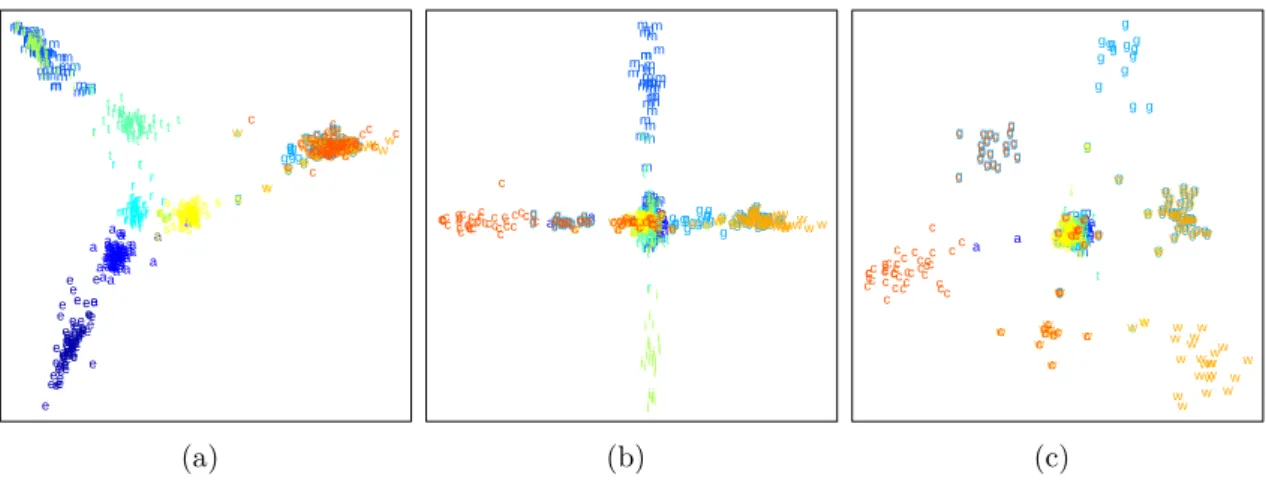
As for projections, if the intrinsic dimensionality of the data is higher than two, information has to be discarded to find a two-dimensional embedding. This infor-mation loss, called the projection error, can obscure existent structure and indicate illusionary structure that is not present. In other words, projective visualizations have a fundamental problem: although they rely on the visual identification of structure—as conveyed by distances and closeness—they cannot ensure distance preservation in the first place. Projection artifacts are thus inevitable and occur even for data of only moderate dimensionality. This can be observed for the Reuters data set (cf. Appendix A.7). It consists of 800 vectors with 11 941 dimensions, assigned equally to k = 10 classes (the letters are used in Figure 2.5): acquisitions (’a’), corn (’c’), earn (’e’), grain (’g’), interest (’i’), money-fx (’m’), crude (’r’), ship (’s’), trade (’t’), and wheat (’w’). Utilizing given classification information for a supervised projection, Figure 2.5a shows the result of the Rank-2 LDA [30] which consists of two subsequent LDA projections: the first one from the original space into an intermediate (k−1) = 9-dimensional space and a second projection down to two dimensions. Although the projection seems to preserve the clustering well, two clusters on the right-hand side (’c’,’g’,’w’) and in the upper left-hand corner (’i’,’m’) consist of points of different classes. The pivotal question is why? There are two possible explanations: both clusters are indeed mixed in the original domain or the mixture is actually an occlusion artifact caused by the projection error of the second LDA. Because the first LDA preserves the clustering in the (k−1) = 9-dimensional space, this intermediate space can be explored with a scatterplot matrix. Figures 2.5b-c acknowledge that the second assumption is true. Looking at the point cloud from the directions of the 7th and 8th (cf. Figure 2.5b) or the 7th and 9th
(cf. Figure 2.5c) dimensions reveals that the points that are mixed in Figure 2.5a form their own clusters in the intermediate 9-D space. This does not surprise much
e e e e ee ee ee e e e e e e ee e eee e e e e e eeeee e e e e e e e e ee e e e eee e e e e e e e e e e e e e e e e e e ee e e e e e e e eee e e a a a a a aaa aa a a a a aa aa a a a aa aaaaaa a a a a a a a a a a a a a a a a a a a a a a a a a a a a aa a a a aaaaaa a a a a a a a a a a aa m m m mm m m m m m m m m m m m m mmmmmmmmmm m m m m m m m m m m mm mm m m m m m m m m m m m m mm m mmmm m m m m m mm m m m m m m m mmm m m m g g g g g g gg g gg ggggg g g g ggggggggg g g g gg g g gg g g g g g g g gg g g g g ggggggg g gg g g g g g ggggg g g g g g g g g g g r r r rr r r r r r r rr r r r r r r r rrr r r rrrr r r r r r rrr r r rr r rr r r r r rr r r r r r rr rr rrr r r r r r r r r r r r rr r r r rr tt t t t t t t t t t t tt tt t t t t t t t t t t t tt t tt ttt t t t tt t t t tt t t t t t t t t t t t t t t t t t t t tt t t t t t t t tt tt t t t i ii ii i i i i i i i i i iii ii ii i ii i ii i i i i i i i i i i i i i i i i i i iiiii i i i i i i i i i i i i ii i i i i i i i i iii i i i i i s sss s s ss s s s s s s s s ss ss ss s s sssssss s ssss s ss s s s s s s s s ssss ss s s s ss s s s ss s s s sss s s ssssss s s s w w w www w w ww ww ww wwwwww w w w w w w w w wwwww w w w ww w w w w w w w w w www w w w w w ww ww w w w w ww ww w ww w w wwwww w wcw c c c ccc c c cc ccc cc c c c c ccc c ccc cc c c cc ccc c c c c c cc ccc c c c c ccc c cc c c c c cc c c c cc c c ccc c c c c c c c c (a) e eeeeeeeeee e e e e ee eeeee e e ee eeee ee e e eee e e e e e e e eeeeeee e e eeeee eeee e e e e e e e eeee e eeeee e aa aaaa a aa aa a a aa a a a aaaaaaaaaaaaaaaaaaaaa a aaa a a a a a aaaaaaa a a a a aaaaaaa a aaaa aaa aaa aaa m m m m m m m m m m m m m m m m m m m m m m m mm m m m m mmm m m mm m m mm m m mm m mm m m m m m m mm m m m m m m m m m m m m m m m m m m m m m m m m m g g g g g ggg g g g g g g g g g g g g g g g g g ggg g g g g g g gg g g g g g g g g g g gg g g gg g g gg g gggg g ggg g g g g gggg gg g g g grr r g r r rrr r rr r rr r r rrr rr r rrrrrrrrrr rrr rrrrr rrrrr rr rrrrrrrrrrrrrrrrrr r r r rrr rrrrrr r r r t t t tt tt t t t tt tt t t t t t t t t t t tttt t t t t t t tt ttttt t t tt ttt t t t t t t t tt t t t t t t t t t t ttt t t t t t tt t t t i i i ii i i i i i i i i i iii i ii i i i i i ii i i iiii i i i ii i i i i i i ii iiii i i i i i i i i i i i i i i i i i i i i i iiii i ii i i s s s s s s ss s ssss ss s ss s ss s s s ss s s sssss s s ss sssssss ssss ssss s ssssssssss s ss ssss sssssss s s swww w w w w w w w w w w www w wwww w w w w w w w www w www wwwwwwwwww w ww w w w w w w w www w w w www w ww w w w w w w ww ww w w w c c c c c c c c c c c ccccc c c c c c c ccccc cccc c c c c c c c ccc c c cc cccc c c ccc cccc cccccc c c c c c c c c c c c c cc c c (b) e e eee eeeeeeeeeeee eeeeeeeeeeeeeeeeee e e e ee e e e e eeeeeee eeeeeee eeee e e e e e e eee e e e ee e e e e aa aa aa aaaaa a aaaaa a a a a a a a a aa aaa aaaaaaa a a a aaa a a aa a aaa a aa aaaa a aaaaaa aaaa aa a a a aaa a aa mm m m m m mm mmm mm m m m mmmm mmm m mmm m m mmm mmmm mmmm m m mmm mm m mm mm m mmmm m m m m mmmmmm m mmmmmmmmmm mm g g g g g g g g g g g g g gg g g g g g g g g g g gg g g g gg g g g g g g g g g g g g g g g gg g g g g g g g g g g g g g g g g g g g g g g gg g g g g g g g r r r r r rr r r rr r rr r rrrrrrr rr r r r rr r r rrrrrr rrrr r r r r r rrrrr r r r r r rrrrrr r rr r r r r rr rrrr rrrr r t t ttt ttttt t t t t t t t t tttttt ttt t t t t t t t tt t tt t t ttt t ttt t t t t tt t tt t t tt ttt t t tt tt t t t t t t t t t t i i iiiiii iiiiiiiiiiiiiiiii i iiiiiii iiiii i i ii iii iiiii ii iiiiiii i i i iiiiiiiii iiii i i i i i s s s s s s ss s ss s ss s s ss s s s s s sss s sssss s s s sssssssssss s s ss ss s s s s s s s s s s s s ss ssss sssssssssswww w w w ww w w w w w wwww w ww w w w w w ww w w w w w w w w w w w w w ww w w w w w w w w w w w w w w w w w w w w w w w w w w w w w w w w w w w w w w c c c c c c c c c c c c c c c c c c c c c c c c c c c cc c c c c c c c c c c c c c c c c c c c c c c c c c c c c c c c c c c cc c c c c c c c c cc c c c cc (c)
Figure 2.5: Projection of the Reuters data set (cf. Appendix A.7): (a) Scatterplot of the Rank-2 LDA showing separated clusters with points of individual classes and two clusters containing points of mixed classes. Looking at the intermediate 9-D space (b) from the 7th and 8th and (c) from the 7th and 9th dimension reveals that both (alleged) clusters actually consist of separated accumulations per class.
given that the second LDA uses only two dimensions to discriminate the classes which contribute most to the optimization criterion. Nevertheless, due to the lack of any knowledge about the intermediate space, the analyst would most likely tend to assume mistakenly that both clusters are really mixed in the original space. Also note that without the opportunity to color the points according to their class, the potential artifacts would have been missed at all. The same is true even for classified data if there is no a priori knowledge about the relation between clusters and classes.
In summary, although they are used frequently for that purpose, projections and axis-based techniques seem suboptimal for visual cluster analysis of large and high-dimensional data. Because they are susceptible to illusionary artifacts, visual complexity, occlusion, and, most importantly, because they do not differentiate between structure and noise, they depend on the data’s benignity for proper de-piction of structure. However, this benignity typically decreases with increasing data complexity. That is, if the data becomes more complex or grows in size and dimensionality, the visualization becomes cluttered and difficult to interpret. In other words, the more structure there is in the data, the harder it becomes to identify any structure at all. This is even worse for noisy data or if classification information is unavailable to make use of colors in the visualization. From a clustering point of view, structural occlusion (occurring for whatever reason) simply prevents the analyst from identifying primary clustering information and from comparing individual clusters. Even if clusters are visible, their (illusionary) extent might not be meaningful and to
compare cluster sizes, points or polylines need to be counted manually—which also assumes that there are no duplicates in the data.
2.3
Novel Topology-Based Solution Approach
The intended preservation of geometric properties like distances, positions, or clus-ter shapes in the final visualization is merely a tool to convey structure in high-dimensional data. However, especially for visual cluster analysis, this tool must be questioned if the result is not guaranteed to be correct and if basic cluster properties are difficult to identify and compare [93]. It turns out that knowledge about single points, absolute distances, exact locations or shapes actually describes secondary clustering information that complicates the depiction of fundamental properties in the first place. Moreover, using representatives for every single data point to let them simulate high-dimensional proximities is neither promising nor necessarily needed to provide a structural overview. Therefore, the goal is to break the habit of applying non-scalable techniques to large and complex data and to find a more appropriate tool for visual analysis of high-dimensional point clouds.
To come up with another solution, we first have to define what is actually desired. Speaking of clusterings, the primary subject of interest are point accumulations surrounded by sparse or empty regions. That is, one is interested in how many coherent groups there are, whether they are embedded in each other, or whether they are well-separated or surrounded by noise. Quantitative properties of individual clusters typically include the number of points, information about their spread or compactness, or their distribution to derive coherence and intra-cluster similarities. Note that for such a clustering description, neither the points themselves nor their pairwise distances are needed. Taking a closer look, it is actually the information derived from point distances that prevents the analyst from identifying the clustering. Thus, if we could do without secondary properties like cluster distances or a cluster’s shape or relative position, we could better focus on primary properties. It appears that preserving global knowledge has to be the first step and that an abstraction of the point cloud into regions of data appearance would suffice for this purpose.
Topological tools are efficient at summarizing data prior to visualization. Typically, they segment a domain into parts of equal behavior or properties. We can build on these ideas if we abstract the point cloud and convert it into another form that is suitable to detect clusters as regions of data occurrence. To this end, we consider the point cloud’s density function and obtain from topological analysis a segmentation into (nested) dense regions. Regions of high density represent clusters, low-dense
Figure 2.6: Topology-based visual analysis approach: The high-dimensional point cloud is abstracted by its density function to represent clusters as dense regions. Maxima (red) of the function indicate feature candidates and saddle (yellow) densities describe region hierarchy and/or separation. The merge tree captures the function’s topology, i.e. how the regions evolve. Each merge tree edge stores three region properties—a region’s size, persistence and stability (cf. Chapter 3.2.4)—and a list of all points in that region. The structural description provided by the merge tree is visualized as a topological landscape. Each tree edge is represented by a hill that accurately reflects region properties, point distributions and the data points themselves (cf. Chapter 4). Colors in the drawing indicate correspondences among regions, merge tree edges and hills.
regions represent noise, and regions of zero density indicate cluster separation. Furthermore, regions have properties, like the number of points comprised or an absolute density; which is high for compact clusters or lower if they are spread. But we cannot say anything about geometry anymore. Not about a dense region’s shape, its geometric extent, its relative position or how far away it is from another separated region. If we wanted to preserve such information in a 2-D image, we would instantly be back in the realm of projection errors and information loss.
We use the density function’s topology as a tool to simplify the data in its original domain. This abstraction makes it possible to preserve structural knowledge without loss and to visualize it occlusion-free. The topological analysis of the density function yields a tree whose edges describe dense regions and how they merge; hence its name merge tree. Each edge is annotated with three region properties and a list of data points together with their densities. To make the complex information provided by the merge tree easier to comprehend, it is represented using an intuitive landscape metaphor. Dense regions show up as (nested) hills and individual cluster properties are indicated by the shapes of the hills (cf. Figure 2.6). The underlying data points will be augmented to the hills of their corresponding clusters.
Such a topological approach has several advantages: First, both the density function and its topology can be calculated for arbitrary dimensional data. That is, independent from the point cloud’s dimensionality, we always end up with a 2-D or 3-D landscape visualization that is free of structural occlusion. Second, the topological description is preserved without loss. This means that every dense region that truly occurs in the original space will clearly be visible in the landscape. Moreover, because