9
syllabus
syllabus
rref
efer
erence
ence
Topic:
• Applied statistical analysis
In this
In this
cha
chapter
pter
9A Types of variables and data
9B Collection of data
9C Stem plots
9D Frequency histograms and
bar charts
9E Describing the shape of
stem plots and histograms
9F Cumulative data
372
M a t h s Q u e s t M a t h s B Y e a r 1 1 f o r Q u e e n s l a n dIntroduction
Karen is a real estate agent. At the end of each year it is part of her job to perform a statistical analysis of house prices in the local area. In her real estate agency, currently there are 60 houses for sale and Karen has summarised their prices in the table below.
Karen must make a presentation on her findings to the Real Estate Institute. What are the different ways in which she can present this information?
In this chapter we will look at different types of data and consider statistics in terms of their presentation.
Defining statistics
People have always been interested in the collection of information about themselves and their environment. The collection of such information in a systematic fashion is called statistics.
Types of variables and data
A statistical investigation usually involves looking at a characteristic of a population. Because this characteristic varies for different members of the population this charac-teristic is called the variable.
Once a known piece of information is assigned to a variable this then becomes a piece of data. For example, if we are studying the maximum daily temperature, we refer to the temperature as the variable as it can be different every day. If we say that it was 25°C on Thursday, a value has been assigned to the variable and this is now a piece of data. The variable that is being studied in an investigation, or a piece of data, can be described as either categorical or qualitative.
Price range Number of houses
$75 000–$100 000 1
$100 000–$125 000 5
$125 000–$150 000 7
$150 000–$175 000 6
$175 000–$200 000 11
$200 000–$225 000 14
$225 000–$250 000 9
$250 000–$275 000 4
$275 000–$300 000 0
$300 000–$325 000 1
$325 000–$350 000 0
$350 000–$375 000 0
$375 000–$400 000 2
Categorical
Categorical data cannot be measured; they can only be put into categories.
An example of categorical data is makes of cars. The categories for the data would be all possible makes of cars such as Ford, Holden, Toyota, Mazda etc. Other questions that would lead to categorical data would be things such as:
• What is your hair colour?
• Who is your favourite musical performer?
• What method of transport do you use to get to school?
Categorical data cannot be placed in a specific order. Although the graphs show the same information, they look different.
With categorical variables, the order in which the columns appear is not important and can be changed without altering the meaning, as they are non-numerical. The frequency of each type of car, which is numerical, is unaffected by the order of the columns.
Quantitative
Quantitative data can be measured. They are data to which we can assign a numerical value.
Data concerning quantitative variables are collected by measurement or by counting. For example, the data collected by measuring the heights of students are quantitative in nature. The data collected by counting the ages of students in years are also quanti-tative.
Toyota Ford
Holden Mazda Mitsubishi Make of car 0
2 4 6 8 10 12
Number of cars
0
Holden Ford Mazda Toyota
Mitsubishi 2
4 6 8 10 12
Number of cars
Make of car
State whether the following variables are categorical or quantitative in nature. a The value of sales recorded at each branch of a fast-food outlet
b The breeds of dog that appear at a dog show
THINK WRITE
a The value of sales at each branch can be measured.
a The value of sales is quantitative.
b The breeds of dog at a show cannot be measured.
b The breeds of dog is categorical.
1
374
M a t h s Q u e s t M a t h s B Y e a r 1 1 f o r Q u e e n s l a n dThere are two types of quantitative data and variables.
1. Discrete — These take only exact values, most often integers. For example, the number of children in a family or the marks achieved on a test. (This is discrete even though you may have half marks.)
2. Continuous — These can take any value within certain limits. For example, a person’s height or the daily temperature are continuous variables because they can be measured to any degree of accuracy.
Types of data
Consider Karen’s summary of house prices.
1 Are the data that Karen has collected categorical or quantitative?
2 Are house prices an example of discrete or continuous data?
State whether each of the following pieces of quantitative data are discrete or continuous. a The number of people in each car that passes through a tollgate
b The mass of a baby at birth
THINK WRITE
a The number of people in the car must be a whole number.
a
Give a written answer. The data are quantitative and discrete.
b A baby’s mass can be measured to various degrees of accuracy.
b
Give a written answer. The data are quantitative and continuous. 1
2
1
2
2
WORKED
E
xample
Types of variables and data
1 State whether the variables in each of the following situations would be categorical or quantitative.
a The number of matches in each box is counted for a large sample of boxes.
b The sex of respondents to a questionnaire is recorded as either M or F.
c A fisheries inspector records the lengths of 40 cod.
d The occurrence of hot, warm, mild and cool weather for each day in January is recorded.
e The actual temperature for each day in January is recorded.
f Cinema critics are asked to judge a film by awarding it a rating from one to five stars.
2 State whether the quantitative data considered in each of the following situations are discrete or continuous.
a The heights of 60 tomato plants at a plant nursery
b The number of jelly beans in each of 50 packets
c The time taken for each student in a class of six-year-olds to tie their shoelaces
d The petrol consumption rate of a large sample of cars
e The IQ (intelligence quotient) of each student in a class
3 For each of the following, state if the data are categorical or quantitative. If quantitative, also state if the variables are discrete or continuous.
a The number of students in each class at your school
b The teams people support at a football match
c The brands of peanut butter sold at a supermarket
d The heights of people in your class
e The interest rate charged by each bank
f A person’s pulse rate
4 An opinion poll was conducted. A thousand people were given the statement ‘Euthanasia should be legalised’. Each person was offered five responses: strongly agree, agree, unsure, disagree and strongly disagree. Describe the data type in this example.
remember
1. Variables and data can be classified as either: (a) categorical — the data are in categories, or
(b) quantitative — the data can be either measured or counted. 2. Quantitative variables and data can be either:
(a) discrete — the data can take only certain values, usually whole numbers, or (b) continuous — the data can take any value depending on the degree of
accuracy.
remember
9A
W WORKEDORKED
E Example
1
W WORKEDORKED
E Example
376
M a t h s Q u e s t M a t h s B Y e a r 1 1 f o r Q u e e n s l a n d5 A teacher marks her students’ work with a grade A, B, C, D, or E. Describe the data type used.
6 A teacher marks his students’ work using a mark out of 100. Describe the data type used.
7
The number of people who are using a particular bus service are counted over a two week period. The data formed by this survey would be an example of:
A categorical data
B quantitative and discrete data C quantitative and continuous data D numerical data
E insufficient information
8 The following graph shows the number of days of each weather type for the Gold Coast in January.
Describe the data in this example.
9 The graph at right shows a girl’s height each year for 10 years.
Describe the data in this example.
Collection of data
A common method of collecting data is through a poll. A poll is the recording of responses to a set of questions known as a questionnaire.
The first step in gathering the relevant data for a statistical investigation is to target the population to be investigated. This means identifying the sections of the population for whom the statistical investigation will have relevance.
Gallup poll
The most famous poll is named after its founder, the American statistician, George Gallup, who was born in 1901.
Find out about Gallup and his work and how Gallup polls are used today.
m
multiple choiceultiple choice
0
Cool Warm
Hot Mild
2 4 6 8 10 12 14
Number of days in January
Weather
5 7 9 10 11 12 13 14 15 Age
Height (cm)
100 120 140 160 180
For example, if investigating the medical needs of a community, we would not conduct our survey at the local fitness club! For such a survey we would survey doctors and other medical personnel, as well as a selection of patients who use the existing facilities.
When starting an investigation, we must determine the quantity of data needed for the database. Consider the case of a company calculating the TV ratings. Does the com-pany need to find out what every household is watching? Obviously they do not so they ask a selection of homes to record their TV viewing.
Now consider the case of selecting a band to play at the Year 12 farewell. In this case it is reasonable to ask every Year 12 student their opinion.
Data can be collected in one of two ways:
1. Census. In a census an entire population is counted. Australians complete ‘The Census’ every five years. This is a survey conducted by the Bureau of Statistics of every house-hold in the nation. For the purposes of most statistical investigations, a census is where everyone in the target population is surveyed, such as the Year 12 example above. 2. Sample. A sample is a more practical method for conducting most surveys. Only a
selection of the target population is surveyed with the results taken to be represen-tative of the whole group. The TV ratings example is one where a sample is used.
Identifying the target population
For each of the following statistical investigations, identify the population that you would target for a survey.
1 The school ‘End of Year’ Committee wants to find out the preferred venue, band and meals for the Year 12 farewell.
2 The local council wants to know what sporting facilities are needed in the local area.
3 A newspaper wants a survey to predict the winner of a forthcoming election.
4 A group of people planning to build a preschool would like to know what facilities attract people to a particular preschool.
5 A recording label wants to estimate the potential success of a ‘grunge’ band.
In each of the following, state if the information was obtained by census or sample. a A school uses the roll to count the number of students absent each day.
b The television ratings, in which 2000 families complete a survey on what they watch over a one week period.
c A light globe manufacturer tests every hundredth light globe off the production line. d A teacher records the examination marks of her class.
THINK WRITE
a Every student is counted at roll call each morning.
a Census
b Not every family is asked to complete a ratings survey.
b Sample
c Not every light globe is tested. c Sample d The marks of every student are recorded. d Census
378
M a t h s Q u e s t M a t h s B Y e a r 1 1 f o r Q u e e n s l a n dSampling methods
To ensure that the results of your sample are representative of the whole population, the method of sampling is important. There are three main methods of choosing a sample: random sample, stratified sample and systematic sample.
Method 1. Random sample
In a random sample, those to be surveyed are selected by chance. When a random sample is conducted, every person in the target population should have an equal chance of being selected. For example, the names of the people to complete your survey may be drawn from a hat. If this method is used, you should get a good mixture of people in your survey.
Suppose that we are going to survey students in a school. We want a mixture of students and could choose a fixed number of students from each year. Suppose we decide to survey 60 students. We could select 12 from each year, but if we did this the survey would not have the correct proportion of students from each year. For example, 22.5% of the students at this school are in Year 8, but only 20% of the survey participants are in Year 8.
Suppose that we are to choose a random sample of 20 students from the population of 800. To choose a random sample each student would be allocated a number between 1 and 800 and the graphics calculator could then be used to make a random choice using the random number generator.
1. To find the random number generator press .
2. Press to choose the PRB menu.
3. Choose option 5: randInt.
4. Select the lower limit, upper limit and number of values, separated by a comma, then close the brackets. To do this press 1, 800, 20.
5. Use the scroll to see the entire list of numbers.
A scientific calculator will generate random numbers. Your calculator may generate a random integer as does the graphics calculator, or may generate a random decimal between 0 and 1. To generate random integers from this decimal we multiply the decimal by the number the sample is being chosen from (in the example above, 800) and round the result up to the next whole number.
Year
No. of students
Year 8 180
Year 9 190
Year 10 185
Year 11 135
Year 12 110
Total 800
Graphics Calculator
Graphics Calculator
tip!
tip!
Choosing a
random sample
CASIO
Random sample
MATH
▼ ▼ ▼
Any other method may not give a truly representative sample. For example, if you survey people in the playground you may:
• have a tendency to ask people you know
• choose an area where a lot of students from a particular year tend to sit • choose more of one gender than another.
Method 2. Stratified sample
In this type of sample you deliberately choose people to complete your survey who are representative of the whole population. In the school survey you would need to select five strata that had the correct proportion of students from each year. For example, if 20% of the school population are in Year 8 then 20% of your sample should be from Year 8.
Three students from a school are to be selected to participate in a statewide survey of school students. There are 750 students at the school. To choose the participants, a random decimal generator is used with the results 0.983, 0.911, and 0.421. What are the roll numbers of the students who should be selected?
THINK WRITE
Multiply the results of the random number generator by the size of the population.
0.983 × 750 = 737.25 0.911 × 750 = 683.25 0.421 × 750 = 315.75
Round up to whole numbers. The 738th, 684th and the 316th people on the roll would be surveyed.
1
2
4
WORKED
E
xample
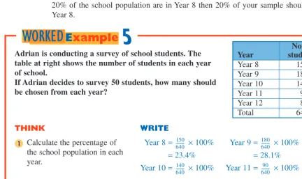
Adrian is conducting a survey of school students. The table at right shows the number of students in each year of school.
If Adrian decides to survey 50 students, how many should be chosen from each year?
Continued over page
THINK WRITE
Calculate the percentage of the school population in each year.
Year 8 = × 100% Year 9 = × 100%
= 23.4% = 28.1%
Year 10 = × 100% Year 11 = × 100%
= 21.8% = 14.1%
Year 12 = × 100%
= 12.5%
Year
No. of students
Year 8 150
Year 9 180
Year 10 140
Year 11 90
Year 12 80
Total 640
1 150640--- 180
640
---140 640
--- 90 640
---80 640
---5
380
M a t h s Q u e s t M a t h s B Y e a r 1 1 f o r Q u e e n s l a n dMethod 3. Systematic sample
Systematic sampling is where those chosen for the sample are chosen in a systematic or organ-ised way. This method is mostly used in quality control situations. For example, suppose that the quality and strength of sports shoes is being tested. The quality control department may test every 20th pair of shoes that comes off the production line. In doing a survey, every 20th person on the school roll may be surveyed.
THINK WRITE
Calculate the number of students that should be chosen from each year to do the survey.
Year 8 = 23.4% of 50 Year 9 = 28.1% of 50
= 11.7 = 14.05
= 12 (nearest whole no.) = 14 (nearest whole no.) Year 10 = 21.8% of 50 Year 11 = 14.1% of 50
= 10.9 = 7.05
= 11 (nearest whole no.) = 7 (nearest whole no.) Year 12 = 12.5% of 50
= 6.25
= 6 (nearest whole no.)
Give a written answer. Adrian should choose twelve Year 8 students, fourteen Year 9 students, eleven Year 10 students, seven Year 11 students and six Year 12 students.
2
3
remember
1. Before beginning a statistical investigation it is important to identify the target population.
2. The survey can be conducted either by:
(a) Census — the entire target population is surveyed, or
(b) Sample — a selection is surveyed such that those selected are representative of the entire target population.
3. There are three methods for selecting a sample.
Method 1.Random sample — chance is the only factor in deciding who is surveyed. This is best done using a random number generator.
Method 2.Stratified sample — those sampled are chosen in proportion to the entire population.
Method 3.Systematic sample — a system is used to choose those who are to be in the sample.
Collection of
data
1 A school conducts an election for a new school captain. Every teacher and student in the school votes. Is this an example of a census or a sample? Explain your answer.
2 A survey is conducted by a council to see what sporting facilities the community needs. If 500 people who live in the community are surveyed, is this an example of a census or a sample?
3 For each of the following surveys, state whether a census or a sample has been used.
a Two hundred people in a shopping centre are asked to nominate the supermarket where they do most of their grocery shopping.
b To find the most popular new car on the road, 500 new car buyers are asked what make and model car they purchased.
c To find the most popular new car on the road, the make and model of every new car registered are recorded.
d To find the average mark in the mathematics half-yearly exam, every student’s mark is recorded.
e To test the quality of tyres on a production line, every 100th tyre is road tested.
4 For each of the following, recommend whether you would use a census or a sample to obtain the results.
a To find the most watched television program on Monday night at 7:30 pm
b To find the number of cars sold during a period of one year
c To find the number of cars that pass through the tollgates on the Sydney Harbour Bridge each day
d To find the percentage of computers produced by a company that are defective
5 An opinion poll is conducted to try to predict the outcome of an election. Two thousand people are telephoned and asked about their voting intention. Is this an example of a census or a sample?
6 A factory has 500 employees. Each employee has an employee number between 1 and 500. Five employees are selected to participate in an Occupational Health and Safety survey. To choose the participants, a random number generator is used. The results are 0.326, 0.352, 0.762, 0.989 and 0.018. What are the employee numbers of those to participate in the survey?
7 A school has 837 students. A survey of 10 students in the school is to be conducted. A random number generator is used to select the participants. If the random numbers chosen are:
0.988 0.251 0.498 0.661 0.247 0.031 0.967 0.932 0.229 0.443 what are the roll numbers of the students who should be selected?
8 A survey is to be conducted of 20 out of 50 000 people in a country town. Those selected are to be chosen using a random number generator.
a Use your calculator to generate 20 random numbers.
b Calculate the electoral roll numbers of the people who should be chosen for the survey.
9B
W WORKEDORKED
E Example
3
W WORKEDORKED
E Example
382
M a t h s Q u e s t M a t h s B Y e a r 1 1 f o r Q u e e n s l a n d9 For each of the following, state whether the sample used is an example of random,
stratified or systematic sampling.
a Every 10th tyre coming off a production line is tested for quality.
b A company employs 300 men and 450 women. The sample of employees chosen
for a survey contains 20 men and 30 women.
c The police breathalyse the driver of every red car.
d The names of the participants in a survey are drawn from a hat.
e Fans at a football match fill in a questionnaire. The ground contains 8000
grand-stand seats and 20 000 general admission seats. The questionnaire is then given to 40 people in the grandstand and 100 people who paid for a general admission seat.
10
Which of the following is an example of a systematic sample?
A The first 20 students who arrive at school each day participate in the survey.
B Twenty students to participate in the survey are chosen by a random number
generator.
C Twenty students to participate in the survey are selected in proportion to the
number of students in each school year.
D Ten boys and 10 girls are chosen to participate in the survey.
11
Which of the following statistical investigations would be practical to complete by census?
A A newspaper wants to know public opinion on a political issue.
B A local council wants to know if a skateboard ramp would be popular with young
people in the area.
C An author wants a cricket player’s statistics for a book being written.
D An advertising agency wants to know the most watched program on television.
12 The table below shows the number of students in each year at a school.
If a survey is to be given to 40 students at the school, how many from each Year should be chosen if a stratified sample is used?
13 A company employs 300 men and 200 women. If a survey of 60 employees using a
stratified sample is completed, how many people of each gender participated? Year
No. of students
8 110
9 90
10 80
11 70
12 50
Total 400
m
multiple choiceultiple choice
m
multiple choiceultiple choice
SkillS
HEET
9.1
W WORKEDORKED
E Example
5
14 The table below shows the age and sex of the staff of a corporation.
A survey of 50 employees is to be done. Using a stratified survey, suggest the breakdown of people to participate in terms of age and gender.
Bias
A high school is having a disco and the organisers expect that most students will attend. A new DJ is employed to run the disco. To gain information about what music should be played, he conducts a survey. The DJ does not have time to complete a school census and so he selects a sample of 10 students.
Now suppose that the DJ visited the school basketball courts at lunchtime and sur-veyed the ten Year 11 boys who were playing at that time. What sort of results would
Age Male Female
20–29 61 44
30–39 40 50
40–49 74 16
50–59 5 10
Census or sample?
For each of the following statistical investigations, state whether you would gather data using a census or sample. For those for which you would use a sample, state the best method for selecting the sample.
1 A company wants to test the life of its batteries.
2 A sporting club wants to elect a new club president.
3 A market research company wants to determine the most popular brand of toothpaste.
4 A theme park wants to know from which State and suburb its visitors come.
384
M a t h s Q u e s t M a t h s B Y e a r 1 1 f o r Q u e e n s l a n dyou expect the DJ to get? Would these results be representative of the whole school’s taste in music?
It is unlikely that the Year 11 boys would like the same music as the Year 7 girls. The DJ’s results are said to be biased because the sample chosen to conduct the survey on was not representative of the whole school population.
Bias occurs when the sample chosen is more likely to be of one opinion than representing the total population. When collecting a sample, methods for selecting the sample are designed to eliminate bias. Consider the above example with regard to the following points.
• A random sample would most probably have selected a mixed group of students to survey. It is unlikely that a random number generator would have selected 10 stu-dents of the same gender in the same year.
• A stratified sample would ensure that a mix of boys and girls from all years was chosen.
Biased sampling
Discuss the problem caused by each of the following biased samples.
1 A survey is to be conducted to decide the most popular sport in a local community. A sample of 100 people was questioned at a local football match.
2 A music store situated in a shopping centre wants to know the type of music that it should stock. A sample of 100 people was surveyed. The sample was taken from people who passed by the store between 10 and 11 am on a Tuesday.
3 A newspaper conducting a Gallup poll on an election took a sample of 1000 people from one Brisbane suburb.
Women and work
A class has been given the task of conducting a statistical analysis that has the title ‘Women and the Australian workforce’.
Julie approaches the assignment by surveying 1000 women to find out what percentage are engaged in full-time work.
Ricardo decides to survey 1000 full-time workers to find out what percentage are women.
1 Discuss the way in which each student should select his or her sample.
2 Is either approach more susceptible to bias?
3 Which of the following questions would it be easier to answer?
a What percentage of women are engaged in full-time work?
b What percentage of the full-time workforce are women?
Explain your answer with reference to your answer to questions 1 and 2.
4 Are the answers to questions a and b the same? Explain your answer.
Cost of a house
Remember Karen at the real estate agency? She collected information on the prices of houses for sale through the real estate agency where she works.
1 Are the data collected an example of a census or a sample? If they are a sample, describe the type of sample that has been taken.
Displaying data
Once a data set has been collected it can be displayed in tabular and graphical form, for various purposes. The type of display chosen depends on the type of data that are being represented.
Stem plots
A stem-and-leaf plot, or stem plot for short, is a way of displaying a set of data. It is best suited to data which contain up to about 50 observations (or records).
The following stem plot shows the ages of people attending an advanced computer class.
The ages of the members of the class are
16, 22, 22, 23, 30, 32, 34, 36, 42, 43, 46, 47, 53, 57 and 61. A stem plot is constructed by breaking the numerals of a record into two parts — the stem, which in this case is the first digit, and the leaf, which is always the last digit.
Stem 1 2 3 4 5 6
Leaf 6 2 2 3 0 2 4 6 2 3 6 7 3 7 1
The number of cars sold in a week at a large car dealership over a 20-week period is given below. 16 12 8 7 26 32 15 51 29 45
19 11 6 15 32 18 43 31 23 23
Construct a stem plot to display the number of cars sold in a week at the dealership.
THINK WRITE
In this example the observations are one- or two-digit numbers and so the stems will be the two-digits referring to the ‘tens’, and the leaf part will be the digits referring to the units.
Work out the lowest and highest numbers in the data in order to determine what the stems will be.
Lowest number = 6 Highest number = 51 Use stems from 0–5. Before we construct an ordered stem plot,
construct an unordered stem plot by listing the leaf digits in the order they appear in the data.
Now rearrange the leaf digits in numerical order to create an ordered stem plot.
Include a key so that the data can be understood by anyone viewing the stem plot.
Key: 2|3 = 23 cars 1
2 Stem
0 1 2 3 4 5
Leaf 8 7 6
6 2 5 9 1 5 8 6 9 3 3 2 2 1 5 3 1
3 Stem
0 1 2 3 4 5
Leaf 6 7 8
1 2 5 5 6 8 9 3 3 6 9 1 2 2 3 5 1
6
386
M a t h s Q u e s t M a t h s B Y e a r 1 1 f o r Q u e e n s l a n dSometimes data which are very bunched make it difficult to get a clear idea about the data variation. To overcome the problem, we can split the stems. Stems can be split into halves or fifths.
The masses (in kilograms) of the members of an Under-17 football squad are given below. 70.3 65.1 72.9 66.9 68.6 69.6 70.8
72.4 74.1 75.3 75.6 69.7 66.2 71.2 68.3 69.7 71.3 68.3 70.5 72.4 71.8 Display the data in a stem plot.
THINK WRITE
In this case the observations contain 3 digits. The last digit always becomes the leaf and so in this case the digit referring to the tenths becomes the leaf and the two preceding digits become the stem.
Work out the lowest and highest numbers in the data in order to determine what the stems will be.
Lowest number = 65.1 Highest number = 75.6 Use stems from 65–75. Construct an unordered stem plot. Note
that the decimal points are omitted since we are aiming to present a quick visual summary of data.
Construct an ordered stem plot. Provide a key.
Key: 74|1 = 74.1 kg 1
2 Stem
65 66 67 68 69 70 71 72 73 74 75
Leaf 1 9 2
6 3 3 6 7 7 3 8 5 2 3 8 9 4 4
1 3 6
3 Stem
65 66 67 68 69 70 71 72 73 74 75
Leaf 1 2 9
3 3 6 6 7 7 3 5 8 2 3 8 4 4 9
1 3 6
7
WORKED
E
xample
A set of golf scores for a group of professional golfers trialling a new 18-hole golf course is shown on the following stem plot.
Key: 6|1 = 61
Produce another stem plot for these data by splitting the stems into: a halves b fifths.
Stem 6 7
Leaf
1 6 6 7 8 9 9 9 0 1 1 2 2 3 7
THINK WRITE
a By splitting the stem 6 into halves, any leaf digits in the range 0–4 appear next to the first 6, and any leaf digits in the range 5–9 appear next to the second 6. Likewise for the stem 7.
a
Key: 6|1 = 61 b Alternatively, to split the stems into fifths,
each stem would appear 5 times.
Any 0s or 1s are recorded next to the first 6. Any 2s or 3s are recorded next to the second 6. Any 4s or 5s are recorded next to the third 6. Any 6s or 7s are recorded next to the fourth 6 and finally any 8s or 9s are recorded next to the fifth 6.
This process would be repeated for those observations with a stem of 7.
b
Key: 6|1 = 61 Stem
6 6 7 7
Leaf 1
6 6 7 8 9 9 9 0 1 1 2 2 3 7
Stem 6 6 6 6 6 7 7 7 7 7
Leaf 1
6 6 7 8 9 9 9 0 1 1 2 2 3
7
8
WORKED
E
xample
remember
1. A stem-and-leaf plot is a useful way of displaying data containing up to about 50 observations (or records).
2. A stem plot is constructed by breaking the numerals of a record into two parts, a ‘stem’ and a ‘leaf’. The last digit is always the leaf and any preceding digits form the stem.
3. When asked to represent data using a stem-and-leaf plot, you should always assume that the plot will be drawn with the data ordered.
4. If data are bunched then it may be useful to break the stems into halves or even fifths.
388
M a t h s Q u e s t M a t h s B Y e a r 1 1 f o r Q u e e n s l a n dStem plots
1 In each of the following, write down all the pieces of data shown on the stem plot. The key used for each stem plot is 3|2 = 32.
2 The money (to the nearest dollar) earned each week by a busker over an 18-week period is shown below. Construct a stem plot for the busker’s weekly earnings.
3 The ages of those attending an embroidery class are given below. Construct a stem plot for these data.
4 The number of dogs brought into a dog refuge each week over a 20-week period is given below. Construct a stem plot for these data.
5
6 The ages of the mothers of a class of children attending an inner city kindergarten are given below. Construct a stem plot for these data.
7 The number of people attending a Neighbourhood Watch committee meeting each fortnight for a year is given below. Construct a stem plot to display these data.
a Stem 0 0 1 1 2 2 3 Leaf 1 2 5 8 2 3 3 6 6 7 1 3 4 5 5 6 7 0 2 b Stem 1 2 3 4 5 6 Leaf 0 1 3 3 0 5 9 1 2 7 5 2 c Stem 10 11 12 13 14 15 Leaf 1 2 5 8 2 3 3 6 6 7 1 3 4 5 5 6 7
d Stem 5 5 5 5 5 Leaf 0 1 3 3 4 5 5 6 6 7 9 e Stem 0 0 1 1 2 2 Leaf 1 4 5 8 0 2 6 9 9 1 1 5 9 5 31 19 52 11 43 27 37 23 41 35 39 18 45 42 32 29 36 39 63 68 49 51 52 57 61 63 58 51 59 37 49 42 53 28 32 18 26 9 29 16 30 8 21 30 35 26 45 41 23 43 19 54 27
The observations shown on the stem plot at right are: A 4 10 27 28 29 31 34 36 41
B 14 10 27 28 29 29 31 34 36 41 41 C 4 22 27 28 29 29 30 31 34 36 41 41 D 14 22 27 28 29 30 30 31 34 36 41 41 E 4 2 27 28 29 29 30 31 34 36 41
Stem 0 1 2 3 4 Leaf 4
2 7 8 9 9 0 1 4 6 1 1 Key: 2|5 = 25
32 28 37 30 29 33 23 34 29 28 32 35 25 35 38 29 39 33 32 30 14 13 19 17 15 22 19 19 20 21 21 18 23 23 29 16 22 11 18 25 21 23 19 20 18
9C
W WORKEDORKED E Example 6 mmultiple choiceultiple choice
8 The number of hit outs made by each of the principal ruckmen in each of the AFL teams for Round 11 is recorded below. Construct a stem plot to display these data.
9
10 The 2001 median house price of a number of Brisbane suburbs is given below. Construct a stem plot for these data.
11
Construct a stem plot for head circumference, using:
12
Construct a stem plot for screw length using:
13 The number of seconds for which 12 Grade-2 children can hold their breath under water is given below.
8.2 9.2 8.1 8.5 9.3 8.9 8.9 9.5 8.9 9.0 9.1 9.7 Construct a stem plot for holding breath using:
Team
Number of
hit outs Team
Number of hit outs Collingwood Bulldogs Kangaroos Port Adelaide Geelong Sydney Melbourne Brisbane 20 34 29 24 21 31 29 25 Adelaide St Kilda Essendon Carlton West Coast Fremantle Hawthorn Richmond 32 34 31 26 29 22 33 28
The heights of members of a squad of basketballers are given at right in metres. Construct a stem plot for these data.
1.96 1.99 2.05 1.85 1.87 2.01 2.03 1.95 1.96 2.21 2.03 1.97 2.17 2.09 1.91 1.89
Suburb $(000) Suburb $(000) Auchenflower Bulimba Balmoral Cannon Hill Carrara Coorparoo Doomben Eagle Farm Fairfield Holland Park 233 217 203 298 246 210 205 202 212 242 Indooroopilly Rosalie Spring Hill Mt Gravatt Nudgee Paddington Sandgate Sth Brisbane Woolloongabba 255 221 252 228 290 285 244 290 283
The data at right give the head circumference (to the nearest cm) of 16 four-year-old girls.
48 50 49 50 47 53 52 52 51 43 50 47 49 49 48 50
a the stems 4 and 5 b the stems 4 and 5 split into halves
c the stems 4 and 5 split into fifths. A random sample of 20 screws is taken and the length of each is recorded to the nearest millimetre (at right).
23 19 17 15 20 19 18 16 21 17 20 23 17 21 20 19 19 21 22 23
a the stems 1 and 2 b the stems 1 and 2 split into halves
c the stems 1 and 2 split into fifths.
a the stems 8 and 9 b the stems 8 and 9 split into halves
c the stems 8 and 9 split into fifths.
390
M a t h s Q u e s t M a t h s B Y e a r 1 1 f o r Q u e e n s l a n dFrequency histograms and bar charts
Frequency histograms and bar charts display data in graphical form.Frequency histograms
A histogram is a useful way of displaying large data sets (say, over 50 observations). The vertical axis on the histogram displays the frequency and the horizontal axis displays class intervals of the variable (for example height, income etc.).
When data are given in raw form — that is, just as a list of figures in no particular order — it is helpful to first construct a frequency table.
The data below show the distribution of masses (in kilograms) of 60 students in Year 7 at Northwood State High School. Construct a frequency histogram to display the data more clearly. 45.7 45.8 45.9 48.2 48.3 48.4 34.2 52.4 52.3 51.8 45.7 56.8 56.3 60.2 44.2 53.8 43.5 57.2 38.7 48.5 49.6 56.9 43.8 58.3 52.4 54.3 48.6 53.7 58.7 57.6 45.7 39.8 42.5 42.9 59.2 53.2 48.2 36.2 47.2 46.7 58.7 53.1 52.1 54.3 51.3 51.9 54.6 58.7 58.7 39.7 43.1 56.2 43.0 56.3 62.3 46.3 52.4 61.2 48.2 58.3 THINK WRITE
First construct a frequency table. The lowest data value is 34.2 and the highest is 62.3. Divide the data into class intervals. If we started the first class interval at, say, 30 kg and ended the last class interval at 65 kg, we would have a range of 35. If each interval was 5 kg, we would then have 7 intervals which is a reasonable number of class intervals. While there are no set rules about how many intervals there should be,
somewhere between about 5 and 15 class intervals is usual. So, in this example, we would have class intervals of 30–34.9 kg, 35–39.9 kg, 40–44.9 kg and so on. Count how many observations fall into each of the intervals and record these in a table. Check that the frequency column totals 60. The data are in a much clearer form now. A histogram can be constructed.
1
Class interval Frequency 30–34.9 35–39.9 40–44.9 45–49.9 50–54.9 55–59.9 60–64.9 1 4 7 16 15 14 3 Total 60 2 3 Mass (kg) Frequenc y 0 2 4 6 8 10 12 14 16
30 35 40 45 50 55 60 65
9
WORKED
E
xample
The marks out of 20 received by 30 students for a book-review assignment are given in the frequency table below.
Display these data on a histogram.
Mark 12 13 14 15 16 17 18 19 20
Frequency 2 7 6 5 4 2 3 0 1
THINK WRITE
In this case we are dealing with integer values. Since the horizontal axis should show a class interval, we extend the base of each of the columns on the histogram halfway below each score and halfway above it.
Mark out of 20
Frequenc
y
0 1 2 3 4 5 6 7
12 13 14 15 16 17 18 19 20
10
WORKED
Example
Construct a histogram using the data in worked example 10 and a graphics calculator.
THINK DISPLAY
Enter the data.
(a) Clear any previous equations. (b) Press and clear any functions. (c) Press , select 1:Edit and press
.
(d) Enter the marks in L1 and the frequency in L2.
Set up the calculator for graphing. (a) Press [STAT PLOT] and select
1:Plot1. Press . (b) Select On and press .
(c) Select the type of graph required. The histogram is the third along on the top row.
(d) At Xlist type in L1 (press [L1]). (e) At Freq type in L2 (press [L1]). (f) Press and highlight 9:Zoom
Stat; press .
(g) If not all of the histogram is shown, press and reset the x- and
y-range and step values.
1
Y= STAT ENTER
2
2nd
ENTER ENTER
2nd 2nd ZOOM
ENTER
WINDOW
11
WORKED
Example
CASIO
392
M a t h s Q u e s t M a t h s B Y e a r 1 1 f o r Q u e e n s l a n dBar charts
A bar chart is similar to a histogram. However, it consists of bars of equal width separated by small, equal spaces and may be arranged either horizontally or vertically.
In bar charts the frequency is graphed against a variable as shown in both figures above. The variable may or may not be numerical.
How-ever, in this chapter we consider only numerical vari-ables. The numerical variable should take discrete values; that is, it should take only certain values (such as whole hours or number of people) rather than being continuous (such as the height of people) which could take any value within a range. This is because the scale is broken by the gaps between the bars. The numerical values are generally close together and have little spread, like consecutive years.
The bar chart above right represents the data presented in worked example 5. Of course, it could have been drawn with vertical bars (columns).
Segmented bar charts
A segmented (divided) bar chart is a single bar which is used to represent all the data being studied. It is divided into segments, each segment representing a particular group of the data. Generally, the information is presented as percentages and so the total bar length represents 100% of the data.
Consider the following table, showing fatal road accidents in Australia.
ROAD TRAFFIC ACCIDENTS INVOLVING FATALITIES Accidents involving fatalities
Year NSW Vic. Qld SA WA Tas. NT ACT Aust. 1991 585 435 362 166 187 65 60 16 1876 1992 578 365 364 142 171 56 42 18 1734 1993 518 381 357 191 190 47 40 11 1735 1994 557 346 367 145 195 51 36 15 1712 1995 563 371 408 163 194 53 56 14 1822 1996 544 383 338 162 220 53 58 17 1775
2 4 6
Number of students Student pet preferences 8 10 12
Dog Cat Rabbit Snake Bird Goldfish
0 5 10 15 20 25
1 2
Number of children in family
Number of f
amilies
3 4 5
1 2 3
Frequency or number of students
Mark out of 20
4 5 6 7 17
16 15 19 20
18
14 13 12
E
XCEL
Spreadshe
et
Segmented bar charts
Source: Federal Office of Road Safety, Road Fatalities Australia, 1996. (From ABS Yearbook, 1998.)
It is appropriate to represent the number of accidents involving fatalities in all States and territories during 1991 as a segmented bar chart.
Firstly, using the data on page 392, we convert each State’s proportion of accidents out of the total to a percentage.
The segmented bar chart is drawn to scale. An appropriate scale would be constructed by drawing the total bar 10 cm long,
so that 1 mm represents 1%. That is, NSW’s accidents would be represented by a segment of 31.2 mm, Victoria’s by a segment of 23.2 mm and so on.
Each segment is then labelled directly, or a key may be used.
Persons killed
Year NSW Vic. Qld SA WA Tas. NT ACT Aust.
1991 663 503 395 184 207 75 67 17 2113
1992 649 396 416 165 200 74 54 20 1974
1993 581 435 396 218 209 58 44 12 1953
1994 647 378 422 159 211 59 41 17 1934
1995 620 418 456 181 209 57 61 15 2017
1996 587 418 385 181 247 64 72 23 1977
State Number of accidents Percentage
NSW 585 585 ÷ 1876 × 100% = 31.2% Vic. 435 435 ÷ 1876 × 100% = 23.2% Qld 362 362 ÷ 1876 × 100% = 19.3% SA 166 166 ÷ 1876 × 100% = 8.8% WA 187 187 ÷ 1876 × 100% = 10.0% Tas. 65 65 ÷ 1876 × 100% = 3.5% NT 60 60 ÷ 1876 × 100% = 3.2% ACT 16 16 ÷ 1876 × 100% = 0.9%
ROAD TRAFFIC ACCIDENTS INVOLVING FATALITIES
NSW 31.2% Vic. 23.2%
Qld 19.3% SA 8.8% WA 10.0%
Tas. 3.5%
NT 3.2% ACT 0.9%
remember
1. On a frequency histogram the vertical axis displays the frequency and the horizontal axis displays the class intervals.
394
M a t h s Q u e s t M a t h s B Y e a r 1 1 f o r Q u e e n s l a n dFrequency histograms and
bar charts
1 Construct a frequency table for each of the following sets of data.
a 3 4 4 5 5 6 7 7 7 8 8 9 9 10 10 12
b 4.3 4.5 4.7 4.9 5.1 5.3 5.5 5.6 5.2 3.6 2.5 4.3 2.5 3.7 4.5 6.3 1.3
c 11 13 15 15 16 18 20 21 22 21 18 19 20 16 18 20 16 10 23 24 25 27 28 30 35 28 27 26 29 30 31 24 28 29 20 30 32 33 29 30 31 33 34
d 0.4 0.5 0.7 0.8 0.8 0.9 1.0 1.1 1.2 1.0 1.3 0.4 0.3 0.9 0.6
2 Using the frequency tables from question 1, construct a histogram for each set of data.
3 Using a graphics calculator, construct a histogram for each of the sets of data given in question 1. Compare this histogram with the one drawn for question 2.
4 Using the frequency table from question 1a, construct a bar chart for the data.
5 The data at right represent the number of hours each week that 40 teenagers spent on household chores. Represent these data by a bar chart.
2 2 7 8
5 1 5 5
2 8 4 8
0 0 2 10
8 4 1 0
7 2 2 3
8 2 9 4
5 9 8 5
1 8 1 2
0 5 2 8
Segmented bar chart
Compare the proportion of fatal accidents in the States and territories during the period 1996 to 2001 by drawing a segmented bar chart similar to that on page 393 for each of the 5 years since 1991.
1 What conclusions can be made from your charts?
2 Would you say that this presentation is misleading in any way?
3 Give reasons for your answers.
9D
W WORKEDORKED
E
Example
9
E
XCEL
Spreadshe
et
Frequency histograms
Mathc ad
Frequency histograms
W WORKEDORKED
E
Example
9, 10
G
Cpro
gram
UV stats
W WORKEDORKED
E
Example
11
Looking at cost
Let’s return to house prices. Look at the table of data that Karen has collected.
Present these data in an appropriate type of graph.
Using a database
If you have access to a computer database, collect the following information on each property displayed in the real estate agents window in your local area.
Category: __________________________ (e.g. house, unit, vacant land, business)
Area: _____________________________
Number of bedrooms: _______________
Number of bathrooms: _______________
Special features: ____________________
Price: ____________________________
Enter your data into your database, and experiment to determine the different ways that you can sort, select and display the data.
Price range Number of houses
$75 000–$100 000 1
$100 000–$125 000 5
$125 000–$150 000 7
$150 000–$175 000 6
$175 000–$200 000 11
$200 000–$225 000 14
$225 000–$250 000 9
$250 000–$275 000 4
$275 000–$300 000 0
$300 000–$325 000 1
$325 000–$350 000 0
$350 000–$375 000 0
396
M a t h s Q u e s t M a t h s B Y e a r 1 1 f o r Q u e e n s l a n dDescribing the shape of stem plots and
histograms
Symmetric distributions
The data shown in the histogram at right can be described as symmetric.
There is a single peak and the data trail off on both sides of this peak in roughly the same fashion.
Skewed distributions
Each of the histograms below show examples of skewed distributions.
The figure below left shows data which arenegatively skewed. The data in this case peak to the right and trail off to the left.
The figure below right shows positively skewed data. The data in this case peak to the left and trail off to the right.
Negatively skewed distribution Positively skewed distribution
Outliers
When one observation lies well away from other observations in a set, we call it an outlier. Sometimes an outlier occurs because data have been incorrectly obtained or misread. For example, below we see a histogram showing the weights of a group of 5-year-old boys.
The outlier, 33, may have occurred because a weight was incorrectly recorded as 33 rather than 23 or perhaps there was a little boy in this group who, for some medical reason, weighed a lot more than his counterparts. When an outlier occurs, the reasons for its existence should be checked.
Similarly in the stem plot at right, the distribution of the data could be described as symmetric.
The single peak for these data occur at the stem 3. On either side of the peak, the number of observations reduces in approximately matching fashion.
Stem 0 1 2 3 4 5 6
Leaf 7 2 3 2 4 5 7 9 0 2 3 6 8 8 4 7 8 9 9 2 7 8 1 3
Frequenc
y
Weight (kg)
Frequenc
y
0 5 10 15 20 25
16 17 18 19 20 21 22 23 24 25 26 27 28 29 30 31 32 33
The ages of a group of people who were taking out their first home loan are shown below.
Describe the shape of the distribution of these data and comment on the existence of any outliers.
Note: It is unusual to have a 77-year-old person taking out a first home loan. Maybe this observation was incorrectly recorded or maybe exceptional circumstances apply in this case.
Stem 1 2 3 4 5 6 7
Leaf 9 9
1 2 4 6 7 8 8 9 0 1 1 2 3 4 7 1 3 5 6 2 3
7
THINK WRITE
Check whether the distribution is symmetric or skewed. The peak of the data occurs at the stem 2. The data trail off as the stems increase in value. This seems reasonable since most people would take out a home loan early in life to give themselves time to pay it off.
The data are positively skewed.
Check whether there is an outlier. The observation 77 is an outlier. 1
2
Key: 1|9 = 19 years
12
WORKED
E
xample
remember
1. When data are displayed in a histogram or a stem plot, we say that their distribution is:
(a) symmetric if there is a single peak and the data trail off on either side of this peak in roughly the same fashion
398
M a t h s Q u e s t M a t h s B Y e a r 1 1 f o r Q u e e n s l a n dDescribing the shape of stem
plots and histograms
1 For each of the following stem plots, describe the shape of the distribution of the data and comment on the existence of any outliers.
Key: 1|2 = 12 Key: 2|6 = 2.6
Key: 10|4 = 104 Key: 2|7 = 27
Key: 4|3 = 0.43 Key: 62|3 = 623
a Stem 0 1 2 3 4 5 6 7 Leaf 1 3 2 4 7 3 4 4 7 8 2 5 7 9 9 9 9 1 3 6 7 0 4 4 7 1 b Stem 1 2 3 4 5 6 Leaf 3 6 3 8 2 6 8 8 9 4 7 7 7 8 9 9 0 2 2 4 5
c Stem 2 3 4 5 6 7 8 9 10 11 12 13 Leaf
3 5 5 6 7 8 9 9 0 2 2 3 4 6 6 7 8 8 2 2 4 5 6 6 6 7 9 0 3 3 5 6
2 4 5 9 2 7 5 d Stem 1 1 2 2 3 3 4 4 Leaf 5 1 4 5 7 8 8 9 1 2 2 3 3 3 4 4 5 5 5 6
3 4 e Stem 3 3 3 3 3 4 4 4 4 4 Leaf 1 8 9 0 0 1 1 1 2 3 3 3 3 3 4 5 5 5 6 7 8 f Stem 60 61 62 63 64 65 66 67 Leaf 2 5 8
1 3 3 6 7 8 9 0 1 2 4 6 7 8 8 9 2 2 4 5 7 8 3 6 7 4 5 8 3 5 4
9E
W WORKEDORKED E Example 122 For each of the following histograms, describe the shape of the distribution of the data and comment on the existence of any outliers.
3
4
The distribution of the data shown in this histogram could be described as:
A negatively skewed
B negatively skewed with one outlier C positively skewed
D positively skewed with one outlier E symmetric.
5 The average number of product enquiries per day received by a group of small businesses who advertised in the Yellow Pages telephone direc-tory is given at right. Describe the shape of the distribution of these data and comment on the existence of any outliers.
The distribution of the data shown in this stem plot could be described as:
A negatively skewed
B negatively skewed with one outlier
C positively skewed
D positively skewed with one outlier
E symmetric.
Stem 0 0 0 0 0 1 1 1 1 1
Leaf 1 2 4 4 5 6 6 6 7 8 8 8 8 9 9 0 0 0 1 1 1 1 2 2 2 3 3 3 4 4 5 5 6 7 7 8 9
Frequenc
y
b c
Frequenc
y
Frequenc
y
a
Frequenc
y
Frequenc
y
Frequenc
y
d e f
m
multiple choiceultiple choice
m
multiple choiceultiple choice
Frequenc
y
Frequenc
y
Number of enquiries 0
1 2 3 4 5 6 7 8
400
M a t h s Q u e s t M a t h s B Y e a r 1 1 f o r Q u e e n s l a n d6
7
8 The amount of pocket money (to the nearest 50 cents) received each week by students in a Grade-6 class is illustrated in this histogram.
a Describe the shape of the distribution of these data and comment on the existence of any outliers.
b What conclusions can you reach about the amount of pocket money received weekly by this group of students?
9
The number of nights per month spent interstate by a group of flight attendants is shown on the stem plot at right. Describe the shape of the dis-tribution of these data and explain what this tells us about the number of nights per month spent interstate by this group of flight attendants.
Stem 0 0 0 0 0 1 1 1 1 1
Leaf 0 0 1 1
2 2 3 3 3 3 3 3 3 3 4 4 5 5 5 5 5 6 6 6 6 7 8 8 8 9 0 0 1 4 4 5 5 7
Key: 1|4 = 14 nights The mass (to the nearest kilogram) of each dog at a dog
obedience school is shown on the stem plot at right.
a Describe the shape of the distribution of these data and comment on the existence of any outliers.
b What does this information tell us about this group of dogs?
Stem 0 0 1 1 2 2
Leaf 4 5 7 9 1 2 4 4 5 6 6 7 8 9 1 2 2 3 6 7 Key: 0|4 = 4 kg
The number of hours of exercise completed each week by a group of employees at a company is shown on the stem plot at right.
a Describe the shape of the distribution of these data and comment on the existence of any outliers.
b What does this tell us about the number of hours of exercise completed weekly by the employees in this company?
Stem 0 0 0 0 0 1 1 1 1 1
Leaf
0 0 0 0 1 1 2 2 2 2 3 3 3 4 4 5
6 7 8
4
9
Key: 0|1 = 1 hr
Frequenc
y
Pocket money ($)
0 1 2 3 4 5 6 7 8
2 2.5 3 3.5 4 4.5 5 5.5 6 6.5 7 7.5 8 8.5 9 9.51010.5
Work SHEET
9.1
Cumulative data
Cumulative frequency
It is often useful to consider the number of data points that are less than or equal to a
particular score. In such cases it is helpful to include a cumulative frequency column on
the frequency distribution table.
The cumulative frequency is the number of records equal to and less than a
particular score. The cumulative frequency of a particular score is obtained by adding the frequency of that score to the sum of the frequencies of all preceding scores.
In other words, if all the data were sorted in order of size, the cumulative frequency would give a ‘running total’ of the number of observations up to each score. Consider the following data that show the heights (in cm) of 40 girls who are competing in trials to form a basketball squad.
A frequency distribution table including a cumulative column could be drawn as follows:
The cumulative frequency column in this case records the number of girls who had a height as indicated by the particular group or those preceeding it. For example the figure 31 in the cumulative frequency column can be interpreted as: ‘There were 31 girls who had a height of 189 cm or less’. The figure 31 in this example was found
by totalling 3 + 6 + 12 + 10. Note that the final number in the cumulative frequency
column should always equal the total number of scores.
Ogives
An ogive (also called a cumulative frequency polygon) is a line graph of the
cumulative frequency results.
An ogive is appropriate only for displaying grouped data. The graph is started on the horizontal axis at a point corresponding to the lowest possible score in the smallest group. In the case of the basketball squad data the graph will start at 170. The ogive is then drawn by plotting the value of the cumulative frequency of each group against each group end point. For the basketball squad data the points which form the rest of the ogive will be (175, 3), (180, 9), (185, 21), (190, 31), (195, 39) and (200, 40).
The ‘S’ shape of this ogive is typical of most sets of data. 181
186 185 172
191 188 186 179
185 193 183 188
175 198 180 183
192 182 179 186
186 175 175 188
188 176 180 182
182 188 188 193
179 180 190 194
172 191 193 181
Height Frequency Cumulative frequency
170– 3 3
175– 6 9
180– 12 21
185– 10 31
190– 8 39
402
M a t h s Q u e s t M a t h s B Y e a r 1 1 f o r Q u e e n s l a n dA percentage axis was added on the right-hand side of the ogive. A percentage axis can be added by ruling a vertical line from the end point of the ogive to the hori-zontal axis. The end point is labelled 100% and then the axis is scaled from 0–100% appropriately. A percentage axis is not an essential feature of an ogive but it will help to answer a lot of questions like some of the following:
1. How many girls had a height of less
than 182 cm? (Find 182 on the height axis, rule a vertical line to the ogive then hori-zontally to the frequency axis. See line (a) in figure B.) Answer: About 15 girls would have a height of less than 182 cm.
2. What percentage of girls had a height of less than 180 cm? (Find 180 on the height axis then rule a vertical line to the ogive then horizontally to the percentage axis. See line (b) in figure B.) Answer: About 22% of girls had a height of less than 180 cm. 3. What percentage of girls had a height
more than 180 cm? Answer: About 22% had a height of less than 180 cm so there must be 78% with a height of more than 180 cm.
Note that when you are interpreting ogives, less than (<) and less than or equal to (≤) make no difference to the approach that we take to solving a question or its answer. Example 1 above would have had exactly the same answer if the question had been:
‘How many girls had a height of less than or equal to 182 cm?’
Percentiles
A percentile is the score below which a particular percentage of the distribution of data lies.
For example the 90th percentile is the score below which 90% of the data lies. In the case of the basketball squad data
the 90th percentile could be found by finding 90% on the percentage axis, going horizontally to the ogive, then vertically down to the ‘height axis’.
The 90th percentile would be about 193 cm. This could be interpreted as: ‘90% of the girls would have a height of 193 cm or less’.
Height (cm) Ogive of basketball squad heights Cumulati v e frequenc y Cumulati v e frequenc y (%) 5
170 175 180 185 190 195 200 10 15 20 25 30 35 40 50% 100% Figure A Height (cm) Ogive of basketball squad heights Cumulati v e frequenc y Cumulati v e frequenc y (%) 5
170 175 180 185 190 195 200 10 15 20 25 30 35 40 50% 100% (a) (b) Figure B Height (cm) Ogive of basketball squad heights Cumulati v e frequenc y Cumulati v e frequenc y (%) 5
Forty sample pieces of rope are tested in an effort to determine their breaking strain. The maximum load that could be attached to each was recorded.
a Add a cumulative frequency column to the table. b Represent the data using an ogive.
c What number of sample pieces broke under a strain of less than 52 kg? d Find the 75th percentile and write a sentence to explain what it means.
e The manufacturer of the rope wishes to label the rope with an appropriate breaking strain. What should the rope be rated at if the manufacturer wants 90% of all ropes to be at least as strong as the labelled rate?
Breaking strain (kg) Frequency Breaking strain (kg) Frequency
40– 2 60– 9
45– 6 65– 4
50– 8 70– 1
55– 10
THINK WRITE
a The cumulative frequency column is a ‘running total’ of the amounts in the frequency column.
The final entry in the cumulative frequency column should match the number of observations.
a
b The maximum height of the ogive will be 40 because there were 40 observations. The ogive will start at 40 kg on the horizontal axis. The next point will represent the end of the first group. By the end of the first group (that is, 45 kg) there had been 2 observations entered. So (45, 2) is the next point on the ogive. The last point is (75, 40). Join the points to complete the ogive. Draw a vertical line from the end point of the ogive to the horizontal axis. Label the top end point as 100%, then scale the axis appropriately.
b
Continued over page
Breaking
strain (kg) Frequency
Cumulative frequency
40– 2 2
45– 6 8
50– 8 16
55– 10 26
60– 9 35
65– 4 39
70– 1 40
Breaking strain (kg) Ogive of rope strength
Cumulati
v
e frequenc
y
Cumulati
v
e frequenc
y (%)
5
40 45 50 55 60 65 70 75 10
15 20 25 30 35 40
50% 100%
13
404
M a t h s Q u e s t M a t h s B Y e a r 1 1 f o r Q u e e n s l a n dA different display
Display Karen’s real estate data in an ogive.
THINK WRITE
c Find 52 kg on the horizontal axis, go up to the ogive, then along to the frequency axis. Arrive at 11.
c About 11 pieces of rope broke under a strain of less than 52 kg.
d Find 75% on the percentage axis, go across to the ogive, then down to the horizontal axis.
d The 75th percentile is 63 kg. 75% of the sample pieces broke under a strain of 63 kg or less.
e If 90% of the ropes are to withstand the strain then 10% of the ropes will break with this strain or less. So find the 10th percentile.
Find 10% on the percentage axis, go across to the ogive, then down to the horizontal axis.
e 10% of the ropes will break under a strain of less than 46 kg. So if the rope is marketed as 46 kg breaking strain then 90% of the ropes will withstand the strain.
Cumulati
v
e frequenc
y
Cumulati
v
e frequenc
y (%)
40 5052 60 70 1011
20 30 40
50% 100%
Cumulati
v
e frequenc
y
Cumulati
v
e frequenc
y (%)
40 50 606370
10 20 30 40
50%
75
100%
Cumulati
v
e frequenc
y
Cumulati
v
e frequenc
y (%)
404650 60 70 10
20 30 40
50%
10
100%
remember
1. The cumulative frequency is the number of times that a score plus all lower scores occur in the set of data. It is obtained by adding together all the preceding data in the frequency column.
2. An ogive is a line graph of the cumulative frequency results.
3. A percentile is the score below which a particular percentage of the data lies.
Cumulative data
1 The frequency table below shows the lengths of 77 flathead caught in a fishing
compe-tition.
a Copy the table and add a cumulative frequency column to it.
b Prepare an ogive of the data.
2 The following frequency table shows the times taken for 60 people involved in a
psychology experiment to complete a simple manipulative puzzle.
a Copy the table and add a cumulative frequency column to it.
b Prepare an ogive of the data.
3 The salaries of the 40 employees of a small manufacturing company are represented
by the accompanying frequency table.
a Copy the table and add a cumulative frequency column to it.
b Prepare an ogive of the data.
c How many employees are earning less than $22 000?
d How many employees are earning less than $31 000?
e Find the 75th percentile of the data and write a sentence explaining what it means.
f Find the 50th percentile of the data and write a sentence explaining what it means.
g Find the 25th percentile of the data and write a sentence explaining what it means.
h The management decides to award pay rises to its highest earning employees. The
top 10% of employees will all get a pay rise. How much salary would an employee need before qualifying for a pay rise?
Length of fish (mm) Frequency Length of fish (mm) Frequency
300–310 9 340–350 8
310–320 15 350–360 7
320–330 20 360–370 4
330–340 12 370–380 2
Time taken (sec) Frequency Time taken (sec) Frequency
6–8 1 14–16 12
8–10 4 16–18 8
10–12 15 18–20 2
12–14 18
Salary ($1000) Frequency Salary ($1000) Frequency
15– 6 35– 5
20– 12 40– 1
25– 8 45– 1
30– 7
9F
EXCEL Spreadshe
et
One-variable statistics W
WORKEDORKED E Example
13a, b
GC program
UV statistics
W WORKEDORKED E Example
406
M a t h s Q u e s t M a t h s B Y e a r 1 1 f o r Q u e e n s l a n d4 A manufacturer of surf clothing needs to know how many clothes of different sizes to produce. The manager organises a survey of young people which provides the following data:
a Copy the table and add a cumulative frequency column to it.
b Prepare an ogive of the data.
c How many young people had a waist size of less than 82 cm?
d How many young people had a waist size of greater than 94 cm?
e Find the 90th percentile of the data and write a sentence explaining what it means.
f Find the 50th percentile of the data and write a sentence explaining what it means.
g The manager decides that production costs can be minimised by only making garments fitting sizes between 78 cm and 100 cm. What percentage of the population will not be catered for by this manufacturer?
5 A biologist who counts the number of seeds in each of 60 pumpkins presents his findings on the ogive at right.
a How many pumpkins contained 30 or fewer seeds?
b How many pumpkins contained more than 50 seeds?
c What percentage of pumpkins had fewer than 45 seeds?
d What percentage of pumpkins had fewer than 20 seeds?
e Find the 90th percentile of the data and write a sentence explaining what it means.
f Find the 75th percentile of the data and write a sentence explaining what it means.
g Find the 50th percentile of the data and write a sentence explaining what it means.
h The worst 20% of pumpkins (in terms of their seed numbers) are to be kept aside for further investi-gation. Find the maximum number of seeds for any pumpkin in this group.
Waist size (cm) Frequency Waist size (cm) Frequency
70– 13 90– 17
75– 28 95– 8
80– 46 100– 7
85– 30 105– 1
Number of seeds
Cumulati
v
e frequenc
y
Cumulati
v
e frequenc
y (%)
10 20 30 40 50 60 70 10
20 30 40 50 60
6 A time trial is a race in which each competitor rides separately, racing ‘against the clock’. The following are the times (in seconds) of 20 competitors in a 1 km cycling time trial.
7 The following data, collected from a maternity hospital, give the birth weights (in kg) of 30 babies.
75 68 73 75
72 77 75 73
68 80 82 72
78 85 90 70
75 82 92 83
Time Tally Frequency
Cumulative frequency 65–
70– 75– 80– 85– 90–
3.7 4.2 3.1
3.2 2.5 2.8
3.8 2.7 2.9
4.1 3.9 3.2
2.9 3.6 3.1
3.3 3.2 3.8
3.6 3.0 3.9
3.1 2.9 3.3
3.6 3.4 4.4
3.9 3.0 3.4
Weight Tally Frequency
Cumulative frequency 2.4–
2.8– 3.2– 3.6– 4.0– 4.4– a Copy and complete the
fre-quency distribution table at right.