ABSTRACT
PHADKE, MADHURA N. Combining Ensembles for Effective Data Visualization . (Under the direction of Christopher G. Healey.)
Dataset ensembles are collections of related datasets, often generated by repeatedly
executing a simulation model with slightly different initial parameters. Ensembles are used extensively by scientists and mathematicians for their research. In order to draw
inferences from these ensembles, scientists need to compare data within and across
ensem-ble member datasets. The size, multi-attribute nature, and spatio-temporal properties
of ensemble data makes this a challenging problem, however. We propose two techniques
that are designed to support ensemble member comparisons. The techniques make use
of glyphs to visualize each ensemble member,and to control the visibility of different
members. We test the basic design of our techniques by visualizing simulated ensemble data containing known data patterns and relationships between ensemble members. We
then apply our techniques to real-world scientific data from experiments and simulations
in high energy physics. Results are positive, suggesting our approach can be used to
©Copyright 2011 by Madhura N. Phadke
Combining Ensembles for Effective Data Visualization
by
Madhura N. Phadke
A thesis submitted to the Graduate Faculty of North Carolina State University
in partial fulfillment of the requirements for the Degree of
Master of Science
Computer Science
Raleigh, North Carolina
2011
APPROVED BY:
Robert St. Amant Ben Watson
DEDICATION
BIOGRAPHY
Madhura N. Phadke was born on 18th May, 1985 in Bangalore, India. She received
a Bachelor of Technology degree in Information Technology form National Institute of Technology, Karnataka, India, after which she worked for two years at Microsoft, India
Development Center. She is currently enrolled as a master’s student in Computer Science
at North Carolina State University. She plans to pursue a career as a test developer with
ACKNOWLEDGEMENTS
I am grateful to all the people who motivated and helped me in my thesis. I would like
to thank my advisor, Dr. Christopher G. Healey, for his astute guidance and motivation. He has guided me throughout my thesis and provided professional advice on my work.
I would also like to thank my committee members, Dr Robert St. Amant and Dr. Ben
Watson, for spending their time reading my work.
I would like to express my gratitude to Dr. Russell M. Taylor II at University of North
Carolina, Chapel Hill, for providing me constant support, feedback and guidance. Many
thanks goes to Femi, Dr. Xunlei Wu and Jon for inspiring me and giving me valuable
feedback.
I have received much support and inspiration from my peers in the Knowledge
Dis-covery Lab. I would like to particularly thank Lifford for his help and feedback on my
thesis. Many thanks goes to Joe, Srinath and Thomas for helping me in various stages
of my thesis. The uncountable hours in KDL will always be missed.
I would like to thank my mother for supporting my dreams and aspirations, and my
father for motivating me to pursue a master’s degree. I could not have achieved much
without the support and faith of my sister, Raghav and my friends. I am indebted to NC State for giving me the opportunity to gain invaluable experience and knowledge. I
am also thankful to all my friends in KDL and at NC State who have encouraged me
TABLE OF CONTENTS
List of Tables . . . vi
List of Figures . . . vii
Chapter 1 Introduction . . . 1
Chapter 2 Data Ensembles . . . 6
2.1 Ensemble Data . . . 6
2.2 RHIC data ensemble . . . 8
Chapter 3 Visualization . . . 11
3.1 Introduction to Visualization . . . 11
3.2 Perceptual Visualization . . . 15
3.3 Visual Attention . . . 15
3.4 Preattentive Processing . . . 17
3.5 Color . . . 21
3.6 Texture . . . 22
3.7 Glyphs . . . 23
Chapter 4 Related Work . . . 24
4.1 Multidimensional Data Visualization . . . 24
4.2 Direct Volume Rendering . . . 25
4.3 Glyph Based Representation . . . 27
4.4 Data Driven Glyphs . . . 30
4.5 Surface Glyphs . . . 31
4.6 Perception-based visualization . . . 33
4.7 Ensemble Data Visualization . . . 35
Chapter 5 Design . . . 38
5.1 Visualizing One Ensemble Member . . . 38
5.2 Visualizing Multiple Ensemble Members . . . 39
Chapter 6 Implementation . . . 44
6.1 ParaView . . . 44
6.2 Visualization ToolKit (VTK) . . . 45
6.3 Sampling . . . 46
6.4 Sinusoidal Scale Factor Variation Technique . . . 48
Chapter 7 Application . . . 50
7.1 Examples . . . 50
7.1.1 Case 1: Same Shape, Differing Attribute Values . . . 51
7.1.2 Case 2: Dissimilar Shape, Similar Attribute Values . . . 56
7.1.3 Case 3: Four Members, Varying Shape and Attribute Values . . . 56
7.2 Application . . . 62
7.2.1 Sinusoidal scale variation on RHIC ensemble . . . 64
7.2.2 Sequential opacity variation on RHIC ensemble . . . 64
Chapter 8 Conclusion . . . 70
LIST OF TABLES
Table 5.1 Combination of visual features . . . 43
LIST OF FIGURES
Figure 3.1 Visualization has been used over centuries to display data. A rose plot of the causes of deaths in the army is an example of early attempts at visualization. . . 12 Figure 3.3 Top: (i)hue is preattentive- red circle is rapidly detected in a sea
of blue circles. Middle: (ii) curvature is preattentive- red circle is easily detected in a sea of red squares. Bottom: (iii) visual interference of curvature and hue- the red circle cannot be easily identified in a sea of red squares, blue squares, blue circles . . . . 19 Figure 3.4 The visualization is an example of the combined use of hue and
brightness in displaying information. Hue, in gray scale, represents latitude of landfall, and orientation represents ocean currents. We see that the two preattentive features can be processed in parallel and do not interfere with each other. . . 20 Figure 3.5 Interference of hue and shape: The boundary formed by different
hues of red and blue (image on left ) is rapidly identified, but the boundary defined by shapes of circles and squares in the presence of varying hues (image on right) is not detected slower. . . 21 Figure 3.6 Left: The two circles of larger size (radius) are easily identified.
Right:The lines which are slightly angled are easily identified from the vertical lines . . . 22
Figure 4.1 Annotated illustration of a foot with the current selection highlighted in green. The figure shows an application of direct volume rendering to create textbook-like illustrations, by using an algorithm that resolves intersection and overlap of labels. . . 26 Figure 4.2 Glyphs used in tensor field visualizations. σa, σb,σc are the major,
intermediate and minor principal stresses. The three glyphs (a) Haber glyphs. (b) Reynolds glyph. (c) HWY shear glyph. The glyphs shown here represent the stress value with x, y and z stress componentsσx, σy, σz = (100,200,50). [16]. . . 28
Figure 4.4 Cardiac wall motion and activity shown using surface glyphs. (a) PET/CT data represented using DVR, with thickness modulated to show regions of low PET activity (b) X-ray simulation of PET/CT data with a combination of saturation, lightness and opacity to highlight regions of low PET activity. The presence of a lesion in the left ventricle is made evident using this technique. . . 31 Figure 4.5 Surface glyph visualization for temperature, precipitation and
pres-sure data for hurricane Isabel. We see that at the eye of the hurri-cane, temperature if the highest, pressure is low and precipitation is high. Also, while temperature and pressure vary with increasing distance from the eye, precipitation does not vary uniformly with increasing distance from the eye. . . 32 Figure 4.6 Pexel based representation to track conditions of typhoon
Amber when it strikes Taiwan in 1997. (windspeed, pressure, precipitation) represented using (height, pexel density, color). (a) Normal weather conditions (b) August 27, 1997: typhoon Amber strikes Taiwan (c) typhoon Amber strikes Taiwan, causing rainfall (d) and (e) Same data as (b) and (c) with (windspeed, pressure, precipitation) represented using (pexel regularity, height, density). Change in lower or higher windspeeds is easier to identify in (b) and (c) . . . 34 Figure 4.7 Spaghetti plots constructed from isocontours of each ensemble
mem-ber are shown. (a:Left) When the ensemble memmem-bers are in agree-ment, the contours form coherent bundles. (b:Right) When ensem-ble members disagree, outliers diverge from main bundle. . . 35
Figure 5.1 The image represents an ensemble of an apple, banana and a pear rendered in one image. The apple is rendered using sphere glyphs, banana is rendered using tetrahedron glyphs and cubes are used to render the pear. Individually the outline of the fruits can be identified, however shape outline is lost when shown in the same image. . . 40 Figure 5.2 Sinusoidal function to control visibility: Variation of scale factor
with time for each volume, for an ensemble of 4 datasets [Ei, i=1 to 4]. Each volume is shown by a separate colored lines. . . 41 Figure 5.3 Pairwise sequential function to control visibility: Variation of
Figure 6.1 An illustration of sampling technique for a 3-member ensemble, the volumes of each member are shown via different colors. The gray part is the common sub-volume . . . 47 Figure 6.2 The color map used to represent attribute value, blue signifies the
minimum value in the ensemble, and red implies the maximum value. 48
Figure 7.1 Strip of screenshots taken from a visualization using sinusoidal scale factor variation of two apples having different attributes. The graph below indicates the positions along the time axis to which the frames correspond. The two members are represented using red and blue spheres respectively, the size of spheres indicates the attribute value at that point. . . 52 Figure 7.2 Strip of screenshots taken form a visualization using sequential
opacity variation of two apple volumes having different attributes. The graph below indicates the positions along the time axis to which the frames correspond. The two apple volumes are repre-sented using tetrahedrons and cubes. A color scheme ranging from blue (=2,lowest) to red (=5,highest) is used to represent attribute value. . . 53 Figure 7.3 Strip of screenshots taken form a video showing sinusoidal scale
fac-tor variation of apple and pear volumes having different attributes. The pear is represented by red spheres and the apple is represented by blue spheres, the size of spheres indicates the attribute value at that point. We see that the pear and apple have same attribute values in the common region, and higher attribute values in other regions . . . 54 Figure 7.4 Strip of screenshots taken form a video showing sequential
opac-ity variation of apple and pear volumes having different attributes. The graph below indicates the positions along the time axis to which the frames correspond. The pear is represented using tetra-hedrons and apple is shown using cubes. A color scheme ranging from blue to red is used to represent attribute value. We see that the pear and apple have same attribute value in the common region, and higher attribute values in other regions. . . 55 Figure 7.5 Selected frames from visualization of ensembles of four members
Figure 7.6 Continuation of frames from visualization of four ensembles using sinusoidal scale variation technique. The graph indicates the po-sition on the time axis that corresponds to the frames. F5 and F6: blue spheres shrink, spots of yellow are seen, indicating differ-ent shape of the two members. F7: yellow spheres are seen clearly amidst shrinking blue spheres. F8: yellow spheres shrink and green sphere member is seen. . . 58 Figure 7.7 Selected frames displayed from the sequential opacity variation
vi-sualization of an ensemble of four members. The graph indicates the position on the time axis that corresponds to the frames. We are able to make attribute value and shape comparison between the members shown in frames F1, F2, F3 and F4. . . 60 Figure 7.8 Continuation of the visualization showing frames F5 to F8. F5:
Octahedron member is visible. F6: Octahedron member becomes less opaque and cube glyphs of the next member are seen, attribute differences between the two ensembles are evident. F7: Cube mem-ber is seen clearly. F8: The cubes glyphs become semi-transparent and spheres get more clear, leading to the effect of rounded cubes. Attribute comparisons are more evident. . . 61 Figure 7.9 A view of the volume of the ensemble members, and below, a cross
sectional view that shows the distribution of temperature values of the members, labelled (a)-(d) from left to right. (a) is represented using green spheres (b) using yellow spheres, (c) using red spheres and (d) using blue spheres in the sinusoidal scale variation tech-nique. In the sequential opacity variation technique, (a) is shown using tetrahedron glyphs, (b) using cube glyphs, (c) using sphere glyphs and (d) using octahedron glyphs. . . 63 Figure 7.10 Sinusoidal scale variation technique on the RHIC ensemble data.
The image contains frames F1 to F4, taken at different times in the visibility cycle, as shown by the graph below. . . 65 Figure 7.11 Sinusoidal scale variation technique on the RHIC ensemble data.
Figure 7.12 Visualization of the RHIC ensemble using sequential opacity vari-ation technique. Selected frames F1 to F4 are shown in the image. The graph shows the position on the time axis corresponding to the frames. We notice the difference in volumetric shape between en-semble members shown using octahedron glyphs and tetrahedron glyphs. Temperature differences are noticed by comparing color. The red tetrahedron seen in the left of F2 shows that ensemble 2 has higher values of temperature in that region as compared to F1, which has orange crosses. . . 68 Figure 7.13 Visualization of the RHIC ensemble using sequential opacity
Chapter 1
Introduction
Recent advances in storage, network bandwidth and processor speeds has led to increased
use of computers in numerous domains. For example, meteorologists are using computer
visualization to predict weather patterns, and medical analysts are using medical imagery
to diagnose tumours. Scientists in many fields are increasingly adopting simulations for
their research. Simulations are computer programs that model the real system under study with the aim of making observations about the environment. Scientists find
sim-ulations useful as they can be repeated and data collection is independent of sensor
locations [40].
Simulation studies often produce results in the form of ensemble data: a collection of
datasets representing independent runs of a simulation model, each with slightly different
initial parameters and execution conditions [27]. Ensemble data is often large, occupying
several gigabytes. In order to derive useful information from ensembles, scientists need a means of analysing this data. Visualization is one such approach to data analysis.
Visualization can be explained as a graphical representation of data or concepts.
channel between a human and the computer [38]. Visualization harnesses this channel
to help users quickly grasp information, a task that would otherwise take a considerable
amount of time. It involves effective representation of data, presentation of data to
view-ers, and interaction between the viewer and the visualization. Visualization techniques
make use of advances in computer graphics and display hardware to present data to the
viewer in an easily comprehensible form.
Statistical and data mining techniques are also used to aid in data analysis. Statistics
can be defined as the science that deals with the collection, classification, analysis, and interpretation of numerical facts or data, and that, by use of mathematical theories of
probability, imposes order and regularity on aggregates of more or less disparate elements.
Data mining is the process of exploration and analysis of large quantities of data in order
to discover meaningful patterns and rules. Both these approaches are very useful in
per-forming data summarizations. In addition to providing an overview, visualization helps
the user to better understand the data by displaying information in the real world
con-text of the data. Some statistical and data mining techniques require predefined queries. Visualization can help in formulating these queries, by providing a means of exploring the
data. Visualization users can get a ‘bird’s-eye’ view of the data and zoom into specific
regions that they find interesting. Thus, visualization complements statistical and data
analysis, in some cases assisting in prior investigation of data while in some others, as
a means of understanding results. It is advantageous to use visualizations due to the
following reasons:
It is possible to display large amounts of data in a way that is easily understood by the viewer.
viewers. This is particularly helpful in the initial stages of data analysis when
formulating theories about the data.
In a well designed visualization, missing data becomes visually apparent. This helps in detecting errors or shortcomings in data collection.
Visualization enables viewing of both global and local features of the data.
Visual-izations offer means of zooming in and out of the data, allowing interactive selection
of a subset of data.
The aim of this thesis is to provide visualization techniques suited for analysis of
ensemble data. Creating an effective visualization is challenging due to the nature of the
data itself: ensemble data have quantitative aspects, for example the value of temperature
over a volume, and qualitative aspects like the shape of the volume. Both these aspects
provide essential information that helps in better understanding the ensemble. Ensemble
data has multiple attributes for each data element. Also, the number of member datasets
in an ensemble can range from a handful to hundreds. Hence, the visualization needs to be carefully designed to present the necessary information without cluttering the display.
We are collaborating with a group of colleagues in mathematics, high-energy physics,
astrophysics, and meteorology to study the problem of ensemble visualization in
real-world domains. Based on extensive discussions with our colleagues, and on studying their
existing work-flows, we identified the following needs for our ensemble visualizations:
1. Attribute value comparison- the ability to compare individual values and their spatial distributions across both space and time.
2. Shape comparison - the ability to compare the surface contours of volumetric
3. Dataset comparison - the ability to comparen datasets belonging to a common ensemble.
4. Outlier detection - the ability to highlight individual values or regions of values
that are considerably higher or lower than the norm.
To address these needs, we designed and implemented two prototype ensemble
visual-ization tools, both of which ordern datasets in an ensemble, then combine subsets of the datasets and present them as an animated visualization. Based on preliminary research, we make use of the visual properties of color and texture to display attribute values and
enable comparison amongst ensemble members.
With our techniques, we make the following contributions:
The techniques are targeted at facilitating the viewer to make comparisons in the
context of the spatial coordinates of the ensemble data, thereby adding meaning
to the comparison results. This may be useful in formulating new hypotheses or
validating previously made hypotheses.
The design of our techniques proposes the use of visibility control as a solution to the problem of multiple volume display in the same spatial region. We incorporate
visibility control by varying visual features like opacity and scale factor. Two
mech-anisms, sinusoid and sequential variation, are applied to vary the above mentioned
features.
The remainder of the thesis is structured as follows. We first review background work on the general problems of volumetric and multivariate data visualization, with a
spe-cific focus on how these techniques might apply to visualizing ensembles. We also discuss
approaches and document implementation details. These are shown using synthetic
en-sembles of fruits. We then apply the techniques to a real ensemble of hydro flow in a
supernova. Finally, we conclude by summarizing the strengths and limitations of our
Chapter 2
Data Ensembles
2.1
Ensemble Data
Ensemble data is a collection of datasets, referred to as members, representing simulations
of real world phenomena that differ from each other by one or more initial parameters. A
simulation is animitation of the operation of a real world process or system over time [3].
It is useful in analysing the behaviour of the system under study by subjecting it to
dif-ferent environmental conditions. Scientists prefer simulations to laboratory experiments
because simulations can be repeated any number of times and the data collection does not depend on the location of sensors [40]. Also, certain studies like research on galaxy
formation need to record and collect data over billions of years. Simulations facilitate
such a collection over a shorter period of time.
By studying simulation data and comparing it with experiments on the real world
system, scientists hope to answer questions pertaining to the nature and behaviour of
the system. Some of these questions are:
to the real world system?
What is the relationship between the various attributes of the system?
How do certain initial parameters affect the behaviour of the system?
Does the simulation behave unexpectedly under extreme conditions?
The ensemble data obtained from multiple simulation runs is enormous and consists
of slightly varying member datasets. Special tools are required to analyse and make meaningful abstractions from the data. However, analysing data that spans over several
gigabytes is not an easy task. Apart from size, there are many other properties of
ensemble data that make its analysis challenging:
Multivariate - Each ensemble member has multiple attributes. For example, the high energy physics ensemble consists of nine parameters in addition to spatial
coordinates.
Spatially positioned - Each sampled point has spatial coordinates that extend
to two or three dimensions to represent its location.
Time varying - Simulations study an evolution of a system over time, and so the
data recorded varies across time.
Redundant - Though the quantity of data is large, only a small fraction of the data may be of consequence to the scientists. Since ensemble members represent
2.2
RHIC data ensemble
Physicists at Michigan State University (MSU) are working on building a physical model
of the behaviour of quark-gluon plasma (QGP). Quarks and gluons are elementary
par-ticles that constitute protons and neutrons. Plasma is a state of matter that exists at
extremely high temperature and/or density. It consists of freely moving charged
parti-cles. Two types of models are used to simulate the behaviour of QGP : a relativistic fluid dynamics approach during equilibrium and hydrodynamic expansion stages, and a
microscopic transport theory approach during the pre-equilibrium and hadronic phases.
Models developed using these approaches are used for physics research. Experimental
data is also available from the Relativistic Heavy Ion Collider (RHIC) and Large Hadron
Collider (LHC) where particle collisions are recorded. We visualized ensemble data
gen-erated from simulations based on a hybrid approach of relativistic fluid dynamics and
microscopic transport theory.
The ensemble we use is described as follows. DatasetDi is a multidimensional dataset
consisting of n sample points, or data elements, sj,0 < j ≤ n. Each data element sj
has values for m attributes, represented as sj = {aj,1, aj,2, . . . , aj,m}, m > 1. The set
E ={D1, D2, . . . , Dp}, p >1 is an ensemble of p members, each Di having the same set
of attributes. Attributes can be of any type:
Nominal - discrete data items differentiated by names, like apple or pear.
Ordinal - data items with a natural ordering, like NBA rankings.
Interval - ordinal data where the intervals between values can be compared, like temperature in degrees Celsius.
mag-nitude of a continuous value versus a unit magmag-nitude, for example pressure in
millibars.
The ensemble data is similar to a collection of multidimensional datasets, and hence it
may seem that multidimensional data visualization techniques can be adopted to support ensemble data. However, in order to develop a visualization that best highlights the
salient features of ensemble data, a more suitable approach might be to develop a new
visualization method that supports the properties of ensembles rather than changing
an existing visualization to be applicable to ensembles. We simplify this task by first
addressing the problem of visualizing a data attribute across the ensemble, and then
applying the solution to multiple attributes. By doing so, we aim to compare attributes
across the different ensemble members and understand their spatial distribution across each member. Despite addressing such a simple subtask, visualization is still challenging
because:
It may seem that ensemble data visualization of one data attribute can be made
similar to multidimensional data visualization, by considering each ensemble mem-ber to be a different attribute. However, many multidimensional data visualization
techniques require values for all the attributes to be available for every data point.
Ensemble members may not cover the same spatial extent, and hence there will be
spatial locations at which some ensemble members do not have an attribute value.
Since the ensemble members represent the same real world phenomenon recorded under different environmental conditions, the volume occupied by each ensemble
member will overlap to a large extent. Hence it is required that the resulting
visualization handles this overlap and displays information without significant
In the next chapter we discuss the concepts behind the visualization tools that are aimed
Chapter 3
Visualization
3.1
Introduction to Visualization
Visualization has been used to represent information for many centuries. Maps
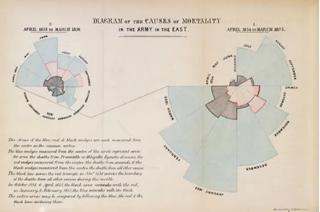
display-ing geographical information were commonly used for exploration and military purposes.
In a report on hospital improvements submitted to the British government in 1858,
Flo-rence Nightingale used a data plot to display the number of deaths in the hospital. In
the data plot (Figure 3.1), the area under the curve showed the number of deaths in a
particular month and the angle subtended by that curve showed the number of days in that month [35]. Though visualization is not a new concept, it has gained considerable
importance in the past few decades due to the extensive use of computers. Advanced
computing technologies have made large data collection and data processing possible.
In order to understand the raw data and the results of complex data processing,
visu-alization has been proposed as a suitable approach. Complicated medical visuvisu-alizations
and Doppler radar maps are now common. Initially an aid to science, visualization is
sci-Figure 3.1: Visualization has been used over centuries to display data. A rose plot of the causes of deaths in the army is an example of early attempts at visualization.
ences: cognition, computer graphics, data analysis and mathematical modelling being
prime amongst them [10], [38]. There is much research on formalizing the process of
visualization, providing a common framework for implementing researched techniques,
and improving the measurement and validation of techniques [28], [32], [34]. Morse and Wehrend and Lohse et. al. have also provided classifications of visualizations in order to
separate artistic notions and implementation details from the meaning of a visualization
[39], [12], [24]. These efforts are aimed at understanding the differences in information
visualization and other forms of graphical communication. Understanding differences
gives more insight into why certain visualizations are successful, helping to pave the way
for new approaches in visualization. However, visualization is not a hard science [22]. It
uses scientific processes and metrics as well as artistic notions like design, aesthetics and illustration [32]. We explain the science behind the techniques that are proposed in this
Though many visualization techniques are applicable across different domains, a prime
factor that governs the visualization technique used is the presence or absence of spatial
coordinates associated with the data. Spatial coordinates or a coordinate reference system
is a means of determining the location of a sample point with respect to a common
point, called the Origin. Real world systems use a three dimensional coordinate system
to assign positional references. Spatial coordinates in raw data refer to the coordinates
assigned in the real world, before the data is rendered on the screen. If real world
data does not have the need for spatial coordinates, the onus of choosing an effective spatial layout lies on the scientist or the visualization designer. It is for this reason
that visualization can be broadly classified into two types: scientific visualization and
information visualization [2]. Scientific visualization is frequently considered to focus
on the visual display of spatial data associated with scientific processes such as wind
patterns over terrain. Information visualization examines developing visual metaphors
for non-spatial data such as the exploration of social networking databases.
This thesis primarily solves the problem of visualizing ensemble data in scientific visu-alization. Many techniques have been developed to visualize scientific data and a number
of research initiatives have benefited from them [36]. Taylor lists examples of scientific
visualizations that have proven useful and provides insights into why those techniques
were successful. He points out that viewing data in its natural spatial extent can provide
better understanding. An example of this is volume rendering used to visualize donor
lung transplants. The visualization aids in planning the surgery, as to where to cut the
bronchial tubes and blood vessels so as to avoid damage to the neighbouring lung. Re-searchers from Princeton and Rutgers visualized the results of the simulation of plasma
turbulence inside a fusion generator. The visualization showed a gradual change in the
under-lying physics. Holographic displays and stereo-volume visualization that control lighting
and view direction via movement of the head and hands aid visual perception. This
was found useful for the visualization of medical images as three dimensional holograms
that can be overlaid on the patient’s actual anatomy. Combining the display of multiple
related datasets can provide an improved understanding of inter-dataset relationships.
This was observed via the visualization of multiple parameters of measured flow past
an air foil. A layered visualization where colour, ellipses and arrows were superimposed
provided a basis for posing new questions regarding out-of-air flow.
Though visualizing data has many advantages, creating a useful visualization is
chal-lenging. Raw numeric data needs to be preprocessed and transformed in order to create
an effective visualization. The process of visualizing data can be treated as a pipeline,
where raw data goes through various stages to transform it into a meaningful graphical
representation. The four stages of the visualization pipeline are listed below:
Data collection and storage - experiments and simulations are used to obtain
data in a machine readable form.
Data preprocessing - data is reduced to contain only relevant details and is
transformed into a form that makes the next steps in the pipeline simple.
Display hardware and graphics - rendering techniques and appropriate
hard-ware are developed and used for displaying the end result.
Interaction mechanisms- various human computer interaction mechanisms are
utilized to allow users to navigate across the data and manipulate it if required.
At every stage in the visualization pipeline, appropriate techniques are needed to
understands. This involves using suitable preprocessing techniques, data collection
meth-ods, visualization algorithms, rendering techniques and interaction mechanisms. Each of
these decisions play a crucial role in ensuring effectiveness of the resulting visualization.
3.2
Perceptual Visualization
Perceptual visualization can be thought of as a visualization technique that harnesses the
human visual system to convey information effectively. It deals with developing a
map-ping function that assigns the attributes of scientific data to one or more visual features.
To generate an effective visualization, we need mappings that presents the data in a form
that can be rapidly and accurately processed by the human visual system. Certain
visu-alization techniques are more effective than others, as they produce visuvisu-alizations that allow for data to be comprehended easily. To identify what makes those techniques
effec-tive we need to understand which visual feature to data attribute mappings are effeceffec-tive.
A study of perceptual guidelines and psychophysics aids in this understanding.
3.3
Visual Attention
Any visual environment is overloaded with complex visual cues. To handle this overload,
the human brain uses a variety of attention mechanisms to serve two purposes: a) to
select relevant information and ignore interfering information, and b) to control visual
attention to enhance the selected information [9].
When viewing an image, the eyes use an approach that allows them to extract detailed
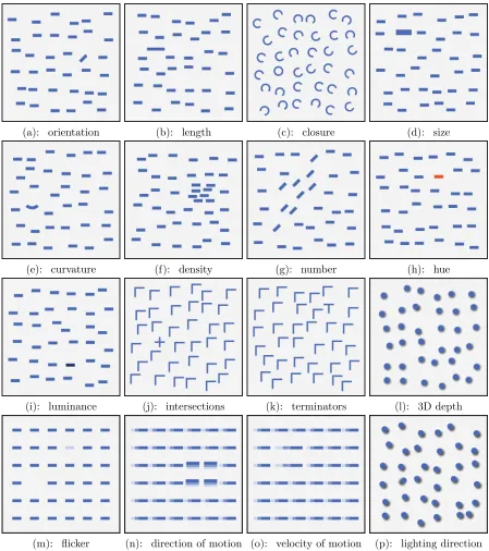
(a): orientation (b): length (c): closure (d): size
(e): curvature (f): density (g): number (h): hue
(i): luminance (j): intersections (k): terminators (l): 3D depth
(m): flicker (n): direction of motion (o): velocity of motion (p): lighting direction
another region in the image—called a saccade [19]. These two activities are repeated,
the change in focus making the whole process highly dynamic. The point of focus during
saccades is highly influenced by various mechanisms that determine which regions or
objects are selected for detailed analysis. Visual attention refers to these mechanisms.
Visual attention can be understood in terms of two underlying approaches. One
approach is when attention is under control and driven by an objective, i.e., goal driven
attention. Also known as the top-down approach, it is a viewer driven attempt to answer
questions or verify hypotheses by scanning an image or searching for details in the image. For example, when we want to count the number of blue circles in Figure 3.3(i), we search
for all blue circles, ignoring the presence of the red circle. The second approach is when
a visual stimulus automatically draws attention to itself. This is also known as stimulus
driven attention, and it involves an inherent measurement of how different the stimulus
is from its neighbours. It is a combination of these two approaches that determines which
visual cues are selected for detailed analysis.
3.4
Preattentive Processing
A means of perceiving visual information in which certain visual features are processed
rapidly and spatially in parallel, is referred to as preattentive processing [17], [37]. It was initially thought that preattentive features are detected before applying attention and
hence the name. It is now understood that attention plays an important role even in this
early stage of vision.
Preattentive features include hue, size, intensity, curvature, lighting and orientation.
Figure 3.2 gives a more comprehensive list of features known to be preattentive [17].
Individual objects- Preattentive features can be used to locate individual objects based on their visual appearance.
Boundary - Viewers can quickly detect boundaries between sets of objects with common visual properties.
Values- Viewers can estimate the number of data elements with a particular visual
property.
Comparison - Viewers can compare values, for example, using color to represent temperature allows the viewer to judge whether one object is warmer or colder than
another.
It may seem that the list of preattentive features can be used to visualize
multidi-mensional data by assigning a feature to each attribute of the data. However, such an
assignment may not create effective visualizations. Studies were conducted that involved
identification of a target item in a sea of distractor items. The target item was made up of a conjunction of two features, where one of the features was used in each distractor.
Searching for a red circle in a sea of red squares, blue circles, or red squares and blue
cir-cles (Figure 3.3) illustrates this experiment. Figure 3.3(i) shows that hue is preattentive
(red circle in a sea of blue circles), and 3.3(ii) shows that curvature is preattentive (red
circle in a sea of red squares). However, when the two are combined as in Figure 3.3(iii),
detection of the red circle is slow. The viewer must scan through the display searching
for the red circle. This shows that assigning visual features in an ad-hoc fashion may interfere with the rapid processing of features that are preattentive in isolation.
The tools discussed in this thesis make use of certain visual features to encode different
Figure 3.5: Interference of hue and shape: The boundary formed by different hues of red and blue (image on left ) is rapidly identified, but the boundary defined by shapes of circles and squares in the presence of varying hues (image on right) is not detected slower.
that are used in our visualization techniques.
3.5
Color
Color can be explained as the way our brain interprets electromagnetic radiation from
wavelengths within the visible spectrum. The different wavelengths are seen as different
colors. The ability of the eye to distinguish between these wavelengths is due to the
presence of cells in the retina of the eye that are sensitive to brightness, called rods,
and cells that are sensitive to short, medium and long wavelengths of light, called cones.
From the viewpoint of color perception, we can describe light in terms of:
Hue- The perception of the dominant wavelength of the light received by the eye. Hue represents the “color” we perceive, for example, blue, purple, pink, orange,
Saturation - The perception of the purity of the hue. A fully saturated hue contains no white light. An unsaturated hue appears as a shade of gray.
Brightness - Brightness, often referred to as luminance, is our perception of the intensity of light.
Varying the three quantities produces many different colors. The human eye is capable
of distinguishing between millions of colors. With constant luminance and full saturation,
the human eye is still able to distinguish between more than a hundred different hues. The tools we describe in this thesis make use of different hues to identify between different
ensemble members.
Figure 3.6: Left: The two circles of larger size (radius) are easily identified. Right:The lines which are slightly angled are easily identified from the vertical lines
3.6
Texture
Similar to color, texture can also be decomposed into lower level perceptual properties.
detected [37]. Figure 3.6 shows that the two circles of larger size can be identified
preattentively, and the region of slightly tilted lines can be immediately detected. The
visualization tools discussed in this thesis make use of these texture elements to encode
ensemble information.
3.7
Glyphs
Glyphs are a mechanism of combining color and texture properties in order to provide a
better means of data representation. A glyph is an individual graphical element which
is composed of visual features like roundness, orientation, size, opacity and color. Each
of these properties are capable of encoding information.
The tools discussed in this thesis make use of three-dimensional glyphs that are spa-tially positioned to represent the volume of the ensemble. In doing so, we take advantage
of past and ongoing research in visualization techniques. The next chapter provides a
Chapter 4
Related Work
In this chapter, we discuss some important past and ongoing research in visualization
that has influenced the development of the ensemble visualization tools discussed in this
thesis. We start by reviewing visualization efforts for multidimensional data. We also
discuss perceptual visualization techniques and explain the salient features that make
them successful. Finally, we look at some ensemble visualization techniques that have found various uses in prediction and handling uncertainty.
4.1
Multidimensional Data Visualization
Multidimensional data visualization involves displaying multiple attributes
simultane-ously on a two dimensional display by making use of visual features and interaction
techniques. By displaying a large amount of information within a single screen,
multidi-mensional data visualization aids in the understanding of the distribution of attributes
across data. It also reveals the relationships within attributes which may not be clear
Many tools have been developed to produce scientific visualizations for
multidimen-sional data. Vis-5d [20] and SimEnvVis [26] are examples of such tools. Vis5d, an open
source visualization software, provides an interactive visualization of 5-dimensional earth
data. The multiple attributes can be depicted by various graphical elements including
iso-level contour surfaces, trajectory lines and topographical maps [20]. SimEnvVis
pro-vides a library of comparative visualization techniques to evaluate simulation data [26].
These tools leave the choice of visualization techniques and the design of the
visualiza-tion to the user. The onus of selecting the right technique and generating an effective attribute-visual element mapping is left to the user.
Ensemble data is generally multivariate, and many ensemble data visualization
tech-niques are influenced by work in volume-based, glyph based and perceptual visualizations
[13], [27]. We describe some of these techniques in the following sections.
4.2
Direct Volume Rendering
Volume rendering has been used to study data in many fields including climate study,
surgical procedures and radiology. A common technique used to visualize volumetric data
is Direct Volume Rendering (DVR). It uses volumetric pixels, or voxels, to represent data.
A voxel is a basic volume element which represents a value in a regular tesselation of three dimensional space. DVR uses mapping functions called transfer functions, that
map every voxel value to visual properties like opacity and color.
Research on transfer functions has led to its successful use in solving many scientific
problems. Statistical transfer functions, that represent statistical properties like mean
and standard deviation, have been useful in detection of brain tumours [15]. In order to
allow the viewer to distinguish between skin and fiber in medical visualizations [6].
Bruck-ner and Groller have used transfer functions to improve illustrations of surgical or
radi-ological procedures, and have provided a way of effectively visualizing inter-penetrating
objects [5]. Rezk-salama and Kolb have introduced opacity peeling as a solution to
over-come the occlusion of interior data points [29]. The technique successfully shows deeper
structures of the brain by displaying layered images of MRI data.
Basic DVR visualizes a single volume. In order to visualize multiple volumes
simulta-neously, DVR has been extended to multi volume rendering by applying data intermixing,
an intermixing of value or voxel features between different volumes to support
visualiza-tion of multiple volumes. Intermixing can be used in many ways, for example, surface
to surface intermixing, where geometric datasets are merged and rendered, and voxel to
voxel intermixing, where voxel data is merged and rendered [7]. Multi volume rendering
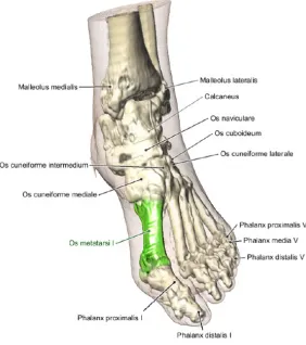
techniques that use data intermixing have been developed to enable volume comparison
[5]. Figure 4.1 shows an illustration of the foot. The anatomical details are labelled using a simple algorithm that resolves overlap and intersection of lines between annotations
and anchor points [5].
4.3
Glyph Based Representation
Glyphs have been used to represent data in scientific and information visualizations. The
visual properties of glyphs such as color, size, and orientation can be made dependent
on dataset attributes to produce effective visualizations [18]. Glyphs have been used in
various forms: as packed groups of glyphs that form patterns and as individual elements
each representing a specific data point.
Glyphs were introduced into continuous field visualization by using independently moving and interacting elements [23]. Kerlick used graphical icons referred to as ‘boids’,
or bird-oid objects, which utilized particle traces and a moving frame of vectors to display
scalar, vector and tensor fields over finite volumes. A prototype of the technique was
developed that allowed the user to select a point in the visualization.
Glyphs have been increasingly used in tensor field visualizations. Tensor fields are
Figure 4.2: Glyphs used in tensor field visualizations. σa, σb, σc are the major,
inter-mediate and minor principal stresses. The three glyphs (a) Haber glyphs. (b) Reynolds glyph. (c) HWY shear glyph. The glyphs shown here represent the stress value with x, y and z stress components σx,σy,σz = (100,200,50). [16].
studies in physical sciences and engineering, especially in computing stress and strain on
materials, use tensor fields. Variations in glyph shapes have been proposed to display
stress and strain in materials, examples of which include the Haber glyph, the Reynolds
glyph and the HWY shear glyph [14], [25], [16]. Haber constructed a glyph with a
cylindrical shaft through an elliptical disk to represent tensor data. The geomertry of the glyph was designed to clearly reveal the directions and magnitudes of principal stresses.
The Haber glyph was successful in visualizing the elastodynamic crack propagation in
brittle materials [14]. The Reynolds glyph is a solid model glyph with a surface consisting
of points whose distance from the origin is proportional to the magnitude of normal
stress in that direction [25]. A stress vector can be split into a normal and a shear stress
component. The HWY glyph is similar to the Reynolds glyph, but represents the shear
stress-strain relationships for simulated soil models [16]. The three glyphs are shown in
Figure 4.2.
Delmarcelle and Hesselink [11] introduced the concept of hyperstreamlines to
effec-tively visualize tensor fields. Hyperstreamlines are continuous geometric structures,
ex-tracted from tensor fields, whose cross section geometry characterizes the tensors they
visualize. Hyperstreamlines are an extension of glyphs in the sense that glyphs give an
instantaneous view of the tensor data, while hyperstreamlines display an evolution of the
tensor data.
4.4
Data Driven Glyphs
Bokinsky developed a technique called Data Driven Spots for visualizing
multidimen-sional data that is spatially organised in two dimensions. She displayed different colored
layers of two-dimensional Gaussian bumps to represent the various data attributes. Hue
identifies the attribute and saturation represents the value of the attribute at the bumps’
spatial locations [4]. User studies showed that performance of data driven spots was better than comparing side by side images of single attribute visualizations. Scaled data
driven spheres (SDDS) [13] extended Bokinsky’s idea to three dimensional data, by using
spheres instead of spots. Multi-colored spheres of various sizes are used to visualize data.
Color represents the attribute and size represents a value of the attribute. Feng et. al.
used spheres because it is easy to interpret these simple glyphs at a wide range of scales.
This technique was very effective in helping radiologists better identify tumors from MRI
(Magnetic Resonance Imaging) and MRS (Magnetic Resonance Spectroscopy) scans used in brain tumor detection. The MRI scan yields anatomical tissue data while the MRS
scan offers a volume of metabolite spectrum. The metabolites provide an indication of
the extent of the tumor, and hence radiologists analyse both data to understand
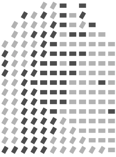
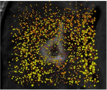
rela-tionshops between metabolites and anatomical features. Figure 4.3 displays an SDDS
visualization of a visible lesion (shown in gray in the background). Concentrations of
metabolites choline and creatin are shown using yellow and orange spheres, respectively.
An inverse relationship between creatin and cholin metabolites is apparent by looking at the visualization.
This technique gives best results for data that has high values of at most one attribute
at any spatial location. A location having high values of multiple attributes would have
with multiple different colored spheres rendered at same point.
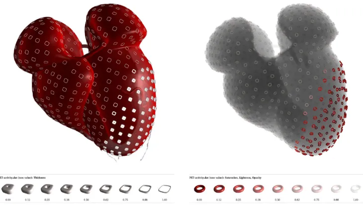
Figure 4.4: Cardiac wall motion and activity shown using surface glyphs. (a) PET/CT data represented using DVR, with thickness modulated to show regions of low PET activity (b) X-ray simulation of PET/CT data with a combination of saturation, lightness and opacity to highlight regions of low PET activity. The presence of a lesion in the left ventricle is made evident using this technique.
4.5
Surface Glyphs
Visualizing multiple volumes simultaneously suffers primarily from the problem of
occlu-sion. Techniques such as blending the volumes makes quantification of attribute values
more difficult. Ropinsky et. al. have extended glyph based visualization to cater to
tributes can be represented unambiguously. Glyph properties of roundness, the degree of
sharpness in glyph edges, and size are mapped to attribute values using appropriate
map-ping functions. A glyph placement strategy is used to place glyphs on a visible isosurface,
a surface that represents sample points of a constant value across the volume. The glyph
placement strategy ensures that glyphs appear well distributed when projected to the
viewplane.
This technique has been successfully used to visualize data from Computed
Tomogra-phy (CT) and Position Emission TomograTomogra-phy (PET). Cardiac wall motion and activity is visualized using supertorus glyphs, and metabolic activity is mapped to glyph thickness
(Figure 4.4(a)) and saturation, lightness and opacity (Figure 4.4(b)). Figure 4.5 shows a visualization of pressure, temperature and precipitation for the hurricane Isabel, with
the three attributes mapped onto color, thickness and roundness of supertorus glyphs.
4.6
Perception-based visualization
Researchers have applied knowledge of preattentive processing and perceptual
guide-lines to create easily comprehensible images. Healey and Enns used perceptual textures
to visualize multidimensional datasets. Data elements or sample points are placed on
a three dimensional height field. Data elements are represented using pexels, or per-ceptual texture elements. The attribute values for a data element are mapped to the
visual appearance of the pexel. Neighboring pexels form texture patterns that can draw
the viewer’s attention when exploring. The use of pexels makes many tasks like target
searches and boundary detection between spatial groups of common attribute values,
preattentively processed. Figure 4.6 displays the use of pexels in tracking windspeed,
Figure 4.7: Spaghetti plots constructed from isocontours of each ensemble member are shown. (a:Left) When the ensemble members are in agreement, the contours form co-herent bundles. (b:Right) When ensemble members disagree, outliers diverge from main bundle.
1997.
Huber and Healey performed experimental studies on the application of perceptual
properties of motion to visualize data [21]. Perceptual properties of motion include
flicker, direction and velocity. Studies were performed to understand the usefulness of
these properties in representing motion. The results of these studies were used in creating visualizations for supernova collapse simulations, and also for visualization of
meteoro-logical data that does not have an inherent motion context, for example pressure and
temperature gradients and high precipitation regions.
4.7
Ensemble Data Visualization
There have been many efforts in visualizing ensemble data. Wilson et. al. have discussed
to visualize uncertainty in ensembles, and draw attention to interesting phenomena the
ensembles reveal. The tools aim to answer questions pertaining to the occurrence of
certain conditions, probability of occurrence of events, and conditions that lead to some
event of interest. Visualization techniques such as motion, multiple linked views and
animation of data evolution over time are used to reveal new findings about the system
under study.
Scientists at Sandia National Laboratories, Lawrence Livermore National
Laborato-ries and University of Utah have developed a framework for ensemble data visualization, called ensemble-Vis [27]. The framework provides a means of visualizing uncertainty in
ensemble data and provides methods for analysing data points of interest to the viewer.
Different ways of displaying data are proposed, like summary views which display selected
information to the viewer while maintaining a sense of context, and trend charts to
dis-play the range of values of attributes at each time step. The framework also incorporates
spaghetti plots into its visualization. Spaghetti plots are lines depicting isocontours for
a specific value of a variable for the chosen time-step. Each ensemble member has a different colored line. When the members are similar, bundles of different colored lines
are seen. Figure 4.7 displays this result. The scientists have incorporated the framework
into a lightweight and advanced visualization library called ViSUS [27]. This library is
combined into the suite of Climate and Data Analysis Tools (CDAT) which is used by
climate researchers. ViSUS has specialized features, such a projection into a model of
the Earth and visualizations enhanced with geo-spatial information, that are required by
climate researchers.
Noodles [31], a tool developed to visualize uncertainty in weather ensembles, also
uses a combination of techniques including spaghetti plots, uncertainty ribbons, glyphs
regions of high uncertainty, interactively select attributes for investigation and observe
evolution of the storm across time.
The available tools for ensemble visualization are a collection of techniques each
tar-geted at uncovering an aspect of information, spread over multiple views. The viewer
gains insight into ensemble data by looking at multiple views, each view aimed at
an-swering an individual question that the viewer poses. Research discussed in this thesis
attempts to provide an integrated visualization that spans one view, and highlights
unex-pected aspects of ensembles. We use concepts derived from glyph based and perception based visualizations for solving specific problems of ensemble visualizations. The next
chapter discusses a design that is aimed at overcoming these challenges by using concepts
Chapter 5
Design
We discuss the design of the ensemble visualization techniques presented in this thesis
by splitting the problem of visualizing ensembles into two sub-problems and solving each
of them:
Visualizing one ensemble member.
Visualizing all ensemble members.
5.1
Visualizing One Ensemble Member
We use a glyph based approach to visualize a single ensemble member. Each data point in the member is represented using a glyph, and attribute values of the data point
are represented by varying glyph properties like color and size. However, an ensemble
member contains a large number of data points, and rendering all of these as glyphs in
a limited screen space can cause occlusion. Overlapping data points can hide the visual
values. When visualizing multiple ensemble members simultaneously, occlusion becomes
an even more critical problem.
In order to reduce occlusion when visualizing one ensemble member, we use sampling
techniques to select a set of its data points that adequately represents the member. The
selection is rendered in the visualization, and the unselected data points are hidden.
The choice of sampling technique is motivated by the properties of the data that are of
interest. We use cluster-based sampling to maintain the spatial distribution of sample
points that highlight volumetric properties of the ensemble member.
5.2
Visualizing Multiple Ensemble Members
Extending the above principle of visualizing one member to all the members of the en-semble concurrently would result in significant on-screen clutter. The differently shaped,
sized and colored glyphs would magnify the occlusion issue as shown in Figure 5.1. The
problem of visualizing an ensemble is essentially twofold:
To identify individual members.
To minimize occlusion.
We use a visual property of the glyphs to solve the first problem. Ensemble membership is represented using either color or shape, that is, a glyph’s color identifies its parent
member, or a glyph’s shape identifies its parent member. For example, in Figure 5.1
shape is used to represent ensemble membership: spheres for the first member (apple),
tetrahedrons for the second member (banana), and cubes for the third member (pear).
When the three members are visualized together, the glyphs’ shapes show which member
Figure 5.1: The image represents an ensemble of an apple, banana and a pear rendered in one image. The apple is rendered using sphere glyphs, banana is rendered using tetrahedron glyphs and cubes are used to render the pear. Individually the outline of the fruits can be identified, however shape outline is lost when shown in the same image.
As a solution to the second problem, our proposed design displays only some of
the ensemble at any given time. We create an animation that visualizes a subset of
ensemble members in succession, with the subset changing gradually over time. By doing so, we exploit the capabilities of working memory to perform inherent comparisons.
information required for tasks such as reasoning and comprehension. The capacity of
working memory is limited, and hence the brain is only able to retain details when
attention is localized.
We control which subset of the ensemble members is displayed using a visibility
fea-ture, either size or opacity, that causes glyphs to appear and dissappear.
Figure 5.2: Sinusoidal function to control visibility: Variation of scale factor with time for each volume, for an ensemble of 4 datasets [Ei, i=1 to 4]. Each volume is shown by a separate colored lines.
Every ensemble member is assigned a visibility cycle. During this cycle, the value of
the visibility feature varies, gradually increasing to a maximum and then decreasing to its
to be out of phase from the other members. This ensures that the glyphs of one member
are visible in a pattern that is different from the other. By setting the visibility feature
to a minimum for much of the total time range, we produce a visualization where only a
subset of the ensemble members are visible at any given time.
Figure 5.3: Pairwise sequential function to control visibility: Variation of opacity with time for each volume, for an ensemble of 4 datasets [Ei, i=1 to 4]. Each volume is shown by separately colored lines.
We tested two types of cycles: a cycle defined by a sinusoid method, and a cycle defined by a sequential variation method. The cycle driven by a sinusoid method is
shown in Figure 5.2. The sinusoid function ensures that at any given time, one or more
degrees of visibility.
The sequential variation method ensures that exactly two ensemble members are
vis-ible on the screen at any given time. It varies the visibility features of pairs of ensemble
members, such that the visibility of one of the members gradually decreases as the
vis-ibility of the next increases. Figure 5.3 shows the variation of the visvis-ibility feature over
time for a sequential variation function. Each ensemble member’s cycle is shown with a
different color.
Providing solutions to the two problems is still insufficient to visualize the ensemble because certain combinations of solutions are inadequate. For example, using a sinusoid
visibility cycle with opacity as the visibility feature will lead to multiple overlapping
‘ghosts’ of semi-transparent glyphs. To address this, we selected two combinations of
solutions that were feasible as shown in Table 5.1.
Table 5.1: Combination of visual features
attribute value ensemble member visibility visibility cycle association
size color scale factor sinusoid
color shape opacity pairwise sequential
The first solution was an attempt to extend the SDDS technique to visualize
ensem-bles. Although we use size both to represent attribute value and as a visibility feature,
our intuition was that the varying size would reduce occlusion as member glyphs would
occupy less space. The second solution provides a mapping of visual features such that
Chapter 6
Implementation
We implemented our techniques using ParaView, an open source scientific visualization
system. ParaView is built on top of the Visualization ToolKit (VTK). In this chapter
we highlight the VTK objects and the salient features of ParaView that were used in our
implementation
6.1
ParaView
ParaView is an open source, multi-platform data analysis and visualization application
[1]. It provides the user with a set of graphical tools and an interface that allows the user to quickly build visualizations. ParaView has support for interactive data exploration and
supports extensions through code. The ability to handle large datasets using distributed
memory and computing resources makes it a useful application. ParaView can be run
on supercomputers for analysis of large datasets as well as on laptops for smaller data.
ParaView is being developed primarily by Kitware and a set of national laboratories,
ParaView is designed to allow components to be reused to provide implementations
for specific domain problems. It is based on the Visualization ToolKit (VTK), which
provides data processing and rendering capabilities. The user interface is written using
Qt, a cross-platform UI library. ParaView has support for Python programming with a
built-in Python shell that exposes VTK and ParaView objects and algorithms.
6.2
Visualization ToolKit (VTK)
VTK is an open source software system used for 3D computer graphics, image processing
and visualization. It consists of a C++ class library and several interpreted interface
layers including Tcl/Tk, Java and Python. VTK provides implementations of many
vi-sualization algorithms and advanced modelling techniques, including texturing methods,
volume rendering, contouring, mesh smoothing, data subset selection and extraction, and
clustering [34], [33].
VTK is object oriented, and follows a general architecture that consists of a pipeline
of data [33]. The pipeline extends from the data source to the visualization image, and
can consist of :
Sources - initial input data from files or generated by VTK.
Filters - components that modify the data, transforming the data as it moves through the pipeline.
Mappers - components that ‘map’ the data onto objects that can be rendered by
the rendering engine.
Actors - components that provide control of appearance properties of the objects
Renderers and Windows - windows or view ports to which the objects are rendered.
User Interface and Controls- components which are used for additional settings and better data exploration.
We use Python code to create a pipeline of VTK and ParaView objects. The pipeline
uses a reader to read the ensemble and filters to perform the sampling. Actor classes are
utilized to create the animation. We ran the code in the Python shell of ParaView in order to use the in built interaction controls. The implementation of each technique is
discussed in detail in the subsequent sections.
6.3
Sampling
Because members of the ensemble have data pertaining to the same scientific event,
they are likely to contain data that has a large spatial overlap. We take advantage of this
overlap for comparing attributes. All the members have an attribute value at data points
in the overlap, and so comparison between ensembles is straightforward for these data
points. Hence, we sample each member such that the overlap has the same set of sampled
points. We consider the volume formed by the data points of each ensemble member, and divide the volume into a common (overlapping) sub-volume and a unique sub-volume.
The common sub-volume consists of data points in the overlapping region with common
spatial locations across all members. The remaining data points of each member form its
unique sub-volume. Figure 6.1 graphically explains this idea. The approach is explained
in the algorithm at Table 6.1. We extract the common sub-volume by asking VTK to
Figure 6.1: An illustration of sampling technique for a 3-member ensemble, the volumes of each member are shown via different colors. The gray part is the common sub-volume
Table 6.1: Sampling the ensemble by utilizing the overlap
C: empty set of spatial coordinates. For each ensemble member M,
C T
M −→C
Sample C −→ C0. C0 contains the sampled common sub-volume. For each member M,
C0 T
M −→ X, the common data points with attribute values from the member. M − C −→Y, the unique data points.
Sample Y −→ Y0.
X + Y0 −→ M0 , the sampled member.
6.4
Sinusoidal Scale Factor Variation Technique
We implement the sinusoidal scale factor variation mechanism by running a ParaView
script that loads the sampled data points of each ensemble member and generates an
animation that incorporates the visibility cycle. Glyphs for each member are assigned a
unique color. Each member’s data points are represented as spheres of that color. The
maximum size of each sphere is proportional to the attribute value of its data point. The maximum size is sealed by the member’s visibility function: a scale factor of 0 is used
when the visibility function is minimum, and a factor of 1 is used when the visibility
function is maximum. In this way the size of the sphere ranges from 0 (hidden) to a size
representing the data point’s attribute value.
6.5
Sequential Opacity Variation Technique
We implement sequential opacity variation technique using the sampling algorithm
de-scribed in Section 6.3. One object in the Paraview pipeline is created for each ensemble
member, to render that member’s sampled points as glyphs. A divergent color map is
used to assign colors to the glyphs based on the attribute value. Figure 6.2 shows the
color map. The opacity of a member’s glyphs varies over time by defining a sequential
animation in ParaView. We use a sine curve to provide a smooth transition between
minimum and maximum opacity. The linear part of the sequential variation that was