Sophos XG Firewall
Reports Guide v15.01.0
For Sophos and Cyberoam Customers
Contents
Reports... 4
Basics...4
Reports Navigation... 6
Dashboards... 9
Traffic Dashboard... 9
Security Dashboard...27
User Threat Quotient (UTQ)...47
Applications...52
User Applications...52
Web... 83
Business Applications...119
User Data Transfer... 127
FTP... 132
Network & Threats...149
Intrusion Attacks...149
Advanced Threat Protection... 164
Wireless...175
Security Heartbeat...179
VPN...184
VPN...185
SSL VPN...195
Clientless Access... 198
Email... 200 Email Usage...201 Email Protection...212 Compliance...236 HIPAA...236 GLBA... 250 SOX...263 FISMA...264 PCI...272
NERC CIP v3... 277
CIPA...278
Events... 278
Bookmarks...281
Custom & Special...281
Executive Report...282
Custom Web Report... 306
Custom Mail Report... 309
Custom FTP Report...311
Custom User Report... 312
Custom Web Server Report...325
Settings... 327
Custom View... 327
Report Scheduling...329
Data Management... 332
Manual Purge...336
Bookmark Management...337
Custom Logo...338
Data Anonymization... 339
Settings... 339
De-Anonymize... 340
Log Viewer... 342
View List of System Events...343
View List of Web Filter Events...343
View List of Application Filter Events...344
View List of Malware Events... 344
View List of Email Events...345
View List of Security Policy Events...345
View List of IPS Events...346
View List of Authentication Events...347
View List of Admin Events... 347
View List of WAF Events... 348
View List of ATP Events...348
Reports
Reports provide organizations with visibility into their networks for high levels of security, data confidentiality while meeting the requirements of regulatory compliance.
Note: This feature is not available in models: CR10iNG, CR10wiNG, CR15i, CR15wi, CR15iNG and CR15wiNG.
Reports offer a single view of the entire network activity. This allows organizations not just to view information across hundreds of users, applications and protocols; it also helps them correlate the information, giving them a comprehensive view of network activity.
Moreover, organizations receive logs and reports related to intrusions, attacks, spam and blocked attempts, both internal and external, enabling them to take rapid action throughout their network.
Given below are some of the salient features of Reports: • At-a-glance flow graphs show usage trends and web activity. • The daily summary Executive Report keeps you informed. • Report anonymization can hide user identities, where needed. • Built-in Syslog support and automated log backup options.
Basics
This section provides basic instructions on how to view Reports, in addition to information on configuration settings related to Reports.
Given below are common screen components used to generate and view reports: • Date Selection
• Records per page
• Page Controls
• Reports Navigation
• Search Reports
• Filter Reports
• Export to PDF
• Export to HTML
• Export to MS Excel
• Bookmark
• Schedule (Add Report Notification)
Date Selection
1.
Use icon to select the time interval for which you want to view the reports. By default, the report for the current date is displayed.
2. Click Generate to generate reports for the selected time interval.
Records per page
Select the number of records (rows) of the report to be displayed per page from Records per page. A page can have a minimum of 5 and a maximum 200 rows.
Page Controls
Every report displays the first page of the report along with total number of pages available for the report. Use the following controls to navigate through pages:
• :Navigate to the next page • :Navigate to the previous page • :Navigate to the first page • :Navigate to the last page
Search Reports
Click icon to perform a search in a given report based on the following search criterion: • is
• is not • contains • does not contain
For example, let's say you want to perform a search for a user with User Name Joseph in Internet Users report under
User Data Transfer Report, given below are sample results using each search criterion: • is - Displays details of the user Joseph
• is not - Displays details of all the users other than Joseph
• contains - Displays details of all the users whose User Name or Name contains Joseph
• does not contain - Displays details of all the users whose User Name or Name does not contain Joseph
Filter Reports
A report can be further filtered or drilled-down using a specific filtering criteria.
For example, clicking the User Name hyperlink from the Internet Users report under User Data Transfer Report
will display all the reports specific to the selected user. You can further drill-down the filtered reports by adding another filtering criteria, let's say - Client Type.
The filter criteria is displayed as:
This means the Internet Users report is filtered to display data only for the user Joseph when logged in through the Web Client. Click icon to remove any of the filter(s).
Export to PDF
Click PDF hyperlink given at the top right of a report to export the report in PDF format.
Export to HTML
Click HTML hyperlink given at the top right of a report to export the report in HTML format.
Export to MS Excel
Click EXCEL hyperlink given at the top right of a report to export the report in MS Excel format.
Bookmark
Use this to create a bookmark of a report page at any level of drill- down. Click Bookmark hyperlink given at the top right of a report to create a bookmark of the report page. The created bookmark(s) are displayed under the Bookmarks menu of the Reports navigation pane.
Schedule
Use this to schedule report notification for a report page. Once configured, the Device sends report schedule(s) to specified Email Addresses as per the configured frequency.
Reports Navigation
Navigation bar on the leftmost side provides access to various modules like Dashboard, Reports, System etc.
Reports Navigation
Refer the Reports module to view reports and configure related settings.Reports module consists of Level 2 and Level 3 menu items.
The Reports module includes following Level 2 menu items: • Dashboards
• Applications • Network & Threats • Email
• Compliance • Bookmarks • Custom & Special • Settings
• Data Anonymization
On clicking a Level 2 menu item, related report headings are displayed as Level 3 sub-menu items. On clicking a Level 3 sub-menu item (report heading), the reports dashboard related to the report heading is displayed.
Note: On clicking the Applications Level 2 menu item, related report headings, although displayed as Level 3 sub-menu items, are further segregated into various groups, as follows:
• User Applications
• Blocked User Apps • Web
• Web Risks & Usage • Blocked Web Attempts • Search Engine
• Business Applications • Web Server Usage • Web Server Protection • User Data Transfer
• User Data Transfer Report • FTP
• FTP Usage • FTP Protection
Once the reports dashboard is displayed after clicking a Level 3 sub-menu item (report heading), the underlying reports are displayed in widget format.
Each reports dashboard has two drop-downs i.e. drop-down 1 and drop-down 2, as shown in the image below:
The drop-down 1 includes fellow sub-menu items, while drop-down 2 includes fellow reports, displayed as widgets on the reports dashboard. For example, in the image above, we've selected User Data Transfer Report as Level 3 sub-menu item. Use the:
• drop-down 1 to view fellow Level 3 sub-menu items falling under the Level 2 menu item i.e. Applications, as shown in the image below:
Dashboards
Dashboards provide a comprehensive summary of network traffic passing through the Device as well as security threats associated with the processed network traffic.
The Reports consists of following Dashboards: • Traffic Dashboard
• Security Dashboard
• User Threat Quotient (UTQ)
Traffic Dashboard
The Traffic Dashboard is a collection of widgets displaying comprehensive summary of the network traffic in terms of applications, web categories, users, hosts, source and destination countries, mail traffic and FTP activities. View the dashboard from Reports > Dashboard > Traffic Dashboard.
The Traffic Dashboard consists of following reports in the form of widgets: • Applications
• Applications Categories
• Application Users
• Hosts
• Source Countries
• Allowed Policies
• Web Categories
• Web Users
• Web Domains
• Web Servers by Data Transfer
• Files Uploaded via Web
• Files Uploaded via FTP
• Files Downloaded via FTP
• FTP Servers
• Mail Traffic Summary
• Mail Senders
• Mail Recipients
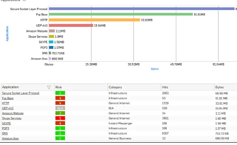
Applications
This Report displays the list of top applications along with application wise distribution of total data transfer and relative percentage distribution amongst those applications.
View the report from Reports > Dashboard > Traffic Dashboard > Applications. The Report is displayed both, as a pie chart as well as in tabular format.
By default, the report is displayed for the current date. The report date can be changed from the top most row of the page.
The pie chart displays percentage distribution of data transfer per application, while the tabular report contains the following information:
• Application/Proto:Port: Name of the application. If the application is not defined in the Device, then this field displays the application identifier as a combination of protocol and port number.
• Category: Name of application category as defined in the Device.
• Risk: Risk level associated with the application. This is a numeric value. Higher value represents higher risk. • Bytes: The amount of data transferred per application.
Figure 1: Applications
Click Application hyperlink in the table or the pie chart to view the Filtered User App Risks & Usage Reports.
Application Categories
This Report displays the list of top application categories along with category wise distribution of the total data transfer and relative percentage distribution among those categories
View the report from Reports > Dashboard > Traffic Dashboard > Application Categories. The Report is displayed both, as a pie chart as well as in tabular format.
By default, the report is displayed for the current date. The report date can be changed from the top most row of the page.
The pie chart displays percentage distribution of data transfer per application category, while the tabular report contains following information:
• Category: Name of the Application category as defined in the Device. • Bytes: Amount of data transferred.
Figure 2: Application Categories
Click the Category hyperlink in the table or the pie chart to view the Filtered User App Risks & Usage Reports.
Application Users
This Report displays list of top users along with the amount of traffic generated for various applications, hosts, destinations, domains and categories.
View the report from Reports > Dashboard > Traffic Dashboard > Application Users. The Report is displayed both, as a pie chart as well as in tabular format.
By default, the report is displayed for the current date. The report date can be changed from the top most row of the page.
The pie chart displays percentage distribution of data transfer per user, while the tabular report contains following information:
• User: Username of the user as defined in the Device. If the User is not defined, then it will display ‘N/A’ which means the traffic is generated by an undefined user.
• Bytes: Amount of data transferred.
Figure 3: Application Users
Click the User hyperlink in the table or the pie chart to view the Filtered User App Risks & Usage Reports.
Hosts
This Report displays the list of top hosts along with host wise distribution of total data transfer and relative percentage distribution amongst those hosts.
View the report from Reports > Dashboard > Traffic Dashboard > Hosts. The Report is displayed both, as a pie chart as well as in tabular format.
By default, the report is displayed for the current date. The report date can be changed from the top most row of the page.
The pie chart displays percentage distribution of data transfer per host, while the tabular report contains following information:
• Host: IP Address of the host. • Bytes: Amount of data transferred.
Figure 4: Hosts
Click the Host hyperlink in table or the pie chart to view the Filtered User App Risks & Usage Reports.
Source Countries
This Report displays the list of source countries from where the Internet traffic is originated along with the country wise distribution of total data transfer and relative percentage distribution amongst those countries.
The report is helpful when you need to identify where your web visitors are coming from. To cite a use-case scenario - you might have an e-commerce website, and would like to know the country to which your potential customers belong.
View the report from Reports > Dashboard > Traffic Dashboard > Source Countries. The Report is displayed both, as a pie chart as well as in tabular format.
By default, the report is displayed for the current date. The report date can be changed from the top most row of the page.
The pie chart displays percentage distribution of data transfer per source country, while the tabular report contains following information:
• Source Country: Name of the country. Note that country association is not applicable to local hosts and Reserved is displayed in such cases.
• Bytes: Amount of data transferred.
Figure 5: Souce Countries
Click the Source Country hyperlink in table or the pie chart to view the Filtered User App Risks & Usage Reports.
Destination Countries
This Report displays the list of destination countries where the web traffic is directed along with country wise distribution of the total data transfer and relative percentage distribution amongst those countries.
The report is helpful when you need to identify where your web visitors are going to.
View the report from Reports > Dashboard > Traffic Dashboard > Destination Countries. The Report is displayed both, as a pie chart as well as in tabular format.
By default, the report is displayed for the current date. The report date can be changed from the top most row of the page.
The pie chart displays percentage distribution of data transfer per destination country, while the tabular report contains following information:
• Destination Country: Name of the country. Note that country association is not applicable to local hosts and Reserved is displayed in such cases.
• Bytes: Amount of data transferred.
Figure 6: Destination Countries
Click the Destination Country hyperlink in table or the pie chart to view the Filtered User App Risks & Usage Reports.
Allowed Policies
This Report displays the list of rules along with rule wise distribution of the total data transfer and relative percentage distribution amongst those rules.
View the report from Reports > Dashboard > Traffic Dashboard > Allowed Policies. The Report is displayed both, as a pie chart as well as in tabular format.
By default, the report is displayed for the current date. The report date can be changed from the top most row of the page.
The pie chart displays percentage distribution of data transfer per Firewall Rule ID, while the tabular report contains following information:
• Rule ID: Firewall Rule ID. • Bytes: Amount of data transferred.
Figure 7: Allowed Policies
Click the Rule ID hyperlink in table or the pie chart to view the Filtered User App Risks & Usage Reports.
Web Categories
This Report displays the list of top web categories along with category wise distribution of total data transfer and relative percentage distribution amongst those categories.
View the report from Reports > Dashboard > Traffic Dashboard > Web Categories. The Report is displayed both, as a pie chart as well as in tabular format.
By default, the report is displayed for the current date. The report date can be changed from the top most row of the page.
The pie chart displays percentage distribution of data transfer per web category, while tabular report contains following information:
• Category: Name of the Web category, as defined in the Device. • Hits: Number of Hits to the Web category.
Figure 8: Web Categories
Click the Category hyperlink in the table or the pie chart to view the Filtered Web Risks & Usage Reports.
Web Users
This Report displays the list of Web users along with user wise distribution of total data transfer and relative percentage distribution amongst those Web users.
View the report from Reports > Dashboard > Traffic Dashboard > Web Users. The Report is displayed both, as a pie chart as well as in tabular format.
By default, the report is displayed for the current date. The report date can be changed from the top most row of the page.
The pie chart displays percentage distribution of data transfer per user, while the tabular report contains following information:
• User: Username of the user as defined in the Device. If the User is not defined then it will display ‘N/A’ which means the traffic is generated by an undefined user.
• Bytes: Amount of data transferred.
Figure 9: Web Users
Click the User hyperlink in the table or the pie chart to view the Filtered Web Risks & Usage Reports.
Web Domains
This Report displays the list of domains along with domain wise distribution of the total data transfer and the relative percent distribution amongst those domains.
View the report from Reports > Dashboard > Traffic Dashboard > Web Domains. The Report is displayed both, as a pie chart as well as in tabular format.
By default, the report is displayed for the current date. The report date can be changed from the top most row of the page.
The pie chart displays percentage distribution of data transfer per domain, while the tabular report contains following information:
• Domain: Displays the name of the domain. • Bytes: Amount the of data transfer.
Figure 10: Web Domains
Click the Domain hyperlink in the table or the pie chart to view the Filtered Web Risks & Usage Reports.
Web Server Domains
This Report displays a list of frequently accessed web servers according to the utilization of bandwidth, along with the number of hits per web server.
View the report from Web Server Usage reports dashboard or from Reports > Applications > Business Applications > Web Server Usage > Web Server Domains.
The report is displayed using a graph as well as in a tabular format. By default, the report is displayed for the current date. The report date can be changed from the top most row of the page.
The bar graph displays the list of web servers along with the number of hits while the tabular report contains the following information:
• Web Server Domain: Displays name of the web server. • Bytes: Bandwidth used per web server.
Figure 11: Web Server Domains
Click the Web Server hyperlink in table or the pie chart to view the Filtered Web Server Usage Reports.
File Uploaded via Web
This Report displays the list of File Uploaded via web along with date, user, domain name, size and source from which it was uploaded.
View the report from Web Risks & Usage reports dashboard or from Reports > Applications > Web > Web Risks & Usage > File Uploaded via Web.
Note: You can view this report from Traffic Dashboard as well. The report is displayed in a tabular format.
By default, the report is displayed for the current date. The report date can be changed from the top most row of the page.
Tabular report contains the following information: • Date: Date of file upload.
• Users: Name of the user.
• Source IP: IP Address of the source.
• Domain: Name of the domain where file has been uploaded. • File name: Name of the file.
• Size: Size of the file.
Files Uploaded via FTP
This Report displays the list of the files uploaded via FTP with file wise distribution of the total data transfer and the relative percentage distribution amongst those files.
View the report from Reports > Dashboard > Traffic Dashboard > Files Uploaded via FTP. The Report is displayed both, as a pie chart as well as in tabular format.
By default, the report is displayed for the current date. The report date can be changed from the top most row of the page.
The pie chart displays percentage distribution of data transfer per uploaded file, while the tabular report contains the following information:
• File: Name of the top file uploaded via FTP. • Bytes: Size of the top uploaded files.
• Percent: Relative percent distribution among the top files uploaded via FTP.
Figure 13: Files Uploaded via FTP
Click the File hyperlink in the table or the pie chart to view the Filtered FTP Usage Reports.
Files Downloaded via FTP
This Report displays list of the files downloaded via FTP along with file wise distribution of the total data transfer and relative percent distribution among those files.
View the report from Reports > Dashboard > Traffic Dashboard > Files Downloaded via FTP. The Report is displayed both, as a pie chart as well as in tabular format.
By default, the report is displayed for the current date. The report date can be changed from the top most row of the page.
The pie chart displays percentage distribution of data transfer per downloaded file, while the tabular report contains the following information:
• File: Name of the top file downloaded via FTP. • Bytes: Size of the top downloaded files.
• Percent: Relative percent distribution among the top files downloaded via FTP.
Figure 14: Files Downloaded via FTP
Click the File hyperlink in the table or the pie chart to view the Filtered FTP Usage Reports.
FTP Servers
This Report displays a list of FTP servers along with data transfer per server along with relative percent distribution among the FTP servers.
View the report from Reports > Dashboard > Traffic Dashboard > FTP Servers. The Report is displayed both, as a pie chart as well as in tabular format.
By default, the report is displayed for the current date. The report date can be changed from the top most row of the page.
The pie chart displays percentage distribution of data transfer per server, while the tabular report contains following information:
• Server: Name of the FTP server.
• Bytes: Total data transfer via FTP server.
Figure 15: FTP Servers
Click the Server hyperlink in the table or the pie chart to view the Filtered FTP Usage Reports.
Mail Traffic Summary
This Report displays type of Email traffic along with number of bytes and percentage distribution amongst the traffic type.
View the report from Reports > Dashboard > Traffic Dashboard > Mail Traffic Summary. The Report is displayed both, as a pie chart as well as in tabular format.
By default, the report is displayed for the current date. The report date can be changed from the top most row of the page.
The pie chart displays relative percentage distribution of traffic types, while the tabular report contains the following information:
• Traffic: The type of Email traffic. Possible options are : • Clean Mail
• Spam
• Probable Spam • Virus
• Hits: The number of hits per Email traffic type.
Figure 16: Mail Traffic Summary
Click the Traffic hyperlink in the table or the pie chart to view the Filtered Email Usage Reports.
Mail Senders
This Report displays the list of top Email senders along with the number of hits that generated the most traffic for various users, destinations, hosts and applications.
View the report from Reports > Dashboard > Traffic Dashboard > Mail Senders. The Report is displayed both, as a pie chart as well as in tabular format.
By default, the report is displayed for the current date. The report date can be changed from the top most row of the page.
The Bar graph displays the relative percentage distribution of data transferred by each sender while the tabular report contains following information:
• Sender: Email ID of the sender. • Hits: Number of Hits to the sender. • Bytes: Amount of data transferred.
Figure 17: Mail Senders
Click the Sender hyperlink in the table or the pie chart to view the Filtered Email Usage Reports.
Mail Recipients
This Report displays list of top Email recipients along with the number of hits that generated the most traffic for various users, destinations, hosts and applications.
View the report from Reports > Dashboard > Traffic Dashboard > Mail Recipients. The Report is displayed both, as a pie chart as well as in tabular format.
By default, the report is displayed for the current date. The report date can be changed from the top most row of the page.
The Bar graph displays the relative percentage distribution of data transferred by each recipient while the tabular report contains following information:
• Recipient: Email ID of the recipient. • Hits: Number of Hits to the recipient. • Bytes: Amount of data transferred.
Figure 18: Mail Recipients
Click the Recipient hyperlink in the table or the pie chart to view the Filtered Email Usage Reports.
Security Dashboard
The Security dashboard is a collection of widgets displaying information regarding the denied network activities and traffic. It also gives an overview of malware, spam as well as top source and destination countries.
View the dashboard from Reports > Dashboard > Security Dashboard. The Security Dashboard consists of following reports in widget form: • High Risk Applications
• High Risk Application Users
• Blocked Applications
• Blocked Application Users
• Objectionable Web Categories
• Objectionable Web Domains
• Blocked Web Categories
• Blocked Web Domains
• Objectionable Web Users
• Blocked Web Users
• Hosts - ATP
• Users - ATP
• Advanced Threats
• Client Insights - ATP
• Intrusion Attacks
• Attackers
• Virus Summary
• Spam Senders
• Spam Recipients
• Detailed View - Client Health
• Web Server Attacks
High Risk Applications
This Report displays a list of Applications with Risk Level greater than equal to 4, along with number of hits and total amount of data transfer per application.
View the report from User App Risks & Usage reports dashboard or from Reports > Applications > User Applications > User App Risks & Usage > High Risk Applications.
Note: You can view this report from Security Dashboard as well. The report is displayed using a graph as well as in a tabular format.
By default, the report is displayed for the current date. The date can be changed from the top most row of the page. The bar graph displays the list of high risk applications along with amount of data transfer per application, while the tabular report contains the following information:
• Application/Proto: Port: Name of the application as defined in the Device. If the application is not defined, then this field will display the application identifier as a combination of the protocol and port number.
• Risk: Level of risk associated with the application. • Hits: Number of hits per application.
• Bytes: Amount of data transfer through the application, in bytes.
Figure 19: High Risk Applications
Click the Application hyperlink in table or the pie chart to view the Filtered User App Risks & Usage Reports.
High Risk Application Users
This Report displays a list of Users accessing high risk applications (Risk Level greater than or equal to 4), along with application count, total number of hits to the applications and total amount of data transfer by each user.
View the report from User App Risks & Usage reports dashboard or from Reports > Applications > User Applications > User App Risks & Usage > High Risk Application Users.
The report is displayed using a graph as well as in a tabular format. By default, the report is displayed for the current date. The report date can be changed from the top most row of the page.
The bar graph displays the list of users along with number of hits while the tabular report contains the following information:
• Username: Username of the user as defined in the monitored device. If the User is not defined in the Device then it will display ‘N/A’ which means the traffic is generated by an undefined user.
• Application Count: Number of applications accessed per user.
• Hits: Number of hits to the high risk applications accessed by the user.
• Bytes: User-wise amount of data transfer through the high risk applications, in bytes.
Figure 20: High Risk Application Users
Click the Username hyperlink in table or the pie chart to view the Filtered User App Risks & Usage Reports.
Blocked Applications
This Report displays a list of blocked applications which have the maximum number of access attempts. View the report from Reports > Dashboard > Security Dashboard.
The Report is displayed using a pie chart as well as in tabular format.
By default, the report is displayed for the current date. The report date can be changed from the top most row of the page.
The pie chart displays the percentage distribution of number of hits amongst the denied applications while the tabular report contains the following information:
• Application/Protocol: Displays the name of the application as defined in the Device. If application is not defined, then this field will display the application identifier as a combination of protocol and port number.
• Category: Name of the application category as defined in the Device.
• Risk: Risk level associated with the application. The risk level is a numeric value. A higher value represents higher risk.
• Hits: Number of attempts to access the application.
Figure 21: Blocked Applications
Click the Application hyperlink in table or pie chart to view Filtered Blocked User Apps Reports.
Blocked Application Users
This Report displays a list of users who made the maximum attempts to access blocked applications. View the report from Reports > Dashboard > Security Dashboard.
The Report is displayed using a pie chart as well as in tabular format.
By default, the report is displayed for the current date. The report date can be changed from the top most row of the page.
The pie chart displays relative percentage distribution of number of hits amongst the denied users, while the tabular report contains following information:
• User: Name of the denied user as defined in the Device.
• Hits: Number of attempts by a particular user to access blocked application(s). • Percent: Relative percentage distribution amongst the denied users.
Figure 22: Blocked Application Users
Click the User hyperlink in the table or the pie chart to view Filtered Blocked User Apps Reports.
Objectionable Web Categories
This Report displays a list of Objectionable web categories accessed over the selected time period along with domain count per Objectionable category, number of hits and amount of data transferred through the category.
View the reports from Web Risks & Usage reports dashboard or from Reports > Applications > Web > Web Risks & Usage > Objectionable Web Categories.
Note: You can view this report from Security Dashboard as well. The report is displayed using a graph as well as in a tabular format.
By default, the report is displayed for the current date. The report date can be changed from the top most row of the page.
The bar graph displays number of hits per category while the tabular report contains the following information: • Category: Displays name of the web category categorized as Objectionable in the Device.
• Domain Count: Number of domains accessed per Objectionable web category. • Hits: Number of hits to the category.
Figure 23: Objectionable Web Categories
Click the Category hyperlink in table or the pie chart to view the Filtered Web Risks & Usage Reports.
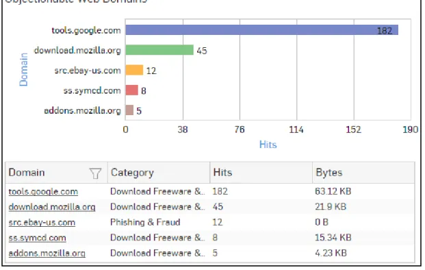
Objectionable Web Domains
This Report displays the list of Domains categorized under a Objectionable web category, along with number of hits and amount of data transferred through the domain.
View the reports from Web Risks & Usage reports dashboard or from Reports > Applications > Web > Web Risks & Usage > Objectionable Web Domains.
Note: You can view this report from Security Dashboard as well. The report is displayed using a graph as well as in a tabular format.
By default, the report is displayed for the current date. The report date can be changed from the top most row of the page.
The bar graph displays number of hits per domain while the tabular report contains the following information: • Domain: Domain name or IP Address of the domain.
• Category: Name of the objectionable web category, under which the domain is categorized. • Hits: Number of hits to the domain.
Figure 24: Objectionable Web Domains
Click the Domain hyperlink in table or the pie chart to view the Filtered Web Risks & Usage Reports.
Blocked Web Categories
This Report displays a list of blocked web categories that various users tried to access and the number of access attempts to each category.
View the report from Blocked Web Attempts reports dashboard or from Reports > Applications > Web >
Blocked Web Attempts > Blocked Web Categories.
Note: You can view this report from Security Dashboard as well. The report is displayed using a graph as well as in a tabular format.
By default, the report is displayed for the current date. The report date can be changed from the top most row of the page.
The bar graph displays list of categories along with number of hits per category while the tabular report contains the following information:
• Category: Name of the category. • Hits: Number of hits per category.
Figure 25: Blocked Web Categories
Click the Category hyperlink in table or the pie chart to view the Filtered Blocked Web Attempts Reports - Web.
Blocked Web Domains
This Report displays the list of blocked web domains that various users tried to access and the number of access attempts to each domain.
View the report from Blocked Web Attempts reports dashboard or from Reports > Applications > Web >
Blocked Web Attempts > Blocked Web Domains.
Note: You can view this report from Security Dashboard as well. The Report is displayed using a graph as well as in a tabular format.
By default, the report is displayed for the current date. The report date can be changed from the top most row of the page.
The bar graph displays the list of domains along with number of hits per domain while tabular report contains the following information:
• Domain: Name of the domain. • Hits: Number of Hits.
Figure 26: Blocked Web Domains
Click the Domain hyperlink in table or the pie chart to view the Filtered Blocked Web Attempts Reports - Web.
Objectionable Web Users
This Report displays a list of Users accessing Objectionable web sites / categories along with number of times the Objectionable web site and web category was accessed and amount of data transferred per user.
View the reports from Web Risks & Usage reports dashboard or from Reports > Applications > Web > Web Risks & Usage > Objectionable Web Users.
Note: You can view this report from Security Dashboard as well. The report is displayed using a graph as well as in a tabular format.
By default, the report is displayed for the current date. The report date can be changed from the top most row of the page.
The bar graph displays number of hits per user, while the tabular report contains the following information: • Username: Username of the user as defined in the Device. If the User is not defined in the Device then it will
display ‘N/A’ which means the traffic is generated by an undefined user.
• Category Count: Number of times a Objectionable web category was accessed per user. • Domain Count: Number of times a Objectionable domain was accessed per user. • Hits: Total number of hits to Objectionable web site and web categories. • Bytes: Amount of data transferred per user.
Figure 27: Objectionable Web Users
Click the Username hyperlink in table or the pie chart to view the Filtered Web Risks & Usage Reports.
Blocked Web Users
This Report displays a list of Users who made the most attempts to access blocked sites.
View the report from Blocked Web Attempts reports dashboard or from Reports > Applications > Web >
Blocked Web Attempts > Blocked Web Users.
Note: You can view this report from Security Dashboard as well. The report is displayed using a graph as well as in a tabular format.
By default, the report is displayed for the current date. The report date can be changed from the top most row of the page.
The bar graph displays list of blocked users along with number of hits per user while the tabular report contains the following information:
• User: Name of the User as defined in the Device. • Hits: Number of Hits.
Figure 28: Blocked Web Users
Click the User hyperlink in table or the pie chart to view the Filtered Blocked Web Attempts Reports - Web.
Hosts - ATP
This report displays a comprehensive summary of host wise advanced threats in your network.
View the report from ATP reports dashboard or from Reports > Network & Threats > Advanced Threat Protection > Hosts-ATP .
Note: You can view this report from Security Dashboard as well.
The report is displayed using a graph as well as in a tabular format. By default, the report is displayed for the current date. The report date can be changed from the top most row of the page.
The bar graph displays the list of hosts along with number of events per host while the tabular report contains the following information:
• Host (Source IP): IP Address of the source host. • Threat Count: Number of threats per source host.
Figure 29: Hosts - ATP
Click Host hyperlink in the graph or table to view the Filtered ATP Reports.
Users - ATP
This report displays a comprehensive summary of user wise advanced threats in your network.
View the report from ATP reports dashboard or from Reports > Network & Threats > Advanced Threat Protection > Users - ATP.
Note: You can view this report from Security Dashboard as well.
The report is displayed using a graph as well as in a tabular format. By default, the report is displayed for the current date. The report date can be changed from the top most row of the page.
The bar graph displays the list of users along with total number of events per user while the tabular report contains the following information:
• User: User name of the infected user. • Host Count: Number of hosts per user. • Threat Count: Number of threats per user.
Figure 30: Users - ATP
Click User hyperlink in the graph or table to view the Filtered ATP Reports.
Advanced Threats
This report displays a comprehensive summary of advanced threats in your network.
View the report from ATP reports dashboard or from Reports > Network & Threats > Advanced Threat Protection > Advanced Threats .
Note: You can view this report from Security Dashboard as well. The report is displayed using a graph as well as in a tabular format.
By default, the report is displayed for the current date. The report date can be changed from the top most row of the page.
The bar graph displays the list of threats along with total number of events per threat while the tabular report contains the following information:
• Threat: Name of the threat.
• Host Count: Number of hosts infected with the threat. • Origin: Origin of the threat. Possible options:
• Firewall • IPS • DNS • Web
• Combination of any of the above
• Events: Total number of events per threat. The number is summation of Log only and Log & Drop events. Advanced Threats
Click Threat hyperlink in the graph or table to view the Filtered ATP Reports.
Security Heartbeat - ATP
The report displays advanced threats associated with the endpoints in your network.
View the reports from Security Heartbeat reports dashboard or from Reports > Network & Threats > Security Heartbeat > Security Heartbeat - ATP.
Note: You can view this report from Security Dashboard as well. The Report is displayed in a tabular format.
By default, the report is displayed for the current date. The report date can be changed from the top most row of the page.
The tabular report contains the following information: • Host (Source IP): IP Address of the endpoint.
• Login User: User name of the user logged into the endpoint. • Process User: Username of the user running the process. • Executable: Name of the infected executable (.exe) file. • Threat: Name of the threat.
• Threat URL/IP: IP Address of the destination.
• Event Last Seen: Displays the date in YYYY-MM-DD HH:MM:SS format when the event was last seen. • Events: Total number of events per host. The number is summation of Log only and Log & Drop events.
Figure 31: Security Heartbeat - ATP
Click the Host hyperlink in the table to view the Filtered Security Heartbeat Reports.
Intrusion Attacks
The Report enables to view the details of the attack that has hit the system and gives the detailed disintegration of attackers, victims and applications through individual reports.
View the reports from Intrusion Attacks reports dashboard or from Reports > Network & Threats > Intrusion Attacks > Intrusion Attacks.
Note: You can view this report from Security Dashboard as well. The Report is displayed as a graph as well as in a tabular format.
By default, the report is displayed for the current date. The report date can be changed from the top most row of the page.
The bar graph displays the number of hits under each attack, while the tabular report contains the following information:
• Attack: Name of the attack launched. • Hits: Number of hits for each attack.
Figure 32: Intrusion Attacks
Click the Attack hyperlink in the table or the graph to view the Filtered Intrusion Attacks Reports.
Intrusion Source
The Report enables to view the details of the attacker(s) who have hit the system and gives the detailed disintegration of attacks, victims and applications through individual reports.
View the reports from Intrusion Attacks reports dashboard or from Reports > Network & Threats > Intrusion Attacks > Intrusion Source.
Note: You can view this report from Security Dashboard as well. The Report is displayed as a graph as well as in a tabular format.
By default, the report is displayed for the current date. The report date can be changed from the top most row of the page.
The bar graph displays the number of hits by each attacker, while the tabular report contains the following information:
• Hits: Number of hits for each attacker.
Figure 33: Intrusion Source
Click Attacker hyperlink in the table or the graph to view the Filtered Intrusion Attacks Reports.
Virus Summary
This Report provides an overview of Virus traffic in your network, in terms of protocols through which viruses were introduced in the network as well as number of counts per protocol.
View the report from Reports > Dashboard > Security Dashboard > Virus Summary. The Report is displayed using a pie chart as well as in tabular format.
By default, the report is displayed for the current date. The report date can be changed from the top most row of the page.
Figure 34: Virus Summary
The pie chart displays number of counts per protocol through which viruses were introduced in the network, while the tabular report contains following information:
• Application/Proto:Port: Name of the protocol through which viruses were introduced in the network. • Count: Number of counts per protocol.
Spam Senders
This Report displays a list of Spam Senders along with number of hits and percent distribution among the spam senders.
View the report from Email Protection reports dashboard or from Reports > Email > Email Protection > Spam Senders.
Note: You can view this report from Security Dashboard as well. The Report is displayed as a pie chart as well as in a tabular format.
By default, the report is displayed for the current date. The report date can be changed from the top most row of the page.
The Pie chart displays a percentage-wise distribution of spam per sender while the tabular report contains the following information:
• Sender: Email ID of the sender. • Hits: Number of hits to the sender.
Figure 35: Spam Senders
Click the Sender hyperlink in the table or the chart to view the Filtered Spam Reports.
Spam Recipients
This Report displays a list of Spam Recipients along with number of hits and percent distribution among the spam recipients.
View the report from Email Protection reports dashboard or from Reports > Email > Email Protection > Spam Recipients.
Note: You can view this report from Security Dashboard as well. The Report is displayed as a pie chart as well as in a tabular format.
By default, the report is displayed for the current date. The report date can be changed from the top most row of the page.
The Pie chart displays a percentage-wise distribution of spam per recipient while the tabular report contains the following information:
• Recipient: Email ID of the recipient. • Hits: Number of hits to the recipient.
Figure 36: Spam Recipients
Click the Recipient hyperlink in the table or the chart to view the Filtered Spam Reports.
Detailed View - Client Health
This report shows in-depth information regarding health status of endpoints in your network.
View the reports from Security Heartbeat reports dashboard or from Reports > Network & Threats > Security Heartbeat > Detailed View - Client Health.
Note: You can view this report from Security Dashboard as well. The Report is displayed in a tabular format.
By default, the report is displayed for the current date. The report date can be changed from the top most row of the page.
The tabular report contains the following information: • Host (Source IP): IP Address of the endpoint. • Host Name: Name of the client.
• Health - Last Seen: Displays the latest health status. Possible options are: • Green: The client is healthy, i.e. not infected with any malicious files.
• Yellow: The client is potentially Objectionable, i.e. it may be infected with some malicious content. • Red: The client is Objectionable and is infected with some malicious content.
• Last Health: Displays the date in YYYY-MM-DD HH:MM:SS format when the health of the host was last changed.
Click the Host hyperlink in the table to view the Filtered Security Heartbeat Reports.
Attacked Web Server Domains
This Report displays a list of attacked web servers along with the number of hits per server.
View the report from Web Server Protection reports dashboard or from Reports > Business Applications > Web Server Protection > Attacked Web Server Domains.
Note: You can view this report from Security Dashboard as well. The report is displayed using a graph as well as in a tabular format.
By default, the report is displayed for the current date. The report date can be changed from the top most row of the page.
The bar graph displays the list of web servers along with the number of hits while the tabular report contains the following information:
• Web Server Domain: Displays name or IP Address of the attacked web server. • Hits: Number of hits per web server.
Figure 38: Attacked Web Server Domains
Click the Web Server Domain hyperlink in table or the pie chart to view the Filtered Web Server Protection Reports. The granular reports page displays multiple reports in the widget form, which can again be drilled down to view filtered reports.
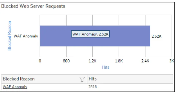
Blocked Web Server Requests
This Report displays a list of Attacks blocked by the Device, along with the number of hits per attack.
View the report from Web Server Protection reports dashboard or from Reports > Business Applications > Web Server Protection > Blocked Web Server Requests.
Note: You can view this report from Security Dashboard as well.
The bar graph displays the list of blocked reasons along with the number of hits per attack, while the tabular report contains the following information:
• Blocked Reason: Name of attack blocked by the Device. • Hits: Number of hits per attack.
Figure 39: Blocked Web Server Requests
Click the Blocked Reason hyperlink in table or the pie chart to view the Filtered Web Server Protection Reports. The granular reports page displays multiple reports in the widget form, which can again be drilled down to view filtered reports.
User Threat Quotient (UTQ)
User Threat Quotient (UTQ) report provides actionable security intelligence to an administrator, by helping them to get quick visibility of risky users who are posing security threats on organization’s network.
Note: Either Web Protection or Network Protection subscription is required to view the UTQ reports. Correlating data from various logs and reports to identify the risky users takes time and analytical skills for administrators,not to forget the chances of human oversight. UTQ gives automatic analysis of user’s Internet behavior, saving the administrators to go through the hassle of correlating the data.
Sophos Firewall calculates UTQ score of each user based on following two criteria:
1. Web surfing behaviour (Only Allowed, but potentially risky and Denied Web traffic for each user)
2. Advanced Threat Protection (ATP) logs (Infected clients/hosts or clients that are part of botnet) UTQ helps administrator to:
• Spot risky users at a glance.
• Identify which clients/hosts within the network are infected or part of botnet • Find out malicious insiders.
• Avoid chances of human oversight in correlating data from various logs and reports. • Take appropriate actions like fine-tuning security policies, security awareness training etc. Given below are the terms and icons used in UTQ along with their meanings:
• Relative Threat Score – Maximum threat posed by the user (in number), relative to the web behaviour of all other users for the selected date or date range.
• Relative Risk Ranking – Rank of the user (in number), in terms of posing security risk on the organization’s network, relative to the web behaviour of all the other users for the selected date or date range.
•
– UTQ Risk Meter, which displays average threat score for the selected user, relative to the threat scores of all other users for the selected date or date range.
UTQ report is displayed in the form of bubble graph as well as in a tabular format. The bubble graph is plotted between Relative Risk Ranking and Relative Threat Score; where the bubble represents the user and bubble size represents Relative Threat posed by the user. Mouse over on the bubble displays details like Username, Relative Threat Score and Relative Risk Ranking of a user.
Figure 40: User Threat Quotient (UTQ)
The bubble graph area is divided into three sections where; • Top 10% are marked as High Risk Users
• Next 40% are marked as Medium Risk Users • Last 50% are marked as Low Risk Users
Note: When the number of users for the selected period is less than 20, all the users are displayed as Blue bubbles and the sections mentioned above are not displayed.
The tabular report contains following information:
• User: Username of the user as defined in the Device. If the User is not defined, then it will display ‘N/A’ which means the traffic is generated by an undefined user.
• Relative Threat Score: Threat posed by the user (in number), relative to the web behaviour of all the other users, for the selected period.
Please note that UTQ is calculated and displayed after 24 hours only, which means there is no UTQ for current day. UTQ can be viewed for:
• Last 14 Days • Last 7 Days • Last 1 Day
By default, UTQ displays up to 100 risky users for the last 7 days along with their Relative Threat Score and Relative Risk Ranking.
Top most right corner of the screen displays UTQ Risk Meter, which displays relative threat score for the selected user.
Click User hyperlink in the table or bubble in the graph to view Reports by User and Date for the selected period.
Reports by User and Date
To view the following reports for a particular user and date, go to Reports > Dashboard > User Threat Quotient (UTQ) > User:
• Advanced Threats
• Detailed View - ATP
• Client Insights - ATP
• High Risk Web Categories
• High Risk Web Domains
• Blocked High Risk Web Categories
• Blocked High Risk Web Domains
Advanced Threats widget
Widget report displays a comprehensive summary of advanced threats in your network. View the report from Reports > Dashboard > User Threat Quotient (UTQ) > User. The report is displayed using a graph as well as in a tabular format.
By default, the report is displayed for the current date. The report date can be changed from the top most row of the page.
The bar graph displays the list of threats along with total number of attempts per threat while the tabular report contains the following information:
• Threat: Name of the threat.
• Host Count: Number of hosts infected with the threat. • Origin: Origin of the threat. Possible options:
• Firewall • IPS • DNS • Web
• Combination of any of the above
• Attempts: Total number of attempts per threat. The number is summation of Log only and Log & Drop attempts.
Detailed View - ATP widget
Widget report provides a detailed summary of advanced threats in your network.
View the report from Reports > Dashboard > User Threat Quotient (UTQ) > User. The report is displayed using a graph as well as in a tabular format.
By default, the report is displayed for the current date. The report date can be changed from the top most row of the page.
• Date: Date in YYYY-MM-DD format
• Host (Source IP): IP Address of the source host. • Threat: Name of the threat.
• Destination: IP Address of the infected destination. • Origin: Origin of the threat. Possible options:
• Firewall • IPS • DNS • Web
• Combination of any of the above
• Attempts: Total number of attempts. The number is summation of Log only and Log & Drop attempts. • Action: Action performed by the Device when a threat is detected. Possible options:
• Log & Drop: The data packet is logged and dropped. • Log only: The data packet is logged.
Security Heartbeat - ATP widget
Widget report provides an insight into advanced threats related to endpoints in your network. View the report from Reports > Dashboard > User Threat Quotient (UTQ) > User. The report is displayed in a tabular format. The tabular report contains the following information: • Host (Source IP): IP Address of the source host.
• Login User: Username of the infected user.
• Process User: Username of the user owning the process. • Executable: Name of the infected executable file. • Threat: Name of the threat.
• Destination: IP Address of the infected destination.
• Event Last Seen: Time when the infected executed file was last found in the host.
• Attempts: Total number of attempts. The number is summation of Log only and Log & Drop attempts.
High Risk Web Categories widget
Widget report displays list of top allowed web categories along with number of hits per web category. View the report from Reports > Dashboard > User Threat Quotient (UTQ) > User.
The report is displayed as a graph as well as in a tabular format.
Bar graph displays number of hits per web category while tabular report contains following information: • Category: Name of the Web category as defined in the Device.
• Hits: Number of hits to the Web category.
Click Category hyperlink or graph to view list of High Risk Web Domains for the selected User, Date / Date Range and Web Category.
High Risk Web Domains widget
Widget report displays list of top allowed web domains along with number of hits per web domain. View the report from Reports > Dashboard > User Threat Quotient (UTQ) > User.
The report is displayed as a graph as well as in a tabular format.
Bar graph displays number of hits per web domain while tabular report contains following information: • Domain: Name/IP Address of the domain.
• Category: Name of the Web category for the domain. • Hits: Number of hits to the domain.
Click icon to view the list of users who have accessed this domain.
Blocked High Risk Web Categories widget
Widget report displays list of top denied web categories along with number of hits per web category. View the report from Reports > Dashboard > User Threat Quotient (UTQ) > User.
The report is displayed as a graph as well as in a tabular format.
Bar graph displays number of hits per denied web category while tabular report contains following information: • Category: Name of the Web category as defined in the Device.
• Hits: Number of hits to the Web category.
Click Category hyperlink or graph to view list of Blocked High Risk Web Domains for the selected User, Date / Date Range and Web Category.
Blocked High Risk Web Domains widget
Widget report displays list of top denied web domains along with number of hits per domain. View the report from Reports > Dashboard > User Threat Quotient (UTQ) > User. The report is displayed as a graph as well as in a tabular format.
Bar graph displays number of hits per denied web domain while tabular report contains following information: • Domain: Name/IP Address of the domain.
• Category: Name of the Web category for the domain. • Hits: Number of hits to the domain.
Click icon view the list of URLs that the selected user has accessed for the domain. Click icon to view the list of users who have accessed this domain.
High Risk Web Domains
Widget report displays list of top allowed risky web domains along with number of hits per domain. View the report from Reports > Dashboard > User Threat Quotient (UTQ) > User > High Risk Web Categories widget > Category
The report is displayed as a graph as well as in a tabular format.
Bar graph displays number of hits per web domain while tabular report contains following information: • Domain: Name/IP Address of the domain.
• Category: Name of the Web category for the domain. • Hits: Number of hits to the domain.
Click icon view the list of URLs that the selected user has accessed for the domain. Click icon to view the list of users who have accessed this domain.
Blocked High Risk Web Domains
Widget report displays list of top denied risky web domains along with number of hits per domain.
View the report from Reports > Dashboard > User Threat Quotient (UTQ) > User > Blocked High Risk Web Categories widget > Category.
The report is displayed as a graph as well as in a tabular format.
Bar graph displays number of hits per denied web domain while tabular report contains following information: • Domain: Name/IP Address of the domain.
• Hits: Number of hits to the domain.
Click icon to view the list of users who have accessed this domain.
Detailed Report
Detailed report displays list of URLs accessed by selected user for the selected domain. The detailed report contains following information:
• Time : Time in YYYY-MM-DD HH:MM:SS format . • Host : IP Address or name of the host.
• URL: IP Address or URL name.
Click View hyperlink against an URL to access the URL.
Domain-wise Users
Report displays list of users who have accessed the particular domain. Domain wise users report contains following information.
• User : Name of the user as defined in the Device. • Hits: Number of hits to the domain by the user.
Click icon to view the detailed report showing a list of URLs that the selected user has accessed for the domain.
Applications
This section provides insight about usage of Web, Application, Internet and FTP traffic in your network. Applications section contains following sub-sections:
• User Applications
• Web
• Business Applications
• User Data Transfer
• FTP
User Applications
User Applications Reports provide an insight into application usage by various users, including denied application traffic.
View the reports from Reports > Applications > User Applications.
Note: Web Protection subscription is required to view all the User Applications reports. Without a valid subscription, some reports do not show any data.
User Application Reports consist of following sub-sections: • User App Risks & Usage
• Blocked User Apps
User App Risks & Usage
The User App Risks & Usage reports dashboard provides an insight about the usage of various applications and associated risks.
View the reports dashboard from Reports > Applications > User Applications > User App Risks & Usage. The Report is displayed in the form of a bar graph as well as in a tabular format.
The Device provides a Risk Meter on the top right corner of all application reports. This risk calculator indicates the overall risk associated with the application(s).The overall risk is calculated on the basis of individual risk associated with the application and number of hits on that application.
User App Risks & Usage reports dashboard enable you to view traffic generated by: • Source Zones
• Destination Zones
• Application Categories
• Applications
• Application Users
• Application Technologies
• High Risk Applications
• Application Risk Levels
• High Risk Application Users
• Hosts - High Risk Applications
• Hosts
• Source Countries
• Destination Countries
• Allowed Policies
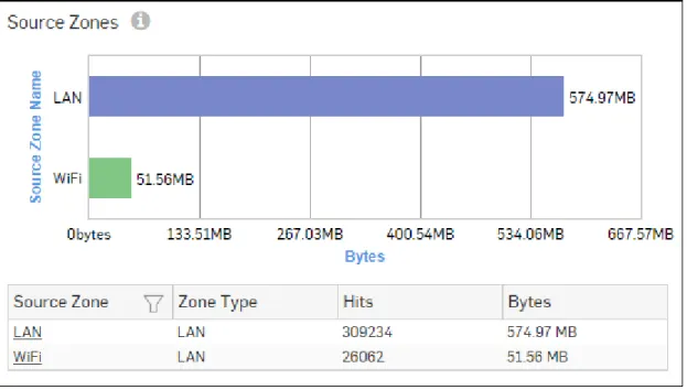
Source Zones
This Report displays a list of Source Zones along with the type of zone, number of hits per zone and zone wise total amount of data transfer.
View the report from User App Risks & Usage reports dashboard or from Reports > Applications > User Applications > User App Risks & Usage > Source Zones.
The report is displayed using a graph as well as in a tabular format. By default, the report is displayed for the current date. The report date can be changed from the top most row of the page.
The bar graph displays the list of network zones along with the amount of data transfer while the tabular report contains the following information:
• Source Zone: Displays name of the zone as defined in the Device.
• Zone Type: Type of the Zone. Possible types are: LAN, WAN, DMZ, VPN and WiFi. • Hits: Number of hits per zone.
Figure 41: Source Zones
Click the Source Zone hyperlink in table or the pie chart to view the Filtered User App Risks & Usage Reports.
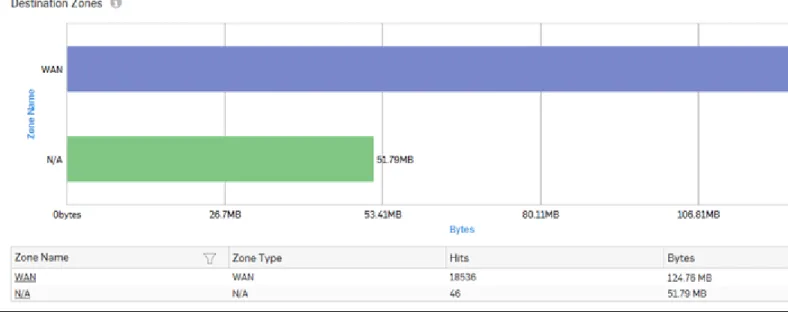
Destination Zones
This report displays a list of top destination zones along with the type of zone, number of hits per zone and zone wise total amount of data transfer.
View the report from User App Risks & Usage reports dashboard or from Reports > Applications > User Applications > User App Risks & Usage > Destination Zones.
The report is displayed using a graph as well as in a tabular format. By default, the report is displayed for the current date. The report date can be changed from the top most row of the page.
The bar graph displays the list of destination network Zones along with the amount of data transfer while the tabular report contains the following information:
• Destination Zone: Displays name of the zone as defined in the Device.
• Zone Type: Type of the Zone. Possible types are: LAN, WAN, DMZ, VPN and WiFi. • Hits: Number of hits per zone.
Figure 42: Destination Zones
Click the Destination Zone hyperlink in table or the pie chart to view the Filtered User App Risks & Usage Reports.
Application Categories
This report displays a list of top Application Categories along with number of hits per category and total amount of data transfer using that application.
View the report from User App Risks & Usage reports dashboard or from Reports > Applications > User Applications > User App Risks & Usage > Application Categories.
The report is displayed using a graph as well as in a tabular format. By default, the report is displayed for the current date. The report date can be changed from the top most row of the page.
The bar graph displays the list of application categories along with the number of hits while the tabular report contains the following information:
• Category: Displays name of the Application Category as defined in the Device. • Hits: Number of hits per application category.