Accessibility Problems of Blind MHealth
Users, a Pilot Study
Indicate Submission Type:
Full paper
Shrirang Sahasrabudhe
University of North Carolina at
Greensboro
[email protected]
Rahul Singh, PhD
University of North Carolina at
Greensboro
[email protected]
Abstract
The purpose of this pilot study is to identify accessibility and usability problems of blind and visually impaired (BVI) mHealth users. We use a novel task-oriented, user-centric, multi-method evaluation approach which was originally developed and was used in the context of accessibility evaluation of web interfaces. We evaluate two mHealth apps for diabetes patients. Our sample comprises two BVI expert iPhone users. Using verbal protocol analysis and app user interface analysis we identify (1) no or inappropriate text alternatives, (2) unpredictable/confusing behavior, (3) absence of Structural Elements, and (4) confusing Reading Order of Data Tables as the primary accessibility and usability problems in the chosen apps. We also propose design principles to mitigate the identified problems.
Keywords
Accessibility, usability, mHealth, blind users, verbal protocol analysis
Introduction
Diabetes is a leading cause of blindness and the number of blind and visually impaired (BVI) individuals with diabetes is rising (American Optometric Association 2016). According to the National Standards for Diabetes Self-Management, Education and Support, the primary interventions to manage blood sugar are awareness, education, and support. These are often delivered through mHealth resources namely healthcare portals accessed using mobile phones and healthcare apps on mobile phones. This research specifically focuses on healthcare apps on mobile phones. BVI users can reap the benefits of mHealth only if it is reasonably accessible and usable to them. However, we do not yet know various accessibility and usability barriers mHealth poses to BVI users. Moreover, accessibility and usability guidelines for mobile apps are yet in nascent phases. Consequently, there is no definitive guidance available to develop mHealth which is accessible and usable to BVI users. Therefore, this is an opportune moment to inform the development of those guidelines through evidence-based empirical research. As a first step, we conduct this pilot study to investigate “What are the accessibility and usability problems of BVI mHealth users in their mHealth interactions?.” Our analysis reveals various accessibility and usability problems. We identify the causes of those problems. We also propose design principles to mitigate those problems.
Trewin (2006) explored the similarity between physical ease of use of the web for desktop users and for mobile users. Their research, however, neither focused on BVI users nor on the accessibility of mobile apps. Numerous earlier studies focused on various problems BVI face while interacting with mobile phones. T Guerreiro et al. (2011) demonstrated that BVI find it difficult to acquire touch screen targets.
Kane et al. (2011) reported that the accuracy of gesture recognition is lower in case of BVI than in the case of sighted mobile phone users. They further suggested ways to improve gesture accuracy in case of BVI. McGookin et al. (2008) demonstrated that BVI face significant problems while using gestures. Leporini et al. (2012) investigated accessibility and usability problems BVI face in interacting with iPhone using the VoiceOver(VO) screen reader. However, they did not focus on the problems BVI face while interacting with native apps or the web using iPhone.
Very few studies have focused on the accessibility and usability problems BVI face while interacting with native apps or the web using mobile phones. Wentz and Lazar (2011) compared Facebook Desktop (web interface designed for desktops) with the Facebook Mobile (web interface designed for mobile phones) and found that the Facebook Mobile was more usable than the Facebook Desktop interface. Milne et al. (2014) evaluated accessibility of nine mHealth apps, which were designed to interface with glucose monitors and blood pressure monitors, using their accessibility rubric. The rubric was based on the IOS app accessibility guidelines and Section 508 web accessibility requirements. They, however, did not consider BVI users' cognition of the interactions with those apps. It is important to note that, the nature of BVI users’ mHealth interactions is different than the nature of mHealth interactions of sighted users. Unlike sighted users, BVI interact with mHealth using assistive technologies like screen reader. Screen reader reads the textual content on screen, such as content of a Web page, in a sequential manner (Leuthold et al. 2008). Owing to this difference in the nature of interaction, at cognitive level, BVI conceptualize those interactions differently than the sighted users do. None of the earlier research pertaining to the accessibility and usability of mobile apps for BVI has considered BVI users' cognition as a factor to understand their mobile app accessibility and usability problems. Consequently, we do not yet fully understand BVI users’ accessibility and usability problems in their mHealth interactions. Which prevents us from designing mHealth which is accessible and usable to BVI users.
Research Design
We adopted a task-oriented, user-centric, multi-method evaluation approach (Babu et al 2013) to answer the research question. Unlike quantitative methods, which are interested in producing generalizable results, qualitative methods are used to study human behavior and behavior changes in a particular context. Our investigation was situated in the intersection of unique BVI users and the context of mHealth interactions. We were interested in producing in-depth understanding of accessibility and usability issues faced by BVI. Therefore, we chose to collect qualitative evidence. We were specifically interested in evaluating usability and accessibility of the diabetes management mHealth apps.
To generate the first set of evidence, we used the think-aloud method of direct observation, also called concurrent verbal protocol analysis, to collect concurrent verbal reports of the BVI participants. Participants work on a task and concurrently verbalize whatever they are thinking (Ericsson and Simon 1984; Todd and Benbasat 1987). Concurrent verbal reports contain evidence of the information that participants process to perform a task (Ericsson and Simon 1984). Ericsson and Simon (1993) found that concurrent verbalizations are non-reactive and do not alter participants’ behavior in tasks. This technique is effective for developing an in-depth understanding of human problem-solving (Newell and Simon 1972) and is a feasible method to trace usability problems in human computer interactions (Cotton and Gresty 2006). To generate the second set of evidence, we analyzed the app user interfaces corresponding to the mHealth tasks using the Web Content Accessibility Guidelines (WCAG) 2.0 level AA conformance requirement.
Mobile App Accessibility Compliance Requirements
The existing mobile app accessibility guidance is scattered across multiple documents. First, mobile web best practices (MWBP) by W 3C (Rabin and McCathie-Nevile 2005), second, the WCAG 2.0 (Caldwell et al. 2008), and third, the accessible development guidelines specified by mobile operating system (OS) providers such as. Apple (2012), Google (2016). MWBP comprises techniques which are useful to develop
web pages which are accessible on mobile devices. WCAG 2.0 provides some guidance about developing webpages which are accessible on smaller screens. OS specific accessibility guidance comprises techniques to develop accessible apps using the native accessibility APIs. Nevertheless, there is no unified definitive guidance which can guide the design of accessible mobile apps. Also, we are interested in informing the mHealth app design in general and not for any specific user interface technology. WCAG 2.0 is not specific to any user interface technology. Therefore, we chose WCAG2.0 as the benchmark for mHealth accessibility analysis.
WCAG 2.0 comprises 12 guidelines. Each guideline comprises testable success criterion (SC). To meet the needs of different groups and different situations, three levels of conformance are defined: A (lowest), AA, and AAA (highest). Each SC has an associated level of compliance, namely, A, AA, or AAA. To meet the level A compliance the web interface should satisfy all the SCs at level A, to meet the level AA compliance the web interface should satisfy all the SCs at level A and all the SCs at level AA, and to meet the level AAA compliance the web interface should satisfy all the SCs at level A, all the SCs at level AA, and all the SCs at level AAA. Often, meeting level AAA compliance requirements is very difficult and impracticable. Therefore, we determined WCAG2.0 level AA compliance requirement to be the most realistic measure for this assessment. As we were specifically interested in uncovering the accessibility problems for BVI; we adopted the WCAG2.0 checklist used by Sahasrabudhe and Lockley (2014). The checklist includes only those checks which are relevant for BVI. The checklist could not be included in the paper due to the space limitations.
Identification of Relevant mHealth Apps
We identified mobile apps targeting diabetes patients through a systematic search of the Apple iOS iTunes app store. We identified the apps which belonged to either "medical" or "health and fitness" appstore categories. Then, we refined the list of identified apps by removing the apps for which no customer rating was available, which were not patient focused, which had minimal functionality beyond traditional media such as books and videos, which were not relevant to the Diabetes, or which were not intended for broad use (e.g., inaccessible without specific login credentials). Then we sorted the list of apps according to the customer ratings for the current version of the respective apps as shown on the Apple AppStore. In cases where multiple apps had identical customer rating, we selected the app with maximum number of ratings among those apps. Then, for this study we chose the top two apps in the sorted list for further analysis. The two chosen apps were: 1. Easy Diabetes and 2. Glucose Buddy - Diabetes Logbook Manager w/syncing, Blood Pressure, Weight Tracking.
Assessment by BVI Participants
Before beginning the actual study, we requested the participants, two English-speaking blind expert iPhone users, to perform one practice task using the default mail app on their respective iPhones while thinking-aloud. The purpose of this practice was to make the participants conversant with the protocol. The rationale to choose the familiar mail app was to ensure that the participants could devote an undivided attention towards learning the think-aloud protocol.
Following the practice, we asked the participants to perform two mHealth tasks using both the apps. The two tasks were (1) add food for lunch or add carbohydrates and (2) select options to view data trends. The first task allowed the participants to add either food details or carbohydrates because although the purpose of the task was to enter the food details, the two apps used distinct nomenclature for that task. Similarly, the second task allowed the participants to select various options to view the health data trends. Although, the two chosen apps did not have exact same functionality for doing this task, we were primarily interested in the user interface elements than the intent of the user activity and the two apps were more or less identical in terms of the user interface elements used for selecting the options to view the health data trends.
We collected the participants’ concurrent and retrospective verbal protocols. We audio-recorded participant verbalizations, and VoiceOver announcements if any while the participants performed the tasks. Then, we transcribed the audio recordings for analysis.
Analysis and Discussion
Concurrent verbal reports comprise participant verbalizations, VO announcements if any, and conversations between participants and investigators as they complete the specified tasks. Participant verbalizations contain evidence of their problem-solving mental models. We decomposed the reports into individual segments representing single units of cognition, perception, or action. We coded each segment corresponding to user goals pertaining to the mHealth tasks, respective plans of action, expected outcomes, actions executed, perception of system responses and their interpretations, including dissonance and consonance. Dissonance denotes inconsistency and failure while Consonance denotes success. This coding scheme allows differentiation of the nuances of accessibility and usability problems and their impact on effective task completion. Segments categorized as dissonance identify problems that can be worked around and overcome; or problems that require sighted intervention. Segments coded as consonance identify effective problem solving in mHealth tasks.
We then consolidated the accessibility and usability problems. The problems fall under four groups. The following section details the outcomes of our analysis.
No or Inappropriate Text Alternatives
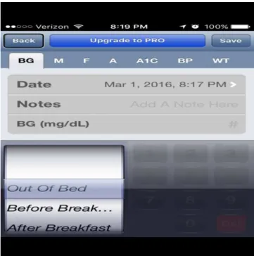
Figure 1: Add log screen in Glucose Buddy app.
WCAG2.0 SC 1.1.1 requires developers to provide text alternatives, which convey equivalent information, for every non-text element. However, the App user interface shown in Figure1 violated this requirement. For example, the buttons on the screen for adding a log lacked appropriate text labels which resulted in a task failure. It is clearly evident from the following interaction.
User Goal User Action System Behavior VoiceOver Announcement User interpretation of the VoiceOver announcement Consonance / Dissonance To understand the meaning of the next element
Right flick
Focus moves to the next element
Save Button Ok. Save button to save the log. Got it.
Consonance
To understand the meaning of the next element
Right flick Focus moves to the next element Selected BG button BG, probably it is blood glucose. But I am not sure.
Dissonance
To understand the meaning of the next element
Right flick
Focus moves to the next element
Cap M button Cap M! I do not know what the purpose of this button is. I cannot move ahead without that information.
Dissonance
Table 1: User Interaction with Glucose Buddy app
The problem can be resolved by adhering to the following design principles.
• Provide descriptive labels for all the screen controls such as buttons, drop-down menus, and text fields etc.
• A label should describe the purpose of the associated screen control.
• Cases where descriptive labels cannot be provided due to the screen-size limitations, provide an informative hint which describes the purpose of the respective screen control.
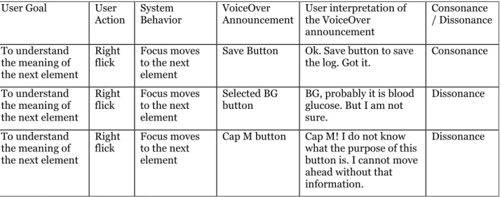
Unpredictable/confusing Behavior
When the participants double tapped on the "graph" button, the new screen shown in Figure2 appeared and the focus was set on the "back" button. As a consequence, the participants could not figure out exactly which screen had appeared. One participant attempted to find the heading on the screen to figure out which screen had appeared. Although, this particular problem did not violate any particular SC, it was an annoyance for the participants. It is clearly evident from the following interaction.
User Goal User Action System Behavior VoiceOver Announcement User interpretation of the VoiceOver announcement Consonance/ Dissonance To understand the meaning of the next element
Right flick
Focus moves to the next element
Graph button Graph button to see the data trends.
Consonance To activate the button Double tap Button gets activated and new screen appears
Back I do not know where I am.
Dissonance
To understand the meaning of the next element
Right flick
Focus moves to the next element
Graph heading Ok. So I am on the screen which shows the health data graph.
Consonance
Table 2: User Interaction with Glucose Buddy app
The problem can be resolved by adhering to the following design principle.
• Ensure that the default focus is set to the text which conveys the purpose of the respective screen.
Absence of Structural Elements
WCAG2.0 SC 1.3.1 requires the information, structure, and relationships conveyed through presentation to be programmatically determined or are available in text. However, the screen shown in figure3 violated the requirement.
The data was presented using inappropriate markup which prevented the VO screen reader to programmatically determine that the data was in fact a table. Consequently, both the participants could not utilize the table navigation abilities of the VO screen reader. Due to which the participants could not form the appropriate conceptualization of the overall information and the interrelationships between the pieces of that information. Which resulted in a task failure.
Also, the app1 interface violated the 1.3.1 SC requirement. The app1 screen which allowed the entry of health data did not contain any structural element such as section heading. The participants had to flick through multiple buttons at the top of the screen to reach the section of the screen they were looking for. In the absence of appropriate structural elements BVI users find it difficult to comprehend the screen structure and also find it difficult to navigate to the desired section of the screen. Also, flicking through the long list of screen elements such as. Buttons is extremely cumbersome for BVI users and reduces the usability of the app significantly.
The aforementioned problems can be resolved by adhering to the following design principles.
• Use the table accessibility techniques to ensure that the table data can be read by screen readers.
• Use heading elements to denote the beginning of the screen sections.
• Use succinct text for section headings.
• The text should describe the purpose of the section that follows the heading.
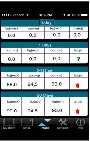
Confusing Reading Order of Data Tables
Figure 3: View trends in EasyDiabetes app
WCAG2.0 SC 1.3.2 requires the correct reading sequence of the content to be programmatically determinable, however the screen shown in Figure3 violated the requirement. It is clearly evident from the following interaction with the app2 screen which showed the trends in the health data.
User Goal User Action
System Behavior
VoiceOver Announcement
User Interpretation of the VoiceOver Announcement Consonance / Dissonance To understand the meaning of the next element Right flick. Focus moves to the next element
bg. max. Probably maximum of blood glucose Dissonance To understand the meaning of the next element Right flick. Focus moves to the next element
bg. AVG. Probably average of blood glucose
To understand the meaning of the next element Right flick. Focus moves to the next element
bg. min. Probably minimum of blood glucose Dissonance To understand the meaning of the next element Right flick. Focus moves to the next element
"0.0" Probably this is the value of the first parameter
Dissonance To understand the meaning of the next element Right flick. Focus moves to the next element
"0.0" Probably this is the value of the second parameter
Dissonance To understand the meaning of the next element Right flick. Focus moves to the next element
"0.0" Probably this is the value of the third parameter. I think this is the second row in this trend table.
Dissonance To understand the meaning of the next element Right flick. Focus moves to the next element 7 days. max 7 days.
From where did this "7 days" appear? this is totally confusing.
Dissonance
Table 3: User Interaction with EasyDiabetes app
Both the participants went through the information multiple times. However, it did not make any sense to either of them. As a last resort, one participant read the entire screen at once. However, it increased his confusion as the reading order for the information was not logical.
The problem can be resolved by adhering to the following design principle.
• Present the data in a manner which makes sense when read in a linear fashion.
Contributions and Limitations
The primary contributions of our research are the identification of mHealth accessibility and usability problems of BVI users, proposed design principles to resolve those problems, and the verification of the appropriateness and the efficacy of the chosen research method to investigate BVI users’ mHealth accessibility and usability problems. Often pilot studies are conducted to verify the appropriateness and the efficacy of research methods for a particular research scenario. Several studies have employed the same research method as we did in our research. However, earlier studies used the method to understand accessibility and usability problems of BVI users in their web interactions (Babu and Singh 2009; Babu et al. 2010; Sahasrabudhe and Lockley. 2014). However, none of the earlier studies utilized the method in the context of BVI users’ interactions with mobile apps. Our research shows that the chosen method is appropriate and effective to investigate BVI users’ accessibility and usability problems in the context of their interactions with mobile apps.
The main limitation of this study is that, owing to the limited number of participants, the results cannot be readily generalized. However, the accessibility and usability problems reported in this paper are arising from technical pitfalls, and should have more or less similar negative impact on all the expert BVI users. Also, novice BVI users would certainly faced more problems in addition to the problems we have identified in this paper. We appreciate the need for conducting a more expansive and rigorous accessibility and usability review of mHealth to validate the findings of our research. We also plan to test the efficacy of the proposed design principles through our on-going research.
Conclusion
With the advent and proliferation of assistive technologies such as VoiceOver screen-reader on IOS and TalkBack screen-reader on Android, BVI individuals can potentially reap the benefits of mHealth. However, inaccessibility of mHealth impedes the revolution. This paper investigated accessibility and usability of two representative Diabetes management mobile apps in the context of BVI. Our results show that, the two apps posed multiple accessibility and usability problems to BVI users. Our analysis also reveals that all the identified problems can be easily resolved if developers follow certain basic accessibility design principles.
REFERENCES
American Optometric Association. 2016. “Diabetes and Eye Health,” Retrieved February 22nd, 2016 from http://www.aoa.org/optometrists/tools-and-resources/diabetes-and-eye-health
Anders, E. K., and Simon, H. A. 1993. Protocol Analysis: Verbal Reports as Data, Cambridge, MA: MIT Press.
Apple. 2012. “Accessibility Programming Guide for iOS,” Retrieved February 22nd, 2016 from https://developer.apple.com/library/ios/documentation/UserExperience/Conceptual/iPhoneAccessi bility/Accessibility_on_iPhone/Accessibility_on_iPhone.html.
Babu, R., and Singh, R. 2009. “Evaluation of Web Accessibility and Usability from Blind User's Perspective: The Context of Online Assessment,” in Proceedings of AMCIS 2009, pp. 623.
Babu, R., and Singh, R. 2013. “Enhancing Learning Management Systems Utility for Blind Students: A Task-oriented, User-centered, Multi-method Evaluation Technique,” Journal of Information Technology and Education: Research, (12:1), pp. 1-32.
Caldwell, B., Cooper, M., Reid, L., and Vanderheiden, G. 2008. “Web Content Accessibility Guidelines (WCAG) 2.0,” http://www.w3.org/WAI/intro/wcag.php.
Cooper, M. 2007, May. “Accessibility of Emerging Rich Web Technologies: Web 2.0 and the Semantic Web,” in Proceedings of the 2007 International Cross-disciplinary Conference on Web Accessibility (W4A) ACM. pp. 93-98.
Cotton, D., and Gresty, K. 2006. “Reflecting on the Think‐Aloud Method for Evaluating e‐learning,” British Journal of Educational Technology, (37:1), pp. 45-54.
Google. 2016. “Making Applications Accessible,” Retrieved February 22nd, 2016 from http://developer.android.com/guide/topics/ui/accessibility/apps.html.
Hailpern, J., Guarino-Reid, L., Boardman, R., and Annam, S. 2009, April. “Web 2.0: Blind to an Accessible New World,” in Proceedings of the 18th international conference on World Wide Web. ACM. pp. 821-830.
Leporini, B., Buzzi, M. C., and Buzzi, M. 2012, November. “Interacting with mobile devices via VoiceOver: Usability and Accessibility Issues,” in Proceedings of the 24th Australian Computer-Human Interaction Conference. ACM. pp. 339-348.
Newell, A., and Simon, H. A. 1972. Human problem solving, Englewood Cliffs, NJ: Prentice-Hall, (104:9). Rabin, J. and McCathie-Nevile, C. 2005. “Mobile Web Best Practices 1.0,”
http://www.w3.org/TR/mobile-bp/.
Sahasrabudhe, S., and Lockley, M. 2014. “Understanding Blind User’s Accessibility and Usability Problems in the Context of myITlab Simulated Environment,” in Proceedings of the 20th Americas Conference on Information Systems. Savannah, GA. pp. 1–14.
Todd, P., and Benbasat, I. 1987. “Process Tracing Methods in Decision Support Systems Research: Exploring the Black Box,” MIS Quarterly, (11:4), pp. 493-512.
Kane, S. K., Bigham, J. P., & Wobbrock, J. O. 2008. “Slide Rule: Making Mobile Touchscreens Accessible to Blind People Using Multi-touch interaction techniques,” in Proceedings of the 10th international ACM SIGACCESS conference on Computers and accessibility, ACM. pp. 73-80.
Oliveira, J., Guerreiro, T., Nicolau, H., Jorge, J., & Gonçalves, D. 2011. “Blind People and Mobile Touch-Based Text-Entry: Acknowledging the Need for Different Flavors,” in Proceedings of the 13th International ACM SIGACCESS Conference on Computers and accessibility, ACM. pp. 179-186.
McGookin, D., Brewster, S., & Jiang, W. 2008. “Investigating Touchscreen Accessibility for People with Visual Impairments,” in Proceedings of the 5th Nordic conference on Human-computer Interaction: Building Bridges, ACM. pp. 298-307.
Wentz, B., & Lazar, J. 2011. “Are Separate Interfaces Inherently Unequal?: An Evaluation With Blind Users Of The Usability Of Two Interfaces For A Social Networking Platform,” in Proceedings of the 2011 iConference, ACM. pp. 91-97.
Milne, L. R., Bennett, C. L., & Ladner, R. E. 2014. “The Accessibility of Mobile Health Sensors for Blind Users,”
Trewin, S. 2006. Physical Usability and the Mobile Web,” in Proceedings of the 2006 international cross-disciplinary workshop on Web accessibility (W4A): Building the Mobile Web: Rediscovering Accessibility, ACM, pp. 109-112.