Interactive Visualization and Exploration of
High-Dimensional Data
by
Adrian Waddell
A thesis
presented to the University of Waterloo in fulfillment of the
thesis requirement for the degree of Doctor of Philosophy
in Statistics
Waterloo, Ontario, Canada, 2016
Author’s Declaration
I hereby declare that I am the sole author of this thesis. This is a true copy of the thesis, including any required final revisions, as accepted by my examiners.
Abstract
Visualizing data is an essential part of good statistical practice. Plots are useful for re-vealing structure in the data, checking model assumptions, detecting outliers and finding unanticipated patterns. Post-analysis visualization is commonly used to communicate the results of statistical analyses. The availability of good statistical visualization software is key in effectively performing data analysis and in exploring and developing new meth-ods for data visualization. Compared to static visualization, interactive visualization adds natural and powerful ways to explore the data. With interactive visualization an analyst can dive into the data and quickly react to visual clues by, for example, re-focusing and cre-ating interactive queries of the data. Further, linking visual attributes of the data points such as color and size allows the analyst to compare different visual representations of the data such as histograms and scatterplots.
In this thesis, we explore and develop new interactive data visualization and explo-ration tools for high-dimensional data. The original focus of our research was a software implementation of navigation graphs. Navigation graphs are navigational infrastructures for controlled exploration of high-dimensional data. As part of this thesis, we developed the first interactive implementation of these navigation graphs called RnavGraph. With
RnavGraphwe explored various features for enhancing the usability of navigation graphs. We concluded that a powerful interactive scatterplot display and methods to deal with large graphs were two areas that would add great value to the navigation graph frame-work.
RnavGraph’s scatterplot display proved to be particularly useful for data analysis and we continued our research with the design and implementation of a general-purpose in-teractive visualization toolkit called loon. The core contributions of loonare as follows.
loon implements a general design for interactive statistical graphic displays that sup-ports layering of visual information such as point objects, lines and polygons. These dis-plays further support zooming, panning and selection, and modification and deactivation of plot elements and layers. Interactions with plots are provided with mouse and key-board gestures as well as via command line control and with inspectors. These inspectors provide graphical user interfaces for modifying and overseeing the plots. loon also
im-plements a novel dynamic linking mechanism that can be used to assign the plots that are to be linked and the linking rules at run time. Additionally, loon’s design provides several different types of event bindings to add and customize functionality ofloon’s dis-plays. In this thesis, we discussloon’s design and framework by giving concrete examples that show how these design choices can be used to efficiently explore and visualize data interactively. These examples revolve around loon’s statistical interactive displays such as histograms, scatterplots and graph displays. We also illustrate how loon’s design can be used to layer on plots relevant statistical information and model fits such as density estimates, contours, regression lines and geographical maps for spatial data analysis.
loon is implemented in Tcl and Tk and we explore the integration of loon’s frame-work into a complete statistical computing environment such asR. We show examples of statistical analyses performed inRthat are enhanced with interactivity usingloon.
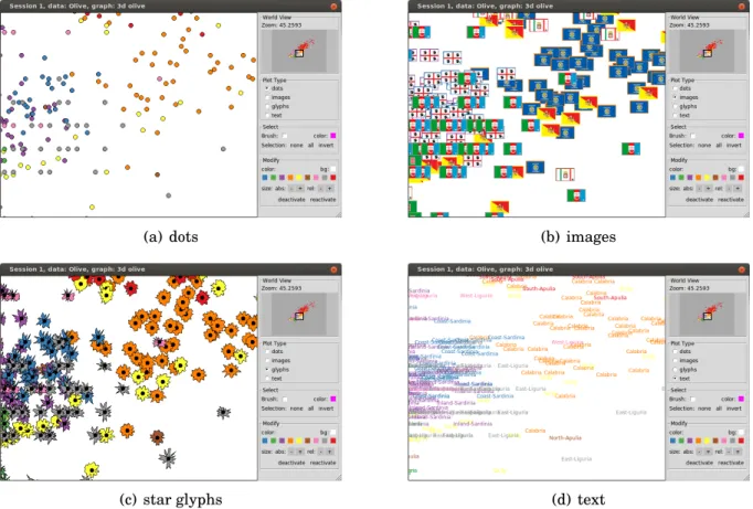
loon also implements a number of new tools for high-dimensional data exploration. The serialaxes display represents the data using parallel or radial coordinates. The scat-terplot display supports high-dimensional point glyphs such as serialaxes glyphs, polygons and images. loon’s navigation graphs allow for multiple navigators and for direct manip-ulation of a graph which includes deactivating nodes and their adjoining edges.
To deal with large graphs, we propose and implement environments for creating nav-igation graphs interactively by filtering the nodes with respect to some node-associated relevant measures. Such measures include the correlation of variable pairs and the graph-based scagnostics measures. We use sliders, histograms and scatterplot matrices to inter-actively filter the nodes based on the value of their associated measure. Measures are kept generic and can be recalculated for the subset of selected data points. As another tool for exploring high-dimensional data, we introduce a setup that allows the analyst to select points and have their k-nearest neighboring points highlighted automatically. The space to calculate the inter-point distances that determine the k-nearest neighbors can be chosen dynamically. Finally, we propose a new high-dimensional point glyph called the spiro glyph.
While some ofloon’s interaction features have appeared in part or in whole in statis-tical systems in the past 40 years (e.g. brushing, panning, zooming, linking plots, etc.),
no other equally rich system has provided (or continues to provide) an interactive data vi-sualization system integrated with a widely available and stable statistical system likeR. BothTclandR are well suited for rapid prototyping of software and statistical methods; with loon rapid prototyping of interactive data visualization tools and methods become possible as well.
Acknowledgements
I would like to thank my advisor Wayne Oldford for his guidance, support and generosity. His deep insight and knowledge have been most influential on my research work and academic development.
I am also grateful to those who contributed to making R and Tcl the excellent tech-nologies that they are today.
Above all, I wish to thank my parents for their constant encouragement and support. Also, many thanks to my siblings and friends. I am particularly thankful to my friends Max and Tobias for their company and for all the ideas we exchanged over the years. Finally, my very special thanks go to Oana for being a wonderful and supportive partner.
Table of Contents
Author’s Declaration ii
Abstract iii
Acknowledgements vi
List of Figures xii
List of Tables xvii
1 Background 1
1.1 On High-Dimensional Data . . . 1
1.2 On Low-Dimensional Views . . . 2
1.3 Navigation Graphs . . . 5
1.3.1 The Canonical Graph Semantic . . . 6
1.3.2 Automatic Graph Construction and Exploration . . . 8
1.3.2.1 Saturated 3d and 4d transition graph . . . 8
1.3.2.2 Graph Products . . . 11
1.3.2.3 Automatic Graph Traversal . . . 12
1.4 On the Problem of Large Graphs . . . 13
1.4.1 Finding an Interesting Subgraph . . . 14
1.4.2 Dimensionality Reduction/Constructing Dimensions . . . 16
1.5 Other Graphs of Possible Interest . . . 21
2 RnavGraph 26
2.1 A Default RnavGraph Session . . . 27
2.2 The Navigation Graph Display . . . 27
2.3 The tk2d Scatterplot Display . . . 32
2.4 Software Architecture. . . 35 2.4.1 navGraph . . . 36 2.4.2 scagGraph . . . 40 2.4.3 Extending RnavGraph . . . 41 2.5 Lessons Learned . . . 43 3 Loon By Example 46 3.1 An Exploratory Data Analysis. . . 47
3.2 Performing the Exploratory Analysis with the loon R package . . . 54
3.2.1 Plot States . . . 54
3.2.2 Graphical User Interface . . . 55
3.2.3 Linking . . . 57
3.2.4 Layers . . . 57
3.2.5 Star Glyphs . . . 58
3.3 Conclusions . . . 59
4 Loon Framework 60 4.1 Introduction to the Displays . . . 62
4.1.1 Scatterplot . . . 62
4.1.2 Histogram . . . 62
4.1.3 Serialaxes Display . . . 64
4.1.4 Graph Display . . . 64
4.1.5 Inspectors . . . 67
4.2 Main Graphics Model . . . 69
4.2.1 Plot Layout . . . 69
4.2.2 Mapping Data Onto the Plot Region. . . 71
4.3 Plot States . . . 73
4.3.2 Configuration Pipeline . . . 78
4.3.3 State Normalization . . . 80
4.4 Graphical User Interface . . . 81
4.4.1 Zoom & Pan . . . 81
4.4.2 Visual Query. . . 82
4.4.2.1 Item Labels . . . 82
4.4.2.2 Interactive Selection . . . 84
4.4.3 Temporarily Relocating Points . . . 86
4.4.4 Inspectors . . . 88
4.4.4.1 loon Inspector . . . 89
4.4.4.2 Worldview . . . 89
4.4.4.3 Analysis Inspectors . . . 90
4.4.4.4 Layers Inspector. . . 90
4.5 Standard Linking Model . . . 91
4.6 Layers . . . 95
4.6.1 Functions and Methods for Layering Data in R . . . 98
4.7 Display Design Decisions. . . 103
4.7.1 Histogram . . . 103
4.7.2 Point and Node Glyphs . . . 103
4.7.3 Serialaxes Display and Serialaxes Glyphs . . . 107
4.7.4 Graph Display . . . 109
4.7.4.1 Graphswitch . . . 109
4.7.4.2 Navigators . . . 110
4.7.4.3 Navigator Contexts . . . 113
5 Advanced Loon Framework 121 5.1 Implementation . . . 121
5.2 Event Bindings. . . 124
5.2.1 R function callbacks . . . 125
5.2.2 State Change Bindings . . . 126
5.2.3 Item Bindings . . . 128
5.2.5 Content Bindings . . . 132
5.3 Custom Linking . . . 134
5.3.1 One Directional And One-To-Many Linking . . . 134
5.3.2 Linking States with Different Names . . . 136
5.3.3 Linking Items Within a Plot . . . 137
5.3.4 Avoiding Circularity . . . 138
5.3.5 Linking Model with Non-Model Layers . . . 139
5.4 Geometry Management . . . 140 5.5 Writing an Inspector . . . 144 5.6 Other Topics . . . 145 5.6.1 Export as an Image . . . 145 5.6.2 Animations. . . 146 5.6.3 Color Mapping. . . 146
6 General Statistical Interaction Examples 150 6.1 Power Transformations . . . 151
6.2 Interactively Adding Regression Lines. . . 153
6.3 Sensitivity Analysis of a Simple Linear Regression . . . 155
6.4 Interactive K Nearest Neighbor highlighting . . . 158
6.4.1 A Quick Solution . . . 158
6.4.2 A Solution With Control Panel . . . 160
7 Exploring High-Dimensional Data 163 7.1 Navigation Graphs . . . 164
7.1.1 Canonical Navigation Graph Setup . . . 164
7.1.2 Dynamic Navigation Graphs Based on Measure Ranges. . . 168
7.1.3 Dynamic Navigation Graph based on Plots . . . 172
7.1.4 Closures of Measures. . . 173
7.1.5 Exploring New Graph Semantics . . . 180
7.2 Spiro Glyphs . . . 184
8.1 Conclusions for loon . . . 190 8.2 Future Work . . . 194 8.2.1 loon in General . . . 194 8.2.2 Current Displays . . . 197 8.2.3 New Displays . . . 198 8.2.4 Navigation Graphs . . . 199 References 201 APPENDICES 208 A R Code for Chapter 6 Examples 209 A.1 Power Transformations . . . 209
A.2 Interactively Adding Regression Lines. . . 210
A.3 Sensitivity Analysis Simple Linear Regression. . . 211
List of Figures
1.1 The Italian olive oil data – recorded fatty acids and sampled areas. . . 7
1.2 Saturated 3d and 4d transition graphs for the olive data. . . 8
1.3 3d rigid rotation and linked scatterplot display. . . 9
1.4 4d transition along a geodesic.. . . 9
1.5 Complete variable graphG for a 4 dimensional data set with variates labelled A,B,C, andD. Line graphL(G). Complement graphL(G). . . 10
1.6 Automatic saturated 3d and 4d transition graph construction with a non-complete variable graph. . . 10
1.7 Two variable graphsG andHcapturing a certain structure. . . 12
1.8 Three graph products ofGandH from Figure 1.7 . . . 12
1.9 Scatterplot matrix example from Hurley and Oldford [44] Section 4.1. . . 13
1.10 a) Scatterplot of the scagnostic measures – convex vs. monotonic. b) Particular scatterplots with high monotonic and convex measure, and high convex and low monotonic measure. . . 16
1.11 Scatterplot of the scagnostic measures – convex vs. monotonic – overlaid on the scagnostic measures along two 4d transitions from the olive data. The blue path shows the scagnostic measures when linolenic transitions into oleic and arachidic transitions into palmitoleic. The green path shows the scagnostic measures when linolenic transitions into palmitoleic and arachidic transitions into oleic. . . 17
1.12 Comparing seven dimensional reduction methods using navigation graphs with the canonical semantic. . . 25
2.1 DefaultRnavGraphsession with the default group colors. . . 28
2.2 Path tool . . . 32
2.3 Different plot types supported by thetk2dscatterplot display. . . 34
2.4 Rectangular brush tool. . . 35
2.5 Saturated 3d transition graph for olive data. . . 38
2.6 RnavGraphsession. . . 39
2.7 scagNav session . . . 41
2.8 User-defined plot for anRnavGraphsession.. . . 44
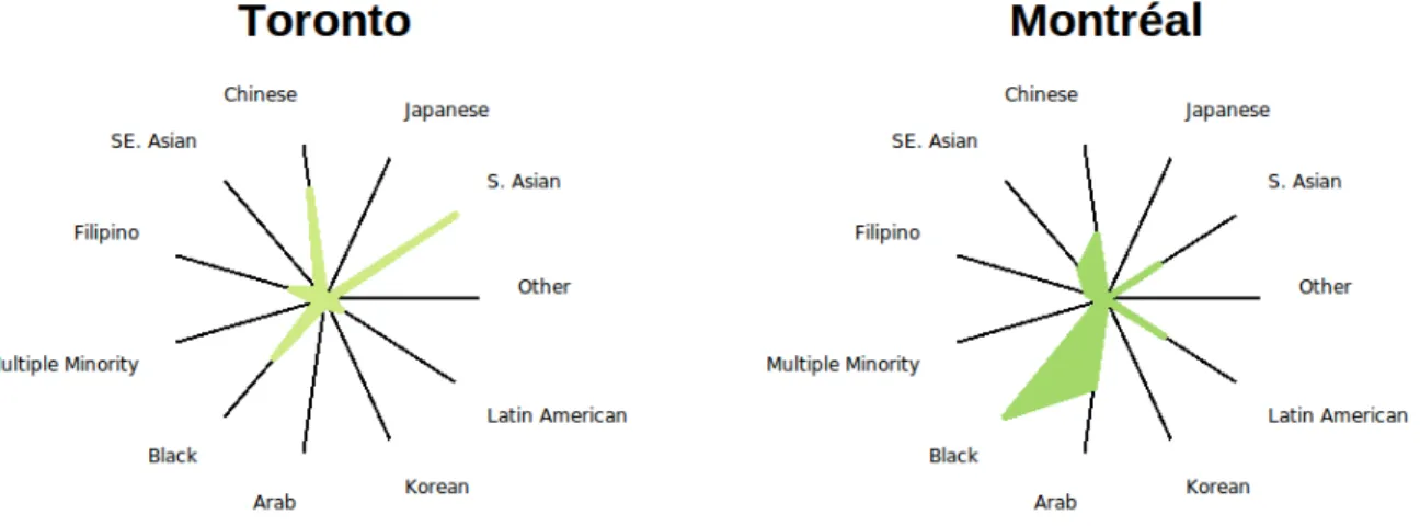
3.1 Visible minority population versus total population for each of the 33 Canadian metropolitan census areas. Here t= total population count, m= total visible minority count. . . 48
3.2 Visible minority population versus total population for each of the 33 Canadian metropolitan census areas – range from 0.0015 for Trois-Rivie`res to 0.18 for Vancouver. Here t= total population count, m= total visible minority count andc=total Chinese minority count. . . 49
3.3 Radial axis plots for the two largest Canadian census areas. . . 50
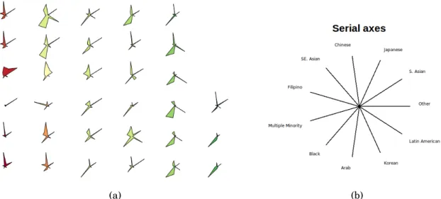
3.4 Radial axis plots, or star glyphs, for all 33 metropolitan census areas. Colors are assigned based on a red-yellow-green gradient from west to east. The radial axis order is shown at the right. . . 51
3.5 Zooming in on a region. (a) A worldview plot. (b) The area of focus – South-western Canada and the Prairies. The region shown in (b) is highlighted with a white rectangle in (a). . . 52
3.6 The default loon inspector is context specific for the active loon plot. For a scatterplot display it shows a worldview, an analysis, layers and glyphs inspector. 53 4.1 loon’s scatterplot display. . . 63
4.2 loon’s histogram display. . . 65
4.3 loon’s serialaxes display plots the data either as a stacked star glyphs plot (a) or as a parallel coordinates plot (b).. . . 66
4.4 loon’s graph display. . . 67
4.6 Main graphics model. . . 69
4.7 Plot layout. . . 71
4.8 The configuration pipeline for state modifications. . . 78
4.9 Zoom and pan gestures for the histogram, scatterplot and graph display. Zoom-ing requires a mouse scroll gesture. PannZoom-ing requires a right mouse button drag. Two superimposed mice with an arrow indicate a drag gesture. . . 82
4.10 loon’s item labels that are displayed with a “tool-tip” pop-up. . . 83
4.11 Interactive mouse/keyboard selection techniques. . . 84
4.12 Selection gestures for the histogram, scatterplot and graph display. Two super-imposed mice with an arrow indicate a drag gesture. . . 85
4.13 Temporary relocating points on a scatterplot.. . . 87
4.14 Worldview inspector and its composition in perspective. . . 90
4.15 Layers inspector. . . 91
4.16 Scatterplot with a layered regression line, a 95% confidence interval and a 95% prediction interval of a simple linear fit. . . 96
4.17 Naturalearth data displayed withloon’s scatterplot display. . . 99
4.18 Two layers: a heat image and contour lines of a 2d density estimation. . . 102
4.19 Point glyph examples. . . 105
4.20 Point glyph size mapping. . . 106
4.21 Glyphs inspector. . . 108
4.22 Graphswitch and graph display. . . 110
4.23 Navigator example. . . 112
4.24 Context2d mapping scheme toxvarsandyvars.. . . 114
4.25 Context2d example session. . . 115
4.26 loon’s slicing2d context setting for 3d transitions. . . 119
4.27 loon’s slicing2d context setting for 4d transitions. . . 120
5.1 Life expectancy (in years) vs. fertility (number of children per women) for dif-ferent countries in 2002. The data is from the Gapminder data project [35]. The choropleth plot (right panel) encodes life expectancy as color. . . 141
5.2 Geometry management. . . 142
5.4 Custom inspector for aspect ratio.. . . 145
5.5 Hcl colors: luminance is 70, chroma on circle is 66. The numbers indicateloon’s default color mapping order. . . 148
5.6 Examples of mapping data values to colors. . . 149
6.1 Power transformation example. . . 152
6.2 Interactively adding regressions lines. . . 154
6.3 Influential points in regression analysis. . . 156
6.4 Influential points in regression: recolor points to remove outliers. . . 156
6.5 Influential points in regression: sensitivity analysis. . . 157
6.6 3 nearest neighbors highlighted. . . 159
6.7 K nearest neighbors highlighting for subspaces. . . 162
7.1 l_navgraphsetup. . . 166
7.2 Star glyphs. . . 167
7.3 l_ng_rangessetup with 2d measures. . . 169
7.4 l_ng_rangessetup with 1d measures. . . 171
7.5 l_ng_rangesusing scganostics measures and the olive data. . . 172
7.6 l_ng_plotssetup. . . 176
7.7 Frey faces image glyphs. . . 177
7.8 Scatterplot of “clupmy” olive data. . . 178
7.9 l_ng_rangessetup with measures1d. . . 178
7.10 l_ng_plotsforscagnostics2dand high sparse and low outlying points selected.179 7.11 Implementing a custom graph semantic. . . 183
7.12 Spiro glyphs from 3d transitions arranged on a grid. . . 186
7.13 Spiro glyphs from 4d transitions arranged on a grid. . . 187
7.14 Spiro glyphs from 4d transitions on a scatterplot. . . 188
7.15 Zoomed in on spiro glyphs from Figure 7.14. . . 188
8.1 Example of a color cross table of the plot statesgroupvs. color. Note that the first row represents theselectedstate and not thecolorstate. The data used here is the olive data and itsAreavariable is assigned to thegroupstate. Also, thecolorstate has a different color for each area inArea. Here, the color of a cell (i,j) is according to the fraction of points that have the color from rowiout of the points that are from the group in column j. For the first row the color of a cell represents the fraction of points that are selected for a given group. . . . 199
List of Tables
1.1 Elementary codes for quantitative information, ranked by the accuracy with which people can extract them from graphs based on experiments from Cleve-land and McGill [18]. The slope judgement spans over a range of ranks as the accuracy of judging two slopes relative to each other largely depends on the magnitude of those slopes. Also, the ranking for density, saturation, and hue
are not based on experiments, but are conjectural. . . 2
2.1 Possible arguments for the user-specified function used in combination with ng_2d_myplot. . . 43
4.1 Important Display States. Dominant States do not have a default value. For states of type factor the default value column shows all possible factor levels and highlights the default factor level in bold. . . 74
4.2 Dominant states for each Display.. . . 77
4.3 Functions for temporarily moving points on scatterplot. . . 87
4.4 loon’s inspectors . . . 88
4.5 loon’s default “used linkable” states. . . 92
4.6 linked states for example . . . 93
4.7 loon’s layer types . . . 95
4.8 Functions that work on layers . . . 100
4.9 loonprovidesl_layermethods for the geospatial data classes in this table. . . 101
4.10 Primitive point/node glyphs. . . 104
4.12 Functions for working with glyphs . . . 105
4.13 The mapping ofsizeto point glyph area. . . 107
4.14 loon’s graphswitch widget.. . . 109
4.15 Working with navigators.. . . 111
4.16 Navigator context-related functions. . . 113
4.17 Scaling methods for context2d. . . 117
5.1 State change binding substitutions. . . 127
5.2 Item binding substitutions.. . . 129
5.3 Item tags for visuals for plots based on the main graphics model.. . . 130
5.4 Canvas binding substitutions. . . 131
5.5 Content binding substitutions. . . 132
Chapter 1
Background
1.1
On High-Dimensional Data
Understanding high-dimensional spaces is intrinsically difficult for humans. Our visual system is limited to perceiving up to three dimensions; therefore, 4+ dimensional spaces are abstract to us. There are many examples that show that high-dimensional spaces can have counter-intuitive properties (Lee and Verleysen [48] and Friedman and Stuetzle [31]). For example, imagine a pdimensional sphere with a thin shell whose thickness is much smaller than the radius of the sphere. The ratio of the volume of the thin shell to the volume of the interior of the sphere is very small when p=3. However, as pgrows the ratio approaches 1. Hence, in high-dimensional spaces, most of the hypersphere volume is located close to its edge. This and many other examples related to “unusual” properties of high-dimensional spaces build upon the fact that, as the dimensionality increases, the space volume grows exponentially. One consequence of the rapid space growth is that the available data can become sparse which, in turn, could limit statistical model fitting (Friedman and Stuetzle [31]). Oftentimes, such problems are collectively referred to as the “curse of dimensionality”, a term coined by Bellman [9].
1.2
On Low-Dimensional Views
High-dimensional data are omnipresent and data visualization is widely considered part of good statistical practice for any data analysis. However, finding revealing visualizations for high-dimensional data is oftentimes not a straightforward task. To create a good visu-alization that helps answer a research question two main decisions have to be made: what is the information to be visualized and how should this information be visually encoded onto a graphic. In other words, what is relevant and how can we see it?
The latter decision can be guided by considering how the information will be decoded by the viewer. Cleveland and McGill [18, 19, 20, 21] rank ten “fundamental geometric, colour, and textural aspects that encode quantitative information” on a graphic based on the accuracy with which people can extract this information. Their ranking, shown in Ta-ble1.1, is based on a number of experiments, but also on some theoretical considerations.
Rank Code
1 Positions along a common scale
2 Positions along identical, nonaligned scales
3 Lengths 4 Angles 4-10 Slopes 6 Areas 7 Volumes 8 Densities 9 Colour saturation 10 Colour hues
Table 1.1: Elementary codes for quantitative information, ranked by the accuracy with which people can extract them from graphs based on experiments from Cleveland and McGill [18]. The slope judgement spans over a range of ranks as the accuracy of judg-ing two slopes relative to each other largely depends on the magnitude of those slopes. Also, the ranking for density, saturation, and hue are not based on experiments, but are conjectural.
For continuous data, a two-dimensional scatterplot performs well in the ranking in Table 1.1. That is, the values of each variate are encoded as positions along a common scale. Also, the pattern of the point glyphs (i.e. the geometrical representation of a data point on the plot) can expose a possible relationship between the two variates. Additional information could be encoded onto a scatterplot by modifying the point glyph style which is usually a filled circle by using color, size or special glyphs such as star glyphs. However, according to Table 1.1, such additional information will be poorly encoded compared to information that is decoded as the scatterplot coordinates.
For three-dimensional data, a three-dimensional scatterplot or point cloud would per-form well according to Table 1.1. To visualize a 3d scatterplot one either needs a three-dimensional display or has to project the point cloud onto a 2d plane. However, a per-spective projection will encode depth with shape or size of the glyphs, whereas with an orthogonal projection the depth information gets lost.
In conclusion, it is desirable to visualize some low-dimensional representation of the data that captures relevant information.
Many visualization techniques take the approach of laying out multiple low-dimensional plots either spatially or temporally so that the data analyst can visually link them. Scat-terplot matrices are the best known of these multivariate visualization techniques. A scatterplot matrix for p-variate data lays out the p(p−1) scatterplots of every ordered variable pair onto a p×p grid such that the scatterplots within a column or row share theirx-axis or y-axis, respectively.
Elmqvist et al. [25] propose the use of scatterplot matrices as navigational infrastruc-tures to guide a 3d rigid rotation. The resulting projections of the 3d space onto a 2d subspace will then be shown on a 2d scatterplot display and appears as a smooth movie, i.e. the viewer can track the points. This way, the visual linkage between plots is done spatially and temporally.
The idea of looking at linear projections rather than just plotting the original variates has been used for a long time. For example, Friedman [30, p. 249] writes that “Any structure seen in a projection is a shadow of an actual (usually sharper) structure in the full dimensionality”.
Friedman and Tukey [32] introduced the termprojection pursuitas an algorithm that seeks highly revealing low-dimensional linear projections of multivariate data. This al-gorithm requires the definition of a projection index which is a measure corresponding to some feature of interest in the subspace defined by the projection (e.g. spread of points). Projections that optimize this index are then visually inspected by the analyst. Local op-tima for a projection index are also of interest as they may reveal relevant information that cannot be seen in the globally optimal projection.
Another approach to finding interesting projections involves looking at all possible pro-jections or at least at a dense subset of them. If the propro-jections from the dense set are ordered such that the changes in projections are small then the resulting visualization will be a smooth movie. Asimov [5] proposed this approach and called the sequence of such projections a “grand tour”. However, even for a small number of dimensions, such a grand tour can take a very long time to watch. Huber [38, p. 438] argues that if some “interesting” features can only be seen within a “squint angle” of about 10◦ then a grand tour in four dimensions would take about 3 hours.
With projection pursuit one can hope to find an interesting projection in a more timely fashion. But the value of watching a smooth movie of moving points in a scatterplot is compelling. Buja and Asimov [12] argue that
the speed vectors of data points in a grand tour provide two additional dimen-sions of information in addition to the two dimendimen-sions of location, thus letting us perceive a full 4-dimensional space at any given point in time.
Cook et al. [23] discuss some of the shortcomings of projection pursuit and grand tours
Unfortunately static plots suffer from a lack of context because they have been removed from their neighborhood in the projection space, and although a grand tour provides the neighborhood context it has a tendency to spend too much time away from, or indeed never visit, the interesting projections.
tool. Projection pursuit guided tours display a grand tour movie until the data analyst decides to use a particular projection as the starting point of a projection pursuit. The movie continues for the projection index optimization, showing the projection for each optimization iteration.
In summary, high-dimensional data can be difficult to comprehend, but good visual exploration can help overcome this issue by revealing relevant information in the data. One approach for visualizing high-dimensional data is to lay out different low-dimensional views either spatially or temporally so that the analyst can visually link them. Well known examples of this approach include scatterplot matrices, projection pursuit and grand tours.
1.3
Navigation Graphs
Hurley and Oldford [44] propose using graphs that are sets of vertices (nodes) and edges to navigate a view of the data. The nodes of such navigation graphs represent low-dimensional spaces whereas the edges represent some transition between those spaces. That is, every location on the graph defines a view of the data. In a graphical user inter-face, these graphs become navigable when a “bullet” is placed onto the graph. The location of the bullet can be then linked to some display showing a particular view of the data. In this thesis, we call the relationship between a location on the navigation graph and the corresponding view the “graph semantic”.
For example, in Hurley and Oldford [44] the graph semantic of their main example associates every location on the graph with an orthogonal projection of the data onto a two-dimensional subspace. The nodes then represent the subspace spanned by a pair of variates and the edges either a 3d- or 4d-transition of one scatterplot into another, depending on how many variates the two adjoining nodes share. Hereafter, we refer to this particular graph semantic as thecanonical graph semantic.
Hurley and Oldford [44] use the analogy between a navigation graph and a city map. One can explore a new city by either randomly driving around (grand tour), by always choosing the most interesting looking path at each intersection (projection pursuit) or by using a city map with marked routes that show regions of interest (navigation graphs).
In the light of this analogy, when exploring a new high-dimensional data set, we first need to create an accurate map that highlights the most interesting regions of the data. For the canonical graph semantic applied to the original data variates, the most exhaus-tive navigation graph that can be created is a complete graph with¡p
2 ¢
nodes represent-ing the unordered variate pairs of a p-dimensional data set. Using an exhaustive graph does not guarantee showing an interesting view of the data as interesting 2d projections could be lying on arbitrary 2d subspaces. However, we believe that exploring the original variates before transforming the data is important. In general, a model that explains a phenomenon based on few original (and easily interpretable) variates is preferred over a model that includes arbitrary linear combinations of the variates.
Using navigation graphs encourages the analyst to spend time on visually exploring the data similarly to playing a captivating game. Dragging a bullet along a navigation graph is an easy task and the immediate result is a smooth movie that can provide valu-able insight into the data.
In the remainder of this chapter, we give a detailed overview of the theory and appli-cation of navigation graphs as proposed by Hurley and Oldford [44]. Later on we review some tools that can be used to find small and relevant navigation graphs.
1.3.1
The Canonical Graph Semantic
The navigation graph framework was introduced by Hurley and Oldford [44] as a general concept; nodes represent views and edges represent a smooth morphing from one view into another. However, most of the theory and examples in [44] were built around the canonical graph semantic linking every location on a navigation graph to a 2d subspace. Graphs whose nodes represent 2d subspaces are called 2dspace graphs. A 2d space graph that has only edges connecting two nodes whose union span a 3d space is called a 3d transition graph. Similarly, if the graph edges only connect two nodes whose union span a 4d space then the graph is called a 4d transition graph. In addition, when an edge exists for any possible 3d or 4d transition we call such a graph asaturated 3d or 4d transition graph, respectively.
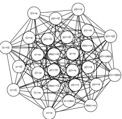
For illustrative purposes, we use the Italian olive oil data set from Forina et al. [29]. These data record the percentage composition of 8 fatty acids found in the lipid fraction of 572 Italian olive oils sampled from 9 different areas (see Figure1.1).
Fatty Acids palmitic (p1) palmitoleic (p2) stearic (s) oleic (o) linoleic (l1) linolenic (l2) arachidic (a) eicosenoic (e) Areas North-Apulia South-Apulia Calabria Sicily East-Liguria West-Liguria Umbria Coastal-Sardinia Inland-Sardinia
Figure 1.1: The Italian olive oil data – recorded fatty acids and sampled areas.
For the olive data, there are ¡8 2 ¢
=28 unique unordered variate pairs and hence 28 possible nodes in a navigation graph with the canonical semantic. Figure 1.2 shows the saturated 3d and 4d transition graphs. We call the large yellow circle in each navigation graph a “bullet”. The bullet location defines the projection to be visualized in a linked scatterplot display and can be interactively dragged along the graph.
Regarding the particular implementation of a 3d and 4d transition, Hurley and Oldford [44] propose to rotate the starting plane along a geodesic path into the target plane, as described by Hurley and Buja [41].
For a 3d transition, this rotation results in a 3d rigid rotation. For example, the loca-tion of the bullet in Figure1.2(a)is 30% between the two 2d spaces (stearic,eicosenoic) and (archidic, eicosenoic). Hence, the linked scatterplot display shows the orthogo-nal projection of the 3d point cloud onto a plane through theeicosenoic axis that is 30 degrees rotated from thestearic axis towards the arachidic axis, as shown in Figure
1.3(a) and 1.3(b). Moving the bullet from the (stearic, eicosenoic) node towards the (archidic,eicosenoic) node is equivalent to rotating the x−y plane from the (stearic,
(a) saturated 3d transition graph (b) saturated 4d transition graph
Figure 1.2: Saturated 3d and 4d transition graphs for the olive data.
For a 4d transition, Hurley and Oldford [44] interpolate the plane along the geodesic path which in this setting is equivalent to orthogonally rotating one variate into another, for both x and y axes. This is illustrated in Figure 1.4 and in practice will result in a smooth movie that is less intuitive than the one from a 3d rigid rotation.
1.3.2
Automatic Graph Construction and Exploration
1.3.2.1 Saturated 3d and4d transition graph
Saturated 3d and 4d transition graphs, as shown in Figure1.2for p=8, can be constructed automatically for any p-dimensional data set by using graph theoretic algorithms.
Avariable graphassociates one variate to each of its nodes. An edge of such a variable graph represents a pairing of the two variates; for example, an edge could represent the correlation between the two variates. For any variable graph, G, the line graph of G,
y
x
(a) 3d point cloud and a plane con-trolled by the bullet position.
y
x (b) The linked scatterplot display showing the orthogonal projection of the 3d points onto the plane.
Figure 1.3: 3d rigid rotation and linked scatterplot display.
x y
y
x Figure 1.4: 4d transition along a geodesic.
L(G), constructs a saturated 3d transition graph. L(G) turns every edge ofG into a node of L(G), and nodes in L(G) are adjacent if the corresponding edges in G share a node. Hence, L(G) will show every variable pairing of interest (i.e. an edge in G) as a node and every possible 3d transition for these nodes. Further, the complement of L(G), L(G), constructs a saturated 4d transition graph.
Figure1.5shows a complete variable graphG, its line graphL(G) and the complement of the line graph L(G) for four variates labelled A, B, C and D. In this example, the
variable graphGis saturated and hence the relationships between all paired variates are of interest. A B D C AB BD AD BC CD AC AB BD AD BC CD AC G L(G)
Figure 1.5: Complete variable graphGfor a 4 dimensional data set with variates labelled
A,B,C, and D. Line graph L(G). Complement graph L(G).
If the variable graph is not complete such as in cases where certain relations are not of interest then the corresponding line graph and its complement are still saturated 3d and 4d transition graphs, but with fewer nodes. For example, the variable graphG in Figure
1.6 does not have the edges (A,C) and (A,D) which indicates that these variable pairings are not of interest here.
A B D C AB BD BC CD AB BD BC CD G L(G)
Figure 1.6: Automatic saturated 3d and 4d transition graph construction with a non-complete variable graph.
1.3.2.2 Graph Products
Graph products of two graphsG and Hare useful for constructing transition graphs that preserve certain structures of the initial graphsG andH. Of particular interest here are statistically meaningful examples where
1) the variates separate into two distinct sets and
2) there may be additional structure between the variates within each set that can be captured by a graph.
Hurley and Oldford [44] give several such examples for
1) variates separating into two distinct sets
– response vs. explanatory
– endogenous vs. exogenous
– design variates vs. covariates
– original vs. derived
– causal vs. associated
2) structure between variates can be captured by a graph
– time ordering
– regression structure
– Markov property
– conditional independence
– path diagram
We now briefly review two concrete examples from Hurley and Oldford [44] that illus-trate the use of graph products.
Figure1.7shows two variable graphsGand Hthat both capture some ordering of the variates within the graph. All three graph products in Figure 1.8 preserve some of the structure inG and H; in particular, these graph products have only edges that are per-mitted byGand H. In addition, the Cartesian productGH has only edges representing 3d transition, the Tensor product G×H has only edges representing 4d transitions, and the strong product (GH) equals (GH)+(G×H), as the notation suggests. Hence,GH
Figure 1.7: Two variable graphsG andH capturing a certain structure.
Figure 1.8: Three graph products ofG andH from Figure1.7
is a restricted 3d transition graph, G×Ha restricted 4d transition graph, and GH and
G×Hare complements inGH.
Another example of using graph products given in Hurley and Oldford [44] is shown in Figure 1.9, where the restricted transition graphsGH,G×H and GH correspond to moving within a rectangle in a scatterplot matrix. Note that the rectangular shape in Figure1.9is due toGandH being complete graphs.
1.3.2.3 Automatic Graph Traversal
In addition to automatic graph construction, Hurley and Oldford [44] explore algorithms that construct meaningful paths and cycles on a graph to automatically traverse the graph. For example, a Hamiltonian path visits each node exactly once. A Hamiltonian cycle is a Hamiltonian path concatenated with the start node of that path. An Eulerian path
vis-A B C D (a) G Y X Z (b) H AX DZ AY AZ BX BY BZ CX CY CZ DX DY (c) 3d transitionsGH Z A B C D X Y
(d) Focus on shaded region of the scatterplot matrix
Figure 1.9: Scatterplot matrix example from Hurley and Oldford [44] Section 4.1.
positions, 2-factorizations and Eulerian tours might also be of interest (see Hurley and Oldford [44]). Greedy algorithms such as a greedy Eulerian might be of additional value for traversing weighted transition graphs (e.g. visiting the “most interesting” edges first, where what is interesting is expressed with the weights). We discuss possible weights in more detail in the next section.
1.4
On the Problem of Large Graphs
The saturated 3d and 4d transition graphs for the 8-dimensional olive data, as shown in Figure1.2, have 28 nodes and 168 and 210 edges, respectively. Analyzing these 168+210=
378 transitions would require a long concentration span from an analyst. The problem gets even harder with increased dimensionality; for example, for 15 dimensions the total
number of edges of a saturated 3d and 4d transition graph is¡(152) 2
¢
=5460 which for a fast edge transition of 1 second would take over 1.5 hours to explore.
As mentioned in Section1.3, navigation graphs should optimally be “road maps” with only interesting routes regardless the dimensionality of the data. In addition, even for data with thousands of dimensions, it would be great to be able to construct some small navigation graphs that capture the essential patterns of the data.
Next, we discuss two ways to deal with large navigation graphs. First, we look at ways to find interesting subgraphs that could reveal relevant information. Second, we discuss methods for creating a reduced new set of variates that capture interesting patterns in the data; these methods are commonly called dimensionality reduction algorithms.
1.4.1
Finding an Interesting Subgraph
An explorative data analysis using a complete 2d space graph and the canonical graph semantic is equivalent to using an interactive scatterplot matrix as proposed by Elmqvist et al. [25]. However, navigation graphs are a more powerful navigational infrastructure; that is, aside from the fact that navigation graphs allow for a generalkd space navigational framework using any imaginable graph semantic, they also allow for the reduction of the complete 2d space graph to any arbitrary subgraph.
Finding an interesting subgraph of a saturated 3d or 4d transition graph is preferable to dimensionality reduction if the original variates are important to interpret and com-municate the results. Although finding an interesting subgraph can be done manually, we will focus here on automated methods based on kd space measures.
Any measure that can be associated with either the nodes or the edges of some 2d space graph could be used to determine a subgraph. For example, regression coefficients, projection pursuit indexes and scagnostic measures(Wilkinson et al. [83] and Wilkinson and Wills [85]) are all useful 2d space measures that also have a statistical meaning. One could use these 2d measures to determine edge weights on a complete variable graph and, consecutively, construct a saturated 3d or 4d transition graph from a variable graph whose edge weights are greater than some thresholdw0, i.e. L(G(w>w0)) andL(G(w>w0)).
Scagnostic measures are particularly interesting for the canonical navigation graph semantic as they are specifically designed to assess some characterizations of 2d scatter-plots. The concept of scagnostic measures is similar to the one of projection pursuit indices; John W. Tukey was involved in defining both concepts. However, scagnostic measures and projection indices differ in their motivation; that is, finding interesting scatterplots vs. interesting projections. John and Paul Tukey discussed the concept of scagnostics in [77] but have never published details about their particular scagnostic indices. About 20 years later Wilkinson et al. published nine graph-theoretic scagnostics measures [83,85].
These scagnostic measures are named according to the properties of the scatterplots patterns that they are measuring: outlying, skewed, clumpy, convex, skinny, striated, stringy, straight and monotonic. For example, the monotonic measure is the squared Spearman correlation coefficient and it is the only scagnostic measure that is not based on geometric graphs. All the other measures are derived from the following 2d Euclidean geo-metric graphs where nodes lie on a 2d space: the convex hull, alpha hull and the minimum spanning tree. For example, the stringy measure is the ratio of the diameter to the length of a minimal spanning tree. Prior to constructing these geometric graphs, identified out-liers (see Wilkinson et al. [83]) are deleted in order to keep the scagnostic measures robust and the scatterplot points are binned using adaptive hexagonal binning (Carr et al. [14]) in order to improve computational performance. All scagnostic measures are designed to lie within the closed unit interval.
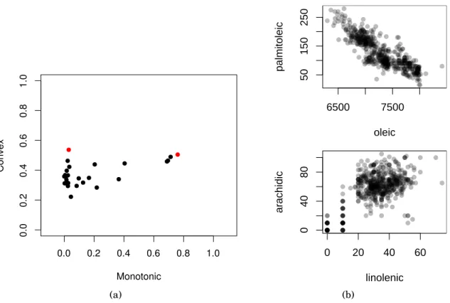
Figure 1.10(a)shows the scatterplot of the convex vs. the monotonic scagnostic mea-sure for all 28 scatterplots of the original olive variates. That is, each point represents one of the ¡8
2 ¢
scatterplots of the olive data. Figure 1.10(b) shows the two scatterplots corresponding to the two coloured dots in Figure1.10(a).
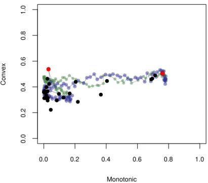
A computationally more involved way of finding an interesting subgraph based on 2d measures is to calculate those measures for a dense set of 2d projections along the 3d or 4d transition. For example, Figure1.11shows how the convex and monotone scagnostic mea-sures change during the two 4d transitions from (palmitoleic, oleic) into (linolenic,
arachidic) and from (palmitoleic, oleic) into (arachidic, linolenic). Given such a transition trajectory of the scagnostic measures, one could then make up rules on whether to include or not an edge as part of a smaller (sub)graph. Also, Fu and Oldford [33] propose
(a) 6500 7500 50 150 250 oleic palmitoleic 0 20 40 60 0 40 80 linolenic ar achidic (b)
Figure 1.10: a) Scatterplot of the scagnostic measures – convex vs. monotonic. b) Par-ticular scatterplots with high monotonic and convex measure, and high convex and low monotonic measure.
3d scagnostic measures that could be used as edge weights of 3d transition graphs.
1.4.2
Dimensionality Reduction/Constructing Dimensions
Finding subgraphs for very high-dimensional data such as image data (i.e. n images) might not be a computationally feasible option. Even a very small 32×32 pixel greyscale image such as this one has 1024 dimensions with¡1024
2 ¢
=523, 776 possible scatterplots. An alternative to finding interesting subgraphs is to construct fewer new dimensions using a dimensionality reduction technique.
Dimensionality reduction is a large research field and many techniques have been pro-posed especially in the last two decades. One major motivation for dimensionality reduc-tion has always been to visualize high-dimensional data. Hence, many such methods arose from geometric intuition and the results are usually interesting to look at.
Figure 1.11: Scatterplot of the scagnostic measures – convex vs. monotonic – overlaid on the scagnostic measures along two 4d transitions from the olive data. The blue path shows the scagnostic measures when linolenic transitions into oleic and arachidic transitions into palmitoleic. The green path shows the scagnostic measures when linolenic transitions into palmitoleic and arachidic transitions into oleic.
We now review some popular dimensionality reduction techniques that originate from interesting geometric motivations. That is, we provide the geometric intuition for prin-cipal component analysis, Fisher discriminant analysis, multidimensional scaling, kernel methods and two manifold learning methods, isomap and locally linear embedding.
Principal component analysis (PCA) goes back to Pearson in 1901. Today, PCA is prob-ably the best known dimensionality reduction method. There are two ways of looking at PCA that lead to the same algorithm. A geometric motivation defines the principal direc-tions as a basis of a hyperplane for which the average squared distance between the points and their projection onto this hyperplane is minimized. Alternatively, principal directions are the orthogonal directions with maximum variance of the projected data points. Hence, the orthogonal projections of the data onto the first principal direction has maximum
vari-ance among all possible orthogonal projections. Further, the original axes can be projected onto the principal directions and visualized with the projected points. Plots that include observations and variates in the context of PCA are called biplots and were proposed by Gabriel [34].
For labelled data, such as the olive data with its area label, one can also use a super-vised dimensionality reduction method. One such method is Fisher Discriminant Analysis (FDA) (Fisher [26]) which was originally defined for two-class data and then generalized by Rao [61, Sec. 9c] for multi-class data. FDA seeks a direction for which the orthogo-nally projected data have a minimal within-group variance and a maximal between-group variance. In general, it is possible to find j, where j≤pfor pdimensional data, mutually orthogonal directions that separate the groups best. Gnanadesikan [37] calls these direc-tions thediscriminant coordinates or CRIMCOORDS. Hence, dimensionality reduction is achieved by projecting the data onto the first j discriminant coordinates.
Multidimensional scaling (MDS) refers to a set of dimensionality reduction techniques that find a low-dimensional embedding or configuration ofn objects in a geometric space (usually Euclidean) so that their interpoint distances correspond to the observed dissimi-larities (or proximities) between the objects. Examples of proximities include correlations, similarity ratings, travel times and metric distances. Hence, MDS can be used with pair-wise dissimilarity data in addition to multivariate data. There are linear and non-linear MDS variants.
Kernel methods map somep-dimensional data into am-dimensionalfeature spacewith the goal of applying a linear method such as PCA, regression, or support vector machines, in this feature space. Letϕ: Rp→Rm denote the mapping into the feature space where usually m> p (m can also be infinite). The “kernel trick” allows us to determine the
m optimal parameters w of the linear model Yw in the feature space without having to explicitly evaluate the mappings yi =ϕ(xi), but rather through the inner product
eval-uations κ(xi,xj)= 〈ϕ(xi) ,ϕ
¡
xj
¢
〉, called kernel evaluations. The kernelization of a linear method involves first finding a dual representation of the optimal parameters w so that the optimization is n- rather than m-dimensional. Next, the optimal solution has to be expressed in terms of the data variates only in the form of pairwise inner products. For
Anouar [6] have shown how to kernelize the Fisher discriminant analysis for multi-class data.
Isomap (Tenenbaum et al. [74]) and locally linear embedding (Roweis and Saul [62]) are two prominent nonlinear dimensionality reduction algorithms in the manifold learning domain. In manifold learning, it is assumed that the data at hand lie on a manifold embedded in the variable space of the data. Optimally, the dimensionality of the manifold is the same as theintrinsic dimensionality. For example, for a set of images portraying an object from different perspectives, the intrinsic dimensionality is defined by the camera position which is the only thing that changes during the image recording. If such images have each p pixels then, even for small monochrome images of size 50×50 pixels, the dimensionality of the data will be 2500. However, the intrinsic dimensionality is maximum 3, assuming the camera always points towards the object and maintains the same distance to the object.
Isomap has the goal to preserve the geodesic manifold distances between data points. These distances are approximated by the length of the shortest path along points that are in close proximity. To do so, a graph G is constructed with nodes representing the data points. The nodes inGget connected if their associated points lie close together. Closeness can be defined as either an absolute distance threshold (i.e. ² region) or as theK nearest neighbours. The edge weights are defined as the distances between the points of their corresponding nodes. The geodesic manifold distance is then approximated by the length of the shortest path between each pair of nodes inG. This distance measure is then used to create a low-dimensional embedding using classical multidimensional scaling.
Locally linear embedding (LLE) (Roweis and Saul [62]) tries to preserve the distances between points in a small neighbourhood. That is, LLE assumes that, given enough points, small neighbourhoods such as theK nearest neighbours are well approximated by linear manifolds.
Some of these dimensionality reduction methods are interrelated, similar, or even equivalent under certain parametrization, see Maaten et al. [49, sec. 5.1].
We find that dimensionality reduction and navigation graphs have a mutually bene-ficial relationship. That is, oftentimes analysts conveniently choose to reduce the
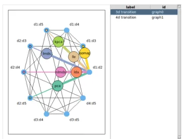
dimen-sionality of the data to two or three dimensions in order to visualize them, whereas using navigation graphs easily accommodates the exploration of 5 to 20 dimensions. In addition, navigation graphs also facilitate the exploration of results from multiple dimensionality reduction methods in parallel. For example, Figure 1.12 shows a 3d navigation graph with 7 “bullets” that each drive a scatterplot display inFigure 1.12(a)using the canonical graph semantic. The data for the projections displayed in these scatterplots come from 7 different dimensionality reduction methods that were used to reduce the olive data to 5 dimensions. The dimensionality reduction methods included in this example are: prin-cipal components analysis (pca), linear discriminant analysis (lda), a variant of Fisher’s discriminant analysis, (classical) linear multidimensional scaling (lmds), non-linear mul-tidimensional scaling (nlmds), kernel principal components (kpca), isomap and locally lin-ear embedding (lle). For lda we used theArealabels of the olive data as group classifiers, for both lmds and nlmds we used the Euclidean inter-point distances as dissimilarity mea-sures, for kpca we used a polynomial kernel of degree 3, for isomap we used the 6 nearest neighbors for calculating the shortest paths, and for lle we used the 6 nearest neighbors to define a small neighborhood. This setting was created with loon, a software we devel-oped for interactive data visualization and introduced later inChapter 3. The scatterplots inFigure 1.12(b) are linked so that points representing the same olive oil share some vi-sual attributes such as color and size. By working with different dimensionality reduction methods, navigation graphs and an interactive setting, one can compare the results of dif-ferent dimensionality reduction methods directly and in real time. TheRcode to recreate this setting can be found in thel_ng_dimreddemo of theloon Rpackage. This demo can be run as follows:
library ( loon )
demo ('l_ng_ dimred ')
Generally, any method producing a lower dimensional embedding can be used to create a smaller navigation graph. In turn, an even smaller sub-graph can be found using the methods discussed inSubsection 1.4.1.
1.5
Other Graphs of Possible Interest
The navigation graph framework is more general than the canonical graph semantic; that is, graphs provide a navigable infrastructure that track a real time morphing from one display of a set of variates into another. Any display on the variates associated with each node would work as long as the graph semantic of an edge transition is defined.
Hurley and Oldford [44] propose some alternate ideas for the semantic of edge tran-sitions. For example, a 3d transition graph could also be used to control a conditioning on the common variates. This conditioning is known as slicing; that is, a transition along the edge (AB,AC) could show the scatterplot of C vs. B for the subset of the data for which A is within a certain range determined by the bullet position. Slicing controlled by a navigation graph can be extended in a straightforward manner to categorical data. The scatterplot could then be replaced by a mosaic plot or eikosogram (Cherry and Oldford [16]).
Navigation graphs can also represent more than two dimensions on each node. Navi-gation graphs with nodes representing a set of k variates are calledkd space graphs. Let
S(p,k) denote a complete kd space graph for pvariates. S(p,k) can be decomposed into graphs S(p,k,i) whose edges connect nodes that share exactly ivariates, and
S(p,k)= k−1
X
i=0
S(p,k,i).
For example, edges on a 3d space graph with 4d transitions (i.e. some subgraph of
S(p, 3, 2)) can define a rotation of two disjoint variate sets. This rotation can be visualized with a 3d point cloud. Alternatively, the common variates can be used for conditioning in slicing.
If the edges in a 3d space graph define 6d transitions (i.e. their connected nodes do not share any variates) then a transition can represent a morphing of a scatterplot matrix into another using 4d transitions as described in section 1.3.1. For example, a transition from the scatterplot matrix of ABC into DEF can be visualized by transitioning ABinto
In a 4d space graph with only 6d transitions such as ABCD→CDEF, it is possible to dynamically morph Cleveland’s conditional plot (Cleveland [17]) of (A,B)|(C,D) into that of (E,F)|(C,D).
1.6
Interactive Data Visualization Software
We wrote the RnavGraphsoftware (see Chapter 2) that implemented a user interface for navigation graphs by providing a “bullet” on a graph to drive the transitions, as proposed by Hurley and Oldford [44]. WithRnavGraphour goal was to interactively analyze data in theRstatistical environment [60] using navigation graphs. While working on the interac-tive graph we investigated various options for readily available interacinterac-tive scatterplots in
R; it became obvious to us that interactivity for both the graph and the scatterplot display – or any display for that matter – was important for effectively using navigation graphs.
There is a long history of the design and development of interactive visualization soft-ware for exploratory data analysis dating back to at leastPRIM[27] in 1973. Other exam-ples include Quail [43], Lisp-stat [76], Plot Windows [67], DINDE [58], DataDesk [80],
Data Viewer[40], thegobifamily [68,13,69,47],iplots[79] andMondrian[75]. Among other features, these systems provide a scatterplot that supports the following features: dynamic zooming and panning via mouse gestures and some form of brushing and linking (we are not completely sure aboutPRIMand linking).
These systems take different approaches to providing interactive data visualizations graphical user interfaces (GUI). PRIM, Data Desk, Data Viewer, the gobi family and
Mondrianprovide in essence an encapsulated environment to visualize and explore data. That is, they have limited or no connection to a complete statistical system with a major user community such as R. Hence, creating new plots and control widgets dynamically from a command line interface and incorporating various statistical analyses is not pos-sible with these systems. On the other hand, Quail andLisp-stat do support dynamic creation and incorporation of statistical analyses, but they are not integrated into a com-plete statistical system; adding new statistical tools toQuailorLisp-statinvolves their respective authors having to write these tools first, see for example Anglin and Oldford [4].
Finally,iplotswas designed to bring interactive graphics to theRenvironment. However,
iplotsuses actions in menus that cannot be controlled via the command line.
ForRnavGraph, we first used the interactive scatterplot display ofGgobivia therggobi
R package [47]. However, we were missing some important features such as advanced point glyphs for the scatterplot display including images, text and star glyphs. We also found that installingrggobiwas difficult on certain operating systems which would have limited the potential users of RnavGraph package. We were frustrated with not having interactive tools whose value in exploratory data analysis has long been known (at least 20 or more years ago [70,51,7,42,2]) that were integrated with commonly used and sta-tistically rich set of more formal analysis tools (as provided for example by the open source system,R). This frustration is shared by others. At a recentR users conference, Di Cook [22] shared her frustration and listed the following “challenges to the young developers”:
• Interactivity on the plot • Different types of brushes
• Different kinds of linking between plots • Programmability
• Strong connection with model fitting • Portability, easy install, web compatible • Large quantities of data
• Incorporating inference • Conceptual framework
We ended up writing our own interactive scatterplot displaytk2das part of the
RnavGraph Rpackage, seeSection 2.3. Motivated from the results oftk2dwe took up de-signing and implementing a new interactive general-purpose visualization system called
loon. We reflect inChapter 8on howloonmeets the challenges set by Di Cook.
This thesis is structured as follows. In Chapter 2, we discuss RnavGraph, a software environment for interactively exploring data using navigation graphs. In Chapter 3, we
present a visual exploratory analysis of the visible minority populations distributed across major census metropolitan areas of Canada. We highlight visualization and interaction methods that are used for this analysis. We endChapter 3with an introduction of loon and discuss howloonis used to perform the visual analysis of the minority data. To that means, we introduce the relevant conceptual aspects of theloonframework.
InChapter 4andChapter 5, we presentloon’s framework in detail.Chapter 6presents some relevant statistical applications that were enhanced with interactive visualization in
loon. InChapter 7, we introduce some novel tools inloonfor exploring high-dimensional data with navigation graphs. We conclude this chapter by introducing a novel high-dimensional point glyph called spiro glyph. Chapter 8 wraps up this thesis with con-clusions and a discussion of future research work.
(a) Navigation graph with canonical graph semantic and bullets representing different dimensionality reduction methods.
(b) Scatterplots driven by the location of the bullet corresponding to a particular dimensionality reduction method.
Figure 1.12: Comparing seven dimensional reduction methods using navigation graphs with the canonical semantic.
Chapter 2
RnavGraph
As part of our research, we have developed a software package called RnavGraph that provides an interactive environment to explore high-dimensional data using navigation graphs.RnavGraphis an open source package for theRstatistical environment and hosted on the Comprehensive R Archive Network (CRAN).
RnavGraph is a major milestone in our research as it represents a first implementa-tion of the concept of navigaimplementa-tion graphs and it demonstrates that, in practice, navigaimplementa-tion graphs are useful to explore real data. We designedRnavGraphto be flexible so that novel graph semantics can be applied and tested.
The design ofRnavGraphis an important part of our research. This design includes the selection of essential features for an useful interactive navigation graph environment, the software architecture and the user experience design.
In this chapter, we discuss the functionality of theRnavGraph package. We first show how to initialize anRnavGraphsession for the canonical graph semantic. We then describe the user interactions with the two main displays: the navigation graph display and the 2d scatterplot display. Next, we present part of the software architecture and show how
RnavGraphcan be extended to accommodate a new graph semantic. We end this chapter by listing some limitations of theRnavGraphpackage.
Many examples included in this thesis use the olive data first introduced in Subsec-tion 1.3.1. We thereforeattachthe olive data inRwhich allows us to refer to its variables by their names (i.e. Areavs. olive$Area).
attach ( olive )
We also create a second data set calledoliveAcidsthat includes only the fatty acid vari-ables, but not theRegionandAreavariables.
oliveAcids <- subset (olive , select =-c(Area , Region ))
2.1
A Default RnavGraph Session
RnavGraphis started from within anRsession. The canonical 2d scatterplot example, as described inSubsection 1.3.1, is the default setting and requires the following code: nav <- navGraph (ng_ data ( name =" olive ", data = oliveAcids , group = Area ))
This code produces the navigation graph display as shown inFigure 2.1(a)and the scat-terplot display calledtk2d as shown inFigure 2.1(b). Note that the default group colors assigned to the points in thetk2dscatterplot display inFigure 2.1(b)do not correspond to the color key for the olive data defined inFigure 1.1.
The navigation graph display and the scatterplot display in Figure 2.1 form the core components of the RnavGraph package. However, the navigation graph can control any display accessible fromRusing any user defined graph semantic.
The most important user interactions with the navigation graph in Figure 2.1(a) are simple; the yellow “you are here” bullet can be dragged along the graph, and controls the 3d rotation or 4d transition shown in the scatterplot display inFigure 2.1(b). The 4d transition graph is accessible via the Graph menu.
2.2
The Navigation Graph Display
We now describe the user interactions with the navigation graph display with the help of stylized drawings. These drawings follow the color scheme of the default settings of
(a) interactive 3d transition navigation graph
(b) interactive 2d scatterplottk2d
Figure 2.1: DefaultRnavGraphsession with the default group colors.
RnavGraph. However, the appearance of the navigation graph display can be customized by the user.
A stylized version of the navigation graph display with a 3d/4d transition graph for the four variates A, B, C, and D looks as follows:
A:B
A:D B:C
C:D 0
The two main elements in the navigation graph display are the navigation graph in the center and a number between 0 to 99 in the upper right corner. This number shows
We use visual clues to guide the user interactions with the graph. Graph nodes are either orange or dark gray (i.e. or ) depending on whether the node is adjacent to the bullet or not. The graph edges are wide when they connect the bullet to an adjacent node or thin otherwise. An edge that has been completely traversed by the bullet will change its color from dark to light gray . Moving the mouse pointer over a node, edge or label will highlight that element green (i.e. and ), whereas moving the mouse over the bullet will highlight it light red .
The default initial graph layout arranges the graph nodes on a circle. The user can manually move the nodes and labels on the navigation graph display by dragging the elements while pressing the CTRL key. The labels are restricted to lie within a certain radius of the node.
A:B A:D B:C C:D Ctrl & Drag 0 A:B A:D B:C C:D Ctrl & Drag 0
There are several ways to navigate the bullet on a graph. The most intuitive way is to drag the bullet towards an adjacent node. If the bullet is located on a node (i.e. the percentage number is 0) then dragging the bullet will select an edge once it is moved past a small circular decision boundary around the start node. The bullet will then lock onto the adjacent edge that is closest to the suggested dragging direction. The visual clues (as described above and highlighted in the diagram below) will signal that the bullet has locked on an edge and the percentage number will be greater than 0. Once the bullet locks to an edge, it can be either dragged or moved with the mouse scroll wheel.
A:B A:D B:C C:D 40 A:B A:D B:C C:D Drag 0 A:B A:D B:C C:D 0
The success of selecting the intended edge for traversal depends on the user’s precision in dragging the bullet, but also on the graph layout; that is, if multiple adjacent nodes are located close together it might be hard to drag the bullet in the desired angle away from the node. In this case, one can first select the desired adjacent node to lock the bullet on the corresponding edge. If a non-adjacent node (i.e not orange) is selected at any time, then the bullet will jump onto that node.
A:B A:D B:C C:D Drag 40 A:B A:D B:C C:D 0 A:B A:D B:C C:D
Select adjacent node 0
A transition can also be automatically traversed or animated by double clicking on an adjacent node. The number of steps (i.e. the rotation resolution) and the animation time can be changed in the navigation graph display settings.
A:B A:D B:C C:D 0-99 A:B A:D B:C C:D Double Click 0 A:B A:D B:C C:D 0
A sequence of edge transitions (i.e. a path) can also be defined and animated (“walked”). Paths can be defined manually or with theng_walkfunction. A path is defined manually by Shift selecting a node sequence. Note that this requires the bullet to lie on a node.
A:B
A:D B:C
C:D
0
Shift & Select
A:B A:D B:C C:D 0 A:B A:D B:C C:D
Shift & Select 0
A:B
A:D B:C
C:D
Shift & Double Click 0 A:B A:D B:C C:D A:B A:D B:C C:D 0
Paths can be saved, re-loaded, commented on, and re-walked with the path tool, as seen inFigure 2.2. The path tool is accessible from theTools > Pathsmenu.
Figure 2.2: Path tool
2.3
The tk2d Scatterplot Display
Thetk2dscatterplot display, as seen inFigure 2.1(b), is a powerful interactive scatterplot display that is native toRnavGraph.
We developedtk2dbecause there was no available interactive scatterplot display that we found adequate for testing the navigation graph framework. We initially linked the navigation graph to the scatterplot display of GGobi [69], but later on we decided to im-plement our own scatterplot display as GGobi has not seen any major development in recent years and we needed more features such as plotting images as point glyphs. We keptGGobisupport for versions ofRnavGraphup to version 0.1.5, but eventually removed it with the release of R 3.0.0 as at that time rggobi was not available on CRAN for all operating systems.