Graphical Spreadsheet
Simulation of Queues
Armann Ingolfsson
School of Business
University of Alberta
Edmonton, Alberta T6G 2R6, Canada
[email protected]Thomas A. Grossman, Jr.
Faculty of Management
University of Calgary
2500 University Dr. NW
Calgary, Alberta, Canada T2N 1N4
Abstract
Graphical representations of spreadsheet queueing simulations can be used to teach students about queues and queueing processes. A customer graph shows the experience of every individual customer in a queue, based on arrival time, start of service, end of service, and showing clearly the length of time in queue and service time for each individual customer. The cumulative effect is powerful, illus-trating how one long service time (or short interarrival time) can cause delays for many succeed-ing customers. The server graph (a Gantt chart) shows the experience of each server, illustrating how customers stack up, and the nature of periods of idle time. The graphs are linked to a spreadsheet simula-tion and update instantly when the simulasimula-tion is rep-licated. The graphs illustrate the complete evolution of a queue (which simulation animations cannot do) and help provide a holistic view of queues. They can be used to teach students about the nature of queues and support active learning where the stu-dents articulate for themselves the cause of queue behaviors.
This paper shows how graphical representations of spreadsheet queueing simulations can be used to give students a richer understanding of queues, provide a deeper understanding of simulation, and to serve as a lead-in to teaching queueing theory results. This paper builds on previous work on spreadsheet queue-ing simulation (Grossman, 1999), with the relevant material summarized in sections 2-4. The contribu-tion of this paper (seccontribu-tions 5-8) is the development and use of "live" simulation graphs to provide a rich visual means for understanding queues and simula-tion, and techniques for using these graphs to moti-vate students, enhance their learning, and stimulate their interest in simulation.
The queueing simulation and their graphical repre-sentations were implemented in Microsoft Excel 97, and any specific instructions below refer to this soft-ware package.
1. Introduction
Queuing theory has always been a staple in survey courses on management science. Queueing theory is a powerful tool for computing certain steady-state queue performance measures. However, queueing theory is a poor vehicle for teaching students about what transpires in queues. For example, queueing theory tells us that, other things being equal, a queue with higher service time variability has longer aver-age queueing time than a queue with lower variabil-ity. (Note that we are using "queueing theory" to mean what it usually means to students taking a sur-vey course in management science: a small collec-tion of formulas, typically for single server Mark-ovian queues.) However, queueing theory yields no insight into why this occurs.
Spreadsheet queueing simulation can be used to give students insight into queue behavior -- why queues form, why they persist, the role of variability, and the non-linear effect of increasing utilization on queue performance. In this paper we extend previ-ous work on spreadsheet queueing simulation to pro-vide a graphical representation of queue behavior. This graphical representation, which is connected to a live simulation model, allows students to ar-ticulate for themselves powerful insights about queue
behavior. This enhances their intuition about queues and stochastic phenomena in general, and gives them a solid foundation to utilize queueing theory formu-las when appropriate.
2. Approaches to Teaching Queueing
There are three approaches to teaching about queue-ing: analytical queueing theory, dedicated simula-tion packages, and spreadsheet simulasimula-tion.
Queueing theory is widely taught in business school OR/MS survey courses, and students can use it to quickly compute a handful of steady-state perfor-mance measures for simple queueing systems. As presented in textbooks for management science sur-vey courses (for example, Camm and Evans 1996, Winston and Albright 1997, or Ragsdale 1998), queueing theory is limited because the models are simplified to make them analytically tractable, the results apply only to steady-state behavior, and the number of performance measures that can be com-puted is small. Because deriving results using queue-ing theory models requires mathematics beyond the scope of the survey course, they are presented as black box formulas, and students do not gain the insights that OR/MS professionals obtain by study-ing the underlystudy-ing theory.
Steady state queueing theory results are not particu-larly useful for understanding what actually tran-spires in queues: their dynamics, the effect of vari-ability, human behavior while waiting in line, and such important technical issues as the role of initial conditions and the distinction between transient and steady-state behavior.
Simulating queues using dedicated software pack-ages is flexible, powerful and widely used. It is of-ten the best technology for computing quantitative results. Many simulation packages are available, such as SLAM, GPSS, Extend+, and Arena. How-ever, simulation packages hide the mechanics of queues, are expensive and time-consuming to learn, and are not widely used in survey courses on OR/ MS, although Liberatore and Nydick (1999) argue that they should be.
3. Overview of Simulating Queues in Spread-sheets
Any spreadsheet model can be simulated using tech-niques that can be found in survey textbooks such as Ragsdale (1998) or Winston and Albright (1997). There are three classes of spreadsheet simulation models (Evans and Olson, 1998), activity-driven, event-driven, and process-driven, each of which can be used for queueing simulation.
An activity-driven simulation describes the activi-ties that occur during fixed intervals of time (for example, an hour, day, or week), typically using one row of the spreadsheet for each time interval. The activity-driven approach (often used in textbook inventory models) seems to have first been used for queueing by Clauss (1996) for ship unloading. How-ever, we think this approach oversimplifies most queueing systems, unless the simulation time inter-vals are made very small - which makes the spread-sheet model very large.
An event-driven simulation describes the changes in the system at the moment of each stochastic event, typically using one row of the spreadsheet for each event. This approach was apparently first used for queueing by Winston (1996) for a single-server queue. Evans and Olson (1998) describe a similar model . The event-driven approach has technical advantages of efficiency and flexibility, but it is not good for teaching because it obscures the customer experience of queues, and it is less intuitive than the process-driven approach.
A process-driven simulation (Figure 1) models the logical sequence of events for each customer, typi-cally using one row of the spreadsheet for each cus-tomer. This approach was apparently first used for queueing by Chase and Aquilano (1992), who present a model of two serial single-server queues with zero queue size. Process-driven simulation was first described in a management science textbook by Plane (1994) for a model of a single-server queue. Grossman, Tran, and Ursu (1997) developed proto-types of multiserver process-driven models, includ-ing balkinclud-ing, reneginclud-ing, and multi-server serial queues. Hesse (1997) extends Chase and Aquilano's model by allowing the second queue to hold one customer. Camm and Evans (1996) and Lawrence and
Pasternack (1998) contain single-server process-driven models. Evans and Olson (1998) describe one-and two-server process-driven models. Grossman (1999) discusses in detail the use of process-driven spreadsheet queueing simulations. Evans (2000) uses a single-server process-oriented queueing model similar to Figure 1. He presents live graphs of aver-age performance measures, including averaver-age num-ber in queue, average percent idle time, and average waiting time per customer, and indicates that indi-vidual replications demonstrate different times to converge to the long-term average value.
4. Process-Driven Spreadsheet Queueing Simulation
A process-driven spreadsheet queueing simulation (Grossman 1999) uses one row for each customer. We provide students with a paper template of the spreadsheet (Figure 1) with all cells except interarrival times and service times blank and work with them to fill out the template, computing for each customer the arrival time, service start time, end time, wait time, and so forth. This by-hand simu-lation insures that every student understands how
the model functions.
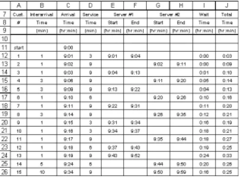
In the spreadsheet model, the user enters the start time and end time of the simulation. The user pro-grams probability distributions for interarrival time and service time. The spreadsheet model samples the distributions and computes the values shown in Figure 1. A screen shot of the spreadsheet is in Figure 2. De-tails of how these models are pro-grammed and instructions for downloading spreadsheet queue-ing simulation template files can be found in Grossman (1999). Interarriv al Time (min) Start (hr:min) End (hr:min) Start (hr:min) End (hr:min) start 9:00 1 1 9:01 3 9:01 9:04 0:00 0:03 2 1 9:02 9 9:02 9:11 0:00 0:09 3 1 9:03 9 9:04 9:13 0:01 0:10 4 3 9:07 9 9:11 9:20 0:04 0:13 5 3 9:10 9 9:13 9:22 0:03 0:12 Server #2 Wait Time (hr:min) Total Time (hr:min) Cust. # Arrival Time (hr:min) Service Time (min) Server #1
Figure 1: A two-server queueing simulation template. The entries in bold are included on the template. Students use the bold entries to compute the italicized entries.
Figure 2: interactive version (opens new window; requires Internet Explorer 4.01 or later)
We now discuss the key idea of this paper, which is to represent graphically the results of a spreadsheet queueing simulation such as the one shown in Fig-ure 2.
5. Graphical Representations of a Spreadsheet Queueing Simulation
We have integrated two graphical representations with the spreadsheet queueing simulation templates. These graphs are "live" in the sense that when the spreadsheet is recalculated (for example, by press-ing the F9 key in Microsoft Excel) the graphs in-stantly change to reflect a new replication. We refer to the two representations as the customer graph and the server graph. For each graph, we discuss the form of the graph and how it can be programmed. In the Appendix we indicate how spreadsheet queueing simulations containing these graphs may be down-loaded.
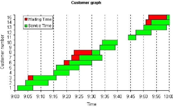
5.1 The Customer Graph
Figure 3 shows the "customer graph". The horizon-tal axis measures time. The vertical axis displays the customer number, with customer 1 the first to arrive, customer 2 the second to arrive, etc. (column A of Figure 2). A two-color horizontal bar repre-sents the experience of each customer. The left hand portion of the bar represents the customer's waiting time (this is absent if the customer does not wait). The right hand portion represents the customer's ser-vice time. The left edge of the bar is placed at the customer's arrival time (column C of Figure 2) to the system. The separation between the colors is the start of the customer's service (columns E and G of Figure 2). The right edge of the bar is the time of end of the customer's service (columns F and H of Figure 2).
In contrast to animated simulation packages, the customer graph shows the entire evolution of the system on one graph.
When the simulation is replicated (that is, the spread-sheet is recalculated, by pressing the F9 key), the customer graph is updated instantly and automati-cally. The updated graph reflects new samples from the interarrival and service time distributions, and the corresponding customer arrival times, service start times, and service end times.
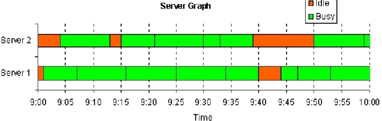
5.2 The Server Graph
Figures 4 shows the "server graph" (a Gantt chart) corresponding to the same replication as Figure 3. The horizontal axis measures time. The vertical axis shows the server index. The server graph represents each server by a horizontal bar whose length equals the duration of the simulation. Each server bar is divided into sections whose color indicates whether the server was busy (serving a customer) or idle dur-ing that time interval. The busy sections are broken
up by vertical lines to show when the server fin-ished serving one customer and immediately began serving the next customer.
Like the customer graph, the server graph is updated instantaneously when the simulation is replicated (that is, the spreadsheet is recalculated).
Figure 5 shows both the customer and server graphs for three replications. When viewed in a web browser, the Figure cycles automatically through the three replications.
5.3. Programming the Spreadsheet Queueing Simu-lation Graphs
It is easy to program the spreadsheet queueing simu-lation graphs. However, some non-standard tech-niques are required. We summarize here the steps required to program the graphs in Microsoft Excel 97.
The steps for constructing the customer graph are: 1 Program in this order each customer's arrival
time, time in queue, and time in service. 2 Graph these data using Excel's built-in "stacked
bar chart."
3 Format the arrival time series to have no area and no border (this makes the series invisible on the chart).
4 Format one of the visible series (time in queue or time in service) to have zero gap width Figure 5: Customer and server graphs. When viewed in a web browser, the Figure will cycle through
(double-click the series and choose the options tab). The zero gap width will be applied to both visible series. Now, one can interpret the upper envelope of the bars to be the cumulative num-ber of arrivals to the system as a function of time. Constructing the server graph is more complicated than constructing the customer graph. The steps are as follows.
1.Create a column for each server that contains all the start and end times of services performed by that server, sorted in ascending order. Excel's SMALL(range, i) function (which finds the i-th smallest number in range) can be used to do this, assuming all the start and end times for a par-ticular server are in a contiguous range (for ex-ample, see columns E and F in Figure 2, for server 1).
2.Select the columns corresponding to all the serv-ers and plot them using Excel's built-in clustered bar chart. Instruct Excel that the data is orga-nized in rows, rather than columns.
3.Format one of the series to have an overlap of 100.
4.Reverse the order of the series.
5.Change the area color of the series so they alter-nate - corresponding to busy and idle intervals. The customer and server graphs display time on the horizontal axis using Excel's time format, assuming the underlying data is formatted to display as time. Unfortunately, Excel defaults to using rather strange times to display on the horizontal axis, such as 8:38. The Appendix shows VBA code that overcomes this problem. The code executes every time the worksheet recalculates (and therefore, every time the simulation is replicated). It sets the lower and upper limits on the time axis to be the ones specified for the simulation and chooses approximately ten time instants to display between the upper and lower lim-its. The interval between two consecutive displayed times is constrained to be a multiple of 5 minutes.
6. Uses of the Spreadsheet Queueing Simulation Graphs
The spreadsheet queueing graphs help communicate clearly the function of a complex model. Although we have students in class fill out by hand the tem-plate in Figure 1, the richness of the model does not seem to be fully appreciated until the moment we recalculate the worksheet while viewing the cus-tomer graph. In addition, repeated replications seem to help students more fully internalize the function of simulation models. In contrast to queueing theory formulas (and to some extent simulation packages) the spreadsheet simulation is not a black box. Stu-dents can do the simulation by hand, and hence it is easier to grasp the functioning of the model. Because of the rich graphical presentation, complex data are easily interpreted, particularly by students with weak quantitative skills. With some facilita-tion from their instructor, students can articulate the insights themselves. This reduces their dependence on the instructor. Such active learning presumably results in deeper understanding and better long-term retention.
Students can see for themselves the impact of vari-ability by observing multiple replications of two models that differ only in the variance of service time. This in turn leads to student insights into why queues form -- particularly when utilization (arrival rate divided by total service rate) is significantly lower than 100%. Likewise, the simulation model can quickly be programmed to have a very brief interarrival time, or a very long service time (or one can hit F9 several times until such an effect occurs) so students can observe. This helps students under-stand why queues persist after forming. These in-sights are not possible with queueing theory formu-las, and are harder to obtain with simulation anima-tions.
The utilization performance measure often indicates that servers have idle time. It is attractive to devote this idle time to useful work, but this is problematic in many real situations. The server graph shows the nature of server idle time, and allows students to observe the challenge of harnessing the idle time periods. The graph makes obvious the stochastic
nature of server idle time, which makes difficult any attempt to plan useful work between customers. The server graph also shows the length of server idle periods, highlighting that they are often too short to be useful.
7. Advanced Topics Using Spreadsheet Queueing Simulation Graphs
We use spreadsheet queueing simulation graphs to teach several advanced topics to business students. The graphs have proven useful for an intuitive proof of Little's Law, to teach the craft skill (Powell 1998) of cleaning flawed data, and for linking microscopic features of queues (for example, arrival times of in-dividual customers) with macroscopic measures (for example l, the average arrival rate to the system), and for understanding non-linear changes in queue performance as utilization increases.
7.1 Little's Law
The idea for the customer graph originally came from a diagram that is sometimes used to derive Little's law - for example, see Figure 2.3 in Kleinrock (1975). Our informal derivation goes as follows. Define A(t) to be the cumulative number of arrivals up to time t, D(t) to be the cumulative number of departures up to time t and L(t) = A(t) - D(t) to be the number in system at time t, as shown in Figure 6.
Then the average arrival rate of customers is
λ = A(t)/t (1) Now let
F(t) = area of shaded region from 0 to t in Figure 6 = total system time for all customers
= total number of "customer-hours"
We now see that the average system time of a cus-tomer is
W = (total system time for all customers)/(to tal number of customers)
= F(t)/A(t) (2) The average number of customers in the system is L = (total "customer-hours")/(total hours)
= F(t)/t (3)
Combining (1), (2), and (3) we see that L = λW
of us has used this informal derivation in a 4th year undergraduate business course for a few years. The better students usually notice, and point out, that equation (2) is only approximately true, unless t is chosen so that L(t) = 0, that is, the system is empty at time t. Otherwise, F(t) will not include all of the system time for the last few arriving customers. This, and the implicit assumption of first-in-first-out, is what makes the derivation informal.
7.2 Cleaning Data and Checking Assumptions One very real problem that anyone who tries to ap-ply queueing theory is often faced with is imperfect data. Figure 7 shows a particularly troublesome part of a real dataset that one of us has used as the basis for an assignment. The Figure shows the times at which customers arrived to a "water kiosk" in a third world country, entered service ("arrival at tap"), and Figure 6: Informal derivation of Little's law.
departed after receiving service. Unfortunately, many of the numbers are missing. Some students might have seen examples of imperfect data sets in a prior statistics course. If the data set can be thought of as consisting of several independent draws from the same distribution, then one option is to simply re-move the missing observations from the data set. Here, the situation is more complicated - one cannot simply remove a customer with one or more miss-ing numbers from the dataset, because that customer may interact with other customers in important ways. The choice is really between modifying the data set intelligently or not using the data set at all. The op-tion to use the data set after removing all missing observations is not realistic in this case.
Some of the missing data are easy to estimate, par-ticularly the arrival times. For example, a reason-able estimate for the missing arrival time for cus-tomer 72 would be the average of the arrival times of customers 71 and 73. When several arrival times in a row are missing (such as for customers 74-76) one can estimate the missing times such they are equally spaced between the last known arrival time and the next known arrival time. In addition, one
will have to make sure the arrival time of a cus-tomer is always less than or equal to the "arrival at tap" time for that customer, if it is known.
The missing departure times can also be estimated fairly easily. One can estimate the average service time, using customers for which both "arrival at tap" and "departure time" are available. Then one can estimate the missing departure times as "arrival at tap" plus the average service time (2 minutes and 34 seconds in this case).
The tricky part is estimating the missing "arrival at tap" times. These should be estimated in a way that is consistent with the queue discipline (first-come-first-serve) and the number of servers (two). This is
where the customer graph can help.
Figure 8 shows a customer graph for the data shown in Figure 7, after the missing arrival times and de-parture times have been estimated as explained above. The "arrival at tap" times have been set equal to the arrival time of the respective customers, to provide initial estimates.
Arrival Number Arrival Time Arrival at Tap Departur e Time 70 8:21 8:21 8:27 71 8:25 8:26 8:32 72 ? ? 8:30 73 8:28 8:31 8:34 74 ? ? 8:30 75 ? ? 8:31 76 ? 8:31 ? 77 8:33 ? 8:41 78 8:34 ? 8:37 79 8:35 8:41 8:49 80 ? ? 8:36 81 8:36 8:42 ? 82 ? ? 8:40 83 8:39 8:41 8:43
Figure 7: Imperfect transactional data for a water kiosk.
A close look at Figure 8 shows that the "arrival at tap" time for customer 72 must be adjusted from its current value of 8:26:30. A server does not become available until 8:27, when customer 70 departs. The next customer with missing "arrival at tap" data is customer 74. From the queueing graph, we see that this customer will not have access to a server until customer 72 departs, at 8:30. Continuing in this fash-ion we can replace all the missing "arrival at tap" times with estimates that are at least consistent with how the system operates.
It is even possible to do the estimation graphically in Excel, by grabbing the vertical line correspond-ing to an "arrival at tap" time and movcorrespond-ing it. When one does this, Excel brings up the goal seek dialog box, and asks what "changing cell" to use. Enter the cell with the missing "arrival at tap" data and click OK, and Excel will adjust the data to correspond to the new position of the vertical line in the graph. Some students enjoy applying this procedure because the can concentrate on the graphical representation rather than precise numbers on the time scale, but for other students the complexity of the procedure is an impediment.
The customer graph can also be used to examine the validity of assumptions about how the system oper-ates. For example, we notice that customer 74 de-parts from service before customer 73 enters ser-vice. So the queue does not operate in a truly first-come-first-serve manner at all times (and this is not an artifact of how we estimated the missing data -the "arrival at tap" for customer 73 and -the depar-ture time of customer 74 were both recorded). The customer graph also shows that customers 71, 73, and 76 are all receiving service simultaneously, de-spite the system having only two servers (again, this is based on numbers that were actually recorded, not our estimates of missing number). Apparently, customers "shared servers" at certain times. It is easy to throw one's hands up in frustration and ask for better data, but in reality that might not be an option. Customer graphs can help pre-process the data in an intelligent way to allow the best analysis that is possible, given the quality of the data. Queue-ing graphs also help the analyst see whether assump-tions about how the system operates are supported by the data.
7.3 Linking Transactional Data to Macroscopic Pa-rameters
The customer graph displays almost all there is to know about a queueing system in one picture. To use a term coined by Edward R. Tufte [Tufte, 1983], the customer graph has a high data-ink ratio. The average arrival rate to the system (l) can be visual-ized as the (average) slope of the A(t) curve in Fig-ure 7, and estimated numerically as A(t)/t as dis-cussed above. The number in system at any time t can be visualized as the vertical distance between A(t) and D(t). The average number in system (L) can be visualized as the average vertical distance between A(t) and D(t). Hence, the customer graph can be used to illustrate both such macroscopic pa-rameters as l and L, and microscopic transactional data (arrival time, waiting time, service time) for every customer -- all in one picture. This can help to explain the link between the detailed behavior of a queue over time (which students usually understand easily) and average measures of performance, such as L and W (which students usually have more dif-ficulty interpreting).
7.4. The Effect of Increasing Utilization on Queues As a first order approximation, many students be-lieve intuitively that utilization less than 100% means that no queue should form. The customer graph al-lows them to see that a queue does form if there is variability in arrivals or service, and the size of the queue increases non-linearly as utilization gets close to 100%. They can articulate for themselves why this is so.
8. Benefits of Spreadsheet Queueing Simulation Graphs
The use of spreadsheet queueing simulation graphs can enhance student understanding of queues. By providing a rich visual representation of the com-plete evolution of a queue, complex queue behavior can be presented to students so that they can articu-late the insights themselves, rather than relying on the instructor for wisdom. The ease with which rep-lications can be made and instantly presented on the
graph makes the basic concepts of simulation very clear to students. It also shows how simulation (in a spreadsheet or in dedicated simulation software) can be used to model complex business processes. Graphical spreadsheet queueing simulation is a strong lead-in to traditional queueing theory results. Students develop intuition regarding queues in gen-eral. They easily grasp the distinctions among one arrival, one particular day's queue (or one replica-tion), average performance in a single day, and av-erage performance across many days. It is easier for students to understand the meaning of queueing theory results, and to appreciate the limitations of the average results that most queueing theory mod-els yield. In turn, the hard work required to imple-ment a spreadsheet queueing simulation makes them appreciate the speed with which queueing theory provides results.
Finally, spreadsheet queueing simulation increases student interest in learning simulation software (and taking elective courses in simulation). Business stu-dents find spreadsheet simulation of queues to be inherently interesting. This makes them excited about simulation in general. However, programming spreadsheet queueing simulations, even with the templates in Grossman (1999) can be cumbersome. When we demonstrate a simulation package such as Arena and indicate that a queue which requires hours of spreadsheet programming can be programmed in under 1 minute in Arena, students take note. Simu-lation elective enrolments have increased since we started using spreadsheet queueing simulation in the required course.
9. Conclusions
We discussed the use of spreadsheet queueing simu-lation graphs to enhance student understanding of queues and of simulation. Use of this technique seems to increase student interest in elective courses in simulation.
We look forward to using the server graph in re-search work with call center managers exploring the possibility of mixed inbound-outbound call centers where outbound calls are made during periods of
idleness in a pure inbound call center. It is difficult to understand and communicate the size and stochas-tic nature of the time windows for outbound calls. The server graph provides a powerful stochastic rep-resentation of these time windows.
10. Appendix
10.1 Software Downloads
A family of spreadsheet queueing templates with customer and server graphs for queues with balk-ing, renegbalk-ing, and both balking and reneging can be downloaded from http://www.bus.ualberta.ca/ aingolfsson/simulation/ [local copy] .
10.2 VBA Code
The following VBA code scales the time axis on the customer and server graphs in a way that we find more pleasing than Excel's default scaling. The code needs to be associated with the worksheet that con-tains the graph. The name of the worksheet does not matter. Copies of this same subroutine can be associated with several worksheets, if desired. Cells with the names start_time and close_time must exist somewhere in the workbook. The code scales the value axis of every chart in the worksheet it is associated with.
Private Sub Worksheet_Calculate()
Dim N As Long, I As Integer
Dim X As Double
N = ActiveSheet.ChartObjects.Count
' Find open time in minutes
X = ([close_time] - [start_time]) * 24 * 60
' Find how many 5 minute intervals in open time.
' Then divide by ten and take integer value. The result,
' times 5 minutes, will be the interval length. Therefore,
' there will be approximately ten inter-vals, and each interval
' will be a multiple of 5 minutes.
X = Int(X / 10 / 5 + 1) For I = 1 To N W i t h ActiveSheet.ChartObjects(I).Chart.Axes(xlValue) .MinimumScale = [start_time] .MaximumScale = [close_time] .MajorUnit = 1 / 24 / 60 * 5 * X End With Next I End Sub
11. References
Camm, J. D. and J. R. Evans (1996). Management Science: Modeling, Analysis and Interpretation, South-Western College Publishing, Cincinnatti, OH. Chase, R. B. and N.J. Aquilano (1992), Production and Operations Management, sixth edition, Rich-ard D. Irwin, Chicago, IL.
Clauss, F. J. (1996), Applied Management Science and Spreadsheet Modeling, Duxbury Press, Belmont, CA.
Evans, J. R. and D. L. Olson (1998), Introduction to Simulation and Risk Analysis, Prentice Hall, Upper Saddle River, NJ.
Evans, J.R. (2000), "Spreadsheets as a Tool for Teaching Simulation", INFORMS Transactions on Education, Vol. 1, No. 1, http://ite.informs.org/ Vol1No1/evans/evans.html
Grossman, T. A., Tran, K. and Ursu, G.D. (1997), "Prospects and techniques for dynamic discrete event simulation in spreadsheets," Proceedings of the In-ternational Association of Science and Technology for Development International Conference on Ap-plied Modelling and Simulation, Banff, Canada, July, available at http://www.ucalgary.ca/~grossman/ simulation/history.htm.
Grossman, T. A. (1999), "Spreadsheet Modeling and Simulation Improves Understanding of Queues," Interfaces vol.29, no.3, pp.88-103. Templates avail-able from http://www.ucalgary.ca/~grossman/simu-lation/ .
Hesse, R. (1997), Managerial Spreadsheet Model-ing and Analysis, Richard D. Irwin, Chicago, IL. Kleinrock, L. (1975), Queueing Systems, Volume 1: Theory, John Wiley and Sons, New York, NY. Lawrence, J. A. and B.A. Pasternack (1998), Ap-plied Management Science, a Computer-Integrated Approach for Decision Making, John Wiley and Sons, New York, NY.
Liberatore, M. J. and R. L. Nydick (1999), "Break-ing the mold: A new approach for teach"Break-ing the first MBA management science course," Interfaces, vol.29, no.4, pp.99:116.
Plane, D. R. (1994), Management Science, a Spread-sheet Approach, Boyd and Fraser, Danvers, MA. Powell, S. G. (1998), "The studio approach to teach-ing the craft of modelteach-ing," Annals of Operations Research, vol. 82, no. 1, pp.29-47.
Ragsdale, C. T. (1998), Spreadsheet Modeling and Decision Analysis, second edition, South-Western College Publishing, Cincinnati, OH.
Tufte, E. R. (1983), The Visual Display of Quantita-tive Information, Graphics Press, Cheshire, CT. Winston, W. L. (1996), Simulation Modeling Using @RISK, Duxbury Press, Belmont, CA.
Winston, W. L. and S. C. Albright (1997), Practical Management Science, Spreadsheet Modeling and Applications, Duxbury Press, Belmont, CA.