Trends in the Distribution
of Income in Australia
Productivity Commission
Staff Working Paper
March 2013
Jared Greenville
Clinton Pobke
Nikki Rogers
The views expressed in
this paper are those of the
staff involved and do not
necessarily reflect the views of the
Productivity Commission.
ISBN 978-1-74037-430-9
This work is copyright. Apart from any use as permitted under the Copyright Act 1968, the work may be reproduced in whole or in part for study or training purposes, subject to the inclusion of an acknowledgment of the source. Reproduction for commercial use or sale requires prior written permission from the Productivity Commission. Requests and inquiries concerning reproduction and rights should be addressed to Media and Publications (see below).
This publication is available from the Productivity Commission website at www.pc.gov.au. If you require part or all of this publication in a different format, please contact Media and Publications.
Publications Inquiries:
Media and Publications Productivity Commission
Locked Bag 2 Collins Street East Melbourne VIC 8003 Tel: (03) 9653 2244 Fax: (03) 9653 2303 Email: maps@pc.gov.au General Inquiries: Tel: (03) 9653 2100 or (02) 6240 3200
An appropriate citation for this paper is:
Greenville, J., Pobke, C. and Rogers, N. 2013, Trends in the Distribution of Income in Australia, Productivity Commission Staff Working Paper, Canberra.
The Productivity Commission
The Productivity Commission is the Australian Government’s independent research and advisory body on a range of economic, social and environmental issues affecting the welfare of Australians. Its role, expressed most simply, is to help governments make better policies, in the long term interest of the Australian community.
The Commission’s independence is underpinned by an Act of Parliament. Its processes and outputs are open to public scrutiny and are driven by concern for the wellbeing of the community as a whole.
Further information on the Productivity Commission can be obtained from the Commission’s website (www.pc.gov.au) or by contacting Media and Publications on (03) 9653 2244 or email: maps@pc.gov.au
CONTENTS iii
Contents
Acknowledgments iv
Abbreviations v
Overview 1
1 About this study 15
1.1 What this paper is about 16
1.2 Measuring income and its distribution 17
2 Individual income 29
2.1 Trends in labour income 31
2.2 The impact of capital & other income 50 2.3 Earnings of men, women and the top ‘1 per cent’ 53
3 Household income 59
3.1 The distribution of gross household income 60 3.2 What has contributed to the change in the distribution of gross
household income? 64
3.3 The contribution of taxes and indirect transfers to the distribution
of household incomes 80
3.4 The impact of household composition and family formation on
household income 89
4 Australian trends in perspective 99
4.1 The wider context for comparison 100
4.2 Are the trends observed in Australia observed internationally? 104
4.3 Areas for further work 109
A Summary measures of the dispersion of income 111
B Data and related issues 117
C How does Australia compare internationally? 125
Acknowledgments
The authors wish to thank the following people for their help and advice in the production of the paper: Peter Whiteford (ANU), Roger Wilkins (University of Melbourne), Bindy Kindermann and Heather Burgess (ABS) and Jenny Gordon, Paul Gretton, Ralph Lattimore, Lisa Gropp, Noel Gaston and Alan Johnston (Productivity Commission).
The views in this paper remain those of the authors and do not necessarily reflect the views of the Productivity Commission or of the external organisations and people who provided assistance.
ABBREVIATIONS v
Abbreviations
ABS Australian Bureau of Statistics ATO Australian Tax Office
CURF Confidentialised Unit Record Files GST Goods and Services Tax
HES Household Expenditure Survey
HILDA Household, Income and Labour Dynamics in Australia OECD Organization for Economic Cooperation and Development
PC Productivity Commission
SIH Survey of Income and Housing USA United States of America
Key points
• Between 1988-89 and 2009-10, the incomes of individuals and households in
Australia have risen substantially in real terms and in comparison to trends in other OECD countries, with particularly strong growth between 2003-04 and 2009-10. – The increase has mainly been driven by growth in labour force earnings, arising
from employment growth, more hours worked (by part-time workers) and increased hourly wages.
• While real individual and household incomes have both risen across their
distributions, increases have been uneven.
– The rate of growth has been higher at the ‘top end’ of the distributions than the ‘bottom end’.
– Incomes for those in the middle of the distribution have spread out (that is, they have become less concentrated around the average).
• These changes underlie the recently observed increases in summary measures of
inequality (such as the Gini Coefficient) in Australia for individual and household incomes.
– At the individual level, the key drivers are the widening dispersion of hourly wages of full-time employees and (to a lesser extent) the relatively stronger growth in part-time employment.
– At the household level, the key driver has been capital income growth amongst higher income households. The impact of growing dispersion of hourly wages on the distribution of labour income has been offset by increased employment of household members including a decline in the share of jobless households.
• Final income is also influenced by government taxes and transfers. These have a
substantial redistributive impact on the distribution of household income, substantially reducing measured inequality.
• Although the progressive impact of the tax and transfer system declined slightly from
the early 2000s (with the introduction of the GST and a fall in the number of recipients of government benefit payments associated with higher employment), real growth in the value of direct and indirect transfers contributed to growth in incomes for low income households.
• The analysis highlights the need to examine the changes in various income
components and population subgroups in order to understand the changes in the distribution of income and inequality measures such as the Gini coefficient.
– Differences in individual income, and therefore household income levels, occur for a variety of reasons including personal choices and innate characteristics as well as opportunities and inheritances. These differences combine with broader economic forces and policy settings to influence the distribution of income over time.
OVERVIEW 3
Overview
Variation in incomes is a feature of all economies. At any point in time, some individuals and households earn relatively less, while others earn relatively more, resulting in a distribution of different incomes. Differences in individual incomes occur for a variety of reasons including personal choices and innate characteristics (such as age, intelligence and choices made over work life balance) as well as opportunities and inheritances. These individual differences combine with broader economic forces and policy settings to influence the distribution of income over time.
The measurement and analysis of the distribution of income, including the analysis of inequality in incomes, are the focus of a well-established academic literature.1
This paper seeks to contribute to the existing analysis by examining what has happened to the distribution of income in Australia since the late 1980s, at both the individual and household level. Distributional changes are explored along with changes in summary measures of income inequality, such as the Gini coefficient, according to its technical meaning used within the academic literature.
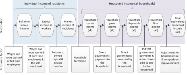
A ‘build-up’ approach to income has been adopted, exploring first individual and then household income. This allows for the factors that influence individual income, such as the returns individual workers obtain from participating in the workforce, to be traced through to household income which is affected by a broader set of demographic, social and government policy influences. In doing so, changes in the distribution of income from various sources and for population subgroups are explored in detail, with a particular focus on types of employment, working hours, hourly wages, taxes and transfers and household composition. Figure 1 depicts the income sources and population groups examined.
The ‘build-up’ approach also helps to provide insights into changes in summary distributional measures — such as the widely used Gini coefficient. The approach also highlights the need for care when making assessments based on such summary measures alone.
The analysis makes use of data from five Australian Bureau of Statistics’ Household Expenditure Surveys (HESs), conducted from 1988-89 to 2009-10. The
1 See Nolan, Salverda and Smeeding (2011) for a comprehensive survey of the income inequality literature.
resulting changes identified, therefore, relate to this period and will be influenced by the specific characteristics of the start and end points — such as the economic, demographic and social conditions that prevailed. Given survey timing, only five snapshots of the distribution of income are available. However, the HES includes information on direct and indirect government transfers and taxes, making it an appropriate data source to examine various components of income in detail.2
Figure 1 The ‘build up’ approach to income
The broader context of increasing incomes in Australia over the past 20 years
The context for any analysis of Australia’s income distribution over the last 20 years is the widespread increases in real incomes driven by the growth in the Australian economy. Individual labour earnings have increased by around 38 per cent on average, while ‘equivalised’ final household incomes (which additionally includes direct government payments, the provision of government funded services (indirect transfers) and taxes, and takes into account household size and composition) increased by 64 per cent (figure 2).3 Real income growth has
occurred ‘across the board’ — that is, for the lowest to highest income groups.
2 All surveys suffer from misreporting and non-response bias — the HES is no different. However, with the quality assurance practices of the ABS and a large sample size, these should be minimised. It should also be noted that compulsory superannuation payments are not treated as income for workers. Instead, as per international convention, superannuation is treated as income when it is drawn down.
3 Household incomes are adjusted to reflect the requirement of larger households to have a higher level of income to achieve the same standard of living. This process, called equivalisation, adjusts household income by a factor related to the size and composition of the household. The Australian Bureau of Statistics equivalisation factor has been used in this study and is equal to
OVERVIEW 5 Over the last 20 years, around 75 per cent of the growth in real household earnings has come from increased labour force earnings. This reflects:
• Increased employment— the proportion of adults in paid employment per
household increased from 56 per cent in 1988-89 to 60 per cent in 2009-10.
• Longer working hours amongst part-time workers — average hours worked by
Australians with part-time jobs has grown by around 16 per cent, from 17.6 hours in 1998-99 to around 20.4 hours in 2009-10.4
• Increased real wages — between 1998-99 and 2009-10 real hourly wages
increased by 22.7 per cent for full-time workers and 8.1 per cent for part-time workers.
That is, between 1988-89 and 2009-10, more Australians joined the labour force, got jobs, worked longer hours and were paid more per hour.
Figure 2 Individual and equivalised final household incomes, 1988-89 to 2009-10
Inflation adjusted 2011-12 dollars
While these economic gains have been widespread, they have not been uniform. Growth for those in the top half of the distribution (above the median) has been greater than for the bottom half (in both absolute value and proportionate terms). This is true both in terms of individuals’ market based earnings (from the supply of labour and returns to capital plus private transfers) as well as in terms of equivalised
the inverse of the sum of 1 times the number adults plus 0.5 times the number of children present in the household.
4 Due to data constraints, hours worked and hourly wage rate analysis is not possible for 1988-89 and 1993-94. 0 400 800 1200 1988-89 1993-94 1998-99 2003-04 2009-10 Equivalised final household income Individual labour income
final household income. The different rates of growth at the top and bottom of the income distribution, along with movements in summary measures such as the Gini coefficient (box 1), underlie the observation that income inequality has risen in Australia in recent years as widely reported by the OECD (2011) and researchers including Leigh (2005), Whiteford (2011) and Wilkins (2013) amongst others.
Box 1 What is the Gini coefficient ?
The Gini coefficient can be depicted graphically using the Lorenz curve, which depicts the cumulative income shares against cumulative population share.
The curvature of the Lorenz curve depicts the level of inequality. If all individuals (or households) had the same income (perfect equality), then the curve would lie along a 45 degree ray from the origin. The Gini coefficient is the ratio of the area enclosed by the Lorenz curve and the perfect equality line (A) to the total area below the perfect equality line (A+B). It ranges from 0 (perfect equality) to 1 (perfect inequality).
Source: Jenkins and Van Kerm (2008).
Given the complex nature of income inequality, detailed analysis of the underlying distributional change is necessary in order to understand the nature and significance of changes in simple aggregate measures.
What has happened to individual earnings?
An individual’s market income is made up of labour earnings (from working full-time, part-time or being self-employed) and ‘capital & other’ income (such as interest from savings, dividends from shares, rents from investment properties and private transfers). Capital & other income is concentrated in the higher income groups and has become more so over time. Measured levels of inequality are sensitive to reported investment losses and have varied over time, but rose in aggregate between 1988-89 and 2009-10. However, it is a small proportion of overall market income (around 11 per cent in 2009-10).
100% 100%
Cumulative share of people from lowest to highest income
Cu m ulat iv e sh are o f i nc om e earn ed A B Lorenz curve Perfect equality
OVERVIEW 7
Figure 3 Movements in the distribution of individual labour income, 1988-89 to 2009-10
Inflation adjusted 2011-12 dollars
Probability distribution of labour incomea
Per cent change in labour income by decilea Gini Coefficientsb
a For people reporting labour incomes. Negative incomes are present in the data as these represent losses
from an individual’s own unincorporated business b For people reporting incomes in each category. Capital & other income Gini coefficient estimates exceed 1 in 2003-04 as some individuals report negative incomes from own unincorporated businesses.
Labour income is the most important component of market income for most (figure 3, top panel). The distribution of labour income of workers has shifted to the right (indicating rising average incomes) and flattened (indicating greater spread of income). The ‘top’ tail of the distribution has also lengthened. These effects have led to the increase in the Gini coefficient from 0.35 in 1988-89 to 0.41 in 2009-10
0.00 0.02 0.04 0.06 0.08 0.10 -500 0 500 1,000 1,500 2,000 2,500 3,000 Pr opor tion $ (2011-2012) per week 2009-10 1988-89 0 20 40 60 80 Decile 0.0 0.2 0.4 0.6 0.8 1.0 1.2 1.4 1988-89 1993-94 1998-99 2003-04 2009-10 Market income Labour income Capital & other income
— indicating rising inequality in labour incomes amongst those employed at the individual level (changes are all statistically significant at the 1 per cent level). Changes in full-time, part-time and self-employed subgroups, as well as increased employment, also help to explain the observed changes in the distribution of individual labour incomes. The different characteristics of these workers subgroups have both level and trend effects on measured inequality.
In terms of the level effect, a large part of labour income inequality simply reflects differences in the average earnings of the different types of worker. Taken alone, measured inequality amongst full-time workers (around 62 per cent of the workforce in 2009-10) is considerably lower than for labour earnings overall (Gini coefficients of 0.31 and 0.41 respectively). When full-time workers are combined with part-time workers (who have lower average incomes), measured inequality increases.5 Decomposition analysis suggests that differences in average earnings
between different types of worker account for around half of labour income inequality.6
The effect of pooling worker groups on aggregate distributional trends depends on changes in the relative share of each in the total workforce. Between 1988-89 and 2009-10, the share of the workforce employed part-time has increased alongside increased participation rates, particularly amongst women. As part-time workers earn considerably less on average than full-time and self-employed workers, this compositional change has increased measured inequality amongst those employed. Increased overall employment rates that have occurred with the increased share of part-time workers in the workforce, however, have had a different effect on measured levels of household income inequality (discussed below).
In addition to the changing composition of the workforce, much of the measured increase in income inequality for individuals has been due to the distributional changes that have occurred within worker subgroups — particularly amongst full-time workers. While full-full-time workers have the most equal distribution of income, they also exhibit the clearest upward trend in inequality over the last 20 years. On the other hand, measured inequality has been relatively stable among part-time workers while the trend is unclear for the self-employed. Rising weekly income inequality among full-time workers has been due to the dispersion of hourly wages
5 Only the self-employed — who by far have the most unequal distribution of income — have a Gini coefficient (0.59) that exceeds that of overall labour force earnings.
6 A subgroup decomposition was used to identify how much of the income variation that occurs within a subgroup, compared to that which exists between subgroups, contributes to the overall Gini coefficient result.
OVERVIEW 9 between high and low earners. Hours worked by full-time workers have been relatively stable across all income levels.7
While changes in the distribution of income can be examined in a multitude of different ways, two areas attract particular attention — the gender pay gap and incomes of the very top earners (the top ‘1 per cent’). Both involve complex causes and effects and have attracted considerable debate. However, in terms of summary distributional measures such as the Gini coefficient, HES data suggest that:
• the top 1 per cent have not been relatively more important in explaining
movements in labour income inequality compared to other earners. Noting that while, as a group, it is more difficult to accurately measure the incomes of the top 1 per cent due to generally lower survey response rates, data from the HES suggests the top 1 per cent of labour force earners make a modest impact on measures like the Gini coefficient across survey periods (removing this group from the income distribution lowers the Gini coefficient by 6.5 per cent). However, their contribution to the Gini has been consistent in the data from each survey — rising inequality in Australia is also driven by the 99 per cent, not just the 1 per cent.
• the gender pay gap appears to be a relatively minor component of measured
individual labour income inequality. Decomposition of most indicators suggest that less than 3 per cent of measured inequality is driven by difference in average hourly rates of pay between men and women (the highest estimate was 15 per cent). The overall increase in labour income inequality between 1988-89 and 2009-10 appears to have been a result of factors that affect men and women in similar ways.
What has happened to household income?
The household story is both more complex and more important in economic welfare terms. While market income (at the individual level) describes the distribution of income arising from individuals’ interaction with the economy, ultimately equivalised final household income has the greatest impact on an individual’s consumption and material living standards. The Gini coefficient for equivalised household income has increased from around 0.25 in 1988-89 to around 0.27 in 2009-10, with most of this increase occurring since 2003-04.8
7 However, there is considerable cross sectional variation in hours worked by full-time employees, with the highest decile working around 10 hours longer per week than those in the first decile.
The movements in the distribution of final equivalised household incomes are predominantly the result of changes in gross household income (pre-tax market income and direct government transfers). The basic distributional shifts in gross household income (figure 4, left panel) appear similar to those based on individual income measures. However, at the household level, this is not a story of higher deciles experiencing greater income growth than lower deciles (as is the case in terms of individual market earnings). Rather a U-shaped growth pattern is observed (figure 4, right panel). This indicates high growth at the bottom of the distribution (tending to decrease inequality), moderate growth at the middle (with an ambiguous effect on inequality), and very high growth at the top (tending to increase inequality). That is, there are both convergent and divergent forces affecting household income, with the latter dominating overall.
Figure 4 Change in gross household incomes, 1988-89 and 2009-10a Inflation adjusted 2011-12 dollars
Probability distribution Per cent change in income by decile
a All households.
The income sources underpinning these changes differ by decile.
• At the bottom of the distribution, increases in government payments have been
very important. In particular, increases in government payments (particularly related to the Aged Pension) accounted for, on average, around 45 per cent of income growth in the 1st decile and 57 per cent of income growth in the 2nd decile. The impact of government payments diminishes for higher deciles, but still comprises around 4 per cent of the income growth of the 9th decile.
• Labour income is the biggest source of growth for most households, but is
particularly important for the 6th to 9th deciles (above 70 per cent). 0.00 0.02 0.04 0.06 0.08 0 1,000 2,000 3,000 4,000 5,000 Pr opor tion of hous ehol ds $(2011-12) per week 1988-89 2009-10 0 20 40 60 80 Deciles
OVERVIEW 11
• Capital & other income has grown relatively evenly across most deciles, but has
had the biggest effect on the 10th decile. This ‘top-end’ capital income growth occurred mainly between 2003-04 and 2009-10 (more than doubling in this period).
The combined result of these changes is that there is no clear trend in measured gross household income inequality between 1988-89 and 2003-04. The Gini coefficient only increased slightly from 0.39 in 1988-89 to 0.40 in 2003-04. Since 2003-04, however, measured inequality rose — to 0.43 by 2009-10. The top-end growth in capital & other income is the main driver of the change between 2003-04 and 2009-10. But even with capital & other income included, both the level and the growth in household inequality is lower than that experienced by individuals — a result of the equalising effect of household members combining income, a greater proportion of household members working, as well as government payments targeting people on lower incomes (discussed further below).
In contrast to individual market income, changes in household labour earnings have not contributed to the recent increase in measured gross household income inequality. The difference arises because individual market income only includes people that are working (or have some capital & other income) and does not capture the distributional consequences of the marked increase in employment. This increase has been most prevalent among families in the bottom half of the income distribution and among households containing dependent children — employment for sole parent families and couples increased by around 11 per cent and 6 per cent, respectively. As people in these groups would have otherwise earned no labour income, the increase in employment exerts an equalising force on the distribution of income that offsets the dispersion of average hourly wages.
Demographic and social factors, such as family formation and age, have some readily observable impacts on the distribution of (gross) household income. For example:
• the vast majority of households at the bottom of the distribution (the 1st and 2nd
deciles) are either lone persons or single parents. Around half of these households have an average adult age over 65. Fewer than 21 per cent contain an employed adult.
• conversely, the top of the distribution (the 9th and 10th deciles) is made up almost
entirely of working age households, with 80 per cent of resident adults in the labour force. Almost all of these households contain couples.
Family formation can also directly affect household inequality if people with higher earnings tend to partner with other people with high earnings. The OECD (2011)
found that this partnering pattern has been an important contributor to rising inequality in the 1980s and 1990s, both in Australia and internationally. In practice, this phenomenon is difficult to observe, generating some uncertainty as to its importance. At any rate, between 1998-99 and 2009-10, rates of partnering between people with similar individual earnings appear to have stabilised, suggesting its role in explaining distributional changes, if any, would have diminished over the last decade.
At the other end of the spectrum, the proportion of households with no employed members (jobless households) has been in decline since 1993-94. This has contributed to the growth in household incomes and exerted downward pressure on measured inequality. However, during this period, the average income gap between households with employed members and jobless households increased.
Finally, government tax and transfer policies (both direct and indirect) substantially decreased measured income inequality (figure 4). In 2009-10, the combined effect of taxes and transfers was a reduction in the Gini coefficient from 0.52 (household market income) to 0.34 (final income) — slightly lower than in previous years. Taking account of household size (in particular the economies of scale in consumption when working adults cohabitate), further reduces the Gini coefficient to 0.27 (equivalised final income).
Figure 5 The impact of taxes, transfers and household size on the Gini coefficienta, 1988-89 to 2009-10
a All households.
The impact on inequality of Australia’s system of taxes and transfers varies. Some parts of the system, such as consumption taxes, make the distribution of household
0 0.1 0.2 0.3 0.4 0.5 0.6 1988-89 1993-94 1998-99 2003-04 2009-10 Market income
Gross income (includes transfers) Disposable income (Includes direct transfers and tax)
Final income (includes direct and indirect transfers and taxes) Equivalised final income (final income adjusted for household size)
OVERVIEW 13 income less equal (though this effect is relatively minor). In general, however, the tax and transfer system reduces inequality through a number of means.
Direct transfers
These include government payments such as the Age Pension, the Disability Support Pension, unemployment benefits and Family Tax Benefits (A and B). These payments, by design, are targeted toward individuals and families on lower incomes and reduce income inequality considerably. In 2009-10, direct transfers accounted for around half of the total fall in inequality between market and final income. As employment has increased, the share of households receiving direct payments has decreased, although for those that do receive payments, amounts have risen significantly in real terms (from $266 in 1993-94 to $346 in 2009-10 in 2011-12 prices). The relative decline in the number of transfer recipients has also reduced the marginal effect of transfers on household inequality (the percentage reduction associated with an increase in the average level of benefits has become smaller). Overall, despite considerable growth in the value of direct transfers, the impact on inequality has also diminished. Direct transfers lowered inequality of equivalised market income by 28 per cent in 1993-94 and 23 per cent in 2009-10.
Direct taxes
Primarily comprising income tax, taxes reduce inequality by taxing those on higher incomes at a higher rate. In 2009-10, direct taxes accounted for around 18 per cent of the total reduction in inequality between household market and final income. Over time, the equalising effect of direct taxation has diminished slightly — lowering inequality of equivalised market income by 9 per cent in 2009-10 compared with 10 per cent in 1993-94.
Indirect transfers
These refer to the direct provision of services such as education, health, housing and childcare assistance (together, education and health comprise 83 per cent of indirect transfers). While all Australians are entitled to these services, they make up a greater share of final income for those on lower incomes, reducing measured inequality. In 2009-10, indirect transfers account for around 37 per cent of the fall in inequality between market and final income. Indirect transfers have increased by around 77 per cent in real terms since 1993-94 and, due to the relatively high share of indirect benefits in gross income for those in lower deciles, the increases have
helped to further reduce inequality — reducing measured inequality of equivalised market income by 17 per cent in 2009-10 compared with 15 per cent in 1993-94.
Are the distributional movements in Australia different from other countries?
Some of the observed developments in Australia’s income distribution between 1988-89 and 2009-10 are also evident in other OECD countries. The stronger growth in incomes for those (individuals and households) at the top of the distribution compared with those at the bottom has also occurred in most other OECD countries. In particular, the growing dispersion in full-time earnings, especially amongst men, is commonly observed across OECD countries.
However, in contrast to other OECD countries, the growing dispersion in full-time earnings has not translated into a greater spread of household labour earnings in Australia. Australia’s increases in workforce participation and employment, particularly for households in lower income deciles, have more than offset this development. In other words, growth in labour force participation and hours for part-time workers and declining unemployment have meant that labour market earnings have had a moderating impact on measured household labour income inequality.
ABOUT THIS STUDY 15
1 About this study
Since the early 1990s, Australia has experienced its longest period of continuous economic growth on record and associated rise in household incomes. It has also avoided some of the more severe effects of the global financial crisis.
Average real household incomes in most OECD countries have grown over the past 20 years — a notable exception is United States for which median real household incomes have fallen over the past decade (OECD 2012a). Rising income levels, however, have been accompanied by a widening of the distribution of income in most OECD countries (and many developing countries). As noted by the OECD (2011):
Over the two decades prior to the onset of the global economic crisis, real disposable household incomes increased by an average 1.7% a year in OECD countries. In a large majority of them, however, the household incomes of the richest 10% grew faster than those of the poorest 10%, so widening income inequality. Differences in the pace of income growth across household groups were particularly pronounced in some of the English-speaking countries, some Nordic countries and Israel. (p. 22)
The OECD (2011) reports that Australia’s experience has been similar, albeit with higher rates of growth in both income (across the entire distribution) as well as inequality. Understanding these trends requires an examination of changes observed in sub-groups (such as full-time versus part-time workers), different units of analysis (such as between individual versus households) and types of income (such as market income and government payments). For convenience, these are referred to as ‘proximate factors’ in this paper. This is the focus of this paper.
This area of inquiry is of ongoing relevance to the Commission’s work. In analysing the overall effectiveness and efficiency of government policies, the Commission is often asked to also consider the distributional impacts (for example, PC 2005 and 2009). Distribution changes, and specifically trends in inequality, are important because:
• growth in average income is a widely used indicator of economic and social
progress. Yet aggregate measures can conceal important information about the experience of different groups and different individuals. Understanding distributional trends and what lies behind them enriches our knowledge of the performance of the economy.
• people care about inequality, and it influences government policy. Better
information about factors underlying changes in measured inequality can help better inform future policy.
1.1 What this paper is about
This staff working paper examines the recent trends in Australia’s individual and household income distributions. It examines the proximate factors that help explain aggregate trends to provide a more detailed understanding of the composition of the income distribution (in terms of both the groups represented within it and the different kinds of income they receive). It also examines whether the Australian experience mirrors general trends across OECD countries.
The approach of this paper is to ‘build-up’ from basic units of analysis and income measures to more comprehensive ones (detailed in the following section). The remainder of this chapter outlines the data used and ‘tool kit’ of techniques typically used in distributional analysis and some of their limitations.
Chapter 2 examines trends in the distribution of individual market income. The market incomes of different groups are analysed, with a particular focus on full-time, part-time and self-employed workers. This chapter breaks market income down into its two main sources — labour and capital, with a particular focus on the former (which is the largest source of market income). The unit of analysis throughout chapter 2 is the individual.
Chapter 3 examines how changes in different types of income contribute to the distribution of household final equivalised income (this concept is explained in the following section). This involves examining how the distribution (and its trends) changes when government transfers, taxes and the effects of household size are considered. Several different population groups are considered including family types (such as single, dependent children amongst others), working and non-working age and jobless households. The unit of analysis throughout chapter 3 is the household.
The final chapter places these findings in context by comparing Australia with broader OECD trends. It also suggests possible areas of future work.
ABOUT THIS STUDY 17
1.2 Measuring income and its distribution
Measuring the distribution of income is not straightforward. First, ‘income’ needs to be defined. Second, the aspects of the distribution to be measured and how these should be estimated need to be determined. These issues are briefly discussed below.
‘Building up’ to household income
People receive income from a number of sources. At the most basic level, income comprises the remuneration individuals receive in exchange for their labour (paid employment or self-employment), earnings on investments (such as property, shares or from funds held in interest bearing deposits) and other private transfers. The former is referred to as labour income and the latter is referred to as capital & other income. Combined, these form market income.
Many people also receive direct transfers from government. These include the Aged Pension, the Disability Support Pensions, unemployment benefits, Family Tax Benefit A and Family Tax Benefit B, amongst others. Market income combined with direct transfers is referred to as gross income.
As many of these payments are calculated based on household level characteristics (for example, some depend on the number of children present or household income) it is useful to analyse gross income (and subsequent measures of income) at the household level. Additionally, using households as the unit of analysis is a better guide to the financial resources that individuals have access to than their individual market income. This is because many households share income and divide paid (employment) and unpaid (such as caring for children) labour differentially among household members (for example, the labour income of the primary carer of a newly born child will often be less than the financial resources to which that person has access to).
As people are required to pay tax on their income, the amount of money they actually receive is generally less than their gross income (providing their income exceeds tax free thresholds). Gross income minus direct taxation obligations is known as disposable income.
In addition to direct payments, governments also supply a range of public services either free of charge or at subsidised rates which can be considered as ‘income in-kind’. This represents an indirect transfer. At the same time, the amount of goods and services individuals can purchase with their disposable income is reduced by taxes that occur at the point of sale (indirect taxes). To account for these factors the
Stiglitz-Sen-Fitoussi Commission (Stiglitz et al. 2009) noted that when examining household income, the most comprehensive measure is one that takes:
… account of payments between sectors, such as taxes going to government, social benefits coming from government, and interest payments on household loans going to financial corporations. Properly defined, household income and consumption should also reflect in-kind services provided by government, such as subsidized health care and educational services. (p. 13)
In practice, detailed measures of in-kind services are often unavailable (this is a motivating factor in the data set chosen for this study, which is discussed in the following section).
Income measures which take into account in-kind services in addition to taxes and transfers are usually termed ‘adjusted disposable household income’ or final income. The later term is used by the Australian Bureau of Statistics (ABS) and is adopted in this paper.
Finally, in order to link the total income available to each household to actual resources available to its members, the size and composition of the household (that is, the number of people and their age) needs to be taken into account. The material requirements of households grow with each additional member. However, due to economies of scale in consumption, these requirements are not necessarily proportional to the number of household members.1 Equivalising household income
attempts to account for this.2
Final equivalised household income provides a more complete picture of the resources available to people, how they are distributed, and how this distribution has changed. However, understanding changes in this measure requires analysis of changes in its constituent parts. This building up of the income distribution in Australia is illustrated in figure 1.1.
1 For example a two-person household may use less than twice the electricity of a one person household.
2 The equivalisation approach in this study follows that of the ABS. The equivalising factor applied to household income is calculated using the ‘modified OECD’ equivalence scale. The equivalising factor is determined by applying a score of 1 to the first adult in the household, with each additional adult (those 15 years or older) allocated 0.5 points, and each child under the age of 15 allocated 0.3 points.
ABOUT THIS STUDY 19
Figure 1.1 Building up to the distribution of equivalised final incomea
a Labour income estimates from the HES do not include compulsory superannuation payments. Instead, as
per international convention, superannuation is treated as income when it is drawn upon and treated as such by individuals.
Data on the distribution of income in Australia
This paper draws on the Household Expenditure Surveys (HESs), undertaken by the ABS. This survey collects detailed information about the expenditure, income, assets, liabilities and characteristics of households resident in private dwellings throughout Australia. The survey was undertaken in 1984, 1988-89, 1993-94, 1998-99, 2003-04 and 2009-10. In the most recent year the sample size was 9774 households. Due to issues with data consistency, this working paper has only examined HESs from 1988-89 onwards. In some cases, data items were not collected in earlier years, further limiting the period considered (for example, information on imputed private rent is only available in the 2009-10 survey and the measurement of hours worked by individuals is too coarse prior to 1998-99 to estimate hourly wage rates).
The HES has a number of attractive features for examining the distribution of income in Australia. The Survey of Income and Housing (SIH) and the Household Income and Labour Dynamic in Australia (HILDA) survey are frequently used in the analysis of Australia’s income distribution. There has been relatively little analysis of the HES (in particular prior to it merging with the SIH in 2003-04). The HES was chosen for this study as it contains a richer set of forms of income, from market (labour and capital) to government payments (direct and indirect) along with taxes (direct and indirect). The inclusion of indirect taxes and transfers allows for the construction and analysis of final income, which offers a more
complete picture of household income. Final household income can then be contrasted with other measures of income or units of analysis (such as individual income) as all data are gathered at the same time using the same methodology. This facilitates a richer analysis of distributional trends than would otherwise be possible.
That said, there are also some limitations in using HES data.
• As with other long running income surveys (such as the SIH), there have been
changes that affect the consistency of the data. Over time, the ABS has improved its methodology, providing estimates of income items that are closer to their conceptual definition (box 1.1). While such changes improve the quality of data over time, it does mean that data across various surveys are not exactly the same. This increases the uncertainty of inferences about trends over periods where the definitional changes occur. However, in general, these effects appear to be relatively small (appendix B). Changes in survey design over time are discussed in more detail in appendix B.
• The HES is collected infrequently compared to the SIH (every two years) and
HILDA (collected every year from 2001). This makes it difficult to identify key ‘turning points’ in trending data. It also means that any trends identified will be influenced by unusual factors affecting data at the start and end points of series (though this problem affects all time series analysis). Nevertheless, summary indicators derived from the HES appear to display trends consistent with those in the more frequent SIH and HILDA data.
• Information on individuals and households in the lowest income deciles is
subject to some degree of ambiguity as many report expenditures greater than incomes and, on average, greater than those in higher incomes. This is also true of the SIH.
• Incomes for the top 1 per cent of earners are likely to be less accurate due to
lower survey response rates amongst this group which are not accounted for in sample weighting procedures.
• The treatment of compulsory superannuation payments is likely to complicate
changes in employee earnings between 1988-89 and 2009-10. As per international convention, superannuation is treated as income when it is drawn upon and treated as such by individuals. Superannuation reforms have taken place during the period examined by this study which would influenced labour incomes and therefore the distribution of income.
It should also be noted that research making use of HILDA data has found differing patterns in income inequality compared to research making use of ABS data (see Wilkins 2013). As discussed in appendix B, survey design and sample size are
ABOUT THIS STUDY 21 likely to account for some of these differences, but further work is required to reconcile the differences found.
Nevertheless, the HES remains a valuable information source for developing a better understanding of the distribution of income in Australia, particularly when complemented with analysis based on other surveys. Where possible, estimates derived from the HES have also been checked against estimates in alternative ABS series.
Box 1.1 Summary of recent changes to income measurement in HES
• 2003-04
• Change in measurement of current income from own unincorporated business and
investments from reported income for the previous financial year to respondents' estimates of expected income in the current financial year.
• Inclusion in employment income of all salary sacrificed income and non-cash
benefits received from employers.
• Collection of a more detailed range of income items and information on all assets
and liabilities of respondents. 2009-10
• Questions added to the survey on the amount of ‘additional’ overtime respondents
expect to earn in the given year (in addition to ‘usual’ overtime).
• Netting off of interest paid from interest earned on borrowed funds to purchase
shares or units in trusts. Previously only gross interest earned was recorded for investments other than rental properties.
• Inclusion of termination payments and workers’ compensation lump sums, with an
upper boundary of three months wages.
• Inclusion of irregular bonuses in employment income (in addition to regular
bonuses).
• Expansion of family financial support from regular cash payments, mainly child and
spousal support, to also include other forms of financial support including goods, services, rent, education (capital transfers, e.g. cars, remain excluded).
Source: Appendix B.
Representing the distribution of income
Income distributions are generally skewed to the right. That is, the mean or average income is greater than the mode (the most commonly occurring level of income). This skewing of the distribution of income tends to be greater for individual income than for household income as household formation exerts an equalising force. The same measures of the distribution of income can be applied to individual and
household income. Such measures seek to provide information on the shape of the distribution of income (whether wage, market, gross or final) for the population of interest (workers, individuals or households).
There are a range of different measures of the distribution of income. Some focus on the income share for specific groups — such as the proportion of income held by the top decile (or percentile) of the population. Others focus on characteristics of the distribution or seek to estimate the distribution itself — as with estimates of the probability density function of income obtained from kernel density estimation methods (box 1.2).
Box 1.2 Kernel density estimation
There are several methods that can be used to depict the distribution of income, ranging from histograms (frequency counts within defined income ranges) to attempts to estimate the shape of the distribution itself via kernel density estimation.
Kernel density estimation can be used to estimate the probability density function of a random variable, such as income (which is observed randomly within income surveys). It is a non-parametric approach that estimates the shape of the distribution by calculating the relative density of the number of observations for any given value of the variable of interest. Density estimates are produced using a similar method to histograms, with the exception that intervals are allowed to overlap. In this way estimates are produced by collecting ‘centre point densities’ through ‘sliding’ the interval, or window, across the data range.
The estimated functions allow the income distribution to be presented graphically, providing one lens through which to view changes over time. It remains important that other aspects of the distribution are also explored (including its moments: mean, median, mode amongst others) to understand the nature of the shifts observed.
Kernel density functions have the advantage over histograms in that they can be estimated as continuous smooth functions (histograms provide estimates over discrete ranges). For this study, kernel density estimation has been done in Stata using the Epanechnikov kernel function. Density estimates obtained have been converted to population proportions.
Source: StataCorp (2009).
Commonly used summary measures include those which examine income shares or ratios. Share measures include the share of income (or average income) of those within intervals defined by the share of the population — deciles (groups making up 10 per cent of the population), quintiles (20 per cent), and quartiles (25 per cent) are the most common.
ABOUT THIS STUDY 23 The income estimate at any given percentile represents the value of income below which that per cent of incomes fall. For example, the income value at the 50th percentile means that 50 per cent of people earn less than that income (the 50th percentile is the same as the median income). Income at the 90th percentile means that 90 per cent of the population earn less than that amount.
The availability of income data from taxation records has allowed income shares to be used to examine historical changes in the distribution of individual incomes over long time periods (see, for example, Atkinson, Piketty and Saez 2011). This provides only a limited picture of trends in the distribution of income. The data needed to measure the characteristics of household income distributions are more detailed and is usually collected through household surveys. Improvements in data collection and availability have supported the more thorough examination of trends in the distribution of household equivalised income in the recent literature (for example Johnston and Wilkins 2006, Pavcnik 2011, Bray 2012, and Wilkins 2013).
Measures of inequality
Much of the analysis on income distributions focuses on the dispersion of the distribution (the second moment of the distribution). That is, the spread of income between those at the bottom and those at the top. Such measures, usually called measures of inequality, summarise the spread of incomes across the entire population (unlike percentile or decile measures which present point estimates). There are several widely used measures of inequality, the most common being the Gini coefficient and the standard deviation of log income. Other measures capture particular aspects of the distribution such as percentile or decile ratios. Commonly used ratios include the 90th to 10th percentile (‘P90:P10 ratio’), the P90:P50 ratio and the P50:P10 ratio. These measures are particularly useful for data sets where high and low incomes are coded or where issues of under reporting exist. (The HES does not include coded income data and with a large data set, along with the ABS’s quality assurance processes, misreporting error is minimised as much as possible.) However, such measures focus on the percentiles (or deciles) examined and therefore do not reflect information about the spread of incomes that occur elsewhere in the distribution.
Ideally, inequality measures are designed to conform to a set of axioms to avoid measures that can behave in perverse ways (box 1.3). For example, measuring dispersion by the variance of the distribution is not independent of income scale, meaning a doubling of all incomes leads to a quadrupling of measured inequality.
Box 1.3 Five key properties of inequality measures
• The Pigou-Dalton transfer principle — any measure of inequality must, in response
to a mean preserving redistribution, rise (or at least not fall) for an income transfer from a lower income to a higher income person and fall (or at least not rise) for a counter transfer (Pigou 1912; Dalton 1920).
• Income scale independence — any measure of inequality should be invariant to
uniform proportional changes in income. That is, if each individual’s income changes by the same proportion then measured inequality should not change.
• Principle population — any measure of inequality should be invariant to replications
of the population. If two identical income distributions are merged, measured inequality should not change.
• Anonymity — the inequality measure should be independent of any characteristic of
individuals other than their income (or the indicator whose distribution is being measured). For example, measured inequality in an economy with two individuals, A and B, whose income shares are 60 and 40 per cent respectively should be invariant if the income shares are swapped.
• Decomposability — overall measured inequality should be related consistently to
constituent parts of the distribution. That is, if inequality increases amongst all sub-groups of the population then overall inequality would also be expected to increase. Source: Litchfield (1999).
Much of the literature concerning income inequality focuses on the Gini coefficient (see box 1.4 and appendix A). In short, this measure depicts the difference in the observed income distribution to one in which income is equally distributed. This measure satisfies the axioms of inequality measures but is not without its limitations. First, there is not an unambiguous interpretation of changes in the Gini (see following section). Second, the Gini is only decomposable if the partitions of a distribution are non-overlapping (Litchfield 1999) — that is, if the income distributions of the sub-group populations for which the decomposition is sought do not overlap. For example, the Gini coefficient would only be decomposable between the effect of part-time and full-part-time earners if the maximum income from part-part-time workers does not exceed the minimum earnings of full-time workers. If this is not the case, some of the variation in the Gini coefficient cannot be attributed to a particular sub-group as it will be correlated to both.
This paper does not seek to advance the large volume of literature that surrounds the measurement of the dispersion of income. Instead, a ‘practitioners approach’ is taken, which focuses on graphical depictions of distributional change using probability density functions, decile analysis and the commonly used Gini coefficient as the summary measure of inequality.
ABOUT THIS STUDY 25
Box 1.4 The Gini coefficient
The Gini coefficient can be graphically represented using the Lorenz curve, which depicts the cumulative income shares against cumulative population shares (see example in figure below). The curvature of the Lorenz curve depicts the level of inequality. If all individuals (or households) had the same income (perfect equality), then the curve would lie along a 45 degree ray from the origin.
The Gini coefficient is the ratio of the area enclosed by the Lorenz curve and the perfect equality line (A) to the total area below that line (A+B). It ranges from 0 (perfect equality, A=0) to 1 (perfect inequality B=0).
Source: Jenkins and Van Kerm (2008).
Measures of inequality and distributional changes
The link between distributional shifts observed in probability density functions and summary measures of income inequality such as the Gini coefficient is not straightforward. Distributional shifts can be characterised into four components:
• sliding — a ceteris paribus shift to the right or left along the income line • stretching — a ceteris paribus increase in spread around a constant mean • narrowing — a ceteris paribus decrease in spread around a constant mean
• flattening — a ceteris paribus disproportionate increase in density (or proportion
or the population) on one side of the mode (Jenkins and Van Kerm 2004).
A ceteris paribus (rightward) sliding of a distribution along an income line (figure 1.2, top left panel) represents a situation where incomes of all individuals within a population have increased. In this instance, the Gini coefficient will remain unchanged as the spread of incomes across the population has also remained unchanged.
100% 100%
Cumulative share of people from lowest to highest income
Cu m ulat iv e sh are o f i nc om e earn ed A B Lorenz curve Perfect equality
Figure 1.2 Types of distribution change and changes in Gini coefficient
Sliding change
No change in Gini coefficient Increase in Gini coefficient Stretch change
Narrowing change
decrease in Gini coefficient Increase in Gini coefficient Flattening change
A ceteris paribus stretching of a distribution will occur in instances of growing tails (figure 1.2, top right panel). Both the proportion of individuals on low incomes increases, and the proportion of individuals with high incomes increases (or upper point increases). In this instance, the spread of incomes has increased and the Gini coefficient will also increase. A ceteris paribus narrowing of the distribution is the reverse of this and will decrease the Gini coefficient (figure 1.2, bottom left panel). A ceteris paribus flattening of the distribution is the most complex change and can take several forms. It can occur with a shift in the proportion of the population from the left side of the mode to the right, where these individuals become dispersed across the income ranges on the right of the mode (as depicted in figure 1.2, bottom right panel). Such a shift will increase the Gini coefficient even where the highest observed income remains unchanged.
Income % Income % Income % Income %
ABOUT THIS STUDY 27 Even more complex than links between probability density functions and the Gini coefficient are those between these measures and changes in social welfare (box 1.5). It should be noted that any specific Gini value is neither ‘good’ nor ‘bad’ in the sense that a different Gini result would be welfare enhancing.3 Instead, it
represents a measure of the dispersion of the distribution of income and, if viewed over time, provides a way to summarise changes in income dispersion.
Box 1.5 Distributional shifts, the Gini coefficient and welfare
The four stylised distributional changes — sliding, stretching, narrowing and flattening can, in part, be related to assessments of social welfare.
Assuming that assessments are based on a social welfare function that satisfies the property of monotonicity — that is, more income is better than less regardless of relative income — then a sliding to the right of an income distribution implies an increase in welfare (no change, all else remaining equal, in the Gini coefficient). In other words, real increases in incomes for all means the population is better off than before.
Further, assuming a social welfare function that is increasing and S-concave in income — that is, where higher incomes increase welfare but the welfare improvement of an additional dollar of income for those with initially high income is less than the impact on those with initially low incomes — a stretching of the distribution (increase in Gini) implies a decrease in social welfare. A narrowing confers the opposite.
The social welfare implications for a flattening or squashing of the distribution are less clear. In essence, a flattening or squashing of the distribution is likely to be driven by changes in the skewness and kurtosis in the distribution. Jenkins and Van Kerm (2004) show these effects are generally driven by changes in sub-groups which should be evaluated independently.
This highlights that for some welfare-enhancing changes, the Gini coefficient remains unchanged or could even increase. Further, it is likely that changes in a distribution over time incorporate most of these facets. Given these considerations, welfare inferences from changes in aggregate Gini coefficient estimates are not possible. Source: Jenkins and Van Kerm (2004).
3 For example, two societies with the same Gini coefficients can have very different distributions of income. Consider a hypothetical country (country A) in which 50 per cent of the population receives all the income earned in equal amounts (that is, total income is distributed equally amongst 50 per cent of the population. The Gini coefficient for country A would be 0.5. Another country (country B) where 25 per cent of all income is earned equally by 75 per cent of the population with the remaining income earned by 25 per cent of the population would also have the same Gini coefficient — 0.5. Despite having the same Gini coefficient, these countries have very different underlying income distributions.
To address the question of whether welfare is affected by a change in the distribution of income, the underlying factors determining the distribution and reasons behind observed changes must be understood. Social welfare must also take into account the effects of non-market changes associated with changes in measured income. The importance to the individuals in the population of their relative income position and attitudes to inequality must also be known.4 Such questions are beyond
the scope of this paper.
4 Research has indicated that not only do attitudes to both own relative position and inequality in general differ across countries, gender, age and cultural background (Austen 2002), they also change over time (Meagher and Wilson 2008).
INDIVIDUAL INCOME 29
2 Individual income
Key points
• Average real labour incomes have grown substantially — from around $800 per
week in 1988-89, to around $1100 per week in 2009-10 in 2011-12 dollar terms (a 38 per cent increase).
• While these economic gains have accrued to both high and low income groups:
– income has grown faster among high earners (as a group) than low earners – the distribution of income has shifted to the right (a decline in the relative
population of people on very low incomes) and has become flatter (greater diversity in earnings)
– these changes have been associated with increases in measures of labour income inequality, such as the Gini coefficient (which has increased from 0.35 in 1988-89 to 0.41 in 2009-10 among employed people).
• In part, labour income inequality reflects differences between the average earnings
of full-time, part-time and self-employed workers. These accounted for around half of measured inequality in labour income in 2009-10. The remainder is due to income differences that occur between people within each of these groups.
– Income inequality is lowest among full-time workers and highest amongst the self-employed.
– Between 1988-89 and 2009-10, indicators of labour income inequality rose steadily amongst full-time workers, were stable amongst part-time workers and were volatile among the self-employed.
• Employee earnings are determined by hours worked and hourly wages.
– For full-time workers, real hourly wages have grown by around 23 per cent since 1998-99 while hours worked have changed little. Hourly wages have grown faster for high income earners than for low income earners.
– For part-time workers, both hourly wages and working hours have increased (around 8 per cent and 16 per cent, respectively), raising weekly earnings.
• Capital & other income is highly concentrated and has become more so over time.
However, it is a small proportion of market income (around 11 per cent in 2009-10)
• The growth in the dispersion of hourly wages for full-time workers is the key driver of
overall increases in measured inequality for both labour and market income.
– The growth in the relative proportion of people employed part-time has played a lesser role.
• HES data suggest, that neither recent trends specific to the top 1 per cent of income
earners, nor the gender-pay gap, explain the broader trends in measured individual income inequality.
For most people of working age, the money earned from paid employment (or self-employment) comprises their most important source of income. This is known as their labour earnings. It should be noted that current weekly incomes for some individuals who are self-employed (that is, they run their own unincorporated business) are negative. These result from individuals reporting a loss from their business. Income for this group will also include returns to capital invested in the business. Despite this, as no ‘imputed wage’ is available for unincorporated business owners, income from an own unincorporated business represents the best proxy for wages for the self-employed and has been used in this study. Capital & other income (such as rents or returns from investment and private transfers) also represent an important source of income for some people. Together, these income sources comprise an individual’s overall market income (figure 2.1), which is a determinant of where they sit in the overall distribution of income (additional determinants such as taxes, transfers and household formation are discussed in chapter 3). This chapter identifies how engagement with labour and capital markets has shaped Australian market income over the last 20 years — how the distribution of market income has changed and how developments among sub-groups have driven broader trends.
Figure 2.1 Sources of individual market income
This chapter does not attempt to identify causal factors or estimate their contribution to observed distributional changes.1 Rather, the focus is on providing a
richer description of the distribution of income generally and, in particular, the distributional changes that have affected summary measures of inequality. The chapter proceeds as follows.
1 See Gaston and Rajaguru (2009) for a recent analysis of the causal factors underlying distributional changes in Australia.
Market Income
Labour Income
Full-time wage
income Part time wage income
Unincorporated business
income
Capital & Other Income
Return on investments (shares, property
etc)
Interest on