The spread of rents in Ireland, over time and space Ronan Lyons, Trinity College Dublin
For much of the period from 2008 to 2013, any discussion of housing in Ireland was done almost entirely within the prism of the last housing bubble, which burst in 2007. 2014, however, marked a shift in the focus of public debate from the past to the future. The Housing Agency commissioned research on the need for construction of new homes over the period 2014-2018 (Housing Agency, 2014), while the cost of living, rapidly rising rents and rent controls were all prominent topics in Dublin constituency of the 2014 European Parliament elections (see inter alia Fitzpatrick 2014, Murphy 2014). This concern with the cost of living – following increases of the order of 20 per cent in both rents and house prices – is largely concentrated in Ireland’s urban centres, in particular Dublin.
The spatial variation in conditions in the rental and sales markets for accommodation stems from the confluence of a number of factors, from the very local – such as the ease with which some local authorities permitted construction in the decade to 2007 – to the big picture, not least the
increasing importance of clustering, what economists refer to agglomeration economies, in the developed world.
This chapter will examine trends in the rental market Ireland since World War 2, with a particular focus on the last decade. It will look not just at the average rent nationwide but also how the spread of rents has changed and is changing. The first section examines trends in rents over time, and how those trends compare to changes in the cost of living, incomes and house prices. The second section presents a portrait of trends in tenure choice, in particular the fraction renting versus the fraction living in owner-occupied accommodation. The next section looks at rents in more detail since the turn of the millennium, with a particular focus on how the spread of rents has evolved in that period, and why. The final section concludes with some insights from this overview of trends in Ireland’s rental market.
1. Trends in rents in Ireland since World War 2
Over four hundred years ago, in 1611, in the Dublin City Assembly, James Tobin, a “poor decayed man” presented himself to the city fathers (Gilbert 1892). Dublin Corporation was his landlord and he sought – and was granted, provided he could show collateral – remission of his arrears of two years of rent of £1 Irish money per year. On his death, the rent on the house was increased to £1.33 a year. An unskilled labourer at this time could have expected to earn about 12 pence per day, or £15 a year assuming 300 days of work (D’Arcy 1989). This suggests that rent accounted for just under 10% of outgoings in the early 1600s.
By the outbreak of the Great War in 1914, the average rent in Ireland was 4 shillings a week, or £10.50 (€13.20) a year, a figure that had risen to £13.40 (€17.06) by independence in 1922, at a time when an unskilled labourer in building would have earned £166 a year (ILO 1927). This suggests that the fraction of income spent on rent was remarkably similar in the early seventeenth century and the early twentieth century.
the average Irish person, the fraction of earnings that is spent on rent now is 28%, significantly more than either one century or four centuries ago. This somewhat fragmentary long-run perspective can be supplemented by examining official statistics on rents and comparing them with trends in the cost of living, incomes and house prices.
1.1 Nominal rents in Ireland, 1947-2014
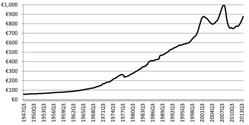
Figure 1 outlines trends in the average monthly rent since the introduction of the modern Consumer Price Index in the late 1940s. Working backwards from what we know to be the average rent now, as weighted to reflect where people live, we can see that the average rent per month in Ireland has increased from less than €60 in the late 1940s to an average of €835 in the period 2005-2014. What is noticeable about the general trend is how relatively infrequently the nominal rent has fallen in almost 70 years. There are just three instances of falling nominal rents in this period: 1978 saw a fall in rents of almost 10%, but aside from that, both periods of falling rents are since 2000. Rents fell moderately from late 2002 to early 2005, reflecting both an increase in the supply of
[image:2.595.90.508.393.604.2]accommodation after the Bacon Reports (see Chapter xxx for more details) and increasingly loose credit conditions, which facilitated home ownership over renting. The final period of falling rents, from 2008 to 2011, saw a much more dramatic fall, reflecting both income and supply pressures associated with the collapse of the Irish economy after 2007.
Figure 1. The average monthly rent in Ireland, 1947-2014
Source: Central Statistics Office, Consumer Price Index (various issues)
The unique trend in rents over the past decade is shown in starker relief in Figure 2, which outlines the annual change in rents each year (the dashed black line) and also the change in rents over the last ten years annualised (the solid grey line). In general, over the period since 1948, the annual change in rents over the previous decade has been around 5%. For the period 2010 to 2014, however, rents were roughly the same as a decade earlier. The rapid increase in rents from 2012 took place within the context of remarkably little change in rents in ten years.
Source: Central Statistics Office, Consumer Price Index (various issues)
The picture from nominal rents, therefore, is that for most of the past seven decades, they have increased at roughly 5% a year, with the final 15 years or so marking a notable exception to this. Taking the period 2000-2014 as a whole, rents were certainly volatile but were not significantly different at the end of the period to where they were at the start.
1.2 Real rents in Ireland, 1947-2014
The typical increase of 5% a year during the second half of the twentieth century may seem high but this does not account for changes in the cost of living: a rent of £40 may have been higher in 1945, relative to the general cost of living than a rent of £400 in the early 1990s. Figure 3 presents an index of rents that adjusts for the cost of living (“real rents”), using the CSO’s Consumer Price Index. This presents a very different picture.
[image:3.595.80.473.78.284.2]In particular, figures for rents that adjust for the cost of living point to two almost completely separate rent ‘regimes’ at work in Ireland between 1947 and 2014, either side of a period of remarkable transition during the 1970s. From the late 1940s until the early 1970s, rents were at a similar level, and indeed rose by in real terms by about 30% in the twenty years to 1972. Over the following ten years, real rents as measured by the CSO fell by 60%. In contrast, the fall in real rents after 2007 was about 23%. In between, real rents rose quite substantially during the 1980s and 1990s, by about 45% between 1984 and 2001.
Figure 3. Index of rents adjusted for cost-of-living, 1947-2014 (1947Q4=100) -25% -20% -15% -10% -5% 0% 5% 10% 15% 19 48Q3 19 51Q1 19 53Q3 19 56Q1 19 58 Q3 19 61Q1 19 63 Q3 19 66Q1 19 68Q3 19 71Q1 19 73Q3 19 76Q1 19 78Q3 19 81Q1 19 83Q3 19 86Q1 19 88Q3 19 91Q1 19 93Q3 19 96Q1 19 98Q3 20 01Q1 20 03Q3 20 06Q1 20 08Q3 20 11Q1 20 13Q3 1-year change
Source: Central Statistics Office, Consumer Price Index (various issues)
This dramatic fall in the real cost of renting was driven by substantial increases in the general price level and rents not keeping pace, rather than by rents themselves falling. Indeed, between 1972 and 1982, nominal rents rose by almost 80%. However, the general price level rose in the same period more than four-fold, thus meaning that in real terms, rents declined and declined dramatically.
It should be noted, however, that this is based on the CSO index of rents, a single albeit authoritative source. (Likewise, the Census until recently measured average rents and found a roughly similar magnitude of increase between 1961 and 1991.) A task for future research will be to verify and better understand that fall in rents and which forces and market segments drove it.
1.3 Rents in Ireland relative to incomes, 1980-2014
A more intuitive way of thinking about how expensive rents are is to compare them to incomes. Detailed datasets on earnings are not available for Ireland prior to the 1980s, and even then the only series that predates the late 1990s covers the Public Sector. However, combining the various series, it is possible to chart how the average rental bill over the course of the year compared to the typical gross annual income. This is shown in Figure 4.
[image:4.595.129.475.78.285.2]The two decades to 2009 show a steady if not always smooth decline in how much of the typical income would be taken up in rent, from almost 40% in the late 1980s to just 25% in 2010. The more extreme rental market cycles of 1999-2004 and 2005-2010 are visible within this overall trend, as is the increase in rents after 2011, at a time when incomes were largely stagnant.
Figure 4. Average annual rent as a fraction of average income, 1988-2013 0
20 40 60 80 100 120 140
19
47Q3
19
50Q3
19
53Q3
19
56Q3
19
59
Q3
19
62Q3
19
65Q3
19
68Q3
19
71Q3
19
74Q3
19
77Q3
19
80Q3
19
83Q3
19
86Q3
19
89Q3
19
92Q3
19
95Q3
19
98Q3
20
01
Q3
20
04Q3
20
07Q3
20
10Q3
20
Source: Central Statistics Office (various tables) 1.4 Rents in Ireland relative to house prices, 1950-2014
The final way to think about the cost of rented accommodation is to compare it to the price of housing. For most first-time buyers, their choice is a direct comparison of the two, while for investors and landlords, how the annual rent compares to the value of the dwelling determines its return, which can be compared to other assets such as savings accounts and shares. Housing is typically viewed as riskier than a bank account, thus its return or yield should be higher to reflect this risk premium – but equivalently, housing is less risky than the typical share in a publicly listed
company, so its return should be smaller than this.
As is the case with so many important economic series in Ireland, little is known about house prices prior to the 1980s. Piecing together various reports, it is possible to present house prices from 1950 on, but the picture that emerges shows a gross yield so high as to cast doubt on the underlying figures. The dramatic fall in real rents during the 1970s implies that the gross yield (annual rental income as a fraction of the property value) was above 20% before this. As pointed out above, to better understand the long-run context of Irish housing, more authoritative figures on both rents and house prices for the period prior to the 1990s are needed.1
Figure 5. Implied gross yield on Irish housing, 1950-2014
1 The author is involved in a project to compile long-run house price and rent indices, initially for Dublin, based
on information contained in the Registry of Deeds and in newspaper archives. 0%
5% 10% 15% 20% 25% 30% 35% 40%
19
88Q1
19
89Q2
19
90Q3
19
91Q4
19
93Q1
19
94Q2
19
95Q3
19
96Q4
19
98Q1
19
99Q2
20
00Q3
20
01Q4
20
03Q1
20
04Q2
20
05Q3
20
06Q4
20
08Q1
20
09Q2
20
10Q3
20
11Q4
20
Source: House prices – Department of the Environment, Central Statistics Office, ERSI-PTSB; Rents – Central Statistics Office Consumer Price Index (various issues)
2. Tenure choice and the mortgage market
[image:6.595.124.478.75.284.2]It has become something of a mantra that Irish households buy, rather than rent. Nonetheless, the statistics show a much more nuanced picture than this. Figure 6 presents information from the Census on the nature of occupancy of Irish households, from the 1946 Census through to the 2011 Census.2 More than 40% of Irish households lived in rented accommodation in 1946, a figure that fell steadily to 18% by the 1990s. Since then, however, the fraction in rented accommodation has increased – particularly since the 2006 Census and particularly in private rented accommodation (see Chapter xxx for more details) – and more than 27% of Irish households were in rented accommodation at the time of the 2011 Census.
Figure 6. Irish households by nature of occupancy, 1946-2011
2 The 1946 Census does not break down renters into social and private rented segments, so the figure given is
the total. 0% 5% 10% 15% 20% 25% 30% 35% 40%
19
50
19
53
19
56
19
59
19
62
19
65
19
68
19
71
19
74
19
77
19
80
19
83
19
86
19
89
19
92
19
95
19
98
20
01
20
04
20
07
20
Source: Central Statistics Office, Census (various issues)
OECD research has highlighted that Ireland’s apparent fondness for owner-occupancy may be fiscal, rather than cultural, with the taxation more skewed in favour of homeownership in Ireland than in any other country by the mid-2000s (Rae & van den Noord, 2006). One of the principal fiscal biases was mortgage interest relief, abolished in 2013, the key effect of which was to make borrowing cheaper, effectively shifting the tax burden on to renters.
[image:7.595.123.475.75.283.2]The margin between owning and renting thus depends on the nexus of credit and fiscal conditions. Figure 7 shows this graphically, comparing the gross yield on housing with the fraction in rented accommodation. The positive association is clear, albeit based on a small number of Censuses. The way to interpret the graph is as follows. If the gross yield on housing was as high as 25%, this would mean that in four years, the rent would cover the cost of the house. With housing cheap, relative to rents, and assuming mortgage interest rates of less than 25% (as was the case), a sensible household would look to borrow a mortgage to buy the house outright. This would bid up the price of housing until the yield reflected more closely the prevailing interest rate.
If households did not do this, as appears to have been the case from the 1940s to the 1960s, something must be preventing them from doing so. The obvious solution to this is the availability of credit. Up to the 1970s, when more than a third of households rented and gross yields in property appear to have been greater than 20%, the supply of funds for mortgages was determined
completely by local deposits at Irish building societies. In contrast, in the 2000s, Irish financial institutions could access international capital markets, and while this was the case, the yield on Irish housing was as low as 5% and fewer than 20% of households lived in rented accommodation.
Figure 7. Scatterplot of occupancy and yield, 1946-2011 0%
10% 20% 30% 40% 50% 60% 70% 80% 90%
1946 1961 1971 1981 1991 2002 2011
Non-renting households
Social rented sector
Source: Central Statistics Office, Census (various issues)
This is indicative evidence of how intertwined the issue of tenure choice is with a host of other policy issues, including the tax treatment of owner-occupancy and the nature of credit conditions. Where the percentage in rented accommodation will be in Census 2021 cannot be guessed without a more thorough understanding of these relationships.
3. Rents over boom and bust
So far, when rents have been discussed in this chapter, it has been done in the context of the
average rent nationwide, and how trends in that compare to trends in the cost of living, incomes and house prices. However, rents vary hugely between market segments – both type, from 1-bedroom apartments to 5-bedroom houses, and location, from central Dublin to rural markets in the West of Ireland.
3.1 Data and methodology
This section examines the spread of rents over thirteen years from 2002 to 2014 and across fifty-four rental markets: the twenty-two Dublin postcodes; south, north & west County Dublin; the four other cities; and the twenty-five counties. It does this using a dataset of over 1.5 million rental listings on the Daft.ie website from the start of 2002 to mid-2014.
The methodology employed is the hedonic regression, which is the standard framework for analysing large datasets of house prices or rents. In effect, the methodology is designed to decompose the rent of any individual property into its component parts. In this case, a property’s rent is a function of four factors: the time it was listed on the market (the period is divided up into quarters); its location (the fifty-four markets described above); the property’s size (one to five bedrooms); and the property’s type (house or apartment). Depending on the motivation for the research, this can be extended to include factors such as the property’s exact location (e.g. distance from city centre or amenities such as the Luas) or attributes such as the property’s age or whether it has a washing machine or dishwasher.
3.2 Results of the analysis 0% 5% 10% 15% 20% 25% 30% 35%
0% 10% 20% 30% 40% 50%
Esti
m
ate
d
g
ro
ss y
ie
ld
o
n
h
o
u
si
n
g
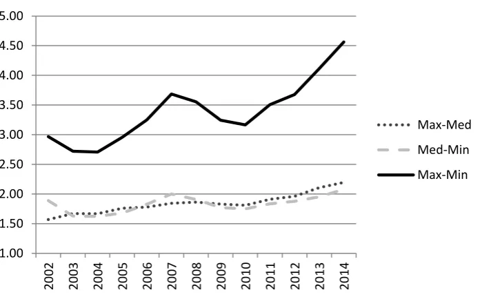
Figure 8 presents three ratios of rents, based on this analysis across fifty-four markets. The
[image:9.595.125.475.215.430.2]underlying figures are the average rent for a two-bedroom house in each of the markets. The solid black line in the picture presented shows the gap between most expensive and least expensive areas for rented accommodation grew from 2004 to 2007, as rents were rising sharply, before falling back between 2007 and 2011, as rents fell. However, since 2011, the rent in the most expensive area has risen from 3.2 times the cheapest to 4.6 times, a level far higher than seen during the previous peak of the market in 2007.
Figure 8. Selected ratios of rents across markets, 2002-2014
Source: Author’s analysis of Daft.ie listings
The ratio of the most and least expensive areas can be broken down into two constituent parts, also shown in Figure 8: the ratio of the maximum (or dearest area) to the median (or middle-ranking value) – shown by the dotted line – and the ratio of the median to the minimum (or cheapest area) – given by the grey dashed line. What they indicate is that the more expensive areas have, more or less, been steadily growing more expensive relative to the typical area since 2002, while the relationship between the middle and cheapest areas has been more cyclical. Since 2010, however, both these constituent ratios have increased, meaning the growing gap in rental costs is not just due to one end of the rental market spectrum.
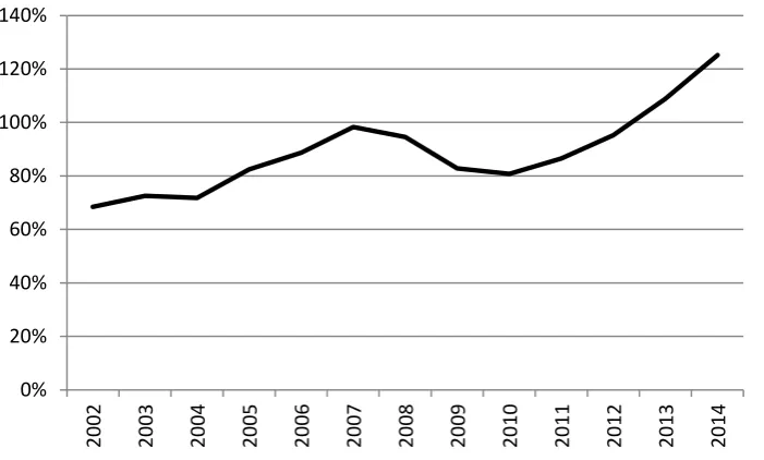
As is to be expected, the most expensive parts of the country to live in rented accommodation are in Dublin. Figure 10, which shows the “Dublin premium”, i.e. the average gap between rents in Dublin and rents outside Ireland’s five main cities, confirms this. The Dublin differential moves in a very similar way to the max-min ratio depicted in Figure 9. In 2002, the typical rent in Dublin was about two-thirds higher than the typical rural rent. By 2007, rents in the capital were twice as high, before this premium fell to eighty per cent in 2010. Since 2010, however, the Dublin differential has grown steadily from 80% to over 120%.
Figure 9. Dublin differential in the rental market, 2002-2014 1.00
1.50 2.00 2.50 3.00 3.50 4.00 4.50 5.00
20
02
20
03
20
04
20
05
20
06
20
07
20
08
20
09
20
10
20
11
20
12
20
13
20
14
Max-Med
Med-Min
Source: Author’s analysis of Daft.ie listings
The analysis above shows that the spread of rents is very much counter-cyclical – when incomes decline, so does the spread of rents across markets. But incomes did not been increase in any substantial way between 2011 and 2014 and yet rents rose and with it the Dublin differential. Ultimately, this comes down to supply and demand.
[image:10.595.125.476.76.287.2]The fundamentals of the property market – both lettings and sales – comprise principally of demand, measured through changes in household incomes, and supply. While the increase in rents from 2004 to 2007 may have been driven by rising incomes, the trend since has been determined by supply factors. Figure 10 shows the number of weeks supply on the market in Dublin, the other four cities combined, and in the rest of the country, on the first of each month from the start of 2007 until mid-2014.
Figure 10. Estimated number of weeks supply on the market
Source: Author’s analysis of Daft.ie listings 0%
20% 40% 60% 80% 100% 120% 140%
20
02
20
03
20
04
20
05
20
06
20
07
20
08
20
09
20
10
20
11
20
12
20
13
20
14
0 2 4 6 8 10 12 14
2007 2008 2009 2010 2011 2012 2013 2014
N
u
m
b
e
r
o
f we
e
ks
Dublin
Other cities
As can be seen, in all three regions, the dramatic fall in rents was associated with a substantial increase in the available stock. This is measured in weeks of supply, by dividing the stock available to rent on the first of each month by the average number of listings that came off the market over the previous year. Between four and six weeks of supply is the level typically associated with stable rents. Over the course of 2007 and 2008, the available stock rose to almost twelve weeks outside the cities, although this reduced sharply in 2013 and early 2014. In Dublin just two weeks of demand was on the market throughout the same period (2013-2014). This tightness of supply, last seen in early 2007, was the underlying reason for the sharply rising rents at this time.
3.3 Insights from the analysis
The findings about the “Dublin differential” and the tightness of supply in the capital throughout the period 2011-2014 are related. Ultimately, supply is fixed and, with significant available stock for much of the period in other parts of the country, those in need of rented accommodation could have moved elsewhere. That they chose not to, putting up instead with higher rents and thus a greater Dublin differential, is a testament to the pull of cities.
Ultimately, this Dublin differential stems from the greater ability of people to earn a living when we are clustered close together, what economists call agglomeration economies. Going back to the 1600s, two leases less than a year apart are a telling indicator of the importance of location. In 1619, Michael Hamlin, a merchant, was given a lease on “Moore’s acre” in Ballybough, at that time far removed from the bustle of city life, at the rate of just £0.17 an acre (Gilbert 1892). A few months later, William Dignam, a smith, was given a lease on a small plot of ground in central Dublin less than two miles away, with a per-acre rate of almost £150 (ibid.).
Proximity to a means of earning a living meant that these huge variations in the value of land – almost by a factor of hundred in the case of the two leases discussed above – could occur over very small distances. While the introduction of transport infrastructure such as rail and road has changed the magnitude of the relationship between urban centres and the cost of accommodation, the fundamental principle remains.
The credit-fuelled nature of the housing market bubble in the decade to 2007 meant that not only houses but also jobs were available throughout the country. As Ireland emerges from the shadow of this bubble and crash, however, the same fundamental underlying economic forces will still be at work. Indeed, related research has found that the premium for being close to urban centres in both the sales and rental markets has grown, in percentage terms, since 2007. In an economy with high unemployment, it pays to be close to where jobs are more likely to be created.
4. Conclusions
Once changes in the cost of living are factored in, a very different picture emerges. Inflation-adjusted rents have indeed risen for much of the period since the 1940s, in particular rising 30% over the course of the 1950s and 1960s and then by 40% during the 1980s and 1990s. However, by far the most dramatic feature of trends in real rents is their collapse during the 1970s, a result of rents rising by only 80% while general prices rose by a factor of four. Much more detailed datasets on private market rents will be needed to better understand the nature of this fall in the real cost of accommodation, just as Ireland also needs far better datasets on historical house prices.
An examination of tenure choice since World War 2 highlighted a connection between the swing from renting to homeownership and conditions in the credit market (as well as policy decisions such as mortgage interest relief). The fraction in rented accommodation is a cornerstone parameter in planning for the future of the Irish rented sector but, in the language of social science, it is
endogenous, interacting with a host of other variables in the Irish economy. These interrelationships are another priority for research in the sector.
Lastly, this chapter included an analysis of a very detailed dataset of rental listings since 2002. This analysis highlighted key trends in the spread of rents over the rental market cycle. Whether looked at as the ratio of maximum to minimum rents, or at the gap between rents in Dublin and rents outside the main cities, the rental market in 2014 had a very different stucture than at any point over the previous twelve years.
References
D’Arcy, F. (1989), ‘Wages of Labourers in the Dublin Building Industry, 1667-1918’, Saothar, XIV, pp. 17-34.
Fitzpatrick, M. (2014), ‘Cost of Living Crisis – Public Meeting’. Available online:
http://maryfitzpatrick.ie/?p=1460.
Gilbert, J. T. (1892), Calendar of ancient records of Dublin in the possession of the Municipal Corporation of that city: Volume 3, Dublin: Dollard.
Housing Agency (2014), Housing Supply Requirements in Ireland’s Urban Settlements 2014-2018: Overview, Dublin: Housing Agency. Available online:
https://www.housing.ie/Housing/media/Media/Publications/Future-Housing-Supply-Requirements-Report.pdf.
ILO (1927), ‘Money Wages Calculated on the Basis of 48 Hours’ work at Ordinary Time Rates in October 1926’, International Labour Review 15.
Murphy, P. (2014), ‘Housing Crisis: We Need Rent Controls!’. Available online:
http://www.paulmurphymep.eu/2014/04/housing-crisis-we-need-rent-controls/.