Visualization and Concept Drift Detection Using Explanations of Incremental
Models
Jaka Demšar, Zoran Bosni´c and Igor Kononenko
University of Ljubljana, Faculty of Computer and Information Science Veˇcna pot 113, 1000 Ljubljana, Slovenia
E-mail: [email protected], {zoran.bosnic, igor.kononenko}@fri.uni-lj.si
Keywords:data stream mining, concept drift detection, visual perception
Received:October 10, 2014
The temporal dimension that is ever more prevalent in data makes data stream mining (incremental
learn-ing) an important field of machine learning. In addition to accurate predictions, explanations of the models
and examples are a crucial component as they provide insight into model’s decision and lessen its black box nature, thus increasing the user’s trust. Proper visual representation of data is also very relevant to user’s understanding – visualization is often utilised in machine learning since it shifts the balance between per-ception and cognition to take fuller advantage of the brain’s abilities. In this paper we review visualisation in incremental setting and devise an improved version of an existing visualisation of explanations of incre-mental models. Additionally, we discuss the detection of concept drift in data streams and experiment with a novel detection method that uses the stream of model’s explanations to determine the places of change in the data domain.
Povzetek: V ˇclanku predstavimo novo vizualizacijo razlage inkrementalnih klasifikacijskih modelov in posameznih napovedi. Predlagamo tudi metodo zaznave spremembe koncepta, temeljeˇco na nadzorovanju toka razlag.
1
Introduction
Data streams are becoming ubiquitous. This is a conse-quence of the increasing number of automatic data feeds, sensoric networks and internet of things. The defining char-acteristics of data streams are their transient dynamic na-ture and temporal component. In contrast with static (tabu-lar) datasets (used inbatchlearning), data streams (used in incrementallearning) can be large, semi-structured, incom-plete, irregular, distributed and possibly unlimited. This poses a challenge for storage and processing which should be done in constant time – for incremental models, opera-tions ofincrement(fast update of the model with the new example) anddecrement(forgetting old examples) are vi-tal. Concepts and patterns in data domain can change (con-cept drift) – we need to adapt to this phenomenon or the quality of our predictions deteriorates. We discuss data streams and concept drift more in Section 2.1.
Bare prediction quality is not a sufficient property of a good machine learning algorithm. Explanationof individ-ual predictions and model as a whole is needed to increase the user’s trust in the decision and provide insight in the workings of the model, which can significantly increase the model’s credibility. The model independent methods of explanation have been developed for batch [12, 13] and incremental learning [2] (Section 2.2).
Data visualisation is a versatile tool in machine learn-ing that serves for sense-maklearn-ing and communication as it
conveys abstract concepts in a form, understandable to hu-mans. In Section 2.3 we discuss visual display of data in an incremental setting and describe the improper visualisation of explanation of incremental models. The main goal of the article is its improvement, which is presented in Section 3. An additional goal (Section 4) was to devise a method of concept drift detection which monitors the stream of expla-nations. Finally, we test the improved visualization and the novel concept drift detection method on two datasets and evaluate the results (Section 5).
2
Related work
2.1
Data stream mining
In incremental learning, we can observe possibly infinite data stream of pairs (xi,Ci), wherexiis thei−thinstance andCiis its true label. After the model makes a prediction
is detected, we can suggest that there has been a change in the generating distribution – concept drift. The nature of change is described with two dimensions: the cause of change (changes in data, hidden variables, changes in the context of learning...) and the rate of change. The change detection can be also completely left out (using windows and blindly forcing the operations of increment and decre-ment). The other approach is to actively detect change ei-ther by monitoring the evolution of performance measures or comparing distributions over two time windows. In the explanation methodology (Sections 2.2 and 4) we use two methods from the former group.
The basis of monitoring the learning process using sta-tistical process control (SPC) [4] is detecting significant error rate using central limit theorem. Each processed in-stance is in one of the three possible states -in control,out of controlandwarningwhen the system is in between the former states. Whenin control, the current model is incre-mentally updated with the current instance, since the error rate is stable. Inwarningstate, a buffer is filled with incom-ing instances – it serves as an optimally-sized container for data that is relevant for the new model if the drift occurs (out of controlstate) – the buffer is then used to construct a new learning model form the instances in it. If the system goes fromwarningback toin control, the buffer is emptied, since we deemed the error rise to be a false alarm.
The other method, Page-Hinkley test [8], is simpler in its nature. It was devised to detect the change of a Gaus-sian signal and is commonly used in signal processing. The method’s behaviour can be controlled with parameters λ
(threshold for alarm) and δ, which corresponds to the al-lowed magnitude of changes.
2.2
Explanation of models and individual
predictions
Explanation of individual predictions and prediction mod-els is used to gain additional insight into the model’s de-cision and to lessen the black box nature of most predic-tions. The adequately explained prediction increases the user’s trust and understanding of the model and extracts additional information.
Although some models are already transparent (e.g. decision trees, Bayesian networks) and model-dependent methods of explanation exist for most others, these meth-ods do not meet the requirement forconsistency of expla-nation, which enables comparison of explanations across different models. IME(Interactions-based Method for Ex-planation) [13] with its efficient adaptation [12] is a model independent method of explanation, which also addresses interactions of features and therefore successfully tackles the problem of redundant and disjunctive concepts in data. The explanation of the prediction pi for instancexi is defined as a vector of contributions of individual feature values(ϕ1, ϕ2, . . . , ϕn)whereϕjis the contribution of the value of thej-th feature. Positiveϕj implies that the fea-ture value positively contributed to the prediction (and vice
versa) while the absolute value|ϕj|is proportional to the magnitude of influence on the decision. The sum of all con-tributions is equal to the difference between the prediction using all feature values and a prediction using no features (prediction difference). The explanation quality in highly correlated with prediction quality [13]. Consequently, for very good models, the explanation gives us an insight not only into the working of the built model, but also into con-cepts behind the domain itself.
In order to discover dependencies among feature val-ues, 2n subsets of features are considered. An efficient sampling-based approximation method exists [12], where the explanation of a prediction is modeled with game the-ory as a cooperative game(N,∆)where playersNare fea-tures and∆is the prediction difference. The payoff vector divides the prediction difference among feature values as contributions that correctly explain the prediction1. The explanation of a single prediction can be expanded to the whole model by iterating thorough all possible feature val-ues and using contributions of randomly generated instance pairs to compute the contributions of each attribute value.
An adaptation of existing explanation methodology to incremental setting is proposed in [2]. In addition to the ef-ficiency requirements, the key feature of incremental learn-ing to consider is the possibility of a concept drift. The ex-planation in incremental learning should therefore itself be a data stream. An adaptation is developed by considering the existing model-independent method in batch learning [12] and equipping it with drift detection and adaptation methods.
In the incremental explanation methodology, the basic concept is slightly modified by introducing the parameter
max_window. It acts as a limiter for maximum size of the learning model, by narrowing down the model by FIFO principle, if necessary. The batch explanation is integrated at key points in SPC2 (changes of states), resulting in a
granular stream of explanations which reflect local areas of static distributions and intermediate areas of concept drift. An optional parameterωdetermines triggering of periodic explanations independent of change indicators. Aside from periodic explanations, the granularity of the stream is com-pletely correlated with change detection – the explanation of the model occurs only when error rate significantly in-creases, indicating a change in the distribution of gener-ating the instances3. Explaining an individual prediction
follows the same process as in batch explanation, only that the local learning model is used.
1The concept of Shapley value is used as a solution.
2SPC meets the requirement of model-independence – it works as a
wrapper for an arbitrary classifier. In addition to the occurrence of a
con-cept drift, it also detects its rate (the smaller the buffer is betweenwarning
andout of control, the faster the drift occurs)
3The resulting stream of explanations itself can be a subject of analysis
2.3
Data visualisation
Data visualization is often utilised in machine learning since it shifts the balance between perception and cognition to take fuller advantage of the brain’s abilities [3]. A data stream can be seen as a collection of observations made se-quentially in time. Sampling based research shows that the majority of visualizations depict data that has a temporal component [9]. In this context, visualization acts as a form of summarization. The challenge lies in representing the temporal component, especially if we are limited to two-dimensional non-interactive visualisations. Concept drift is the other property in data streams that makes creating good visualization a hard task. Even if we manage to effectively summarize and display patterns in data at some point, we are still left with the task of displaying the change in them. The main goal of this paper is improving the existing methodology for visualising explanations of incremental models [2]. The feature value contributions are repre-sented with customised bar charts. When explaining a static model, all possible values are listed along the axis with mean negative and mean positive contributions of each feature. When plotting multiple such visualisations (as is the case in locally explaining incremental models based on change detection) they become very difficult to read as a whole because of the large number of visual elements that we have to compare (we sacrifice macro view completely in favour of micro view). To consolidate these images and address the change blindness[7] phenomenon, charts are stacked into a single plot, where the age and size of the explanation are represented with transparency (older and “smaller” explanations fade out). The resulting visualisa-tion is not tainted by first impressions (as it is only one image) and is adequately dense and graphically rich. How-ever, the major flaw of this approach lies in the situations when columns, representing newer explanations override older ones and thus obfuscate the true flow of changing ex-planations, for example, when the concept drift precipitates the attribute value contributions to increase in size without changing the sign. Concepts can therefore become not only hidden; what’s more, the visualization can be deceiving, which we consider to be worse than just being too sparse. Therefore, we need to clarify the presentation of the con-cept drift along with an accurate depiction of each expla-nation’s contributions while maintaining the macro visual value, that enables us to detect patterns and get a sense of true concepts and flow of changes behind the model.
3
Improved visualisation
When visualising explanations of individual predictions, horizontal bar charts are a fitting method also in the in-cremental setting – we plot the mean positive and negative contribution of each attribute value and the mean of each attribute as a whole. Individual examples are always ex-plained according to the current model which, in our case, can change. This is not an obstacle, since the snapshot of
the current model is in fact the model that classified the example, so we can proceed with the same explanation methodology as in the static environment4.
This approach fails with explanations of incremental models as we need a new figure for each local explanation (Subsection 2.3). To successfully represent the temporal component of incremental models, we use two variations of a line plot where thexaxis contains time stamps of ex-amples and the splines plotted are various representations of contributions (yaxis).
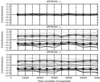
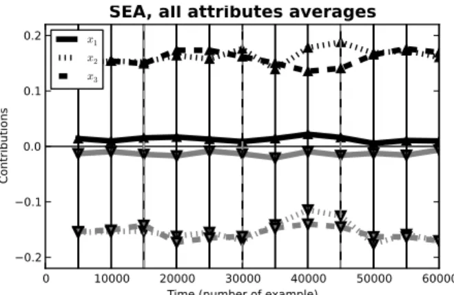
The first type of visualization (examples in Figures 2 and 4) has one line plot for each attribute. Contributions of values of the individual attribute are represented with line styles. The mean positive and mean negative contribution of the attribute as a whole are represented with two thick faded lines. Solid vertical lines indicate the spots where explanation of the model was triggered (and therefore be-come the joints for the plotted splines), while dashed ver-tical lines mark the places where the actual concept drift occurs in data. The second type is an aggregated version (examples in Figures 3 and 5) where the mean positive and mean negative contributions of all attributes are visualized in one figure. In these two ways we condense the visu-alization of incremental models without a significant loss in information while still providing a quality insight into the model. Exact values of contributions along with times-tamps of changes can be read out (micro view), while gen-eral patterns and trends can be recognised in the shapes of lines that are intuitive representations of flowing time (macro view). The resulting visualisations are dense with information, easily understandable (conventional plotting of independent variable, time, onx-axis) and presented in gray-scale palette, making them more suitable for print.
4
Detecting concept drift using the
stream of explanations
When explaining incremental models, the resulting expla-nations are, in themselves, a data stream. This gives us the option to process them with all the methods used in incre-mental learning. In our case, we’ll devise a method to de-tect outliers in the stream of explanations and declare such points as places of concept drift. The reasoning behind this is the notion that if the model does not change, then also the explanation of the whole model will not change. When an outlier is detected, we consider this to be an indicator of a significant change in the model and thus also in the un-derlying data. In addition to this, the method provides us with a stream of explanations that is continuous to a cer-tain degree of granularity and so enables us to overview the concepts behind the data at more frequent intervals than the existing explanation methodology.
4That means that, without major modifications, we can only explain
We use a standard incremental learning algorithm [4] (we learn by incrementally updating the model with each new example, decrement the model if it becomes too big or rebuild the model if we detect change [5]) and intro-duce thegranularityparameter which determines how of-ten the explanation of the current model will be triggered. This will generate a stream of explanations (vectors of fea-ture value contributions) that will be compared using co-sine distance. For each new explanation, the average coco-sine distance from all other explanations that are in the current model, is calculated. These values are monitored using the Page Hinkley test. When an alarm is triggered, it means that the current average cosine distance from other explana-tions has risen significantly, which we interpret as a change in data domain – concept drift. The lastgranulation ex-amples are then used to rebuild the model, the Page Hink-ley statistic and the local explanation storage are reset (to monitor the new model).
The cosine distance is chosen because, in the case of ex-planations, we consider the direction of the vector of contri-butions to be more important than its size, which is very in-fluential in the traditional Minkowski distances. It also car-ries an intuitive meaning. The Page Hinkley test is used in favour of SPC because of its superior drift detection times [10] and the lack of need for a buffer – examples are al-ready buffered according to the granularity. The method is therefore model independent. Algorithm 1 describes the process in a high level pseudocode.
5
Results
5.1
Testing methodology and datasets
We test the novel visualisation method and the concept drift detection method on two synthetic datasets, both contain-ing multiple concepts with various degrees of drift between them. These datasets are also used in previous work [2], so a direct assessment of visualization quality and drift detec-tion performance can be made. From the results of this testing, we may conclude whether the new methods are the improvements. The naive Bayes classifier and theknearest neighbour classifier are used. Their usage yields very sim-ilar results in all tests, so only results obtained by testing with Naive Bayes are presented.
SEA concepts [11] is a data stream comprising 60000 instances with continuous numeric featuresxi ∈ [0,10], where i = 1,2,3. x1 andx2 are relevant features that determine the target concept with x2 +x3 ≤ β where thresholdβ ∈ {7,8,9,9.5}. Points are arranged into four blocks: β = 8, β = 9, β = 7andβ = 9.5, consecutively. Although the changes between the generated concepts are abrupt,10%class noise is inserted into each block.
The second dataset,STAGGER, is generated withMOA (Massive Online Analysis)data mining software [1]. The instances represent geometrical shapes which are in the fea-ture space described by discrete feafea-tures size, colorand shape. The binary class variable is determined by one of
Algorithm 1 Detecting concept drift using the stream of explanations
Require: h{classifier}
Require: (x~i, yi)t{data stream}
Require: m{number of samples forIME} Require: g{explanation granulation}
Require: max_window{maximum size of the model} Require: λ{Page Hinkley threshold}
local_explanations←[] Φ =h{Incremental classifier} buf= []{buffer}
for(x~i, yi)∈(x~i, yi)tdo
Φ = Φ.increment(x~i)
iflen(Φ)> max_windowthen Φ = Φ.decrement() end if
buf.append((x~i, yi))
iflen(buf)> gthen
buf=buf[1 :]{Maintain buffer size} end if
ifi%g== 0then
φi=IM E(Φ){Explain the current model}
dist_φi←mean(cos_dist(φi, φ0)
∀φ0∈local_explanations)
ifP ageHiknley(dist_φi) =ALERTthen
Φ =h(buf){Rebuild} local_explanations←[] end if
local_explanations←local_explanations∪φ end if
end for
the three target concepts ((size=small)∧(color=red), (color = green) ∨(shape = square) and (size =
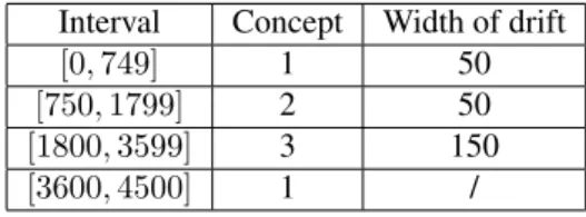
medium)∨(size=large)). We generate 4500 instances which are divided into blocks belonging to the particular concept (presented in Table 5.1). The concept drift is ap-plied by specifying an interval of certain length between blocks – there, the target concepts of the instances mix ac-cording to the sigmoid function. Therefore, the dataset in-cludes gradual drift, disjunction in concepts and redundant features.
Interval Concept Width of drift
[0,749] 1 50
[750,1799] 2 50
[1800,3599] 3 150
[3600,4500] 1 /
Table 1: STAGGER dataset used for evaluation
5.2
Improved visualizations
Concept drifts in STAGGER dataset (we use
the SPC algorithm – the change in explanation follows the change in concept. Windows generated by the vertical lines give us insight in local explanations of the model (where the concept is deemed to be constant). Disjunct concepts (2 and 3) and redundant feature values are all explained correctly (e.g. reduncacy of "shape" and disjunction of "size" values in concept 3). Figure 1 demonstrates how classifications of two instances with same feature values can be explained completely differently at different times – adapting to change is crucial in incremental setting. This is also evident in the aggregated visualization (Figure 3), which can be used to quickly determine the importance of each attribute.
t = 1500
circle blue medium circle blue medium
t = 2350
-1.0 -0.5 0.0 0.5 1.0 Contributions
-1.0 -0.5 0.0 0.5 1.0 Contributions
Figure 1: Explanations of individual predictions.
−0.6 −0.4 −0.20.0 0.2 0.4 0.6 Co ntr ibu tio ns attribute: size small large medium −0.6 −0.4 −0.20.0 0.2 0.4 0.6 Co ntr ibu tio ns attribute: color blue green red
0 1000 2000 3000 4000
Time (number of example)
−0.6 −0.4 −0.20.0 0.2 0.4 0.6 Co ntr ibu tio ns attribute: shape circle square triangle
Figure 2: Visualization of explanations triggered at change detection (STAGGER).
For SEA dataset, feature values were obtained by equidistant discretization in 10 intervals for each feature. Since the blocks containing each concept are rather long and all concept drifts were successfully detected by SPC, the explanations obtained by change detection and those that were triggered periodically, do not differ greatly (we usemax_length= 4000,ω= 5000). Explanations of in-dividual instances are tightly corresponding to explanations of the model.
As can be seen in figure 4, the shape of contributions of featuresx2andx3reflects the target conceptx2+x3≤β; lower values increase the likelihood of positive classifica-tion and vice versa. Feature x1 is correctly explained as
0 1000 Time (number of example)2000 3000 4000 −0.6 −0.4 −0.20.0 0.2 0.4 0.6 Co ntr ibu tio ns
STAGGER, all attributes averages size
color shape
Figure 3: Aggregated visualization of explanations trig-gered at change detection (STAGGER).
irrelevant with its only contributions being the result of noise. The succession of target conceptsβ ∈ {8,9,7,9.5}
is even more recognizable in the aggregated visualization (Figure 5). Changes in data are not as significant as those in STAGGER dataset, although the drift can still be ob-served, the dip aroundt= 40000being a notable example (the concept drifts fromβ= 7toβ = 9.5).
−0.4−0.3 −0.2 −0.10.0 0.1 0.2 0.3 0.4 Co ntr ibu tio ns
attribute: x1
−0.4−0.3 −0.2 −0.10.0 0.1 0.2 0.3 0.4 Co ntr ibu tio ns
attribute: x2
0 10000 20000 30000 40000 50000 60000
Time (number of example)
−0.4−0.3 −0.2 −0.10.0 0.1 0.2 0.3 0.4 Co ntr ibu tio ns
attribute: x3
Figure 4: Visualization of periodic explanations (SEA).
5.3
Concept drift detection
0 10000 20000 30000 40000 50000 60000 Time (number of example)
−0.2 −0.1 0.0 0.1 0.2
Co
ntr
ibu
tio
ns
SEA, all attributes averages
x1
x2
x3
Figure 5: Aggregated visualization of periodic explana-tions (SEA).
with significant delay. In this regard the proposed method is inferior to SPC algorithm – the concept drift detection in noticeably delayed and we’re also dependant on two pa-rameters – granulation and alert threshold, so the generality of the method is diminished.
No adaptation to change, STAGGER SPC, STAGGER
Timestamp of example
Detection from stream of explanations, STAGGER Detection from stream of explanations, SEA
0 1000 2000 3000 4000 0 1000 2000 3000 4000 Timestamp of example
Timestamp of example 0 1000 2000 3000 4000
Timestamp of example 0 20000 40000 60000
Figure 6: Loss of prediction and concept drift detection with several methods – no drift detection (static classifier), drift detection with SPC [2] and drift detection using the stream of explanations. The thick vertical lines indicate occurrence of true change in data and the dashed vertical lines mark drift detection.
When testing with SEA datasets, the concept drift was not correctly detected. Changing the granulation, Page Hinkley alert threshold and max_window parameter re-sulted in varying degrees of false alarms or non reaction to change (see Figure 6). This behaviour can be attributed to a small magnitude of change that occurs in data – the dif-ference between concepts in data is quite small and contin-uous. However, when explaining this (incorrectly adapted) model we still recognise true underlying concepts due to themax_windowproperty which causes the model to
au-tomatically decrement when it becomes too big5.
We conclude that, in this form, the presented method is not a viable alternative to the existing concept drift detection methods. Its downsides include high level of parametrization (maximum size of the model, granular-ity and alert threshold level) which require a significant amount of prior knowledge and can also become improper if the model changes drastically. Consequently, another as-sessment of data is needed – the required manual super-vision and lack of adaptability in this regard can be very costly and against the requirements of a good incremental model.
The concept drift detection is also not satisfactory – it is delayed in the best case or concepts can be missed or falsely alerted in the worst case. Another downside is the time complexity – the higher the granularity the more fre-quent explanations will be, which will provide us with a good stream of explanations but be very costly time-wise. The method is therefore not feasible in environments where quick incremental operations are vital. However, if we can afford such delays, we get a granular stream of explana-tions which gives us insight into the model for roughly any given time.
A note at the end: we should always remember that we are explaining the models and not the concepts behind the model. Only if the model performs well, we can claim that our explanations truly reflect the data domain. This can be tricky in incremental learning, as at the time of a concept drift, the quality of the model deteriorates.
6
Conclusion
The new visualization of explanation of incremental model is indeed an improvement compared to the old one. The overriding nature of the old visualisation was replaced with an easy to understand timeline, while the general concepts (macro view) can still be read out from the shape of the lines. Micro view is also improved as we can determine contributions of attribute values for any given time.
The detection of concept drift using the stream of expla-nations did not prove to be suitable for general use based on the initial experiments. It has shown to be hindered by delayed detection times, missed concept drift occurrences, false alarms, high level of parametrization and potential high time complexity. This provides motivation for further experiments in this field, especially because the stream of explanations provides good insight into the model with ac-cordance to the chosen granulation.
The main goal of future research is finding a true adap-tation ofIMEexplanation methodology to incremental set-ting, i.e. efficient incremental updates of explanation at the arrival of each new example. Truly incremental explana-tion methodology would provide us with a stream of ex-planations of finest granularity. In addition to this result (for each timestamp we get an accurate explanation of the
current model), a number of new possibilities for visuali-sation would emerge, particularly those that rely on finely granular data, such as ThemeRiver [6].
References
[1] A. Bifet, G. Holmes, R. Kirkby, B. Pfahringer, and Braun M. Moa: Massive online analysis.
[2] J. Demšar. Explanation of predictive models and individual predictions in incremental learning (in slovene). B.S. Thesis, Univerza v Ljubljani, 2012.
[3] S. Few. Now You See It: Simple Visualization Tech-niques for Quantitative Analysis. Analytics Press, USA, 1st edition, 2009.
[4] J. Gama. Knowledge Discovery from Data Streams. Chapman & Hall/CRC, 1st edition, 2010.
[5] D. Haussler. Overview of the probably approximately correct (pac) learning framework, 1995.
[6] S. Havre, B. Hetzler, and L. Nowell. Themeriver: Vi-sualizing theme changes over time. In Proc. IEEE Symposium on Information Visualization, pages 115– 123, 2000.
[7] L. Nowell, E. Hetzler, and T. Tanasse. Change blind-ness in information visualization: a case study. In In-formation Visualization, 2001. INFOVIS 2001. IEEE Symposium on, pages 15–22, 2001.
[8] E. S. Page. Continuous inspection schemes. Biometrika, 41(1):100–115, 1954.
[9] Gunopulos D. Keogh E. Vlachos M. Das G. Ratanamahatana C.A., Lin J. Mining time series data. In Data Mining and Knowledge Discovery Hand-book, pages 1049–1077. Springer US, 2010.
[10] R. Sebastião and J. Gama. A study on change detec-tion methods. InProgress in Artificial Intelligence, 14th Portuguese Conference on Artificial Intelligence, EPIA 2009, Aveiro, Portugal, October 12-15, 2009. Proceedings, pages 353–264. Springer, 2009.
[11] W. Nick Street and Y. Kim. A streaming ensemble algorithm (sea) for large-scale classification. In Pro-ceedings of the seventh ACM SIGKDD international conference on Knowledge discovery and data min-ing, KDD ’01, pages 377–382, New York, NY, USA, 2001. ACM.
[12] E. Štrumbelj and I. Kononenko. An efficient explana-tion of individual classificaexplana-tions using game theory. The Journal of Machine Learning Research, 11:1–18, 2010.