Open Access
Research
Interactive visualization of clusters in microarray data: an efficient
tool for improved metabolic analysis of E. coli
Theresa Scharl
1,2, Gerald Striedner*
2, Florentina Pötschacher
2,
Friedrich Leisch
3and Karl Bayer
2Address: 1Department of Statistics and Probability Theory, Vienna University of Technology, Wiedner Hauptstr. 8-10, A-1040 Vienna, Austria, 2Department of Biotechnology, University of Natural Resources and Applied Life Sciences, Vienna, Muthgasse 18, A-1190 Vienna, Austria and 3Department of Statistics, University of Munich, Ludwigstr. 33, D-80539 Munich, Germany
Email: Theresa Scharl - [email protected]; Gerald Striedner* - [email protected];
Florentina Pötschacher - [email protected]; Friedrich Leisch - [email protected]; Karl Bayer - [email protected]
* Corresponding author
Abstract
Background: Interpretation of comprehensive DNA microarray data sets is a challenging task for biologists and process engineers where scientific assistance of statistics and bioinformatics is essential. Interdisciplinary cooperation and concerted development of software-tools for simplified and accelerated data analysis and interpretation is the key to overcome the bottleneck in data-analysis workflows. This approach is exemplified by gcExplorer an interactive visualization toolbox based on cluster analysis. Clustering is an important tool in gene expression data analysis to find groups of co-expressed genes which can finally suggest functional pathways and interactions between genes. The visualization of gene clusters gives practitioners an understanding of the cluster structure of their data and makes it easier to interpret the cluster results.
Results: In this study the interactive visualization toolbox gcExplorer is applied to the interpretation of E. coli microarray data. The data sets derive from two fedbatch experiments conducted in order to investigate the impact of different induction strategies on the host metabolism and product yield. The software enables direct graphical comparison of these two experiments. The identification of potentially interesting gene candidates or functional groups is substantially accelerated and eased.
Conclusion: It was shown that gcExplorer is a very helpful tool to gain a general overview of microarray experiments. Interesting gene expression patterns can easily be found, compared among different experiments and combined with information about gene function from publicly available databases.
Background
The implementation of comprehensive analysis tools from systems biology into bioprocess development con-cepts enables the change from empirical to rational
knowledge based approaches in host engineering and process design. DNA microarrays are powerful, state of the art tools for the monitoring of cellular systems on tran-scriptome level providing insight into cellular response to
Published: 15 July 2009
Microbial Cell Factories 2009, 8:37 doi:10.1186/1475-2859-8-37
Received: 29 April 2009 Accepted: 15 July 2009
This article is available from: http://www.microbialcellfactories.com/content/8/1/37
© 2009 Scharl et al; licensee BioMed Central Ltd.
defined changes in cultivation conditions, e.g induction of recombinant protein production [1]. The successful application of microarrays as monitoring tool in bioproc-ess development strongly depends on concerted design of cultivation experiments as well as array experiments and systematic data analysis. To enable interpretation of results the most significant information must be extracted from the acquired microarray data by using optimally suited methods of statistics and bioinformatics. Compar-ative analysis of data sets from independent experiments provide additional information and contributes to the optimal exploitation of microarray data. Cluster analysis is frequently used in gene expression data analysis to find groups of co-expressed genes which can finally suggest functional pathways and interactions between genes. Clusters of co-expressed genes can help to discover poten-tially co-regulated genes or genes associated to conditions under investigation, i.e., the induction strategies. Usually cluster analysis provides a good initial investigation of microarray data before actually focusing on smaller gene groups of interest. In the literature numerous cluster algo-rithms for clustering gene expression data have been pro-posed. Besides traditional methods like hierarchical clustering, K-means, partitioning around medoids (PAM, K-medoids) or self-organizing maps there are several algo-rithms dealing with time-course gene expression data (e.g., [2-5]). Clustering is commonly used to reduce the complexity of the data from multidimensional space to a single nominal variable, the cluster membership. In the analysis of microarray data clustering is used as vector quantization because no clear density clusters exist in the data. Genetic interactions are so complex that the defini-tion of gene clusters is not clear. Addidefini-tionally microarray data are very noisy and co-expressed genes can end up in different clusters. Therefore the set of genes is divided into artificial subsets where relationships between clusters play an important role. Depending on the purpose of the clus-ter analysis different numbers of clusclus-ters can be appropri-ate. Few large clusters are typically used for a broad overview of a data set and many small clusters are more suitable to detect co-regulated genes (e.g., over 25 clusters in [2]).
The display of cluster solutions particularly for a large number of clusters is very important in exploratory data analysis. Visualization methods are necessary in order to make cluster analysis useful for practitioners. They give an understanding of the relationships between segments of a partition and make it easier to interpret the cluster results. In this work neighborhood graphs [6] are used for visual assessment of the cluster structure of partitioning cluster solutions.
All cluster algorithms and visualization methods used are implemented in the statistical computing environment R
([7], http://www.R-project.org). R package flex clust[6] contains extensible implementations of the K-centroids and QT-Clust algorithm. The new interactive visualization toolbox gcExplorer[8] uses the non-lin-ear graph layout algorithms implemented in the open-source graph visualization software Graphviz (http:// www.graphviz.org) for the arrangement of nodes. Biocon-ductor packages graph and Rgraphviz[9] provide tools for creating, manipulating, and visualizing graphs in R as well as an interface to Graphviz. The gcExplorer con-tains several possibilities to investigate gene clusters. A detailed view of single clusters is given by clicking on the nodes of the graph where various panel functions can be used to show the corresponding genes, e.g., matrix plots for gene expression profiles over time or HTML tables giv-ing detailed information about differential expression as well as links to databases. Properties of the clusters can be included in the display of the neighborhood graph, e.g., cluster size or cluster tightness. Additionally external knowledge from differential expression analysis or func-tional grouping is used to investigate the data. Finally dif-ferent experiments can easily be compared by visualizing groups of genes with common expression pattern in one experiment and potentially different expression pattern in the other experiment. The latest release of gcExplorer is always available at the Comprehensive R Archive Network CRAN: http://cran.R-project.org/package=gcExplorer.
Methods
Cluster Algorithm
In this paper the quality-based cluster algorithm stochas-tic QT-Clust [10] is used which is an adaptation of the original QT-Clust algorithm proposed by Heyer et al. [2]. In contrast to cluster algorithms like K-means where the number of clusters is defined a priori the quality of clus-ters is the central parameter now. The quality of a cluster is given by the maximum diameter of the cluster. The pos-sibility to tune the quality of clusters is very helpful for practitioners. Depending on the goal of the experiment different properties of the clusters are desirable which can either be a few rather large clusters or many small clusters with very specific expression patterns. Additionally the minimum number of points that form a single cluster is chosen. Microarray data are noisy data and outliers can easily distort cluster solutions. Stochastic QT-Clust is robust to outliers as outlier observations will not be added to any cluster. Hence the number of clusters is controlled indirectly through these two parameters. A further tuning parameter is the number ntry of candidate clusters gen-erated in each run. The algorithm works as follows:
1. Start with a randomly chosen centroid.
2. Iteratively add the gene that minimizes the increase in cluster diameter.
3. Continue until no gene can be added without sur-passing the diameter threshold.
4. Repeat from 1. for ntry - 1 further centroids.
5. Select the largest candidate cluster and remove the genes it contains from further consideration.
6. Goto 1. on the smaller data set.
7. Stop when the largest remaining cluster has fewer than some prespecified number of elements.
If ntry is equal to the number of genes G the original QT-Clust algorithm is obtained. Stochastic QT-QT-Clust speeds up the procedure and yields different local maxima of the objective function. The original algorithm will always converge in the same local optimum.
In order to gain maximum information the choice of the cluster diameter and the minimum number of points has to be carefully chosen as both have a large impact on the resulting clustering and its interpretation. A small diame-ter will yield a clusdiame-ter solution with many small clusdiame-ters containing genes with very similar expression patterns whereas a larger diameter will result in a smaller number of less tight clusters. Additionally, if the diameter is
cho-sen too small many genes cannot be added to a cluster and will be treated as outliers. The minimum number of points also has a big in influence on the number of clus-ters and the number of outliers. If small clusclus-ters are allowed (e.g., the minimum number of points is 2) there will be less outliers than in the case of a larger minimum number of points. There is a tradeoff between the number of clusters, the size of the clusters and the number of out-liers. Therefore it is necessary to finetune these parameters for each data set to obtain a cluster solution that fits the needs of the current experiment. In order to use the neigh-borhood graph for the visualization of a cluster solution obtained from QT-Clust the corresponding cluster centro-ids are computed. However, neighborhood graphs are generally applicable to various partitioning cluster algo-rithms like the well-known K-means or PAM.
Neighborhood Graphs
Neighborhood graphs [6] use the mean relative distances between points as edge weights in order to measure how separated pairs of clusters are. Hence they display the dis-tance between clusters. In the graph each node corre-sponds to a cluster centroid and two nodes are connected by an edge if there exists at least one point that has these two as closest and second-closest centroid.
For a given data set XN = {x1,...,xN} the distance between points xi and xj is given by d(xi, xj), e.g., the Euclidean or absolute distance. CK = {c1,...,cN} is a set of centroids and the centroid closest to x is denoted by
The second closest centroid to x is denoted by
The set of all points where ck is the closest centroid is given by
Now the set of all points where ci is the closest centroid and cj is second-closest is given by
For each observation x s(x) is defined as
c x d x c
c CK
( )=arg min ( , ).
∈
c x d x c
c CK c x
( ) arg min ( , ).
\{ ( )}
=
∈
Ak ={xn| (c xn)=ck}.
Aij ={xn| (c xn)=c c xi, ( n)=cj}.
s x d x c x
d x c x d x c x
( ) ( , ( )) ( , ( )) ( , ( )).
=
+
2
s(x) is small if x is close to its cluster centroid and close to 1 if it is almost equidistant between the two cluster centro-ids. The average s-value of all points where cluster i is clos-est and cluster j is second closest can be used as a proximity measure between clusters and as edge weight in the graph.
|Ai| is used in the denominator instead of |Aij| to make
sure that a small set Aij consisting only of badly clustered points with large s-values does not induce large cluster similarity.
Neighborhood graphs are a useful tool for the visualiza-tion of the structure of a cluster soluvisualiza-tion. Addivisualiza-tionally they can be used as exploratory tool to determine the quality of a given clustering and to validate the number of clusters.
Data
The E. coli cultivation data were collected at the Depart-ment of Biotechnology at the University of Natural Resources and Applied Life Sciences in Vienna. Two recombinant E. coli processes with different induction strategies were conducted in order to evaluate the in influ-ence of the expression level of the inclusion body forming
protein NproGFPmut3.1 on the host metabolism. The
standard strategy with a single pulse of inducer yielding in a fully induced system (in the following called experiment A) was compared to a process with continuous supply of limiting amounts of inducer resulting in a partially induced system (in the following called experiment B) [11]. The time point of induction of the partially induced system was set one doubling past feed start. The bioreac-tor, the used equipment as well as the on-and offline anal-ysis was published in detail by Achmüller et al. [12]. The resulting process data shown in Figure 1 clearly emphasize the central impact of induction strategies on the cellular response of strong expression systems and their behavior in production processes. The product formation rate trig-gered by full induction is too high and the thereby pro-voked metabolic overload impedes cellular growth. The increase in the total cell dry weight (CDW) attained past induction was mainly caused by the formation of the recombinant protein. This means that growth and prod-uct formation were decoupled completely. In conse-quence of these reactions product formation and process control were maintained only for a short period. How-ever, in the experiment with limited induction cells were able to cope with the metabolic load triggered by the recombinant gene expression level for more than one doubling. Product formation was tightly coupled to cellu-lar growth but approximately 9 hours past induction the metabolic load level exceeded the cellular capacities. The glucose yield coefficient (YX/S) decreased and the cells lost
s
A s x A
A
ij i
x A ij
ij ij
= ≠ ∅
= ∅ ⎧
⎨ ⎪
⎩⎪
− ∈
∑
| | ( ),
,
1
0
Process data
Figure 1
their ability to divide. The net cell mass generated in this phase was channeled into cell size and the cells entered a similar state as in the process with full induction.
In order to analyze the cellular response to different induction strategies on the transcription level two inde-pendent DNA microarray experiments were performed. A dye-swap design was used and the cells in the non-induced state of each experiment were compared to sam-ples past induction. Since the production period of the fully induced system was limited to approximately one generation (7 h at a growth rate of 0.1 h-1) samples were
drawn in a frequency of 1 h-1. To cover the production
period of the process with limited induction the sampling frequency was reduced to one sample every two hours. The used microarrays were epoxide-coated slides (Corn-ing® Epoxide Coated Slides) with selective probes (50-mer
oligos) for all 4289 open reading frames of the E. coli K12 genome (MWG E. coli K12 V2 oligo set; MWG Biotech AG, Germany) spotted in duplicates. The two experiments (including all processing protocols) have been loaded into ArrayExpress (http://www.ebi.ac.uk/microarray-as/ ae/). The ArrayExpress accession number of the array design is A-MARS-10. The experiment with fully induced
E. coli expression system (experiment A) has accession number E-MARS-16 and the experiment with partially induced system (experiment B) has accession number E-MARS-17. For standard low level analysis the data were preprocessed using print-tip loess normalization. Differ-ential expression estimates were calculated using Biocon-ductor [13](http://www.bioconBiocon-ductor.org) package
limma[14]. The two data sets were filtered by excluding genes expressed at a very low level (average log2 intensity smaller 8), genes not showing differential expression (log-ratio M smaller ± 1.5) at least at one time point and genes with p-value of the corresponding F-statistic smaller 0.05. After filtering the data acquired from the experiment with a fully induced E. coli expression system (experiment A) consists of 733 genes and the data acquired from the proc-ess with limited induction (experiment B) consists of 429 genes where 311 genes are differentially expressed in both experiments. The filtered data sets were clustered using stochastic QT-Clust and further analysis and visualization was conducted using the gcExplorer.
Results
Cluster Visualization and Interpretation
The major goal of this study is to identify differences between two independent microarray experiments which cannot be compared directly. For this purpose the two data sets are clustered into small and tight subgroups of genes with common expression pattern which can easily be investigated. The diameter of the clusters is tuned in such a way to get in the range of 15 clusters and 10 out-liers. The minimum number of points that form a single
cluster is set to 2. These parameter settings lead reasonable cluster solutions that can directly be interpreted. The data sets of experiments A and B were separated into 19 and 15 clusters respectively with 20 and 9 outliers. Next these two cluster solutions are investigated independently and com-bined in the following section. In case of very similar clus-ters the neighborhood graph can be used to combine the clusters after proofing the similarity. However, in this exploratory approach it is advantageous to merge similar clusters than to split large ones.
The resulting cluster solutions are visualized as neighbor-hood graphs in Figure 2 using the gcExplorer where nodes correspond to cluster centroids. In the two graphs rela-tionships between clusters can easily be explored as simi-lar clusters are connected by edges. The thicker and darker an edge is drawn the more similar two clusters are. Several groups of clusters can be found. In the neighborhood graph of experiment A the clusters in the top left corner (e.g., 1,2,3) are not connected to the clusters in the bot-tom right corner (e.g., 17,18,19) indicating that the corre-sponding genes show very different expression profiles. This can be confirmed by looking at the expression pro-files of the corresponding genes of experiment A (see Fig-ure 3). The genes in the bottom right clusters are all up-regulated (e.g., clusters 17 and 19) whereas the genes in the top left clusters are down-regulated (e.g., clusters 1, 3, and 4). The obtained results clearly show that the infor-mation gain of this work benefits from splitting the data sets in many small clusters at the beginning. For example, cluster 17, 18 and 19 contain genes with similar expres-sion profiles. However, the level of up-regulation is much higher in cluster 19. If interpretation of a general trend is required these small clusters can be treated as a large one as it is often easier to investigate the smaller ones.
The cluster profiles with immediate and stern up or down regulation followed by constant values for the rest of the process definitely reflect the macroscopic outcome of the experiment with full induction. The irreversibility of the cellular response to the applied load level is mirrored in the transcriptome data. The only exception are the tran-scription profiles of genes related to phage shock grouped in cluster 15 which show continuously increasing gene expression until the end of the process.
a downregulation after 9 hours past induction (e.g. cluster 9 and 13) or profiles with a 9 hour-delayed response to induction (e. g. cluster 6 and 3) were obtained. Further-more, a large number of genes belongs to clusters with continuously increasing or decreasing trends past induc-tion. These findings distinctly contradict the results of experiment A where only few genes show such a behavior. Again, the transcription data precisely reproduce the major changes in the experiment, the induction and the incipient metabolic overload. The new visualization tool-box offers various possibilities for the analysis of microar-ray data which cannot all be shown here. In the graphs shown so far simple node symbols are used including the number of the corresponding cluster but there are several possibilities how to include additional information in the representation of nodes. The most simple method is to use color coding, e.g., to color nodes by size or tightness of the corresponding clusters. Another possibility is to use different shapes or symbols for nodes representing clus-ters with specific properties. The neighborhood graph is implemented in an interactive way and gene clusters can be investigated by clicking on the nodes. Plots of the expression profiles of the corresponding genes pop up and HTML tables giving further information about the genes link to databases like Ecocyc (http://ecocyc.org/). The gcExplorer is applicable up to a very high number of clusters. Related clusters are not forced to lie next to each other in the graph as edges can have various lengths (e.g.,
the edge between clusters 18 and 19 in the left panel or the edge between clusters 2 and 3 in the right panel).
Functional Grouping
Cluster analysis is used to find groups of co-regulated genes in the microarray data without prior knowledge about the gene functions. However, by clustering expres-sion profiles of co-expressed genes groups of genes with similar function are found. External information about the annotation of genes to functional groups can easily be included in the neighborhood graph, e.g., the accumula-tion of gene ontology (GO, [15]) classificaaccumula-tions in certain gene clusters can be highlighted in the node representa-tion. For E. coli GO classifications about biological process (GOBP), molecular function (GOMF) and cellular com-ponent (GOCC), the GenProtEC ([16], http://genpro tec.mbl.edu/) classification system for cellular and physi-ological roles of E. coli gene products and the RegulonDB ([17], http://regulondb.ccg.unam.mx/) providing infor-mation about operons and regulatory networks were implemented. These knowledge-based functional map-pings can be used to study cellular functions in individual clusters.
In the left panel of Figure 5 clusters of experiment A with genes controlled by σ32, the main regulator of heat shock
response are highlighted. In the right panel gene expres-sion profiles of the closely related clusters 16 and 17 are
Neighborhood graphs
Figure 2
Neighborhood graphs. Neighborhood graph of the QT-Clust cluster solutions for experiment A (left panel) and experiment B (right panel).
k1
k2 k3
k4
k5
k6 k7
k8 k9
k10
k11
k12 k13
k14 k15
k16 k17 k18
k19
k1
k2
k3
k4
k5
k6
k7
k8
k9
k10
k11
k12
k13
displayed. 21 of 66 genes of the two clusters are under control of σ32. Further functional characterization of these
two clusters using GOMF yields the assignment of 26 genes to the GO-term GO:0005515 (protein binding) and of 16 genes to GO:0005524 (ATP binding). GOBP maps 11 genes to GO:0006950 (response to stress) and 10 genes to GO:0006457 (protein folding). On the other hand, a considerable number of 18 genes of these clusters is not mapped by the GO classification system as their molecular function is unknown or uncertain. Their cluster membership provides hints how these genes are embed-ded in the regulatory network of the cell and suggests potential cellular functions. A good example is ybbN, a thioredoxin-like protein with chaperone properties recently demonstrated in in-vitro experiments [18-20]. The relevance of the thus determined properties for cell physiology is still unknown but the cluster result strongly supports the suggested function as chaperone.
Construc-tion of a ybbN deletion mutant, a clone with plasmid encoding ybbN and conduction of experiments similar to the described cultivations will provide the information which is required to confirm these assumptions.
gcExplorer – a tool for comparative graphical analysis of microarray experiments
One typical application of the gcExplorer is the com-parative graphical analysis of different and independent
μ-array experiments. It is exemplified in the following workflow. A cluster solution of a single experiment (e.g., experiment A) can easily be compared to other experi-ments (e.g., experiment B) in order to find genes or groups of genes with similar as well as different behavior. This is achieved by clustering the genes of experiment A and using this partition to investigate experiment B. This pro-cedure helps to quickly identify groups of genes that clus-ter in both experiments and on the other hand to reveal
Diagram of experiment A
Figure 3
differences between the experiments. An example of a gene cluster which is very similar between the two experi-ments is shown in the top panels of Figure 6. In the top left panel cluster 15 of experiment A is shown for the full induction data. In the top right cluster the same set of genes is shown under limited conditions. An example of a tight cluster of genes showing a strong and direct down-regulation in response to induction is given by cluster 6 (see Figure 6 bottom left panel). In experiment B the majority of genes grouped to cluster 6 of experiment A show a delayed rather than a direct down regulation in response to induction (bottom right panel of Figure 6) whereas a considerable number of genes shows no com-mon behavior. In the following fliE, fliA and lpp, three genes with deviating profiles were selected to be examined in more detail.
fliA and flgE are the only genes of cluster 6 showing strong and direct down-regulation under limited induction con-ditions. These genes belong to the GO group GO:0003774 (motor activity). The expression patterns of all genes of this group are shown in Figure 7. In the experiment with limited induction (right panel) all these genes were down regulated in contrast to experiment A (left panel) where no common response was detected. A possible explana-tion of these findings is that cells exposed to high but tol-erable induction levels (experiment B) were able to compensate for depletion of cellular resources and capac-ities by reduction or cessation of non essential branches of the metabolism. In the defined environment of a bioreac-tor motility provides no benefits but demands energy and metabolites. Consequently, the cells cut down these expenses to maintain central cellular functionality.
Diagram of experiment B
Figure 4
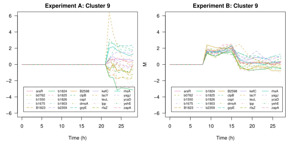
Another interesting transcription profile in cluster 6 of experiment A is given by the murein lipoprotein lpp. Under fully induced conditions this gene is down-regu-lated whereas under limited induction conditions the expression level of this gene follows a distinct up- and down trend coinciding with the process phenomenons described in Section Data. In the cluster solution of exper-iment B lpp is assigned to a cluster of 25 genes (Figure 8) comprising genes involved in membrane lipid synthesis (gnsB, rfaZ), membrane sysnthesis (rhsA), cell division (zapA) cold shock response (cspBCI) but also 8 predicted genes of unknown function. Lpp is the major lipoprotein of the outer membrane and one of the most abundant proteins in E. coli. It is essential for the stabilization and integrity of the bacterial cell envelope [21]. The gnsB gene increases the membrane fluidity and flexibility [22]. Cells activate an energy demanding protective strategy by syn-thesis and translocation of Lpp which is in contrast to the cut-back strategy described above. This comparative anal-ysis of the two experiments clearly reveals the irreversible overload of metabolism in the experiment with full induc-tion. Cells were not able to respond in a concerted and accurate way. On the other hand, cells exposed to limited induction of recombinant gene expression cope with emerging stress by different strategies in order to survive. The described cellular responses are similar to transitional changes of cells entering the stationary phase. This spore-like multiple-stress resistance state enables maintenance
of viability under bad conditions [23]. The identified genes involved in these defense mechanisms are potential candidates for indepth investigation and provide clues about the regulatory mechanisms involved.
Conclusion
The interactive visualization tool gcExplorer was devel-oped in order to make cluster analysis useful for practi-tioners. It allows not only to visualize the cluster structure, beyond that the gene clusters are plotted or shown in HTML tables with links to databases. Additional proper-ties of the clusters like cluster size or cluster tightness can be highlighted as well as external information like func-tional grouping. Furthermore gcExplorer provides functions for comparative graphical analysis of different
μ-array experiments. gcExplorer is a userfriendly soft-ware tool for the analysis of gene expression data and very helpful for practitioners to get an overview on the output of μ-array experiments.
In this study microarray data from two processes with a strong recombinant E. coli expression system were ana-lyzed. Neighborhood graphs enable the investigation of the underlying cluster structure and relationships between clusters. The implemented features for functional group-ing allowed the assignment of cellular functions to clus-ters and provided hints about the functionality of other genes belonging to a certain cluster. Comparative
graphi-σ32-regulated genes
Figure 5
σ32-regulated genes. Neighborhood graph of experiment A where clusters containing σ32-regulated genes are highlighted (left panel). Gene expression profiles of the corresponding genes of clusters 16 and 17 are shown in the right panel.
k1 k2 k3 k4 k5 k6 k7 k8 k9 k10 k11 k12 k13 k14 k15 k16 k17 k18 k19
0 5 10 15 20 25
−6 −4 −2 0 2 4 6
Cluster 16+17 Experiment A
Comparative graphical analysis of microarray experiments
Figure 6
Comparative graphical analysis of microarray experiments. Comparison of cluster 15 and 6 of experiment A under fully induced conditions (left panels) and limited conditions (right panels).
0 5 10 15 20 25
−6 −4 −2 0 2 4 6
Experiment A: Cluster 15
Time (h)
M
pspA pspB
pspC pspD
sdaA yjbO
0 5 10 15 20 25
−6 −4 −2 0 2 4 6
Experiment B: Cluster 15
Time (h)
M
pspA pspB
pspC pspD
sdaA yjbO
0 5 10 15 20 25
−6 −4 −2 0 2 4 6
Experiment A: Cluster 6
Time (h)
M
0 5 10 15 20 25
−6 −4 −2 0 2 4 6
Experiment B: Cluster 6
Time (h)
Motor Activity
Figure 7
Motor Activity. Motor Activity (GO:0003774) in experiment A (left panel) and experiment B (right panel).
0 5 10 15 20 25
−6 −4 −2 0 2 4 6
Experiment A: Motor Activity
Time (h) M flgB flgC flgE flgF flgG flgH flgJ flgK motA fliE fliF fliG fliH fliJ fliK fliM fliN
0 5 10 15 20 25
−6 −4 −2 0 2 4 6
Experiment B: Motor Activity
Time (h) M flgB flgC flgE flgF flgG flgH flgJ flgK motA fliE fliF fliG fliH fliJ fliK fliM fliN
Different response: the lpp cluster
Figure 8
Different response: the lpp cluster. Cluster 9 of experiment B under fully induced conditions (left panel) and limited con-ditions (right panel).
0 5 10 15 20 25
−6 −4 −2 0 2 4 6
Experiment A: Cluster 9
Time (h) M arsR b0762 b1550 b1675 B1823 b1824 b1825 b1826 b1903 b2359 B2598 clpB cspI dmsA grpE kefC lacY leuL lpp rfaZ rhsA yagJ ycaD yehE zapA
0 5 10 15 20 25
−6 −4 −2 0 2 4 6
Experiment B: Cluster 9
Publish with BioMed Central and every scientist can read your work free of charge
"BioMed Central will be the most significant development for disseminating the results of biomedical researc h in our lifetime."
Sir Paul Nurse, Cancer Research UK
Your research papers will be:
available free of charge to the entire biomedical community
peer reviewed and published immediately upon acceptance
cited in PubMed and archived on PubMed Central
yours — you keep the copyright
Submit your manuscript here:
http://www.biomedcentral.com/info/publishing_adv.asp
BioMedcentral
cal analysis of these two experiments resulted in the iden-tification of differences in the cellular response and a number of interesting gene candidates involved. It was shown that the cellular strategies are different in the two DNA-μ-array experiments. Useful information was extracted for the further advancement of the expression system by means of genetic engineering or by means of process engineering.
Competing interests
The authors declare that they have no competing interests.
Authors' contributions
TS and GS contributed equally to this manuscript. TS and GS carried out the analysis of the data and wrote the man-uscript. TS implemented the software. GS and FP per-formed the experimental part of the work. All authors participated in design and discussion of the research. FL and KB directed the research.
Acknowledgements
This work was supported by the Austrian Kind/Knet Center of Biopharmaceu-tical Technology (ACBT). Technical assistance of Jürgen Kern and Franz Clementschitsch is highly appreciated.
References
1. Dürrschmid K, Reischer H, Schmidt-Heck W, Hrebicek T, Guthke R, Rizzi A, Bayer K: Monitoring of transcriptome and proteome profiles to investigate the cellular response of E. coli towards recombinant protein expression under defined chemostat conditions. J Biotechnol 2008, 135:34-44.
2. Heyer LJ, Kruglyak S, Yooseph S: Exploring Expression Data: Identification and Analysis of Coexpressed Genes. Genome Research 1999, 9:1106-1115.
3. De Smet F, Mathys J, Marchal K, Thijs G, Moor BD, Moreau Y: Adap-tive quality-based clustering of gene expression profiles. Bio-informatics 2002, 18(5):735-746.
4. Ben-Dor A, Shamir R, Yakhini Z: Clustering gene expression pat-terns. Journal of Computational Biology 1999, 6(3–4):281-297. 5. Bickel DR: Robust cluster analysis of microarray gene
expres-sion data with the number of clusters determined biologi-cally. Bioinformatics 2003, 19(7):818-824.
6. Leisch F: A Toolbox for K-Centroids Cluster Analysis. Compu-tational Statistics and Data Analysis 2006, 51(2):526-544.
7. R Development Core Team: R: A Language and Environment for Statistical Computing. 2008 [http://www.R-project.org]. R Foundation for Statistical Computing, Vienna, Austria [ISBN 3-900051-07-0]
8. Scharl T, Leisch F: gcExplorer: Interactive Exploration of Gene Clusters. Bioinformatics 2009, 25(8):1089-1090.
9. Carey VJ, Gentleman R, Huber W, Gentry J: Bioconductor Soft-ware for Graphs. In Bioinformatics and Computational Biology Solu-tions Using R and Bioconductor Statistics for Biology and Health Edited by: Gentleman R, Carey VJ, Huber W, Irizarry RA, Dudoit S. New York: Springer-Verlag; 2005. [ISBN 978-0-387-25146-2]
10. Scharl T, Leisch F: The stochastic QT-clust algorithm: evalua-tion of stability and variance on time-course microarray data. In Compstat 2006 – Proceedings in Computational Statistics Edited by: Rizzi A, Vichi M. Physica Verlag, Heidelberg, Germany; 2006:1015-1022.
11. Striedner G, Cserjan-Puschmann M, Pötschacher F, Bayer K: Tuning the transcription rate of recombinant protein in strong Escherichia coli expression systems through repressor titra-tion. Biotechnol Prog 2003, 19(5):1427-32.
12. Achmüller C, Kaar W, Ahrer K, Wechner P, Hahn R, Werther F, Sch-midinger H, Cserjan-Puschmann M, Clementschitsch F, Striedner G, Bayer K, Jungbauer A, Auer B: Npro fusion technology to produce
proteins with authentic N termini in E. coli . Nature Methods 2007, 4:1037-1043.
13. Gentleman R, Carey VJ, Huber W, Irizarry RA, Dudoit S, (Eds): Bio-informatics and Computational Biology Solutions Using R and Bioconductor Statistics for Biology and Health. New York: Springer-Verlag; 2005. [ISBN 978-0-387-25146-2]
14. Smyth GK: Limma: linear models for microarray data. In Bio-informatics and Computational Biology Solutions Using R and Bioconductor, Statistics for Biology and Health Edited by: Gentleman R, Carey VJ, Huber W, Irizarry RA, Dudoit S. New York: Springer-Verlag; 2005. [ISBN 978-0-387-25146-2]
15. The Gene Ontology Consortium: Gene Ontology: tool for the unification of biology. Nature Genetics 2000, 25:25-29.
16. Serres M, Goswami S, Riley M: GenProtEC: an updated and improved analysis of functions of Escherichia coli K-12 pro-teins. Nucleic Acids Res 2004, 32:D300-2.
17. Salgado H, Gama-Castro S, Peralta-Gil M, Diaz-Peredo E, Sanchez-Solano F, Santos-Zavaleta A, Martinez-Flores I, Jimenez-Jacinto V, Bonavides-Martinez C, Segura-Salazar J, Martinez-Antonio A, Col-lado-Vides J: RegulonDB (version 5.0): Escherichia coli K-12 transcriptional regulatory network, operon organization, and growth conditions. Nucleic Acids Res 2006:D394-7.
18. Caldas T, Malki A, Kern R, Abdallah J, Richarme G: The Escherichia coli thioredoxin homolog YbbN/Trxsc is a chaperone and a weak protein oxidoreductase. Biochemical and Biophysical Research Communications 2006, 343:780-786.
19. Kthiri F, Le H, Tagourti J, Kern R, Malki A, Caldas T, Abdallah J, Lan-doulsi A, GAA R: The thioredoxin homolog YbbN functions as a chaperone rather than as an oxidoreductase. Biochem Bio-phys Res Commun 2008, 374(4):668-72.
20. Soni K, Jesudhasan P, Cepeda M, Williams B, Hume M, Russel W, Jayaraman A, Pillai S: Proteomic analysis to identify the role of LuxS/AI-2 mediated protein expression in Escherichia coli O157:H7. Foodborne Pathog Dis 2007, 4(4):463-71.
21. Hirashima A, Wang S, Inouye M: Cell-free synthesis of a specific lipoprotein of the Escherichia coli outer membrane directed by purified messenger RNA. Proc Natl Acad Sci 1974,
71(10):4149-53.
22. Sugai R, Shimizu H, Nishiyama K, Tokuda H, Tokuda H: Overex-pression of yccL (gnsA) and ydfY (gnsB) increases levels of unsaturated fatty acids and suppresses both the tempera-ture-sensitive fabA6 mutation and cold-sensitive secG null mutation of Escherichia coli. J Bacteriol 2001, 183(19):5523-8. 23. Ramirez Santos J, Contreras Ferrat G, Gomez Eichelmann M:
Sta-tionary phase in Escherichia coli. Rev Latinoam Microbiol 2005,