M.B.U.E.:
Analyzing graphics
When you view an advertisement, you generally encounter
two elements:
COPY
and
GRAPHIC
.
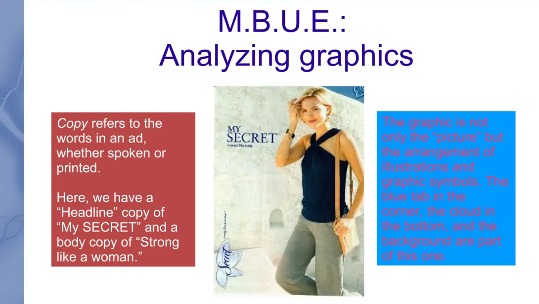
Copy refers to the words in an ad, whether spoken or printed.
Here, we have a “Headline” copy of “My SECRET” and a body copy of “Strong like a woman.”
The graphic is not only the “picture” but the arrangement of illustrations and
graphic symbols. The blue tab in the
M.B.U.E.:
Motion, balance, unity, emphasis
“Motion” is the
movement the
viewer's eye takes
on the visual
pathway. I have a
separate
presentation just on
motion.
The next three slides
will deal with:
Balance: formal
Balance: informal
Unity
Balance: How to find the center
The optical center of a picture is not the
geographic center. Impose a Christian cross on the photo or illustration: that is the center, because we are
Formal balance
Formal balance
puts an equal
amount of visual
weight on each side
(incl. diagonal) of
the center.
Suggests stability,
safety, certainty.
Think of the center point as a FULCRUM beneath a see-saw. To balance the graphic, you need even “weight” on both sides.
“Weight” is dark space, a solid, or a word.
Notice how half the face is on either side of the middle, how the headdress,
which is heavy with color,
“weighs” the same as the orange
background?
Look at the lettering, the inset boxes. See how the box on the right is lower and larger than the one on the left? See how the feather on the right of the face is larger than the left? These balance “Y-a-k-i-m
being on the left.
Nearly formal?
Not... really.
Top and bottom
balance, but not equally.
There is a lot of
dark of the pole to make up for the
white of the notice.
What's more, the diagonals are more
equivalent than equal.
When there is balance, but it leans or
mismatches, it's not formal.
If a graphic
is a see-saw
with the
balance as
the fulcrum,
then
balance can
be achieved
with one big
thing near
the center
and many
small things
at the edge
(like
Informal balance:
Suggests action, novelty,
innovation, and excitement.
In this case, it's obvious that the W in the title is heavy, but it's also obvious that the green guy's head is pretty big.
He is at the center line, and he is heavy, so he can be balanced by a smaller object, or a couple of them, at the edge. In this case, the endangered damsel balances the grinning head diagonally, while it balances the W in the other diagonal. The boulder-like grave stones balance the black space, and the damsel's exposed flesh is a match in light tones for them.
Unity
Unity is the
advertiser's ability
to keep the ad
together.
The viewer must
STAY PUT on the
product and not
have eye or mind
wander.
Unity tricks
Masses of blank space will create a visual
vaccuum for the eye and keep the viewer
inside an ad.
Margins, either actual lines or implied ones,
will also “box” the viewer.
Eye motion from visual elements can
redirect the viewer.
Logo and special trademark graphics (or
Hungry? Thirsty?
There is a great deal here. The balance is ____?
As for the motion, there are no creatures with eyes, so it's entirely structural, with the hamburger and Coke bottle moving our eyes.
This graphic, though, uses borders to create several compartments – each of which could contain the eye.
1. Left side border of white, top border of green, and bottom a Coca-Cola red label.
2. The bottle interrupts the label and white space. It is thus by
perspective tricks “in front” of a yellow box of a diner menu announcing what many of you are thinking about right now.
Emphasis: What are they selling?
Emphasis is the graphic designer's need to
make sure that the product is highlighted.
Light is one of the most common tricks
here, where the product receives the
greatest light or the “sun shines” on it.
The product is often in a gaze, and
structural lines will point toward it.
If the ad lets anything but the product take
A photo with emphasis
This photo was a casual,
non-professional shot, and it is not advertising, and yet it uses
structural motions to lead the eye inexorably toward the lady to the left.
These women are not fashion models.
The emphasis here is the act of putting the mail in the mailboxes.
Emphasis: Brand
Symbol, light, balance, all for one emphasis.
The ad has informal balance
(exciting!) and good unity (blackness of outer space or the night sky for a border), but what sets it apart is the way that the balance's shift tricks us into falling for a single, massive piece of structural motion and, regardless, reading:
“OLDSMOBILE.”
The rocket intersects the title, and the orange that might attract the eye goes instantly into the silver line of the rocket that fires into that graphic. It
seems like the ad sends us off the page, looking for the next thing, but not without reading “Oldsmobile” and getting “Oldsmobile rocket.”
What's all this, then?
I had to include some “bad,” too.
In fact, this common flyer isn't bad. It
simply has a function other than
advertising.
Unity comes from a literal border
drawn into each page, and there is
little attempt balance. The composer
does give it the old college try, but it's
a hopeless task. Emphasis is flat: the
company does not have a preference
of which item you come to buy.