BACHELOR THESIS
A pilot study on interactive decision trees
written by Renske Hortensius
Industrial Design
Student
Renske Hortensius S1439561
Company Wolters Kluwer Zuidpoolsingel 2 Alphen aan den Rijn The Netherlands
Final Presentation
Prof. Dr. Ir. Mascha C. van der Voort Dr. Ir. Mohammad Rajabalinejad Joy van Baren
7 July 2016
5
This bachelor thesis is written in collaboration with the University ofTwente and the company Wolters Kluwer Nederland B.V.
In this preface I would like to thank Kluwer for allowing me to write my Bachelor Thesis in their environment, because a lot of learning oppor-tunities were given to me. I learned a lot about the subject, but also about working in a professional environment, designing in an agile way and about presenting my work to colleagues and users. The help from all people I have spoken with in special the users, author, publisher and manager was very much appreciated and I hope you can profit in the future from this new functionality in the Navigator.
I would like to specifically thank Henriette, Anneke and Joy for supporting me in the process of this research. Your input and enthousiasm about the assignment kept me motivated. I would also like to thank the whole Navigator team for welcoming me with open arms and for always making me laugh during lunch breaks or randomly during the day.
I hope my enthousiasm about the assignment shines through in this report and you enjoy reading my bachelor thesis about interactive decision trees.
7
Wolters Kluwer Nederland B.V. maakt gebruik van een online informatieportal genaamd de Navigator, om juristen en fiscalisten van informatie en functionaliteiten te voorzien. Het bedrijf is gefocust op het digitaliseren van informatie en is van mening dat een boek online uitbrengen niet hetzelfde betekent als je profileren als een online uitgever. Het bedrijf heeft een nieuwe behoefte bij de klant geïdentificeerd: het aanbieden van praktische content om informatie op een efficiënte manier te vinden. Het bedrijf ziet interactieve beslisbomen als een mogelijke oplossing. Een verkennend onderzoek is uitgevoerd om te ontdekken wat nodig is om deze beslisbomen te integreren in de Navigator en om uit te vinden hoe interactieve beslisbomen visueel kunnen worden weergegeven.
De gebruiker wil interactieve beslisbomen kunnen vinden en als favoriet kunnen markeren in de Navigator. De gebruiker wil beslisbomen kunnen printen en op kunnen slaan op de computer. Ook moet de gebruiker kunnen navigeren door vorige vragen en wil de gebruiker de antwoorden kunnen aanpassen. Uit een brede analyse zijn ontwerplichtlijnen opgesteld, bestaande uit de volgende aspecten: overzicht, voortgangsindicatie, consistentie, schaal-baarheid, toegankelijk voor iedereen, flexibiliteit en aandacht.
Ideeën zijn gegeneerd en concepten zijn ontwikkeld die getest zijn door middel van een gebruikerstest. Ook de mening van een auteur, uitgever en manager zijn opgenomen in de uiteindelijke aanbevelingen voor een visueel ontwerp van een interactieve beslisboompagina. Deze aanbevelingen zijn gebaseerd op de ontwerprichtlijnen. De belangrijkste aanbevelingen zijn dat gegeven antwoorden zichtbaar moeten blijven, een categorisatie van de vragen moet worden toegevoegd, de beslisbomen geïntegreerd moeten worden in de Navigator en een uitgebreide uitleg (in de tekst of in een apart venster) aan een vraag moet kunnen worden toegevoegd. De titel, een korte omschrijving en de eerste vraag zijn de voornaamste drie elementen die op de startpagina van een interactieve beslisboom aanwezig moeten zijn.
Het integratieplan beschrijft alle aspecten van de integratie van inter-actieve beslisbomen in de Navigator. Eerst moet de behoefte van de gebruiker in kaart worden gebracht en het resultaat van een beslisboom moet gedefinieerd worden. Vanuit een zakelijk oogpunt moeten de opties voor uitbesteding worden onderzocht en data verantwoordelijkheden moeten worden toegewezen. Een invoeromgeving voor de auteur moet ontworpen worden en een bestand met richtlijnen voor een auteur moet worden gedefinieerd. Auteurs moeten ook geschoold worden in een andere manier van schrijven. Terminologie in de titels, maar ook in de content is een belangrijk onderdeel van de integratie en de nieuwe functionaliteit moet gecommuniceerd worden naar de gebruikers. De gebruikers moeten vertrouwen hebben in de juistheid en compleetheid van een beslisboom.
De gebruiker is geïnteresseerd in interactieve beslisbomen. Verder onderzoek en gedetailleerde plannen, zoals beschreven in dit onderzoek, kunnen in werking worden gesteld om te beginnen met het integreren van beslisbomen in de Navigator.
The Dutch share of the company, Wolters Kluwer Nederland B.V, makes use of an online information portal called Navigator to provide information and functionality to primarily law and tax professionals. The company is focussed on digitizing information and believes publishing a book online is not the same as being an online publisher. A new customer need was identified to provide users with practical content that helps the user get to the right information efficiently. The company’s attention was drawn to a solution called interactive decision trees. A pilot study is performed to identify what is needed to incorporate interactive decision trees in the Navigator and how the decision trees can be visually presented to the user.
The identified customer needs include the ability to find the trees and favourite the trees in the Navigator. It should be possible to print the interactive decision tree and to save it to the computer. The user wants to be able to go back to previous answers and be able to change the answers. Design principles defined based on a broad analysis of interactive decision trees include guidelines about the overview, progress indication, consistency, scalability, accessible for everyone, flexibility and attention.
Ideas and concepts are generated and tested with users in a user test. The perspective of an author, publisher and manager is also gathered. The result of this test phase is recommendations for the final visual design of an interactive decision tree page in the Navigator based on the earlier defined design principles. The most important recommendations include show all the answers of previous questions, incorporate a categorisation of the questions, integrate the trees in the Navigator, add an elaborated explanation (in-text or in a separate window) and the recommended elements to include on the first page are a title, a short description and the first question.
The implementation plan is about aspects to think of when integrating interactive decision trees in the Navigator. First the real need of the customer need and the result of a decision tree should be defined. For the business perspective outsource options should be investigated and data control needs to be assigned. An input environment needs to be created for the author and a template for writing interactive decision trees is recommended. The authors need to be prepared for this different way of writing. Also important is the terminology used in both the title as the content of the decision tree. The new functionality ‘decision trees’ should be communicated to the user and it is important to make sure the user trusts the system.
9
TAble of ConTenTs
5 Test & Development 56
5.1 User Test 57
5.1.1 Structure 57
5.1.2 Results 58
5.2 Author’s Perspective 63
5.3 Publisher's Perspective 64
5.4 Manager’s Perspective 65
6 Final Findings 66
6.1 Implementation Plan 67
6.1.1 To decide 67
6.1.2 To do 70
6.2 Visual Design Recommendations 74
7 Conclusion 78
8 Discussion 82
References 86
Appendix 88
A. Research Proposal 90
B. Requirements 96
C. Workshop about decision trees 102
D. Ideas Ja/Nee 103
E. User test questions 104
Preface 5
Abstract 6
Samenvatting 7
Introduction 10
1.1 Background information 11
1.2 Assignment 11
1.2.1 Motive 11
1.2.2 Goal 12
1.2.3 Research questions 12
1.3 Structure of the report 13
2 Analysis 14
2.1 Defining an Interactive Decision Tree 15
2.2 Existing Decision Trees 16
2.3 The Navigator 20
2.4 Design Navigator 23
2.5 Existing Wolters Kluwer Tools 24
2.6 Competitors 26
2.6.1 General Competitors Navigator 26 2.6.2 Decision Tree Tools Competitors 28
2.7 User 30
2.8 General User Interface Guidelines 31
2.9 Guidelines and Needs 33
2.9.1 Design Principles 33
2.9.2 Customer Needs 34
3 Ideas 36
3.1 Concept Visualisation 37
3.2 Ideas Step 1 38
3.3 Ideas Step 2 39
3.4 Ideas Step 3 and 4 42
3.4.1 Concept 1: All in one 44
3.4.2 Concept 2 : Window Integration 46
4 Concepts 48
4.1 Step 1 49
4.2 Step 2 49
4.3 Step 3 and 4 50
4.3.2 Concept 1: All in One 51
11
1.1 Background information
“Wolters Kluwer provides legal, business, tax, accounting, finance, audit, risk, compliance, and healthcare professionals the essential information, software, and services they need to make decisions with confidence.” [1]
The company originally was founded in 1836. Due to a merger of the two publishers Kluwer and Wolters-Samsom the company in current form started in 1987. Products of Wolters Kluwer are designed for a big range of sectors and products are both services and books. Professionals in the above stated sectors make use of their services. An educative branch called Wolters-Noor-dhoff was part of the company for twenty years but was sold in 2007. Wolters Kluwer operates in over 180 countries and has around 19.000 employees all over the world. [2] The head-quarter is established in Alphen aan den Rijn. In 2015, approximately 83 percent of the company’s revenue was gathered by digital products, software and services. The company is also listed as one of the 100 most sustainable corporations in the world. [3] The most important values of the company are ‘Focus on customer success’, ‘Make it better’ and ‘Aim high and deliver’.
The Dutch share of the company, Wolters Kluwer Nederland B.V., makes use of an online information portal called Navigator to provide information and functionality to primarily law and tax professionals. In the online portal laws and regulations, jurisprudence, policies, literature and comments are acces-sible. Customers use the portal to gather information to support a lawsuit for example. A big part of the Navigator is the search engine where all the documents can be accessed.
The Navigator team is constantly working on improvements for and the maintenance of the portal. The developers of the Navigator are trained to work in a fast-paced and flexible environment. The design strategy agile working and fitting framework scrum are practiced, which means every three weeks a viable output should be delivered. The idea of implementing customer wishes within a small time limit is key.
1.2 Assignment
For a relevant result it is important to formulate the motive and goal of the assignment early in the process. All three parties, the University of Twente, Wolters Kluwer and I, need a clear description of the end result.
1.2.1 Motive
Wolters Kluwer wants to create the biggest possible added value for their customers. Therefore customer is key in all of their products. They present themselves as online knowledge supplier and are always looking for innova-tive ways to deliver information to their customers. A new customer need
1 INTROduCTION
13
InTroduCTIon
1.3 Structure of the report
The following chapters of this report are dedicated to find the answer to the previous stated research questions. Several phases, analysis, ideas, concepts, test & development and final findings, lead to the conclusion. In the last chapter the research methods are evaluated.
The first chapter, analysis, explores several aspects of the assignment. First the term interactive decision tree is defined. The Navigator is elaborately explained and existing interactive decision trees are analysed. Existing practical content of Wolters Kluwer is investigated and the user of the
Navigator is characterized. Customer needs are identified as well. Research on user interface guidelines is done in order to understand the challenges and to define design principles that are kept in mind through out the design of the final concept.
In the idea and concept chapters the creative process is described. First a visualisation of the concepts is presented because several elements need to be designed. The first ideas and paper drawings are presented. Several digital versions of two chosen paper ideas are designed. In the concept phase two chosen ideas are chosen and elaborated into mock-ups. This phase explains the concepts and reflects on the design principles.
The concepts are evaluated in a user test which is described in the test & development chapter. In this chapter the opinions of an author, a publisher and a manager about interactive decision trees are shared as well.
In the final findings chapter all previous research is put into work. An imple -mentation plan describes the aspects that need to be taken into account when integrating interactive decision trees in the Navigator. Visual design recommendation are presented as well.
The conclusion summarizes and integrates the final findings to answer the research questions. The last chapter of this report disucces the presented work and evaluates the research methods.
was identified to provide information to professionals clearly and easily to enable them to give the best advice to their clients by offering interactive decision trees in the Navigator. In the current situation customers have to search for specific information in several regulations, laws and other documents. It can take a lot of time to find the right information, read it and interpret it. Customers also want to ensure that they have looked at a question from all possible angles, and are therefore both correct and complete in the answer they present to their internal or external customer. The input is a practical question and by asking the right follow-up question the output offers the user the right information to give the best advice to their client. The ultimate goal is to let the customer find practical information efficiently. Paper decision trees are already used by the customer, but these are not considered user-friendly because it takes a lot of time to complete them. This is due to the formatting. A future goal for interactive decision trees is the feedback from the service to the customer, instead of the other way around. This is easy to explain with an example. If a law changes, this has to be changed within the system. Every customer who ever included this law in their decision making process should be notified, so the advice (potentially) can be adjusted.
1.2.2 Goal
Wolters Kluwer wants to support their customers in the best way possible by offering interactive decision trees in the Navigator that enables them to find practical information easily and efficiently. The goal of this bachelor assignment is to perform a pilot study on these decision trees. Research has to be done where in the Navigator decision trees can be incorporated best and what is needed to implement this tool. It also consists of making prototypes that show the possible visual and substantive outcomes of the tree in the style of Wolters Kluwer. The focus of this assignment is on the navigation and the visual aspect of a specific part of the decision tree, where with help of literature the requirements for such a system will become clear. This is realised starting with gathering general informa-tion about interactive decision trees. Secondly, the customer is described and the Navigator is explored. Thirdly, possibilities for a suiting decision tree for Wolters Kluwer are explored and fourthly, a user test is carried out and adjustments are made to the concept. The customer is involved throughout the design process. A completely functioning system that is ready for integration in the Navigator is not part of the assignment. The entire assignment is completed within fourteen weeks.
1.2.3 Research questions
To reach the proposed goal research has to be done and questions have to be answered. In order to complete the assignment it is important to have knowledge about interactive decision trees itself, the competitors, the users and the design of the Navigator. The two main research question are:
“What is needed to incorporate interactive decision trees in the Navigator?”
and
15
2 ANALySIS
2.1 Defining an Interactive Decision
Tree
This report describes the process of designing an interactive decision tree. A clear definition of what is understood by an interactive decision tree in this report is important. Interactive decision trees exist on several levels of complexity.
The idea of a decision tree is simple and one can draft a tree out of almost anything. Let’s take a simple example: Should I wear shorts today? If one asks this question to a friend they first want to know the circumstances to answer the question correctly. A first question could be: Is the sun shining today? One answers with yes or no and based on this answer the friend tells you if you should wear shorts or not. If one writes this decision making process down in an efficient way it turns into a decision tree. Below a figure is shown of a simple decision tree drafted from the example.
As one can imagine, the answer to this question can be based on several conditions: the weather, planning of the day, clothes in your closet, etc. The more conditions the more complex the decision tree. Also a decision tree can consist of not just bilateral questions but questions with multiple answers, which increases the scale of the complete tree enormously. An interactive decision tree is a digitized version of the flat tree shown above and informa -tion is presented in a practical way. Due to the tree structure, the total amount of conditions to get to the final answer differs. If one enters one branch the decision tree could be done within one condition. One is simply not going to wear shorts if it is freezing outside. If one goes to another branch there could be a hundred other conditions to get to the right answer. If it is not freezing more questions need to be asked to know if one should wear shorts.
Basically a document is categorized as an interactive decision tree if it consists of a question or statement where conditions enables one to find the needed information.
In this chapter the analysis is addressed. In order to design an interactive decision tree research had to be done on several subject matters. Concluding this chapter require-ments are formulated for integrating interactive decision trees in the Navigator, which is a starting point for the next phase: ideas and concepts. The analysis deals with defining an interactive decision tree, research on existing interactive decision trees, research on User Interface guide-lines, in-depth research on the Navigator, analysing existing research of Wolters Kluwer, competing companies, the user of the Navigator and the user of the interac-tive decision trees specifically. Both from the above named research subjects and the input from the company itself, marginal and ideal requirements are formulated.
17
AnAlysIs
KPN [4]
This is the home page of customer services of a phone company called KPN. The homepage has a very basic and simple decision tree used to indicate the subject of the problem and narrow down solutions quickly. With a move-over on the options, you know which subject you are going to choose if you click. After choosing in step 1 and step 2, you immediately are forwarded to the page dedicated to your subject. On the left all subjects are shown, these are the same as on the homepage for easy switching. Once you clicked on a subject the sections of the subjects are shown if you click on plus. However if you click on the name itself the site directs you to other places on the website and the whole decision tree disappears. On the right the actual information is shown, in this case including a roadmap. The website adapts when the size of the browser changes. The menu on the left disappears quite fast when minimizing the browser horizontally. The text is readable in every browser size. The website operates exactly the same in different internet browsers. The icons make the page interesting to look at. These also make the website more interactive.
Riksjatravel [5]
This tool determines where you can go on holidays if you can’t decide. All questions are closed and the maximum amount of options is four. There are two types of questions, one where you can click on the picture itself and one where you have to click on a number in the scale. You are always restricted by the given choices. Below the progress is shown and you can navigate to previous questions. You can’t however click on the question you want to go back to. You can just navigate one question at the time.
Rondreis [6]
In this test you can also determine which country you want to travel to. It is a very easy decision tree, with always multiple options. I expect there are some countries behind it, who have all been assigned certain terms. For example, if you choose the option nature instead of culture only the countries with this term assigned to them will keep being an option. Then out of these residual countries, a certain amount of countries will be removed from the ‘answer’ list again and so on. This is also the reason you cannot write something yourself. The answers aren’t very flexible. Above the picture the progress is shown. You can go back to any question you want. It is however not possible to skip a question, so you are not able to go to a future question. If you move over an option that option lights up. The picture size changes and the place where you have to choose the options moves with every question. Every question is shown on a new page. This tree is part of a bigger page, where more information is shown than just this test.
DSM-5® Differential Diagnosis App [7] This app includes interactive decision trees. The app is developed to help clinicians diagnose their patients. Usually a number of questions is asked to
discover the psychiatric illness and with this app you will not forget a step and discover illnesses you wouldn’t immedi -ately think of. You can select a symptom from the list and a decision tree starts. Every time you select an answer a new question appears. Below the tree infor-mation about the symptom is shown. After answering a certain amount of yes/no questions the app gives you the diagnoses, afterwards alternative diagnosis are shown to rule out all possibilities. This interactive decision tree is part of a bigger app and the trees are shown in a separate section. The app is specifically designed to use on smart phones or smart watches.
2.2 Existing Decision Trees
In this sub-chapter several existing decision trees are analysed and customer needs are gathered. These gathered needs are based on the red marker notes in the figures and the finalized list can be found in section 1.2.8
Figure 2: Annotations of User Interface KPN
Figure 3: Annotations of User Interface Riksjatravel
Figure 4: Annotations of User Interface Rondreis
19
Belastingdienst [9]On the website of the Dutch government a lot of information can be found about taxes and tax returns. This is both for the employee as well as for the business owner. On the latter’s page a lot of questions are answered. In the bottom a quick menu is located where frequently asked questions can be accessed. At the top of the screen a few of these questions(that are most common) are highlighted. Both links bring you to the same page, which is the page shown on the right.
At the left side of the screen the subjects are shown. Sub-subjects are first hidden, but can be accessed by a roll-down menu which appears if you click on a certain subject. Once you’ve clicked on a subjects, the information is shown on the right. You can then click on a sub-subject and new information is shown on the right. This information is shown in text form including tables.
Mag Ontslag [8]
On this website you can use several tools, where decision trees are used to gather information about resigning from your job. Above the homepage is shown, where you can choose several subjects for your tool. You are able to carry out a decision tree as an employer or as an employee. The different subjects are already clustered and it is a clear overview of all the content.
The goal of this tree is gathering information about a specific subject. It answers practical questions in an easy way. At the end you see an overview of all your answers and you get an answer on your question. These documents can be downloaded or emailed.
The way you run through the decision tree differs. Sometimes the questions are asked separately, one question per screen, sometimes the questions are asked all at once on the same screen. The questions also very between yes/no, multiple choice or open questions. Sometimes you are able to fill in something yourself, but mostly you are restricted to the offered options. An example of a starting point question could be if you are eligible for a certain compensation. The deliverable after some follow-up questions is a yes/no answer. Another decision tree makes you calculate the expected time for you to get a new job. This is done by filling in simple entry fields on the left side. On the right side the answer is shown, which consist of a table with multiple impor-tant numbers. This decision tree lets you stay at the same page. It is very clear what happens in the answer if you change one field. It might be useful to let this calculation be more interactive by immediately showing the change instead of having to click on the calculate button.
UWV [10]
This informative website helps solving questions about employee insurances. At the homepage(figure 1) you can chose several subjects you want to get answers about. After you decided you come at a new page. In this page you have two options, that have several options in itself again. This saves an extra screen and the user isn’t confused, because the decision flow is clear. Once you made a choice again, a new screen appears with several options again. This saves extra pages, but you have to search for the information yourself more. Besides the first choice is made vertically and the next page the first choice is made horizontally. Behind these choices the answers, which consist of for example a roadmap for an approach or information about the chosen subjects. This decision tree answers question but isn’t stated in question/answer form. You just click on the subjects your question is about and the system serves you information.
Figure 6: Annotations of User Interface Mag Ontslag
Figure 7: Annotations of User Interface Belastingdienst
21
AnAlysIs
Search Engine
In this part of the portal all information you have access to(due to subscrip-tions and individually bought collecsubscrip-tions) from the database. If you press enter or click the search button, the search engine will start generating results for you. You can add terms by typing and pressing enter again. It will show the two terms separately. By clicking the cross next to the term on the right you delete it. Once you’ve searched for a term, for example ‘staatssteun’ the results will show below the search engine on the right. At the left filters are shown. These are visible, but can be hidden if you want too. The filters can narrow the documents down for specific purposes.
While typing the first few letters a so-called word wheel is shown with suggestions. You can immediately see which documents exist with a name close to your search and search on that term instead. Besides filtering of information, you can print the document list or a specific document. You can also sort the documents differently, by default this sorting is by relevance. You can choose to sort by date(increasing) and date(decreasing). It is also possible to change the visual presentation of the documents from elaborate to concise. The filtered documents are shown and the title and meta data, on the right, are immediately visible. Below the title the validity date and concise content is shown.
In the elaborate search engine you can filter the results even more. This is done by entering the law name, article number, exact date or period, reference, ECLI, title, author and additional sub-filters to the filters previously mentioned. The results will be more suitable to your request. Once you’ve clicked on a filter the term shows up in the search engine so you always know which filters you used.
2.3 The Navigator
The Navigator is a paid online information portal for legal and tax professionals. The users have to be aware of the latest law regulations, jurisdiction and literature relevant for their discipline to advise their customers in the best way possible. Because Wolters Kluwer is an (online) publisher not all documents are accessible to anyone. There are three subscriptions: Basic, Complete and Expert, which all include certain collections. Collections are clustered documents and publications aimed at certain disciplines and subjects, for example ‘income tax’. Additional collections can be bought separately as well, depending on your subscription. The most important function are addressed below.
Homepage
If you navigate to www.navigator.nl you have to log in first. This is done using a log in which can be gathered by buying a subscription for Navigator. You are also able to log in using a student or employee account or with an ‘Legal Intelligence’ or ‘Rechtsorde’ account. On the homepage you have access to several different information sources. It is always accessible by clicking on the Navigator logo or the home button. Most important is the search engine located at the top of the page. Below the search field a few headings are visible. ‘Favorieten’ shows the documents and publications you’ve favourited. The fourth element is the ‘Blijf op de hoogte’ tab, where you see topical news about your area. At the top right you can sign in and out of the Navigator. You are also able to change your Navigator settings, for example your profession. Next to these buttons you can learn more about the Navigator with the ‘Over Navigator’ button. Next to these buttons are also the ‘privacy’ and ‘suggestie?’ buttons. At the top left of the screen you find the home button, but also short-cuts to search in the publications database and find ‘Thema’s’. The last button is the ‘Mijn Navigator’ button, where personal labels and notes can be accessed.
Figure 9: Navigator Homepage
23
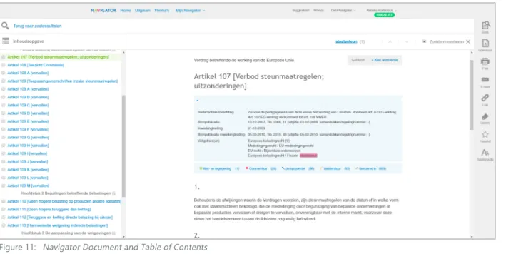
Document pageIf you clicked on a document in the search engine you are immediately directed to the right document. At the top the title is shown. Below that the meta data is shown and this information can be hidden. This meta data contains editorial notes, source of publication, date of entry, source of publication of date of entry and disciplines. In this blue box you are also able to access different types of information: laws, comments, jurisdiction, literature and stated in. On the top right you can see if the law is valid or outdated and you can choose the law version you are searching for. In the text of the document the terms you searched for are highlighted. On the left the table of content can be accessed, printed and downloaded. In the menu on the right are all functions within a document acces-sible. You are able to search the current document with any search term. You are able to download the document in PDF or RTF format and you can choose to include document data. You are also able to print the document including or excluding document data. Below the E-mail button is located, where you can share (part of) the document immediately without leaving the Navigator. You can also get a link to share the document with others. You can add a label and favourite the document. It will show up in ‘Mijn Navigator’ or the homepage. Three font sizes are available.
My Navigator
You can create and attach a label to a certain document. Once you’ve done this the label shows up in the ‘My Navigator’ tab where you can access all your labels. You can click on a label and it shows you all the documents you attached the same label to. This way you can make a categorization yourself. The same holds for the notes and remarks, which you can add in a document with the selection tool. You can find these personal notes on the separate ‘My Navigator’ notes and remarks tab. You can also search through these notes and labels with a specific search engine.
Themes
In themes matters are touched upon that are important in the legal and tax business at the moment. The author explains and elaborates on a certain subject and the theme contains links to relevant laws, jurisdiction and models. These are updated regularly.
2.4 Design Navigator
Below a figure of all existing buttons, text, logos, colours and other visual components is shown. These are all subtracted from the Navigator website and indicate which design choices need to be made for a fitting integration of decision trees.
Figure 11: Navigator Document and Table of Contents
25
AnAlysIs
Decision tree from Navigator Poland
In the legal department of Wolters Kluwer an interactive decision tree is incor-porated. On the right of the screen the structure in shown and all components are clickable. If you click on a node in the right window the left window will scroll to the matching elaboration with law references. The result will be a statement on the subject the tree is built for, i.e. the length of maternity leave.
SmartDox
This is a software from Wolters Kluwer which can draft contracts easily. While filling in questions the program automatically generates a contract with all relevant articles. This document is available as download at the end of the session. The answers on the questions are also included in the end for relia-bility purposes and accuracy of the information.
IntelliConnect
In the America's share of the company interactive decision trees are already incorporated in an online information portal. These trees are sold as an individual functionality or are included when buying a certain content package in their portal. Their decision trees exist of one questions per page and have several references per question. First an explanation is given and then a question is asked or a calculation tool is presented on the screen. They've experienced the user is likely to complete and print the tree.
2.5 Existing Wolters Kluwer Tools
As said before, the company is busy trying to provide their customer with practical information. All throughout the company and in several departments and countries research has been done and concepts have been drafted and even implemented already. This part of the report will deal with the already drafted tools within the company to present information practically.
Models for legal practice
With these models several outputs can be generated, i.e. contracts or letters. These models make official requests, i.e. marriage registration, more efficient. You can download the model and a Word document will open. A document is shown where several spaces are kept blank. There is a number at each blank space that references to a number below the actual model. This reference explains the reason why the information needs to be incorporated in the letter and gives examples for the input. The word document doesn’t include these elucidations while exporting. The Navigator contains hundreds of these models. However the design is not very intuitive and the Word document looks outdated.
Paper decision trees for civil matters
The company already has decision trees on paper that can be used to for example figure out if you are entitled to state aid. Although the content of the trees is correct, it is not efficient and you still have to search for the answer. The company is interested in charts like this and they can be very useful. They are however not digitized and can not be integrated in the Navigator yet.
Figure 13: Paper decision tree about tresholds
Figure 14: Interactive decision tree about maternity leave from Wolters Kluwer Poland
27
Bloomsbury Professional (Tax Planner Interactive) [13]Bloomsbury Professional is not a very important competitor to Wolters Kluwer because it is aimed at the UK market and Wolters Kluwer Navigator is specifically focused on the Netherlands. However, Bloomsbury does provide practical tax information and uses an interactive tool to present the informa-tion. In this tool the provided information is shown chopped into different market life cycle components. Once you’ve chosen your segment you can choose your goal and an interactive decision tree tool opens. You have to answer very practical yes/no questions about the situation and the end result is a gathering of the facts, a client summary letter, step-by-step guidance plan and more tips and tricks.
LexisNexis[14]
LexisNexis pioneered in the 1970s with an online legal data system where documents were accessible digitally. [15] They currently have the world’s biggest online database for legal related information and offer multiple solutions for several different market segments. Lexis Advance is an online legal research solution where jurisdiction and laws can be found and is part of Wolters Kluwer Poland. The Lawyer Overview Tool provides several calculation insights. LexisNexis Academic is aimed at students specifically and provides a legal related information database where articles and juridical publications can be accessed.
2.6 Competitors
A selection of general competitors of the Navigator and corporations that offer work flow tools that could be used for decision trees are displayed in this chapter.
2.6.1 General Competitors Navigator
Overheid.nl [11]
This website is an initiative from the government of the Netherlands. On this website a lot of information from different government organizations can be found and the website can be useful to general citizens, private business owners and entrepreneurs. On the tab government a search engine with all up-to-date laws and regulations can be consulted and filters are available for your search results. The results are shown clearly and the whole law can be accessed.
Fiscaal Totaal [12]
Fiscaal Totaal presents itself as online knowledge bank for relevant fiscal deepening. On this website all laws and jurisdiction can be found. You are able to search with a search engine and filter your results. They offer special tools and templates that supply practical information. Almanacs, tax guides and calculating tools are also included. Fiscaal Totaal for Financial is a program targeted to financial specialists.
Figure 16: Search results overheid.nl
Figure 17: Fiscaal Totaal law overview page
Figure 18: Interactive decision tree from Bloomsbury Professional about investment
29
AnAlysIs
Yonyx [18]
On this website you are able to create interactive decision trees. You have multiple editing options: map view and slide view. The map view shows the structure of the tree. The slide view looks more like how it’s going to end up for the user. You are also able to see the end result any time you want. In the slide view you can add a follow-up question and structure the tree this way. It is also possible to give the questions a name and a description. In the editing views you are also able to see the cumulative traversal analytics.
SmartDocuments [19]
This company is a specialist within the branch of customer communication and document creation. With their services it is possible to create a custom-ized tool for document creation with a touch of your own company. They offer maintenance help and it is possible to link several application to a SmartDocuments tool. Their aim is offering customers the convenience of creating documents fast and with corporate identity. They realise this by offering templates and remembering information from all documents that can be reused afterwards.
2.6.2 Decision Tree Tools Competitors
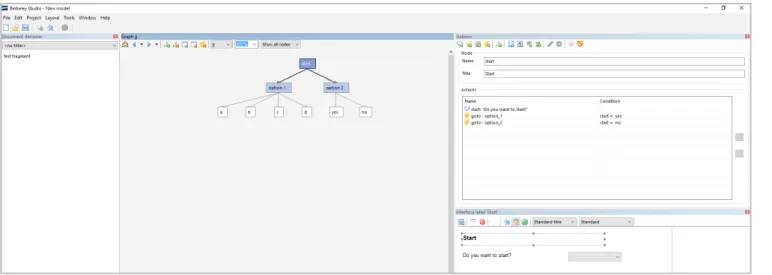
Berkeley Bridge [16]
This software is designed to create an interactive decision tree easily. After downloading the program an interface is shown with multiple windows. The middle window shows the structure of the tree which you can edit directly. You are able to add nodes and connect questions with answers to them. If you add a question a new window will appear where you are able to fill in the details. In the interface window you will directly see your changes. You are able to choose an answer kind, for example a check-box or a combo-box. The tree can be exported as an XML file.
Zingtree [17]
This website helps you create an interactive decision tree. When starting a new tree there are three choices in the way of creating: drawing, insert questions and the blank starter tree. It is also possible to choose between two lay-out options, buttons or panels. The node in the tree is also flexible, it can vary between a question(commonly-used) and linking to another tree. You can add a yes/no question and fill in the question and answers yourself and link these to the next question. The ‘designer’ lets you draw up the structure with the components you’ve made and make connections easily.
Figure 20: Author input software from Berkeley Bridge
Figure 21: Author input software from Zingtree Figure 22: Interactive decision tree output from Zingtree
Figure 23: Author input software from Yonyx
Figure 24: Interactive decision tree output from Yonyx
31
2.8 General User Interface Guidelines
The usability heuristics for user interface design defined by Jakob Nielsen [20]contain several principles which should be kept in mind while designing in an user centralized way. It states that a user should always be aware of the system status, providing feedback to the user within a certain time frame is essential for a user-friendly design. A relation between the system and the real world should be established to create recognition for the user and make the user interface intuitive. As a designer you should keep in mind the fact that users make mistakes and functions as undo and redo should therefore be supported. During the design process components with a high error risk should be avoided. If an error does occur clear indication and explanation of the solution is essential. Confusion should be avoided at all times and consist-ency is an important heuristic to makes users understand a system better. Also, users get accustomed with a system and the system should be designed to give the user the opportunity to increase their efficiency. Besides functional heuristics aesthetic design also plays a big role in a user-friendly interface design. Minimalistic design is preferred as every additional information component competes with the other components in the frame. A designer should not create distractions by adding unnecessary information making optimal use of the selective attention of the user. The user should not spend his time in a cluttered environment searching for the right information, the so-called visual search should be kept at minimum. Another way to decrease the visual search is providing the user the needed information in one screen taking account the human memory limitations. Ideally help concerning the use of a system is not necessary. However sometimes it is impossible to avoid and help should be offered focusing on the task of the user and offering specific solutions.
Action selection
When the user is subjected to a choice, no more than the essential options should be presented, particularly if time is critical. Many choices result in longer response time and more mistakes. Time required for a single high-complexity choice is higher than multiple low-complexity choices. A contradiction concerning this complexity of choice is: keep choices simple, but use a small number of complex choices. A single choice among a larger list is often better than multiple sequential choices among smaller lists. [21]
Human brain limitations
When designing an user interface the limitations of the human brain should be taken into account. Especially the attention, perception, interpretation, comprehension and cognition are important factors. Attention can be divided in three modes: selective, focused and divided attention.
Selective attention is influenced by a certain amount of factors. Some of these factors are: salient features, expectancy, value and effort. When designing a decision tree these factors should be kept in mind, because this supports for example highlighting important information or keeping information hidden to focus on the highly important information.
Focused attention is to maintain processing of the desired source and avoid
2.7 User
Fiscal and tax professionals, i.e. lawyers, jurists, payroll tax specialist or accountants, work in a fast-paced business and efficiency is important. The professionals(juniors and seniors) use the Navigator to find the complete law, jurisdiction, relevant news and publications. The use of this information varies a lot. Lawyers may use it to strengthen their case and fiscal advisors may use it to give a client advice for their company. The task of the users is therefore flexible but a few examples are: ‘gather facts, draft contracts, litigate, research, give advice, calculate risks, transfer knowledge and mediating between two parties’. The database of the Navigator contains a lot of subject specific information and is therefore used by the professionals to find in-depth information. The seniors use latent knowledge and use the Navigator to find the exact document, the juniors are more likely to search for new information. The time they spend searching for information in the Navigator also varies. Some users may use it once every month and some users use it several times a day.
33
AnAlysIs
distractions. The decision tree should not contain visual so-called noise to
improve the focused attention. Making information discriminable in a certain way will help the user distinguish information and keep focused and pay attention to the right thing. Making two components the same colour makes the user wonder if they are connected.
Divided attention is the ability to do certain tasks at the same time. Dual-task environments should be avoided in a design as it is an additional difficulty for the human brain and makes the design more complex. [21]
Visual perception
The Gestalt Principles [22] define several guidelines in terms of visual perception which can be applied to user interface design. These principles describe how the human brain groups images.
Similarity and Anomaly
Continuation
Closure
Proximity
Figure & Ground
2.9 Guidelines and Needs
2.9.1 Design Principles
Mainly out of the analysis of existing decision trees(Chapter 2.2, denoted with a 2), the Navigator(Chapter 2.3, denoted with a 3), the user(Chapter 2.7, denoted with a 7) and the research on user interface guidelines(Chapter 2.8, denoted with an 8) design principles for the user interface for decision trees for the Navigator were gathered and clustered. The complete list is shown below.
Overview
• Minimize different pages (2)
• Input and Output generated on the same page (2) • Subject categorization (2)
• Seeing response immediately when changing a field (2) • Ability to go back to any question you want (2)
• Ability to return to decision tree, if linked to another page (3) • Reduce fear of incomplete information (8)
Progress indication
• Indication of progress (8) • Indication of chosen path (8) • Show future questions (2)
• Show if a question is required (2)
• Clear boundaries where the decision tree ends (2) Consistency
• Interface design fitting with Navigator (3) • Same lay-out, same interaction (2)
• Consistent way of filling in the entry fields (8) • Consistent direction of flow, i.e. scrolling down (2) • Consistency in directory links (8)
Scalability
• Functionalities consistent when changing the page size (2) • Compatible with different operating systems (3)
• Compatible with different browsers (3)
• Responsive design (on desktop, tablet or phone) (3) • Adaptive to uncertain amount of questions (3) Accessible for everyone
• Take into account colour blindness (7) • Take into account dyslexia (7)
Flexibility
• Adaptive to different inputs (3) • Adaptive to different outputs (3) • Adaptive to elaborate explanation (2) • Opportunity to grow in total size (3) • Maintenance (3)
• Performance (3) Attention
• Minimize visual searching time (8)
• Balance amount of questions on one page (8) • Cluster information that belongs together (8)
35
... be able to change my answersAs systems need to be adapted to the possibility of errors(Chapter 2.8) of humans, it is a logical step to include this error handling functionality in the decision trees. Besides error handling, it is necessary for the user to be able to explore several different answer paths to compare and come to the right answer and advise for their client.
As this pilot study can be categorised as an exploratory research, the focus lies on investigating the customer needs and gathering broad knowledge. Therefore the measurable requirements were not used often during the design process. The requirements however have been defined to anticipate on future restrictions and can be found in Appendix B. All wishes from the user are included in this document aswell.
2.9.2 Customer Needs
Wolters Kluwer wants to know how interactive decision trees could be integrated in the Navigator. Therefore it is important to prioritise functions and pinpoint which functions are necessary to gain profit from this new functionality of the Navigator. Together with the product owner and several influential people from the company this Minimal Viable Product (MVP) was drafted. An explanation from a marketing’s point of view and measurable requirements are added to the most important customer needs as stated below.
As a user I want to...
... find interactive decision trees in the Navigator
Interactive decision trees as one may notice is written in plural form. Several subjects lend themselves for being put into a decision trees and with implemen-tation a number of trees is going to be integrated at the same time. An overview page has to be designed, where all trees can be found. This also helps concerning the business strategy, promoting decision trees as a new concept, a new
functionality, thus with a new page. Besides finding the trees on a separate page, integration with existing content and functionalities is also important to reinforce the use of the trees. It also makes the customer aware of the functionality
‘decision trees’. Therefore trees will be found in the word wheel, search results, themes and relevant articles as well.
... Favorite interactive decision trees in the Navigator
An existing functionality of the Navigator, as stated in chapter 2.3, is the ability to mark a document as favourite. Someone using the decision tree and familiar with the Navigator will expect this functionality to be active and looking at the KANO model [23] this is a basic requirement. It is also easier for the user to find the decision tree, as the favourite documents are shown on the homepage.
... save the interactive decision tree to the computer
Once the user has found the decision tree and has used it in any way the result of the user’s actions should be saved somewhere. Because technology and informa -tion systems are a big part of the society nowadays, a func-tion like saving is also expected and will be very much missed.
... print the interactive decision tree
As much as Wolters Kluwer wants to digitize their products the industry is not ready for complete digital enclosure. Paper is still very much integrated in practice and books stand at the core of the law. It is therefore important to give a voice to this need. Besides the habit of using paper in the industry, people who are excited about digitization prefer a printing option as well, because reading for example is easier on paper than on screen.
... be able to go back to a previous question
37
IdeAs
3.1 Concept Visualisation
As ideas are meant to lead to a concept eventually it is important to know the scope of the assignment and have a clear vision of the deliverables. Research on integrating interactive decision trees in the Navigator resulted in several minimal requirements as discussed in chapter 2.9.2. These requirements implicate several design components in order to complete the assignment as visualised below.
If interactive decision trees are going to be integrated in the Navigator they need to be found in order for people to use them. A decision tree can be accessed, noted as IN in the concept visualisation, and exited, noted as OUT in the concept visualisation, in two type of ways.
In this chapter the beginning of the creative process of this assignment is touched upon. Small ideas, first visions and figments are all part of the process. As ideas can look great in your mind the thinking process really starts with drawing these out and discovering new ideas because of these visualisations. This chapter describes the thinking process and deals with premature ideas.
3 IdEAS
39
3.3 Ideas Step 2
3.2 Ideas Step 1
Besides accessing a specific tree through the overview page, a tree is also visable in several other places. If searched for a specific term in the search engine the related decision tree will be shown in the woord wheel and search results. If the decision tree is favourited by the user it should show up in the ‘Favorieten’ window. As themes combine several information sources to one general topic, fitting decision trees will be added to this page as well. Trees will be shown at a relevant article page as well to create awareness for the functionality. The format of favourites and themes is set and decision trees can be added the exact same way. New designs are made for the Wordwheel.
All existing interactive decision trees can be found on the overview page. This step can be seen as finding the functionality in the Navigator and will exist as a button on the top menu (next to ‘Uitgaven’). On the overview page the titles of all trees together with an explanation of the final result are presented. The trees will be categorised by job description : jurists, tax expert and government specialist and by discipline(if >16 trees).
Figure 29: Digital ideas interactive decision trees overview page
41
IdeAs
The previous designs were focused on the components and structure of the page. The few best designs were chosen to digitize and to elaborate the visualisation and are shown below. This selection was based on the findings from chapter 2.9 and the input from employees. The ideas for the current word wheel integration are shown below.
The designs for the new word wheel with more information: When decision trees are going to be integrated in the word wheel, a completely
new design is preferred as the tool should be distinguished from regular documents. Below a few designs of new word wheel designs are shown where types of documents are in separate categories.
Figure 30: Ideas current word wheel
Figure 31: Ideas new word wheel
Figure 32: Digital ideas current word wheel
43
3.4 Ideas Step 3 and 4
Once the tree is found and opened information needs to be provided and questions needs to be answered. The defined minimal functionalities as stated in Chapter 2.9.2 such as the ability to print a provisional tree need to be realised in this step. In the designs below the first three images from the left side are regarding this step.
1
2
3
4
5
6
7
8
9
10
This step is the final step in order to finish the decision tree. The result has to be represented and the functionalities download and print need to be realised. Once the result is showed and downloaded or printed the user has completed the interactive decision tree and will leave the page. Below all paper element designs are presented with the last image on the right representing step 4.
Introduction (Step 3) Execute (Step 3) Execute (Step 3) Result (Step 4)
45
IdeAs
Out of the paper designs with different elements two main directions were derived. The designs are on component and structural level. It is therefore important to realize that the focus is also based on these assets, meaning the actual visual appearance and the substantive content are still subject to change. All designs have one thing in common, which Is the framework they are in. The Navigator document screen as explained in the Navigator analysis (1.7??) already provides a print, download and favourite option. It is useful to keep these functionalities, because the decision trees are going to be integrated in the Navigator and it would save a lot of work in the development phase.
Looking at the customer needs, most designs would be a good fit and have the right components to satisfy the end user. However, it is not necessarily about the presence of the component but more about how well and in which way the requirement is realized. The next two concept foci are chosen based on the Design Principles (Chapter 2.9.1). Important to point out is the requirement of flexibility. Because it is not clear yet what the content, input and output, amount of questions and elaboration of the decision trees is going to be and probably options will be incorporated in the long-term, the ability to up- and downscale the design was important aspect in defining the directions.
3.4.1 Concept 1: All in one (Idea 9)
This design is focused on fast completion and more specifically towards simple questions. The design exists of one window where all the questions can be
answered by scrolling down the page. The categorization is highlighted and when a category is completed a dot appears on the left. This makes it easy to scroll up to previous categories. When a reference is needed a link is in the text and a new internet browser tab will open with the relevant article or calculation or the explanation will be shown in-text.
Figure 35: All in one idea 1
Figure 36: All in one idea 2
Figure 37: All in one idea 3
47
3.4.2 Concept 2 : Window Integration (Idea 5)
This design is focused on letting the user keep overview which is realized in two ways. On the left of the screen a subject subdivision is shown. Keeping in mind the assumption that every decision tree can be divided into categories in some sort of way. The user has a progress indicator, because the menu on the left drops one down when a new category is addressed. It is also possible to go back to a previous finished category. An elaborate explanation is hidden and can be excessed by means of an hyperlink or clicking ‘more information’. The explana -tion is shown in a new window or in-text. This design is spacious meaning the length of the question can vary without causing trouble. The visual search is also minimised by adding category headers and the memory capacity is decreased as all given answered are still visible.
Figure 39: Window integration idea 1
Figure 40: Window integration idea 2
49
ConCepTs
4.1 Step 1
The second idea for the overview page is chosen for the final concept. At the top the title states 'Decision Trees' and a general description about the functionality is given. Below the list of interactive decision trees start and a categorisation is added on the left to make it easy to scroll through the titles. The subjects are closed at first and one subject at the time is open with the corresponding titles. An interactive decision tree is indicated by a specific title and a description where the goal of the tree is stated.
4.2 Step 2
The chosen concepts for the word wheel are presented below. Decision trees are going to be limited, meaning that every time a decision is found through the word wheel it needs special attention. In the current word wheel the best way to get attention would be to put the decision tree at the top of the wheel with a logo to indicate the sort of document. With the new word wheel design where more information is incorporated the design is chosen with the most clear overview. Using the colors of the categories as also done with the themes page creates distuinguishment between the results and the icons make it easy for the user to recognize the type of document.
The concept phase is where several concepts are defined out of the ideas from the previous chapter. The ideas are not just digitized, but adapted to the visual design of the Navigator and first problems are addressed and details are changed to make it suitable for computers. The end result of this phase is detailed concepts ready for use in the user test. The content used in these designs is from Allard Knook's book 'Handboek Staatssteun'.
4 CONCEPTS
Figure 42: Overview page
51
4.3 Step 3 and 4
In the concept phase the two interactive mock-ups for step 3 and 4 are presented and an elaborate explanation is given as to why certain choices were made. First of all, both concepts are integrated in the framework of the Navigator. The functionalities on the right menu, as described in chapter 2.3, can be re-used and the use of these functionalities is known to the user. Recognition was stated as one of the design principles in chapter 2.9.1. The ‘Zoek’, ‘E-mail’, ‘Link’, ‘Labels’, ‘Favoriet’ and ‘Tekstgrootte' functionality are exactly the same.
The functions that differ from the current Navigator functionalities are the print and download option. As shown below the special download and print functionality consists of three options, translated into 'Overview current subject', 'Complete provisional tree' and 'Result' with the options 'Including answer path' and 'Including reference articles'.
4.3.2 Concept 1: All in One
The main goal of this concept is to keep overview and to be able to change answers easily. The screen opens when a specific tree is chosen and the title is presented on top. The title consists of a general question. An introductory explanation is below which states the goal of the decision tree. The user can immediately start the decision tree with question 1. In green a categorisation is denoted to give the user something to hold on to and distinguish groups of questions. The answer buttons are big and therefore easy in use. This tree is optimized for bilateral questions, but several answer possibilities are also possible. The idea of this design is the user keeps seeing all information and this is presented without reloading several pages.
Figure 44: Functiionalities at decision tree in current Navigator
Figure 45: Changed functionalities
53
ConCepTs
The image below shows the result of the subcategorisation. Several headers can appear with the title on the left to help the mind distinguishing certain groups of questions. The answers of the questions are highlighted and keep being visible throughout filling in the whole tree. This way the user can track the answer path and the overview is remained. The user can change an answer by clicking on an answer button and all questions after will be deleted.
The result is presented on the same page as well and a short answer is shown at first. By clicking a plus sign on the right of the question the elaborate explanation shows. This plus sign can be added to explain a question as well.
4.3.1 Concept 2: Window Integration
The chosen concept is mainly focused on flexibility. The design consists of roughly four elements. The first element is the title. The title in this case is a question with two answer possibilities. The decision tree is specifically targeted at 'leningen en garanties'. The subcategorisation elements on the left indicates the progress and gives the user information about the rest of the tree. The shading will change to the subject shown on the middle window. The middle window shows the actual content and the first screen exists of an introduction. The user is able to start the tree. The grey window on the right is reserved for elaborate information. Colour blindness is taken into account as the use of colour together with shading is used. The user can distinguish the current category due to the shading.
The screen on the next page is an example of how the executing of an inter-active decision tree can be visually presented. As one can see the shading on the left is changed to 'leningen' and questions are asked in the middle window. The user is able to answer a question by clicking on a bullet point. The concept is designed spacious so there's a lot of room for flexibility. A question can be five words long, but also a question of five lines would fit in this design. Because the 'ja' and 'nee' bullet points are placed vertically there is also room for flexibility in the answers. A long answer or offering more answer possibilities is possible. The questions and answers within a certain category stay visible throughout the process, so the overview is kept. An answer can be changed by clicking on the bullet point of the question one wants to change and all answers will be deleted up to the question you clicked on. This is inevi-table because the answer of every question defines the next (set of) questions.
Figure 47: Concept All in One: Categorisation
Figure 48: Concept All in One: Result with elaboration
55
The results page is shown above and the answer is a short sentence with theopportunity to read the law article referenced in the question. The previous questions can be accessed by clicking on a title in the menu on the left and the given answers are shown. The user can see the whole process by clicking through all categories. The whole decision process including final answer and referenced articles can be downloaded or printed.
This concept idea arose while thinking about integrating relevant documents in the decision tree immediately. This design offers the most possibilities to integrate information and the separate window makes it easy to fill in the tree and see which changes a certain answer brings about while reading the elaborate information. The window on the right is suitable for both small and large texts fragments and is therefore fitting for a flexible design. The elaborate explanation can be accessed by clicking on the hyper link in the question. The explanation will stay visible until the next hyper link is clicked. The hyper link is always accessible.
Figure 50: Concept Window Integration: Precategorisation
Figure 51: Concept Window Integration: Elaborated explanation
57
TesT & developmenT
In the test phase several insights were gathered from people connected to the Navigator and/or decision trees. A user test has been carried out to show the interest of the customers in decision trees in the Navigator, an in-depth interview was carried out with an author and a publisher gave his opinion about the matter.
5.1 User Test
5.1.1 Structure
The main goal of the user test was to investigate the interest of integrating practical content in the Navigator. To give the users an idea how this is going to be realized an interactive mock-up has been presented and the opinion of the user was asked. The mock-up consisted of a clickable representation of step three of the concept visualisation, the page where the user executes the decision tree. The choice to test step three only was made based on the time frame of the user test in combination with the high complexity and innovative aspect of this step compared to the other steps. Two people were interviewed, the test lasted approximately an hour and took place in their own office. To gather consistent results an outline of the user test was created and this can be found in Appendix E. The outline of the user test consists of five divisions:
1 Pre-Test Interview
To gather the most useful feedback this part of the test is dedicated to making the user feel at ease. Questions about the user’s function in the company and the user’s knowledge of the Navigator were asked. The second goal of this first part of the user test is to gather insights about their way of working and their digital capabilities.
2 Interest for interactive decision trees
As Wolters Kluwer wants to make profit with this new functionality it is important to investigate the need for practical content. This part of the test deals with the user’s knowledge about interactive decision trees and their expectations. The users are asked to illustrate a common case in their work area to help them connect to the concept and make it relatable. The goal is to uncover what users would seek in a decision tree and if they think it would fit in the Navigator.
3 Functionalities
In this part of the test the assumption is made that decision trees are going to be integrated in the Navigator. The goal is investigating needs and wishes of the customer regarding functionalities and to discuss where the user would expect to find a decision tree in the Navigator. As for the functionalities an open discussion is created where users are asked to name functionalities on the basis of a very simple decision tree. The image shown does not include substantive content, but helps the user imagine how a decision tree could look like. This image is integrated in the Navigator to help the user’s imagi -nation. The first question asked is ‘What functions would you expect?’ and ‘What functions would you like to see?’.
Once the discussion progresses more specific questions like ‘What would like to print?’, ‘Would you like to share this information with colleagues?’, ‘Would you like to have an indication of progress?’ and ‘Would you like an elaborate explanation at each question?’


![Figure 26: Gestalt Principles visually explained [22]](https://thumb-us.123doks.com/thumbv2/123dok_us/9780807.479175/17.1785.914.1618.248.1117/figure-gestalt-principles-visually-explained.webp)