STUDENTS’ PERFORMANCE JUDGING STATISTICAL VISUALIZATIONS 1
Experimental evaluation of students’ performance in judging statistical visualizations
Alexander Arendt University of Twente
Faculty of Human Factors and Engineering Psychology
Alexander Arendt Bentheimer Str. 96 48599 Gronau Germany
Abstract
Constant misinterpretation of the p-value and the absence of an assessment of the underlying assumptions of statistical models have led to alarmingly low replicability in, among others, the fields of psychology and ecology. A suggestion by Zuur, Ieno and Elphick (2010) was that any student who had a standard statistical education could make inferences about the underlying assumptions with the help of good visualizations. In this research we have focused on the assumptions of normality of residuals and homogeneity of variance. An experiment was conducted where participants were asked to assess normality and homogeneity of variance with the help of 100 histograms or 100 conditional boxplots, respectively. The participants received feedback after each trial. The sample consisted of 33 Dutch and German students between the age of 19 and 32, who had their statistical education at the University of Twente. The results did not meet the expectations. The objective measures which the participants should have extracted from the visualizations did not influence the participants’ response and there was great variation in how the individual stimuli influenced the response. Also, the feedback did not elicit a learning effect. These findings are discussed with respect to the design of the stimuli, the experiment and the education of the participants. It is concluded that it is unlikely that both plots did not convey any meaningful information and an advice for fine-tuning the experiment is given. The possibility that the current practice in education caused the low performance is proposed together with possible alternatives.
STUDENTS’ PERFORMANCE JUDGING STATISTICAL VISUALIZATIONS 3
Table of Content
Abstract ... 2
Table of Content ... 3
Experimental evaluation of students’ performance in judging statistical visualizations .... 5
Background ... 7
Method ... 13
Participants ... 13
Materials ... 13
Procedure ... 14
Instruction ... 14
Experiment ... 15
Debriefing ... 16
Design ... 16
Data Analysis ... 17
Results ... 18
Exploratory Data Analysis ... 18
Normality ... 18
Logistic Regression ... 22
Normality ... 22
Homogeneity of Variance... 24
Further exploration of data... 27
Discussion ... 28
References ... 35
Appendices ... 40
Instruction 1 ... 40
Instruction 2 ... 42
R Syntax ... 43
Tables ... 58
STUDENTS’ PERFORMANCE JUDGING STATISTICAL VISUALIZATIONS 5
Experimental evaluation of students’ performance in judging statistical visualizations Zuur, Ieno and Elphick (2010) noticed that almost half of their ecology students frequently forgot to check the underlying assumptions of the statistical models they used in their analyses. According to the researchers not every one of these violations has a severe effect on the respective conclusion, yet sometimes they lead to type I and type II errors, thus, rejection of a true null hypothesis or non-rejection of a false null hypothesis. This means that statistically significant differences are overlooked or, the other way around, perceived to exist where they do not. This problem dates not exclusive to the field of ecology. As Leys and Schumann (2010) have shown, psychologists often fail to check the assumptions of the model they use whereby they endanger the validity of their inferences (Sawilowsky, 1990). One can imagine that such errors may lead to false recommendations regarding the choice for appropriate ecological or psychological interventions, which may carry severe consequences in some cases.
The visualization of data holds many advantages, such as the possibility to present a whole dataset to the reader or the display of peculiar or expected differences in the data. It enables authors to let their findings strike the eye and be relatively easy to comprehend (Cleveland, 1984b). Contemporary researchers suggested conditional boxplots for checking for homoscedasticity and histograms for the normality of the observations (Cleveland, 1984a).
STUDENTS’ PERFORMANCE JUDGING STATISTICAL VISUALIZATIONS 7
Background
The main cause for incorrect application of NHST-procedures is the negation of the underlying assumptions. Cohen (1990, 1994) stated that often times, psychologists wanted to force an NHST-model on a research question or hypothesis even though they were not fit for their data, which they failed to see because they did not check the underlying assumptions of the employed model.
Of course, NHST has its correct applications and interpretations, the main problem is that it is often not checked whether it is applicable to the data at hand, rendering psychologists unable to connect their question with a suitable method. They would rather look for results in the outcomes of an Null Hypothesis Significance Testing (NHST)-analysis they were not supposed to apply and try many different tests until one of them fits (Cohen, 1990; Wilkinson, 1999). This also led to a pool of non-replicable research with badly reported results (Ioannidis, 2005).
A popular method amongst social scientists is the analysis of variance (ANOVA) (Aiken et al., 1990). ANOVA is a statistical method with which we can analyze measurements with respect to different types of effects. Also, we are able to estimate the magnitude of said effects (Scheffé, 1959). It needs to be assessed beforehand, though, if the ANOVA is applicable for the present data. A multitude of assumptions needs to be assessed to check for the applicability. These assumptions are namely the homogeneity of variance and normality of residuals. Also the data have to be checked for outliers, to prevent what Zuur et al. called “rubbish in, rubbish out” (2010, p. 1), but we decided to leave outliers out of this study and concentrate on the other two concepts.
These assumptions are necessary to be able to make sure that the robustness of the ANOVA is not stressed too much. Normality means in this context that a dependent variable is normally distributed for each group in the respective study. The ANOVA is quite robust to violations of normality. Homogeneity of variance, or homoscedasticity, is a state that shows that the variance of the outcome variable is the same in every experimental group. Taken together, we can make sure that we can compare the examined groups because every group has the same differences and similarities in itself as every other group.
STUDENTS’ PERFORMANCE JUDGING STATISTICAL VISUALIZATIONS 9
Another problem of the current practice is that there is almost no attention on Exploratory Data Analysis and Initial Data Analysis (Chatfield, 1985; Hartwig & Dearing, 1979). These two procedures have proven valuable for “[…] getting a ‘feel’ for them [the data]” (Chatfield, 1985, p. 214) and gather enough information to be able to conduct a more sophisticated analysis with mathematical tools.
It can be argued that there is no better instrument for interpreting, for example, the skew of a histogram or the information depicted by boxplots, than the human eye and brain (Wilkinson, 2012; Zuur et al., 2010). This is supported by findings by Morgan, Watts and McKee (1983), who found that visual acuity is better for static images, which graphs ultimately are, than dynamic images. Also, as stated by Gestalt-psychologists, the perceptual system will always organize visual information as simple as possible, when the condition, in this study the design of the visualization, allows for that (Palmer, 2003).
and measurement. This means, they take a look at differences, similarities and extract real values by reading the scales, respectively (Cleveland et al., 1988).
When looking at the way humans derive information from visualizations, as according to Cleveland and McGill (1984), we hypothesized that there must be a degree of curvature or angle of lines, from which on out humans cannot infer normality from histograms anymore. We also hypothesized that there is a cut-off for area and length which render humans unable to infer homogeneity of variance from conditional boxplots. These properties are represented by the objective measures of skew (v) and sample size (N) and scale, group size and σ, respectively.
Thus, what is needed to successfully infer meaning from statistical visualizations is the capacity to recognize patterns and match them to past experiences, or objective measures. This was referred to by Curby and Gauthier (2010) as perceptual expertise. According to their review, everyone possesses a certain degree of perceptual expertise in one or more fields. Therefore, students of psychology should per se possess perceptual expertise in interpreting statistical visualizations. There exist several theories to explain the phenomenon of expertise, the two most popular being the chunk-theory by Chase and Simon (1973), which has been generated from empirical evidence, and the template theory by Gobet and Simon (1996), which was found to better explain the empirical evidence (Gobet, 1998). Even though these researches have been carried out on chess players, their findings are valid for other fields as well, because the exploration of the cognitive aspects of chess have proven to have great external validity (Gobet, 1998).
STUDENTS’ PERFORMANCE JUDGING STATISTICAL VISUALIZATIONS 11
amount of information contained in a visualization of data and journals frequently use visualizations, which should offer sufficient opportunity for young psychologists to have practiced the interpretation of data visualizations (Cleveland, 1984b). If, however, the initial performance is insufficient, there should at least be a learning effect through the repetition of the task, which is one way to reach expertise according to the theory of deliberate practice (Ericsson & Charness, 1994).
Giving feedback can greatly enhance the learning effect of a task when it is given immediately after the task is completed. Fyfe and Rittle-Johnson (2016) conducted a study in which they let school children perform mathematical operations on a computer. The computer had given either immediate or summarizing feedback or none at all. The immediate feedback had proven the most efficient one. Already one day later, the children who had little prior knowledge had greatly improved their performance when they were given immediate feedback the day before.
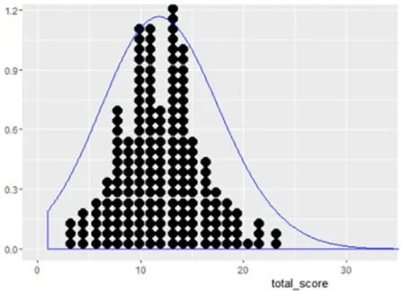
Histograms feature all elements necessary for the assessment of normality. There is a scale on the y-axis that helps extract real values and the horizontal alignment of the measurements makes it possible to align the scale with the high points of the bars. The high points then form a curve of some sort. This curve is straightforwardly comparable to the optimal bell from the Gaussian normal distribution and thereby an inference can be made of the data at hand. To also judge the sample size, which greatly influences to what degree the data can be normally distributed; the bars can be transformed into dot-bars wherein every dot depicts, for example, ten participants.
Boxplots feature all elements necessary for the assessment of homogeneity of variance. There also is a scale on the y-axis to extract real values and several groups can be depicted on one panel. The judgment of the variance can then be made by comparison of the several boxplots. The variance of a group can be assessed by looking at the area the boxplot fills, the interquartile ranges and the respective whiskers, the length and end-points of the whiskers and the area that the black median-bar fills. To make an inference about the homogeneity of variance in the shown sample, the last task is to compare each boxplot and look for differences and similarities.
STUDENTS’ PERFORMANCE JUDGING STATISTICAL VISUALIZATIONS 13
Method
Participants
Thirty-three people (17 male) participated in the study. All of them were students of Psychology at the University of Twente and were sampled by directly approaching people we knew from our study or the years above and below us, by making use of the SONA-systems subject pool or by reacting on flyers which were distributed in the building of the faculty of behavioral sciences. Nine of them were of Dutch origin, 24 of German origin. Their ages ranged from 19 to 32 years with a mean of 23 (M = 22.781, one missing value). All participants gave informed consent. This study has received ethical approval by the Ethics Committee for Behavioral and Management Sciences at the University of Twente (Request No.: 16073).
Materials
For the conduction of the experiment, a computer and two sheets of paper were neces-sary. The computer needed Python 2.7 and the PyGame-module for the experiment to run on it. The experiment was programmed by the researchers. The used laptops had a screen resolution of 1366x768 pixels or 1920x1080 pixels on a 15.6” screen. Datasets were simulated with R Version 3.3.0 (Murdoch, 2016) to create the necessary stimuli.
The second one-hundred datasets were created by drawing samples from a linear model with three groups with fixed means. Sample size was different for each dataset but in even steps. Residuals were set to be normally distributed, yet the standard deviation varies with the mean. A table with the parameters of these 100 datasets can be found in Table 2. An example of the boxplot-stimuli is shown in Figure 8.
Additionally, to support our cover story, see below under “procedure”, the program kept track of scores. A correct answer was rewarded with one extra point, and, after a streak of five correct answers this bonus was set to two points per correct answer. A streak of fifteen resulted in getting three points per correct answer.
The two sheets of paper contained some information on the studies behind the plots as to give participants something to relate to, and instructions on how to answer during the experiment. The content of the instructional sheets can be found in Appendix 1.
Procedure
Instruction
The participants were told they were going to play a game to prevent frustration. After conduction of the experiment the participants were disclosed about the true nature of the study. A cover story was invented as to create motivation and thereby prevent frustration when doing the task. They had been told at recruiting that the study at hand was about game-based learning and that the effect of the statistical game was to be researched. For the experiment it was sought to choose a quiet place. These were found in the library or the laboratory for behavioral sciences on campus grounds, or at home when neither of the aforementioned locations was available.
STUDENTS’ PERFORMANCE JUDGING STATISTICAL VISUALIZATIONS 15
on the left of the screen was only for giving them an idea and not for one-to-one comparison. The two instruction sheets were laid aside a laptop where the experiment could be run. No instructions were given during the experiment as it was assumed that the knowledge of the constructs was still available, at least unconsciously.
Experiment
The laptop ran the program. At first, the researcher had to type in information on the participant number, age, gender, nationality, year in the study of psychology and, optionally, the participants were allowed to enter their last known grade in statistics. The participants sat in front of the laptop and were first presented with the rules for the game, as mentioned above. Then they were asked to read the first instruction sheet (Appendix 1).
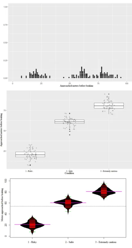
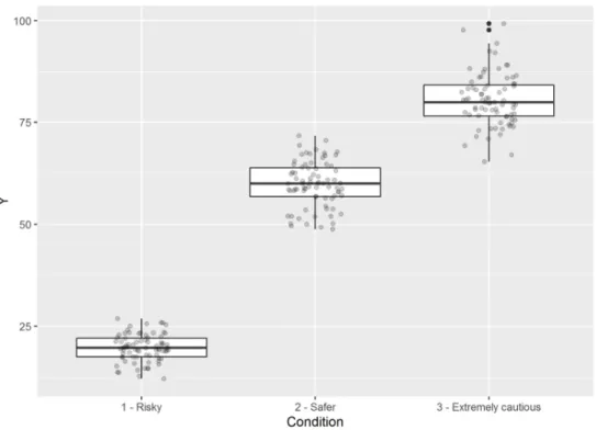
One half of the datasets was simulated to come from a questionnaire with several 5-point-Likert-scale questions. The other one contained information on people who rated their own driving style (“Risky”, “Safer” and “Extremely cautious”) and then gave information on how close they approach someone before decelerating or passing in meter. From the first dataset, 100 dot-histograms have been made, showing the total score on the questionnaire on the x-axis and the frequency of these scores on the y-axis. The second dataset has been used to create 100 boxplots with jittered raw data. The jitters display data points. The x-axis featured the three groups and the y-axis depicted how close they approach another car on a scale from 0 to 100 meters.
ideal histogram chosen by the outcomes of a D’Agostino test for normality. The ideal can be found in Figure 9.
The participants were shown a leaderboard with fictional scores where they always were placed in the middle, again, to prevent frustration. They were asked to read the second instruction sheet. Five practice trials had to be done then where the participants were asked to gauge whether the boxplots depicted a homogenous variance in the sample. One-hundred boxplots had to be evaluated in the actual experiment. An ideal conditional boxplot was provided, which was chosen by looking at the outcomes of a Levene’s test of homogeneity of variance. This ideal can be found in Figure 10. After completion, another fictional leaderboard was shown.
Debriefing
The participants finished the experiment after the second leaderboard had been shown. They were thanked for their participation and were disclosed the true nature of the study, namely the pure measurement of how people evaluate these plots. If the participants were signed up for the study via SONA-systems, they received their points, otherwise no rewards were offered.
Design
STUDENTS’ PERFORMANCE JUDGING STATISTICAL VISUALIZATIONS 17
with the significance (Yes / No) of the D’Agostino test for normality and, respectively, the significance of the Levene test for homogeneity of variance.
Data Analysis
An initial exploratory data analysis was conducted before a model was constructed. Bar charts were made per participant to compare correct and incorrect responses and see if the ratio is above guessing level, followed by scatterplots which show the rejection or acceptance of an assumption in relation to the objective measures of the skew and sample size and the amount of scale relative to σ, per simulated dataset, respectively. The same graphic has been made for the results of the Shapiro-Wilk-test for normality and the Levene-test for homogeneity of variance. A line-plot for the performance in relation to the number of completed trials was used to assess whether an improvement took place in the course of the experiment.
A generalized linear mixed-effects model (logistic regression) was employed to find out if the objective measures predicted the participants’ answers, or, practically speaking, if the participants used the objective measures to make their judgment. An Intercept for the stimuli was computed to check for effects of the stimuli themselves, without the objective criteria. The learning effect was deducted from an interaction effect. The values taken into consideration were fixed and random effects as well as 95% confidence intervals which were computed to probabilities (µ) of rejection of either assumption or to linear predictors (η), respectively.
Results
First we will explore the data visually and then we will report the results of the logistic regression. We start with the results on normality and continue with the results on homogeneity of variance in each of the two parts.
Exploratory Data Analysis
Normality
In Figure 1 the significance of the Shapiro-Wilk test for normality was plotted on a graph in which the x-axis represents the skew in the sample and the y-axis represents the sample size. We can see very clearly that with increasing skew the probability to reject normality increases. The cut-off lies at a skew of about 0.5 (v = 0.5), the sample size plays only a small roll in predicting the response of the test.
STUDENTS’ PERFORMANCE JUDGING STATISTICAL VISUALIZATIONS 19
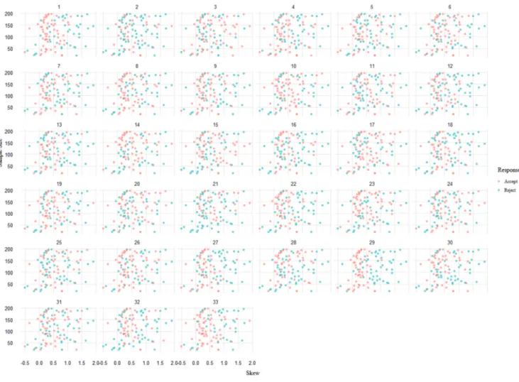
In Figure 2 we can see the same graph with the responses of our participants.
In general, the responses of our participants gave an unclear picture of what influenced their decision for rejection or acceptance. There was no common pattern in how the participants responded. For example, the proportion of rejection and acceptance differed considerably between the participants 2 and 21 on the one, and participants 14 and 33 on the other hand, to name some extreme cases. At times, samples with a skew of 0 were rejected and sometimes samples with a skew of more than 1 were accepted. It became apparent that the participants did not base their judgments on objective measures.
Homogeneity of Variance
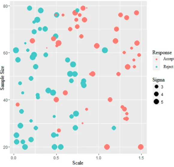
In Figure 3 we can see the significances (Yes / No) of the Levene test for homogeneity of variance with respect to the sample size on the y-axis and the scale on the x-axis. The size of the dots represents the value of σ.
It can be observed that the sample size plays a more significant role than it did for
normality. Most of the accepted assumptions lie within an area of a sample size of more than 50,
STUDENTS’ PERFORMANCE JUDGING STATISTICAL VISUALIZATIONS 21
smaller than 3 and a scale of at least 0.5 facilitate the acceptance of the assumption (σ < 3, s ≥ 0.5). From a scale value of 0.6 upwards the test generally accepts the assumption for small and
average values of σ (σ ≤ 3, s > 0.6). When σ becomes bigger the value of scale needs to be bigger
than 0.75 to let the test accept the assumption (σ > 3, s ≥ 0.75). All in all, each measure appears
to play a significant role in influencing the response of the test. If the scale is small, but sample
size big and σ small, the test more easily accepts the assumption. The same applies for a big
scale even though the sample size is small and σ is big. Σ, though, appears to have the smallest
influence as even a small value fails to influence the decision of the test for very small sample
sizes and small scales.
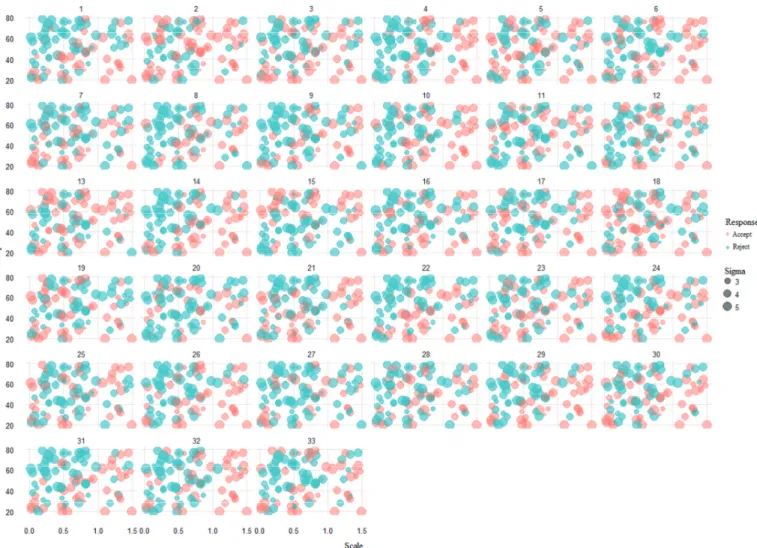
Here again, the participants’ responses are widespread. Big and small scales alike were sometimes accepted and sometimes rejected; even very small sample sizes with small scales and large σ were accepted by most of the participants. The differences become most apparent when we compare, for example, participants 1 and 7, who tended to reject big sample sizes with small scales and participants 2 and 13 who did it vice versa. Altogether, none of the patterns matched the pattern of the Levene test. It became clear that we could not find any system of judgment or a criterion on which the participants’ based their judgments.
Logistic Regression
Normality
In Table 1 we can see the fixed effects for skew and sample size and the interaction effect of them on the participants’ judgments of the histograms. In the case of the intercept, where the objective measures do not have any influence and the probability to reject should be 50%, the probability to reject was logist(-0.098) = 48% (β0 (v = 0, n = 0) = 0.475). The credibility interval
for the intercept also includes much smaller and much larger values, so we cannot say so with sufficient certainty (µ = 0.475, 95% CI [-0.934, 0.661]). To calculate the linear predictor we constructed the following regression term from the estimates. By means of this term the probability to reject the assumption for different values of skew and sample size can be computed.
η = -0.098 + 0.488 * x1 + (-0.007) * x2 + 0.006 * x1 * x2 µ = eη/ (1 + eη) = logist(η)
retransform-STUDENTS’ PERFORMANCE JUDGING STATISTICAL VISUALIZATIONS 23
ing to the probability scale we have a probability of logist(0.350) = 41% that a participant rejects with these values (µ (v = 0, n = 50) = 0.413). With considerable skew x1 = 0.5 and a more advantageous sample size x2 = 100, the probability that the assumption will be rejected is 44% (µ (v = 0.5, n = 100) = 0.436). For a skew x1 = 1, the probability becomes 57%, a very marginal change in probability of rejection for a severe change in skewness (µ (v = 1, n = 100) = 0.571). The credibility intervals for the interaction effect and sample size immediately show that we can be sufficiently certain of this information (95% CI 0.012, 0.000] for Sample Size, 95% CI [-0.002, 0.014] for the interaction]). We cannot be certain about the effect of skew though (95% CI [-0.580, 1.650]). At least the direction of the effect of skew is reasonable.
Table 1
Fixed effects of skew, sample size and their interaction on participants’ judgments of the histograms
Parameter Center Lower * Upper *
Intercept -0.098 -0.934 0.661
Skew 0.488 -0.580 1.650
Sample size -0.007 -0.012 0.000
Sample Size * Skew 0.006 -0.002 0.014
*95% credibility limits
[0.737, 1.074]). Thus, our stimuli feature properties other than the objective criteria that influence the response.
Table 2
Random effects of skew, sample size and completed number of trials on participants’ judg-ments of the histograms
Parameter Center Lower * Upper *
Intercept 0.680 0.355 1.074
Skew 0.780 0.188 1.362
Sample size 0.002 0.000 0.006
Skew*Sample size 0.004 0.000 0.009
Stimulus Intercept 0.891 0.737 1.074
*95% credibility limits
Initially, a more complex model was computed which included effect sizes for stimuli and the number of completed trials. This caused the model to be barely computable. After pruning the model by isolation of the two variables, we could observe that the number of completed trials had no effect whatsoever. Hence we scrapped it from the model and only included the effect sizes for stimuli. This result suggests that there was no learning effect elicited by our feedback.
Homogeneity of Variance
Table 3 depicts the fixed effects for scale, group size and the interaction effect of scale and group size on the participants’ judgments of the conditional boxplots. The same procedure used in the step before has been applied again but this time the assumption to be rejected or accepted was homogeneity of variance. The following regression term was set up for the computation of the linear predictor; there were no interaction effects of number of completed trials with neither scale, group size or scale and group size combined (95% CIs [-0.015, 0.026], [0.000, 0.000], [0.000, 0.000]) and no effect of the number of completed trials (95% CI [-0.023, 0.006]).
STUDENTS’ PERFORMANCE JUDGING STATISTICAL VISUALIZATIONS 25
µ = eη/ (1 + eη) = logist(η)
If the scale is x1 = 0 at a group size x2 = 0 then the probability to reject the assumption that the data is homoscedastic is logist(0.828) = 70% (β0 (s = 0, N = 0) = 0.695). That is
considerably above the expected value of 50%. If the scale is x1 = 0 at a group size x2 = 10 then the linear predictor η = 0.518 and the probability to reject the assumption that the data is homoscedastic is logist(0.518) = 63% (µ (s = 0, N = 10) = 0.626). With a scale x1 = 0.75 at a group size x2 = 40 the probability is logist(0.428) = 61% (µ (s = 0.75, N = 40) = 0.605). Even with considerably high values for scale x1 = 1.5 and a big group size x2 = 80, the probability does only differ from the guessing level by 14% and also in the wrong direction with logist(0.868) = 70% (µ (s = 1.5, N = 80) = 0.704). Scale probably has a positive effect but, as with skew, the credibility interval runs very broad (CI 95% [-0.945, 2.165]). We can be quite certain of small effects of group size and an interaction effect of scale and group size (for N 95% CI [0.053, -0.010], for the interaction effect scale * N 95% CI [-0.018, 0.04]).
Table 3
Fixed effects of scale, group size and the scale * group size interaction on participants’ judgments
Parameter Center Lower * Upper *
Intercept 0.828 -0.293 1.918
Scale 0.560 -0.945 2.165
Group size -0.031 -0.053 -0.010
Trial -0.008 -0.023 0.006
Scale*Group size 0.014 -0.018 0.040
Scale*Trial 0.004 -0.015 0.026
Sigma*Trial 0.000 0.000 0.000
Scale*Group size*Trial
0.000 0.000 0.000
*95% credibility limits
Interac-tion effects of number of completed trials with scale, group size and scale and group size com-bined are sufficiently certain to be non-existent (95% CI [0.000, 0.016], [0.000, 0.000], [0.000, 0.000]). The participants differ systematically in their individual skill level with a standard deviation of 0.666, which can be said sufficiently certain (95% CI [0.123, 1.178]). There is variation in how much the participants were influenced by scale, with a standard deviation of 0.746. Even considering the lower credibility limit the variation stays reasonable (95% CI [0.127, 1.266]). The participants did not differ in how much they were influenced by group size, which is very certain (95% CI [0.006, 0.025]). As with the histograms there was something to the individual stimuli aside from the objective criteria that influenced the response. This is indicated by the high standard deviation of 0.672. This also is sufficiently certain (95% CI [0.549, 0.831]). None of the participants were influenced by their number of completed trials, which is very certain (95% CI [0.000, 0.016]). All in all, there was a lot of variation in the sample, which is positive, but the variation in how frequently the stimuli were rejected raises concerns.
Table 4
Random effects of scale, group size, trial and stimulus on participants’ judg-ments
Parameter Center Lower * Upper *
Intercept 0.666 0.123 1.178
Scale 0.746 0.127 1.266
Group size 0.015 0.006 0.025
Trial 0.004 0.000 0.016
Scale*Group size 0.006 0.000 0.019
Scale*Trial 0.003 0.000 0.016
Group size*Trial 0.000 0.000 0.000
Scale*Group size*Trial
0.000 0.000 0.000
Stimulus intercept 0.672 0.549 0.831
STUDENTS’ PERFORMANCE JUDGING STATISTICAL VISUALIZATIONS 27
Further exploration of data
Discussion
Current practices in statistics focus strongly on Null Hypothesis Significance Testing (NHST) which led to psychologists and ecologists alike blindly applying tests to their data until they have some reasonable result. Zuur et al. (2010) proposed the alternative that good statistical visualizations could substitute traditional NHST-procedures, at least for testing the assumptions for linear models like the analysis of variance (ANOVA) or linear regression. We have assumed that psychology students should have no problems when inferring the objective measures from the visualizations. The EDA has shown that some participants have performed averagely, but still their performance was as good as guessed on group level and their answer was almost not influ-enced by the objective criteria of skew or scale and not at all affected by sample or group size. Also, there was no learning effect to be found for either of the constructs in the more complex model we used in the beginning. Even though the EDA showed some individuals performing averagely, all in all these are devastating results. Obviously, our participants were not able to infer from our plots sufficiently and there was variation in how strong each individual participant has been influenced by the objective measures, which indicates a heterogenic sample. We cannot confirm the proposition of Zuur et al. (2010) in so far that students with statistical training can, without further instruction, easily infer from plots. The results suggested that there were underlying factors for both the histogram and boxplot stimuli. There could be several reasons to these results.
per-STUDENTS’ PERFORMANCE JUDGING STATISTICAL VISUALIZATIONS 29
formed with what they had learned in their program. The fact that they did not have this knowledge was surprising to us. Secondly, there could have been an issue with the experiment. Perhaps we asked wrongly, gave misleading feedback or simply expected too much from our participants. Lastly, our design could be flawed. There could be something wrong with the stimuli or the way they were presented. Maybe the stimuli failed to convey the information they were supposed to.
The evidence for underlying factors in the stimuli that influence the participants’ responses is there. Not only did the participants obviously fail to extract the real values from our plots but there also was variation in the way different participants rated the same stimulus, which leaves behind some hope that at least some people are able to successfully infer from the visualizations. An exploration of the most and least rejected stimuli did not bear fruit, as there were no common criteria distinguishing a stimulus that was rejected often from one that was rejected less often. On the one hand, this could have been caused by there being a loss of detail when the visualizations were put into the program or the wrong choice of stimuli. On the other hand it is highly unlikely that the visualizations for both constructs have been flawed in such a way that they completely fail to convey any meaningful information.
The choice for stimuli was influenced by the research of Zuur et al. (2010), followed by thorough literature research to confirm, which led to the conclusion that dot-charts would pose more useful than plain histograms and that boxplots are, indeed, a fitting choice to convey information about the relations between groups (Cleveland et al., 1988; Cleveland, 1984a). It was important to use the graphics that Zuur et al. proposed because they were responsible for the forthcoming of the current study (Zuur et al., 2010). The great advantage of dotplots and jitters on the boxplots was that they rendered us able to convey the sample size to the participants. Also, it could be argued that the form of dot- and boxplots makes it easy to infer from them (Cleveland & McGill, 1984, 1986).
STUDENTS’ PERFORMANCE JUDGING STATISTICAL VISUALIZATIONS 31
study, the eye can scan the data points in one straight line instead of having to jump between dots. Also the area to be judged is bigger and thereby more salient. A direct comparison of histograms, box- and beanplots can be seen in Figure 5.
The golden standard for assessing normality is the quantile-quantile-plot (q-q-plot) (Kratz & Resnick, 1996). On a q-q-plot one can directly compare the normal distribution with the data that was put in. As the data points get closer to the bisection it gets likelier that the data came from a normal distribution. Visually, this bears many advantages but it may be a bit harder to understand what one is looking at without further instruction.
Thus, there is no unity in the field of statistical visualizations on what graphs to use, which leaves us with but one possibility: to learn from this lesson and also try other means of visualization in further research on this topic. This leads us to the question whether the experiment may have been flawed.
During every trial the participants were asked if the displayed data was normally distributed or if the variance in the displayed data showed homogenous variance. Of course, there are other ways to ask and maybe that would have changed the outcome of the experiment. We wanted to see if our participants used objective measures when inferring from the visualizations. Instead of asking to infer a judgment from the visualization we could have asked more precisely to assess the skew in the displayed data or to compare the minima and maxima of the boxplots.
STUDENTS’ PERFORMANCE JUDGING STATISTICAL VISUALIZATIONS 33
Buehl (1999), activating prior knowledge is generally helpful in awakening interest and facilitating information processing, provided the assessment method was not flawed. Many of our participants asked, before or sometimes during the experiments, to receive further instruction which we denied to them due to our design decisions.
A shift in education could include laying the focus on Generalized Linear Models (GLMs) with reporting effect sizes, confidence intervals and probabilities rather than visualiza-tion or hypothesis testing, if the visualizavisualiza-tions really did not convey anything meaningful (Cumming, 2014; Hoekstra, Johnson, & Kiers, 2012; Zuur et al., 2010). With GLMs there is no need for the data to be normally distributed and size of variance becomes a factor, not a criterion. Here, one considers upfront what kind of distribution and what variance structures one can expect in the data and then choose for the right procedures. We would need to teach students how to identify the kind of exponential distribution in their data, how to interpret the variances of their measurements and choose for the right link function, for example the logit-function for logistical regression as applied in the current study.
of what values were important to make an inference or if pure guessing took place, of course the answers on particular stimuli differ as well.
For future research on this topic one could alter the graphics and questions in a control group study to the proposed alternatives to be able to assess whether the problem lay in the design. Also one could control for the power of prior instruction to performing the task. Perhaps then a learning effect could be elicited. It could also prove helpful to pull a sample from proven experts in the field to assess the power of the visualizations, as to secure that participants have sufficient knowledge to infer from the graphics.
STUDENTS’ PERFORMANCE JUDGING STATISTICAL VISUALIZATIONS 35
References
Aiken, L. S., West, S. G., Sechrest, L., Reno, R. R., Roediger, H. L., Scarr, S., … Sherman, S. J. (1990). Graduate training in statistics, methodology, and measurement in psychology: A survey of PhD programs in North America. American Psychologist, 45(6), 721–734. http://doi.org/10.1037/0003-066X.45.6.721
Bowers, J. (2005). EDA for HLM: Visualization when Probabilistic Inference Fails. Political Analysis, 13(4), 301–326. http://doi.org/10.1093/pan/mpi031
Chase, W. G., & Simon, H. A. (1973). Perception in chess. Cognitive Psychology, 4(1), 55–81. http://doi.org/10.1016/0010-0285(73)90004-2
Chatfield, C. (1985). The initial examination of data. Journal of the Royal Statistical Society. Series A, (Statistics in Society), 148(3), 214–253. Retrieved from http://www.jstor.org/stable/2981969
Cleveland, W. S. (1984a). Graphical Methods for Data Presentation: Dot Charts, Full Scale Breaks, and Multi-based Logging. American Statistician, 38(4), 270–280.
Cleveland, W. S. (1984b). Graphs in Scientific Publications. The American Statistician, 38(4), 261–269. http://doi.org/10.2307/2683400
Cleveland, W. S., McGill, M. E., & McGill, R. (1988). The Shape Parameter of a Two-Variable Graph. Journal of the American Statistical Association, 83(402), 289–300.
Cleveland, W. S., & McGill, R. (1984). Graphical Perception: Theory, Experimentation, and Application to the Development of Graphical Methods. Journal of the American Statistical Association, 79(387), pp. 531–554. http://doi.org/10.2307/2288400
http://doi.org/10.1016/S0020-7373(86)80019-0
Cohen, J. (1990). Things I Have Learned (So Far). American Psychologist, 45(12), 1304–1312. http://doi.org/10.1037/0003-066X.45.12.1304
Cohen, J. (1994). The Earth Is Round (p smaller than .05).pdf. American Psychologist, 49(12), 997–1003.
Cumming, G. (2014). The new statistics: Why and how. Psychological Science, 25(1), 7–29. http://doi.org/10.1177/0956797613504966
Curby, K. M., & Gauthier, I. (2010). To the trained eye: Perceptual expertise alters visual processing. Topics in Cognitive Science, 2(2), 189–201. http://doi.org/10.1111/j.1756-8765.2009.01058.x
D’Agostino, R. B. (1971). An omnibus test of normality for moderate and large size samples. Biometrika, 58(2), 341–348.
Dochy, F., Segers, M., & Buehl, M. M. (1999). The Relation Between Assessment Practices and Outcomes of Studies: The Case of Research on Prior Knowledge. Review of Educational Research, 69(2), 145–186. http://doi.org/10.3102/00346543069002145
Ericsson, K. A., & Charness, N. (1994). Expert performance: Its structure and acquisition. American Psychologist, 49(8), 725–747. http://doi.org/10.1037/0003-066X.50.9.803
Fyfe, E. R., & Rittle-Johnson, B. (2016). The benefits of computer-generated feedback for mathematics problem solving. Journal of Experimental Child Psychology, 147, 140–151. http://doi.org/10.1016/j.jecp.2016.03.009
Gelman, A. (2011). Why Tables Are Really Much Better Than Graphs. Journal of Computational and Graphical Statistics, 20(1), 3–7. http://doi.org/10.1198/jcgs.2011.09166
STUDENTS’ PERFORMANCE JUDGING STATISTICAL VISUALIZATIONS 37
into graphs. The American Statistician, 56(2), 121–130. http://doi.org/10.1198/000313002317572790
Gobet, F. (1998). Expert memory: a comparison of four theories. Cognition, 66(2), 115–152. http://doi.org/10.1016/S0010-0277(98)00020-1
Gobet, F., & Simon, H. a. (1996). Templates in chess memory: a mechanism for recalling several boards. Cognitive Psychology, 31(1), 1–40. http://doi.org/10.1006/cogp.1996.0011
Hartwig, F., & Dearing, B. E. (1979). Exploratory data analysis. Newbury Park, CA: Sage. Hinkle, D. E., & Wiersma, W. (2003). Applied Statistics for the Behavioral Sciences (5th ed.).
Andover, UK: Cengage Learning, Inc.
Hoekstra, R., Johnson, A., & Kiers, H. A. L. (2012). Confidence Intervals Make a Difference: Effects of Showing Confidence Intervals on Inferential Reasoning. Educational and Psychological Measurement, 72, 1039–1052. http://doi.org/10.1177/0013164412450297 Ioannidis, J. P. A. (2005). Why most published research findings are false. PLoS Medicine. Kampstra, P. (2008). Beanplot: A Boxplot Alternative for Visual Comparison of Distributions.
Journal of Statistical Software, 28(code snippet 1), 1–9. http://doi.org/10.18637/jss.v028.c01
Kratz, M., & Resnick, S. I. (1996). The qq-estimator and heavy trails. Communications in Statistics, Stochastic Models, 12(4), 699 – 724.
Levene, H. (1960). Robust tests for equality of variances. In I. Olkin (Ed.), Contributions to probability and statistics: Essays in Honor of Harold Hotelling (pp. 278–292). Stanford: Stanford University Press.
http://doi.org/10.1016/j.jesp.2010.02.007
Morgan, M. J., Watt, R. J., & McKee, S. P. (1983). Exposure Duration Affects the Sensitivity of Vernier Acuity to Target Motion. Vision Research1, 23, 541 – 546.
Murdoch, D. (2016). R 3.3.0 for Windows (32/64 bit). Retrieved April 22, 2016, from https://cran.r-project.org/bin/windows/base/
Palmer, J. (2003). Visual Perception of Objects. In A. F. Healy, R. W. Proctor, & I. B. Weiner (Eds.), Handbook of Psychology (Vol. 4, pp. 179 – 211). Hoboken, NJ: John Wiley & Sons, Inc.
Sawilowsky, S. S. (1990). Nonparametric Tests of Interaction in Experimental Design. Review of Educational Research, 60(1), 91–126. http://doi.org/10.3102/00346543060001091
Scheffé, H. (1959). The Analysis of Variance. New York, NY: John Wiley & Sons, Inc.
Tufte, E. R. (2007). The visual display of quantitative information (2nd ed., Vol. 16). Cheshire, Connecticut: Graphics Press Cheshire, CT.
Tukey, J. W. (1977). Exploratory Data Analysis. In Exploratory Data Analysis (1st ed., pp. 5 – 23). Upper Saddle River, NJ: Prentice Hall. http://doi.org/10.1007/978-1-4419-7976-6 Washburne, J. (1927). An experimental study of various graphic, tabular, and textual methods of
presenting quantitative material. Journal of Educational Psychology, 18(7), 465–476. Wilkinson, L. (1999). Statistical methods in psychology journals: Guidelines and explanations.
American Psychologist, 54(8), 594–604. http://doi.org/10.1037/0003-066X.54.8.594
Wilkinson, L. (2012). The Grammar of Graphics. In Y. M. James E. Gentle, Wolfgang Karl Härdle (Ed.), Handbook of Computational Statistics (pp. 375–414). Springer.
STUDENTS’ PERFORMANCE JUDGING STATISTICAL VISUALIZATIONS 39
Appendices
Appendix 1
Instruction 1
As part of a nationwide online-survey on student satisfaction with the services provided by their higher educational institutions, students were asked to evaluate the library of their institution. This was done by means of a 10 item questionnaire. Example items included “The last time I asked for help, the librarians working at the library were able to answer my questions competently.”, and “The last online catalogus reservation I made was processed in due time.” For each item, the participants replied by marking their preference on a 5-point-Likert-scale (1 = completely unsatisfactory, 2 = partly unsatisfactory, 3 = neutral, 4 = partly satisfactory, 5 = completely satisfactory). The obtained answers of the participants yielded one total score per participant on the scale.
The obtained data was read into an spss file.
‘Higher educational institution’ was added as a grouping variable to distinguish samples. Each sample represents the students of one specific educational institution.
distribu-STUDENTS’ PERFORMANCE JUDGING STATISTICAL VISUALIZATIONS 41
tion of participant total scores. Each graph shows a specific sample, thus the total scores of the students of a specific educational institution on the questionnaire.
We would like you to answer the following question per graph presented:
Are the total scores normally distributed?
Press <y> on the keyboard for “yes”. Press <n> on the keyboard for “no”.
For your convenience, each sample graph will be accompanied by a graph of an ideal normal distribution. You may refer to this “ideal” as a means for comparison.
Also, there is no need to think long before answering. Your intuitive answer will usually be the best one.
There will be 5 practice trials. Upon completion of the practice trials, your score will be reset to 0 and the actual game begins.
Appendix 2
Instruction 2
A questionnaire has been sent to a randomized sample of car drivers. They were asked, among other questions, how they would rate their own driving style (risky, safer, extremely cau-tious). They were also asked how close they pull up to cars that braked when driving on a high-way before stopping or steering around (numerical in meters).
The data has been transformed into a data file for SPSS. Per group of drivers (risky, safer, extremely cautious) it has been examined more closely how far they stay away from other driv-ers when braking on a highway.
Imagine you want to check with an Analysis of Variance-method if there is an effect of self-reported driving style on the space they keep between themselves and other drivers.
In this case, you need to check whether the data fulfills the assumption of homogeneity of variance. You will do that with the help of the following box-jitter plots. The dots in the graphs represent data points. The following 100 graphs are possible representations of the aforemen-tioned data.
We would like you to answer the following question per graph presented:
Are the variances homogenous?
STUDENTS’ PERFORMANCE JUDGING STATISTICAL VISUALIZATIONS 43
For your convenience, each sample graph will be accompanied by a graph of ideal homogeneity of variance. You may refer to this “ideal” as a means for comparison.
Also, there is no need to think long before answering. Your intuitive answer will usually be the best one.
There will be 5 practice trials. Upon completion of the practice trials, the actual game will continue (i.e. during the trials your score will be frozen).
Press <ENTER> to start the 5 practice trials.
Appendix 3
R Syntax
```{r purpose, eval = T, echo = F} purp.book = T
purp.tutorial = F purp.debg = F purp.gather = T
purp.mcmc = F #| purp.gather purp.future = F
```
library(haven) library(stringr) library(ggplot2) library(openxlsx) library(emg) library(knitr) library(moments) library(car) library(gridExtra) library(lme4) library(MCMCglmm) library(brms) library(rstanarm) library(bayr)
rstan_options(auto_write = TRUE) options(mc.cores = 3)
opts_knit$set(cache = T) ```
```{r profile, eval = T, echo = F, message = F}
## The following is for running the script through knitr # source("~/.cran/MYLIBDIR.R")
thisdir <- getwd()
# datadir <- paste0(thisdir,"/Daan/") # figdir = paste0(thisdir, "/figures/")
## chunk control
opts_chunk$set(eval = purp.book, echo = purp.tutorial, message = purp.debg,
cache = !(purp.gather | purp.mcmc))
options(digits=3)
opts_template$set(
fig.full = list(fig.width = 8, fig.height = 12, anchor = 'Figure'), fig.large = list(fig.width = 8, fig.height = 8, anchor = 'Figure'), fig.small = list(fig.width = 4, fig.height = 4, anchor = 'Figure'), fig.wide = list(fig.width = 8, fig.height = 4, anchor = 'Figure'), fig.slide = list(fig.width = 8, fig.height = 4, dpi = 96),
STUDENTS’ PERFORMANCE JUDGING STATISTICAL VISUALIZATIONS 45
invisible = list(eval = purp.book, echo = purp.debg), sim = list(eval = purp.book, echo = purp.tutorial),
mcmc = list(eval = purp.mcmc, echo = purp.book, message=purp.debg), gather = list(eval = purp.gather, echo = purp.gather)
)
## ggplot
theme_set(theme_minimal())
```
# Simulation of stimuli for normality assessment
Data sets are created by drawing from the ex-gaussian distribution. The below example shows the distribution with $\mu = 100, \sigma = 2, \lambda = 1/20$.
```{r}
data_frame(x = seq(0,200,1)) %>%
mutate(total_score = demg(x, 100, 2, 1/20)) %>% ggplot(aes(x = x, y = total_score)) +
geom_line() ```
## Simulation
For the first part of the experiment, 100 stimuli are drawn that vary in how much they are effected by the Gaussian component (large $\sigma$, little skew) in relation to the exponential component (small $\lambda$).
```{r simulation_normal} set.seed(42)
n_Stim = 100
S01 <-
data_frame(Stimulus = str_c("S01_",1:n_Stim), dist = "exgauss",
N = round(runif(n_Stim, 20, 200),0), mu = 10,
sigma = runif(n_Stim, 1, 4), lambda = 1/runif(n_Stim, 1, 4))
# list of data frames
D01 <-
S01 %>%
alply(.margins = 1,
total_score = remg(s$N, s$mu, s$sigma, s$lambda)))
# all values < 50
ldply(D01) %>%
filter(total_score > 50) %>% print()
```
The following table shows the parameters of the `r n_Stim` data sets, the plot shows the generated data sets (the stimuli). The parameters of the simulated data sets were chosen as :
$\mu = 10$
$\sigma ~ uniform(1,4)$ $\lambda ~ uniform(1/4, 1)$ $N ~ uniform(20, 200)$
```{r simulation_normal_results} kable(S01)
# plot(P01) ```
## Objective criteria
Participants have to judge the data sets for normality. In the simpliest case this is just a yes/no answer. The responses will then be compared to objective criteria, possibly:
1. the amount of skewness in the population (as represented by the "true" parameters)
2. the amount of skewness in the sample
3. result of a test for skew with Agostino test ($p < .05$) 4. result of a test for normality with shapiro test ($p < .05$)
```{r criteria_normal}
emg_skew <-
function(mu, sigma, lambda) 2/(sigma^3 * lambda^3) * (1 + (1/(sigma^2 * lambda^2)))^(-3/2) ## Wikipedia
C01 <-
STUDENTS’ PERFORMANCE JUDGING STATISTICAL VISUALIZATIONS 47
rename(skew_Sample = V1) %>%
mutate(skew_Pop = emg_skew(mu, sigma, lambda)) %>% ## population skewness
full_join(select(ldply(D01,function(d) agostino.test(d$total_score)$p.value),
Stimulus, agostino.p = V1)) %>%
full_join(select(ldply(D01,function(d) shapiro.test(d$total_score)$p.value), Stimulus, shapiro.p = V1)) %>%
mutate(agostino.nhst = ifelse(agostino.p < .05, "skew p<.05", "no skew"),
shapiro.nhst = ifelse(shapiro.p < .05, "non-norm p<.05",
"normal")) %>% as_data_frame()
C01 %>%
ggplot(aes(x = skew_Pop, y = skew_Sample, size = N))+
geom_point(aes(color = agostino.nhst, shape = shapiro.nhst)) + geom_smooth(se = F, method = "lm")
## population skewness
head(C01) %>% kable()
C01 %>%
mutate(agostino.rejected = agostino.p < .05, shapiro.rejected = shapiro.p < .05) %>% summarize(mean(shapiro.rejected),
mean(agostino.rejected))
```
## Example Stimuli
```{r sim_normal_create_plots}
# list of plots
P01 <-
llply(D01[1:n_Stim], .fun = function(d)
ggplot(d, aes(x = total_score)) + geom_dotplot(binwidth = 1) + xlim(1,50) +
ylab("") )
``
# Simulation of stimuli for homogeneity of variance assessment
Data sets are created by drawing from the a linear model with three groups with fixed means. Sample size varies, but the data is balanced. Residuals are normally distributed, but a scale parameter is applied to the standard deviation, letting it vary with the mean to a certain extent. The means ($\mu$) of the three groups were fixed as $[1, 3, 4]$ Sample size, standard deviation of the first group and the scale parameter $\phi$ are varied across simulated data sets as follows:
The parameters of the simulated data sets were chosen as :
$\N_{grp} = uniform(20, 80)$ $\sigma ~ uniform(2,6)$
$\phi ~ uniform(0, 1.5)$
$\sigma_i = \sigma + \mu_i\phi$
In effect, when $\phi$ get larger, the variance in the groups more stringly increases with the mean, leading to more pronounced heteroscedasticity.
## Simulation
```{r simulation_homo} set.seed(42)
n_Stim = 100
## simulation parameters
S02 <-
data_frame(Stimulus = str_c("S02_",1:n_Stim), N_grp = round(runif(n_Stim, 20, 80),0), sigma = runif(n_Stim, 2, 6),
scale = runif(n_Stim, 0, 1.5))
## function to create one data frame
F02 <-
function(P, mu = c(1,3,4)) {
expand.grid(Condition = as.factor(c("1 - Risky", "2 - Safer",
"3 - Extremely cautious")), Part = 1:P$N_grp) %>%
full_join(data_frame(Condition = as.factor(c("1 - Risky", "2 - Safer",
STUDENTS’ PERFORMANCE JUDGING STATISTICAL VISUALIZATIONS 49
mu = mu),
by = "Condition") %>%
mutate(sigma = P$sigma + P$scale * mu, Y = rnorm(P$N_grp * 3, mu * 20, sigma))
}
# create data frames D02 <-
S02 %>%
alply(.margins = 1,
.fun = F02) ```
The following table shows the parameters of the `r n_Stim` data sets, the plot shows the generated data sets (the stimuli).
```{r sim_results_homo} kable(S02)
# plot(P02) ```
Below are a few example plots:
```{r sim_homo_create_plots} # list of plots
P02 <-
llply(D02[1:n_Stim], .fun = function(d)
ggplot(d, aes(x = Condition, y = Y)) + geom_boxplot() +
geom_jitter(width = .4, alpha = .2) )
# examples
marrangeGrob(P02[1:8], nrow = 4, ncol = 2) ```
## Objective criteria
Participants have to judge the data sets for homogeneity of variance. The responses will then be compared to objective criteria:
1. the amount of scale, relative to $\sigma$ 2. result of the levene test ($p < .05$) ```{r criteria_homo}
data = d)$`Pr(>F)`[1] # levene tests
C02 <-
ldply(D02,fn.levene) %>% rename(levene.p = V1) %>%
mutate(levene.nhst = ifelse(levene.p < .05, "heterosced p<.05", "homosced")) %>%
as_data_frame() C02 %>%
ggplot(aes(x = scale, y = N_grp))+ geom_point(aes(color = levene.nhst))
head(C02) %>% kable()
C02 %>%
mutate(levene.rejected = levene.p <= .05) %>% summarize(mean(levene.rejected))
```
```{r save_stimuli, message=FALSE, warning=FALSE, include=FALSE, eval = F}
for (i in 1:n_Stim) { ggsave(plot = P01[[i]],
filename = paste0("S01_", i, ".png"), path = "stimuli")
}
for (i in 1:n_Stim) { ggsave(plot = P02[[i]],
filename = paste0("S02_", i, ".png"), path = "stimuli")
}
```{r save_data, message=FALSE, warning=FALSE, include=FALSE, eval = T}
write.xlsx(D01, file = "S01.xlsx")
write.xlsx(C01, file = "Simuli_normal.xlsx") write.xlsx(D02, file = "S02.xlsx")
write.xlsx(C02, file = "Simuli_homo.xlsx")
#save.image(file = "VEDA1.Rda") ```
STUDENTS’ PERFORMANCE JUDGING STATISTICAL VISUALIZATIONS 51
```{r load_data, opts.label = "gather"} #load("VEDA1.Rda")
read_raw <- function(filename) { read_csv(filename) %>% select(2:8) %>%
mutate(obs = row_number()) %>%
mutate(TaskID = str_sub(StimID, 3,3)) %>% mutate(trial = obs %% (100 + 1))
}
VEDA1_raw <-
dir(pattern = "pp.*csv", recursive = T) %>>% ldply(read_raw) %>%
as_data_frame() %>%
rename(Part = participantID) %>%
mutate(Task = ifelse(TaskID == "1", "Normality", "Constant Var"), grade = as.numeric(Grade),
Stimulus = StimID,
correct = Correctness) %>% select(-Grade, -TaskID)
VEDA1_Normal <- VEDA1_raw %>%
filter(Task == "Normality") %>% left_join(C01) %>%
mutate(reject.test = agostino.p < .05, correct = as.logical(correct),
reject.part = (reject.test == correct))
VEDA1_ConstV <- VEDA1_raw %>%
filter(Task == "Constant Var") %>% left_join(C02) %>%
mutate(reject.test = (levene.p < .05), correct = as.logical(correct),
reject.part = (reject.test == correct))
#write_sav(VEDA1, "VEDA1.sav")
write_sav(VEDA1_Normal, "VEDA1_Normal.sav") write_sav(VEDA1_ConstV, "VEDA1_ConstV.sav")
#save.image(file = "VEDA1.Rda") ```
The following two plots show the association of the response (accept or reject normality) for the Shapiro test and the participants. We see an rather clear profile for the test: with increasing skew in the sample. The second plot shows the responses of participants, which generally is less clear cut and shows arge variation of the pattern across participants. It is immediatly clear that participants have severe difficulties in judging normality.
```{r eda_norm} #load("VEDA1.Rda")
C01 %>%
ggplot(aes(x = skew_Sample, y = N, col = shapiro.nhst)) + geom_point()
VEDA1_Normal %>%
ggplot(aes(x = skew_Sample, y = N, col = reject.part)) + geom_point(alpha = .5) +
facet_wrap(~Part) ```
We estimate a model for participant in dependence of sample skew and sample size.
```{r load_mcmc, eval = !purp.mcmc} load("VEDA1_mcmc.Rda")
```
```{r mcmc:Norm, opts.label = "mcmc"} #load("VEDA1.Rda")
rstan_options(auto_write = TRUE) options(mc.cores = 3)
logit <- function(x) log(x/(1-x))
# M1_Norm <-
# VEDA1_Normal %>%
# mutate(min_sample = 20) %>%
# brm(reject.part ~ skew_Sample + N + ((1 + skew_Sample + N) | Part), # family = bernoulli,
# iter = 4000,
# #prior = set_prior("normal(1,0.00001)", class ="sd", group = "Stimulus", coef = "Intercept"),
# data = ., # chains = 1) #
STUDENTS’ PERFORMANCE JUDGING STATISTICAL VISUALIZATIONS 53
M2_Norm <-
VEDA1_Normal %>% mutate(min_sample = 20,
skew_Sample = abs(skew_Sample)) %>%
brm(reject.part ~ skew_Sample * N + ((1 + skew_Sample * N)|Part ) + (1|Stimulus),
family = bernoulli, iter = 4000,
#prior = set_prior("normal(1,0.00001)", class ="sd", group = "Stimulus", coef = "Intercept"),
data = ., chains = 1)
#save.image(file = "VEDA1.Rda") #
# M3_Norm <-
# VEDA1_Normal %>%
# mutate(min_sample = 20) %>%
# brm(reject.part ~ skew_Sample * N * trial + ((1 + skew_Sample * N * trial)||Part ) + (1|Stimulus),
# family = bernoulli, # iter = 4000,
# #prior = set_prior("normal(1,0.00001)", class ="sd", group = "Stimulus", coef = "Intercept"),
# data = ., # chains = 1) #
# #save.image(file = "VEDA1.Rda") ```
Fixed effects
```{r tab:Norm_fixef} #load("VEDA1.Rda")
M2_Norm %>% fixef() %>% kable() ```
Random effects
```{r tab:Norm_grpef}
M2_Norm %>% grpef() %>% kable() ```
The following two plots show the association of the response (accept or reject heteroscedasticity) for the Levene test and the participants.
```{r eda_constV} #load("VEDA1.Rda")
C02 %>%
distinct() %>%
ggplot(aes(x = scale, y = N_grp, col = levene.nhst)) + geom_point()
VEDA1_ConstV %>%
ggplot(aes(x = scale, y = N_grp, col = reject.part)) + geom_point(alpha = .5) +
facet_wrap(~Part) ```
We estimate a model for participant in dependence of sample scale and sigma.
```{r mcmc:ConstV, opts.label = "mcmc"} rstan_options(auto_write = TRUE)
options(mc.cores = 3)
# M1_ConstV <-
# VEDA1_ConstV %>%
# brm(reject.part ~ scale * sigma + (1|Stimulus), # family = bernoulli,
# data = ., # chains = 3)
# #save.image(file = "VEDA1.Rda")
M3_ConstV <-
VEDA1_ConstV %>%
brm(reject.part ~ scale * N_grp * trial + (1 + scale * N_grp * trial|Part) + (1|Stimulus),
family = bernoulli, data = .,
chains = 1, iter = 4000)
#save.image(file = "VEDA1.Rda")
```
STUDENTS’ PERFORMANCE JUDGING STATISTICAL VISUALIZATIONS 55
```{r tab:ConstV_fixef}
M3_ConstV %>% fixef() %>% kable() ```
Random effects
```{r tab:ConstV_grpef}
M3_ConstV %>% grpef() %>% kable() ```
## Further exploration of data
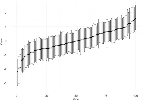
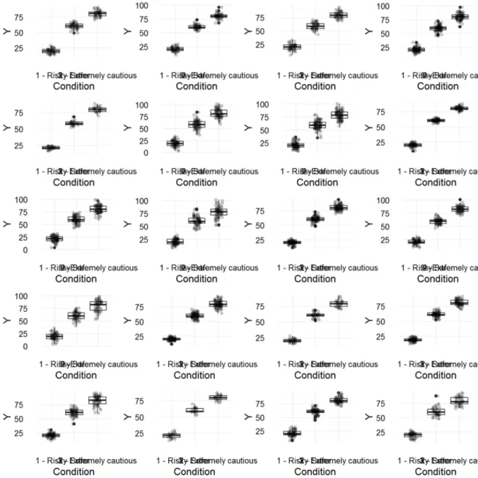
We have observed in both experiments that objective criteria (skew, scale, sample size) are being ignored by many participants. But the responses are not just random. The Stimuli intercept random effects show that stimuli systematically vary in how frequently they get rejected. Hence, there must be other criteria students use to judge the distributions. Maybe, participants had no clue about the objective criteria and used "fallback" heuristics, such as the ruggedness of the distribution. Maybe, we can identify these heuristics by comparing plots of low and high rejection rates. For that purpose, we extract the stimulus-level random effects. They represent by how much a plot differs from the average rejection rate.
### Normality
We start with the normality stimuli. The table below shows the Stimulus random intercepts.
```{r extract_stim_RE_Norm} #load("VEDA1.Rda")
T_StimRE_Norm <- ranef(M2_Norm) %>%
filter(str_detect(parameter, "Stimulus")) %>%
mutate(parameter = str_replace(parameter, "Stimulus\\[S01_", ""), parameter = str_replace(parameter, ",Intercept\\]", ""),
order = min_rank(center)) %>% rename(Stimulus = parameter) %>% arrange(order)
The following plot shows the centers and 95% CIs for stimuli, ordered by center.
Although, the estimates are rather uncertain, there is considerable variance: stimuli vary by how frequently they are rejected.
```{r fig:caterpillar_Norm} T_StimRE_Norm %>%
ggplot(aes(x = order, y = center, ymin = lower, ymax = upper)) + geom_point() +
geom_errorbar()
```
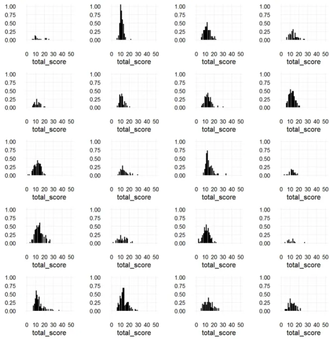
Now let's see, whether we can identify properties that are associated with high rejection:
We print every fifth stimulus, ordered by rejection rate
```{r fig:Norm_ordered, opts.label = "fig.large"}
P01[T_StimRE_Norm$Stimulus][seq.int(1, 100, 5)] %>>% grid.arrange(grobs = ., nrow = 5, ncol = 4)
```
### Constant variance
Now the constant variance stimuli. The table below shows the Stimulus random intercepts.
```{r extract_stim_RE_ConstV} T_StimRE_ConstV <-
ranef(M3_ConstV) %>%
filter(str_detect(parameter, "Stimulus")) %>%
mutate(parameter = str_replace(parameter, "Stimulus\\[S02_", ""), parameter = str_replace(parameter, ",Intercept\\]", ""),
order = min_rank(center)) %>% rename(Stimulus = parameter) %>% arrange(order)
kable(T_StimRE_ConstV) ```
The following plot shows the centers and 95% CIs for stimuli, ordered by center.
STUDENTS’ PERFORMANCE JUDGING STATISTICAL VISUALIZATIONS 57
```{r fig:caterpillar_ConstV} T_StimRE_ConstV %>%
ggplot(aes(x = order, y = center, ymin = lower, ymax = upper)) + geom_point() +
geom_errorbar()
```
Now let's see, whether we can identify properties that are associated with high rejection:
We print every fifth stimulus, ordered by rejection rate
```{r fig:ConstV_ordered, opts.label = "fig.large"}
P02[T_StimRE_ConstV$Stimulus][seq.int(1, 100, 5)] %>>% grid.arrange(grobs = ., nrow = 5, ncol = 4)