Visualizing Business Production Performance
Real-Time Dashboard
Bachelor thesis
Industrial Engineering & Management
University of Twente
I
Visualizing Business Production Performance
Real-time Dashboard
Bachelor Thesis Industrial Engineering & Management
Behavioural Management and Social Sciences
University of Twente
June 2019
Author
Sandra Motamedi Nia s1738968
Bachelor Industrial engineering & Management
Educational Institution
University of TwenteDrienerlolaan 5 7522 NB Enschede The Netherlands
Supervisor University of Twente
Dr. A. I. AldeaFaculty Behavioural Management and Social Sciences
Second supervisor University of Twente
Prof. dr. M.E. IacobFaculty Behavioural Management and Social Sciences
The company
MedsprayColosseum 23 7521 PV Enschede The Netherlands
Supervisor Medspray
J. PieffersI
Preface
Dear reader,
This bachelor thesis is written in the context of completing my bachelor’s in Industrial Engineering and Management at the University of Twente. I started with this research in April 2019 and I positively look back to the last three months I have been working on this research which is carried out for the company Medspray. During this assignment, I did research on visualizing the production performance within the manufacturing department of the company. In these months, I have gained many new experiences, learned a lot and gained knowledge about the activities within Medspray. I would like to use the opportunity in this preface to thank my supervisor and colleagues of Medspray. I worked on my research with great pleasure, especially due to the pleasant and open atmosphere within the company.
In particular, I want to thank Jacob Pieffers, my company’s supervisor, for his time and support during the research. I also would like to thank Wietze Nijdam for making this opportunity possible and helping me to gain knowledge about the company.
From the University of Twente, I want to thank my first supervisor Aldina Aldea for the constructive feedback and guidance during my whole thesis process which improved the quality of this research. I also want to thank Maria Iacob, my second supervisor, for her suggestions and feedback which has taken this research to a higher level. I learned a lot from critical remarks.
Finally, I want to thank my family and friends for providing support and giving advice. The interest of many gave me a pleasant feeling.
I hope you enjoy reading my report! Kind regards,
II
Management summary
This management summary discusses the reason and approach of the research with the corresponding results.
Context
This research takes place in the manufacturing department of Medspray. Medspray designs and develops aerosol and spray devices and is active in three locations all located in Enschede.
Throughout the years, the company has been dynamic and fast-growing towards being a high-tech business. Medspray aims to triple the speed of production by the end of 2019. To do so, the
production line will expand. In order to keep track of the performance within the production line, the company needs a visualization of the production performance based on real-time data.
Problem description and purpose
Currently, the company monitors the performance of the production line in Excel-sheets and in the database of the company. This means there is no quick display of the performance within the production line of the manufacturing department. The end-users, which are the manufacturing manager, as well as the employees of the production line, want to have an insight into the
performance based on real-time data. This will help them in making decisions and keeping track of production performance. Therefore, the main research question of the research is:
Approach
The first step to answer this main research question is to map the current situation within the production line of the company. The manufacturing manager and the employees within the production line are interviewed and observed to gain knowledge about the current situation. Mapping the current situation of the manufacturing department within Medspray identifies the content of the visualization. The Systematic Literature Review identifies the Key Performance Indicators (KPIs) which are used to visualize the performance of the production process. The
identified KPIs determine the content of the visualization on the criteria set up by the end-users. The end-users also requested other valuable information besides the KPIs. Table 1 lists the selected content, both the KPIs and non-KPIs
Table 1: Content of the dashboard
KPI content Non-KPI content
Productivity Inventory level
Yield Average production speed
III The next step is to find a visualization technique to visualize the chosen content. Various well-known visualization techniques are compared. To be able to determine which technique is most suitable for the company, criteria are set up based on the needs of the end-users. With these criteria, a
technique is chosen that best meets the needs of Medspray, namely a dashboard.
Thereafter, the software to develop the dashboard is chosen based on the needs of the company. The next step discusses the data architecture of the required data. Finally, the design of the chosen technique is chosen by conducting a literature review.
Conclusion
All in all, the real-time dashboard which is developed for the manufacturing department of Medspray reached the norm of the company. The core problem is solved:
Meaning the dashboard gives a quick display of the performance within the production process of Medspray. So, the dashboard gives the company possibilities to monitor the performance within the production process of the company and based on that, make quick appropriate decisions to further improve.
Recommendations
Since the company is growing fast, the dashboard will play an essential role in keeping track of the performance. The dashboard which visualizes the content is based on the currently available data. Of course, when the company is expanding the production line through investing in more machines and outsourcing particular tasks, the information visualized on the dashboard increases. Therefore, managing and changing the dashboard over time is required.
Recommendations for KPIs to visualize in the future are performed when the company has expanded. These KPIs are listed in Table 2.
Table 2: Recommended KPIs Recommended KPIs Utilization rate Breakdown frequency Production cycle time Order to delivery lead time Overall equipment efficiency
IV
Contents
Preface ... I
Management summary ... II
Contents ... IV
List of Tables ... VII
List of Figures ... VIII
Terms and definitions ... IX
1. Introduction ... 1
1.1 Company information ... 1
1.2 Research objective ... 2
1.3 Problem Context ... 3
1.3.1 Problem cluster ... 3
1.3.2 Norm and Reality ... 4
1.4 Research design ... 5
1.4.1 Research method ... 5
1.4.2 Type of research ... 7
1.4.3 Reliability and validity ... 8
1.6 Intended deliverables ... 9
1.7 Structure of the report ... 9
2. Theoretical framework ... 10
2.1 Current situation ... 10
2.2 KPIs to measure the performance of the production process ... 11
2.2.1 Concept matrix ... 11
2.2.2 Outcome of the Systematic Literature Review ... 12
2.3 Performance management ... 13
2.3.1 Performance management Vs. Performance measurement ... 13
2.3.2 Performance management methodologies ... 14
2.4 Techniques to visualize the performance of the production process ... 16
2.5 Software to develop the dashboard ... 18
2.5.1 Purpose of the dashboard ... 18
2.5.2 Comparison of software ... 19
2.6 Data architecture ... 20
V
2.6.2 Concept of Data Architecture ... 21
2.6.3 Concept of ArchiMate model ... 21
2.7 Design of a dashboard ... 23
2.7.1 General design ... 23
2.7.2 Type of dashboard ... 25
2.7.3 Chart types ... 25
2.6.4 Layout ... 26
3. Current situation ... 28
3.1 Flowchart ... 28
4. Content of the dashboard ... 30
4.1 KPI selection ... 30
4.1.1 Interviews end-users... 30
4.2 Key content of the dashboard ... 32
4.3 ArchiMate Model ... 33
5. Design of the dashboard ... 34
5.1 Design based on the purpose of the dashboard ... 34
5.2 The dashboard ... 34
5.2.2 Visualization of the KPIs and required data ... 37
6. Evaluation and validation of the dashboard ... 41
6.1 Prototype 1 ... 41
6.2 Prototype 2 ... 41
6.3 Prototype 3 ... 42
6.4 Final dashboard ... 42
7. Conclusion, Limitations & Recommendations ... 44
7.1 Conclusion ... 44
7.1.1 Research questions ... 44
7.1.2 Problems in problem cluster ... 46
7.1.3 Main research question ... 46
7.2 Limitations ... 47
7.2.1 Lack of data ... 47
7.2.2 Lack of knowledge ... 48
7.2.3 Time limitation ... 48
7.3 Recommendations and further research ... 49
VI
7.3.2 Recommended non-KPIs ... 50
7.3.3 Additional dashboards ... 50
7.3.4 Speed of updating ... 51
7.3.5 Future work ... 51
7.5 Contribution to the theory ... 52
7.6 Contributions to practice ... 52
References ... 54
Appendices ... 57
Appendix A: Table with the corresponding tasks within each phase of the MPSM ... 57
Appendix B: Systematic literature review ... 58
B.1 Definition of the key concepts ... 58
B.2 Documentation ... 58
B.3 Exclusion and Inclusion ... 59
B.4 Review... 60
Appendix C: Preparation and structure of the required data in Power BI ... 61
C.1 Software ... 61
D.2 Type of dashboard – data architecture ... 63
Appendix D: ArchiMate model Symbols ... 65
Appendix E: General manual for developing a performance dashboard ... 71
F.1 Step 1: Purpose and objective ... 71
F.2 Step 2: Content of the dashboard ... 74
F.3 Step 3: Select software ... 74
VII
List of Tables
Table 1: Content of the dashboard ... II Table 2: Recommended KPIs ... III
Table 3: Overview of the research questions ... 7
Table 4: Research questions: Type of research ... 8
Table 5: Overview chapters ... 9
Table 6: Concept matrix... 12
Table 7: Dashboard versus Scorecard (What is SixSigma.NET, 2018) ... 17
Table 8: Pros and Cons Dashboard Software ... 19
Table 10: Production Performance KPIs ... 31
Table 11: Overview location of the extracted data ... 33
Table 12: Content of the dashboard ... 37
Table 13: Schedule of the orders ... 40
Table 14: Selected KPIs and non-KPIs ... 45
Table 15: Situation after the implementation of a dashboard ... 47
Table 16: Example of visualization overview products ... 51
Table 18: Tasks within phases MPSM ... 57
Table 19: Definition key concepts ... 58
Table 20: Systematic Literature Review ... 58
Table 21: Exclusion and Inclusion criteria ... 59
Table 22: Overview performance KPIs ... 60
Table 23: Data architecture vs. Power BI ... 63
Table 24: Overview ArchiMate Structural Relationships {Josey et al., 2016}... 65
Table 25: Overview ArchiMate Other Relationships {Josey et al., 2016} ... 66
Table 26: Overview ArchiMate Structural Relationships {Josey et al., 2016}... 66
Table 27: ArchiMate Bussiness Layer Elements part 1 {Josey et al., 2016} ... 67
Table 28: ArchiMate Business Layer Elements part 2 {Josey et al., 2016} ... 68
Table 29: ArchiMate Application Layer Elements {Josey et al., 2016} ... 69
Table 30: ArchiMate Technology Layer Elements {Josey et. al, 2016} ... 70
Table 31: Categorizing Dashboards (Few, 2006) ... 73
Table 32: Criteria Dashboard Software ... 75
VIII
List of Figures
Figure 1: Locations of Medspray ... 1
Figure 2: Spray Nozzle Unit Production at Medspray ... 1
Figure 3: The use of an SNU from Medspray ... 2
Figure 4: Problem cluster to identify the core problem ... 3
Figure 5: Reality – Manual input and Analysis of Excel sheets ... 4
Figure 6: Norm – Quick display of the performance ... 4
Figure 7: Phases of the MPSM ... 5
Figure 8: Perspectives of the BSC ... 15
Figure 9: Principles of Lean Management ... 16
Figure 10: Features of Power BI (Architecture) ... 20
Figure 11: General ArchiMate framework (The Open Group, 2016)... 22
Figure 12: Level of detail in type of dashboards... 25
Figure 13: Location of Emphasis ... 26
Figure 14: Use of colours in Dashboard ... 27
Figure 15: Current Flowchart of the Supply Chain Medspray Manufacturing Department headquarter .. 29
Figure 17: ArchiMate model Dashboard production line Medspray ... Error! Bookmark not defined. Figure 18: Screenshot dashboard page 1 ... 35
Figure 19: Screenshot dashboard page 2 ... 36
Figure 20: Summary production current day ... 38
Figure 21: KPI "Amount produced" ... 38
Figure 22: KPI Yield ... 38
Figure 23: KPI "On Time Delivery" ... 39
Figure 24: Average speed ... 39
Figure 25: Inventory level semi-finished products ... 40
Figure 26: Slicer per day ... 40
Figure 27: Prototype 1: Dashboard in Excel ... 41
Figure 28: Prototype 2: Dashboard in Tableau ... 42
Figure 29: Power BI version 1 ... Error! Bookmark not defined. Figure 30: Power BI Desktop structure ... 61
Figure 32: Direct Query Architecture ... 64
Figure 33: Direct Query Architecture ... 64
Figure 34: Steps of developing a performance dashboard ... 71
Figure 35: Classification of chart types ... 75
IX
Terms and definitions
Canvas A screen background for graphic representations and images.
Cleanroom A cleanroom is a working environment with high purity and is designed to reduce or even exclude contamination of the product within that space. Within Medspray, it is a production hall where the production of the end product takes place.
Database A database is a digital place where data can be stored in a structured and organized way.
Dashboard A dashboard is a clear and insightful visual representation of information. DAX Data Analysis Expressions is a library of functions that can be combined to
build formulas and expressions in Power BI Desktop.
Downtime Downtime is the time that a system or resource is unavailable due to maintenance or repair.
ERP An Enterprise Resource Planning system automates and connects business processes within an organization.
Flow chart A flowchart is a schematic, graphical representation used to depict a business process.
KPI A Key Performance Indicator is a variable to analyze the performance of a company.
OEE Overall Equipment Effectiveness is a KPI which shows the actual production time as a percentage.
Operator An operator is an employee who operates a machine in a factory. Within Medspray, an operator is an employee in the cleanroom.
SLR A Systematic Literature Review is a method in which available evidence is collected systematically. The found literature is selected according to predetermined criteria. Finally, the literature is summarized.
Spray nozzle A spray nozzle is a device that facilitates dispersion of liquid into a spray. SQL Structured Query Language is the world’s most popular language for
-1/76-
1.
Introduction
This report describes the completed research at Medspray in Enschede. The first chapter introduces the research. Within this chapter, section 1.1 provides a brief description of the company and section 1.2 contains the reason for the investigation. Therefore, section 1.3 describes the problem
identification and section 1.4 discusses the research design. Finally, section 1.5 describes the intended deliverables.
1.1 Company information
The research is performed for the company Medspray which consists of three locations in Enschede. Figure 1 visualizes these three locations.
• Headquarter (HQ) at Colosseum 23, Enschede. Here the offices and the research lab are located.
•
High Tech Factory (HTF) at De Veldmaat 17, Enschede, the location of the production.•
MESA+ NanoLab at Hallenweg 23, Enschede which is for research and development.Medspray Enschede produces different spray nozzles for inhalers, body sprays, and air fresheners. The spray nozzles at Medspray consist of a processed silicon chip with a plastic shell. The design of the chip and the plastic shell are patented by Medspray. The processed chip is placed in the plastic shell and fused together. Figure 2 illustrates the production of the Spray Nozzle Unit (SNU) at Medspray. The result is the end product: an SNU. The design and functionality of the chip are tested by Medspray in its own test lab.
Figure 1: Locations of Medspray
-2/76- Development of the company
The company Medspray was founded in 2002 and includes around 40 employees. Throughout the years the company has grown a lot towards being a high-tech business and has been constantly developing their products. Their employees are highly educated people who are working in diverse fields including lab, finance, manufacturing, and marketing and sales. During the research, the focus is on the manufacturing department of Medspray.
Because the research is for the manufacturing department of Medspray, data is used and gathered from the production line within the cleanroom in the High-Tech Factory, which is the location where the production takes place. In the High-Tech Factory, there are many cleanrooms, including one cleanroom for Medspray. In the cleanroom, the subassemblies are assembled, tested and finally packaged. Within the research, the focus is on the Spray Nozzle Units, which the company produces for a year from now.
1.2 Research objective
Medspray produces SNUs which are medical device
components designed and manufactured by the company itself. Figure 3 illustrates the use of an SNU. Currently, the goal of Medspray is to scale up the production three times the current size because of the increased demand of customers.
Since the company is growing at such a high speed, the
processes within the company get complicated and the chance
of losing insight into the production process increases. To stay manageable after the expansion of the production line, the performance of the production process needs to be visualized. The visualization gives management information about the current situation within the production process to help them make appropriate decisions at the right time.
Moreover, the employees of the production line, which are operators, also need to have a structure in their work and need to have a visualization of their performance in order to perform specific tasks in the right order. Also, visualizing the performance creates a more transparent work environment and a clear understanding of the expectations which in return leads to a less stressful workplace. The performance of the production process should be mainly expressed in Key Performance
Indicators (KPIs) which are variables or measures to analyze the performance within an organization. The used KPIs need to be based on real-time data of the production process to give insight into the current situation.
Currently, there is no visualization within the production line of Medspray. The employees can keep track of the performance in Excel sheets. Within these sheets, the performance is not expressed in KPIs but the data is presented in tables. Therefore, there is no visualization of the current
performance within the production line of Medspray in order to get a quick overview and determine improvements.
-3/76- All in all, Medspray needs to get insight into the performance of the production process expressed in KPIs based on real-time data. This visualization helps the company to focus on the key drivers of the business and to manage the progress within the production process. The visualization of the
performance is not a one-time activity, it has to be managed regularly. The visualization helps in recognizing improvements and making appropriate decisions by the management as well as the employees of the production line.
1.3 Problem Context
This section identifies the observed problems in Medspray. Subsequently, the problem cluster shows the relationship between these problems and motivation is given of the chosen core problem. The last part explains the current difference between the norm and reality.
1.3.1 Problem cluster
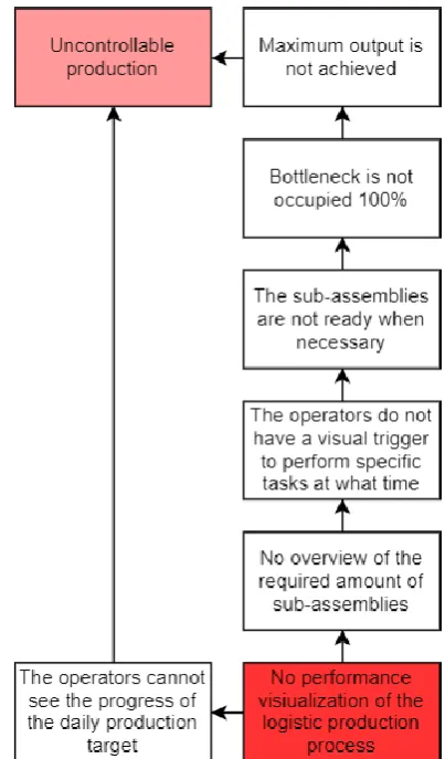
The manufacturing manager and the operators are interviewed to get a deep understanding of the problems within the manufacturing department. In order to gain insight into the process and the problems associated, a problem cluster is made of the problems which can be influenced and are related to the start problem (Heerkens & van Winden, 2012). This problem cluster, which is visualized in Figure 4, shows the identified problems, the action problem, and the core problem.
The starting problem is that Medspray has an uncontrollable production, the light red problem within the problem cluster. The causes of this
problem are mainly that the employees of the production line cannot see the progress of the daily production target and have no overview of the required amount of sub-assemblies. The determined root of these causes is the core problem:
This core problem is chosen based on the four rules of thumbs of Heerkens and van Winden (2012): 1. A problem will only be in the problem cluster if it is sufficiently sure that the problem actually
occurs. Therefore, leave out what is not known.
2. In the chain of problems, go back to the problems which no longer have a cause. These could be core problems. So, go back in the causal chain.
3. What cannot be influenced, cannot be a core problem.
4. If problems remain in the problem cluster, choose the most important problem as the core problem.
[image:17.595.314.516.190.534.2]“There is no performance visualization of the production process within Medspray. “
-4/76- First of all, only problems which can be influenced and actually occur are included in the problem cluster. Secondly, the core problem “There is no performance visualization of the production process
within Medspray“ has no cause itself and can be influenced by developing a visualization. Solving this core problem provides Medspray with a controllable production and solves all the subproblems in the problem cluster. Therefore, the assignment is to visualize the performance of the production process within Medspray.
1.3.2 Norm and Reality
When there is a difference between the norm and the reality, there is often a problem. Currently, this is the case within the manufacturing department of Medspray. The norm within Medspray is to have a controllable production. In other terms, the company wants to have a production line with visualizations of the real-time performance in order to make the right decisions at the right time and to manage the production to be more effective.
Instead, the performance is manually filled in and managed within Excel spreadsheets. Figure 5 illustrates an example of the current visualization of the performance. Therefore, there is no quick display of the current performance within the production process. Moreover, due to the lack of a quick real-time performance visualization, it is hard for the management and the operators to determine improvements and have an insight into the current progress within the production process.
All in all, the norm is to provide the company with a quick display of the current performance within the production process. Figure 6 visualizes an example of the norm for the company. The reality is that there is no visualization of the performance within the production process of the company. There is only visualization available through analyzing the manual input in Excel spreadsheets by the employees of the manufacturing department. Therefore, the manager and the operators do not have the right information at the right time in order to make appropriate decisions and reach the
company’s goals. The assignment, visualizing the performance of the production line, removes this discrepancy between the norm and reality.
Current situation Preferred situation
-5/76-
1.4 Research design
This section describes the steps of scientific research which are carried out. Section 1.4.1 first describes the problem-solving approach with the corresponding research questions. Section 1.4.2 discusses the type of research. Section 1.4.3 analyzes the reliability and validity of the research. Finally, section 1.4.4 discusses the limitations of the research.
1.4.1 Research method
In order to solve the core problem,“Medspray has no
visualization of the performance of the production
process”, the Managerial Problem-Solving Method (MPSM) is used. The MPSM is a systematic approach to solve business problems which are handled in their organizational context (Heerkens & van Winden, 2017). Furthermore, the MPSM is a general method that can be used in various situations for different problems in all fields This makes it beneficial compared to other problem-solving methods.
Moreover, the MPSM focuses on the context of an organization in order to come to a solution which is best suitable for a specific organization. Figure 7 visualizes the seven phases within this problem-solving method. Appendix A shows the exact steps which are performed during this research within all phases.
The MPSM encounters research questions in almost all the phases. This section describes the research questions which are answered during each phase of the MPSM in order to solve the main research question of the research:
Phase 1: Defining the problem and Phase 2: Formulating the approach
Research question 1: What does the current production process of Medspray look like?
First, the current situation within the production process of the company is analyzed. This is necessary in order to get a deep understanding of the core problem and to be able to compare the starting value with the end value after the solution is implemented. Moreover, mapping the current situation helps in finding the causes of the problem. Literature research is done to map the
production process and choose the best suitable technique. After that, the production process of the company is mapped based on the chosen technique.
Research question 2: What is performance management?
[image:19.595.339.523.228.347.2]This research question needs to be answered to get an idea about the core of the problem. Currently, Medspray does not have any visualization within the production line. Therefore, this research question helps in understanding the importance of visualization and the manner of
Figure 7: Phases of the MPSM
-6/76- measurement. In order to get an answer to this research question, a literature review is needed to find out the characteristics of performance management. After this, the most used performance management methodologies are discussed.
Phase 3: Analyzing the problem
Research question 3: Which KPIs can be used to measure the performance of the production process?
(Systematic Literature Review)
KPIs have to be found which can be used to visualize the performance of a production process. These KPIs are found through performing a Systematic Literature Review.
Phase 4: Formulating solutions and Phase 5: Choosing a solution
Research question 4: Which KPIs are most suitable for the company?
After the KPIs are found with the Systematic Literature Review, existing data is searched which is available within the company and based on that, KPIs are selected which are best suitable and have the most value for the company. Based on specific requirements of the manufacturing manager and the operators, the key KPIs are selected for the company with the use of a KPI selection.
Research question 5: Which techniques can be used to visualize the performance of the production process within Medspray?
Now, the focus is on finding visualization techniques to solve the core problem. First of all, existing techniques have to be found which visualize the performance of the production process, this is done through a literature review. After that, one technique has to be chosen which is most applicable for Medspray.
Phase 6: Implementing the solution
Research question 6:Which software to make a dashboard is best suitable for Medspray?
There is a lot of software to choose from to create a dashboard. The most used software are compared and the most applicable one for the company is used to develop the dashboard.
Research question 7:How to prepare and structure the required data in the software?
The content of the dashboard is based on real-time data which needs to be updated on a daily basis. Therefore, a data model architecture is required to ensure the right data is collected as required. This research question is answered through a literature review about data architecture and the way to model it.
Research question 8:How to design the dashboard with the chosen software?
After the visualization technique and the software are chosen, the design of the dashboard needs to be determined. This is done through a literature review and interviews with the end-users, which are the manufacturing manager and the operators. The design needs to fit the needs of the company. Furthermore, the interface and functionality of the software are discussed.
Phase 7: Evaluating the solution
In phase 7 of the MPSM, the evaluation is checked through measuring the improvement, ensuring further management and implementing possible improvements.
-7/76-
1.4.2 Type of research
This subsection discusses the type of research which is carried out for each of the research questions. The answer to research question 1, which is about the current situation of the company, is given by interviewing employees of the manufacturing department within Medspray. These interviews are semi-structured which means open questions are predetermined but are not fixed. The questions which are prepared beforehand are used as a kind of checklist to make sure all the subjects are covered. This way, there is room for the respondents to come up with personal views and experiences.
Moreover, this results in a deeper understanding of the activities within the company because the interview is not only focused on questions which are predetermined but also have space to come up with important information to better understand the activities of the company. Based on the information of these questions, a flow chart is created which gives an overview of the global activities within the manufacturing department of Medspray.
Due to the fact the focus of this research is on the manufacturing department, an in-depth understanding of the production process within the company is needed. To get an insight into the current situation within the manufacturing department, observations are done within the production line to map all the specific activities. During these observations, questions are asked to the
employees within the production line to get a clear overview. These employees will use the visualization to see the performance and progress of the production line and therefore their preferences also need to be considered.
Also, a final interview is done with the manufacturing manager to check whether the information which is obtained from the observations and employees are correct. The manufacturing manager also uses the visualization to see the performance of the production process and make appropriate
decisions to reach the company’s goals. Table 4 visualizes the type of research to answer the other research questions.
Research questions: Chapter/Section: Research question 1: Section 2.1 & Chapter 3
Research question 2: Section 2.3
Research question 3: Section 2.2 & Appendix B Research question 4: Chapter 4
Research question 5: Section 2.4 Research question 6: Section 2.5
Research question 7: Section 2.6, Section 4.3 & Appendix C
[image:21.595.167.447.125.328.2]-8/76- Table 4: Research questions: Type of research
Research question Type of research
2 Literature review performance management and methodologies
3 Systematic Literature Review
4 Answer research question 3 and interview with end-users 5 Literature review visualization techniques
6 Literature review existing software 7 Literature review data architecture
8 Literature review dashboard design
1.4.3 Reliability and validity
Validity and reliability determine the quality of the research data and the conclusions which are drawn from it. Therefore, this subsection discusses the internal and external validity within the research and subsequently the reliability.
Valid research means that the research results are correct. Also, whether the measurements are done with what was intended to be measured (Golafshani, 2003). Validity can be categorized into two main types, external and internal validity:
1 External validity is the ability to generalize the data about people, situations and periods. During the research, the focus is on designing a way to visualize the performance of the production process. To be able to do this, first, an analysis of the current production process is made. Subsequently, the specific information which needs to be visualized is determined. Within the research, data is used from the company, which therefore means that the visualizations are specific for the company itself. However, the outcome of the research might be generalizable for a company which has a comparable production process and growth. Moreover, the visualization can be used for inspiration or as an example for other comparable companies. So, the research is in some way externally valid.
Also, within the company, there are about ten operators in total, which are selected randomly when doing observations in order to increase the external validity of the observations.
2 Internal validity is the extent to which the conclusions of the research are valid for the research group. Therefore, during the observations which are performed, the reality is observed. Of course, when the presence during those observations is known, it is likely that the operators behave differently. Therefore, observations are done as unobtrusively as possible to ensure the internal validity within the outcome of the observations.
-9/76- different days. This reduces the chance of accidental events. Moreover, at the end of the
research, the effect of the chosen visualization technique is tested. In order to check whether there are any improvements, observations are performed. To make sure the results are reliable, observations are performed in the exact same manner and timeframe.
1.6 Intended deliverables
This last section of the introduction discusses the deliverables of the research. First of all, a flow chart is given in order to map the supply chain of the manufacturing department of the company. Moreover, the most suitable KPIs for Medspray are given based on the result of the systematic literature review and the needs of the company. Thereafter, advice will be given on which visualization technique is most suitable for Medspray to visualize and monitor the production performance. With the use of the recommended visualization techniques, the selected KPIs are visualized in a functional and attractive way. This solution visualizes the performance of the production process within the production process of the company.
Not only KPIs are visualized on the chosen visualization technique, but also inventory levels, production speed and the orders of customers. This helps the operators to get a structure in their work especially when the production process is scaling up.
Furthermore, a report is given with recommendations of the future visualization content to Medspray in order to optimize the performance of the production process.
1.7 Structure of the report
Table 5 gives an overview of the chapters within this research.
Overview chapters:
Chapter 1: Introduction
Chapter 2: Theoretical framework Chapter 3: Current situation
Chapter 4: Content of the dashboard Chapter 5: Design of the visualization Chapter 6: Evaluation
Chapter 7: Conclusions, Recommendations & Limitations
-10/76-
2.
Theoretical framework
This chapter discusses the theoretical framework which is needed to answer the main research
question “How to visualize the performance of the production process of Medspray?”. First, the techniques to map the current production process of the company are described. Thereafter, the existing KPIs to measure the performance of a production process are defined. Then the concept of performance management and the theory of visualization techniques are described. The last section is about the software to create the chosen visualization technique.
2.1 Current situation
This sectionis about mapping the current production process of the company. In order to do so, a literature review is done in existing methods to map business processes. “A business process is
the combination of a set of activities within an enterprise with a structure describing their logical order and dependence whose objective is to produce the desired result.” (Aguilar-Saven, 2004).
Therefore, to get a deep understanding of the current business process, it should be visualized in a model. There are several modelling techniques possible depending on the purpose of the analysis (Aguilar-Saven, 2004). The article of Aguilar-Saven (2004) includes a list of the main process modelling techniques.
Flowchart
The purpose of mapping the business process within Medspray is to visualize the flow of the actions. Moreover, to get a graphic representation of the current production process of the company. Therefore, the process modelling technique which is used for mapping the current situation of the manufacturing department of the company is a flow chart. A flow chart gives a graphic representation of the flow of the actions within the production process. So, having mapped the business process within a flowchart gives a visualization of the high-level steps within the production process of the company.
Generally, a flow chart can be used to provide insight into the content of various sub-processes and process steps. The schematic representation of a (sub)process offers the user the opportunity to visualize findings. The simplicity of a flowchart ensures that it can be read and understood by almost everyone involved. This makes a flowchart a commonly used methodology in especially production and logistics flows.
A flowchart shows the steps within a process. All steps are linked with arrows which indicate the connections. The different symbols indicate whether it is a step or a decision. Flowcharts can be used for analyzing, documenting, improving and keeping track of a process. It helps in
understanding the relationships between the steps, making decisions about important steps and eliminating less relevant steps.
-11/76- together, this is one of the most used diagrams in the world, in both technical and non-technical fields. Flow charts often get more specialized names such as process flow diagram, process map, functional flow diagram, business process map and Business Process Modelling & Notation
(BPMN). Flow charts are related to other popular charts, such as Data Flow Diagram (DFD) and the activity diagram in Unified Modelling Language (UML).
Business Process Modelling Notation
The flowchart will be developed using a Business Process Modelling Notation (BPMN), which is a formal notation for describing processes. BPMN is a universal modelling language that helps organizations to effectively model, optimize and execute processes. It is a tool for implementing Business Process Management. BPMN visualizes process flows, actors, process steps and actions (White, 2004).
For a company, it is essential to make business operations transparent and measurable. Each entrepreneur wants to improve the business. In order to improve, first, the current situation of working needs to be clear. Business processes are recorded to map the current situation within a company.
Once the business processes are established, improvements can be investigated. Improving a process can, for example, lead to the process of shortening by omitting steps. Another possibility is to recognize and remove duplicate steps in a process. Ultimately, improving processes can have many consequences for the company. Costs can be saved, the quality can be improved, the number of errors can be reduced and ultimately, customer satisfaction will increase.
2.2 KPIs to measure the performance of the production process
This section is about the existing Key Performance Indicators (KPIs) which express the
performance of the production process. KPIs are a summarized set of key variables or measures which inform managers and employees about how well an organization is achieving its goals. A KPI is expressed in a number and is related to a norm or goal. By aligning the KPIs with the objectives of the organization, the objectives can be made measurable. A Systematic Literature Review is performed to identify the available performance KPIs. Appendix B shows the method of this systematic literature review and the table with the KPIs identified. This part discusses the concept matrix which is made based on the Systematic Literature Review. Furthermore, each of the review articles is discussed briefly. Finally, the answer to the research question is discussed.
2.2.1 Concept matrix
Table 6 shows a concept matrix which organizes the systematic research. This concept matrix presents connections between the chosen articles and the specific key concepts of the research question (Smale, 2015). Only in one of the articles, the key concept “logistic” has been discussed. If the topics “KPI”, “performance”, and “production process” are to be discussed, the articles from
-12/76- Table 6: Concept matrix
Key Concepts
KPI Visualization Performance Production Process
Art
icl
es
1.(Lai & Man, 2017)
X
X
X
2.(De Felice & Petrillo, 2015)
X
X
X
X
3. (Mousavi and Siervo, 2017)
X
X
X
X
X
4.(Tokola, Gröger, Järvenpää,
& Niemi, 2016)
X
X
X
X
5.(Jovan et al., 2006)
X
X
X
X
2.2.2 Outcome of the Systematic Literature Review
In this subsection, the five chosen articles and their similarities are briefly discussed in order to summarize the answer of the research question “Which KPIs exists that can express the
performance of the production process?”.
Article 1 (Lai and Man, 2017)
This article is mainly about applicable KPIs for the performance of engineering facilities. Within the article, selection criteria for KPIs are discussed, such as being measurable and practical for data collection. Furthermore, the article divides KPIs into the five categories. Two of the five categories, “Financial” and “Task & equipment” , might be applicable for Medspray. Finally, the article highlights that the most essential indicators have to be chosen based on their weights of importance level.
Article 2 (De Felice & Petrillo, 2015)
This article is about the importance of an efficiency evaluation for the survival and growth of any firm (De Felice & Petrillo, 2015). Furthermore, the article describes the KPIs divided into the categories of each part of a scorecard. Also, the relationships between each part of the scorecard with the corresponding KPIs are discussed. Due to the fact that a scorecard is also a visualization technique, these KPIs might be applicable for Medspray.
Article 3 (Mousave and Siervo, 2016)
This article focusses on the translation of the real-time data into KPI transfer functions of the production process (Mousavi & Siervo, 2017). Two important KPIs, Overall Equipment Efficiency and Overall Line Effectiveness, are discussed in particular. These KPIs give the ability to visualize
“the losses and gains more accurately and the cost of production can be reduced whilst resource utilization reaches a balance” (Mousavi & Siervo, 2017). Based on the fact that especially real-time data is used within the chosen visualization technique, these KPIs are definitely applicable. Article 4 (Tokola et al., 2016)
Also, this article is focused on real-time data being an important success factor for manufacturing companies to facility agile and efficient manufacturing (Tokola et al., 2016). Furthermore, the article is mainly about the dashboard, which is a visualization technique. Finally, the article divides KPIs into “Production” and “Quality“ categories, which are both applicable to this research. In the paper, research has been on the Interest of each KPI based on a 1-5 scale, therefore the
-13/76- Article 5 (Vladimir et al., 2016)
This article is about KPIs which visualize the efficiency of the production. The focus is on finding an appropriate set of KPIs that are specific to the observed production process (Lai & Man, 2017).
Moreover, this article discusses that “a production manager is usually overloaded with current
production process data with the main problem being how to extract the relevant information from this vast amount of data in order to make fast and correct decisions” (Lai & Man, 2017). This problem can be solved with the use of KPIs. Furthermore, the article gives requirements to output production process variables, like being easily measurable. This information is used in choosing the KPIs which are visualized within the company. The three main productions KPIs which are mentioned in the article are“Productivity”, “Mean Product Quality” and “Mean Production Costs”, which are applicable to the company where the research is executed. These KPIs are focused on the existing production data.
Similarities and differences of the articles
Each of the articles expresses the importance of KPIs to cover performance aspects. Moreover, the identification of the KPIs is important for a company as is stated in all the articles. In this way, the current value of a KPI and the target of that KPI can be compared and decisions can be made to fill the possible gap. The interesting thing is that each of the 5 articles discuss KPIs which mainly visualize the performance of the production process, but none of them discuss the same KPIs.
2.3 Performance management
In order to make business decisions, usually, real-time data need to be used. There are several applications which users perform Business Intelligence tasks, performance management, among others, enables decision-makers to track key performance indicators of the business using visual dashboards (Chaudhuri, Dayal, & Narasayya, 2011). This section discusses first the difference between performance measurement and performance management. Thereafter, performance management methodologies are described. Finally, techniques are discussed which can visualize performance management.
2.3.1 Performance management Vs. Performance measurement
This subsection describes the concepts of performance management and performance measurement.
Performance measurement
Performance measurement is used within a multitude of organizations to, for example, keep track of the actual output of the various employees or components. Measuring performance can have both positive and negative effects. Deploying performance measurement can have various functions, all of which serve to improve the performance of the organization.
Performance management
-14/76- organization strategy. This creates a set of clear strategic goals and indicates which factors are essential for achieving the strategy. Key Performance Indicators (KPIs) need to be defined to measure success.
Therefore, the effectiveness of the measurements is largely dependent on the extent of managing the measurements. Organizations need to have a process of evaluating, responding to and
aligning around measures in order to get anything out of them (Miyake, 2019). That is what performance management is about.
While performance measurement asks, “How do wetrackthe progress of the strategy we’ve put
in place?”, performancemanagementasks, “How do wemanage the strategy we’ve put in place?”
All in all, performance measurements are critical in an organization to track the progress, but it is not a process for doing anything about the results. Performance management, on the other hand, offers a way to actually do something about the measures (Miyake, 2019). Therefore, a form of performance management in an organization is to assess whether an action is good, bad or indifferent. It would be impossible to maintain permanent control over an action or organization without performance management.
2.3.2 Performance management methodologies
A performance management methodology is a methodology which supports performance management. This section discusses the most commonly used performance management methodologies to continuously monitor the business performance based on the defined performance indicators.
Balanced Scorecard
The first method is the Balanced Scorecard (BSC). The BSC is a well-known strategic system of Kaplan & Norton which is the most commonly used model in both literature and practice (Garengo, Biazzo, & Bititci, 2005). The BSC attempts to provide important information that is necessary to adequately reflect the overall strategy of an organization in specific performance measures. The BSC can be used to define success factors and performance indicators.
This methodology clarifies the strategic goals and categorizes them into the perspectives financial, innovation, customer and internal. Figure 8 visualizes these four perspectives.
• The financial perspective: shows how the company performs financially. The goal is to represent shareholder value. Measures can be related to profit, costs or income.
• The internal perspective: shows whether the company is doing the right things in the right way. Measures for this perspective can be, for example, productivity or machine downtime. • The innovation perspective: shows how intangible resources, such as people and information,
support the organization. Measures which fit this perspective are presence and data accuracy.
-15/76- Six Sigma
Most companies use Six Sigma as a process improvement methodology to view processes critically and problems can be traced. Six Sigma offers the possibility to accelerate the
improvement of the overall performance. Because Six Sigma focuses on business processes and process improvement, the methodology offers a simple way to address performance issues after they have been identified or detected ("What is Six Sigma? " 2004). In the statistics, the Greek letter sigma (σ) is used to express the variability. In terms of quality, variability is synonymous with the number of defects. The variability in business processes can be expressed in defects per million. To achieve the Six Sigma performance level, the company should reduce the number of defects. Six Sigma is, therefore, a performance methodology aimed at reducing the number of defects in a business process.
Lean
Lean is a business strategy and a way of working where everything and everyone in the company focuses on creating value for the customer in all processes. Therefore, lean is about creating value and eliminating waste. Through putting the customer first, a maximum added value can be created for the customer with minimal effort. This improves quality, reduces lead times and reduces costs. This has a positive effect on customer satisfaction, employee engagement, and on the profit.
Figure 9 visualizes the five important principles of lean management:
1. Define value: an organization needs to identify the customer’s wishes and thereby identify the customer’s perception of value.
2. Map Value Stream: An organization needs to map the value flow of processes and eliminate waste within these processes. The following questions are relevant:
[image:29.595.144.424.116.343.2]-16/76- b. Which activities do not directly add value (but are necessary for business operations),
and how can these activities be reduced to a minimum?
c. Which activities add no value at all and can, therefore, be eliminated?
3. Create Flow: The organization needs to create a continuous flow of the product or service. 4. Establish Pull: The organization needs to prevent overproduction. This is done by ensuring
that there is no production without the previous step in the process.
5. Pursuit Perfection: keep striving for perfection. The organization needs to create a continuous culture of improvement.
Figure 9: Principles of Lean Management
2.4 Techniques to visualize the performance of the production process
In the previous sections’ performance management and the performance management methodologies: Balanced Scorecard, Six Sigma, and Lean are discussed. This sectionis about existing techniques which visualize performance management. In order to find the most suitable technique, a literature review is done.The visualization of the performance can be done with various techniques. The two most commonly used techniques for companies to visualize KPIs are the Balanced Scorecard and the Dashboard (Brundage, Bernstein, Morris, & Horst, 2017; Pacific, Crest, & Group) “Dashboard and Scorecard, both are automation tool represented graphically or as a structured report that
provides “at-a-glance” information about the business performance by evaluating and measuring
the crucial performance factors often termed as Key Performance Indicators (KPI) which helps
-17/76- Balanced Scorecard
The BSC is also discussed in section 2.3.2. “Using scorecards bridges gaps between short-term objectives, such as financial measures, and long-term strategies and planning” (Baker, 2015). Due to the fact the company is interested in the daily strategies and planning and also not in financial measures, this visualization technique is not applicable for the research.
Dashboard
A popular way to dynamically display KPIs is to use a dashboard. A dashboard is a tool that is often used in combination with a Performance Management Methodology. Dashboards are used to display important information, including KPIs. Also, a dashboard offers an at-glance window into overall business performance, which is mainly the aim of the research (Baker, 2015). Another important purpose of a dashboard is that the data can be easily updated. The most distinctive feature of a dashboard is the three layers of information: monitoring, analysis, and management. Because of these layers, a dashboard is able to display a lot of information on a single screen.
Moreover, “A strategic dashboard focuses attention on analysis and reflection for quality decision making to improve performance” (Baker, 2015).
So, a dashboard displays the most important data at a glance. The dashboard brings the most important visualizations together in a consumable view. A dashboard is based on real-time data in order to give businesses the opportunity to make instant decisions.
Conclusion
The most suitable technique to visualize performance needs to be chosen based on the objectives and goals of the company.The most important requirements of the company are to have a visualization technique which handles real-time data, which measures performance, is interactive and maps the Business Performance.
Therefore, based on the comparison visualized in Table 7 and the purposes of a scorecard and dashboard mentioned in the paper of Baker (2015), the best suitable visualization technique for Medspray is a dashboard.
-18/76-
2.5 Software to develop the dashboard
This section is about identifying the software which will be used to develop the dashboard. The selection is based on the requirements of the company and a comparison between existing software. Therefore, first, section 2.4.1 discusses the purpose of the dashboard based on observations and interviews with the manufacturing manager and the employees of the production line which are the end-users. Based on this information, section 2.4.2 compares three software to develop a dashboard and the most suitable one is chosen.
2.5.1 Purpose of the dashboard
First of all, the aim of the dashboard is to monitor and control the current situation within the manufacturing department of the company. The dashboard which is created for the company essentially gives a quick overview of the current performance of the production process. Therefore, the dashboard needs to be easily understood and modified by the end-users, especially because Medspray is fast growing and their demands will change over time.
The main end-users will be the operators who are working in the production line of the company. With the KPIs and information visualized on the dashboard, they will be able to make decisions to improve the performance and get motivated to do so. Of course, also the management will make use of the dashboard to see in a quick glance the current performance within the production line.
Moreover, the management can, based on the dashboard, make decisions for the operators to improve the specific parts in the production line.
“Dashboards can now be the primary interface for measuring the success of an organization’s strategy as part of a Business Performance Management (BPM) initiative” (Schiff, 2019).
“Business performance management (BPM) is a key business initiative that enables companies to
align strategic and operational objectives with business activities in order to fully manage
performance through better-informed decision making and action” (Shi & Lu, 2010). Therefore, BPM is focussed on the constant improvement of an organization through connecting indicators such as KPIs with their performance. BPM is not only about objectives in KPIs, but also about the relationship between bosses and employees on the workplace.
Therefore, it is essential to create a dashboard which strengthens this relationship and let the staff feel responsible for their own results in order to be committed and motivated. Through activating and stimulating employees, they are more able to achieve both their own operational objectives and strategic objectives. To do so, the software can be used to create a dashboard in order to provide the employees with a good understanding of their duties and work performance. Therefore, the
dashboard needs to visualize the most important KPIs and need to be interactive.
Since the company has high confidential data, the safety of the software has a critical role in
choosing the appropriate software. Also, the flexibility of displaying the dashboard is important since the production line is in a different building as the headquarter of Medspray where the office of the manufacturing manager is located. Another point to consider is the possibility to customize the visualization and the variety of different visualization types.
-19/76- is growing so fast, there is not much space for an employee to be trained for using and maintaining the dashboard. Of course, for each company costs are also an important factor.
2.5.2 Comparison of software
There are a lot of software to create a dashboard in, three of them, Tableau, Qlik Sense, and Microsoft Power BI, are compared in order to choose the most suitable one for Medspray. Table 8 gives the advantages and disadvantages of each of the three software ranked by the importance of the criteria based on the interviews with the end-users.
Table 8: Pros and Cons Dashboard Software
Power BI is a Business Intelligence (BI) service from Microsoft. Data from a company can be simply exported to Power BI. The dashboards and reports make it possible to analyze and visualize data easily. Power BI has a cloud service (Power BI service) and a desktop interface (Power BI desktop), the use of these connections is explained in Appendix C.
1 ("Tableau Software Review: Pros and Cons of a BI Solution for Data Visualization," 2017)
2 ("Qlik Sense Advantages and Limitations – Explore the Pros & Cons," 2019)
3 ("Microsoft Power BI Pros and Con," 2019)
Criteria Tableau1 Qlik Sense2 Power BI3
Ease of use ⚊ ⚊ ✔
Costs ✖ ✖ ✔
Connectivity to a variety of data sources
✔ ✔ ✔
Technical support required ✖ ✖ ✔
Secure ✖ ⚊ ✔
Speed ✔ ⚊ ✔
Memory ⚊ ✖ ✔
Flexible use in different kind of screens
✔ ✔ ✔
Custom visualizations ✖ ✔ ✔
Innovation & Versioning ✖ ⚊ ✔
✔ Criteria available
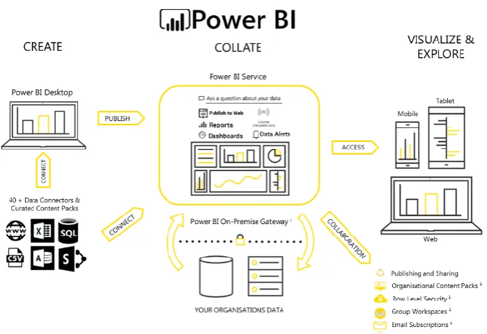
-20/76- Figure 10 visualizes the relation between Power BI Service and Power BI Desktop together with the other features of Power BI. In the Power BI Desktop, data can be imported from other programs. With this data, a report can be made. This report can be published to Power BI Service which can be attached to a dashboard. From the Power BI Service, users have the opportunity to open the dashboard or report on any device.
Figure 10: Features of Power BI (Architecture)
Moreover, Power BI is mainly an Excel-driven product which is a big advantage since Excel is an industry standard to store data. “Power BI is a data cleaning, data modelling and visualization tool which is capable of making a robust and complex data model composed of many different sources. This functionality is not present in Tableau Desktop, it requires the incorporation of another tool
which essential drives up cost.” ("Tableau vs Power BI," 2019). Also, Power BI is an analytic tool that helps to create and share actionable and intuitive reports for business insights.
-21/76- • Can automate information provision
• Can combine all kind of data sources • Low threshold for end users
• Low priced based on usage
Looking at the pros and cons of Table 8, the purposes and requirements from the company of the dashboard and the benefits discussed, the conclusion is that Power BI is the most suitable software the create a dashboard.
2.6 Data architecture
This section first introduces the concept of Data Management. Thereafter the concept of Data Architecture is discussed. Finally, ArchiMate is discussed as a tool to model the Data Architecture.
2.6.1 Concept of Data Management
After the content of the dashboard is determined, data need to be gathered and managed in order to visualize the chosen content (Huberman & Miles, 1994). For this, the data must be managed. Data management is about maintaining, updating, managing and securing data. Files are checked whether changes have occurred and adjusted if necessary. The files are enriched with new and additional data from external sources. Keeping the data up to date can be automated. Therefore, the purpose of data management is to ensure that the current data is complete, reliable and available on time for the execution of business processes and for taking the right management decisions.
2.6.2 Concept of Data Architecture
“The unambiguous specification and description of enterprise architecture’s components and
especially of their relationships requires an architecture modelling language that addresses the issue of consistent alignment and facilitates coherent modelling of enterprise architectures.”(Group, 2013). Data architecture is part of the enterprise architecture and provides an overview of the present and required data in an organization. The data architecture is determined by analyzing the information needs of an organization and is represented using various models and techniques. Data Architecture is about the agreements which are made about how data is stored and how an organization wants to deal with the possibilities to achieve optimal results with this data. Therefore, data architecture is a collection of models, processes, and rules which determine where data is stored and how they are integrated to be optimally utilized in systems and organizations.
Legislation and regulations are increasingly playing a greater role, which is why the foundation of a Data architecture is an essential condition for being able to continue to comply with laws and regulations.
2.6.3 Concept of ArchiMate model
-22/76- ArchiMate makes it possible to provide insight into the structure and coherence of business
processes, organizational structures, information flows, and technical infrastructure. ArchiMate offers a clearly defined set of concepts and relationships. Therefore, ArchiMate facilitates the discussion about architecture and the transfer of architectural knowledge to development teams. ArchiMate is an integrated architectural language which describes and visualizes the relationship between different business and IT domains. With these integrated architectures, stakeholders can plan and communicate the impact of decisions and changes across the entire organization.
The focus of ArchiMate is on integrated modelling, visualization, and analysis. Integrated modelling means creating coherence between the models of other architecture languages and frameworks. Visualization or providing insight into architectural models means communicating within the own conceptual framework about the integrated architecture. Because the coherence between the domains can be made transparent, it can also be analyzed (Josey, Lankhorst, Band, Jonkers, & Quartel, 2016).
ArchiMate tries to model relationships at an abstract level between the domains which are described in more detail in other methods, such as UML and BPMN. ArchiMate differs from UML and BPMN because it is more conceptual and focuses less on the details. This makes it possible to provide insight into the structure and coherence of business process, organizational structures, information flows, and technical infrastructure. ArchiMate meets the need for more precise documentation in the field of enterprise architecture (Josey et al., 2016).
-23/76- • The Business layer: allows to model the business organization, business processes and
products. This layer offers products and services to external customers.
• The Application layer: allows to document the application landscape and understand dependencies between these applications. This layer supports the business layer with application services.
• The Technology layer: allows cataloging an infrastructure over the hardware, software, and network. This layer offers infrastructure services need to run applications, realize by computer and communication: hardware and system software.
Each of these layers is further subdivided into passive structure, behaviour and active structure elements. This allows describing the enterprise.
• Passive structure (what): an object on which behaviour is performed.
• Behaviour structure (how): a unit of activity performed by one or more active structure elements.
• Active structure (who): an entity that is capable of performance behaviour (Group, 2013).
Appendix D explains the various elements of an ArchiMate Model with the layers and the relationship possibilities.
The modelling language ArchiMate connects concepts with which architectures can be modeled. There are clearly defined rules with which indirect relationships between concepts can be deduced. With the implementation, the connection between existing and desired situations can be made visible.
ArchiMate is about communication and is a visual modelling language for describing enterprise architecture. As the IT landscape of organizations becomes more and more complex and innovations and changes follow each other faster, it is important to create a joint picture of how IT is organized. To do this properly, a shared visualization language is needed (Josey et al., 2016).
All in all, ArchiMate provides:
• A language with concepts to describe architectures • A framework to organize these concepts
• A graphical notation for these concepts
• An open standard maintained by the Open Group
2.7 Design of a dashboard
This section is about the design of the dashboard. After the software to create the dashboard and the content of the dashboard is chosen, a literature review is done about the design of this dashboard. First, general information about the design of the dashboard is discussed. Thereafter, the type of dashboard is described. Subsequently, the chart types and the layout of the dashboard are discussed.